Hey Sumos!
We’ve reorganized and simplified our launcher.
Check it out.
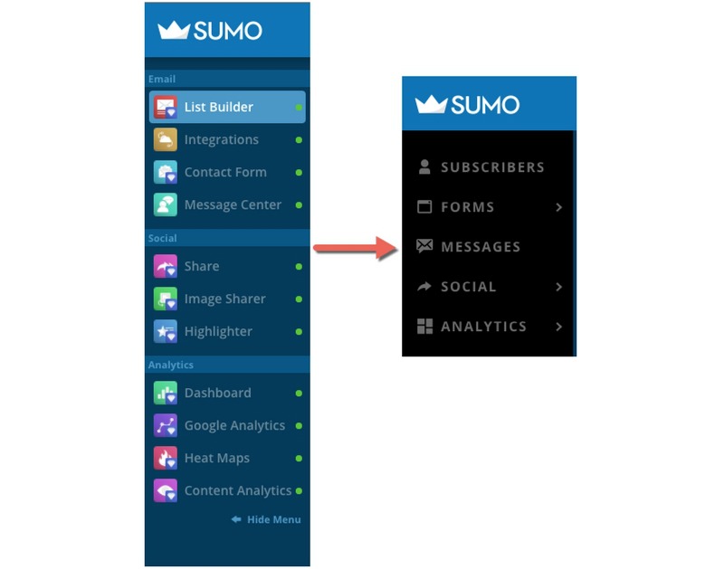
Our brains naturally group similar items together so it only made sense to carry this over to our new launcher sidebar layout.
This fresh update is in its final stages and we wanted you to know before it goes live.
Once it’s ready, you’ll be able to use the launcher based on what you’re trying to do.
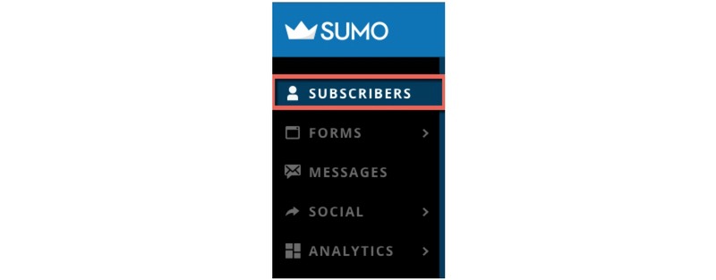
Need to see a list of your subscribers? Head right to Subscribers. You can also send your messages right from here too.
Ready to build your next opt-in form? Make a beeline to Forms.
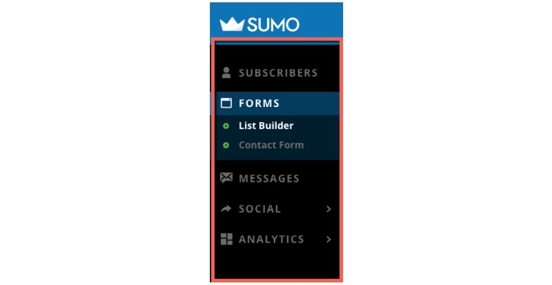
To give you an idea of where everything is, here’s a quick breakdown of the new layout:
Under Forms, you’ll find all of your List Builder forms and Contact Form.

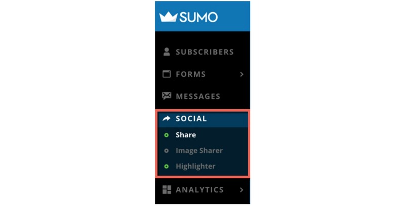
The Social tab gives you access to Share, Image Sharer & Highlighter.
Just below Social, you’ll see Analytics which has your Dashboard, Google Analytics, Heat Maps, and Content Analytics.
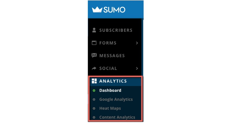
On top of changing the layout, we moved Integrations under Settings. So you’ll find this once you click on the gear icon, or Settings link, in the top right header.
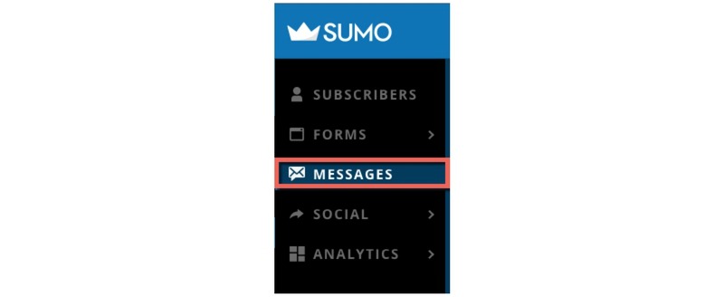
Message Center also received an update and now it’s separated into two tabs:
- Messages – Here’s where you’ll find your message history
- Subscribers – This gives you a list of your subscribers and it’s also where you’ll send your messages from.

As you start using this new launcher, consider your goal first. What are you trying to do? Then make your way over to the corresponding link and you’ll find what you need.
Check out the clean and simple launcher now
To minimal designs that make life easier,
Devan Ciccarelli
Add A Comment
VIEW THE COMMENTS