This is a case study from Sumo user Brian Dean of Backlinko.
So a few weeks ago I had this problem …
My site was getting a fair amount of traffic, but no matter how many Aweber forms I slapped on my blog, I couldn't get ANYONE to sign up for my email newsletter.
But here’s the weird part:
- I’ve been in the internet marketing game for more than 5 years
- I knew that people wanted to know when I put out new content
- I knew that an email list is one of the most valuable assets a business can have
The problem was … I had no idea how to build that email list.
When you build an email list, you have direct access to your customer base. You don’t need a middleman like Facebook or Google to get your message heard. With that direct access you’re able to provide lots of amazing value and occasionally pitch products and services.
But for people to sign up for your list, you need to ask them.
One day I logged into Google Analytics and was shocked to see that my conversion rate for people to sign up for my list was at an all-time low: a pitiful 1.73%.
I was feeling bummed about my conversion problem. So I messaged Noah on Facebook to hear his take.
Me: “Dude, my conversion rate is TERRIBLE.”
Noah: “DUDE, you need to use our free List Builder app in Sumo”.
Me: “OK let me check it out … wait, WTF?! This is a popup? Hell no. I’m not using a pop up. I hate those things.”
Noah: “It’s no big deal. Trust me, people don’t mind as much as you think. Just tryyyy it ;-)"
I’ll be honest … I was VERY wary about putting a popup on my site. On the other hand, I was desperate and ready to try anything.
So I decided to give it a shot.
I went over to Sumo.com and downloaded the WordPress plugin. Then I logged into WordPress, clicked on “add new plugin” and uploaded the plugin (.zip file) that was sitting on my desktop. It only took me about 23 seconds.
FYI: If you don’t use WordPress, you can just copy and paste the 2-line Sumo code into the footer of your website and you’re set.
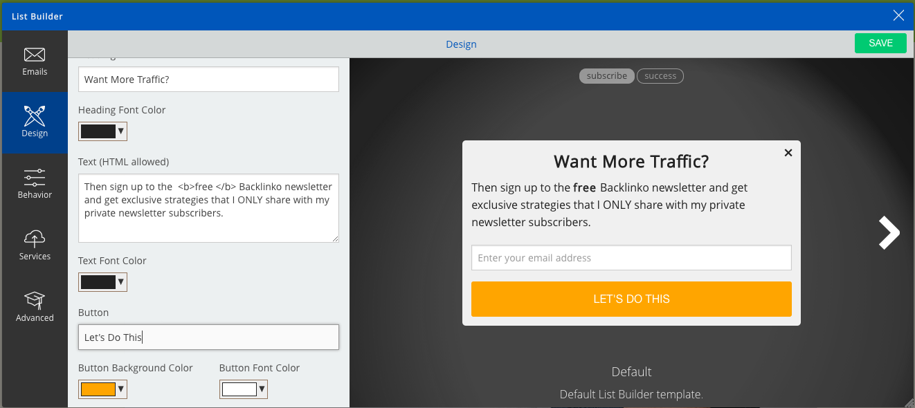
Next, I fiddled around with some of the options so that it matched the look and feel of my site:

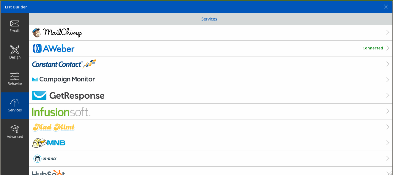
In a couple of seconds, I linked my Aweber account to import my list.

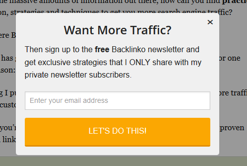
Here’s what it looked like when I was done:

I thought to myself: “OK, so I’ll use List Builder for a few days just to make Noah happy. When I see that people are immediately leaving my website and I have tons of complaints in my inbox, I’ll take it down.”
So I waited two days to see what List Builder had done.
As soon as I looked at my stats … my jaw dropped.

Can you say “daaaaaaamn”?
My site’s overall conversion rate was less than 2% before I started using List Builder. Over a 2-day span, my site was converting at an average of 4.83%.
In case you suck at math like I do, let me put it this way:
That little form more than doubled my conversion rate (literally) overnight.
And check it: NO ONE cared about the nano-second interruption. I’ve had the form on my site for almost a month now and no one has said a word about it.
Now that I've shown you exactly how List Builder can grow your email list, let me walk you through three things, that in retrospect, helped me get such awesome results.
#1: Set PopUp Mode in List Builder to “Smart”
Smart PopUp mode is like Noah standing behind your visitor and saying “hey, opt-in right now!” at the PERFECT moment.
Most pop-ups appear after a certain amount of time has elapsed.
That’s nice, but what if someone opens your site in one tab, pops over to their email in another, and then heads back to your site.
What’s the first thing that they see? A popup … before they’ve read a word of your content (yeah, that's not good).
List Builder, on the other hand, shows up when someone has actually already engaged with your content, meaning they’re in “this blog is awesome” mode and more likely to sign up.
#2: Use a Brief, Benefit-Driven Headline
Like anything online, the headline you use for Sumo is HUGE.
When I wrote my headline I just thought to myself, “what do most of my visitors want?” and wrote my headline around that. Simple yet effective.
In my case, my headline turned out to be “Want More Traffic?”. Your visitors may want to lose their gut, save an hour a day, or find their dream job. Make your short-and-sweet headline reflect that.
#3: Use Strange Copy On Your Button
Conversion scientists agree: The text that you put on your buttons can make or break your conversions.
You may have noticed that the button on my Sumo form said “Let’s do this!”.
Why did I use that instead of something like “Sign Up”?
Terms like “Sign Up” and “Register” convey a certain level of commitment. And generally, people don’t like committing to anything (especially online).
On the other hand, terms like “Send me my tips!”, “I’m in!” or “Sounds Good” give off a sense of fun and ease. Basically: they convert better.
If you’re still on the fence about using List Builder, just do me one favor: try it.
You have nothing to lose by giving it a shot … and A LOT to gain.
In my case, it not only doubled my conversion rate, but added serious meat to my bottom line.
Each new email subscriber that I get is worth about $15 to my business.
List Builder instantly added 15-ish new subscribers per day to my list. That’s an extra $225 per day .. or $82,125 per year!
Not bad for a tool that’s 100% free and takes less than 2-minutes to install.
Click here and install List Builder and the other Sumo apps on your site now. If you have a WordPress site, click here to download our WP plugin.
Add A Comment
VIEW THE COMMENTS