Product landing pages are the most important type of page for any ecommerce business. They’re where the sale is made and where the value to the user has to be the strongest.
Organic search to product pages is a vital source of traffic, for a couple of reasons. First, it’s very qualified because as soon as a user searches for a specific product, she’s in the late stage of the research process. Second, it’s free traffic that sometimes takes a while to ramp up, but once it’s rolling it can constantly bring in new customers for nearly zero cost. Third, organic search is a stable part of every research process nowadays, which means that most customers are present on this channel.
Back in 2014, a collaborative study between Google and Millward Brown Digital showed that 90% of users leveraged organic search in their research process and performed 12 searches on average engaging on a specific brand's site—and that was just in the B2B industry![*]
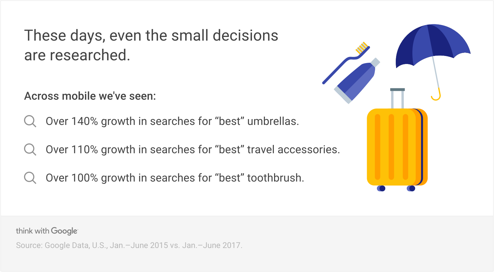
Product reviews and search queries including “best” are growing at a rapid pace, indicating the expanding research people do online—especially on mobile and soon on voice devices.
But there are also challenges with organic traffic coming to your ecommerce site. Competition is high and increasing, as many ecommerce brands have invested in SEO. But competition doesn’t only come from other brand product pages; it has also increased in the search results (and you’re often competing with Google itself!). One part of that is the ads Google is displaying above and below the organic search results, plus Google Shopping ads. On top of that, we see Google search features like research articles, Google News and Google Maps—and this example is only for a short-head keyword like “running shoes.”
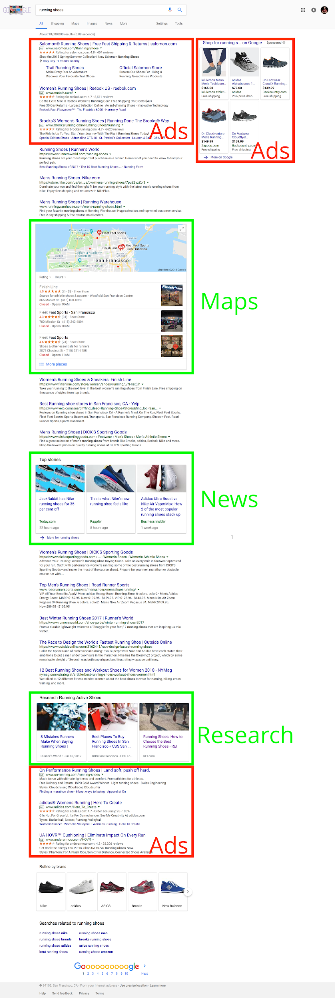
The attention on search results pages (SERPs) is increasingly fought for by other companies and Google features.
There are even ads on Google’s image search!
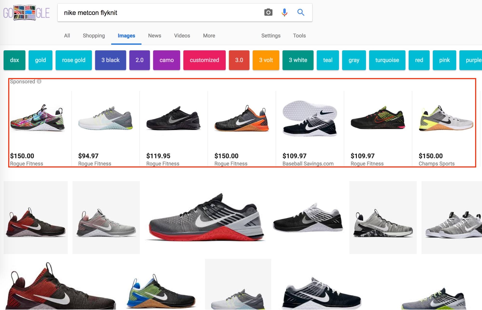
Bottom line: the market is growing but so is your competition.
The question is: what can you do about it?
Fight harder!
To help you with that, I’ve compiled this guide on creating the ultimate ecommerce product landing page to generate the maximum amount of organic traffic and conversions for your business.
I distinguish between on-page elements and characteristics. The former are elements you can see and change on the landing page. The latter are characteristics that well-performing landing pages have in common but are not directly visible. I will show you best and worst practices for 18 product page elements broken down into these three distinct groups so you can make your pages rank higher, generate more SEO traffic and convert more sales.
%(tableofcontents)
Today, we can no longer distinguish between SEO and conversion optimization; both disciplines are closely related through user experience. Since Google started to factor “user satisfaction” into ranking criteria, the line has blurred. That makes things easier because we can look at product landing page elements through the same lens.
Metadata
The first touchpoint between user and brand is on the search results page, not on the website. A brand presents itself through metadata (from the source code of the page), which is composed of three elements:
-
Title
-
URL
-
Description
-
Meta Keywords (meta keywords haven’t mattered in some time)
All three elements are important for conversion because they signal the user what to expect behind the result. The search result has to look right for the user to click. If the user doesn’t get to the page in the first place, a perfectly conversion-optimized experience doesn’t matter. Below is a snippet from a standard search engine result.

When a snippet has enhancements, we call it a “rich snippet.” Rich snippets come with additional features, such as review stars, technical specs, breadcrumb navigation, price, rating, and more.

In the following section, we will go over optimizing these snippets for maximum clicks.
Title
The title tag has become one of the strongest ranking signals for organic search. It’s surfaced in search results, in the browser tab, and on social networks (more about that under “OG tags”).
The title’s job is more than just a heading; it sets the tone for what the piece of content is about for users and search engines. It creates the semantic context (meaning) for the body content and other keywords in it.
Best And Worst Practice
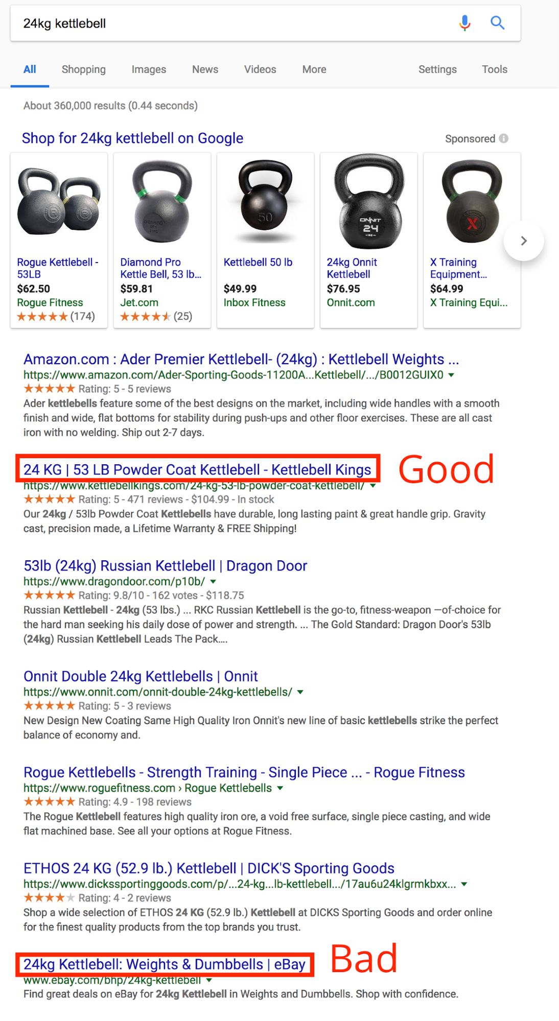
What the best practice does right:
-
It conveys value by mentioning a value of the product that stands out (powder coat).
-
It stays within the recommended length of 600px (50-65 characters).
-
It contains the main search keyword.
-
It’s compelling to click without sounding “clickbaity.”
-
It’s unique.
What the worst practice does wrong:
-
It confuses you by adding the product category in the title (weights & dumbbells).
Meta Description
Meta descriptions are not a direct ranking signal but influence the clickthrough rate for a search results page. If a description is written well, users are more likely to click the snippet. This is even more important on mobile devices because users’ attention spans are shorter and therefore expectations higher. If a result cannot keep its promise, which is made in the description, mobile users will leave quicker than desktop users.
Best And Worst Practice
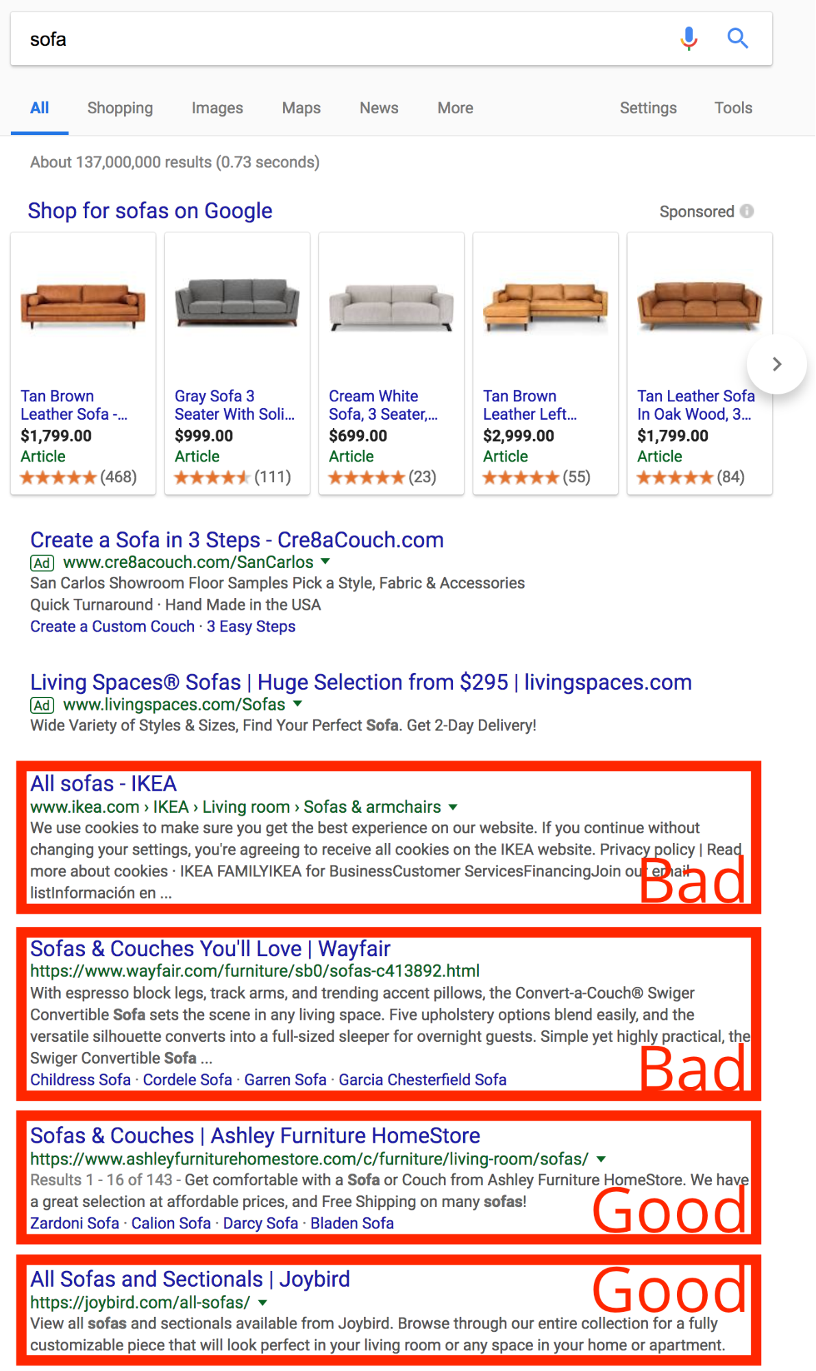
What the best practice does right:
-
It contains the main keyword and secondary keyword at least once.
-
The length is between 150 and 300 characters.
-
It contains a call to action.
-
It describes the page/product, sets the expectations of the user and conveys value.
-
It’s unique.
What the worst practice does wrong:
-
It contains irrelevant information. For example, IKEA’s description reads “We use cookies to make sure you get the best experience on our website…”. That’s because IKEA’s meta description in the source code only contains the words “all sofas,” which was probably automated. Google understands this and tries to provide a better meta description (and fails).
-
It’s truncated (i.e,. you can’t see the full meta description).
OG Tags
OG Tags are part of the Open Graph Protocol and help to display links to your site in a nice and controlled way, just like on search engines. That means for example that the title, description, image, and URL of an article will be displayed correctly and as you want them to when shared on Facebook or Twitter.
You can find a full list of Open Graph Tags on the official site, but here are the most common ones:[*]
-
og:title
-
og:type
-
og:image
-
og:url
They should be placed as meta tags in the <head> section of your source code. If you use WordPress, you can either install the official OG Tag plugin or use the Yoast plugin.
Best And Worst Practice
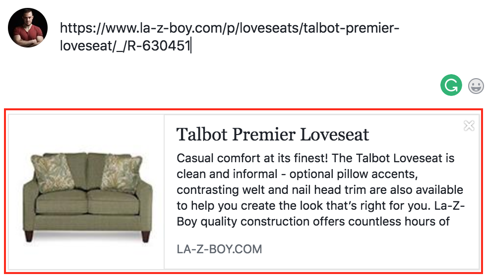
When you paste a URL into Facebook's status update module, you get a preview of what the share will look like.
La-Z-Boy added all relevant OG tags to the product page: title, description, URL, image.
Koernerfurnite, on the other hand, hasn’t defined any OG tags on its product page and therefore doesn’t get good-looking social media snippets.
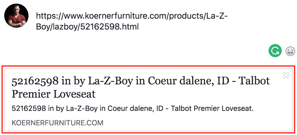
What the best practice does right:
-
It has title, description, image, and URL OG meta tags in the <head> section of your source code.
-
All components have the right image size and character length.
What the worst practice does wrong:
-
Only some or no OG Tags implemented.
If you’re concerned about your OG Tags, you can use either of these tools to check a page for valid implementation:
URL
The final component of a perfect snippet we can impact is the URL. It doesn’t stick out in the search results as much as the description or title but can still make a snippet look “off.” As observed in anecdotal tests, users are less likely to click a URL that consists of mostly numbers and characters.
Google tries to show a breadcrumb navigation whenever possible in a snippet.

Breadcrumbs help the clickthrough rate because they make your search page result look “cleaner.” Google pulls them from the Breadcrumb navigation on the page and only shows them in a “clean” way if you added schema markup (code you add to your page that helps search engines read what your page is about) to your site.
Best And Worst Practice
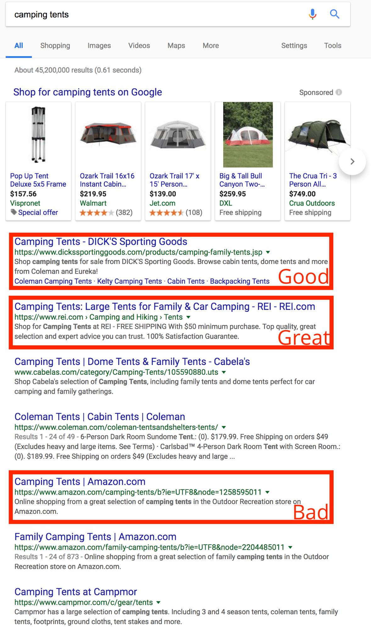
What the best practice does right:
-
Dick’s Sporting Good’s snippet in the screenshot above has a clean URL that’s easy to understand for users.
-
REI’s snippet URL is even better, as it’s shown in a breadcrumb rich snippet and consists of a hierarchy (Camping and Hiking > Tents).
What the worst practices do wrong:
-
Amazon’s snippet URL has a long filter parameter at the end (b?ie=UTF8&node=1258595011), which doesn’t look good and is less trustworthy.
To get breadcrumbs and rich snippets, you need to implement schema markup. Schema is like a dictionary for code: it helps search engines understand what a piece of data is about.
For more help with Rich Snippets, you can try Google’s own Structure Data Markup Helper.[*]
For breadcrumbs specifically, you can check the Schema Breadcrumb documentation.[*]
Content
Next, we’ll take a look at how content pushes organic traffic and sales. We’ve started with how a site presents itself in search results, the first touch point with the customer, and now we’re moving on to the information the site provides to visitors.
Image And Video Galleries
Image and video galleries are a crucial part of the value proposition. When shopping online, customers can’t try clothes on or hold a product in their hands, so they rely on the visual information on the site. Your job is to make it easy and convenient for them to get the best visual experience possible.
Worst Practice
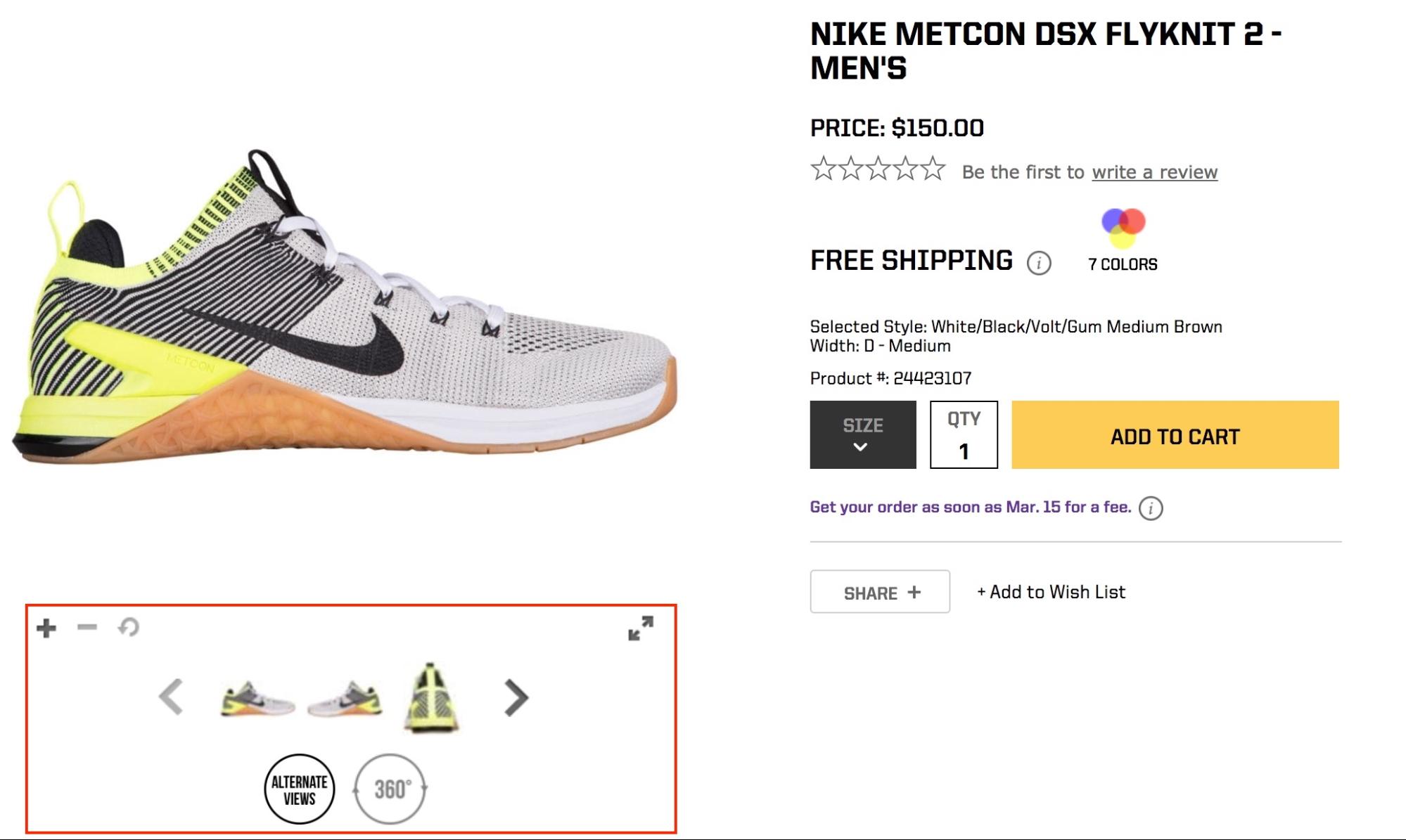
What the worst practice does wrong:
-
Shows too-small thumbnails that make it hard to see what the image looks like.
-
Forces users to click through the thumbnail gallery unnecessarily (the example above has five thumbnails, but doesn’t show two of the thumbnails).
-
Uses buttons to zoom in (users expect to be able to zoom in with a click).
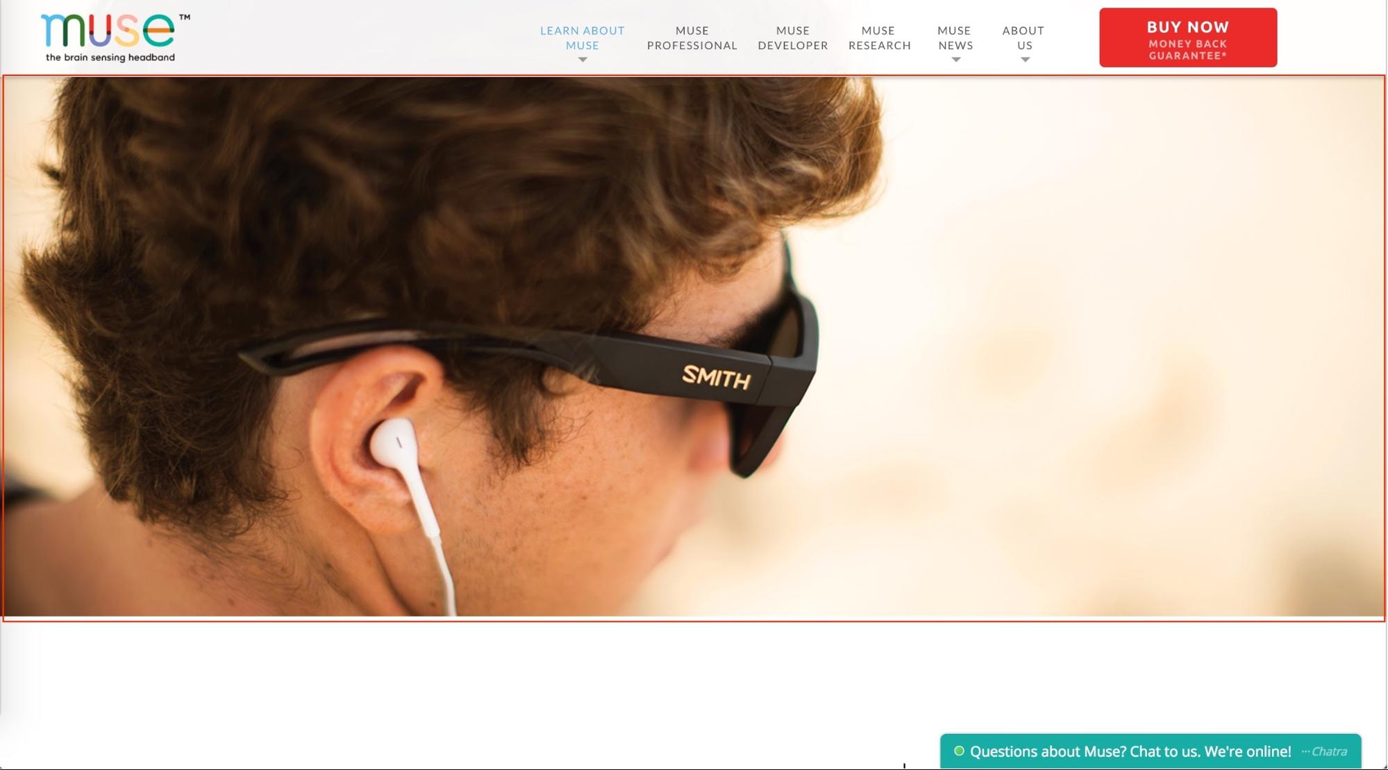
You also want to avoid an image header without text on product pages. The emptiness looks like the page is incomplete and leaves too much room for interpretation. For example, the image below could be an ad for Smith Sunglasses or Apple EarPods.
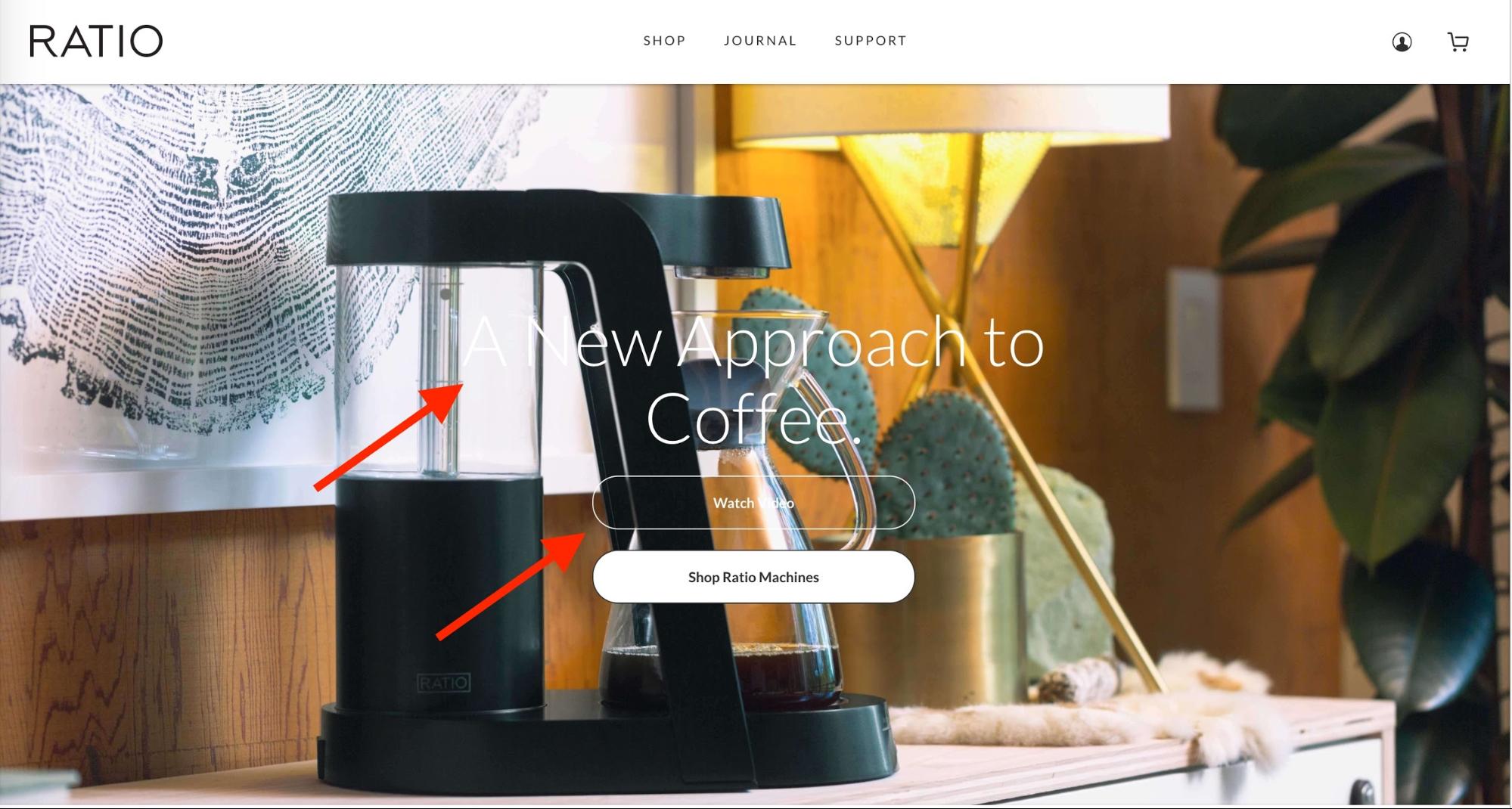
Also, be careful with the colors of your text against your background image. Below, the headline and first call-to-action button have text that is very difficult to read.
Best Practice
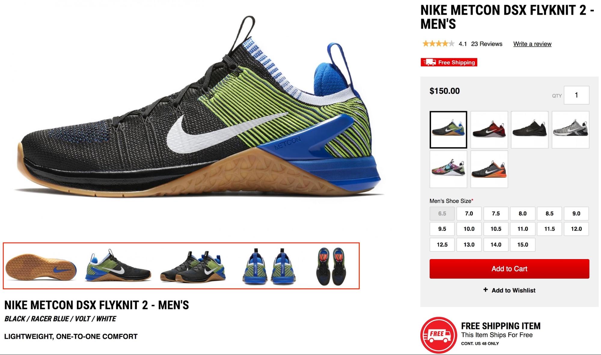
What the best practice does right:
-
Uses as much space for the product image as possible.
-
Shows the product from all angles in a single convenient view.
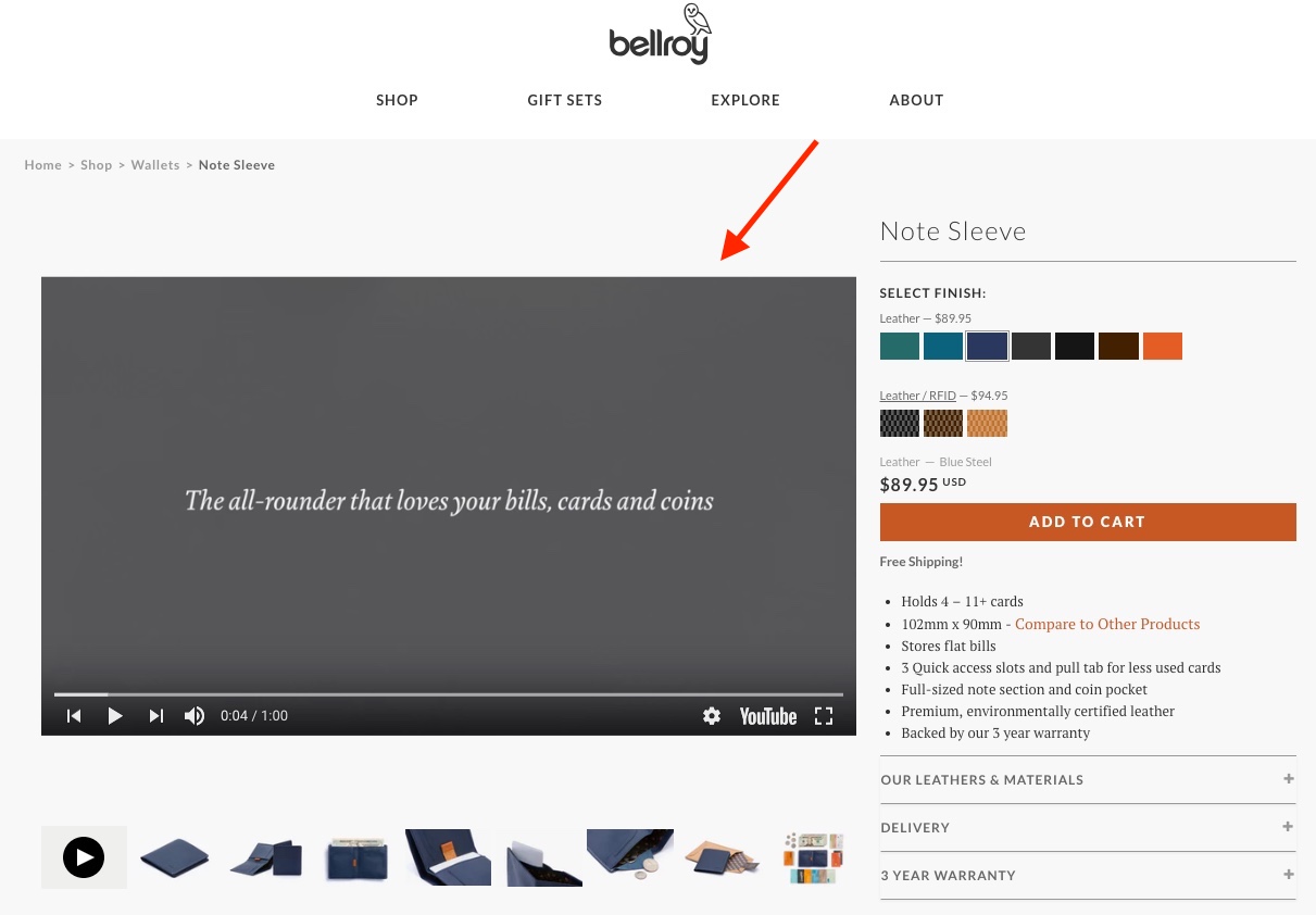
For best results, show a video that explains the product and presents it from all angles.
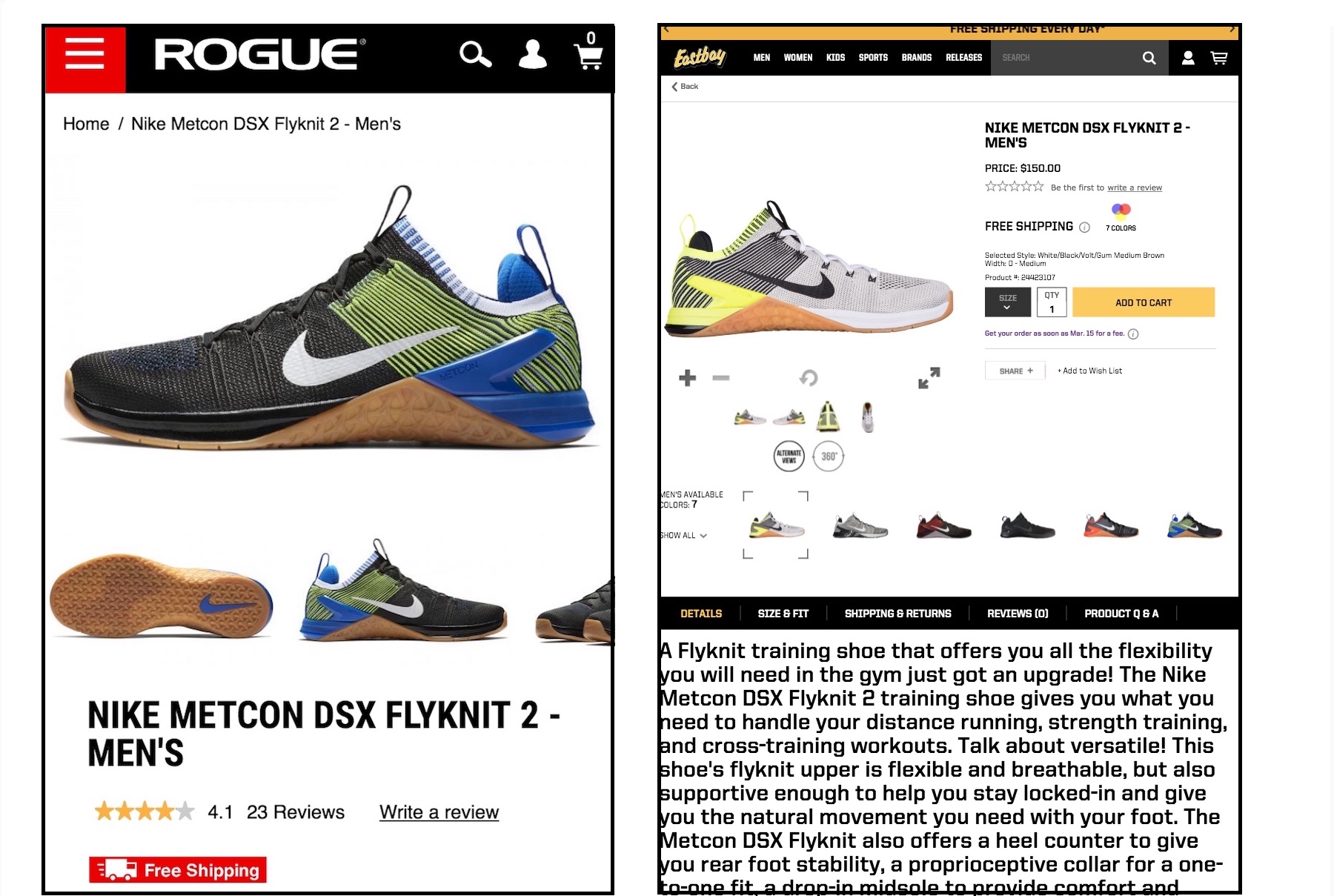
The difference becomes especially apparent on mobile devices (screenshot below is a side-by-side comparison). Users can easily swipe through the image gallery in the best practice (on the left). In the worst practice (on the right), they have to zoom in to hit the right buttons – a frustrating experience.
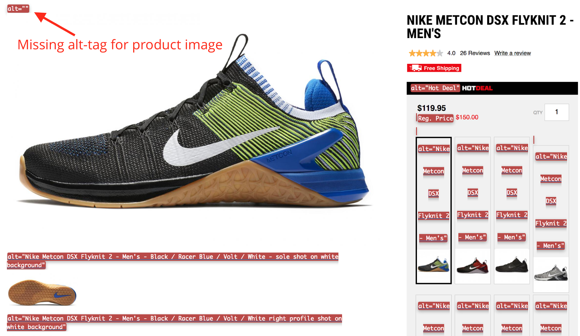
Unfortunately, none of the examples use the alt attribute 100% correctly. Since search engines cannot literally “see,” they rely on a multitude of factors to understand what’s inside an image. The alt attribute is the most crucial factor, along with the image file name and surrounding content, when optimizing images. It helps search engines determine the relevancy of a page for a keyword. A relevant alt attribute contributes to better rankings.
Heading Tags
Heading tags help users and search engines to get a quick grasp of the content structure. The heading tags provide a semantic structure to the outline of the content.
H1s carry the most weight for SEO, should be used just once on each page, and should be unique on each page. The remaining tags, H2-H6, can be used multiple times on the page, but should be used in hierarchical order (H2, H3, then H4, not H2 then H4). However, it seems that Google is giving heading tags less power nowadays since most sites don’t use them correctly anyway.
Let’s compare the product pages for the Beats Studio 3 on the Beats by Dre site against a retailer site.
Worst Practice
As you can see in the screenshot below, the H1 tag is empty, and H tags carry irrelevant terms. I circled every empty or irrelevant H tag in red, so you can see how the site uses them for layout, instead of structuring content.
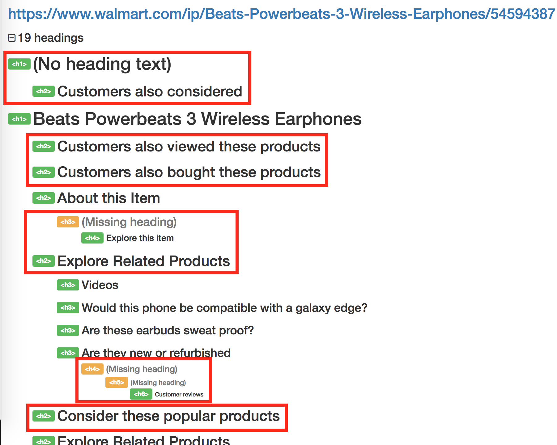
What the worst practice does wrong:
-
No relevant H tags (they probably use H tags in the navigation).
-
Hierarchy is not kept.
-
No H1.
Best Practice
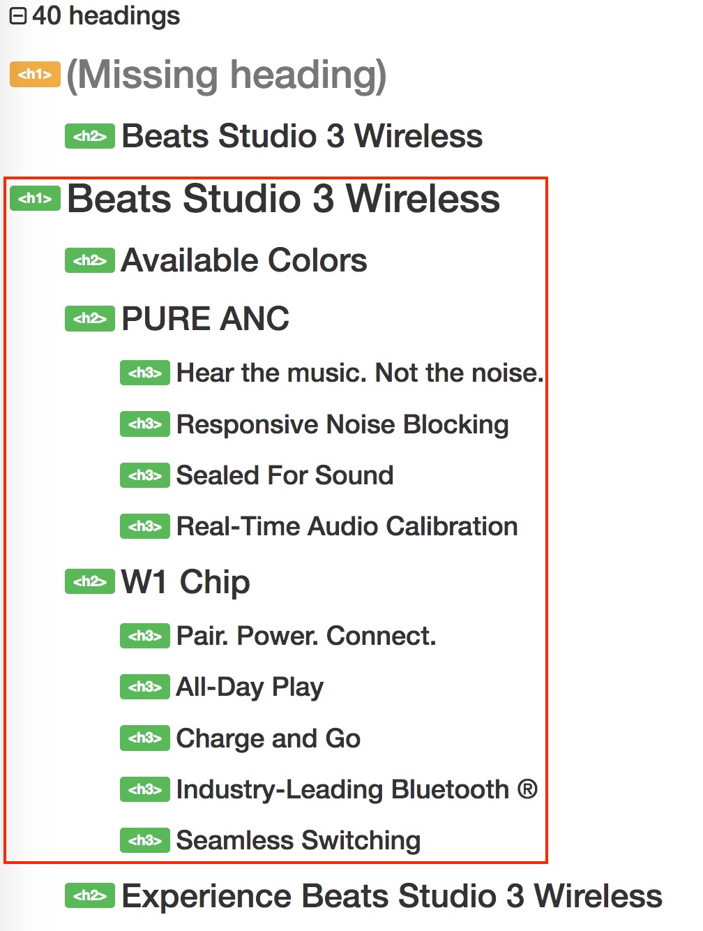
What the best practice does right:
-
Mostly keeps the hierarchy.
-
You could tell what the page is about just from looking at the headings.
-
Product name and/or main keyword in the H1.
-
There is just one H1.
Product Description
Product descriptions are a chance to use text to extend the visual experience that comes through images and videos. They can be difficult to scale because you can’t write unique and beautiful descriptions for thousands of products. However, it’s recommended to not just copy the description from the manufacturer.
Ecommerce deals with commodities, which means that most shops carry the same inventory. To stand out, you need to make your product page as unique as possible. The product description is a great opportunity for that.
What you want to avoid are long and dry deserts of text. Instead, loosen it up by structuring it, including images, and making it easy for people to find the information they’re looking for in the description. Often people want to buy a product for slightly different reasons: some care about durability, others more about looks—even in the same product. The description should help users to find the value and information they need to make the purchase.
Worst Practice
Look at the screenshot below; the same product description can be found on many other sites. It’s not going to prevent you completely from ranking, but it’s also not going to benefit you.
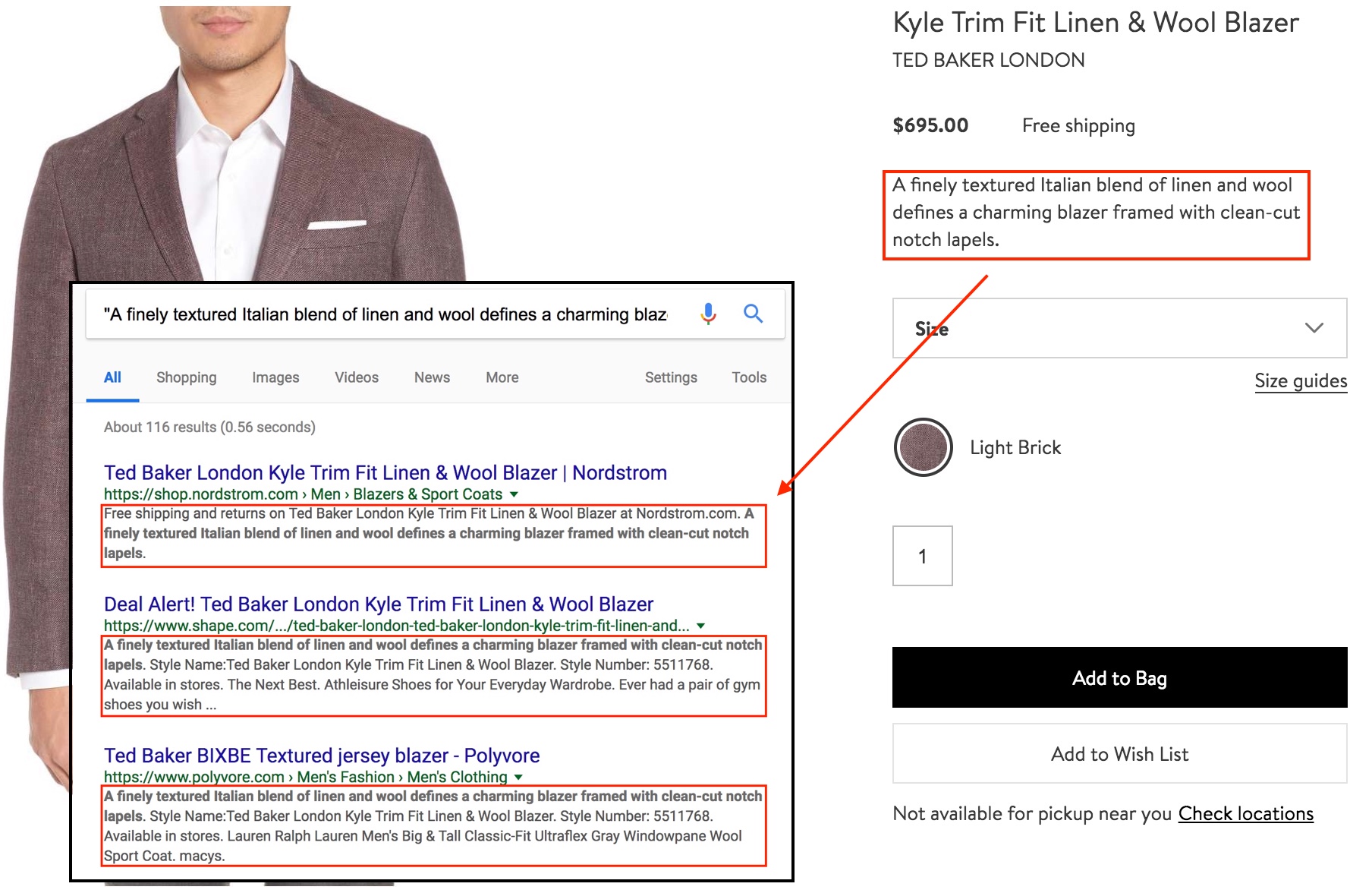
What the worst practice does wrong:
-
Same product description as on other sites.
-
Very short product description (<150 characters) on the page. If space is an issue or you don’t want to distract users, you can continue the description below the top section of the page.
Best Practice
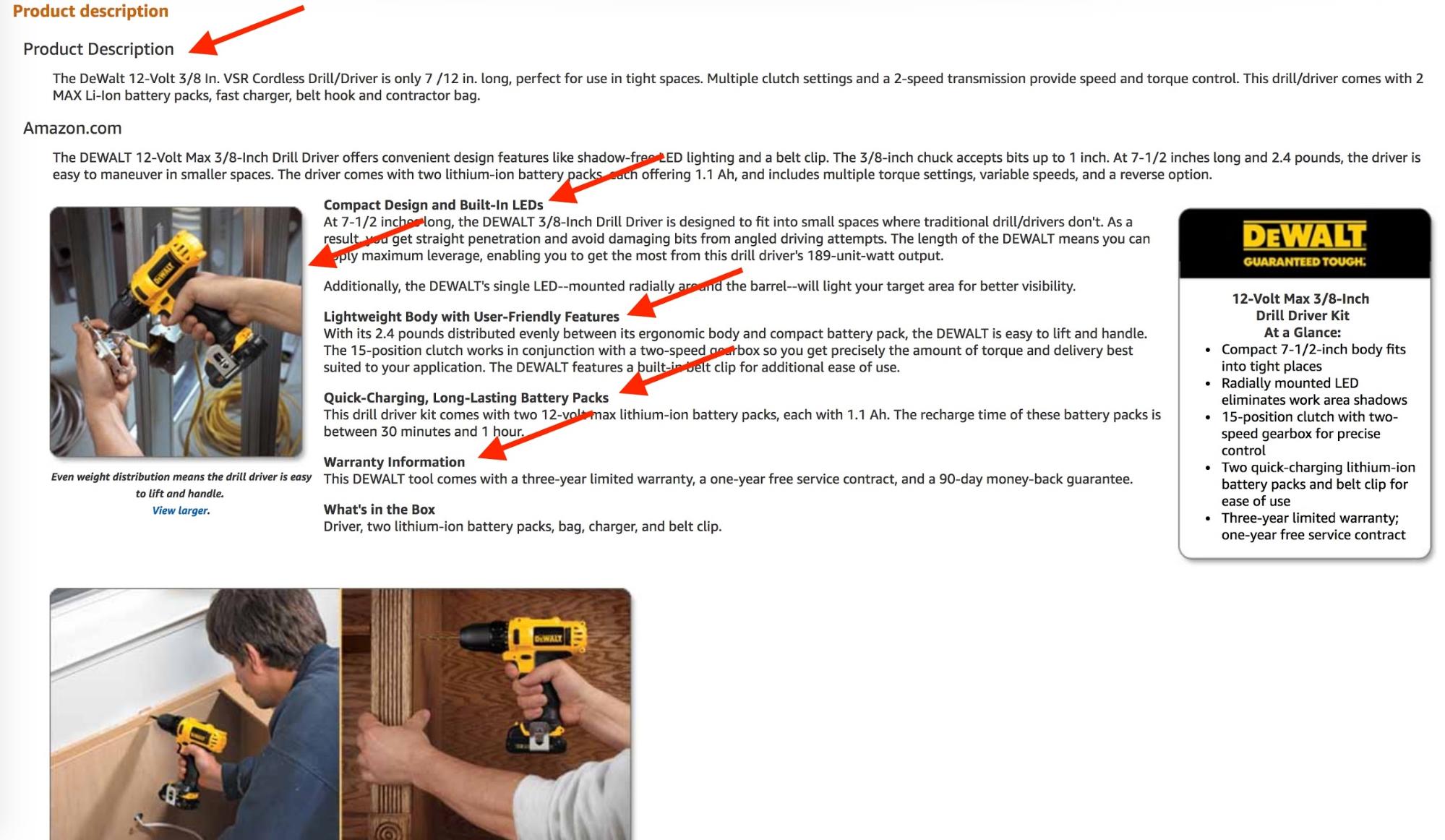
Amazon
Home Depot
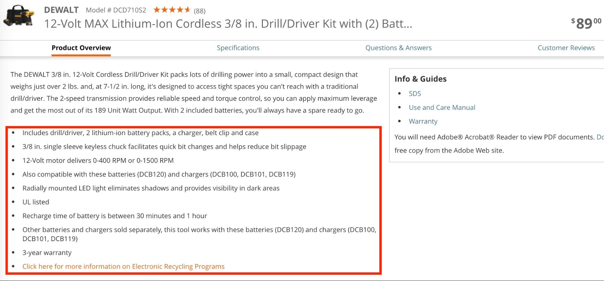
What the best practice does right:
-
Description is long and contains every aspect of the product.
-
Headings and short paragraphs to make information digestible.
-
Images support text for better visual understanding.
-
Bullet points allow for quick scanning of information.
Features
Product features are probably the most important content a product page can have after the product image and title for product-aware users.
Apple’s product page for the iPhone X—the flagship product of the world’s most valuable brand—consists mainly of features. The benefits of the product are communicated in story format, which creates an emotional response while being informative.
It’s mainly a conversion driver. It’s the longest product page I’ve ever seen (too long to capture fully in one screenshot), and besides features, there’s not much else. Here are just three of the eight features on the page:

Features separate a product from its competitors and are the most valuable aspect to the customer, besides price and quality. They have to be communicated clearly, and in best case visually.
Worst Practice
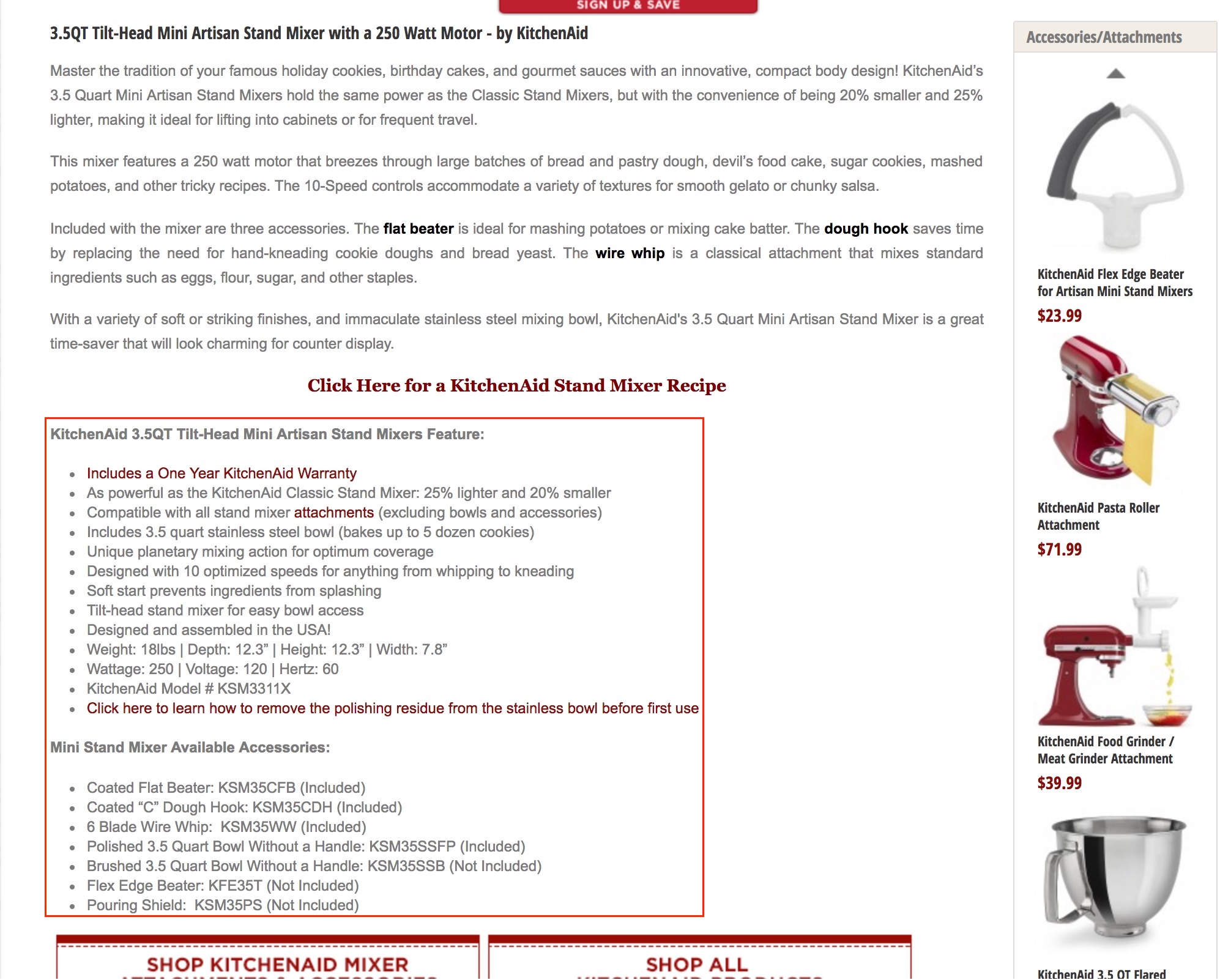
What the worst practice does wrong:
-
No visual showcase of features.
-
Small font and overwhelming lists that are hard to comprehend.
Best Practice
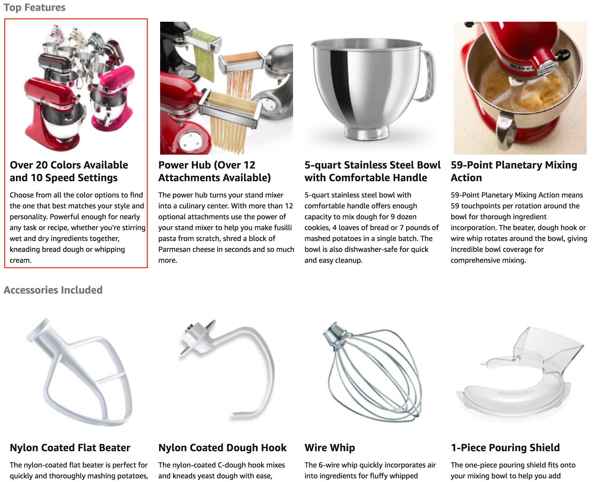
What the best practice does right:
-
Easy to scan.
-
Nice images to show features.
-
Not too much text.
Story
The best product pages tell a story. We’ve already looked at Apple’s iPhone X page, but there are numerous other examples.
The usual path is to go from “what” to “how” to “why” in retail:
-
What is it?
-
How does it work?
-
Why is it better? (or “why should I buy this?”)
Worst Practice
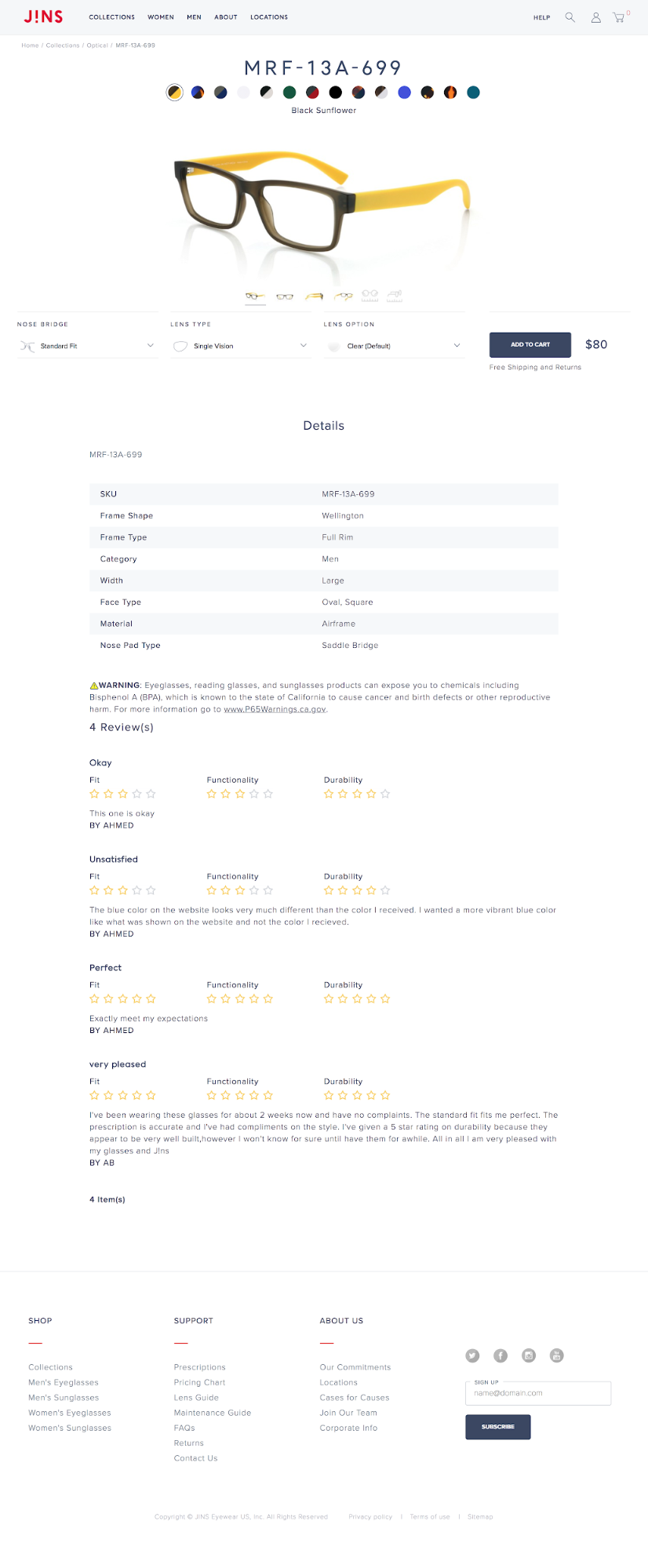
What the worst practice does wrong:
-
No story that guides the user through understanding the value of the product
Best Practices
One good example is Allbirds:

Another good one is Warby Parker:
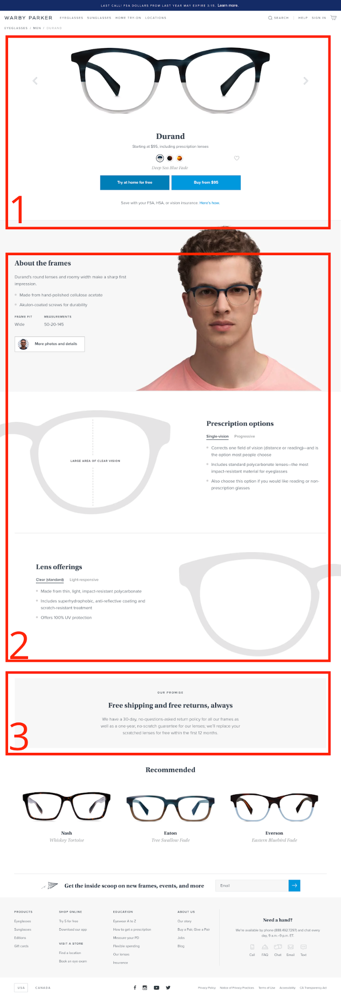
What the best practices do right:
-
Follow a clear order that’s easy to understand
-
Concentrates on story elements (no fluff)
In the best practice examples, the story and structure provide the product page a certain flow. Whereas in the worst practice examples the other flows are harder to comprehend and can potentially decrease the purchase rate. If a product page started in reverse order, with the “why should I buy this?”, users would seek to understand “what is this product” first and therefore not be as receptive to the “why.”
Specs
Specs, or “technical specifications,” can be a deal breaker for products where size is crucial (think: clothes, furniture, etc.). Users are not inclined to buy without knowing the proper dimensions and technical compatibility. Therefore, you should make it as easy as possible to quickly comprehend the most important facts and help users make that decision.
Worst Practice
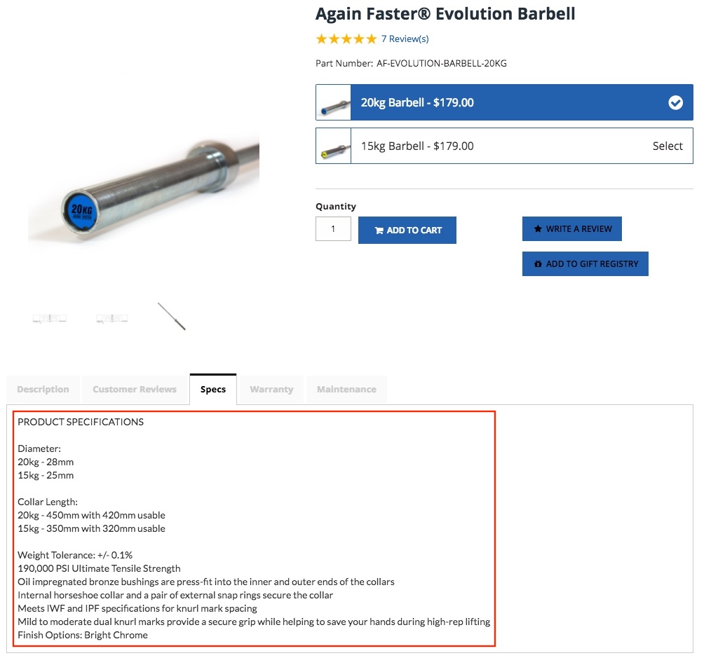
What the worst practice does wrong:
-
Unformatted text.
-
Images are hard to find and of low quality.
-
Hard to put numbers in perspective.
Best Practice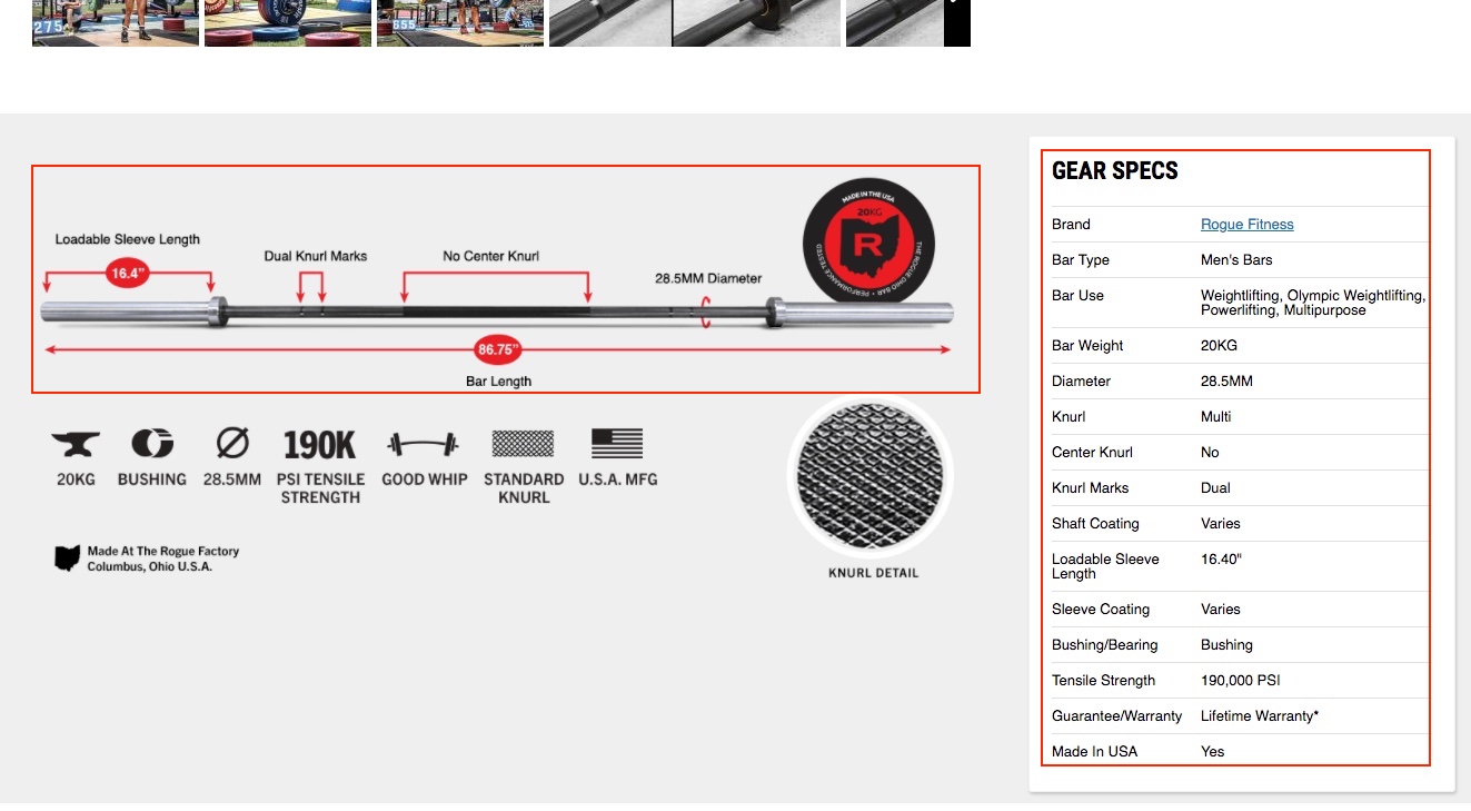
What the best practice does right:
-
Visual presentation of most important specs.
-
Easy to comprehend by formatting specs with a table.
Social Proof & Customer Service
A study by Qubit titled “What works in ecommerce” that was based on a meta-analysis of 6700 online experiments concluded that it wasn’t call-to-action elements, buttons, or colors that moved the needle most regarding revenue per visitor. It was scarcity, social proof, and urgency. Psychological factors are more effective than visual ones.[*]
On ecommerce product pages, they come in many forms: reviews, FAQs, feeds from social networks, etc. Humans are hardwired to trust and sometimes imitate others. It’s an evolutionary behavior: we are more inclined to look at what others do, like eating berries that could be poisonous, and then make our decision based on that.
Reviews
Reviews are the most commonly found form of social proof, not only on platforms like Yelp but also Amazon and Google. They come in stars or written reviews.
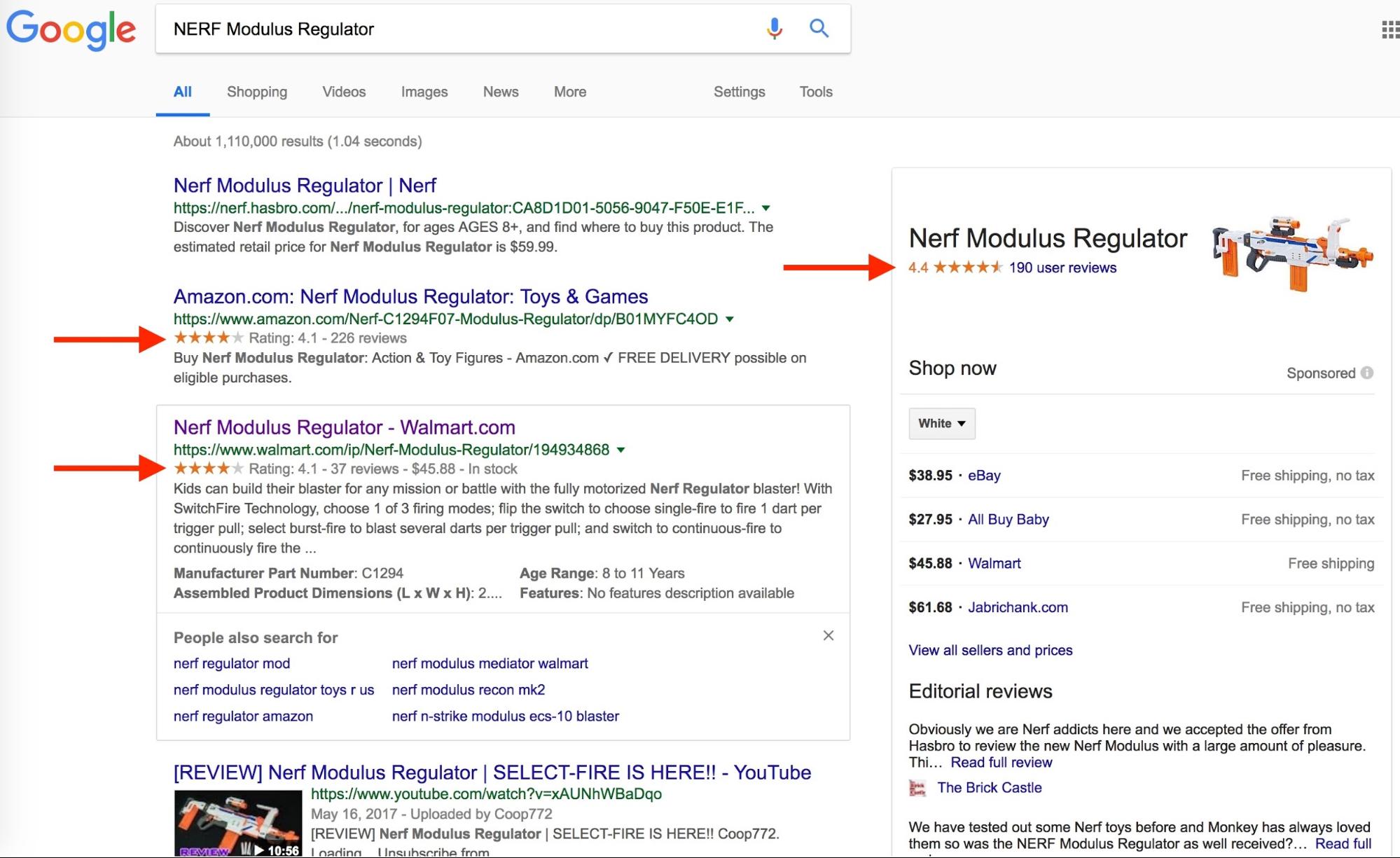
Amazon
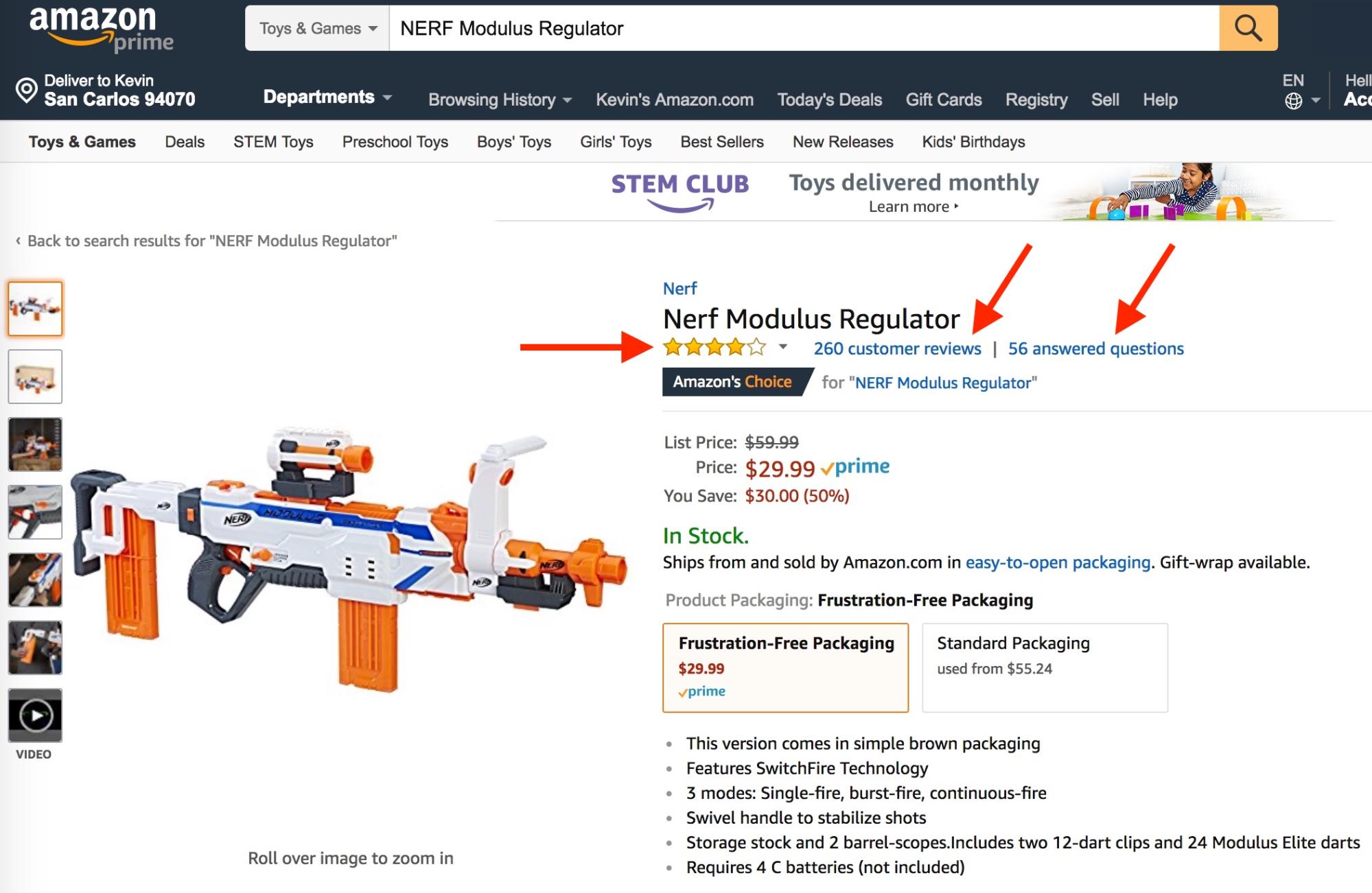
Good reviews give you an overview of all opinions about a product out there. Average ratings are not enough; users want to go deeper. That’s why you should provide several forms of reviews: averages (stars), distributions (lines), and written reviews.
The more expensive a product is, the more important reviews become.
Worst Practice
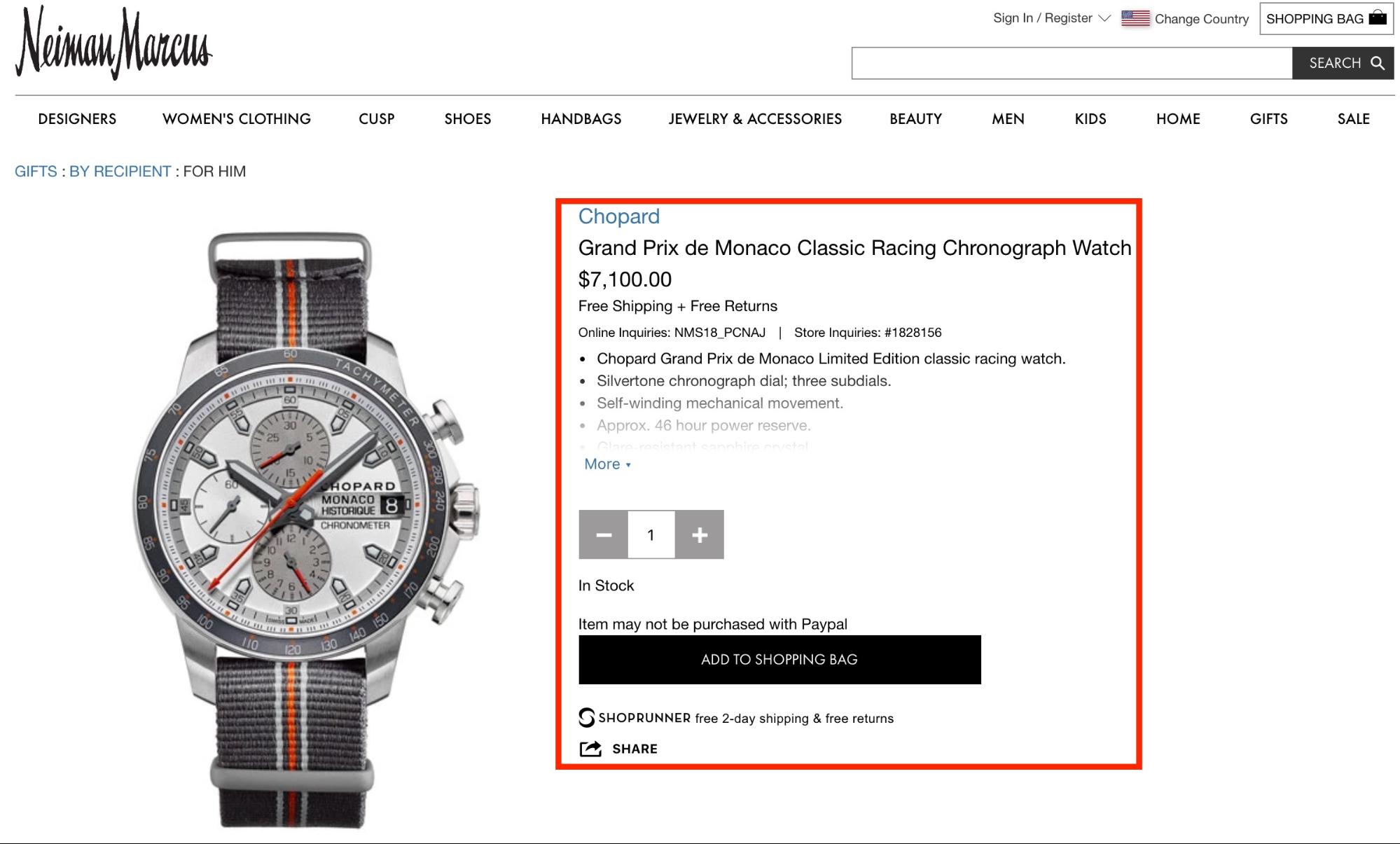
What the worst practice does wrong:
-
No reviews shown (for a product that costs $7,100).
Best Practice
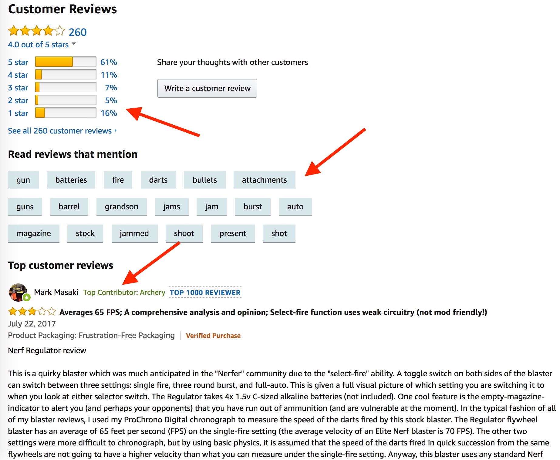
What the best practice does right:
-
Make a distribution of ratings available, not just an average.
-
Provide elements that make it easy to scan large amounts of reviews to find the information that’s valuable to a user.
-
Show full, written reviews that show every detail of the review.
FAQs
FAQs are a form of customer service but in the way they’re used in ecommerce nowadays—with questions and answers from users—they also display social proof. The line is blurry.
Amazon was the first one to show user-generated Q&As, but now others are using the same approach, too. That content format has become incredibly valuable with Google rolling out “featured snippets,” a short answer to a simple question in the search results.
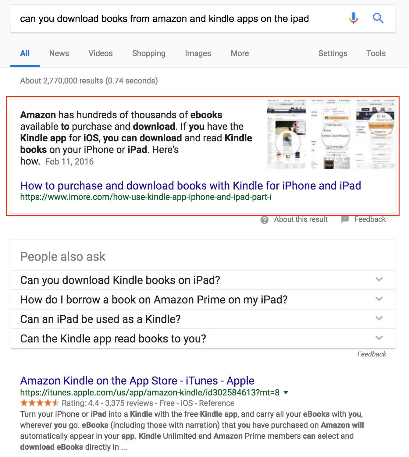
Featured Snippets do increase traffic to the site that occupies them because it gets much attention and, in many cases, people have follow-up questions. But that comes at a cost: it makes the search results page for that query more competitive.
Worst Practice
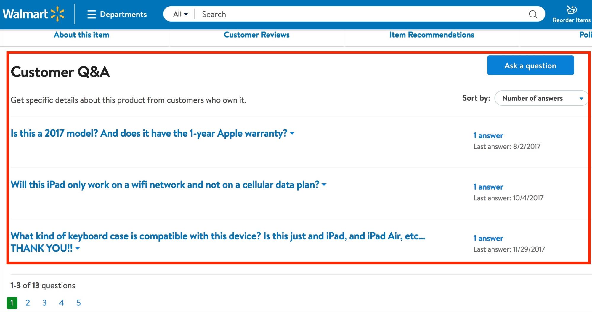
What the worst practice does wrong:
-
Doesn’t make it easy to scan Q&A quickly.
-
Doesn’t show a rating of the answers or questions.
Best Practice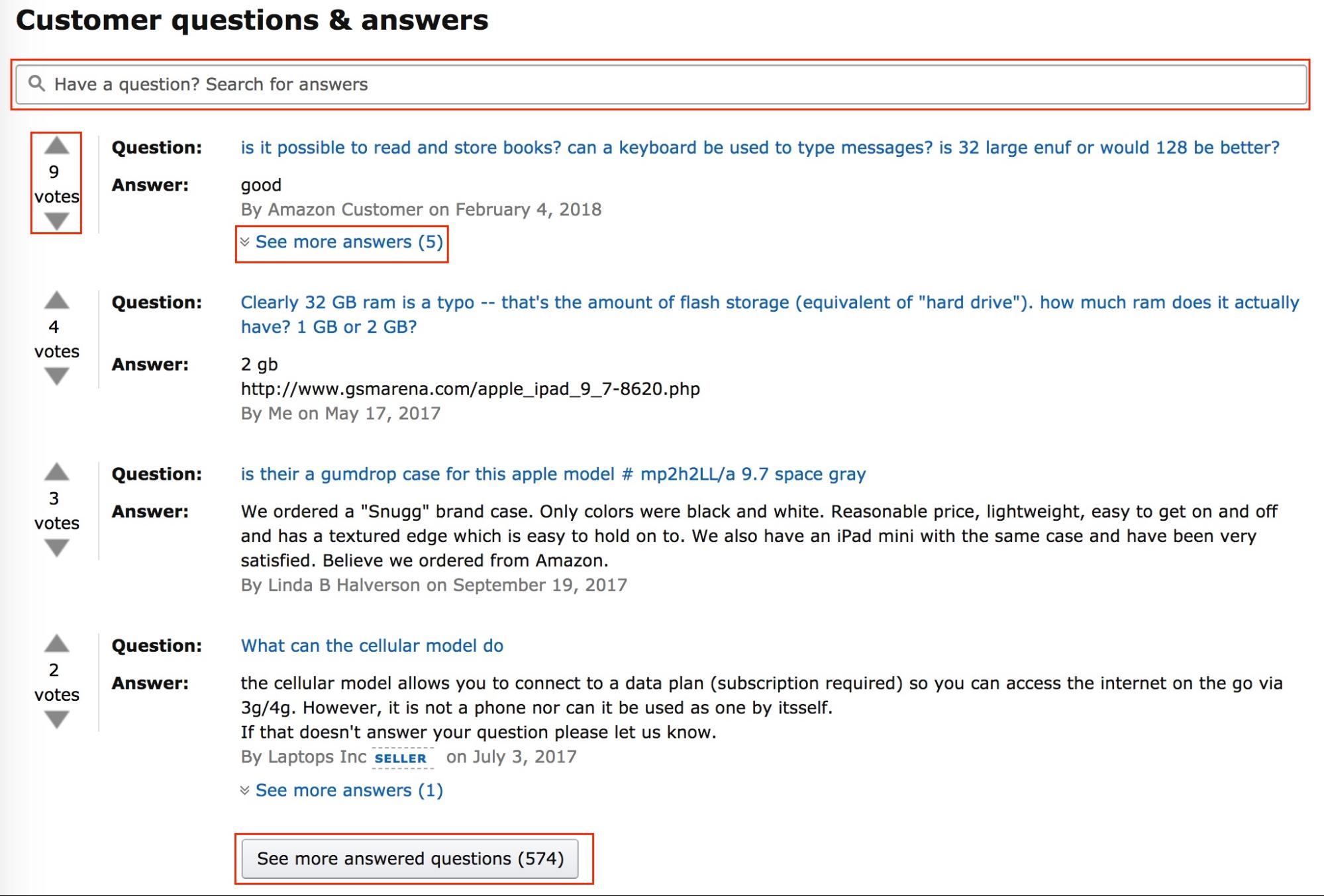
What the best practice does right:
-
Shows votes for answers, so users can quickly see the most relevant Q&A.
-
Allows users to search Q&A.
-
Give users the chance to see more questions and answers on one page to better scan them.
Social Feeds
Social feeds have evolved with the rise of Instagram. Most of the time, manufacturers or retailers ask users to share a picture of themselves using the product with a specific hashtag, which makes it possible for the retailer to show only related images.
It’s a very powerful form of social proof because you can click on the images and visit the profiles of people posting them. You can see that they are real people and the images show what the product looks like in a real situation, rather than a polished picture made by professionals in a studio.
Worst Practice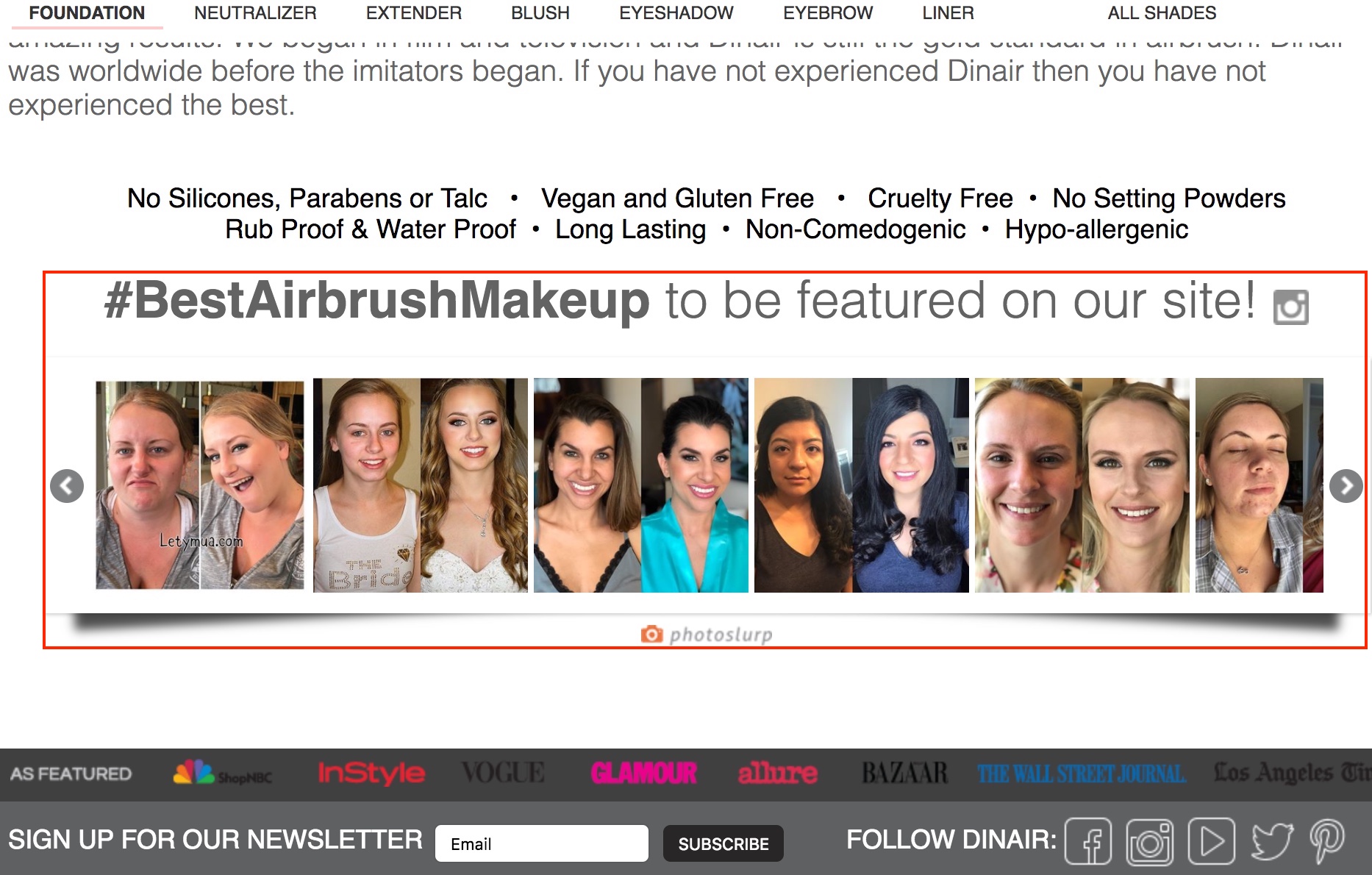
What the worst practice does wrong:
-
Adds a generic social feed without context.
-
Adds the social feed to the homepage instead of the product page.
-
Doesn’t give the feed its own space—the social feed is too close to other elements on the page and makes the section very crowded.
Best Practice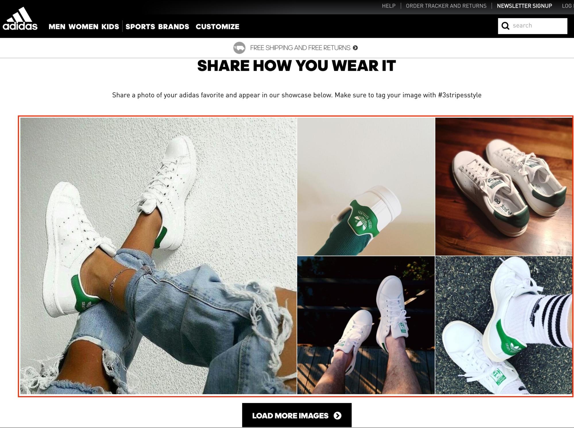
What the best practice does right:
-
Shows a few images with different layouts, but not too many.
-
Leaves enough white space around the feed to allow users to comprehend it.
-
Feed is integrated on the product page and shows only relevant images.
Trust Symbols
Trust symbols or badges can improve conversion rate significantly because they are like a guarantee for the site’s trustworthiness.
The higher the price of a product or the less known a brand is, the more important is it to have a trust badge on your site or page. Baymard Institute conducted a study in 2016 about trust on ecommerce sites and found out just that:
We see that when testing sites from large brands (i.e., Apple, Microsoft, Walmart) users have few security concerns, even with a minimum of “visual security” simply because they are large corporations and well-known brands (although they are still highly vulnerable to layout bugs).
By contrast, when testing sites that are newer, less well-known, or more niche than these major brands, we have however observed users raise security concerns very easily if there are no visual clues. Hence, the more well-known a site or brand is, the less “visual security emphasis” clues are needed.
The most trustworthy signal when paying online seems to be Norton Secured seal, followed by Google Trusted Store and BBB Accredited Sites. These trust badges provide more of a feeling of security, rather than proving a technical specification.[*]
Certain products need trust badges to support their integrity, for example, organic food.
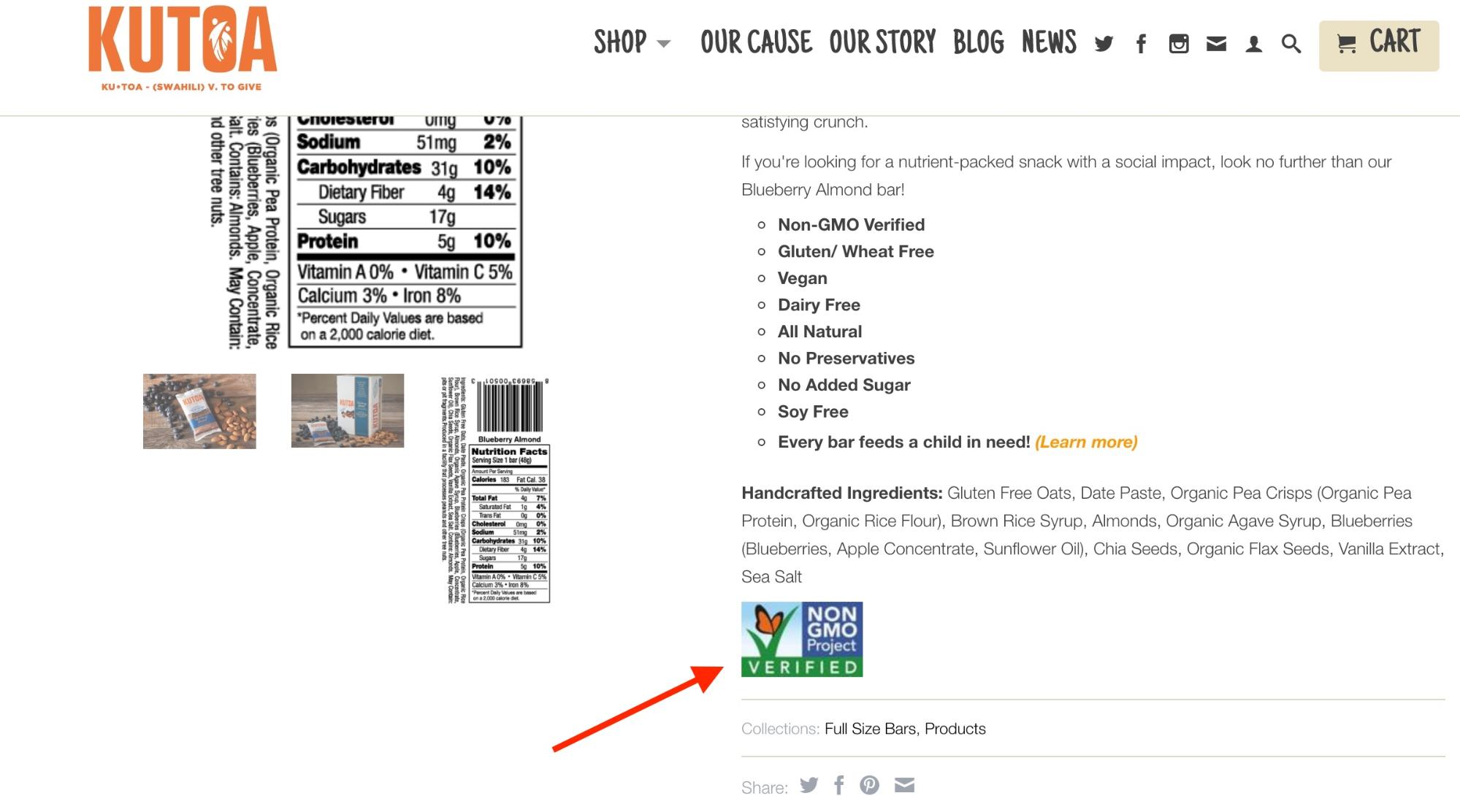
Of course, https plays right into this feeling.When a site is not on https, it can show a “not secure” note that looks very untrustworthy.[*]
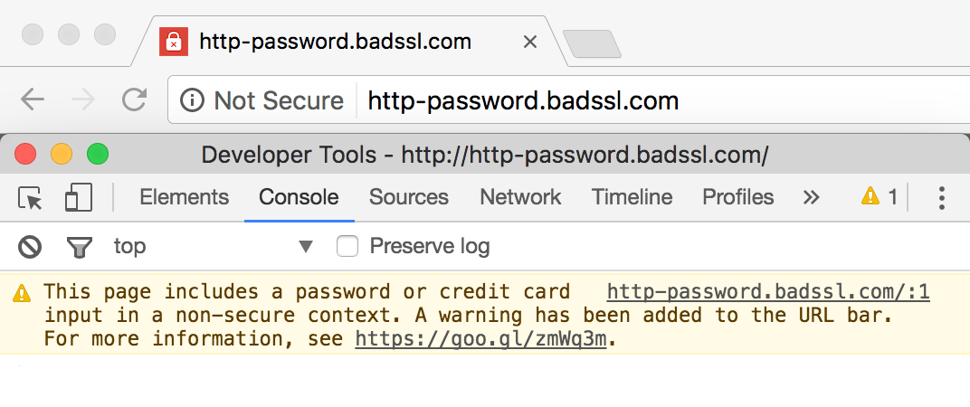
Worst Practice
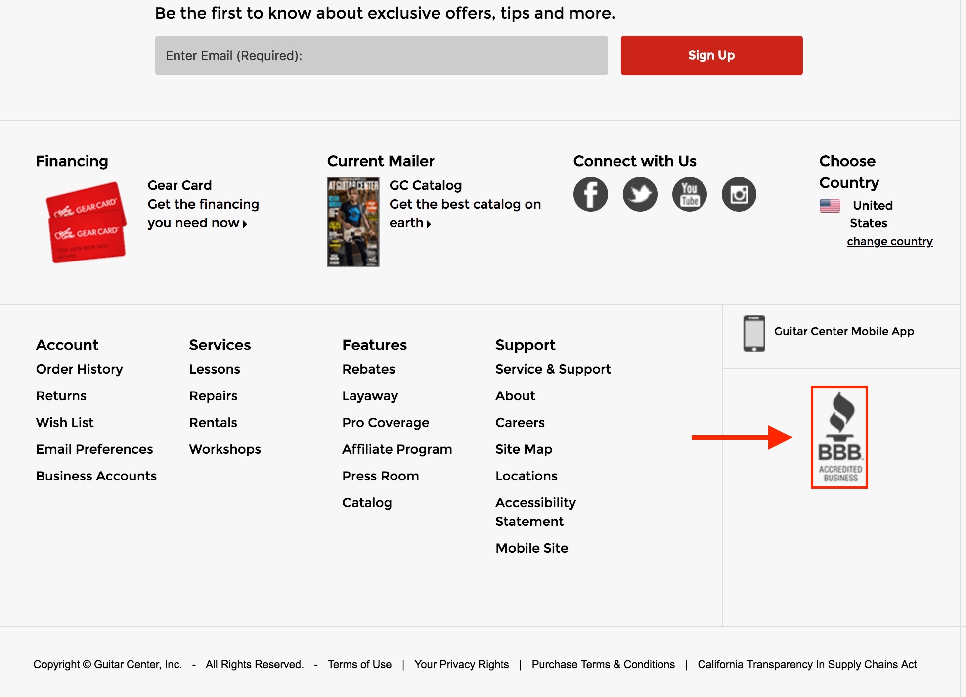
What the worst practice does wrong:
-
Hiding the trust badge in the footer.
Best Practice
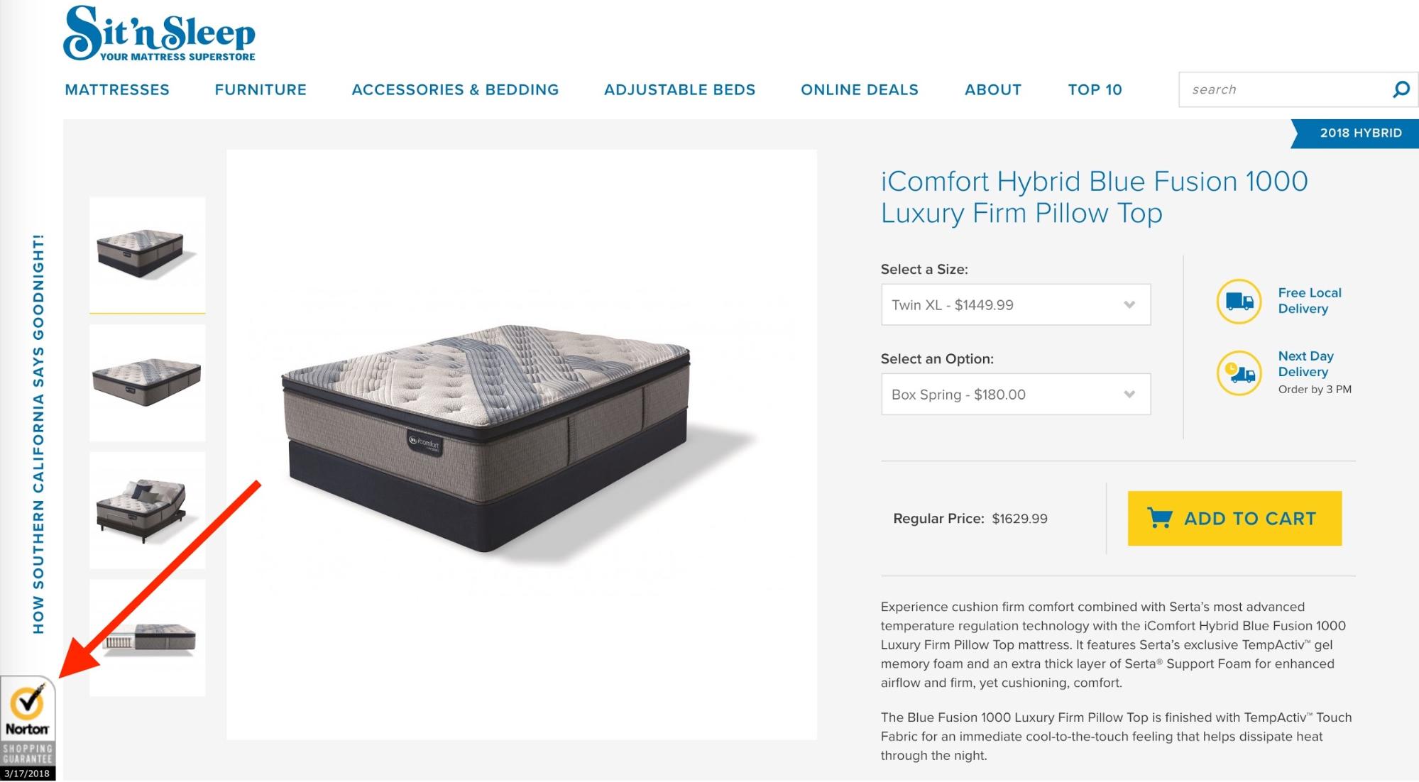
What the best practice does right:
-
Promotes trust badge prominently and visibly (sticky).
Chatbots
Chatbots are a new thing and the first helpful integration of AI into ecommerce that shows promising results. They provide a sort of customer service that goes beyond Q&A and gives a feeling of talking to another person instead.
There are different kinds of chatbots: some have very fixed response patterns, others use machine learning to provide a more flexible (and real) experience. Some work on messengers like Facebook, Slack, or SMS; others work right on the product page.
However, chatbots can also be a trap for brands if they have poor implementation. A few cardinal sins to avoid are:
-
Not disclosing that the customer is talking to a bot.
-
Only providing a fixed sequence of answers.
-
Not redirecting customers to a human being when a bot can’t help further or gets stuck.
On the other hand, a well-done chatbot can be entertaining (see screenshot below) and provide value.
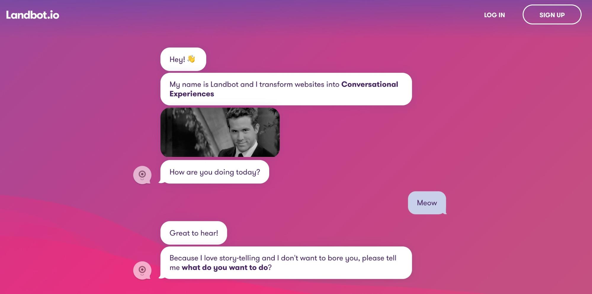
Poor Practice
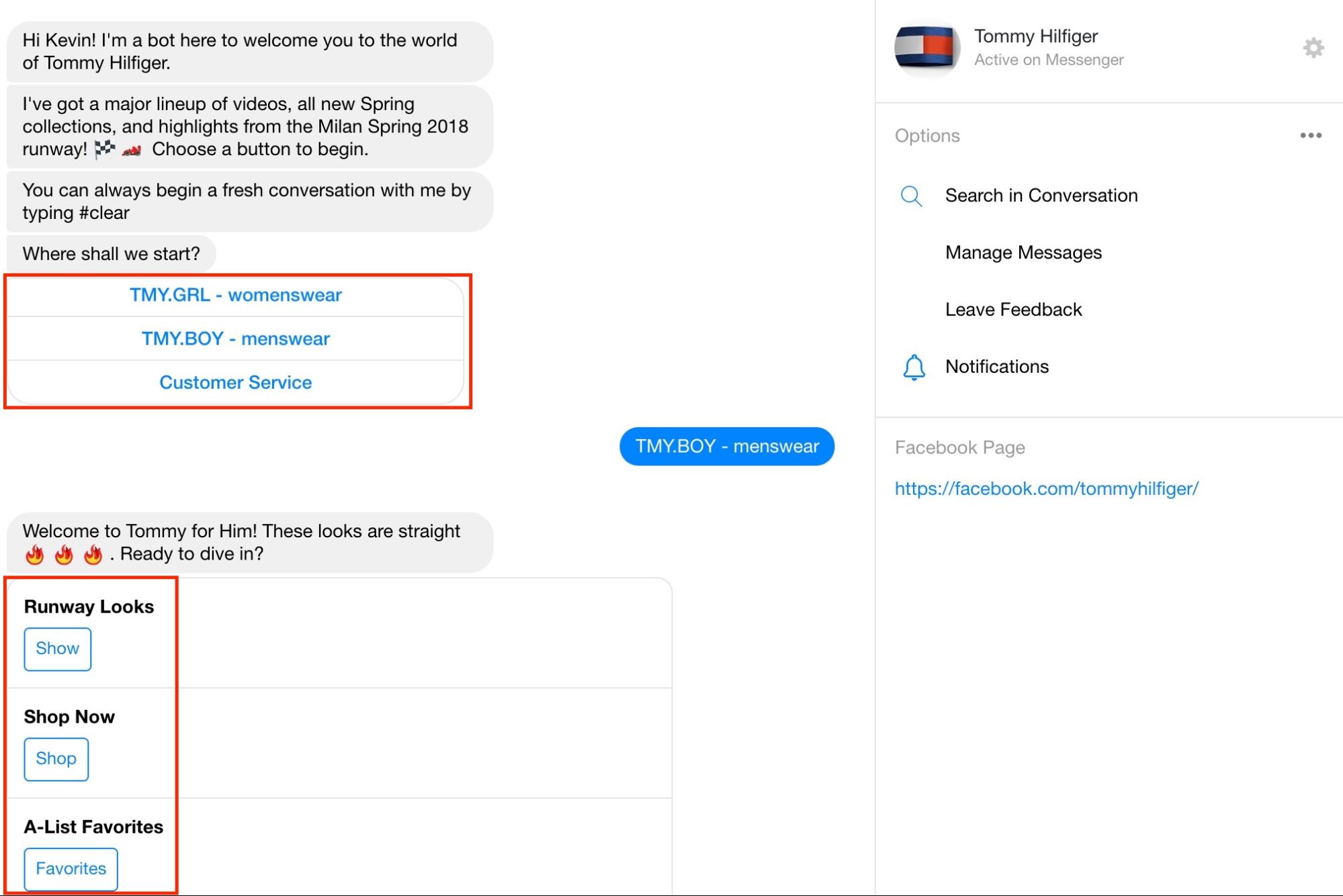
What the worst practice does wrong:
-
Chatbot is a just a series of choices, not a conversation.
Best Practice
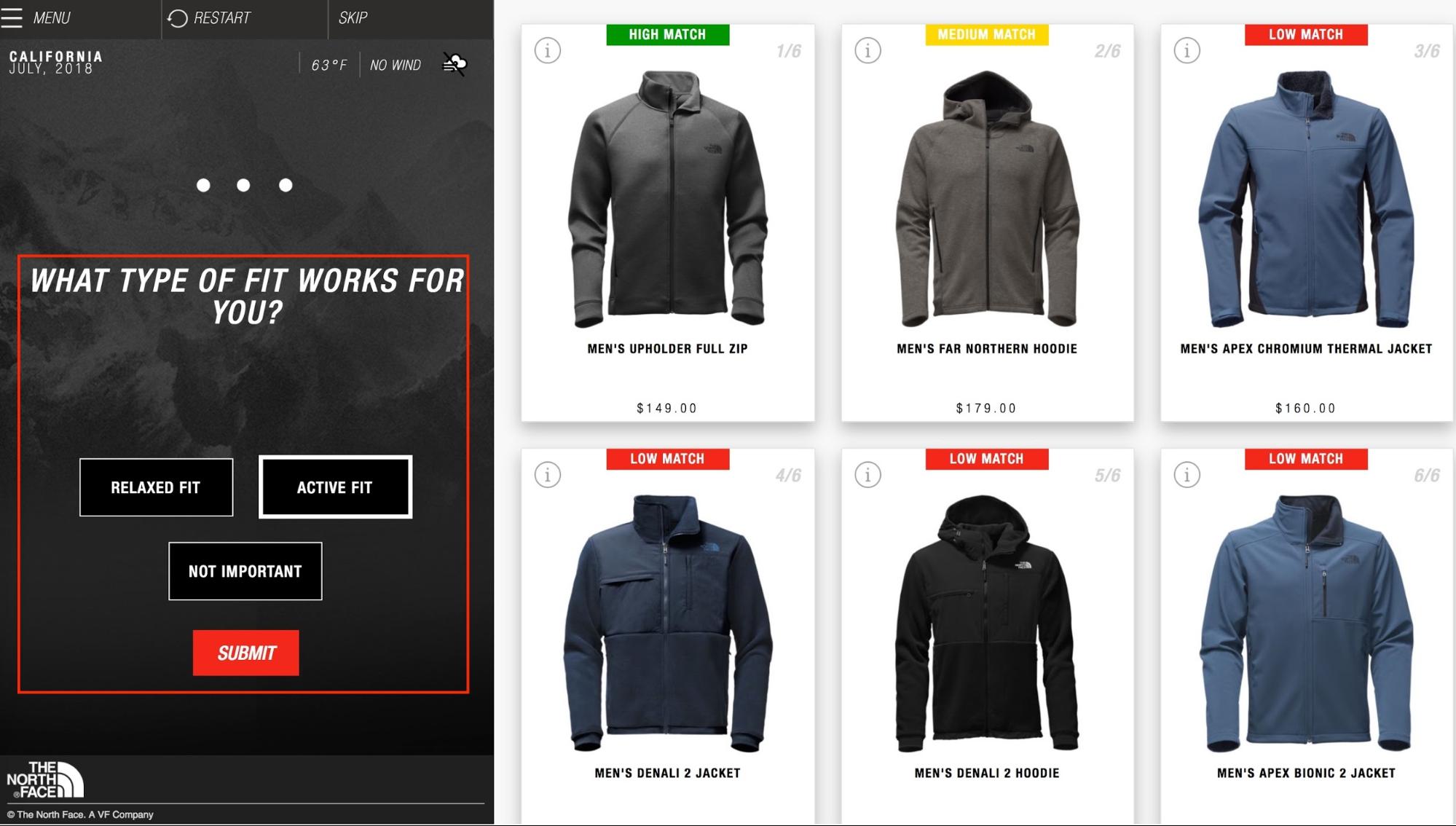
What the best practice does right:
-
Make it easy to communicate with the chatbot about the specific product you’re looking at. That provides context and removes friction from the experience.
-
Your chatbot should be able to reply to more than predefined questions, by using AI (at this point it’s a matter of investing into a good solution: for enterprise companies I recommend Conversable, for smaller companies Dialogflow, for B2B companies Drift)
-
In case of a problem, i.e., a question the bot can’t answer, the user should be able to get in touch with a human, either via phone or directly in the chat experience.
Price
Price is one of the most important product differentiators in retail. Customers go a long way to get a lower price, so it has to be very clear how much a product is.
Worst Practice
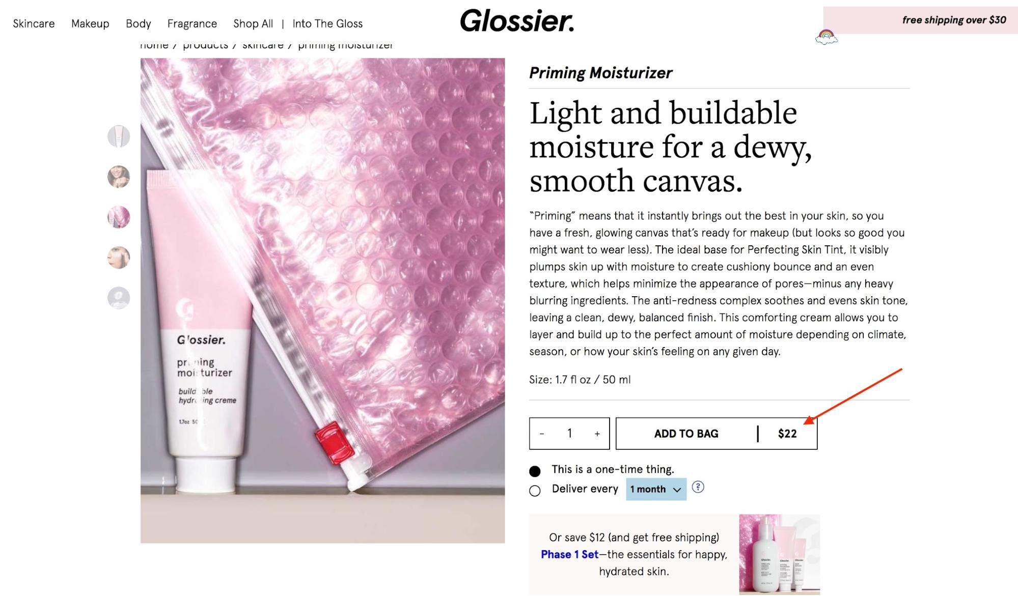
What the worst practice does wrong:
-
Not clearly indicating the price.
-
Not making it easy for users to find it quickly when visiting the product page.
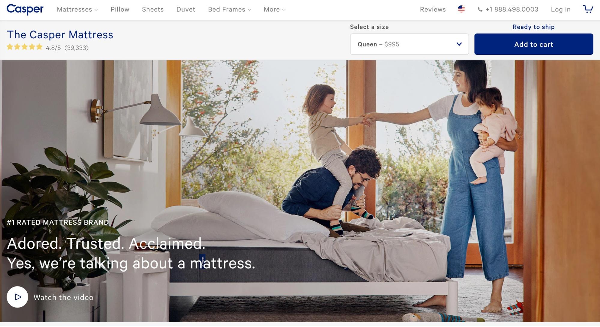
Not placing the price intuitively can hurt your conversion rate. I intentionally didn’t indicate where it is on Casper’s product page below, so you can see how hard it is to find. But, I promise, it’s there.
Best Practice
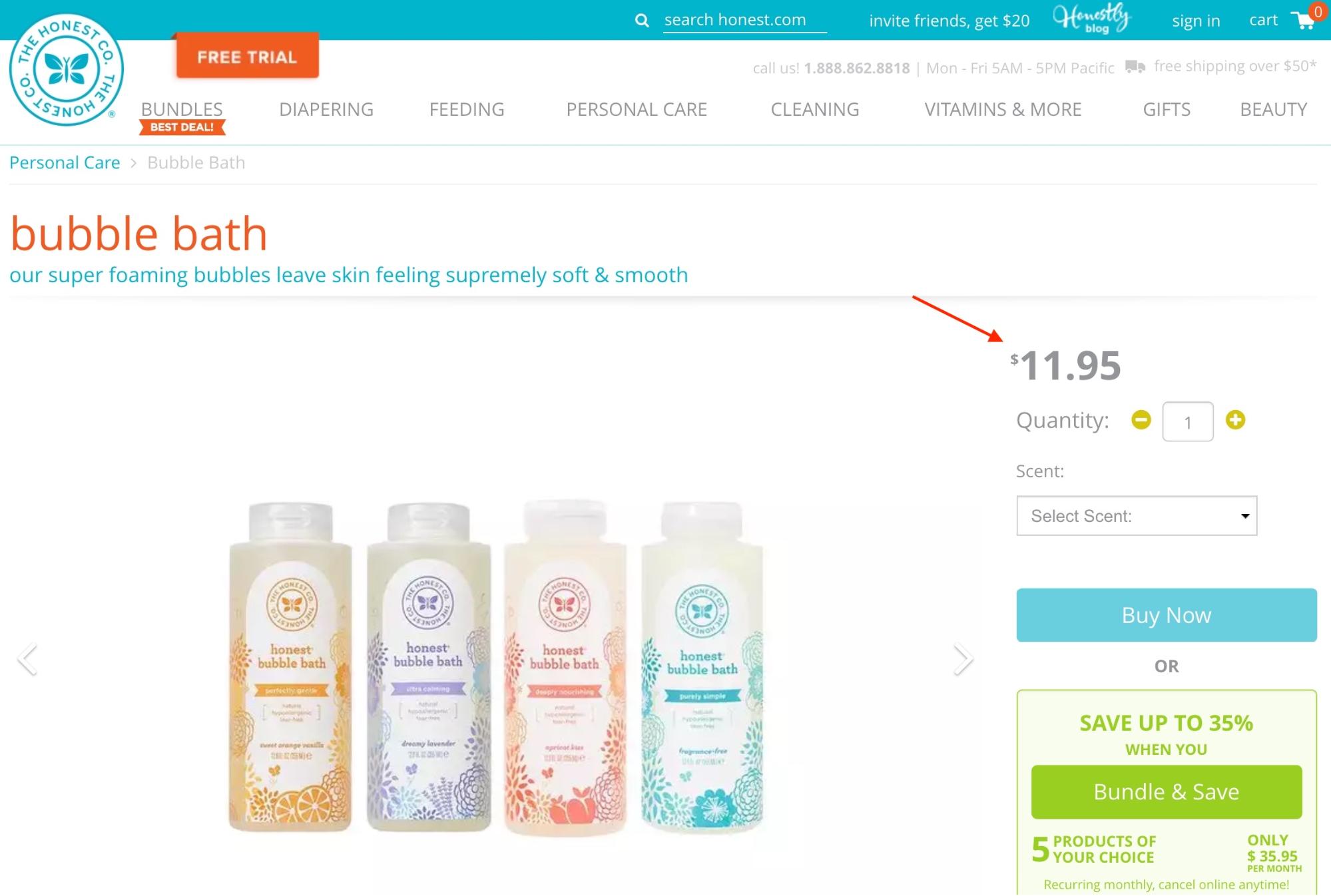
What the best practice does right:
-
Separating the price from the rest of the design.
Buy Button
The buy button falls into a similar category as price: it must stand out clearly and convey how the customer is purchasing. Is it a subscription, or a one-time purchase?
Good buy buttons clearly separate themselves from the overall design of a page and should come in bold colors.
Worst Practice
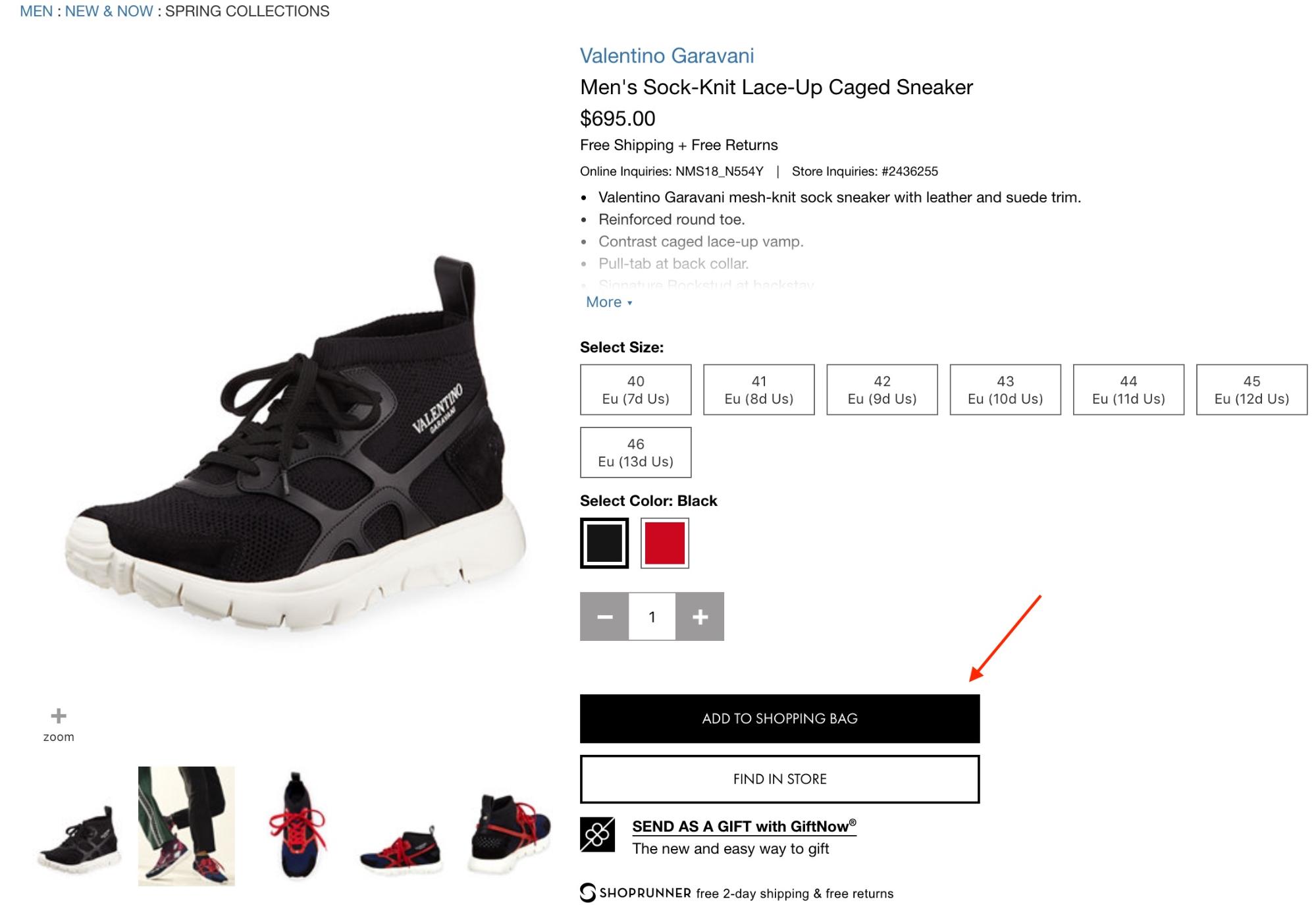
What the worst practice does wrong:
-
Buy button doesn’t clearly stick out from the rest of the design.
Best Practice
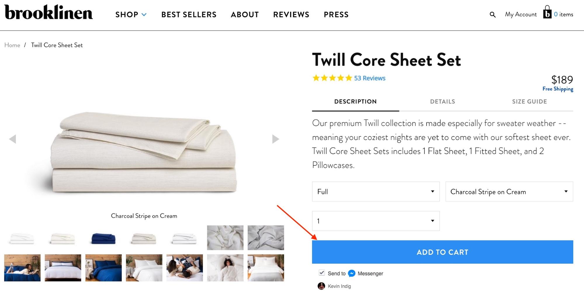
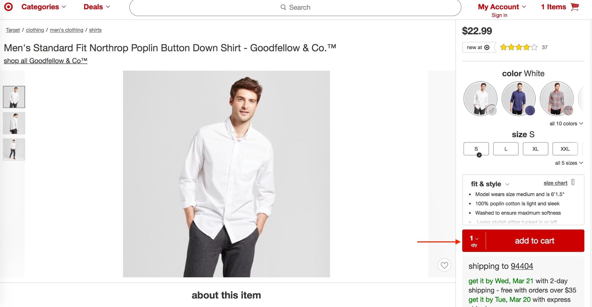
What the best practice does right:
-
Buy button is very easy to identify.
Related/Similar Products
Related product sections on a page help customers in several phases throughout their buying journey. When a customer already knows what brand they want, they can see complementary products for that brand. When they know only what kind of product but not the brand, it can help them be aware of the range of features for that category of product.
Worst Practice
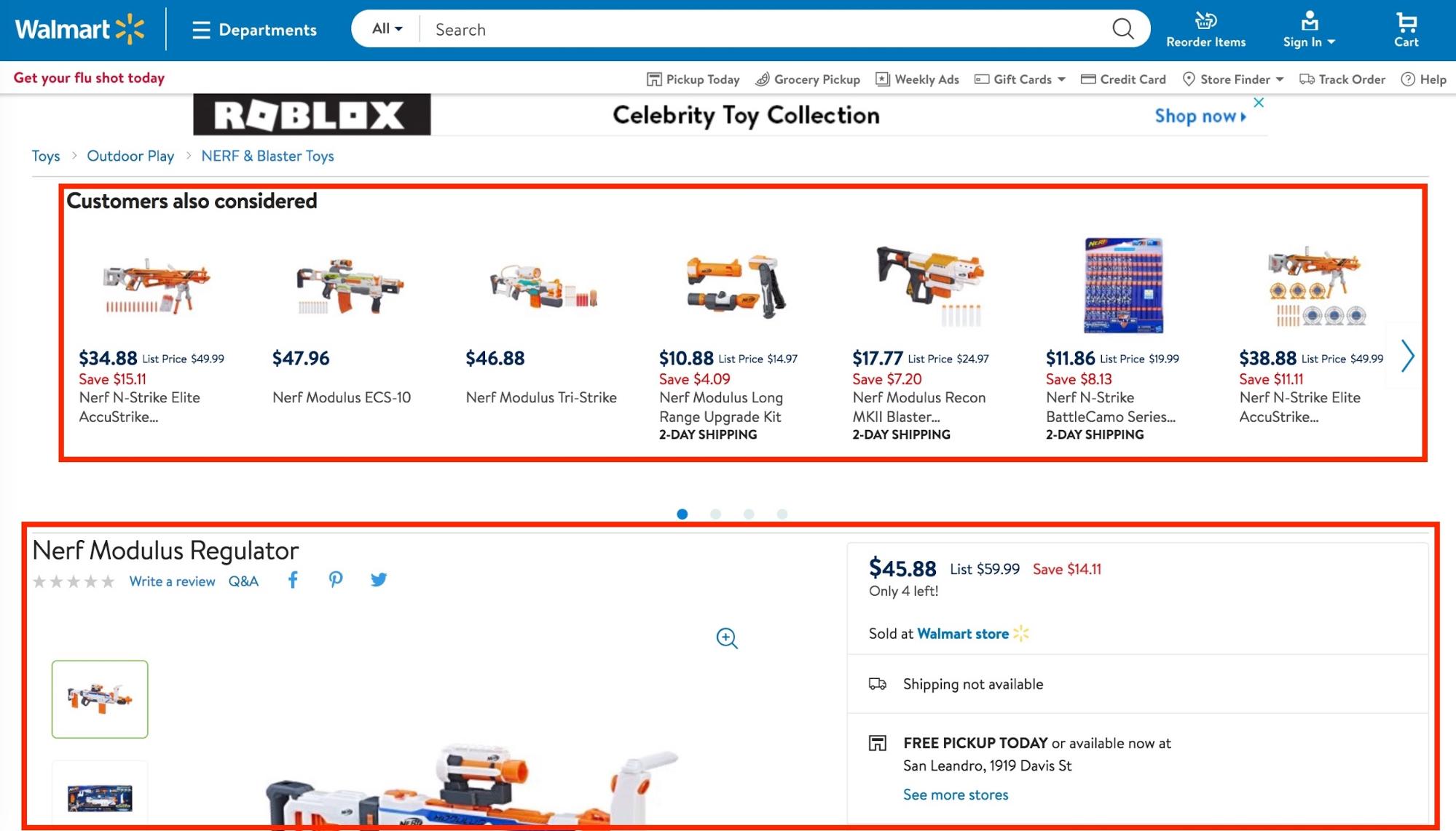
What the worst practice does wrong:
-
Putting related products before the actual product. That just distracts customers from their original intent.
Best Practice
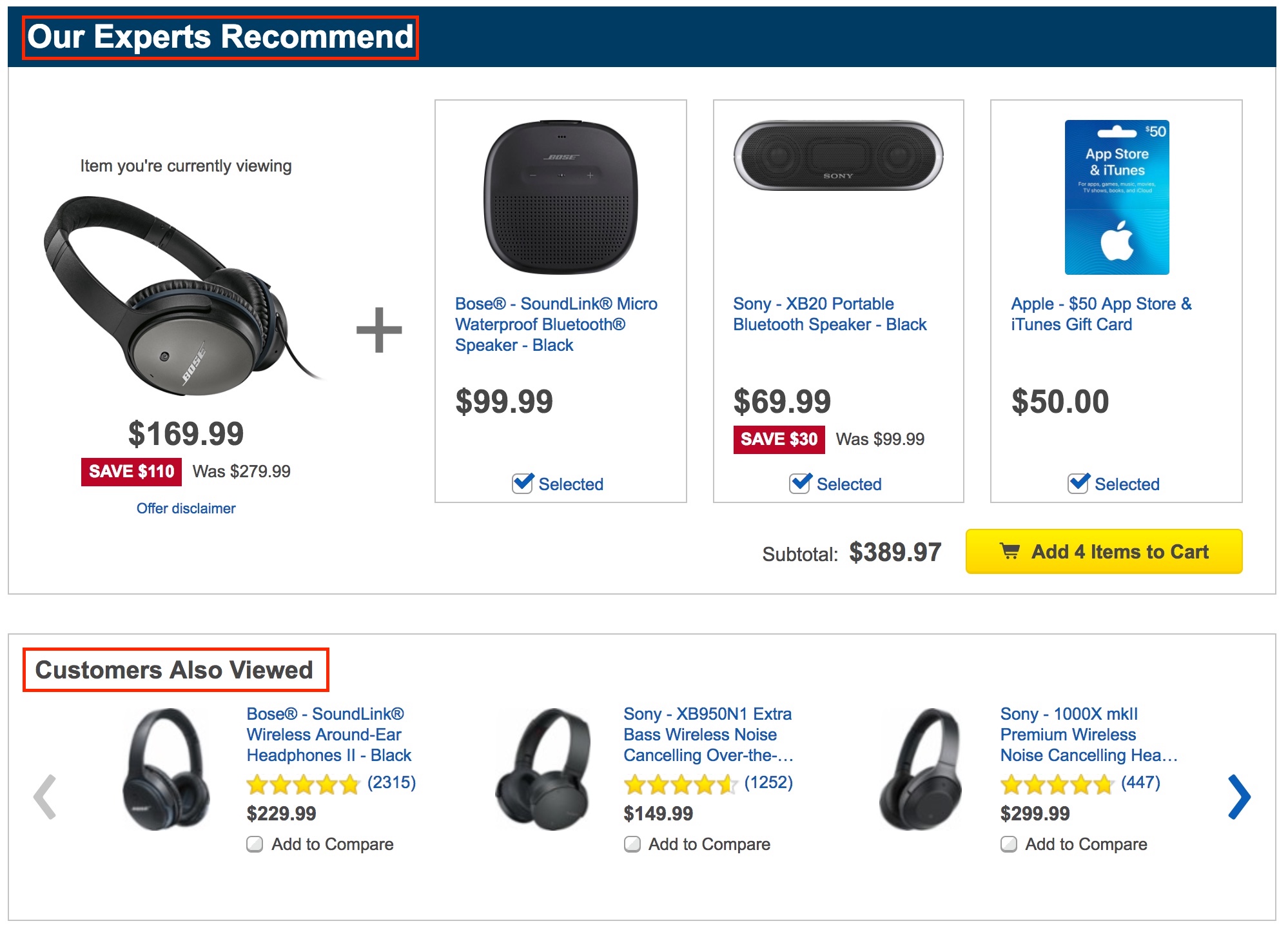
What the best practice does right:
-
Shows related products that are as relevant as possible.
-
Offers a product bundle recommendation to increase average order value.
-
Provides several different types of related products (“our experts recommend,” “customers also viewed,” “most frequently bought together,” etc.).
-
Shows this section below the main product description.
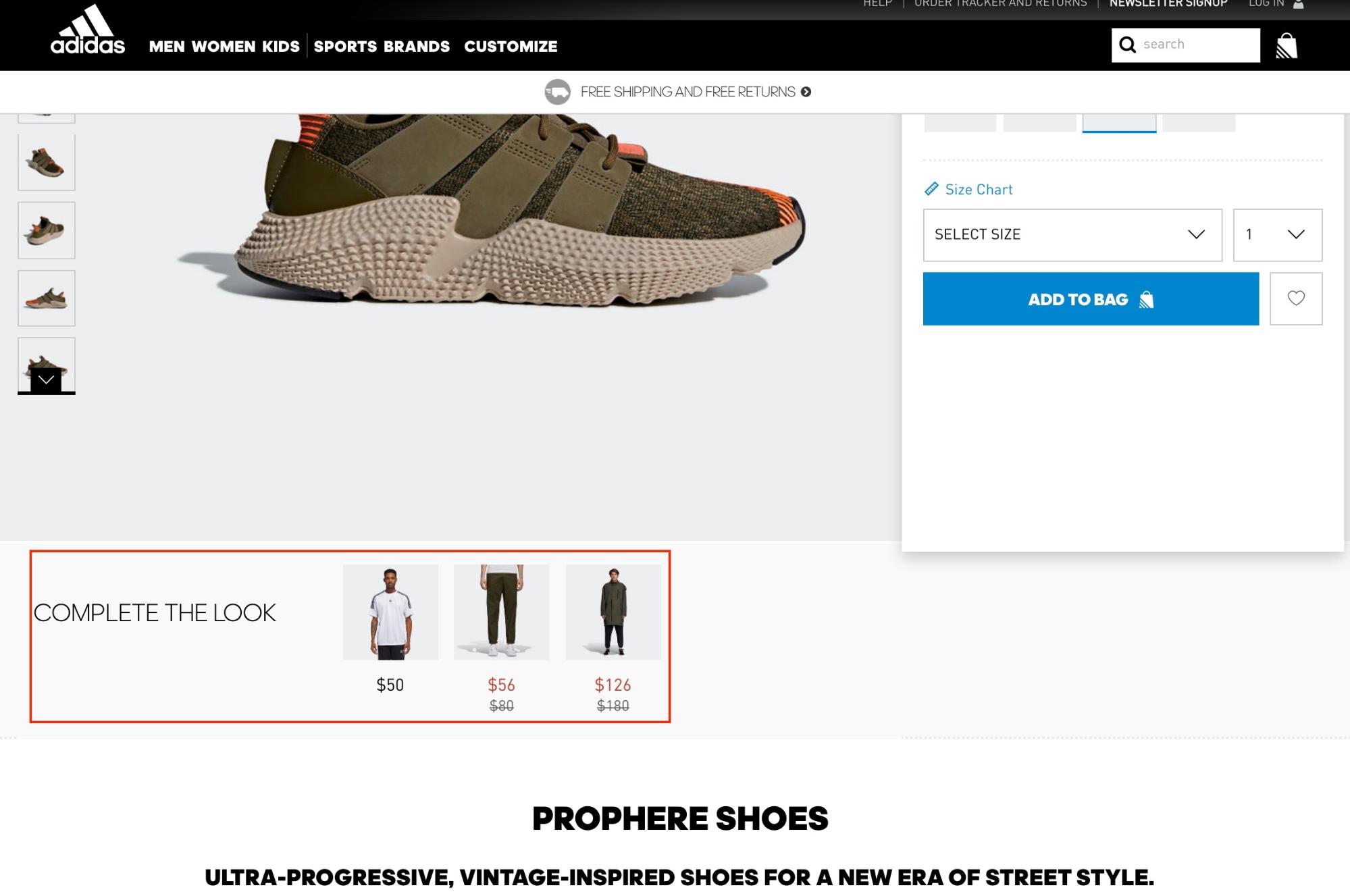
In fashion, “complete the look” is a great way to sell complementary products. This also raises the value of the currently looked at product, because it puts it into greater context of an outfit. Shoppers might be encouraged to buy more products through that feature.
What Have We Learned
Optimizing product pages for more organic traffic and conversion comes down to metadata, content, social proof, and customer service. The basic idea is to make it as easy and enjoyable as possible for users to buy your products. That experience starts on Google’s search results page and continues to the point at which the customers buys.
The line between conversion optimization and search engine optimization is as blurry as ever and has perhaps vanished completely. Google factors in user satisfaction and experience to determine organic results; we can’t separate the two any longer. The way to increase revenue can follow three paths:
-
Bringing in more people
-
More people buying
-
People buying more
If we group all the factors mentioned in this article into high-level recommendations, the ultimate product page has to be easy to understand, contain all relevant information in a concise way, provide fantastic service, and point out how other customers experience the product.
If you’d like to get a checklist with a summary of all 18 product page best practices I covered in this article, including actions items for every product page element, click on the button below.
Add A Comment
VIEW THE COMMENTS