A couple of weeks ago I smacked you over the head with 10,000 words of Facebook-traffic-generating goodness, showing you exactly how to drive massive numbers of visitors from Facebook (fo’ free).
I was practically vomiting knowledge rainbows. 
You’re welcome.
Anyway, 10,000 words of actionable, step-by-step content is a lot to consume, let alone action.
So wouldn’t it be nice if there were Facebook tools you could use to drive massive traffic back to your website from the most popular social media network on the planet?
Well, have I ever got good news for you, dear Sumoling…
There are!
In this guide I’ll be going over the tools you can use to completely dominate Facebook in order of how you should be using them.
Here are the tools we’ll be going over:
- Sumo Share App
- Sumo List Builder
- BuzzSumo
- Buffer
- Canva
- Facebook Image Grid Tool
- WordPress Yoast SEO
- Image Sharer
- Edgar

Get a cup of coffee and settle in to do some exploring. Of course, we need to start at the beginning…
Sumo Share App
In the Facebook guide, I told you that it’s important to make it dead simple to share your content. After all, nobody is going to hunt for the option to share your content.
When you make your content easy to share on Facebook, more people will have the opportunity to discover it, like it, and engage with it.
So the first tool you must download is Sumo’s share buttons. Head over to your Sumo Store and install Share if you haven’t already.
Then, go to the “Settings” tab on the left, and drag Facebook from Available Services to Selected Services:
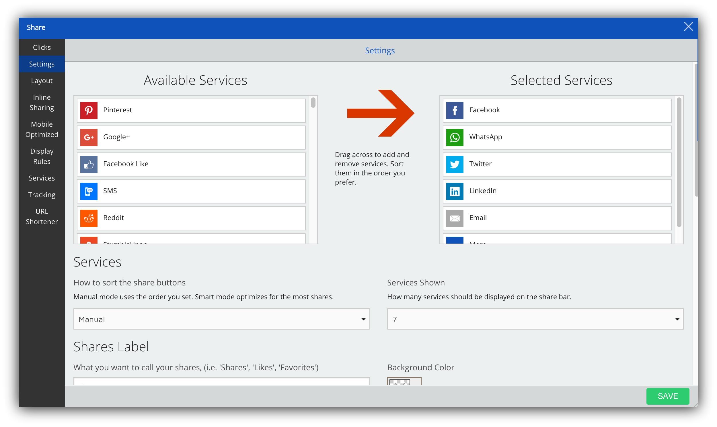
Remember how I’ve told you before that too much choice is a bad thing?
Well, that’s why if you want to focus on Facebook, you should remove most other Selected Services in your share bar.
When given too much choice, people tend to choose nothing. That means that if you activate every service under the sun, nothing will get shared.
Remove all of your options in your Share buttons except for your top four options, and press save.
If you’re focusing on Facebook, that should be the top network on your Share bar.
Then, head to the Layout tab, and choose one of the placements that will float alongside the content as your visitor consumes it.
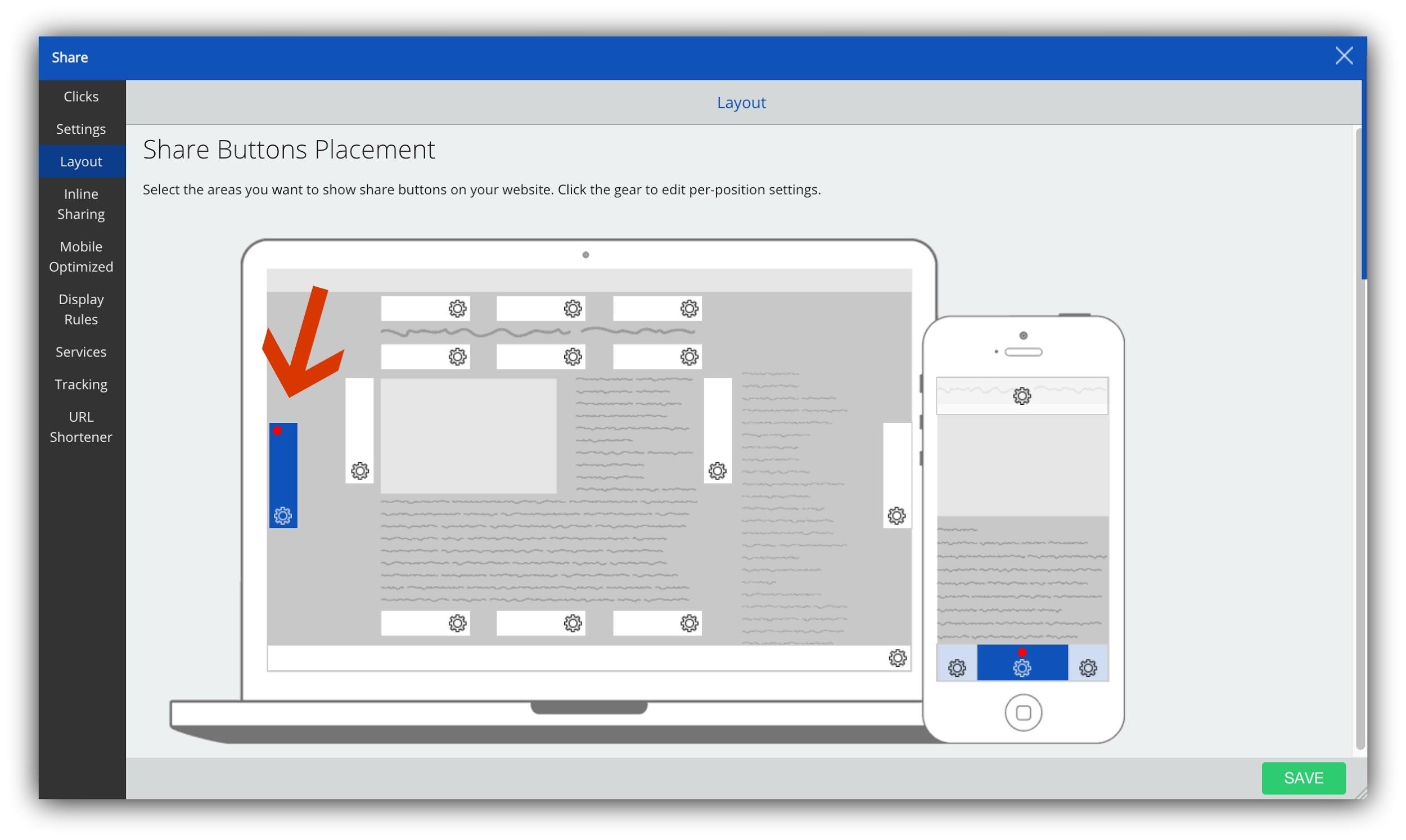
That way they won’t have to scroll up or down to share your content (which they won’t, of course).
This will make your content far more shareable so you can start drawing in traffic.
Sumo Scroll Box
As Noah says, you must have a singular focus.
If you’re reading this, it’s probably because your singular focus is tackling Facebook as your social platform of choice to drive traffic back to your website, you should drive all your calls to action toward that one thing.
That means setting up your Scroll Box to drive Likes to your Facebook page or members to your Facebook group.
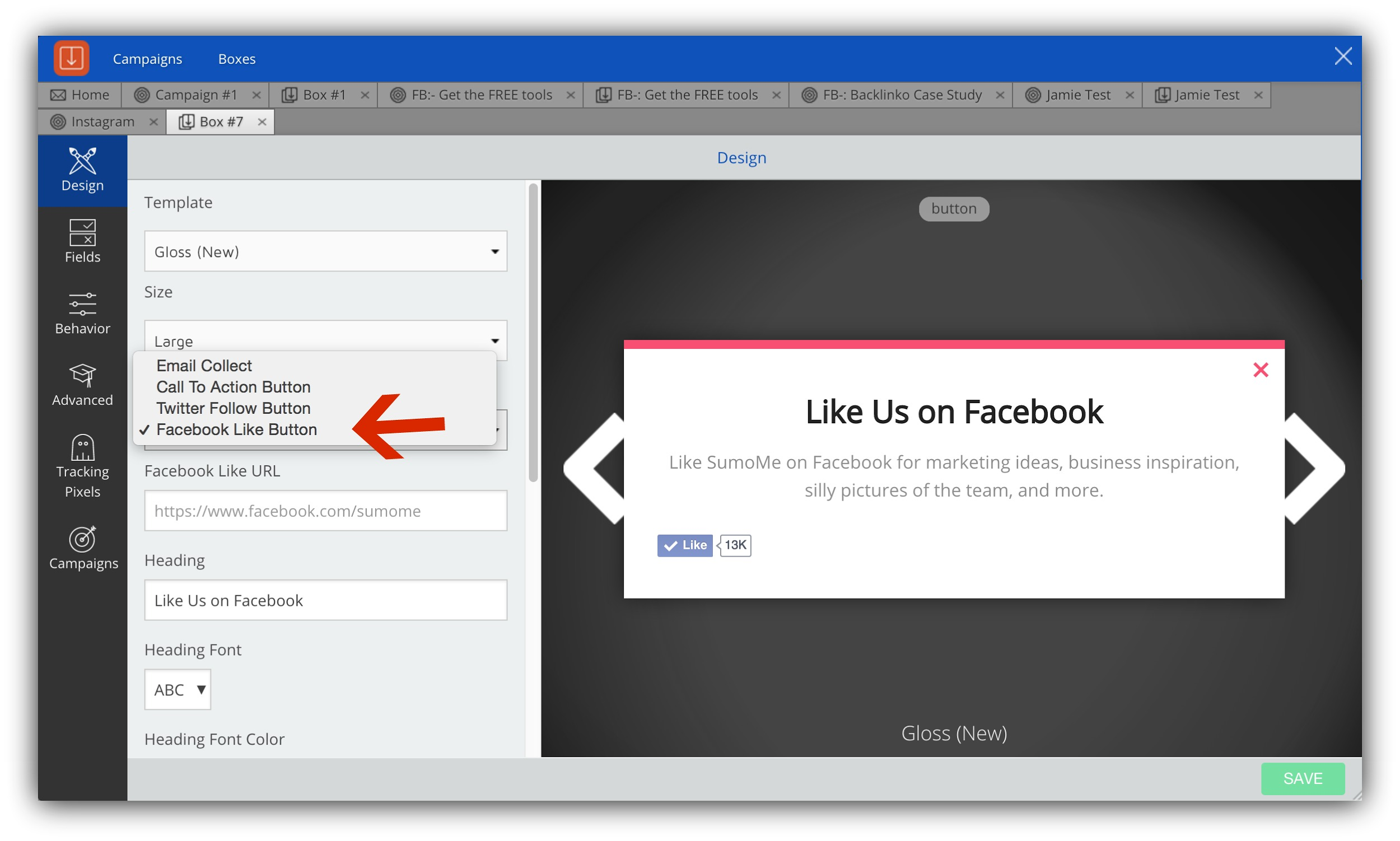
Scroll Box makes it super simple for people to follow through with your call to action by placing the like button right in the pop up.
Once you have your website set up to maximize the potential of Facebook, you can head out into the wild to make sure your time is well spent.
BuzzSumo
If you want to give your Facebook content the best chance of succeeding, past performance is the best indicator of future success – at least in this case.
Every social media platform has certain types of content that outperform for the general population, but every audience is different. Luckily there is already data for that.
To find it, look up keywords for your industry in BuzzSumo to see which headlines and types of content does best on Facebook.
Sort the shares by clicking on “Facebook”, like we’ve done with our example of getting website traffic:
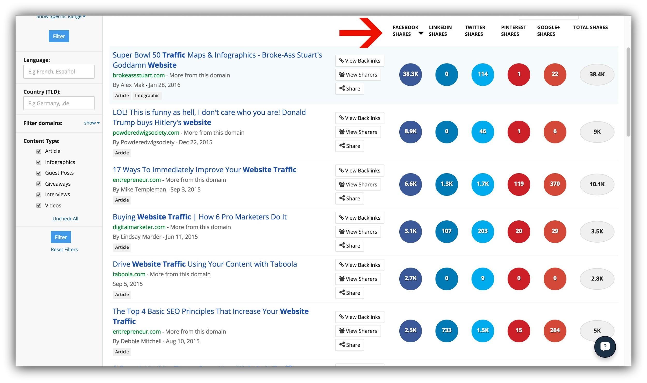
This tells us that in Sumo’s industry, SEO for website traffic, immediately improving your website traffic and (oddly) buying website traffic are all popular topics.
As I scrolled down, I noticed the usage of power words in the headlines (“Top”, “Basic” “Immediately”) and also the usage of numbers (“How 6 Pro Marketers”, “17 Ways to Immediately, “Top 4 Basic”).
This proves that our target audience shares content with these elements more often, which gives me a good benchmark for posts we are focusing on driving Facebook traffic to.
After you’ve done this and noted the trends, take this newfound knowledge with you to the next tool.
Buffer
You’ve probably seen Buffer around. It’s a tool you can use to schedule social media posts to go out automatically.
That functionality is great, but one of the best (but underused) ways to use Buffer is to test what your audience responds to on Facebook using the analytics.
The most popular type of media on Facebook has been shown to be video, but every audience is different. So, if you don’t already have a Buffer account, sign up (it’s free).
Then, within Buffer, and armed with knowledge from BuzzSumo of the most popular types of content and headline structures on Facebook in your industry, you can schedule a series of posts to go out that test different elements.
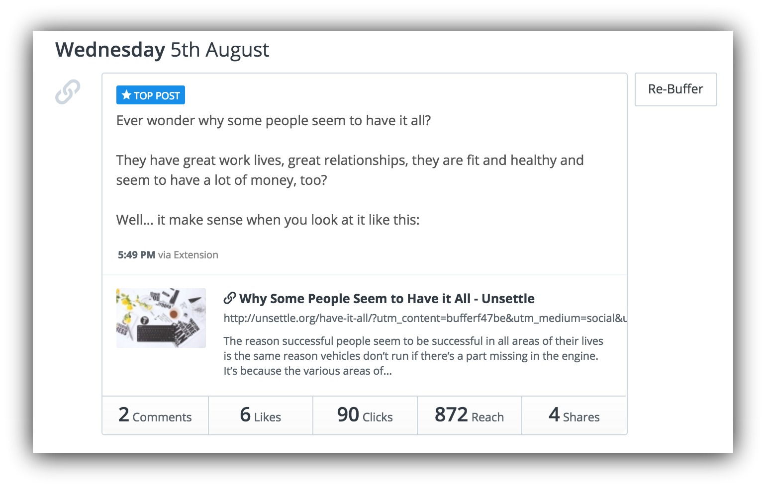
For example, this “Top Post” on my personal blog’s Facebook page saw a lot of engagement:
When compared to this post without an image:
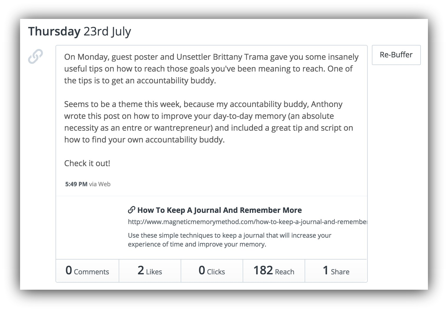
The headlines assume a similar formula, and there is text on both of them – so evidently my audience interacts with posts that have images more.
Here are a few things to test:
- Headlines: We told you how important headlines are and gave you a plethora of places to use headline formulas. We even gave you a kickass headline generator because #yolo. Split test what headlines work the best with your audience on Buffer. Does your audience respond to headlines with numbers? Power words? Shorter headlines? Test it.
- Calls to action: Do you want your fans to “like” the post so it gets in front of more people in the newsfeeds? Or do you want them to click on a link to consume some content? Test different types of calls to action to see what your audience responds to.
- The type of media: Test the different types of media on Buffer. Keep an eye on engagement with your posts as you test videos, images, and text posts.
- Type of post:Try out different types of posts, such as questions, motivational quotes and plain links.
- Content length: Studies show that longform content performs, on average, better than short content on many platforms, but that short content takes the cake for Facebook. As with the rest of these, you won’t know what works with your audience until you try.
Schedule a series of posts in Buffer based on these tests. To get the best and most accurate data, try to schedule them around the same time each day – otherwise you may be pulling data from different audiences.
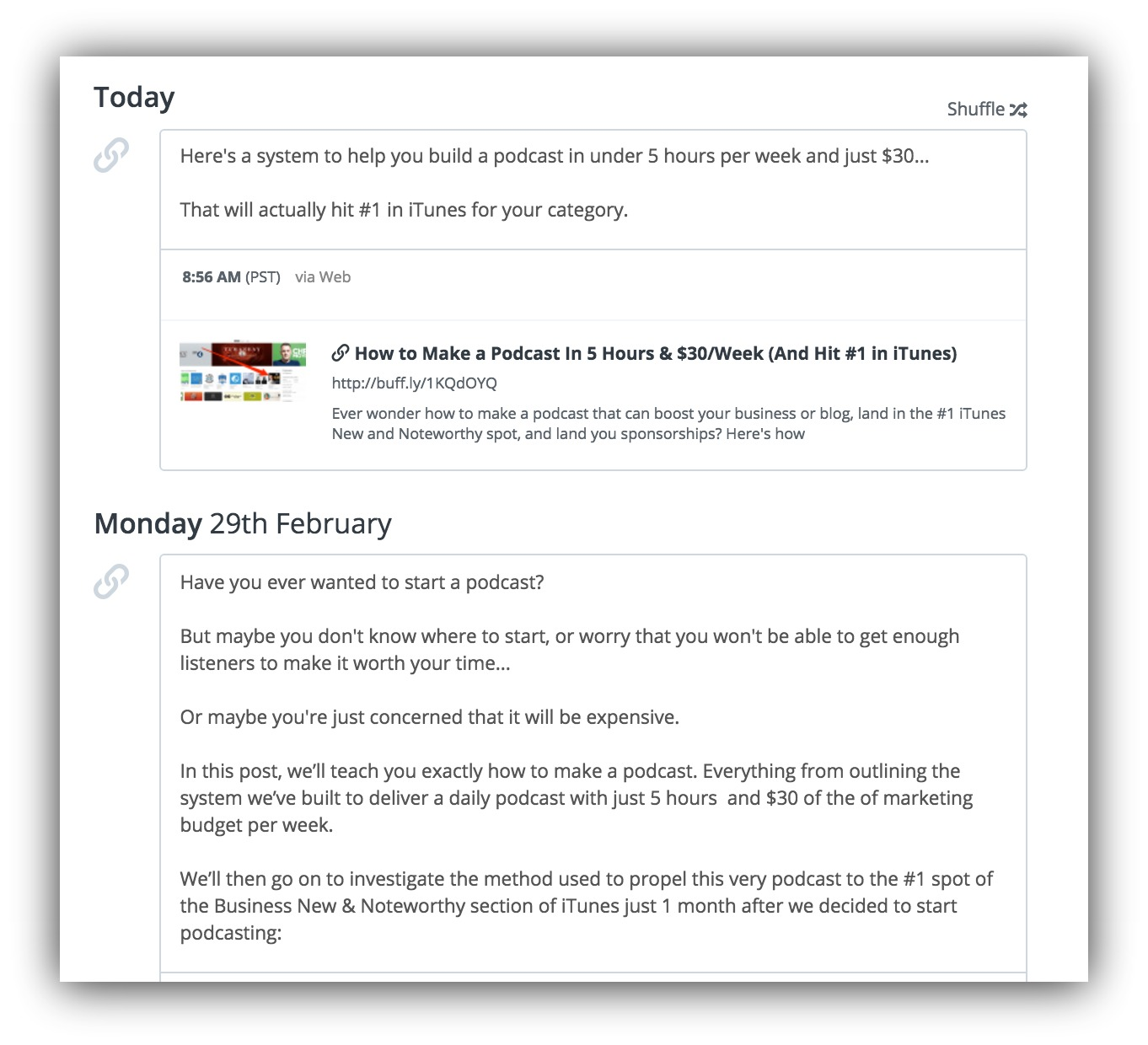
I’ve tested short and longer form text in this scheduled post:
After your posts have been published, you can head back to Buffer and go to the Analytics tab to see the results:
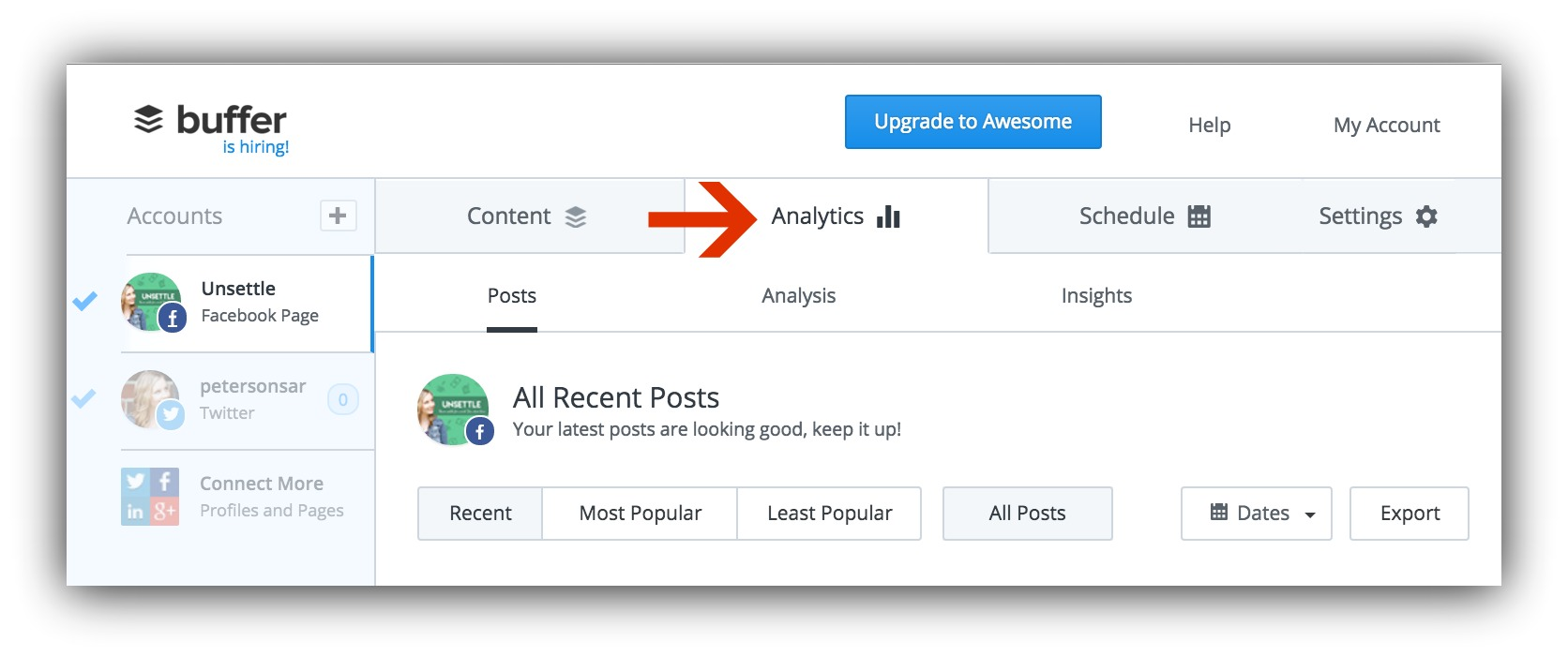
Compare comments, likes, shares, and clicks (keeping in mind that your reach won’t be the same on all of your posts).
After a series of these tests, you should have a good idea of exactly what your audience responds the best to.
With this knowledge, you can then spend some time creating shareable images for your Facebook posts.
Canva
Have you ever gone to share a piece of content on Facebook or another visual platform, only to have no image show up with the content – or worse, an ugly image?
Does that make you proud to share the content?
Unlikely.
It also doesn’t make your friends want to click on it, and enjoy it.
That’s why you have to create eye-catching images for your content. When it’s shared on Facebook, the image should compel people to actually engage with your content.
So that’s where Canva comes in.
Canva is a tool you can use to easily make images to go with your content – yes, even if you’re not a designer.
When you’re creating your images in Canva, it’s best to stick to a text-over-image format. You can see how we’ve done this in one of our Facebook posts:
Airbnb, Slack, Amazon, and every other top site uses this tactic. Are you taking full advantage of it? Posted by Sumo.com on Thursday, December 17, 2015
Ooh, ahh, so pretty!
Because the human eye tends to scan over text and land on images, this ensures that the headline you worked so hard on does it’s job of hooking people in.
To create an image like this, head over to Canva and open a Facebook post design: 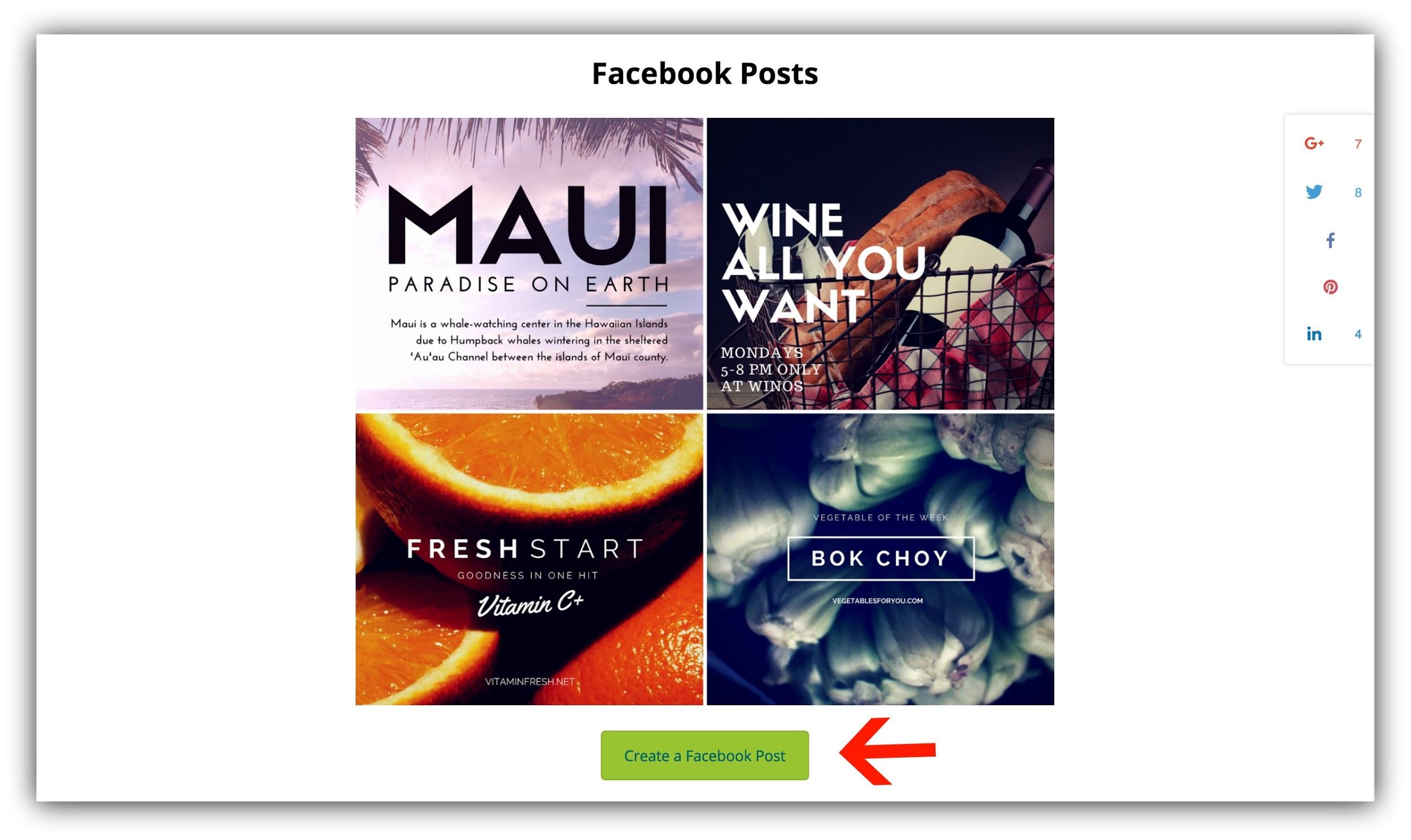
This will automatically assign the appropriate size to your image.
When you have your Canva template open, you can head to a no-attribution stock photo website like Pixabay.com for the background photo.
Let’s say I was going to make an image for Nat’s edition of 0 to 10k Visitors. Because we’re talking about traffic, I’m going to type in “traffic” in Pixabay:
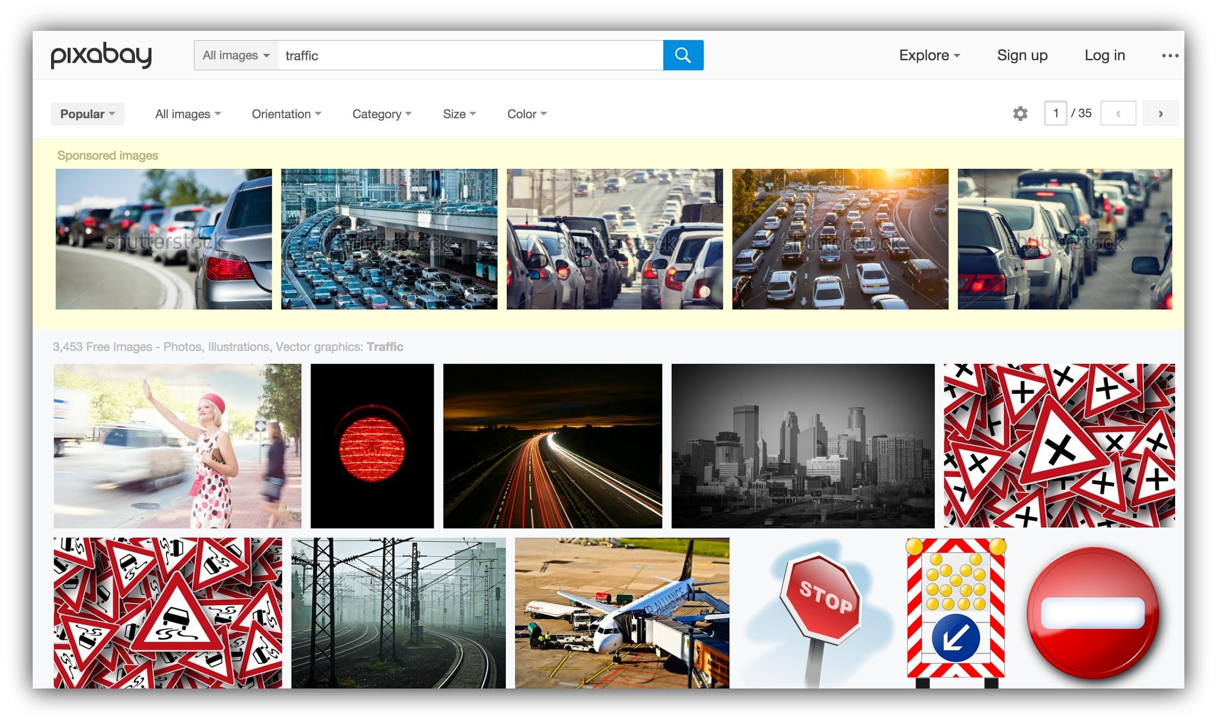 Choose an image that isn’t too “busy”, so your text overlay will stand out and be legible. I chose the one I did because it has a dark background.
Then, upload the image into Canva:
%<11>
And add text to the image. You can either choose one of Canva’s text formats, or you can add your own text and play around:
- For ease, choose a pre-set format.
- For branding and aesthetic, use your own.
I chose to create my own text so that it would be in line with Sumo’s branding.
Play with the placing of the text, and use different fonts. I like to use a script for keywords and words I want to draw attention to:
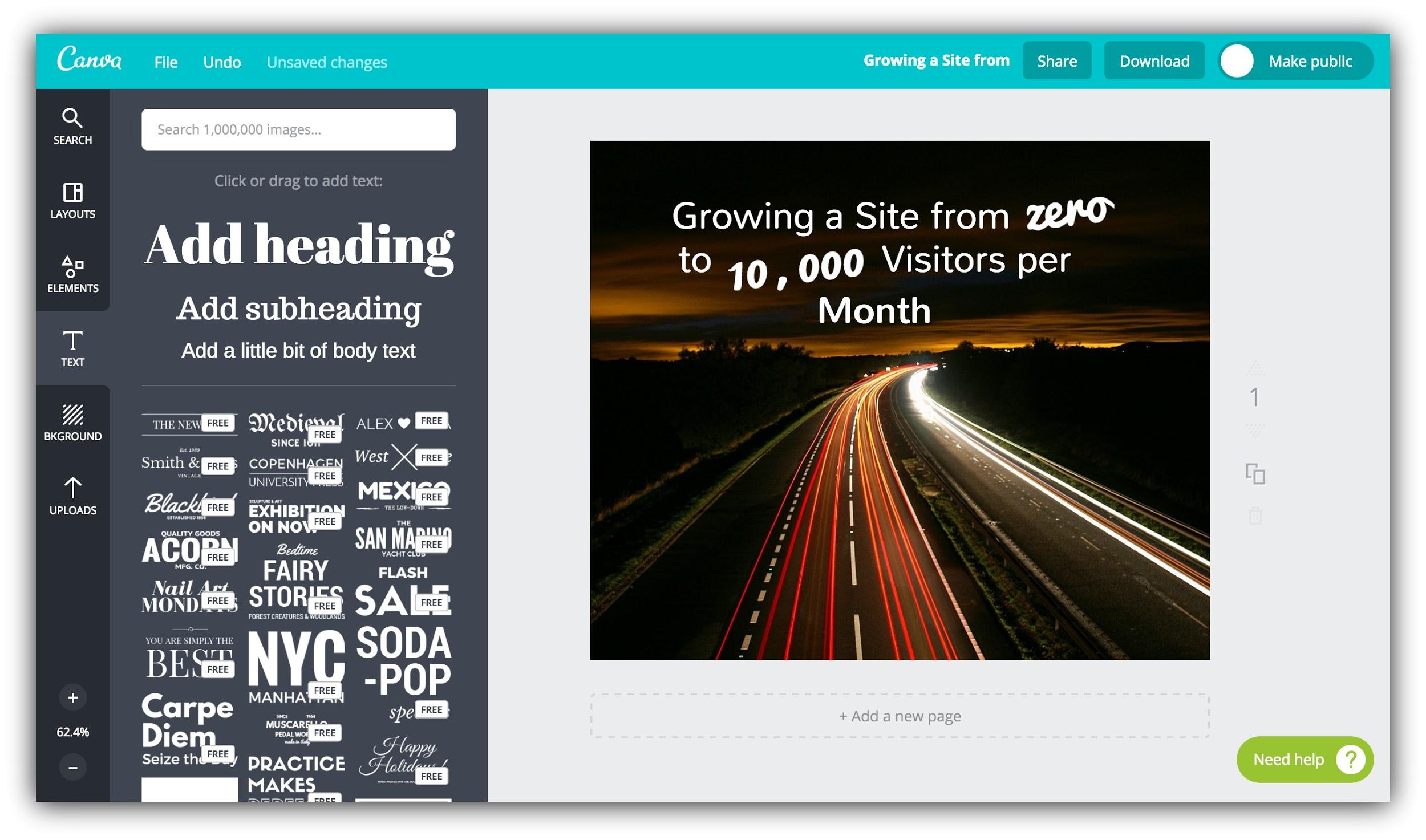
Once you have your basic design, try to make sure that the text makes up no more than 20% of your image.
If you ever want to boost or advertise your content on Facebook, these are the image sizing guidelines. Don’t worry – we’ll go over how to make sure this is the case with the next tool.
You can download the image now, but do NOT close your Canva window. You’ll need to be able to pull up your design in the next step to make changes.
Facebook Image Grid Tool
After you’ve created an image within Canva, the next step is to make sure your image is Facebook ad friendly.
I’m not suggesting that you’ll boost your Facebook post right away, but to save yourself time and hassle in the future, I’d recommend just complying with Facebook’s ad standards right away.
So head over to Facebook’s grid tool and upload your design:
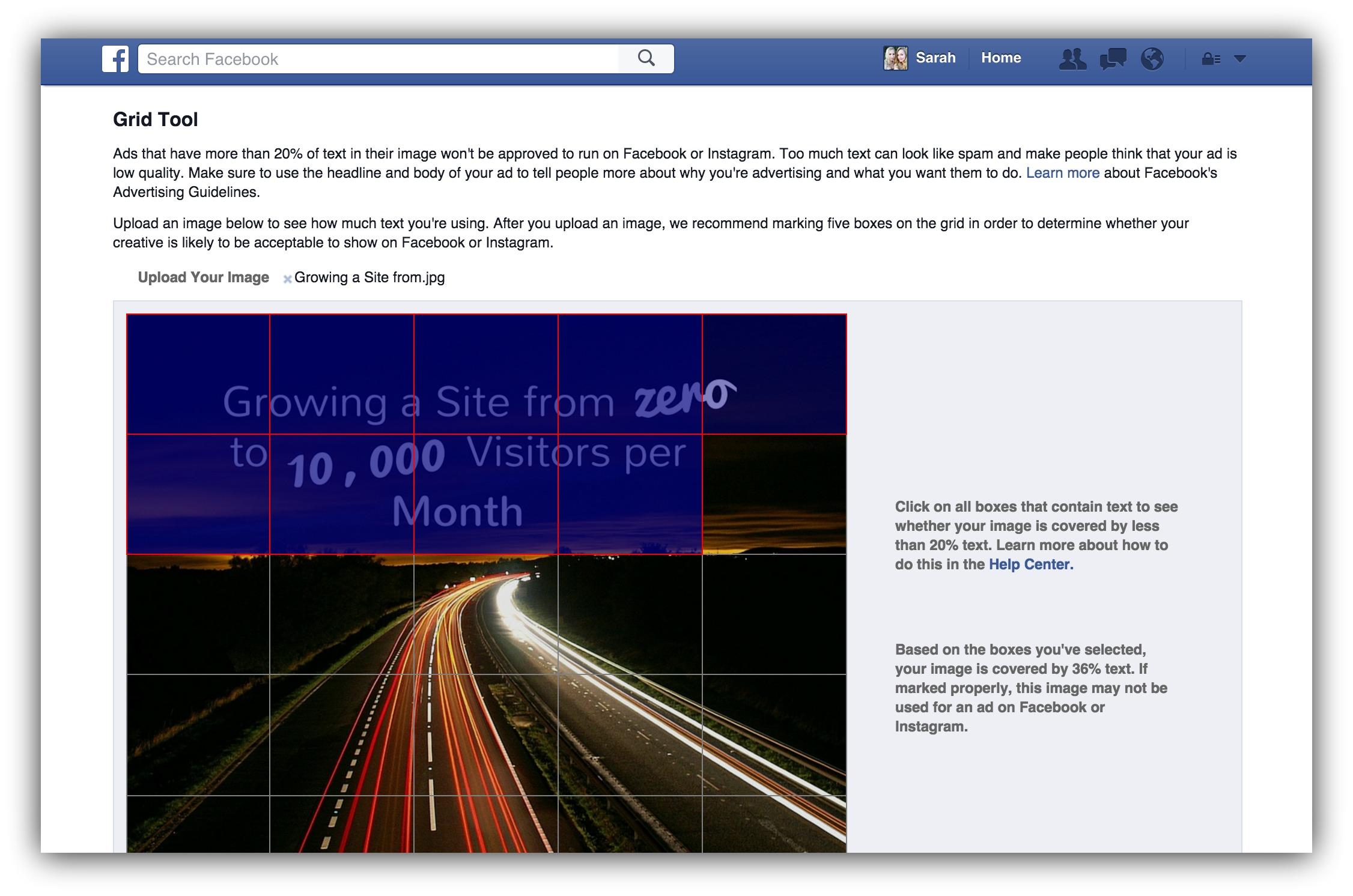
Click the squares that have text in them and the tool will calculate what percentage of your image the text takes up.
Facebook only allows 20% in ads, so if you’re over that (as I was), you can go back to Canva and tighten up the text in the design.
Once you’ve done that and the text on your image is sized appropriately, you can move onto the next tool (which also contains the next step)…
WordPress Yoast SEO
An SEO tool which is also a Facebook tool?
Sounds far fetched, right?
But I mentioned in the Facebook guide that you should set your images as the meta image on your content so that when people share on social media (including Facebook), the image you actually want to show up is displayed.
That’s where the Yoast SEO plugin comes in (assuming you’re on WordPress, if not, you’ll have to set the open graph meta data manually).
Head to your WordPress dashboard if you haven’t already installed Yoast, and search for it in the Plugins section.
After you’ve installed it, we’re going to set the meta image as the image you’ve just created. Head to your piece of content in WordPress and scroll down to the Yoast widget below the content. Press the third button on the left of the widget:
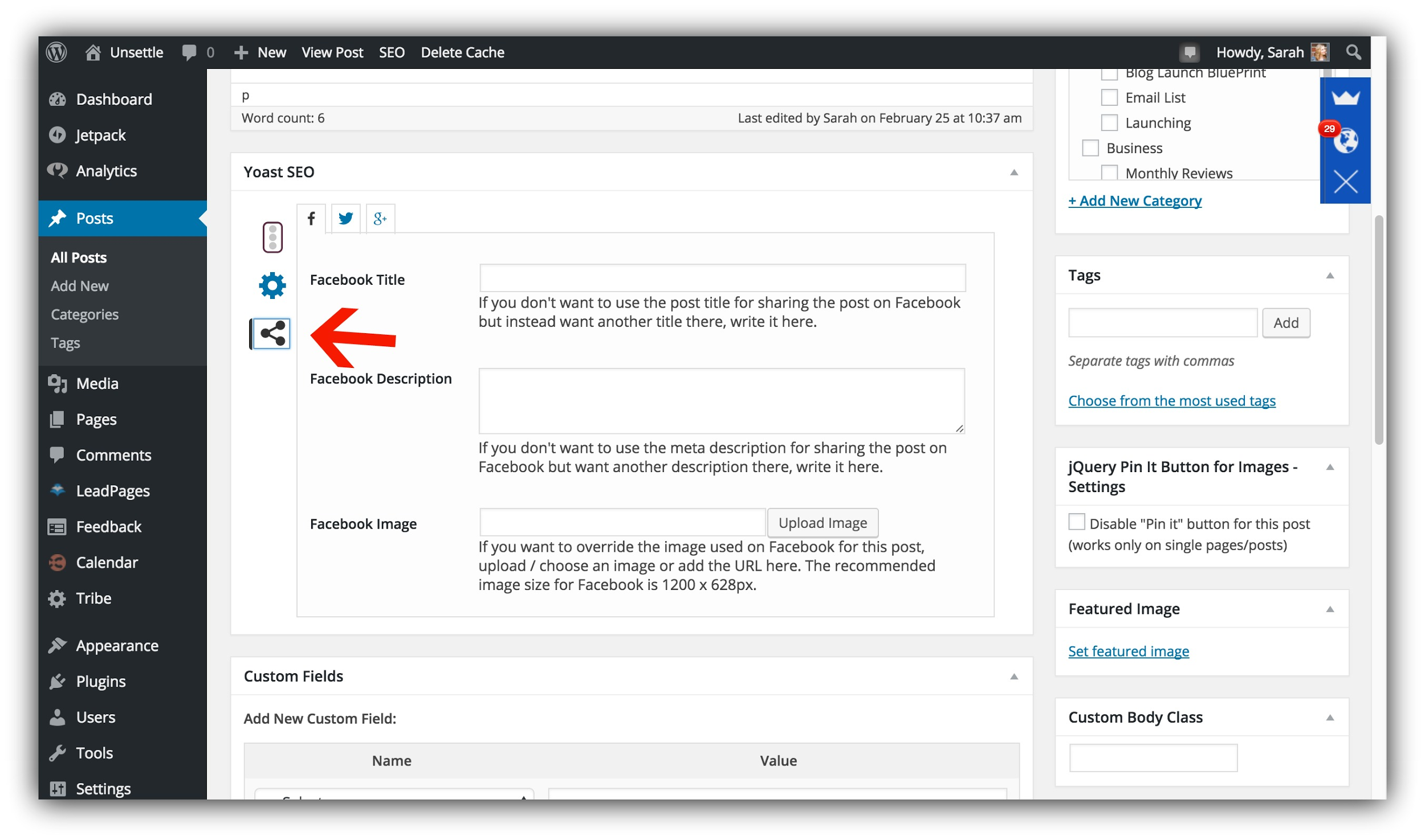
This will take you to the social media meta information tab.
Upload the image you just created into “Facebook Image” in the Facebook tab.
You can also set your own description and title specific to Facebook if you want it to differ from the one you set for the post in general:
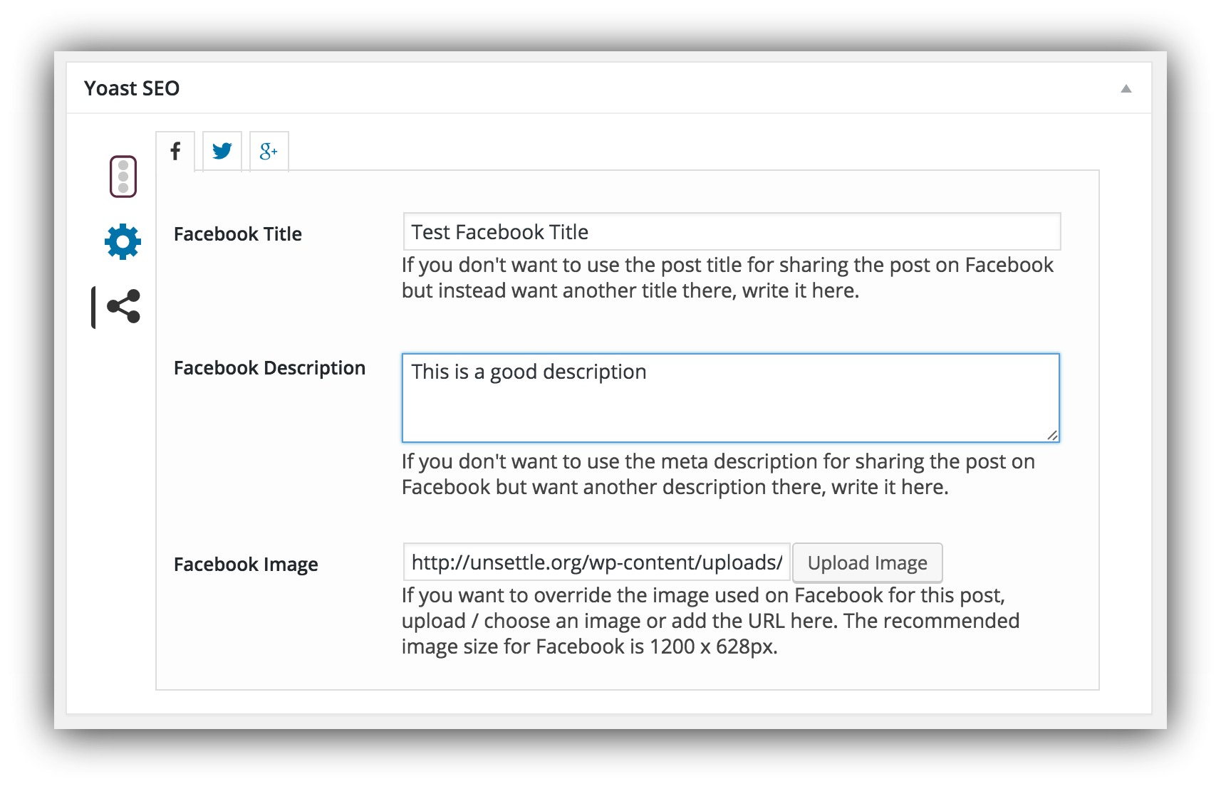
Pro tip: Use the information you dug up on BuzzSumo and through using Buffer to split test different headlines and types of content to create a title you know will be popular on Facebook.
Then you have to make it easy to share those images you just worked so hard to create…
Sumo Image Sharer
After you’ve created a beautiful image for your content with Canva, you have to make it super simple for your audience to share the images on Facebook.
That means making sure that you have Image Sharer on your site.
Once you've activated Image Sharer, under Settings, drag Facebook from Available Services to Selected Services.
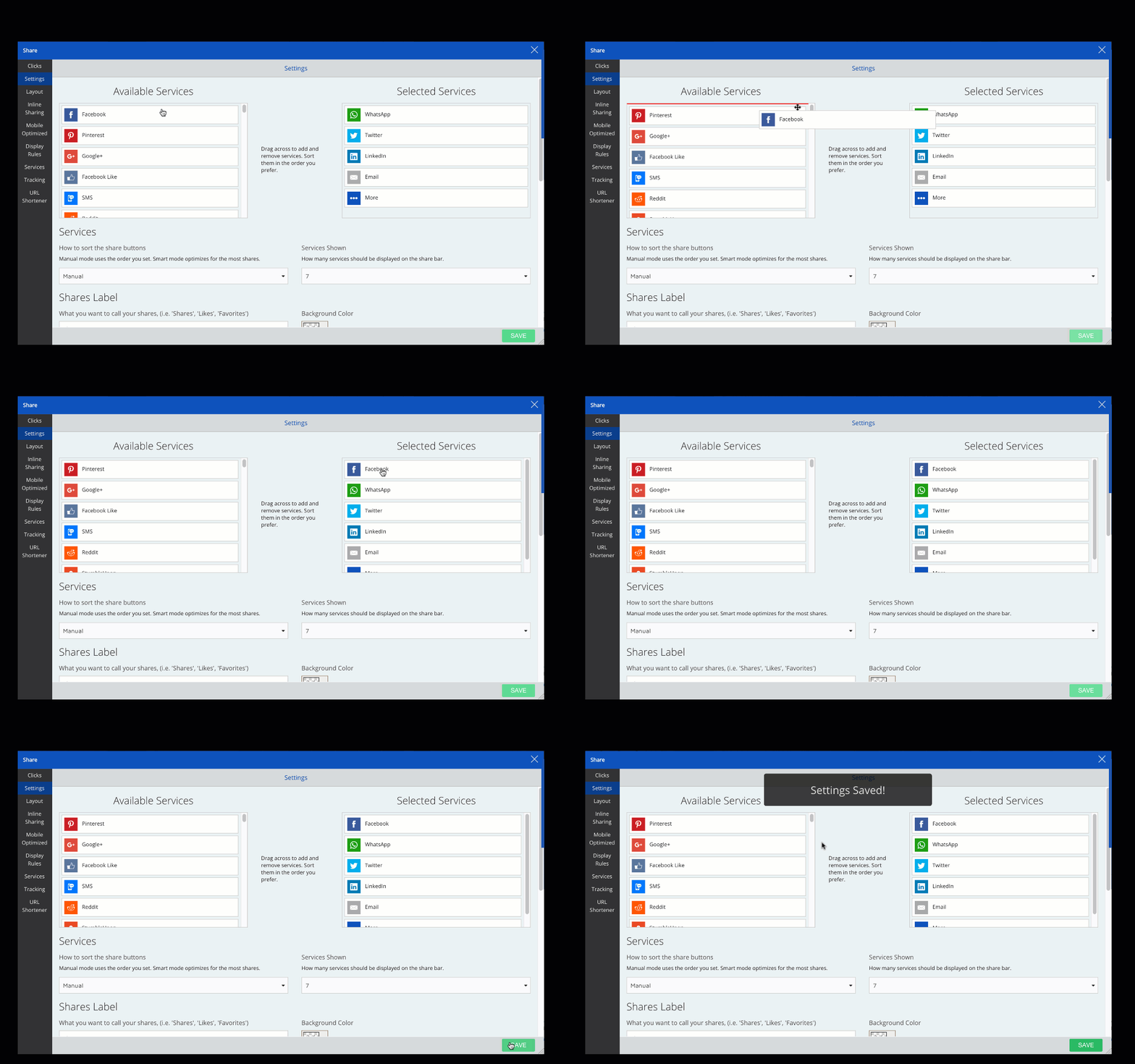
When the image is in your content, your audience will be able to share it with the click of a button, making it far more likely that they’ll actually do it.
Because remember…
If you don’t make it easy for people to take action, they won’t take action.
Edgar
Just like constantly creating new content for your blog, podcast or YouTube channel can be counterproductive, creating new content for Facebook constantly can be draining and turn you off using the social network for good.
That’s where Edgar comes in.
Edgar is a tool that schedules social media updates as a library, reusing the content you’ve already created.
According to Edgar, “most social updates are only seen by a teensy fraction of your audience” – so why keep creating new content when you’ve stumbled across what works?
After you test which content works best with your audience on Facebook using Buffer, you can take the winners and line them up in Edgar:
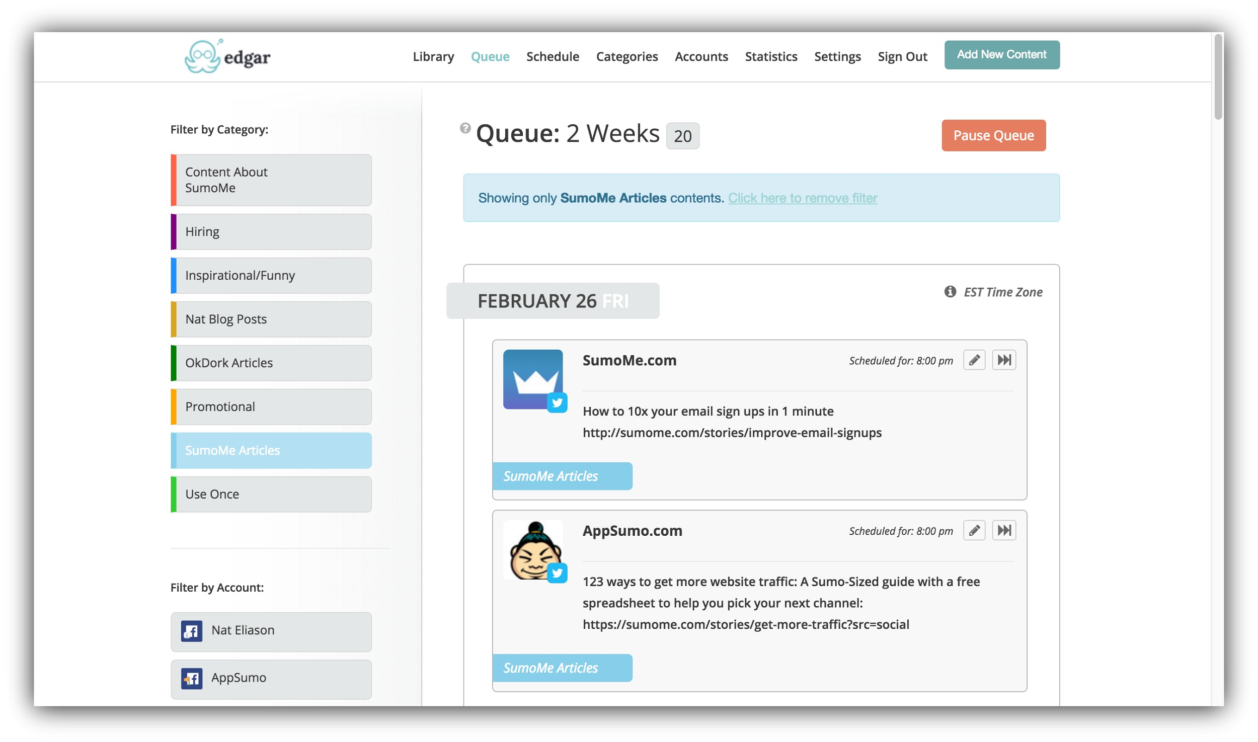
This will let you create a library, putting your updates on autopilot and taking more work off of your plate.
After you’ve built a library of Facebook posts in Edgar to automate part of the process, you just need to focus on driving Facebook traffic to your new content. You can do that by using Buffer to schedule posts after you’ve scheduled your content.
Stop Letting Facebook Traffic Get Away
We’ve already given you every single method of driving free traffic from Facebook to your website.
Now I’ve equipped you with the tools and resources you need to create a system so Facebook marketing doesn’t take over your life, time, and business.
You just need to follow this guide and put these systems and tools into practice so you can stop letting that Facebook traffic get away…
And start driving massive traffic like you deserve.
Let me know in the comments below – have you used any of these tools? Which is your favorite?
Add A Comment
VIEW THE COMMENTS