Product photography can make or break your product’s success.
Don’t believe me? Imagine you’re scrolling through Facebook and you see a product you’ve always wanted. Which of these would you click?
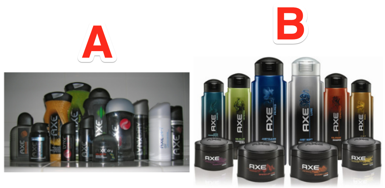
Enough said. For our purposes, let’s use the example of a Shopify store getting samples of a new product. What are all the photos you should take?
This article will answer that question and share 13 product photos you need for every marketing channel. Let’s go!
%(tableofcontents)
How To Use This Guide
This guide is a big list of product photography ideas for every use we could think of.
The goal is ONE photo shoot per product that covers all the photos you’ll ever need — from marketing to web design, print to flash sales, and more!
To take all these photos in one shoot, you’ll need some things:
-
A DSLR camera (smartphone will work in a pinch).
-
A camera or smartphone tripod.
-
A white poster board for the background of product-only shots.
-
Natural lighting and/or 2-3 photo stand kits with bright white lights.
-
An assistant, if possible.
Note: this is not a guide on how to shoot product photos.
It’s a list of the different shots you should take so you don’t have to break out the photography equipment a bunch of times when you realize you don’t have a certain shot you need.
Pro Tip: Try to knock out as many photos as you can in one sitting for as many products as you can. Setup can take a while, so you want to minimize setting up and tearing down as much as possible.
Now, let’s get started!
Product Photography Ideas For Your Website
We’re starting with your website because these photos are the most important — your site is where the sales happen.
Before you get started, it’s a good idea to do your homework.
-
Check out your competitors' websites to see the angles and shots they used and how they used them.
-
Do a Google Image Search or Pinterest search for your product, and see lots of ideas at once.
-
Search for forums in your niche to see what kind of questions people ask about your product, then try to answer those questions in your photos.
-
Call your manufacturer’s support number and ask them what the most common questions about your products are, or read their FAQs. Again, try to answer those questions using your photos.
After your research, here are some photos you should take:
Product Page Photos
These shots are meant for your product page.
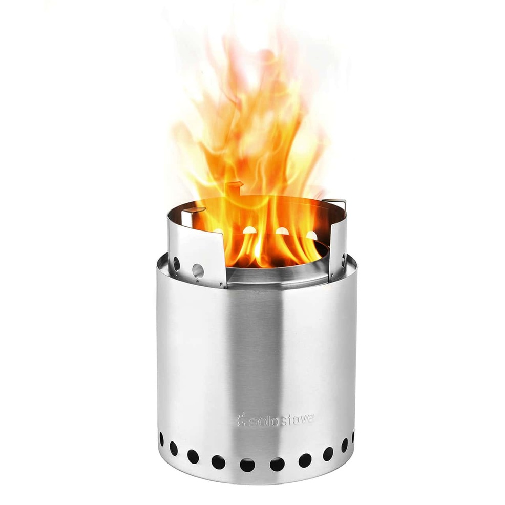
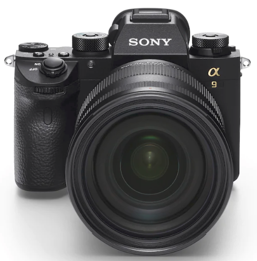
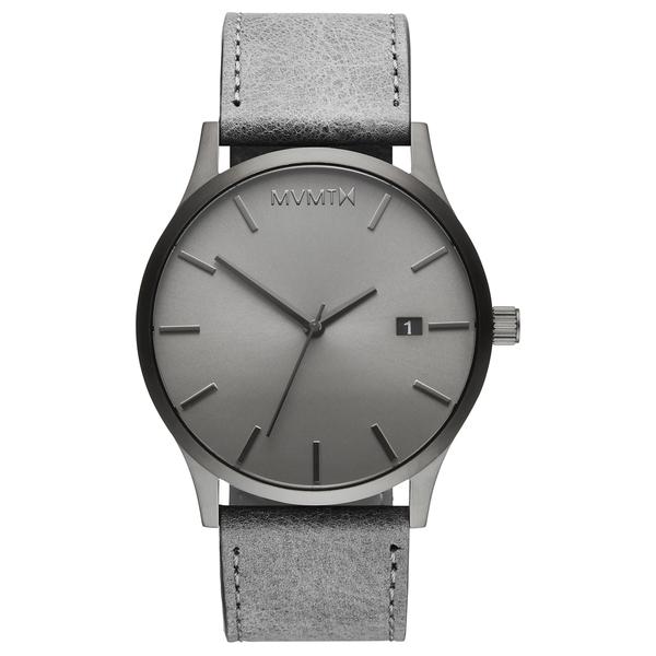
1. Plain white background
This one is self-explanatory — a no-nonsense photo of your product on a white background with no distractions.
Examples:
Solo Stove:[*]
Sony:[*]
MVMT Watches:[*]
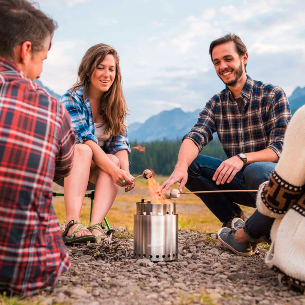
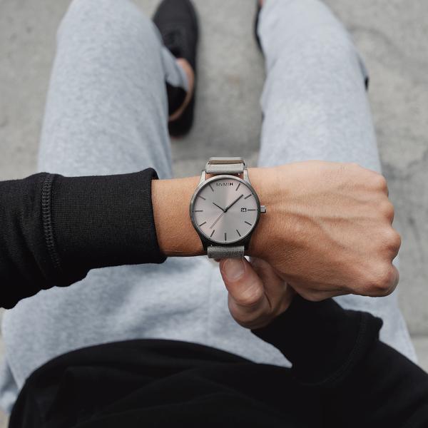
2. In-use lifestyle shot
These shots should show your product being used.
Examples:
Solo Stove:[*]
MVMT Watches:[*]
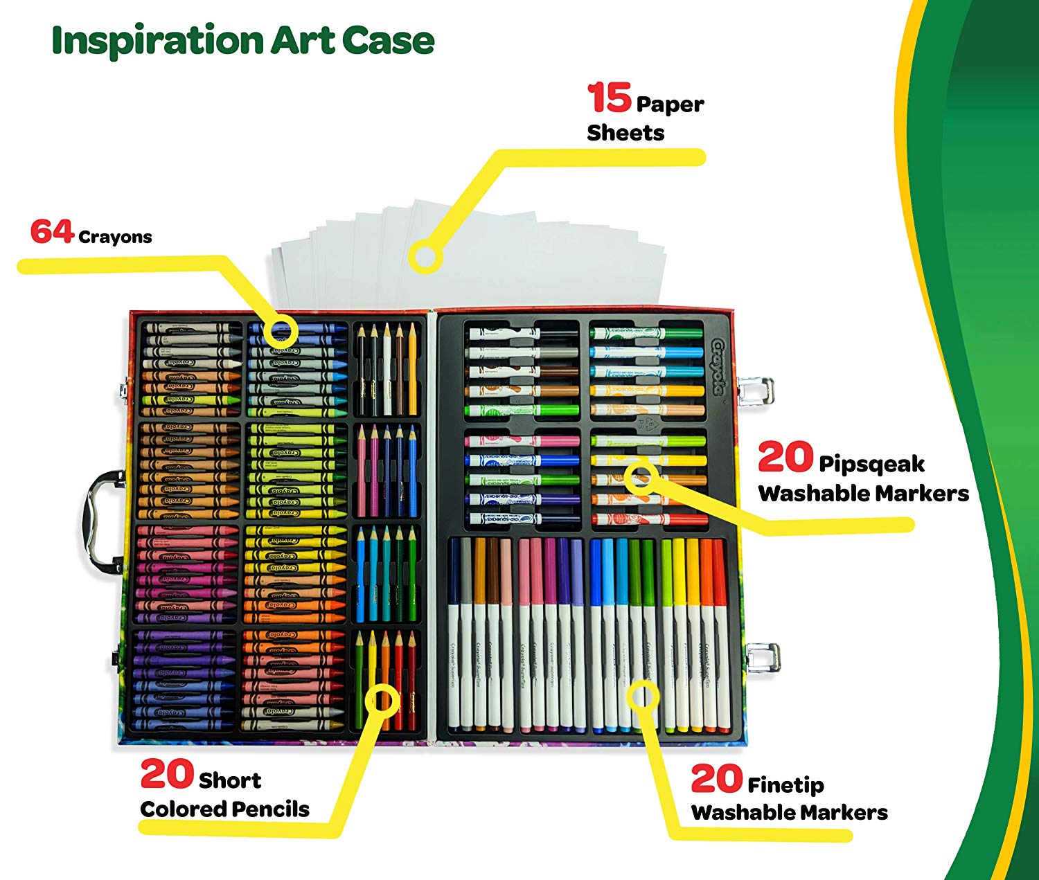
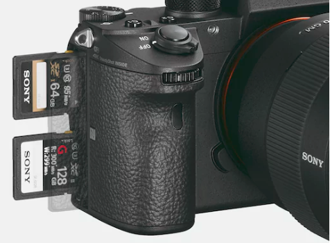
3. Close-up on details/explanation shot
These shots can show the product's intricate details or how an aspect of the product works.
Examples:
Solo Stove:[*]

Pro Tip: Not all your photos need to be actual shots of your product! Sometimes graphics (like the one above) can help to explain your product from a different angle. You can draw out a rough idea of what you’re thinking then use your in-house designer or hire someone on Fiverr or DesignCrowd to make this for you.
Crayola Inspiration Art Case:[*]
Sony:[*]
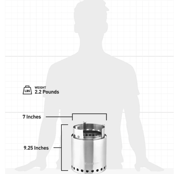
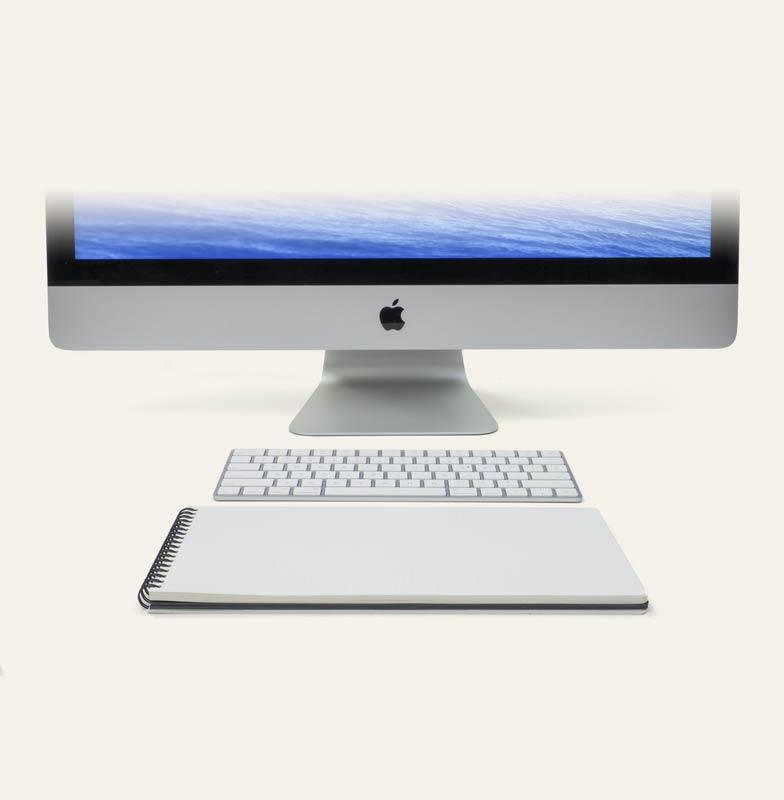
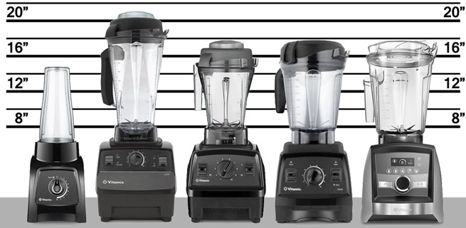
4. Comparison shot
These photos compare your product to something to show its size. This helps people see how big it is, to make sure it's what they need (and lower the chance of a product return).
Examples:
Solo Stove:[*]
Panobook:[*]
Vitamix:[*]
Website Banner Photos
Next up we have some photo ideas to use in website banners, such as at the top of your homepage.
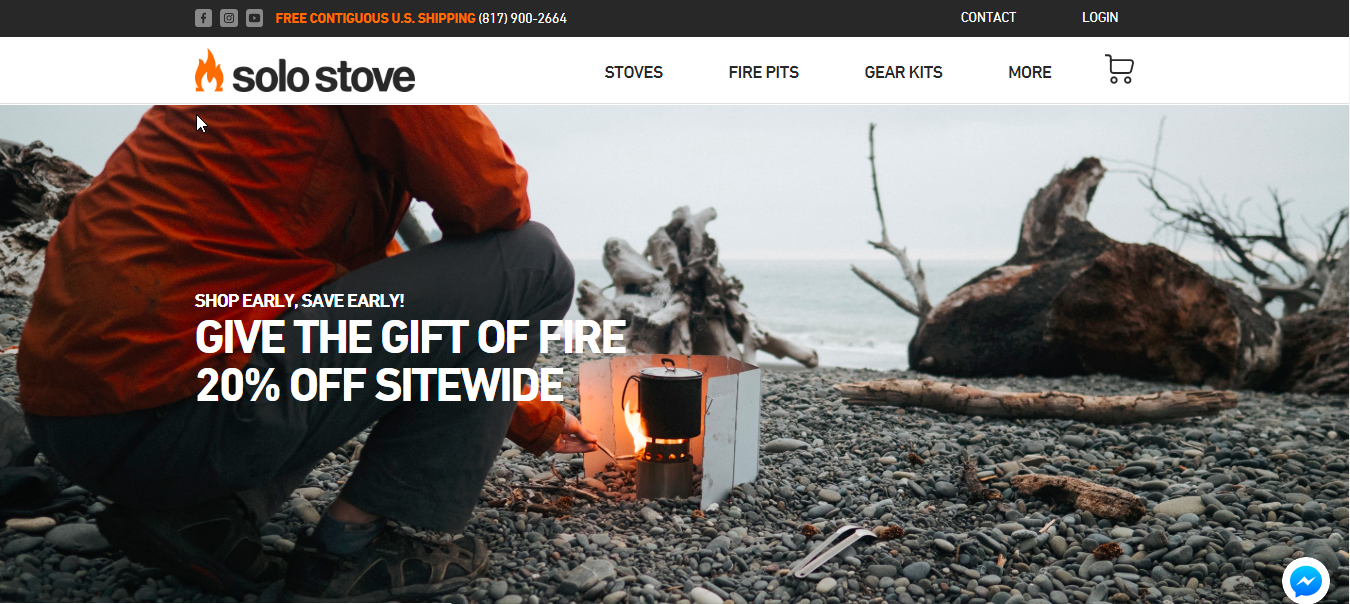
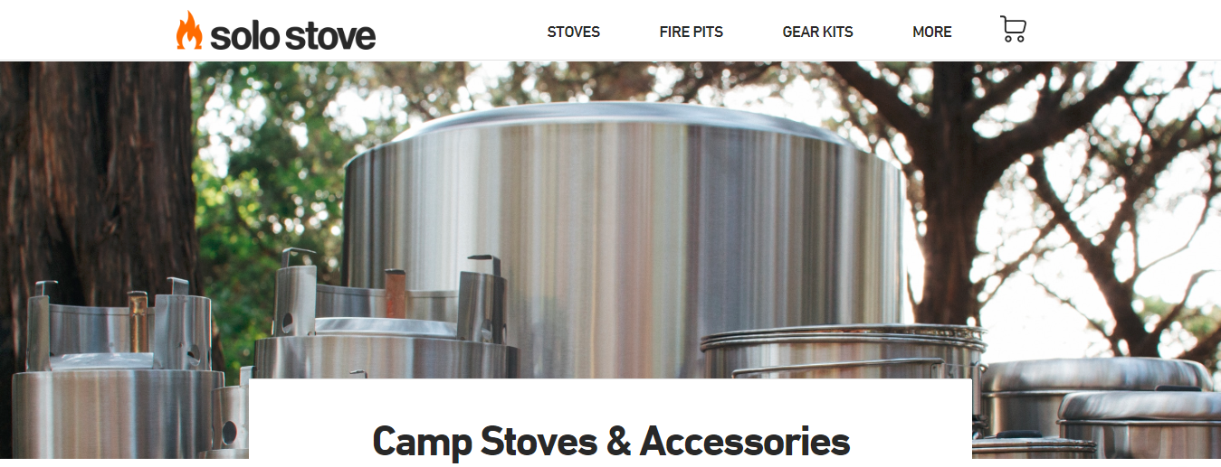
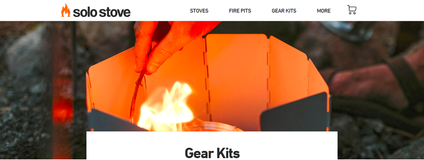
1. Product In Use
A product-in-use shot is a great way to create a banner. Be sure to leave some “empty” space around the product to add text, like price, benefits, etc.
Here are a few examples from Solo Stove:
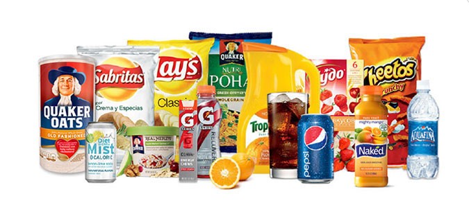
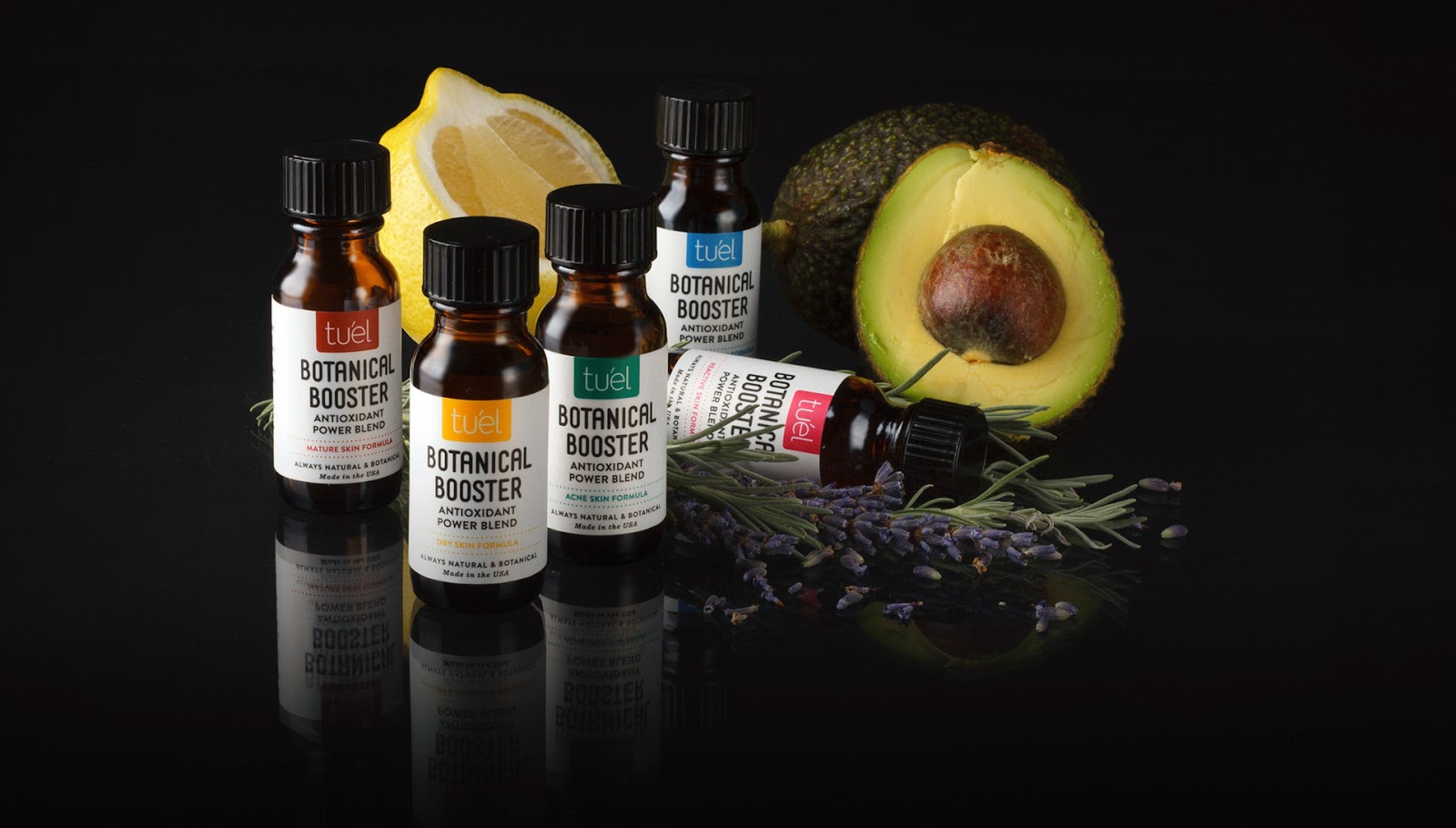
2. Product Category Shot
Try taking a shot with all your products in a given category or lineup, like Family Dollar does here:[*]
Here’s another example from Tu'el Skincare:[*]
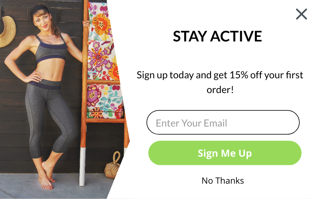
Sumo Popup Photos
If you’re using Sumo’s email capture tools, you’ll want some product photos just for them. The recommended file size for your popup is 100-400kb, with dimensions of 214 x 325 px.
Examples:
Copa Azul (an ecommerce store that sells Brazilian beach towels):

Green Apple Active (certified organic bamboo activewear for women):
Blog Photos
Your blog is a crucial part of marketing your online store.
Without blog content, you’ll miss out on ranking for long-tail keywords, building easy backlinks to improve your site’s domain authority, and having great content to share on social media and to your email list.
Part of a great blog post is media — photos, screenshots, and videos. You can reuse other product photos, but consider taking a few photos just for your blog posts. Take some of your product used in the way you’re explaining in your article.
If you’re not sure what you’ll be writing about yet, take different shots of using your product in unique ways or in different scenarios.
Examples:
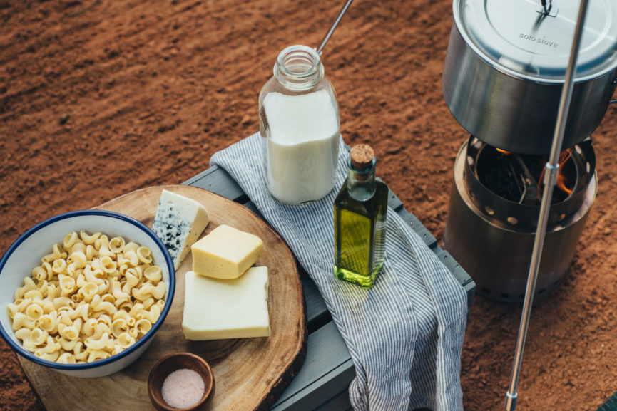
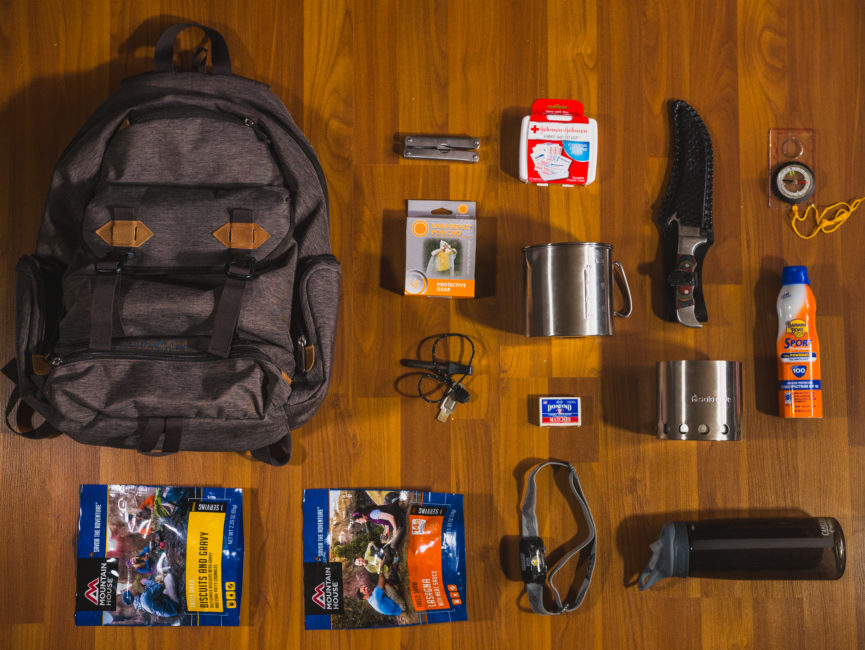
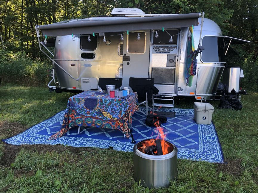
Here are some examples of how Solo Stove uses product photos in their blog articles.
In a mac n’ cheese recipe:
In a “What you need for a day hike” article:
In their articles with customer stories:
Product Photography Ideas For Social Media
Social media is a needy beast. You have to constantly pump out new content.
The solution? Take a ton of pictures ahead of time, so you have plenty of photos to share with different angles and takes on your products.
Pro Tip: In addition to these new photos you take for social media, you can reuse most of the other photos you took earlier.
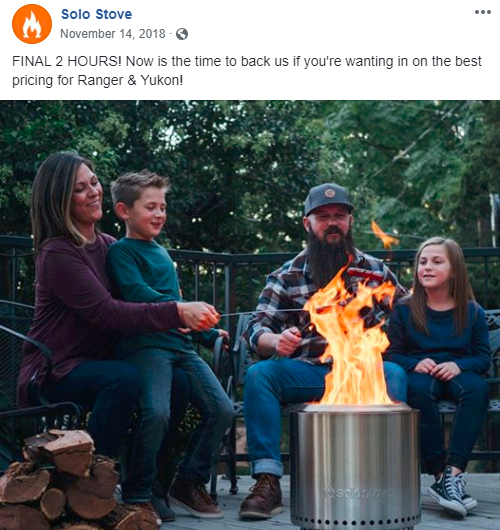
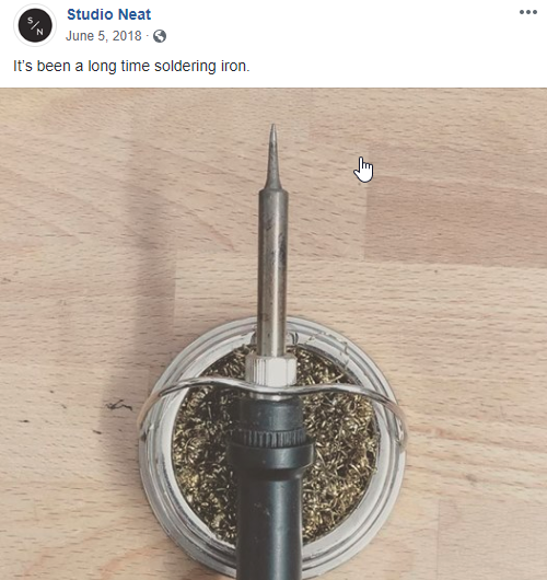
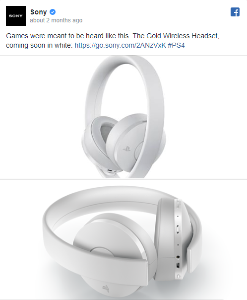
Facebook Post Photos
Dimensions: 1200 x 900 px (4:3)
Examples:
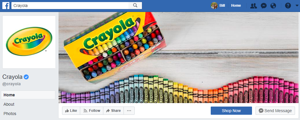
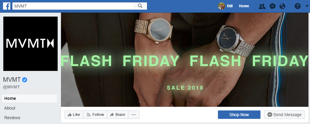
Facebook Cover Photos
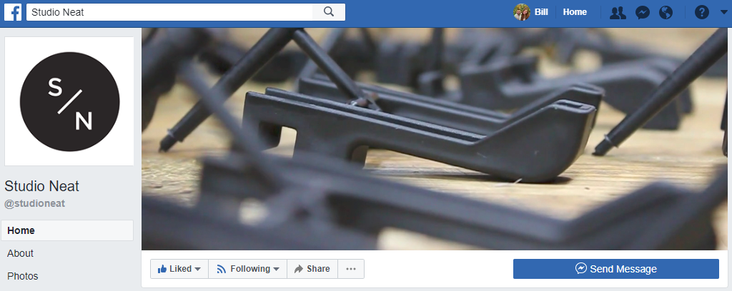
Dimensions: 828 x 315 px (2.62:1)
Examples:
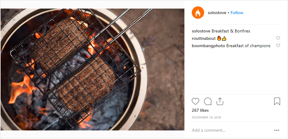
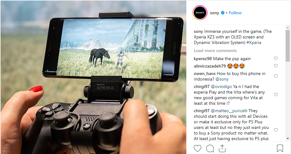
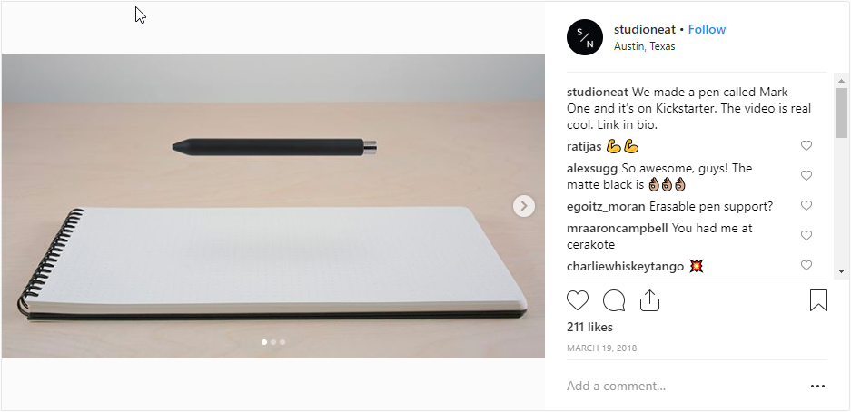
Instagram Photos
Dimensions: 2048 x 2048 px (1:1)
Examples:
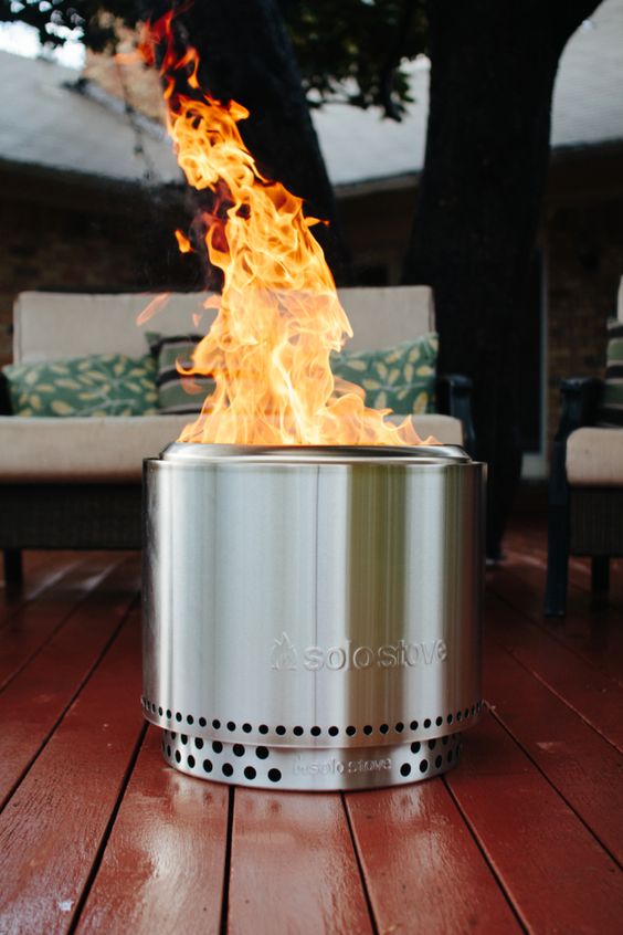
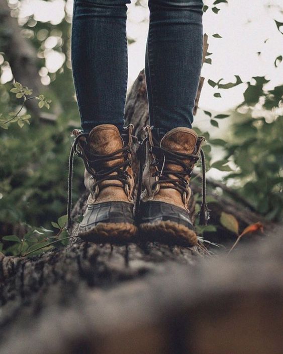
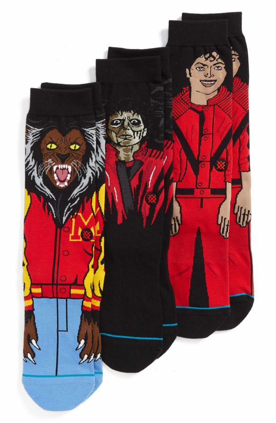
Pinterest Photos
Dimensions: 600 x 900 px (2:3), up to 600 x 1260 px (1:2.1)
Examples:
Pro Tip: You can easily create Pinterest images for free using Canva.
Product Photography Ideas For PPC Ads
Still going, eh? Next up, we’ve got photo shoot ideas for all your PPC needs.
Facebook Ad Photos
Dimensions: 1200 x 628 px (2:1.1)
Facebook ad photos need to be captivating. But there are lots of different ways to do that. These examples show different takes.
Examples:
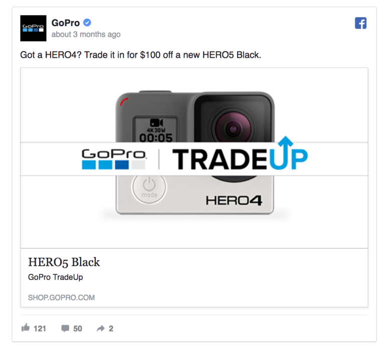
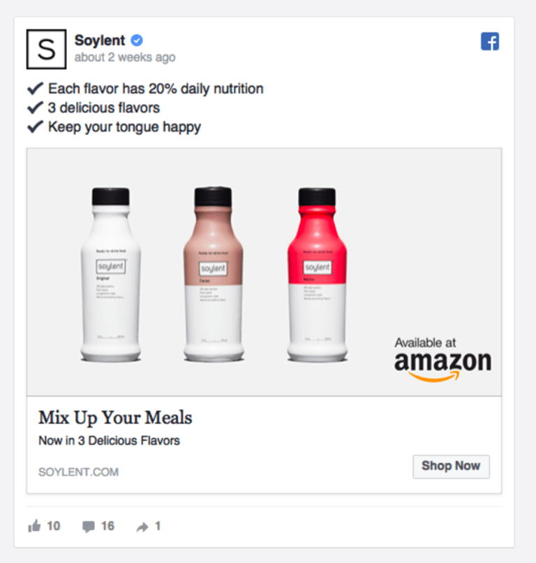
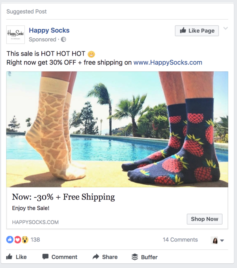
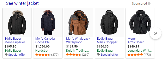
Google Shopping Photos
Unlike Facebook ad photos, your Google Shopping images must adhere to very strict rules. These images need to have a pure white background and display ONLY the product, with no props or distractions.
Dimensions: 800 x 800 px (1:1)
Examples:
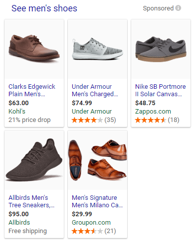
Product Photography Ideas For Email
A common question we get from Sumo customers is “how do I make our emails look and convert better?”
Part of the answer is using (or reusing) high-quality product photos in your emails. The other part is copywriting, but that’s for another article!
Abandoned Cart Emails
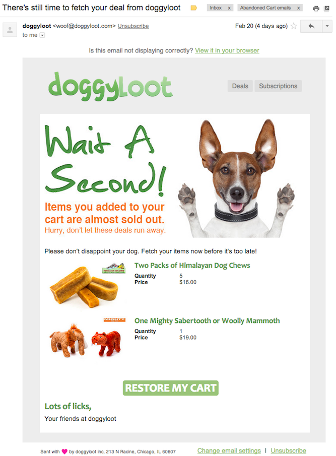
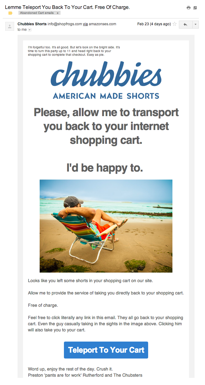
Your abandoned cart emails don’t necessarily need their own photos. You can include photos of the products your visitors added to cart before leaving your site.
However, you can always add some extra fun images to your emails!
Examples:
The dog in Doggyloot:
The guy chillin’ on the beach for Chubbies:
Product Page Emails (Viewed Product Page Then Left)
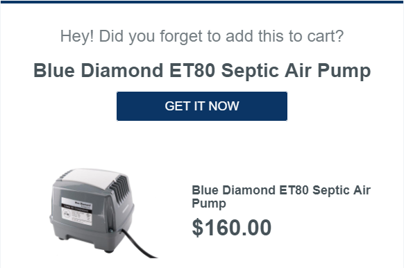
Like abandoned carts, having a visitor view a product page then leave is a missed opportunity. If you’re lucky enough to have that visitors’ email address (say they’re a past customer or signed up for your email list), send them these emails.
Examples:
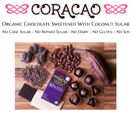
Single Product Emails
If you’re promoting a single product to your list, like a new product launch or flash sale, you can either reuse the photos you took in the previous sections OR take some ahead of time, like our examples below.
Examples:
Saved By The Dress:
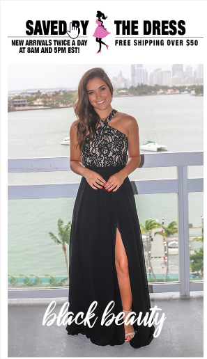
Solo Stove:

Product Photography Ideas For Print
Looking to take your marketing old school with print magazines or direct mailers? We’ve got ideas for that, too.
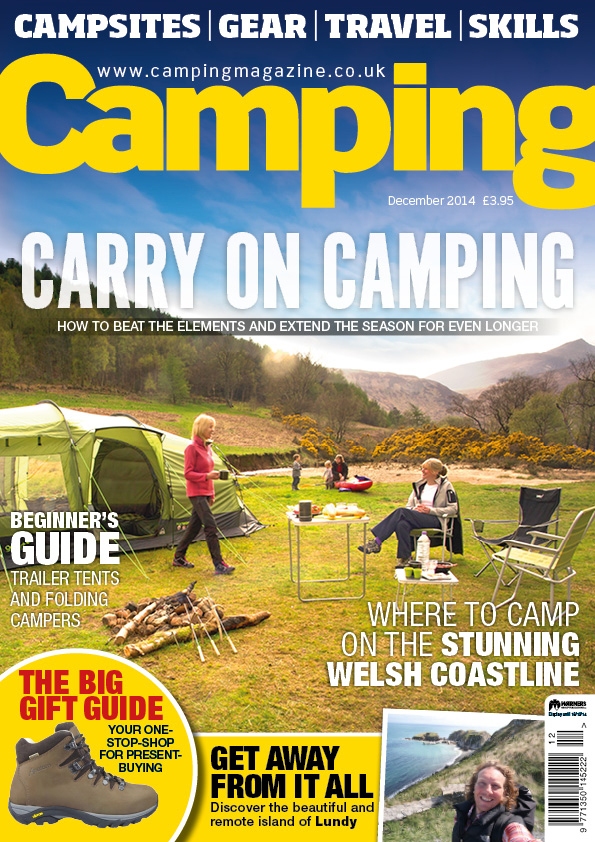
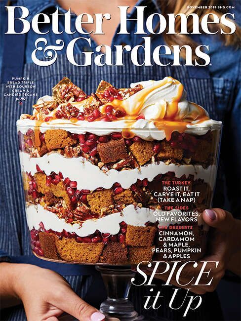
Magazine Photos
Thinking about running a magazine ad? We’ve got you covered..
Dimensions: 8.5 x 11 inches (2550+ x 3300 px)
Examples:
Camping Magazine:[*]
Better Homes & Gardens Magazine
Direct Mail Photos
Direct mail includes fliers, postcards, and letters that promote your products. It’s not a common ecommerce marketing tactic, but we wanted to cover all fronts!
Some advice when taking direct mail photos…
-
Get shots from varying distances away. That way you have multiple options to see which looks best once you get to the computer.
-
You can reuse your magazine photos, leaving space for ad text.
-
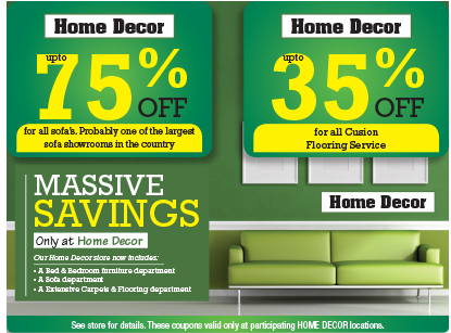
Think about what kind of ads you want to put on the mailer. Set up your background so there’s space in those areas (like the % off boxes in the home decor example below).
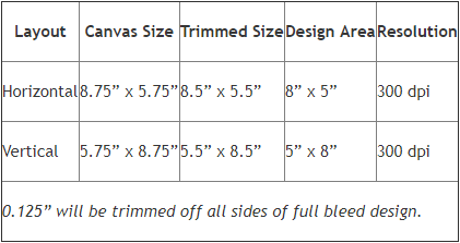
Note: When taking direct mail photos, you’ll need to keep in mind the file format requirements. Typically, all files must be in RGB color mode, 300 DPI in resolution, to the specified sizes below, and in JPG format. However, you’ll want to contact the printing company to double check these requirements.[*]
Examples:
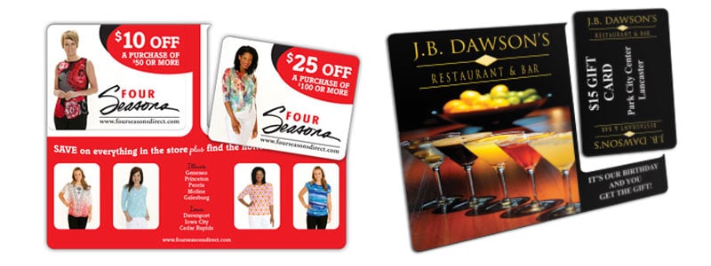
SmartHomePromotion:[*]
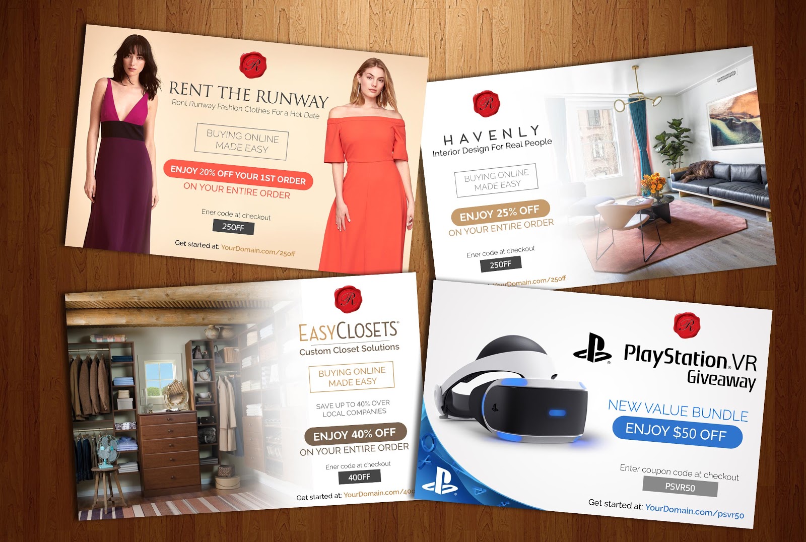
Tips For Better Product Photos
To round off our guide, here are some quick and simple tips for better product photography:
-
Show the full product with no distractions (in your white background photos)
-
Images should be at least 1000 px wide, 2000 px is better (for product zoom)
-
Don’t forget to compress using a tool like Photoshop, Gimp, or IrfanView
-
Stick to RGB Color mode
-
Use JPG file type. PNG files take up too much space and decreases load speed (but save the originals on your hard drive for future editing/cropping)
To add text or edit your photos, I recommend Canva. It’s free to use with an easy drag-and-drop UI.
Get My Product Photography Shot Checklist
The product photography ideas in this guide are sure to keep you stocked up on product photos for every need. But scrolling through this guide when you’re ready to start shooting could be a pain.
That’s why I created a product photography shot list, with every shot from this guide nicely tucked into an easy-to-follow checklist. The checklist has two categories:
-
White Background Product Shots
-
In Use Product Shots
I did this so you have a print-friendly list of the photos you need to take against a white background, and all the ones you need showing off your product in use.
Click the button below to get yours for free right now, and check them off as you shoot!
Get The Product Photography Shot Checklist
Product photography is the difference maker. Improve your store today.
Add A Comment
VIEW THE COMMENTS