HEADS UP SUMOS: Conrad is giving away his $199 course for a limited time at the end… read the post to find out how you can get it!
But first, I’ll let Conrad, co-founder of Fedora, tell you about how he boosted his signups by 70% with one tool…
—
As co-founder of a startup growing 30% each month, I might be addicted to looking for leverage.
To meet our aggressive goals, our team is constantly thinking about how to quickly put high-potential ideas to the test.
A recent goal has been to get as many people as possible into our weekly webinars. While most tests we’ve run have had a small or negligible impact on how many people sign up, one recent test gave us a 70% boost.
I want to show you how you can get that kind of boost too.
Two weeks ago, I live-blogged an experiment to see if Sumo’s new app, the Welcome Mat, could increase the number of people signing up when compared to our normal landing page.
Welcome Mat is a big, bold, call to action that temporarily covers your site when someone arrives. Depending on the prompt you’re using, the visitor can enter their email address or click on a call to action button. Otherwise, if they scroll down or click “no thanks” that popover disappears like so:
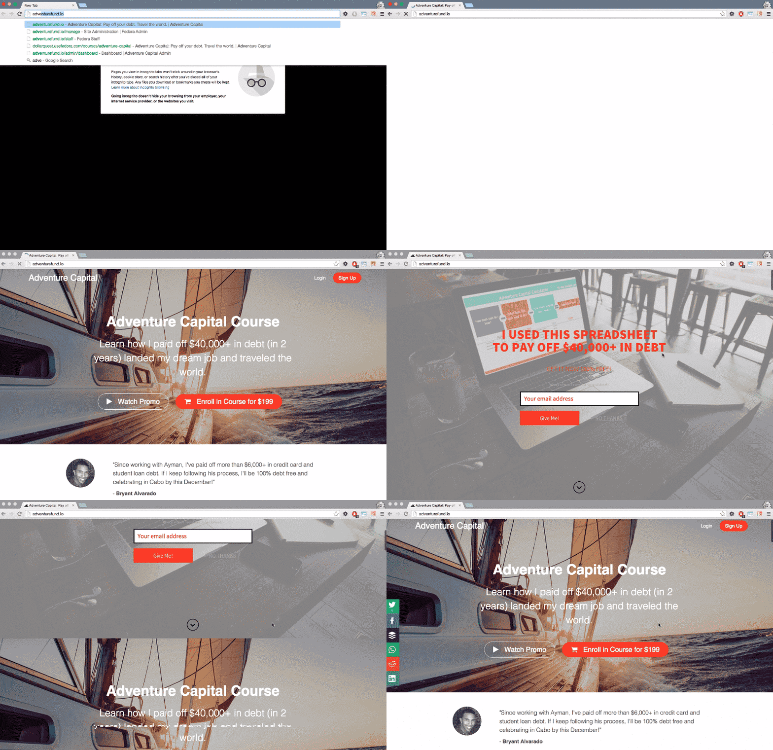
Research and experience have told me that having minimal design on the homepage can increase signups, and the Welcome Mat is the best way to quickly create a minimal landing page.
The only question was could the Welcome Mat outperform our existing homepage setup?
In this post, I’m going to walk you through exactly how we set up our test as if it were a scientific experiment.
And not to spoil anything, but I believe the results will show you it’s worth testing out Welcome Mat on your own homepage as well.
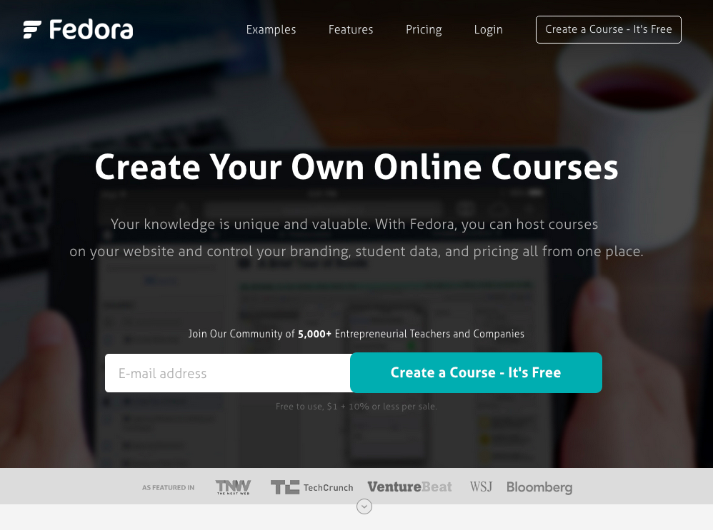
Background
Why We Wanted to Test the Welcome Mat
About 2 years ago, my friend Mattan Griffel explained how a minimally designed homepage performed better than the typical link-jumbled homepages you’re used to seeing.
The minimal homepage proposes that you can increase your signups by keeping your homepage stupidly simple.
Check out the homepages that come from the growth teams at companies like LinkedIn, Spotify, DropBox and Pinterest:
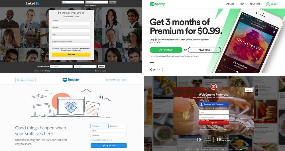
Notice how each of these homepages has almost no information outside of a clear value proposition, some social proof, and a call to action?
This minimal design works NOT because these are well-known startups. Most of them STARTED with this approach and kept it because it worked.
To date, I’ve consulted on and seen hundreds of A/B tests that confirm a minimal homepage improves signups. By keeping your homepage minimal you:
- Reduce cognitive overload so visitors don’t get confused.
- Focus your audience on a single, clear value proposition.
- Are able to test what actually converts a particular source of users.
The Sumo team agreed that minimal landing pages were perfect for increasing signups, and they created Welcome Mat to make it as easy as possible for anyone to build their own. Before, you would have to do it yourself, like Andrew Warner (founder of Mixergy) did:

But now we could try it out on our site in less than a minute.
What We Were Doing at Fedora
Our startup is a B2B/B2C hybrid. While we’ve tried to keep our homepage minimal, it’s also optimized to help users evaluate our product, and for SEO.
When first arriving, we’ve found many customers demand information. They want an answer to what our pricing and features are. They also want to see examples of how others have used us.
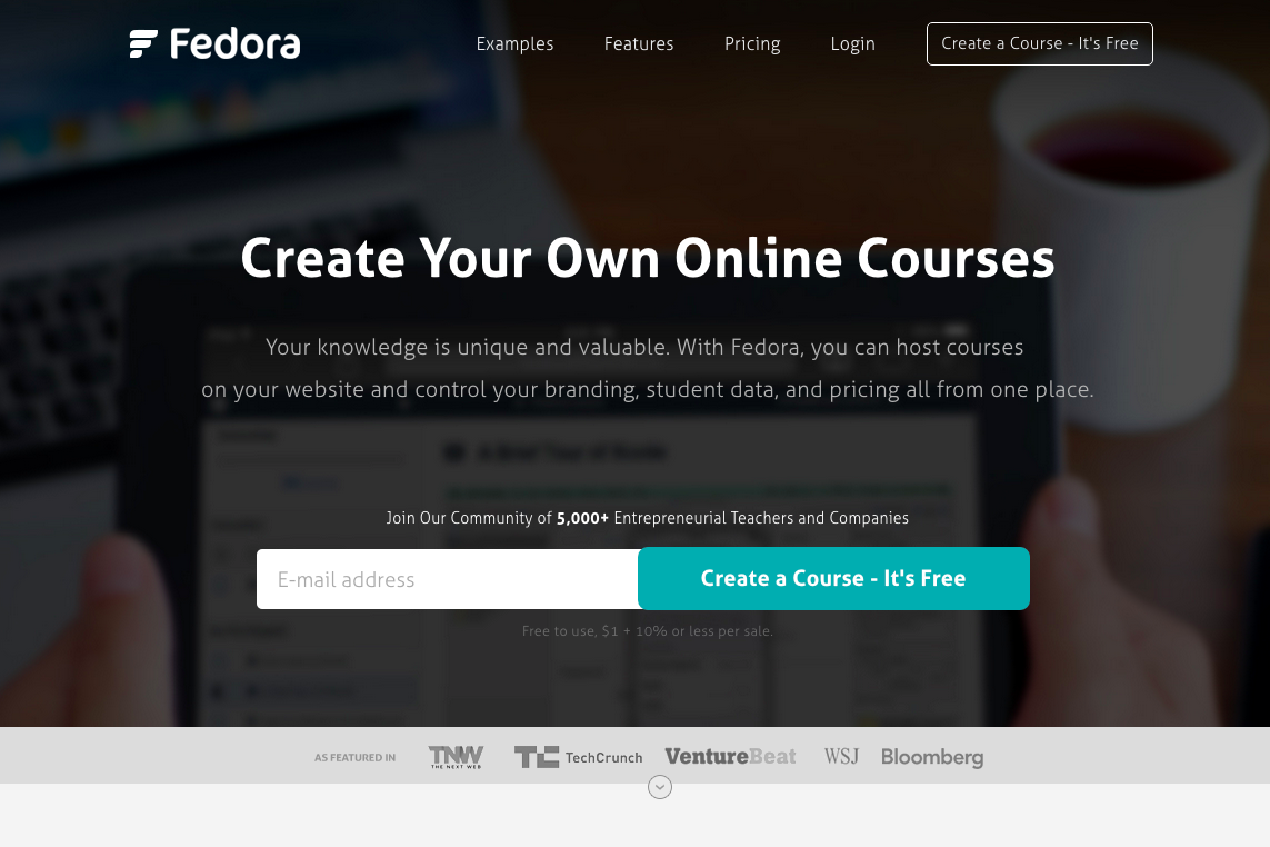
While we have tried to be minimal, maybe the Welcome Mat would help us push our boundaries? And hey, worse case scenario we could cut it after 24 hours.
Structuring the Experiment
Before getting started, we needed a hypothesis to test our results against. We hypothesized that implementing the Welcome Mat would improve our Quick-Start Webinar signups by 25%.
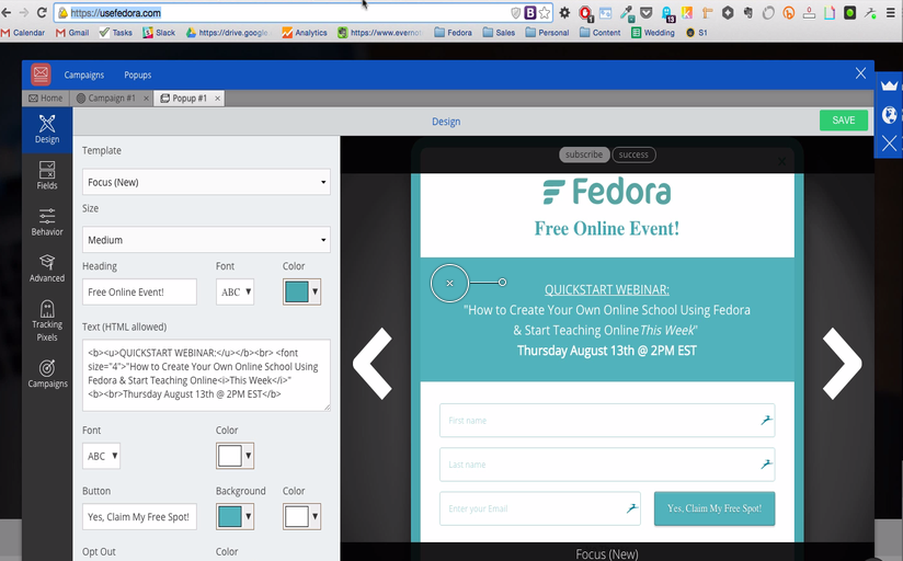
Most of our webinar signups in the past came through a Sumo List Builder pop up that’s set to trigger after 5 seconds on any page that’s linked to our homepage:
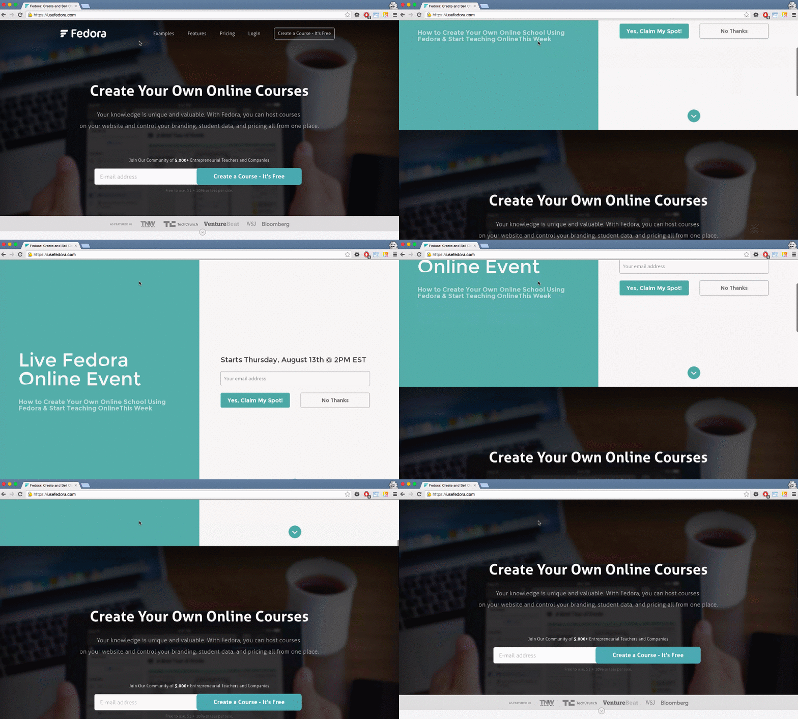
For the test, we used the design and wording from our popup, but applied it to this Welcome Mat that appeared when anyone first arrived:
To run the test, I didn’t want to take up resources from the technical team who would have had to build a custom A/B testing setup. Instead, we patched together a mixture of Optimizely, Sumo and MixPanel to measure the results. Each of these products is free to use at a small scale.
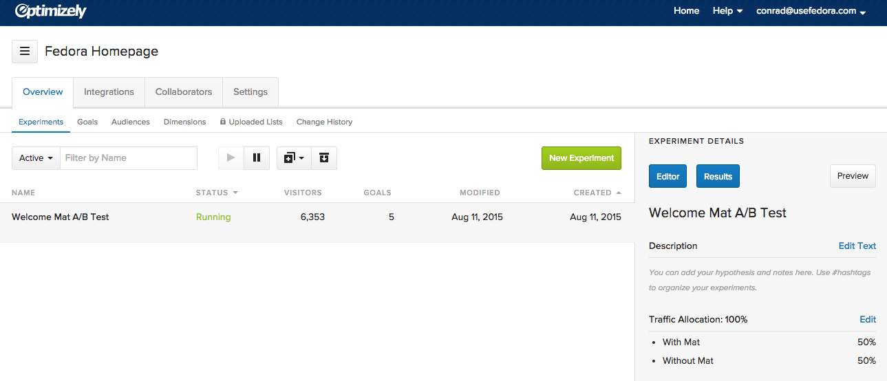
We used Optimizely to split our traffic between the version of the site with the Welcome Mat, and the version without.
Once the Optimizely snippet was on our homepage, we put one snippet of Sumo on the A test, and another snippet on the B test. This is how the implementation looked in Optimizely:
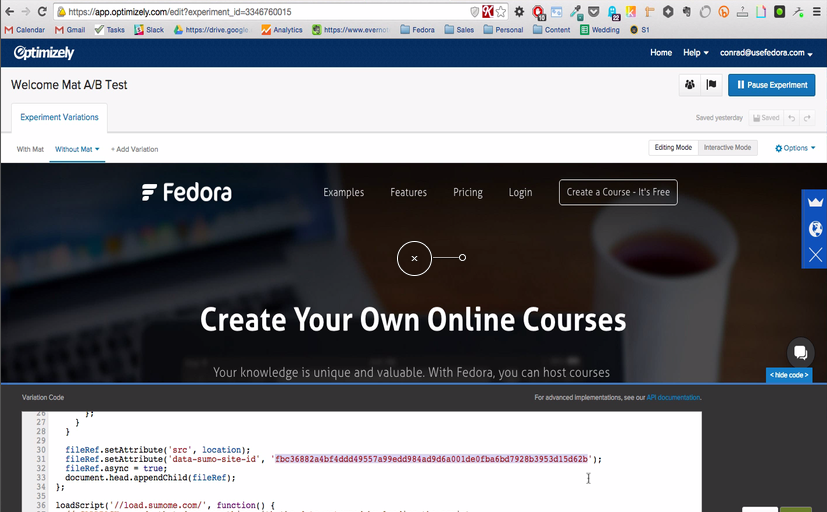
Doing this required using two separate Sumo accounts, but since we had a free 14-day trial on the second account, this came at no cost.
Given we wanted to continue to track how users convert beyond the sign up, we went with using MixPanel to measure the signups.
What’s great is MixPanel has an easy Optimizely integration which automatically creates a super property to tag users who’d signed up for the the A test and the B test.
Here’s how it looks in MixPanel:
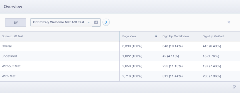
Once I had the MixPanel signups, I’d then login to both Sumo accounts and pull the total for the day. The screen I’d see looked like this for the Welcome Mat version:
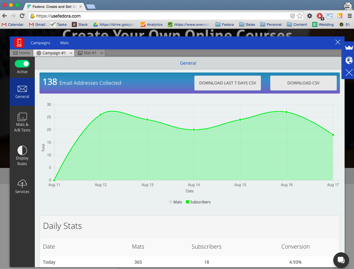
I then manually totalled each of these in a Google spreadsheet and used an A/B testing calculator to check statistical significance and verify that we could truly say there was a winner.
Experiment Results
After 5 days, our Welcome Mat version got 70% more webinar sign ups than the version without the Welcome Mat.
But not only did we get more webinar signups, we also didn’t lose any Fedora signups after people had seen the Welcome Mat.
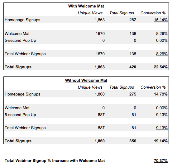
The two numbers to pay attention to are the number of Unique Views on the call to action with (1670) and without (887) the Welcome Mat.
What appears to be happening is that we had a lot more people (almost double) see the Welcome Mat than the pop up over a similar period of time with a similar conversion rate.
So even if the Welcome Mat didn’t necessarily convert higher, it still resulted in more signups because more people were seeing it.
If you’re interested in learning more about some details on the process, I discussed those in the post which ran live here.
Why We Think Welcome Mat Worked So Well
With a 70% increase in our target, here are a few reasons we believe on the Welcome Mat performed so well for us:
- It applies the minimal homepage concept of keeping the value proposition clear to focus attention, while giving the user control.
- The webinar offer and copy were already well-tested with the existing pop up. Sometimes you need to run quite a few tests to get it to work, and for the minimal time invested, I’m surprised the first test performed so well.
- There’s potential for a novelty effect. Because the Welcome Mat is new and different, we’re able to capture a first-time user’s attention.
Next Steps
What I love about the Welcome Mat is that even if you’re resistant to the idea, it gives you the best of both worlds.
You get the effect of increased signups from the minimal homepage, but you can still add more information on your regular homepage after it. You’re not forcing anyone to signup, you’re just making it easier to do so.
Now that we know the Welcome Mat works, we’ve brainstormed a few ideas to improve our results:
- Run A/B Tests with two Welcome Mats – There are a ton more experiments we can do with different designs and calls to action, and within Sumo, we’re able to easily run future A/B tests of different Welcome Mats against each other.
- Add an exit intent pop up – Having a 5-second delay pop up instead of an exit intent popup for the Welcome Mat was a mistake. Including a pop up that would show upon exit intent is likely to measurably improve webinar signups.
But more importantly, now that you know Welcome Mat works, it’s time to take action.
I want you to go plug a Welcome Mat into your site and see how much it increases your own signups, and then I want to help you turn those signups into $$$ in the bank.
SPECIAL OFFER: Expires Tuesday, September 1st 1:00PM ET
In the past 3 years, I’ve gone from doing growth consulting to co-founding Fedora, GrowHack and founding the User Growth Bootcamp. I’ve learned a ton about growth that’s helped our startup get to more than half a million users in the past year.
While I don’t do consulting anymore, I have come up with a course built to help you start or grow your business.
The course is called Profitable Course Idea and it takes you from zero to your first online presale. It works for almost anything–whether it’s a course, SaaS or even physical product.
In it, I take you through three phases:
- Creating great content for your target audience.
- Using that content to grow your email list.
- Creating and monetizing a new product to this list.
Using this system I’ve helped a number of students get their first 1,000 subscribers. One student made almost $7,000 pre-selling her first online product before it was even created.
To help you do the same, I’ve put together a special VIP version of the course for new and old Welcome Mat Pro users available until Tuesday, September 1st 1:00PM ET.
When you join the VIP course, you’ll get:
- Full access to all of the lessons
- Email support (from yours truly) during the lessons
- AND I’ll invite you to a special coaching session on Sept. 1st where I’ll run through your most popular questions around growing your product.
Normally, VIP costs $199 and doesn’t come with a workshop… but you’ll get this VIP Course for FREE as a perk for being (or becoming) a Welcome Mat Pro user.
Here’s how to get the VIP course:
- %(productlink:welcome-mat-pro:[Click here]) to sign up for a free trial of Welcome Mat Pro (if you aren’t already a Pro user).
- Forward your Welcome Mat Pro receipt to nat@sumo.com
- Nat will send you a VIP link, and I’ll welcome you in!
BUT you have to do this before September 1st at 1:00pm ET.
Looking forward to seeing you there :).
Conrad
Add A Comment
VIEW THE COMMENTS