You know what my #1 worry was when I started my blog?
It wasn’t what I was going to write about. It wasn’t even if people would read my stuff (I had a whopping 87 Twitter followers and an email list of 7).
I was worried about what my blog would look like.
Obviously I should’ve worried about the first two things — especially since 4 of the 7 emails in my list were fake addresses.
But I didn’t. Before I wrote my first word, I sat there for days trying to choose the right blog template.

Me after 12 hours of looking
It’s a big decision isn’t it? The theme you choose will be how your blog looks for the rest of time. It’s the storefront for your ideas. And you want your storefront to look more like the Apple store than a JC Penney.
So there you go, tearing through page after page on ThemeForest, trying to find the perfect theme that’s cool and edgy, yet professional and casual all at the same time.
But how do you pick the right one? Sort by newest so you get a blog unlike any other? By most popular so you get a tried-and-true theme? By price because $60 IS JUST TOO MUCH FOR A TEMPLATE?!
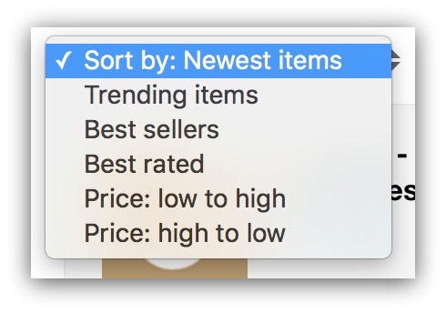
Can you feel the pressure?
Here’s the funny thing. None of those choices are the right choice.
Forget Best Sellers And Parallax Bulls**t. Here’s What Really Matters With Blog Templates
Best sellers, trending items, newest items…don’t pay attention to those. They’re ok as a starting point, but you shouldn’t choose your blog template based on factors that have nothing to do with the usability of your potential blog.
If I could only create one category for blog templates, it’d be this…
Scroll rate.
That’s the one stat that matters most when you buy a blog template out of the box. Yet no one shows you that stat.
It’s a bigger deal than you think. Scroll rate basically means how much of your page people see.
Think of it this way. Let’s say this is your blog homepage:

It’s an entire page full of your stories. Easily accessible, looking fresh, the whole shebang.
But imagine your visitors only saw this much of your homepage:

For the record, that’s 12% of your homepage. If you were using this template, that means your visitors would see three of your nine articles.
That’s what happens when visitors don’t scroll on your homepage.
It essentially means those other articles don’t exist. It’s kind of hard to read something when you don’t even know it’s there.
The fact is, your blog posts can be doomed to non-existence before you ever write them. And it’s all because no one told you how far down visitors would scroll on that page.
*Thankfully, you’ve got me and my nerdy shut-in habits to help you out. *
Here’s the deal. Thousands of blogs use Content Analytics to see how far down the page their readers get. If you don’t know, Content Analytics looks like this:
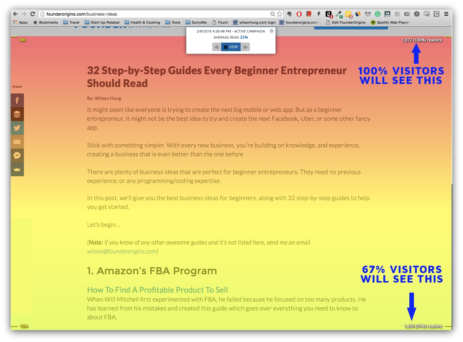
The warmer the color, the more visitors on that part of the page.
So I burned the midnight oil many nights in a row and did something…weird.
I isolated the top blogs — we’re talking the ones with 1,000,000+ readers — and analyzed their blog layouts to see what the absolute most scrollable blog template was.
Bad news first: there is no perfect, super scrollable template. Otherwise we’d all be using it and I’d be tanning my horribly pale Minnesotan skin instead of writing this article.
Now the inevitable good news: I found 10 elements that keep people scrolling down a blog homepage.
You won’t have all 10 on your blog right now. You probably won’t even have five.
But if you can slowly implement these into your homepage design, little by little you’ll turn your page into something people can’t help but scroll through.
Because the alternative….well….
%(6)
You get the idea. No one wants their content to die just because of a bad blog layout.
These 10 elements fall into one of two categories: above the fold and below the fold.
- Above the Fold: Everything you see on your screen when you first visit a web page.
- Below the Fold: Everything beneath that.
Designers place a lot of emphasis on the above the fold section — it’s the first impression of your site, and it usually collects purchases and keeps people moving.
While that’s important, the below the fold needs some lovin’, too. That’s what keeps people scrolling — meaning more of your articles being seen, read and shared to the masses.
Both are important, which is why I give five tips for each of the two categories.
But even more important is what I did with those tips. I spent 12 hours digging around the internet for 10 ready-made blog templates that follow all the science-backed best practices in this guide.
See the 10 blog templates you can buy right now for maximum scrollability.
Let’s get it.
5 Above The Fold Blog Strategies For Longer Visits
Strategy #1: Small Menu + Hero Image = Absolutely Yes
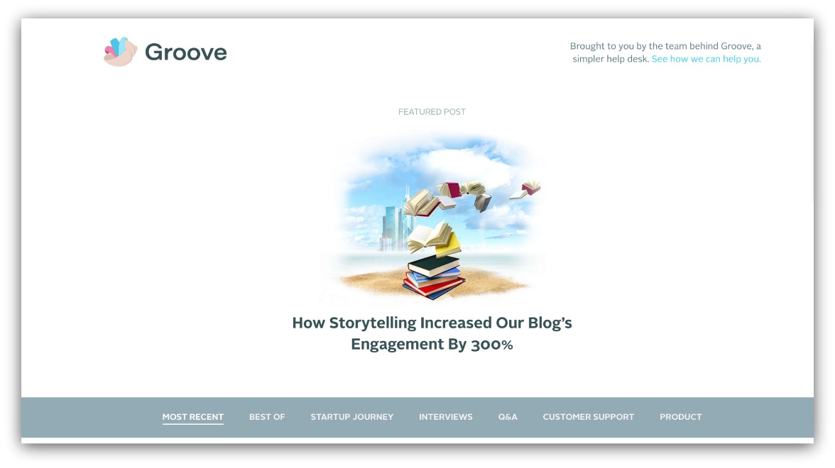
Example of a menu + hero layout on Groove
Of all the first folds I analyzed, this is consistently the most successful style I found.
There’s just so much to like about it:
-
Places Emphasis On One Article: You get to shine the spotlight on one article, every time. It can be your most recent article, an old fan favorite or one that drives opt-ins if you’re behind in monthly goals (NOTE: The 5th point on this list will show why this is preferred).
-
Promotes Additional Scroll: Inherently, visitors know there isn’t just one article on a homepage. By keeping additional stories below the fold, you guide your visitor to scroll more.
-
Gives Opportunity For Personalization: The menu is key, because you immediately give the opportunity to only see certain types of articles. That way visitors aren’t frustrated digging through endless articles trying to find what they want.
-
Simple: There isn’t a lot of choice. You either click the article, go to a category or scroll down. Choice paralysis doesn’t set in with dozens of options in the first fold.
Check out this example from A Sweet Pea Chef:
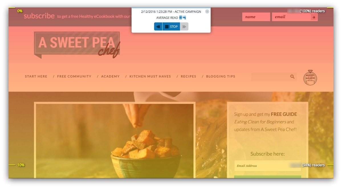
94% of readers get to the bottom of the fold (read: screen). To give you perspective, the average first fold of successful blogs only retained 81% of readers.
Here’s an even crazier stat. If I exclude blogs with a hero/menu style, the average retention rate on above the fold is 72% of readers.
That’s just an unnecessary drop off, and it all has to do with how the blog is laid out.
A Sweet Pea Chef has a perfect, textbook above the fold layout. There’s a category menu, their first image/article and a spot to opt-into the blog. Nothing crazy complex, and it keeps people engaged enough to keep scrolling.
Takeaway: For a higher scroll chance, use the menu/hero style above the fold.
Strategy #2: No Article, No Problem…Just Have A Purpose
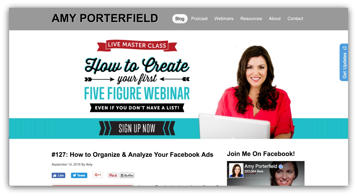
You’d think putting anything except blog content above the fold would kill your scroll rate, right?
HA! You know a rhetorical question when you see one.
The funny thing is, it really doesn’t hurt your scroll rate. But there’s a caveat to that: It doesn’t hurt your scroll rates if you have a clear purpose for that space.
If anything, it supplements your site. If you can accomplish a goal before the scroll, you’re gaining added value from your blog.
Here’s why it doesn’t hurt. Visitors know they’re visiting a blog. When they see the immediate opt-in ask, then know there’s blog content below the fold. So they’ll do one of two things:
- Opt-in
- Scroll down
Very rarely will they see your opt-in ask and furiously leave the page.
Vanessa Van Edwards shows exactly how this works to a T in her blog The Science of People:
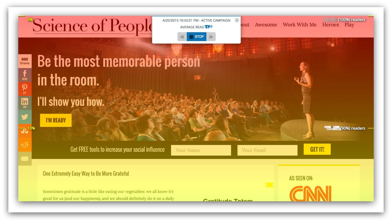
She uses the menu/hero image layout as well, but you see the main goal is to opt-in to her email list. And very few people drop off the page because of it.
The thing that stands out with her layout is you see the first blog post stick up above the fold. That’s a subtle but powerful design choice. It gives the reader instant validation that blog posts are only a scroll away.
Takeaway: Your above the fold section can feature something not blog-related as long as it has a purpose.
Strategy #3: A Page Without Purpose Is A Disaster
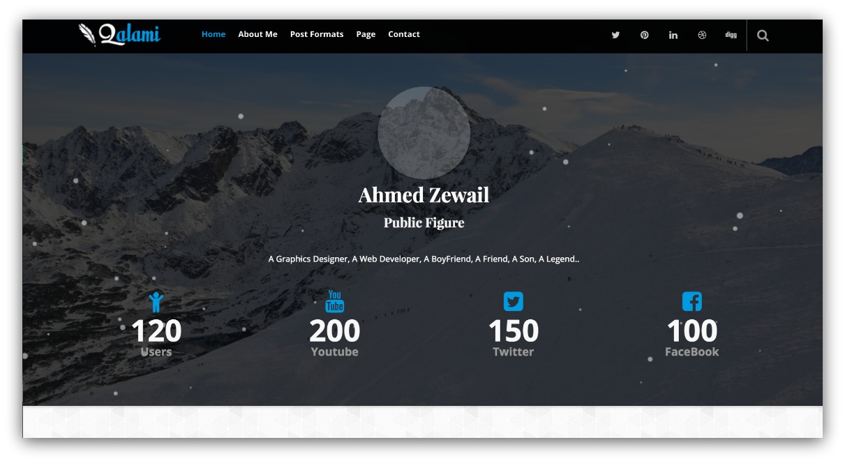
Those buttons click to nothing…
The very best, most effective blogs give people a reason to scroll or act. The blogs that saw the most visitors leave before even scrolling at all relied too much on one of three things:
-
Social Proof: Dedicating an entire above the fold to social proof leads to fewer people scrolling down your blog’s homepage.
-
Logos: Ever seen this video? Logos are great, but not when they take up a significant amount of the above the fold area.
-
Too Much Navigation: Choice paralysis rears its ugly head again. Too much choice (for example, links) overwhelm your visitor — meaning they ultimately take no action.
This happened on one of my favorite blogs (name redacted). The content is great (I can thank them for many a meal in my freezer). They have a lot of readers, too.
The only issue is visitors don’t get to the main content:
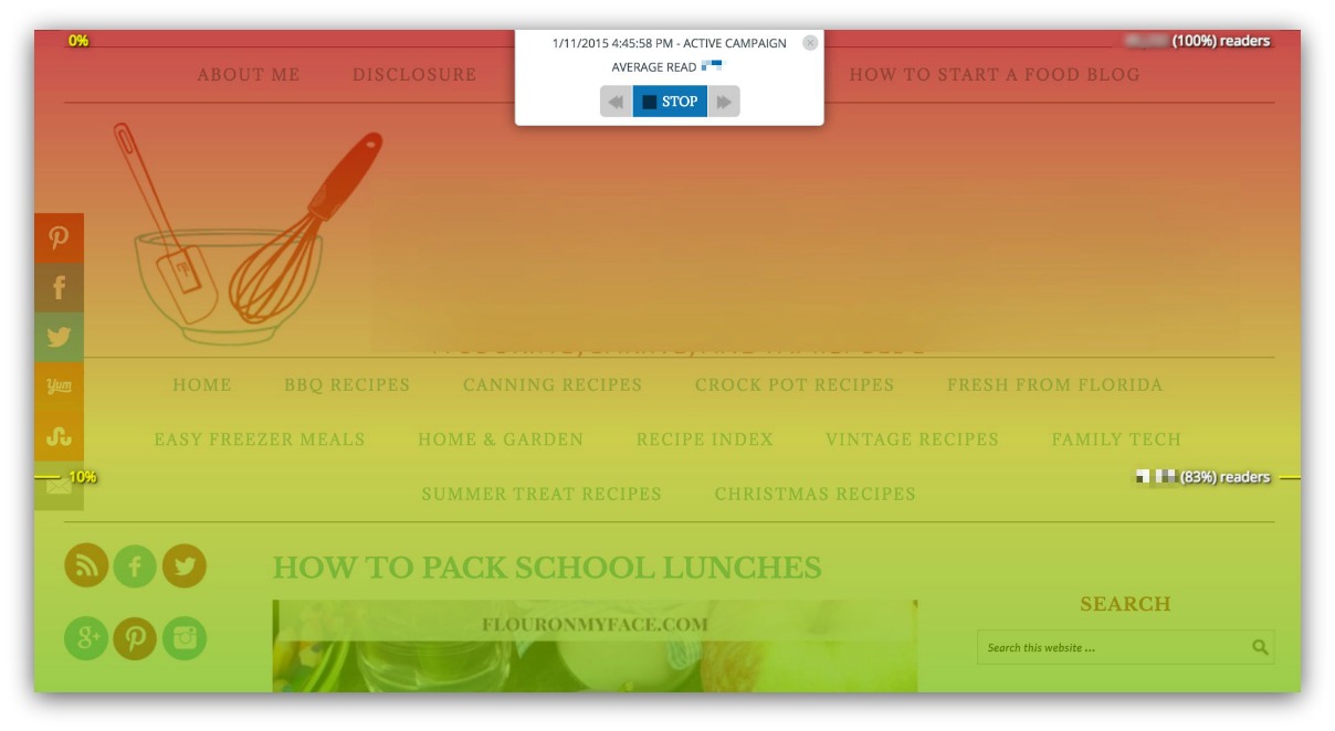
See where the red fades to green? That means visitors leave the site around that area. Any idea why?
It’s because the logo and category links take up a lot of space.
A simple fix for this? Shrink the logo down, put the categories in a drop down menu, and push the article up above the fold. Since the logo doesn’t link anywhere, it’d be easy to give it less visual prominence.
The category links are important but, again, they can be redesigned to save space (like one of those tiny houses). Those two changes would make the articles the main focus again, which would increase scroll rates.
Takeaway: If your above the fold isn’t an article, make sure it has a clear, actionable purpose.
Strategy #4: Sliders Are Risky
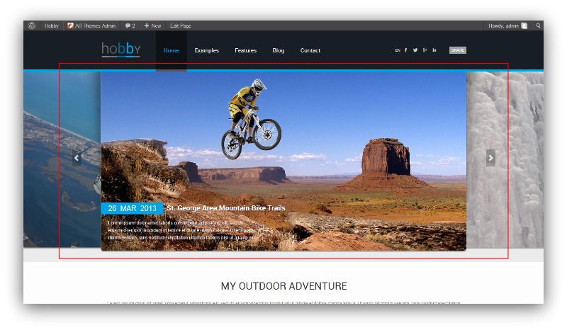
Hold on. I have to clear my throat before I yell this through the internet.
DO NOT USE SLIDERS ABOVE THE FOLD.
Almost lost my voice there. I’ll yell that all day, every day, 24/7 if I have to. Using a slider on your blog’s homepage is a clear way to set yourself up to fail.
When I say slider, I’m talking about a feature on your page that cycles through your articles. They’re built into almost every blog template you can buy.
Yes, even though data proves they shouldn’t be.
Take it from the University of Notre Dame. Out of the 3.7 million visits official website pulled in during a six-month period, only 1% of people clicked on ANY of their slider images.
Plus, my own research found this…
On blogs that had sliders above the fold, only an average of 69% of visitors stayed on the page.
“But Sean, they’re leaving the page because they’re clicking on my article. That’s the point, isn’t it?”
Wrong. A few people might click on your slider, but the vast majority leave because the slider isn’t loading, they’re experiencing banner blindness, it’s being blocked by a pop-up blocker or they just don’t like your slider.
Because really, who likes sliders?
So not only is the slider not clicked, it’s also hurting your site other ways:
-
It’s Probably Not Mobile Friendly: Some sliders aren’t optimized for mobile, meaning your cool slider will look like a scrunched-up image blur (if it even shows up at all).
-
Uh Oh, SEO…: Big sliders can mess with loading times, leading to a big dip in where your page ranks on search engines.
Using a slider is just begging to have the odds stacked against you. Don’t do that to yourself, ok?
Takeaway: Don’t use sliders. Just…don't.
Strategy #5: More Doesn’t Mean Better
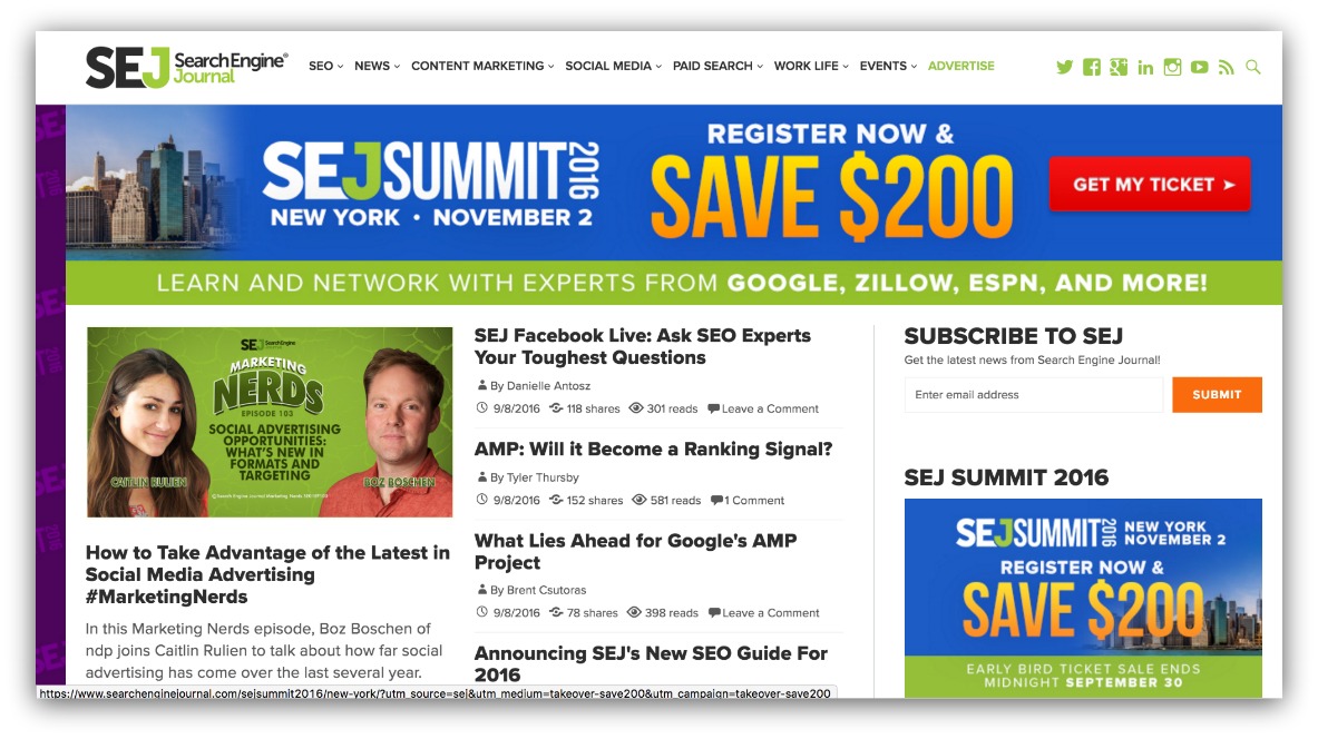
Admittedly, this is the more polarizing topic of this guide. But we’re talking about how to get visitors to stick around and see more of your site, and this isn’t one way to do that.
When you stuff every article you’ve ever written above the fold, my research shows you will see fewer people move below the fold.
Two reasons for that — one good, one bad.
Let’s start with the good. The good news is fewer visitors scroll past your calls to action because they actually click them above the fold. With all those articles, they don’t need to scroll.
But that’s also the bad news — a double-edged, blog-wielding sword. With all that choice, visitors can assume those articles are the only or best choices on your page, which causes them to leave the page entirely.
Prime example of this is from a blog that focuses on Apple products (and how to use them).
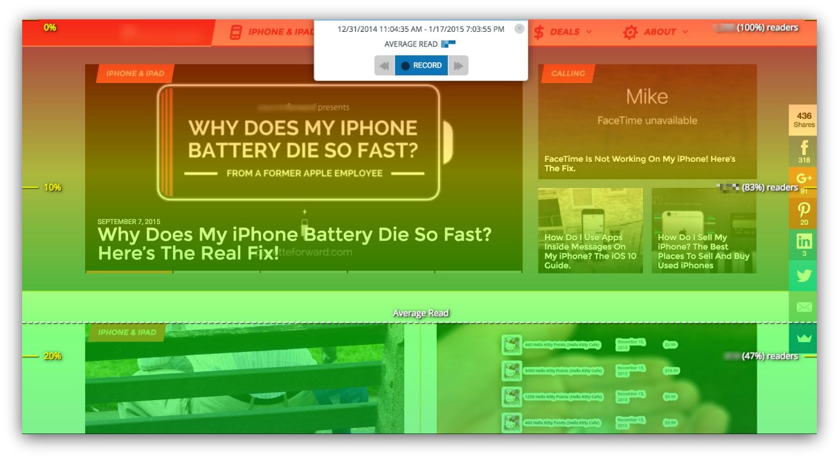
Right now, half their readers drop off above the fold. There are dozens of articles below the fold, but half the visitors will never see them.
This blog has a ton of traffic with people checking the site daily. Because of that frequency, most people are only looking for the newest articles — aka the above the fold stuff.
HOWEVER, you are most likely not this blog.
Many other blogs I analyzed had this kind of drop off rate but the clicks were just as low, too. I only showed you this blog as an example because I’m not going to put an unsuccessful site on blast (and this particular blog is is crazy successful).
So just remember that “more is better” isn’t always true. More can (and most times does) mean too much — making people bounce faster than a Super Ball shot out of a cannon.
Takeaway: Don’t overload your visitors with too much choice.
5 Below The Fold Blog Strategies For Longer Visits
Here we are. Below the fold. It sounds shady, doesn’t it?
If you’ve done everything right above the fold, then you can worry about what people do below the fold.
Because that’s as far as design can take you. After the first two folds (above and below), your content is what keeps people scrolling/wanting more/drooling on their keyboards.
And these five below the fold design tips, when paired with the above the fold tips, will keep people scrolling FOR-EV-ER.
Shoutout to The Sandlot
Strategy #6: Embrace The Rows
Anyone else see that title and think of Creed singing “With arms wide ooopeennnn?”
Just me? Alright.
Either way, my arms are wide open, 100% ready to embrace this layout style as the new default below the fold.
Why? Because my research shows it consistently works better than any other (standard) layout right now.
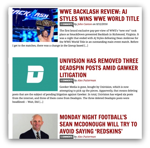
Currently, there are three very common types of layouts for blogs (below the fold).
First is the big headline, big image and big description variety:

Normally, the headline and image take up the entire fold.
Then, there’s the multiple images per fold with headlines underneath:
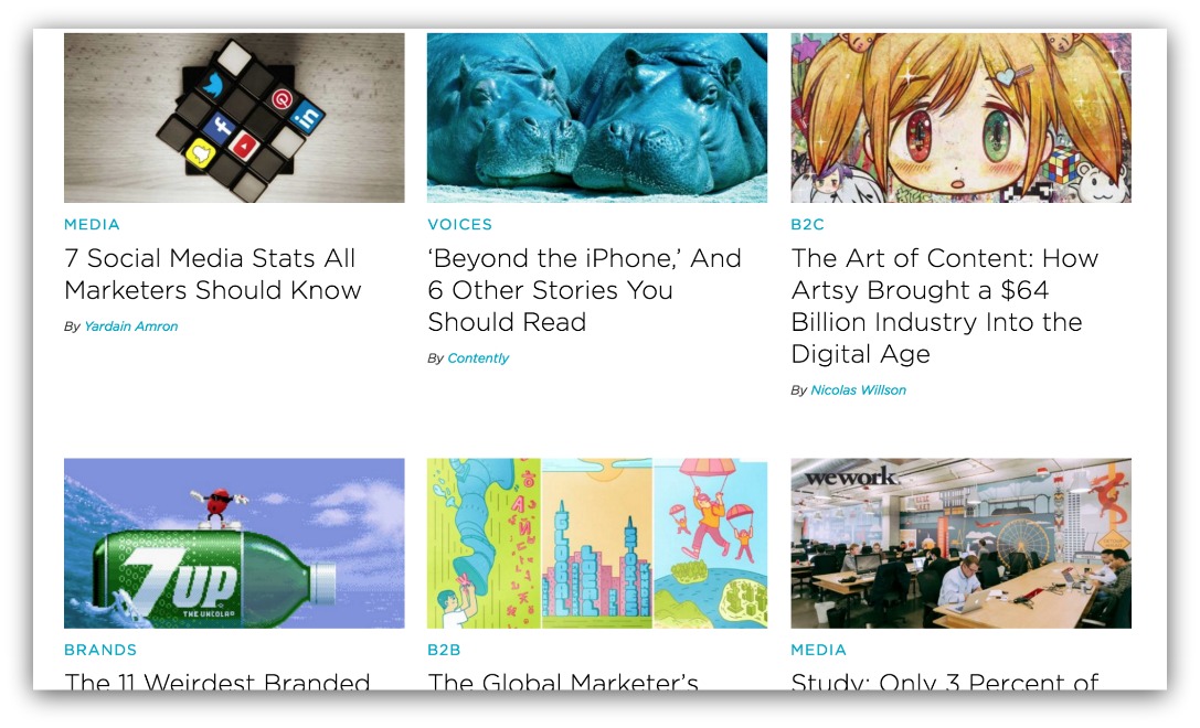
These layouts have multiple articles displayed, generally accompanied by a headline below or on the image.
Then there’s the concise row layout:

You’ll usually see 2-3 stories per fold, with an image aligned one way and the title/description aligned opposite.
Almost every blog you can buy abides by one of these three layouts. And it’s the last one — the row-style — that keeps visitors scrolling longer.
Here’s the key to looking at Content Analytics on a blog layout. The best-case scenario is 100% of visitors get to the bottom of your page.
THAT is a hilarious pipe dream. So the next best thing you want is a slow drop off of visitors as they scroll through your site.
Abrupt changes in color = bad news. That means visitors are leaving your page with more urgency than people abandoning the Titanic (too soon?).
You want slow, gradual changes in colors. That means visitors are staying on your page, scrolling consistently.
And the most consistent layout for scrolling is the row layout.
Look at all these below the fold layouts that use the row style:
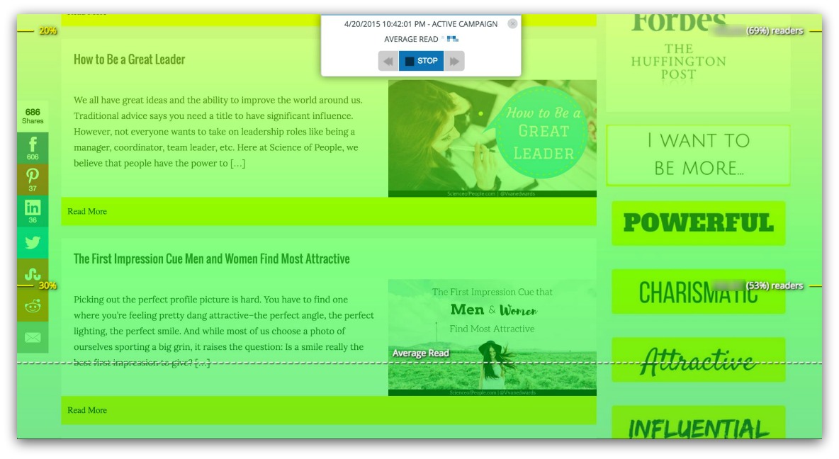
Here’s the Science of People again keeping visitors on the page, scrolling down to the next fold.
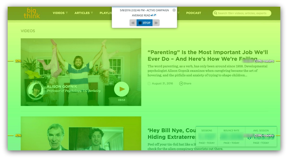
And here’s Big Think with a great example (only 8% of visitors leave in this fold!). Their row layout it a bit bigger, but you can still clearly see two articles in the fold.
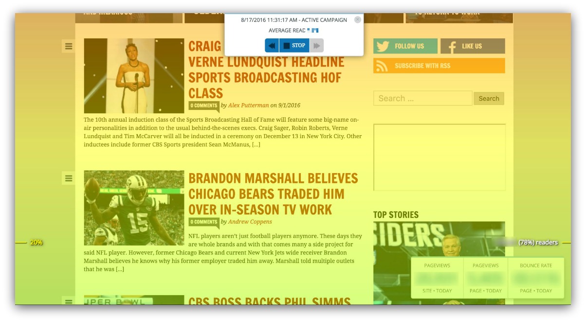
And here’s Awful Announcing keeping people on the page, too.
There’s something about this type of layout that works. And it boils down to two factors:
-
You Don’t Overwhelm with Choice: Rows seem to fall in line with scrolling habits. Each scroll brings one new article into view. The eye doesn’t have to track anything unfamiliar, which makes it easy to scroll farther.
-
The Information Is Easy to Digest: Everything is close together and in context. You don’t have to scroll down past a title and image to see a description. It’s compact and easy to reference as a whole.
Takeaway: Of the three most common blog layouts, you’ll be at an advantage if you select a template with rows.
Strategy #7: If You Have One Story Per Fold It Better Be The Best D**m Headline And Image Ever
It’s not that row-based templates are inherently the greatest thing to grace a website. It’s also a mix of other templates just not working well.
I found that the toughest layout for scrolling was the large headline, image and description template.
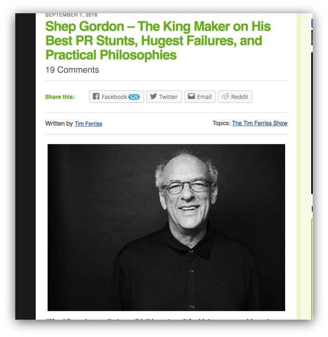
God bless Tim Ferriss for creating killer content and being a great writer, because this is statistically the hardest style to pull off.
Here’s why: all the visitor sees is the headline and image. That means they’re judging your article based on a few words and a picture.
And mom always told you not to judge a book by it’s cover.
So the headline and image better be the best damn headline and image known to mankind to keep you scrolling.
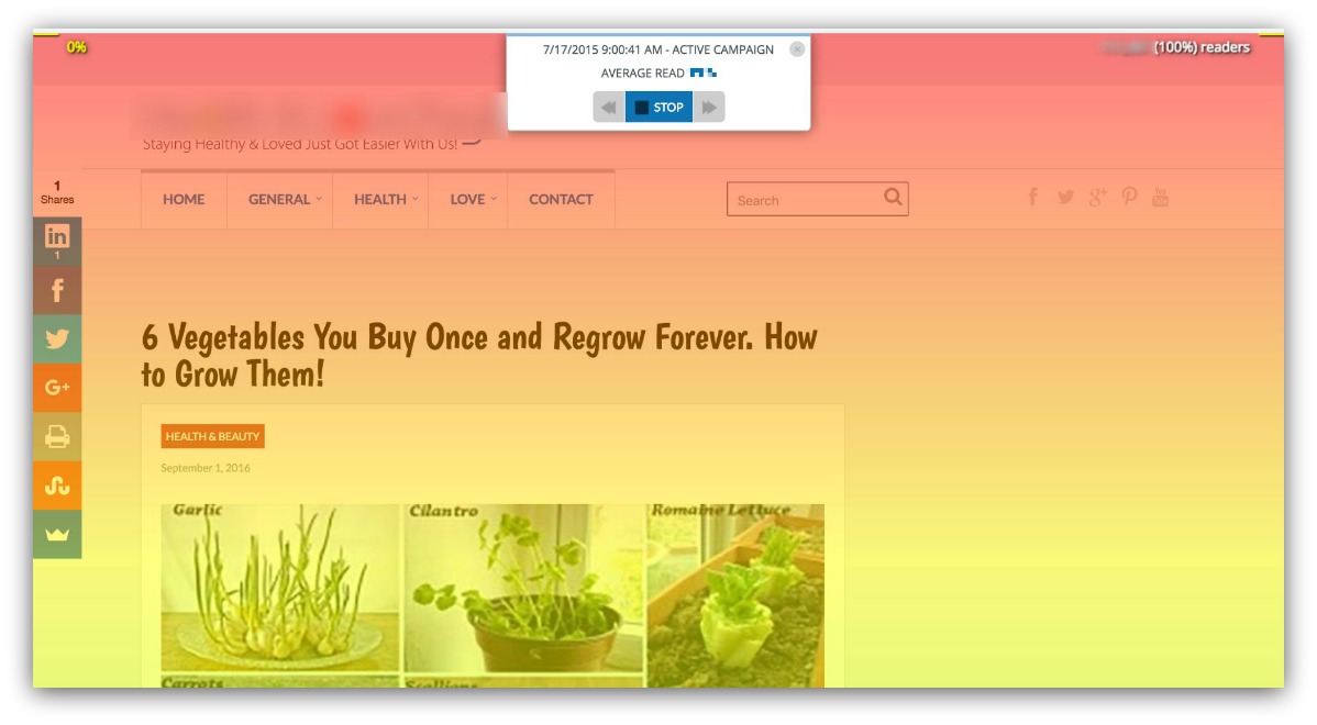
Here’s an example from a great food blog. Again, another successful site because of the quality articles they write.
And this article is no exception. But even with a great headline and captivating image, 26% of visitors drop off the page before they ever see the second article.
Some blogs I reviewed had drop-off rates of up to 56% in a single fold. And it’s because they suffered from generic headlines and images.
Facts are facts. If a bad headline and image take up the entire screen, people won’t want to keep scrolling.
Takeaway: If you have this layout, spend extra time crafting a killer headline and image. Check out this headline generator and this guide on 49 types of headlines for ideas.
Strategy #8: Pinterest For Blogs
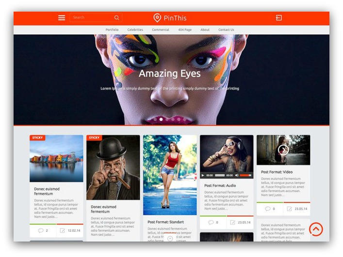
Outside the three common below the fold layouts, there’s a new style that’s slowly dominating the blog game.
And, not surprisingly, t’s straight-up ripped off from Pinterest.
“Steal like an artist” is the technical term, I think.
But when we’re talking about scrolling, Pinterest is up there with Twitter and Facebook because of infinite scrolling.
Now, you most likely don’t have enough content for infinite scrolling. Here’s the thing — you only need enough for a couple folds-length.
And if you have a decent amount of content, jump on this hot design trend:
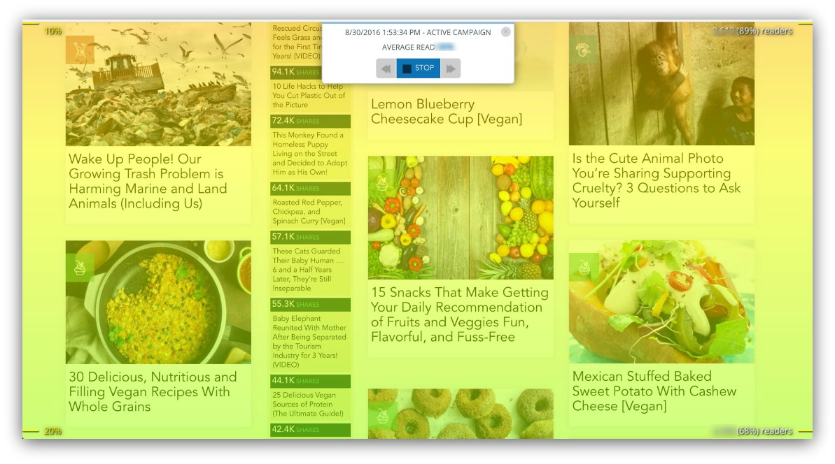
Here’s One Green Planet using the Pinterest-style below the fold to strike a balance between getting clicks and keeping readers scrolling.
The most interesting thing about this discovery is how it directly contradicts an above the fold rule we covered — more doesn’t mean better.
Above the fold, the more choices you gave the less likely a visitor would continue scrolling. However, below the fold (with this layout) is a different story.
One Green Planet has 13 stories in this fold. Normally, that would lead to some serious choice paralysis. But here’s why it works:
People are used to Pinterest.
There are over 100 million active users on Pinterest. Every one of those users is used to scrolling endlessly for that perfect thing to put on a wall.
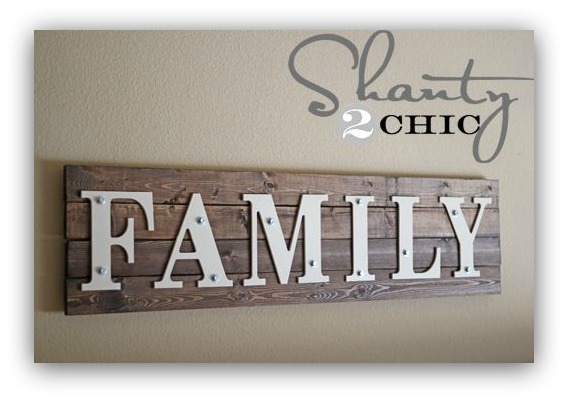
9/10 times it’s this
So One Green Planet (and many other blogs) took a page from that playbook and designed their below the fold to match Pinterest.
And the results are clear. Although there are more choices, visitors don’t leave the page as frequently.
Takeaway: Pinterest-style layouts below the fold let you show more articles without people dropping off.
Strategy #9: Keep Your Layout Consistent
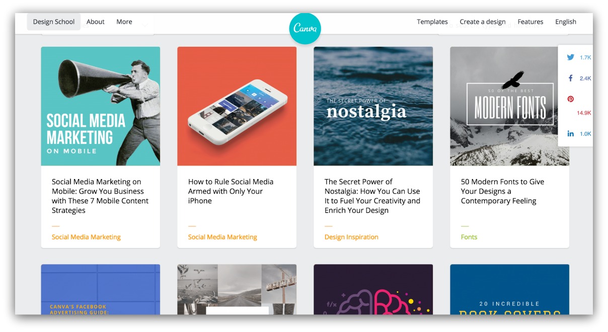
Consistency is key. Just ask my scale after I break down on a weekend taco binge.
Below the fold, consistency is what keeps your visitors scrolling. The same layout, repeated over and over makes it easy for your readers to scan and scroll.
Disrupt that layout and you create a completely different viewing experience. Ever walk through your long-time grocery store and one day they change up the aisles?
It’s confusing and you get more frustrated than curious.
Look what happens when a blog changes up their layout below the fold:
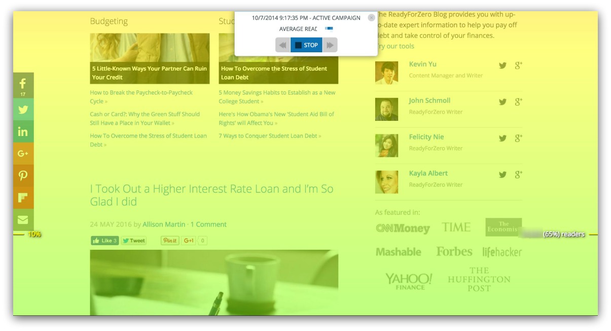
The color change is abrupt (orange to green), which is essentially a 30%+ loss in visitors.
But look what happens when you keep your layout consistent:
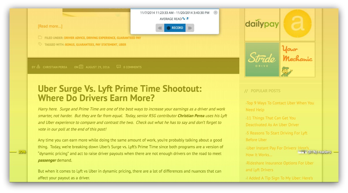
Look at how little drop-off there is (less than 15%). This is The Rideshare Guy’s blog keeping visitors scrolling through the page. He doesn’t go with the row strategy, but that’s because he’s consistent with his layout and his headlines are great.
There are so many new templates flooding the marketplace with crazy designs and funky layouts (I know, I sound like an old man). But it’s the ones that stay consistent that perform best.
Takeaway: Stay consistent below the fold.
Strategy #10: Have A Description, But Be Brief
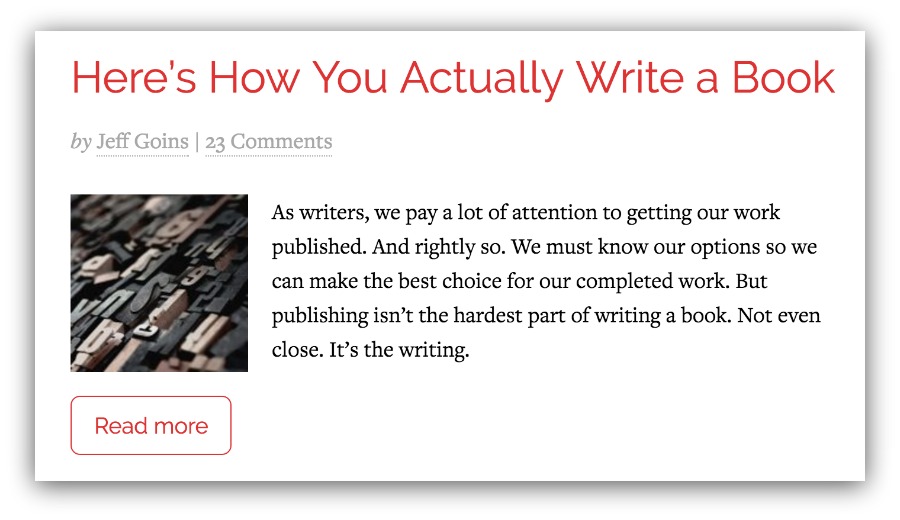
Article descriptions might be the most overlooked part of a blog layout.
But it’s the one aspect that can control your entire layout.
Within a blog, there are four types of descriptions. None:
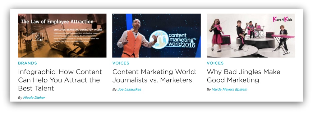
Short:
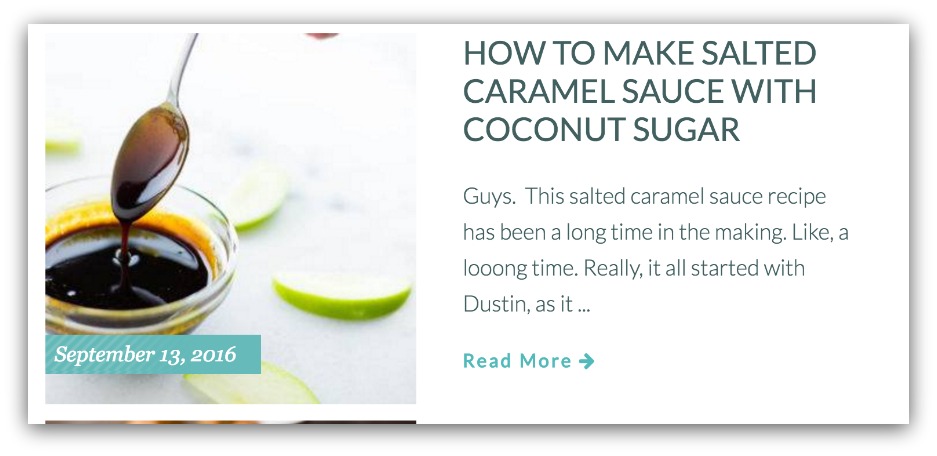
Medium:
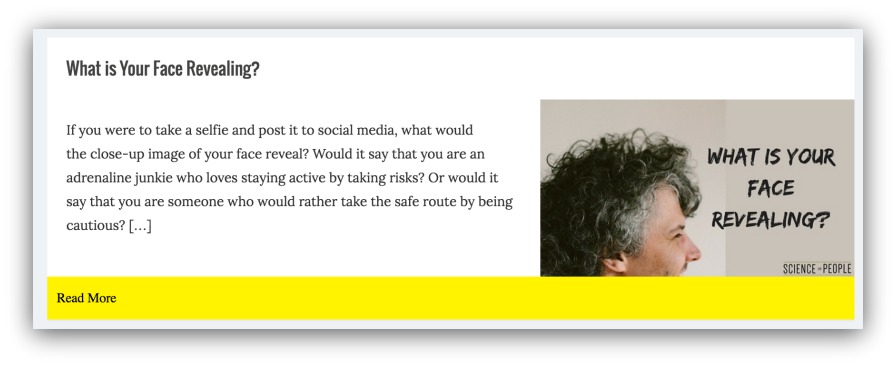 And long:
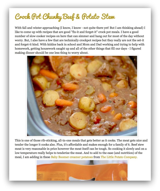
Of the four types of layouts, small to medium descriptions are used in 73% of successful blogs.
Three reasons for that:
-
You Have More Control: When you use long descriptions, you’re essentially copy/pasting your article. Shorter descriptions let you give an overarching teaser to entice visitors to read.
-
Sometimes Headlines Aren’t Enough: With a headline and image, you only have those two options to inspire a click. The description offers a third option to capture those people on the fence.
-
You Save Space: Longer descriptions take up more space, which means you get less articles in each fold. That’s the difference between one article and three.
The majority of successful blogs — layouts that keep people scrolling — use these small to medium descriptions to walk the line between scrolling and clicking.
Emulate them, and your site can see success, too.
Takeaway: Use descriptions, but keep them short.
Use These Blog Templates (I Recommend Them)
So you’ve read this and gone, “Ok, now what?”
One of three things will happen:
- Do Nothing: “Nah, Sean. I think I’ll just keep my blog the way it is.” If 4k words couldn’t convince you, then at least download Content Analytics to see how far people scroll on your page.
- Make Changes: Awesome! You’ve got the coding know-how to change your blog layout. Good for you. I envy your blogging/coding ability.
- Buy A New Template: You might have the ability to change your template all together. OR, you were looking for a new template and stumbled on this guide. So now you’ll buy a new blog template.
If you’re that last person, then check this out. I created a spreadsheet of 10 blog templates I can recommend right now that you can buy, install and run with confidence.
I spent close to 15 hours (seriously) wading through all the templates on Themeforest to find you the absolute best ones that follow the suggestions in this guide.
I include my thoughts next to each template, as well as the configuration you’d run for the best results.
Grab that spreadsheet below.
Add A Comment
VIEW THE COMMENTS