Almost every action you take on the web is a result of a prompt, better known as a call to action (or CTA for short).
-
“Buy Now”
-
“Subscribe”
-
“Get 25% Off”
Knowing how to create a well-written and beautifully placed CTA is one of the most powerful skills any marketer can have in their arsenal.
But what does a great CTA look like?
In this post, we look at 20 call-to-action examples from industry-leading brands like Wistia, Everlane, Netflix, and more.
%(tableofcontents)
What Is A Call To Action?
A CTA encourages a website visitor to do a specific activity. They can be used to encourage a range of actions, including:
-
Moving visitors to a page/funnel.
-
Converting a reader to a subscriber.
-
Turning a visitor into a customer.
Keep on reading to see 20 CTAs used by industry-leading brands.
SaaS Call-To-Action Examples
1. Drift
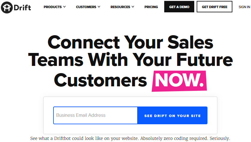
Drift opts for a "show, don’t tell" approach with the homepage's main CTA.
The electric blue “See Drift On Your Site” CTA contrasts with the white background. A line of text below the form tells what the visitor will see when they enter their email address and click the button: “See what Driftbot could look like on your website.”
The simple design of this page makes the word NOW, with its pink highlight, stand out and gives the impression that Drift is all about moving fast and delivering results.
2. Hey Taco
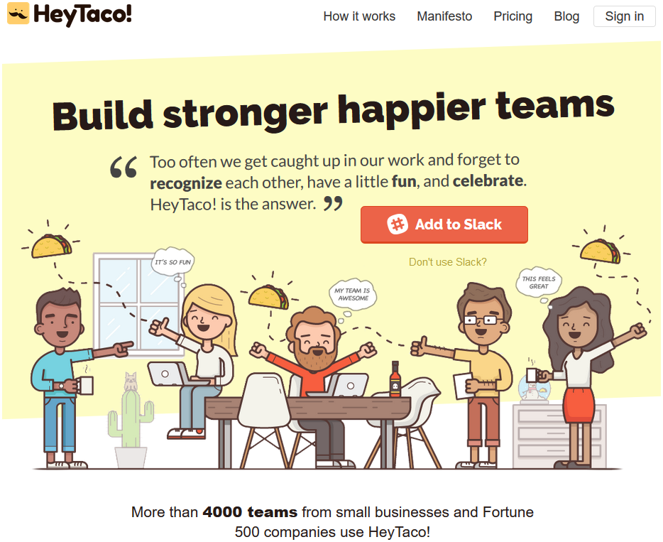
Hey Taco is a fun Slack app that lets teams share gratitude and celebrate together. If someone on your team does a great job, send them a virtual taco — it’s like Taco Tuesday, but every day. What’s not to like?
The main Hey Taco CTA button asks visitors to “Add to Slack,” as the product must be connected to Slack to work. The orange color also makes the button pop out against the light background.
Clicking this button takes a visitor to the Slack sign-in page so they can connect the app to their company Slack account.
3. Trello
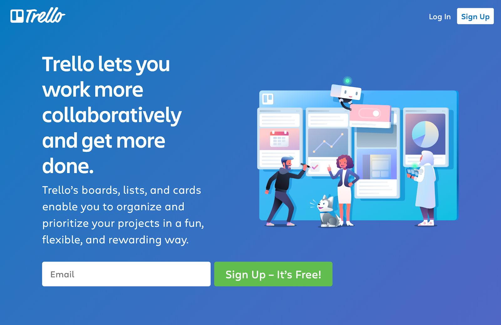
The Trello team has used a minimalist design for the hero section of the homepage, and the genius in this CTA lies in the details surrounding it.
Trello is a versatile tool: It can be used to plan design sprints, create content calendars, track goals, and much more. The illustration on the right highlights the product being used in a variety of ways, and this is reinforced in the copy above the CTA.
Using green to highlight the CTA button makes it stand out from the rest of the page. By including "It’s Free!" in the copy, visitors know they have nothing to lose by giving it a try.
4. Wistia
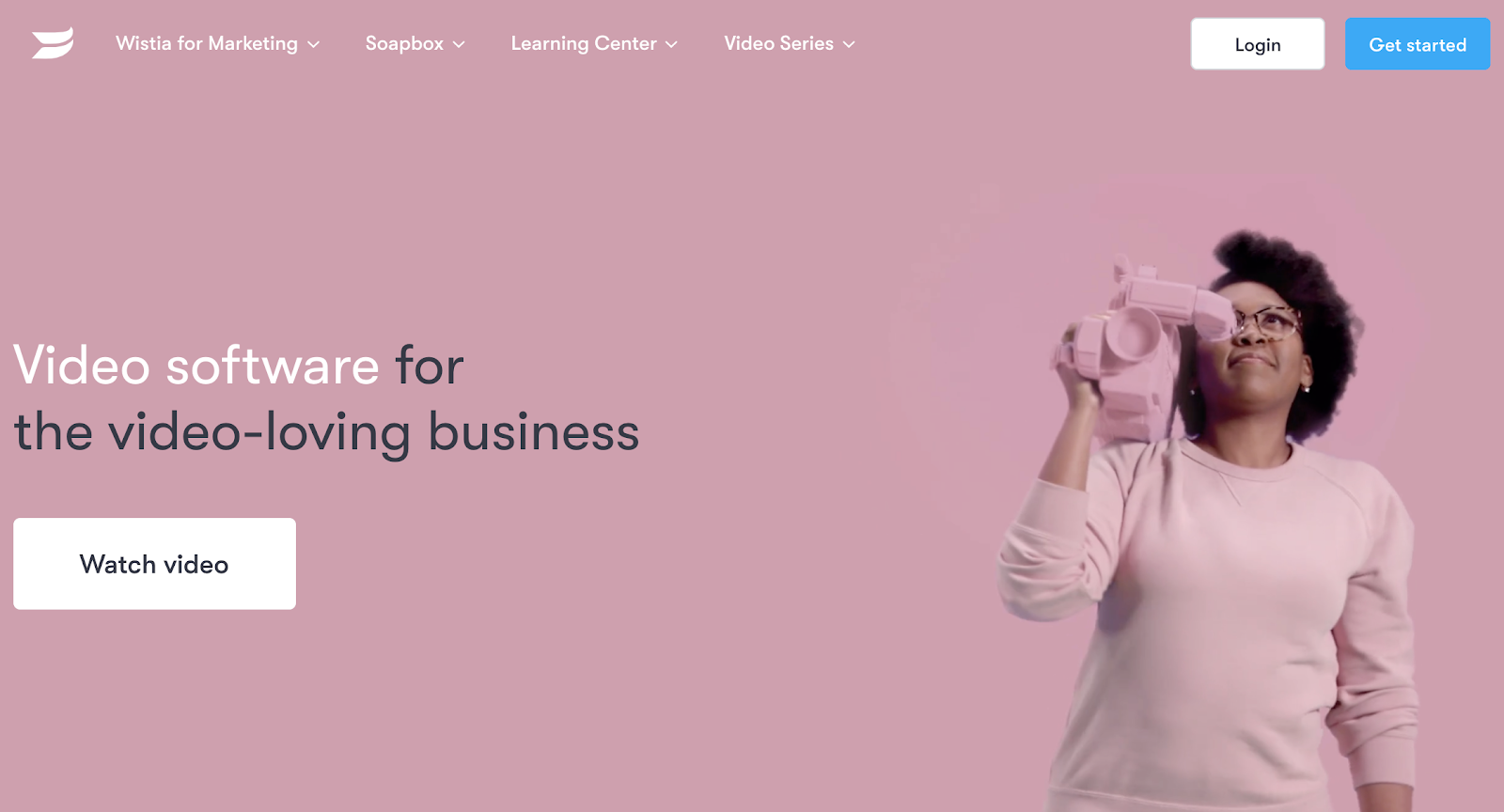
Video hosting company Wistia focuses its main homepage CTA on showcasing its product.
Clicking the white "Watch video" button opens up an explainer video focused on Wistia’s product and solutions.
This feels like a great way for Wistia to encourage visitors to learn more about its software and hosting services while also showing the product in action. It’s a softer approach than pushing new visitors to sign up right away.
5. Hotjar
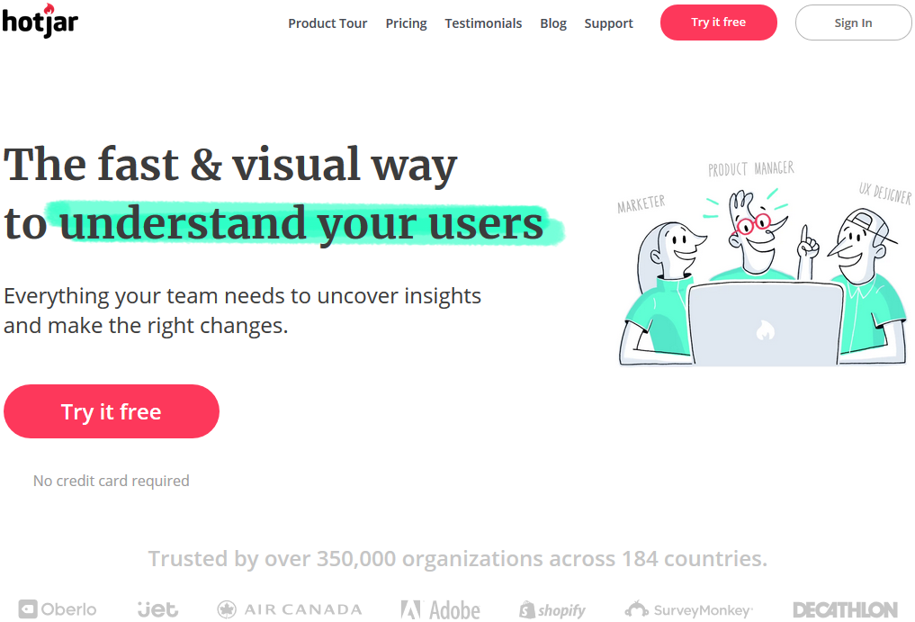
Hotjar uses negative space and colors to drive attention toward its main CTA.
First, it uses a bright green highlight on the "understand your users" text, and this same green is used on the clothes of the characters in the feature illustration. This helps to connect the copy with the people in the image (you/your team).
The CTA stands out, as it’s brightly colored against a white background. You may notice the CTA is repeated in the site's main navigation, too.
"Try it free" also tells the visitor that it won’t cost anything to get started and the "No credit card required" copy backs up this point.
6. Expensify
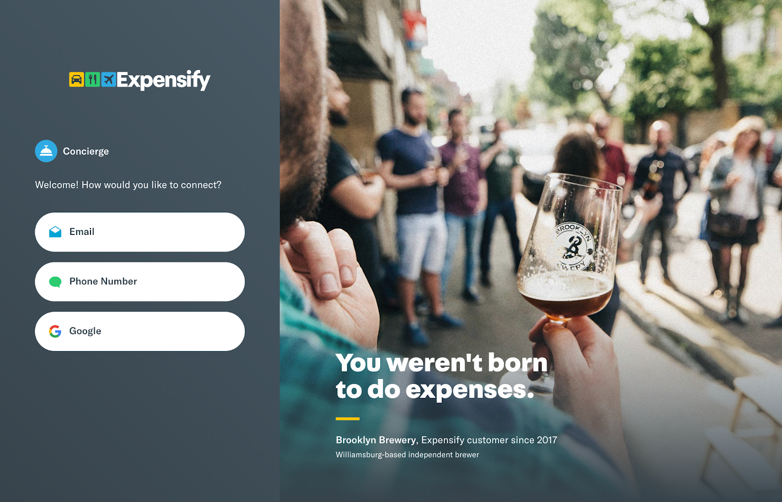
Expensify’s homepage feels original. The screenshot above shows the whole page — yep that really is it. Each time you load the site, a different Expensify customer is highlighted (Brooklyn Brewery in this example).
The page features three CTAs giving visitors the option to get started with their email address, phone number, or Google account. This lets the visitor choose whichever method is best for them, rather than forcing them down one specific route.
One of my favorite parts of the CTA is simple microcopy above the buttons. By using the word concierge — someone who works in a hotel to arrange things, such as theater tickets and visits to restaurants — Expensify makes the visitor feel like the stress of expenses will be taken care of for them.
7. Culture Amp
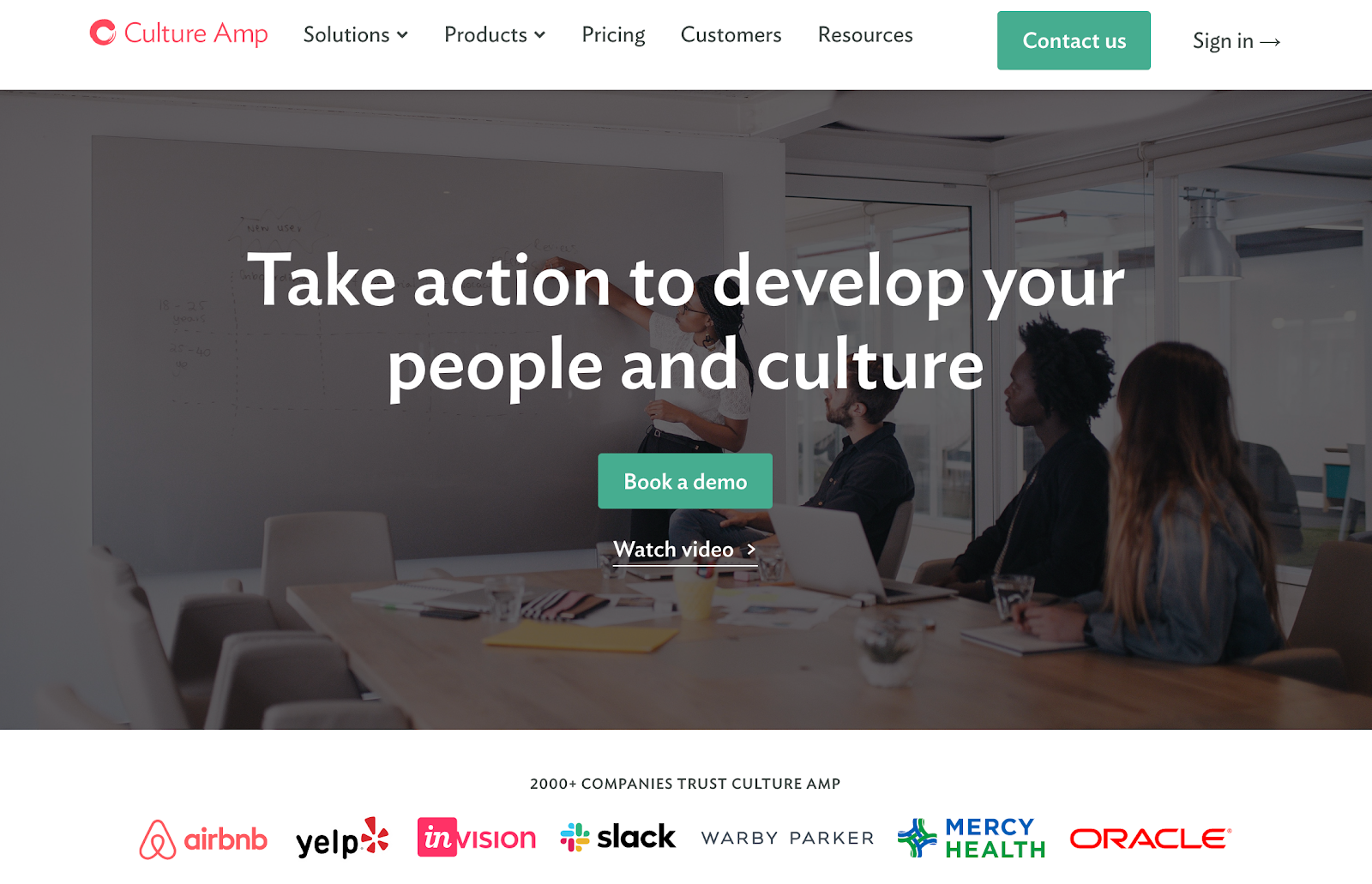
For your CTA, you need to consider your price point and how customers are onboarded to your product.
Most self-serve and small business tools focus on driving sign-ups from their main CTAs, but for enterprise software, it’s a little different.
Culture Amp is a team engagement and performance tool for businesses of 50 to 2,000+ employees. And its main CTA pushes visitors to "Book a demo" of its product. This enables Culture Amp to provide a more personal approach to sales.
Ecommerce Call-To-Action Examples
8. MVMT
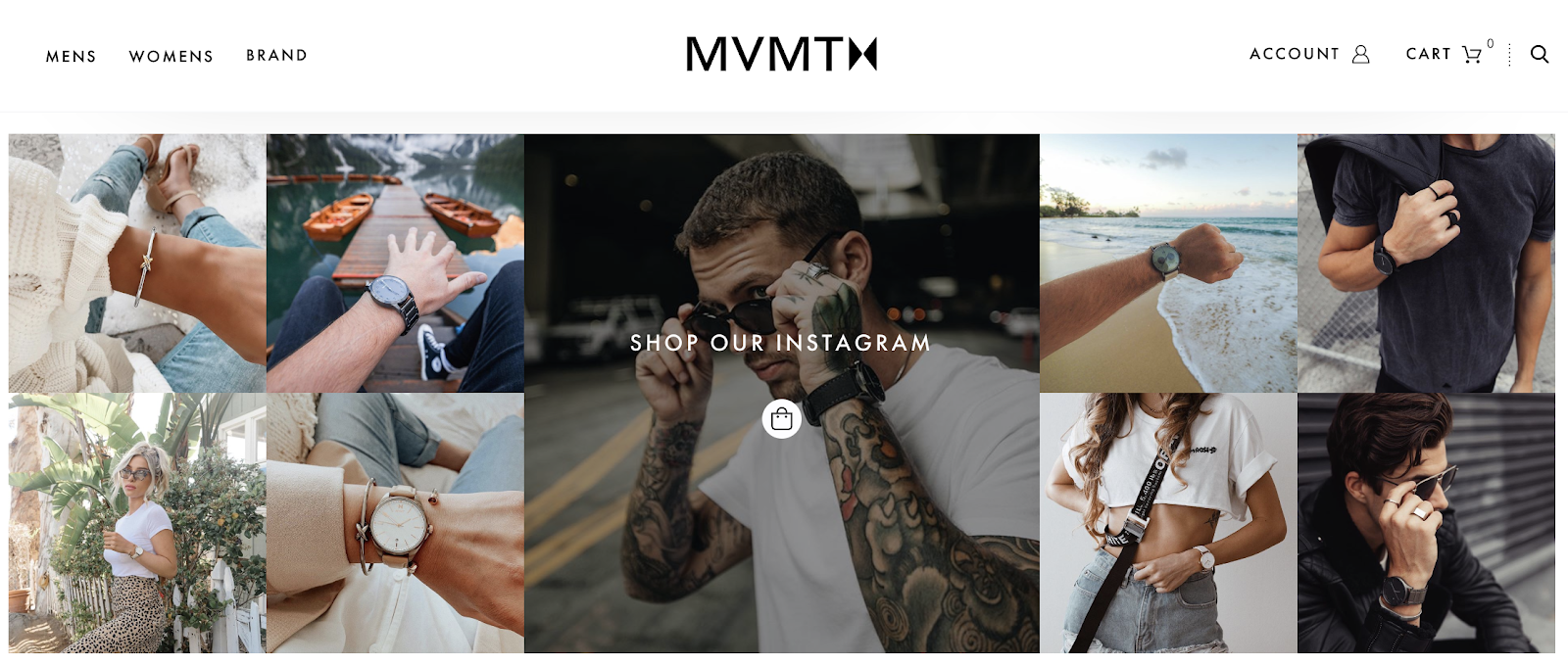
Instagram has become a key tool for ecommerce marketers, with many brands showcasing products on the platform.
With this CTA, watch brand MVMT enables visitors to view its recent Instagram posts and see which products have been featured in its content.
If you’ve come to their site in search of a specific product you saw on Instagram, you can locate it directly from the post rather than wasting time searching its store.
9. Everlane
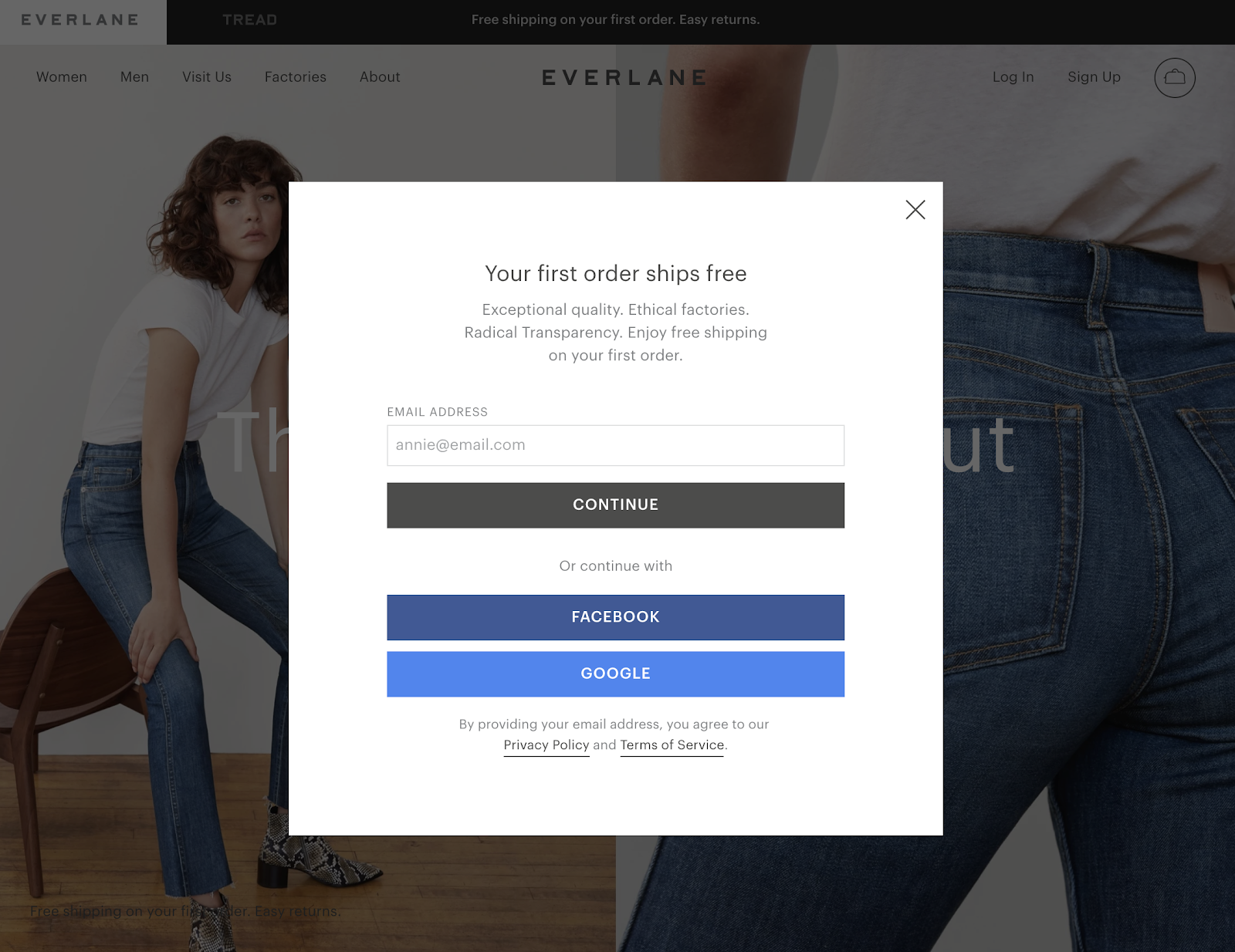
Everlane uses a splash page to welcome new visitors to its website and offer free shipping on your first order if you join their mailing list.
Unexpected shipping costs are one of the key reasons shoppers abandon carts. By offering free shipping, Everlane hopes it will convert more visitors into customers.
Plus, with the visitor’s email address, Everlane can play the long game and try to move each new lead through its funnel if they don’t convert on the first visit.
10. Soylent
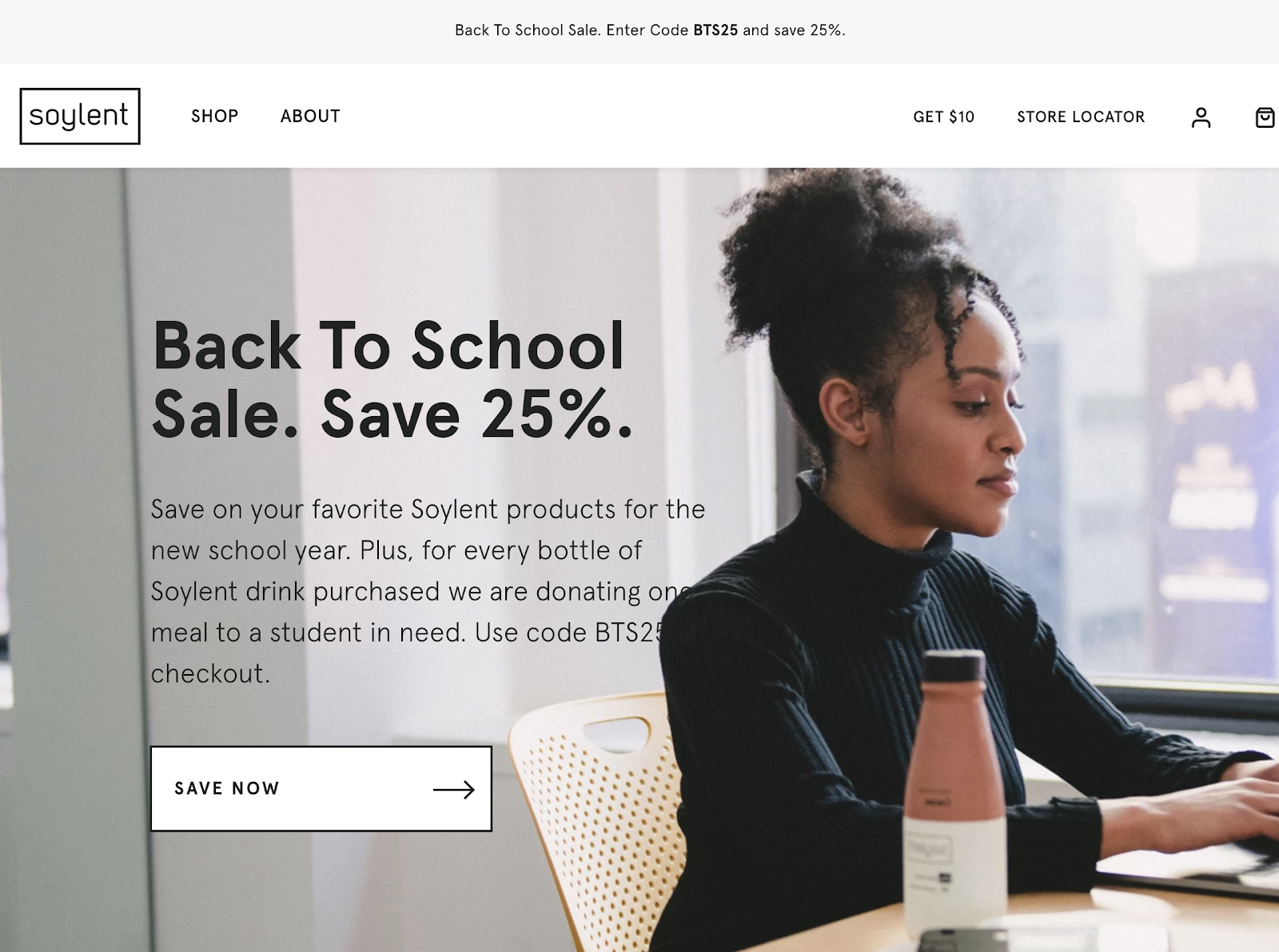
In this example, Soylent uses a CTA to back up the headline. On this page, Soylent is promoting a sale. Instead of saying "Buy Now", it uses "Save Now," which corresponds with the rest of the message its sharing with visitors.
By using their CTA to reinforce the savings theme, Soylent could increase the number of people who want the offer and click on the CTA.
11. Casper
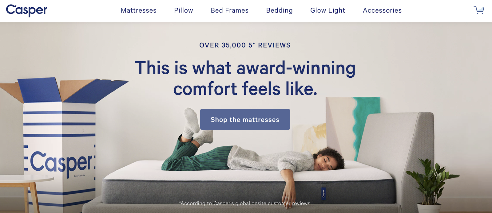
There’s a lot of great work on display from Casper here.
First, the CTA "Shop the mattresses" tells the visitor exactly what they are going to see: mattresses. Though Casper is largely known as a mattress brand, it has expanded its product offering, so it’s great to provide the user with details on exactly where the CTA will take them.
Second, it uses social proof in a couple of ways to tell the visitor that the product is high-quality and worth their investment:
-
"Over 35.000 5* Reviews": This isn’t just one or two good reviews. 35,000 people giving it 5 stars is pretty powerful, isn’t it?
-
"Award-winning": Awards are only given to the best, right?
12. Native
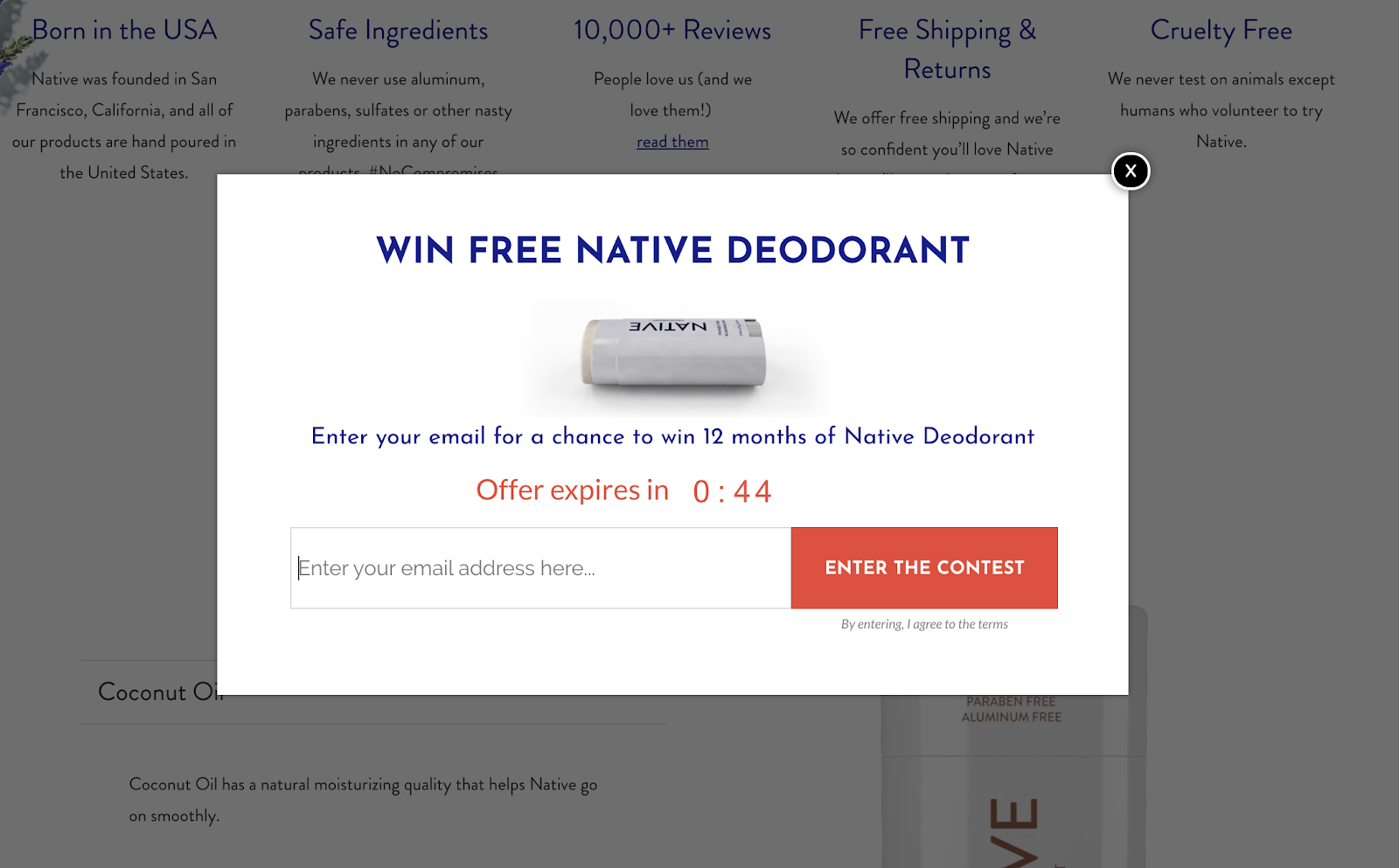
Ah, scarcity. I’m surprised we got this far without talking about the power of scarcity to boost conversion rates.
In this example, Native, a direct-to-consumer deodorant brand, uses a pop-up to offer visitors the chance to win a whole year of free products. But it’s a limited-time offer.
Visitors only have 60 seconds to enter their email for a chance to win. This encourages the visitor to act quickly and enter their email before they miss out on the opportunity.
13. Equal Parts
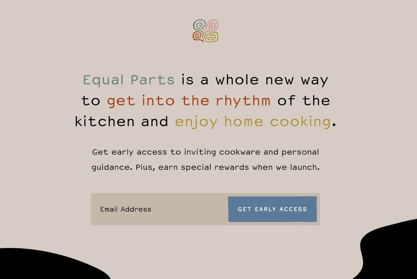
Here’s a prelaunch landing page from cookware brand Equal Parts. With the CTA here, Equal Parts is using exclusivity to drive conversions.
By entering their email address, visitors can receive early access to their product range and earn rewards when the brand launches. Exclusivity is a key driver of growth (hence why EVERY release of Supreme Streetwear sells out right away).
Subscription Service Call-To-Action Examples
14. Netflix
Signing up to a product can feel like a big commitment. What if you sign up and don’t enjoy the product?
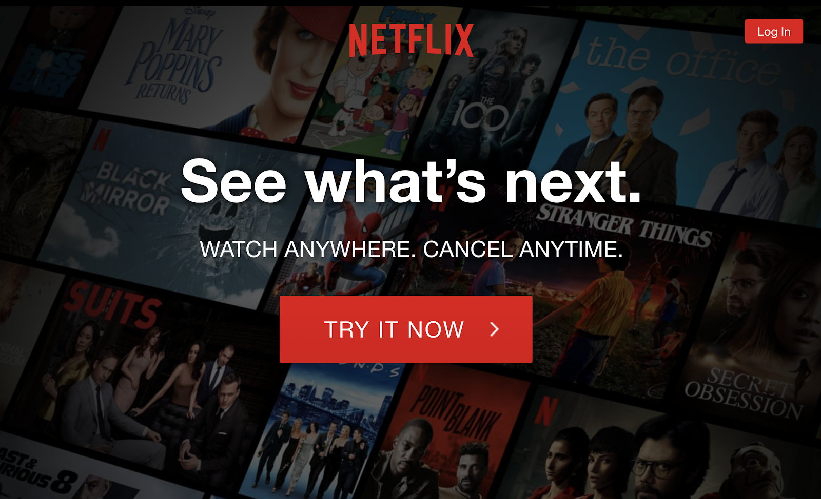
Netflix gets around this concern by letting potential customers know they can cancel their account anytime.
The CTA button is large and gives the visitor a clear indication of what Netflix would like them to do from this page.
15. Spotify
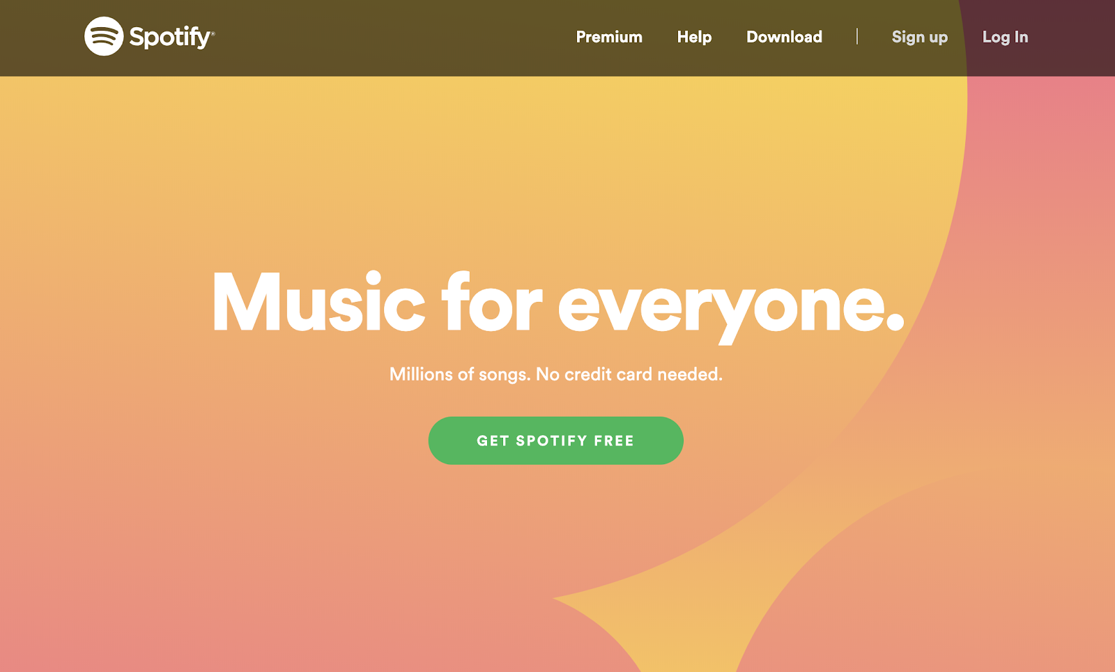
One of the best ways to convey the value your product offers is to keep your message short and to the point. Spotify does this wonderfully.
Its heading "Music for everyone" and the subhead "Millions of songs" assures visitors that whatever music they are looking for, it’ll likely be on Spotify. By adding a note about not needing a credit card, it also alleviates any worries about unexpected charges.
The main CTA button "Get Spotify Free" reinforces the message that getting started with Spotify won’t cost a dime.
16. Birchbox
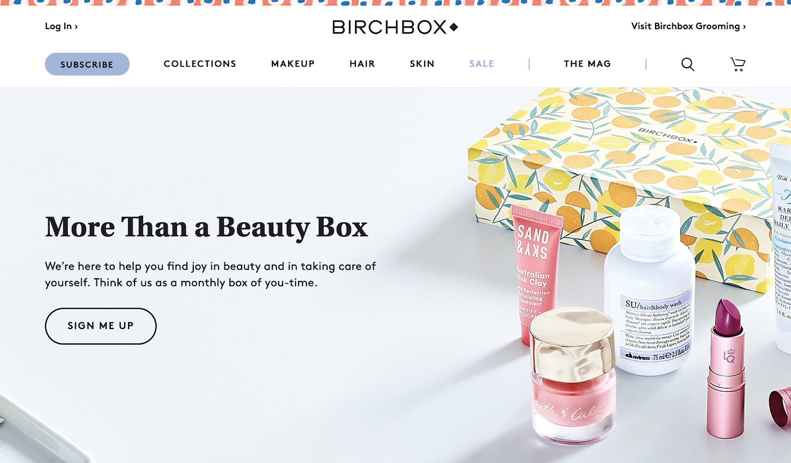
Pronouns can have a big impact on conversions. When Unbounce changed "start your free 30-day trial period" to "start my free 30-day trial period" it saw a 90% increase in clicks.[*]
And with its CTA, Birchbox opts for "Sign Me Up."
The data from Unbounce might make a pretty convincing case for "my" versus "you" but it also seems more conversational and allows the reader to feel in control of the interaction. As Tommy Walker writes over at Clickz: “I like doing things because it's my decision (get my ebook) not because someone tells me to (get your ebook).”
17. Barkbox
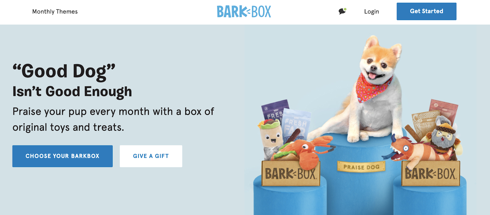
From looking at the Barkbox CTAs, it appears they cater to two distinct customer groups:
-
Dog owners
-
People who want to send gifts
This is reflected in the two main CTAs: "Choose Your Barkbox" and "Give A Gift." As "Choose Your Barkbox" is larger and matches the "Get Started" CTA in the site’s navigation, it suggests this is the primary CTA on the page.
18. Graze
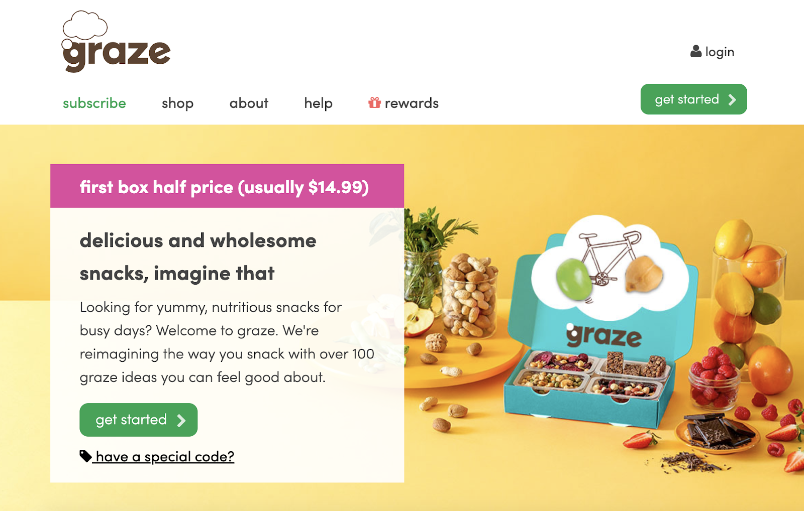
In this example, Graze does a great job with its design to make the CTA stand out by creating a feature box. The feature box contains:
-
An offer: First box half price
-
Product description: Helping to create a scenario the user is familiar with — wanting to have healthy snacks on busy days
-
CTA button: "get started"
All these elements combine to make it obvious what the user is doing by clicking the CTA button. They are: Starting a subscription to a healthy snack box with the first box half price.
Plus, using "get started" makes it feel like the user is going on a journey with the brand and building a relationship rather than simply buying a product.
Service Business Call-To-Action Examples
19. 99 Designs
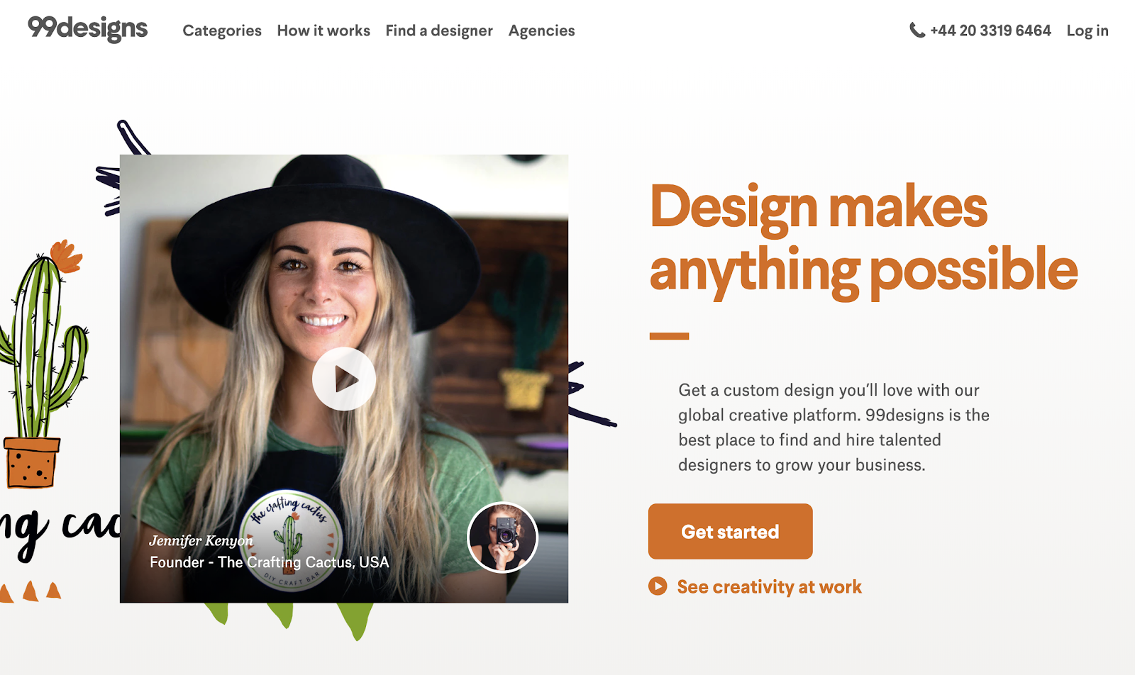
The genius of this CTA lies in the supporting copy. The copy tells the reader what 99 Designs offers custom design, talented designers supply the work, and the result will grow your business.
And if you’re looking for design work, that ticks all the boxes, right?
-
Unique designs specifically for your business ✅
-
Talented designers from across the globe ✅
-
Artwork that will help you to grow ✅
The CTA button is clear and lets the user where they need to click to move through to the next step of the process.
And if the visitor not ready to commit just yet, there are two secondary CTAs to showcase the results business have had with 99 Designs:
-
The feature image play button: This opens up a video testimonial from the founder in the image.
-
The "See creativity at work" copy under the CTA button: This opens up another video showcasing a range of work from 99 Designs.
20. Single Grain
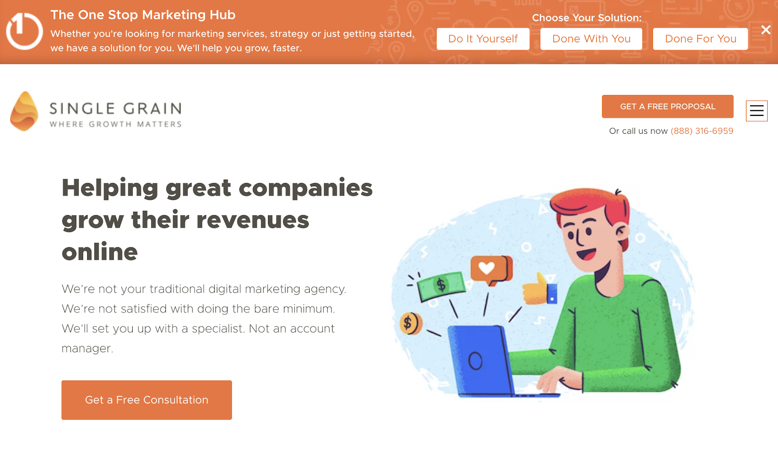
There’s a lot at play on Single Grain’s homepage, but I’d love to focus on what makes this page feel different…
…the CTA bar at the top of the page:

This bar is great because it shows the visitor that no matter the type of marketing help they are looking for, Single Grain has a service tailored to them.
When you hover over any of the three CTA buttons on this panel, you’re shown a short description of how Single Grain’s solutions work:
-
Do It Yourself: We have put together an entire course on how we gained clients like Uber, Amazon and Salesforce using content marketing frameworks that you can duplicate.
-
Done With You: Our team of experts will create marketing strategies, audits, setups and also consult with you. You do the work.
-
Done For You: Our team of experts will execute marketing campaigns for you. We'll do the work.
When a visitor clicks any of the CTA buttons, a lead capture window opens up. By taking this segmented approach, Single Grain can ensure it sends the correct follow-ups to each type of customer.
For example, a "Do It Yourself" lead will get content related to Single Grain’s course, rather than its marketing strategy consultation services.
CTA Copy That Converts Cheatsheet
The CTA is the most important part of any page on your website.
It can be the difference between making a sale or your website visitor leaving empty-handed. If you want to grow, you need to think carefully about your CTAs.
To help you create killer CTAs for your website, I’ve created a quick guide with 10 pieces of copy that will help increase the conversion rate of your CTAs. Click the button below to get access now.
Add A Comment
VIEW THE COMMENTS