It’s estimated that ecommerce businesses lose more than $4.6 trillion (yep, TRILLION) in abandoned orders each year.[*]
But it’s not all doom and gloom. Business Insider estimates that a huge $2.75 trillion of that lost revenue is recoverable.
Want to grow your profits?
Recovering your lost revenue could be one of your most effective strategies — after all, if you’re losing out on sales due to cart abandonment, you’ve already done 90% of the hard work by getting your product into a customer’s basket.
But to recover that lost revenue, you need to create killer abandoned cart emails.
Abandoned cart emails can be incredibly engaging — and they convert lost revenue to money in your bank account at an incredibly high rate!
In fact, shoppers who click cart abandonment emails spend an average of $36 per click.[*]
Today I’m going to show you exactly how some of the world’s most effective ecommerce businesses rescue lost revenue.
-
6 Steps To Crafting Revenue-Recovering Abandoned Cart Emails
%(tableofcontents)
What Are Abandoned Cart Emails?
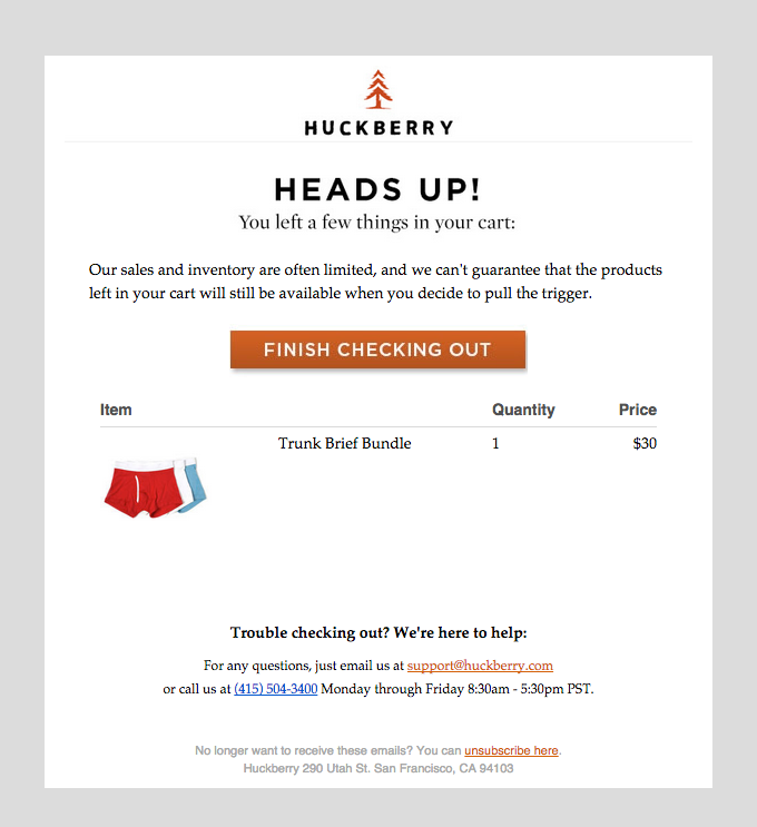
Abandoned cart emails are automated messages sent when a customer leaves an item in their shopping cart without completing the purchase.
If I visited Huckberry and left its site without purchasing my cart's contents, Huckberry would use my stored customer data (if I was logged in) to send an automated message like this:[*]
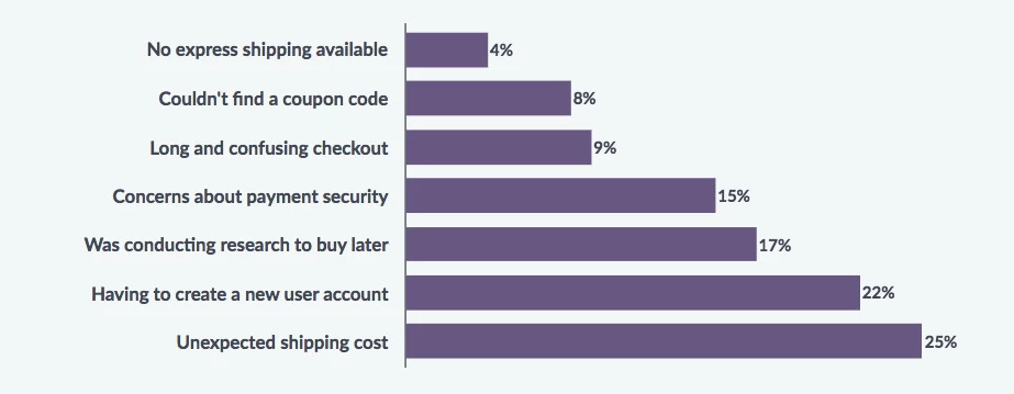
There are hundreds of reasons shoppers abandon carts. But VWO found some of the most common reasons include unexpected shipping costs, having to create an account, and concerns about payment and security.[*]
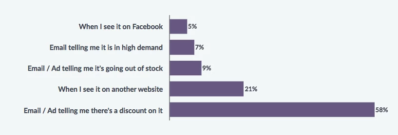
Data from VWO also found that 58% of shoppers said that emails and ads which offer a discount on an abandoned product bring them back to the website.[*]
By sending abandoned cart emails, you can give a little nudge to shoppers to return to your store and complete their purchase.
If you know why shoppers tend to abandoned carts across your industry, you can use your emails to address their concerns.
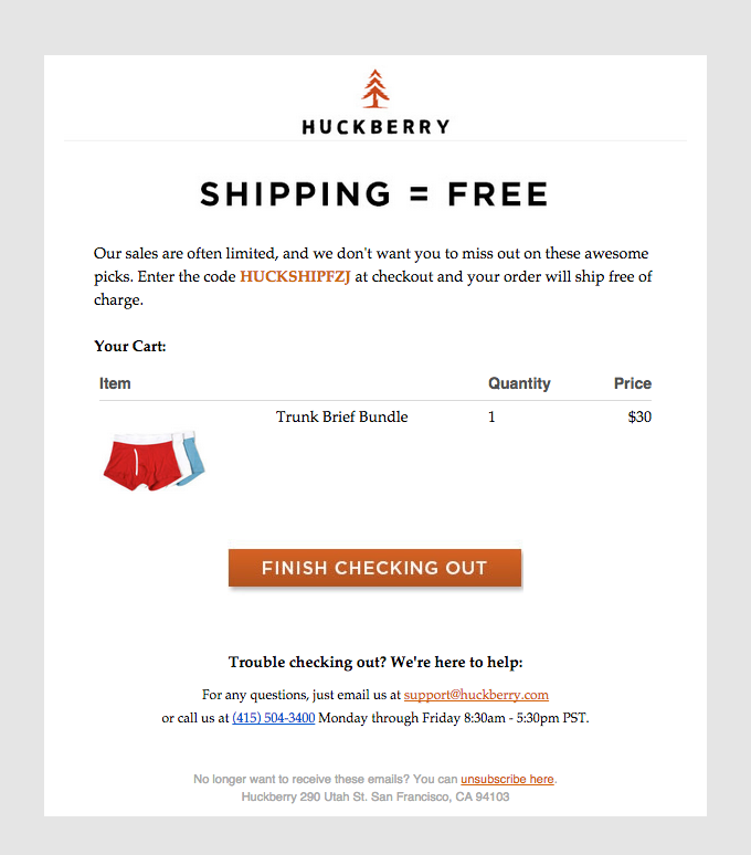
Huckberry understands the importance of shipping costs to shoppers and sends a variation of its abandonment email that focuses on free shipping:[*]
When Should You Send Abandoned Cart Emails?
There’s not one best time to cart abandonment emails, though it seems between 30-60 minutes after the shopper leaves their cart is a good fit for many stores.
After testing various times (30 mins, 60 mins, >1 hour 30 minutes), Pro:Direct Soccer US found that sending their emails 30 minutes after the shopper left the cart lead to a 19% increase in conversions.[*]
And back in 2013, Marketing automation platform Marketo recommends that your first email should be sent within an hour of the cart abandonment.[*]
Whatever you do, don’t wait so long that the shopper has forgotten what and why they wanted to make a purchase, or went and bought from your competitors.
Salesforce found that abandoned cart emails tend to generate the highest overall revenue within the first 24 hours after sending — while the product(s) in the customer’s cart are still fresh in their mind.[*]
Abandoned cart emails also generate 60% of their revenue on the day of send.[*]
6 Steps To Crafting Revenue-Recovering Abandoned Cart Emails
1. Write An Irresistible Subject Line
A great subject line is key to getting your emails opened.
Most brands tend to keep their cart abandonment messages simple. For example:
-
Fashion designer Moschino states "You left something behind."

-
Wine store Winc uses the subject line "You forgot something unforgettable."

-
Pet retailer Chewy simply says "Forgot something?’"

If you’re looking to keep your subject lines simple, try to experiment with questions:
-
Did you forget something?
-
Did you leave something behind?
-
Still available?
Or simple statements like:
-
You left this in your [brand name] basket
-
Don’t miss out
-
Complete your order now
To take it a step further, try experimenting with some less common subject lines.
Make It Unique
One of the best cart abandonment emails I’ve seen is from Ugmonk founder, Jeff Sheldon, and the reason it stands out is that it takes a very personal approach.
The subject line "Offering you my personal email" is very different from the usual abandoned cart emails that tend to focus specifically on you, the shopper, forgetting or leaving something behind.
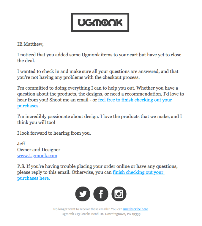
On Really Good Emails, Matthew Smith explains just how he felt receiving this email:[*]
“Oh man oh man, this is great. The subject alone is gold. When leaving items in the cart, Ugmonk shows me that they really care and wants to know more about why I might have left those items there. This is a really well done email for ecommerce.”
In a similar vein, community-driven ecommerce platform Massdrop uses a neat subject line formula to personalize its cart abandonment messages:
-
Hey [First Name], still interested in the [Product Name]?

Here’s a copy of the corresponding email.[*]

2. Use Killer, On-Brand Copy
Getting your email opened is just the first step.
Once the customer has opened your email, the real magic needs to happen.
In ecommerce, copywriting can make your brand stand out from the crowd. Your abandoned cart email is a perfect place to do this and showcase your brand and what you stand for.
Great copy should take your customers on a journey. And no matter where they interact with your brand — your homepage, ads, social media posts, or emails — you should be telling the same story.
A perfect example of this is Whiskey Loot.
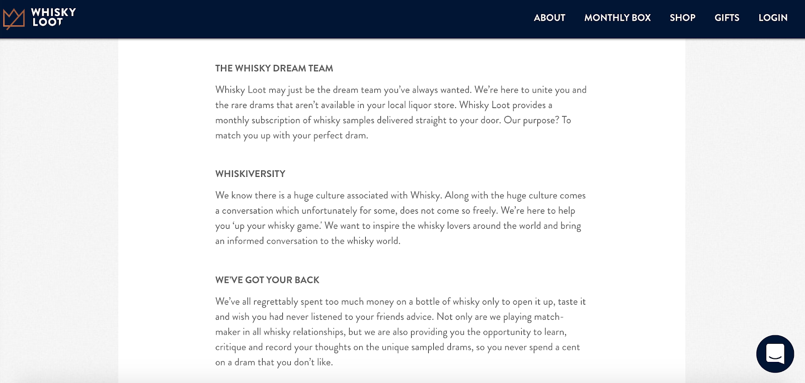
If you check its About page, you can tell Whiskey Loot is a fun, friendly and approachable brand. The copy is written like the brand is talking to a friend. It’s clear the brand doesn’t take itself too seriously.
Product descriptions are also written in a fun, playful tone:
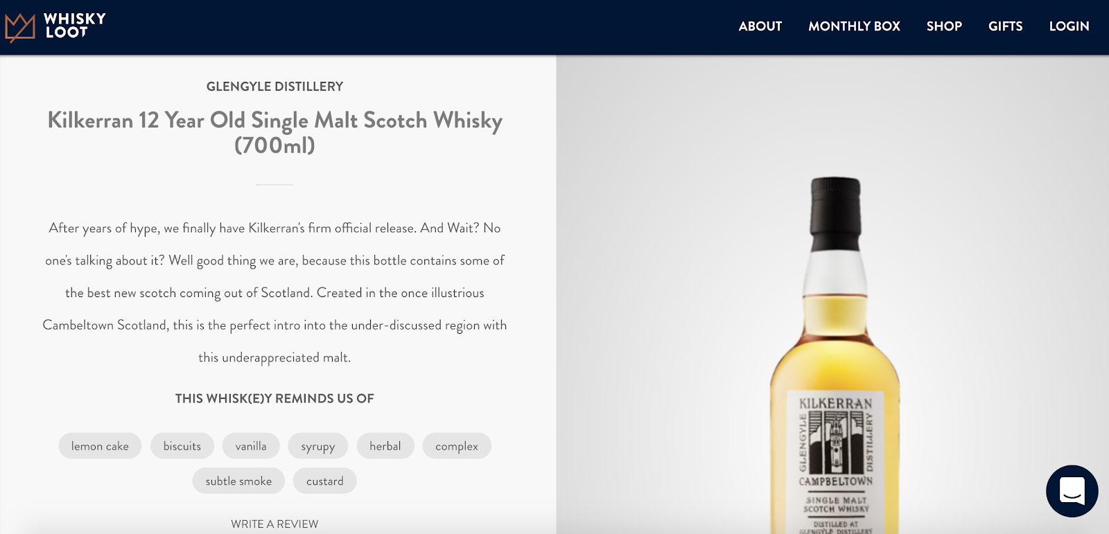
For example, “And wait? No one’s talking about it” makes the reader feel like they’re in a conversation and “well good thing we are” also helps to breed trust and show that Whiskey Loot is keen to keep you abreast of the latest and best whiskeys on the market.
In this day and age, great copy doesn’t just mean words. Emojis can say a lot about your brand, too. When you first visit the Whiskey Loot site, you’re presented with a banner featuring two whiskey emojis:

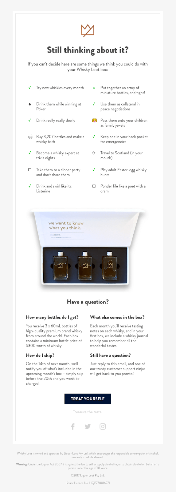
Then, if a shopper doesn’t complete checkout, the cart abandonment email stays completely on brand.[*]
-
It’s fun and playful, suggesting the shopper could "Put together an army of miniature bottles, and fight!"
-
It features emojis as bullet points.
-
The CTA button copy says "Treat Yourself" rather than something more formal like "Complete Checkout."
The subject line is "Your cart is sobering up" — something a little less serious than usual abandoned cart subject lines like "You forgot to check out."
When writing your email, think about how you reiterate what your brand stands for in the copy. Focus your copy around:
-
What makes your brand unique.
-
The benefits of your product (or service).
-
Why the shopper should buy from you (not a competitor).
3. Include Beautiful Product Photos
They say a picture is worth a thousand words. But in the ecommerce industry, you could argue that a high-quality picture is worth thousands of dollars in revenue.
The average adult makes thousands of small decisions every day, so deciding to hit the "Pay Now" button or to abandon the cart on your site is just one of thousands of things every customer has on their mind on any given day.
For your cart abandonment email, you might want to remind them exactly what product they were so close to buying and just why they wanted it bad enough to add it to their basket.
Product photos are a great way to do this.
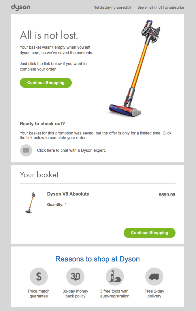
In its abandonment email, Dyson prominently features the image of the recipient's unbought product:[*]
British fashion retailer Jack Wills takes this one step further by showcasing multiple images for each product left in the shopper’s basket:[*]

Save some prime real estate in your email for showing the product left in the cart.
4. Add Clear, Eye-Catching CTAs
What’s the number one goal of any cart abandonment email?
Quite simply, it’s to complete a sale.
So you need to make the mission of your email abundantly clear to the reader.
To boost the number of shoppers who complete transactions from your abandonment emails, get creative and use unique, interesting copy.
For example, in its abandonment email, Huckberry uses the copy "Finish Checking Out."
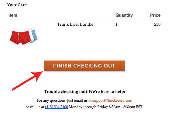
It may sound simple, but I love this copy. Why? Because "Finish" implies you’ve already started the process — it makes it feel like you’re almost there and who doesn’t like to finish what they’ve started?
Winc also opts for creative copy, using "I’m ready for wine" in its email.
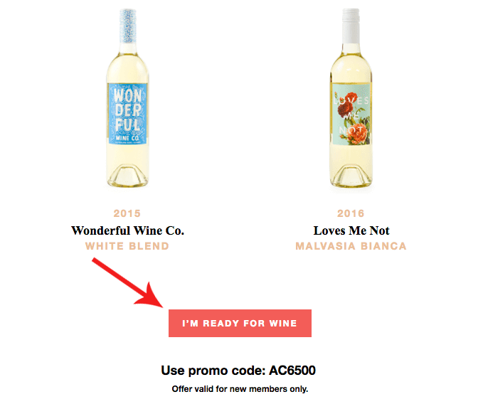
Using the first person is a great way to engage shoppers as this copy puts the shopper in the driver's seat and clearly shows them what they’ll get if they click the button.
First person can increase conversions too. In one landing page test, Unbounce found that a simple change from “Get your free 30-day trial” to “Get my free 30-day trial” sent conversions through the roof — jumping up by 90%.[*]
5. Remind Shoppers About Offers
A study from VWO found that 58% of shoppers are motivated to return to store websites when they receive messages offering discounts.[*]
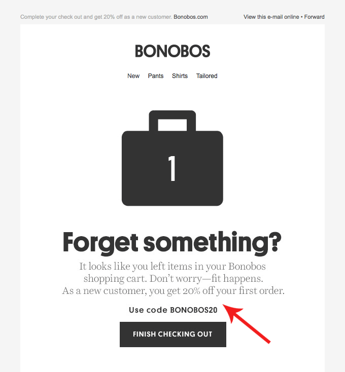
Bonobos takes advantage of this by reminding potential first-time customers of a 20% discount on the items in the cart:[*]
Similarly, Dot & Bo uses a strikethrough and bright red text to remind the shopper that they can get a good deal on Dot & Bo:[*]
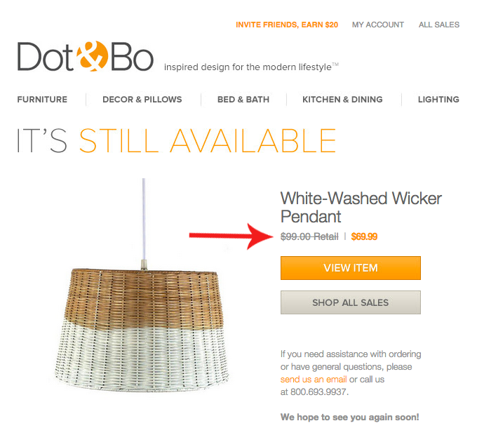
Knowing that unexpected shipping costs are also the number one reason for cart abandonment makes your email a great place to remind shoppers if you offer free shipping.
Brooklinen uses free shipping to encourage shoppers back to their carts.[*]
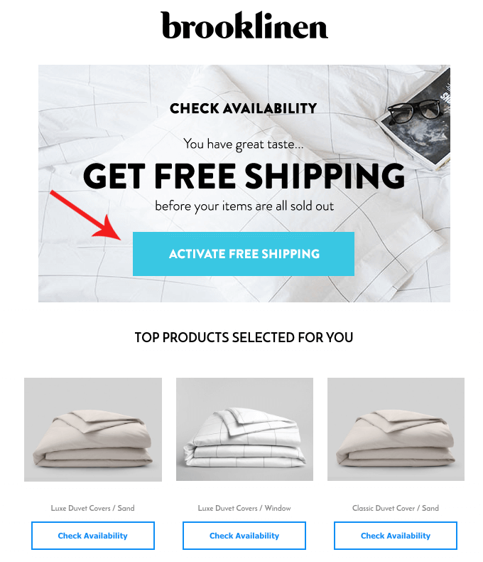
This email also uses scarcity, saying "before your items are sold out" to encourage immediate action.
6. Test, Test, Test
Even the BEST marketers won’t get their emails perfect without a little experimentation. In fact, you could argue that no email is ever perfect.
Email marketing should be a game of constant improvement — tweaking copy, images, colors, CTAs, and more to keep your conversion rates moving in the right direction.
For example, Huckberry sends multiple variations of its abandoned cart email:[*]
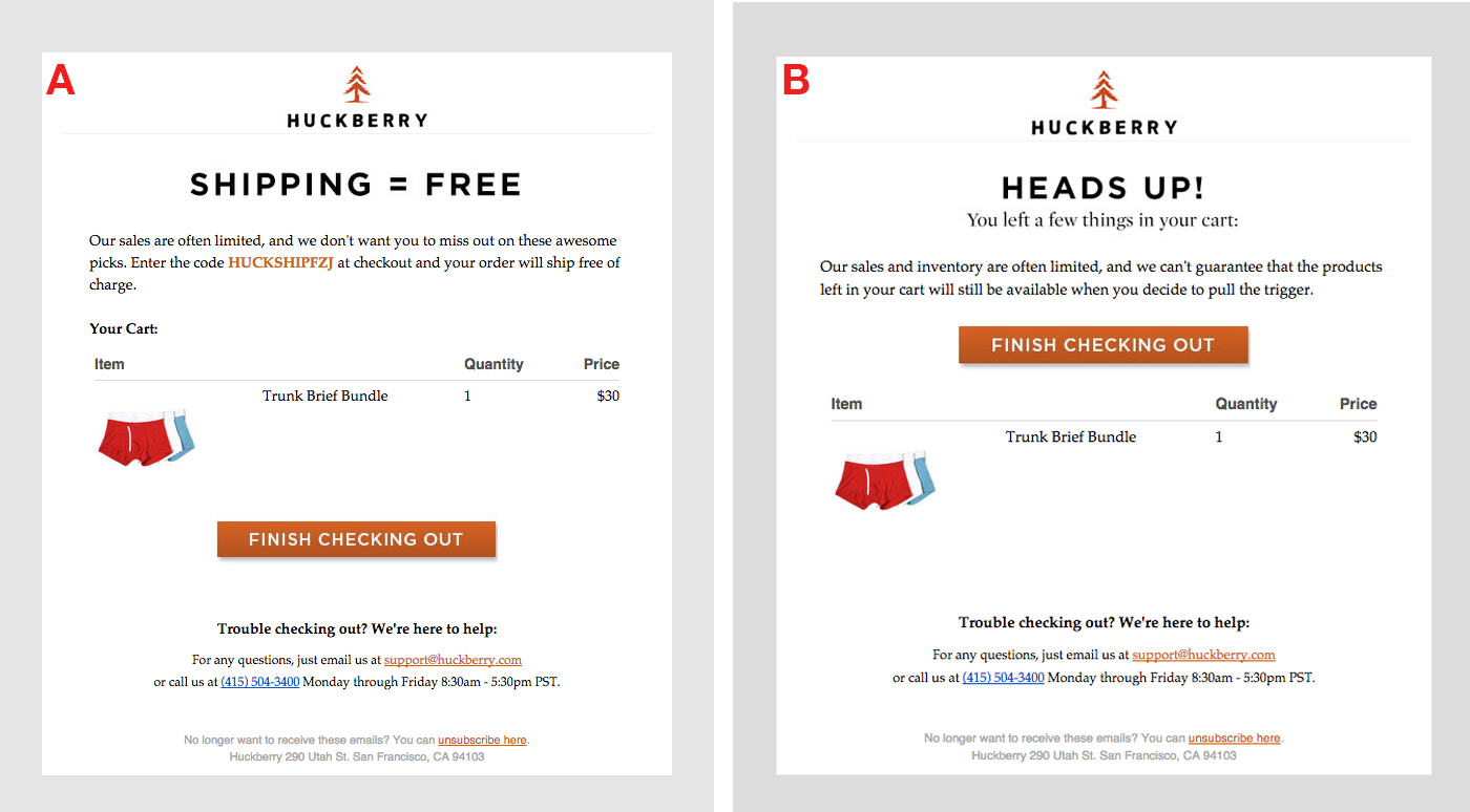
Variation A:
-
Uses the subject line: "Free Shipping On Your Huckberry Order."
-
Has the CTA button below the product details.
-
Focuses on a free shipping offer.
Whereas Variation B:
-
Uses the subject line: "Heading out without checking out?"
-
Has the CTA button above the product details.
-
Focuses on scarcity instead of free shipping.
Don’t just create one version of your email and settle for the results. If you’re not testing, you might as well be chucking dollars out of your wallet.
How Do You Actually Send Cart Abandonment Emails?
So by now you’re probably convinced you NEED to start sending cart abandonment emails (if not, leave a comment below to let me know why!).
But how do you actually do it?
Setting up emails might sound like a time-consuming task. But it’s much easier than you think, I promise…
If you use Shopify, you can set up abandoned cart emails directly within the Shopify dashboard.[*]
Recover Lost Revenue Today
So there it is. Everything you need to know to recover tons of lost revenue for your business.
But this is the part where most people get stuck. You’ve read the post, taken in the information and now… well, now, it’s time for action.
Taking action is the difference between a wannabee ecommerce whiz and Jeff Bezos — one thinks, and the later acts.
Need some Inspiration?
Add A Comment
VIEW THE COMMENTS