Ecommerce has evolved a lot in recent years.
New trends, new capabilities, and a bigger focus on usability have all improved the customer experience.
But alongside these innovations come more competition than ever. Anyone can start an online store with just $50, and people are!
If you want to beat the competition, you need every slight edge you can get. Luckily, I’ve put together 12 crucial ecommerce best practices for you to improve your store.
Let’s dive in!
User Experience Best Practices
Ecommerce User Experience Best Practices
User experience (UX) is important for three reasons:
-
It improves your conversion rate.
-
It builds trust with your users.
-
It increases your organic rankings.
So what can you do to reap these benefits?
1. Create A Clear Navigation
There are few things more annoying than not knowing how to browse an online store. Creating a clear navigation for your site can be complicated, especially if your store has hundreds or thousands of products.
Here’s what you need to do:
First, grab a spreadsheet or piece of paper and create a sitemap of your website. It may look like this:
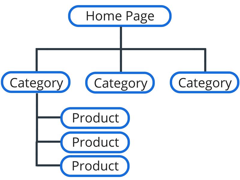
You can use a tool like GlooMaps to create visual sitemaps for free using an online program.[*]
Once you’ve drawn up your sitemap, ask yourself: Do these categories make the most sense? Is there a better way to arrange them to make the site easier to navigate? Do you have the technical and monetary resources to make these changes?
Pro tip: Be clear, not clever when it comes to navigation. Naming a category “Puppy Food” is better than “Puppy’s Banquet” in most situations, for example.
If you’re having trouble, take a look at Amazon’s categories. They’ve put tons of money and research into their navigation, so they must be doing something right!
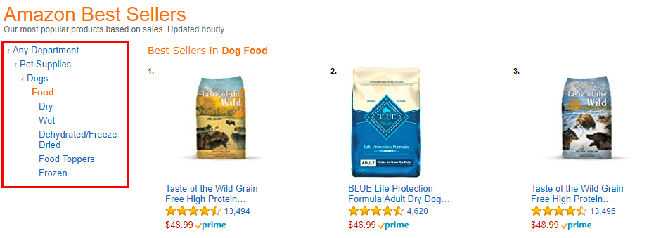
Notice how they use breadcrumbs to narrow down the categories and show you where you are in the site. This is also a best practice we’ll get to next. But three quick tips for you on navigation first:
-
Make top-level navigation buttons clickable.
-
Use the word “menu” to signify your menu on mobile.
-
Show a search bar on every page of your site.
Note: To give you an example of a “Menu” icon on mobile, see Target’s mobile site:
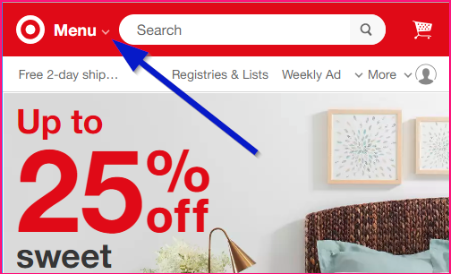
Easy, right? On to breadcrumbs!
2. Always Leave Breadcrumbs
Remember the old tactic of leaving breadcrumbs along your trail so you can find your way back? That’s where this term comes from.
You’re showing people exactly where they are at any given time, and giving them the option of going to a specific higher-level category.
Here’s an example from my Wanderlust Shirt Page:[*]
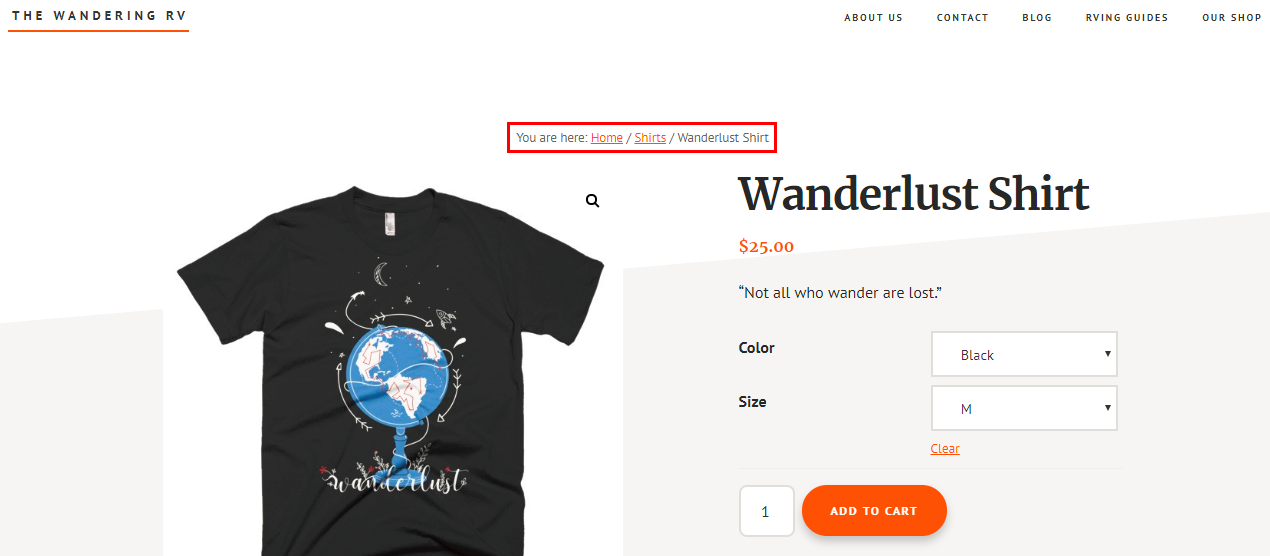
Not only is this great for users, it’s also great for Google and SEO. While Google will sometimes create their own breadcrumbs, creating actual markup with breadcrumbs increases your chances of getting them.[*]
Here’s a search result without breadcrumbs:

And here’s a search result with breadcrumbs:

As you can see, one is a long URL; the other is a simple navigation with “>” in between each breakdown.
This is marginally helpful for users, but it’s also a big help for Google’s crawl bots to navigate your site. This could improve your site’s crawl rate (the speed at which Google’s robots crawl your website) while also creating stronger topical relevance for your site, which Google cares a lot about.
Besides that, I’ve seen where breadcrumbs can increase time on page and decrease bounce rate (since users can easily go to another page on your site), which is another ranking factor for the search engines.
Long story short: Breadcrumbs are good. Use them.
3. Use A 16 Point Or Bigger Font Size (Screens Are Hard To Read!)
When writing a college paper, we’re always told to use 12 point fonts. Somehow those ideas were carried over to websites and used as a default for most sites.
But let me show you why a 12 point font is too small for the web:
This is 12 points. Imagine if this entire article were in 12 points. The font is weaker, harder to read, and downright ugly (in my opinion).
These days, most sites use a 14 or 16 point font. Thank goodness! It’s easier to read on screens, especially on mobile.
If you want to get scientific, you can use a font size calculator to determine the best font size for your specific website and typeface.[*]
And while we’re on the subject of typeface, what are the best fonts for readability on the web?
Here are a few that look and read well:
-
Open Sans
-
Josefin Slab
-
Arvo
-
Lato
-
Vollkorn
-
Abril Fatface
-
Ubuntu
-
PT Sans + PT Serif
Easy enough. Moving on!
4. Make Your Page Load Like Lightning (Less Than One Second)
These days, people are impatient.
Bounce rates and site abandonment skyrockets after a website starts to take more than three seconds to load — up to 38% of people when it takes five seconds. You can drop that to 9% if you reach a two-second load time.[*]
You can check your page load speed for free with the Pingdom speed test tool or Google’s PageSpeed Insights.
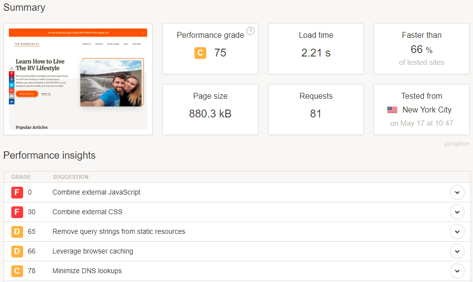
Both tools give you recommendations on how to improve your performance. Looks like I have some work to do!
Unfortunately, most of these performance improvements require a web developer (unless you happen to be one, then kudos to you).
Here’s how to improve your site’s speed without hiring someone or redesigning the site:
-
Compress all your site’s images. You can do this manually with Gimp or Photoshop, or you can install a WordPress plugin like WP Smush. Try to reduce their size to 70kb or less.
-
Remove any apps, plugins, or add–ons you don’t use. Over time, it’s easy to install a ton of stuff on your site. But the more add-ons you have, the slower your site will be.
-
Get a faster hosting provider. This is the easiest way to improve your site’s speed. If your images are compressed and you’ve removed unnecessary apps, this is the first thing to check. Changing hosting providers is fairly easy. Personally, I really like SiteGround because they’re fast, reliable, and will transfer your site from another host to their platform for you for free. Kinsta is also really great. [*]
Fun Fact: Sumo’s apps won’t slow down your site! Read why here.
And that’s all there is to it! One last tip on usability best practices…
5. It’s The 21st Century. You Need A Responsive Website!
Mobile internet usage surpassed desktop worldwide back in 2016. In the U.S., desktop is still beating mobile, but only by ~2%. That means roughly half of the U.S. population is primarily using mobile browsers.[*]
There’s no doubt about it — your site has to be mobile responsive!
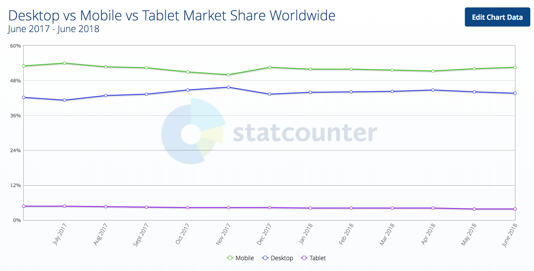
Need more proof? My girlfriend and I run a blog about RVing. The majority of our audience is age 35-65, yet over 70% of our traffic is on mobile!


Yes, our audience is more mobile than most. But this means even the older crowd is now using mobile.
To check if your site is mobile-friendly, plug it into Google’s Mobile-Friendly test. This will give you a rough score of what Google thinks, including if there are usability issues, your site uses flash, your fonts are too small, or your touch elements are too close.
Beyond that, you should simply look at your site on a mobile device. Navigate it as your customers would. Make a test purchase.
If the experience feels clunky, it doesn’t matter if your site passes Google’s test. You need to make some changes so it’s actually mobile friendly.
So how do you create a mobile-friendly website?
You really only have two options:
-
Use a mobile-friendly theme.
-
Hire a developer to make your site mobile friendly.
And that’s it for user experience best practices! Next up, testing.
Ecommerce Testing Best Practices
Split testing is a key part of any successful online business, and online stores are no exception.
You can test new products, new marketing channels, new offers, and more. This section will help you do that with ease!
1. Use One-Variable Split Tests
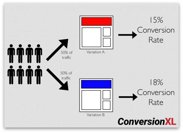
Split testing is also referred to as A/B testing. This is because you show your visitors two different pages to see which performs better: Version A and Version B.
While you can technically show people two entirely different pages, it’s best to test one element at a time (such as just the price, just the image, just the description, etc.). Otherwise, you won’t know which change caused the increase (or decrease) in conversions.
Here’s a visual:
Side note: Sumo apps have a built-in split testing tool to test your popups!
You can also use the following tools to help you run split tests:
-
WordPress: Neat A/B Testing, Simple Page Tester, Optimizely
-
Shopify: Neat A/B Testing, Products A/B Test (by SpurIT), Optimizely
-
BigCommerce: Justuno, Optimizely, Visual Website Optimizer
-
Magento: Amasty A/B Testing Tool, MockingFish A/B Testing Tool, Magento’s Built-In Split Testing Tool (in Magento 2 Enterprise)
Now go run some tests!
2. Test New Products with Pre-Orders or Dropshipping
Adding new products to your store can be a huge hassle, especially if you store, pack, and ship all your own products — and if the products don’t do well, you’re out the money and storage space for that new inventory.
You don’t dropship? You can still use it as a way to test new products.
All you have to do is find a dropship supplier[*] who carries the products you want to test. You could also use a print-on-demand service, such as Printful or Teespring, to test T-shirts, mugs, phone cases, etc.
Some of the biggest dropship suppliers are:
-
Doba
-
Dropship Direct
-
Megagoods
-
Wholesale Central
You can also check out supplier directories like SaleHoo, or use a tool like Oberlo to sync dropship suppliers with your store and cut out some extra work.
Alternatively, you can run preorders on new products to gauge interest. (Just be sure to let people know that you’ll only add the products if you reach X number of presales, Indiegogo style.)
3. Try Adding Live Chat to Your Online Store
According to a report by Kayako, 52% of consumers are more likely to repurchase from a company who offers live chat support.[*]
A separate study by Zendesk found that 92% of customers feel satisfied when they use a live chat feature for customer service. I’m definitely one of them![*]
Live chat has become an integral part of online sales for many companies. While it’s more prevalent in SaaS and service-based companies, ecommerce stores are starting to pick up this trend.
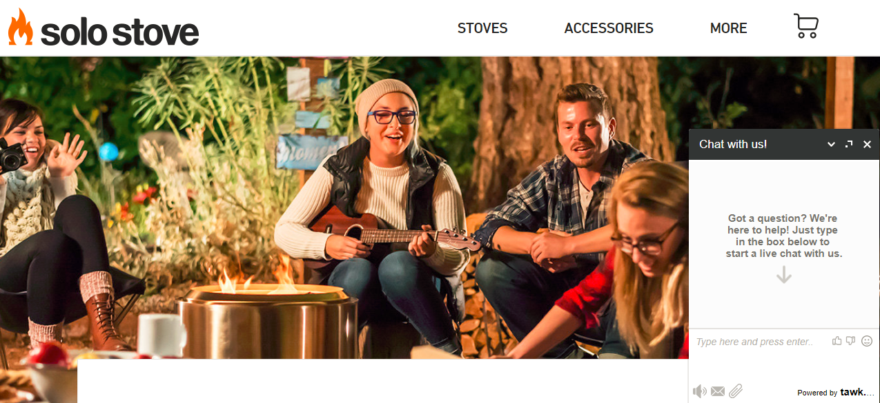
That said, it is also time-consuming, and customers expect to be answered within 30 minutes or fewer. In 2017, the average wait time for live chat was just 45 seconds! And the average conversation lasted nearly 15 minutes.[*]
If you’re not ready to spend a lot of time on live chat or hire someone to answer questions for you, you could also try using chatbots!
Even if you do have these resources, it’s still something you should test before committing. Try it out for a week or month and see if it affects your conversions or customer loyalty (by measuring repeat orders). If not, it may be an unnecessary extra expense.
Here are some live chat apps you could try:
-
Sumo
-
Formilla
-
LiveChat
-
Zendesk
-
Kayako
4. Test Different Featured Products On Your Homepage
Most of the sites I own or manage see 10-30% of all traffic visiting the homepage at some point. Plus most of your natural backlinks will point to the homepage.
Your homepage is a huge opportunity to close more sales. According to a study by KoMarketing, 86% of people who visit a site’s homepage expect to see information about that site’s services or products. This is for a B2B vendor site, but I believe it still applies to other sites from what I’ve seen.[*]
Take a former client of mine, The Smoothe Store, for example. Before working with them, their homepage had virtually nothing on it — just a few product categories and an automated slider.[*]
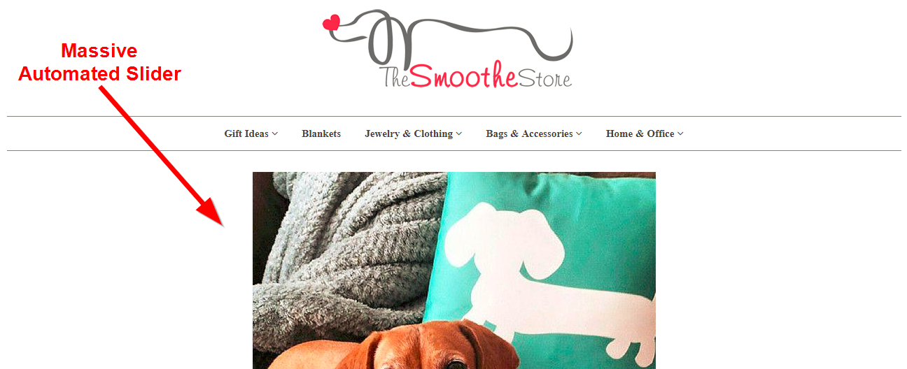
(On that note, please don’t use automated sliding carousels! I’ll explain why in the design section coming up.)
After adding some content, best-selling categories, and more featured products, their sales increased over 30%![*]

Side note: I actually made the changes for SEO purposes (we got them to #1-3 spot for dozens of their target keywords), but the changes ended up helping with conversions, too!
It worked so well that they later added more products and categories people were interested in:
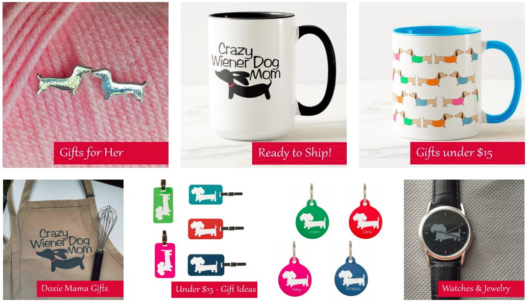
Moral of the story?
Don’t be afraid to try adding (or changing up) featured products on your homepage.
Some ideas you can try:
-
Best-sellers
-
Products “for him” or “for her”
-
Sale products
-
Products under $15 (or another dollar amount)
And that’s all for our ecommerce testing best practices! Next up, design.
Ecommerce Design Best Practices
These days, the way an ecommerce site looks is just as important as the products it sells, or the usability of the site.
Great design improves trust, which in turn increases sales. Great design can also help in other ways — like more backlinks, more press opportunities, and more word-of-mouth.
I’ve got three design best practices for you:
1. No Sliding Carousels!
Automatic image sliders/carousels have become a major fad in the last five years. But remember how I said The Smoothe Store had sliding carousels and you should absolutely stay away from them?
This is because they’re horrible for usability.
First of all, they’re distracting. The human eye is drawn to movement… and away from your call to action.
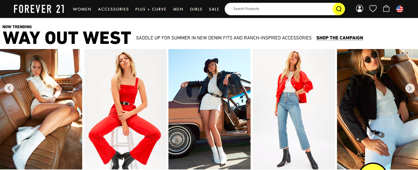
Take Forever21 for example. Their slider rotates every four seconds. I don’t even have time to look at these oddly posed models to figure out what the heck they’re advertising before seeing a new image.
Second, you should never have more than one or two calls to action (CTAs) on any given page. The more options you give, the more people you lose.
Finally, the buttons on sliders are usually hard to click, and people tend to click the wrong thing when trying to follow them. Not to mention they usually move too fast and annoy the heck out of people. (It can’t just be me!)
What should you do instead? You have two options:
-
Add static content, as I did above with The Smoothe Store.
-
Use a rotating carousel, but make it manual. People have to click through to see the next one instead of it automatically sliding.
Personally, I think the first option is the best by far. But again, you can always test the two and see which converts better for you!
2. Use Large, High-Resolution Product Photos
This should be a no-brainer by now, but in case you somehow missed the memo, product photos matter. A lot.
In the world of online retail, people can’t hold a product like they can in real life. You have to sell it to them with nothing more than text and pictures (and, if you’re really good, videos).
Many ecommerce stores use the stock photos given to them by their suppliers. Most supplier’s product photos suck.
Translation: Your photos suck.
The thing is, good product photography isn’t that hard or expensive anymore. You can create a product photography station for less than $40 using your smartphone.
-
A camera (most smartphones will do)
-
A tripod
-
A white background (thin white poster board or a white wall)
-
White bounce cards made of foam board
-
A table
-
Tape
-
The right room (one with natural light)

If you’re feeling really ambitious, you can even create full 360-degree photos with a spin table for an extra $100.
When shooting your images, here are a few shots you may want to take:
-
An action shot with the product in use.
-
A comparison shot of the product next to a pencil or something people can recognize the size of to show your product’s size.
-
A close-up to show the intricate details and craftsmanship of your product.
-
A shot of the packaging of the product, especially if you have awesome packaging!
-
A group shot showing multiples of the products.
-
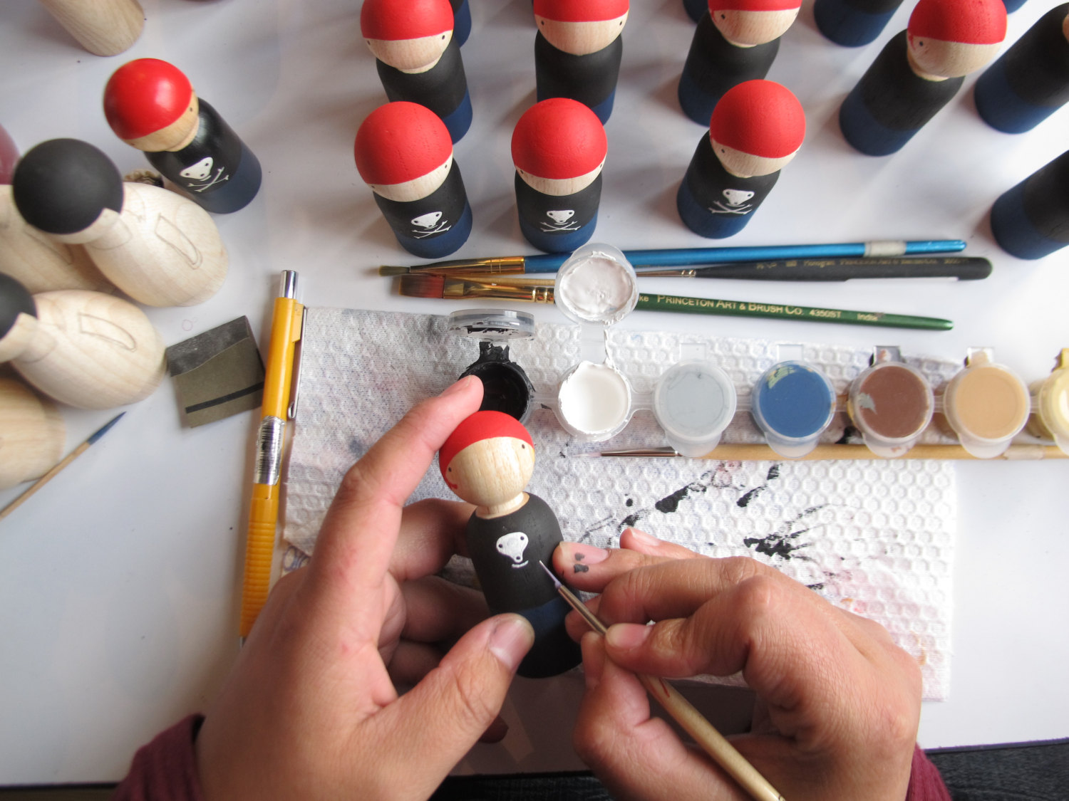
A process shot showing the creation of the product (as pictured below).
Pro tip: Don’t forget to compress your images! Loading speed matters, and product photos can be bulky and bloated. You can do this with a plugin (like WP Smush) or using a photo editing tool like PhotoShop or Gimp.
3. Don’t Be Afraid Of White Space
My final design tip shows I’m a minimalist at heart…
White space is your friend.
As your store grows and you offer more and more products, it’s easy to create an overstuffed, overly complex site. Too many navigation buttons, too many images, too many offers.
Not to harp on Forever21 again, but look at their homepage:

Almost 90% of the page is filled with stuff. It’s almost impossible to know what to click.
Their product pages are just as bad:
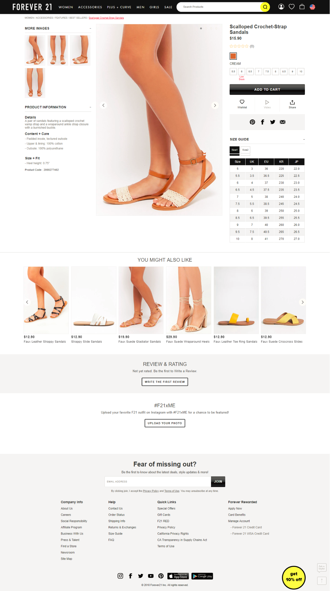
They want you to add the item to your cart, press a yellow button to get 10% off, add it to your wish list, share it, review it, upload a picture of it and join their newsletter. Yikes!
Quick Zip Sheets, on the other hand, has one CTA above-the-fold: Buy Now.[*]
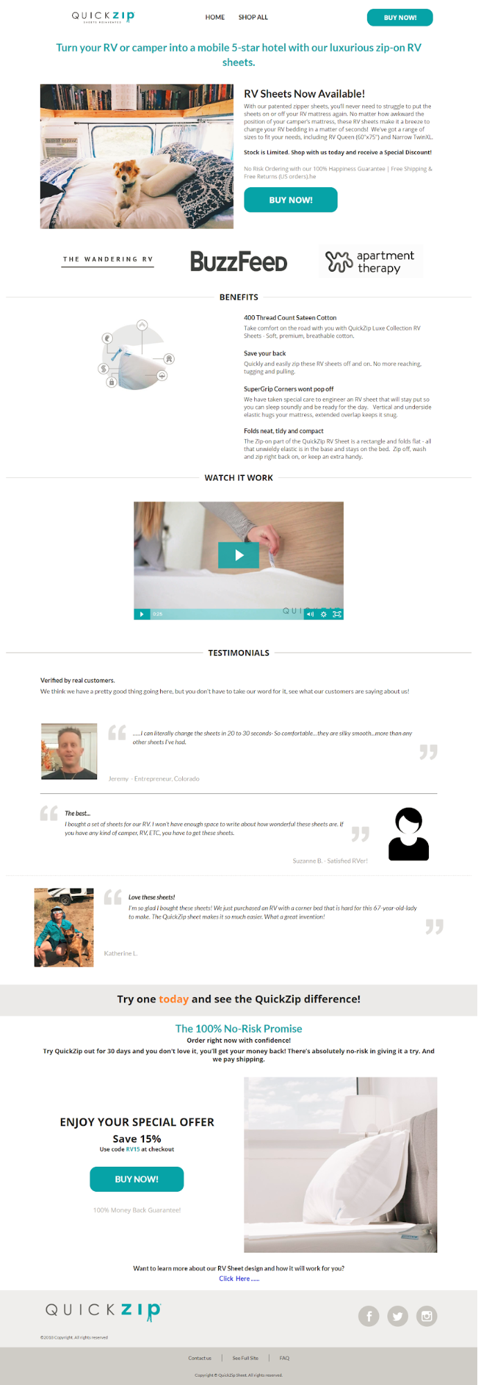
Everything else on the page, all the long-form information, is simply there to help you make a purchase decision. (Minus the link to the blog article, but that’s at the very bottom of the page.)
Plus, there’s plenty of white space in between the images and text, and there’s a clear division of content using color cues, lines, and images.
What Did We Learn?
Look: There’s no “one size fits all” method that applies to every single online store. There are just too many differences between industries and target audiences.
But there are plenty of rough best practices you can adapt to fit your own needs.
My advice?
Grab the checklist below and start implementing them one at a time (including a bonus list of conversion rate best practices I put together). Use the A/B testing methods I shared above to make sure they’re helping (not hurting) your conversion rate.
Ecommerce Best Practices ChecklistOver to you. What changes have you made that have increased your conversion rate? Share your insights in the comments!
Add A Comment
VIEW THE COMMENTS