Email is an amazing channel to stay connected with your customers and increase your sales.
Once you’ve built your email list, it’s still incredibly challenging to figure out what types of ecommerce emails you should be sending.
In this post, I’ll guide you through 19 successful ecommerce emails, breaking down what makes them successful, including real-life examples and giving tips on how you can execute similar campaigns for your business.
If you want to increase your revenue through email marketing, THIS is the post for you.
%(tableofcontents)
Order Receipt and Shipping Emails
1. LaLaLab’s Referral Email
Transactional emails (emails triggered by user actions such as signing up for a service or making a purchase) have an open rate four to eight times higher than mass emails.[*]
Since they know more people will open a receipt than a typical email, LaLaLab takes advantage of this opportunity by driving awareness of their referral program right at the top of their receipts.
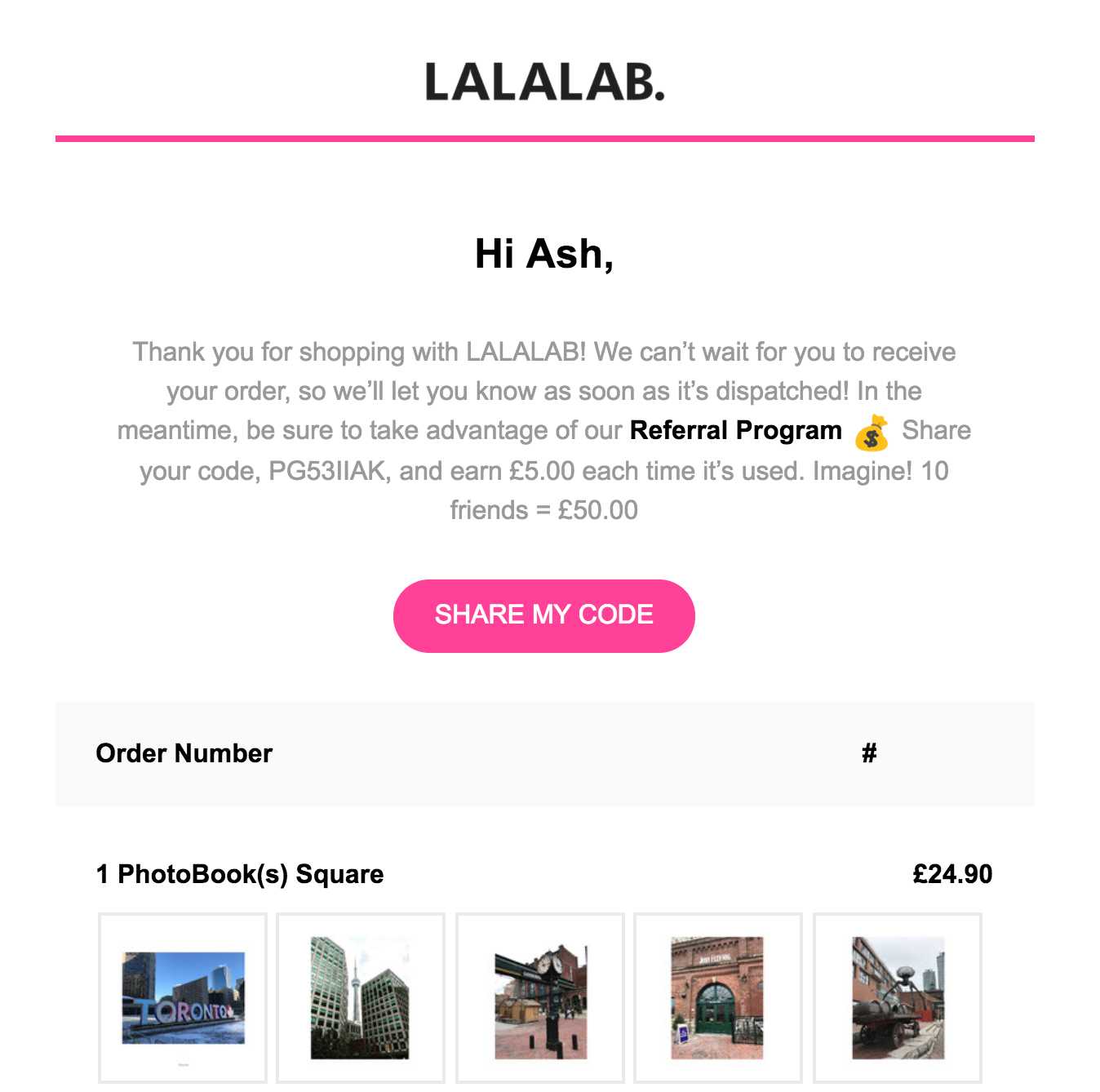
Referrals from friends are the #1 trusted source of advertising. By offering the chance to refer a friend directly after a customer has committed to a purchase, LaLaLab has a great chance of being recommended.
LaLaLab uses the email copy to reinforce the value of their program by showing how much customers could make by referring 10 friends, and uses sharing the referral code as the primary call to action (CTA) in the email.
2. Away’s On-Brand Receipt Email
Over the past couple of years, Away has become a popular luggage and accessories supplier amongst travel enthusiasts. That’s in no small part due to the impressive job Away has done in creating a much-loved brand that’s focused on helping their customers make the most of every travel opportunity.
Whether you’re on Away’s website, their social media profiles, or receiving one of their email campaigns, everything is consistent and focused on enhancing your travel experiences.
This even shines through in Away’s receipts: 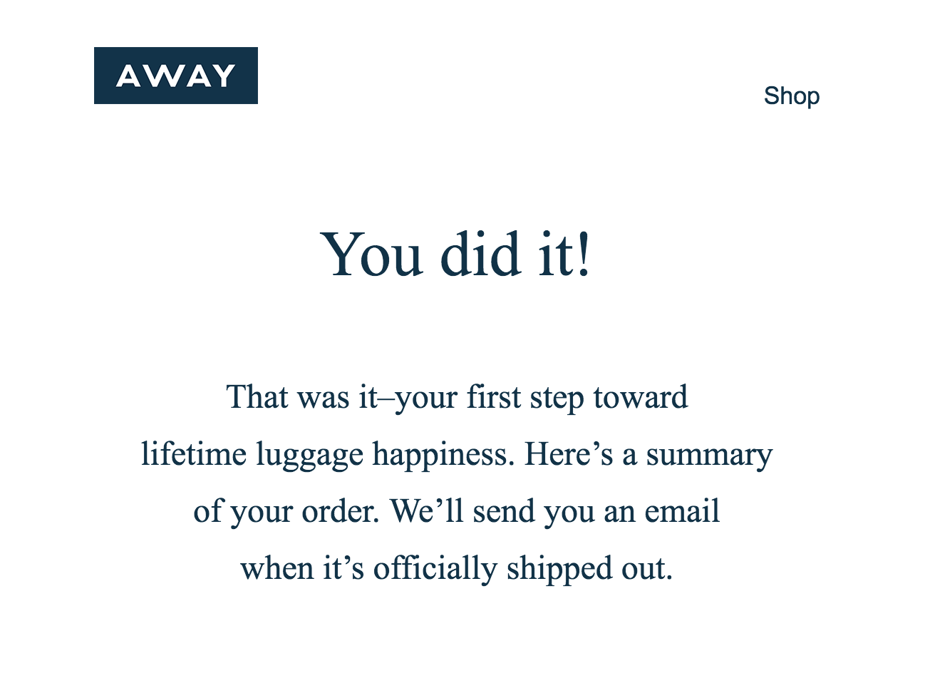
Though the touches might be subtle, the use of “You did it!” front and center of the email gives customers a sense of achievement. And “lifetime luggage happiness” gives customers a sense of how their travel experiences could be enhanced by the purchase.
When writing any email to your customers, think about your brand message and how you can share that in all of your communication.
3. Moment’s “Good Things” Email
Moment crafts beautiful camera accessories for smartphones, and the emails they send are just as well thought out as their products.
Customers receive the below email when their order is shipped. From the subject line “Good Things are Headed Your Way!” to the great content and CTAs, this email is simply brilliant.

Here’s a copy of the email:
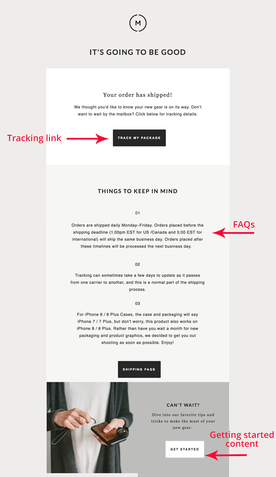
The email answers key customer questions throughout, putting the customer at ease regarding their purchase:
- There is a package tracking link to answer “when will my delivery arrive?”
- Frequently asked questions regarding delivery are answered
- The email ends with a link for getting started with the new purchase
The inclusion of the “Get Started” link is a nice touch as it provides a way for the customer to continue engaging with the Moment brand (and their purchase) before it arrives.
When you’re creating a shipping notification email, give the customer as much information as possible and some fun ways they can continue to interact with your brand.
4. Bloom & Wild’s Discount Delivery Email
Bloom & Wild is a flower delivery service offering unique bouquets of flowers that can fit through a letterbox or mail slot.
As customers often order flowers for other people, Bloom & Wild sends a thoughtful email to let customers know their order has been delivered. Here’s an example below:
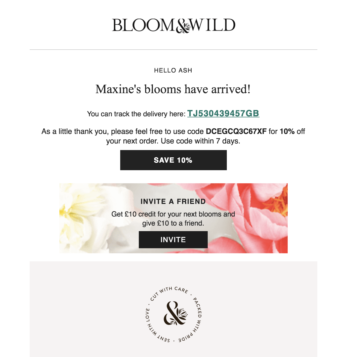
The email arrives just as the delivery has been made—a time when the customer is likely to be feeling good about their purchase and may have even received a thank you message from the person who received the flowers. This is a perfect opportunity for Bloom & Wild to offer some discounts on further purchases. They do this in a couple of ways:
- A limited-time discount offer: The email features a CTA offering a 10% discount on the next purchase. They use scarcity to encourage immediate action by limiting the offer to seven days.
- A friend invite offer: Knowing the power of word-of-mouth, Bloom & Wild provide customers with an “invite a friend” offer with double-sided rewards—both customers and their friend will receive £10 credit. With your ecommerce email campaigns, analyze your sales process and think about opportunities for your customers to invite their friends—and give them an incentive to do so.
Sales and Offer Emails
5. Pro Direct Soccer’s Exclusivity Email
Pro Direct Soccer is the world's largest online football store and regularly emails its customers with offers and new product releases.
The below email is one that Pro Direct Soccer sent to announce the launch of a new adidas football boot. It uses scarcity and exclusivity perfectly to entice the recipient into making a purchase:
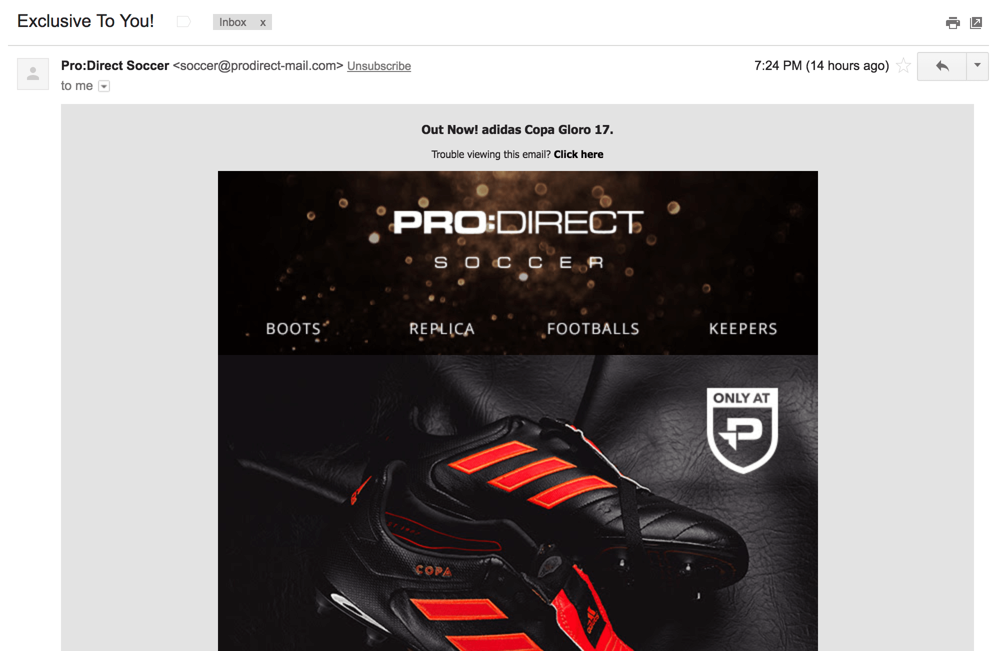
First, the subject line “Exclusive To You!” encourages the recipient to open the email to see what the exclusive is.

Second, when the buyer knows that the item is only available from Pro Direct Soccer, it creates a reason for them to buy immediately.

When crafting offer or launch emails to your list, think about ways to create reasons for them to purchase right away. This could be:
- A limited-time offer (closes at 10:00 tonight)
- A low-stock warning (only 100 available)
- An indication of demand (sold out in 24 hours previously)
6. Tribe’s Scarcity Email
Tribe, a nutrition company from the UK, often runs flash sales and offers. The email below is an example of one recent sale:
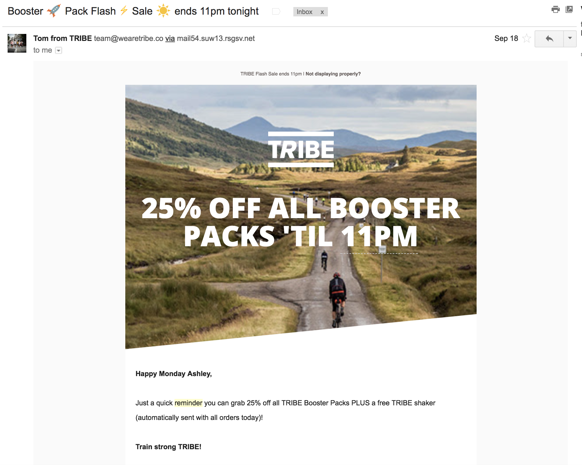
In the subject line of this email, Tribe mentions the flash sale and the deadline (11 pm) but doesn’t reveal the amount that is discounted. This gives the shopper a reason to open the email.
Once the email is opened, the recipient can see the 25% discount offer and another reminder that the offer expires at 11 pm. This creates an urgency to buy. In the text below the main CTA, Tribe offers even more value to the shopper with a “free Tribe Shaker”.
This all combines to create an irresistible offer and the hard deadline of 11 pm that forces the shopper to make a decision quickly.
By letting recipients know how long they have to make the purchase or take up an offer, you can use scarcity and FOMO (fear of missing out) to drive sales.
7. Ugg’s Exclusivity Sale
Customers love to feel like VIPs. Ugg clearly understands this as illustrated by the below email: 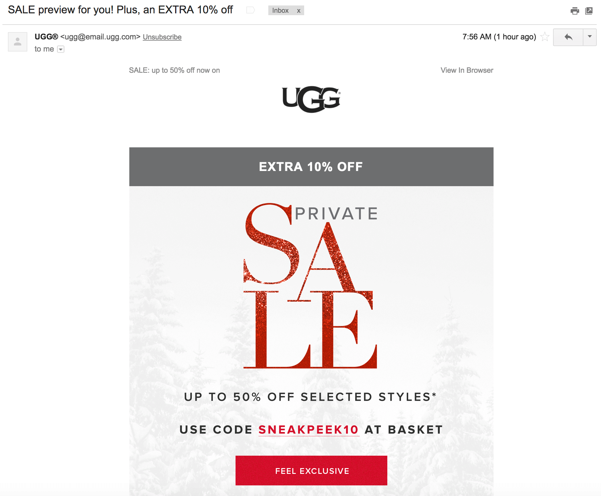
When you receive an email like this, you can’t help but feel special.
The subject line “SALE preview for you! Plus, an EXTRA 10% off” makes customers feel like the offer is just for them. Throughout the email, customers see plenty of little touches that make them feel like a VIP.
- It’s a “Private” sale
- The discount code “SNEAKPEEK10” gives the customer another feeling of exclusivity
- “Extra 10% off” gives the customer the chance to save more than an average Ugg customer
The key takeaway from this Ugg email is to offer your customers and subscribers something that is just for them. This can help build loyalty amongst your customers and also drive sales.
8. MeUndies Upsell Email
Recurring revenue is an incredible way to grow a business. MeUndies understand this and as such offer subscription packages for their products.
To entice more of their customers to join recurring, monthly plans—rather than just making occasional one-off purchases—MeUndies regularly creates “member only” offers where you need to have a subscription to purchase selected products. To promote these offers, MeUndies often sends emails like the below example:
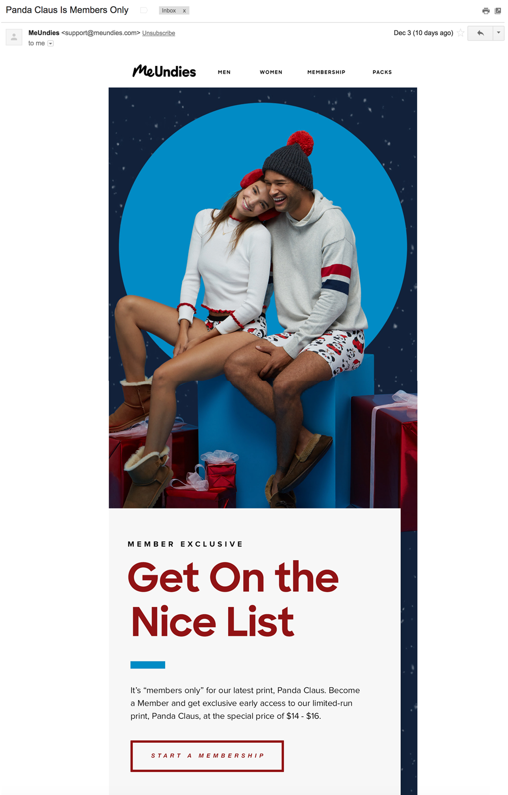
This email works for a bunch of reasons:
- It’s seasonal: MeUndies knows their customers will likely be looking for festive gifts as the holidays approach
- It offers the chance to be a VIP: By becoming a member, customers can receive exclusive designs and access to products before anyone else
- Customers receive a discount: The email mentions the special member’s price for new underwear
9. MLS’s Free Shipping Email
Of all U.S. digital shoppers who abandoned their carts, 39% do so because there wasn't free shipping.[*]
With this in mind, MLS sent the email below to entice shoppers with the promise of free shipping on all purchases:
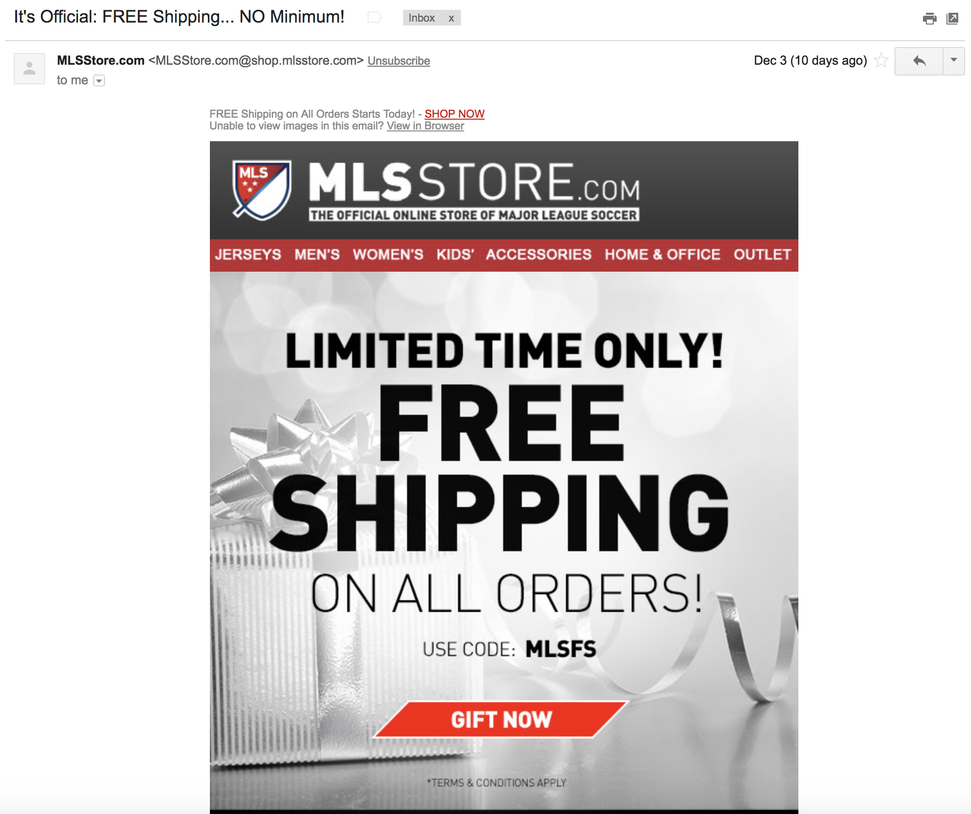
The email focuses purely on MLS’s free shipping offer, bold, large text to promote the offer, and uses the “limited time only” scarcity phrase to drive action from shoppers who don’t want to miss out on the offer.
If your store regularly offers free shipping, email is a great way to drive awareness of this. And if you don’t, a free shipping offer could be an awesome tactic to drive sales over a limited time.
10. Graze’s Seasonal Offer Email
Sales and offers tied to events and seasons can be a great way to increase your sales throughout the year. This is something Graze does wonderfully with their ‘buy one get one free’ offer for the festive season:
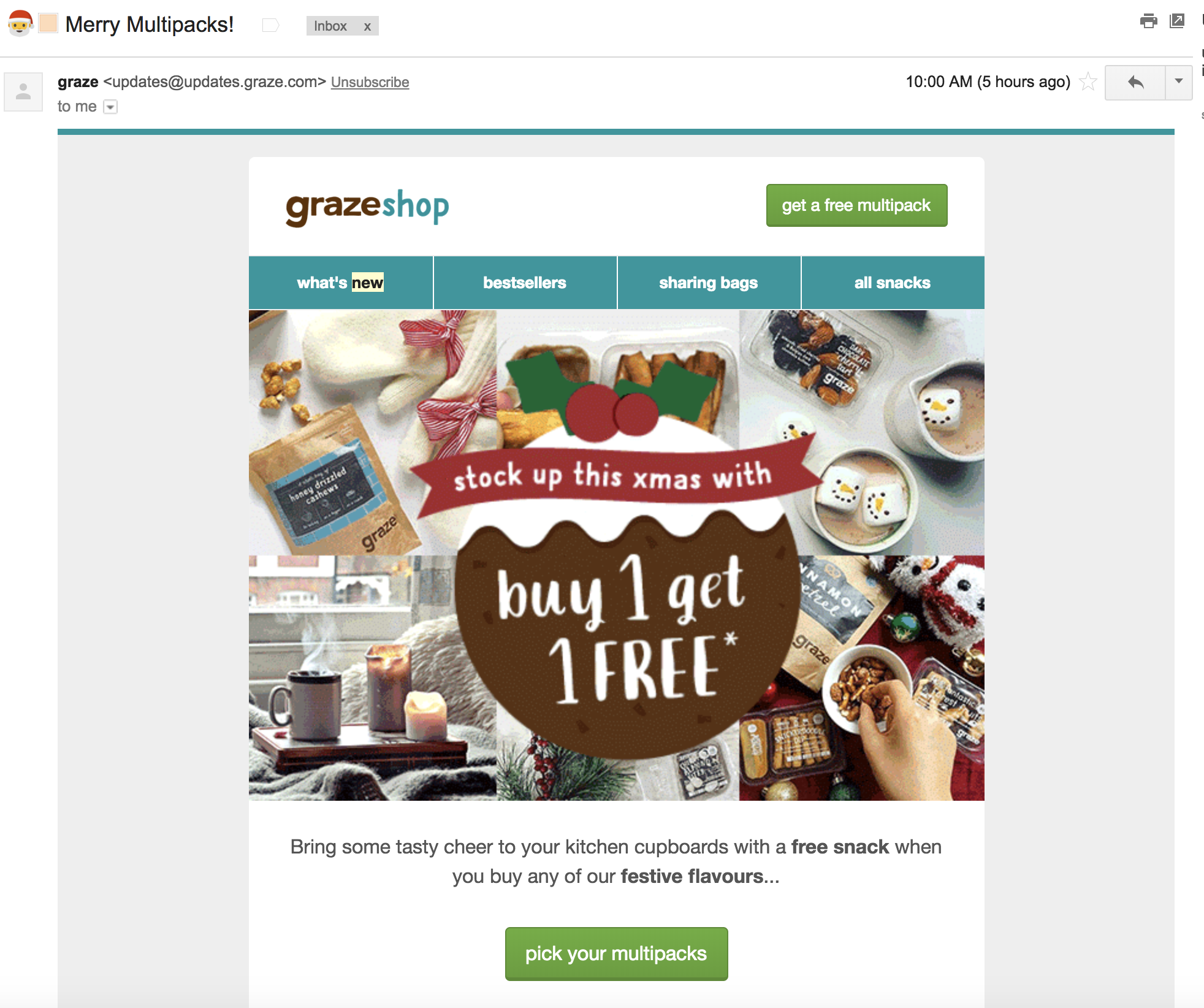
This email works well because everything is consistent and tied in with the festive season, from the types of snacks photographed to the festive accessories in the background of each image (snowmen, oven gloves, candles.)
The promotion is also front and center of the email so that once a shopper opens the email, they can instantly see the offer.
Graze took advantage of one of our top email subject line tips by including emojis in the subject line. Research has found that 56% of brands using emojis in their email subject lines saw a higher open rate on their emails.[*]
11. SpiritHoods Customer Re-Engagement Offer Email
SpiritHoods sells Faux Fur (100% Fake Fur) products, and by using re-engagement emails, it was able to recover 16% of inactive customers.[*]
Here’s an example email:
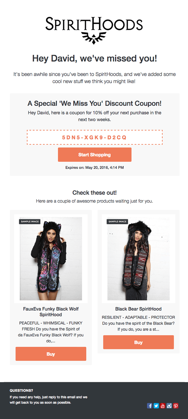
SpiritHoods sends these emails as soon as a customer is deemed to be inactive.
Customers receive this email when they’ve been inactive for three times the average repeat purchase time. For example, if the average repeat purchase time is one month, an inactive customer would receive this email after three months.
The focal point of this email is the discount code offered to entice customers back to SpiritHoods store. The offer is time restricted, giving the shopper a sense of urgency and the expiration date is clearly shown underneath the main “Start Shopping” CTA. SpiritHoods also includes some recommended products in the email to entice the customer back to their store.
When planning your ecommerce email campaigns, think about how you can use email marketing to re-engage inactive customers based on average repeat purchase time.
Cart Abandonment Emails
12. Reiss Cart Abandonment Email
On average, about 70% of customers don’t purchase after putting an item in their cart.[*]
Knowing that a high percentage of their shoppers would abandon, Reiss has created cart reminder emails to show customers items left in their carts. Here’s an example:[*]
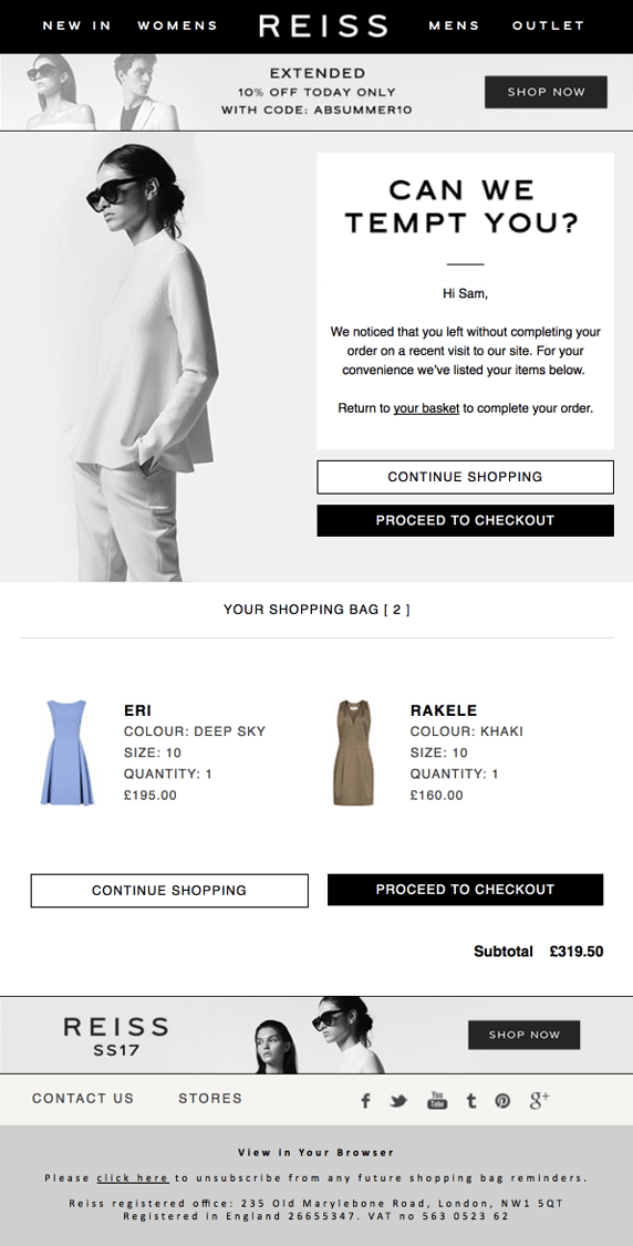
The email features personalized touches such as:
- The shopper’s name
- Gender personalization (shoppers see models of their own gender)
- Their full basket contents
The email also includes clear CTAs to entice the shopper to continue shopping or proceed directly to the checkout and complete their transaction.
This cart abandonment email campaign generated great results for Reiss:[*]
- 46% open rate
- 13% click rate
- 6% increase in sales
13. Cath Kidston Cart Abandonment Email
Cath Kidston, a UK retail store, use cart abandonment emails to increase their order completion rate.
The email below is sent out to customers two hours after they’ve abandoned their cart; the timeliness of this campaign means that it’s opened by more than half of recipients.[*]

Like Reiss’ cart abandonment email, Cath Kidston’s email features the shopper’s whole basket and options to continue shopping and checkout.
This campaign generates clickthrough rates of 16%, and a 65% higher average order value than direct sales.[*]
14. Casper Cart Abandonment Email
Reviews are an incredibly powerful form of social proof. When I want to go to a new restaurant, I often check Yelp for reviews. Same goes for a hotel. I’ll almost always check TripAdvisor for reviews before I make a decision.
Reviews can be an incredibly powerful way to increase sales. Casper, an ecommerce company that sells mattresses, use reviews in their cart abandonment emails:[*]
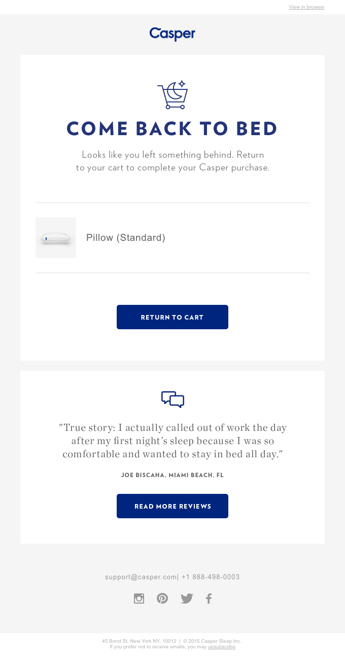
Including a review in an abandon cart email is a great way to use social proof to encourage a shopper to complete their purchase. Not only does the testimonial make Casper’s product seem amazing, but it aligns with their fun and playful brand.
The email also features two main CTAs:
- The most important CTA (and first in the email) takes the shopper back to the cart
- The secondary CTA enables the shopper to view more reviews from happy Casper customers
When someone abandons their cart on your site, try using social proof as a way to get them over the line and parting with their hard-earned cash. Reviews are amazingly powerful, and a well-placed customer quote could be the difference between making a sale and missing out.
15. Whiskey Loot Cart Abandonment Email
Whiskey Loot is a whiskey subscription service that sends customers the best new whiskey samples each month.
When shoppers abandon their Whiskey Loot cart, they receive a super-fun, engaging email:[*]
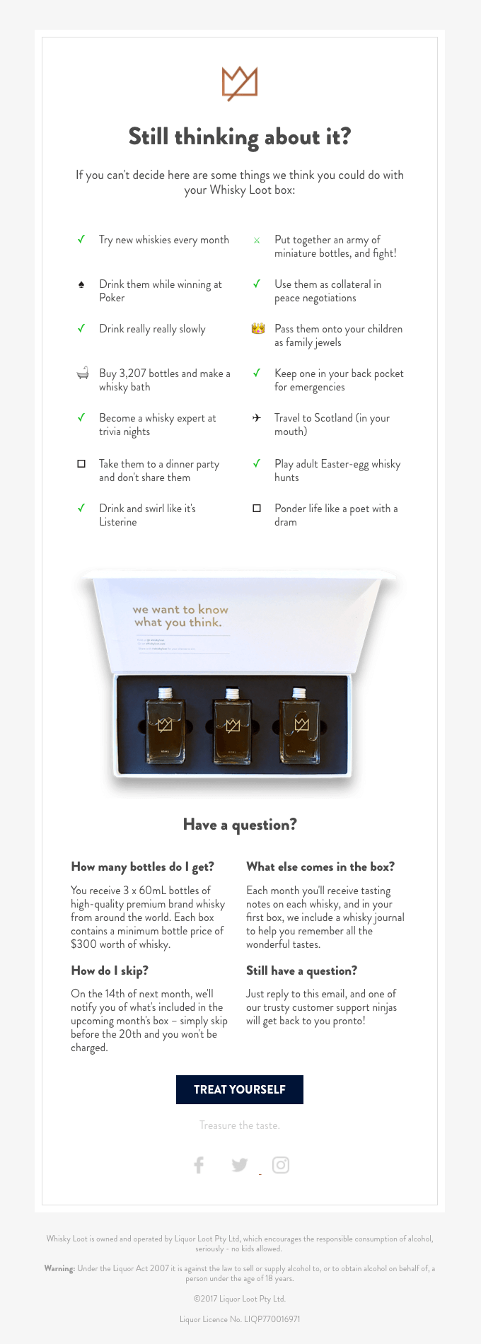
The email opens up with a list of 10 things the customer could do with their Whiskey Loot subscription, to help them make up their mind about the purchase. Much like the Away example above, Whiskey Loot uses their emails as a way to showcase its fun, unique brand style.
It also contains some important FAQs and a product screenshot to show what the customer will be purchasing. The solo “Treat Yourself” CTA in the email takes the customer back to their basket so they can check out and complete the sale.
When putting together a cart abandonment email, include reasons why your customer should complete the purchase and have a clear CTA that takes them back to the checkout.
Feedback and Review Emails
16. Chilly’s Review Email
Chilly's is a bottle company with a mission to accelerate the adoption and everyday use of reusable products. Reviews are quite important for Chilly’s as a way to build trust with new website visitors through social proof, and are featured quite prominently on their homepage:

Chilly’s use email as a key channel to get reviews from customers. Once the order has been delivered, they follow up with a simple review request email:
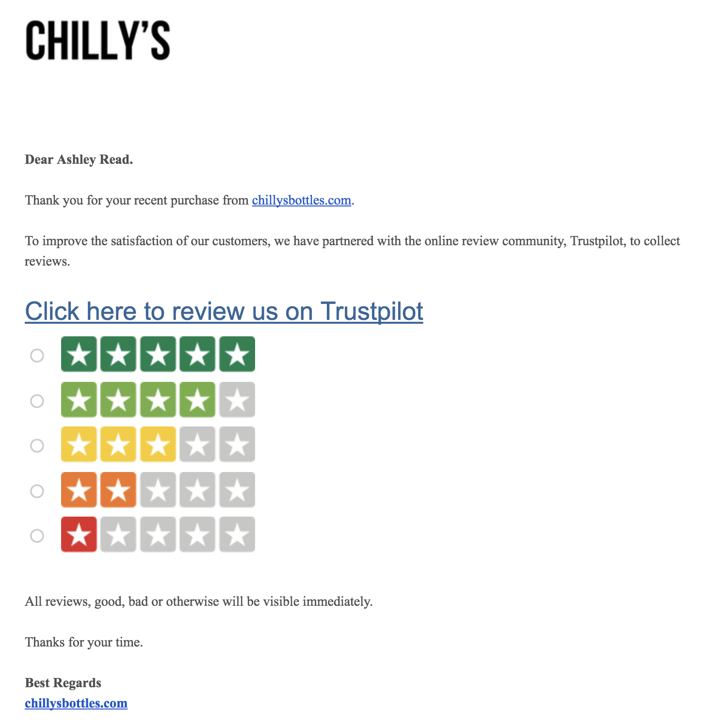
To entice the shopper to leave a review, Chilly’s doesn’t ask them to write a review right away. Instead, they only ask for a rating from one to five stars.
Once the shopper has committed to the review by clicking a rating, they ask for a text review:
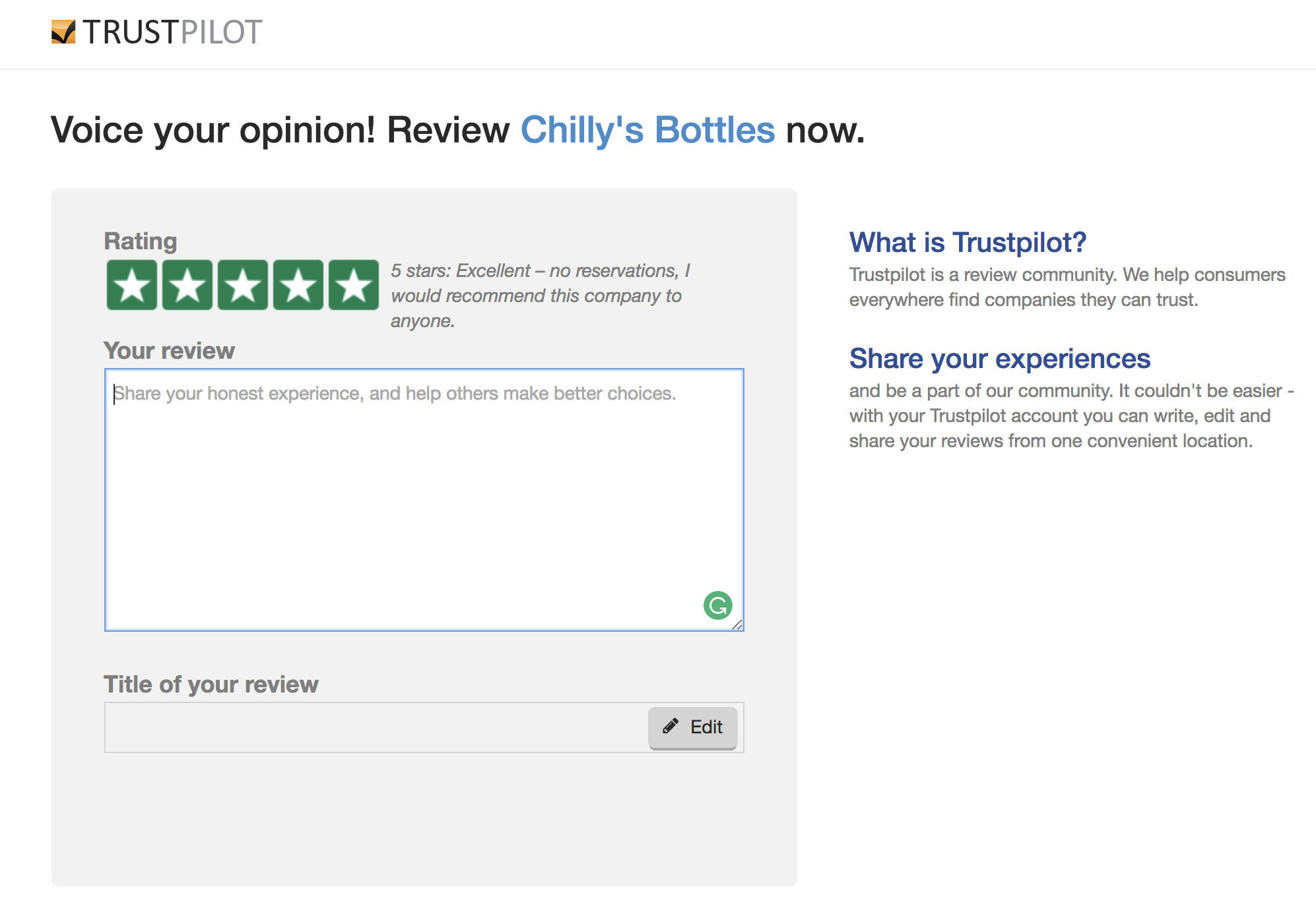
This works well because Chilly’s creates a lower barrier to entry for potential reviewers. Instead of asking for a written review right off the bat, they start with a simple one-click rating. This is a great way to increase the number of reviews you receive. Knowing these reviews, good and bad, will be displayed on Chilly’s website also builds up a layer of trust between the customer and business.
When asking for reviews, make it as simple as possible for your customer to take the first step and commit to reviewing your product.
17. Amazon Review Email
Amazon’s review request email is incredibly simple and focused on exactly one thing: generating product reviews:
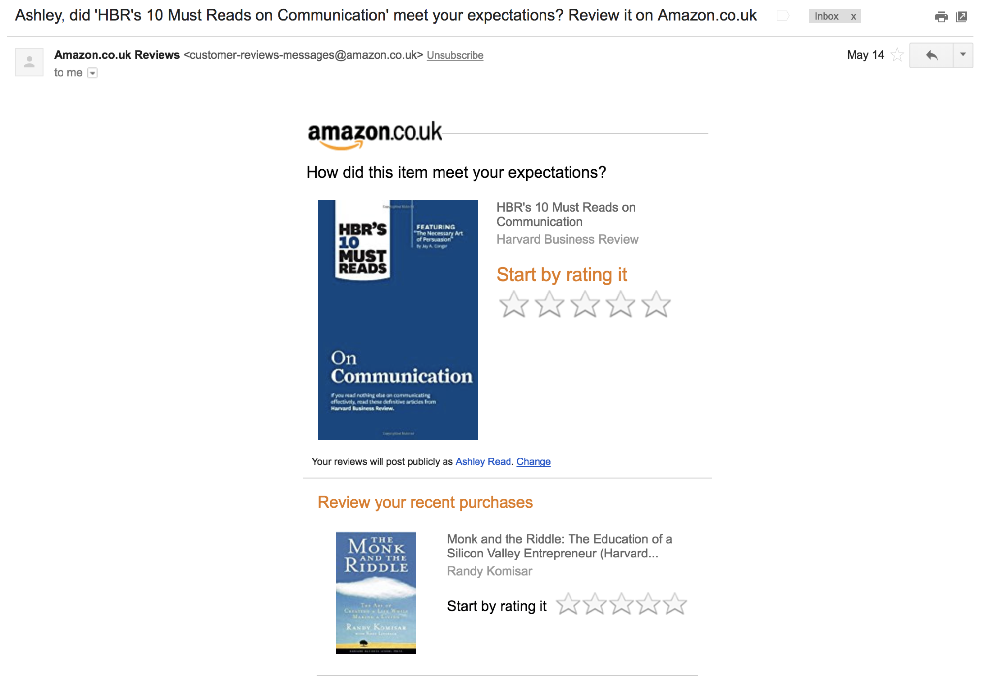
The subject line starts with a personalized touch by using the customer's name and immediately identifying the product to review.
The main CTA in the email is to rate the recent purchase between one and five stars. Under the customer’s latest purchase, the email also encourages the customer to rate other recent purchases.
When requesting reviews from your customers, focus an email specifically on generating reviews, and avoid distracting people with multiple CTAs.
19. Food to Live Feedback Email
Food to Live is an ecommerce business that sells healthy food and snacks. Feedback plays an essential part in their business and helps the company to produce the best products and experiences for its customers.
Food to Live follows up all sales with a feedback email a week after the order was made:
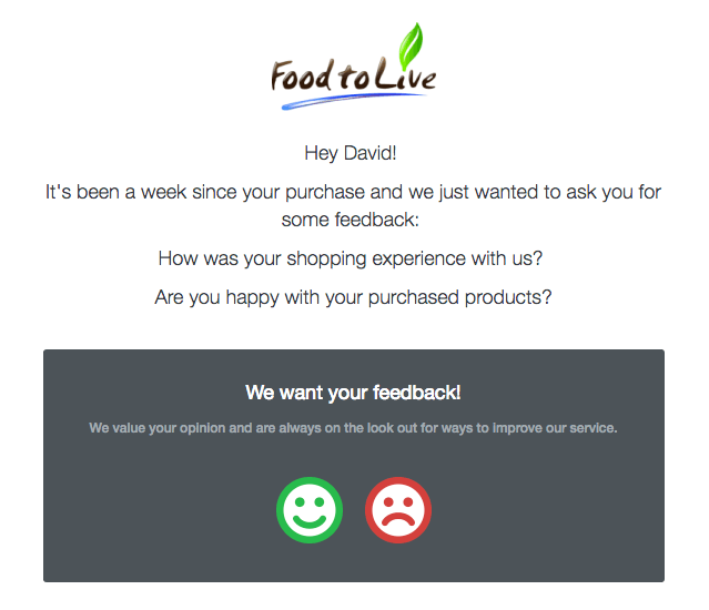
The timing of this email is important as it gives the customers an opportunity to have tried the snacks they purchased and form an opinion on the product and service they received.
The feedback is framed around two simple questions:
- How was your shopping experience?
- Are you happy with your purchased products?
Then, much like Amazon and Chilly’s above, Food to Live offers a simple, one-click rating using happy and sad smiley faces.
19. Nokia Health’s Honest Feedback Email
Nokia Health offers a bunch of smart health products that enable customers to analyze their wellbeing.
Their feedback email stands out because it seeks open, honest feedback:[*]
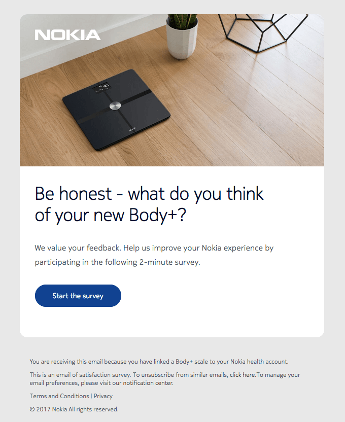
Nokia Health isn’t seeking perfect feedback with this email, and they aren’t even seeking feedback they can publish on their website. Instead, they want their customers to take a quick survey and leave their honest feedback to help their team deliver the best possible customer experience.
In the email copy, it’s clear how much time commitment you’ll need to leave your feedback as Nokia Health explains it’s a ‘2-minute’ survey and this makes it easier for the customer to understand the commitment needed on their part.
If you’re looking for feedback, ensure your customer always knows what’s required of them. No one likes to get tricked into a 20-minute, in-depth survey.
Ready to Maximize Your Revenue From Email Marketing?
The emails outlined in this post have been proven to drive opens, clicks, and revenue for ecommerce businesses.
If you want to be truly successful with email marketing, growing your list is just the start—it’s what you do with your list that will make the difference to your bottom line.
Want to grow your ecommerce revenue? Send better email with our complete swipe file of 20 ecommerce email campaigns.
Add A Comment
VIEW THE COMMENTS