Optimizing your ecommerce landing pages is all about creating the ideal user experience. The more inclusive, informative, and efficient your buyer's journey is from ad to conversion, the more conversions you're likely to see.
When conversions are so closely linked to sales (1:1 with ecommerce), your Return on Ad Spend (ROAS) is your kingpin KPI. You want your money to be generating sales, not clicks. This is where true revenue-focused conversion rate optimization (CRO) comes into play.
So, to keep you focused on generating sales from your ecommerce landing pages, here are 24 tips to optimize their performance.
We've got quite a few tips to look at. So, let's get started.
1. Quality Product Image
The product image is the core piece of your ecommerce landing page. Naturally, it's of vital importance that you start off with a high-quality photo to display your product.
Do more than taking an ordinary product picture with some nice lighting. You want to display your product in a dynamic way that shows how customers can use it — and encourages them to make a purchase.
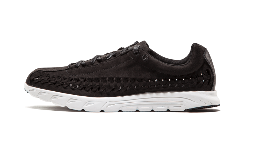
Just take a look at the examples below:
Plain Product Photo:[*]
Dynamic Product Photo:[*]
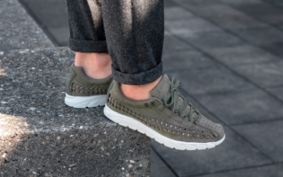
You can see the differences between the plain product photo on top, and the dynamic product photo on the bottom. The more unique and eye-catching your product photos, the better sense your users will have of what your product is like in real life. Someone is actually wearing the shoe.
In fact, how comprehensively you display your product can have quite the impact on your ecommerce conversions. 360 degree product views have been seen to boost conversions by 27%.[*]
See the 10% landing page conversion rate we got using a quality product image
2. Product Zoom Feature
Online users tend to be shopping from a point of convenience rather than going out to shop in person.[*]
One large concern users have about shopping online is needing to return an item they haven’t seen and felt in person. Your landing page must have up-close-and-personal views of your products. It’s imperative to give enough of a feel for your product that it overcomes a user’s hesitancy about not getting a complete in-person sense of the item.
This is where product zoom features come in.[*]

Visit Amazon, and you’ll see they love their product zooms — and for good reason. The resolution, quality, and completeness of the product imagery are very important to ecommerce shoppers.[*]
On top of implementing your product zoom feature, you can offer 360-degree views of your product. Providing a 360-degree view for customers resulted in a 27% increase in conversions (over conventional 2D images) for one customer.[*]
The more of a complete picture you can provide your user, overall, the better off you'll be.
As a general ecommerce rule, have all necessary product information on the page. The same goes for your product image — you want it to provide as much information as possible.
3. Product Sizing & Other Information On The Same Page
We've discussed the importance of having a comprehensive gallery of product photos. Your landing page copy also needs to include all the information your user might want to know about your product.
What should this landing page copy include? Ask yourself what questions you might ask about a product before purchasing:
-
Sizing options (for apparel)
-
Product dimensions (if not clothing)
-
Materials used (if relevant)
-
Features and functionalities
-
Speed/rate/resolution (if relevant)
You can see a strong example of having all the necessary information on the same page in the screenshot below:[*]
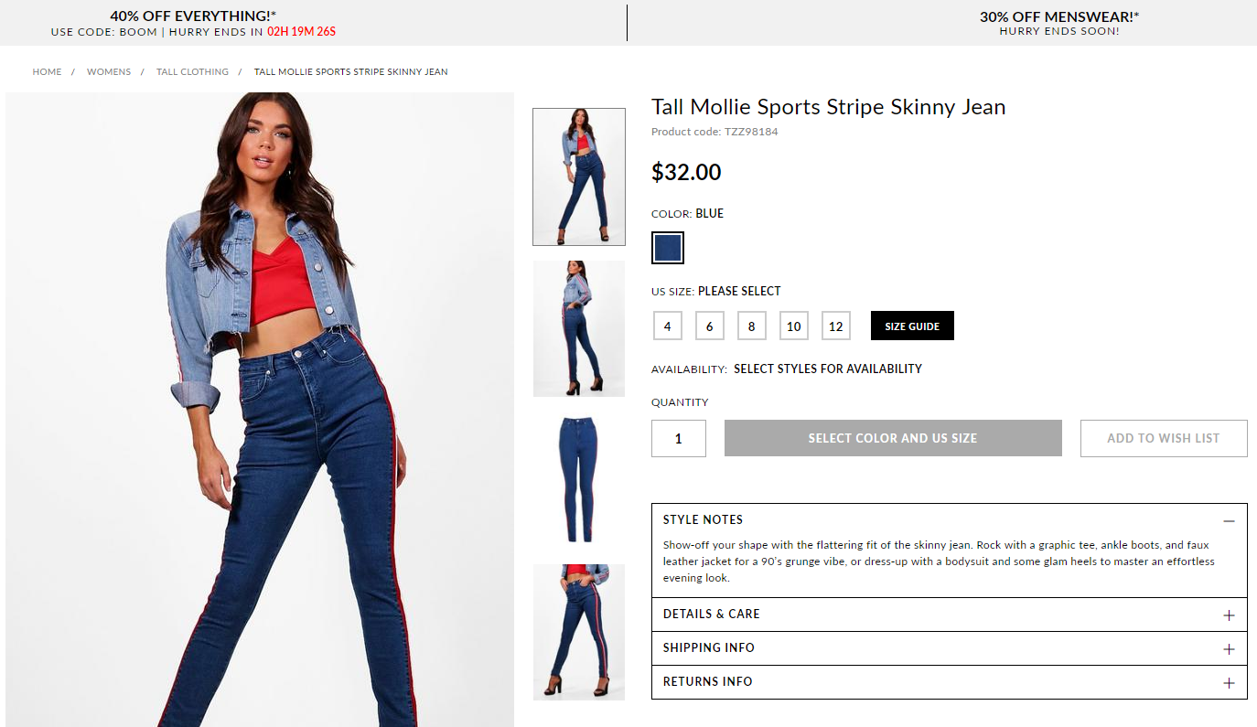
Your goal is to keep a potential customer on the landing page. You don't want them leaving to research — they may not come back. Instead of leaving it up to the whim of a curious customer, have all the information they need on your landing page.
4. Product Videos
You don't have to stop at photos. Having a video walkthrough of your product can be a huge booster to ecommerce conversions. In fact, in one study, marketers found that 44% of customers view product videos while researching their desired local product or/services.[*]
Now, this stat isn’t for walkthrough videos specifically. But it does prove the importance of product views as a whole, regardless of type.

Videos are some common marketing experiences in today's post-digital world.
By post-digital, I mean that today’s users aren’t only aware of high-quality digital experiences like video in their marketing interactions — they expect it.
Behind-the-scenes videos help your landing pages by providing a sense of expertise and transparency in an engaging medium. You can also use video as social proof by including customer testimonials and reviews.[*]
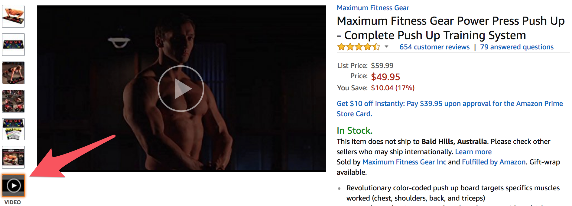
Videos can be great for enhancing your 360-degree product view, or you can use a video to explain the features and benefits of your product. You can even take it one step further and have your satisfied customers create your explainer videos for you. This way, video can step into the realm of direct customer testimonials by taking on the form of user-generated content (UGC). But we’ll get into that later.
5. Social Proof & Reviews
Customers generally love buying what our friends/peers/contemporaries buy. As the late, great, P.T. Barnum once said:
Nothing draws a crowd like a crowd.
Now, to add to the legendary entertainer's quote, let's put some statistics behind it for backing:
-
On average, nearly half of shoppers say they will leave a site and turn to search engines if the brand or retailer site lacks sufficient reviews for that product[*]
-
97% of customers look at product reviews before making a purchase[*]
-
For local businesses, 37% of users go directly to a third-party review site rather than a search engine to find and read reviews[*]
What does this mean? It means that providing reviews and social proof on your ecommerce landing page is a must. You want users on your page to focus on converting — and you want to control what reviews they see and “put your best foot forward.”
Well, only if you want to boost your sales.
There are several types of social proof out there for you to evaluate.[*]
They range from the customer-submitted product videos and reviews, to simple quotes and testimonials. You can see an quasi-example below:

Here’s a landing page design template for using testimonials and reviews (note: the real magic comes from your own users’ satisfaction.)[*]
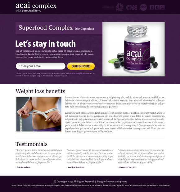
Reviews aren’t the only forms of social proof. As we'll discuss, you can even have your customers create your social proof for you if you really want to start seeing a boost in your ecommerce performance.
6. Mobile Optimization
In 2017, over half the world’s traffic came from users on mobile devices, a jump from 30% to 50% in just two years. This rate of increase means that ecommerce sites can’t afford to miss out on the rising wave of mobile traffic.[*]
Even though mobile accounts for such a large percentage of our traffic, customers still have complaints about making mobile shopping more convenient.[*]
This leads to two big takeaways for ecommerce brands:
-
You need to optimize your ecommerce landing pages to accommodate a growing mobile customer base.
-
With mobile shopping continually growing, there’s a huge window of opportunity to edge out ecommerce competition.[*]
So how can you optimize your ecommerce landing pages for mobile customer experiences? To start:
-
Use a responsive site to make sure your landing page adjusts to mobile screens[*]
-
Make sure you’re compressing your images and minifying any HTML, CSS, etc.[*]
-
Optimize your checkout process to make it as simple as possible for users to buy[*]
7. User-Generated Content
I've mentioned how using social proof can improve sales and how high-quality photo and video improve landing page performance. Why not combine the two tips?
UGC has been a great way to improve ecommerce performance for a while now. Back in 2016, top-performing retailers were able to see over a 100% increase in conversions on ecommerce sites when the users had interacted with a piece of UGC.[*]
Having users submit photos and videos of them using your product gives your potential customers a real-world example of how awesome your product is. It also puts a real face to your product as opposed to a corporation.
Instead of combing through your reviews to find the pretty five-star ratings and raving quotes, UGC consists solely of what the actual customers think. You can take a look at some classic cases of UGC below:[*]
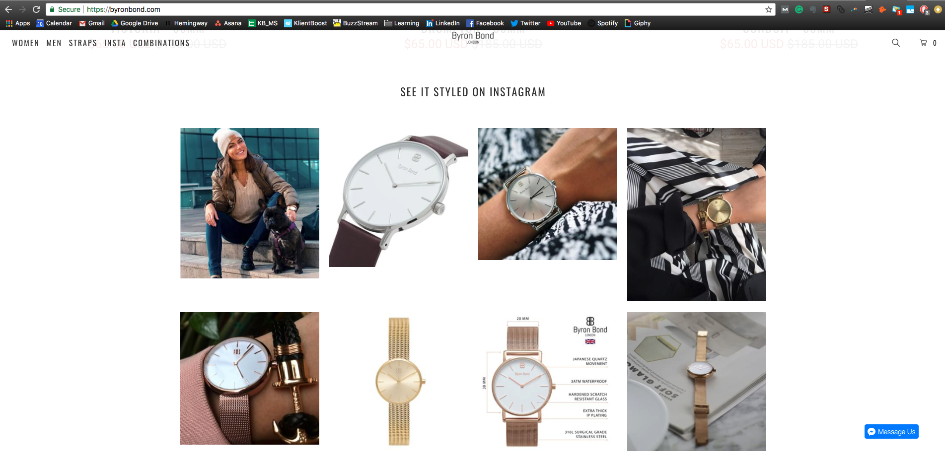
UGC isn't restricted to big brand names though. With Instagram becoming more and more popular, UGC campaigns are becoming commonplace. Like Byron Bond in the above example, you can link to your Instagram account on your UGC product photos and make your pages more shareable as well.
Linking your ecommerce landing page to your Instagram account is a great way to get the UGC floodgates flowing.[*]
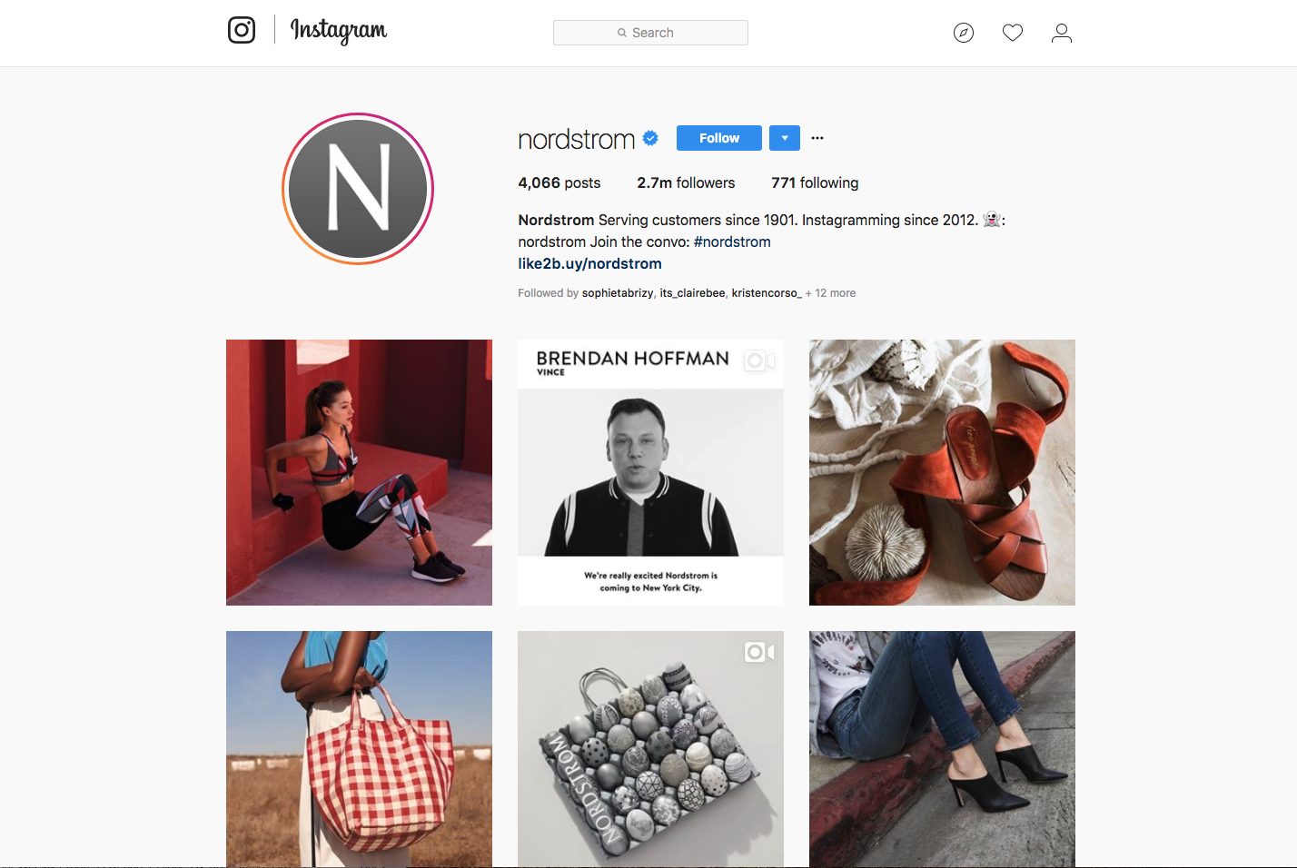
When it comes to collecting and curating UGC, it’s a matter of fostering a helpful community of happy customers.
Granted, actually getting your users to submit UGC isn’t as easy as I make it sound. This is where having a social media team that performs outreach and rewards customer submissions can become a powerful part of your marketing.[*]
8. Traffic Temperature (Ice Cubes Versus Lava)
At KlientBoost, we call this method of gauging the temperature of our incoming PPC (pay-per-click) traffic "ice cubes and lava."[*]
Not everyone is going to want your highest-value product. Likewise, not all users are going to want to buy from your site immediately. You need to tailor your content, copy, and offer for where the user is in their buyer’s journey.
If you’re bringing in cold traffic (ice cubes) then you don't want to scare them away with purchase-focused copy and creatives.[*]
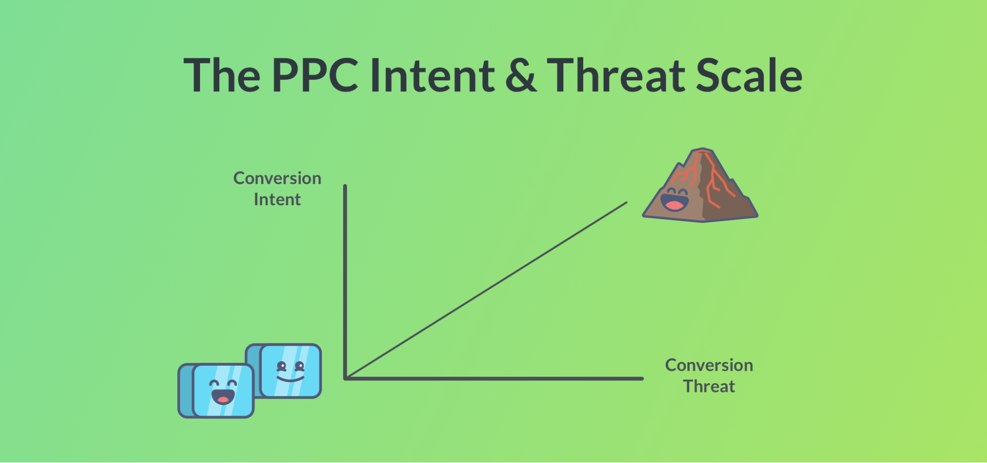
On the other hand, if your ads are bringing in some hot traffic (lava), you don't want to miss out on possible sales by only showing informative copy. The general trend line on the chart shows that the hotter the traffic (higher intent) your ads generate, the more intensive the offers (higher threat) you can promote on your landing page.
Make sure you're accounting for this when you're personalizing your offers — it's all about showing the right products to the right users.
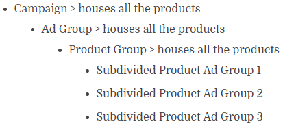
You can do this by cutting down your “keyword:search term ratio” in your ecommerce PPC. On ordinary PPC, the best way to do this is through using Single Keyword Ad Groups (SKAGs) in your AdWords setup. But for ecommerce, Single Product Ad Groups (SPAGs) are the way to go.[*]
9. Personalize Copy For Returning Customers
Your landing page copy should be customized beyond just what ads your potential customers are coming from.
In terms of “PPC temperature,” you can consider users who have previously visited your site as molten hot lava. They’ve already displayed an interest in your product and (hopefully) have already passed the consideration stage of your funnel (the “Leads” stage pictured below).
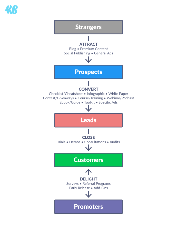
At this point, your success is all about marketing your unique value and closing the sale (or upsell) with copy that prioritizes the interest they’ve shown in the past. This is where customizing your landing page copy to your returning customers can make the difference between conversions and bounces.
Today, users are looking for a personalized ecommerce experience. Including past purchases and discounts on items that have previously been in their cart or were previously unavailable, can increase conversions and sales a great deal.[*]
Here’s an example of what this might look like when a customer adds a Nike shoe to their cart, then comes back to the site:[*]
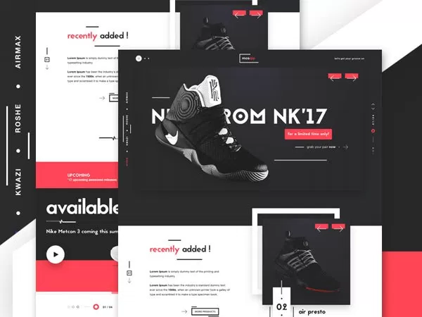
We'll dive into some specific tactics on how to personalize your pages to your customer's previous behavior below.
10. Limited-Time Offers
One specific way to boost conversions is using copy that creates a sense of eagerness to convert your users. With what? With that good old "U-word" all us marketers are so used to typing.
“URGENCY”
You can create a sense of urgency on your pages through many different means beyond just copywriting. On top of headlines that imply a sense of urgency and direct, action-focused call to actions (CTAs), you can also leverage color, time, and even your remaining stock.[*]
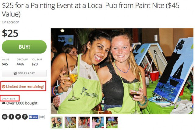
If you have limited stock, you can post a live countdown of how many items you have left, or stress how much time the user has to act on this specific offer.
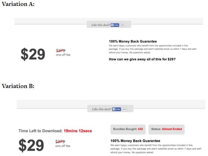
By emphasizing the limited-time offer, you can evoke some urgency in your users that should generate an increase in sales. For instance, the conversion rate of Variation B from the above screenshot performed nearly three times better than the original, boosting sales from 3.5% to 10%.
11. Product Recommendation Engines (PREs)
The smarter shopping platforms and product engines become, the more useful they become to marketers looking to optimize their ecommerce performance. With certain shopping platforms’ AI, you don't even have to research your repeat customers to find their favorite products. Tools, called Product Recommendation Engines, will find your best products to recommend for you.[*]
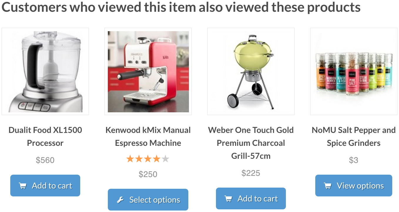
These PREs will take into account your users' different clicks, views, and time on page. For returning users, they’ll account for what products they've bought, added to a cart, and left in a cart.
The recommendation engines take time to fill with the necessary amount of user data, both explicit (comments, likes, etc.), and implicit (purchase history, return history, cart events, etc.). By using one on your site, you’ll be able to continually optimize your PRE as it processes more user information.[*]
If you’re using a landing page for this ecommerce campaign, make sure it is still linked to your actual site (where the PRE is hosted).
By integrating PREs into your ecommerce landing pages, you can show relevant products to more purchase-ready users, and increase your upsells and repeat purchases by doubling down on your wins. Ideally, you will identify your most profitable product lines or categories, and allocate more ad spend on PPC campaigns towards these landing pages. After all, you don’t want to be investing in traffic; you want to be investing in conversions — aka, sales.
12. Make The Conversion Process Easy
You've taken the time to optimize your landing pages, and users are filling up their carts. The last thing you want now is them to bounce away from your page without completing the purchase. You wouldn't want your in-store customers randomly leaving the store after an hour of browsing without buying anything.
Here's the difference: for ecommerce shopping — it's your cart itself that can be causing customers to leave. Your landing page or product page may be perfect, and users may be delighted with your product — but if your cart and checkout process itself isn’t optimized for speed and simplicity, your finish line may be the very cause of your problems.
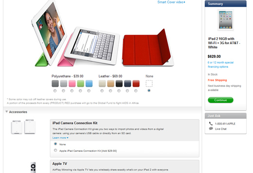
Here’s an example of a good ecommerce checkout experience that’s simple and easy-to-read, with an order bump:[*]
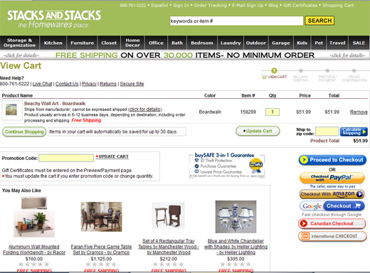
Here’s an example of a bad ecommerce checkout experience with lots of checkout buttons, and too many options to choose from:[*]
According to a recent study of U.S. adults, 28% of cart abandons are caused by unnecessarily complicated checkout processes.[*]
Additional forms or registration also play a part in this high cart abandonment rate. It doesn't make sense to optimize your landing pages for higher performance and keep your Achilles heel of a checkout process. Make the actual conversion process itself as easy as possible. If you want users to convert on your page, make it easy for buyers to check out.
13. Feature-Focused Product Copy
There are so many different ways to describe your awesome product. Where to begin?
Start with the actual features of what your product can do. Be specific with your ad copy — you aren't just marketing your blender can blend up fruit. Your copy should focus on what features of your blender are unique to the market:
-
How fast does your blender blend?
-
What metal are the blades made of?
-
How well/completely does it blend fruit?
-
How much faster is it than competitors’ blenders?
-
What else can your blender blend?
-
etc.
Feature-driven copy is where you get to explain the "what" of your product to users. Here’s an example Blue Apron’s Roasted Pork & Mustard Pan Sauce landing page:[*]
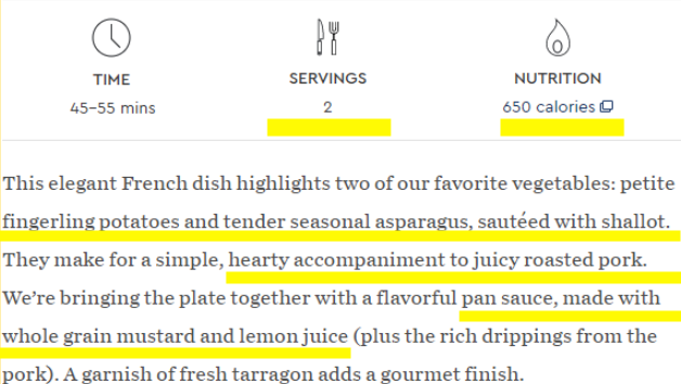
Yes, a picture is worth a thousand words, but that doesn't mean you can't spare a few to explain your product on top of that.
In the above screenshot, you can see the descriptions of ingredients and the time necessary to prepare the meal; you can even click through to view nutrition facts on the “650 calories” text.
Here’s another example from Blue Apron’s homepage:[*]
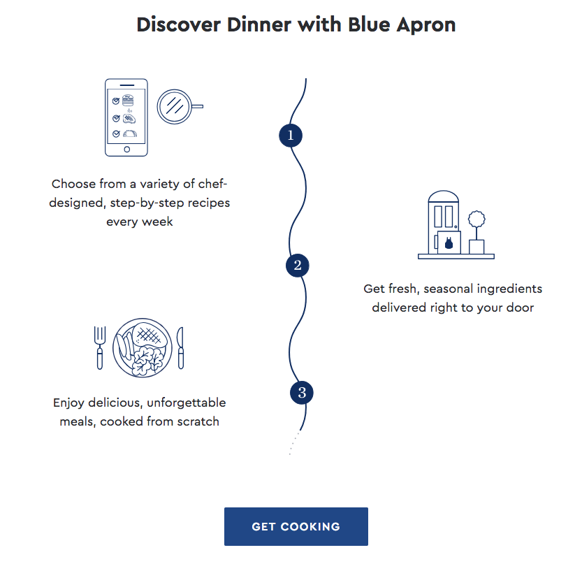
Feature-driven copy most likely won’t be the deciding factor in closing the sale. Even though we’re partial to our own products and their unique features, often users see a blender as, well, just that — a blender.
Feature-driven content is more vital to differentiating your product when you’re selling a complicated item at high rates. Otherwise, it’s the benefits and user-focused value that’s going to help you make the sale.
14. Benefit & Value-Focused Copy
If feature-driven copy is where you get to explain the "what" of your product, then benefit-driven copy is where you get to explain the "why."
The key here is to be specific with the benefits your product provides users. The obvious benefits won't work here. In the blender example, listing "blended fruit smoothies" as a benefit isn't going to work. But, some benefits like the ones below might:
-
Blends a 12 oz smoothie in half the time of other blenders
-
Titanium blades for fine chopping
-
Removable bottom makes cleanup easy
-
Easy-pour lid ensures there's no spillage when serving
The above examples of benefit-driven copy focus on speaking in terms of what customers value — the benefits of a product that makes their lives easier.
If you want to take it one step further, benefit-driven copy can include "value-driven copy" that monetizes these different benefits.[*]
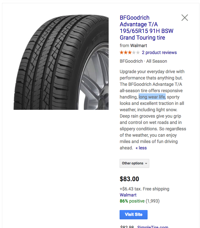
Putting an actual dollar amount to the benefit is a great way to increase engagement. Now, it might not work so well for blenders, so we'll look at a different example here.
Let's consider your ecommerce site is now selling cars. The benefits (and their value) of the new car model you're selling could look something like this:
-
Tires last two times as long as any other car, yet are the same price (50% the cost on replacements)
-
Shatter and scratch proof windshield (zero future repair costs)
-
1.5 times the average MPG (50% savings on gas)
When you get an actual product, you can put a dollar amount to these stats as opposed to percentages, showing users their actual savings in dollars.
Regardless of which of the three tiers of copy you use on your landing page, the key is to remind your users of the value of converting — the value of your product.
Answering the “why” behind your product often outperforms classic feature-driven copy, as the why is more closely tied to emotions and the user’s actual desires. It also avoids complicated jargon that can bore users. Communicating your unique value proposition as clearly and delightfully as possible is key.[*]
15. Clear & Present CTAs
Keeping your CTA above the fold on your landing pages is considered a tried and true best practice.[*]
But when your landing page is also a product page, things can get crowded. If you're selling a product that requires a good deal of background information that the user will be scrolling to read, an above-fold CTA may not be enough. Your CTA is meant to be the driving action on your landing pages, and it should be constantly encouraging and reminding users to convert.
If you do have a long landing page, the CTA should be constantly visible to your users. No matter where the user is scrolling on your page, make sure the CTA is always clear and present.
You can use sticky elements like in the example below to do this:[*]
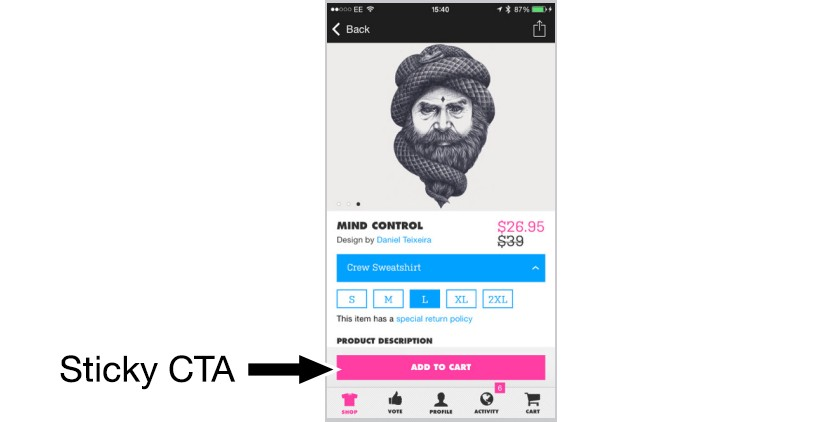
Sticky elements will anchor your CTA or registration form to be on screen regardless of where your user is on the page. This is a great way to keep the goal of conversion always on your user's mind (and in their peripheral vision) while they peruse your products.
16. Shipping Rates (& Other Adjustments)
As long as you're being consistent with supplying all necessary purchase information, make sure you don't leave out shipping costs. An ecommerce study showed that 25% of customers reported unexpected shipping costs as their reason for abandoning a cart.[*]
More often than not, digital customers are estimating their total bill as they fill their cart. So, hitting them with extra shipping costs at the very end of the shopping experience can be jarring. In fact, it can be a bit of a slap in the face.
Today, digital customers value transparency, and keeping them in the loop of what they're being charged for is a great way to build that trusting relationship. But hitting them with extra charges at the end is a great way to burn a bridge. In fact, 39% of customers say they would bounce if hit with surprise shipping fees during checkout.[*]
Let's take a look at the example below:[*]
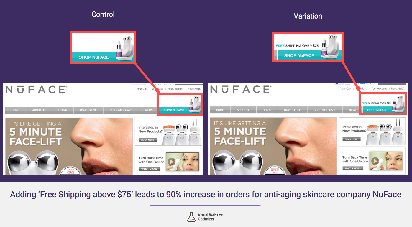
As you can see in the example above, adding the “Free Shipping Over $75” nearly doubled their orders for their skincare product. This is most likely for two reasons:
-
Clearly and transparently explaining the shipping prices helps comfort users, and makes converting easier as there is no fear of hidden fees.
-
There is an actual incentive now to increase order size and complete your order, so users can capitalize on the free shipping deal.
A little transparency can go a long way, as the stats in the above example show.
17. Dynamic Pricing Options
If you have a large and diverse enough product base, you may be regularly shifting your prices. Sometimes this may be caused by your own costs and expenses changing, and other times it may be caused by you offering a special deal. Regardless, you want to keep your prices competitive and adaptive.
This is where dynamic pricing options are so helpful.
In the below screenshot, the flight-booking site Easyjet gives multiple pricing options for certain flight dates. It even highlights the best deal with the “lowest fare” badge on certain tickets.[*]
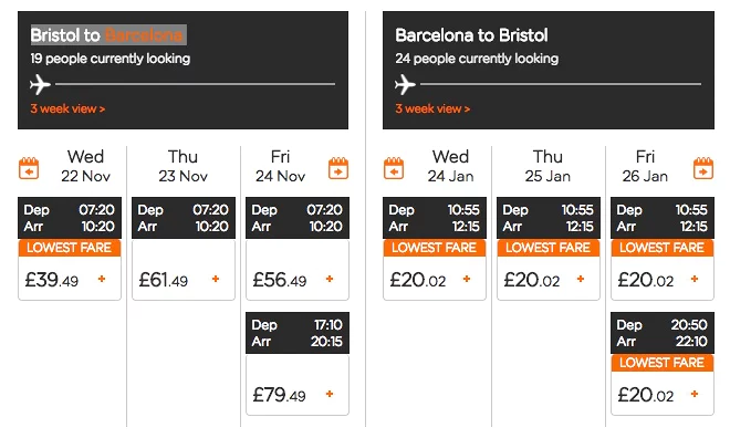
Any way you can highlight the "deal" your user is getting by the slashed prices is a good conversion tactic, as long as it is truly a deal.
The goal is that you’re not only offering your customers a deal, but that you're promoting the fact that it is a deal. The savings may not be as much of a conversion booster as the feeling that they're getting a deal.
18. Solve Your Cart Abandonment Issues
Making your conversion process as easy as possible and optimizing your CTAs and product information is a good start. But there's still plenty to be done if you want to optimize your entire checkout process.
You want to make sure that your conversion processes aren't scaring users away. But you also want to make sure that you're catching any loose sales that may have bounced with a full cart (or are considering bouncing).
Expensive shipping is the primary reason why people abandon their cart:[*]
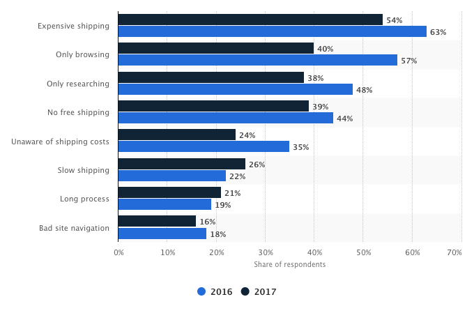
Knowing this information, you can offer people free shipping or a discount when they try to abandon their cart, like what Fanchest did with this Sumo cart abandonment popup to recover $60,300 in sales:
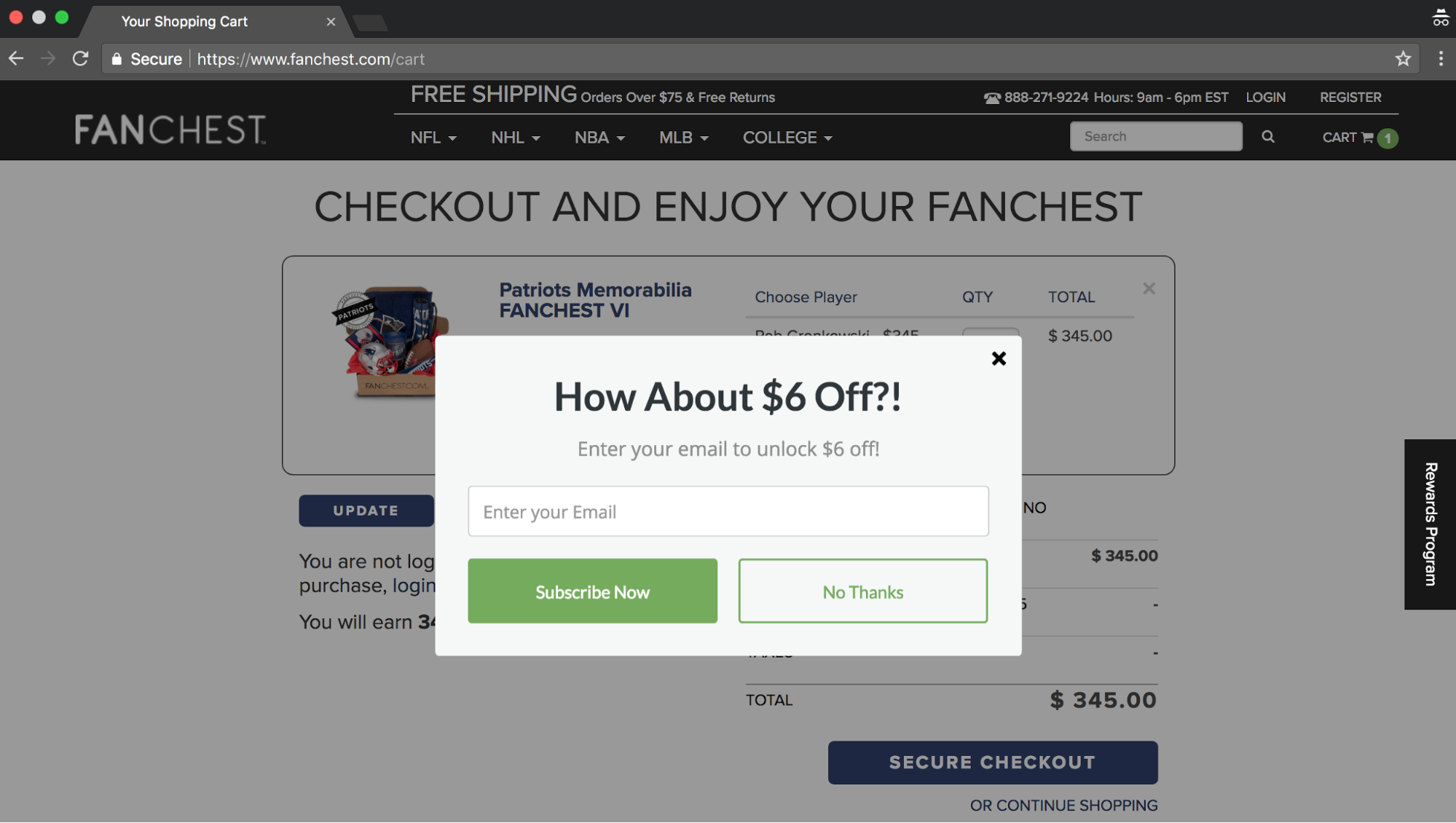
People who see this you can pull across the finish line without further ad spend, helping boost your bottom line. This strategy can also can help increase the customer lifetime value (CLV) of your users, if you're taking first-time buyers and turning them into repeat customers.
19. One-Time Purchases Versus Repeat Customers
Each type of user has his or her own level of value to your business. Based on their purchase frequency, average purchase price, etc., you can calculate the CLV of a user.[*]
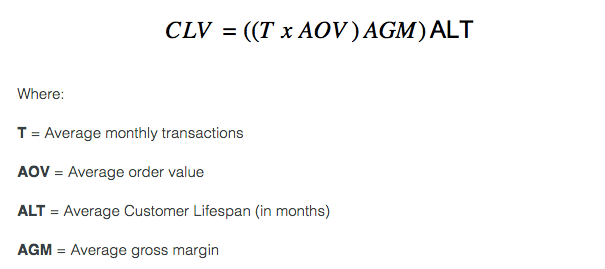
One-time purchasers would obviously have a low CLV as they only contribute to your sales revenue the one time. However, repeat customers have a higher CLV because of their upsell potential. Essentially, the more revenue a single customer is responsible for generating, the higher their CLV.
You want to prioritize campaigns that generate the most profitable type of customers. As Gordon Tredgold has said:[*]
“[You want to] Fire Your Worst Customers”
To boost overall CLV of your ecommerce customers, you may want to look into product upsells. There are also other ways to improve the long-term CLV of your clientele.[*]
As a rule, it's important that you at least segment your campaigns between landing pages that generate first-time/one-time purchases, and those that generate repeat customers.
20. Create Urgency To Close Sales
I mentioned the perks of leveraging urgency on your landing pages in a previous section on limited-time offers. But there’s more to urgency than just stressing a limited-time offer.
Many successful ecommerce brands show users how many of a product are in stock to help increase urgency and encourage users to buy right away.
This is a big win tip when it comes to closing one-time purchases. If you're marketing a seasonal or trending product (like Tony Robbins does when marketing his events) on your ecommerce landing pages, emphasizing their exclusivity and urgent off-the-rack popularity should boost sales quite a bit.
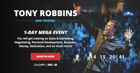

Using urgency can help fix any cart abandonment issues you may still be dealing with, by convincing any undecided customers to buy before they miss out. Fear of missing out is a real thing, after all.
21. Exit Intent Popups
Thus far, the tips we've discussed to help you with cart abandonment have been ways to lower friction to make conversion easier. But what if your conversion slide is already as slippery as you can get it, and users are still bouncing with full carts? Well, then you can implement some less-gentle tactics like the example below.
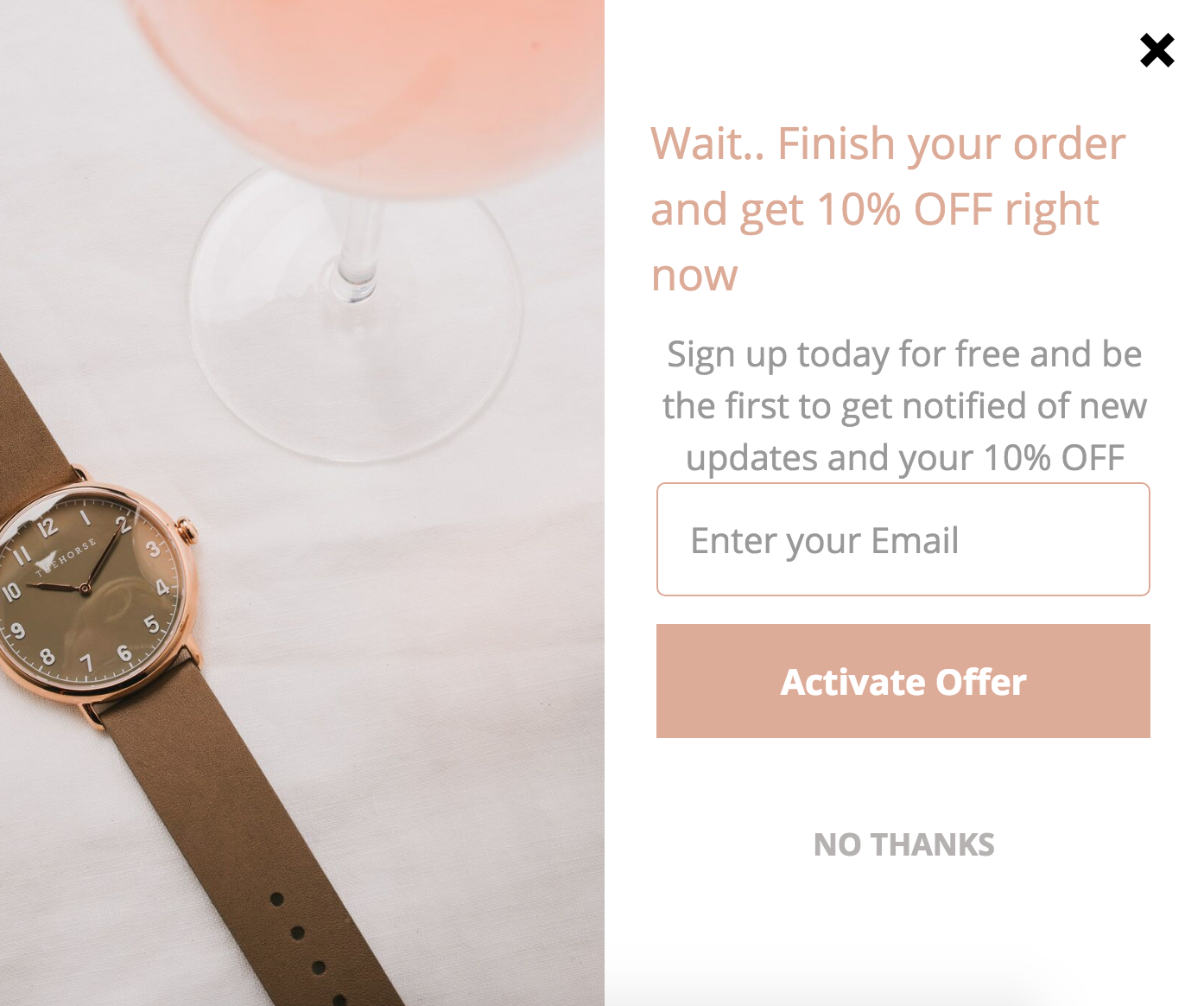
This exit intent popup generated $50,522.22 sales in 30 days for The Horse (a small ecommerce company in Australia). You can see step-by-step how they set it up here.
Using exit popups can help remind users that they still have items in their cart they have yet to purchase, and prompt them to finish their order.
Not all cart abandonments are straightforward bounces off your domain. Some can be attributed to users simply forgetting to finish the transaction. And, on top of that, some cart abandonments are due in some part to uncertainty about the quality of the domain, payment method, or product.[*]
Exit popups can both remind users who have forgotten to convert, and encourage users who are on the edge, both of which should be good for your sales. You can even create exit surveys that ask users why they were bouncing, which can help inform your future landing page strategies.[*]
22. Social Login
If you've implemented any form of loyalty programs to increase the CLV of your ecommerce customers, you may be using a login for users to gain access. Guest what? Users hate that.
With users today having to remember so many different usernames and passwords, adding one more isn't helping you at all. This is where plugins like Social Login can help give your loyalty program a little boost. Here’s how Huckberry does it:
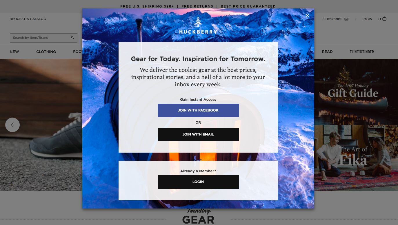
Social Login allows users to sign in and buy your products or special offers with their social profile. More importantly, it lets them log in with a click of a button — no username, no password, no nothing.
This can cut down the registration and login hassle by a great deal, which should put your users in a more purchase-ready mindset. On top of the already listed perks, Social Login usually allows for a "share with friends" promotional option.
23. Remarketing From Cart Abandons
The last two tips we have to discuss focus on remarketing your ecommerce landing pages towards users who have left. The first tip will focus on remarketing specifically towards those who have abandoned their carts on your site.
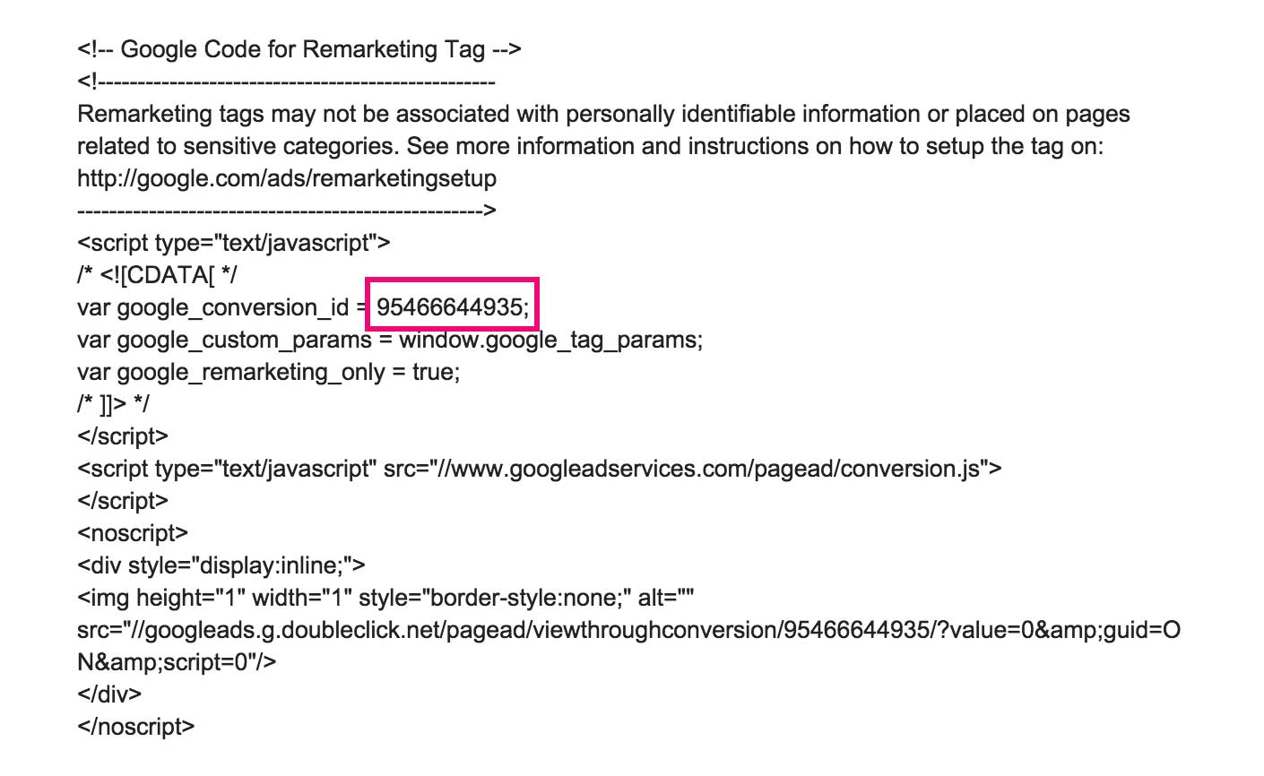
By placing a remarketing pixel on your cart page, you can target remarketing campaigns towards users who have added items to their cart without ever hitting your thank you page. Here’s an example of a remarketing pixel that you'd place in your cart page's code:[*]
You can reach out towards these potential customers with social media remarketing campaigns that promote the same products they were looking at. Or, if you really want to get aggressive, you can continue to narrow your remarketing audience with more targeting.
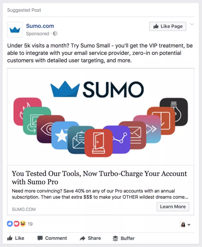
The more you whittle your audience down in any campaign, the more you'll be able to customize your offer to exactly what your user is looking for. And the more you can hit the mark — whether it's on the first interaction or the last — the more sales you're going to see.
24. Remarketing From Thank You Page
Remarketing campaigns don't have to be targeted solely towards cart abandoners. Regardless of what the name implies, you can target remarketing campaigns towards customers who have already purchased as well.
There's no iron law that states you're not allowed to place remarketing pixels on your thank you page itself.
By placing the tracking pixel on your thank you page (with the exception of potential EU GDPR limitations), you can identify which users are buying which products.
But, on top of that, you can then track these users down and remarket to them with ads that promote relevant product upsells. As opposed to advertising products that they failed to purchase, you can advertise new ones that they can return to buy.[*]
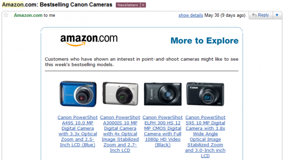
This is how you can take one-time purchases and turn them into repeat customers with an upward-trending CLV.
Tactics such as these help you increase your ecommerce bottom line without having to drastically increase your budget. Why? Because of the last perk of this tip: remarketing campaigns usually have the highest return on investment of all campaign types.
What Have We Learned
When it comes to optimizing your ecommerce landing pages, it’s key to remember that these pages serve more as sales fronts than your ordinary product page. Keep your pages focused on generating sales and revenue over clicks and impressions, and you’ll be headed down the right path.
Here are the key takeaways to remember from this post:
-
Exhaust all of your product display options. Whether it’s product zooms or 360-degree views, or simply having really nice product photos. Make sure your customer has every view they need.
-
Provide any and all necessary product info. Customers are going to want size information, shipping information, and sometimes even production information. Keep your customers informed.
-
Provide context and social proof for your products. Don’t state facts and features – provide a context to the benefits and value of your product in the real world beyond the landing page experience.
-
Personalize the buyer’s experience as much as possible. Whether it is personalizing the copy or customizing product recommendation engines, make sure you create as personal and targeted an experience as you can.
-
Give your buyer’s options (when it favors you). Don’t throw your customers into analysis paralysis. But don’t be afraid to give them options and suggestions that your data shows they may like.
-
Catch the customers slipping through the cracks. At each stage of the funnel, potential customers will fail to convert. Don’t let all these potential customers fall through the cracks — capitalize with retargeting and upsells to boost your overall conversions and revenue.
-
Don’t give up after people first visit your landing page. Retargeting with classic tracking pixels, retargeting from the thank you page for upsells and cross-sells, and more — just because your customer completed a purchase doesn’t mean it’s the end of your ability to generate more revenue.
To see the 10% landing page conversion rate we got from using 3 of the 24 tips in this post, download the case study below.
Add A Comment
VIEW THE COMMENTS