Picture this…
A visitor lands on your website to read a blog post you spent hours crafting. They read it, get the answer to their question, then the mouse moves to the browser’s close button…
But wait!
You’re using exit intent technology to track mouse movement, and just as the visitor is about to leave the web page, you display a popup with a well-crafted offer.
Just like that you’ve captured the visitor’s email address and turned that anonymous visitor into a lead.
The vast majority of your site visitors leave without taking action. Some sources estimate that up to 95% of visitors will never return to a website. Many think that’s a problem; we think it’s an opportunity!
When an exit popup appears, it is your last-ditch effort to convert them. Exit intent refers to a visitor’s intent to leave a website, and exit intent popups use sophisticated tracking technology to predict when a visitor is about to leave. Exit intent popups work by trying to reengage users before they leave the page.
It’s simple to set-up, but when used properly, can dramatically increase conversions whether you’re trying to build your email list or prevent someone from abandoning a checkout.
Table of Contents
Want to implement exit intent technology and turn your website into a lead generation machine after reading this article? Start a free BDOW! account today. It’s the best form and popup tool for online business owners.
What is an Exit Intent Popup?
An exit intent popup is a popup that appears when the visitor attempts to leave the page. On desktop devices, it triggers when the visitor’s cursor moves outside the webpage window. On mobile devices, it triggers when the visitor scrolls up.
Unlike an instant popup or timed popup, an exit popup is less intrusive because it doesn’t interrupt visitors while they are browsing your page.
Some people may argue popups are annoying in general, but when used correctly pop-ups can improve a user’s experience. Plus, exit intent popup triggers when someone is leaving your website anyway—why not try to convert them before they’re lost to the world wide web?
An exit intent popup’s primary purpose is to prevent a visitor from leaving your website without converting. An exit intent popup example could include seeking feedback, offering discounts, or delivering valuable content to engage users before they leave. The best exit intent popups can:
- Capture abandoning visitors.
- Increase webinar or training registrations.
- Grow your email list.
- Promote special offers.
- Reduce your cart abandonment.
Benefits of using exit intent popups include increased conversions, reduced bounce rates, and improved user engagement.
Benefits of Using Exit Intent Popups
Exit intent popups offer a multitude of benefits that can significantly enhance your website’s performance:
- Increased Conversions: By targeting visitors who are on the verge of leaving, exit intent popups can effectively increase conversions and reduce bounce rates. This last-minute engagement can turn potential exits into valuable actions.
- Improved User Experience: Exit intent popups can be tailored to provide a personalized experience, offering visitors relevant content or offers based on their behavior and demographics. This personalization can make visitors feel valued and understood.
- Enhanced Customer Engagement: These popups can help businesses engage with their customers more effectively, building trust and fostering long-term relationships. By providing valuable information or offers, exit intent popups can encourage visitors to interact more with your site.
Advanced Exit Intent Popup Strategies and Best Practices
Remember, an exit intent popup is your last chance to catch a visitor’s attention. An exit popup will only become a powerful tactic for your website when you use it strategically.
There are a few exit popup hacks and strategies that you can follow to create high converting exit campaigns that engage visitors. Really, you should follow these tips any time you’re creating popups.
There are a few exit popup hacks and strategies that you can follow to create high converting exit campaigns that engage visitors. Really, you should follow these tips any time you’re creating popups.
1. Use a Strong Headline
Your headline is one of the most important elements of a popup.
The first thing your visitors see on your exit popup is the headline, and based on your headline, they make a split second decision whether to learn more or continue to leave.
Your headline should be concise, clear, and use benefit-focused language to ensure exit intent popups convert.
Avoid being overly clever—remember, your visitor is on their way out.
Related: To learn how to write a strong, compelling headline, read our BDOW!-sized list of 51 Headline Formulas and pick one for your exit popup. Looking for a shortcut? Generate a headline for your popup in seconds using our headline generator.
Get Access To The Popup Headline Generator
2. Use a Minimal Design
Too much content in a popup runs the risk of overwhelming visitors and driving them away. This is a winning combination:
Strong Headline, eye-catching creative, benefit-focused text, and a simple call to action = high converting.
Using creative images and videos can be an effective way to catch a visitor’s attention, but be sure that creative aligns with your objective.
Not a designer? No worries! BDOW! has you covered.
BDOW! has a library of professionally designed popups. All you need to do is change up the copy of the popup. Easy!
3. Target Visitor’s on Specific Pages
Relevance is key.
The more you can tailor your exit intent offer or message to your visitor, the more effective your exit popup will be. Instead of annoying your visitors with a one-size-fits-all popup, show an offer that’s relevant to the content on that page, raising your conversion rate.
For instance, let’s say you run a health supplement shop that provides supplements to combat various diseases. You could create exit intent popups for each of those various diseases so that the message shown on the page is highly relevant to the visitor.
Advanced page targeting allows you to show your exit popup only on specific pages.
For example, we show this custom exit popup (to drive signups) only to readers on our best email subject lines blog post.
How to do this with BDOW!: To target visitors on a specific page, go to the form editor, in Visibility > Display Rules, click the Add New Rule button. Select Show (or Not Show if you want to hide the popup from visitors on a specific page). In URLs > Paths, add the slug of your targeted page.

4. Target Visitors by Referrer Domain
Another advanced targeting hack is to show your exit popup based on your visitor’s referral domain. For example, you could create a custom exit popup for visitors who come to your site from a partner’s website.
This strategy is effective when you’re getting traffic from guest posting, webinars, or any form of partnership. It creates additional trust, and allows you to create a more personalized experience.
How to do this with BDOW!: To target visitors by referrer domain, go to your Visibility settings and add a new display rule. Select Show, then in Referrer > Referrer Domain Names, add the domain name you want to target.

5. Use a Countdown Timer
Use a countdown timer in your popup if you want to create a sense of urgency. These can be especially effective when promoting:
- Limited-time products or offers
- Special discount offers on checkout pages
- Free training and webinars
- Conference sign-ups
- Course enrollments
If your offer is time sensitive, consider adding a countdown timer. It can remind visitors that the promotion won’t last forever and encourage visitors to take action now.
How to do this with BDOW!: Go to your form editor, in Design, hover over Add New and select Countdown. Update the format and style of your countdown timer, set the date and time of your choice, and you’re done.

6. Offer a Lead Magnet or Content Upgrade (a freebie)
When a visitor lands on a blog post, you know they’re interested in that topic. It’s the perfect time to offer more information on that topic in exchange for an email address.
Blog posts typically have high bounce rates, meaning that visitors leave the page without taking any additional action on that page. An exit intent popup that offers additional information on a given topic is a great way to get visitors to take the next step and convert them into leads.
Lead magnets give your visitors a more appealing reason to join your email list compared to a popup with “Join My Newsletter” as the headline.
How to do this with BDOW!: It’s easy to add a lead magnet to your exit popups. In the form editor, go to the Success tab, and select Download Content Upgrade under the Subscribe Success Redirect section.
Select a file to upload and you’re done.

7. Offer a Unique Discount
One of the most popular e-commerce strategies is offering unique discounts to subscribers. Why? Because a discount can be an effective conversion lever, especially when it’s time sensitive.
Create an exit popup that offers a special discount in return for subscribing. This is one of the most effective ways to get a visitor to reconsider leaving.
You can add this kind of exit popup to any page, but they’re particularly effective on product pages and checkout pages. On a checkout page, a “Don’t Leave!” offer can prevent cart abandonment.
How to do this with BDOW!: Inside BDOW!, you can connect your Shopify or WooCommerce store to deliver a unique discount to your email subscribers.
To do it, you first need to connect BDOW! to your Shopify or WooCommerce in Monetize > Discounts.
Then, click Create Discount. Add the details of your discount code to the New Discount settings, and click Save.
To show the unique discount code to new email subscribers, go to the exit popup form editor.
In the designer, be sure to choose the “success” side of your form, hover over Add New and click Discount Code.

Next, click the Assign Discount button and select the discount code you just set up.
Check out this tutorial for more guidance:
8. Run A/B Tests
Always be testing.
Tools like BDOW! make it easy to create experiments where you can test variations of the same form and create experiments testing headlines, messaging, creative, calls-to-action (CTAs), button colors and more.
Raising your conversion rate from 1% to 2% means getting double the email subscribers or sales. Small tweaks to your exit popup can have outsized results.
How to do this with BDOW!: In Forms, hover over the down arrow icon on the right side of the popup you want to test. Click Create Test.

Update one variable (image, headline, or description) on your test popup. You can then access the a/b test stats and choose a winner in Forms > Tests.
9. Turn Your Best Popup into an Exit Intent Popup
You don’t need to reinvent the wheel when it comes to creating an exit intent popup. Simply evaluate your best performing popups and considering turning it into an exit intent popup on pages where you have a high bounce rate.
You already know your highest converting popups resonate with your target audience.
It’s the same popup, but with a different trigger!
How to do this with BDOW!: Go to Campaigns and filter based on Active Forms. You can then sort your forms so that you only see your best performing popups. Select Clone Form and then change the visibility settings.

10. Creating a Sense of Authority and Trust
Building authority and trust is crucial for any business, and exit intent popups can play a significant role in this process. By incorporating elements such as social proof, customer testimonials, and clear, concise language, you can establish your business as an expert in your industry. This not only builds trust with your visitors but also increases the likelihood of converting them into loyal customers.
An exit intent popup that highlights your expertise and reliability can reassure visitors that they are making the right choice by engaging with your business.
11. Using Social Proof and Customer Testimonials
Social proof and customer testimonials are powerful tools for building trust and credibility. By showcasing positive reviews, ratings, and testimonials, you can demonstrate your business’s value and reliability to potential customers. Exit intent popups are an excellent platform for displaying social proof and customer testimonials, providing visitors with the assurance they need to take the next step.
Here are some effective ways to incorporate social proof and customer testimonials into your exit intent popups:
- Display Customer Reviews and Ratings: Highlight positive reviews and high ratings from satisfied customers to build trust.
- Showcase Customer Testimonials and Success Stories: Share compelling testimonials and success stories to illustrate the positive impact of your products or services.
- Highlight Industry Certifications and Awards: Display any industry certifications or awards your business has received to establish authority.
- Use Trust Badges and Security Seals: Include trust badges and security seals to reassure visitors about the safety and reliability of your site.
By integrating social proof and customer testimonials into your exit intent popups, you can create a sense of authority and trust, making it more likely that visitors will convert into customers.
The Best Exit Intent Popup Examples
Ready to increase conversions and turn your website into a lead generation machine? Here are some of the best exit intent popups to inspire your next exit intent campaign.
Note how many different use cases there are for exit intent popups. Yes, you can use exit popups to collect email addresses, but an exit intent popup offer could also include a discount, free shipping, and bonuses.
Grow Your Email List
The most common use for an exit popup is to grow an email list.
Encourage your visitors to join your list by offering something valuable before they leave.
For example, we ask abandoning visitors to join our email list by offering our Shopify Marketing Vault.
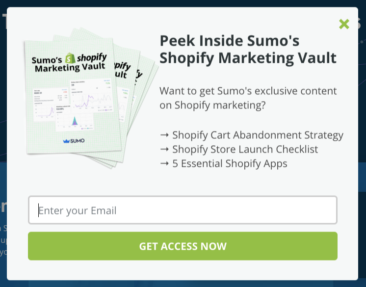
We show this to visitors reading our blog posts, just before they leave. It’s been seen by 282,978 visitors and has generated 4,153 new email subscribers for us:

Key Takeaway: The money is in the list. Use an exit popup to offer a lead magnet that will convert your visitors into subscribers.
Promote Your Special Offers
The next most common usage of an exit popup is to promote special offers. It could be an exclusive discount for first-time visitors or a limited-time offer during the holiday season.
Here, KLOS Guitars uses it to offer a one-time discount on the visitor’s first order.[*]
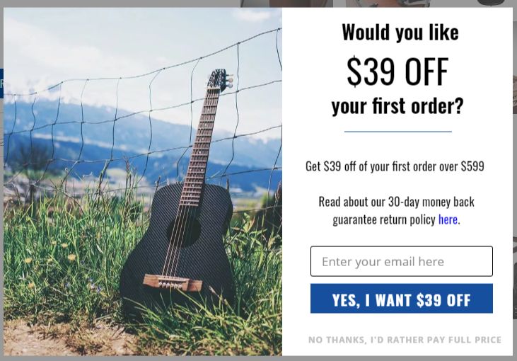
This exit popup helped to generate 1,507 new subscribers for KLOS Guitars.
At the same time, 136 new customers with a total purchase amount of $115,490.99 have come from this BDOW! exit popup:

Key Takeaway: Your visitors might not be aware of your promotions. Use an exit popup to notify them about an exclusive offer before they leave. It also gives visitors a reason to purchase NOW instead of later (or never).
Increase Webinar Registrations
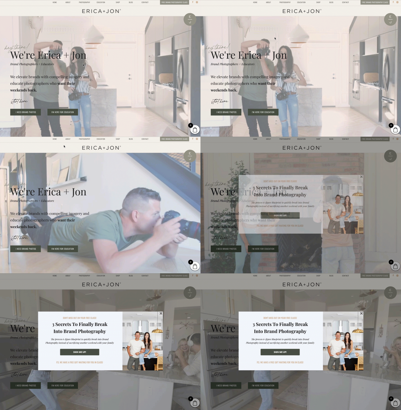
This is one of my favorite exit popup examples. Brand photographers Erica + Jon created this exit intent popup to promote a bonus that people received when they signed up for their free training on brand photography.

The result: A 13% conversion rate! And it accounted for almost 11% of their total sign-ups, which meant hundreds of extra sign-ups for their webinar. That’s potentially thousands of extra dollars in revenue!
Key takeaway: This exit popup example is so powerful because it highlights a bonus that people only receive when they sign up for the webinar. Someone may end up registering just to receive the bonus.
Reduce Cart Abandonment
Your customer adds a product to the cart. Just before they proceed to checkout, they get distracted by a notification on social media.
The lifesaver: An exit popup.
M2S Bikes shows this exit popup before their potential customers abandon the cart. It encourages the visitor to check out immediately to get a special 10% off the first purchase.
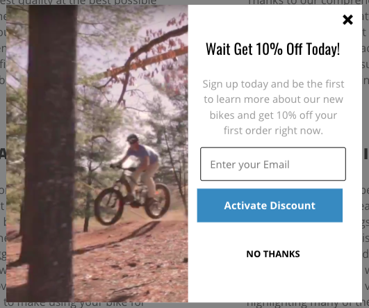
The result: 1,039 visitors have seen the 10% off offer, and 239 have entered their email address to get the 10% off code.
Furthermore, they got 39 new customers with an EXTRA total revenue of $78,622.54. Woah.

Key Takeaway: Winning back a cart-abandoning visitor costs less than acquiring new, cold customers to your business. Using an exit popup to encourage immediate checkout = $$$.
Increase Average Order Value
This is another great example of an exit popup offer that not only tries to keep visitors on the checkout page, but also attempts to increase the order value.
TONIC created this exit intent popup to promote a bump offer. With just a click of a button, a website visitor can add an additional item to their cart.
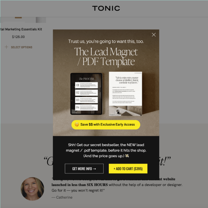
The Result: TONIC made an extra $4000 that weekend. Not bad for an exit intent popup that took only a few minutes to create and implement!
Measuring and Optimizing Exit Intent Popups
It’s important to monitor and evaluate the performance of your exit intent popups in order to better understand visitor behavior and preferences on your website.
Tracking and Understanding Exit Intent Popup Metrics
Exit intent popups may have different goals such as directing visitors to a sale on your website or asking for an email address. Regardless of the goal, the most important metric to track is the popups conversion rate:
Conversion Rate: The percentage of visitors who take the desired action (e.g., signing up for an email list, clicking a button, making a purchase, etc.) after seeing the popup. It’s the primary indicator of a popup’s effectiveness.
Click-Through Rate (CTR): This measures how many visitors clicked on the popup’s call-to-action (CTA) compared to the total number of times the popup was displayed. A high CTR typically suggests that the popup’s message and design are compelling.
Views: The amount of times the popup has been viewed. This metric is sometimes referred to as impressions.
Revenue Attribution: E-commerce stores often offer discount exit popup. For popups directly tied to sales, such as offering a discount, it’s important to track the revenue attributed to those pop-ups to understand their ROI.
It’s easy to see all your key stats in BDOW! such as your forms conversion rate and revenue tied to discount campaigns.
Exit Intent Popup Conversion Rate Benchmarks
Typically, a good conversion rate for exit intent popups can fall within the range of 2% to 5%, similar to traditional popups.
Here’s a breakdown of what these exit popup conversion rates might imply:
- Below 2%: Conversion rates that fall below 2% often suggest there’s room for improvement. This could mean your messaging, offer, or design may not be resonating well with your audience, or that the pop-up isn’t targeted effectively.
- 2% to 5%: This is generally considered an average to good range for exit intent pop-ups. Here, it’s assumed that the pop-up offers value and is well-designed, with a clear call to action.
- Above 5%: Achieving more than a 5% conversion rate is excellent and suggests that the pop-up is highly effective. This could be due to a highly compelling offer, superb targeting, and timing, or a stellar copy that meets the visitors’ needs just right.
Bear in mind that these figures are just general benchmarks!
To truly understand what a “good” conversion rate is for your specific context, you need to evaluate your own data over time and how the conversion rate contributes to your overall business goals.
Continuous testing and optimization are crucial to establish your own popup benchmarks.
Common Exit Intent Mistakes to Avoid
When employing exit intent pop-ups as part of your digital strategy, be mindful to avoid common missteps that can diminish their effectiveness or, worse, irritate your visitors. Here are some frequent mistakes to steer clear of:
Overwhelming Visitors: The line between eye-catching and overwhelming is fine but crucial. Pop-ups that are too aggressive with their design, use clashing colors, or feature excessive animation can be off-putting. Aim for a design that is engaging yet not overpowering.
Ignoring Mobile Experience: Many websites still make the mistake of not optimizing their exit intent pop-ups for mobile users. An exit intent pop-up that works seamlessly on desktop might cover too much screen space or be difficult to close on a mobile device, leading to a frustrating user experience. Be sure the exit button is easy to access on both mobile and desktop devices. Tip: Make device specific pop ups.
Complex or Unclear Offers: Pop-ups need to communicate their message succinctly and clearly. Visitors should understand the offer at a glance. Avoid complicating the message with too much text or confusing language that makes the visitor work to understand the value.
Frequent Interruptions: If a visitor has seen the pop-up before and has chosen to dismiss it, presenting the same pop-up again too soon can be irritating. Use cookies to track visitor interactions with your pop-up and set sensible intervals before it reappears.
Ineffective Timing: The pop-up should appear when a visitor is showing signs of leaving the site, not right after they arrive or while they’re still actively engaged with the content. Incorrect timing can disrupt the user experience and reduce the effectiveness of the exit intent strategy.
Neglecting Compliance: With the importance of privacy and data protection, ensuring that your exit intent pop-ups comply with regulations like GDPR and CCPA is a must. Make sure to include clear and concise privacy policies and opt-out mechanisms.
Check out our section on exit intent popup best practices to create the very best experience for your website visitors.
Tools and Software for Exit Intent Popups
When looking for software or a tool to help you build exit intent popups, you should consider features like ease of use, customization options, and analytics.
It’s also important to find a tool that integrates your exit intent popups with other marketing tools such as email marketing software and CRM systems.
BDOW! checks all of those boxes and more. It is super easy to build high converting exit popups with BDOW!, and you also get access to other form types:
- Welcome Mats: popups that take up the entire screen and typically appear as soon as a website visitor lands on a page.
- Click Triggers: popups that appear after someone clicks on a link.
- Scroll Boxes: these popups scroll with the page.
- Inline Forms: embedded forms, these often make good contact forms.
- Smart Bars: perfect for promoting a sale or promotion.
How to Create an Exit Intent Popup using BDOW!
Creating an exit intent popup using BDOW! is easy.
In your BDOW! Dashboard, go to Campaigns and click Create New Form.
Select your goal based on what you want to accomplish using the popup.
Next, select Popup as the form type for your form.
Design your popup using the drag-and-drop form editor.
In the Visibility Settings, choose Manual Mode (Smart Mode is the default). Then, under When to Display, choose to show the form when a User Leaves. You can then choose what time frame you want to stop the popup from showing, like 7 days, so your visitors don’t get annoyed if they’ve seen another popup on your site recently.

If you use another email marketing platform, you can connect to your email service provider in the Connect to Email Service tab.When you’re done, click Publish to save and make the popup live.
Conclusion
Exit intent popups are incredibly effective tools for capturing the attention of potential customers right before they leave your site.
While some may find them intrusive, the reality is that exit popups convert visitors into leads and sales by offering additional value, such as a free sample box or discount code, just as they are about to exit.
Exit popups work. The data proves it.
By understanding user behavior and utilizing the right exit intent popup software, you can create high converting exit popups that engage visitors and encourage them to reconsider leaving.
Whether your goal is to capture leads or reduce cart abandonment, exit intent popups work wonders to boost your website traffic and achieve your business objectives.
Add A Comment
VIEW THE COMMENTS