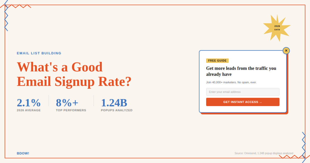
The average email opt-in rate is 2.1%.
That means roughly two out of every 100 people who visit your site end up on your email list. If you’re sitting above that number, you’re already beating the majority of websites out there.
If you’re below it, this post will fix that.
We’re breaking down what counts as a good email signup rate, how different popup types stack up against each other, and eight specific things you can do today to move your numbers up. No fluff, no generic “just A/B test everything” advice at the end.
Table of Contents
What Is a Good Email Signup Rate?
Before chasing a benchmark, it helps to know what range you’re actually aiming for.
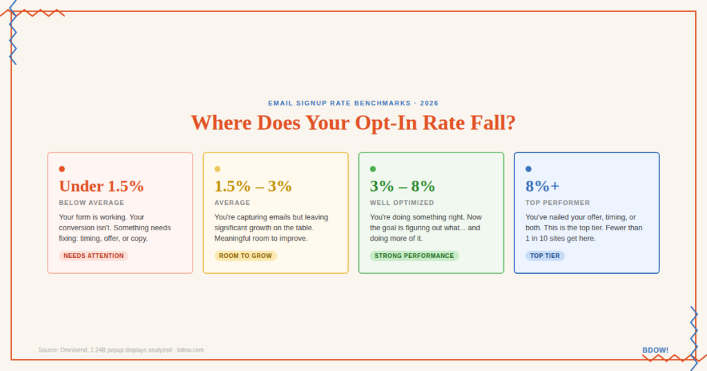
Here’s a simple way to read your current opt-in rate:
- Under 1.5%: Below average. Your form is working, your conversion isn’t.
- 1.5% to 3%: Average range. You’re capturing emails, but there’s meaningful room to grow.
- 3% to 8%: Well-optimized. You’re doing something right. Now figure out what and do more of it.
- 8% and above: Top-performer territory. You’ve either nailed your offer, your timing, or both.
A few things affect where you’ll land: whether you’re using a lead magnet, which type of popup you’re running, how well your CTA is written, and whether your form is showing up at the right moment. More on all of that below.
The Average Email Opt-In Rate in 2026
The 2.1% figure comes from Omnisend’s analysis of over 1.24 billion popup displays. It’s not a survey or an estimate. It’s what actually happened across a massive cross-section of websites.
One caveat worth knowing: Omnisend’s data skews ecommerce, where opt-in rates tend to run lower than other verticals. Other studies looking at different datasets land higher. Wisepops, for example, reports an average of 4.82%. The right benchmark for you depends on your industry, your traffic, and your offer. But 2.1% is a reasonable conservative floor for the web overall.
Here’s what’s worth understanding about averages in general: they include everything. High-converting sites and low-converting sites are both in there. Sites with beautifully optimized forms… and sites with a generic “sign up for our newsletter” box that nobody clicks.
Think of 2.1% as the floor, not the target.
The sites hitting 3% to 8%? They’re not doing anything exotic. They’re just not leaving obvious mistakes in place. The eight tactics below cover the most common ones.
Email Signup Benchmarks by Popup Type
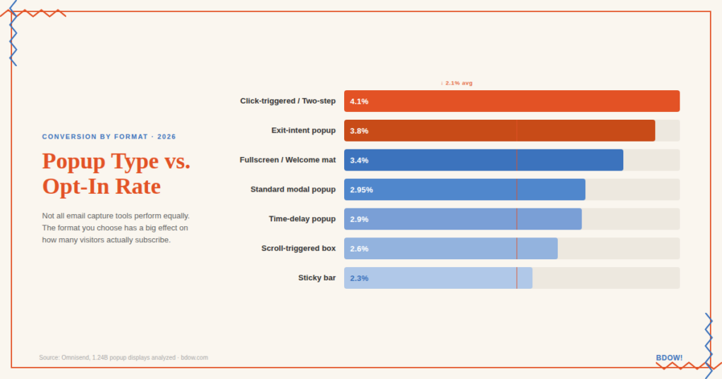
Not all email capture tools perform the same. The type of form you’re using has a big effect on your opt-in rate. Sometimes more than your copy or offer.
Here’s how different popup types generally compare:
Fullscreen / welcome mat This is the highest-converting format. Because it takes over the entire screen and isolates the signup as the only option, there’s nothing else competing for attention. When done well (with a strong offer and clear CTA), fullscreen overlays can push past 6% with some regularity. The tradeoff is that they’re also the most interruptive, so your offer needs to earn the real estate.
Standard popup / modal The workhorse of email list building. A centered popup showing up at the right moment with a clear value proposition is still one of the most reliable ways to collect email addresses. Average conversions hover around 3%, with well-optimized versions hitting higher.
Scroll-triggered box A slide-in form that appears after a visitor scrolls a certain percentage of your page. Because it targets readers who’ve already shown interest, the people who see it are more engaged than average, which can improve quality even if raw conversion rate is slightly lower. The default trigger depth is around 40%, but dropping it to 20–25% often increases conversions without sacrificing quality.
Sticky bar The most low-key format. It sits at the top (or bottom) of the browser and follows visitors as they scroll. Conversion rates are lower than modal or fullscreen popups because the form is easier to ignore. That said, it’s also the least intrusive option, which makes it a good secondary tool when you’re already running another popup type. The key to making it work: use a high-contrast color that actually draws the eye, and set it to sticky (not static) so it stays visible the whole time.
Two-step / click-triggered Technically not a “popup type” so much as a setup. But it consistently outperforms standard forms. Instead of showing the form immediately, a button or link triggers the popup when clicked. This works because of a simple psychological principle: if someone clicks to open a form, they’re already halfway to opting in. That small act of commitment makes them more likely to follow through.
Why Your Opt-In Rate Might Be Lower Than You’d Expect
Before jumping to solutions, it’s worth knowing the most common culprits.
You’re showing the popup too fast. Asking for someone’s email three seconds after they land on your site is like asking for a first date before you’ve introduced yourself. Give visitors enough time to understand what your site is about. Time-delay popups that trigger after 10–15 seconds, or scroll-triggered forms that appear after the visitor has read a portion of your content, consistently outperform immediately-displayed forms.
Your CTA isn’t doing any work. “Sign up for our newsletter” is not a call to action. It tells the visitor what they’re doing for you. What are they getting? If you can’t answer that clearly in one sentence, your conversion rate will show it.
You’re asking for too much. Every additional field you add to your signup form creates friction. Name and email is more friction than just email. If you’re collecting first names for personalization, that’s a reasonable tradeoff. Just know it will cost you some signups. Email-only forms consistently convert higher.
Your form isn’t optimized for mobile. More than half of website traffic comes from phones. If your popup is hard to close, covers the whole screen in a way that’s difficult to navigate, or has tiny tap targets, you’re losing a large portion of potential subscribers before they even read your CTA.
8 Ways to Increase Your Email Signup Rate
These aren’t ranked in order of impact. Every audience responds differently, which is why testing matters. But each of these has moved the needle for enough sites that they’re worth trying.
1. Switch to a two-step opt-in
Add a button or hyperlinked text to your content or sidebar that triggers the popup on click. Instead of showing the form to everyone who visits a page, you’re showing it to people who voluntarily opened it.
The conversion rate on click-triggered popups is consistently higher than time-delayed or scroll-triggered versions. The extra click signals intent, and intent converts.
2. Time your popup better
If your popup is set to appear after just a few seconds, try extending the delay. Or switch from time-based triggering to scroll-based: set the form to appear after a visitor has read 25–30% of the page. You’re targeting people who’ve already decided they like what they’re seeing.
Exit-intent popups are another strong option. They show up when a visitor’s cursor moves toward closing the tab, catching people at the last moment before they leave. Exit-intent popups convert at around 3.8% on average, above the overall mean.
3. Cut your form to one field
Remove the name field. Email only.
Yes, personalized emails that use first names perform better. But an email address you collected by making the form frictionless is worth more than one you never collected because the extra field was enough for someone to bounce. You can always ask for a first name in the welcome email after they’ve subscribed.
4. Rewrite your CTA around the benefit
Your headline should answer one question: what does the person on the other side of this form actually get?
Compare these two options:
- “Sign up for our newsletter” (what you get: newsletters)
- “Get the weekly strategies our best clients use to book more leads” (what you get: something specific and useful)
The second version doesn’t have to be perfect. It just has to be honest and specific about the value. That alone is enough to move your rate.
5. Give them a reason to sign up (lead magnet)
A strong lead magnet is the single biggest lever most sites aren’t pulling. If your opt-in offer is “join my list,” you’re competing with every other list that person is already on. If your opt-in offer is a useful checklist, short guide, template, or video that solves a specific problem, you’re offering a trade.
People respond to trades. Especially when the thing on the other side is immediately useful.
6. Make your popup page-specific
A single generic popup shown sitewide will always underperform a popup that matches the content the visitor is already reading.
If someone’s reading your blog post about booking discovery calls, a popup offering “5 scripts for high-converting discovery calls” is going to outperform a popup that offers your general newsletter. The targeting takes a few extra minutes to set up and routinely delivers conversion rates 2 to 3 times higher than a generic sitewide form.
7. Use a color that demands attention
Especially for sticky bars and scroll boxes. If your form blends into your site, people won’t see it. Choose a CTA button color that creates contrast with the surrounding design. This sounds simple because it is. It’s also the thing most people skip because it requires touching their brand colors.
Run an action color that pops. Your designer might wince. Your conversion rate will thank you.
8. A/B test before you assume
Every site’s audience is slightly different. The popup timing that works for one business might not work for yours. The offer that converts for a B2B SaaS site might fall flat for an e-commerce store.
The only way to know what’s actually working is to test one variable at a time. Headline vs. headline. One field vs. two. Exit-intent vs. scroll-triggered. BDOW! has A/B testing built in. Use it before assuming any tactic is or isn’t working on your site.c is or isn’t working on your site.
What a Better Opt-In Rate Is Actually Worth
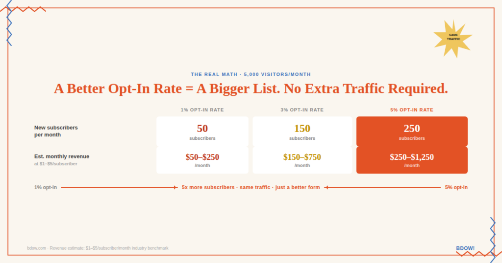
Let’s make this concrete. Say your site gets 5,000 visitors a month.
At a 1% opt-in rate, you’re adding 50 new subscribers per month. At 3%, you’re adding 150. At 5%, you’re adding 250.
That’s a 5x difference in list growth without changing your traffic at all. Just from fixing your form.
Most email lists generate somewhere between $1–$5 per subscriber per month depending on the business and how well the list is monetized. At the conservative end, the difference between a 1% and a 5% opt-in rate on a 5,000-visitor site is potentially $200–$1,000 in additional monthly revenue. Per month. From the same traffic.
The email list is the asset. The opt-in rate is how fast you build it.
The email list is the asset. The opt-in rate is how fast you build it.
Start With One Change
You don’t have to rebuild your entire opt-in strategy today. Pick the one thing on this list that’s most obviously wrong with your current setup and fix that first.
If you don’t have a lead magnet, start there. If your CTA says “sign up for our newsletter,” that’s your first rewrite. If you’ve never tested popup timing, set up a simple A/B test.
BDOW! makes it easy to set up any of the popup types covered above, test variations, and see what’s actually working on your specific site. Create a free account and run your first test this week.
If you want more on building an email list that actually converts, these are worth reading:


Add A Comment
VIEW THE COMMENTS