Note: The Sumo app referenced inside this blog post has now been deprecated.
To learn about Sumo’s new apps for growing your business, click here to visit the Sumo home page.
If your car was acting up, would you blindly throw open the hood and start tinkering with things?
I hope not. You might end up doing more damage than good.
But what if your car wasn’t acting up? Would you still roll up your sleeves and uproot some spark plugs?
Absolutely not.
Do that and you’ll destroy your poor Prius. That’s a recipe for disaster.
Which is why it’s crazy when marketers frequently change things on their web pages without knowing what they should change.
I get it. People read a couple articles on LinkedIn and think they need to scorch some earth by changing copy on buttons or moving stuff around on their page.
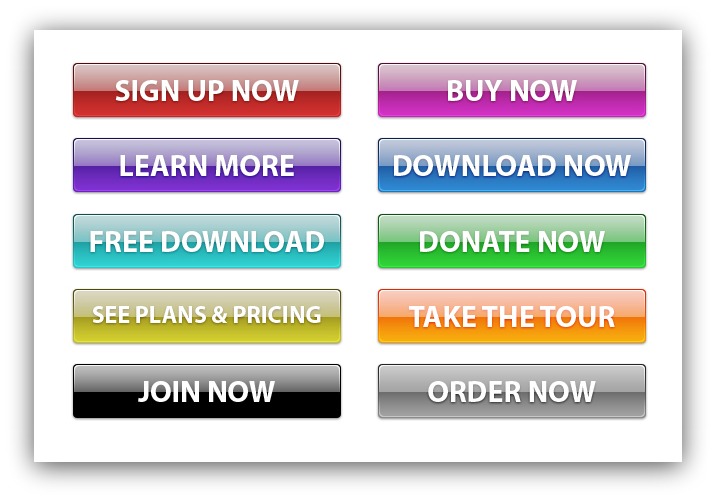
I’ll put all these on my page and see which one works best.
But guess what? Just like fixing a car, blindly changing things on a web page can do some serious damage. Damage like:
- Decreased conversions
- Loss in sales
- Sunk costs of time and money you spent changing things up
Every audience is different, and every page design is unique. Just because using a different image increased conversions for Joe Somebody doesn’t mean you should drop everything and change your images.
Your visitors will tell you with their actions what you should change.
So how do listen to what your visitors want?
Easy. You listen with heat maps.
Heat maps: What Are They, How Do They Work and Why Do You Need Them?
I could make this entire post pretty short and let my good friend Louis CK explain why you need heat maps:
But that wouldn’t be helpful. So let’s start here:
Heat maps are the visual representation of your visitor’s strongest motivations and desires. They’re like the window into the minds of your visitors.
That may seem technical, so let’s break down the meaning behind this word to get a better, more concrete understanding (degree in Latin not required):
- Heat: The “heat” in heat map just refers to the amount of action on a particular area of a page. The warmer the color (red, yellow, white) the more action happening. The cooler the color (purple, blue, green) the less action happening.
- Map: You know what a map is.
So heat maps are, in layman's terms, visual guides that reveal your visitor’s habits.
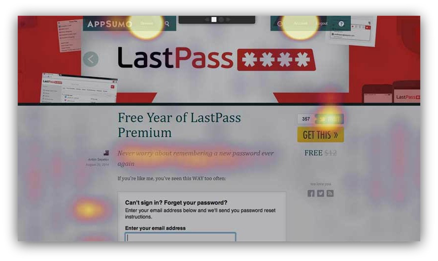
A heat map in action. Note the bright “action” colors.
By capturing and analyzing the action on a given page, you can learn what you need to change on a web page to get higher conversions.
It feels a bit like cheating, I’ve got to admit. You’re literally letting the visitor tell you what you need to test or optimize (without them having to explicitly say it).
But you still need to know what to look for when you read these heat maps.
Whenever you create a web page, you have an end-goal in mind for the visitor. If you have an e-commerce site, you might want people to buy your merch. If you’re watching your homepage, you might want people to click a certain piece of navigation.
Heck, you might have a long article and are curious if people are reading all the way to the bottom (answer: they’re not)….

Me, right now.
Either way, these goals define what kind of heat map you use. To simplify it, you can judge how effective a page is by measuring two main things:
- Information Engagement: Are people reading what you’ve written? If 10% of visitors don’t even make it to your call-to-action, that’s a problem. Heat maps help you see how far down the page they get.
- Action(s) Taken: Where are visitors clicking? Are they clicking on the wrong thing? Heat maps help you see if people are completing your desired action and if there are any roadblocks preventing them from doing so.
If you can capture and interpret this data, you can begin to split-test and build web pages that convert like crazy.
So how do you go about getting these insights?
Lucky enough, there’s a heat map for each type of insight. And they’re incredibly simple to interpret.
Let me show you.
NOTE: Download this spreadsheet quick. It’s the five pages you need to install heat maps on. Reading the post with that spreadsheet open will help you later on when you install heat maps on your site.
The Two Types Of Heat Maps You Need On Your Site
Heat Map #1: Scroll Heat Maps (aka Content Analytics)
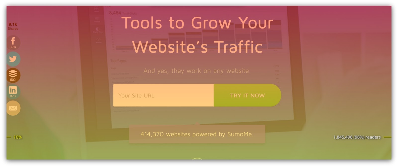
Insight it Tracks: Information engagement.
How It Works: Imagine this: You’re going on-stage to give a presentation. The moment you step on stage, a chunk of the audience leaves.
Crud. Why’d they do that? Whatever. You continue on with the presentation.
But after your very first sentence, half the audience leaves.

That sort of mass exodus would certainly give you reason to pause. Perhaps it was something you said?
As you get deeper and deeper into the presentation, more and more people leave until you’re left with 1/10th of the audience (and they’re just playing on their phones, anyways).
If you could go back into your presentation and see exactly when s people left, would you?
Damn right you would.
And that’s what Content Analytics measures: how engaging the messaging is on your web page.
Messaging, in this sense, is the sum of three things:
- Copy: Is the headline attention-worthy? Is your content engaging? Does it make people want to act?
- Imagery: Do your images compliment your copy? Are they well-designed? Do they serve a purpose?
- Page Layout: Are visitors focusing on the most important things? Can they easily get where they want?
It takes a combination of those three to keep people engaged, and this heat map measures how effective that trifecta is.
Naturally, if your messaging is engaging, more people will get to the bottom of your page. If your messaging is out of sync, fewer people will make it all the way through your page.
Ask any copywriter or designer if they set out to create work that people abandon halfway through, and you’ll most likely get this look:

No one sets out to create unengaging work, but the reality is it’s an uphill battle to capture sustained focus. Think about this:
55% of visitors will spend 15 seconds or less on your page.
In a study we conducted, we found on average that 80% of visitors don’t make it to the bottom of an article.
When you’re fighting that kind of battle already, it’s crucial to measure where people are abandoning your page and why they’re doing it.
That’s where Content Analytics comes in.
How to Interpret Content Analytics: Content Analytics is a simplistic heat map to understand, because you have to scroll through the map to see where people drop off the page.
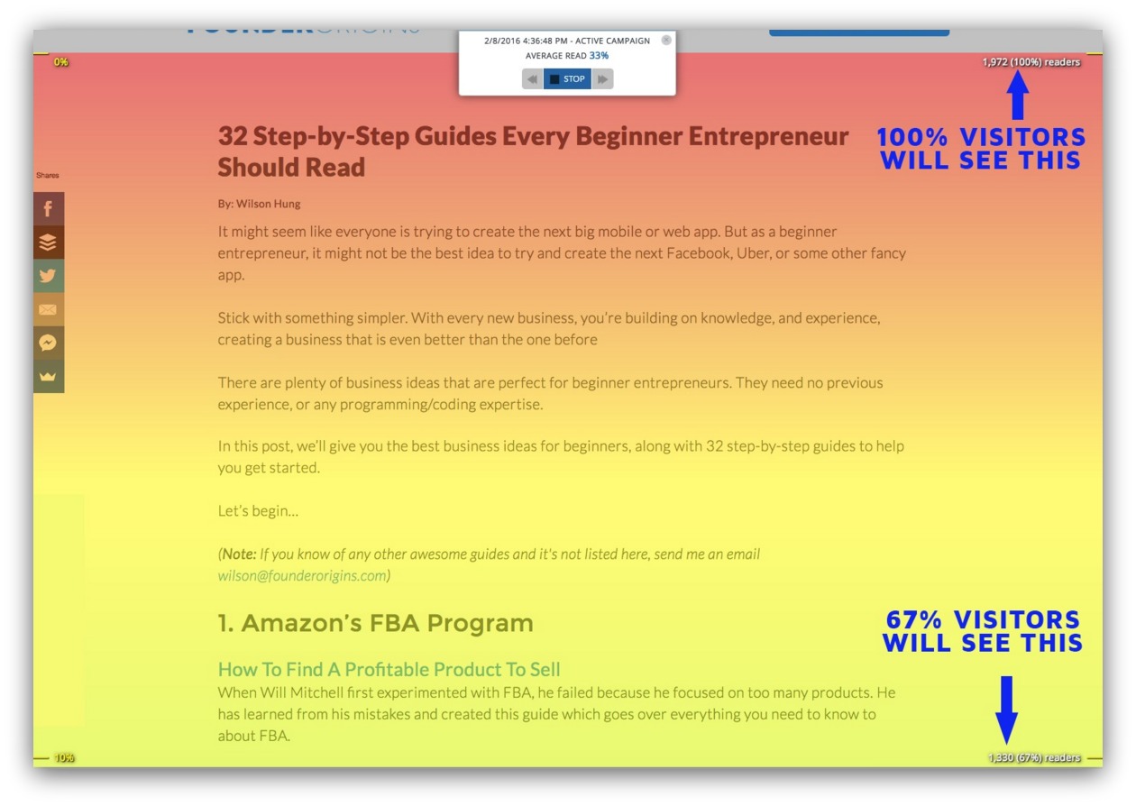
You can see some horizontal color bars on this heat map, and they blend into other colors beneath them. This represents the gradual decline in visitors on your page.
Sometimes these bars can be wider or more narrow depending on the severity of people dropping off the page. But when you look at these colors, keep this key in mind:
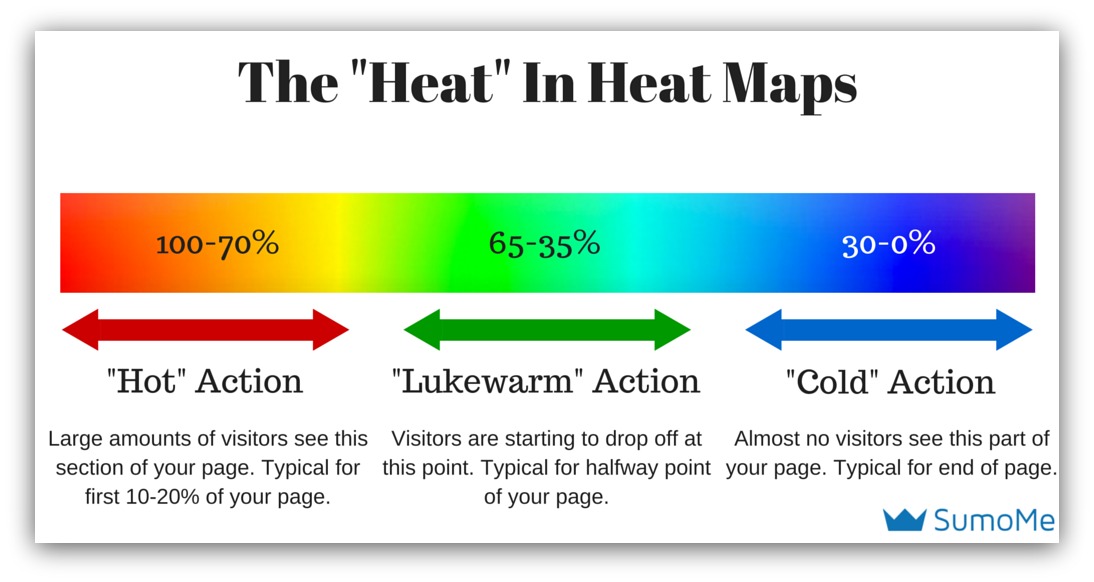
One thing we do with Content Analytics to make it easier (and eliminate guesswork) is display the actual readership percentage as you scroll through the heat map:

In this example, 96% of readers make it 10% down the page. You’ll easily see how engaged your readers are at 10% intervals.
So really, you’re looking for two things:
- Wider “Hot” Colors: If you have wide sections of red, orange and yellow colors, it means your messaging rocks. People aren’t leaving your page, and they’re seeing the entire message as you intended. This is the end goal of any page you create. Kudos to you, my friend.
- Abrupt Changes in Color: If you see an abrupt change in color, it means something in that section of your page made people want to leave. By targeting these areas, you can pinpoint where you need to change your messaging — perhaps rearranging sections or swapping out content.
Got it? Good. Let me show you a real-life example of a Content Analytics in action.
Content Analytics In Action
Believe it or not, you can’t just throw your call-to-action anywhere on your page and expect people to take action.
I know. Shocking, right? That’s why designers get paid the big bucks to create pages that place emphasis on your call-to-action.
But even the best designer is shooting in the dark if they don’t listen to their audience. Case in point…
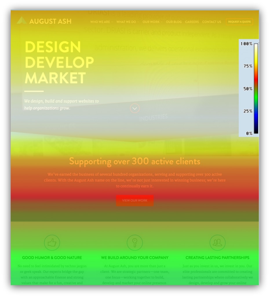
This is August Ash’s homepage. Well….it WAS. Because, after looking at this test, they saw something they needed to change pronto.
Can you tell what it is?
Don’t worry. It’s not like those weird images where you have to cross your eyes and lie about seeing a dolphin or something. Just take a look and see what might be concerning on the page.
Give up? Here’s a hint: take a look at the call-to-action button. It’s big. It’s bold. It’s red. It’s even got a clear message of “View Our Work.” Those are all the things experts would tell you to do.
But look at the color in that section:

That’s a quick mix of red-to-green which means, according to the key, only 45-60% of visitors even see the call-to-action.
Whoa. So you’re telling me almost half their visitors didn’t even get to the most crucial part of their web page?
That’s no bueno. With that information at your disposal, you could look at two quick fixes to test out:
1. Move The Call To Action Into The First Fold: 100% of your visitors see the first fold, so try moving the CTA there. People are conditioned to see a CTA there, and companies like Dropbox, Evernote, Sumo and Spotify employ this tactic.
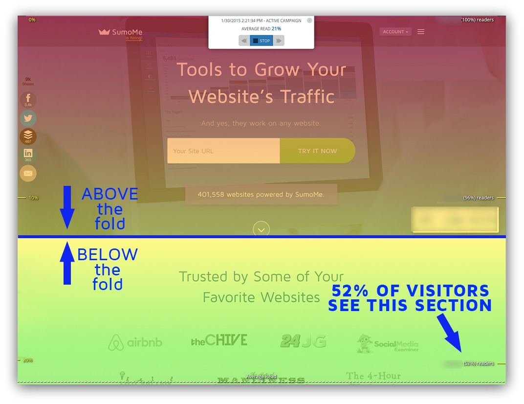
2. Duplicate the Call To Action: Better yet, keep the call-to-action where it is AND add one in the first fold. While too many CTAs can be distracting, having one in the first fold as well as the preceding section is something worth testing.
But you wouldn’t know to do that without Content Analytics. They help you see the hidden side of visitor behavior — how they move.
Heat Map #2: Click Heat Maps (aka Heat Maps)
Insight It Tracks: Action(s) taken
How It Works: Movie directors don’t yell, “Lights, camera, THINK ABOUT IT SOME MORE!” It’s “Lights, camera, ACTION” for a reason — when it comes down to it, action is what matters most on your web page.
Click heat maps (aka Heat Maps) measure the actions taken on a given web page.
Actions can range from downloads, opt-ins, purchases, link-throughs, etc. As long as you have to click to make that action happen, this heat map can measure it.
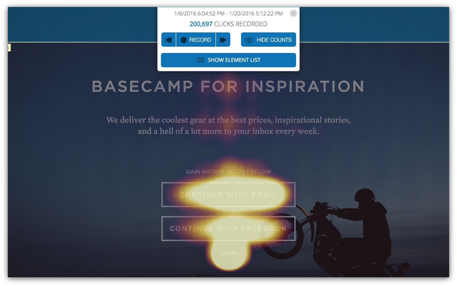
It’s pretty straightforward, too. Whenever a visitor clicks on your web page, this heat map will mark that spot on the page. The more clicks that occur in a spot, the “warmer” that area will look.

The two call to action buttons are the most-clicked thing on this page
When you’re using Heat Maps, you’re looking for two main things:
- Are They Clicking On Your Goals?: Every web page has a goal, and that goal is usually achieved via a click (downloads, purchases, log-ins, etc.). This heat map will show you if people are acting on that goal.
- Are There Wasted Clicks?: This may be more important than the first insight. If the majority of your clicks aren’t going to your primary goal, then you need to pump the brakes and take a hard look at the other elements you’ve included on your page. There may be links, navigation or images (some perhaps unclickable) that are stealing clicks from your main goal.
So how do you determine if there are wasted clicks on your page? Luckily, it’s a relatively simple process that takes a few seconds to interpret.
How to Interpret Heat Maps: Unlike Content Analytics, the entire page won’t be covered with color. Instead, you’ll see something like this:

There isn’t as much color as Content Analytics, but you can probably tell what’s being clicked on without me telling you. The spots that have brighter, lighter colors are the high-click zones. When the colors fade out, the clicks decrease, too.
So if you see a spot that looks like this:
Then you can pump your fist and whisper to yourself:

Good luck getting that out of your head.
Because that’s a hot area full of clicks. AND, they’re the most important CTAs on that page. It’s nice when those things come together like that.
People are either clicking on things (to various degrees) or they’re not. While the above example was a happy-go-lucky tale of things going right, it doesn’t always turn out that way.
Sometimes people don’t click your main CTA.
Sometimes they don’t click anything.
Hell, sometimes they click everything BUT your CTA. It’s super annoying.
So to steal a bit from Dave Chappelle, let me show you “Four Times When Clicking On A Web Page Goes Wrong.” I’ll give you the four biggest reasons why people aren’t clicking on your CTA (and how you can fix that).
1) They’re Clicking On Images
The Problem: You’ve got awesome images on your web page.
Unfortunately, people are clicking on those MORE than your main CTA.
Check out what happens on this homepage:
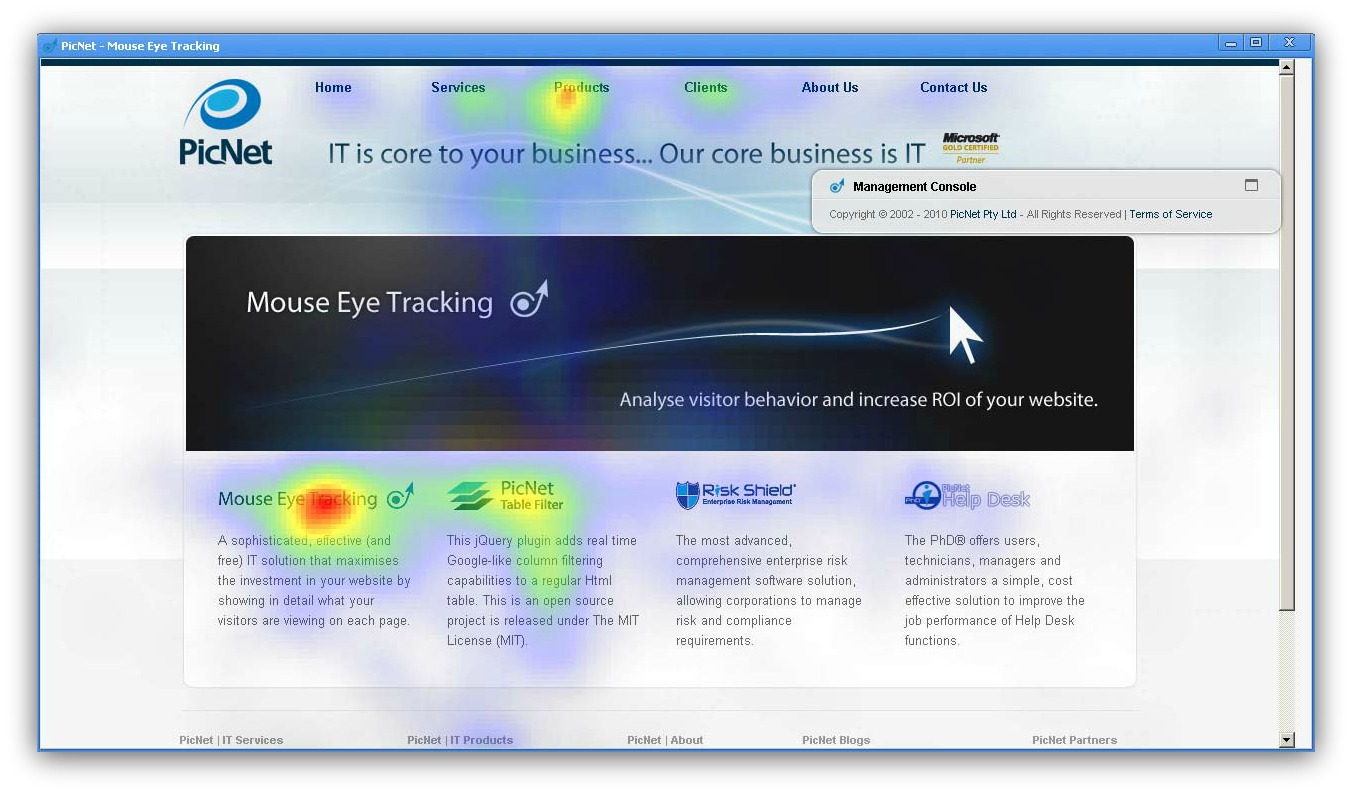
From Picnet
It’s a simple homepage that has all the usual elements: logo, navigation bar, product information. Nothing too out of the ordinary.
Except the images are being clicked more than the call to action.
It may be tough to see, but the banner is the main call to action here. Yet more people click on the information below the banner.
But here’s the true M. Night Shyamalan twist: those images aren’t even linked.

People are clicking on those images thinking they’ll take them to a product page, yet nothing happens. That means the clicks being stolen from the main CTA aren’t going anywhere.
The Solution: There’re a few ways to go about this. If people are already clicking on those images, you could link them to relevant pages. It’s hard enough to get people to click something, so you might as well leverage those existing clicks, right?
If that’s not your jam, then you’ll have to do some experimenting with that imagery. Couple things you could try out:
- Reduce the size of the images
- Use new images
- Move the images to a different part of the page
- Get rid of the images
- Blend the images into the background
Test these to see which one creates more clicks on the main CTA. Proper imagery is a tough cookie to crack, so make sure your changes are small and you always test against a control.
2) They’re Clicking On Navigation
The Problem: How many times have you seen this kind of navigation and decided to GTFO of that page immediately:
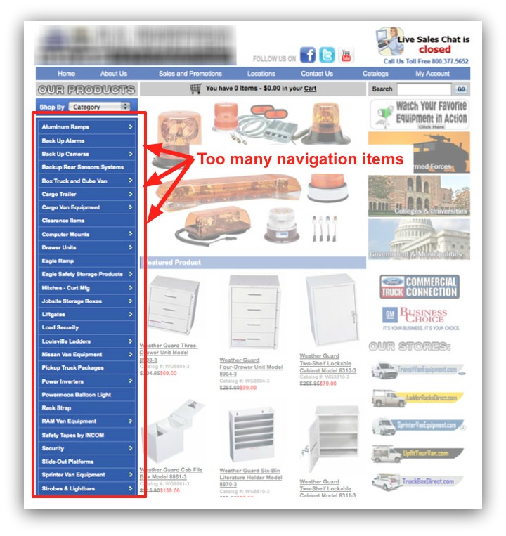
That’s just too much. But that’s not the kind of navigation I’m talking about here.
I’m talking about nice, clean navigation that inadvertently turns into the most-clicked area of your page.
Look, it’s important to have good navigation. People come to your site from all parts of the world wide interwebz, so you need a way for them to easily get to what they need.
So I’m not saying nix the navigation bar. Far from it. I’m just saying be thoughtful of how you present your navigation bar.
Let’s kick it back to a reference we made earlier in the post. Remember this heat map?
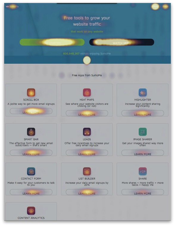
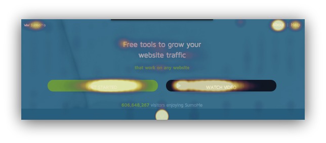
That’s an old version of the Sumo homepage. There are a healthy amount of clicks going around, but one area stands out:

Check out the top right navigation area. That’s the “About” section getting a TON of clicks.
When they click “About,” it means they’re not clicking “Get Started” or “Watch Video” — two proven calls-to-action that get conversions.
So how do you fix that?
The Solution: This one is a bit tricky and can require a healthy amount of split testing. But I can show you what Sumo did to remedy this situation:
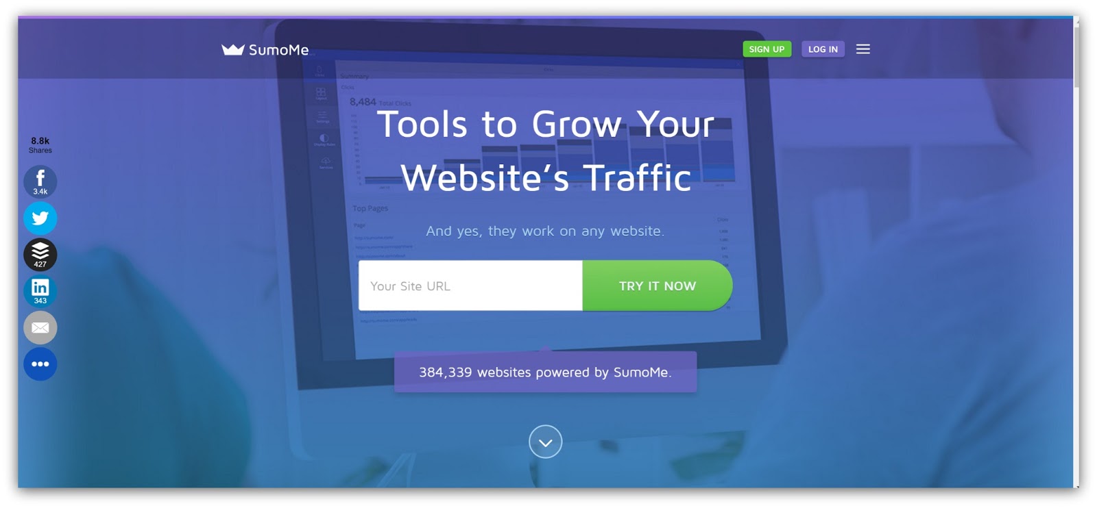
This is the first fold. Ignore how everything kinda sorta looks really different and just focus on the navigation:

There are only four options now. You can either:
- Click the Sumo logo (which takes you back to that homepage)
- Click the “Sign Up” button (which generates a user)
- Click the “Log In” button (for users to login, obviously)
- Click the sandwich icon
And this appears when you click that sandwich icon:
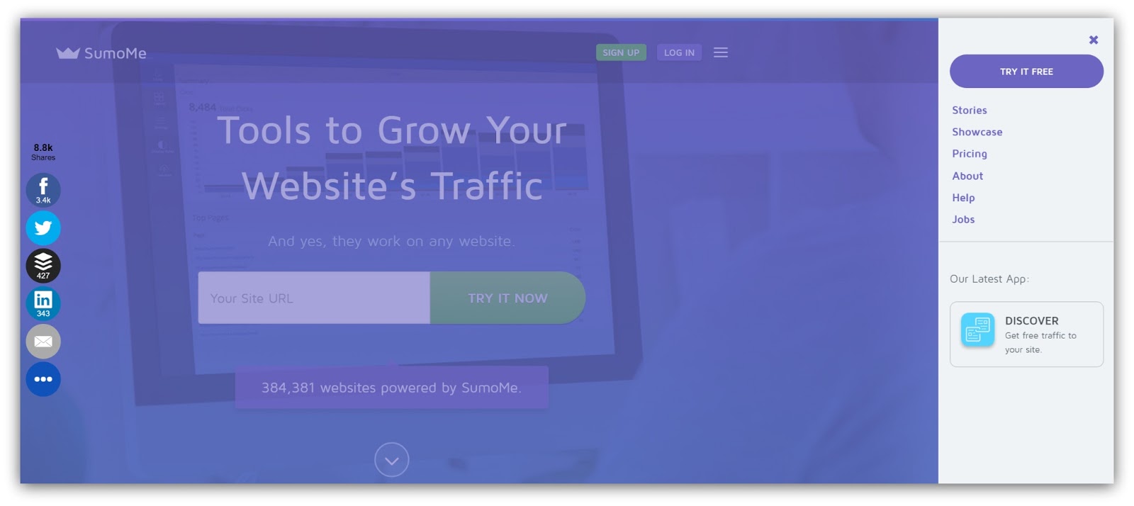
All the stuff that used to be in the navigation bar — Blog, Pricing, About, Help, etc. — are now accessible in this handy right-side navigation.
But you have to click the sandwich icon first.
That means everything in that first fold drives towards a goal unless the visitor is actively seeking out additional information.
That’s how Sumo increased conversions through the click heatmap. So the lessons learned from this?
- Drive Towards A Goal (While Being Accessible): Your navigation shouldn’t detract from your main CTA. Give your visitors a way to navigate the site, but make sure that navigation doesn’t overshadow the page.
- Listen to The Audience: If visitors are overwhelmingly clicking on something in the navigation, it may mean your page isn’t answering all their questions. For example, if they click the “About” link, you might look into adding more information about your company on the homepage. Use the opportunity to listen to the audience and cater to their needs.
3) They’re Clicking On The Wrong Button
The Problem: You want to help your visitors. You want to help them so much that you give them every opportunity to try different tools to grow their business.
But what happens when you overshadow your main CTA with something that doesn’t drive conversions?
This happens:
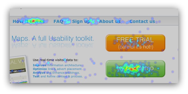
From Hypee
The first button gives you a free trial, while the second button leads to a demo (in this case a YouTube video).
The free trial is the main goal, yet more people click on the free demo AND the “how it works” link in the header. Those areas are stealing clicks
So how do you fix that?
The Solution: In a case like this, the audience is practically yelling what they want.
Give them more information.
It’s the lack of product information that’s killing conversions. The audience clearly needs more information before they’ll even consider a free trial.
This is one of the most common issues I see on a homepage. If I had to fix this page, I’d do three things:
- Cut the Button: The Demo button is stealing clicks. Get rid of that button and strengthen the page with the next two tips.
- Strengthen the Value Proposition: Visitors should know what your product does the moment they read your headline. A strong value proposition would immediately help clear up any immediate confusion.
- Add More Information on Homepage: Take the information in the “How it Works” and “Demo” section and add that to the homepage. Tell your product/service’s story and include links to the free trial within that narrative. This way you keep visitors on the homepage and control how they see your messaging.
With that advice you can safely place focus on the main CTA — generating a free trial.
Here’s a bonus bit of info: sometimes they might click the wrong thing because of the button itself.
Reasons like:
- Button Color: If your main call-to-action button isn’t brighter or bolder than any other call-to-action, you risk visitors thinking the main CTA isn’t as important.
- Button Placement: If your main CTA button isn’t in a prominent place, it can be easy for a visitor to completely miss it. Make sure your button is easily noticeable at all times.
- Button Size: The smaller the button, the harder it is to see. If it’s your main CTA, make it the biggest, most badass button on the page.
- No Button At All: Trust me, I’ve seen this happen, too. Sometimes the main CTA is just a link that’s lost in the sea of text on a page. Make sure your CTA is obvious to the point where people can spot it 10 out of 10 times (by following the suggestions above).
By testing all this stuff out, you can avoid the confusion (and whiskey crushing) my colleague experienced. Zero in on the elements they’re clicking on, then work to shift focus to the main CTA.
4) They’re Not Clicking At All
The Problem: You know that feeling when your computer starts freaking out and you have no idea why?
It’s a scary feeling. You’ve got no control AND the expensive thing you use everyday suddenly won’t let you go on Facebook.
That’s a world I don’t want to live in.
Now imagine this big, expensive web page you sunk lots of resources into isn’t converting at all.
That would understandably suck. It could be for any reason I’ve outlined above, but what happens if the heat map looks like this:
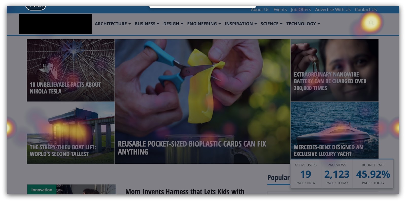
Ouch. I think my TV remote gets more clicks in a minute than the entirety of this page.
It looks like a smattering of clicks all over the place, but besides the search bar there’s no centralized spot where everyone clicks.
So what happens now?
The Solution: I’ll level with you. This is the scariest thing you could see in a heat map.
It could be a variety of issues. It’s going to take a lot of incremental testing to figure out what’s going wrong.
However…90% of the time it can be attributed to one thing.
Clutter.
That’s right. Your page is way too busy, and visitors have no idea what to do when they’re there.
What does clutter look like, exactly? Check this out:
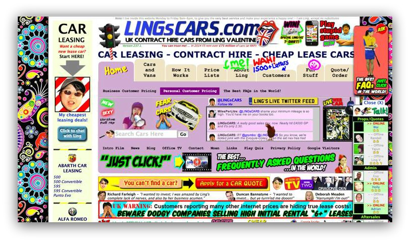
MY EYES!
What is going on here? Where in the world do I click? What’s the point of this page, anyway?
There’s way too much going on to possibly know what to do once I land on this page.
But hey, that’s an extreme case. This, on the other hand, is pretty commonplace:
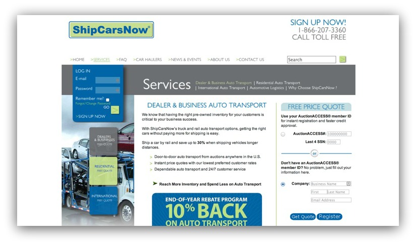
This looks like a normal page, doesn’t it? The colors separate sections well, the spacing is alright and there aren’t many distracting images.
By all accounts, this should be a successful page, right?
Wrong. This is an example of following design guidelines but not user experience guidelines. It may not look like clutter, but real interaction with this page says there’s something wrong.
The biggest problem? The sheer amount of calls to action. Specifically, eight of them (if you don’t count the navigation bar) in the first fold. You’ve got:
- A login section that also prompts a sign-up (1)
- Three separate squares that give a price quote option to three different audiences (2-4)
- A services bar with links to information sections (5)
- A free price quote section (asking for your social security number…wow) (6)*
- An area to register your company for a database (7)
- An offer for 10% back on auto transport (8)

This is classic “choice clutter.” There’s too much to do on the page, and two psychological terms show us why that’s the downfall of this page:
Information Overload
Information overload is the difficulty a person can have understanding an issue due to the presence of too much information.
In layman's terms: you’re seeing too much and don’t know what to do.
From a visual sense, information overload occurs when the amount of input to a system exceeds its processing capacity. Our minds have limited capacities when dealing with stimuli, so an overload of images and colors can render our comprehension and decision sectors virtually non-existent.
When you don’t know what to do, it leads to the worst action a user can make: no action.
Overchoice
Overchoice is the act of making no choice when faced with an abundance of choices.
Here’s an example. What’s easier for you to answer:
“Should we watch Game of Thrones or Boardwalk Empire” OR “What should we watch?”
Two different feelings, right? That first question gives you two choices. You can weigh pros and cons between the two and come to a conclusion.
But what about that second question? Asking what you want to watch could mean a variety of things — movies, tv shows, YouTube clips… anything, really. When you have that universe of media to choose from, it becomes exponentially difficult to make a choice at all.
The same can be said of web pages. Overchoice can drive visitors away.
Here’s the main takeaway: don’t clutter your web page. If heat maps show scattered clicks everywhere, you can point to clutter and work from there.
But you wouldn’t know any of this stuff without a click heat map. You’d be guessing why people don’t buy/opt-in/interact on your page.
So to finish this post off, I’m going to show you how to set up Heat Maps and Content Analytics with Sumo test in under two minutes (fo’ free).
How To Set Up Heat Map Tests (In Under Two Minutes)
This might be the easiest thing you do all day. No joke.
And it’ll turn your website into a butt-kicking conversion machine.
So here’s all you have to do:
- Click this link to get Heat Maps and this link to get Content Analytics for free.
- Install the Sumo plugin on WordPress OR insert some code into the head of your web page.
- Go to the page you want to set up the two heat maps on (your homepage, contact page, etc.)
- Click on the Sumo badge and you’ll see a “Flame” icon. Click that.
- A message will pop up asking if you want to start recording. Click “Yes.”
And that’s it. Seriously. You’ve now got a live, functioning heat map running on your web page.
Two minutes of time could net you thousands of dollars or opt-ins on your site. Plus, you get free access to all the other awesome Sumo tools like List Builder, Welcome Mat, Scroll Box and a whole lot more list building tools.
On top of all this (the tools and the article), I want to give you something else to make sure you crush it with your first heat map.
Believe it or not, there are five pages on your website that you need to install heat maps on immediately. These five pages are the ones that drive revenue and help grow your email list.
I’ve created a spreadsheet that reveals these five pages. For each page, I give you questions to answer that will help you better understand what your visitors are doing on those pages.
If you install heat maps AND use this spreadsheet, you’re guaranteed to improve your conversions and help create a better experience for your visitors.
Don’t let another visitor leave your site without knowing why. Grab the spreadsheet below and master heat maps today:
Add A Comment
VIEW THE COMMENTS