A landing page is one of the most effective ways to increase your website conversions.
If you’re looking to move leads through your funnel (and let’s be honest, who isn’t?), landing pages are your best friend.
A great landing page is free of distraction and laser-focused on the task in hand. From the headline and offer, all the way down to the footer, every aspect focuses on conversion.
But what makes a great landing page? And why is it so powerful for boosting conversions?
This guide will answer those questions and give you everything you need to create the best landing pages on the internet.
Table of Contents
Let’s get going…
Grab Your Landing Page Checklist Today
What Is A Landing Page?
A landing page is a page on your website designed to convert visitors into leads, subscribers, or customers. It’s a page where visitors “land” when they click one of your campaigns or CTAs from Facebook, email, or even another page on your site.
Landing Page vs. Webpage
Landing pages are designed with a single goal in mind, while most pages have multiple functions. For example, your homepage might be designed with any number of goals in mind:
- To educate users about your product
- To encourage visitors to explore other pages
- To increase sign-ups
(I could go on, but you get the point…)
Take Sweetgreen. Its homepage features a ton of options for the visitor (I counted 20+ actions you could take on this page). Here are just a few options:
- See what’s new on its menu
- Place an order
- Download its app
- Check locations
- Learn its story
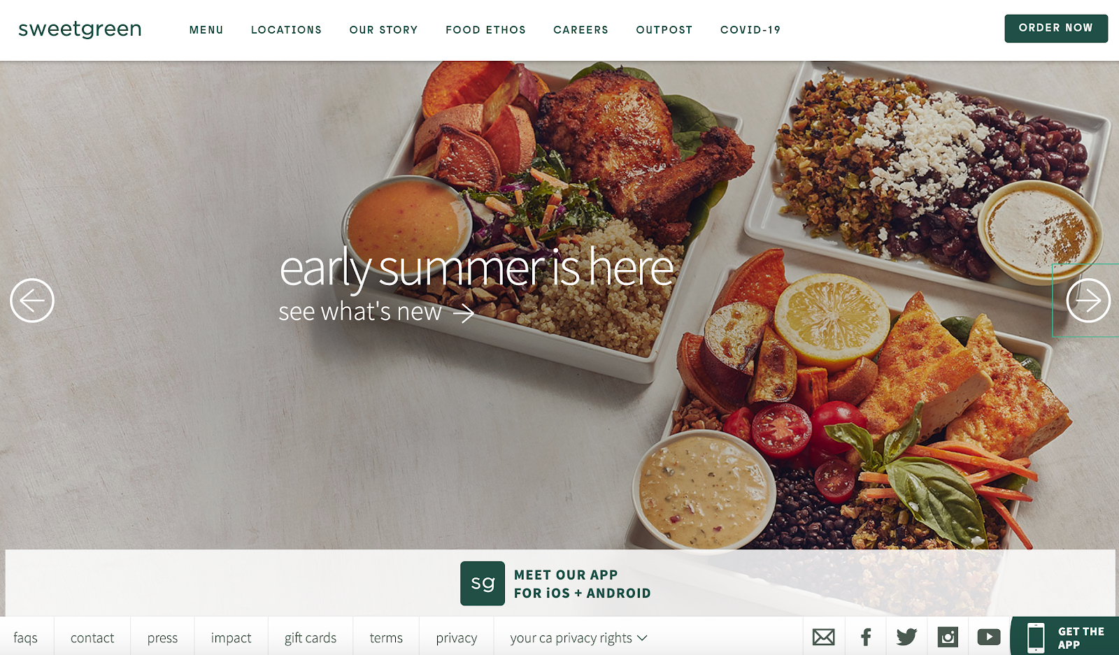
Compare this to a landing page Sweetgreen uses for one of its Facebook ad campaigns to promote new stores opening in Colorado:
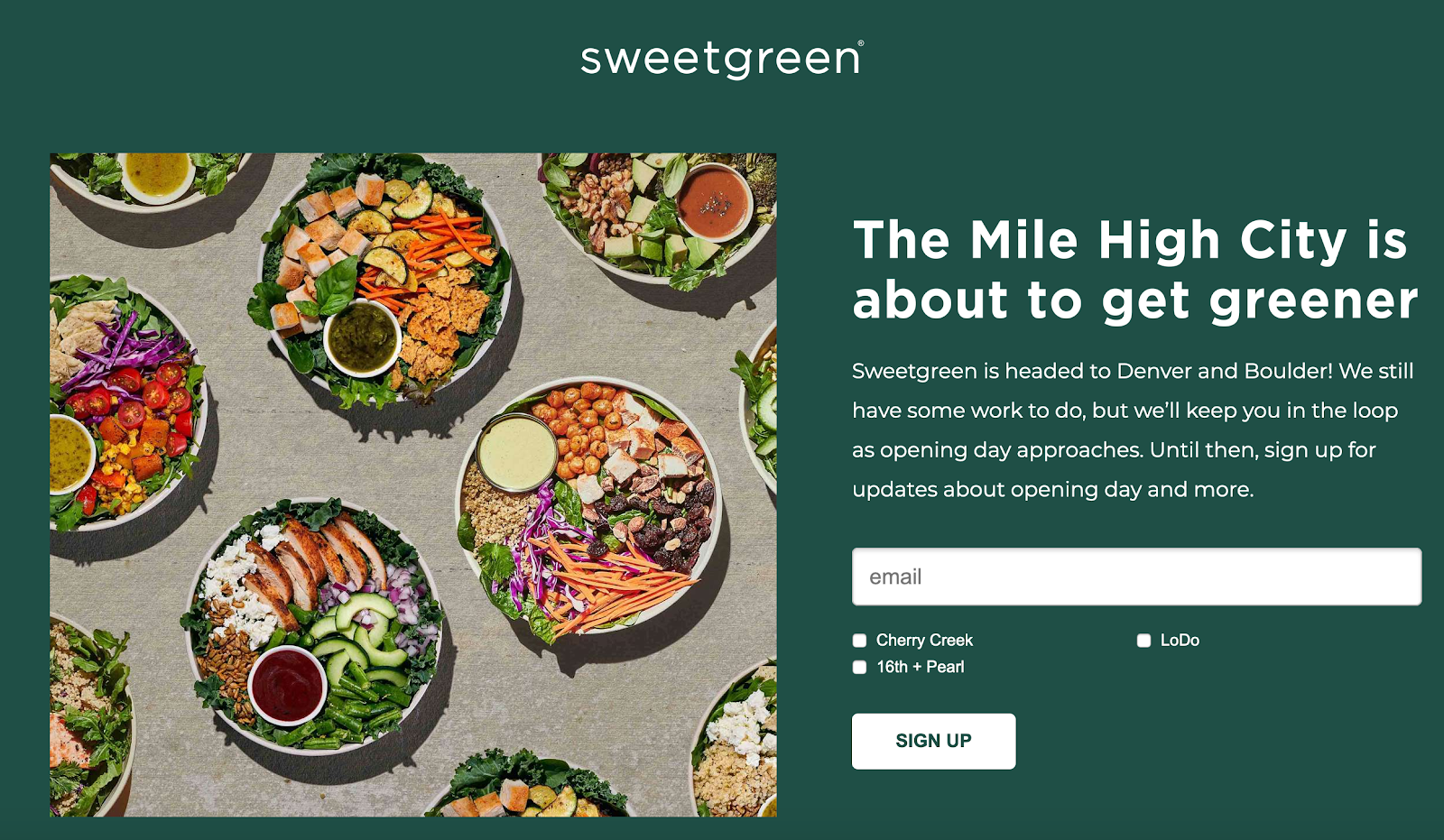
Notice the difference?
The landing page is much simpler. It’s 100% focused on encouraging people to sign up for updates about the new Colorado stores. There are no links to other parts of the site, and no distractions taking the visitor’s focus away from the call to action.
Landing pages serve a completely different purpose from other pages on your site, especially the homepage.
Your homepage lets the user do almost anything they can think of. But every part of a landing page, from the headline and copy to the images/videos and CTA, is focused on one goal.
Landing Page Objectives
As we’ve mentioned, a landing page has a singular goal. And though that goal can vary — joining a mailing list, making a purchase, etc. — most objectives can be achieved using one of these three styles of landing page:
Click-Through Pages
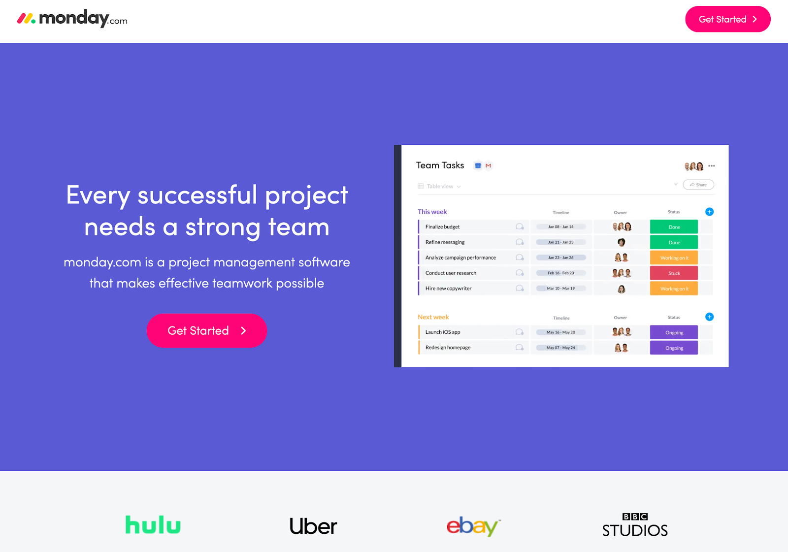
Click-through landing pages tend to be used by software or service businesses — essentially any business where making a purchase is more complicated than simply clicking “buy now”.
These types of pages will often feature a CTA like “Get Started” or “See a Demo.” Once a visitor clicks, they begin the registration process.
Here’s an example click-through page from Monday.com:
Lead Capture Pages
The goal of a lead capture page is to, well, capture leads. These pages tend to include some form of offer or reward in return for sharing your details. These pages can be used as intermediary pages.
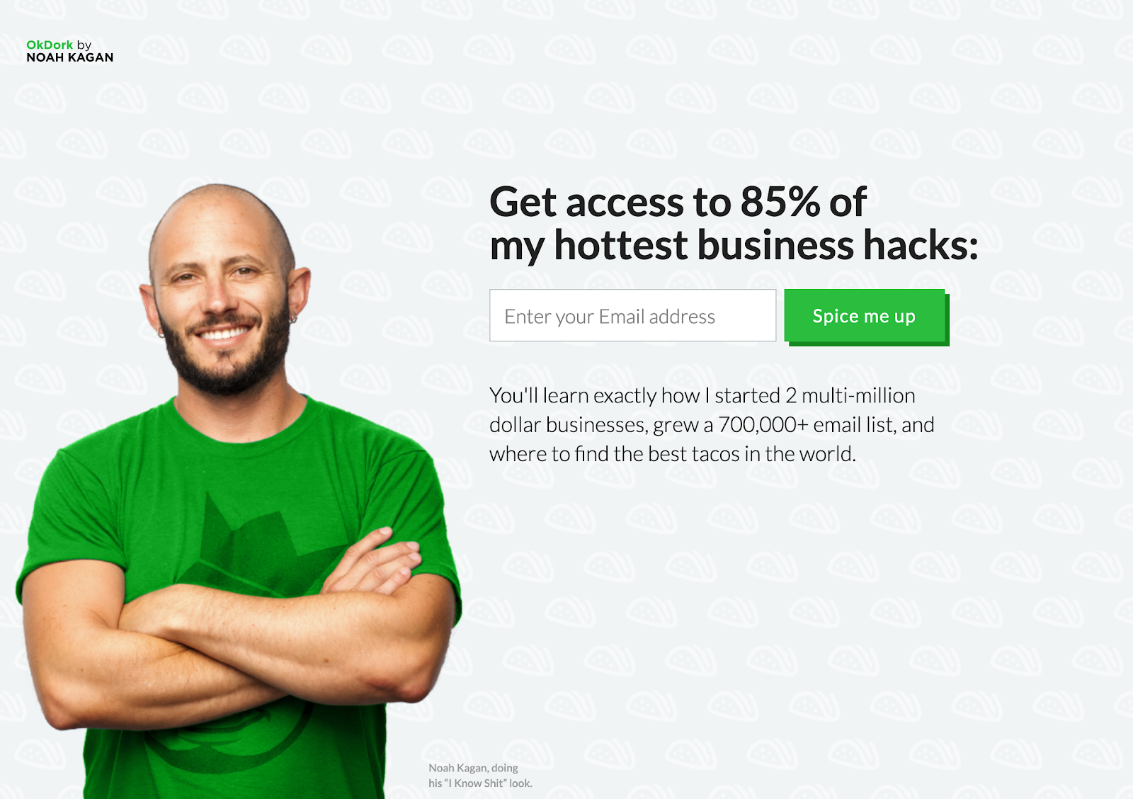
For example, Noah uses a lead capture landing page on his site OkDork before someone lands on his homepage. The goal is to generate new sign-ups to his mailing list in exchange for “Noah’s hottest business hacks.”
Sales Pages
Sales pages tend to be used when you’re sending pre-qualified traffic to a landing page that sells a product. For example, maybe someone has just watched one of your ads on YouTube or has opted in to an email campaign you’re running.
A sales page exists to get people at the bottom of your funnel over the line from lead to customer.
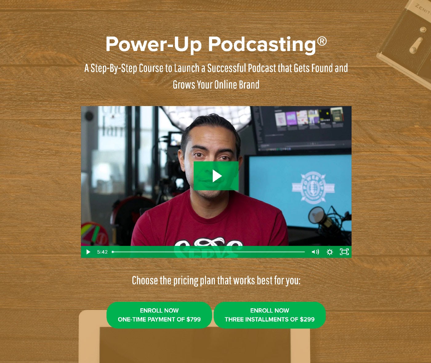
Why Your Business Needs To Use Landing Pages
In short: Landing pages can help you to increase conversions.
So honestly, why wouldn’t you use them?
Landing pages convert so well because of their focus. Most pages on your site have several jobs, so naturally they won’t convert at super-high rates. But with a landing page, you can gear every pixel on that page toward getting the visitor to take your desired action. There are no distractions.
Another big benefit of landing pages is that you can create pages that match user intent. Take this ad from Winc:
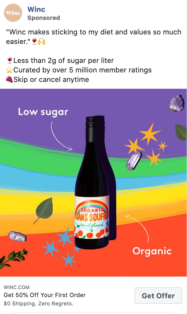
At a glance, this ad is telling the viewer:
- Winc is low in sugar; less than 2g per liter
- 50% off the first order
- No commitment, skip when you want
After clicking the link, Winc takes you to a landing page created specifically for this campaign:

The landing page tells visitors the same story as the advert: Low sugar, 50% off, cancel anytime (no risk). And look at those CTAs — both drive visitors directly to the next stage of Winc’s funnel (becoming a customer).
Now let’s compare that experience to the top section of Winc’s homepage (what a first-time visitor would see in their first few seconds on the site):
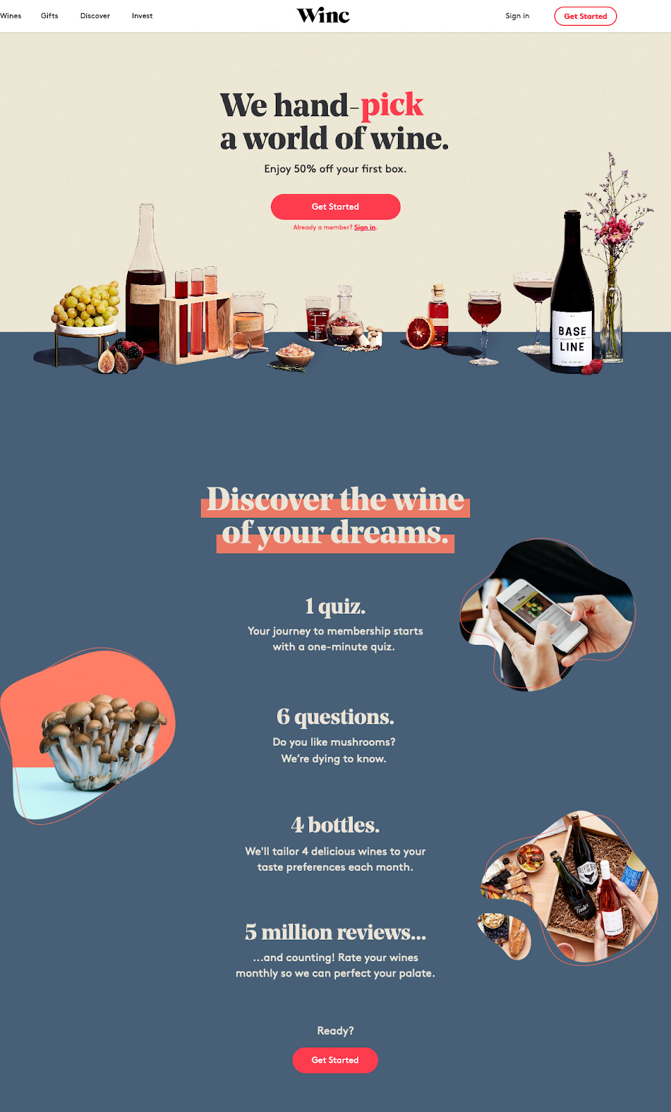
Winc does a great job with its messaging across every brand touchpoint, but if we’d clicked that Facebook ad and landed on the homepage, the experience isn’t as smooth. Yep, the 50% discount on your first box is still there. But there’s no mention of the low sugar options or canceling at any time. Plus, there are so many other links fighting for attention compared to the singular CTA of the landing page.
Now you can start to see why landing pages convert so well, right?
If you care about your conversion rates, you need to be using landing pages to create a seamless user experience from your marketing channels to your funnel.
Let’s say you want to move previous website visitors from awareness to the consideration stage of your funnel. You could set up a retargeting campaign to get people to opt in to your email list. Sending these people to your homepage with 30+ links vying for their attention would perform much worse than sending them to a page with just one CTA to join your list.
When You Should Use A Landing Page
Landing pages work best when you use them to greet inbound traffic from paid or owned sources. For example, here are a few settings where it would make sense to use a landing page:
- When you set up a new Facebook Ads campaign
- If you run outdoor or audio ads where someone can’t click through to your site directly
- When you send an email about a new feature
- Promoting something specific from your Instagram bio link
Use a landing page when you’re driving traffic to your website to achieve a singular goal.
If someone discovers your site view word-of-mouth or organic search, they will likely be a little more inquisitive and want to browse around different pages to learn more about your business. But when you’re sending warm traffic or people who already know a little about your business to your site, it’s best to send them to a landing page that will directly help you to achieve your goal.
How To Create A High-Converting Landing Page
While there are many landing page builders you can use to create a landing page and every one of them is unique, the most successful ones often have five things in common:
- A compelling offer (or USP)
- Attention-grabbing images or videos
- Supporting content
- A clear call to action
- Social proof
1. A Compelling Offer
What makes your proposition irresistible?
When someone arrives on your landing page, they need to understand two things instantly:
- What you’re offering
- How whatever you’re offering will improve their lives
To make clicking your CTA feel like an easy decision, you need to communicate these two things clearly and concisely as soon as the page loads.
For example, let’s take Noah’s landing page again, but we’ll dig a little deeper this time.

This landing page exists to capture email addresses, and this is clear for everyone who lands on this page to see.
So what’s Noah offering, and why is it irresistible?
Well… learning exactly how a founder of multiple six-figure businesses thinks about business growth is pretty compelling, right?
Without a compelling offer, your landing page just won’t work. It must be exciting, enticing, and give every visitor a reason to take your desired action.
Your offer also HAS to match visitor intent to be successful. People visit Noah’s site to learn about growing businesses, so this page makes sense in this context.
The same goes for the Winc landing page we shared earlier:
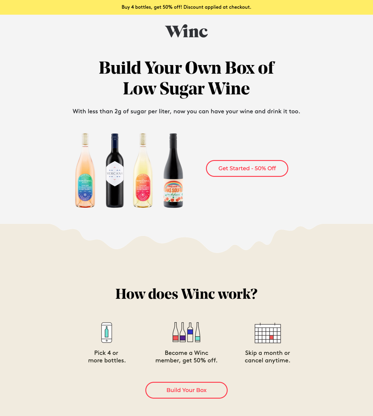
To land on this page, people have to click an ad focused on low-sugar wine. And the offer on this page is compelling to people who care about this topic: Build your own box of low-sugar wine… oh and have 50% off too.
That’s compelling.
Before you do anything else — write copy, start designing, etc. — think about the offer you want to display on your landing page and what will make it irresistible to this page’s target audience.
2. Attention-Grabbing Images Or Videos
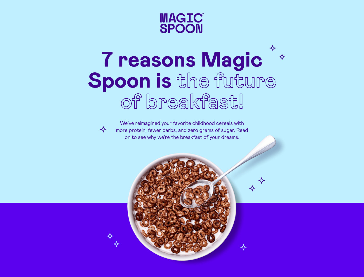
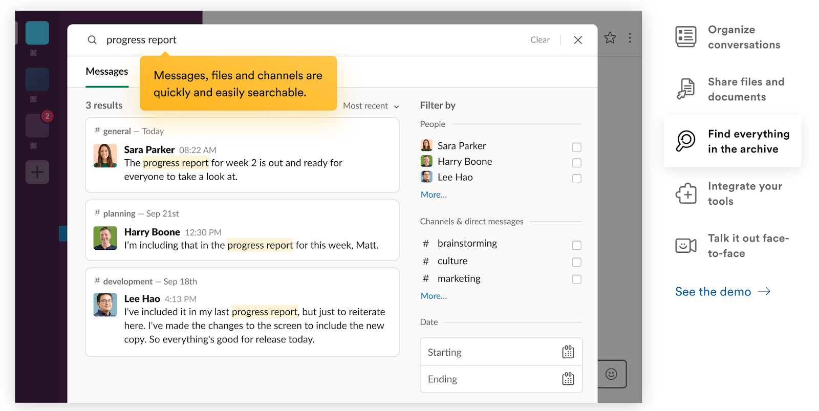
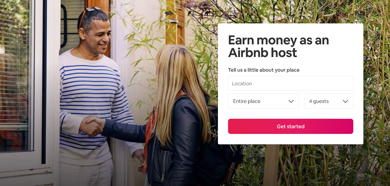
Visuals can have a huge impact on a landing page’s performance. The images and videos you use give you a chance to create a great first impression on every visitor. Each visual you use should serve a specific purpose and ideally show your product in context.
For example:
-
If you’re a food brand, show your product looking irresistible like Magic Spoon.
-
As a software business, you could show your product in use like Slack.
-
You could also show people experiencing your project, like Airbnb’s hosting landing page that shows a host greeting a guest.
The goal of your visuals — as with every element on a landing page — is to entice the visitor to click your CTA. And one of the best ways to do this is to use creative that makes the visitor feel something: Excitement, fear of missing out, inspiration, optimism, etc.
If your visuals don’t grab your visitors, they won’t feel the desire to take action. The goal should be to use images or videos to show visitors how your product or service can make their lives better.
3. Supporting Copy
In the movies, the leading actors are often the stars of the show. They’re the ones featured on the billboards, doing all of the interviews, and winning the awards. But without a great supporting cast, no film would be a success.
In the world of landing pages, your offer and visuals are the leading stars, and your supporting copy is the glue that brings everything together and leads your visitors ever closer to clicking your CTA.
Your offer and visuals are great to pique someone’s interest, but people are curious. Many will need more than a ~10-word headline and beautiful imagery to take the next step. This is where your supporting copy comes in.
The key thing to do here is to explain more about your offer:
- What are the benefits?
- What are the key features of your product or service?
- Why can’t someone afford to miss out on this offer?
Here’s an example from Write of Passage, an online writing school:
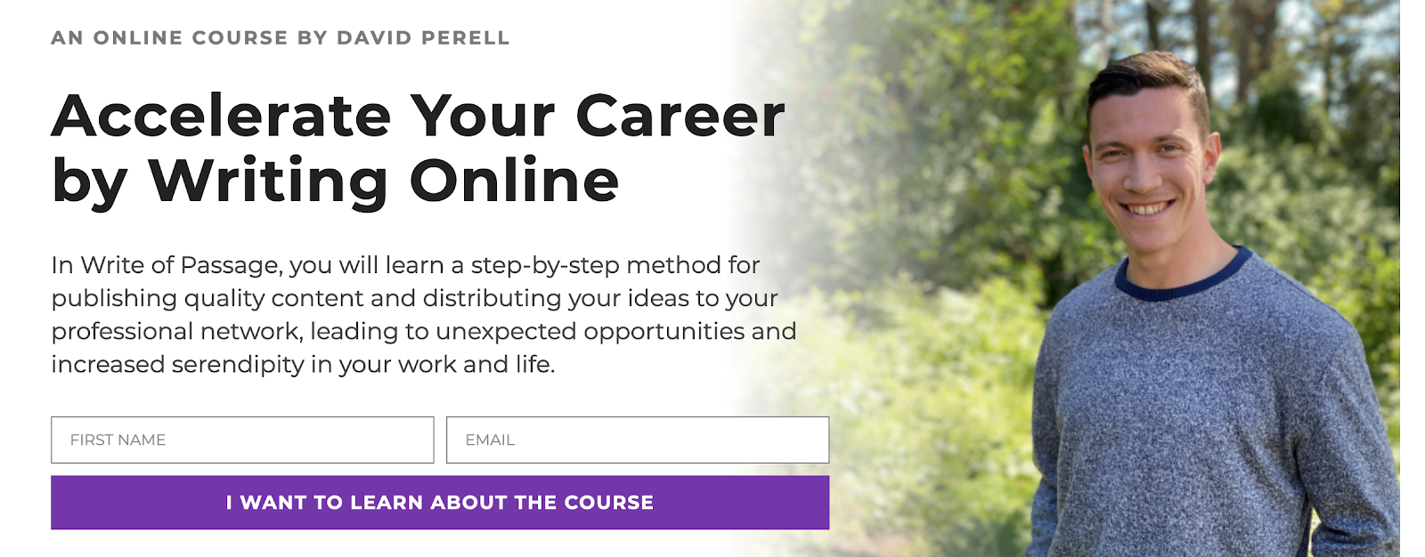
It starts with a clear offer and visual, with supporting copy sharing exactly how the course will benefit each student. As you scroll, you’re presented with more benefits to support the claims in the hero section.
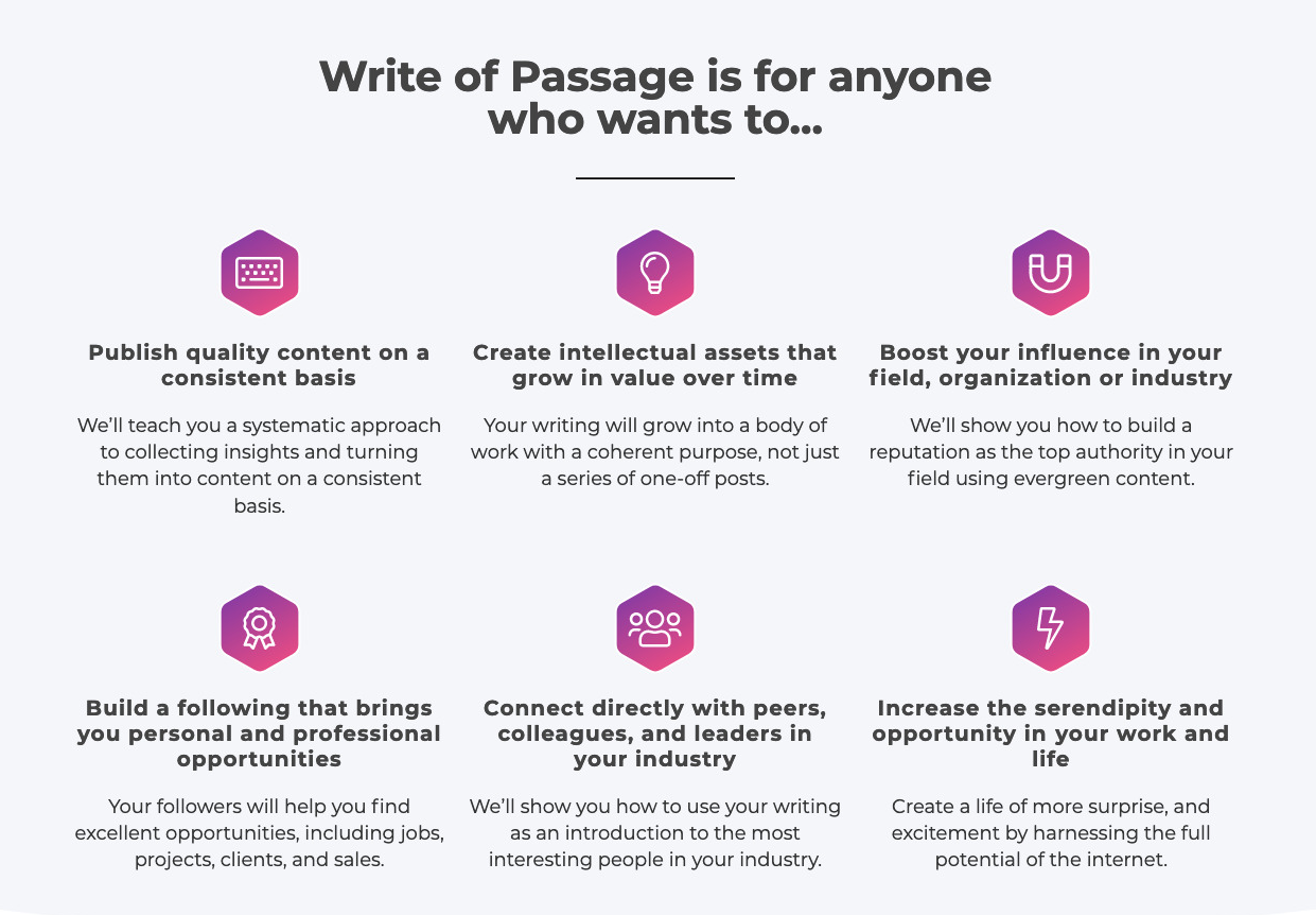
As you write your supporting copy, try to focus on the visitor and what they care about. This copy should back up your offer and nudge the visitor ever closer to converting.
4. A Clear Call to Action
The goal of every landing page is to get your visitors to click your call to action (CTA). A CTA tends to be a button that encourages a website visitor to take a specific action.
For example:
- “Get Started”
- “Sign Up”
- “Buy Now”
Here’s a “Take the quiz” CTA button on one of Warby Parker’s landing pages:
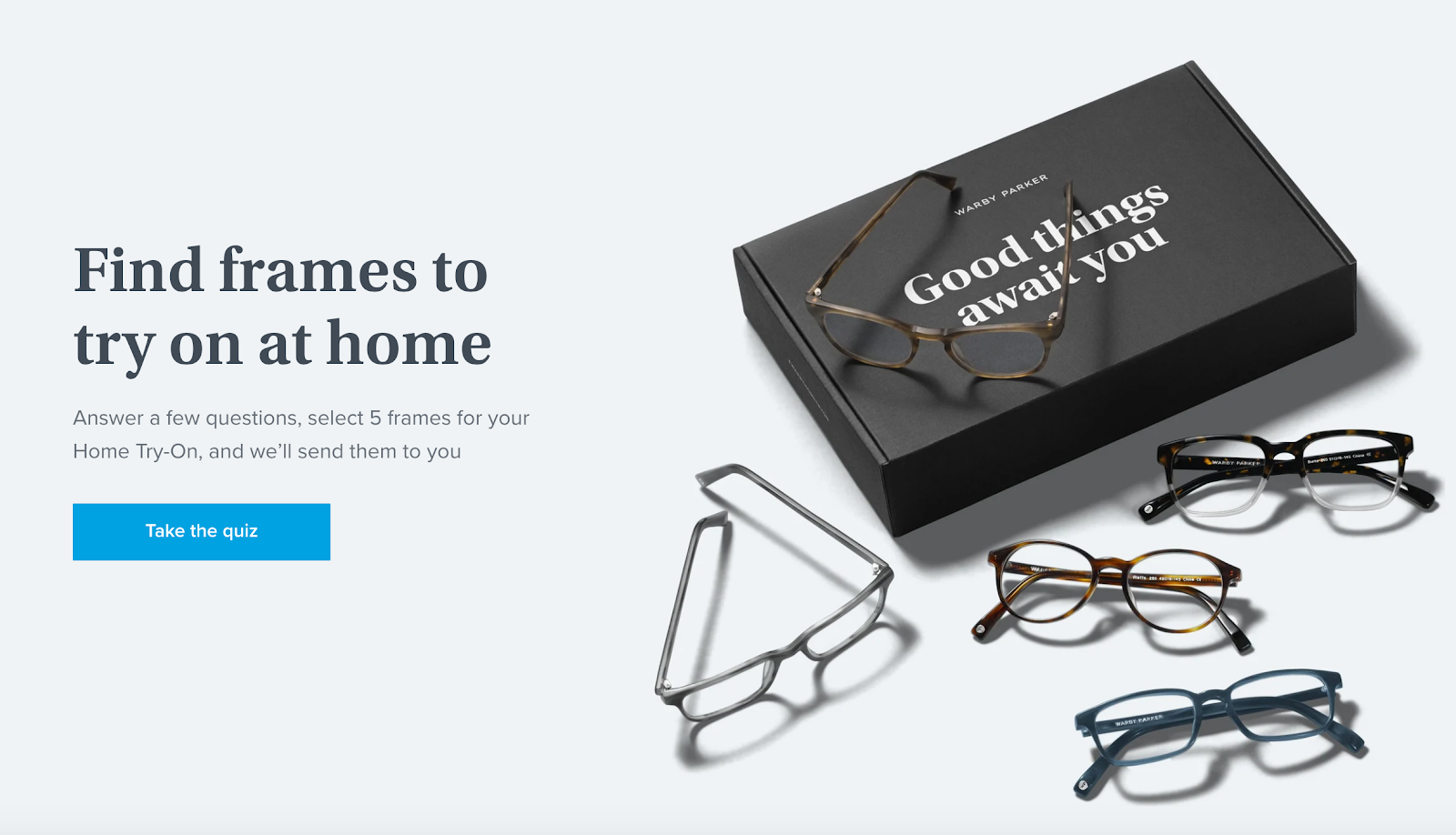
There are plenty of CTAs you can use, but here are a few tips to make a highly clickable CTA:
-
Choose a contrasting color: Your CTA button needs to stand out from everything else on the page. Try to use a color that contrasts the background and commands attention.
-
Make the action obvious: Visitors should understand what will happen if they click the button. For example, “Buy now” will clearly initiate a purchase, the above “Take the quiz” will launch a quiz to help you find the right glasses frames. CTA copy like “Next” or “Click here” is too generic and will leave visitors wondering what action will happen.
5. Social Proof
Social proof is your secret weapon in conversion. We like to validate our decisions based on what other people are doing.
Social proof is all around us. For example, if people are queuing outside a cafe, that tells us the cafe must be good, or if a good friend tells us about a new brand, that’s usually all we need to trust that brand.
See how Gousto uses social proof on one of its landing pages below:
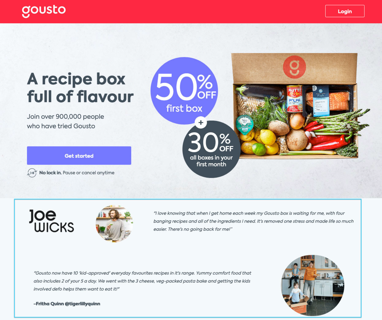
There are many types of social proof, from testimonials and quotes (used by Gousto above) to ratings and reviews, and case studies.
Bite Toothpaste uses press features as social proof on its landing page:
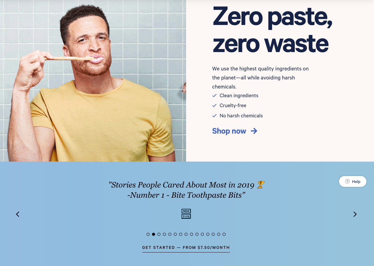
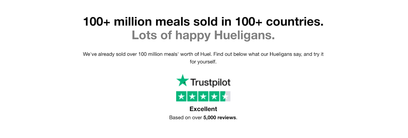
And Huel uses raw quantity (100 million sold) and reviews (5,000+) as social proof on its landing page:
When you’re trying to convince someone to take action on your landing page, social proof is one of the most powerful techniques you can use. Think about how you could feature:
- Quotes from customers
- Success stories or case studies
- Endorsements from social media
- Logos of well-known customers or avatars of well-known individuals that use your product/service
- Reviews from trusted sources like TrustPilot, Yelp, TripAdvisor
- Press mentions from big publications
Ready To Build Your Next Landing Page?
So there we have it. Everything you need to know about landing pages, and the key elements every successful page needs.
You’re not all set to build your highest-converting landing page yet. What are you waiting for?
Add A Comment
VIEW THE COMMENTS