The call to action (CTA) is one of the most powerful parts of any marketing campaign.
Whether you want to —
Increase sign-ups or sales
Build your email list
Generate more traffic
— the call to action will play an important role in helping you achieve your goals. And the art of crafting an irresistible call to action is an essential skill for the modern marketer to master.
Below, I’ll share seven techniques to help you write ultra-effective CTAs for your website, emails, and marketing campaigns.
- What Is A Call To Action?
- 7 Techniques To Help Write An Effective Call To Action
- CTA Copy That Converts Cheat Sheet
What Is A Call To Action?
Before we dive into how to write a call to action, let’s first dig into exactly what a call to action is.
A call to action (or CTA for short) tells visitors to your website what action they should take next.
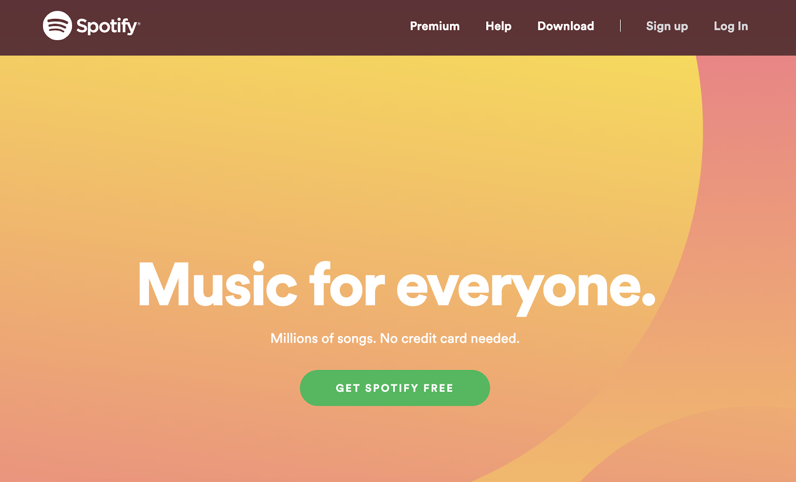
Almost every webpage will feature a CTA. From a homepage trying to encourage visitors to sign up:
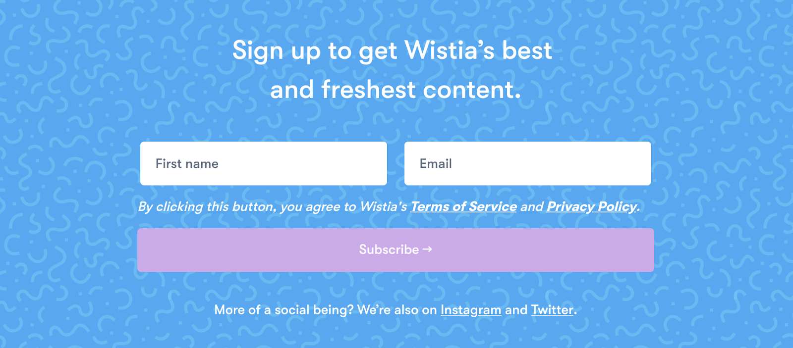
And a blog post featuring an email list subscription:
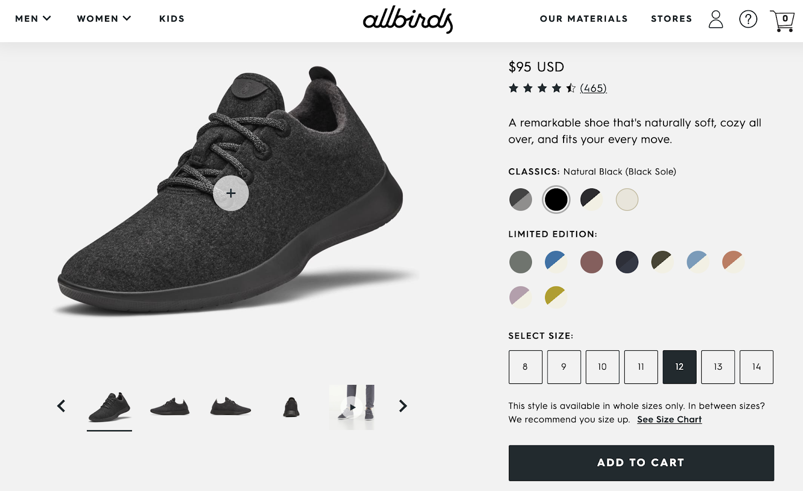
To a product page focused on adding something to a basket:
A call to action helps to guide your audience across your website — think of them as signposts to help direct visitors through your funnel.
A well-crafted CTA can be the difference between a conversion and a missed sale.
But there’s a sweet science to writing a CTA. Keep reading to discover seven techniques to writing effective, clickable CTAs.
7 Techniques To Help Write An Effective Call To Action
1. Use Verbs
Verbs are action words. And in a call to action, a verb lets your audience know exactly what you want them to do.
For example:
Buy
Download
Listen
Subscribe
Sign Up
Without a verb, CTAs can lack direction. As an ecommerce business, you could have a CTA like:
“Our new baseball cap is available”
That statement lacks bite, though. As a reader, I’m not quite sure what I’m supposed to do with that information. Adding a verb makes the instructions much easier to follow. For example:
“Buy our new baseball cap”
You can even take this one step further by adding in an adverb like “now”:
“Buy our new baseball cap now”
Let’s look at a real-world example. On Everlane product pages, the CTA says ‘Add To Bag’, the action is clear: By clicking this CTA, the product will be added to the shopper’s bag:
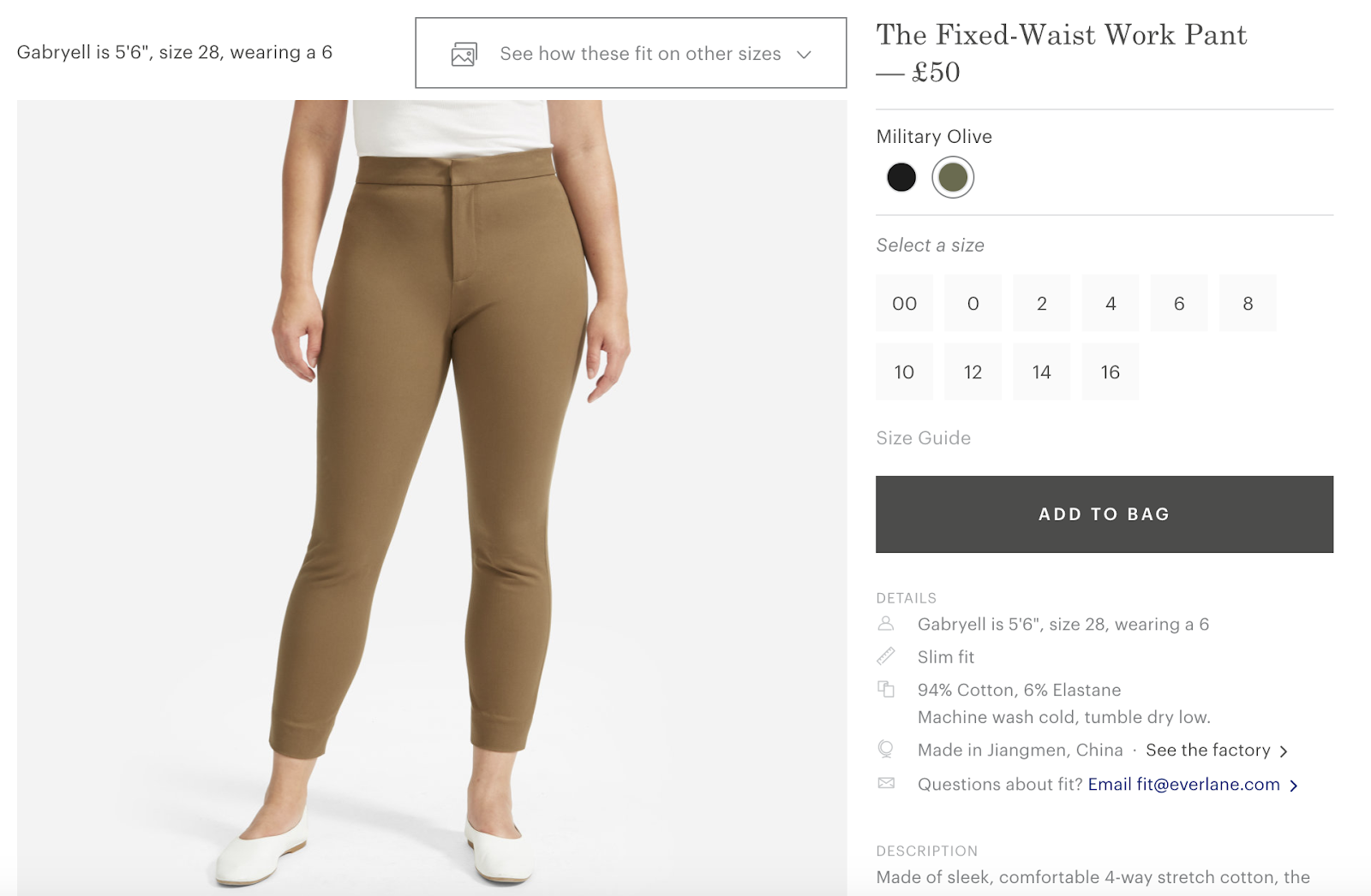
If this CTA didn’t use a verb like “Add” and instead said “Product Available”, it wouldn’t be as powerful, and the conversion rates would most likely drop.
Use verbs in your CTAs to give the reader clear direction on what action you’d like them to take and the results of taking this action.
2. Focus On FOMO
FOMO (fear of missing out), is defined as:[*]
“A pervasive apprehension that others might be having rewarding experiences from which one is absent.”
So in plain English: The thought of missing out on something is a key motivator to taking action.
FOMO plays against a range of feelings and emotions. I’m sure you’ve experienced a few of these thoughts over the years when debating a purchase:
“If I don’t buy now, I’ll miss out.”
“I need to sign up or I’ll be the only person who doesn’t get [x].”
“By doing [x], I’ll improve my [income / happiness / health, etc].”
FOMO is why you see businesses running limited-time sales and releasing exclusive or rare products (Hey, Supreme). It makes people act immediately, as there’s no time to deliberate.
I’m sure you’ve probably seen plenty of CTAs that target the fear of missing out or make products feel exclusive. They often include words and phrases like:
Now
Limited Time
Only [X] Available
One-Time
Only 24hrs Left
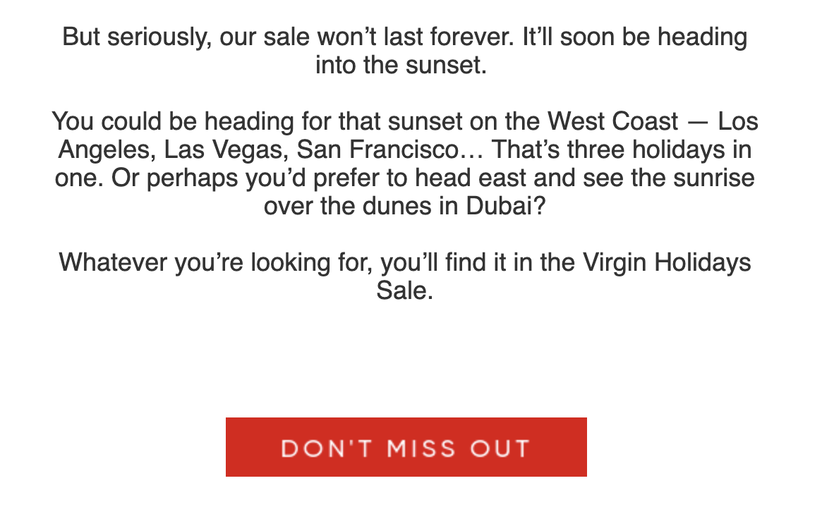
Virgin Holidays used FOMO in a sales promotion email:
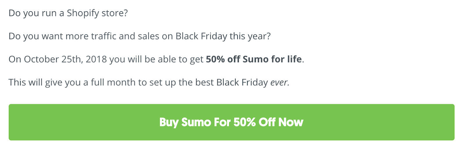
And back in 2018, Sumo ran a limited 24-hour sale for selling on Black Friday:
When writing a call to action, FOMO can work in a couple of ways:
Scarcity: If something is available in abundance, there’s no urgency to act. You can always come back later, anyway. But if something has a limited-time offer, or limited stock, this creates scarcity and forces action right away.
Exclusivity: Similar to scarcity, exclusivity sparks urgency. Amazon Prime produces exclusive shows and movies for subscribers that can’t be viewed anywhere else. If you want to watch that content, you need to be a member.
3. Take Away The Risk
Our brains are constantly assessing risks.
From big things like “Should I quit my job to go traveling?” to smaller decisions like “Is Apple Music worth $10 per month?”
When you’re writing a great call to action, you can use risk (or reassurance) to increase your conversions.
When you first visit the Netflix website, you can’t browse its library of movies and TV shows, so signing up can feel somewhat of a risk as you don’t know for sure what’s waiting on the other side of its landing page.
So to reassure new customers that they have nothing to lose, Netflix focuses its call to action on the fact that new customers can try for free before making a payment.
Here’s one of its landing pages:
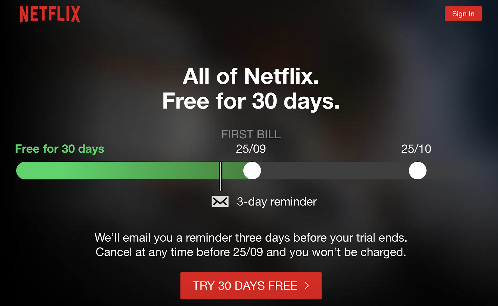
The main CTA clearly states new customers can ‘Try 30 Days Free’, but this message is also made clear in the main graphic and copy across the page:
Headline: ‘All of Netflix. Free for 30 days.’
Subheading: ‘We’ll email you three days before your trial ends.’
Graphic: Highlights the 3-day reminder, so you don’t forget to cancel if you’re not enjoying the free trial.
4. Sell Benefits, Not Features
People don’t buy features; they buy benefits.
When the iPod came out, Apple sold the benefit of having ‘1,000 songs in your pocket’, rather than the feature of ‘1GB storage’.
And when it comes to writing a call to action, focusing on the benefit can be a great way to increase your clicks and conversions.
On his website, fitness coach Adam Frater uses his main CTA to sell the benefits of buying his program:
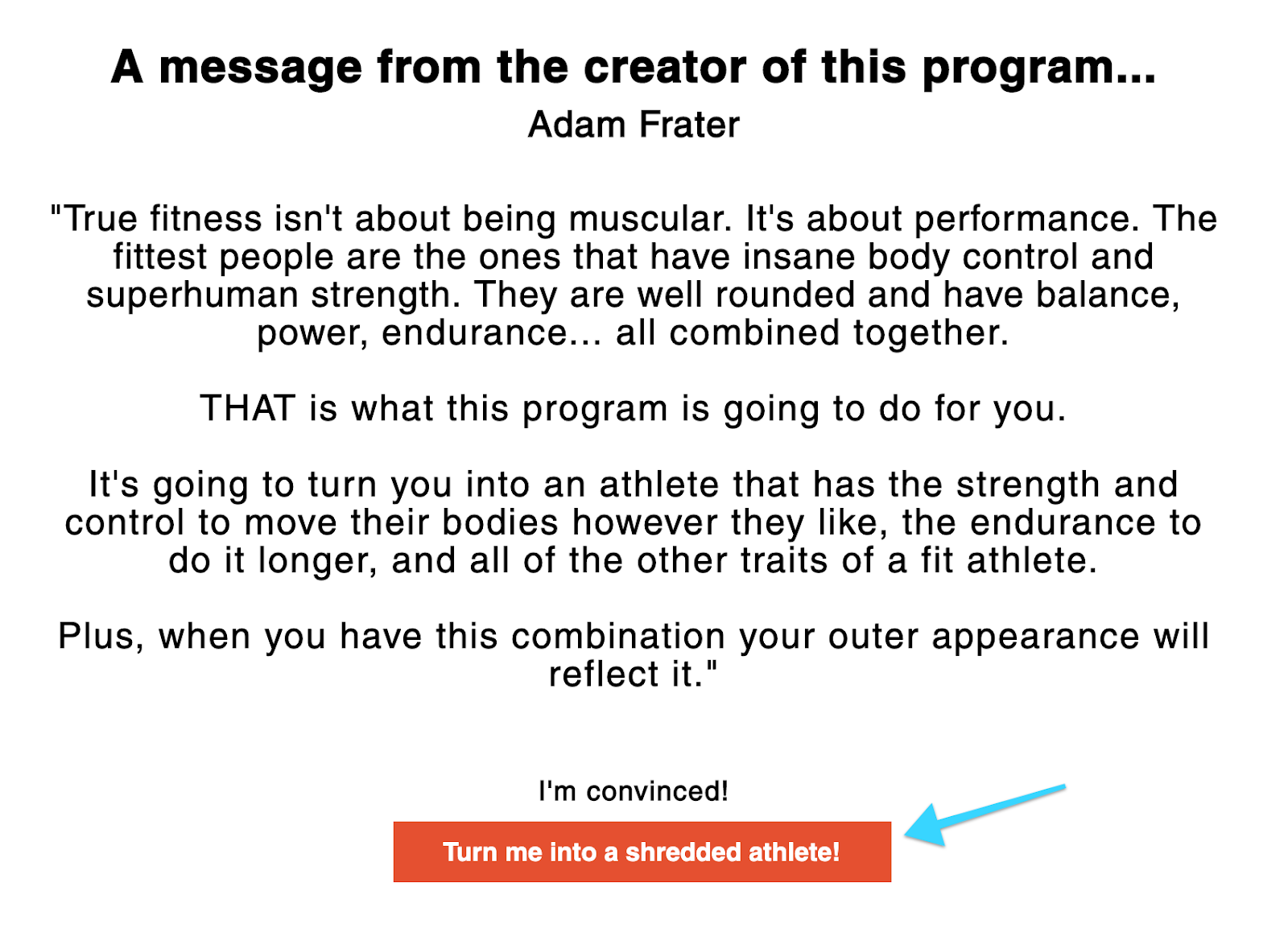
The CTA button reads: “Turn me into a shredded athlete!” — the benefit of his program, instead of focusing on the features (e.g., 10 workouts you can do at home).
Author Ramit Sethi focuses his homepage CTA on his earning potential quiz. Sethi focuses the hero section of his website on selling the benefits of knowing your earning potential:

Most prospects don’t care about product features. They care much more about the benefits they will receive from the product. When you write a benefits-focused CTA, highlight the “why” the customer would want to purchase, rather than “what” your product is.
Basecamp sells the “why” very well on its homepage:
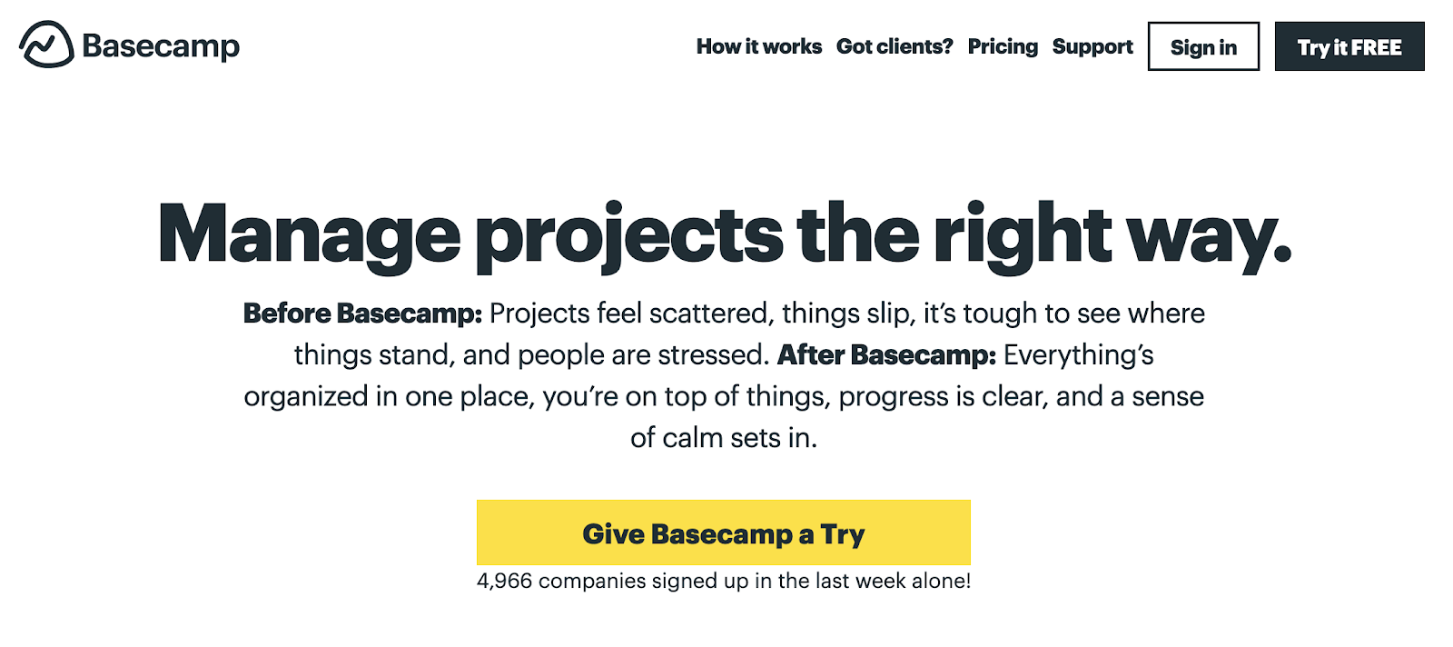
Instead of focusing on what Basecamp does, this CTA focusing on the problems it solves (benefits) for customers.
5. Keep It Simple
Sometimes the best CTAs are the simplest ones.
“Buy Now”
“Subscribe”
“Download”
“Click Here”
It can be tempting to try to reinvent the wheel, but you don’t always need to. The best play could instead be to stick to the tried and true CTAs that deliver time and time again.
With a CTA, you don’t want to make the user think. The words you choose for your CTA buttons should describe the resulting action clearly for the user.
For example:
“Add To Basket”: Should add this product to a shoppers basket
“Download Now”: Will trigger a download, either directly or by emailing the download to the user.
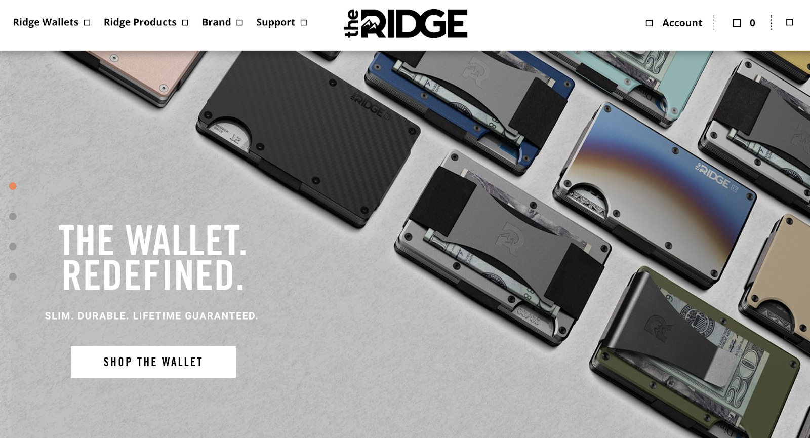
Across its website, Ridge Wallet keeps its CTAs clear and concise. On its homepage, the CTA is to ”Shop The Wallet” (this takes visitors to a page where they can see all of its wallets):
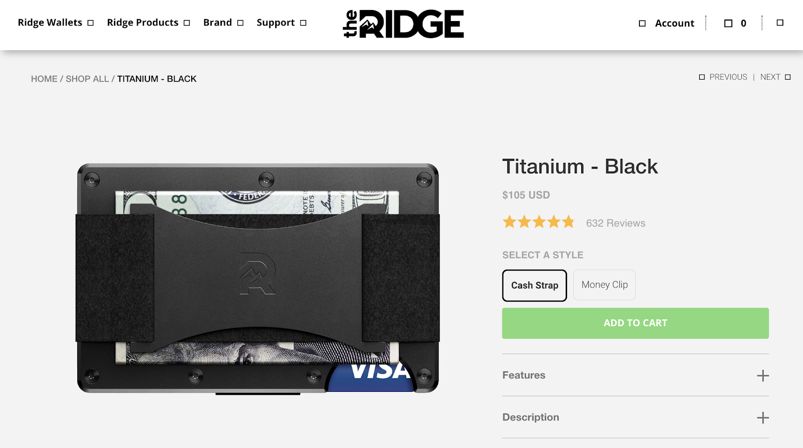
Then on its product pages, the main CTA is to ”Add To Cart”:
When writing a simple call to action, think about the easiest and clearest way to describe the action the CTA will trigger.
6. Use Secondary CTAs
In most cases, you don’t want to give people too many options as this can be confusing for the user. But in some examples, multiple CTAs can work extremely well.
Take Amazon.
Amazon knows a thing or two about ecommerce, and every product page it includes two main CTAs:
Add to Basket
Buy Now
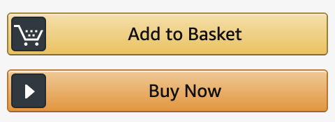
These two buttons essentially do the same job, but in slightly different ways:
Add to Basket: Puts this product in your basket and leaves you to continue shopping (hoping to increase average revenue per checkout if you buy multiple products).
Buy Now: Takes a customer directly to checkout if they know they have finished their shopping.
”Add to Basket” is the primary CTA, as Amazon would like customers to browse and add multiple items to their basket versus buying one product.
Apple also uses multiple CTAs across its site:
”Learn More”: Gives people a chance to dig deeper into a product and educate themselves on the various models, features, and benefits.
”Buy”: Takes the shopper directly into the purchase funnel, allowing them to choose between models, colors, etc.

In the software world, Culture Amp also uses a secondary CTA on its homepage:

In this call-to-action example, Culture Amp gives visitors the option to book a product demo or watch a video to learn more about its product.
Both serve the same purpose: Product education. But as ”Book a Demo” is the main CTA, this is most likely the most profitable route for Culture Amp to acquire customers (I’d assume people are more likely to buy after a demo than watching a video).
As a potential customer, I might want to gather more information before booking a demo. So the ”Watch Video” CTA gives me a clear direction if I’m not quite ready to commit to a demo.
It all depends on your customers. If you’re not sure someone will be ready to commit to a purchase, a secondary CTA can be a great way to help them move through your funnel.
7. Focus On An Instant Reward
As the old saying goes: “First impressions matter.”
And when it comes to delivering for a new customer or subscriber, you want to deliver value as soon as possible to provide them with a rewarding experience.
This is known as instant gratification, and humans love it. When we decide we want something, we often want it now — it’s why over 100 million people pay for Amazon Prime to receive faster shipping.
The copy you use in your CTAs can also go a long way to setting expectations on when someone might see a reward from taking an action on your site.
This Shopify Academy banner features a “Register Now” CTA button:
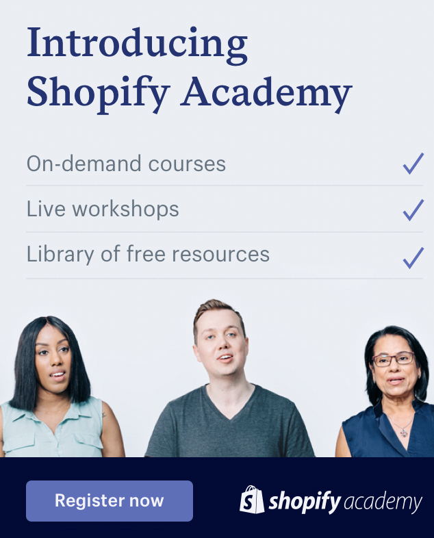
By clicking this button and registering, people can instantly view on-demand content. No waiting, and instant gratification. If a customer had to wait 24 hours to receive the reward, the experience wouldn’t be as satisfying.
Marshall Haas also focuses on an instant reward with the CTA button on this download form:
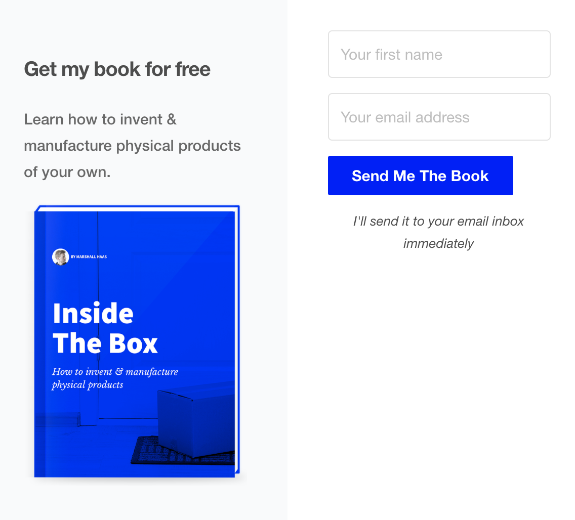
The button “Send Me The Book” is followed by additional copy to let you know you’ll receive it immediately after completing the form and clicking the CTA.
CTA Copy That Converts Cheatsheet
The CTA is the most important part of any page on your website.
It can be the difference between making a sale or your website visitor leaving empty-handed. If you want to grow, you need to think carefully about your CTAs.
To help you create killer CTAs for your website, I’ve created a quick guide with 10 pieces of copy that will help increase the conversion rate of your CTAs. Click the button below to get access now.
Add A Comment
VIEW THE COMMENTS