Image search is the quiet giant of web searches.
According to data from Jumpshot, over 20% of all U.S. web searches happen on Google Images.[*]
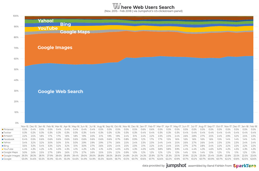
That’s more than on Facebook, Amazon, and YouTube combined!
Image optimization is more complex than it first appears. But when you know how, it can help you attain qualified traffic and crack hard search results pages.
How?
Google integrated images into “normal” search results in 2007 and started to show pictures for certain keywords (called vertical search).
For example, on this search page for taco (hat tip to Noah Kagan), there are three universal search integrations: maps, knowledge graph (with nutrition values), and images.
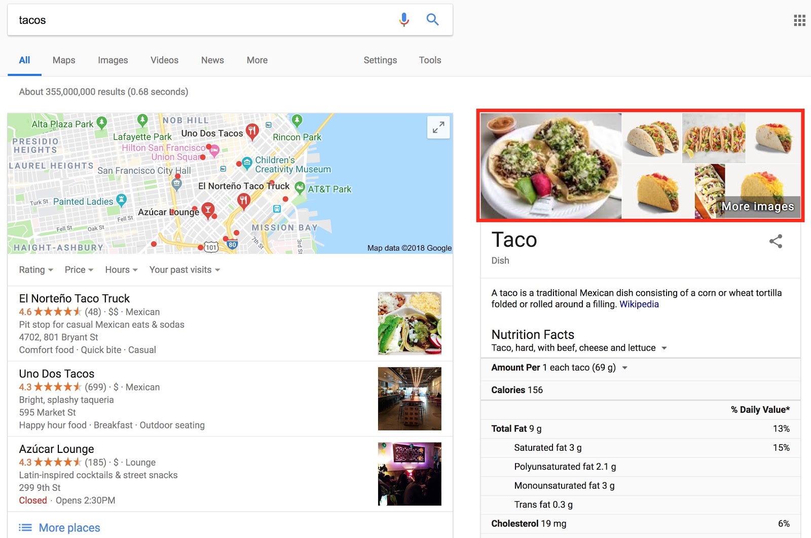
Search results look different depending on your search. Often, images are somewhere integrated on the page.
Consider this case for summer jacket. If you’re an ecommerce store and can’t rank in the regular organic results, you can still get valuable traffic by ranking an image.
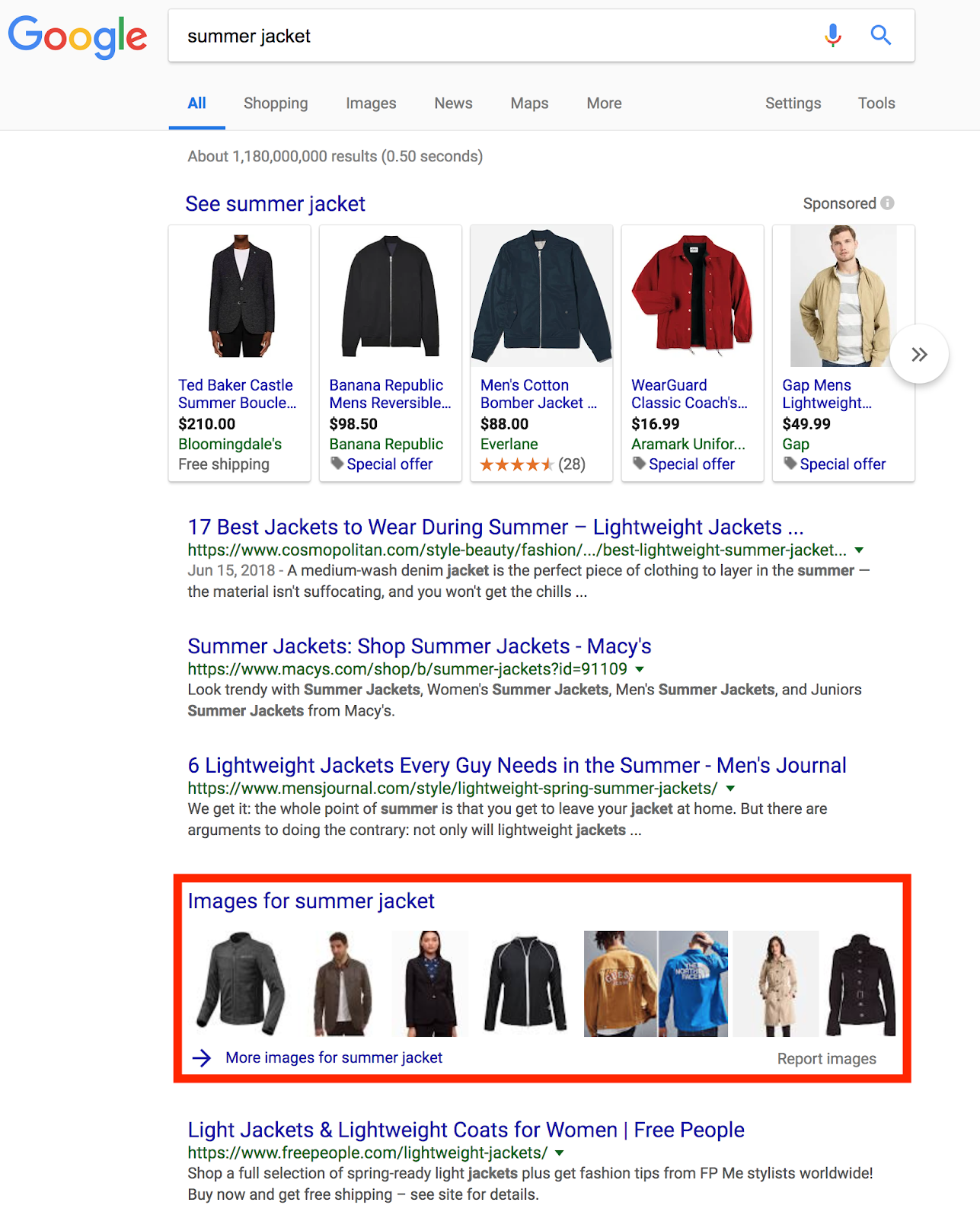
That’s just one example of how you can outrank incumbents with images.
It’s very powerful!
That’s why in this article I present 16 tips for optimizing images for organic traffic. I’ve drawn many recommendations from the Google image optimization guide and case studies throughout the internet.[*]
The tips are in order of impact, so tip #1 has more impact than tip #16.
%(tableofcontents)
Tip #1: Choose Images Related To Your Content
Once the visitor is on your page, relevant images help to explain the text, break up walls of text, and let a quick scan of the page show this content matches the search intent. All of this helps the reader to stay longer on the page and the site, which may be positive signals to search engines about the helpfulness of your site to a query.
On top of that, what do you do when a reader shares your article on social networks with an image that has nothing to do with the topic? Right, people won’t click it!
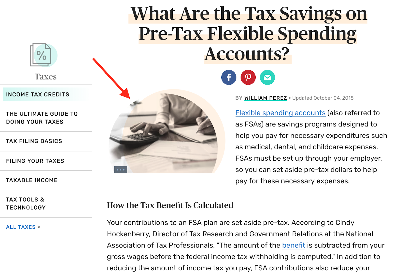
Place images close to the related part in the text. It’s not enough to add topic-relevant images; they also have to be placed right. Google can relate images to their surrounding content. It’s more powerful to place an image close to a headline that’s related to its alt attribute than farther away.
Tip #2: Optimize Alt Text, Filename, And Caption
This one is a classic: optimizing image alt text. The primary use of alt text is for screen readers; the screen readers include the text to help people with visual impairments understand the image.
Its secondary purpose is for search engines to use it as a factor to determine what’s in an image. Google is getting better at “seeing” images, but they still use several ways to understand what’s in an image.
In Google’s image optimization guide they state “Google uses alt text along with computer vision algorithms and the contents of the page to understand the subject matter of the image.”[*]
Your content management system (CMS) or ecommerce store (like WordPress or Shopify, respectively) should let you set an image's alt attribute. If you’re not sure which images have an alt attribute, use a crawler like Screaming Frog or a tool like SEMrush or Ahrefs to find out.
Below is an example of an unoptimized alt attribute. There's nothing in alt="MAIN" that describes the image.
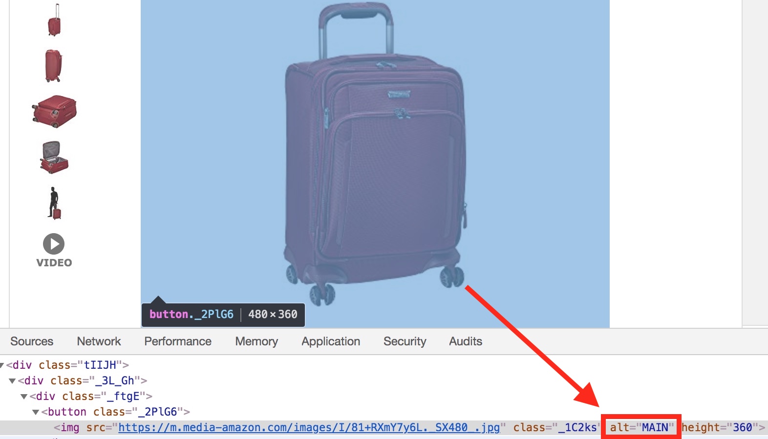
Don’t forget that when you link with an image, the alt attribute is the anchor text. Whether you link to an internal or external page, the anchor text carries a lot of weight, making the image alt attribute even more important.
An optimal alt attribute is descriptive (explains what’s in the image) and unique (used only once on the site). In the suitcase example, it could be “large red {brand} trolley suitcase”. It doesn’t matter if the alt attribute is capitalized. Similar best practices apply to filenames.
The image filename is similar to its alt attribute in that it helps a search engine understand the image, and it uses similar best practices. The filename should be descriptive and unique, and it can match the alt attribute for that image. This also makes management of your image resources easier, both on the website and in a centralized repository.
The image filename below is clearly not optimized. It has a cryptic name “ah8141-001-003-web.jpg,” which is wasted potential.
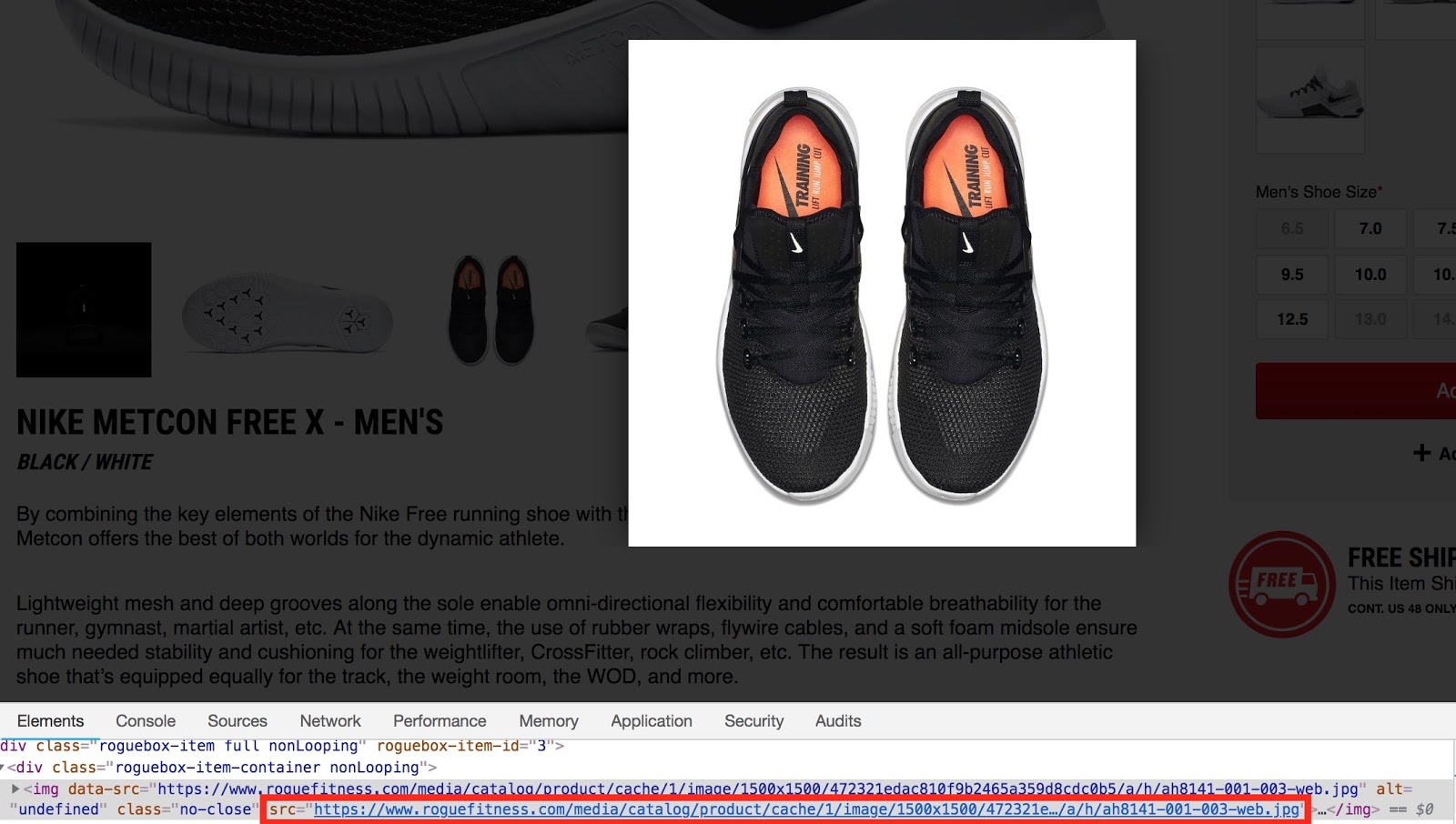
A better filename would be “nike-metcon-free-x-for-men”. You could add “front” or “side” to images of other views of the same product.
Just like filenames and alt attributes, captions help Google and readers understand the context and substance of an image.
When scanning content, captions help a to quickly make sense of it. Lastly, for readers with visual impairments, captions are a big help in consuming content.
In most cases, you can add image captions easily in your CMS.
Tip #3: Reduce Image Size To Increase Page Speed
Image compression is important in SEO as large images can significantly slow down your site, and Google now emphasizes having quick-loading sites in their results.
To find the file size of images, use a crawler, as mentioned before, or use a page speed analysis tool like webpagetest.org.
According to the HTTP Archive, the median total image size on a desktop webpage is about 650kb, which is not a lot.[*]
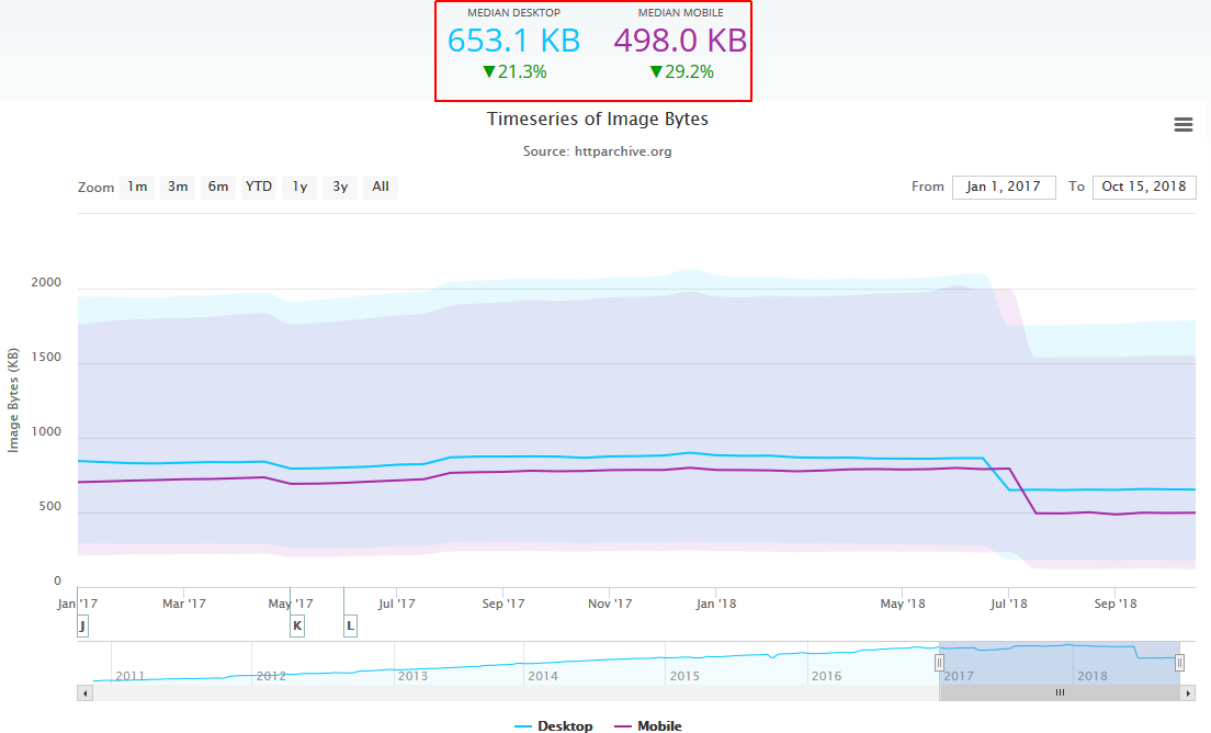
Try out Google’s Pagespeed Insights tool to see what I mean.
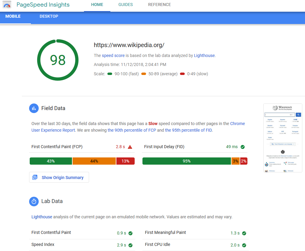
You can find the image file size when you scroll down under the item for Avoids enormous network payloads.
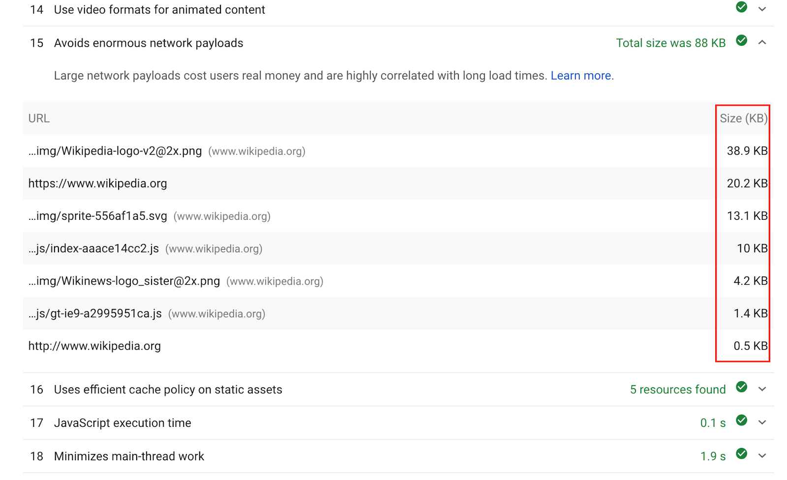
It will give you your speed score (pictured above) and optimization opportunities you can follow to speed up your page load (pictured below).
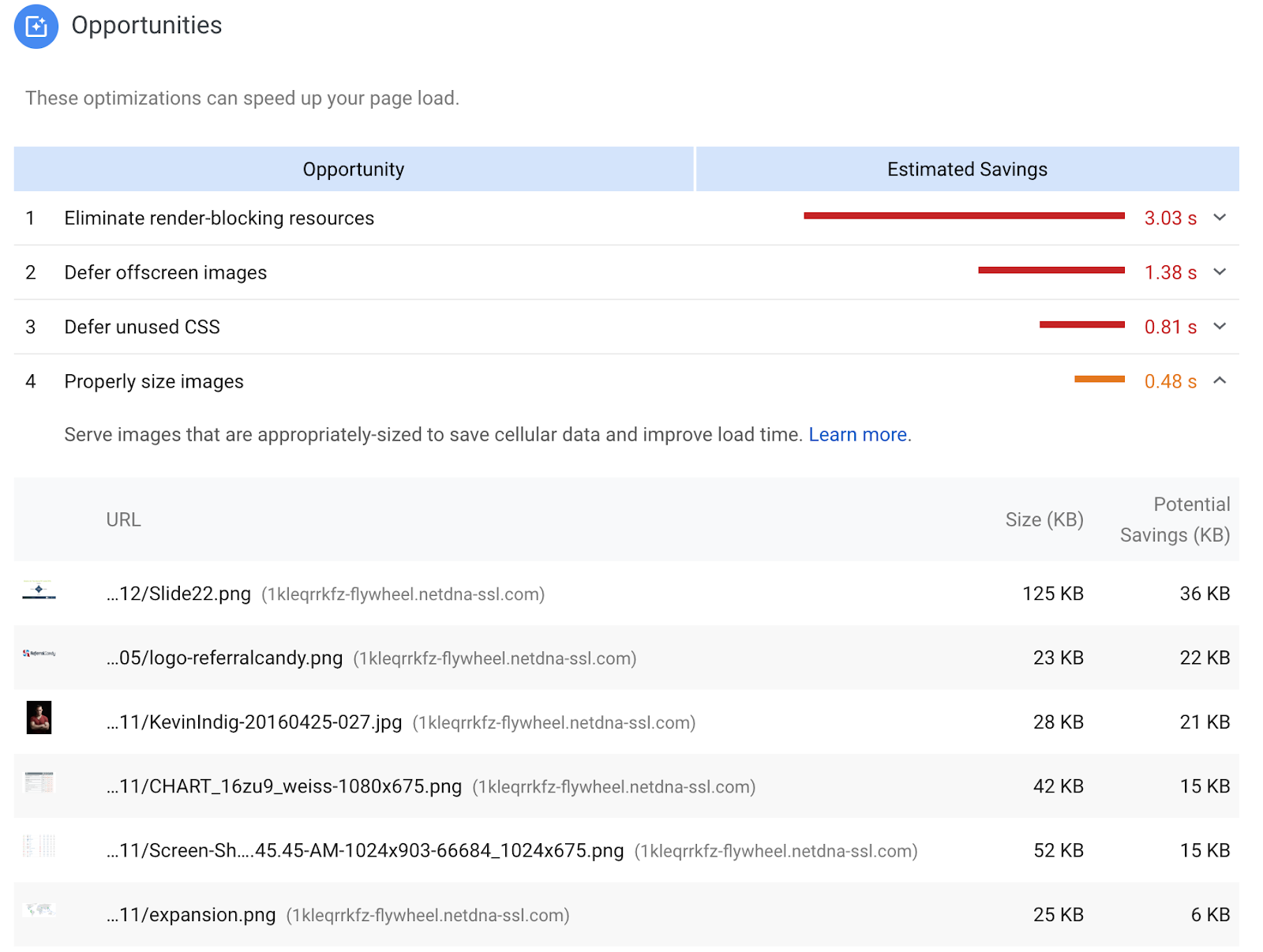
At the same time, image compression is an art in itself. The best way to go about it is to integrate a tool into your workflow; add image compression to your publishing schedule or automate the process by using one of the tool’s APIs. Here are five of the most common ones:
-
ImageOptim
-
JPEGmini
-
PunyPNG
-
Kraken.io
-
TinyPNG/TinyJPG
There are two types of compression: lossy and lossless. The latter is algorithmic file size reduction while a perfect copy of the original file is stored. The former is a file size reduction without preserving a perfect copy.
Tip #4: Define Image Dimensions In The Source Code
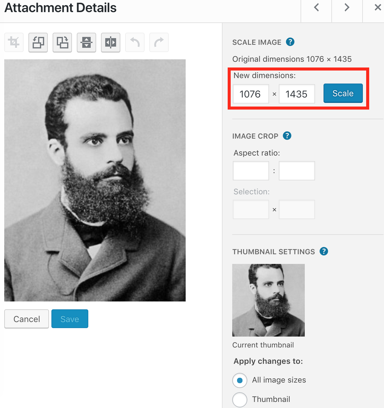
Defining image dimensions — width and height — is important for two reasons. First, it provides a better user experience because the page doesn’t jump when it loads. When defined, browsers can size the actual <img> elements on the page before the CSS and/or image resources are loaded.
That’s especially important when you load images asynchronously, meaning you defer images that are not above the fold to load after the main content. On mobile, this effect is even more interrupting.
Second, specifying image dimensions is a requirement for:
-
AMP (Accelerated Mobile Pages), a code standard to speed up mobile sites.
-
PWAs (Progressive Web Apps), an increasingly popular way to make apps out of websites.
You can change image size in your CMS (Media > select the image > click “edit image”), or with an image editing tool before you upload it.
Tip #5: Make Images Responsive
Responsiveness should be a no-brainer, especially since Google recently rolled out mobile-first indexing.[*]
Responsive images scale with the size of the site, meaning the site uses the same images on desktop and mobile, but the displayed image adjusts to the size of the device used.
With mobile-first indexing, sites will be indexed based on their mobile version, not based on the desktop version. Having a responsive site is the best way to guarantee that goes smoothly, and responsive images are crucial for such an experience. On the other end are mobile subdomains, for example m.domain.com, which are suboptimal because the same URLs exist on the domain and mobile subdomain. Thus, there are different URLs for each image, which can lead to complications.
There are a couple of things you should do to make images responsive.
-
Give images a srcset attribute in the source code. A CMS like WordPress has this natively built in. For others, you need to modify the source code manually.
-
Use relative sizes when specifying image dimensions (or specify width and height).
Tip #6: Add Images To XML Sitemaps
XML sitemaps are maps for search engines to help them to discover all the relevant content on a site. That also applies to images. According to Google, images in XML sitemaps “increase the likelihood that your images can be found in Image Search results”.[*]
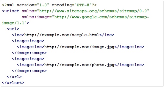
The best ways to go about adding images to XML sitemaps is to have your CMS generate them automatically (WordPress has good plugins) or use an XML sitemap generator. There can be up to 1000 images for each URL listed in the image sitemap.
Tip #7: Optimize The Image URL
Optimizing image URLs is often forgotten in technical SEO. Just like a page’s URL helps Google to better understand what it’s about, an image’s URL does the same.
The Google image publishing guideline states: “Google uses the URL path as well as the file name to help it understand your images. Consider organizing your image content so that URLs are constructed logically”.[*]
As we can see in the image below, the URL is very cryptic but has the product name included. I think this is a mediocre example: it’s not bad but could be better.
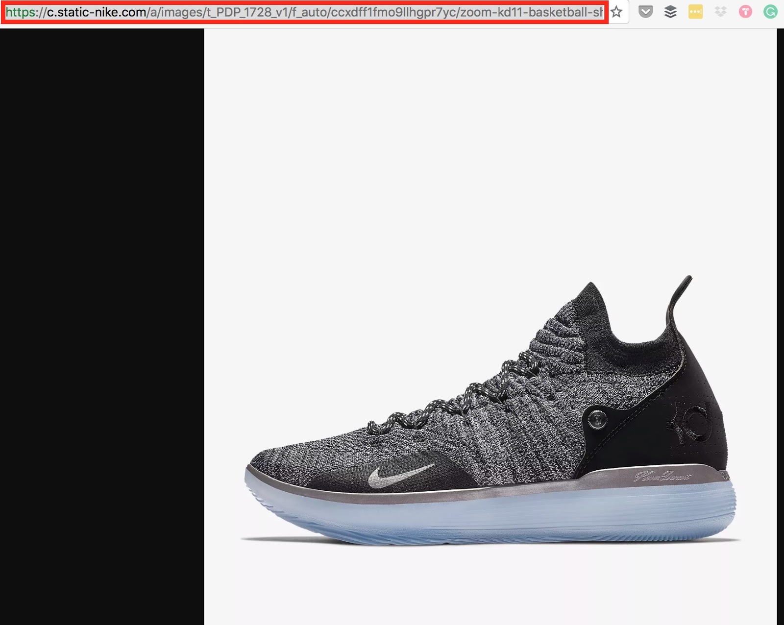
The full URL looks something like this: https://store.nike.com/us/en_us/product/kyrie-low-id/?piid=44944&pbid=7202.png
A more descriptive URL, containing the shoe name, size, whether it’s for women or men, and shoe type would be helpful to add. Every image should have a descriptive URL. The only exception are graphical elements, which add to the layout of the site.
Tip #8: Optimize Page Title And Description
Images and the rest of the content on a page pollinate each other. The relevance of written content and images forms one piece. Since the meta title of a page carries quite some weight for relevance, it also rubs off on images. Google explicitly recommends to craft descriptive page titles and meta descriptions.
Page titles should be descriptive and concise. Avoid vague descriptors like "Home" for your home page, or "Profile" for a specific person's profile.
Finally, make sure your descriptions are truly descriptive. Because the meta descriptions aren't displayed in the pages the user sees, it's easy to let this content slide. But high-quality descriptions can be displayed in Google's search results, and can go a long way to improving the quality and quantity of your search traffic.[*]
Tip #9: Add Structured Data To Images
Google states: “If you include structured data, Google Images can display your images as rich results, including a prominent badge, which give users relevant information about your page and can drive better targeted traffic to your site."[*]
Google shows badges in the Google app for Android, mobile web, and in regular mobile search. Google Image badges help users understand whether an image is what they’re looking for, and are available for products, videos, and recipes.[*]
You can get a badge by adding structured data to your page for images, while GIFs re automatically badged.
The screenshot below shows an example of badges for the search “mens sneakers”. Keep in mind that the images with the red arrows are not ads!
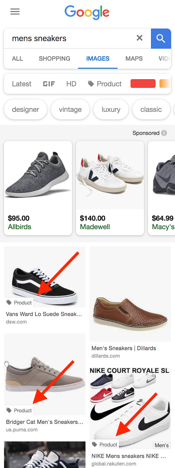
Google is aware of the high usage of Image Search.
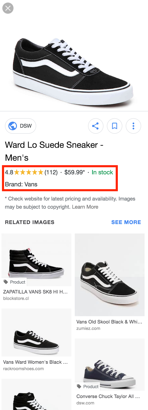
When you click on one of the badged images, you get a view with ratings, price, and availability. If that’s not a way to increase conversions, then I dunno what is ;-).
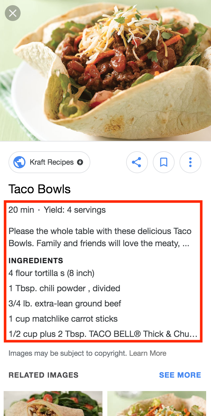
Badges are also available for recipes, showing ingredients, cooking time, and servings.
Tip #10: Don’t Over-Optimize Images
You can over-optimize anything, including images. Things not to do involve keyword-stuffing the alt text, filename, captions, or image URL path.[*]

How do you know when too much is too much? Anything that goes beyond describing what the image shows and enriching the context is too much. In the example above, you see that the alt text is stuffed with related keywords and variations. That’s neither helpful for users nor search engines. Adding specific information, like in this case “Dalmatian puppy playing fetch” instead of “puppy”, or product model, brand, and size is absolutely okay.
Tip #11: Use Formats Like GIF, PNG, JPEG
Three image formats have become more important in recent years: GIF, PNG, and JPEG.
GIF is the only universal choice for animations. It’s such a “simple” format because it’s limited to 256 colors.
To preserve fine detail with high resolutions, use PNG. Compared to JPEG, it’s a lossless compression and is designed for browsers.
For photos, screenshots, or similar images, use JPEG. JPEG applies lossy compression to images, which is usually not a problem for the internet.
So, whenever you need high-quality images, say as a photographer or for certain luxury products, use JPG. In every other case, PNG is the best format.
There are free image converters, such as Vector Magic, Imverter, or Mac Image preview (click File > Export) but of course, you can also use paid alternatives like Photoshop.
Tip #12: Create Unique Pictures/Images And Graphics
The most efficient way to stick out with an image or photo is to create your own. Not only does that increase the chance of it being shared on social networks (especially Pinterest) but it also gives your content a certain quality.
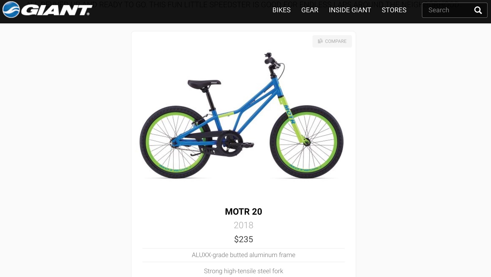
Consider the image in the screenshot below. It’s only a single image that doesn’t help the user to see the product from all angles and make a purchase decision. If I was the manager of the online store, I’d take some pictures myself, which helps me to stick out from other competitors (which might have the same inventory) and improve the user experience.
If you want to create graphics but don’t want to use a more sophisticated tool like Photoshop, use simple solutions like Canva or Keynote/Powerpoint.
Or look at this article by Zappos and how they use just three simple graphics to increase the quality of the article.

Graphics of this type can be used several times. They give a blog character and uniqueness.
Tip #13: Improve User Experience With Images
Images can often help explain concepts or product details to a user faster and easier than plain text. Users can be reassured the content will meet their needs at a glance before they even start reading the text.
Whatever way Google measures user satisfaction, whether clickthrough rates or people staying on a page vs. immediately clicking back to the search results, a positive user experience is universally good. In ecommerce, having very high-quality images versus none can make all the difference. The way a product is displayed increases the value of the product (just think of Apple) and online that’s being done by images.
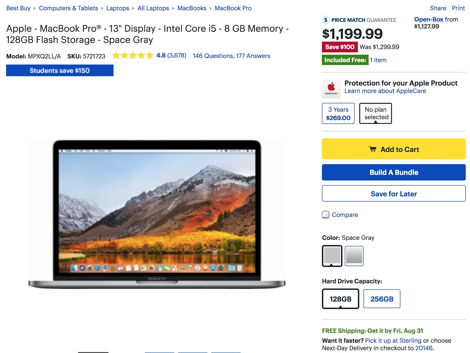
Compare Best Buy's product landing page for the Macbook with the one from Apple (both above the fold) for a second.
Best Buy
Apple

Not to bully Best Buy here, but the Apple experience conveys much more value just through the headline and huge visuals. In fact, the whole landing page for the MacBook Pro consists mostly of those two elements.
So, don’t shy away from using many high-quality visuals and images, especially in ecommerce. Show the product from all angles, and show it being used versus not being used. Using the mentioned image formats, dimensions, and compression ensures that your site loads fast even though you use high-quality images.
Tip #14: Don’t Put Important Text Into Images
A big mistake is to put important text into an image, like a headline. That prevents Google from reading that text. Most of the time, it doesn’t look good and it distracts users who use a screen reader.
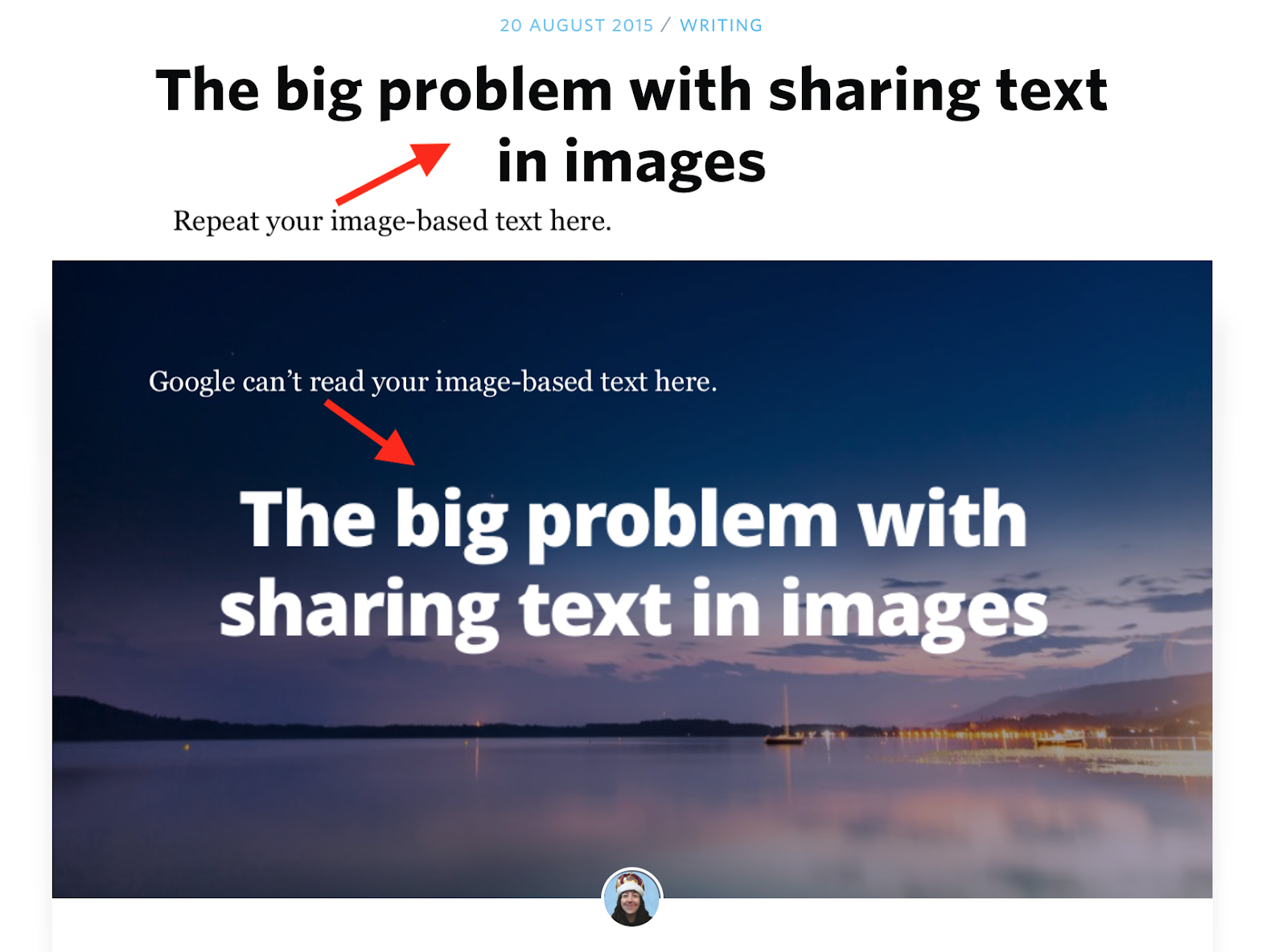
If you really have to, though I don’t recommend it, make sure the text comes up again in the content or caption, somewhere near the image (like in the screenshot above). Or you use CSS to place and style the headline in the image.
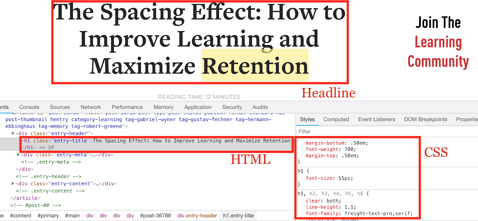
CSS has become very powerful in the recent years; so much that you can even code games in CSS! Hence, you can solve most styling issues with CSS. For example, sometimes you want to do something visual with content, like giving a headline a cool style. The easy way to do that is to just create a graphic for the headline but the right way is to do it with CSS.
Tip #15: Don’t Forget GIFs!
We spoke about GIFs in the context of good image file formats, but they’re often forgotten as a workaround when you can’t find a good image because they help illustrate a point. Images for analogies are a great way to make your audience remember concepts. The same applies to GIF: use animations to stress a point, like this:
Don’t overdo it; at a certain point it’s annoying, but using a couple of GIFs in an article can loosen it up.
GIFs have become a means of communication, similar to emojis, and are legit to use. Of course, there are cases in which they appear foolish, like when writing about serious topics.
Tip #16: A/B Test Images In Ads And Use The Lessons For SEO
Finding the right image isn’t easy. Especially in ecommerce, you want to use as many data points as possible to display the right image for your products because they seem to have such a big impact on conversion.
One important underutilized data point comes from testing different images in ad campaigns and transferring the lessons back to product pages. These lessons can come in the form of showing the best performing product screenshot first or showing only images that perform well in Facebook/Instagram ads.
The goal is to improve the user experience by getting data points that allow you to decide whether the image is good or not before you add it to a page. Remember, images have a big impact on user experience and, therefore, SEO.
Google understands whether the user experience on a site was good or not by looking at how quickly users return to search, known as long versus short clicks. Google can also measure the clickthrough rate of results and determine what sites users are inclined to visit. That is often dependent on brand awareness and the previous experience users had with a certain site.
Testing images in ads can speed up the process. Measure several pictures against each other in ads and see which ones get better click rates for the landing or product page you send traffic to. Then, use that picture for the page.
You should test product pages and landing pages, but don’t forget about other opportunities like Google Ads, Facebook or Instagram. Every piece of data helps you to put together a picture.
The screenshot below is from the results of a benchmark campaign I ran for a travel startup. The goal of a benchmark campaign is to get a sense for what works well and what doesn’t.

The first four rows are campaigns on Instagram, the last four Facebook, comparing the performance of different pictures against each other. You see two rows for the same picture because one campaign was optimized for clicks, the other for impressions. Notice how the image in the 3rd and 4th row has a better CTR on Instagram than the one in the 1st and 2nd row. The same for Facebook: the image in the 5th and 6th row performs better than the image in the 7th and 8th row.
That is valuable information to use on the landing page.
3 Key Takeaways To Optimize Your Images For SEO
Here are the three key takeaways:
-
Use unique and high-quality images in GIF, PNG or JPEG format.
-
Add relevant images to your pages and make sure they’re positioned close to the text they’re related to.
-
Optimize URL path, alt attribute, and image filename for optimal organic rankings.
For a one-page checklist of everything we’ve covered in this article, click the button below.
Image SEO Optimization Checklist
Images still provide almost one quarter of all searches on the web, so start optimizing!
Add A Comment
VIEW THE COMMENTS