More control. Faster results.
Sounds good, right? We’ve been hinting at big changes coming at Sumo, and this mantra has been the core guide behind everything we do.
And today, we’re proud to unveil the first of many big changes coming from our crazy whiskey-drinking developers.
Let me introduce you to the newest version of the best list building tool on the internet — List Builder 3.
A List Building Tool Ahead of Its Time
We’re not kidding when we say List Builder is the most popular email capture tool of our time. It’s powered hundreds of thousands of sites and added millions of emails to people’s lists.
Not bad. So why change anything?
-
More Control: We want your popup to be unique to your site and your needs. So we’re giving you an unprecedented level of control over how your popup looks.
-
Faster Results: Time is scarce. That’s why we’re making it even easier to get your popup active and collecting leads even faster.
So that’s what we’ve done. Let me show you some of the cool things we’ve done to change the game…
Drag And Drop, Anyone?
In the old builder, you saw a lot of dropdowns without a lot of direct control over certain elements you wanted to edit:
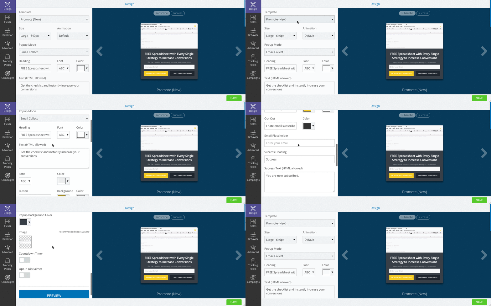
The old builder
It’s worked well, but we always wanted to give you more control over how your popup looked. So we ditched our current layout and yelled “POWER TO THE PEOPLE!”
The first noticeable change is seeing the templates you can choose to hit your goal (instead of a dropdown with template names):
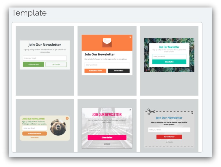
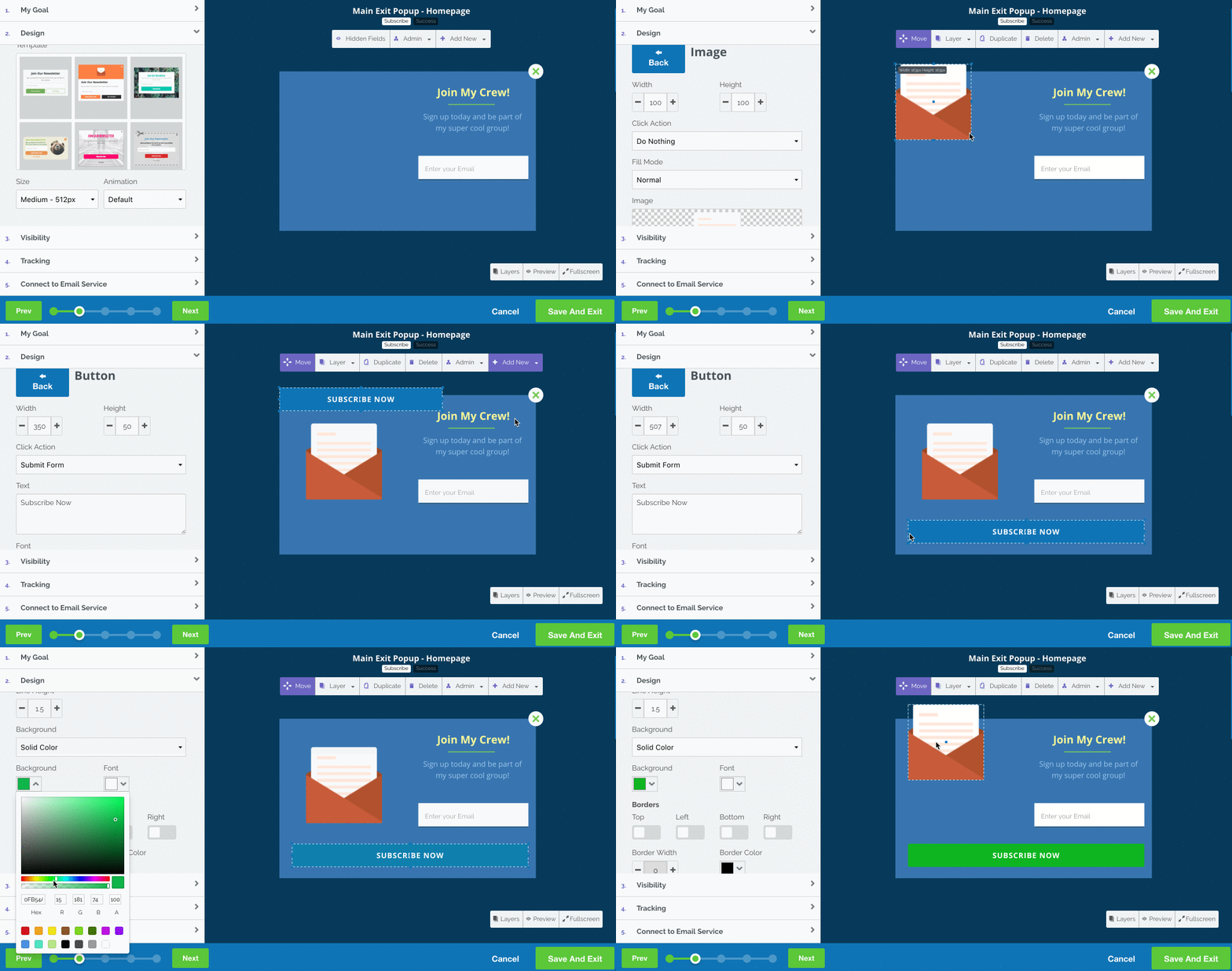
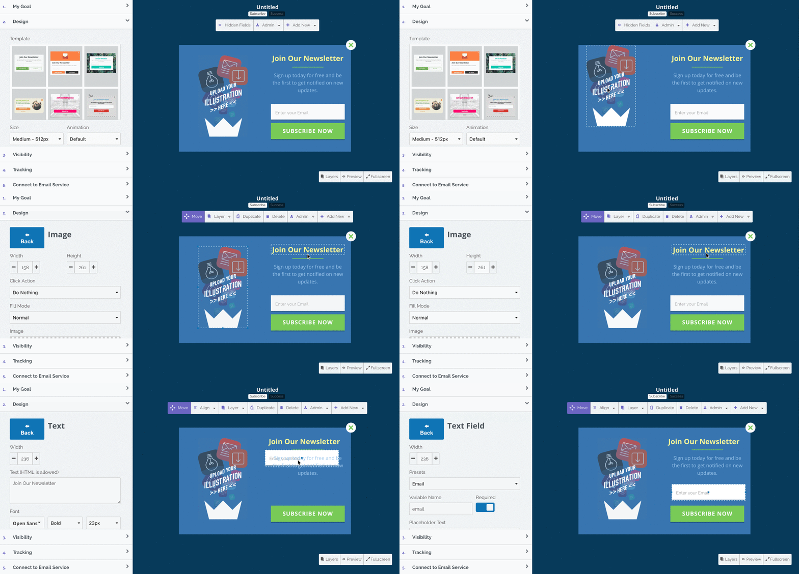
But that’s not where the real magic happens. The way you create a popup? It’ll truly be unique to you with more customization and full drag-and-drop capabilities:
HOLD YOUR APPLAUSE, WE’RE MERELY HUMANS WITH COMPUTERS
Every element — headlines, text, fields, images, buttons and more — can be dragged anywhere and resized with the drag of a mouse.
And if you want to edit anything, it’s as simple as clicking on the element and editing in the design area on the left:
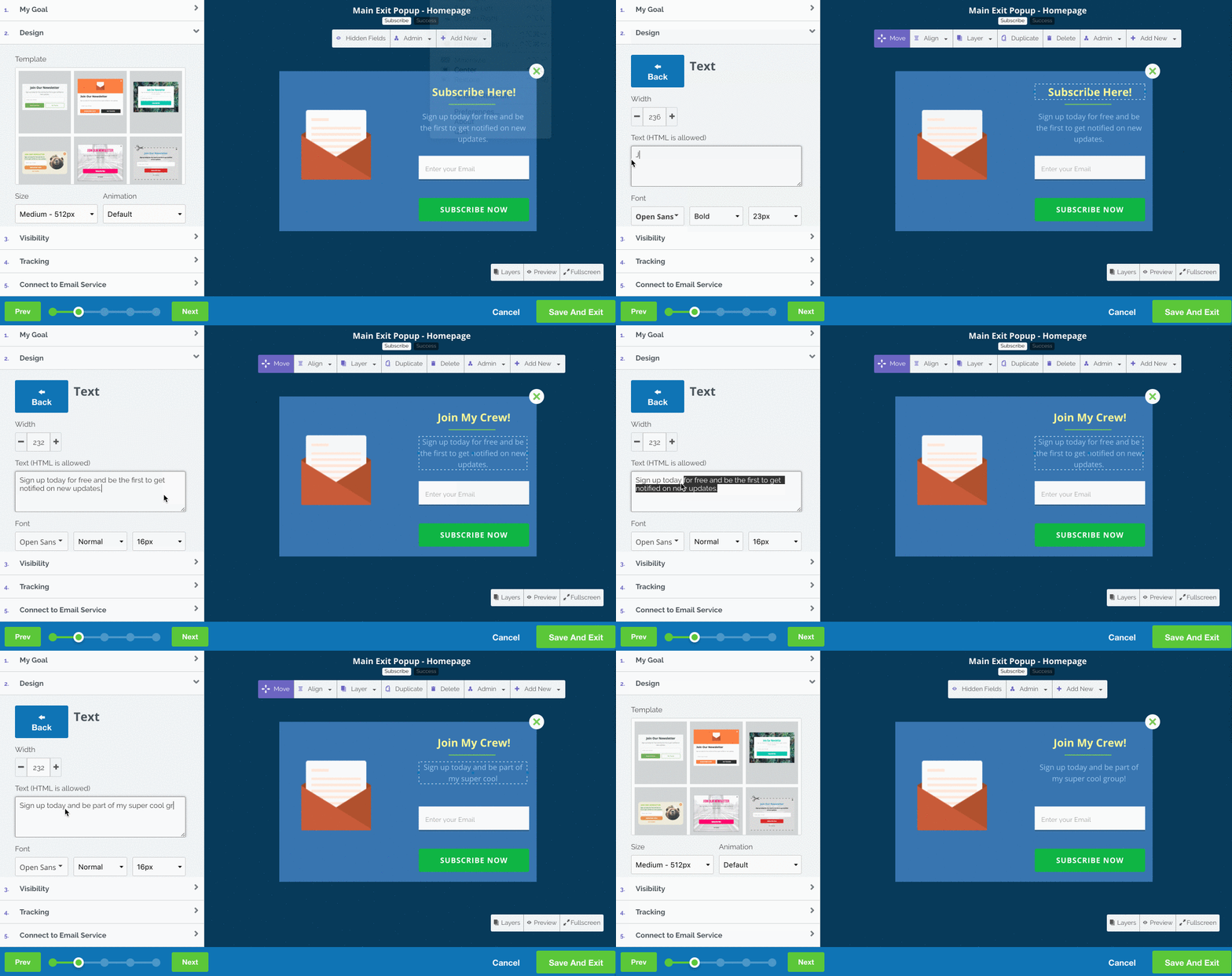
We’ve added quite a bit to the editor, too — it’s part of us giving you more control over your popups. Now, you can change font size, alignment, background color, borders and a whole lot more:
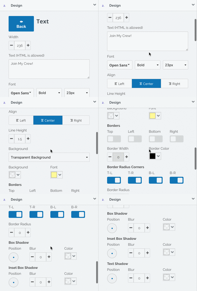
But say you’re a rebel. You don’t want to use the templates Mark worked so hard to create (and hundreds of thousands of people have tested).
No problem. We’re giving you the ability to create your own popup with addable elements:

You can add anything ANYWHERE on your popup — text, images, buttons, fields, dropdowns, countdowns, and the list goes on and on.
Plus, you can hit the “Preview” button in the bottom-right corner of your screen any time you want to see the popup as it would appear on your site:
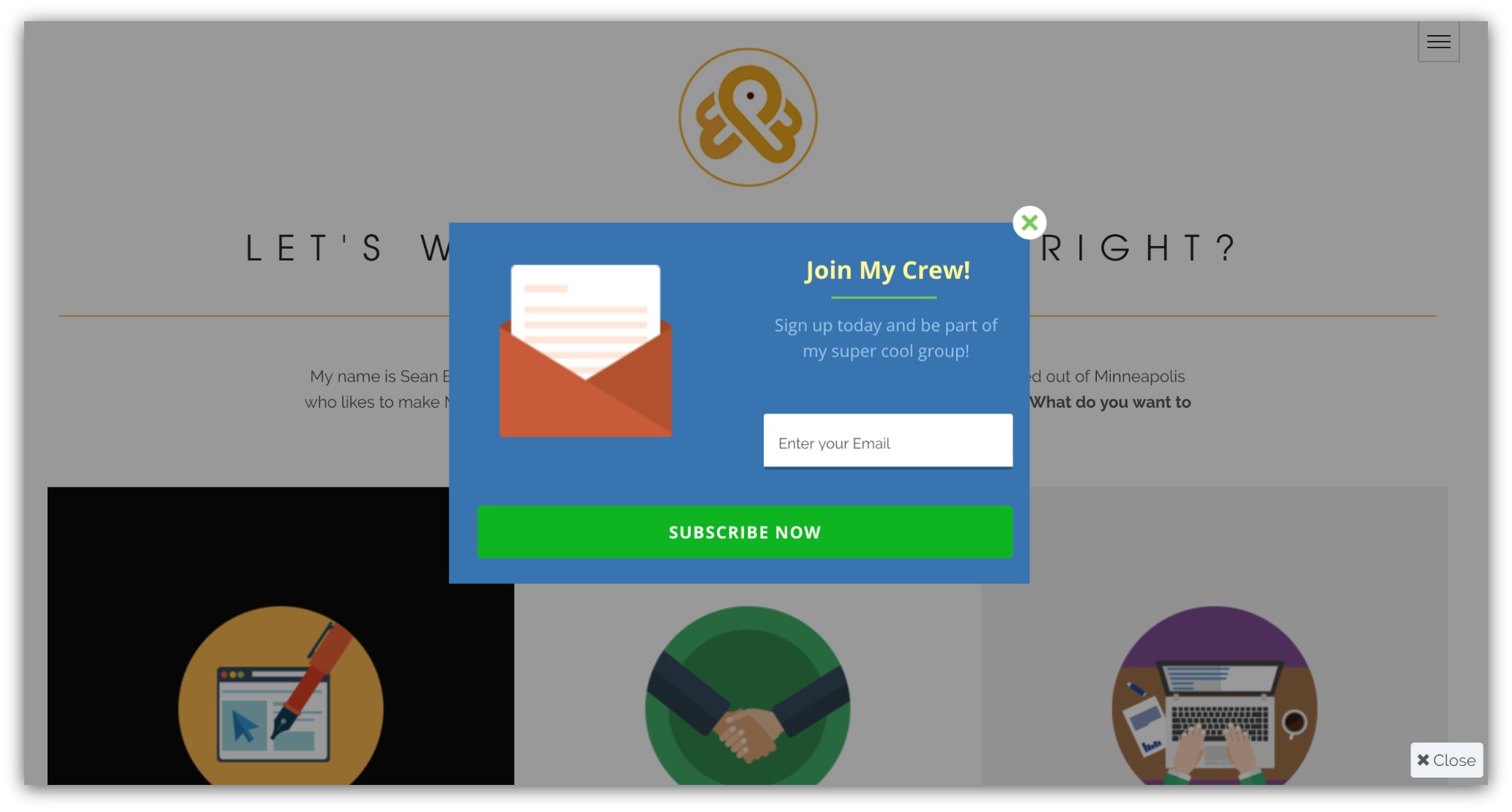
Drag-and-drop on the most popular list building tool ever? Consider this the most advanced popup builder in existence.
Click Here to Try List Builder 3
Find What You Need, Quicker
We want you to easily see what your popups are doing at all times. Not only that, but we wanted you to have easier access to ever popup you’ve created.
In the old List Builder, that could be a tough task. By default, you’d go to either the last campaign or popup you worked on before you closed out:
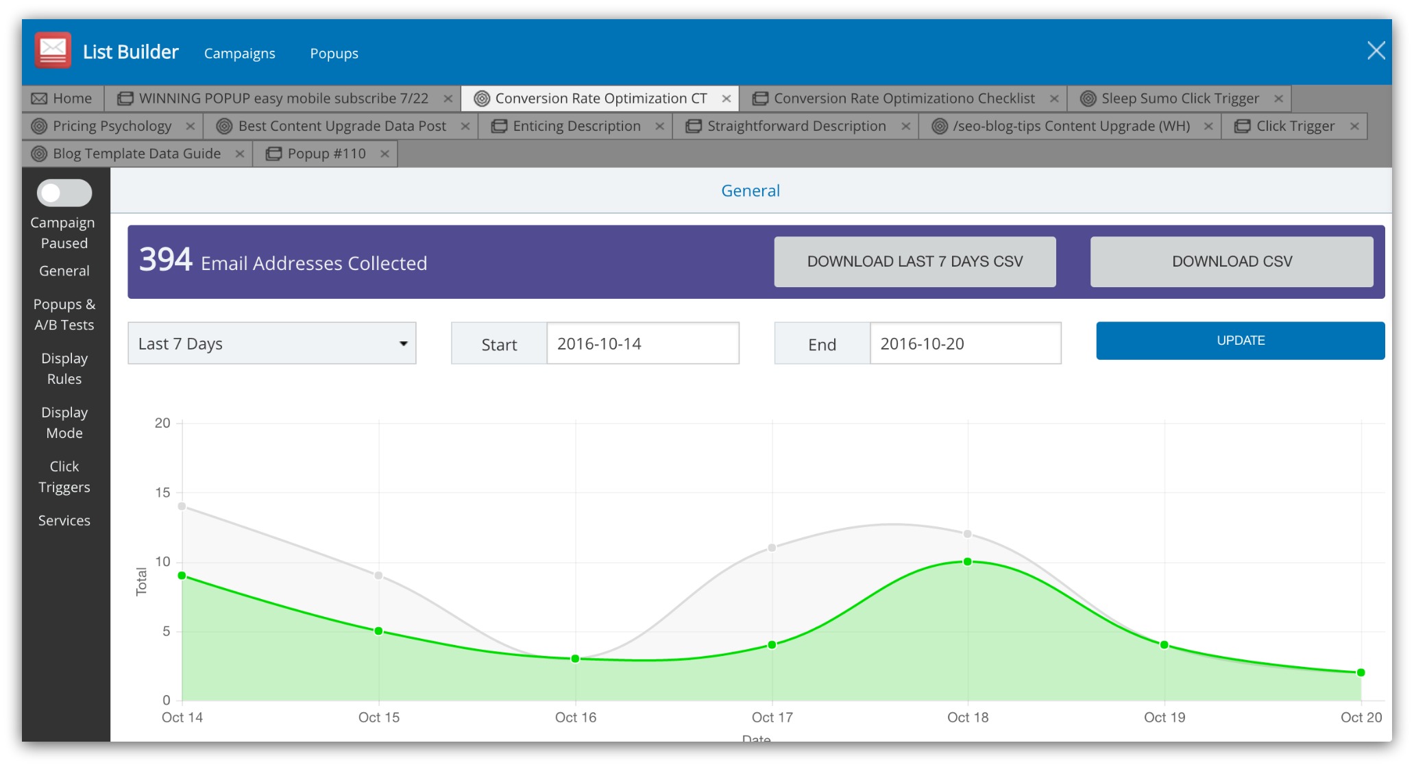
The old List Builder
You’d have to sift through tab after tab, and it really created a cluttered feel and more time spent finding what you need.
Now, you don’t have to worry about campaigns or all those tabs to sort through. All your popups are easily accessible on the home screen.
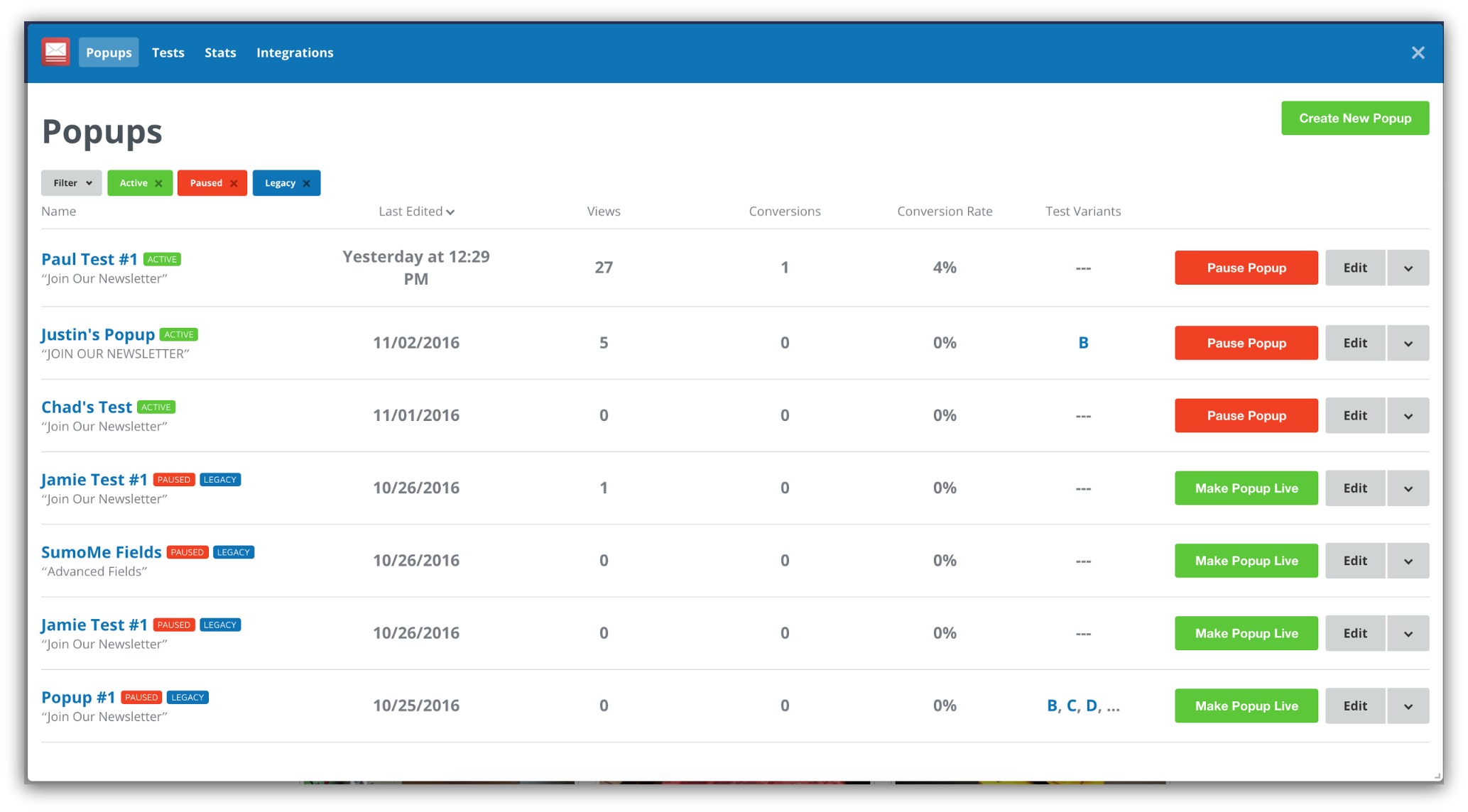
We baked in little things that make a big difference. Now you can:
-
Instantly see if your popups are working: See the stats that matter for every popup like views, emails collected and conversion rate.
-
Control your popups on the home screen: Start or pause any popup from the home screen with one click.
-
See the popups you want to see: Sort your home screen by active, paused, deleted or all popups.
We’re taking everything you love about List Builder and putting it all on one screen.
Note: If you currently use List Builder, don’t worry — your popups aren’t going anywhere. When you open List Builder 3, you’ll be asked to import your current popups into the new app.
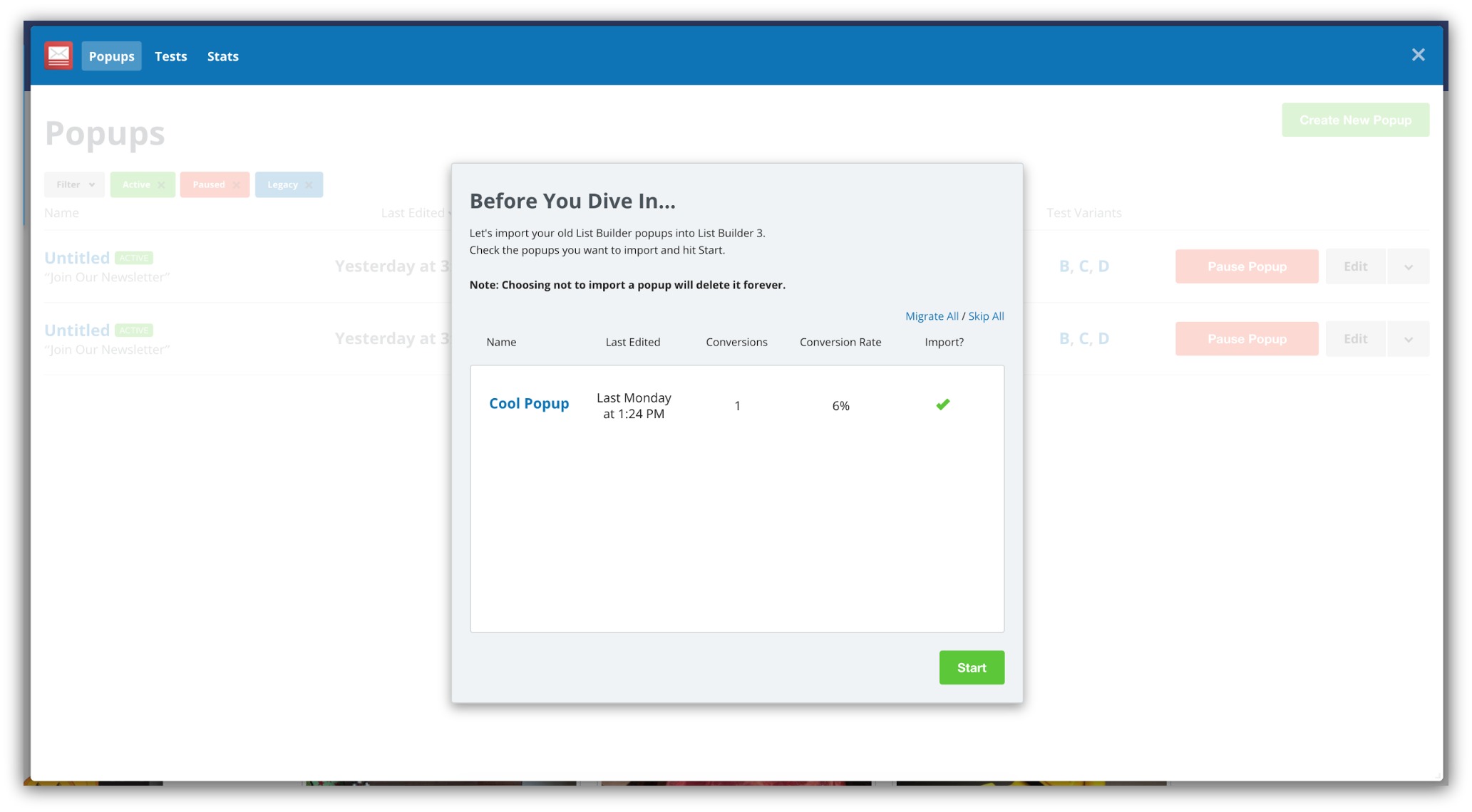
Those will show up on the home screen with blue “Legacy” tags. When you edit these popups, you’ll do so in the old List Builder functionality.
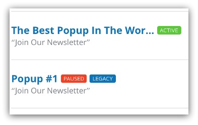
And to make it even easier to get your popup activated and collecting leads, we changed the way you create your popup.
Click Here to Try List Builder 3
Get Your Results, Faster
After months of user feedback, testing and developing, we’ve completely reworked the “builder” area of List Builder 3 to give you a new level of control with even faster results.
We’ve made it easier to create a popup from beginning to end. From the moment you hit “Create Popup,” we make every step straightforward and take the guesswork out of creating a popup.
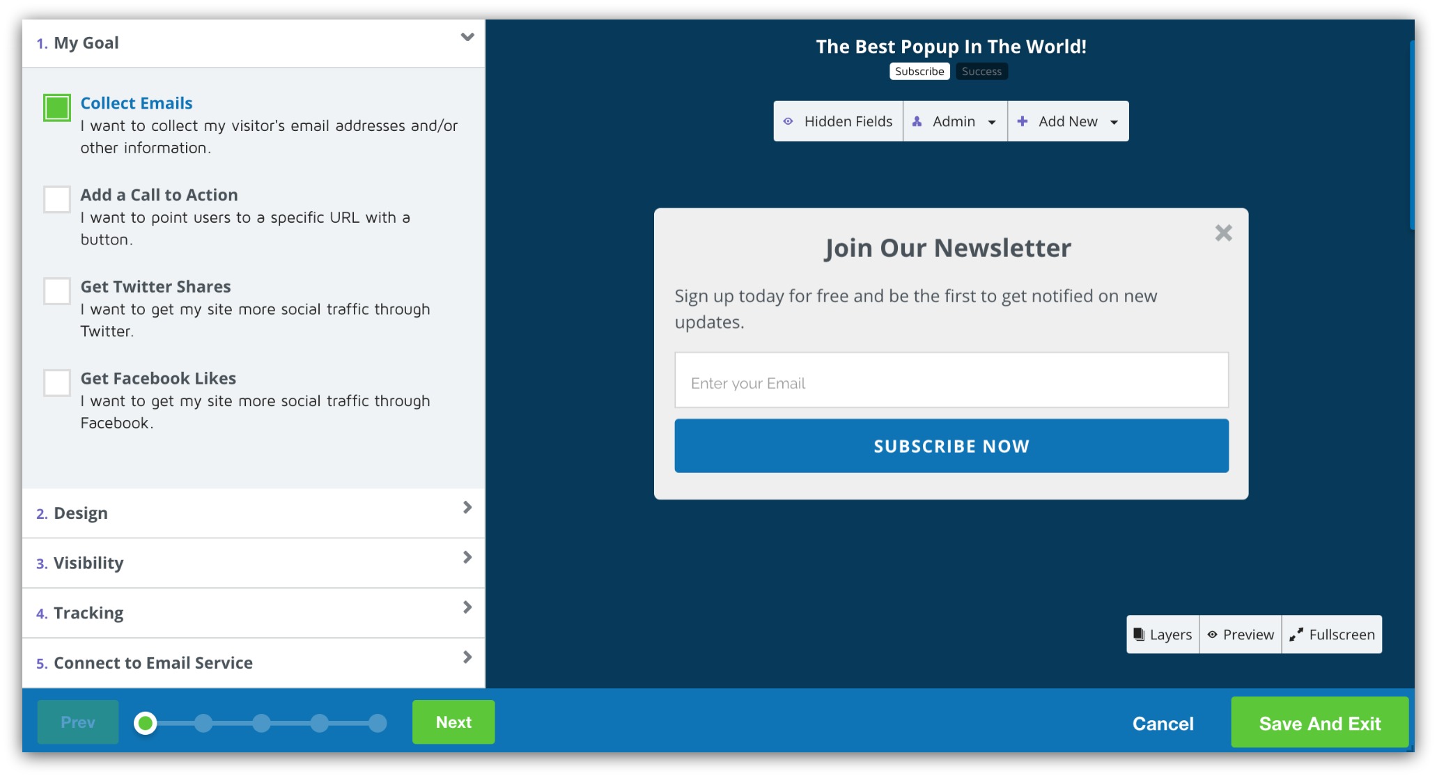
You now have a straightforward path to get you from “what am I doing” to “hey, it’s collecting email addresses” quicker than ever before. You go through five phases — Goals, Design, Visibility, Tracking and Connecting to Email Services.
As you move through each phase, a progress bar at the bottom of the page shows how close you are to launching your popup.
The first step we’ve baked in is called “My Goal.” We created this section for two reasons:
-
To Give You A Goal (And Keep You Focused): We found when you start with a goal for your popup, you create a better popup. With that focus, you write and design towards that goal.
-
Custom Templates Tailored to You: Instead of picking a random pre-designed template, we’ll show you templates that are geared toward achieving your specific goal.
You can choose from four set goals:
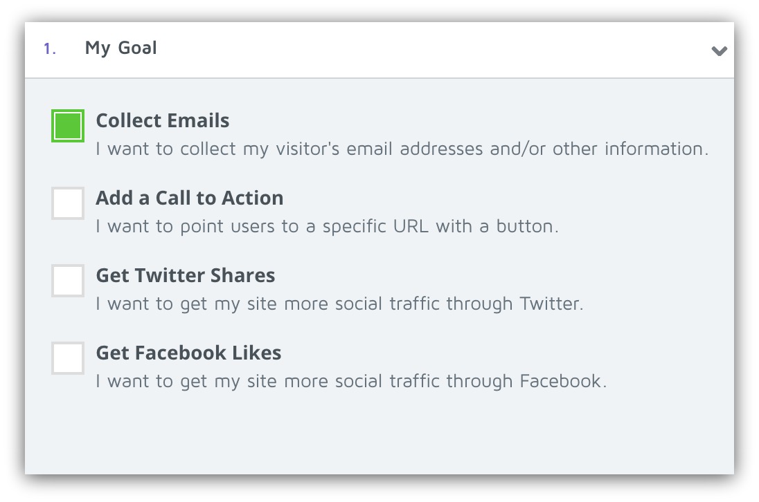
All you do is select your goal and you’re taken to the second (and quite possibly coolest) step in the builder process — the design.
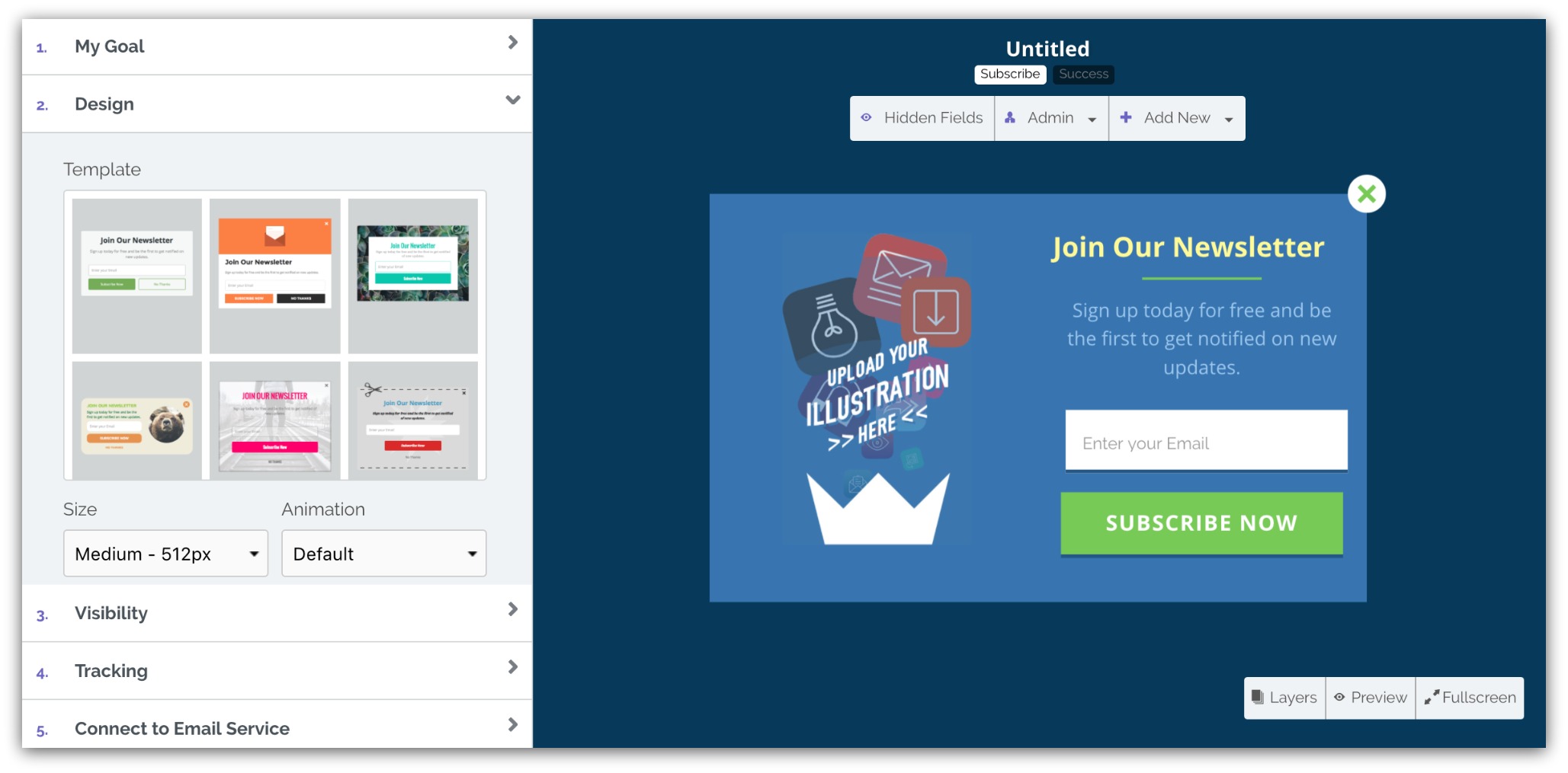
We talked about it already in the drag and drop section, but it’s so cool we wanted to show it again:
My god that’s sexy
And it gets even better because we’re making it easier than ever to control where and how you show your popup with our new “Visibility” section.
If you’ve used List Builder before, you know this was a bit tricky. You’d have to go into Campaigns AND the individual popup to set where and how your popup would appear:
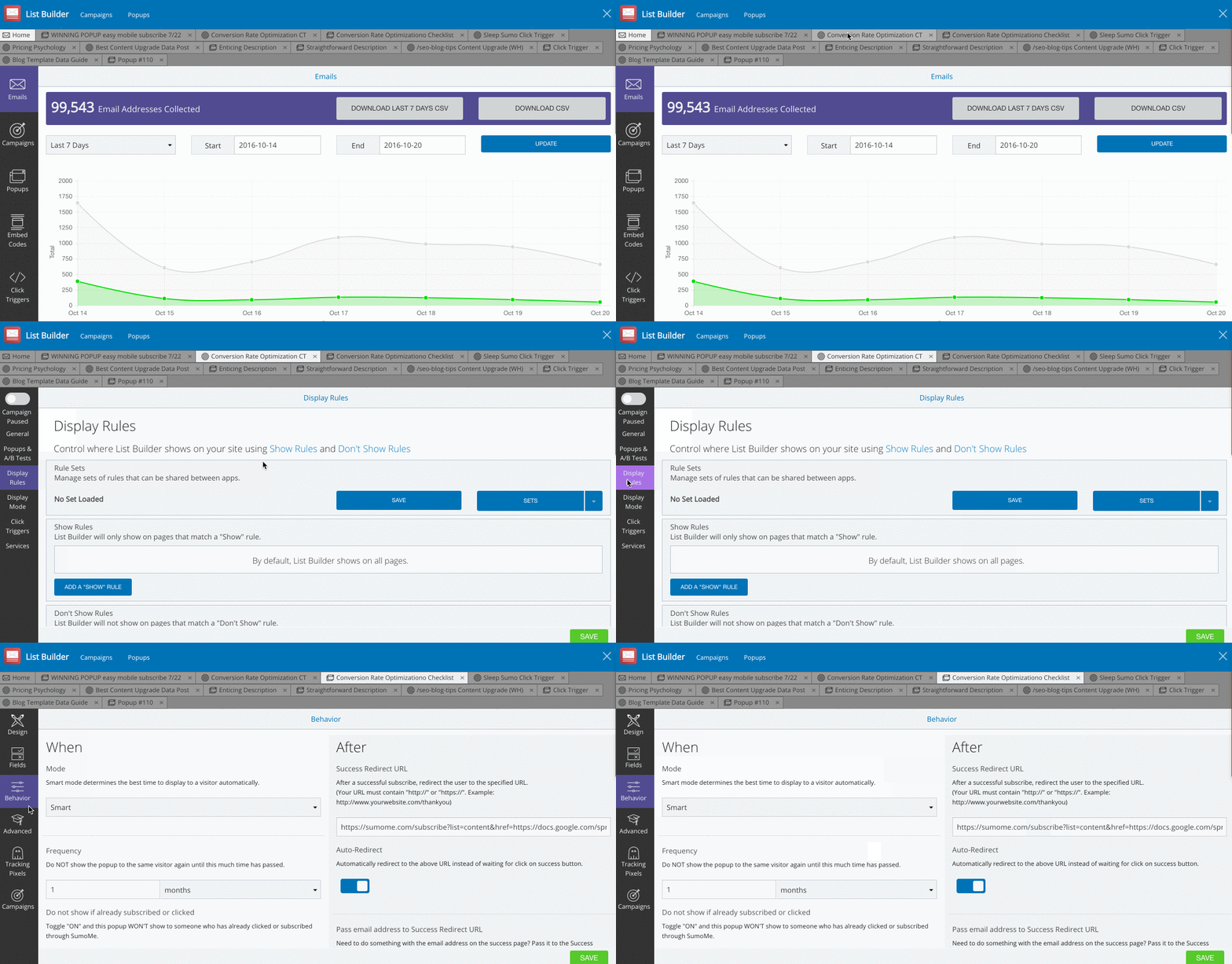
The old way to set visibility
Not only did we cut this process down to one screen, but we made it part of the overall path to publishing. Everything you need to show your popup to the right people is in one place:
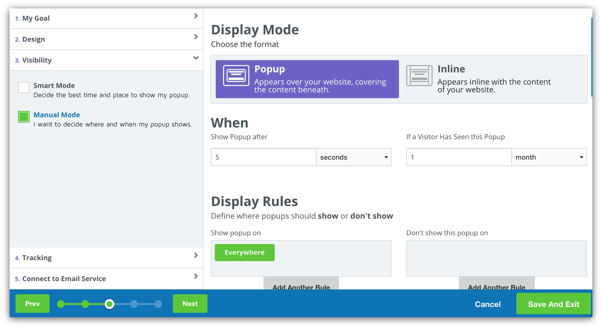
Like before, there are two modes: Smart and Manual. Smart Mode decides when to show the popup, whereas Manual Mode gives you more control over when and where to show your popup.
One last IMPORTANT update we’ve made in this area. When you go into “Connect to Email Service” you can connect each popup to a list in your email service provider.
OR, you can go to the “Integrations” tab and set a default list for every popup you create:
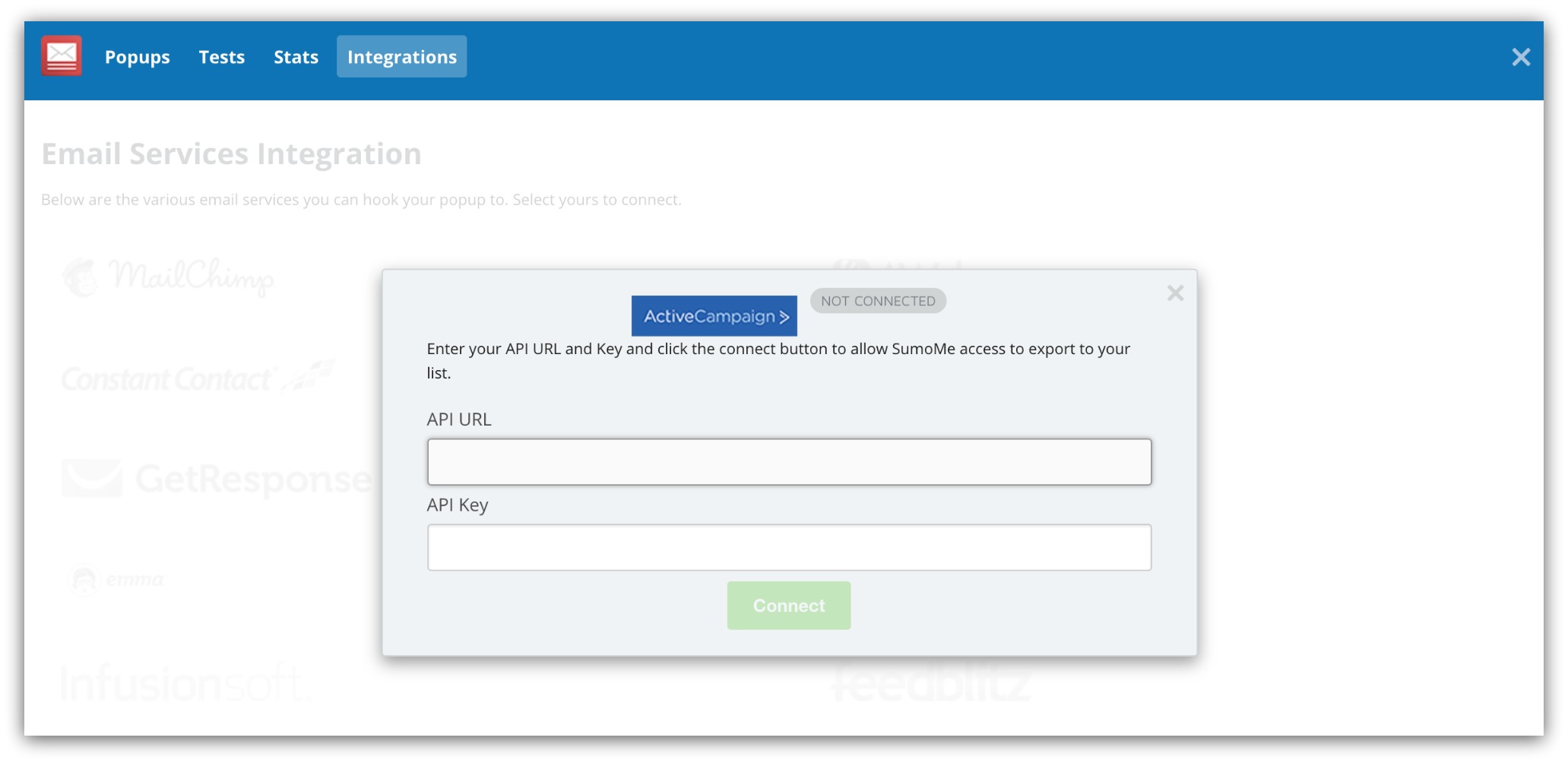
Now you don’t have to worry about connecting an email service provider every time you create a popup. Just set once and all your emails will flow into one list.
After that, you push “Save and Publish” and your popup is live, large and in charge.
Click Here to Try List Builder 3
A Test You’ll Actually Want To Take
We’re big fans of A/B testing your popups. We see this sort of thing happen routinely:

When you test your popups, you get more opt-ins. Instead of publishing one popup and guessing what works, you can set up two different popups and test them against each other. Whichever one works best, you keep that active and pause the underperforming one.
Over time, those opt-ins add up to more sales. You want more sales, right?
That’s why we made it even easier to test your popups:
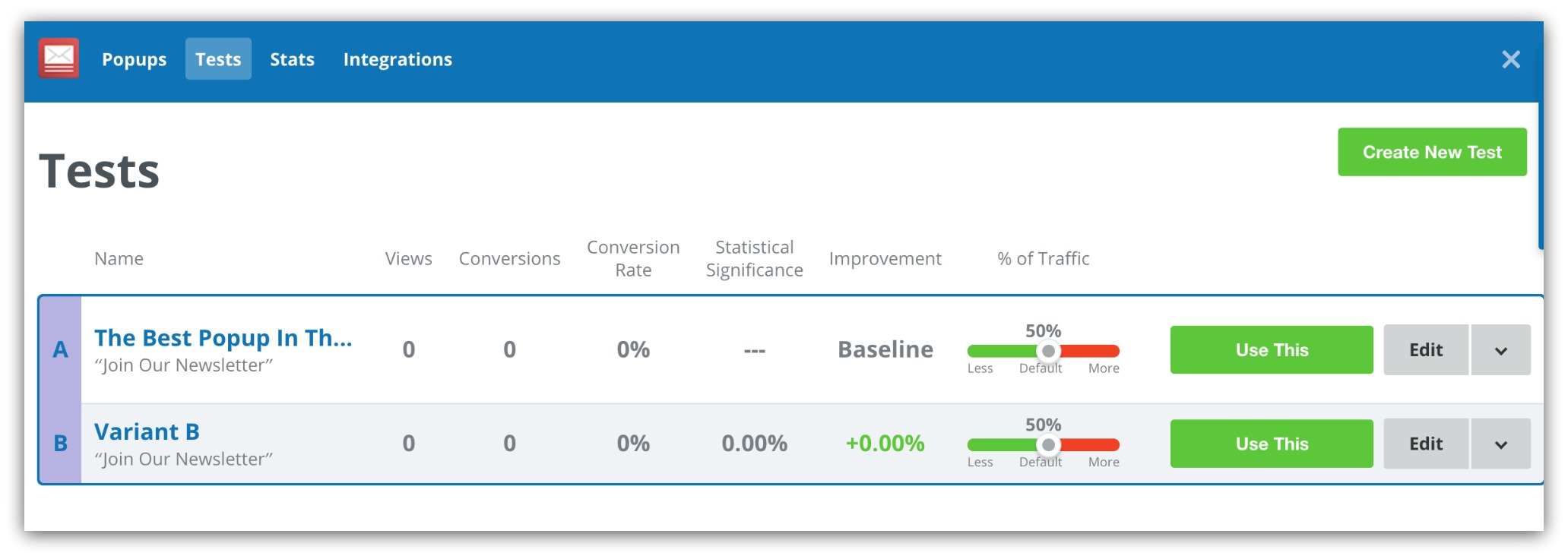
Clicking on the “Tests” option in the menu shows every A/B test you’re currently running. Each test is grouped in blue boxes, and all the stats like conversion rate and improvement are displayed within.
And creating a new test is easy. Just click on the green “Create New Test” button in the top-right corner and you’ll get this window:
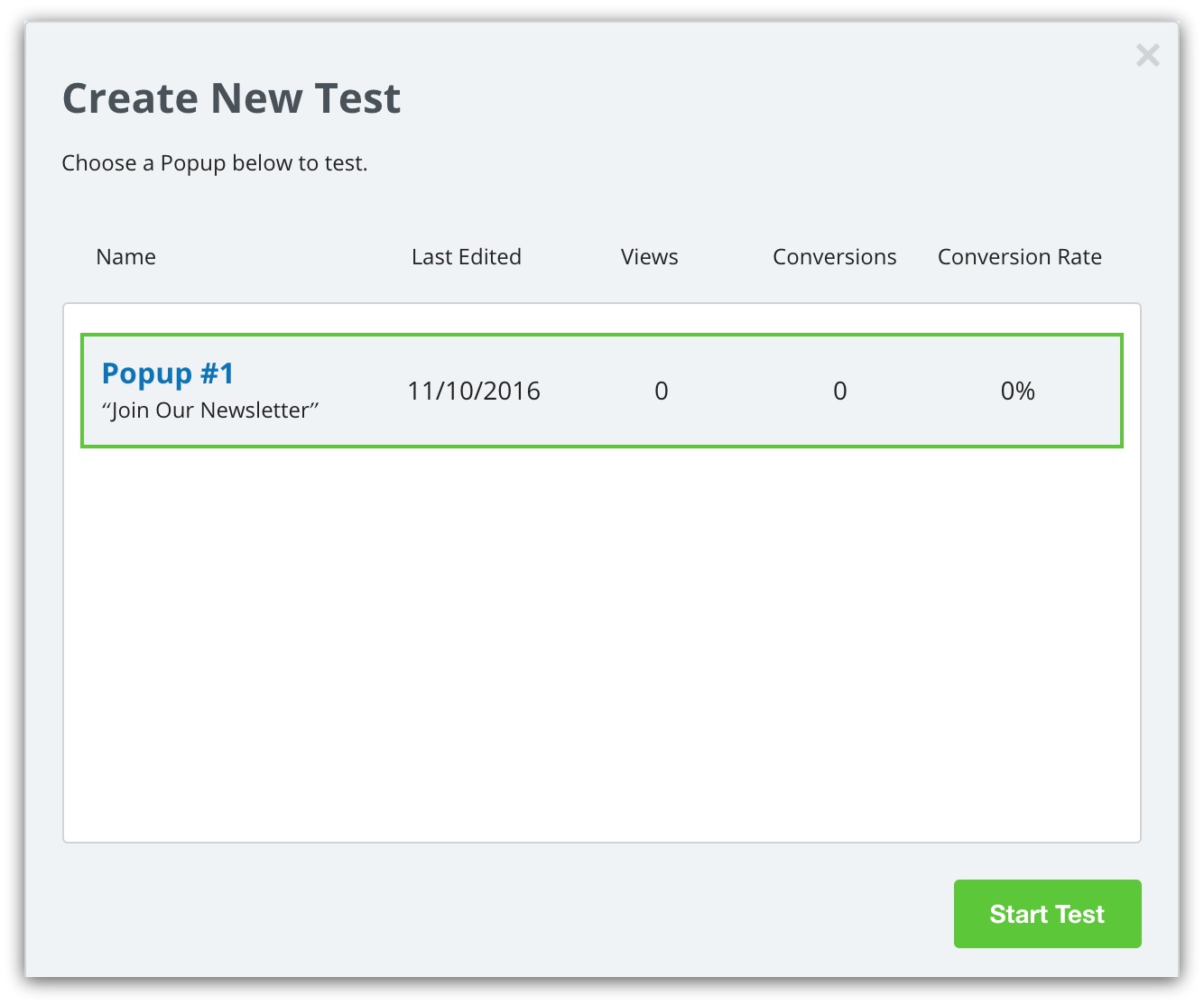
You simply select the popup you want to test, then hit “Start Test.” You’ll be taken back to the editor where you can change the design, text or other elements on your variant.
Once you have a winner (more on that in this guide on A/B testing), you can turn off your variants by selecting the winning popup:

Doing that will end your test and show the winner to all your visitors. It’s all about giving you more control with faster results.
Click Here to Try List Builder 3
Grow Your List Even Faster
We just turned the internet’s best list-building tool into something even stronger. Having an email list is the best way to control visits, engagement and sales. And we just gave you even more control over how you build your list.
And we’re not stopping at List Builder 3. In the coming months, we’re going to release new stuff that’ll blow your mind. When you grab Sumo Pro today, you get:
-
List Builder 3 Access AND Everything Coming Soon: Start using List Builder 3 before everyone else. Plus, you get Pro-level access to everything we release in the future.
-
Every App You Love, Pro-Style: Get access to EVERY Pro feature for all 12 apps including Click Triggers, Instant Landing Page, gorgeous templates and more
-
A/B Testing: Test different copy, templates, buttons and images to get more emails, more sales, more tacos. (Hint: We’ve seen Sumo users improve their conversion rates by 50% because of A/B testing)
-
Automated Email Integrations: Integrate with email service providers like Mailchimp, Constant Contact, Aweber, ConvertKit, and 22 others to automatically pass email addresses into your lists.
Get Sumo Pro today, use List Builder 3 and have more control over how YOU build your list.
Add A Comment
VIEW THE COMMENTS