Have you been wondering what makes a newsletter stand out?
I’ve been obsessed with newsletters, which is why I keep notes on what makes the crème de la crème of the email letters so great. If you want your newsletter to shine, grab these notes.
Want them?
Read on to find ten tips that I’ve cherry-picked from the best newsletters in the industry.
Let’s roll:
%(tableofcontents)
1. Understand your newsletter’s focus
Chances are you already have a newsletter or are about to start one. But before you send, ask yourself: what’s my newsletter’s focus? What does the email talk about?
Without an answer to what you’ll talk about, you’re likely to send “meh” emails one after the other that don’t leave a positive impression.
Every good newsletter out there is known for something.
Eddie Shleyner’s emails, for instance, are widely applauded for their copywriting lessons. And, not just any writing lessons. Shleyner’s newsletter shares “micro” lessons, or quick lessons to improve your writing.[*]
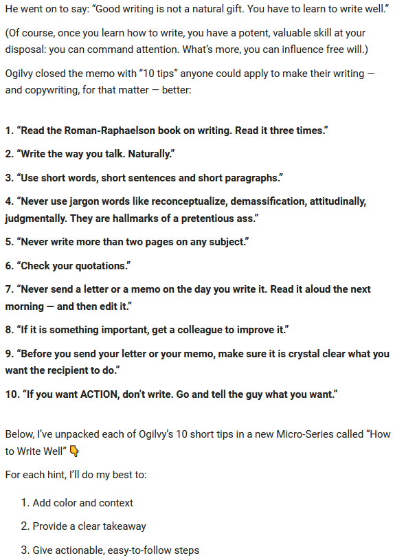
See what happened there? Shyleyner took the time to carve a clear focus for his newsletter, which helps him stand out.
In another example, live stream platform Uscreen shows how to craft a great fitness email campaign, know your audience, and determine the focus of each email.
Whether you’re welcoming subscribers to your newsletter or sharing details about an existing promo, like we see below, it’s important to know the goal of your newsletter before you ever get started.[*]
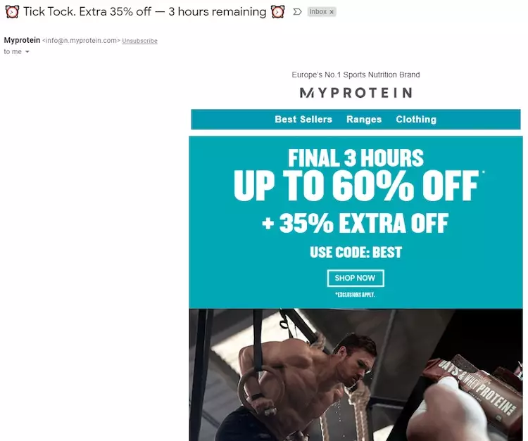
And while you’re figuring out your newsletter’s focus, think about how you’ll provide value in your emails too. Will it be with the help of educational content? If so, how do you plan to educate your subscribers? Will you tell stories with solid take-home messages? Or do you plan to share tips?
Remember: nailing your newsletter’s focus is essential for making it memorable. A well-thought-out focus gives people a reason to follow (and even wait for) your emails.
2. Stick with a newsletter template so readers know what to expect
Email subscribers love it when they know what to expect from your newsletter. This brings us to email templates — a good way to offer familiarity to your readers.
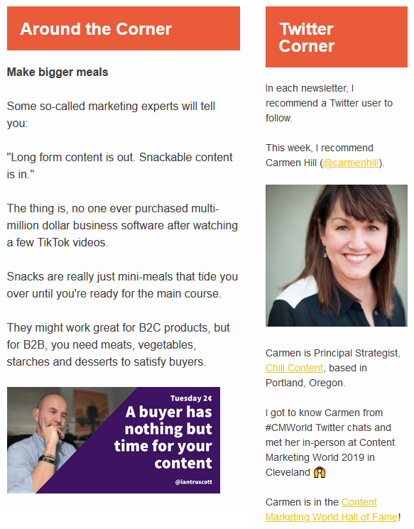
Once you’ve drilled down on your focus, work on your template. How will you organize all the info?
Do you want to divide it into sections like Dennis Shiao does in his newsletter Content Corner?[*]
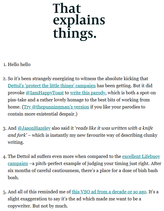
Or, would you want to use a simpler template? In his newsletter That Explains Things, Nick Parker relies on a numbered list to share his message. Take a look:[*]
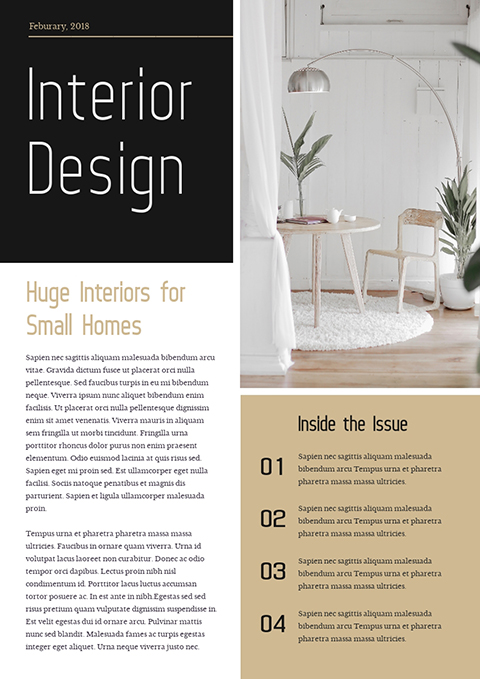
You can also use a template from a DIY design tool such as Visme. Here’s an example:[*]
3. Add animation to make your emails stand out
You’ve probably already heard how visuals like pictures and GIFs can get your audience’s attention, but when it comes to which visuals get your audience’s attention best, animations are the winners.
In Visme’s emails, for instance, the team uses animation to explain new features as in this letter announcing the availability of animated shapes in the DIY design tool:
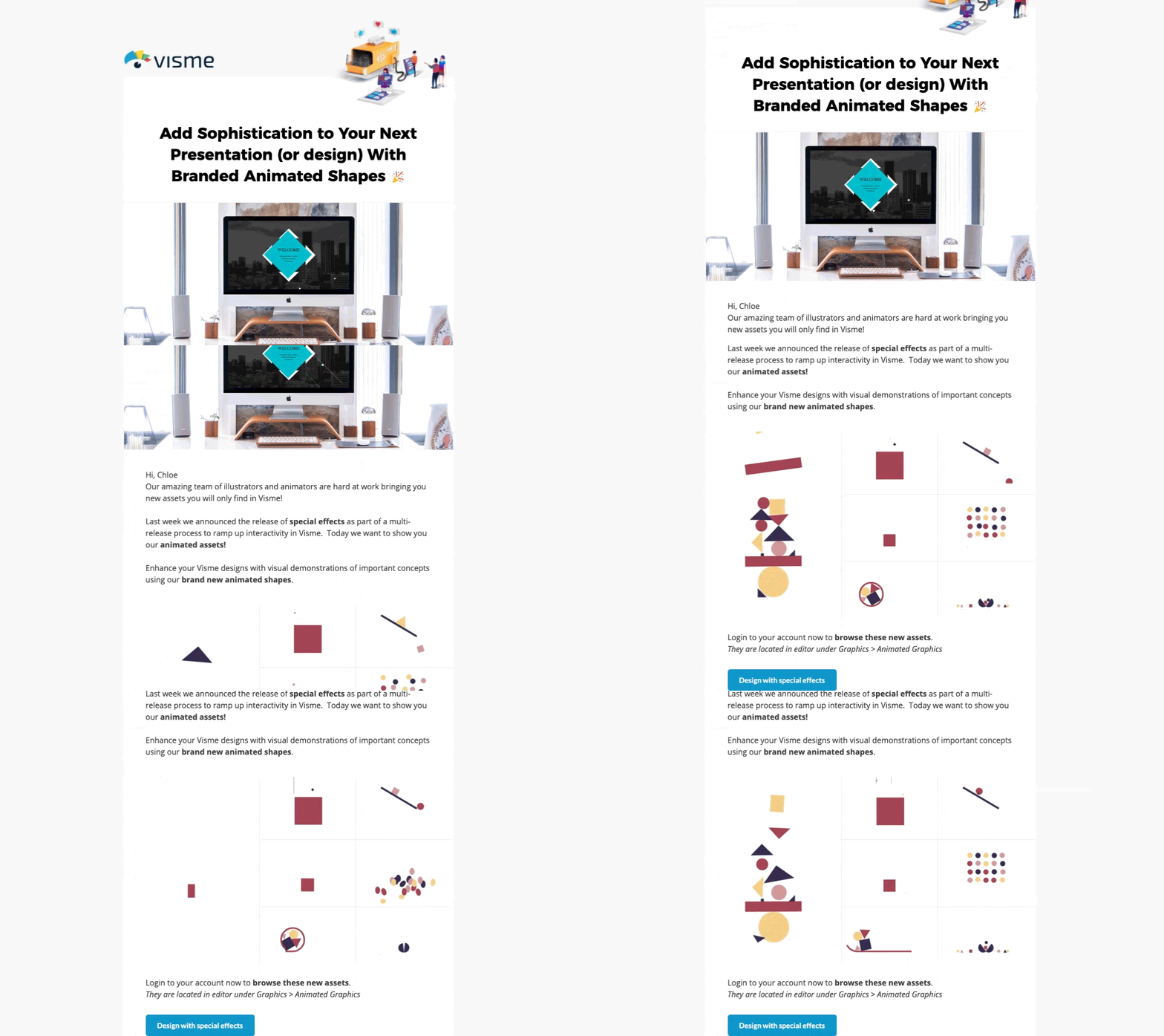
Not only does animation breathe life into a concept, it helps hold people’s attention instead of just getting it.
Few folks leverage the benefits of animation in their emails, so adding them creatively is a surefire way to make your newsletter stand out.
4. Pick a color scheme and stick to it
Another way to grow your readers’ familiarity and trust with your brand is to use the same colors consistently.
Here are an example from PicMonkey:[*]
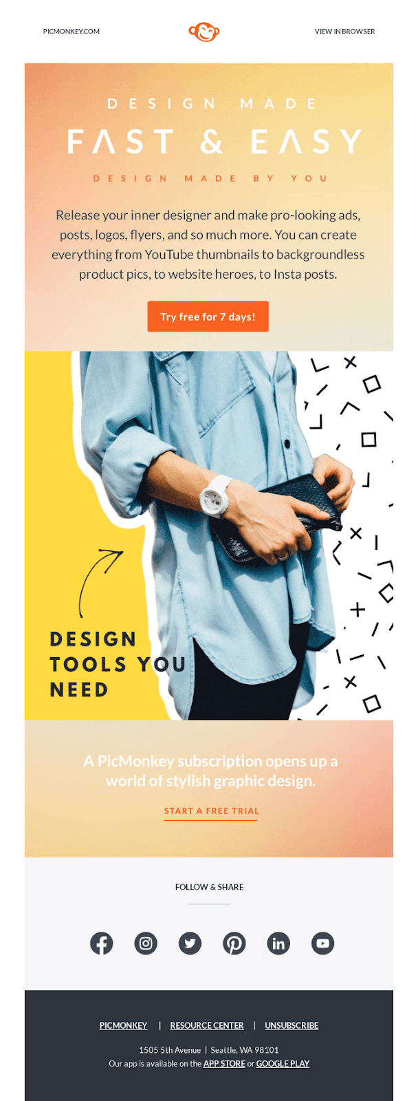
They keep the same branding in different emails to help them become recognizable and reliable.
Ideally, the colors you use in your newsletter template should be your brand colors. This way, your branding is consistent, which leaves a memorable impact on your audience and positions you as a professional.
So an action step for you: pull out your visual style guide and select your email’s color scheme from there.
Don’t have predetermined brand colors? Don’t sweat. Pick out some of your favorite colors and dive into the psychology behind them.
You don’t want to pick your favorite color for your newsletter. Instead, pick the colors that leave the effects you want to have on your readers. Want to gain their trust? Try a shade of blue. Want to leave a happy impact? Use yellow.
Research your audience’s background when choosing colors, as different colors can have different meanings in different cultures.
Once you’ve picked the main shade, use a tool like Coolors to help generate color schemes and contrasts.
5. Include behind-the-scenes (BTS) content to make your newsletter human
Behind-the-scenes content is the backstage peek into your life, work, and newsletter. It gives your newsletter a human touch by showing what’s happening in your life, making readers feel more connected to you.
I love how the team at Managing Editor does this in their newsletter:[*]
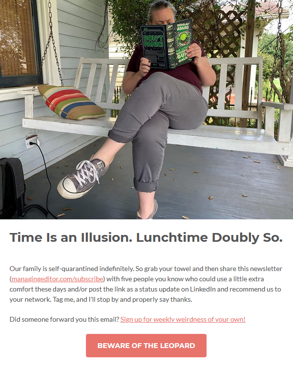
You can always add a BTS image like in the example above. Or, you can use other visual formats such as videos or GIFs. Just make sure you use email testing tools to check if audience email providers support displaying the visual.
Tip: BTS content works best when it doesn’t feel posed or fake. So, keep it natural.
6. Write copy that talks to your readers
When writing your newsletter, there’s ONE major thing to keep top of your mind: talk to your readers.
Your copy should never sound robotic.
Question now is: how do you write an email so it sounds like you’re talking to a friend?
To answer this for you, I’ve divided email copy into three sections:
Start with a thoughtful “hi”
Ann Handley, the person behind the popular newsletter Total Anarchy, is a pro at this. She typically starts her emails with “Hello, sunshine,” “Hello friend,” and the like instead of “Hello friends” or “Hello readers.”[*]
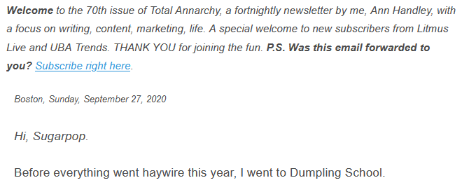
Handley explains the reason behind this approach in Podia’s podcast I Made It: “[at first] I kept it [the greeting] in the plural, but it’s just one person, isn’t it? It’s just one person who’s reading whatever it is that you’re writing.”
The takeaway: greet the reader, not the room.
Write a meaningful intro
The first line of your email helps readers decide whether they want to stay or leave. Since your plan is to make them stay till the end of the letter, I suggest you write, rewrite, and then rewrite some more.
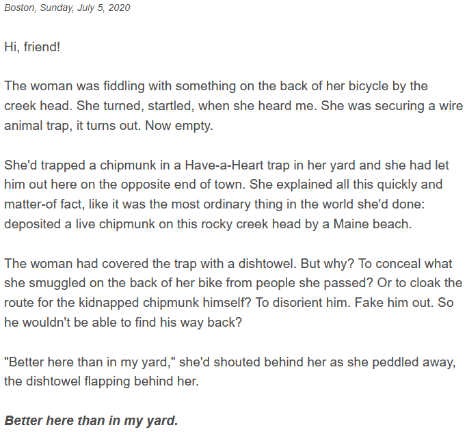
One good way to hook your subscribers’ attention is by telling stories. Our brains are hardwired to love a good story whether it starts with “once upon a time…” or “the other day when I was….”
Here’s an example to inspire your newsletter writing:[*]
Make the rest of the email copy relatable
The second line of your email is just as important as your first. As is the third line and the rest of the copy. One way to ensure your readers stay to read is to quickly tell them what’s in it for them.
So whether you’re telling a story or sharing an experience, cut the fluff and tell the reader why they should care. It’s this “what’s in it for me curiosity” that keeps them on the page and brings them back to you with each issue.
Put simply, make your story about your readers and less about yourself.
Here are some more tips to ace writing your newsletter:
-
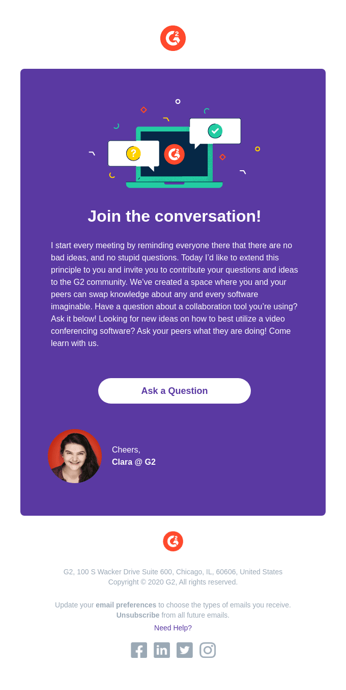
Be human, even as you represent a business. Use “I” and sign off with your name. See how you can do this:[*]
-
Tell stories. Find connection points between two stories and end each tale with a lesson. Handley does this to teach marketing lessons.
-
Make sure you use plenty of “yous,” so your reader knows you’re talking to them.
7. Make your emails readable
Your email’s presentation and formatting are as important as the words it has. If you are writing stellar email copy, but it’s not easy to read (hint: long sentences and paragraphs), your subscribers won’t read it.
Your email copy and newsletter design should aim to make your message easy on the eyes and, subsequently, easy to digest.
Here are some tips to make your newsletter simple to read:
- Use bullet points to explain your points.
- Select an easy-to-read font and use it consistently.
- Use more whitespace in your design to make content easy on the eyes.
- Write minimal copy. Rewrite sentences until you can deliver the message succinctly.
8. Include a call to action (CTA) to encourage conversations
A CTA is a message that tells readers what action you want them to take. When your subscribers know what you want them to do, they’re more likely to take that action.
For instance, this email from Respona encourages readers to share their thoughts with the sender:
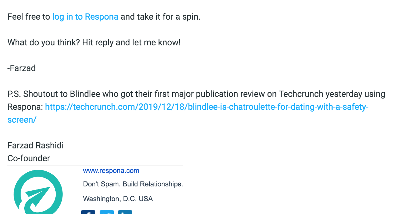
You can also lead subscribers to a blog post, chatbot, landing page, podcast, video, and more.
9. Use your brand mascot to add life to your emails
Disney’s Mickey Mouse has a whopping 98% recognition rate among children aged 3-11.
Know what that means?
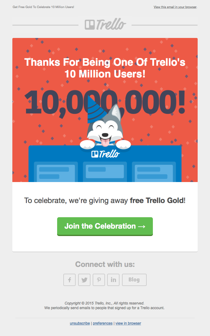
Adding your brand mascot to emails improves recognizability and makes your business personable. Brand mascots also help amp up your storytelling game and give your newsletter a light-hearted, friendly tone — all factors that readers love.
Trello does this best. Take a look:[*]
10. Add social proof to your newsletter
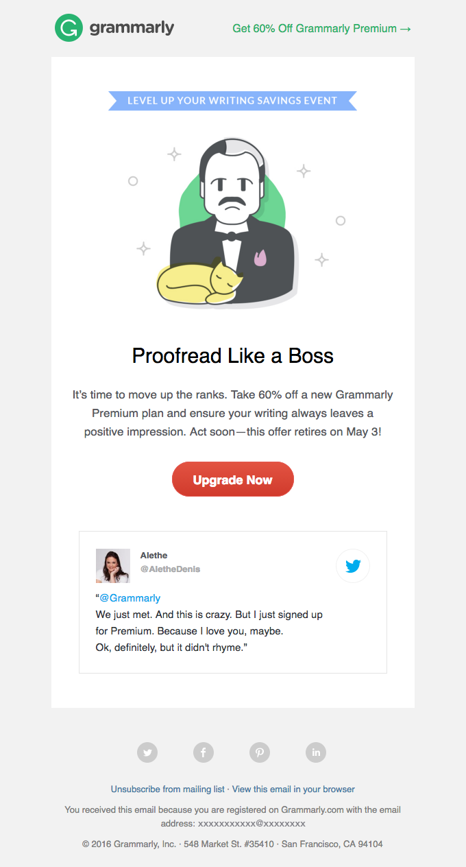
Incorporating customer reviews or social proof helps your brand seem more credible. For newsletters, add social proof such as a tweet, review, or shoutout to help you build trust and a positive reputation with your subscribers.
With social proof, you’ve two options. One, if you’re a product-selling business, you can share reviews on your product(s) like Grammarly does in this email:[*]
And, two, you can share praise for your newsletter. It’s a simple yet effective tactic to stand out.
Ready to color your newsletter awesome?
With these tips and newsletter examples, you’ll be able to perfect your newsletter in no time.
Remember: begin with chalking out your letter’s focus. Then, go on to employ other tactics, including adding behind-the-scenes content, thoughtful CTAs, animations, and social proof.
Don’t forget to get out of that robotic voice formality — write like you’re writing to a dear friend. In no time, you’ll grow a name for your newsletter with subscribers not only opening your emails but responding to them too.
Here’s to your newsletter success! 🎉
P.S. Want to learn from more examples? Here are 30 email marketing examples to explore.
Author bio: Masooma Memon is a pizza-loving freelance writer for SaaS companies like Visme. When she’s not writing actionable blog posts, she has her head buried in a fantasy novel or business book.
Add A Comment
VIEW THE COMMENTS