How many times have you heard this line?
“If you want to collect email addresses, all you have to do is ask.”
Seems like common sense. Someone’s on your site, so they must be interested enough in your blog to subscribe.
That’s why you see so many opt-ins like this:
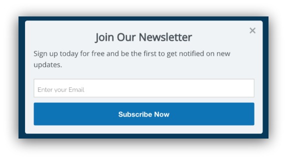
Join a newsletter, get some updates. Done deal — let’s sit back and watch the email addresses roll in, right?.
Wrong.
This kind of ask? My data found it only works for a very VERY small group of people.
The scary news: Most of us don’t fall into that group.
The even scarier news: Most of us operate like we are in that group.
What happens when you’re in that group? You ask yourself the same question I hear when I review hundreds of sites a year.
“Why is my conversion rate so low?”
After studying the patterns of 400 million pop-ups, I can tell you why. And it comes down to how you’re asking for your visitor’s email address.
This guide is 4k words long. If you want it for later, you can download this free ebook with all the information from this guide PLUS a list of 28 content upgrades I don’t include in this post (HINT: They build your list like crazy).
Why Asking For Email Addresses Is Killing Your Conversion Rate
Have you ever tried cold-emailing someone?
It’s hard as hell. But anyone can tell the difference between a good cold email and a bad one.
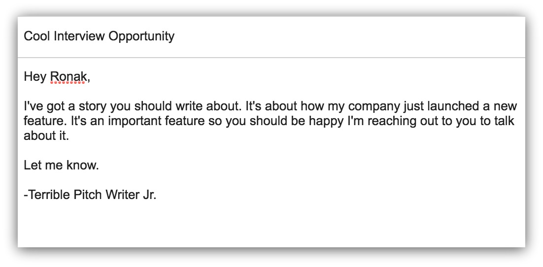
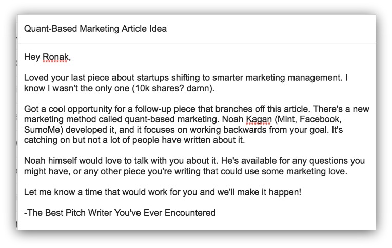
Case in point. Which one of these emails would you be more likely to reply to?
OR:
So what’s the difference? Well:
In the first pitch, the writer is cutting to the chase and asking for a favor – without even knowing the person they’re emailing. They aren’t offering anything of value. The writer assumes they’re so important the reporter should feel privileged to write about them.
The second pitch is a give. It provides tremendous value, offering a new idea and access to an important marketer without explicitly asking for the reporter to write about them.
So, what does this have to do with email marketing?
Asking for email addresses is the same.
See, there are two ways to collect an email address and build your list: you can give, or you can ask.
They seem like the same thing. But as we saw in the pitch emails, they’re wildly different:
-
Giving: This is when you give something of value to the visitor. An ebook, infographic, discount…anything that gives explicit value to the visitor.
-
Asking: This is when you ask for an email address without explicitly giving anything of additional value.
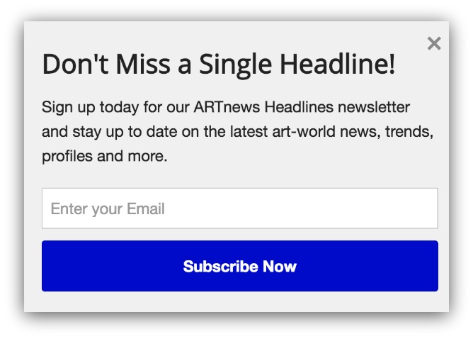
That’s why asking pop-ups look like this:
And giving pop-ups look like this:
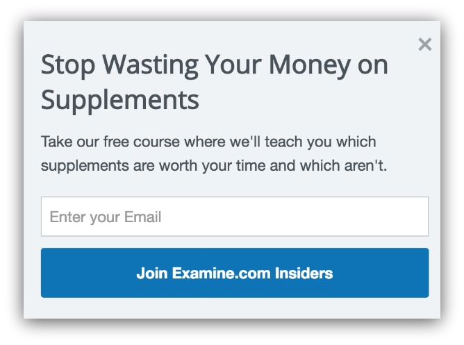
The first pop-up asks you to join a newsletter so you can get more of their content. The second pop-up gives you a free course to teach your about supplements.
The confusing part is both pop-ups work.
But only one type of opt-in will work for you. So which one will it be?
Coffee Is For Closers, Asking Is For The Elite
My findings revealed two questions you should ask yourself:
- Are you a well-known thought leader, celebrity or brand?
- Do you have over 100,000 page views per month?
Usually those two go hand-in-hand. But if you didn’t answer “yes” to both those, then you shouldn’t use the ask technique in your pop-ups.
Here’s why. I segmented data we pulled on 400 million List Builder pop-ups into three groups.
The first group was pop-ups with at least 2,000 opt-ins (people giving their email addresses) and at least 20,000 impressions (amount of times the popup was shown).
This group represents popular websites with large audiences. While 20,000 impressions was the baseline, some sites had pop-up impressions as high as 40,000,000.
They’re also successful. With at least 2,000 opt-ins, we’re looking at conversion rates far higher than the average.
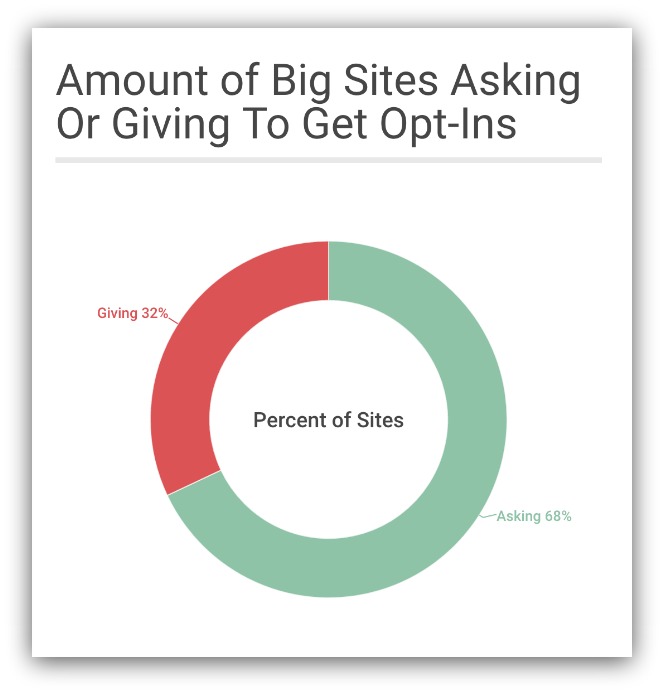
68% of big, successful sites simply ask their visitors to sign up. That’s why you see sites like Jeff Gordon just asking for an opt-in:

You may look and say, “But they’re eligible for giveaways and they get stuff.”
True. But anyone can enter those giveaways. And you’re essentially just receiving promotional updates a majority of the time. It’s not like a subscriber is getting a huge piece of value. They’re opting in to the Jeff Gordon brand.
Or there’s James Altucher:

He’ll give you some tips, but it’s mostly his new blog posts and promotions as well. But it works because he’s provided so much value with his books, podcast and appearances, so you’re opting in to his brand, too.
Then there’s the established blogs like Wait But Why:
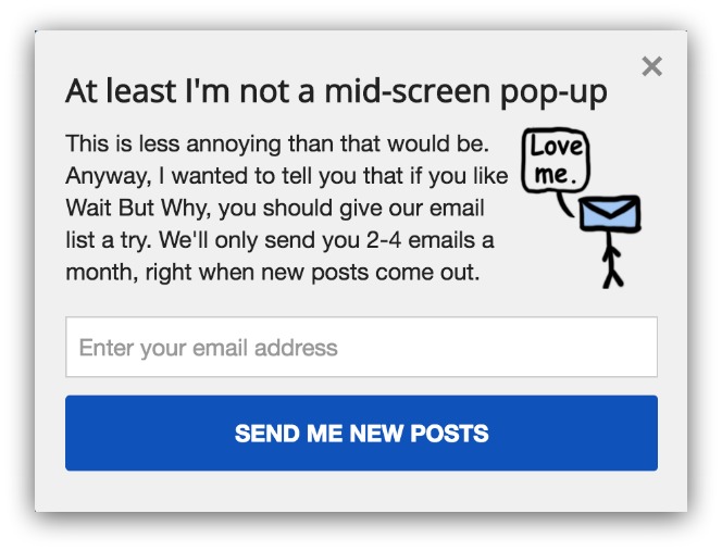
Mid-screen pop-ups, amirite?
This is a case where the popularity and following comes from the value of the blog itself. Since the blog is popular, visitors will want updates whenever a new post comes out. That’s why simply asking for an opt-in works here.
So this is where most guides would stop and say “Alright, emulate these chosen few. Do what they do, go forth and be fruitful.”
But I kept digging.
I looked at another group: pop-ups with fewer than 5,000 impressions and less than 25 opt-ins.
This represents sites that don’t have a lot of traffic and have miniscule conversion rates. To put it bluntly, this is what you want to avoid when creating a pop-up.
The results shocked me:
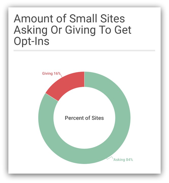
That is a staggering number. 84% of unsuccessful, low-traffic popups ask for opt-ins in lieu of providing value by giving something away.
I don’t want to put any sites on blast, but know that most of these pop-ups that ask for opt-ins look like this:

Not a lot of value from this. Remember, the top sites could simply ask for an email address because they have inherent value. They’re established brands, so people want to follow them.
These low-traffic sites are just starting out, so they don’t have that inherent value. No one feels compelled to follow them (yet). Visitors don’t want to be on yet another newsletter, so there needs to be value to inspire action.
Think of it like high school. Did the super popular kids ever want for dates or attention? Nope. People craved to simply be around them.
Nerdy troglodytes like myself? Nothing short of lighting my pants on fire and passing out free Mountain Dew would get me noticed.
But these are the two extreme ends of the spectrum. High-traffic, high-conversion sites vs. low-traffic, low conversion sites.
Which begs the question: what about everyone else?
That brings me to the third group I analyzed. I looked at pop-ups with at least 5,000 impressions (but no more than 20,000) and a conversion rate of over 4%. This represents sites with moderate traffic and successful pop-ups.
No surprise, these successful mid-size sites give instead of ask:
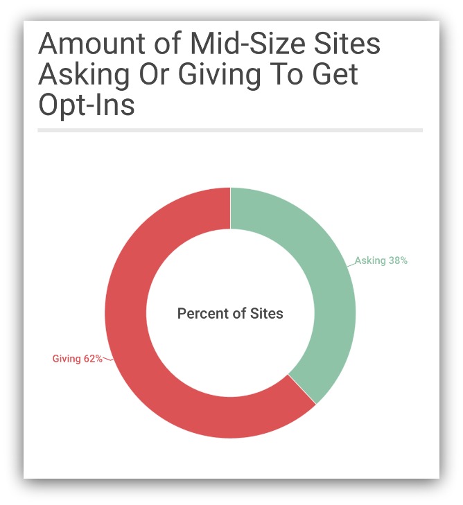
That’s a clear majority giving instead of asking. The reason there’s 38% asking in this group is because some niches are small. If you’re the name in that niche, then you’re effectively a rockstar (just with less traffic).
For the most part, mid-size sites give. That’s why you see pop-ups like this:
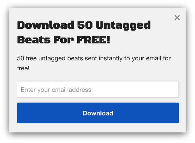
Here’s a cool pop-up offering 50 free untagged beats. Those beats take time to make, and giving away 50 of them certainly feels like big-time value.
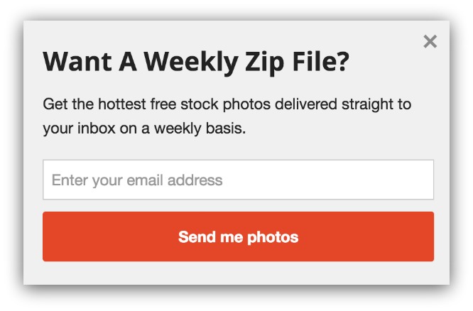
For those in need of stock photos, this pop-up offers a zip file full of them every single week. That’s another example of giving great value in exchange for an email address.
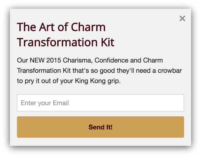
Heck, the Art of Charm gives away an entire transformation kit if you give your email address. It’s value like this that makes it hard to not give up your email address.
Summary
– Big Brands, Sites and Celebrities Can Ask: They have inherent value from what they do and who they are. People want to follow them, so they can simply ask for an email address.
– Small, Mid-Size Sites Should Give: There isn’t enough value yet to simply ask for an email address. You need to give the visitor something valuable to promote action.
So you’re in one of two categories. You’re either part of the privileged and you can just ask for an opt-in (because you’re a big shot).
Or you’re in the other (much bigger) group where you have to give something of value to collect email addresses.
Both have different approaches for creating a pop-up that converts.
And, since I’m fair and balanced, I’ll show you how to craft a great headline, description and giveaway — no matter which group you’re in.
For the Big Shots: How To Strengthen Your Ask With Proof
Alright. If you’re reading this, you’re a big shot. Or you’re the marketing person representing the big shot.
Either way, Ron Burgundy would describe you as a pretty big deal. Since you’re a big deal, you can create a pop-up that asks people to follow you, then kick back and enjoy the benefits of fame.
Note: But I will say this. I don’t have the data (yet), but I’d advise you to try out a give strategy, too. If it’s already working for everyone else, imagine what it could do for you.
Here’s the thing: there’s more to asking than just saying “Give me your email and I’ll send you updates.”
I found some interesting patterns in my research. These patterns will help you craft headlines, descriptions and calls-to-action that will beat whatever your current pop-up says.
Bold statement. But the findings back it up.
Headlines: Shorter. Better.
The thing to remember is you don’t have to do a lot of convincing. The more words you use, the more opportunity to say the wrong thing (or dissuade your reader from acting).
That’s why your headline should be short and to the point. Two tips for that — either be completely straightforward, or let your brand essence shine through.

Jeff Gordon takes the straightforward approach with the headline “Jeff Gordon Newsletter Signup.”
No mincing words there. You know right away you’re joining Jeff Gordon’s newsletter if you sign up.
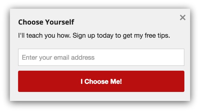
James Altucher takes the branding approach with the headline “Choose Yourself.” You’ll see that core branding message throughout his site, books and emails.
It’s a strong message that every one of his fans knows. He reinforces that branding in the headline of this pop-up.
You’ll notice that both these headlines are short. The average ask headline is 4.5 words long. But don’t write half a word, because that looks like a typo and no one will get the joke.
Descriptions: Focus on Social Proof
We’ve written about the importance of building up social proof. When people see other people trust you, they’re more likely to trust you, too.
If you’re a massive brand, you have the equally massive social proof. Specifically, your follower count will dwarf almost anyone else’s.
So use that number for serious social proof.
Let’s go back to the Jeff Gordon example:
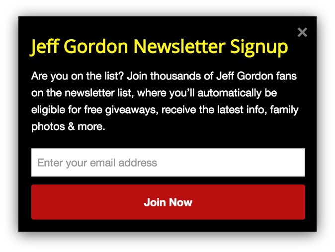
“Join thousands of Jeff Gordon fans…” It makes you feel like you’re part of something big, doesn’t it? Thousands of people follow him. He must be important, right?
If you’re asking those questions in your mind, then the social proof has done its job. It’s all about proving your value. A large following? That’s valuable.
Here’s me being nit-picky, though. Descriptors like “hundreds” and “thousands” don’t really mean much. “Thousands” can mean 2,000, just like “hundreds” can mean 200.
If you want to really wow, use a specific number.
So I’d rewrite the pop-up to look like this:
- “Over 180,000 fans subscribe to get the newest updates, photos and news about Jeff Gordon. Subscribe and you’ll be in the know, too.”
It’s nothing too special, but leading with the subscribers does two things:
- Shows how popular Jeff Gordon is.
- Proves how many people have already signed up.
If you’re simply asking for an email address, the proof of how many people have already given their addresses is valuable.
Call to Action: Create Community or Exclusivity
The call to action is where you drive home your promise. You’ve followed the previous advice, so your ask is full of your strong branding and social proof.
Make your call to action match that message.
These visitors are opting-in to the community you’ve built with your brand. So what seems more enticing?

Or:

Subscribing seems so impersonal. What does is it even mean to subscribe? That’s why the second call to action is better. It invites the reader to be part of something big.
After all, people just want to belong.
That’s why sites like Examine.com use that approach in their asks:

You’re not just getting newsletters. You’re joining a community of insiders. And YOU get to be a special insider.
That’s the progression you’re looking for. Build on your brand equity in the headline, convey a sense of community and social proof in the description, then tie it together with a communal call to action.
Got it? Cool. Now go back to doing ridiculously successful person things. OR, stick around and learn about a new list building strategy you SHOULD be doing (that everyone else will be doing).
The Medium to Small Sites: Give Great Things, Don’t Be Confusing
Welcome back, the majority of people reading this guide. All that stuff I just talked about for the last 800 words?
Don’t follow it. The data says it’ll hurt your site.
What you and I are going to focus on is the other half of the coin: giving away value to get email addresses.
We’ll still focus on writing a great headline and call to action, but I’m going to really place an emphasis on what you should give away and how to present it.
Let’s begin.
Headlines: Focus On What You’re Giving
Your headline is one of the first things a reader will see. It determines if they’ll even read your description, much less opt-in. Fudge up the headline and you’ll end up staring at an empty email list.
No pressure.
Here’s the secret behind a great headline: it needs to clearly and succinctly focus on your giveaway.
Couple examples of that:

Ecommerce sites can leverage headlines so easily with offers. Free shipping, discounts, instant money…those are all simple and effective.
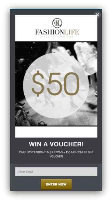
FashionLife does it with an image and a headline. You see the $50 instantly, and the headline says “Win a Voucher.” Put the two together and you realize you could win a $50 voucher. Not too shabby.
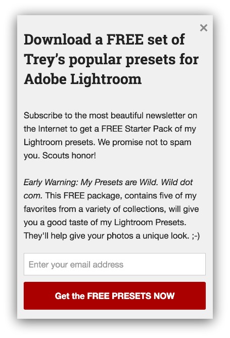
This is a little longer than most headlines, but it does the trick. If he wanted to shorten this, he could say “Get A Free Set of Popular Adobe Lightroom Presets.”
Still, you don’t have to read the description to know what you’re getting. The headline sells the value.
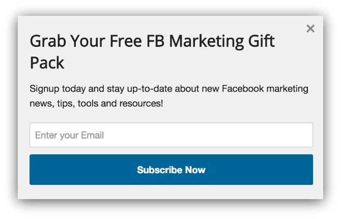
Same deal here. You know you’re getting a Facebook marketing gift pack without needed to read the description (which doesn’t follow up on the headline, but more on that later).
You understand the value from the headline in every one of these examples. In your pop-ups, craft a headline that needs no description. It just makes the actual description that much more powerful.
Speaking of…
Descriptions and Giveaways: Describe Value, Don’t Be Confusing
Let’s go back to this example:

Great headline, excellent giveaway. But the description is a bit of a disconnect. They promise something great in the headline, but never mention it in the description.
If you’re like me, you want to know what’s in that marketing kit. Is it just a cheat sheet? Or is it a full suite of tools, charts, ebooks and the like?
That makes a difference. And the best writers follow up their headline with more.
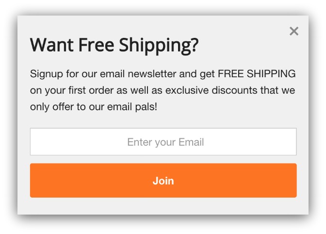
I’ll use this example again because the connection between headline and description is strong. The headline promises free shipping, and the first half of the description clarifies how to get it.
That strong link bridges the reader’s curiosity gap. The more they read, the closer they come to the call to action.
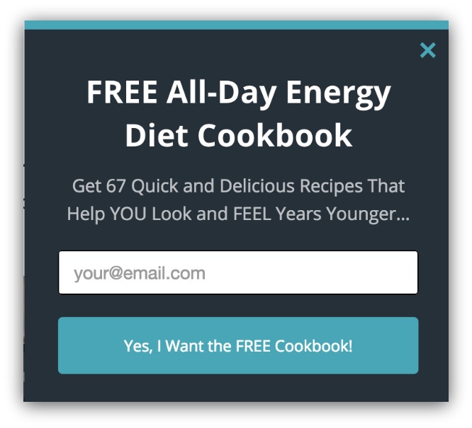
You see the link here, too. The headline promises a free energy diet cookbook, and the description reveals the amount of recipes and how they help your life.
Forming this kind of link is crucial for opt-ins. But that link means nothing if your giveaway isn’t valuable.
You’ve already seen some great examples of strong giveaways. A free cookbook, free shipping, free marketing kit…it’s all free, and it’s all highly valuable.
Here are a few solid content upgrades to get you going:
-
Resource List: Got a list of tools that you use to create something? Or maybe some essential reads that everyone needs? Package those up in a short resource list.
-
Video Recording: Record yourself completing a task or sharing advice on a subject. All you need is a phone or a computer.
-
Ebooks: Write a 5,000+ word book on a subject, or package your best posts into a comprehensive ebook.
-
Templates: Examples of templates include email templates, budget templates, business card templates, and so on. You can create templates from things you already use.
-
Discounts: Free shipping, percent off, dollars towards first order…they’re all discounts, and they’re great for collecting email addresses.
-
Swipe Files: If you aren’t familiar with a swipe file, it’s a collection of materials you often reference. If you have success in your field, visitors will want to see what you use most.
You can get 22 more content upgrade ideas PLUS this entire guide in handy ebook-form by downloading it all for free here.
Remember, these are just a few examples of giveaways. Choose the one that works best for your business and make it valuable.
Call to Action: Reinforce That Value
The good pop-ups have clear straightforward calls to action.
But the great ones demonstrate value until the very end.
That’s because it’s about creating a full experience. Sure, you can say “Subscribe.” But it’ll undo the mindset you worked hard to create.
You want to carry your message from the headline to the call to action. And there are two proven techniques to do that.
1) Echo The Giveaway
Your call to action button is generally the most colorful element on your pop-up. That makes this and the headline the first thing readers see.
With that progression of focus, you can add value to your call to action by echoing what your giveaway is.
Ideally, a reader could read your headline and call to action and know exactly what they’re getting. For example:

If you covered up the description, you’d see “Want A Weekly Zip File?” and “Send me photos.” That’s a very cause and effect approach — a need for zip files, and you can get them sent to you.
Same thing here:

You know you get a free cookbook just by reading the call to action.
It helps because visitors won’t always read in the order you think they will. Sometimes it’s headline, call to action, then description. Sometimes it’s call to action, description, headline.
If the first thing I read was a call to action button that said “subscribe,” I might be put off. But seeing the value in the call to action helps give me a reason to read the surrounding elements.
2) Result-Based Outcomes
This technique takes the value-based approach of the giveaway echo technique and infuses visualization as a primary motivator.
Alright, that sounded nerdy. Just look at this:
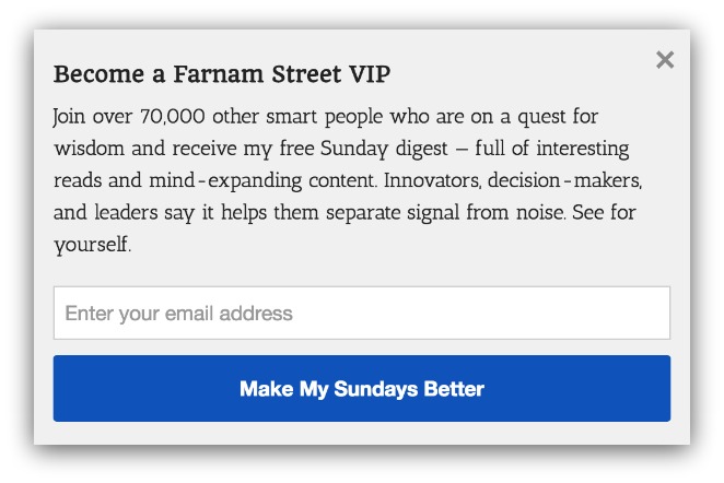
Initially, this looks like a lot to read. So my eye is naturally drawn to the blue call to action button to see what the value is.
Instead of saying what the giveaway is, the button promises me a result. Make my Sundays better.
Of course you’d be curious to see how to make your Sundays better. So you’d go back and read what Farnam Street is doing to make your Sunday better.
This is a result-based outcome. But clicking that button, your life will assumedly take on the characteristics the button describes.
- “Lose Weight Today”
- “Get A Happier Marriage”
- “Shed That Debt”
These don’t say what you’re receiving in order to accomplish these claims. But, since they’re calls to action, acting on them will help you reach their promises.
This technique makes the ask feel more concrete. You aren’t just getting something. You’re opting-in to a better version of yourself.
Whichever technique you use, they’re sure to wrap up your giveaway with an opt-in.
Summary
– Make Your Headline Focus On The Give: The headline is the first thing your reader will see. Instantly reel them in by conveying exactly what they’ll get.
– Describe The Value In Description: Build off the momentum from your headline. The headline pulls them in, and the description sells them. Describe what you’re giving away in this section.
– Reinforce Value In Call To Action: Either echo what you’re giving away, or craft a results-based outcome.
Here’s A Full List Of Content Upgrades
Asking for an opt-in? Only the elite can pull it off. And even then, they could emulate their lower traffic brethren with some killer content upgrades.
Speaking of upgrades. I threw this entire guide into an ebook in case you want to reference it later on. On top of that, I added a bonus section with 28 content upgrade ideas.
If the six ideas in this guide didn’t grab you, or your want more options, grab the ebook with the additional ideas included.
Add A Comment
VIEW THE COMMENTS