In the world of ecommerce, Shopify can’t be beaten. They recently achieved $184.1 million revenue growth in 365 days… from $205.2M to $389.3M.
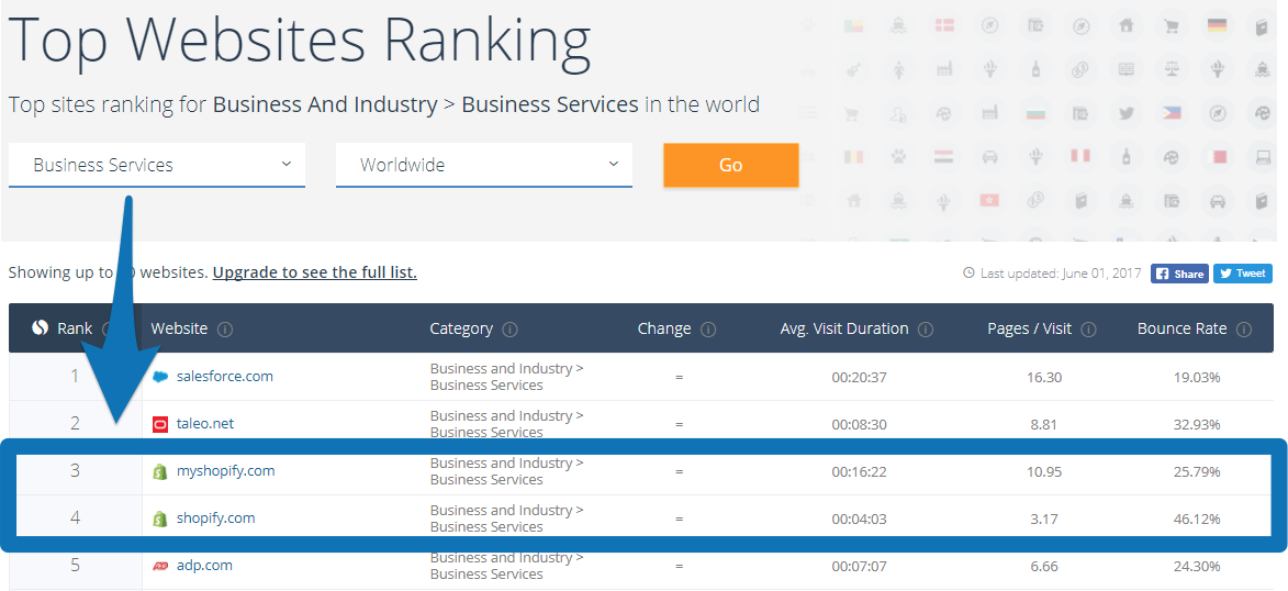
They’re the 3rd most visited website in the WORLD in the “Business Services” category.
But that’s not all.
Last year Shopify had…
- 377,500 paying customers (which grew 55% from the previous year).
- 100.5 MILLION people buying from stores powered by Shopify.
- Doubled the amount of products sold through their platform from $7.7 billion to $15.4 billion.
To figure out EXACTLY how Shopify has grown so fast (apart from having a great product) I completely reverse engineered their marketing so you can use their tactics to take your marketing game to the next level.
Share this post today for your chance to win
1 Year of Shopify for free.
Table of Contents
%(tableofcontents)
[Tip #1] The “Sticky” Free Trial Offer That Gets Customers Hooked On Your Product From Day #1
Free trials are a well-known growth hack that improve customer acquisition.
That’s a fact.
More than a few customers have been pushed over the edge to try out a product just because they knew they could try it for free.
And so of course, Shopify has executed this hack flawlessly.

But there’s something extra about Shopify’s free trial offer that makes it super effective.
Once the prospect’s free trial is finished, it’s almost impossible for them not to opt-in to a paid plan.
Let me explain.
Shopify has their free trial set up in a way that business owners actually accomplish something tangible during their trial. After all, what could be a more tangible result than actually opening up your first ecommerce store?
By the time your free trial is over, you have already done a lot. You have:
- Opened up your store
- Begun setting everything up
- Chosen a domain
- Chosen a theme
- Organized your products
- Runs ads (possibly) and
- Maybe even started selling
Once you have gone through all that time and effort, you aren’t really left with the option to just go and close up shop, are you?
But the growth hack doesn’t end with the free trial.
Shopify has a pricing system designed to make customers “sticky” from day #1 (no matter what the store owner’s level of experience is).
Here is how they do it:
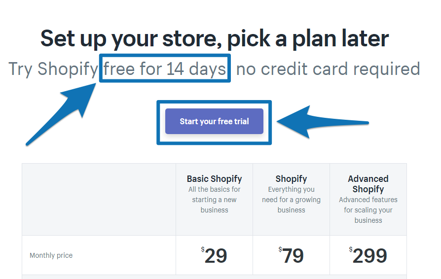
Notice how on Shopify’s Pricing page the primary call-to-action is to get you into a free trial with the “free 14 day trial offer” in the headline and big blue “Start your free trial” button at the top.
This reminds you that there is no commitment if you want to try it.
Then as you grow your online store, Shopify has different pricing levels to scale your store without leaving the Shopify platform.
The takeaway: If you sell a product with a free trial, make sure you have a clear path for people to go from free trial to paid customer (Shopify does this by getting people to set up their whole online store inside Shopify in 14 days and then gets people to pay once their dream is alive on the internet).
[Tip #2] The $100,000 Business Contest You Can Run To Generate Over 1,000 New Signups Every 6 Months
Back in 2010, Tim Ferris and Shopify CEO and founder Tobias Lütke were looking to collaborate on something.
According to Tobias in an interview with MIXERGY, here’s how that conversation went:
“Tim said, ‘Yeah. We should do a contest. How about we give away $100,000?’
I almost fell off my chair. [That was] a lot of money. Then you’re thinking, that might work. It’s strange to many people; we’re a start-up giving away $100,000 in prizes.”
And just like that, Shopify’s now-famous Build a Business competition was born.
Pre-competition, Lütke determined he would need at least 600 new accounts to sign up for the contest to be deemed a success.
As it turned out, the contest performed far better than either of them expected. By the end of the contest, Lütke had signed up more than double that number of new businesses. Here is a more detailed look at the results:
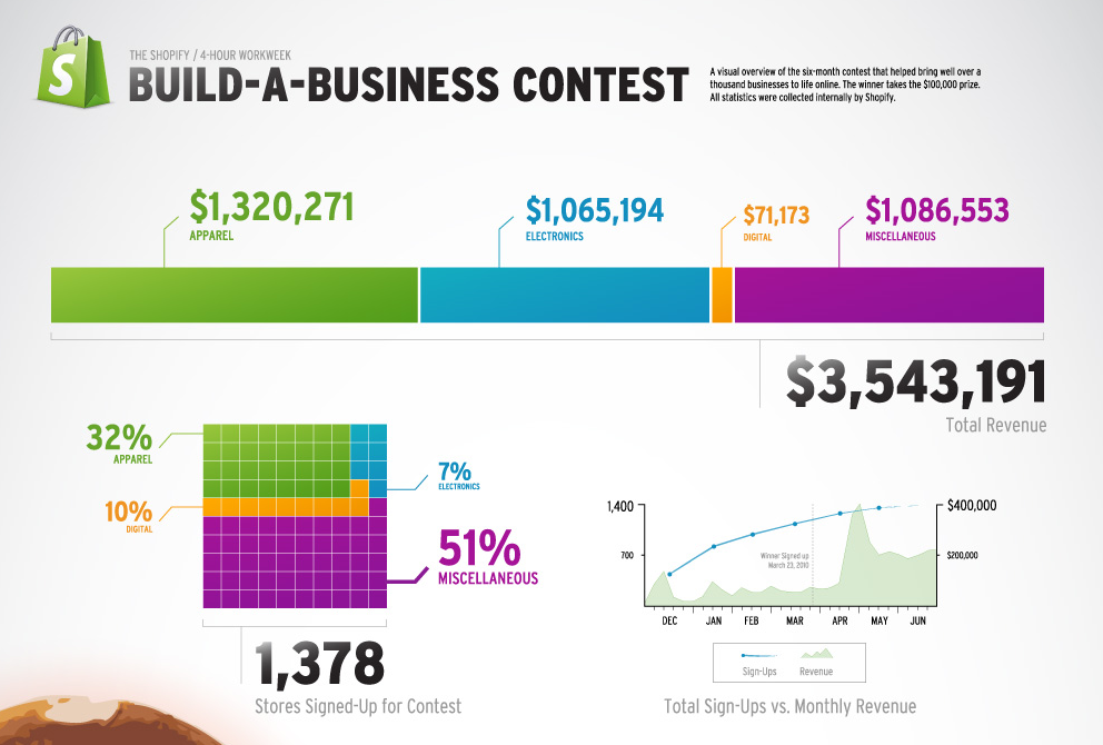
As you can see, this had some pretty potent effects:
- Added monthly revenue of $400,000 for Shopify at the contest’s peak
- 1,378 new store signups
- $3,543,191 total revenue made by store owners
But here’s the real power of the contest, in Lütke’s words:
“These people have built life-changing businesses using Shopify and wouldn’t have done so without the extra motivation from the contest.”
Reread that last part one more time.
With this contest, Lütke got a whole bunch of new customers who normally “wouldn’t have done so without the extra motivation from the contest.”
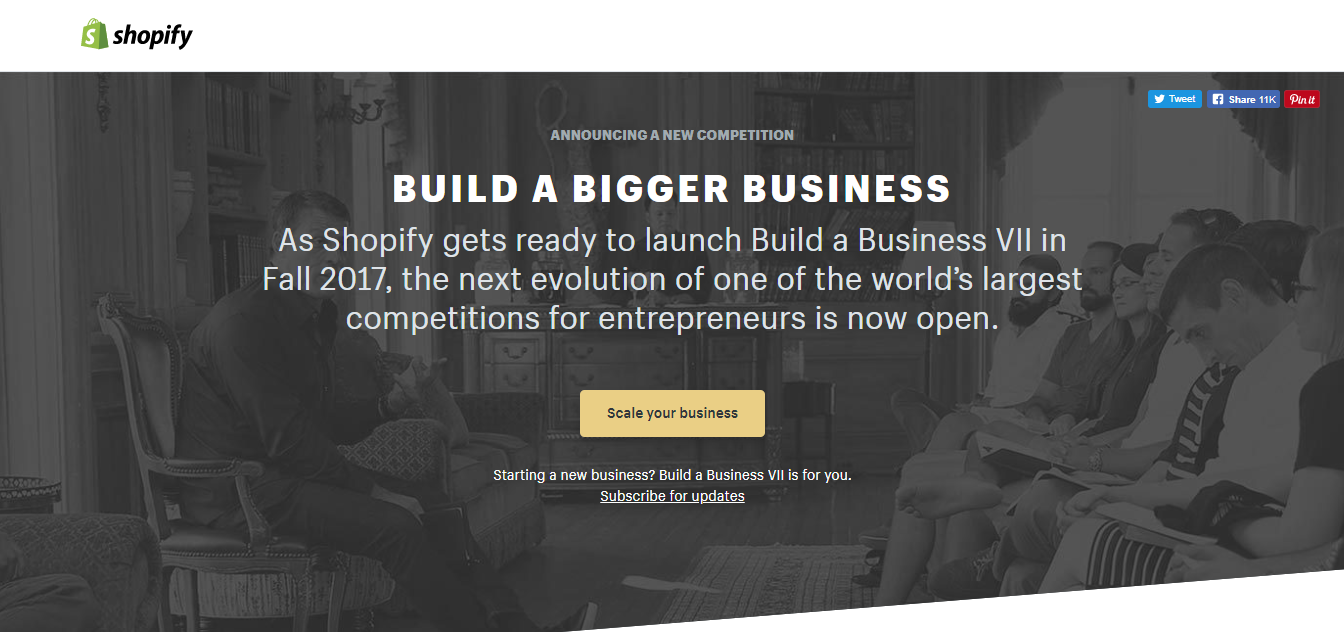
Today, this idea that originally made Tobias fall off his chair has grown into a monster competition that gets them thousands of new customers every year, proving that a contest like this is just the push many people need to get started.
The takeaway: Set up a contest and don’t be afraid to make it big. It could just be the push you need to get hundreds of new sign-ups and encourage some entrepreneurial spirit.
Not ready for the big time? Then try setting up one of these free mini challenges instead.
[Tip #3] The 15 Minute “Just-In-Time” Evergreen Webinar You Can Use To Double Your Webinar Attendance Rate
If you’re on Shopify’s blog, you can’t help but see that little time-ticking box enticing you to sign up for their free online training:
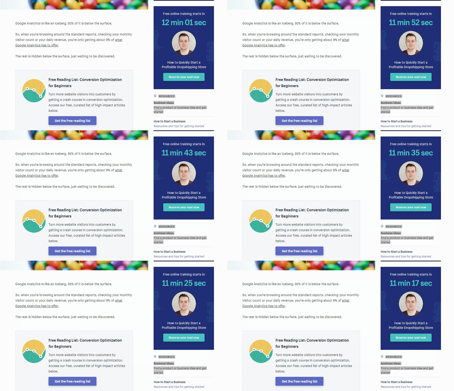
Golden Nugget: Use Just-In-Time evergreen webinars (ie: webinars people can sign-up for and attend straight away) to increase your webinar attendance rate.
They run these trainings every 15 minutes, so clearly Shopify has identified a popular topic that many of their prospects want to know about.
After clicking “Reserve your seat now” and entering your email to sign-up, you’re taken to a landing page that gives you a quick video of what to expect from the training.
You also get a reminder of the time you signed up for and an ‘exclusive’ offer to go along with your free trial:
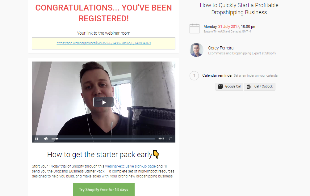
Now, here’s the thing. Shopify doesn’t actually care if you go through and watch the webinar or not (they would prefer it if you do, as you are more likely to sign-up for a 14-day free trial after watching the training).
However, the training is not live.
It’s the same video every 15 minutes.
But instead of telling you that, Shopify are using evergreen webinar software to create urgency with a 15-minute countdown timer.
This is done to make you think it’s offered on a limited basis.
This is classic direct response marketing. It’s a tactic internet marketers around the world have been using for years to increase webinar attendance rates and convert more traffic into customers.
Using the word “training” instead of “live webinar” is a sneaky little copywriting tactic designed to create the illusion of a live event (when combined with a countdown timer most people think they need to sign-up now or they will miss the training).
What Shopify really care about though is getting you signed up for their 14-day free trial on their webinar-exclusive sign-up page.
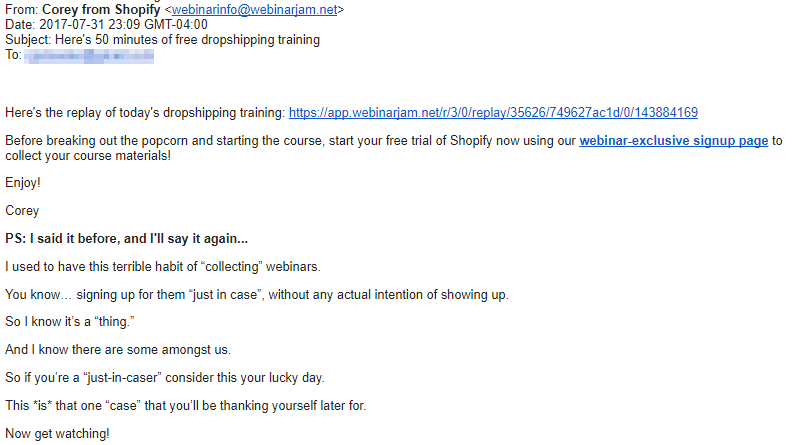
And nothing illustrates this more than the emails they send you after you register and choose your time slot.
Take a look at email #1:
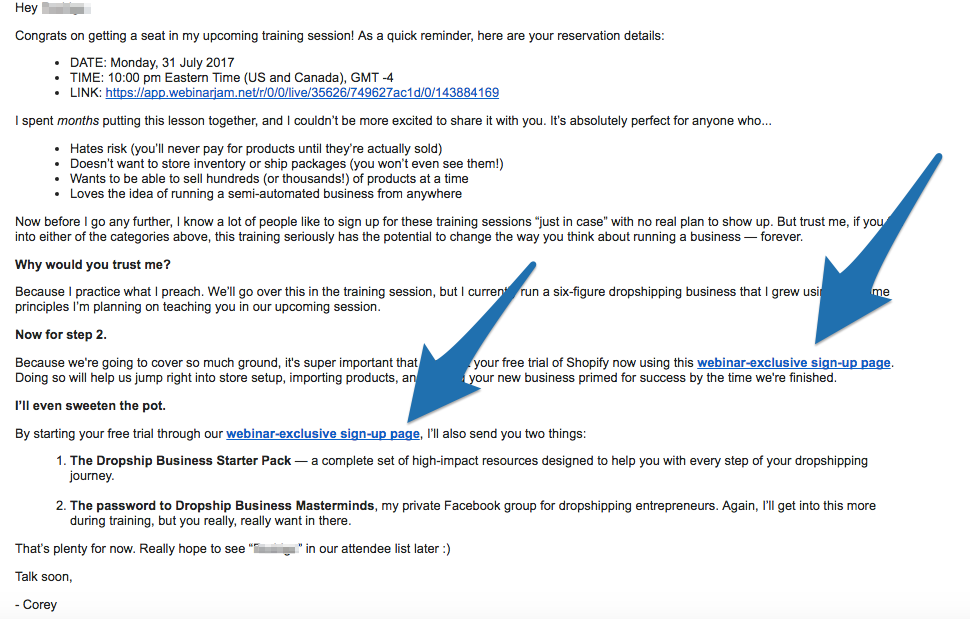
To start, they begin the email with some strong copy about why you should actually bother showing up to the training. But really, that’s not their primary goal.
If it was, they would tell you that you can’t get their ‘special bonuses’ unless you watch the whole webinar.
What they really want to do with this email is present you with a webinar-exclusive free trial link that includes 2 special bonuses to sweeten the deal (See? You can get the bonuses even if you don’t bother with the webinar).
You find the same type of messaging in the next two emails:
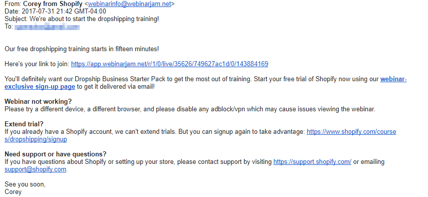
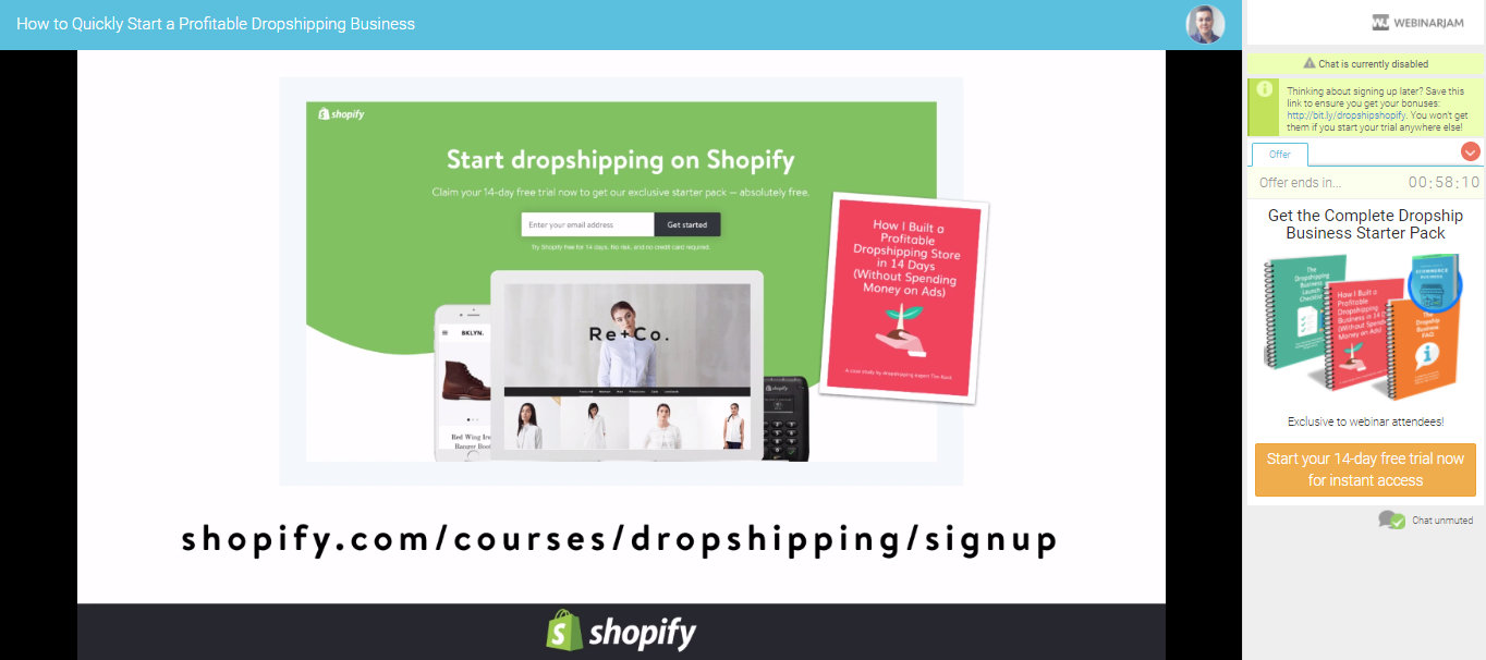
They push the point home even more when you click through to the webinar. Right away, you are reminded that this is the only link you can use if you want to get those 2 special bonuses.
And of course, in a classic show of exclusivity, they start the webinar by saying this special offer is only for webinar participants:
Click here to reveal the evergreen webinar tool Shopify uses
The takeaway: Set up an evergreen webinar on a topic that a large percentage of your ideal customers are interested in.
Use it as a chance to add urgency by using a special webinar-only offer people can get access to when they signup for your webinar (Shopify does this with an evergreen webinar about Starting Your Own Dropshipping Business and offers a Complete Dropship Business Starter Pack exclusively for people who sign-up on the webinar).
[Tip #4] TOFU Tool Content Marketing: Build A Free Tool That Solves A Common Problem Your Customer Has And Rank It #1 On Google
This is Shopify’s secret tool for skyrocketing their organic traffic and driving mass market top-of-funnel brand awareness.
You see, the folks over at Shopify are smart. They know the type of things that go hand-in-hand with setting up an ecommerce website and create content by providing the best answers to common questions their customers have..
But they’ve taken content marketing to a whole new level.
They’ve identified keyword phrases that have high search volume and take complete ownership of them by creating whole subdomains that end up on the first page of Google.
The first subdomain is Burst, a website dedicated to free stock photos (this is the same tool they promoted in email #4 of their onboarding sequence for people to find product photos for their new store).
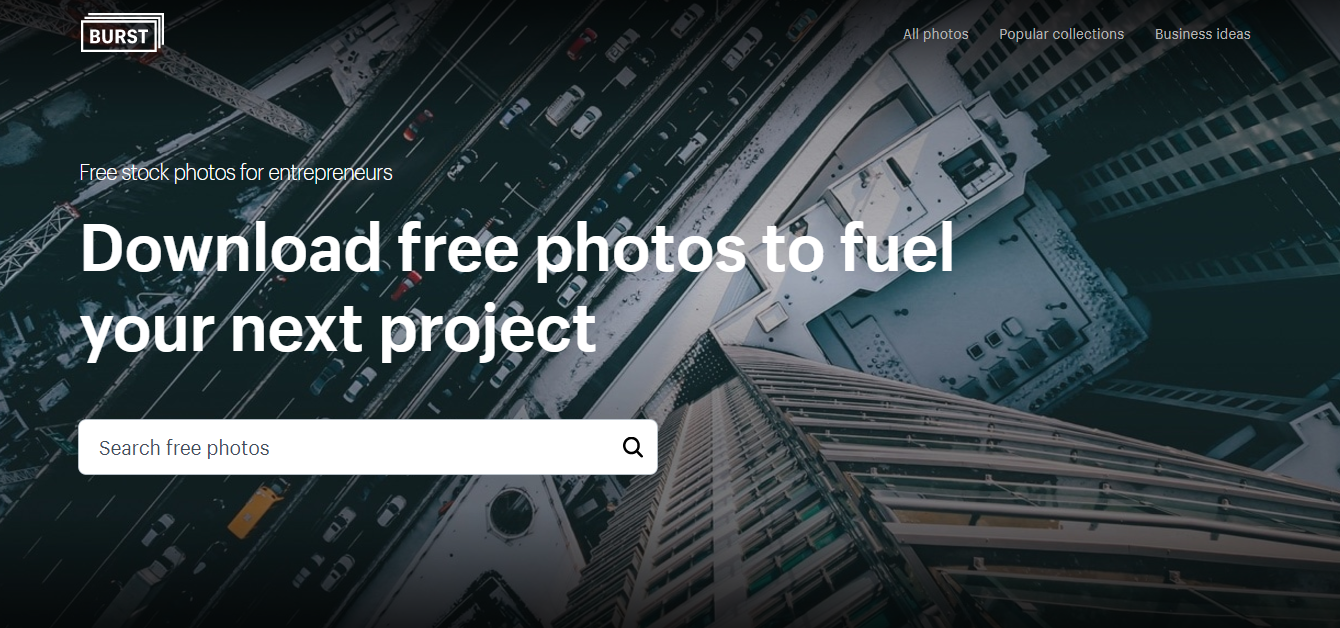
The keyword phrase “free stock photos” is a pretty common search term in Google, netting 40,500 searches monthly on average.

Creating this subdomain and optimizing it for the first page of Google for this keyword phrase is putting a whole new set of eyeballs on Shopify.

Besides Burst, Shopify has a subdomain for buying and selling ecommerce websites.

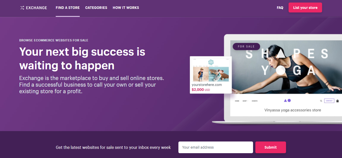
This subdomain ranks #3 on the first page of Google for the keyword “websites for sale” which gets between 1,000 and 10,000 average monthly searches.

The search volume for “websites for sale” is only a fraction of the search volume for “free stock photos.”
This doesn’t mean Shopify wasted its time or money to focus on this keyword phrase. Many companies neglect certain keywords (like “websites for sale”) just because they have low search volume.
But there is still an audience out there looking for an answer, and now there’s a lot less competition.
This is a prime time for you to step in and dominate the search results like Shopify did.
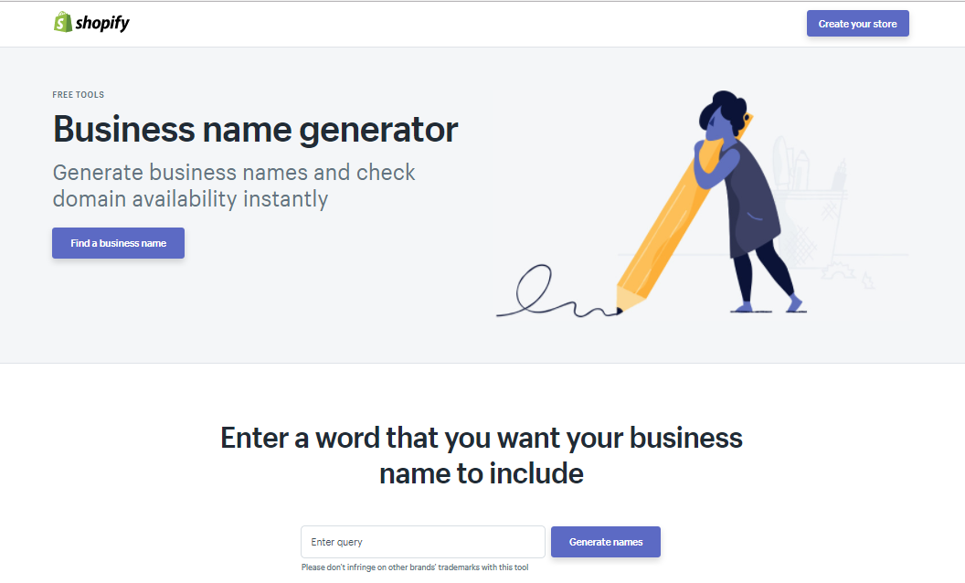
The most successful TOFU tool of all is Shopify’s business name generator. It isn’t a separate subdomain, but it’s a free tool Shopify offers that is killin’ it in Google.
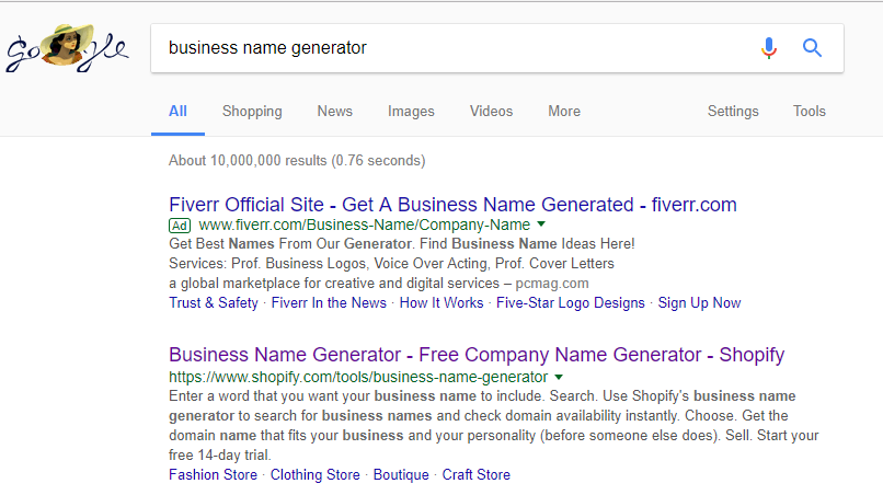
The phrase “business name generator” is searched for tens of thousands of times every month:

And Shopify’s tool is the very first organic listing:
Shopify’s business name generator has done so well that it’s their 5th most popular organic and paid keyword (and it’s one of the few non-branded keywords that made it onto the their top keywords list):
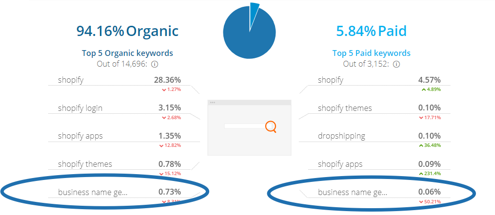
Obviously, this page has been important for Shopify in terms of both organic as well as paid traffic.
More importantly it has strategic business value for Shopify.
If someone is searching for “free stock photos” or “websites for sale”, they might not necessarily be ready for Shopify’s services.
But if someone has chosen their business name, what’s the logical next step? To open up shop!
And Shopify makes that next step crystal clear directly below the business name generator:

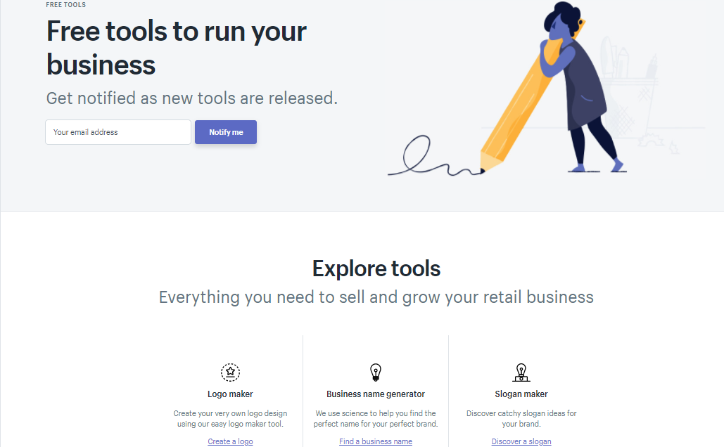
Shopify has 21 “tools” just like this, so they have clearly doubled down on something that works here:
Here’s a quick look at how much global monthly search volume Shopify’s top tools generate with their rank on Google:
| Keyword | Global Monthly Search Volume | Organic Listing For The Tool | Rank |
| name generator | 110,000 | https://www.shopify.com/tools/business-name-generator | 10 |
| logo maker | 90,500 | https://www.shopify.com/tools/logo-maker | 5 |
| purchase order template | 40,500 | https://www.shopify.com/tools/purchase-order-template | 1 |
| gift certificate template | 27,100 | https://www.shopify.com/tools/gift-certificate-template | 8 |
| image resizer | 22,200 | https://www.shopify.com/tools/image-resizer | 7 |
| pay stub | 14,800 | https://www.shopify.com/tools/pay-stub-generator | 4 |
| slogans | 14,800 | https://www.shopify.com/tools/slogan-maker | 3 |
| cpm calculator | 9,900 | https://www.shopify.com/tools/cpm-calculator | 9 |
The takeaway: Build a tool that has strategic value for your business and directly helps your customers solve an annoying problem (Shopify does this with 21 different tools. The most successful helps you generate a new business name based on a word you want your business name to include, where the .com domain is still available) #timesaver
[Tip #5] Master The Article+Video+Podcast Content Multiplier Technique To Generate Millions Of Website Visitors Per Month
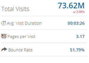
Shopify has a crazy amount of good content on their website that doesn’t require any email opt-in to get it. Just check out their low bounce rate, long average visit duration and high pages per visit:
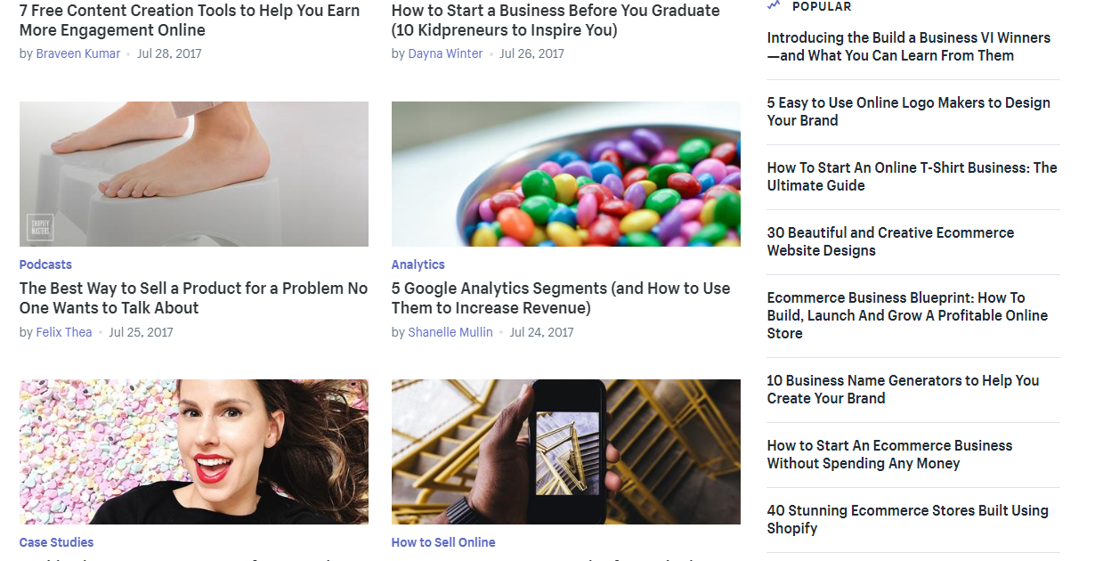
They have a traditional blog which they publish on once per day (it got 27,000,000 page views last year):
The have in-depth guides that give their customers value and position them as an authority (they were downloaded 65,000 times last year):

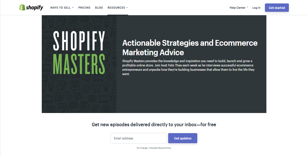
They have a Shopify Masters podcast which gives listeners actionable insights into starting up a store through interviews with successful store owners (it had 1,542,000 listens last year and lets Shopify show off impressive case studies of customers):
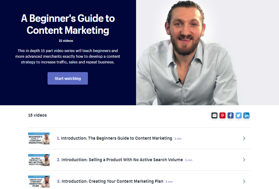
They have 5 step-by-step video courses recorded by ecommerce entrepreneurs for prospects of all experience levels (from beginner to expert level):
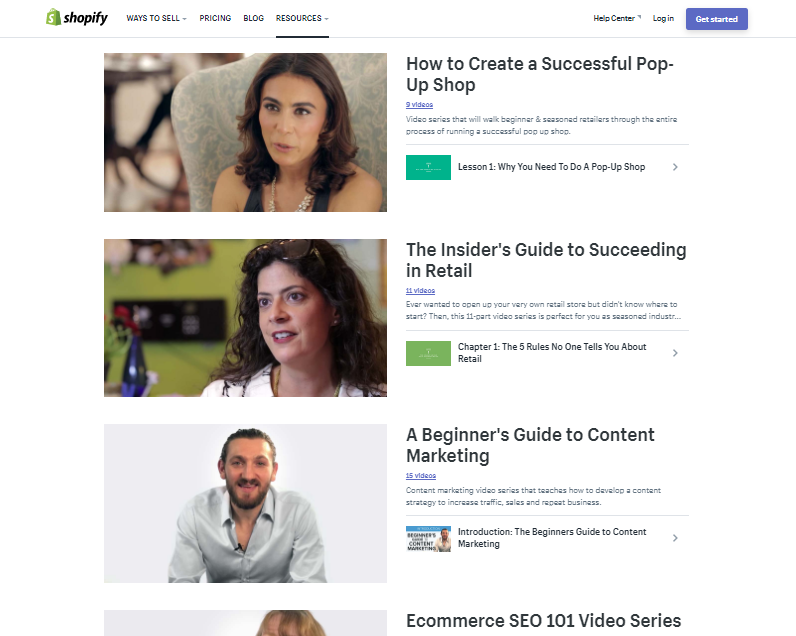
Here is what one of the free video series looks like (it also requires no email opt-in):
They even have a business encyclopedia!
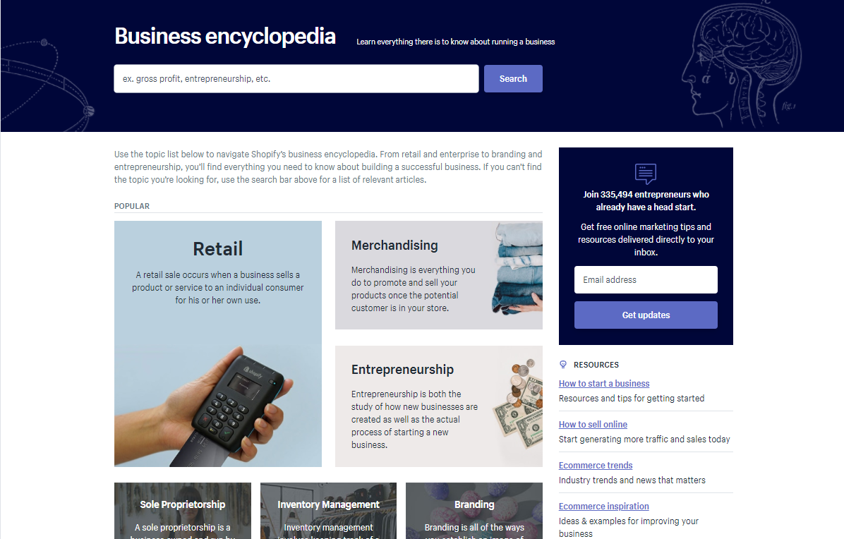
This encyclopedia gives Shopify a bonus SEO boost. It puts them on the first page to answer to all those “what is [business word]” search queries.
If I search “what is retail” on Google, the “retail” page in Shopify’s business encyclopedia is the #1 organic search result:
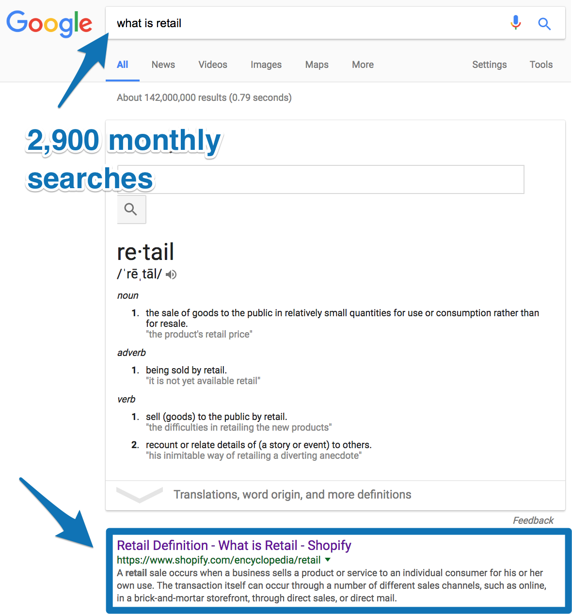
For this 1 keyword, Shopify gets 2,900 monthly search volume (plus traffic for related keywords like “what does retail mean” and “what are retail stores”):

Shopify has optimized their encyclopedia pages so well that it often ranks #1 on Google for the short tail keyword “retail” with 40,500 monthly searches.
As you can imagine, this was a HUGE time and money commitment for Shopify to get all of this content up and running.
Why should they even bother with all that work in the first place? Well, like us here at Sumo, Shopify trusts in the power of content marketing.
Sure, getting the payback from your content marketing strategy can take a loooong time (which is why so many other businesses instead choose to invest in something like paid advertising to get that instant gratification).
But there’s no way Shopify would have bothered putting together all these awesome resources if they didn’t know their effort would be paid back handsomely over time.
Don’t believe me? Then check out their stats from last year:
%(72)
Click here to reveal the content marketing tool Shopify uses
Shopify has put together one of the most advanced content marketing strategies I’ve ever seen.
As you will find out in other tips, part of Shopify’s content strategy revolves around taking their audience’s most commonly searched keywords or most commonly asked questions and building content around that.
But Shopify doesn’t just stop there.
If you can think of a topic, any topic, that’s at least vaguely related to ecommerce, you can bet Shopify has produced some sort of content related to it.
Shopify has literally become your one-stop shop to learn ANYTHING you need to about setting up and running your ecommerce store.
The takeaway: When putting together your content strategy, build content around answers to your customers most common questions. Provide the best answer (Shopify does this with articles, guides, video series, podcasts and a business encyclopedia so their audience can access the type of content they want in the format they like to consume it)
Share this post today for your chance to win
1 Year of Shopify for free.
[Tip #6] The 7-Day Email Onboarding Sequence That Converts Your Free Trial Users Into Paid Customers In 5 Days
Most companies like Salesforce, GoToMeeting and Customer.io who offer a free trial (without credit card) have reported converting less than 25% of free trial users into paid customers.
So, what does Shopify do to combat this?
They set up a killer onboarding process and welcome email sequence that walks customers through the exact steps they need to take to be successful during their free trial.
After signing up for the free trial, this is the sequence of emails prospects receive:

Golden Nugget: Use emojis in the subject line of your most important emails and watch your email open rates skyrocket (Shopify does it in the last 2 emails of their onboarding email sequence to increase open rates).
This is what each of those emails wants you to do:
- Email #1: Feel congratulated (and get on a paid plan if you’re ready)
- Email #2: Sign up for a free interactive training to help you setup your store
- Email #3: Install a free theme
- Email #4: Find stock photos
- Email #5: Find products to sell (if you’re very new to eCommerce)
- Email #6: Claim your domain name before it’s too late
- Email #7: Make sure you get paid
Let’s look at each of these emails more closely.
Email #1: A welcome email with an upsell to the paid plan
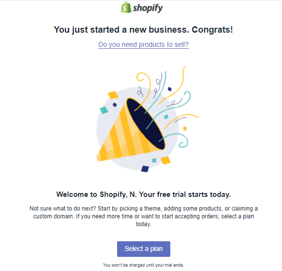
Golden Nugget: That micro-copy you see below the CTA button is making people convert like crazy. I’ll explain.
Initially, I was surprised to see that Shopify is trying to sell their paid plans in the very first onboarding email since they push their free trial all over their website.
But after some analysis, it makes sense.
A free trial offer is a perfect top-of-funnel offer to capture a wide market (both ecommerce beginners and experts). This gets everyone who wants to start an online store signed up and testing out the software.
The offer in the email however is targeted at experienced sellers who are already sold on the idea of Shopify. This email gives them the chance to go ahead and sign up while it’s still fresh in their minds.
And Shopify gives buyers peace of mind knowing “You won’t be charged until your trial ends” with the conversion-boosting micro-copy you can see directly below the CTA button.
Email #2: Sign up for a free interactive training to help you setup your store
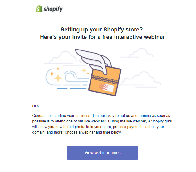
To most people, the thought of setting up an online store sounds like a long and complicated process. But the thought of a live training that guides you through step-by-step makes things sound a lot easier.
The key here is to set your customers up for success, so they see your products value as fast as possible (aka reach their first “a-ha” moment).
Email #3: Install a free theme and email #4: Find photos
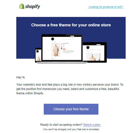
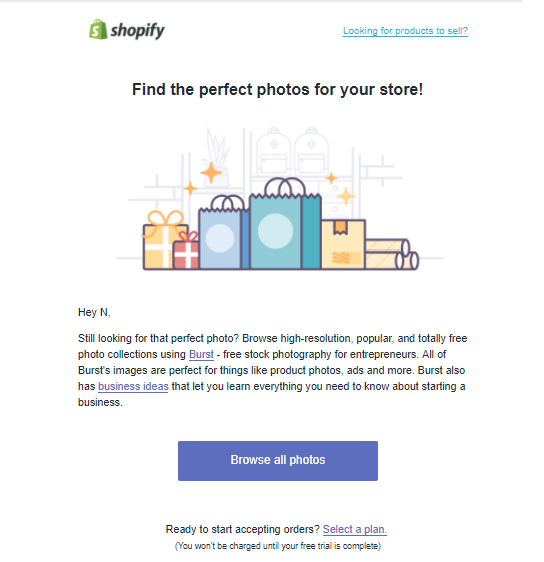
Both of these emails are logical, easy-to-follow baby steps for someone who’s just opened up a store.
Most importantly, these are the 2 most important features Shopify needs you to take to make you a successful paying customer (you aren’t gonna be converting into a paid customer if you’re making no sales… and your store design and product photos are critical first steps to making your first sale).
Also, note the way these 2 emails (and all the other ones before and after it) are laid out:
- Shopify logo
- Bright, eye catching image
- 2-3 sentences of text telling prospects what they’ll find when they click
- Simple CTA button with a personalized call-to-action that matches the content in the email
You’ll also see the option to “Select a plan” at the bottom (this is the CTA Shopify used in the first email and now made it into a secondary CTA) and “Don’t have products to sell?” at the top.
Email #5: What to do if you don’t have any products to sell (addressing your customers most common objection)
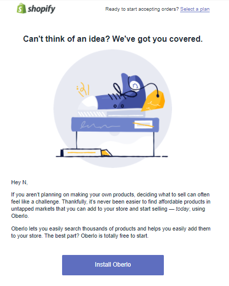
This email is a great way to break down barriers for ‘newbie’ shopkeepers or those who decided to sign up for Shopify on a whim just because they saw it was free.
This email takes them from knowing nothing more than they’d like to open up an online store, to being able to drop-ship products right away:
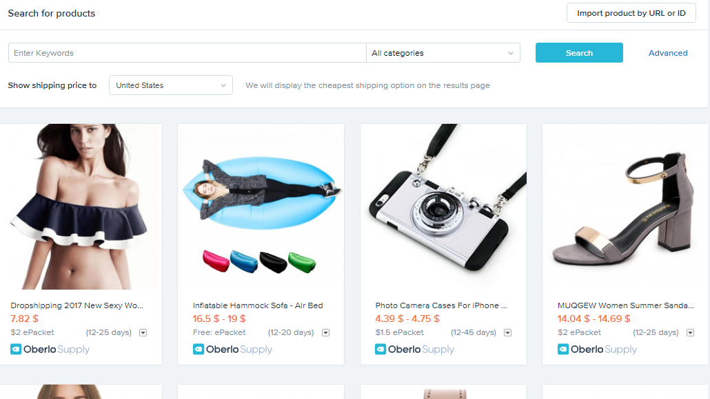
Email #6: Claim your domain before it’s too late
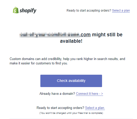
This email starts off with urgency by stating that the domain name given at the top (which will be based on the business name you gave when you set up your account) might still be available.
Naturally, this makes you want to grab that name before someone else does. And once you have officially claimed your domain, your new store moves from imaginary to something much more real.
This is yet another way of getting you fully invested in your online store and pushing you toward a tangible result so it will be harder for you to say no to the paid plan later on.
Email #7: How to get paid
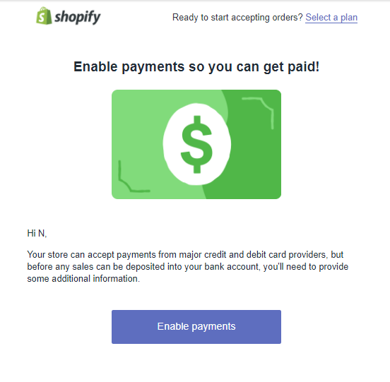
This is the question that’s on everyone’s mind: how do I get paid?
This email is a reminder of one reason why people signed on with Shopify in the first place (to make money) and moves them forward one more concrete step.
This powerful little onboarding sequence shows you that Shopify is there to help you, makes you feel like using the platform will be an easy process and ensures you are more successful later on (since you have a complete understanding of Shopify and all it can do).
The takeaway: All of Shopify’s onboarding emails have just 1 simple action for you take (not 2, not 7… just 1). Try out Shopify’s onboarding email sequence for business:
Email #1: Welcome email that congratulates and offers an upsell for your most aware prospects (Shopify’s upsell is for their paid plans)
Email #2: Email that walks your prospects through their setup, whether this is through a free interactive webinar training, evergreen webinar or merely a video (Shopify offers a live interactive webinar)
Email #3: Email to get your prospects to use the most important feature of your product (Shopify asks you to choose a theme)
Email 4: Email to get your prospects using the second most important feature of your product (Shopify asks you to add product photos)
Email #5: Email addressing your customers most common objection and providing an easy solution (Shopify gives you products you can add to your store to sell right away)
Email #6: Email with some urgency that gets prospects to take a next step and gets them invested in your product (Shopify adds urgency by telling you that the .com version of your domain may still be available and you should check now)
Email #7: Email about something everyone wants to know with a reminder of how you make the process easy (Shopify reminds you to enable payments so you can get paid from major credit card and debit card providers)
[Tip #7] The Get Rich Quick Partner Program: Make Your Partners $11,000 Monthly Recurring Revenue By Getting Them To Build Your Product For You
Shopify is known for having one of the most generous affiliate and partner programs.
There are 3 ways you can be a partner. Here are those options:
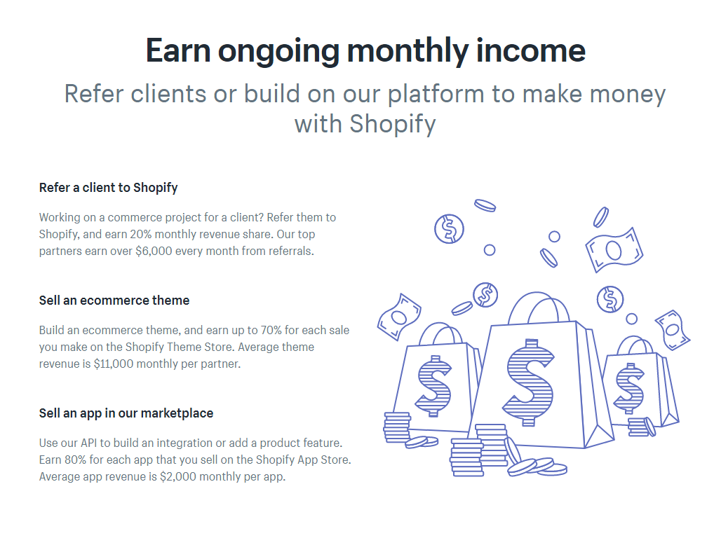
As you can see, the money you can earn through these methods is pretty generous (20% monthly commission for referrals, 70% commission for ecommerce themes and 80% commission for marketplace apps.)
Average revenue ranges from $2,000 to $11,000 per month per partner.
But Shopify’s partner program is limited, to be a part of it, you have to:
a) Work in ecommerce already so you have clients you can refer or
b) Have design and development skills
Which is why there’s also the option of becoming a Shopify affiliate.
If you become an affiliate, you promote Shopify to your followers and offer them a special affiliate link to sign up with.
If your followers sign up with your affiliate link, you get paid. And the payouts are pretty respectable as well:

The purpose of the affiliate program is to make sure people outside of Shopify’s normal audience are being reached. Basically anyone can be a Shopify affiliate.
I saw Shopify affiliate links being promoted by all different types of people:
- Marketers
- Travel bloggers
- Stay-at-home mom websites
This is what an affiliate promotion looks like (this was at the end of a Drop-Shopping Guide article on a travel blogger website):
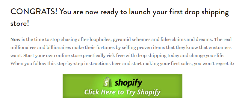
This means Shopify has people in a wide range of fields promoting their product.
And what benefit does Shopify get by dishing out so much cash to their affiliates and partners?
There are two:
Benefit #1: They’re turning a horde of online influencers into an external Shopify marketing team.
This is true for their affiliate program. By incentivizing some nice rewards for each sale an affiliate makes, affiliates will be encouraged to promote Shopify whenever they can.
Benefit #2: They’re getting people to innovate and create new things that make Shopify even better.
Guaranteeing app developers and theme designers a portion of their sales encourages them to create things for Shopify instead of for other platforms.
This helps make sure Shopify can keep the best ideas, apps and themes for themselves.
And Shopify makes sure to give affiliates and partners what they want and need to be successful. This includes marketing material (like ad banners and templates) and a monthly affiliate newsletter.
This will not only get more people interested in becoming affiliates and partners, but also makes sure the affiliates and partners are actually successful.
The takeaway: Build a Partner Program designed to make both you and your partners rich. Be generous by paying high commissions that incentivise your partners to promote you (Shopify does this by paying partners anywhere from 20% to 80% commissions).
[Tip #8] Steal One Customer A Day From Your Competitors Using This 2-Step “Light Switch Technique”
When I type “shopify” into Google, these are the results I get:
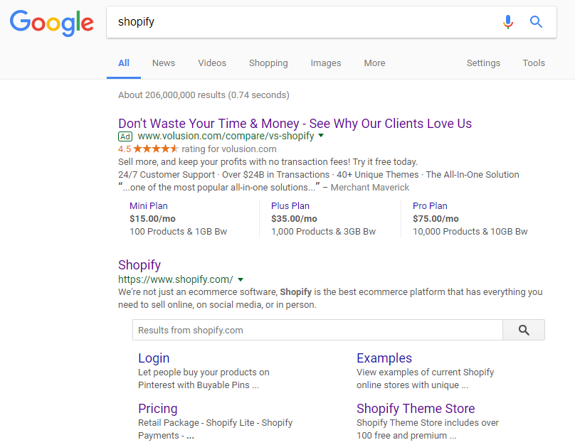
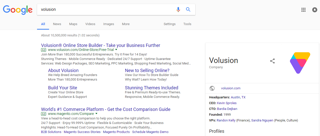
You see that first paid search result? That’s Volusion.
One of Shopify’s competitors.
They want to steal Shopify’s traffic and hopefully convince people to choose them instead.
Their landing page tries to make that loud and clear:
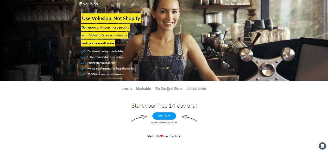
Volusion’s landing page isn’t great and I wasn’t convinced that their offering was better than Shopify’s due to the weak copywriting that doesn’t say exactly why they are better than Shopify.
They should take a look how Drift is stealing Intercom traffic (that’s how you do it right).
Still, the original PPC ad was intriguing enough that I clicked on it in the first place and this is definitely a tactic you can use to steal clicks from your biggest competitors.
Volusion isn’t the only ecommerce solution that’s trying out this tactic. A search for “volusion” on Google brings up a PPC ad for Magento, another competitor:
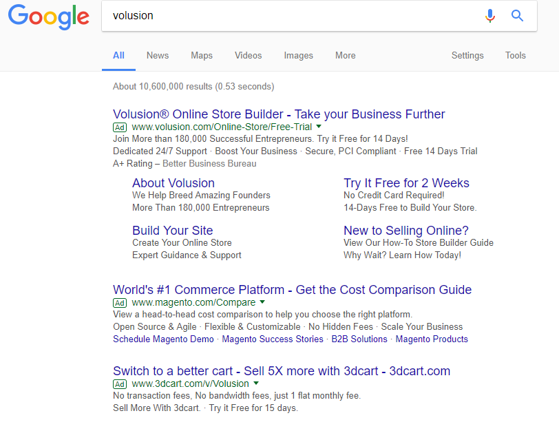
Shopify takes a slightly different approach to stealing their competitor’s traffic: instead of trying to lure in potential new prospects, they try to get people who are already customers on another platform to switch over.
For example, if I search “magento” (that same competitor that was bidding on the keyword “volusion” above), here’s what I find:
A large percentage of people search for a brand name to login. If you can research why your customers switch from your competitor to you, you can use that in your ad copy to highlight your why you are better to win their click and make them switch.
Shopify does this by highlighting they are lower cost and less of a headache.
If I click the Shopify ad, here’s the first thing I see:

Golden Nugget: Use the 2-step “Light Switch Technique”:
Step 1: Uncover the big hairy pain point your competitors customers have
Step 2: Convince them to switch to your solution
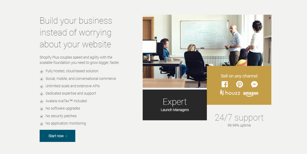
Right away, I can see that the goal of this landing page is not just to tell me why Shopify is better, but make sure I know it’ll be easy to migrate to (which is one of people’s biggest concerns if they have to switch platforms).
It then goes on to do this with a breakdown of Shopify’s benefits:
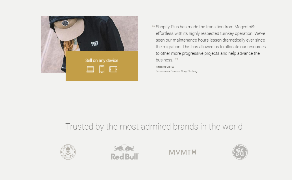
And to finish, a bit of social proof boosts trust and reminds prospects again how easy the switch will be:
The takeaway: Match the offer in your ad and on your landing page to solve the biggest pain people have with your competitors (Shopify does this by addressing people's concern of migration and offering them a dedicated launch manager to make switching from competitors hassle-free.)
[Tip #9] The New “Growth UX” Product Update Page That Gets Over 2,000 Social Shares Without Any Social Sharing Buttons
This Shopify Year In Review page is a sick piece of content for a yearly product update.
It reminds me of Sumo’s $1.5M name change page which was the most shared piece of content on Sumo.com this year until my Tony Robbins article beat it.
For Shopify, this one content piece had generated 2,400 shares and 40 links (41 now) without any social sharing buttons on the page:

Imagine how many more shares this page could have with Sumo Share 😉
Here is just one of the sections from Shopify’s Yearly Product Update page where you can see Shopify’s merchant growth YoY with a well-designed interactive data visualization and global map:
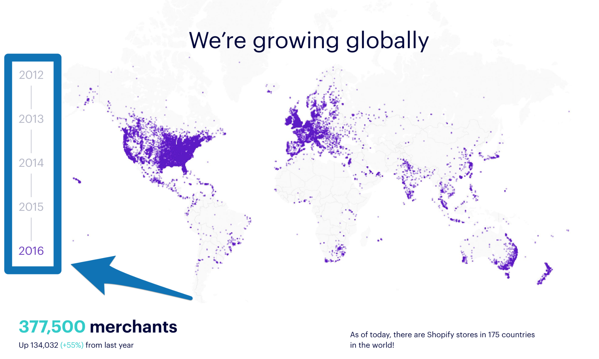
To replicate this for you own yearly product updates, here are the key sections Shopify use to showcase their growth performance:
- Section 1: Headline and subheadline ie: [Year] in Review
- Section 2: Major feature releases, events and company milestones with a link to the landing page to “Learn More” ie: Highlights of [Year]
- Section 3: Global customer growth by year
- Section 4: Global customer growth by continent
- Section 5: How many of [X metric] your customers did
- Section 6: How many of [X metric] the customers of your customers did by year
- Section 7: How many of [X metric] the customers of your customers did on Desktop vs Mobile by year
- Section 8: Total revenue growth by year
- Section 9: Companies you acquired, apps you added to your app store and partners you added to your partner program
- Section 10: Content engagement stats for blog page views, podcast listens, guide downloads, Facebook engagement, Twitter engagement, Instagram engagement, support emails, support chats and support calls
- Section 11: Scaling stats for number of employees, number of offices and number of remote employee countries
- Section 12: Closing tagline with links to your Facebook page, Twitter page, LinkedIn page and company website
The takeaway: Stop posting boring product updates to your blog all the time. Instead, build a well-designed interactive product update landing page you can update every month/year that you are proud to share and your fans are proud to share (Shopify does this with their “Growth UX” Year In Review product update page that’s been shared over 2,000 times.)
[Tip #10] This TOFU/MOFU Paid Search Funnel Hack Is The Exact 1-2 Punch You Need To Convert Your Cold Traffic Into Warm Leads
As I’ve said a bunch of times in the article already, Shopify has the challenge of appealing to a wide range of audience members. But one way they make this possible is by creating super specific PPC landing pages that vary based on the prospect’s keywords and specificity of their search intent.
Here are 2 examples of Shopify’s paid search funnels that show you exactly what I mean:
Paid Search Funnel #1: TOFU (aka Top-Of-Funnel) Search Intent
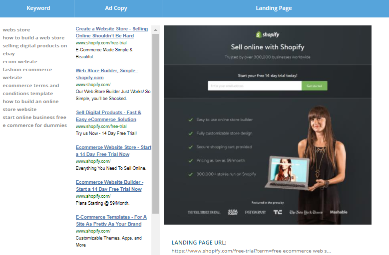
Even if someone puts in a more general search query about online business and selling online, Shopify knows better than to get the click with a generic PPC ad or send prospects to the homepage.
To start, they set up their PPC ad copy to match your search intent. Each ad highlights one of three main selling points: Shopify’s free trial, low-cost plans or ease of use (with words like “simple”) as an extra reason for people to click.
Then, they send prospects to a landing page that is short, sweet, yet still offers up features that would appeal to anyone who plugged in those search terms.
Paid Search Funnel #2: MOFU (aka Middle-Of-Funnel) Search Intent
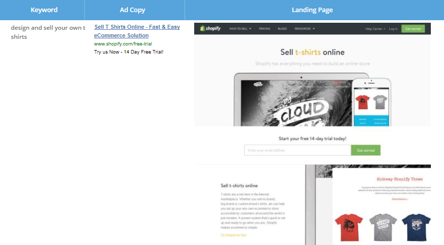
If someone types in a phrase like “design and sell your own t shirts,” they are obviously looking for a very specific result. They don’t want to read the overarching “Shopify is for everyone” message on Shopify’s homepage.
They want to read about how Shopify suits their t-shirt selling needs. So, Shopify makes sure to deliver with PPC ad copy that starts with “Sell T Shirts Online” and a matching landing page about selling t-shirts online that reflects exactly what the searcher wants to see.
And as an added bonus? Google AdWords rewards landing pages that are highly-relevant to their PPC ads with a better quality score and lower click costs #doublewin
The takeaway: Setup different PPC funnels for your top-of-funnel keywords and middle-of-funnel keywords to convert more clicks into sales (Shopify does it by matching 5-10 TOFU keywords with 1 landing page and 1 MOFU keyword to 1 MOFU landing page.)
[Tip #11] The 5-Step Integration SEO Technique You Can Use To Land First Page Google Rankings For High Volume Branded Keywords
This is the exact same SEO strategy I saw in our breakdown of Slack’s marketing strategy. Though Shopify gets 27 million blog page views and has a strong SEO strategy thanks to all the content marketing they do, here's an added tactic they use to generate even more traffic.
Shopify has a huge variety of apps[*], plugins and integrations (1,400+ in total) that customers can tie in with Shopify’s platform.
Many of these are well-known, very successful companies that people regularly search for (like Sumo).
So, how does Shopify leverage this?
By creating individual, keyword-filled landing pages for every single app they partner with. Many of these landing pages then show up in one of the first few pages of Google search results.
For example, if I type “mailchimp” into Google, I find this organic listing on the first page:

Clicking the result brings me to this landing page in the Shopify app store:
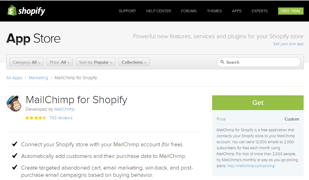
Quickbooks and many other Shopify integration partner names have similar landing pages.
Here’s Sumo’s Shopify integration landing page
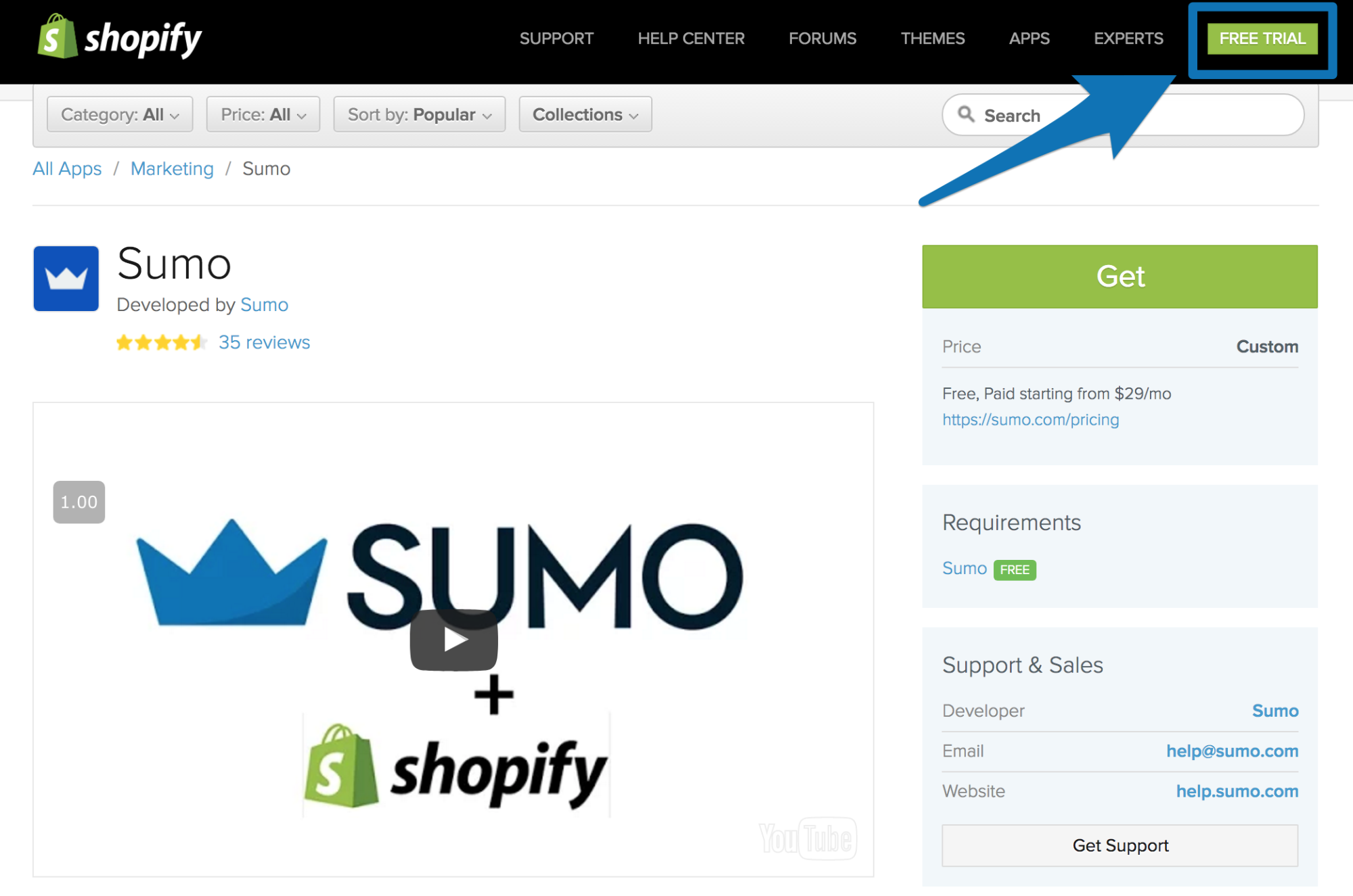
If you run a Shopify store and like free money, check out Sumo’s new discount codes that detect when people are about to leave your website and give a % off to people who give you their email:
Shopify uses integration partners like Sumo to boost SEO and have you download the app. But they also use the landing page to get you to grab your Shopify free trial (the green button in the upper right).
To optimize for on-page SEO, many of the pages follow this 5-step sequence:
1) Headline at the top with the name of the integration
2) A 3 bullet point summary of the integration
3) A brief description of the integration
4) A bullet point list of major features once you have the integration
5) Customer reviews
Not all of the pages have the full 5 steps in the sequence (Step 2-4 are written by the integration partner). Yet, these pages are still ranking in Google (as you can see in the table below). So, they’ve clearly found the sweet spot for which of the 5 steps are most essential for SEO (step 1, 2 and 5).
This table breaks down some of Shopify’s most highly trafficked app-based organic keywords, their monthly search volume, the landing page they bring you to, and their first page Google ranking.
| Keyword | Global Monthly Search Volume | Organic Listing | Rank |
| quickbooks | 368,000 | https://apps.shopify.com/quickbooks-online | 6 |
| locksmith | 165,000 | https://apps.shopify.com/locksmith | 8 |
| countdown timer | 110,000 | https://apps.shopify.com/powr-countdown-timer | 6 |
| google shopping | 110,000 | https://apps.shopify.com/google-shopping | 6 |
| zendesk | 40,500 | https://apps.shopify.com/zendesk | 2 |
Shopify is using this integration SEO technique to build brand awareness for high volume keywords.
The takeaway: Build simple, SEO-rich app integration pages to get your own app featured on the first page of your integration partners branded keywords (Shopify does this with 6 specific on-page SEO optimization tactics.)
[Tip #12] Use This 8 Section “Mass Market” Homepage Layout To Sell To Both Beginners And Experts
As marketers, we often hear that you should direct your marketing message to appeal to the 20-30% of prospects most likely to buy.
But that’s NOT what Shopify does. They just work with too many different types of audience members with too many levels of awareness, background and ecommerce experience for this to be possible.
This means Shopify has to find a way to reach everyone from people who are dreaming of setting up their first online store, to those who are already a well-established big box store.
And there’s no better place to see how they do this in action than on their homepage.
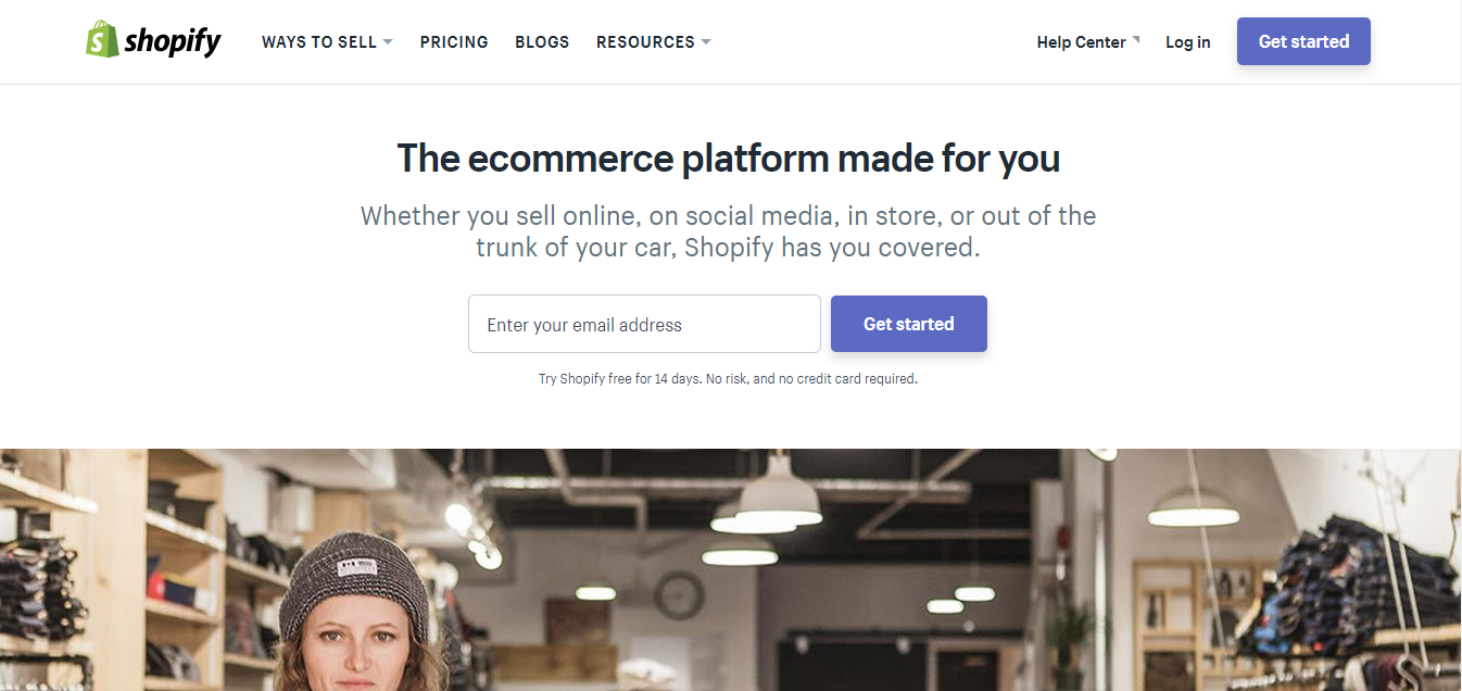
The very essence of the headline above-the-fold is that Shopify is something that works for everyone.
Like most companies with a free trial option, Shopify also makes the free trial their first CTA. Free trial CTAs are enticing and low-commitment buttons that don’t need to do a lot of convincing to get clicked on. This makes it the perfect warm-up CTA that’ll appeal to any audience member.
Next up is a 3-picture rotating sequence of successful shop owners:

Once again, this section further solidifies the message of Shopify being the “go to” ecommerce store option, no matter who you are. All 3 women in the images run very different types of stores, but have still been successful.
This helps less aware prospects imagine the possibilities while also convincing more aware buyers of Shopify’s usefulness.
The next section moves forward by breaking down a major hesitation: that setting up an online shop will be complicated. Instead, this is the message Shopify wants to put out: you can open up a successful ecommerce store even if you don’t have all the technical skillsets.
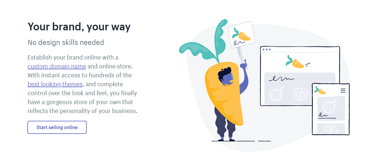
This is an effective message to offer prospects who are early in the sales cycle and still trying to gauge how difficult it actually is to set up an online store.
This little reminder also makes sure these early prospects don’t just throw up their hands in the air and give up because they feel overwhelmed so soon.
Then comes a breakdown of Shopify’s features in scannable bullets:
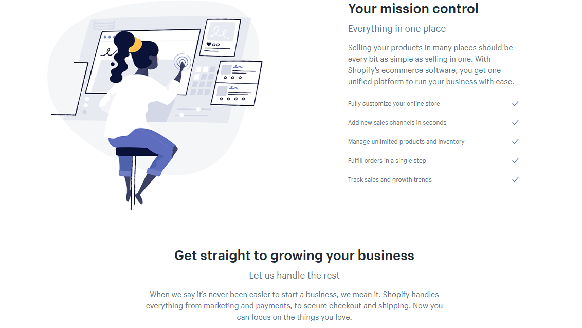
This is Shopify continuing to hone in the message everyone wants to hear: this will be easy and we’re to help.
But there’s one quick thing we have to talk about here. Why use text links instead of a CTA button?
Shopify knows that customers coming to its website have a lot of questions. So, they want to let website visitors self-direct themselves to the most appropriate next-step for them.
Shopify considered how its typical audience members feel when landing on the website. They are probably either:
- New to the process and overwhelmed and intimidated or
- Already using another ecommerce platform and frustrated that they have to make a big switch.
So, if someone who’s feeling either overwhelmed, intimidated or frustrated landed on Shopify’s homepage to a barrage of glowing CTA buttons, how do you think they’d feel?
Chances are, it wouldn’t make them feel any better.
But by instead making these text links, Shopify is able to give prospects clear access to a lot of extra info without overloading them….especially if they are new.
In this way, this also allows Shopify to direct more experienced audience members to the info they are ready for without getting too in the face for everyone else.
In the following section, Shopify drills home the idea of their platform working for any seller with these real-life examples that you can click through:

This would be a perfect place to link some case studies or personal success stories, but this was not something Shopify chose to do.
Towards the bottom of the homepage, Shopify has 3 social proof points and 3 testimonials. This social proof proves to people that Shopify are a big business they can trust:
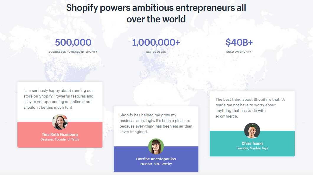
After that is a quick summary of Shopify’s features and a CTA:
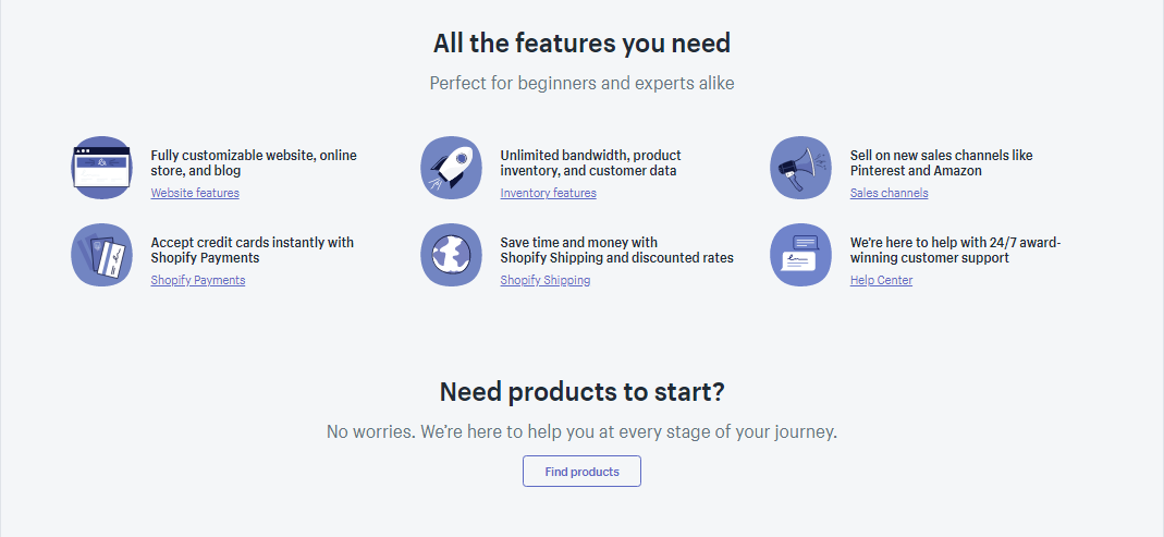
Pay close attention to the arrangement of this section here.
The features section appeals to buyers with more awareness that are already savvy about the product.
But to make sure this section isn’t off-putting to less aware and less experienced buyers, they have a follow up question to rope them in: “Need products to start?”
If you’re someone who’s just starting in the ecommerce world or have only ever thought about it, this is Shopify acknowledging that they’re still useful to you.
They say this pretty openly with the phrase “We’re here to help you at every stage of your journey” just below the question.
Finally, the homepage finishes with a final CTA for Shopify’s free trial:
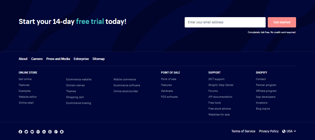
The takeaway: If you serve a wide audience like Shopify does, have sections on your homepage that appeal to both people starting out and more experienced buyers.
Shopify does it by splitting its home page into the following sections:
Section 1: Headline and call-to-action that speaks to everyone
Section 2: Social proof (3 customers selling different products)
Section 3: Overcome 3 most common objections (needing design skills, setting up a custom domain and having a good looking website)
Section 4: Overcome another objection (one place to sell everything)
Section 5: Social proof (5 customers selling different products)
Section 6: Social proof (3 macro company data points and 3 testimonials)
Section 7: Features (6 core features of the product)
Section 8: Call-to-action
[Tip #13] Get Your Tweets Broadcast To Your Customers Followers By Opening A Twitter Support Channel
You already know customer feedback is super important both for dealing with customer support as well as getting insights into product improvements.
This is true just as much for SaaS companies like Shopify, as is for companies in other fields.
And this is exactly why Shopify has made it a point to put their customers and audience at the forefront of all they do.
Tobias Lütke said it best: “your audience is your lifeblood.”
Just one way Shopify puts their customers first is by making themselves available 24/7 to help out.
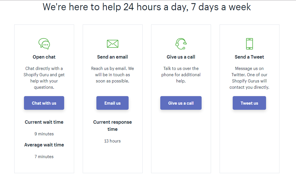
The Shopify customer service team means business. Just look at the number of exchanges their support team had with customers last year:

Twitter is Shopify’s most important channel for customer feedback, support and service.
Alongside their official Twitter account, Shopify set up a specific Twitter account dedicated purely to Shopify Support issues:
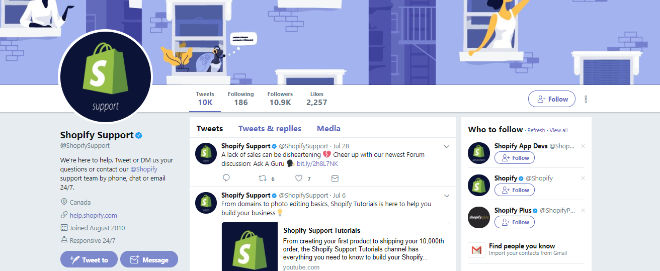
This not only makes things extra convenient for customers, but gives Shopify a chance to show the world just how good their customer service is (meaning other people can see exactly how Shopify talks to its customers).
If you look, you will find Shopify replying back to tweets in a way that is friendly, helpful and timely:
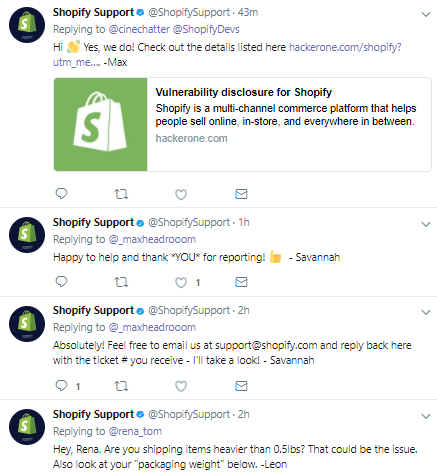
Plus, if you provide great customer experiences on Twitter, you’ll generate more positive awareness for your brand.
Here’s what Tobias Lütke had to say about it in an interview:
“What happens regularly and this is so amazing about Twitter… if someone from our support team puts up a new mini application for just one customer, solves one problem and goes above and beyond, that customer might go on Twitter and say, ‘Hey that was so amazing what Shopify did for me’.”
And before you know it, this tweet about Shopify is being broadcast to all of that customer’s followers…opening up Shopify to a whole new audience.
The takeaway: Show the world your world-class customer service by having a public forum for your customers to ask support questions and get answers (Shopify does this by offering customer support on Twitter in addition to chat, email and phone.)
[Tip #14] Convert Your New Email Subscribers Into Product Signups On Day #1 With This 3-Step Value Builder Newsletter Sequence
There’s a lot of companies out there that make their newsletters either:
- Unappealing to sign up for or
- Boring even after sending to subscribers
Shopify breaks out of that mold in both aspects.
To start, look at how they introduce their newsletter at the top of their main blog page:
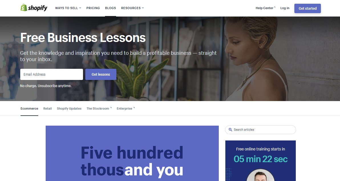
And as a CTA at the bottom of every post:
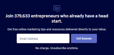
Click here to reveal the email collection tool Shopify uses
Instead of making a CTA that says “Subscribe” like everyone else, their CTA is “Get lessons.” But let’s be honest. When you type in your email and click that button, what you are really signing up for is a newsletter.
Yet, calling on prospects to “Get lessons” is an unexpected and far more appealing twist than simply subscribing to yet another newsletter.
Then, instead of a normal, dull welcome email, their welcome email is a super useful gem offering subscribers to “Get your free blueprint.”
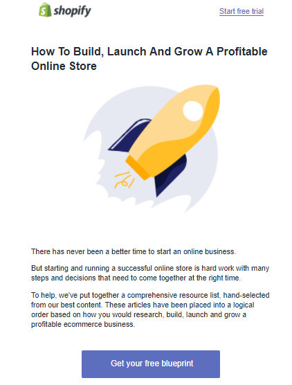
In essence, all this is doing is directing subscribers to a “resources” page…but they’ve managed to make it sound much more exciting by swapping out that word out for “blueprint.”
This resource-page-in-disguise links to a bunch of other content and gives readers the exact steps they need to set up their store.
The page also has strategically placed CTAs throughout, like this double mention of the dropshipping training/webinar we talked about in Tip #7:
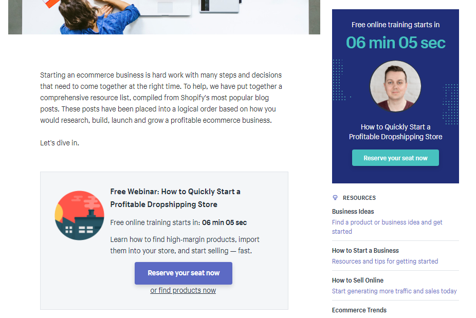
And of course, a call on readers to put all this new knowledge to use by “Getting started straight away with a 14-day free trial”:
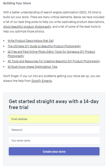
You can see the whole page here.
In summary, here’s the type of generic newsletter sequence you usually see:
“Sign up for newsletter” → “Get free resources” → “Sign up today”
But with Shopify, this newsletter sequence becomes:
“Free business lessons” → “Free blueprint” → “Free 14-day trial”
Which sequence is more appealing?
The takeaway: Customize your calls-to-action to match what your customers desire (Shopify appeals to entrepreneurs desires by offering free business lessons, a free blueprint and a free 14-day trial.)
[Tip #15] The 1% Social Hack: Be 1% Better Than Everyone Else To Get People To Share Any Page On Your Website
As we saw in the example above, Shopify likes to do things in their own unique, slightly unexpected way.
In an interview on Hubspot’s podcast “The Growth Show”, Shopify’s Chief Marketing Officer Craig Miller explained that all you need to do is put a little extra effort into places where other companies don’t to get yourself noticed:
“People have tweeted about our Terms of Service, because our TOS has the stuff written by a lawyer on the right hand side and someone actually took a crack at trying to explain what all the legal jargon means on the left.
Most people don’t think about it, but we took a little bit of effort and created something that we thought was a little bit different, a little bit better, and we’ve literally seen people tweeting “OMG, Shopify has the best TOS I’ve ever seen in my life.”
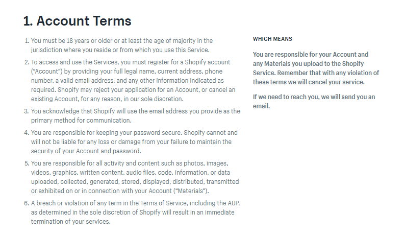
Craig then continues on to give another example of how they liven up the customer experience with minimal effort:
“You logged out of Shopify. Instead of simply saying ‘You logged out of Shopify,’ it would say have a good afternoon/morning/evening. Literally just 3 lines of Javascript, but people comment on that [and say] ‘that’s so cool, I love logging out of Shopify.’”
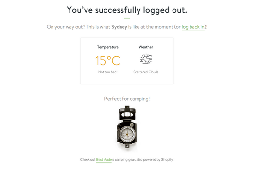
The takeaway: Do the small things better than everyone else if you want your brand to be remarkable (Shopify does this with their Terms of Service and log out screen).
15 Key Takeaways From Shopify's 90% Revenue Growth
When it comes to marketing and skyrocketing growth, Shopify knows what they’re doing.
And now that I’ve lifted back the curtain and shown you how to do the same, it’s time for you to pick a tip and test it out yourself.
Here are the 15 key takeaways:
- Do more than just offer a free trial. Find a way to make your free trial so sticky that prospects can’t help but convert to a paid plan.
- Sometimes, people need a push to get started on something new like your product. Give them that push by setting up a contest where they can win a big prize.
- To really catch the eye (and the leads) of people on your website, set up an evergreen webinar on something you know many of your customers are interested in. Bonus points if you can squeeze some urgency in there.
- Help your customers solve a problem by building a free, useful tool. Not only will this make customers love you, it’ll also help you show up in Google when people search for solutions.
- Stuck on what type of content to create? Build your content strategy around your most common customer questions. Then, answer those questions in several formats (videos, guides, podcasts, etc.)
- Set up an easy-to-follow onboarding email sequence that gives new customers just 1 simple step to take (and don’t try to overwhelm them with all they need to do at once).
- Design a partner program that makes both you and your partners rich. Be generous in your commissions for best results.
- Steal your competitor’s traffic with ad copy and a landing page that solves the biggest pain people have with your competitors.
- Stop publishing boring product updates. Build the ultimate “Year In Review” landing page for your company that you can regularly update. You will be proud to share it and so will your fans.
- Set up PPC funnels that match where your prospect is in the buying journey. Shopify does this by sending 5-10 TOFU keywords to 1 TOFU landing page, and 1 MOFU keyword to 1 MOFU landing page.
- If you have integrations, make sure you use them in your SEO strategy. Do this by creating individual SEO-rich app integration pages that get your app page featured on the first page of your integration partners keywords.
- Don’t listen to the naysayers that say it’s impossible to sell to a wide audience. Be like Shopify and split your homepage into sections so you can appeal to all types of prospects.
- Show the world your high-quality customer service by taking it to a public platform that doesn’t hide anything (Shopify uses Twitter for this reason).
- Customizing your CTAs to match what your customers really want performs better than boring, generic CTAs.
- When it comes to standing out and being memorable, it’s the little things that count. Be 1% better to get your brand shared more.
Share this post today for your chance to win
1 Year of Shopify for free.
Related Articles
%(relatedarticles)
Add A Comment
VIEW THE COMMENTS