Shopify is an incredibly big deal for ecommerce businesses:[*]
- 800,000 merchants use their platform in 175 different countries.
- 1 billion people have bought from Shopify stores in the last 12 months.
- Shopify merchants sold $14 billion worth of products in Q4 2018 ($4.9 billion more than Q4 2017).
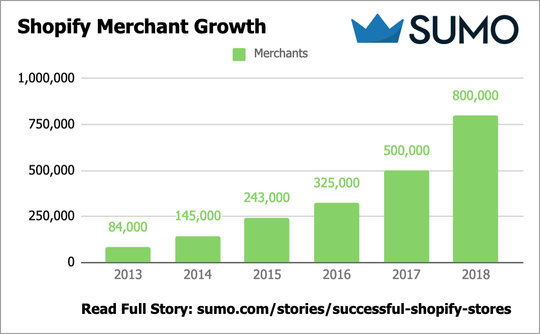
But increased attention and influx of merchants to the Shopify platform means more difficulty for YOU.
Standing out among a sea of great stores is no easy task.
Whether you’re already up and running or you’re thinking of getting started, we’ve put together a list of seven incredibly successful Shopify stores to help provide invaluable inspiration so that you can kick some major ecommerce booty starting today.
Let’s do this.
%(tableofcontents)
Shopify Store #1: SkinnyMe Tea [Shop With Messenger]
Key Takeaway: SkinnyMe Tea seamlessly integrates Facebook Messenger into their store to provide shoppers with an on-demand shopping experience.
Over 1.3 billion people worldwide now use the Facebook Messenger platform every month to send messages to friends and family, receive news and updates from their favorite brands, and yes, shop.[*]
Messenger chatbots are swiftly taking the Shopify ecommerce world by storm and SkinnyMe Tea is capitalizing on what is a massive opportunity.
It all starts with their homepage. Shoppers’ eyes are drawn to the small blue icon in the bottom right-hand corner of the screen:
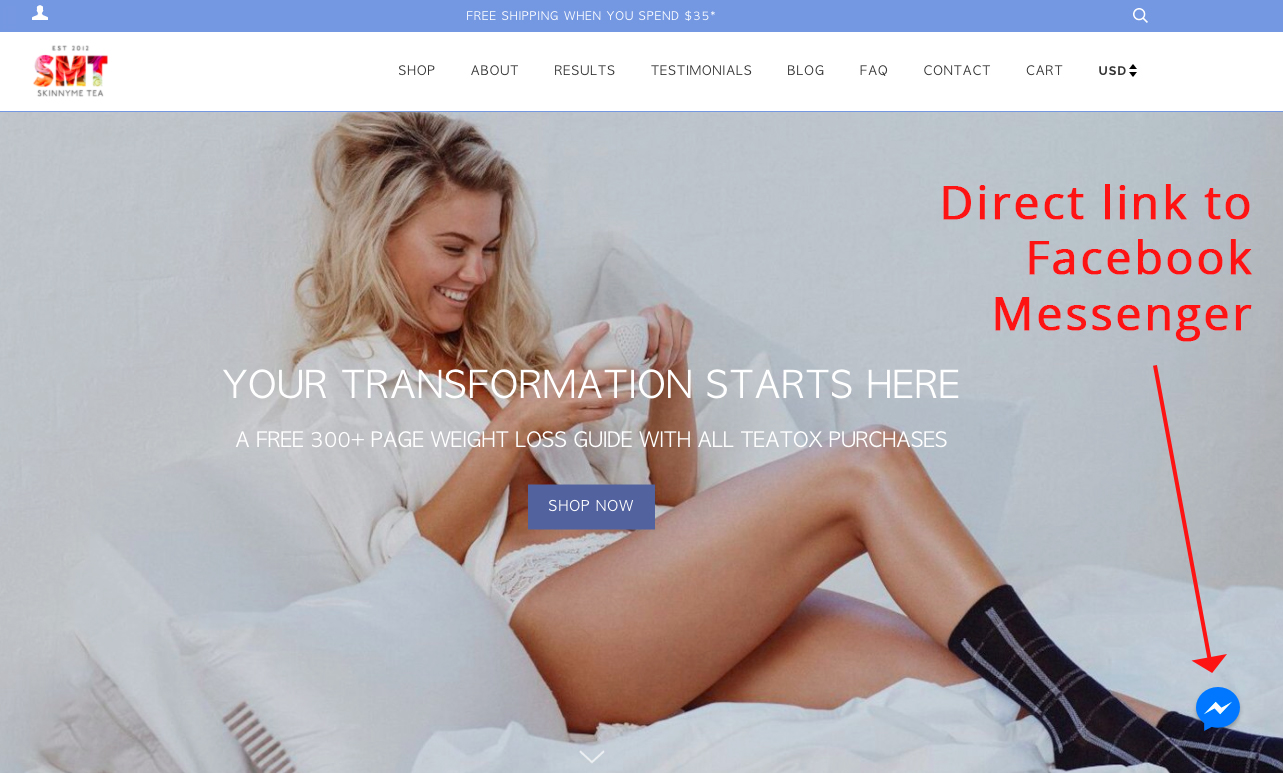
Casual visitors and shoppers alike are presented with the Messenger option that leads directly to a customized sales funnel set up by the SkinnyMe Tea team:
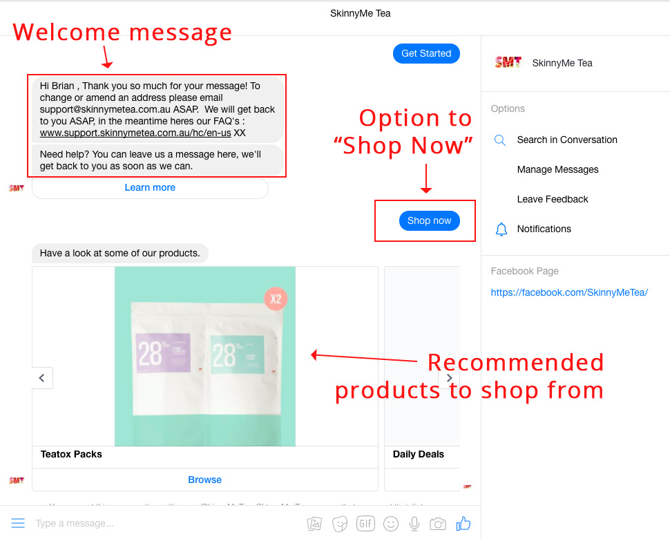
The image above shows the seamless transition from their website to the Facebook Messenger platform. Users see a casual welcome message and an option to “Learn More” or “Shop Now”. Naturally I selected “Shop Now” which immediately presented me with a variety of pre-selected products.
I was interested in Teatox Packs (because of the clever name), and after selecting “Browse” I was presented with several of their Teatox Pack options:
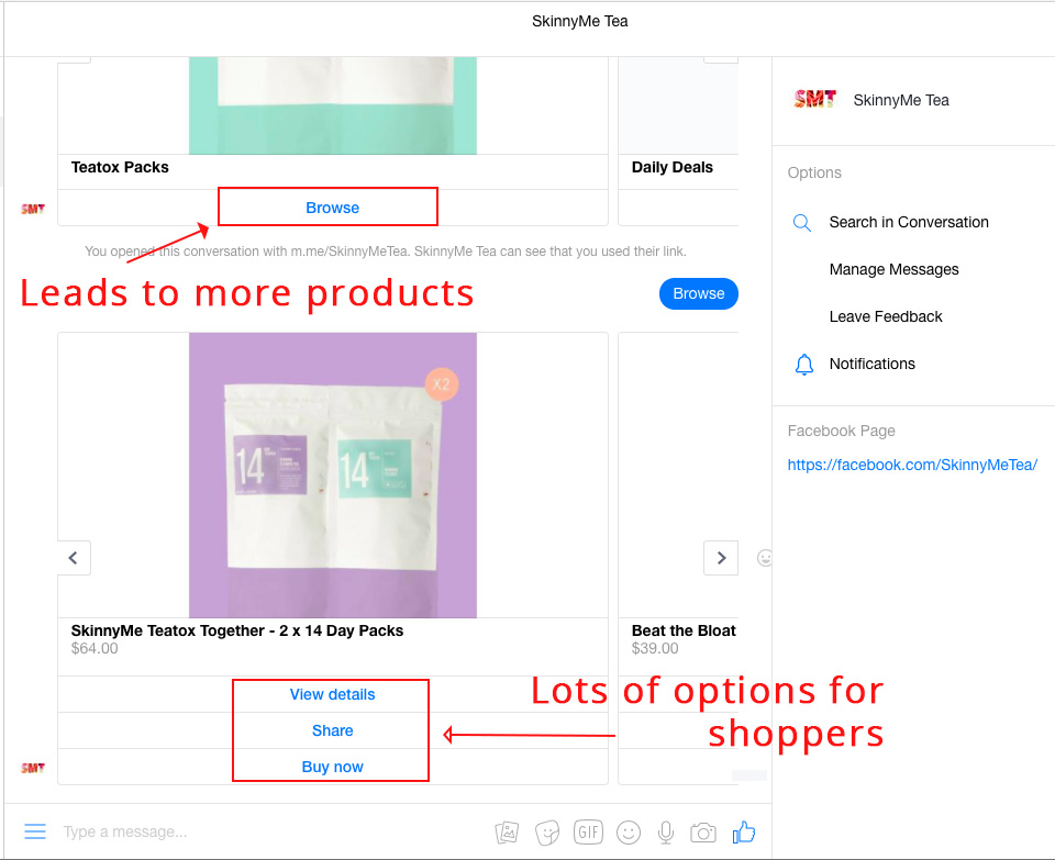
There’s the beauty of utilizing the exclusive Facebook Messenger integration in your Shopify store—the ability for shoppers to learn more about your products or even “Buy now” with the click of one button. Cha-ching![*]
The biggest benefit of Facebook Messenger on Shopify is that Shopify provides a simple integration for online stores to get started with Messenger right away.
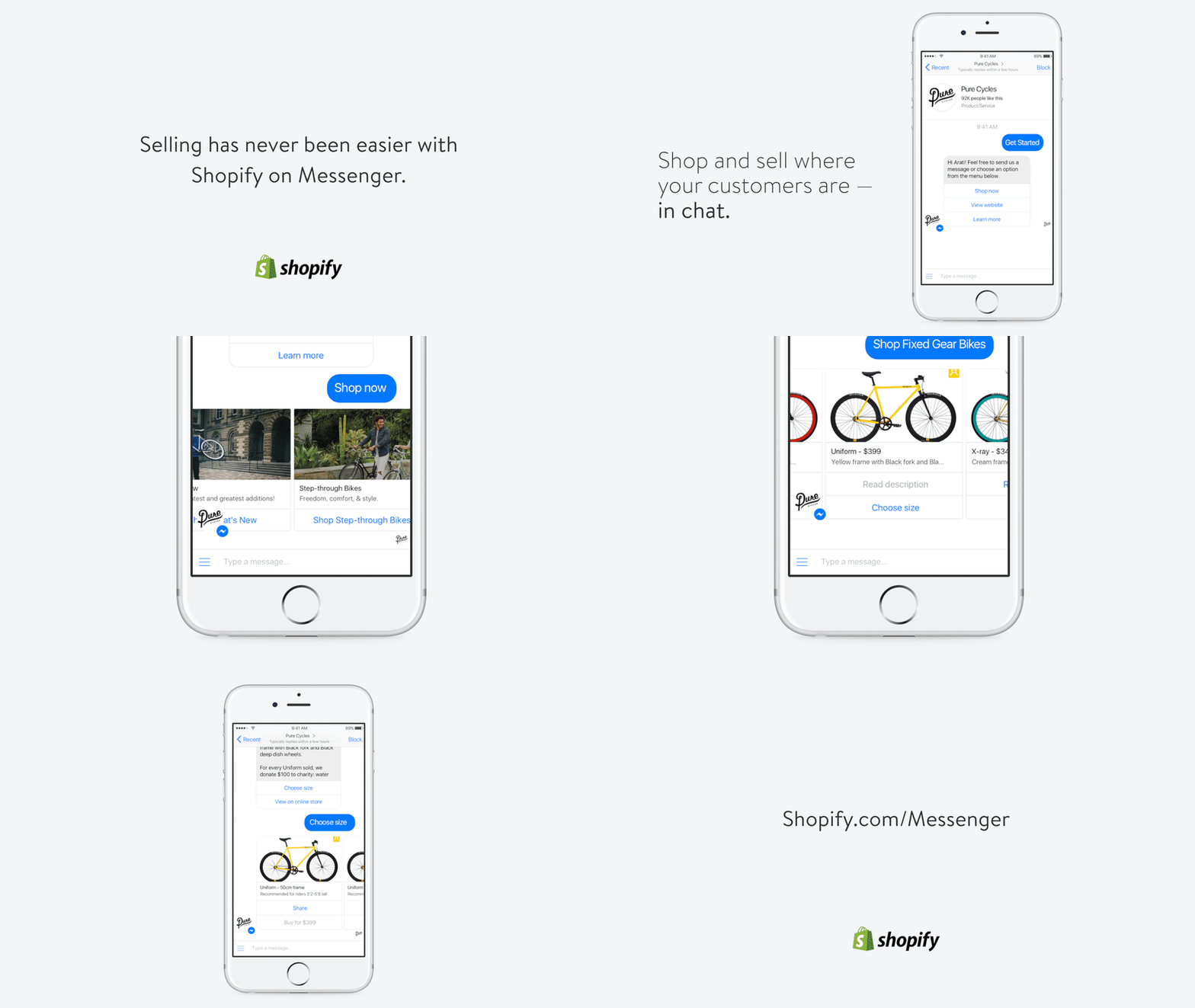
Using Shopify’s Messenger sales channel, visitors are provided with a “Shop Now” option which immediately shows a merchant’s product catalog and lets them tap or click to browse and buy. The purchase is made directly through Shopify’s checkout portal, which operates exclusively within Messenger.
Shopify Store #2: M2S Bikes [Cart Abandonment Cash Machine]
Key Takeaway: M2S Bikes, an electric bike company in North Carolina, USA used one cart abandonment popup to generate $51,994.28 in sales in 50 days.
Website popups flat-out work. Our research shows the top popups average a 9.28% conversion rate.
In fact, Sumo users collected 23,645,948 email addresses with List Builder popups in less than two years. Email addresses they can now use to grow their ecommerce businesses and increase sales on Shopify.
Successful Shopify companies like M2S Bikes use a behaviour-based popup to capture email leads on their shopping cart page, then get them to convert into sales straight away using discount codes.
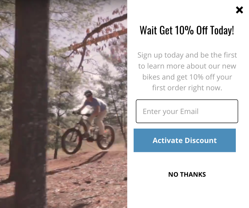
Popups can be intrusive and annoying when done incorrectly, but this one is different. It contains a simple, valuable CTA to get 10% off your order and people only see it when they’ve added something to their cart, then try to attempt to exit the page.
Here are the sales results from M2S Bikes popup looks like:

As you can see offering shoppers who are about to abandon their cart 10% off for simply finishing their order makes purchasing nearly irresistible. Even if visitors don’t purchase right away they’ll have an extra incentive to come back in the future.
All-in-all, here are the results of this one cart abandonment popup:
- 577 people saw the popup
- 130 entered their email
- 26 redeemed the discount code
- $51,994.28 sales made in 50 days
What made this popup so successful was that M2S Bikes used Sumo’s Reduce Cart Abandonment Shortcut (available on Sumo’s free plan) to deliver unique discount codes to people after they entered their email on the popup. This made it one-click easy for their website visitors to redeem the discount code and buy.
We’ve personally seen this strategy work for Shopify stores who sell both low price and high priced products:
- M2S Bikes electric bikes range from $1,450 to $2,950. They made $51,994.28 in 50 days with this one cart abandonment popup.
- A small Shopify store in Australia sells leather goods ranging from $159 to $199. They made $50,522.13 in 30 days with this one cart abandonment popup. Click here to see their results and popup design.
Most people will visit your Shopify store and never purchase a product. That’s the challenging nature of ecommerce! Grab their attention by using this cart abandonment cash machine strategy to convert shoppers into buyers.
If you want to do it for your own Shopify store, click here to get Sumo for free.
Shopify Store #3: WP Standard [Minimal, Elegant Design]
Key Takeaway: WP Standard a previous winner of Shopify’s Design Award, proving that minimal, yet elegant and timeless website design is a rock-solid way to attract customers and sell your product.
As Shopify judge Tina Eisenberg writes, “Whipping Post (now WP Standard) is a beauty of an ecommerce store: a clean, well balanced site, beautifully echoing the design of their products. Strong photography, tasteful typography, appropriate white space, as well a beautifully balanced color palette.”[*]
Whipping Post recently changed their name to WP Standard, but the essential elements of great landing pages that won them the Shopify Design award are still present. Here they are in detail.
First, let’s break down their homepage so that you can replicate their success with your own Shopify store:
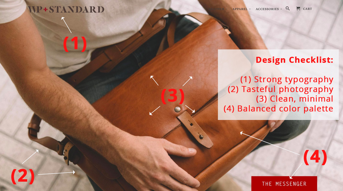
Focus on this simple “design checklist” Eisenberg mentions above on your homepage:
- Strong typography
- Tasteful photography
- Clean, minimal
- Balanced color palette
If you can get these four elements right, you’ll have the makings of a winner.
Next, let’s check out all the elements you’ll need for a minimal product page that will help to increase conversions on your website:
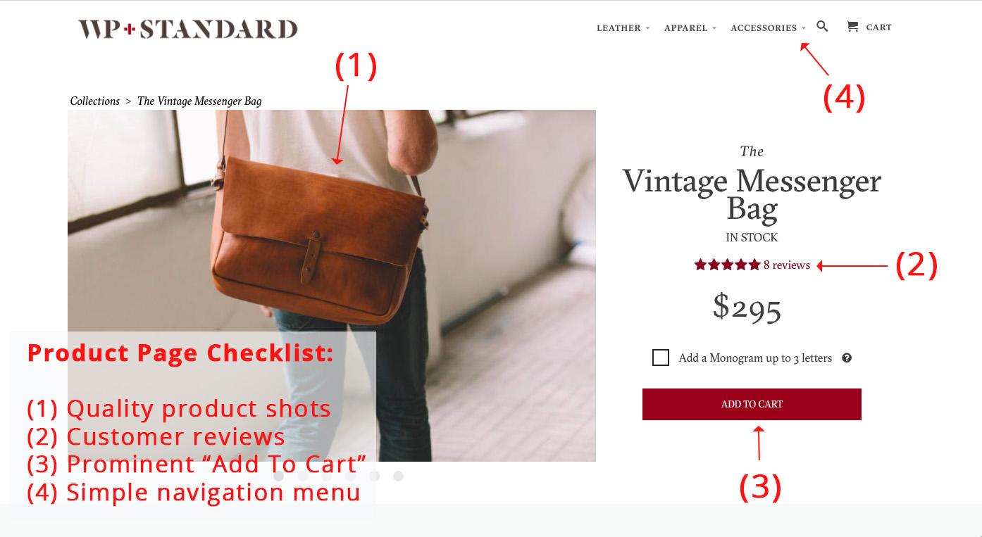
Short, sweet, and to the point. That’s the approach you should consider taking if you want to create a Shopify store that stands out from the rest. And if you need some inspiration, look no further than WP Standard.
What I love about using the Shopify platform to build your store is that Shopify offers something a little bit of something for everyone. If you’re just getting started you can easily build a website from scratch using one of their hundreds of pre-made themes. If you’re an experienced web developer and want to fully customize your website, you can do that, too![*]
Shopify Store #4: Beardbrand [Eye-Catching Visuals]
Key Takeaway: Beardbrand uses a variety of eye-catching visuals and graphic techniques that have allowed them to grow to $120k in monthly sales in less than one year.
Humans are, by nature, visual creatures.
And while there’s much debate over how much faster our brains transmit visual information when compared to text, science has proven the old adage “a picture’s worth 1,000 words” true time and time again.
A single photo of your product can provide more relevant information about the product’s quality than paragraphs of text.
Let’s test this theory. Would you rather:
a) Have me verbally describe the Beardbrand website using only words or
b) Just look at it?
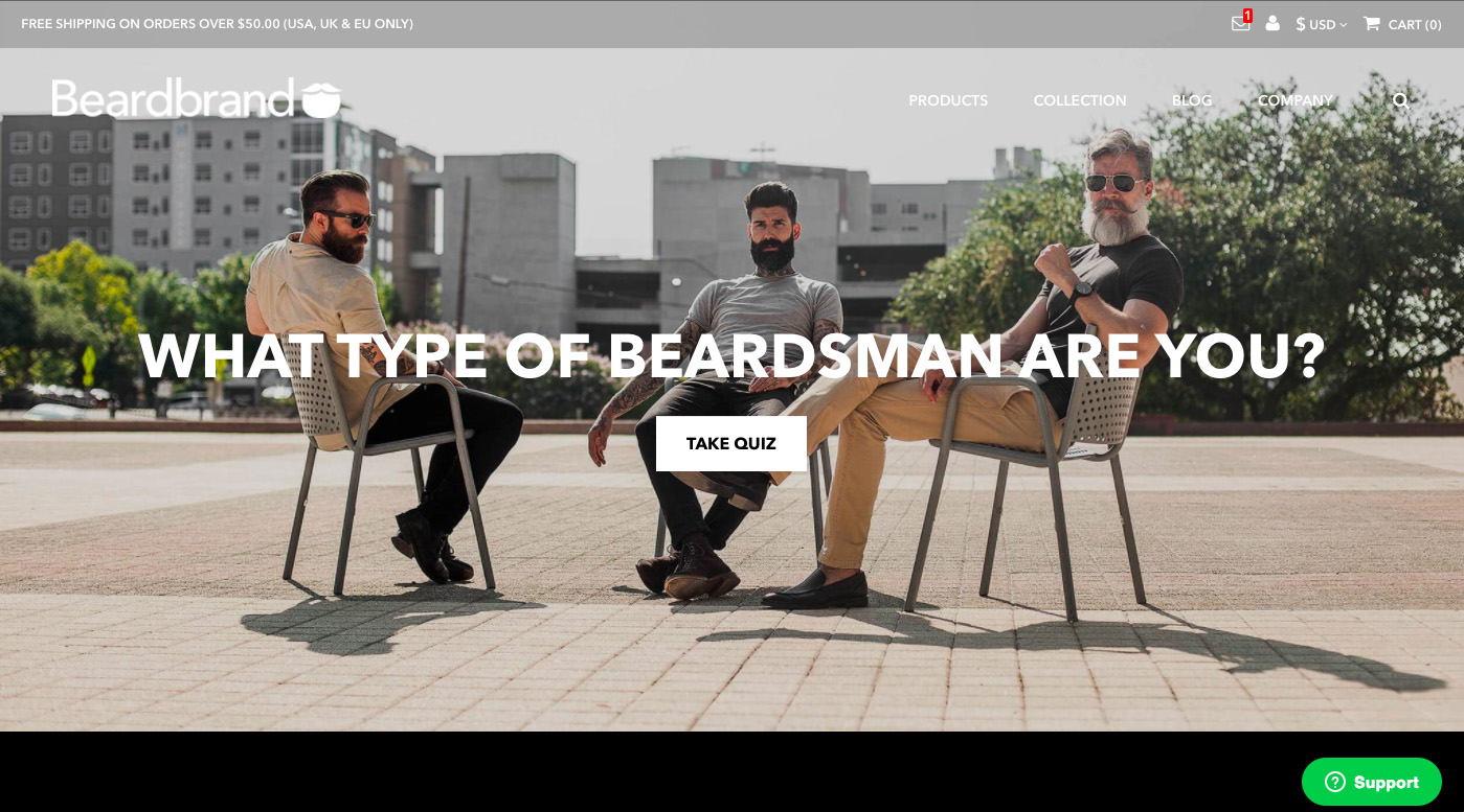
You see my point.
In fact, the Nielsen Norman Group found that, on the average web page, users have time to read at most 28% of the words during an average visit; 20% is more likely.[*]
But there’s one thing about the Beardbrand website that really caught my eye. And according to their founders, helped them generate 7,000 new email subscribers in just a few months. The little red icon in the upper-right:

Playing to our urge to constantly clear our email, Slack, and social media notifications, Beardbrand uses this simple technique to generate leads to their newsletter. Here’s what happens when I click on the icon:
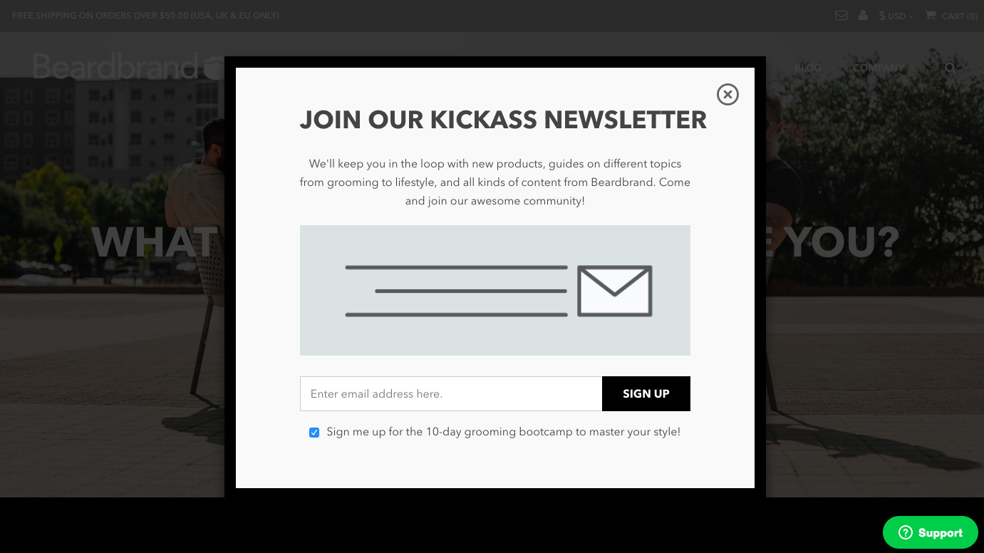
A kick-ass popup (remember our previous lesson?) asking visitors to join their kick-ass newsletter.
Pure. Visual. Genius. No wonder their Shopify store is kicking ass.
Of course, when it comes to adding images to your Shopify store, you still need to follow SEO best practices. Doing things like optimizing the file size of your images, adding alt attributes, and using image sitemaps are all still an important part of your website experience and success (even on Shopify).
Shopify Store #5: Taylor Stitch [Mobile-First Shopping Experience]
Key Takeaway: Taylor Stitch utilizes a fast, mobile-friendly Shopify store design that provides customers with a memorable shopping experience when shopping from a mobile device or tablet.
From 2017 to 2018, time spent by U.S. adults per day on mobile (but not talking on the phone!) increased by eight minutes, reaching a total of 3 hours and 23 minutes per day. In the same time period, time spent on desktop decreased by two minutes to 2 hours and 8 minutes per day.[*]
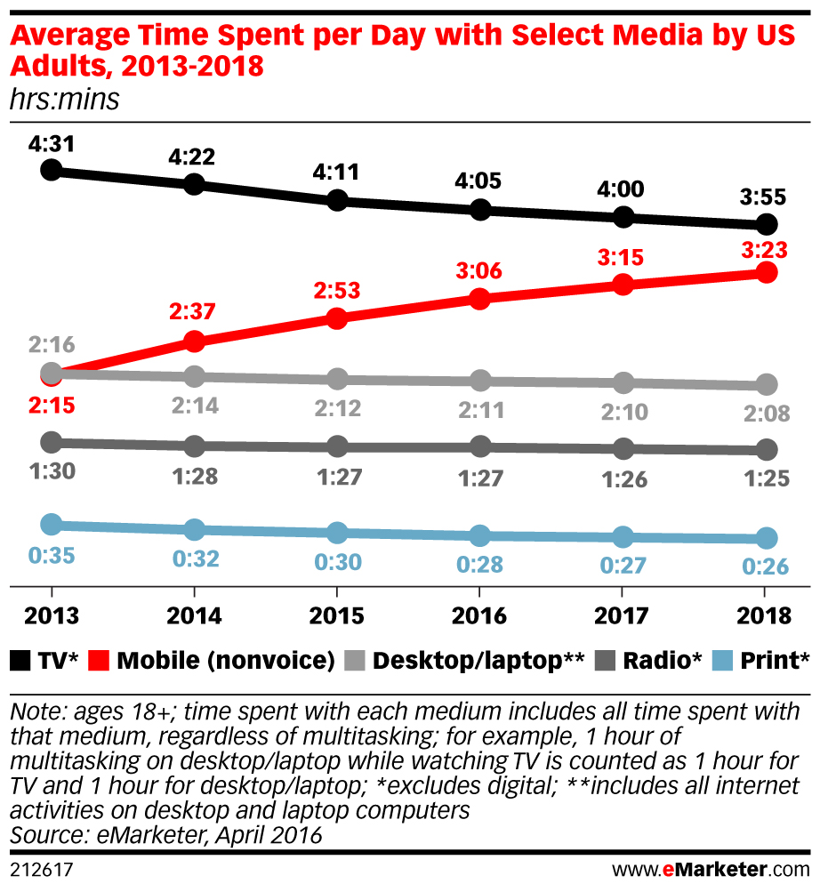
In other words, more and more people are using mobile devices to do things like browse the internet, check out social media, and yes, shop.
That’s why Taylor Stitch is well ahead of the game with their beautiful mobile-friendly website design. It all starts with their homepage:
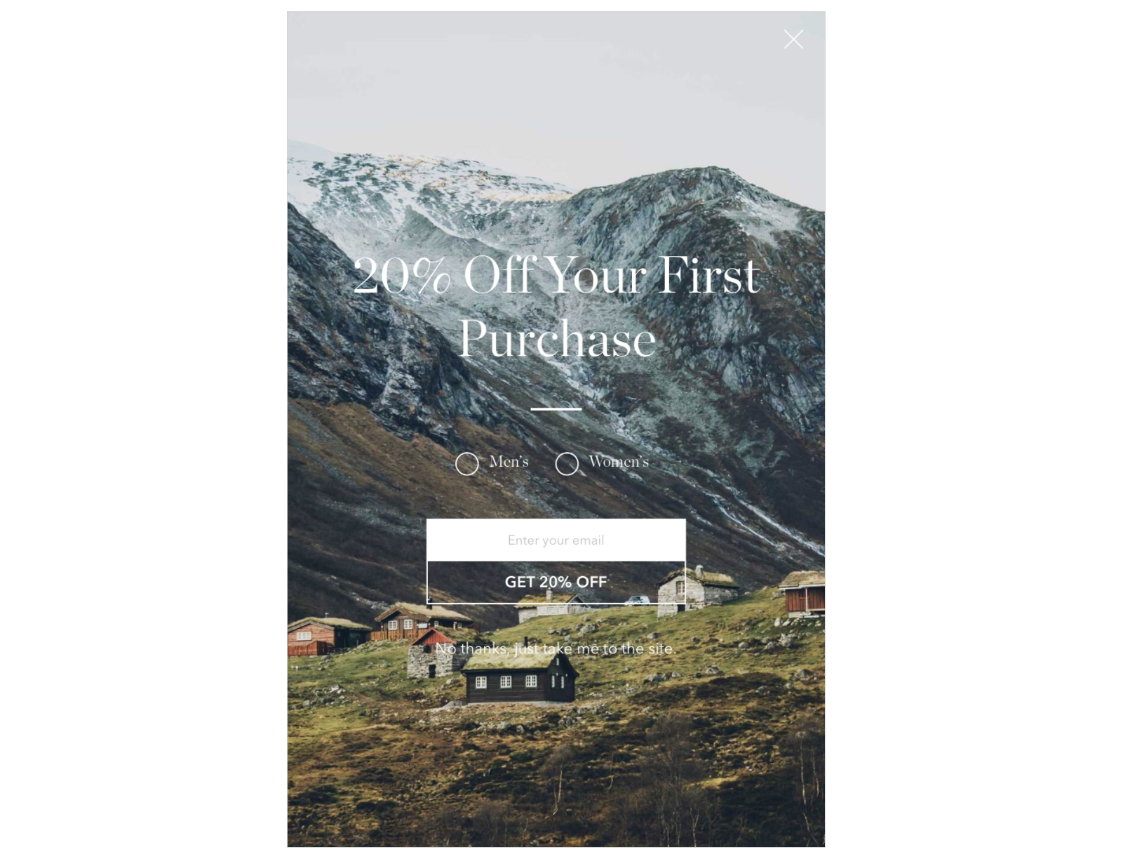
This landing page has it all:
- Eye-catching image
- Solid promotion with a captivating CTA
- Minimal, yet elegant design
Next, you’re taken directly to their product overview page. Again you’re treated to a great photo and a variety of products to peruse:
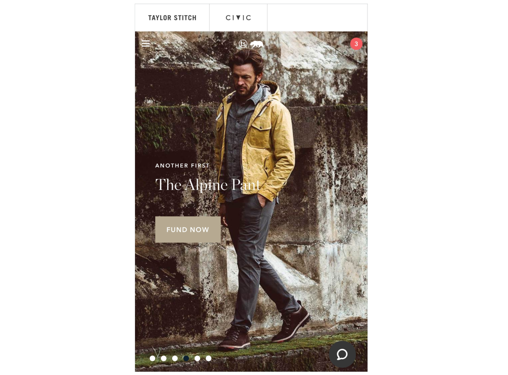
Take note of each of the features here:
- Simple list of products
- Chat bubble to speak with someone
- Ability to take quick action: “Fund Now”
Many of you might recognize the term “Fund Now” from websites like Kickstarter or GoFundMe. However, Taylor Stitch uses the Fund Now button to offer items in certain clothing collections on Pre-Sale.
Next, we’re directed to the individual product itself:
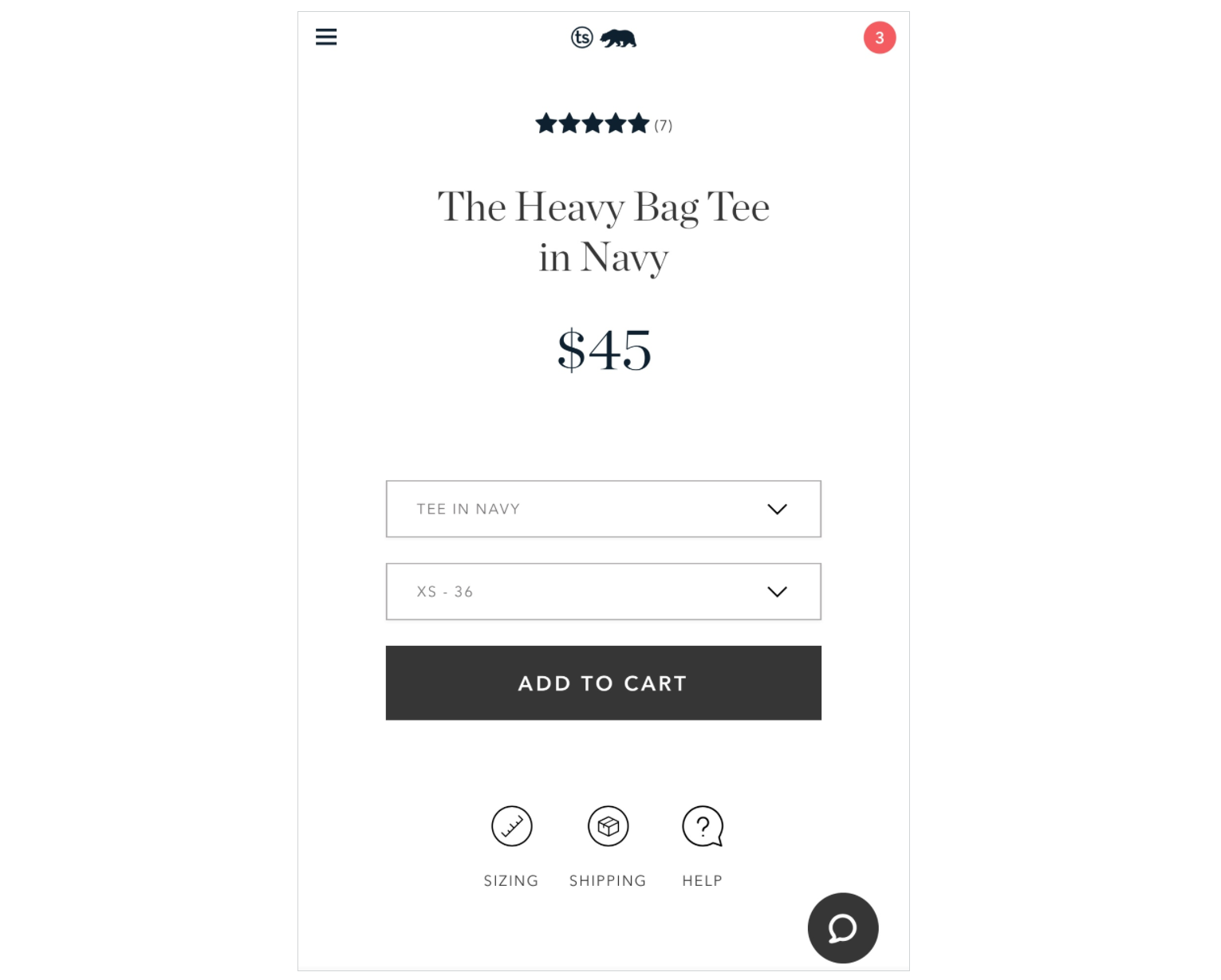
Remember our Shopify store launch checklist from Shopify store #3?
This product page utilizes two of the elements from that checklist, a simple navigation menu coupled with prominent “Add to Cart” button, to help eliminate page confusion and increase sales to the product.
If you’re interested in getting access to this proven checklist with everything you need to launch your brand new Shopify store, download it below.
Download My Shopify Store Launch Checklist
Finally, once we’re all set to buy and we have our product safely added to our cart, we’re presented with the checkout menu:
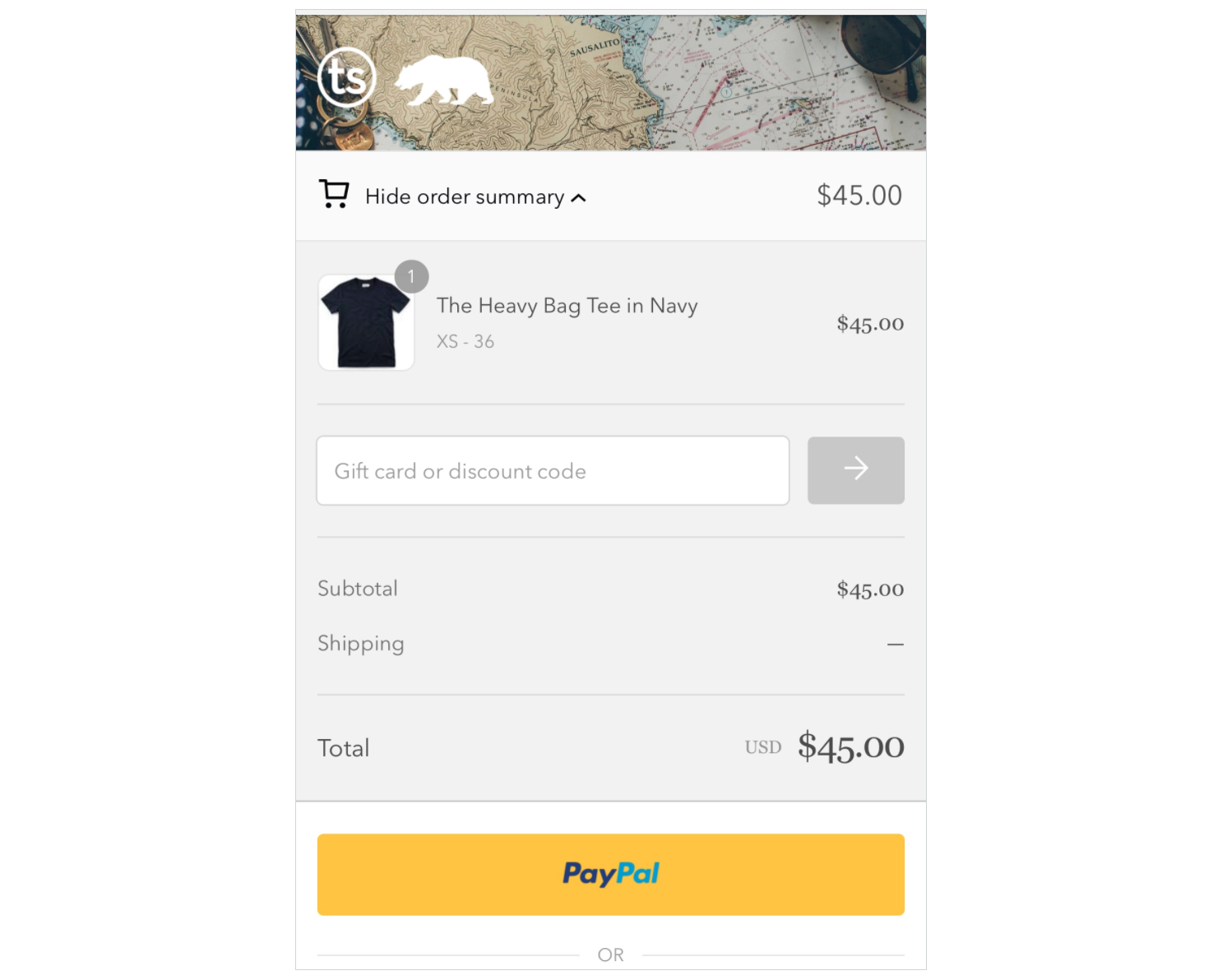
Now this is personal preference, but I love when companies offer the option to checkout with PayPal. Not to mention that 60% of shoppers have at least once abandoned a purchase because the website asked for personal information.[*]
Make it easy, not difficult, for your shoppers.
How do I know all of this is working for Taylor Stitch? Just three years after their launch, the company made a mind-blowing $1.5 million in sales and has continued to grow since then.
Shopify Store #6: Ratio Coffee [Product Videos That Sell]
Key Takeaway: Ratio Coffee uses video to help provide detailed and visual product information to visitors that helps to increase time on page and eventually sales.
Unless you’ve been living without a phone or internet for the past three years, you might have noticed that video is insanely popular. But using video is still one of the most under-utilized marketing strategies.
There are some radical stats to back it up, too:
- 83% of businesses believe that video gives them a good ROI[*]
- The average conversion rate for websites using video is 4.8%, compared to 2.9% for those that don’t use video[*]
Ratio Coffee understands the importance of video in ecommerce so they feature a product video directly on their Shopify store homepage:
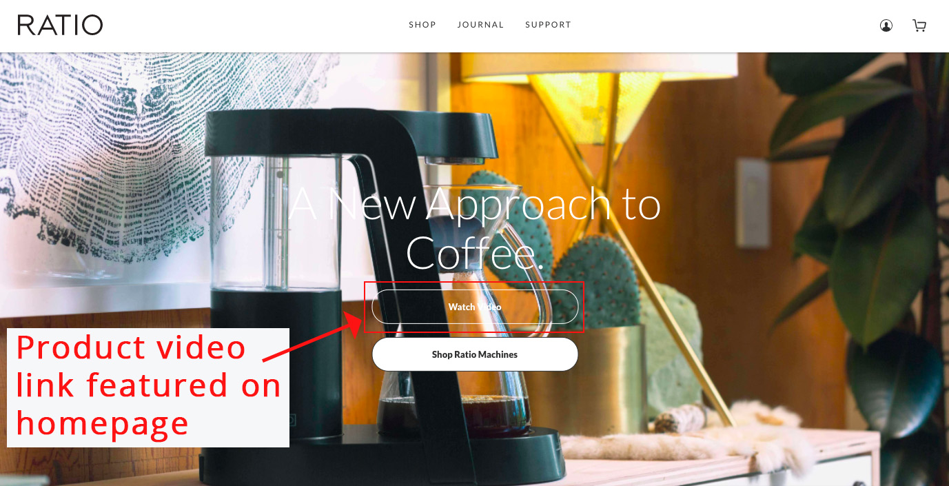
If you’re unsure where to start with product videos, here are some quick tips for you:
- Hire a professional. The last thing you want is a poor product video. It’s a larger cost upfront, but professionals will provide all proper lighting, equipment, and expert advice you’ll need for a quality video.
- Show the product from several captivating angles. Give visitors a feel for how the product looks, feels, and functions in real life.
- Focus on getting the most out of your videos. Taking an evergreen approach, you can break the video down into smaller steps, or “teaser videos” and experiment with each on different channels.
What I love about Shopify is how easy they make it for their merchants to quickly embed YouTube videos on their website store landing pages and product pages.[*]
To embed a video into a page, use the rich text editor. Once the page that you would like to embed the video on is up and running, simply grab the link from YouTube:
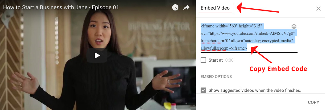
Then click the embed video button on the page in the Shopify rich text editor:
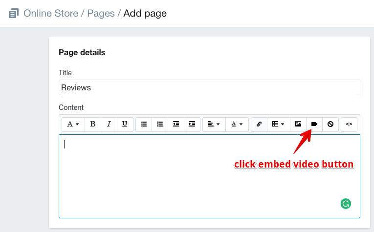
Paste the code from YouTube and click "Insert Video" and you’re done!
Shopify Store #7: Untuckit [The Product Referral Machine]
Key Takeaway: Untuckit uses a simple product referral program to increase inbound traffic to their Shopify store from highly trusted sources of information.
Those trusted sources? Shoppers on your website who have already purchased a product and/or want to tell their friends and family about your business. The most credible form of advertising comes straight from the people we know and trust.
Eighty-three percent of online users in 60 different countries say they trust the recommendations of friends and family—which makes sense because you trust your friends.[*]
But how often will you go out of your way to tell a friend about a product? Probably not often. Unless, of course, there’s something in it for you.
Untuckit uses a simple technique to increase friend-to-friend referrals. Here’s what it looks like:[*]
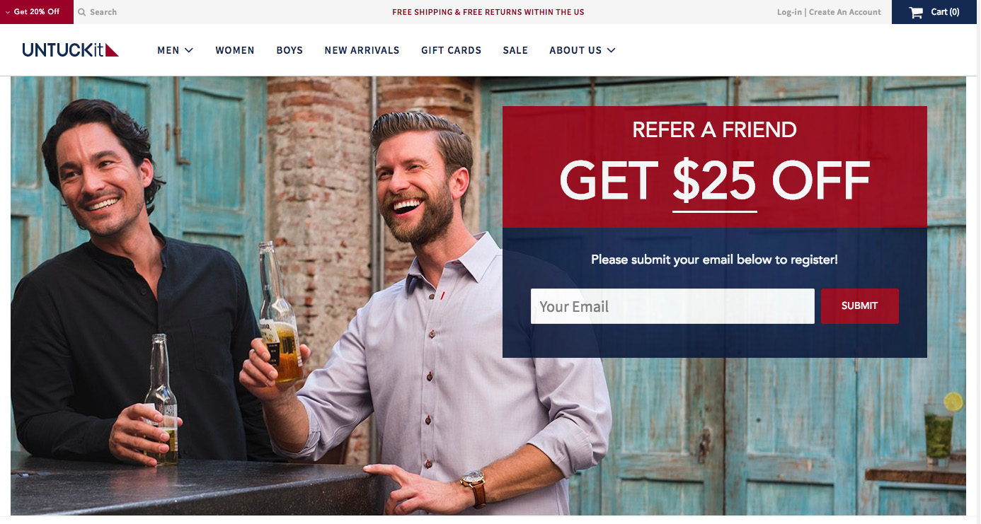
Untuckit uses a Shopify app called Swell to manage their referral program, or you can get started with referral programs on your Shopify store using Shopify apps like Smilio.io and ReferralCandy from our Shopify apps guide.
No matter what Shopify app you use, here are my three biggest tips for making sure you’re providing something that people actually want to share:
- Make sure it’s worth the effort: Having someone refer a product to a friend isn’t a small ask. That friend is putting their reputation on the line. Make sure the “prize” is worth the risk. $25, Untuckit’s offer for example, is pretty darn good.
- Make it super simple to refer friends: The last thing you want to do is make it a hassle for people to refer your product. Notice how easy Untuckit makes it above—a simple email form to register. The process should be no more than one or two steps.
- Everyone gets a bonus: Imagine if you could get someone to refer your product to a friend and then that friend refers your product to their friend and then… I’ll stop there. But you get the point! Providing a bonus for every successful referral is a great incentive for people to keep referring!
Your Shopify Store Is Next
The wonderful thing about Shopify stores and ecommerce marketing is that there is unlimited information out there for you to draw inspiration from.
Shopify makes it ridiculously easy and effective for business owners and businesses of every shape and size to build a killer online store in a matter of minutes. It’s what you do with that store that counts.
If you’re struggling to find traction with your store or product today, that doesn't mean it's going to last forever. Each one of the Shopify stores above provides a unique customer experience in some way:
- SkinnyMe Tea [Shop With Messenger]
- M2S Bikes [Cart Abandonment Cash Machine]
- WP Standard [Minimal, Elegant Design]
- Beardbrand [Eye-Catching Visuals]
- Taylor Stitch [Mobile-First Shopping Experience]
- Ratio Coffee [Product Videos That Sell]
- Untuckit [The Product Referral Machine]
Start small and experiment with one or two of these tactics. If it works, double down. If it doesn’t, cut your losses and move onto the next experiment.
Here's a checklist to help you promote your store:
Get The Shopify Launch Checklist
P.S. Want to learn 10 growth hacks that some of our most successful Shopify customers use, and that we’ve personally used to grow an email list to over 100,000 subscribers? Click here for our most actionable growth hacking ideas to grow your email list and traffic.
Add A Comment
VIEW THE COMMENTS