A thank you page is a valuable but underappreciated page for many brands and websites.
Want to convert more leads/customers and improve engagement?
Here’s what you need to create a thank you page that gets you the most return on your investment and helps you convert more potential customers. I’ve also included the BEST thank page examples from brands like Tidio, Backlinko, and more.
%(tableofcontents)
What Is A Thank You Page?
A thank you page is a page users are directed to after submitting their information to an opt-in, registration, purchase, or a sign-up form.
A common misconception is that they’re simply a way to let your customer know they’ve successfully signed up for your product or service.
The truth is, they’re so much more.
A thank you page is also an opportunity for you to connect with your customers and move them even further down your sales funnel.
A regular run-of-the-mill thank you page will notify the user that their action has been completed successfully and let them know what to expect afterward. But a great thank you page will provide the user with even more value in the form of:
-
Valuable content, such as a link to your blog.
-
Access to exclusive groups, such as a Facebook group or Twitter page.
-
A recommendation for a related product.
This turns your thank you page from simply a confirmation page into a lead-delivering factory. Now you know what a thank you page does, here are four steps to create one for your business.
Step 1. Setting A Clear Goal
A thank you page typically works in conjunction with a landing page. The landing page encourages your users to take that first step toward interacting with your brand — then, you can use your thank you page to direct them to take further action.
However, it’s not enough to put together a landing page and let it do its thing. To measure the true effectiveness of your page and identify areas for improvement, it’s important to establish clear KPIs and goals before you even go live. A thank you page can help in measuring the effectiveness of your landing page.
You need to know what results you want to see from your thank you page.
For most businesses, the key metric is growing their email list in order to generate more leads. By collecting customer information, you can gather a list of already warm leads for marketing to later.
So, how do you track email sign-ups?
The first step is to track your goal completions. Goal completions are meant to track specific events such as downloads, successful email opt-ins, and contact form sign-ups.
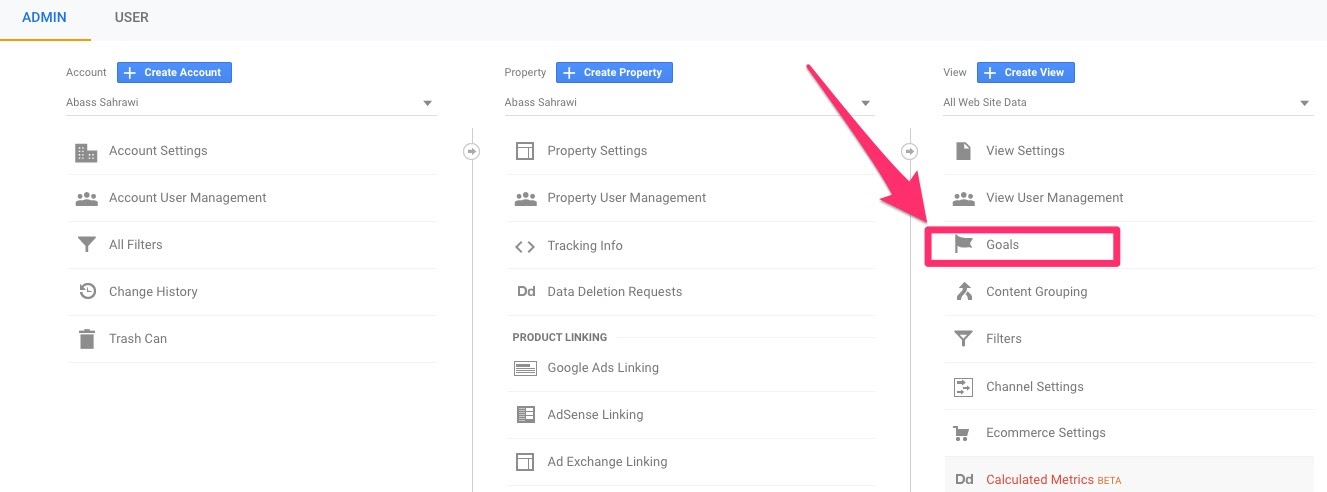
To do this, access your Google Analytics account, then click Admin > Goals.
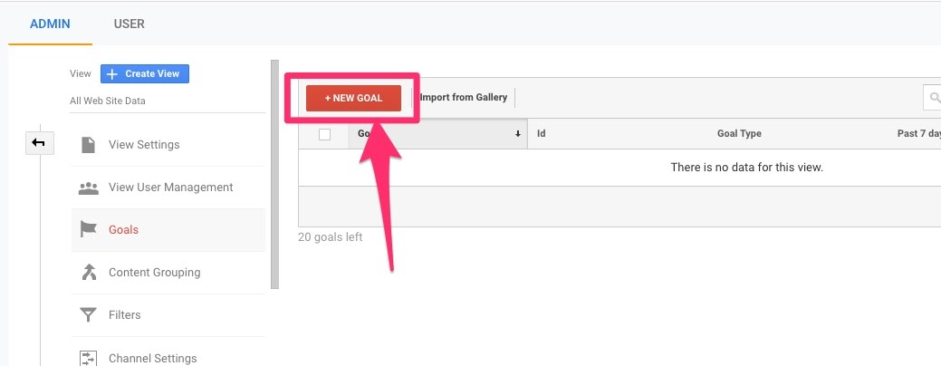
Click the red +New Goal button to the left.
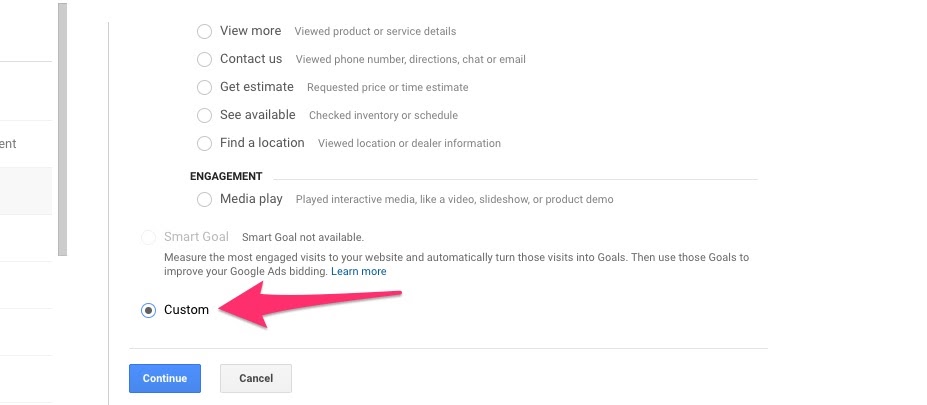
In the Goal Setup column, click Custom.
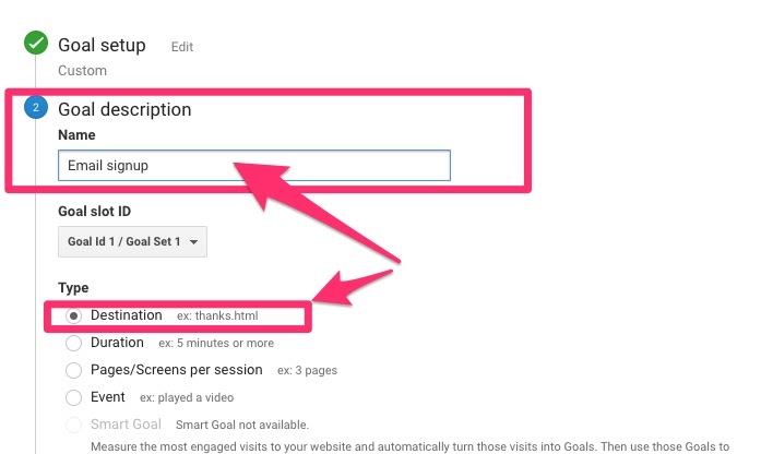
You can then name your goal description in the Name indicator and select the Destination option.
Under Goal Details, enter the URL of your thank you page and click the Save button.
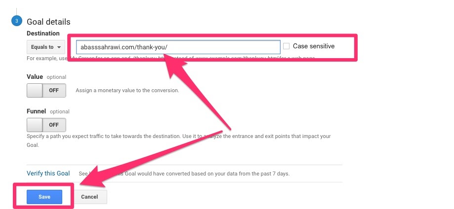
After making sure the Recording button is set to on, you’re good to go! Google Analytics usually takes 1-2 weeks to collect goal completion data, but once it does, you can begin to analyze your data.
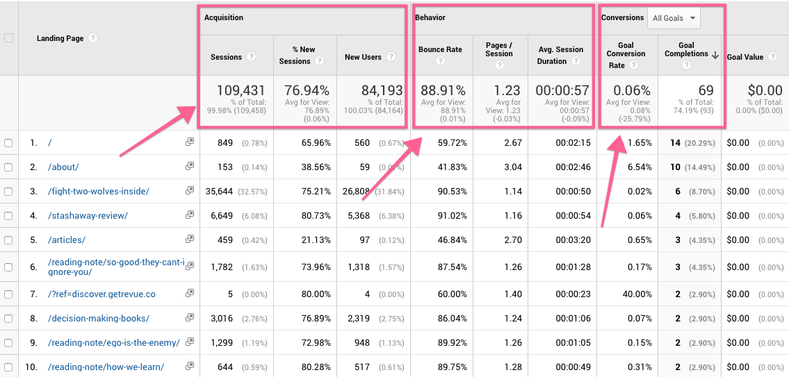
To view your data, go to Google Analytics and click Behavior > Site Content > Landing Pages.
Once you’ve navigated to your thank you page URL, you can monitor page data like:
-
Stats on acquisition: How much total sessions and new sessions you got from each landing page.
-
Stats on behavior: These numbers tell you how the visitors from each page behave on your site.
-
Stats on conversions: These numbers tell you the goal conversion rate and goal completes of each page.
Step 2. Start With Positive Feedback
Although it might seem like a given, your users need confirmation their actions were successful. Your thank you page should include a clear indicator that your visitor is getting what they signed up for, as well as what’s going to happen next (if your offer includes a next step).
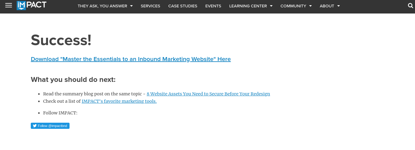
However, if your message ends here, you’re leaving money on the table. Here’s an example of that:

The next essential element of an effective thank you page is the call to action.
Step 3. Add A Call To Action (CTA)
Without a call to action, your customer’s journey finishes on the thank you page. With one, however, you can direct them to other offers or resources they might be interested in, driving them farther along your sales funnel.
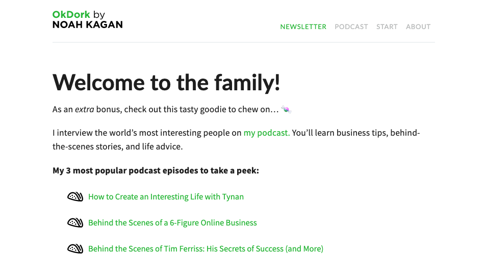
Some popular CTAs include:
-
An offer for a discount.
-
A request for users to share content.
-
Additional content downloads.
-
Linking to relevant posts on your blog.
-
A request for a quote.
-
An invitation to like your page on social media.
-
Access to exclusive membership groups.
Whether it’s encouraging them to share an offer, like in our example, or to check out your website’s blog, you can increase conversions by guiding them to your desired result, instead of allowing them to wander away.
Step 4. Provide Clear Instructions
It’s not enough to simply include a confirmation message and call to action. You also need to educate your users.
This means giving clear information about:
-
What’s going to happen next.
-
When it’s going to happen.
-
Why they want to take this action.
This way your user feels comfortable and informed about where they are in the process. When they know what to expect, it becomes much easier to lead them further down your sales funnel.
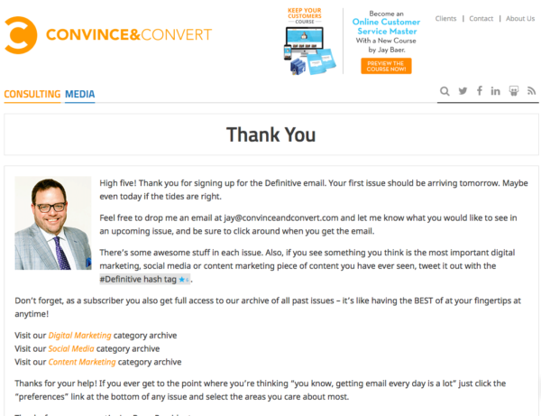
For example, Convince & Convert clearly outlines what will happen after a user signs up, using a tone that keeps things light and fun while addressing any possible questions they might have.
The reason?
To instill confidence in the user. If the user is confident in your brand, they’ll be much more likely to interact with it further down the road.
How Leading Businesses Are Using Thank You Pages To Convert More Leads
The effectiveness of a thank you page doesn’t just stop at KPIs and design elements. A lot of it is contextual, which means you need to think strategically about factors such as who your audience is, what media you’re using, and how you can use data to improve your conversion rates.
I reached out to some of the best businesses and asked them to share how their thank you pages are converting.
Here are their answers.
Example 1. Convert Engaged Users [Tidio]
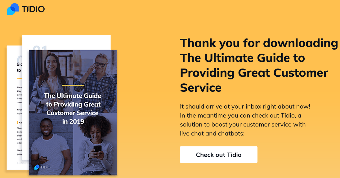
Live chatbot company Tidio saw a great 26.74% conversion rate using the thank you page above.
They attribute a large part of that success to driving already qualified leads to their offer and the quality of their thank you page.
“First of all, we got a sky-high 40.48% conversion rate with people downloading this e-book. We had 168 visitors and 68 of them converted, which means they were already quite qualified leads.”
– Pawel Lawrowski, Head of Growth at Tidio
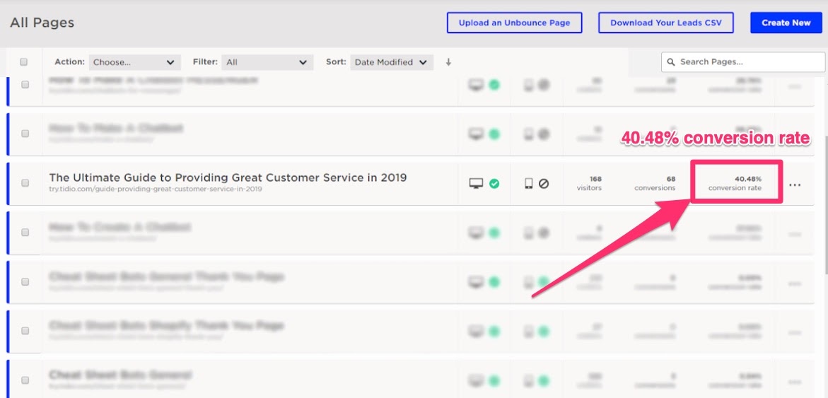
By carefully selecting the audience they marketed their offer to, they were able to boost conversion rates and, in turn, lead interested users down their sales funnel. On top of that, because they knew who their audience was, they were able to drive users to their blog by listing relevant resources and articles.
Key takeaway: Sending users who have opted in for a lead magnet to your thank you page increases your chances of conversion.
Example 2. User Video To Wow Your Customers [Visme]
A common problem brands run into is limiting themselves to a certain medium, such as text, and ignoring other viable options.
However, this can cause you to miss out on potential customers. Visual content creator Visme created this video for their thank you page, and the results speak for themselves.
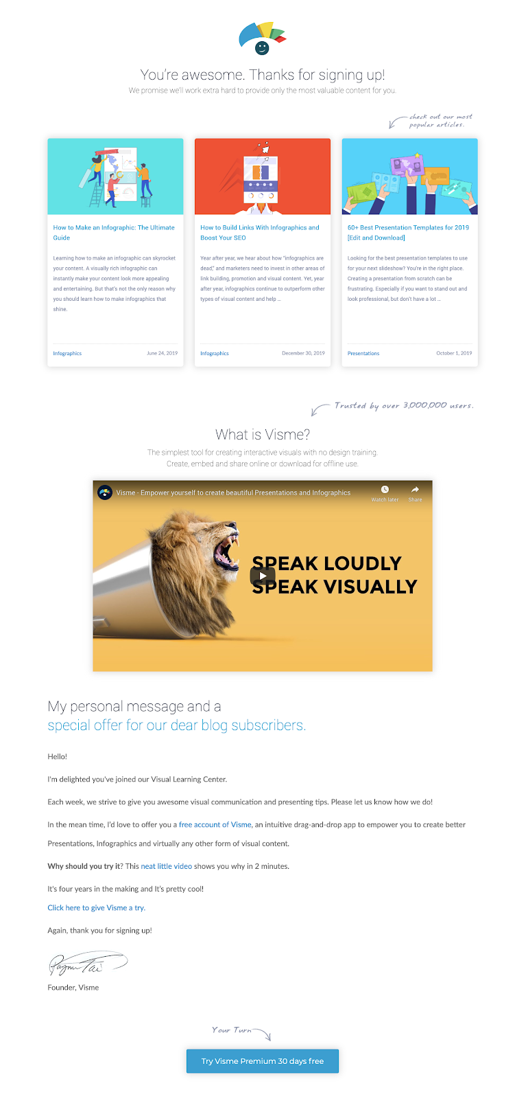
“Between 2,000 to 3,000 users land on this page every month; the video on the page has received about a quarter million views, and we have a few hundred sign-ups per month to our tool from this thank you page.”
– Farzad Rashidi, Director of Marketing at Visme
Using visual media such as video or infographics is highly effective for two reasons:
-
Visual media is easily shareable, making it more likely that your customers will share it with others.
-
Visual media is easily digestible, making it easier for users to pay attention to and absorb information.
Key Takeaway: While not every successful thank you page needs visual media, it’s always a good idea to experiment and analyze how your users react.
Example 3. Test, Test, Test… And Then Test Some More [Docsketch]
Too many companies create their thank you page, go live, and then fail to optimize it.
No matter how great your page is, there’s always room for improvement. By monitoring data and optimizing their thank you page, Docsketch more than doubled their conversion rate — simply by tweaking their copy.
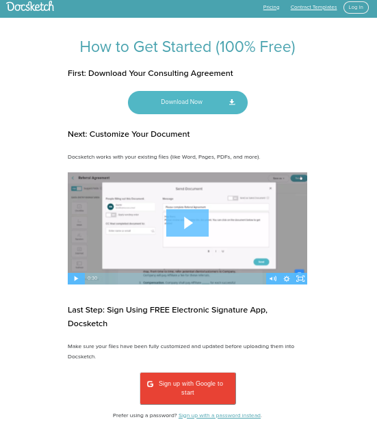
“We get about 600/month new Docsketch accounts from it. It converts at 3.5% currently. We started at about half that at 1.7% and we doubled by telling people that there were two steps to do. Step 1… then Step 2: sign up.”
– Ruben Gamez, Founder of Docsketch
A great way to incorporate this into your own strategy is to analyze your data for weaknesses. Do you have a high bounce rate? Maybe your offer isn’t as clear as it seemed. Is the average time spent on your thank you page low? Maybe you need more information about what you’re offering.
Once you’ve identified areas that need improvement, you can begin to take action to boost your thank you page’s performance.
Key Takeaway: No matter how well your page is performing, optimization should be a part of your growth strategy.
Example 4. Show Them The Path To Success [GetResponse]
GetResponse, an online marketing software company, managed to generate a conversion rate of 9.05% with a simple "sign up free" button. The CTA button appeared on a thank you page shown to users who've successfully registered for one of their webinars.
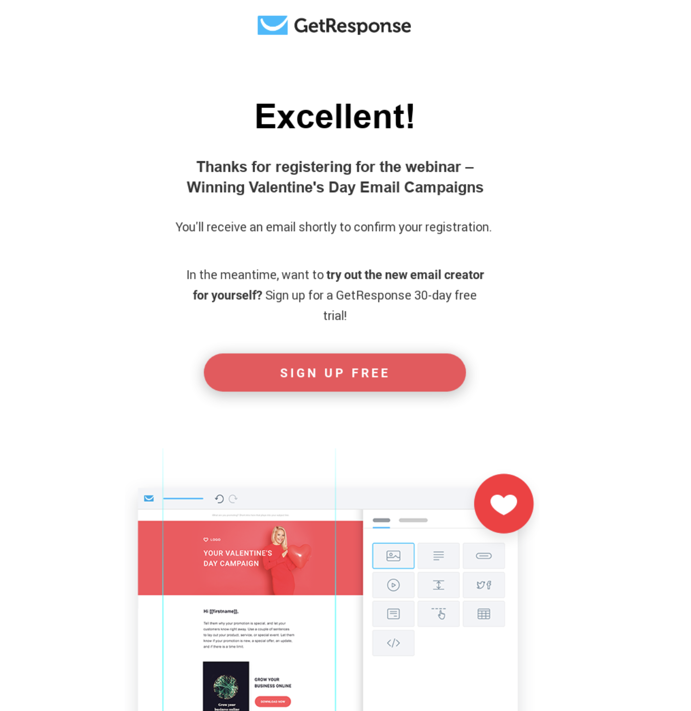
“We’ve decided to run a short promotional campaign and host a webinar on designing winning Valentine’s Day email campaigns. The webinar was meant to be partly educational and partly promotional as we wanted to show the newly launched GetResponse email creator.
At first, on the webinar registration thank you page, we had a CTA button that linked back to a related blog article. But after a couple of days we decided to change that and ask our audience to sign up for a free trial account instead.
Our reasoning was that those who registered for the webinar were already informed that we’ll be showing them how our platform works. This meant that they were already, at least partly, interested in it. And based on our promotional activities, the chances were that at least some of them won’t have already created an account with us.
The webinar registration page with the new CTA ran for several days only, but it generated a conversion rate of 9.05%! And we’re talking here about new free trial accounts created, not just new newsletter subscribers.”
– Michal Leszczynski, Content Marketing Manager at GetResponse
What this example tells us is that it's fundamental to know who you’re reaching through your campaign.
Once you know this, you need to figure out what actions you can ask them to take. And instead of presenting multiple options, you can show them a single CTA button that lets the eager ones get ahead of the curve and try your offer right away.
Key takeaway: Keep your audience and goal in mind when adding a CTA button to your thank you page. There's a good chance that you can align them and reap the rewards.
Example 5. Gather More Information From Your Customer [Have A Word]
Freelance writing coach Pete Boyle used his thank you page to help him grow his Facebook presence. By recognizing where his target audience spent time, he was able to tailor his thank you page to make the most of that marketing channel.
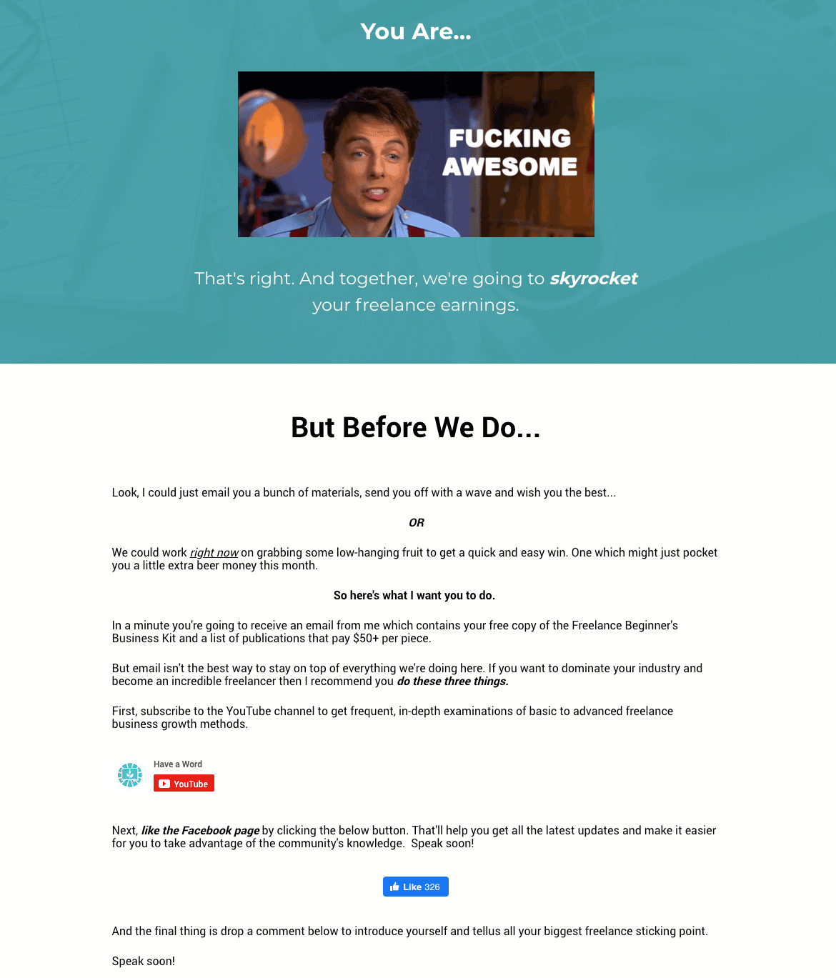
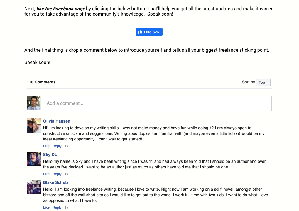
“I added two elements to my Thank You page. The first was a Facebook comment box that asks new subs to outline their biggest challenge right now. This helps me understand what I need to focus on in upcoming content and advice… The second was a like button for the Facebook page.”
– Pete Boyle
Since adding these two elements, Boyle has since seen a 5% increase in comments and a 15% increase in likes on his Facebook page.
Not bad for a simple page!
Pete’s advice for freelancers interested in growing their business through thank you pages?
“The most valuable element for me is the comment section. That information is worth its weight in gold.”
Key Takeaway: Tailor your thank you page to the marketing channels your customers spend time in and use it as an opportunity to collect feedback.
Example 6. Boost Your Social Media Presence [Backlinko]
SEO expert Brian Dean created his thank you page with a specific goal in mind — to direct his users to social media platforms he wanted to expand to and build his following on those sites.
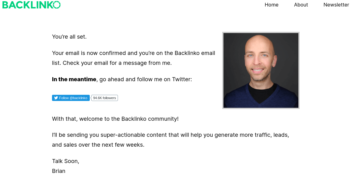
“By the time someone lands on our thank you page, they're already signed up. So what we do is try to cross-pollinate to another social network (right now we're focusing on Twitter). It works super well! In fact, I'd estimate that we get 150-300 new Twitter followers per week from our thank you page. Not too shabby!”
– Brian Dean, Founder of Backlinko
By encouraging his users to follow him on Twitter, Brian created a simple way to reach his followers across multiple platforms, making it easier for him to reach out with relevant products and offerings.
On top of that, Brian also realized the highly viral nature of Twitter, allowing him to create content that can then be shared easily among his followers, something that other freelancers can incorporate into their own thank you pages.
Key Takeaway: Use your thank you page to direct traffic to marketing channels you want to expand.
Example 7. Upsell Your Products [Outreach Mama]
SEO strategist Ajay Paghdal created his thank you page with growth in mind. He offers both backlink building services and an anchor text suggestion software through his other business, Linkio.
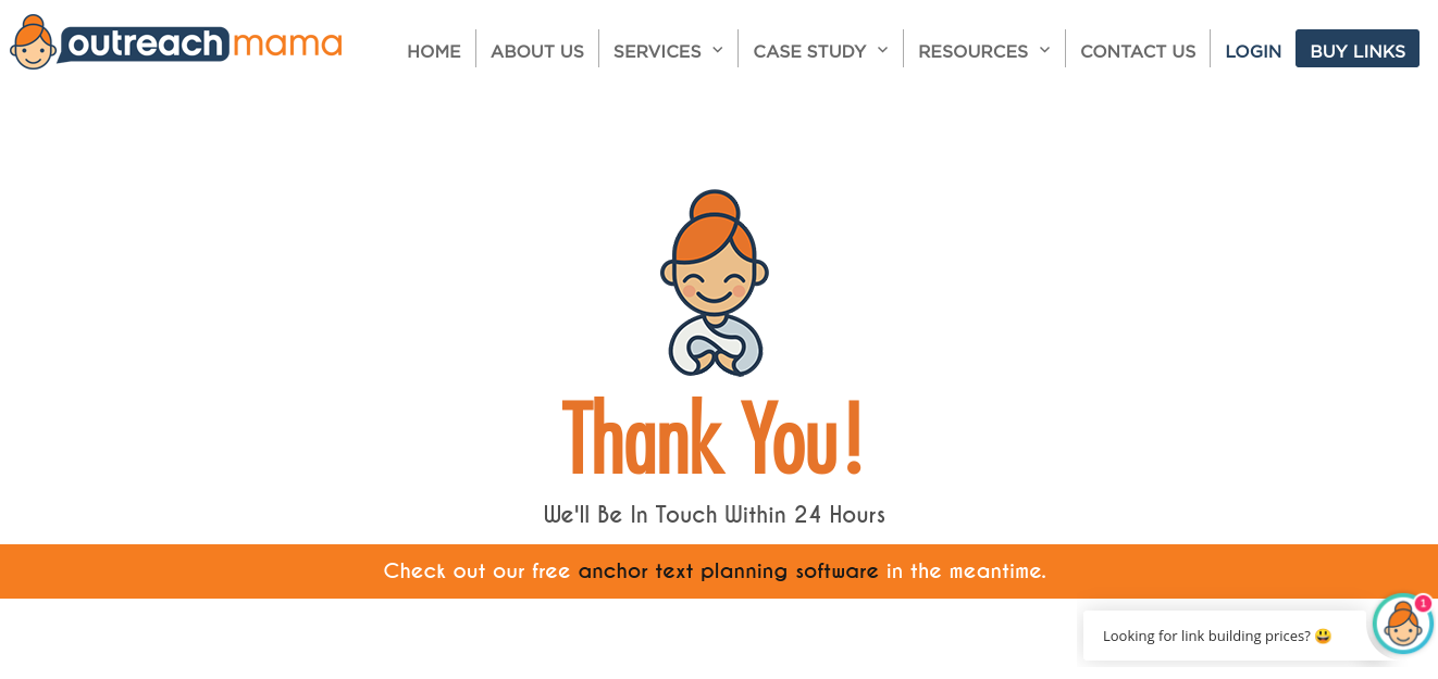
Recognizing that the customers for his backlink building business would also be interested in his software solution, he includes a link to the freemium option for Linkio, effectively offering his customers further value while driving users to his offering.
“Since I have two businesses in the same industry, my thank you page serves as a confirmation but also introduces the second business, a SaaS, and gives the user a link to check it out. The funnel has about a 20% click-through rate.”
– Ajay Paghdal
Key Takeaway: If your business includes multiple services or products, experiment with incorporating them into your thank you page. By upselling your customers, you can boost sales while simultaneously making their lives easier.
Now Create Your Perfect Thank You Page!
You don’t need to reinvent the wheel to create a thank you page that converts. Instead, you should focus on these takeaways:
-
Set up straightforward metrics. Establishing clear metrics will help you figure out what data is relevant to your business strategy and what goals you need to set.
-
Conversions come from clear, actionable steps. If your customers are unclear about what action to take, you’ve lost the opportunity to drive them to the outcome that you want.
-
Constantly test and optimize your thank you page. Whether it's experimenting with different media, copy, or products, this data will help you create a stronger offering.
-
Don’t be afraid to send customers to other channels. While email is still king in marketing, social media platforms can provide a valuable way for you to reach out and encourage users to share your offerings with others.
Upsell, upsell, upsell. Not only will it boost sales, but also it will give you further opportunities to serve your customers and retain their business.
Add A Comment
VIEW THE COMMENTS