Visual storytelling marketing:
- Captures (and keeps) your audience’s attention
- Ensures your messages resonate with them
- Helps your brand connect on a deeper level.
But you can’t just dump a few stock photos into your social posts and articles each month.
In this guide, I’ll show you what to do and what not to do with visual storytelling marketing.
Here’s what else you’ll learn:
%(tableofcontents)
Grab your free copy of our step-by-step checklist to using visual storytelling marketing:
Click here for your free checklist
But before we dive into how the pros use visual storytelling marketing, I’ll show you why this is even worth your time in the first place.
Here’s Why Visual Storytelling Marketing Works So Well
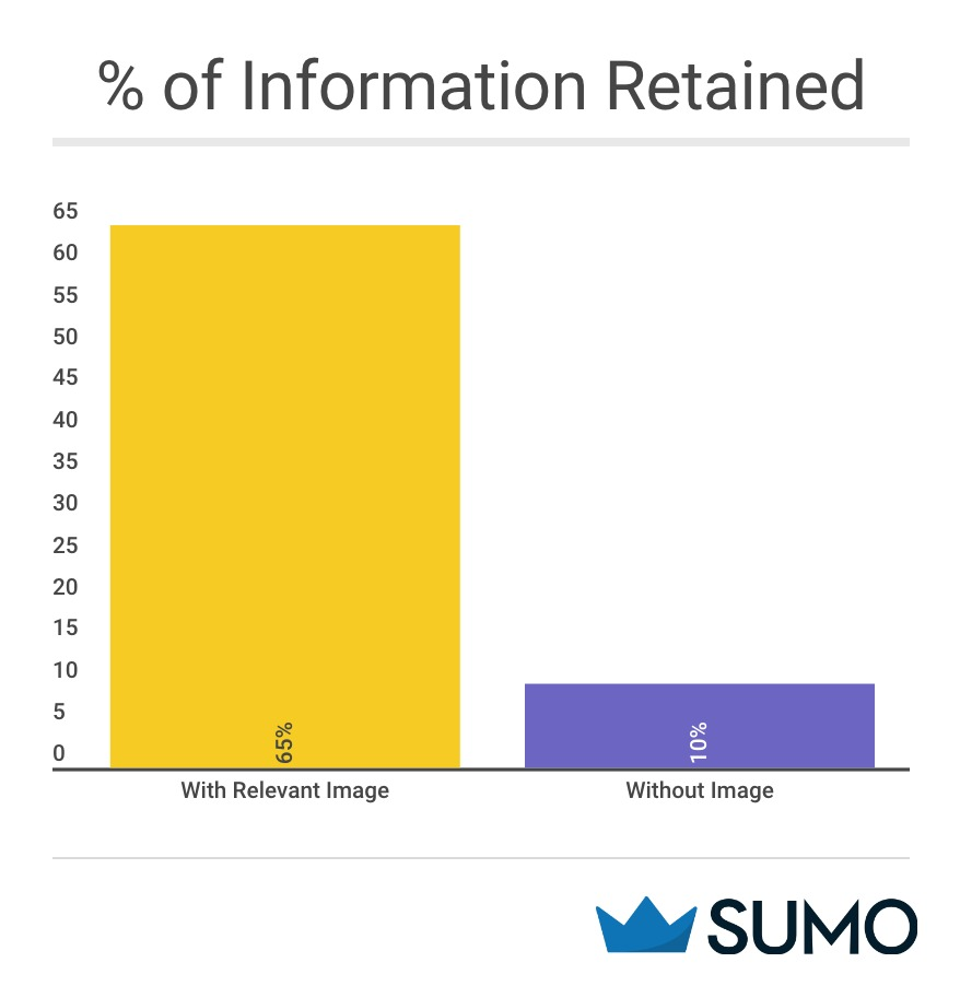
If you heard me explaining something today, you’d only remember about 10% of what I told you in three days.
But if I showed you a relevant image when I was explaining the same information, you’d retain 65% of the information three days later.[*]
That’s because our brains are more equipped to process images than to process words.
In fact, the part of our brain that handles words is smaller than the one that focuses on image processing, according to psychologist Haig Kouyoumdjian.[*]
Kouyoumdjian discovered that visuals:
- Make it easier for us to process difficult concepts
- Reduce how long it takes us to learn and understand something
- Increases our retention
So since visuals work, why not just add a bunch of stock images to your marketing plan and call it a day?
Because adding visuals to your content marketing plan is only Step #1. Adding the right visuals is Step #2.
You can’t establish an engaged community without using your brand story to attract an audience. You need your visuals to tell your brand’s story.
Brands that share their story visually:
- Connect with their readers on a deeper level
- Build a community that supports their message
- Create a loyal tribe of customers who share their brand’s story with their network (increasing brand awareness).
Up next, I’ll show you real world examples to give you some inspiration.
How the Pros are Crushing Visual Storytelling (And How You Can Too)
Study the pros and save countless hours trying to fake it on your own.
Visual Storytelling Marketing Examples #1-2: Instagram is Everything
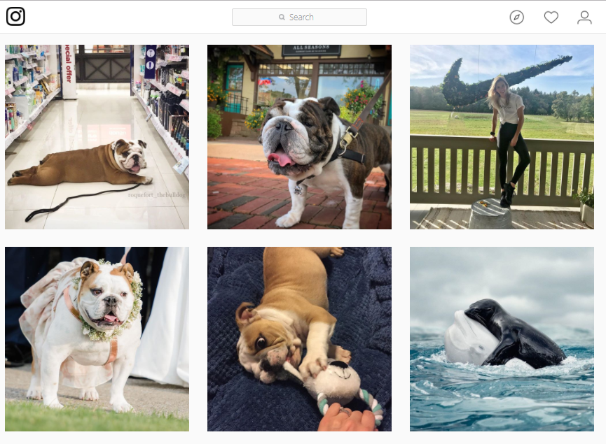
Most brands just post a picture on Instagram and use the caption to explain what’s going on.
Explanations won’t help you grab the attention of casual browsers no matter how adorable the pictures you post:
Instead, use that important space wisely like this next example does:

The company overlaid a customer testimonial (social proof!) on the picture and included a testimonial snippet.
By adding a Compassion Certified seal, they’re reaffirming their mission without dumping a whole paragraph of information to explain it.
So we see all of that visually before we even get to the caption. That’s how you capture your audience’s attention and share a short customer story along the way.
The next example is like an entire article in one image:

This example clearly has a beginning, middle, and end. We know exactly where to start, how to progress, and what to do at the end.
As we hone in on the center, we see that this routine only takes 15 minutes to complete and is “better than coffee”. That rounds out the rest of the story and gives their niche a why should you care point.
You can use this same strategy on Twitter to stand head and shoulders above the rest.
Resources: Use social media tools like Typorama to create your visual stories for Instagram.
Visual Storytelling Marketing Example #3: Use This Same Strategy on Twitter and Rise Above the Noise
Tweets with images receive 150% more retweets than those without images:[*]
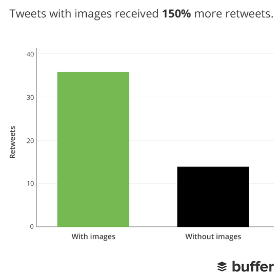
Plus 89% more favorites and 18% more clicks.
But when you scroll through your Twitter feed, you’ll probably see something similar to this:
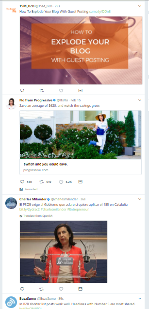
Including an image in your Tweet boosts engagement. But with so many images in Twitter feeds these days, it’s just not enough.
You can’t tell what’s going on just by looking at these images.
Sure, in the first one you know there’s an article being shared, but there’s no story behind the image itself.
With this next Men’s Health Mag example, it’s just the opposite.

Not only does the red suit grab your eye, you also have a much better idea of what’s going on in the post thanks to the raised hand putting the woman above the army of men.
Stencil also uses Twitter as a visual storytelling platform:
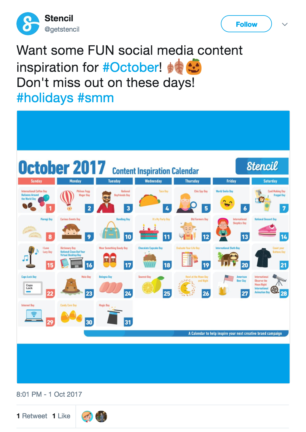
With visual storytelling, they’re able to capture attention and relay complex information in a straightforward way.
Visual Storytelling Marketing Examples #4-8: Infographics are One of the Best Ways to Share a Story
Data shows that infographics are the most shared content type:
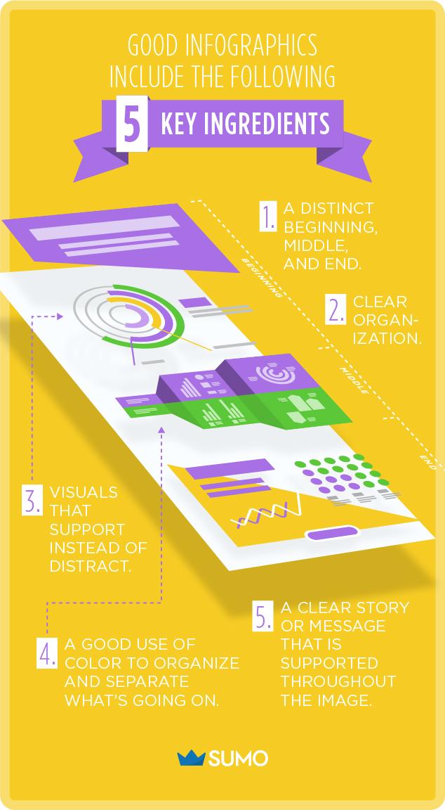
- A distinct beginning, middle, and end
- Clear organization
- Visuals that support instead of distract
- A good use of color to organize and separate what’s going on
- A clear story or message that is supported throughout the image
The next few examples tick all of those requirements and more.
In this first one, Content Crossroads uses the important marketing psychology principal lines of sight to guide your eye through their infographic:
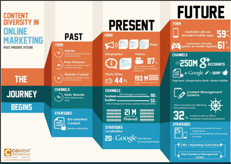
First, your eye is drawn to the heading: The Journey Begins. From there, you branch out just like the image does. You see the past next, the present, and then the future with the future column as the biggest, boldest one.
Each section (form, channels, and strategies) is also separated by a different color which keeps things both organized and easy to read and follow.
The next two infographics use this same idea.
This time the story is easy: How to make a delicious bowl of Ramen using the right amount of ingredients.

This is a little different than the order of the first example, but it still works well since the story still has a clear beginning, middle, and end.
The supporting visuals also complement the main message within each section instead of distracting and taking away from it.
You’ll also notice that the overall story is simple and easy to follow. This is another important thing to keep in mind when using visual storytelling.
Where else can you use visual storytelling to your advantage?
If you said in your display ads, I’ll show you two examples that do this well next.
Resources: Not a designer? You can still make beautiful infographics for your brand. You can make your own using Canva or Venngage, or use Growth Geeks or Fiverr to create cheap infographics.
Visual Storytelling Marketing Examples #9-10: Your Display Ads Should Tell a Short Story Too
It’s easy to create display ads that have an image plus supporting text. But most brands are already doing that.
Share a story with your visual instead and you’ll capture attention from anyone browsing between your ad and your competitor’s.
Don’t believe me? Check out these next two examples.

The visual of the Sumo standing next to a tiny car tells a funny story — that it’s a waste to show the “right product to the wrong consumer”.
The next example also has a nice left to right movement without actually moving.

With this LinkedIn post, the story is of three different people — separated by their own background and a vertical black line — working on Labor Day.
The left to right flow guides your eye in the same direction and completes the story from beginning to end.
While at first glance this may seem like just another image, as you dissect it further, you see the story unfolds. It’s these key ingredients that separate a regular image from one that visually tells a story.
Visual Storytelling Examples #11 & 12: Use Your Content As a Visual Storytelling Platform
Content marketing doesn’t have to be just blog posts, videos or podcast episodes.
You can use visual storytelling to engage your audience on your blog, too.
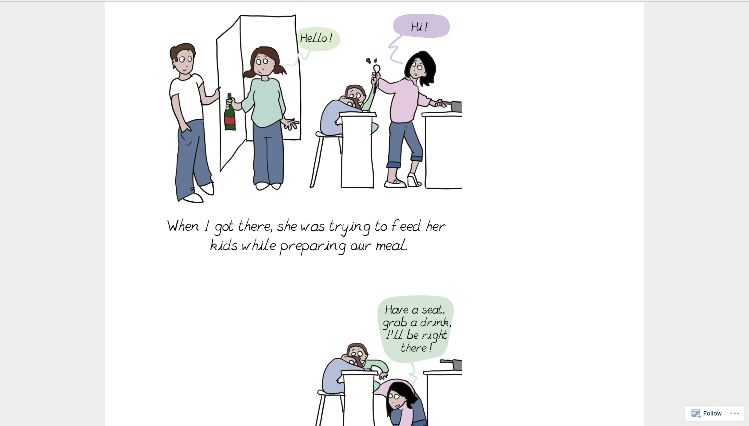
In a comic called “You Should’ve Asked”, a blogger named Emma tells a story that resonated with working mothers worldwide.[*]
Here’s a portion of the comic:
The comic went… well, sort of viral:

Another win for visual storytelling.
The blogger could have just blogged the story in a written format and called it a day. That would have been easier.
But, because she made the piece of content into a comic, it went viral online, and was picked up and republished by publications like Time.com, CNBC and The Guardian.
Don’t want to create entire comics to win at visual storytelling? You can still get some share of your storytelling pie by creating graphics and embedding them into your content.
Check out how Perfect Keto does this on their Keto vs Atkins article, with a gif about the difference between the two diets.[*]

They used visual storytelling as a tool to support the overall piece of content.
Visual Storytelling Example #13: Tell a Story with Data
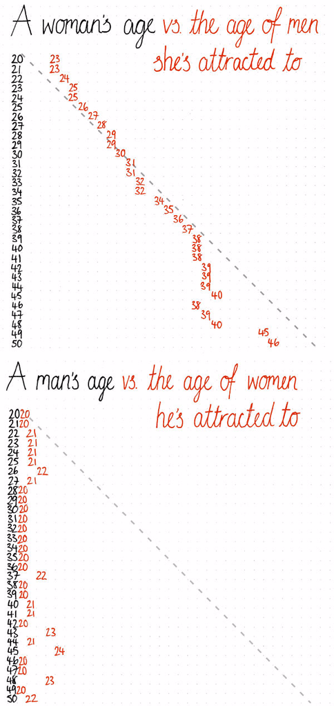
Data can be confusing to make sense of.
And it’s not useful to throw a bunch of statistics and numbers at your audience and expect them to be able to glean results.
But visual storytelling makes data digestible and more easy to consume. Check out how OkCupid uses visual storytelling to present data in an interesting and funny way[*]:
Now that you know how the experts share their stories using visuals, let’s talk about some best practices to keep in mind, starting with what NOT to do.
Characteristics of a BAD Visual Storyteller (Are You Guilty of These?)
We all know terrible storytellers. Their stories take forever and are always full of useless, irrelevant details.
This can happen in the digital world too.
There are three characteristics of bad visual storytellers:
- Irrelevance. Adding stock photos to your articles just for the sake of doing so is like the irrelevant details of a story — you end up distracting and disrupting the flow of the story.
- Self-centeredness. People invest in stories to gain something of value for themselves. So when this nasty habit of self-centeredness is transferred to the digital world, you’ll quickly lose followers. Consider your digital audience here. Why should they care about your story? What’s in it for them? In my examples above, the brands themselves are the smallest part of the image.
- Poor story flow. Many brands get story flow wrong. Think back to when someone told you a story and, as it unfolded, they kept backing up and adding more details. No one wants to listen to stories like these. It’s important that your visual stories have a clear path forward and get right to the point. The flow also needs to make sense and should support and complement the message you’re trying to convey.
Now that you know what makes a bad visual storyteller, here’s how to do it right.
6 Steps to Creating Memorable Visual Stories When You Lack the Skills
Step #1: Identify the message you want to convey
What main point are you trying to share? Once you have your core message laid out, decide on the supporting benefits or additional points you’re trying to make.
Images always tell a story, even if you don’t intend for them to.
This Heider & Simmel video is an excellent example of that.
Step #2: Create your images to convey your story.
Keep your images simple and try not to make them too distracting. They should convey your original message, plus the most important details only. Anything else is irrelevant and should be trimmed.
Three things to keep in mind:
-
The quality of your image is the average of the quality of each visual element. If you have an infographic with killer illustrations but poor typography, the quality perception will be 50% lower. A detail you leave unrefined brings down the whole quality of the image.
Remember that you’re always telling a story, even if you don’t want to. Using a poor quality image instead of a high quality one is choosing to tell the wrong story.
For example, which one of these apples would you want to eat?:

2. The use of stereotypes is important. Visual stereotypes are anything that represent a concept or idea.
For example:
- Power plugs to represent WordPress plugins
- A lamp to represent an idea
- Cursor arrows to represent page access
- Radio microphone to represent podcast.

With visual narratives (unlike with verbal narratives) you don’t have the space or semantic tools to explain some concepts (like hero, good, evil, danger, action) so you have to use visual stereotypes. The same way you need to know the character is the hero of the story just by looking at them, for blog images you need to know what the article is about just by looking the cover image.
3. If you’re creating images to go along with your blog posts, keep in mind that your image should not compete with the article. You already know the importance of your headlines.
The cognitive process of reading happens quickly. Your image should not compete with it.
it has to be an obvious, abstract and literal illustration of what the title is saying, otherwise you tell a second story and cause cognitive tension, losing the reader. Take a look at how we‘ve done this with our Shopify story image:

Don’t try to make the article image the star of the show when the value delivered by the article itself is awesome. Instead, create the perception of quality for the article with a great image that doesn’t compete.
On the flip side, using a lame image will make your awesome article be perceived as rubbish before it’s even read.
Once you’ve selected your image elements with these three things in mind, it’s time to trim.
Step #3: Trim the fat.
Visual storytelling doesn’t leave room for unnecessary details. You have to cram an entire story into a few images.
That’s no easy task. Get rid of anything that doesn’t add value to the story.
Why? The mind gets saturated with visual stimuli quickly. Images are processed by the brain, which operates by the law of economy of energy.
Use the minimum of colors, fonts, finishings, techniques, effects you can get away with.
If you’re working with 4 colors and then you add one more, it’s a 25% of information increase.
If you’re working with one color and add another one, it’s a 100% increase. That’s a lot for the brain to process.
Check out the simple use of two colors (white and green) in the image for 8 Marketing Ideas from Intercom's Multi-Million Dollar SaaS Growth Strategy:

Vs everything that’s going on in this image:
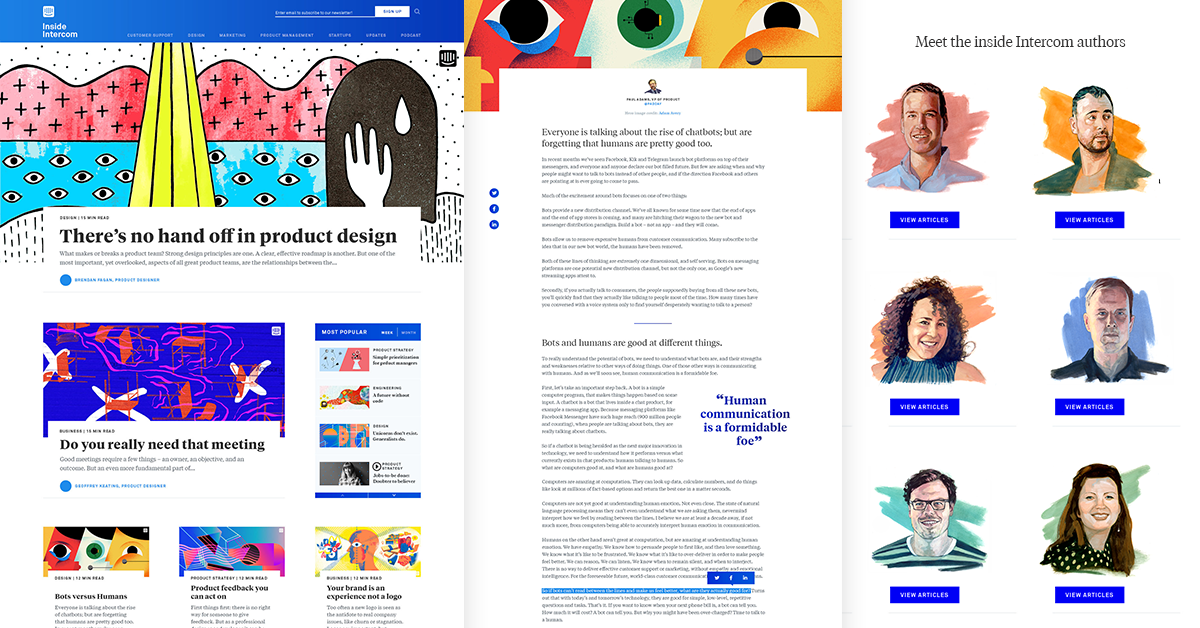
Trim where you can so you don’t give your viewers a headache.
Step #4: Add your brand narrative.
Whatever the story you’re trying to tell with a specific piece of visual communication always has a bigger narrative behind it: the brand narrative.
Make sure to use your brand’s style guide, or visual identity elements, like colors and typography.
Here are Sumo’s colors for making images:
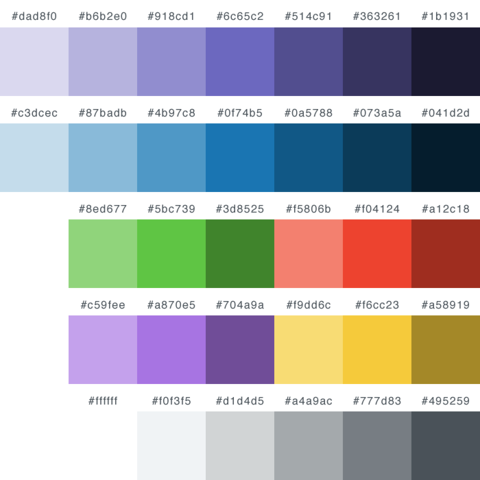
Branding is an important part of your visual storytelling strategy.
Step #4: Consider the medium.
Medium is crucial.
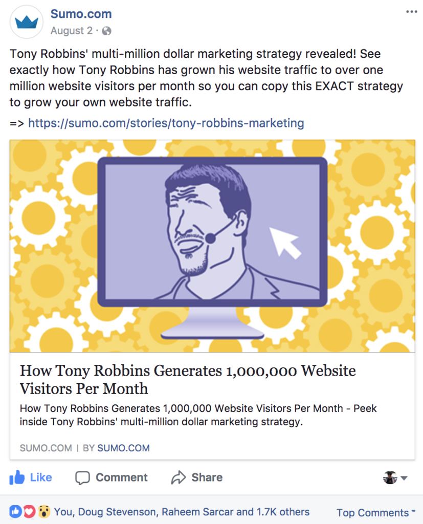
Your images need to look good both on desktop and on mobile.
Details you can see but not understand at smaller scale aren’t going to be neutral, they’ll be noise.
Check out this image on mobile:
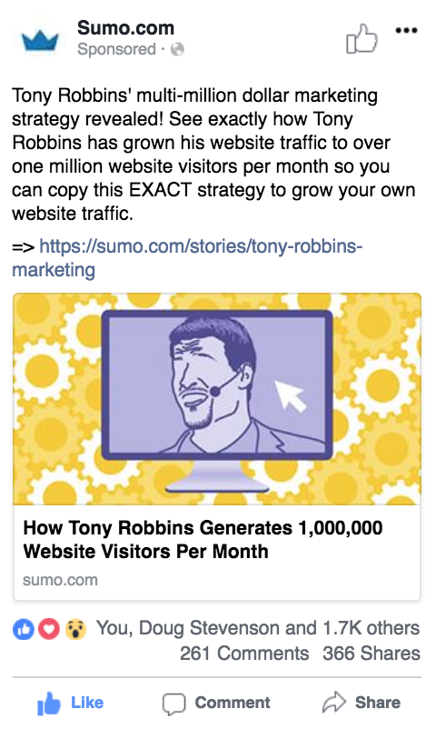
And how it also looks good on desktop:
With your final image ready to go, run it by your team to check that the message is clear to those outside of the creative process. Then, see if the image resonates with others too.
Yes? It’s ready to post. If not, it’s back to editing you go.
If you do have to go back to the drawing board, share your second version with the team just like you did the first time.
Start Using Visual Storytelling Marketing Today
Now that you’re equipped with all of this info, you’re ready to start using this powerful marketing strategy for your brand.
Consider your main message first, only the most important supporting benefits next, and then the overall story after that.
Once you combine all of these pieces in a visually appealing image, you’ll finally harness the true power of visual storytelling marketing like a pro.
Add A Comment
VIEW THE COMMENTS