How many times have you seen this quote?
“When you have written your headline, you have spent eighty cents out of your dollar.”
Probably a lot.
We get it. Headlines are important. The internet is full of articles, books and even paid freaking courses on how to write killer headlines. We even created a free tool to help you create a kickass headline for your articles:
Get the Kickass Headline GeneratorTable of Contents
You know how long Sarah and I spend writing our headlines? At least one hour and countless back-and-forths on Slack to find the perfect headline for each guide.
A 2am rejected headline: “Zombie Content — What it is and how to shoot it in the face”
No argument from me — headlines are important. They determine if your content will get clicked on and read. In a world of headline-skimmers, a well-crafted headline is the difference between 10,000 views and 10.
But here’s the thing…
You’re Spending Too Much Time On Your Headlines (And Getting Worse Results)
Did someone just hijack this guide? What was all that stuff about important headlines just now?
Here’s where it’s time to make a very important distinction that very few people ever write about.
Headlines for articles? Yeah, spend a lot of time on those. They matter.
Headlines on your pop-ups? You’re wasting your time. And you’re probably getting worse results because of it.
That might seem like a gut-punch — especially if you paid a freelancer a decent chunk ‘o change to pen a “masterful headline that appeals to everyone.”
But I can make a claim like that for one simple reason…
I have the data to back it up.
For the last few months, Sarah and I have been rigorously testing the headlines on our content upgrades gated behind Welcome Mat and List Builder. And we only tested two types of headlines — a creative headline and a straightforward headline.

The straightforward headline takes about a minute to come up with. The creative one usually takes longer because:
You come up with a bunch of angles
You write headlines for each angle
You narrow down which ones you like best
You rewrite and settle on one
So after months of tests and thousands of opt-ins collected, we looked at all our tests and discovered something very humbling.
Creativity Is Overrated
Look. Sarah and I are pros. We’ve generated hundreds of thousands of opt-ins, penned article headlines with abnormally high clickthrough rates and written emails that sell over $100,000 in a single day.
We’re pro writers in every sense of the meaning—10+ years each writing professionally at a high level. And we really believe in creative headlines. That creativity is what helps us be so successful.
But when it comes to opt-in opportunities, our creativity actually hurts conversion rates:
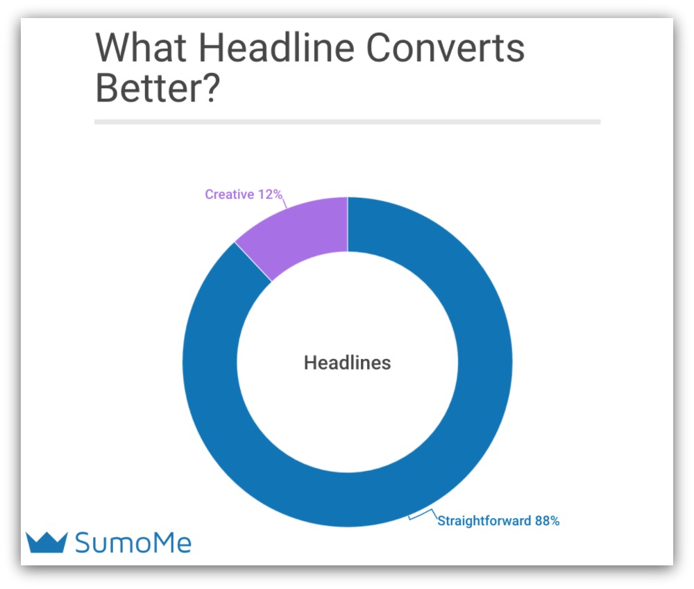
The creative in me screamed in agony when I saw those results. Straightforward headlines beat out the creative headlines 88% of the time.
This goes against EVERYTHING we’ve been told about headlines. That means all the time you put into an especially witty headline is not only wasted time, but it’s hurting your list and sales.
NOTE: This is just for opt-in forms, popups and other list-building mechanisms. Creative headlines are still important for articles.
Not only do straightforward headlines win most of the time, they crush creative headlines in conversions:
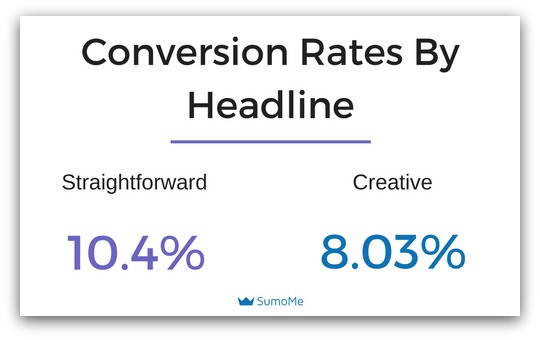
2.37% might not seem like a lot. But in the world of conversion rates, it’s a huge deal. Think of it this way:
You have a page with 1,000 visitors a month
A straightforward headline would get 104 opt-ins, while the creative headline would get 80
In the course of a year, you’d lose 288 potential emails just because you tried to be fancy
Imagine you sold a $200 product, and 10% of your list buys. Now those 288 emails you lost translates to $5,600 in missed revenue.
Just because of a headline.
But I realize the terms “straightforward” and “creative” can be a bit subjective. So let me show you the exact headlines that worked for us.
Here’s Which Headlines Worked (And Which Ones Didn’t)…
Awesome. Nothing like showing my failures to the tens of thousands of you that read this blog. But hey, at least it’s not that dream where I’m up on stage in front of a huge audience and forget all my lines…

Accurate down to the dress and everything
But that’s why A/B testing is so important — you can try these things out, see what works and make the best decision for your business.
Check out a few of the headline tests we ran to see the real headlines we used.
15 Types of Emails Ebook
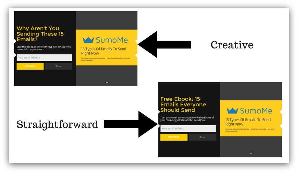
Straightforward Headline: “Free Ebook: 15 Emails Everyone Should Send.”
Creative Headline: “Why Aren’t You Sending These 15 Emails?”
Explanation Behind The Creative: This creative headline tried to invoke feelings of curiosity. It implies there are certain emails you should be sending that you probably aren’t. Wouldn’t you want to know what those emails are?
Conversion Rates:

The straightforward headline converted at 15.42%, while the creative headline converted at 7.1%.
That creative headline cut our conversions in half. That’s really depressing. I don’t want to talk about it anymore.
The Best Place To Collect Opt-Ins Spreadsheet
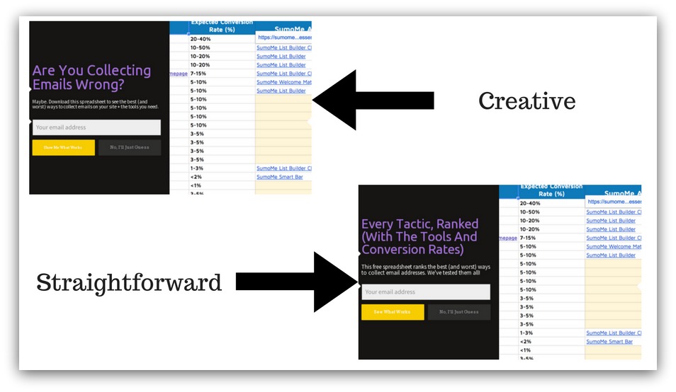
Straightforward Headline: “Every Tactic, Ranked (With The Tools And Conversion Rates)”
Creative Headline: “Are You Collecting Emails Wrong?”
Explanation Behind The Creative: This is another creative headline where we tried to provoke a feeling of curiosity. There are a lot of ways you can collect emails, and sometimes it feels like nothing works. We wanted to tap into that frustration a bit.
Conversion Rates:

The straightforward headline converted at 10.4%, while the provocative headline converted at 7.2%.
The numbers used to be even more disparaging, but sending more traffic to the higher-converting headline brought the conversion rate down a bit. Still, another example where being straightforward won out.
Website Optimization Spreadsheet
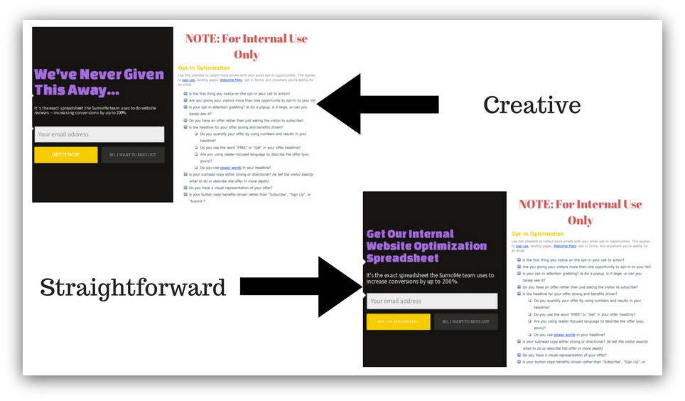
Straightforward Headline: “Get Our Internal Website Optimization Spreadsheet”
Creative Headline: “We’ve Never Given This Away…”
Explanation Behind The Creative: We went for a different approach, invoking curiosity as the only emotion. There’s a bit of mystery and intrigue in being the first to get something. Plus, we’ve given away high-value things, so giving away something completely different piques even more curiosity.
Conversion Rates:

The straightforward headline converted at 16.63%, and the creative headline converted at 15.87%.
Both are high conversion rates, but that’s more due to the giveaway and image used. Even though it’s a 1% difference, the straightforward headline still performs better. These small increases can add up over time.
The Blueprint Behind Republishing Flowchart
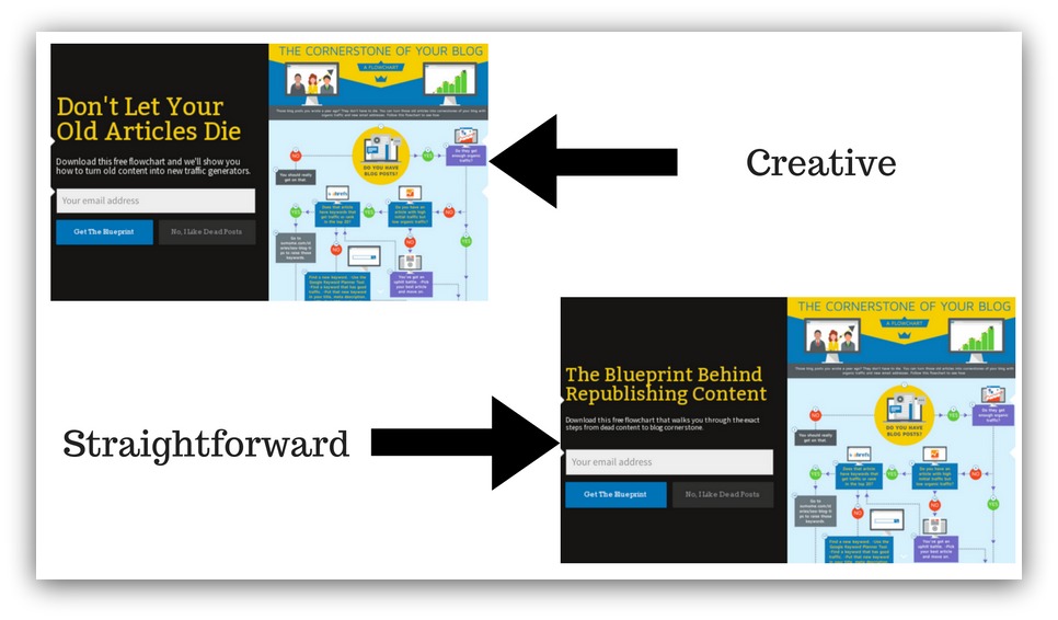
Straightforward Headline: “The Blueprint Behind Republishing Content”
Creative Headline: “Don’t Let Your Old Articles Die”
Explanation Behind The Creative: No curiosity here (well, maybe a little). This is a straight-up consequence headline. We make a statement of implication (don’t let your articles die), and the reader thinks about all the articles they’ve written that just sit there, collecting dust. If they don’t want that, they’ll keep reading.
Conversion Rates:

The straightforward headline converted at 10.38%, while the creative headline converted at 8.75%.
Even this outcome-based headline couldn’t beat a generic, straightforward headline. For all the supposed love on creative headlines, they routinely lose to straightforward headlines.
Which is why you and I should come to the same conclusion…
Why You Should Wave Goodbye to Creative Headlines
Short answer? See the above 1,000 words.
More detailed answer? Here you go:
Data Proves It — Straightforward Headlines Convert Better
I’ll post this again:

Plus you saw it in the examples above. When it comes to conversion rates, straightforward headlines flat-out beat creative ones. And it comes down to a method I call “Know it. See it. Sell it.”
Here’s what I mean. When we create, for example, a Welcome Mat, we want visitors to see our mats in this order:
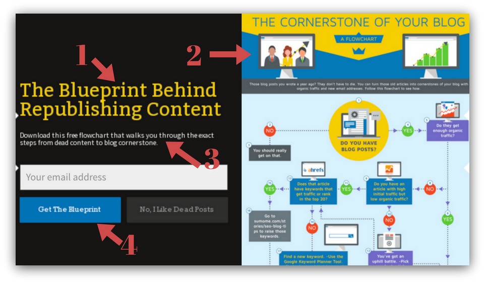
The Headline: This is the “Know it” of the method. The visitor sees the headline and instantly knows what they’re getting
The Image: A split second after they read the headline, I want them to see image on the right — the “See it” of the method. We always use a screenshot of the actual content upgrade. That’s to reinforce the headline so they can see what they’re getting.
The Description: This is the “Sell it” of the method. If a visitor hasn’t opted-in after the headline and image, the description exists to clinch the opt-in. It’s just as straightforward as the headline, yet drives a more benefit-based message.
This is a tried-and-true method for creating a straightforward, high-converting opportunity. And, unlike a creative headline, this method is repeatable every time.
Headlines Are Like The Stock Market
You ever read about how active fund managers routinely lose to passive index funds (funds that automatically track the stock market)?
It’s crazy-sauce. You pay more in fees to a person who actually loses money. So why do people do it?
There’s the allure of upside.
“Brad is a savant and he can double your money.”
“This fund is made up of the highest growth companies.”
And sometimes that’s true — there are times where you can “beat the market.” But those are few and far between, and most people end up losing more money than if they used an easy, automatic index fund.
Headlines are the exact same.
The creative headlines are like the “beat the market” promises. If you happen to nail a creative headline, it can beat the market.
If you nail it. For all the time, effort and sheer experience we’ve put into our creative headlines, they only won out 12% of the time.
We’re pros, just like investment managers are pros. Yet, just like stocks, we routinely lost to the easier option (straightforward headlines).
That’s why you should go with the straightforward headline. Most times you’ll have higher conversion rates, and that headline is much easier to write than the the creative one.
Get Out Of Your Own Way
When we ranked the best ways to collect email addresses, giving away a content upgrade in your blog post was one of the best ways available.
Basically, you provide a link to your content upgrade in your blog post, and then a pop-up like List Builder appears:
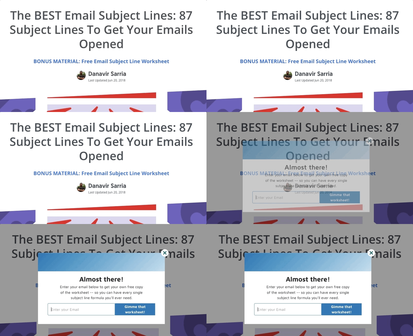
Seems straightforward, right? Yet people mess up because they try to get creative with the headline.
This is the most crucial time to get out of your own way and be straightforward.
Think about it like this. That visitor clicked on the link to get your content upgrade. In our example, that link said, “Click here to get the free cheatsheet now.”
They already want your content upgrade! You don’t need to be fancy or create something catchy to get them to opt-in. If anything, trying to get creative will hurt your opt-ins because you’ll confuse your visitor.
That’s why headlines in these kinds of pop-ups need to repeat what the visitor is getting. It’s a simple way to state what the content upgrade is without the visitor having to guess. More guesswork = less conversions.
Straightforward Headlines, Now Easier
Even if you know you have to write a straightforward headline, you still have to write it. And there are tons of possibilities and nuances that can still shape your conversion rate.
So here’s what I’ve got for you. I created an Automatic Headline Creator for your popups. All you have to do is give it a few bits of information (takes 30 seconds) and it automatically spits out headlines proven to work.
I’ve done all the work for you. Just copy and paste your favorite headline and use it in your popups.
Get the Popup Headline Generator
Add A Comment
VIEW THE COMMENTS