AppSumo is one of the most successful eCommerce companies in history. In the growth study I wrote on AppSumo’s Multi-Million Dollar Marketing Playbook I leaked the four popups that helped the company grow a 1.7 million email subscriber list.
In this article, I’m going to show you how to set up the “Thumb-Targeted Button” popup AppSumo used to get a 100% increase in mobile conversions.

Here is the five-step process you can follow to create a mobile-optimized version of your highest-converting popup like AppSumo. If you don’t have Sumo installed yet, click here and follow these instructions to make your first dollar with Sumo, then come back and follow the five steps below once you’ve started collecting emails.
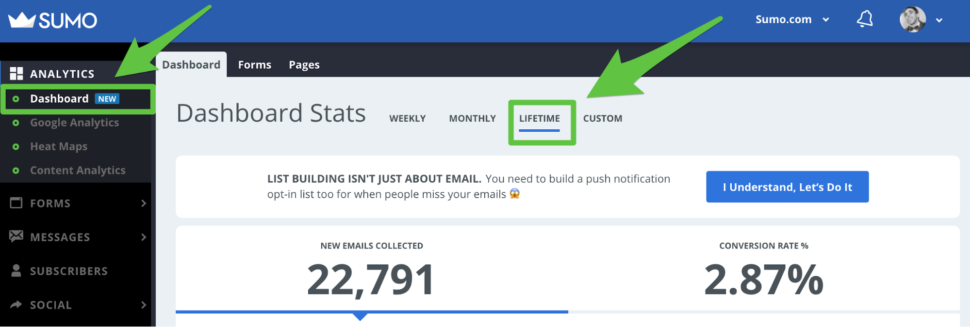
Step 1) Log in to your Sumo Dashboard and click “Lifetime” to see your lifetime email subscriber stats

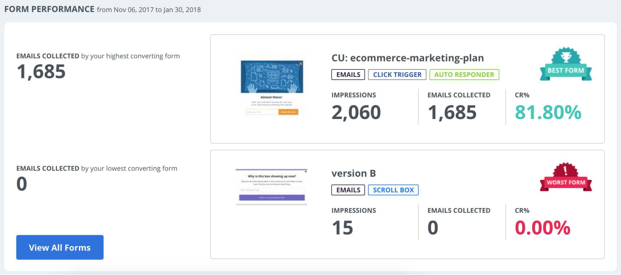
Step 2) Scroll down to see which of your forms is your “best form” aka generating you the most email subscribers

Step 3) Make a duplicate of the form

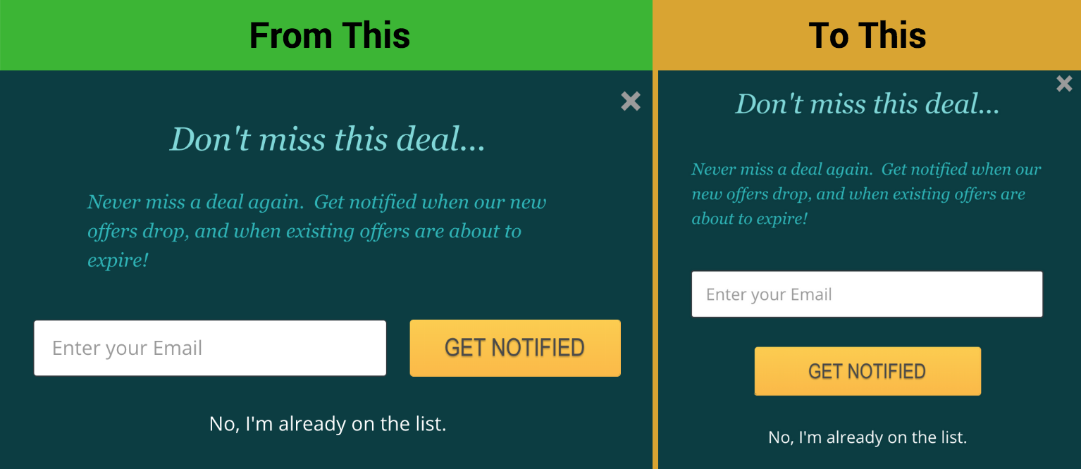
Step 4) Change the Design of your form by moving your button below your email opt-in field. Here is what Jesse “Rocket Scientist” Rhew (Sumo’s Email Optimization Master) did for the AppSumo team:

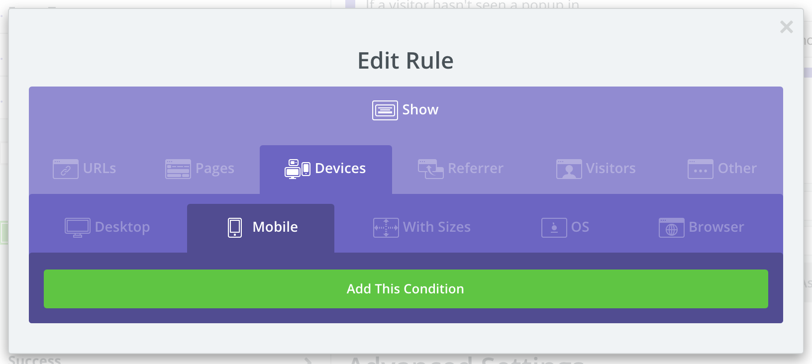
Step 5) Add a Display Rule under your forms Visibility settings to make the form only show on Mobile devices

Here’s what AppSumo’s final visibility settings look like (you can choose to not show your popup on specific pages like AppSumo, or just have it run across your whole site).

This popup works so well because you are taking your highest-converting popup on Desktop and creating a new button layout roughly lined up right under the user’s thumb to make it easier for your website visitors to opt in while browsing on mobile.
Want help executing this mobile optimization strategy for your own ecommerce business and want to see what other opportunities there are for your business? Click here to apply for a 1-on-1 session with one of our Ecommerce Experts.
Or if you want to see AppSumo’s other creative marketing strategies, click here to access AppSumo’s Multi-Million Dollar Marketing Playbook.
Add A Comment
VIEW THE COMMENTS