Hey. Scroll down a bit.
Yep, that’s good. Just a bit farther, down to the next line (I promise it’ll be worth it).
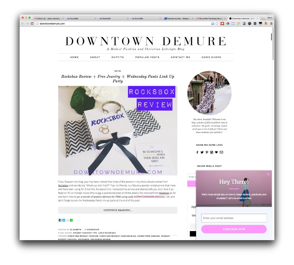
See that pop-up in the bottom right corner? It’s hard to miss.
But it’s even harder to miss than usual, even if you can’t put your finger on exactly why.
That’s because science says my pop-up captured your attention better than any other pop-up.

That specific pop-up is called a Scroll Box. They’re one of the most effective ways to capture emails and build a massive following (folks like Wait But Why, James Altucher and Jeff Gordon use it).
And we’re talking a massive following. Because this specialized pop-up has brought in over 3.5 million subscribers for people using Scroll Box.
Think about that. If you had one of these pop-ups and accounted for even .0001% of that 3.5 million, you’d have 350 new subscribers from a freaking pop-up.
You can easily hit that number. But I don’t want you to.
I want you to get MORE than that.
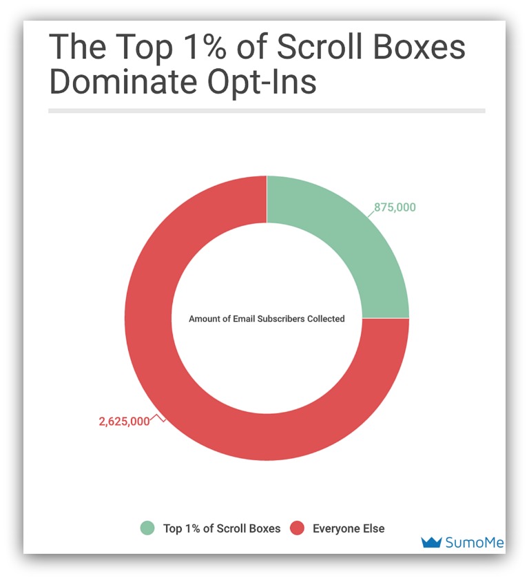
I want you to be part of the top 1% of Scroll Boxers. Because that elite group accounts for 25% of the 3.5 million subscribers. We’re talking thousands of subscribers per Scroll Box.
The secret behind their success? It’s not that they have a better site than you. It’s not that they have more money, either.
It’s because they know how to get your attention.
So I’m going to peel back the curtain and show you how the top 1% capture (and keep) attention with their Scroll Box pop-ups.
NOTE:Here’s a detailed article that shows step-by-step how to create one of these Scroll Boxes (and more).
But first, let’s answer the question I’m sure is on your mind.
WHY A SCROLL BOX ISN’T YOUR AVERAGE POP-UP
Let me guess. When you read “pop-up” you thought of this:
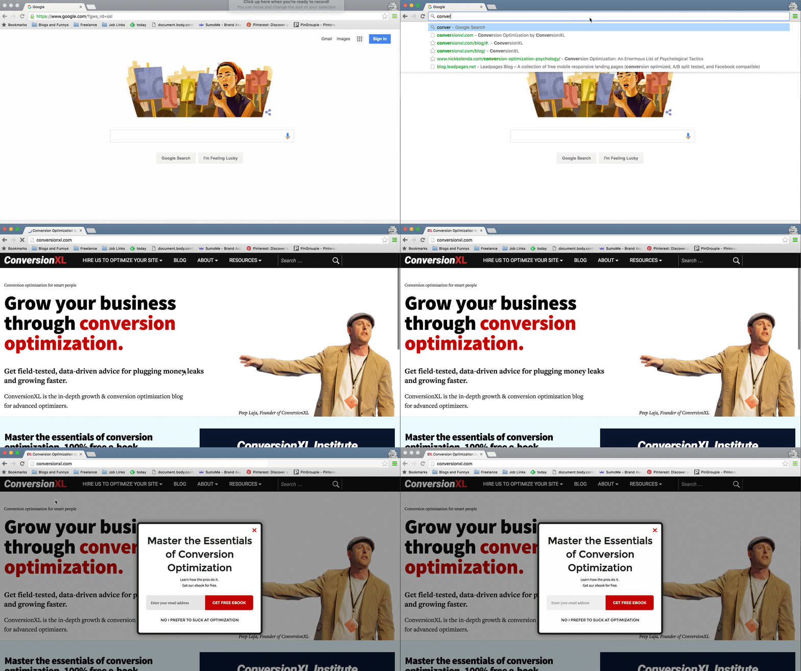
That’s what most people think a pop-up is: a big box that appears in the middle of your screen that stops you from reading. (Hey, these types of pop-ups still work.)
A Scroll Box pop-up is a bit different. You still capture your visitor’s info like name, email address etc. But the presentation is completely different:
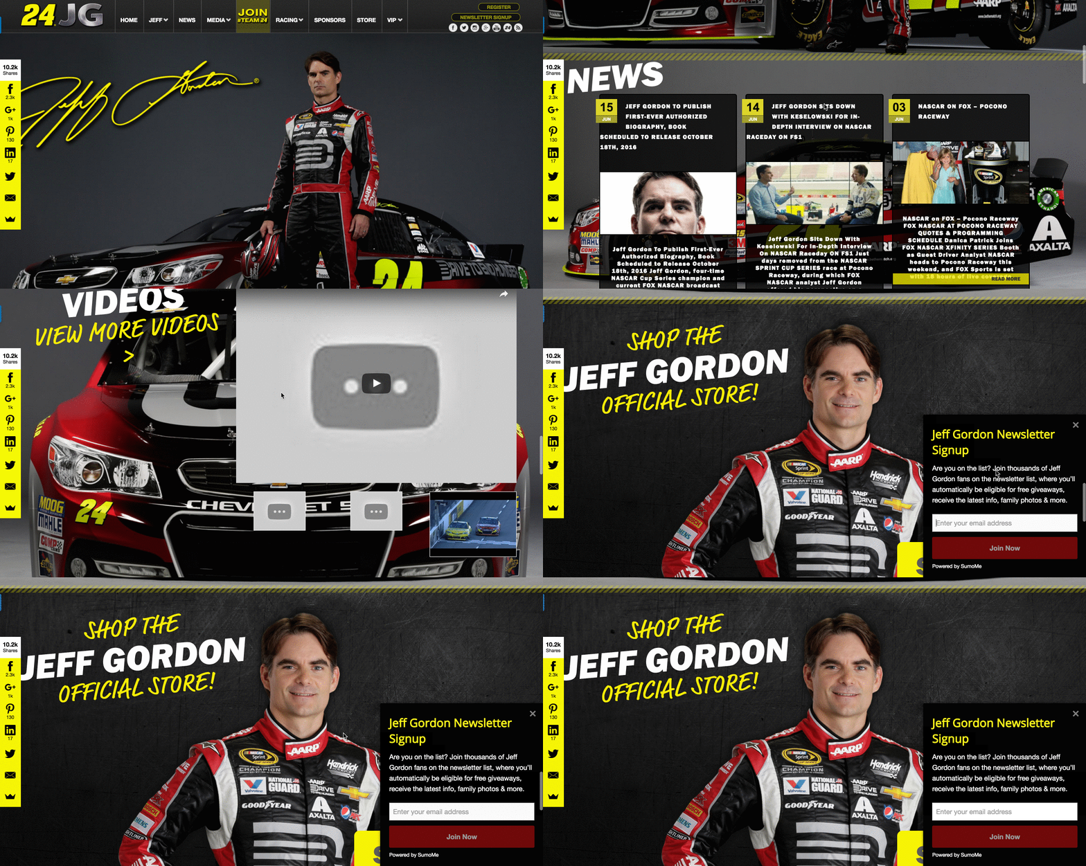
Yes, it’s still a pop-up. But it slides in from the side. It’s the polite version of a pop-up.
Oh. And they capture attention like nothing you’ve ever used before.
Attention is the gateway to engagement. And engagement, in this case, means a massive list of subscribers that read your content and buy your products.
The 1% understand how valuable that is. And here’s what they did about it.
How To Capture Attention Like The 1%
The top 1% of Scroll Boxers don’t have any big advantages over you. All things are equal when you create a Scroll Box pop-up. You have access to the same tools they do.
It’s just how you utilize those tools. Similar to that whole “It’s not the size of the ship but the motion of the ocean” argument.
Er. Moving on.
Those crafty one percenters found four big ways to captivate their audiences and build up a massive following. They are:
-
Where The Scroll Box Should Appear: Almost unanimously, the 1% display their pop-up in the exact same spot.
-
When The Scroll Box Should Appear: At the beginning of a page? Halfway down? At the end?! They know when the best time is to capture opt-ins.
-
If You Should Use An Image: Spoiler alert — only a few do. But it’ll surprise you where they land amongst their elite peers.
-
Light Or Dark Background: If the movement of a pop-up doesn’t capture your eye, the color certainly will. And the 1% have put to rest the debate between light or dark colors.
This combination turns an average Scroll Box into a legit cornerstone of your lead-capture strategy.
And these are the tips that’ll take you there.
NOTE: At the end of this guide I give you a detailed article on how to create an attention-grabbing pop-up. You can wait til then, OR you can click here to access the article now.
Let’s dig in.
Want Your Offer To Die? Put It In The Top-Left Corner
You know those stats where everything is fair and balanced? 56% do X, while 44% do Y?
This is not one of those “close stats.” There is no guesswork at play here as to which is the best route.
Get this: 88% of the best Scroll Boxare positioned in the bottom right corner of a page.
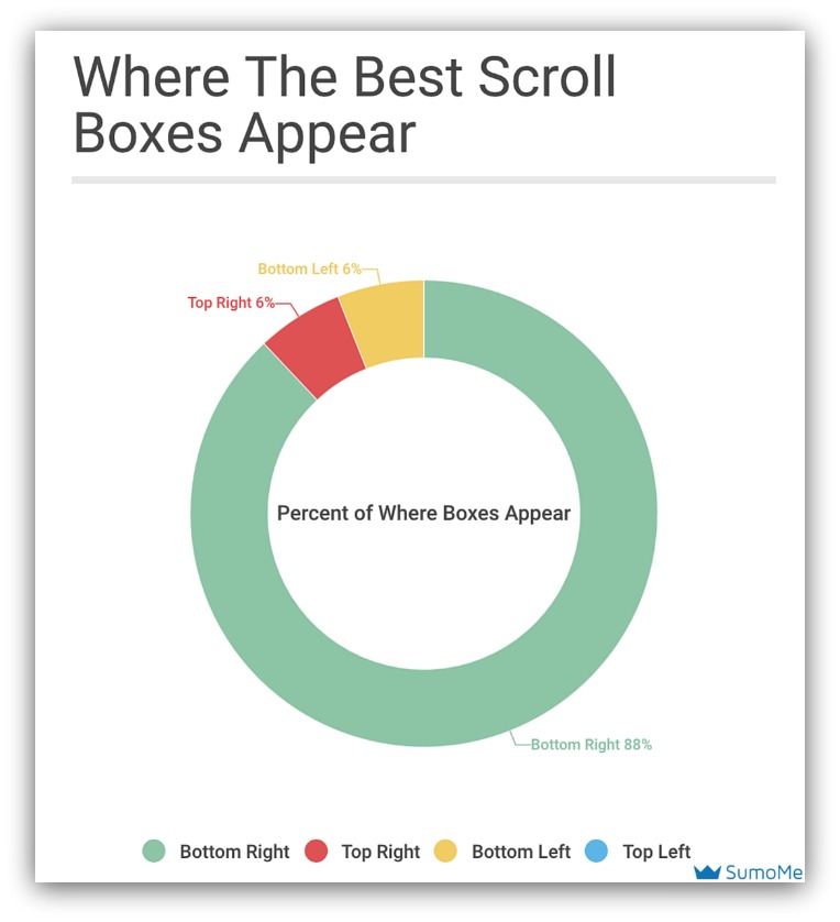
This is like if an NFL team played against a middle school team: it’s extremely one-sided, and you don’t want to be on the wrong side.
There’s such a huge disparity in this graph. To put it in perspective, here’s the breakdown of how often a Scroll Box appears in each area:
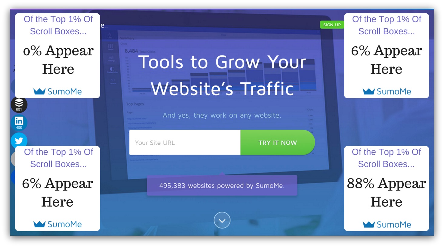
The bottom right is dominating, trailed by the bottom left and top right sides (respectively).
But why do the one percenters almost unanimously choose to put their Scroll Box on the bottom right?
Two reasons.
1) Social Share Called Dibs
Pick a random site. See where their share bar is. I’d bet you a taco it’s on the left side.
That’s because the best place for social shares is on the left side of your page. That’s where we’re used to seeing the share area.
So the left side of the page is taken. A Scroll Box would block some of the share bar, or it would throw off the visual balance of the page.
Which brings me to point numero dos.
2) Everything Is Designed for the Left
EVERYTHING.
A study from the Nielsen Norman Group showed that web users spend 69% of their time viewing the left half of the page and 30% viewing the right half.
Makes sense. We digest information the way we’re taught to read — left to right. And right to left cultures place a bigger design emphasis on the right side of the page.
That’s why so much is designed and placed on the left side of a page. If all our attention is there, it makes sense to put your most important UX elements there.
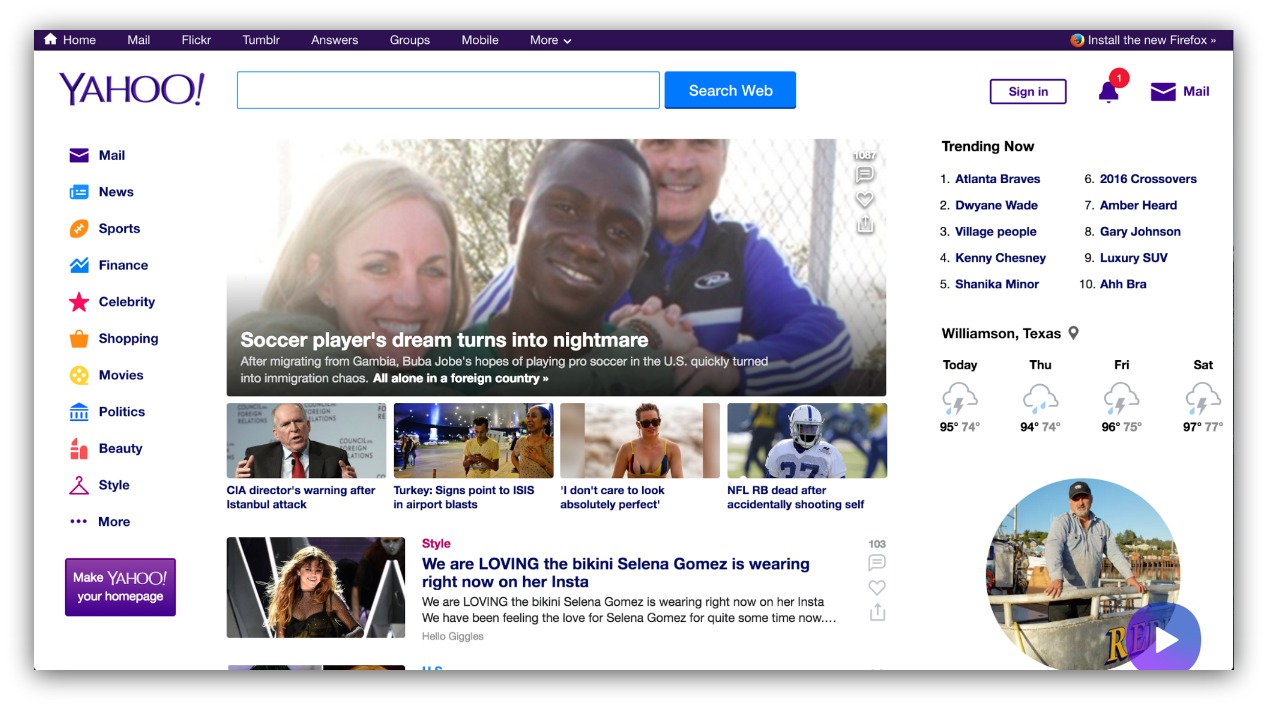
Look at the visual balance on Yahoo’s homepage. The left side is all navigation, both vertically and horizontally (at the top). If you cut the page in half, you’d see this:
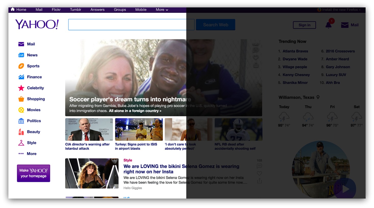
The search bar, headline and stores are shifted mostly to the left side, concentrated in the top and center. But look at the right side:
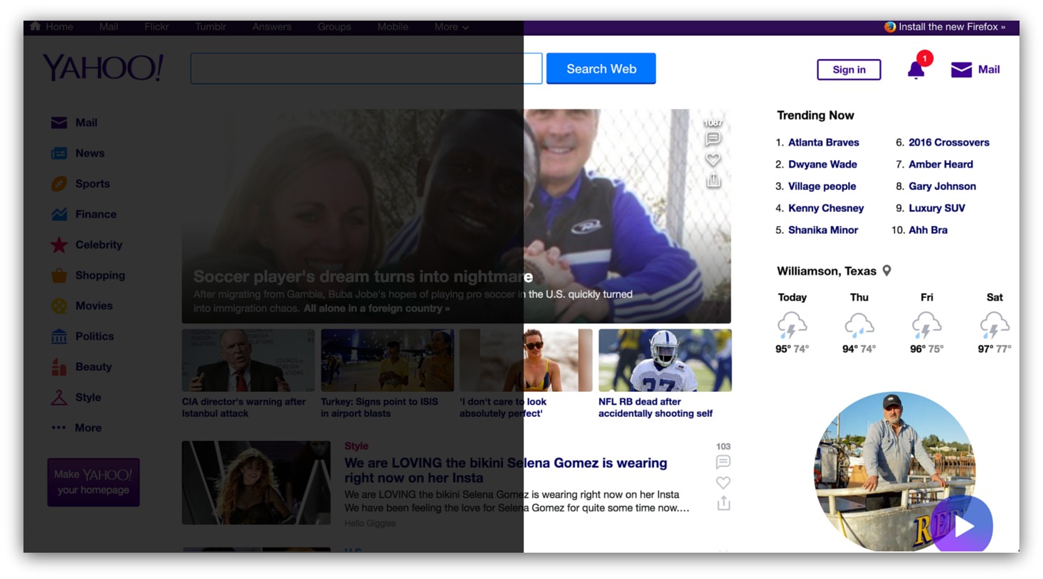
There’s not a lot there. You see trending topics, some weather and then a picture of a dude leaning on a boat.
Adding one more element — like a Scroll Box — to the left side of a page is like adding one too many Jenga blocks to the top of a tower. It throws off the balance of the page and covers up main navigation (people don’t particularly like that).
So if the left side is taken up by share bars and other design elements, it makes sense to grab your attention in a spot that is free of space — the right side. You don’t expect it, and it doesn’t hurt the viewing experience.
 We’ve got the “where” of the attention equation. Bottom right is where it’s at for the most attention-grabbing Scroll Box popups.
The next question? When do you show your Scroll Box?
47% Is The Magic Number
Think back to the last time you were in a store (Amazon shoppers, move on).
When a salesperson approached you, were the first words out of their mouth, “HEY, YOU NEED TO BUY THIS!?”
Nope. Unless you were in Banana Republic recently. They’re relentless.
What generally happens is they wait. They let you browse a bit, see what you’re interested in and then make conversation with you.
Basically, they wait until you’re invested in the purchase process.
Think of your Scroll Box as a living, breathing salesperson. It should appear when your visitor is most invested in your message — whether that’s a blog post, homepage or product page.
And science says, on average, that happens 47.7% down your page:
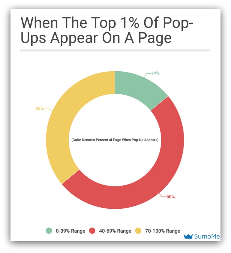
You see that most of the pop-ups appear between the 40-69% mark. Some show their Scroll Box at the 10% mark, while others wait til the 90% or even 100% mark to appear.
But, for the most part, the top 1% of Scroll Box appear between the 40-60% range — specifically the 47% mark.
So why 47%? Well, it’s easy to see once you break a page down into percentages. That’s because most pages — blog posts and product pages — follow the same general structure.
Blog Posts
Here’s an example of a normal Sumo guide:
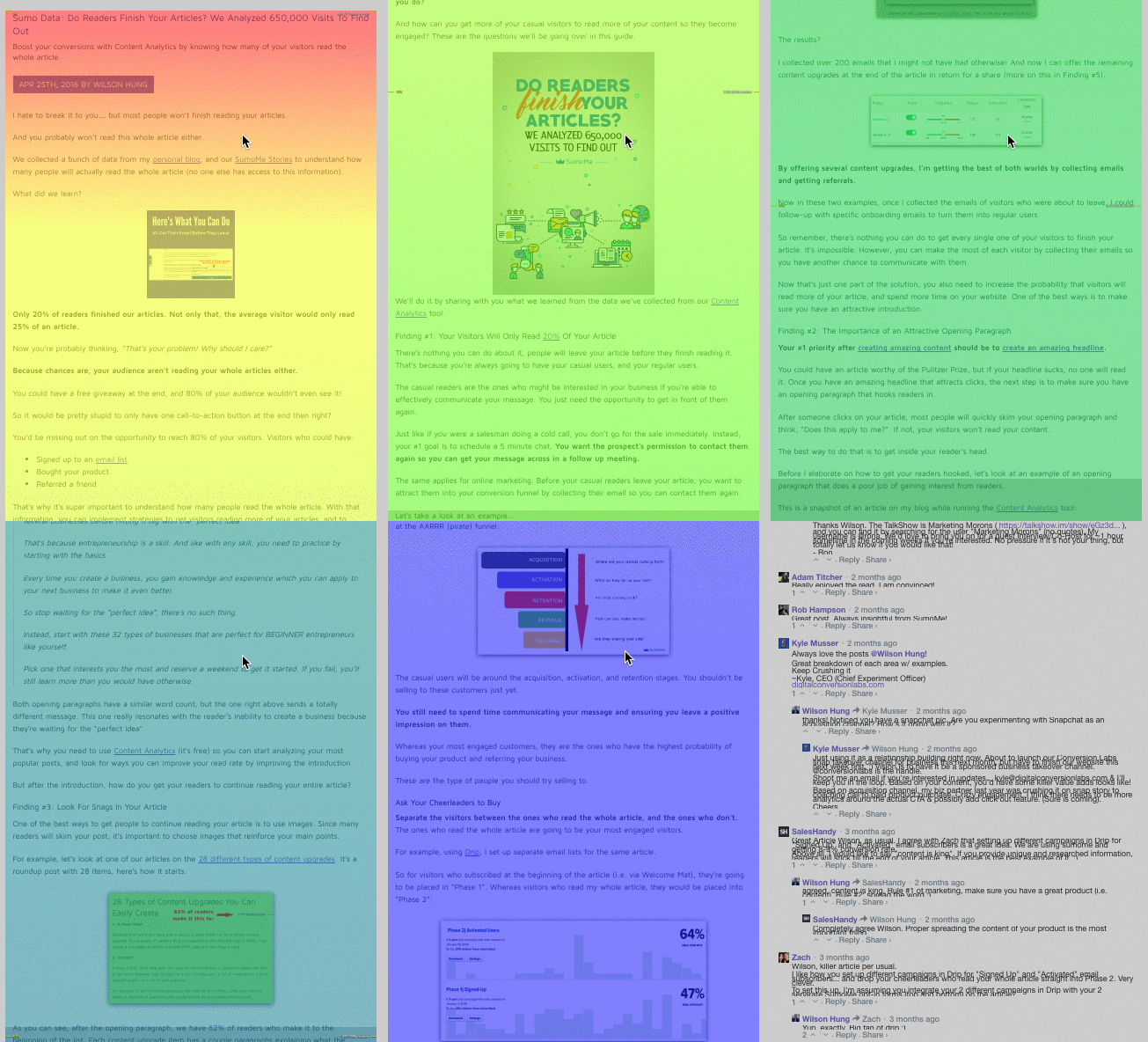
You see the colors transition from warm to cool. That means fewer and few people get to the bottom of the guide. The yellow lines denote the percent of the page (i.e. 10% means you’ve made it through 10% of the guide).
Our Sumo guide structure breaks down to this:
-
10% of Guide: Here’s your introduction, plain and simple. We lay out the scene, present the topic and talk about what we’ll provide in the guide.
-
50% of Guide: At 50%, we’ve gone through a few of our points and dove deep into a few points. This is generally considered the “meat” of an article.
-
90% of Guide: To quote Adele, this is the end. Most guides end here, with the last 10% offering a content upgrade or something of value.
Look at your own content. I bet they follow this same ratio, too. And the cool part is you can apply that ratio to a visitor’s interest level:
-
10% of Guide: They’re getting familiar with your article. They’re still not entirely interested yet. They’re “just browsing.”
-
50% of Guide: They’re interested in your article, and it’s safe to say they’re invested in the material. They can still leave If it’s not engaging enough or drops off in quality, but for the most part they’ll keep reading once they make it this far.
-
90% of Guide: This is your mom, family members, people you’ve bribed, etc. Kidding. These visitors love your article and are the most likely to act on an offer. Though the amount of people that make it to this point are miniscule.
That 50% mark explains why so many of the best Scroll Boxes show up midway through the page. It’s the biggest intersection of amount of readers that are also interested.
Wait too long and you miss out on visitors. Show the Scroll Box too early and you’re wasting an ask on visitors that aren’t as invested.
Product Pages
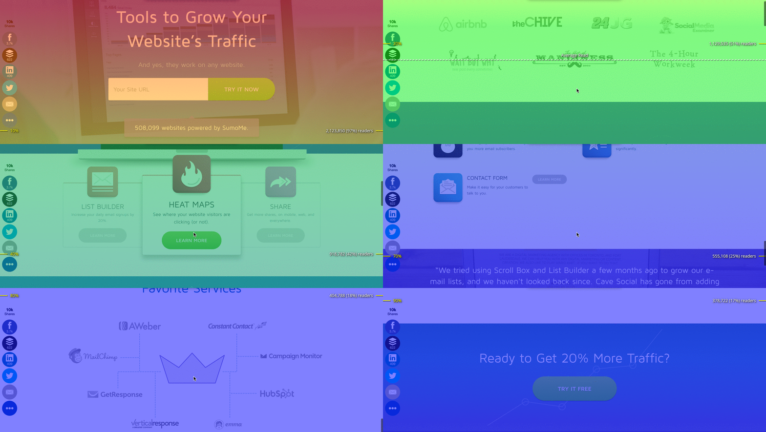
This same principle applies to product and home pages, too. There’s a general structure to these kind of pages. If you look at the Sumo page, you get an idea of the percent breakdown:
-
10% of the Page: This is our “hero layout.” It’s the first section you see on a page, and for us we state our biggest value proposition. Evernote, Dropbox, Spotify and most sites follow that layout.
-
50% of the Page: By this point we’ve gone over features, benefits and some social proof in the form of testimonials and logos. This top half comprises the big selling points that get visitors interested.
-
90% of the Page: If they make it this far, they’re ready to act (or very close to it). They’ve seen every benefit and piece of social proof possible.
And what we mentioned in the above section holds true here. At 10%, visitors aren’t quite interested yet. At 50%, they’re pretty interested. At 90%, they’re ready to act.
That middle of the page — where the intersection of interest and readers are high — is where the best Scroll Boxes appear.
But attention isn’t just about where and when. If that were the case, you could say every bird that flies past my window is a marketing genius.
There’s got to be more than a fleeting appearance to capture real attention. Elements that keep your eyes on the Scroll Box as opposed to glancing then moving on.
One of these elements is controversial. It sparks debate, but we’re going to put it to rest today.
That questionable element?
“Should I use an image or not?”
Settling The Debate Of Using Images in Pop-Ups
Copywriters scream for more words. Designers fight for more images. Engineers debate about how to pronounce GIF correctly.
So who’s right? Do we need more words or more images?
On the surface, it seems like the writers can claim a W. A majority of the top Scroll Boxes don’t use an image. 81% of the best Scroll Boxes don’t use an image, while 19% do.
Debate over, right?
Wrong.
Remember, we’re analyzing the top 1% of Scroll Boxes in existence. But like Inception, we can dive deeper, look at the very best Scroll Boxes and find something even more interesting.
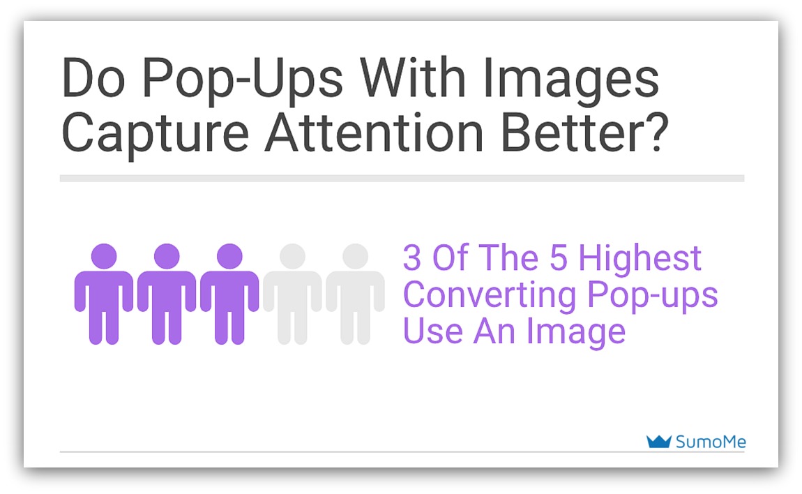
Of the five best Scroll Boxes ever created, three of them use images.

Designers after reading that line.
While it seems like most Scroll Boxes don’t use images, those that use them correctly reap the biggest benefits — namely more subscribers and customers.
But why are images so powerful? Why do the absolute best pop-ups use them to capture attention?
We know the key to attention is speed. Attention occurs in less than a second, so you need to appeal to what the mind processes quickest.
The actual act of a Scroll Box appearing is the first part of the attention equation.
The second part? An image. That’s because visuals are processed 60,000 times faster than text. Your eye progresses from the movement of the box to the image.
But if it’s any random image you’ll actually lose attention. If the image doesn’t instantly convey value then your reader will shift their focus away from the pop-up before they ever read a single word.
So don’t use any random image. Use one of these two types instead.
1) Depiction of Offer
If you’re giving away something — an ebook, product discount or service — physically displaying or depicting that offer works well.
Take a look at Lewis Howes’ high-converting Scroll Box:

When this pop-up appears, your eye goes right to the image of the ebook. Right away, your mind scans the book and text. Subconsciously, you know that the offer will somehow include that ebook.
If he were to use a different image — say a picture of an office or a stock photo — it may not perform as well. Because he uses the specific product, it lends to keeping attention.
2) Design for Direction
The other type of successful image is one that moves the reader’s eye. You see this type of image and it directs you to another spot on the pop-up.
Check out this Scroll Box from The Science of People and take notes:
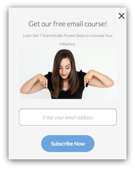
You see the image and where does your eye go? Down, that’s where. She’s pointing to the form field, conveying that it’s important you sign up for her email course.
Your image, then, is doubling down on your call to action. You ask for a signup in the text, and your image reinforces that without explicitly telling you to sign up.
So while it seems like the majority of Scroll Boxes don’t have an image, it’s the ones that use images correctly that dominate the field.
Besides an image, there’s one last element that factors into capturing attention.
And for that, we turn to the learnings of a majestic peacock and less majestic bar-goers.
Readers Crave The Light
Peacocks and pickup artists in bars have something in common.
They both use colors to attract those of the opposite sex.
Peacocks have it in their tail feathers. Pickup artists use it in their shirts and weird accessories they choose. Hey, I’m not judging. I’m just saying they do it (cough weirdos cough).
Either way, they both use color to attract. While your Scroll Box isn’t looking to “hook up” at 3am, it is trying to attract visitors and gain attention.
And that last piece of attention comes from the color you choose for your Scroll Box.
When it comes to color…there’s no magic bullet. Sorry, but it’s not like the color green turns people into frothing, money-throwing lunatics.
No, what it really comes down to is your choice of light or dark backgrounds.
The best Scroll Boxes? They prefer their backgrounds light:
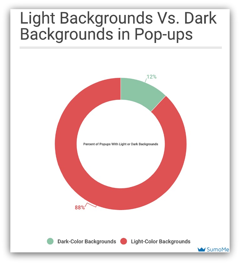
88% of successful Scroll Boxes use lighter backgrounds to capture attention. When I mention lighter backgrounds, I’m talking about light greys:
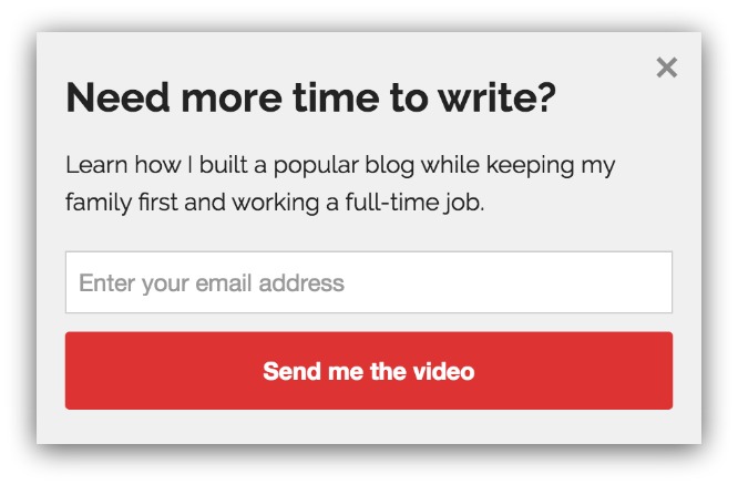
White:
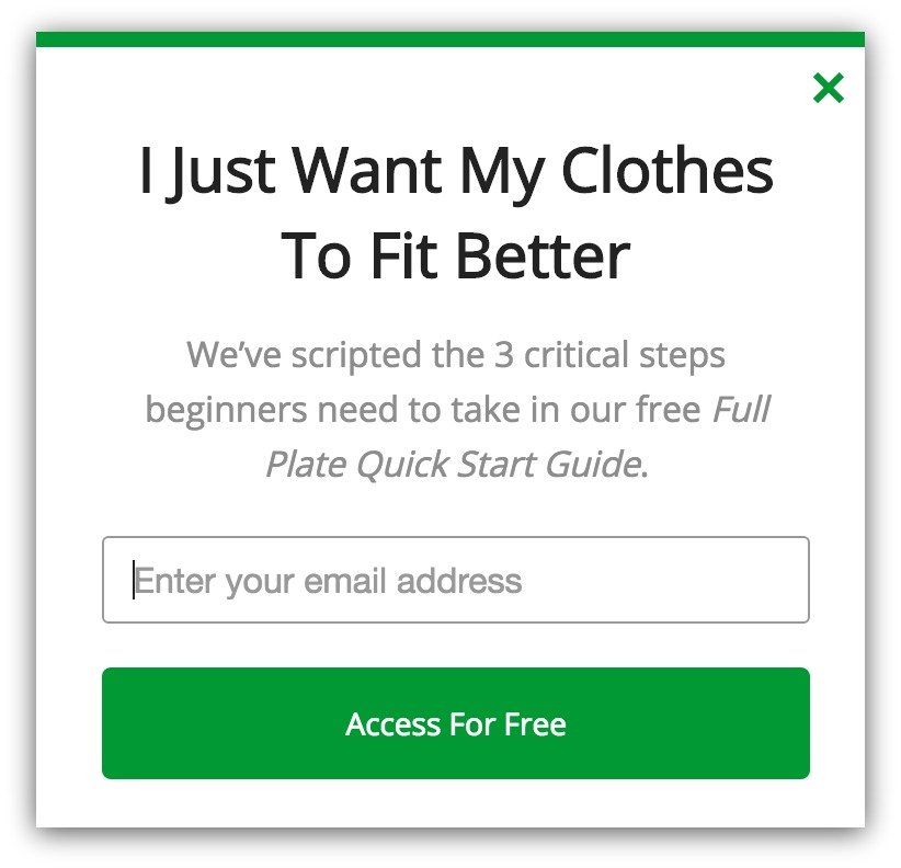
And brighter, light shades of color:

These light colors stand out for two reasons:
- They Add Contrast: Many of these sites have darker or colored backgrounds. The clean, white boxes stand out against these types of backgrounds.
- They Draw Focus to CTA: Your call to action is what makes people act. Since almost every CTA button is a bold color, the white background forces you to see the CTA first.
Even David Ogilvy, the father of modern advertising, knew light backgrounds performed better than dark backgrounds.
He found that black font on white (or light) backgrounds was far easier to read than the inverse. So on top of grabbing attention, those light backgrounds work double time to make your message easier see.
Let Me Show You How To Create An Attention-Grabbing Scroll Box in 3 Minutes
You’ve seen the scientifically backed formula behind attention-grabbing Scroll Boxes. You’ve got the stats that reveal how to be part of the 1%.
All that's left is creating that Scroll Box. We’ve written a very detailed article that can help you create a Scroll Box that’s practically irresistible to the eye.
You can access that article by clicking below.
Add A Comment
VIEW THE COMMENTS