We studied 1,000 top performing sites (with combined traffic stats of 30.7 million website visits per day) using Sumo to find out which email opt-in tools they’re using — and if they’re worth your time.
Today we’re using our data to uncover:
- The 1 Email Opt-In Tool You Can Use To Average A 31.50% Conversion Rate
- The 4 Best Days To A/B Test Your Headlines
- The 8 Highest Converting Email Opt-Ins
- The 5 Lowest Converting Email Opt-Ins
Check out what we discovered:
1) A New Type Of 2-Step Email Opt-In Called "Click Triggers" That Converts 12X Better Than Any Other Email Popup On The Market
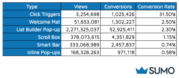
For those strategic enough to spend the time creating Click Triggers, our data found an average conversion rate of 31.50%.
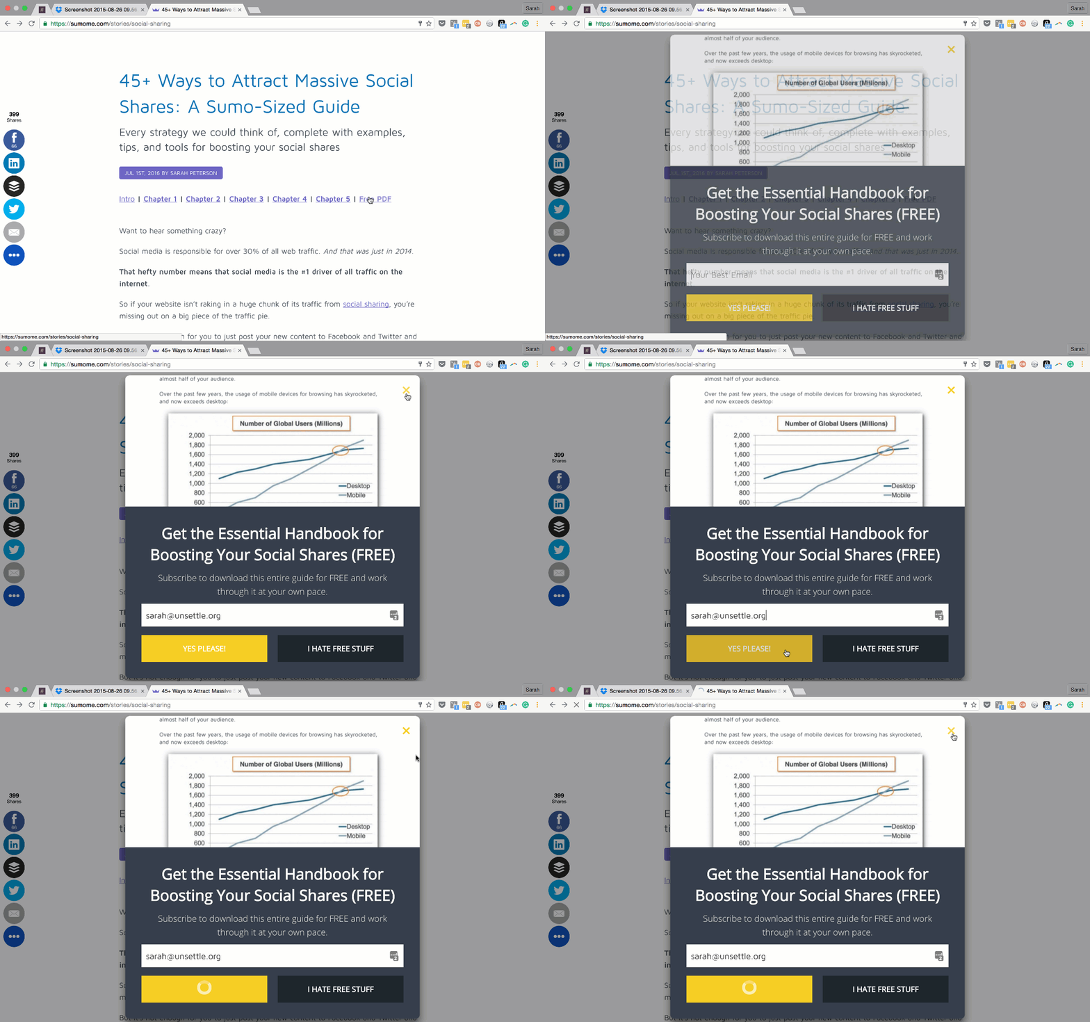
What’s a Click Trigger? A two-step popup that’s activated by a link click (meaning visitors ask for it).
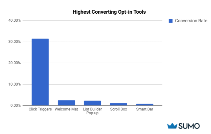
Click Triggers convert 12X better than any other email popup. Welcome Mats and List Builder pop-ups come in at a distant 2nd and 3rd in terms of conversion rates (2.5% and 2.3%, respectively).
But before you add 3 pop-ups to every page of your site, think about your user experience.
Instead of going crazy with adding too many pop-ups, fine tune the settings and you’ll naturally increase conversions.
For example, you can set your pop-ups to show:
- After a certain amount of time has passed
- Just before a user is about to leave (exit intent)
- After a visitor has seen a certain amount of pageviews
Key takeaway: If you’re looking to capitalize on your traffic, Click Triggers are the best option, followed by Welcome Mats and List Builder pop-ups.
2) The 4 Best Days To A/B Test Your Headlines
Here is the best day for you to start testing the email opt-ins above in your own business.
The last 18 weeks of data shows us that the highest opt-in rates occur on Tuesdays, Wednesdays, Mondays, and Thursdays — in that order.
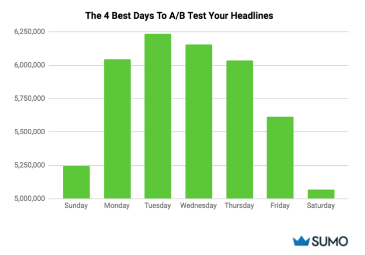
You’ll notice from looking at the chart above that Tuesday is the highest converting day.
So should you only schedule your opt-ins to appear on those days? Or should you strictly focus on Tuesdays?
Not exactly.
Look at your own data to find out if you’re experiencing the same trends. Using your numbers, A/B test your opt-ins on your highest converting day.
Try changing elements like:
- The headline
- Supporting line or subhead
- CTA text
- CTA button + color
Key takeaway: The middle of the week (Mon-Thurs) performs better than weekends and Friday. Use this time to test out different versions of your opt-in.
3) The 8 Highest Converting Email Opt-Ins
Wouldn’t it be nice if you could see the best performing opt-ins to see how yours stack up?
Now you can.
Ready to peek inside a two step Click Trigger opt-in that converts at 92%? Check this out:
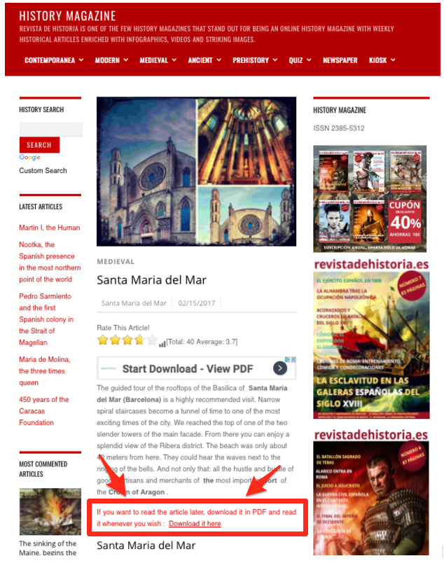
That red line is a link to download the article in a PDF form so readers can refer back to it at their leisure, and without having to bookmark the page.
When you click the “Download it here” link, the actual opt-in pops up. Here’s what it looks like:
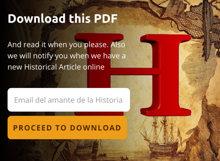
This one simple email opt-in converts at 92%.
Email Opt-In Conversion Magnet #2: The Highest Converting eBook Email Opt-In You've Ever Seen
Unlike this example, the next one can’t be missed.
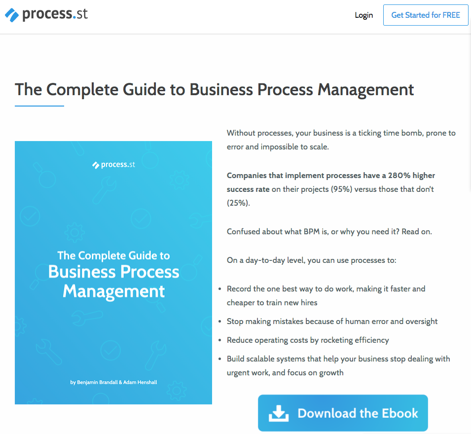
The bright blue button with Download the Ebook is actually the first step of the opt-in. Once you click that, the opt-in form appears:
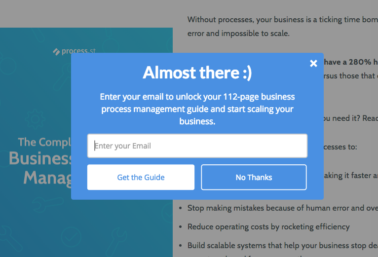
This opt-in converts so highly for 5 specific reasons:
- It uses an opt-in tactic called “2-step opt-in” where the visitor needs to first make a micro-commitment by clicking a button and is then given the chance to opt-in
- A friendly headline with text that isn’t redundant (many people make the mistake of using the same words in their headlines and descriptions)
- A short 1 sentence description summarising exactly what you get when you opt-in
- The “Get the Guide” text is actionable and the button itself is in a different color as the form so it stands out
- The No Thanks button blends in with the background and fades from your attention
As a result, this Click Trigger converts at 79%.
Click Triggers aren’t the only pop-ups converting well. See what I mean in this next section.
Email Opt-In Conversion Magnet #3: The 4 Letter Word You Can Use In Your Email Opt-In Headline To Get A 56% Conversion Rate
This simple and unassuming pop-up is currently converting at about 56%:
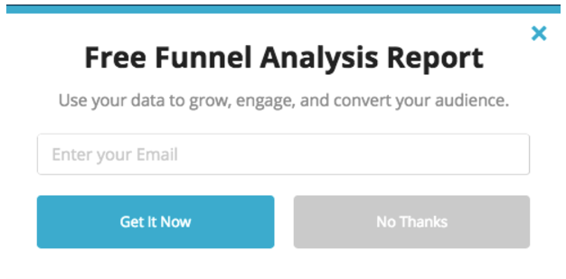
Let’s dissect why it’s working so well.
First, the bold CTA mentions the word free.
This word free is enough to motivate people (up to 68% in one example) to take action when they otherwise wouldn’t.
But the word free isn’t the only motivating element in this CTA.
Free, when combined with Funnel Analysis Report, feels as if you’ll be receiving a custom report just for submitting your email.
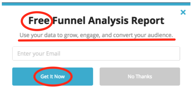
The CTA buttons on this opt-in are brightly colored with the words “Get It Now” instead of something boring and generic like Submit.
To discourage users from clicking the “No Thanks” button, they grayed it out so the blue CTA pops more.
All of this helps increase conversions.
Email Opt-In Conversion Magnet #4: Pulmonary Hypertension News’ 45% Click Trigger Email Opt-In
This next example doesn’t take advantage of customized CTA buttons yet it’s still converting at 45%.
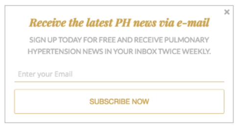
A CTA button that fades into the background and standard Enter Your Email and Subscribe Now text are not recommended for high-converting pop-ups.
So what makes it convert so well?
It clearly explains what you’ll get (pulmonary hypertension news), when (twice weekly), and how (via email) in two sentences.
Here’s the formula: Item + Frequency + How = SUCCESS
You’ll also notice they weave the word free in there along with action-oriented verbs like receive and sign up. These are all copyable.
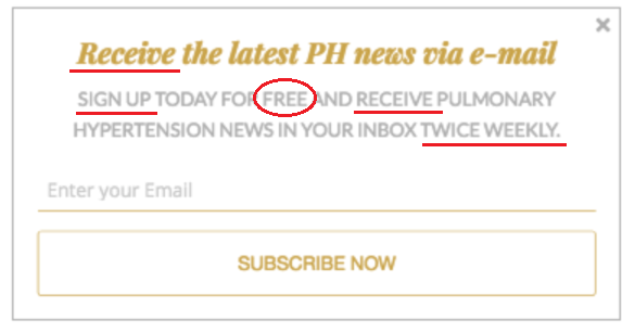
My only critiques:
- Reverse the color order of the button so it stands out more. A simple reversal of the color order (in this example, using a gold box with white words) would better grab their visitors’ attention.
- Get rid of the Subscribe Now text. While this is converting well, imagine how much better it could be converting with something like Get It Now to prompt immediate action.
Key takeaways:
- People like freebies so even though your opt-in has a price (an email address), adding the word free to your offer encourages more takers.
- Play around with your button color and CTA text to compel visitors to take notice, which will both add to your conversions.
- Clearly explain what someone gets when they opt-in or they won’t see the value in following through.
Now that you have the best pop-up examples under your belt, let’s check out the highest converting Scroll Boxes.
Email Opt-In Conversion Magnet #5: Hiker Crate’s 41% Scroll Box Email Opt-In
We found a Scroll Box that converts at 41%:
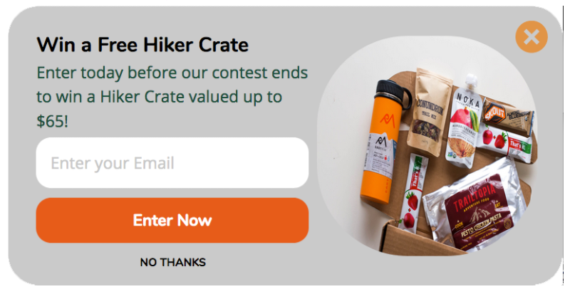
Here’s why this one works so well:
- Before you see that magic word free, you see the word Win, telling you that you have a chance to enter a giveaway just by entering your email.
- The team behind this opt-in even included a price tag that mentions their giveaway is filled with $65 worth of goodies. AND you even see a picture of what’s in store if you win.
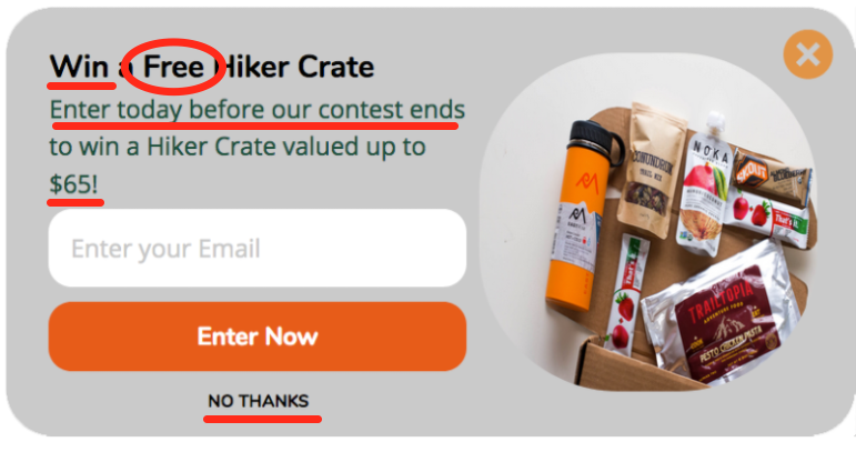
There are also two other factors that are contributing to their success:
- They’ve created a sense of urgency with Enter today before this contest ends. Since they don’t give an end date, there’s no telling how much time a new subscriber has.
- Their No Thanks button isn’t even a button — it’s just the words in a smaller font and it has the same background color as the entire form, making it fade out from your view.
Email Opt-In Conversion Magnet #6: Add The Right Visual Image And You’ll See A 22% Conversion Rate
The next example clocks in at a 22% conversion rate and carries some of the same elements.
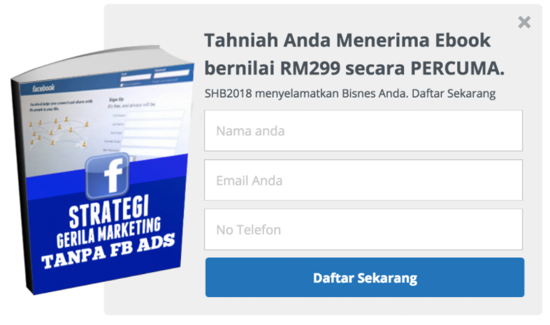
A big bold image of exactly what you get when opting in. In this case, it’s a free ebook on guerilla marketing tactics for Facebook that don’t involve using ads.
They’ve also listed the value of this ebook — in this case, RM299 (299 Malaysian Ringgit).
As for the CTA button, the words Daftar Sekarang, or Register Now, appear again. So they’ve listed — and reinforced — that you should Register Now twice to create urgency.
This example doesn’t even bother with a No Thanks option. If you’re not interested, you’ll have to X out of the box altogether.
Key takeaways: Whenever you’re giving away something for free:
- Include an image of the freebie so people feel as if it’s something real within reach
- Add a price tag to the item to show its value
Contests are another tactic to try with your audience. If you choose this route, be sure to add that sense of urgency so people actually sign up without dilly dallying.
Before we move on, there’s one more thing to consider here: this opt-in asks for 3 pieces of information (name, email, and phone number) from new subscribers, as opposed to just one (email only) like the other highest converting forms do.
In our research, we discovered:
- 97% of the top sites ask for an email
- 5.3% ask for a first name
- 4.5% ask for a name
- 1.3% ask for a last name
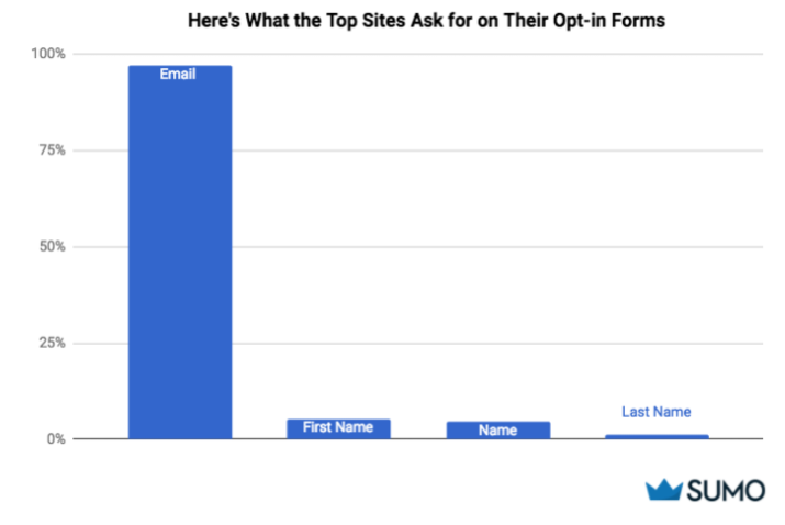
This supports existing research that the more items you have on an opt-in form, the lower your conversions will be.
The thought here is that having more items to fill out overwhelms your potential subscriber which makes them more likely to not take any action.
Keep things simple instead and consider asking for just an email address with your opt-in forms.
Next up, let’s talk highest converting Smart Bars.
Email Opt-In Conversion Magnet #7: The Simple Smart Bar That Converts At 28%
In this first bottom-positioned CTA bar example, you see the word free front and center once again.

You also see that with opting-in, you receive two goodies: a food diary and resource guide. #DoubleWin

The Empower Me text on the CTA button:
- Helps this opt-in earn a 28% conversion rate.
- Gives the person opting-in a feeling that they’ll finally have the tools they need to succeed.
Key takeaways: There’s only so much room to get your message across when it comes to Smart Bars so it’s crucial that yours stand out with actionable words.
- Clearly explain what’s in store when someone opts-in
- Toss out the generic wording on your button.
Up next, I’ll show you the best performing Welcome Mats.
Email Opt-In Conversion Magnet #8: Use This Conversion-Boosting Welcome Mat To Get A 61% Email Opt-in Rate
Want conversions that go above the 60% mark? Study this next example.
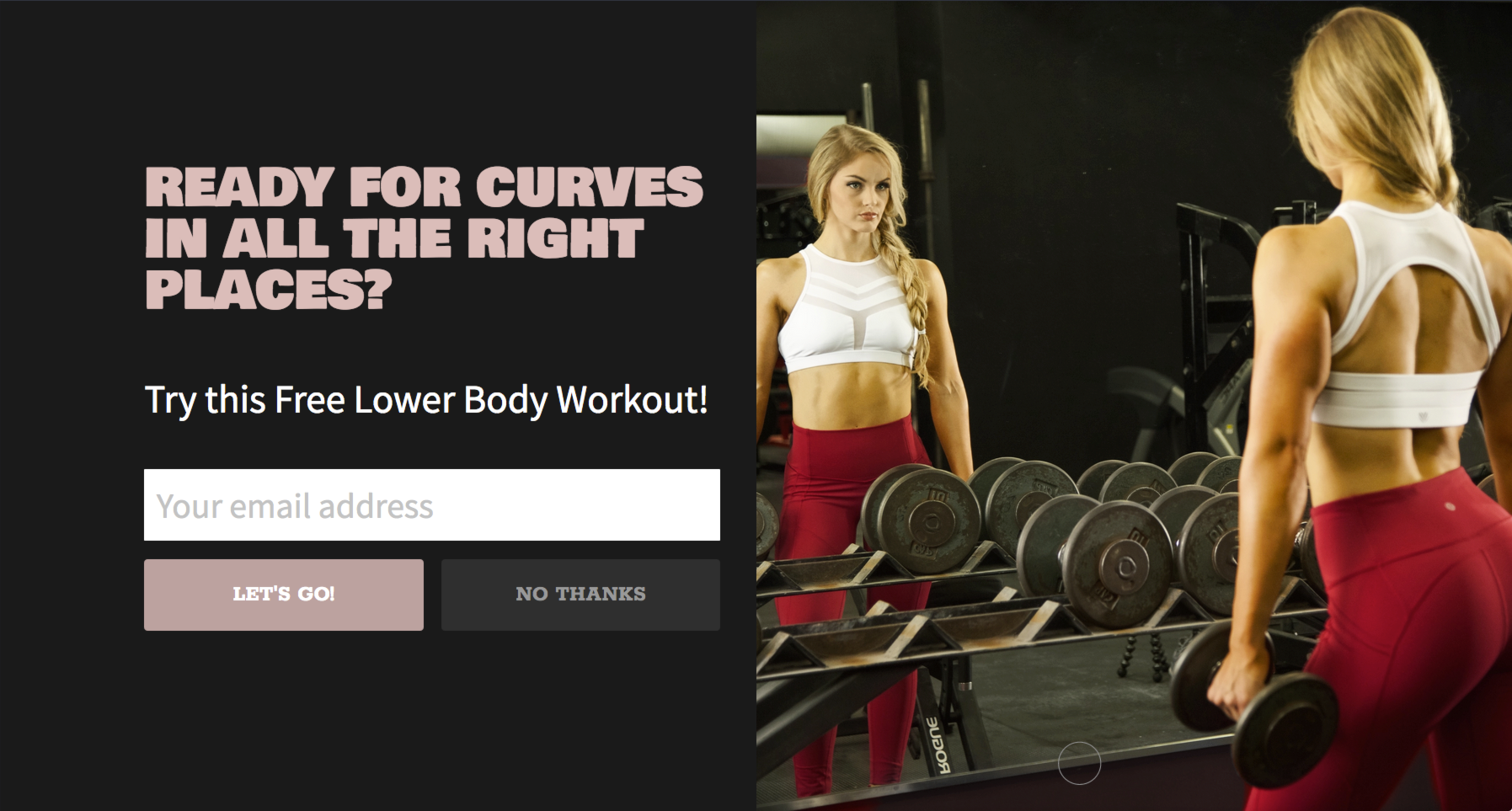
- You’re greeted with a question that forces you to engage with the opt-in, first off. Of course you want curves in all the right places.
- Then you’re hit with another whammy — Try this Free Lower Body Workout. I don’t have to tell you why this works so well.
- If all this A+ work wasn’t enough, there’s even custom opt-in text of Let’s Go to inspire physical and digital movement over the sedentary nature of words like Subscribe Now.
This Welcome Mat converts at 61%.
Key takeaway: Welcome Mats give you the chance to pair your message with an engaging image so don’t waste this opportunity by using crummy stock photos.
Instead, and as we saw in the example above:
- Showcase a picture of what your subscribers will get once they opt-in and they’ll be more likely to do so.
- Go for a custom opt-in message for your CTA button instead of the standard copy like the other opt-in examples.
- Pay attention to the colors you’re using as well. Don’t make your No Thanks option stand out; ideally it should fade into the background.
Now that you know what works really well, let’s cover what isn’t working.
4) The 5 Lowest Converting Email Opt-Ins
Are you making these email opt-in conversion mistakes?
Email Opt-In Conversion Trap #1: How To Avoid Getting 0.07% Conversion Rates On Your Pop-ups
The first example on our list has over 74,000 views, which sounds pretty impressive.
What’s the problem?
Only 53 people have opted in (that’s a .07% conversion rate).
Think about how many missed opportunities that is.
But, after looking at the example, it makes sense.
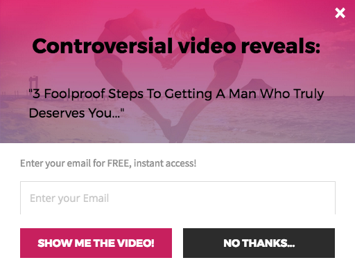
Here are my critiques so you don't fall into this .07% conversion trap:
- The first thing you see is a random statement: Controversial video reveals. It’s not a headline by any means and it doesn’t motivate anyone to do anything. At the very least, they should change this to become the headline: Get a Man Who Truly Deserves You. The supporting call to action could be “Find Out How By Grabbing Your Free Access to This Controversial Video” afterwards.
- This example also showcases the fact that you can’t just throw the word free in there and expect a flood of conversions.
- This popup doesn’t give enough information about the benefit of the video. The button text Show Me the Video is not convincing because people have no idea if they even want or need to see it.
- While the buttons match the image, the hot pink and black buttons are competing with each other for attention. Since the rest of the form is so not working, it’s easy to choose the black No Thanks one.
Take note and don’t make these mistakes.
Email Opt-In Conversion Trap #2: Creating A False Sense Of Urgency Will Tank Your Email Opt-Ins
This next example clocks in at a .01% conversion rate. With 12,970 views, and only 1 opt-in (probably the owner testing it), there’s even more you can learn from here.
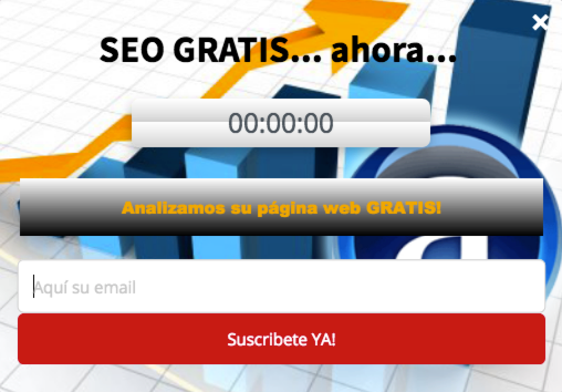
When translated, the bold headline is “Free SEO… now…”. Again, just because the word free is in there doesn’t mean you automatically get more conversions.
Here are the 3 reasons why this email opt-in converts so poorly:
- There’s a countdown timer that’s expired. This does not create a sense of urgency and makes people with common sense assume that the offer is over and not worth opting into.
- There’s a statement in a gray box that says “We Analyze Your Website for Free.” As the meat of the offer, it’s too buried in the form and barely noticeable. This statement might work better as the intro headline and could be changed to: Let Us Analyze Your Website (For Free!).
- The big red opt-in button says “Subscribe Now.” The problem here is the offer is a free website analysis so why is it instructing people to Subscribe? What are they subscribing to? If your users don’t know, they won’t bother taking any action.
The entire form is extremely hard to read due to the busy background image and multiple boxes and colors.
These next few examples are also guilty of driving away users from opting in.
Email Opt-In Conversion Trap #3: The #1 Thing You Can Do to Avoid a .26% Conversion Rate
This scrolling box below is converting around .26% with only 4 opt-ins out of 1,525 views.
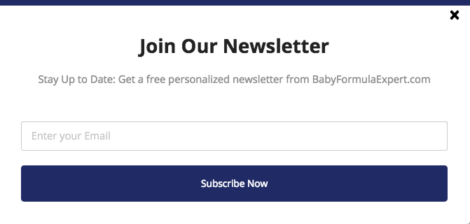
You can blame bland, generic forms for that.
There’s the typical Join Our Newsletter and Subscribe Now buttons, which most people are so used to seeing they simply tune them out.
In between the generic sandwich is a one-liner that doesn’t deliver the benefits of what people get for opting-in. Stay up to date and receive a personalized newsletter?
No wonder they’re not seeing high conversion rates.
This next example takes this awful strategy a step further by not customizing a single thing. They literally used the exact template that comes with the tool.
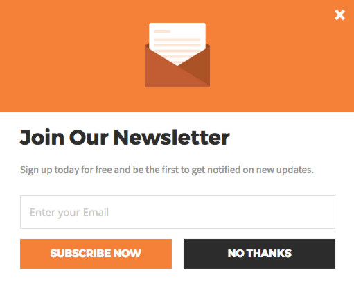
Taking the lazy approach severely limits your conversions. Only 2 people have opted-in out of 2,136 views (.09% conversion rate).
While the generic template is there for you to use in a pinch, if you’re not tweaking it to your specific offer or your audience, you won’t connect with your audience and inspire action.
Key takeaways: Get super specific with your offer and make sure your message speaks to your audience.
If you want to save time by using a generic template, that’s cool, but don’t forget to tweak the text to suit your readers.
You’ll find a similar situation plaguing the lowest converting Smart Bars.
Email Opt-In Conversion Trap #4: Make These 2 Mistakes and You’ll See a .007% Conversion Rate
Let’s start off with an example still rocking the original template:

Because of this lack of creativity, the conversion rate is a paltry .007%. That’s 9 opt-ins out of 116,254 views.
Imagine where this brand would be if they simply worked their text to fit their audience.
The one thing they did right was choosing a sticky Smart Bar so it scrolls with the reader.
This next example fails to do that and it could be why their conversions are suffering.

They at least spent the time to change the call to action statement that precedes the opt-in box. And they even led with the word Get and used FREE too.
So why did only 234 people opt-in out of the 1,289,303 views (for a mere .02% conversion rate!)?
- The bar itself is set as static so it doesn’t move with the reader as they scroll down the page. By doing this, you miss the opportunity to catch those readers who are halfway through your content and completely engaged.
- In addition, this form could benefit from a better CTA on the button than the generic Subscribe Now. In this case, you could say something like Get My First Recipe instead.
Key takeaway: Stop missing out on conversions and start customizing your forms.
At the very least, change the CTA text and set your bar to move with the reader down the page (aka make it sticky).
Up next, I’ll share what you can learn from the lowest performing Welcome Mats.
Email Opt-In Conversion Trap #5: When Your On-Page Email Conversion Elements Don’t Work Together, You’ll See a .03% Conversion Rate
By now, you’re probably an email opt-in auditing pro and already know what I’m going to mention here.
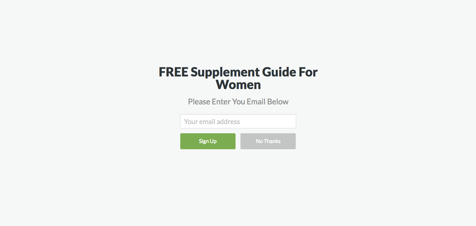
Instead of wasting the space below the headline, use that to drive home what’s in store for people when they opt-in. You can use the box text to give instructions about Entering Your Email.
As for the buttons, the generic Sign Up isn’t going to cut it. And the conversion rates prove this fact at .03% (2 out of 7,052 views).
The big gray box is another area to tackle as it doesn’t stand out visually. It’s more like a big gray blob.
But, you shouldn’t add a background image just for the sake of doing so as this could distract readers.
As an alternative, create a background that compliments your offer like our top two performing Welcome Mats do.
An image of what people are getting when they opt-in or a final product of what they’ll accomplish after using your freebie (curves in all the right places) is a much better idea.
The last example on my list is a total *facepalm emoji*.
At first glance, it doesn’t look too bad. Before I dive into the specifics, see if you can spot the errors here for yourself:
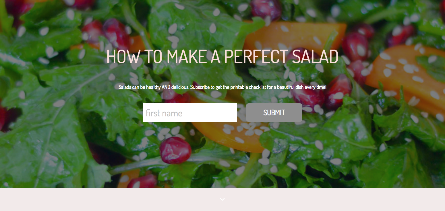
Here’s where things go wrong:
- The bold headline isn’t too bad, but as soon as you go just below that, you can hardly make out or read the supporting sentence.
- The image in the background completely loses the text. Imagine what this looks like on mobile.
- When you zoom in, the text says: Salads can be healthy and delicious. Subscribe to get the printable checklist for a beautiful dish every time. While that sentence is super long and could be cut in half, it’s the next part that really gets me.
- The text in the box asks for a first name instead of an email. This is not going to help you grow your email list. And if that wasn’t inefficient enough, the button just says Submit. So all the readers are doing is entering their first name and sending it away for… what?
As you can guess, here’s what the conversion rate looks like: 2 opt-ins out of 1,709, or .12%.
To fix this:
- Change the headline to How to Make a Salad That’s Healthy AND Delicious. The word perfect is subjective. But by explicitly saying that your salads can be both healthy and delicious, you’re giving readers more info on how they’ll benefit from this offer.
- And instead of using Subscribe to get the printable checklist for a beautiful dish every time…. Chop this down and say Get Your Printable Checklist for a Beautiful Salad Every Time.
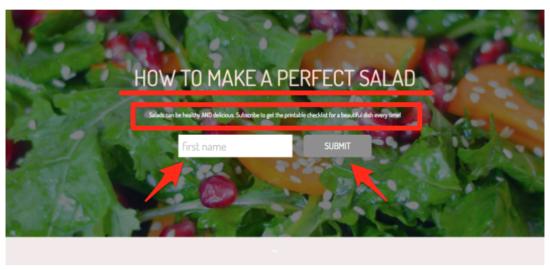
Key takeaway: It’s crucial that you consider your message along with your image when it comes to Welcome Mats. Everything should support and reiterate the benefits of opting-in.
Don’t forget about your buttons too. If you overlook these, you can kiss conversions goodbye.
Audit Your Opt-ins & Increase Your Conversions Today
Now that you’re equipped with this data, it’s essential that you apply it to your audience and your opt-ins.
To do this, remember these seven points:
- Adjust the settings of your pop-ups to capture users after they’ve made it through some of your content, but before they bounce from your page.
- Test your opt-ins on every browser (including both desktop and mobile) to see how they look and perform. Make any necessary adjustments immediately.
- Consider using the word free in your offer as well as adding a price tag of what it’s actually worth.
- Including an image of the freebie, or one of the results you could achieve by using the freebie, is also another good idea.
- Keep your message benefit-driven and specific. Your headline, subhead, and CTA text should be cohesive and support the same goal.
- It’s also essential that you tweak the free templates to speak directly to your audience and your offer. Generic info won’t work!
Tackle these email opt-in tips to go from a 0.01% conversion rate to 92% overnight.
Add A Comment
VIEW THE COMMENTS