Do you remember how badly you wanted to press all the buttons you came across as a kid?
Getting in an elevator was so exciting because you could press buttons and something would happen.
Our affinity for button-pushing didn’t go anywhere (though we now have more social awareness and self control about it). That’s why call to action buttons work: because they’re meant to be clicked or pushed.
Unlike images, for example, we know what’s expected of us when we see a button: click it!
But, just like when you were a kid, not all buttons are created equal.
So how can you make your call to action button so enticing that they’re just begging to be clicked?
In this article, we’ll be going over the best call to action button examples we could find to show you why they work and how you can create your own.
All the examples that show how to capture more emails can be set up for FREE on your website using Sumo.
STRATEGY #1: MAKE YOUR BUTTONS IMPOSSIBLE TO MISS
You could have the best button copy online, the highest converting supporting text, and you could be oozing social proof but if nobody sees your call to action button, that’s all useless.
If you’re trying to create the best call to action button out there, you need to start by making sure it’s seen by your website visitors. Here’s how.
MAKE IT JUMP OFF THE PAGE
Last July, I reviewed over 100 websites for Sumo customers.
The #1 issue I saw on the Welcome Mat, pop-up, and Click Trigger I reviewed was that my eye didn’t immediately go to the call to action button when the tool appeared.
Since we humans have 8 second attention spans, your call to action button should be one of the first things your visitors notice when they land on your page or see your pop-up.[*
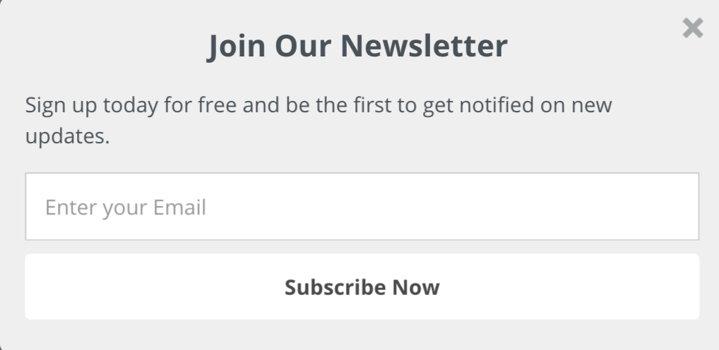
Meaning your button should not look like this:
Instead, make it jump off the page with an action color.
Check out how Sumo customers The Catch and the Hatch does this with their call to action button:
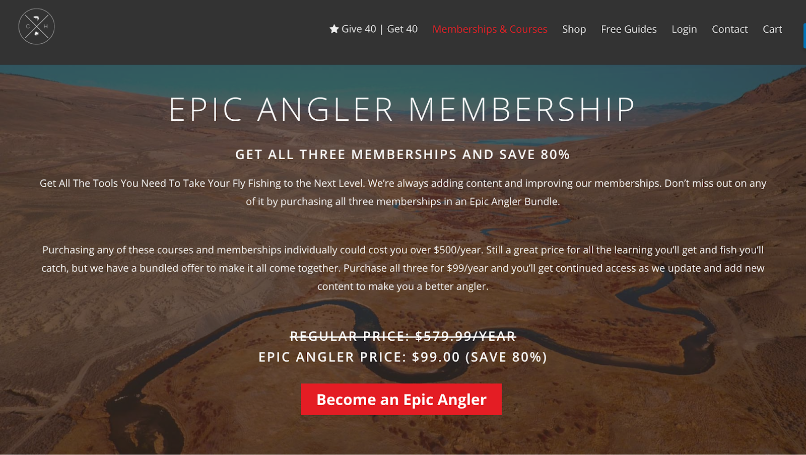
The red “pops” from the brown background, and serves as an action color.
Action color: Any color that stands out, used for elements on a webpage that the administrator wants action to be taken upon (links, buttons).
In the Catch and the Hatch’s case, the link and the button (the two things the owners want you to take action on) are the same color that stands out from the rest of the page.
The Instagram marketing tool Grum does this well, too.
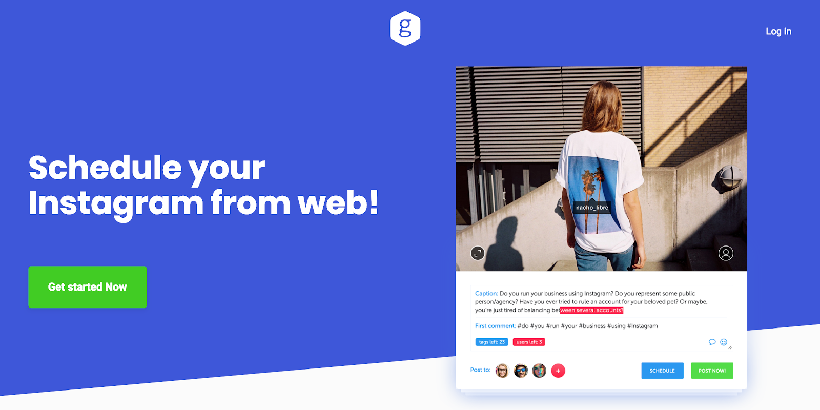
But Grum and my other example use the most debated action colors: red and green. Do you have to follow suit?
Maybe. I’ll explain…
CHOOSE A COMPELLING COLOR
Button color matters. And that doesn’t mean you should just set your button color to green because you heard green outperformed red and that red is a “stop” color.
It means that you need to choose a color that is compelling to your target customers.
Red might be a stop color for a guided meditation website, but for a marketing site it could mean “go”. And you don’t have to limit yourself to just red or green, either.
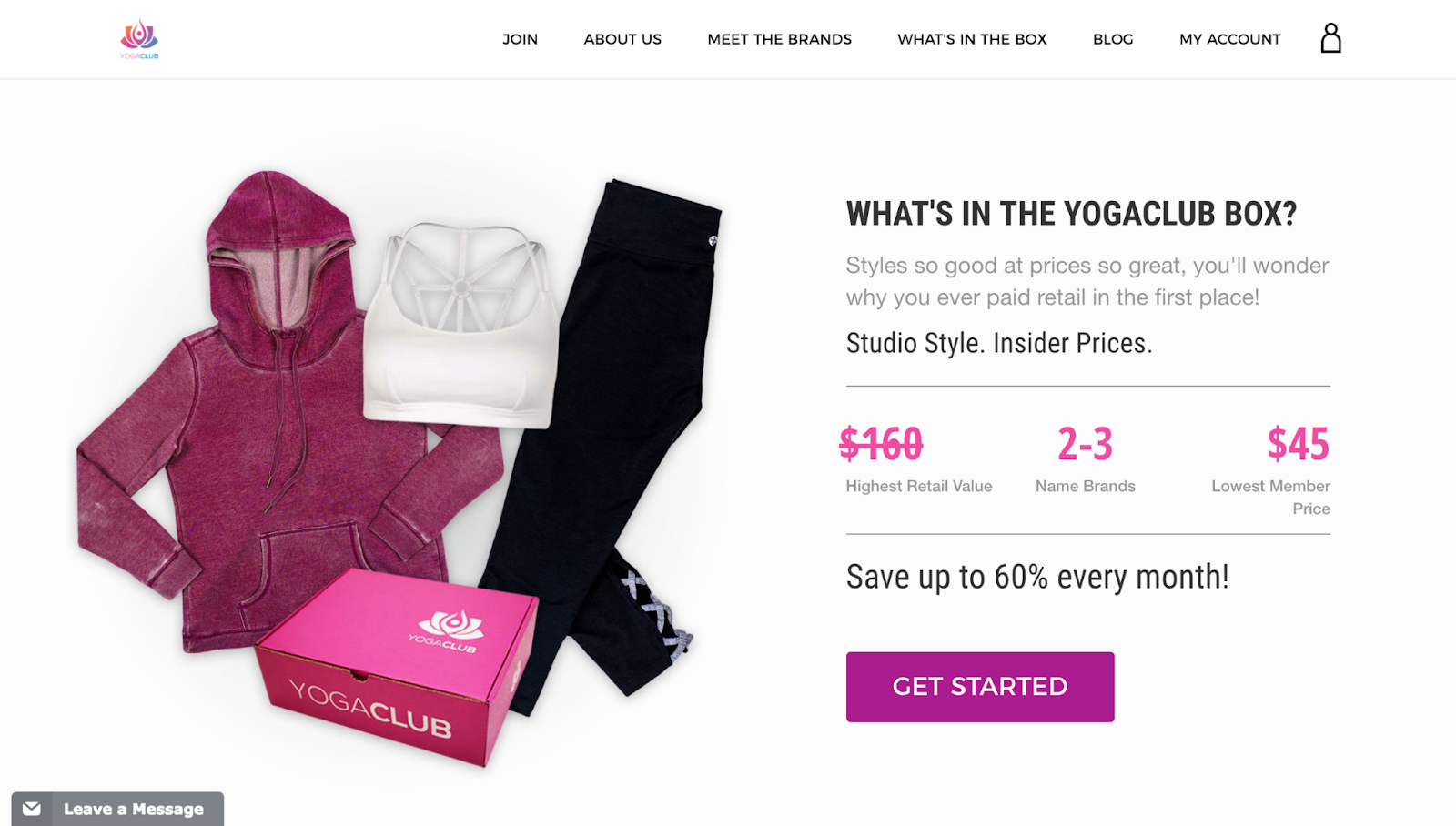
YogaClub uses a fuchsia color for their call to action button, which stands out and commands attention:
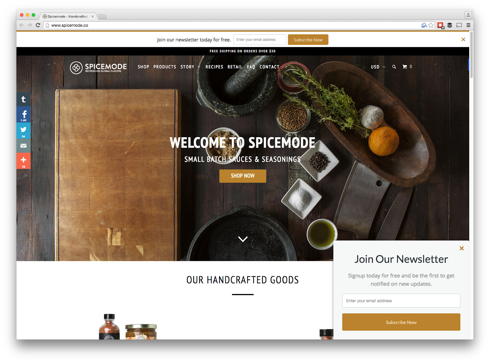
And SpiceMode uses a gold/taupe color that works for their brand.
We’ve found that red works for our audience:
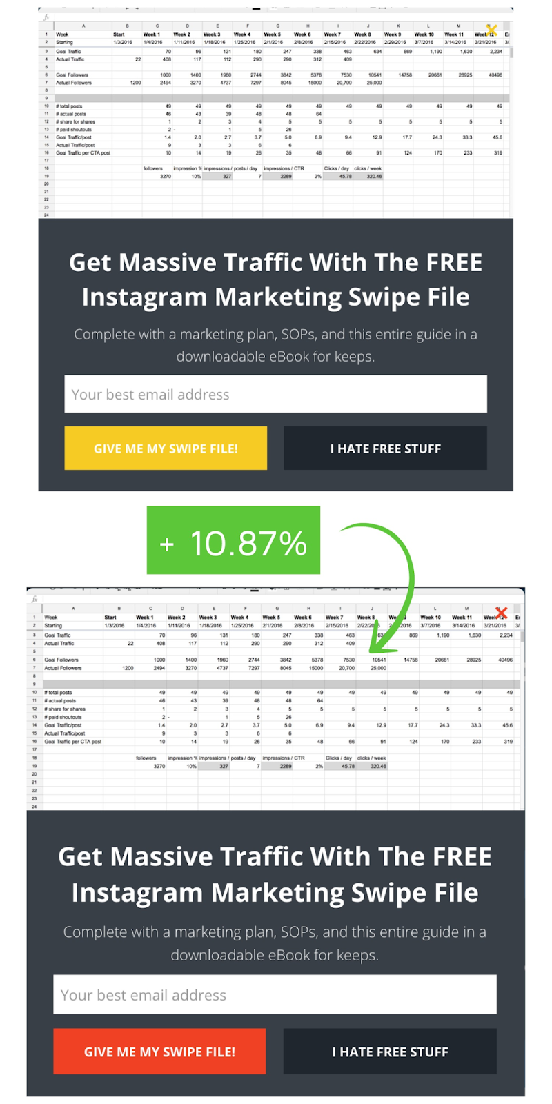
At least when tested against a yellow button. Therein lies the key: find a color that works for your brand and your audience.
And one of the only ways to do this with certainty is through A/B testing.
STRATEGY #2: BE PAINSTAKINGLY OBVIOUS ABOUT THE ACTION YOU WANT YOUR VISITORS TO TAKE
When you land on most websites, there are dozens of things you could do.
That’s because every single image, link, button, and graphic is vying for your attention. So if you want your visitors to click your call to action button, you need to make it ridiculously obvious that’s what you want them to do.
Here are a few ways to do that.
USE LEADING LINES
If you think you have freedom and control over where you look when you land on a webpage, you’re mistaken.
It turns out that we take a lot of direction from “directional cues”, or “lines of sight”. Researchers have shown that leading lines, such as arrows (or even an image of somebody facing toward the call to action) are pretty irresistible to us. We automatically follow them.[*]
Take a look at how Brian Dean from Backlinko uses leading lines to direct visitors’ attention on his homepage:
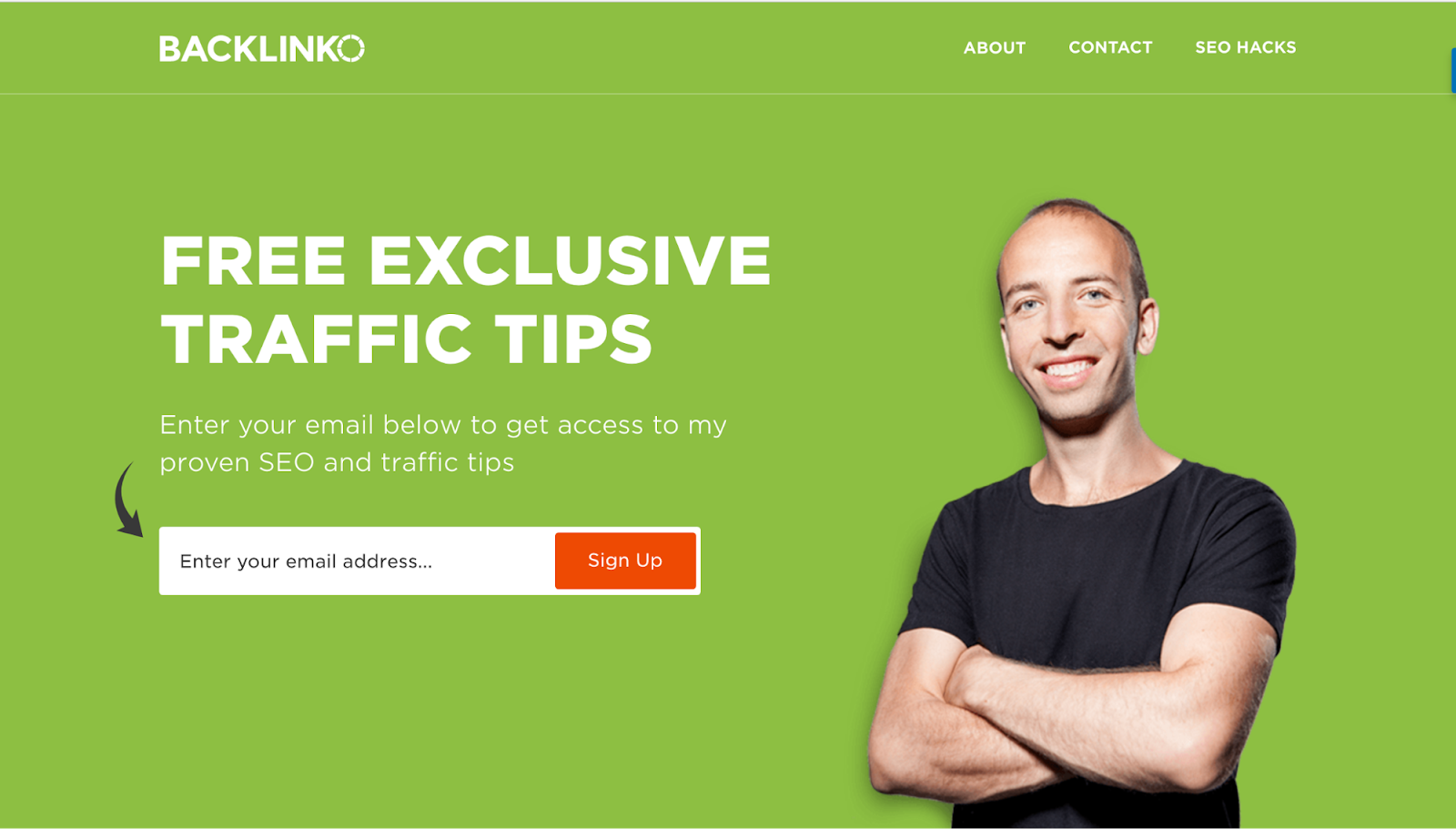
The arrow points to the input form, which leads to the button.
Don’t want to be as obvious? You could always make the button itself form an arrow, like this button from Dollar Shave Club:
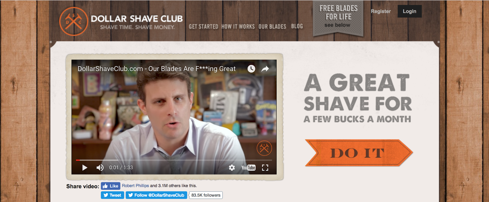
Research doesn’t (usually) lie. Directional cues like leading lines are one of the most well-known conversion rate optimization tools available.
USE VISUALS
Visual content captures attention. So why wouldn’t it work on your call to action button, too?
Take a look at how John Lee Dumas uses a download arrow for his call to action button:
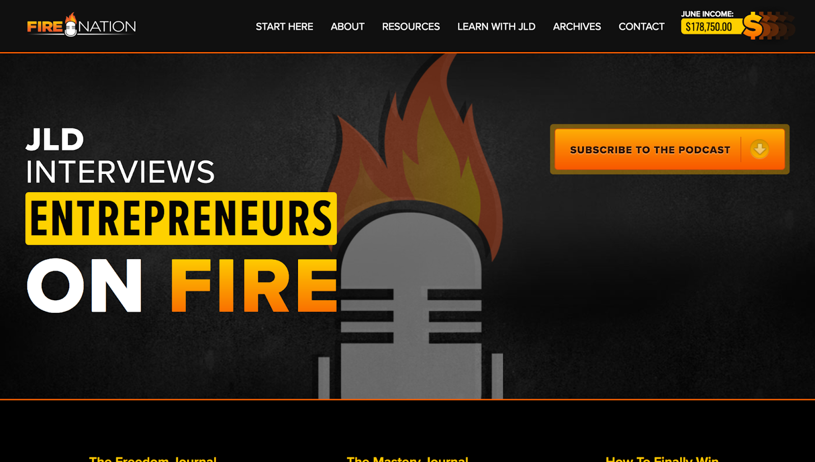
The button makes us picture what will happen when we click it, and makes it feel as if we’ve already clicked the button.
The presence of the graphic also draws the eye to the button far more than if it wasn’t there. Many sites use arrows for this purpose, but you can also use other visuals.
Check out how MarketingProfs uses visuals in their button and flare lines as visuals for their button:
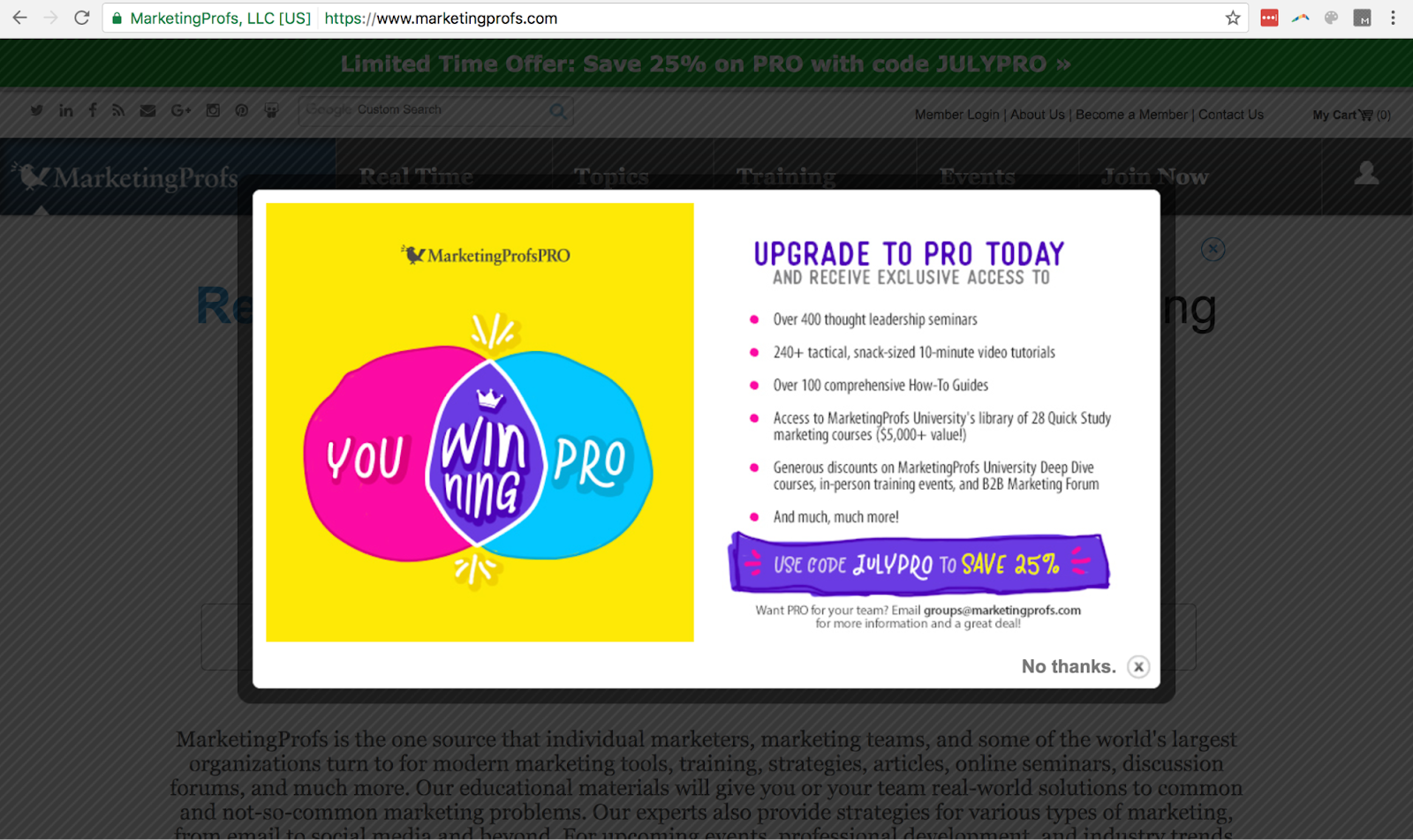
Visual content outperforms plain text on almost every single platform. Use it to increase your conversions, too.
BE MINDFUL OF THE SHAPE
Newsflash: nobody will click on your button if it’s not clear it’s a button.
If your button looks more like a callout box than it does a button, your conversion rate will suffer.

So if you feel compelled to make a call to action button in the shape of a star or a triangle, check yourself before you wreck yourself.
This isn’t your 4th grade PowerPoint presentation.
But just because your button has to… you know, look like a button, doesn’t mean you can’t have a little fun with it.
Take a look at this awesome button Huemor created:
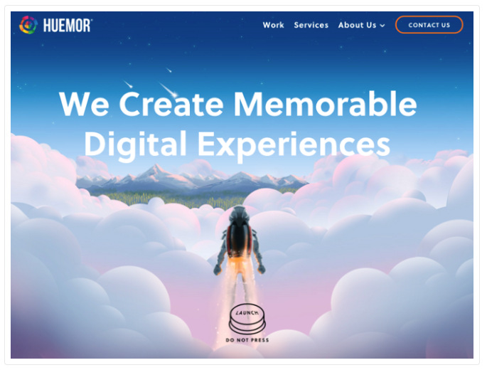
It helps that they pull some reverse psychology on you, but it’s irresistible even if they didn’t.
MAKE IT BIG
We’ve already established that you want your call to action button to stand out.
So why in God’s green earth would you make your button so small that you need a magnifying glass to see it?
There’s a reason why your Facebook page’s call to action button has piss poor conversions:
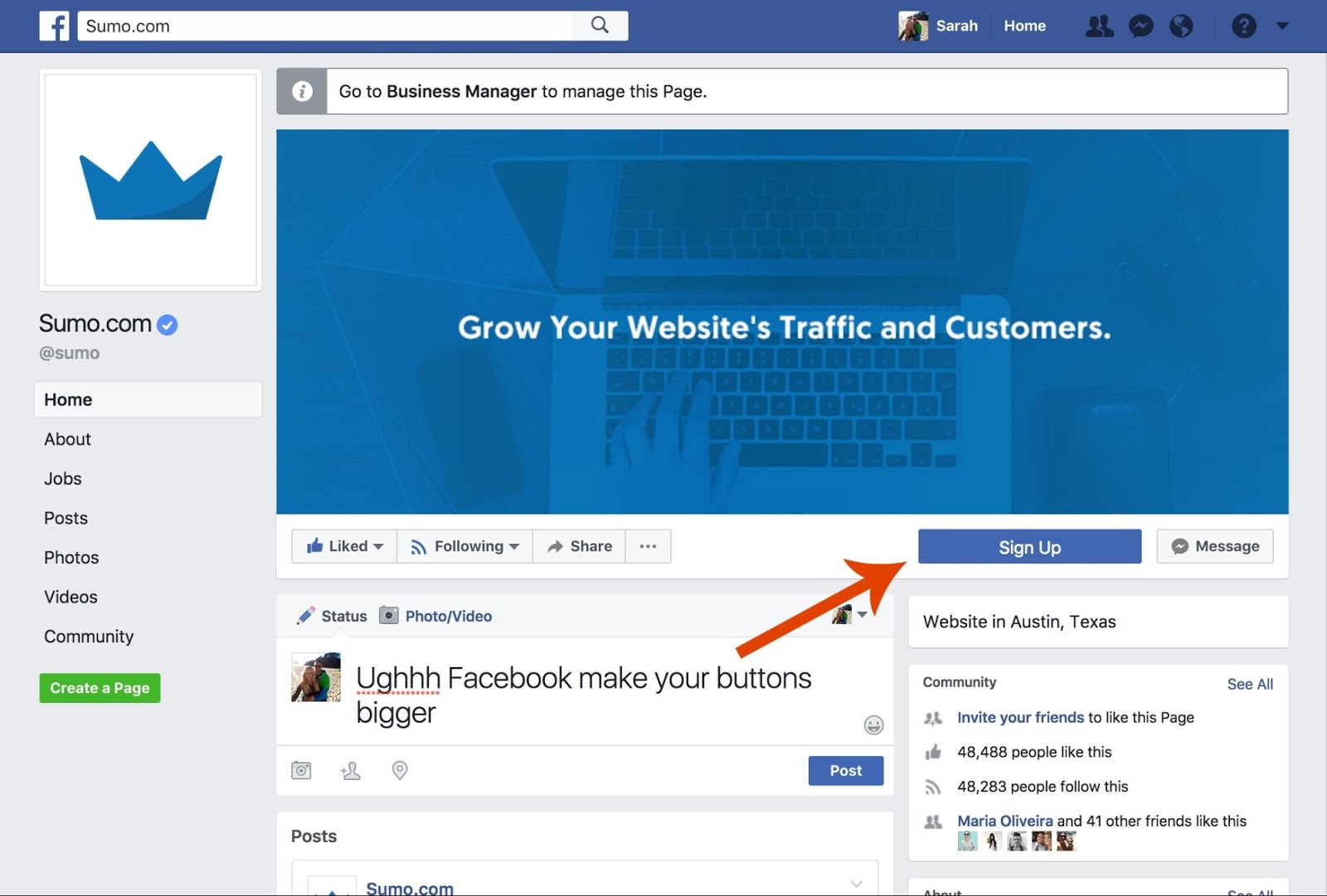
It’s because it’s so small that it just blends in with the page.
The bigger the button, the more eye catching it is. Check out the size of the button on Loaded Lifting’s pop-up:
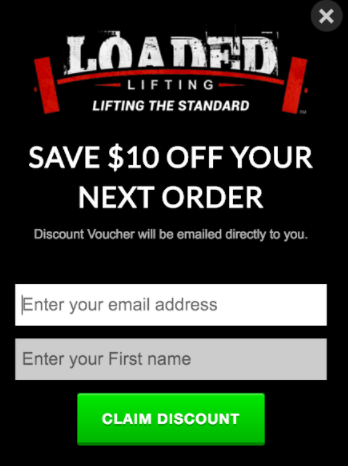
As a percentage of the pop-up, it’s substantial. Create larger buttons to get more attention.
STRATEGY #3: MAKE YOUR BUTTONS IRRESISTIBLE TO CLICK
Getting your buttons noticed (and making sure your visitors know you want them to press them) is important.
But the biggest difference to your conversion rate will be the words you use.
CHANGE YOUR BUTTON COPY
One of the biggest game changers on your conversion rate for your call to action button is your button copy.
In fact, we did an A/B test and found that just by changing the button copy on one of our Welcome Mats, we increased conversions by 182%.
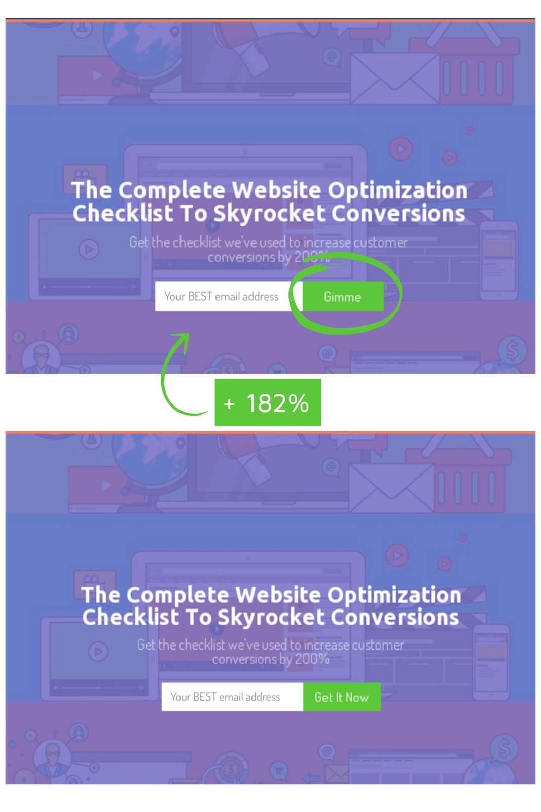
We didn’t change a single thing except the copy, and we collected 182% more emails just by testing that one small change.
The word “gimme” might not work for your audience, but by A/B testing we discovered it works extremely well with ours.
Want to sabotage your conversions?
Make the button copy be “subscribe” or “submit” on your call to action button.
“Subscribe” is self-serving. It leaves the visitor wondering: “what’s in it for me?”, because subscribing to your email list doesn’t communicate the benefit they are getting.
Instead, make the copy benefits driven. This call to action button on Pursue by Kevin does this well with “Get My Copy”:
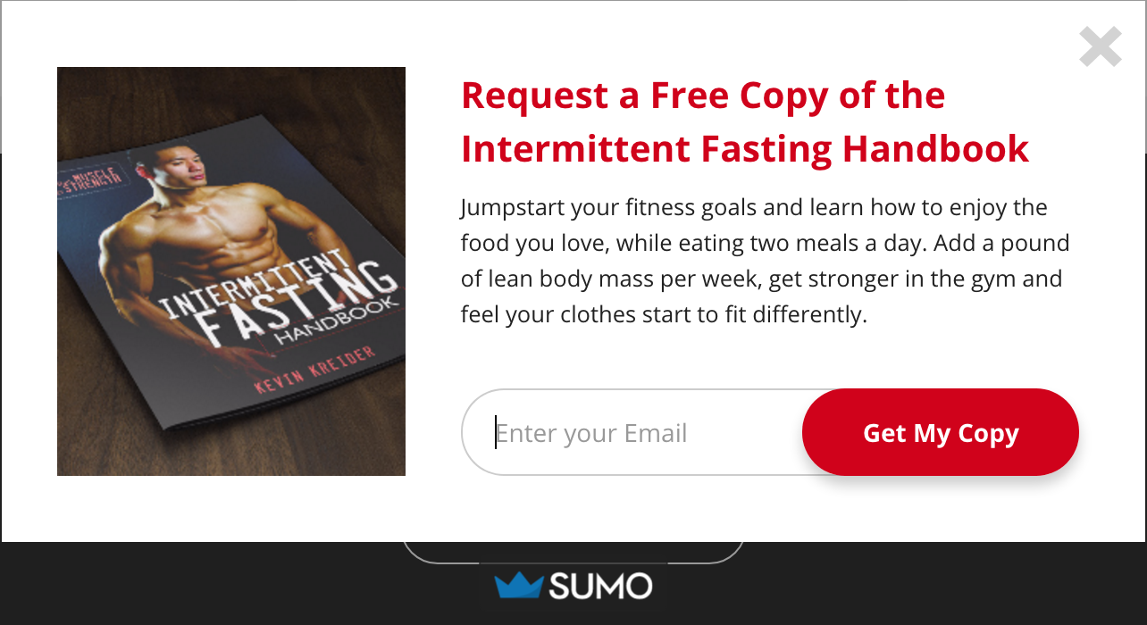
This button reminds visitors what they’re getting in exchange for their email addresses.
Even in our example, “Gimme” does the same thing.
A/B test what works with your target market (we would never have known “Gimme” works so well if we didn’t perform our A/B test), but remember the “what’s in it for me” gene.
USE THE FIRST PERSON
One effective copywriting strategy is eliciting ownership from your audience.
Make your visitors feel as if they already own the product or possess the freebie. The easiest way to do that in your call to action button is to set your button copy to the first person.
In one A/B test, Unbounce found that just changing the button copy from “Start your free 30 day trial” to “Start my free 30 day trial” increased conversions by 90%:[*]
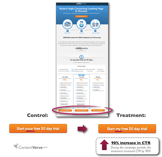
So switch out the “your” and “our” to “I”, “my” to increase your conversions.
You can get some inspiration from the tennis coaching website, Fuzzy Yellow Balls:
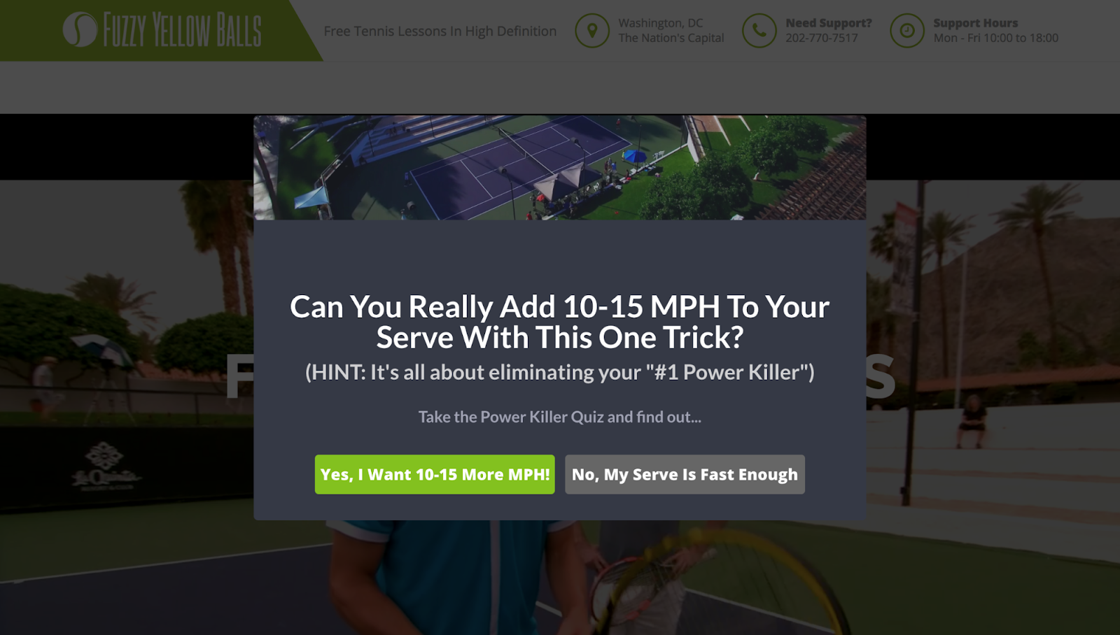
Compare “Yes, I want 10-15 More MPH” to “Get Our Free Trick” and you can see why the site chose the former.
USE MARKETING PSYCHOLOGY
Understanding marketing psychology is the most important skill you can master as an entrepreneur.
But if you don’t want to become an expert on it, you can do pretty well just by using the word “free” in your copy.
Studies show that just by using the word “free”, you can increase conversions by 50%.
Headspace, the meditation app, uses the psychology of “free” in their button copy:

By saying “Sign Up For Free”.
We used the word “FREE” on our Welcome Mat for our Marketing Psychology Cheatsheet:
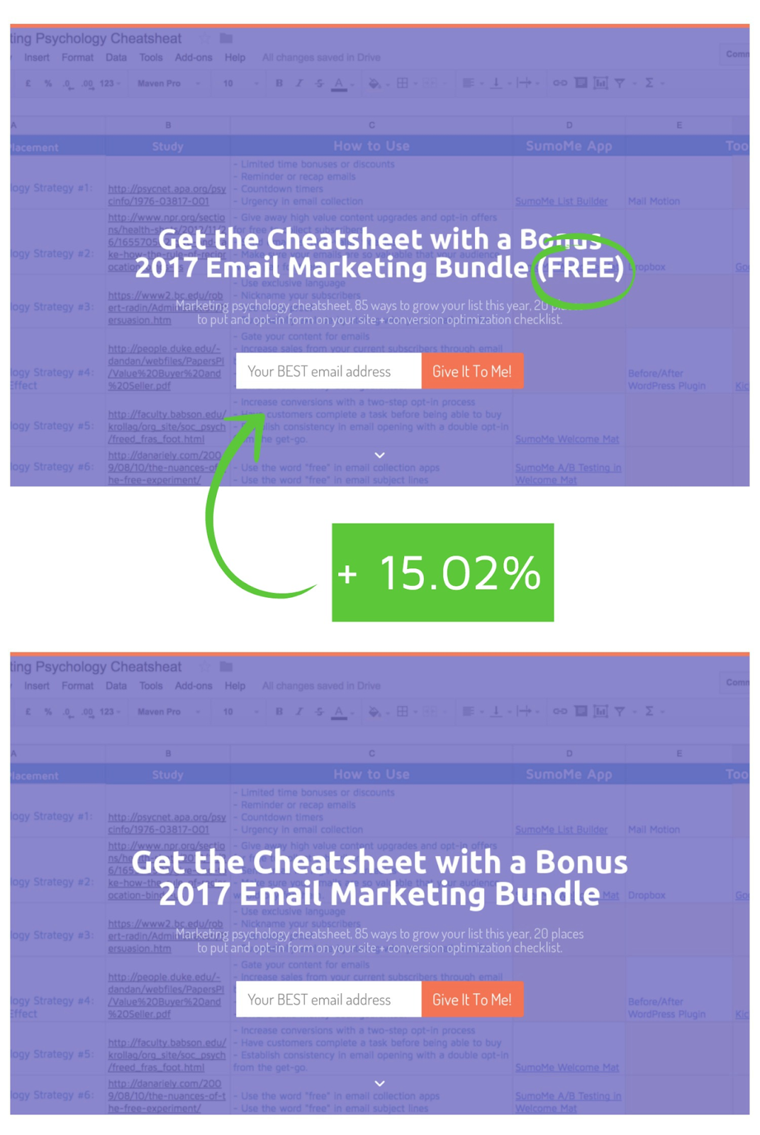
And found that just tacking the word “free”onto the headline, we could get 15% more conversions.

Use this wisdom in your button copy (or near your button) and you’ll see a boost, too.
USE SOCIAL PROOF
Who run the world?
Oh, wait…
People who use social proof. That’s who run the world. Sorry Bey.
Social proof should be used early and often and that includes in your button copy (or supporting text).
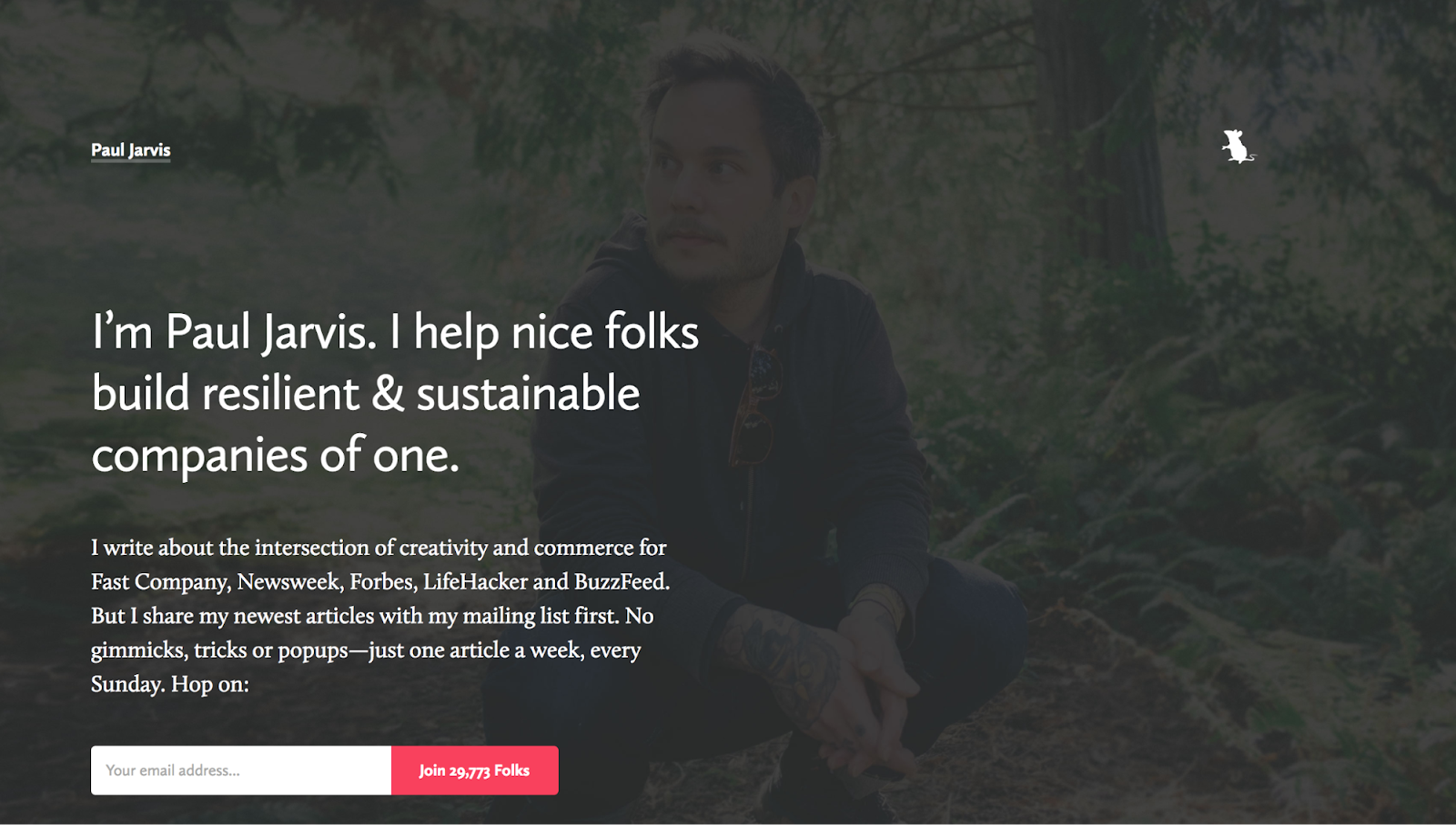
Admit it. If this was the first time you’re stumbling across him, you’re far more likely to subscribe to Paul Jarvis’ email list knowing that nearly 29,773 other people have already done so, right?
And you’re far more likely to try FreshBooks out knowing that 97% of small business owners recommend it, too.
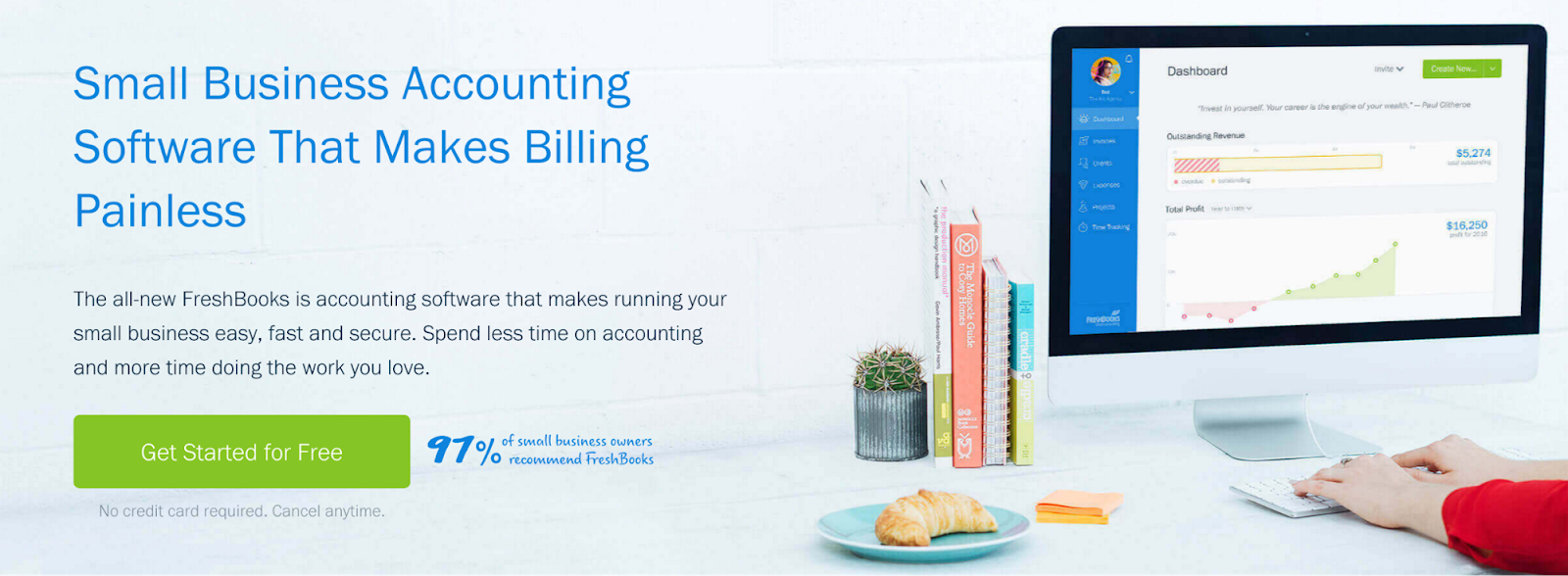
Use social proof in your button copy (or near your button) to get more clicks.
GET TO THE POINT
Yo mama’s so lazy…
That she’ll likely only read fewer than 5 words on your call to action buttons.

Seriously though, nobody wants to read your 8 word call to action button, and if nobody wants to read it they certainly won’t want to click on it.
HubSpot recommends no more than 5 words on a call to action, which makes sense because you don’t want your buttons to end up looking like this:[*]
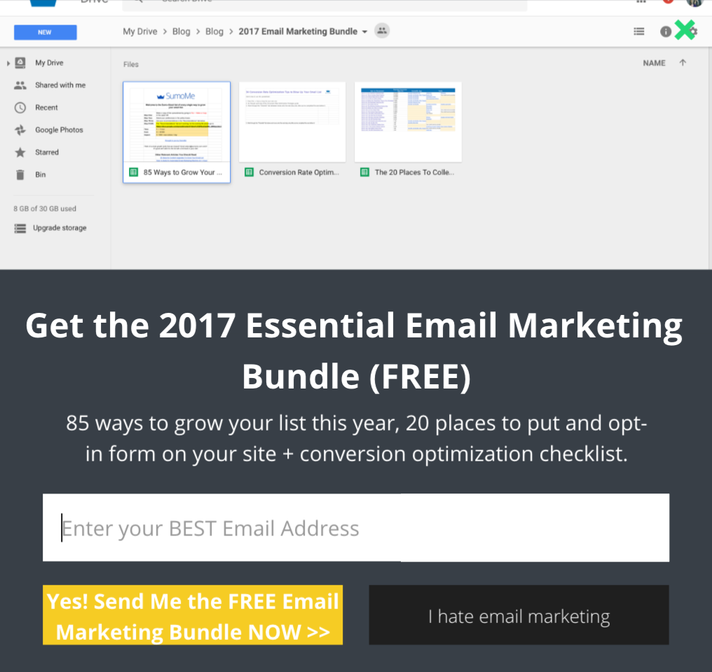
Less is more, and if you need more text, save your conversions and communicate more with supporting text (like Indochino does with their coupon code):
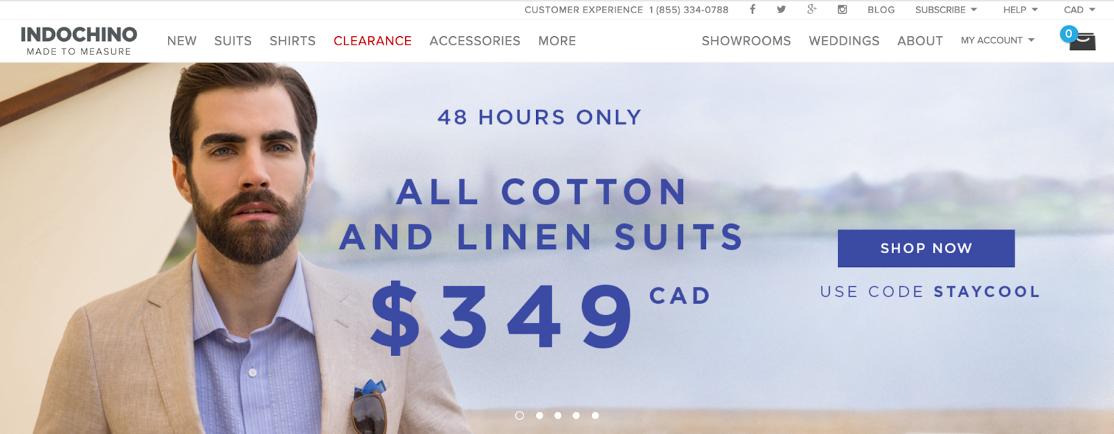
Your buttons copy shouldn’t feel like a chore to read. Get to the point.
STRATEGY #4: CAPITALIZE ON YOUR “NO THANKS” BUTTON
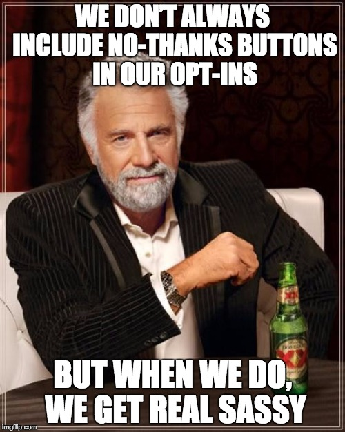
You know those opt-ins that give you the option to either subscribe, or not?
Like this one:
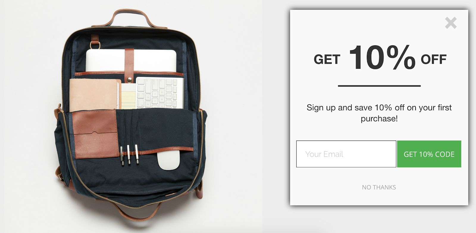
Usually you see boring buttons that say “no thanks”.
These can be an amazing tool to boost conversions from your call to action button if they’re done right…
So I’m going to show you how to do them right.
MAKE THEM FEEL THE PAIN
To get clicks on your call to action button rather than your “no thanks” button, you need to make the CTA button more compelling than saying “no thanks”.
Since it’s less work to say “no thanks” than it is to type in your email address (and then usually go confirm your email), that can be difficult.
So you have to make your visitors feel the pain of saying no.
What are they losing by pressing the “no” button rather than the call to action button?
ConversionXL does this well with their pop-up:
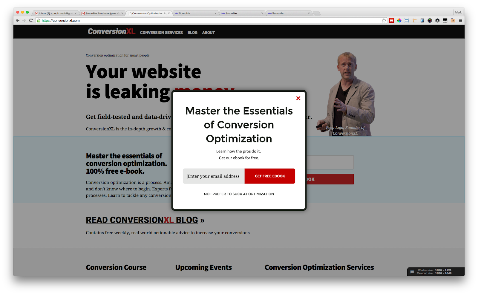
You can either get the free conversion optimization ebook, or click on “No I prefer to suck at optimization”. Which would you choose?
Raphael Paulin-Daigle takes a similar approach:
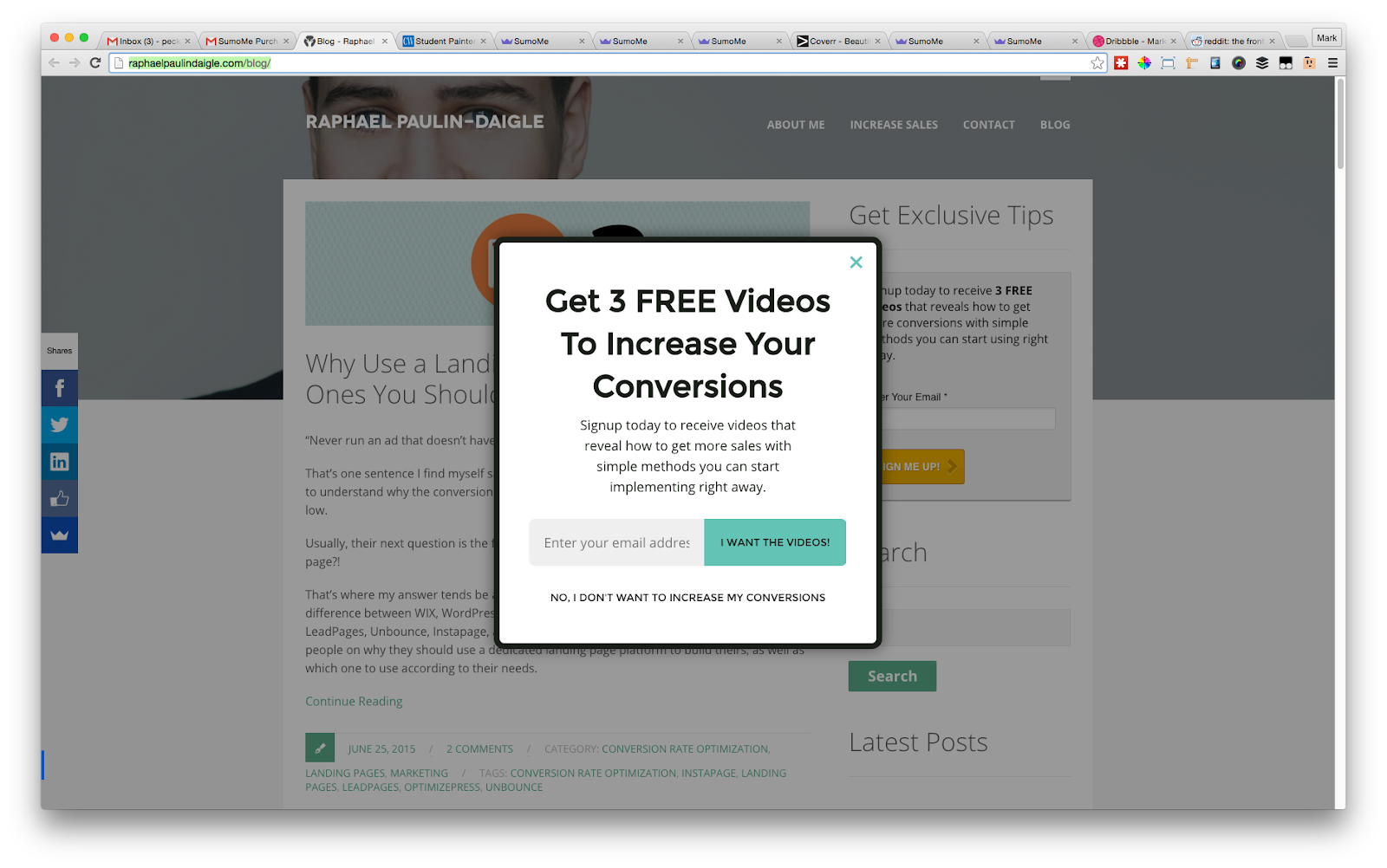
You can either get the videos to learn how to increase your conversions, or keep your low conversions.
Pay attention to the fact that both of the examples above are from conversion experts. If masters of conversion use a strategy, there’s a reason: it increases conversions. You should follow suit.
MAKE IT DISAPPEAR
You don’t want visitors to press that “no thanks” button, right?
So since one strategy to get people to click your call to action button is to make it stand out, it stands to reason that to get them to not click on the button, you’d make it blend in.
Which is exactly what you want to do.
Take a look at how Recommendo made the “no thanks” button on their List Builder pop-up the same color as the background of the pop-up:
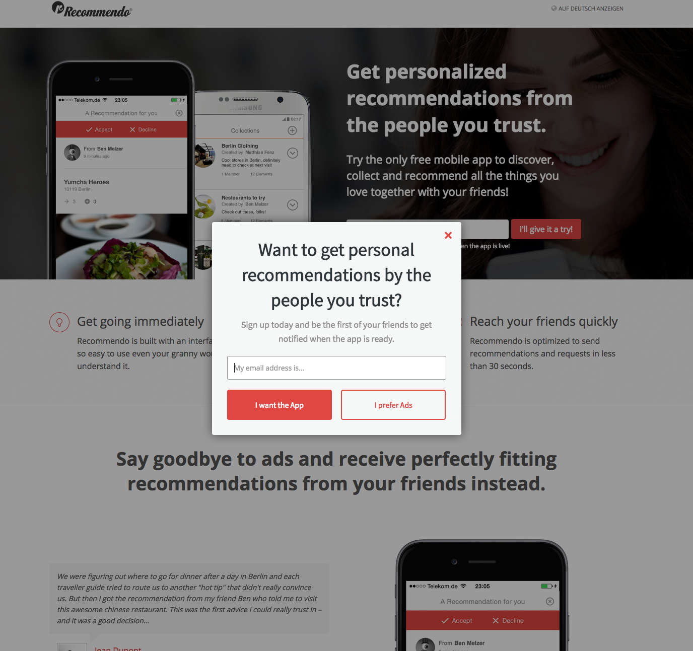
Snakku does a great job of this as well, with the “no thanks” button being the last thing you look at:
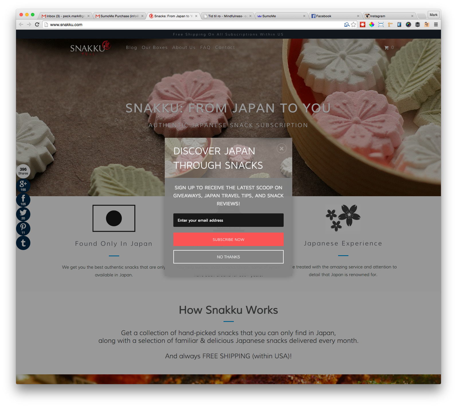
It’s simple. Your call to action button should jump off the page. Your “no thanks” button should not.
GET MORE CLICKS ON YOUR CALL TO ACTION BUTTONS
Your call to action buttons are the last point of contact between the visitor and the conversion.
Fewer clicks on those buttons = fewer:
-
Email subscribers
-
Leads
-
Customers
-
Sales
The good news? It’s not that complicated to whip your buttons into shape.
Step 1: Make sure your visitors can actually find your CTA button.
Step 2: Call them to action.
Step 3: Stop repelling people with your button copy.
Step 4: Use that “no thanks” button to your advantage.
Step 5: Download our FREE conversion rate optimization checklist to make sure nothing is slipping through the cracks.
Step 6: Profit.
Ps. If you’d like to use a FREE tool with professionally designed call to action buttons and email capture forms, try out Sumo.
Add A Comment
VIEW THE COMMENTS