You spent hours on that blog post. Researched it. Outlined it. Revised it twice. And roughly 80% of the people who click on it won’t make it past the first few scrolls.
That’s not a writing problem. That’s a formatting problem.
Here’s what most blogging advice skips: blog post format isn’t just about picking “listicle” or “how-to” from a dropdown menu. It’s two things at once. It’s the type of post you choose (the structural skeleton) and the visual presentation that makes someone actually want to keep reading (the formatting layer on top).
This post covers both. You’ll learn the seven blog post formats that consistently pull traffic, how to format for readability, how to format so AI systems actually cite your content, and how to turn formatting decisions into conversion tools. Whether you’re starting from scratch or staring at analytics wondering why nobody reads past your intro, these are the fundamentals that separate posts people finish from posts people abandon.
And yes, formatting includes where you place your CTAs. Tools like pop-ups and smart bars aren’t just conversion features. They’re formatting elements that give readers a next step at the right moment.
Let’s get into it.
Table of Contents
What Is a Blog Post Format?
A blog post format is both the type of content structure you choose (listicle, how-to, case study) and the visual presentation that makes it readable and actionable.
Most “blog format” guides only cover one of those. They’ll walk you through header hierarchy but never mention that a comparison post needs different formatting than a tutorial. Or they’ll rattle off ten post types and never explain how to make any of them scannable.
You need both. The structure decides what goes where. The formatting decides whether anyone sticks around long enough to care.
This post tackles each layer, in order.
7 Blog Post Formats That Actually Work
Not every post type works for every topic. But these seven have been pulling traffic and conversions for years, and they’re not going anywhere.
1. How-To / Tutorial
Step-by-step instructions for a specific outcome. The reader arrives with a problem, and they leave knowing how to fix it.
These work because the format itself builds trust. Each completed step is a small win that keeps someone scrolling. Our evergreen funnel post is a good example. It walks through a specific system, one step at a time, with enough context that someone can actually build it.
The key to a good how-to: be specific about the outcome in your title. “How to Set Up an Evergreen Funnel” works harder than “Evergreen Funnels Explained.” The reader should know exactly what they’ll be able to do when they finish reading.
2. Listicle
Numbered items around a theme. The reason listicles still dominate search results is simple: they promise a specific scope, and they deliver on it fast.
Our power words list generates thousands of clicks every month. It works because the format matches the intent perfectly. Someone searching “power words” wants a list, not a 3,000-word essay about the psychology of language.
3. Definitive Guide
The “everything you need to know” post. Long, thorough, structured with clear sections so readers can jump to what they need.
This format crushes for high-volume keywords where search intent is broad. Our SEO blog tips guide covers the topic end to end. The key with definitive guides: if someone reads the H2 headings alone, they should walk away knowing what the post covers. Table of contents are non-negotiable for this format. Nobody wants to scroll through 3,000 words hunting for the section they care about.
4. Comparison / Versus
“X vs. Y” or “X alternatives.” These posts catch people mid-decision and give them a framework to choose.
The format works best when you have a genuine take. Nobody needs another “both options are great” post. Pick a stance, lay out the trade-offs, and let readers make the call. Think about how Ahrefs handles their “X vs. Y” posts. They compare tools head to head with real data and screenshots, and they’re not shy about saying which one wins in specific scenarios. That confidence is what makes comparison content convert.
If you’re hunting for comparison angles, our blog post ideaslist has a section on versus-style topics.
5. Case Study
A story about a specific result, with the details that prove it. Case studies build credibility faster than almost any other format because they answer the question every reader is quietly asking: “But does this actually work?”
If you’re running a business, your own customer results are the best source material. One real example with real numbers beats ten hypothetical scenarios. Include the starting point, what changed, and the specific outcome.
Take Sarah from Boise (a BDOW! customer who runs a small ecommerce store). She added one exit-intent pop-up and recovered 23 abandoned carts in her first week. That’s $3,400 she would have just lost. The case study version of that story includes the starting point ($0 in recovered carts), what changed (one specific BDOW! pop-up with a 10% discount offer), and the timeline (seven days).
(We’re guilty of this exact thing, all the time.)Specific numbers stop people mid-scroll. Vague case studies (“Our client saw great results!”) do almost nothing.
6. Roundup / Examples Post
A curated collection. “50 examples of X” or “Best Y for Z.” Our testimonial examples post uses this format. The reader gets a swipe file they can reference, which means they bookmark it, come back, and share it.
Roundups are also natural link magnets. If you feature someone’s work, they tend to share the post.
7. FAQ / Q&A
A post structured entirely around questions and answers. This format is growing fast because AI search systems love pulling from clearly structured Q&A content. When Google’s AI Overview needs a concise answer, it looks for exactly this kind of formatting.
FAQ posts also work as supporting content. You can publish a definitive guide on a broad topic, then write an FAQ post that picks up the long-tail questions around the edges. The format is low-effort to maintain, too. When new questions come up in comments or customer support, you add them to the post and republish.
One more thing: most strong posts blend formats. The best listicles are also how-tos. The best definitive guides include case study elements. (We’re guilty of this exact thing, all the time.) Don’t treat these as rigid categories. Treat them as structural ingredients you can mix.
How to Format a Blog Post for Readability
Picking the right post type is step one. Making it readable is where most blogs quietly fail. Here’s where formatting shifts from “content strategy” to “visual design on the page.”
Start With a Clear Structure
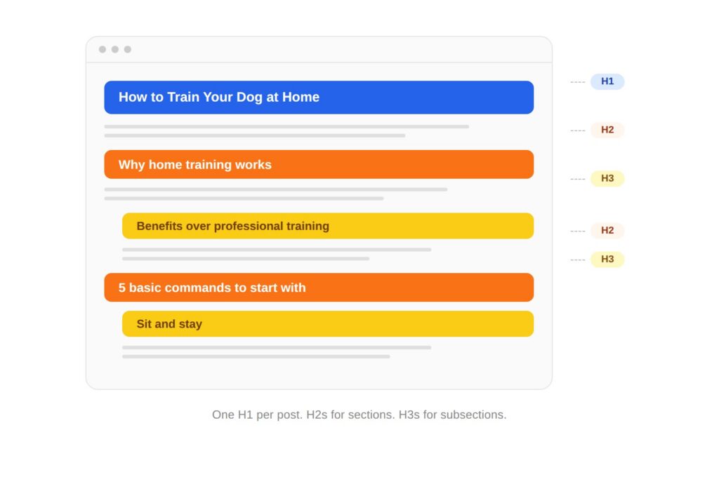
Every post needs a skeleton before it needs sentences. That means a header hierarchy that makes logical sense.
Your H1 is your title. One per post, always. Your H2s are the major sections. Your H3s break those sections into digestible pieces. If you need H4s, the post might be trying to do too much.
For longer posts (1,500+ words), add a table of contents near the top. It lets readers jump to what they care about, and it signals to search engines what the post covers. Write your H2s as questions people actually search when you can. “How to format a blog post” works harder than “Formatting tips” because it matches the way people type into Google.
Keep Paragraphs Short
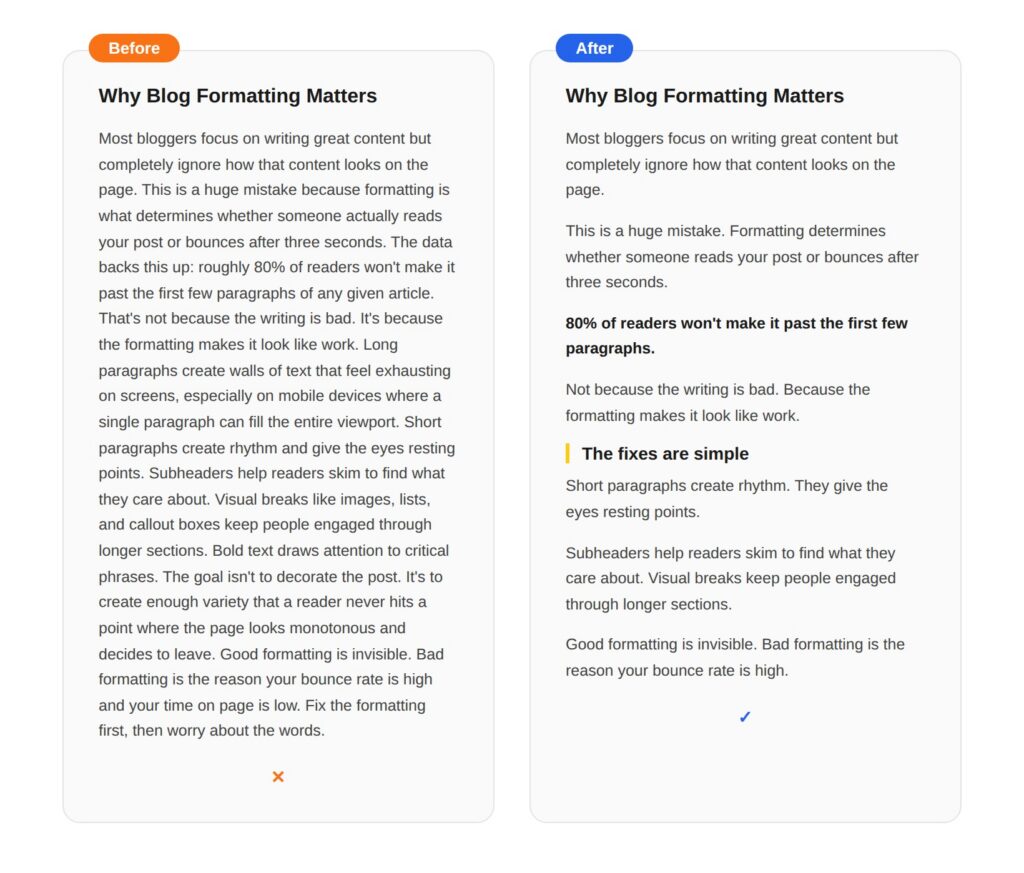
This is the single biggest readability fix most blogs can make, and it costs nothing.
One to three sentences per paragraph. That’s it.
Long paragraphs create walls of text that look exhausting on screens, especially on phones. The content might be great, but the formatting tells the reader’s brain “this is going to be work.” Short paragraphs create rhythm. They give the eyes resting points. And they make it easy to skim without losing the thread.
Single-sentence paragraphs work for emphasis. Use them to land a key point or transition between ideas.
Use Subheaders That Tell a Story
Here’s a test most blog posts fail: read just the H2s and H3s in order. Do they tell a coherent story? Could someone skim the subheaders alone and walk away understanding the post’s argument?
If your subheaders are vague (“Tips,” “Best Practices,” “More Info”), they’re not doing their job. Each subheader should be specific enough to be useful on its own. “Keep Paragraphs Short” is better than “Paragraph Tips.” “Place CTAs Where Readers Actually See Them” is better than “CTA Placement.”
This matters more than most people realize. The majority of blog readers are skimmers. They scroll through the headings, decide which sections are worth their time, and read those. If your headings are generic, skimmers leave. If your headings tell a story, skimmers become readers.
Good subheaders also do double duty for SEO. They’re natural places to work in keyword variations without forcing them. Check out our headline formulas post for patterns that work in both titles and subheaders.
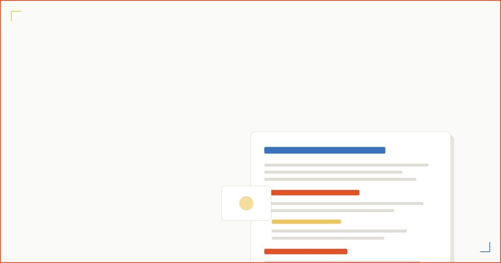
Add Visual Breaks
Walls of text aren’t just hard to read. They look boring. Visual variety keeps people engaged through longer sections.
Images with descriptive alt text break up the flow and add context. Use ordered (numbered) lists when you’re explaining sequential steps. Use bullet points for parallel items that don’t have a natural order. Callout boxes or block quotes highlight key takeaways. Bold text draws attention to critical phrases, but use it sparingly or nothing stands out.
A good rule of thumb: add a visual break every 300 to 400 words. That might be an image, a list, a callout box, or even just a pull quote. The specific element matters less than the rhythm. Readers need variety the same way listeners need a beat change.
The goal isn’t to decorate your post. It’s to keep the page from ever looking like a homework assignment.
Choose Readable Fonts and Colors
This section is short because the advice is simple: don’t make it hard to read.
Use a font size of at least 16px for body text. Set your line height to 1.5 or 1.6 so lines don’t feel cramped. Make sure your text color has strong contrast against the background (dark text on light backgrounds, or vice versa). Check that your blog looks good on mobile, because that’s where more than half your readers are.
One thing people overlook: link styling. If your links blend into your body text, nobody clicks them. Make links a distinct color or add an underline. Internal links are formatting elements too, and they only work if readers can actually see them.
Accessibility isn’t a bonus feature. It’s baseline formatting.
How to Format a Blog Post for AI Search
You’re not just formatting for human readers anymore. You’re formatting for the AI systems that decide whether to cite your content in search results.
Google’s AI Overviews, ChatGPT search, Perplexity, and other AI tools are pulling answers from web content and presenting them directly. If your blog post is formatted in a way that AI can easily extract a clear answer from, you’re more likely to get cited. If your formatting is messy, vague, or buried, the AI pulls from someone else’s site.
Here’s what to focus on:
Put Direct Answers First
Start each section with a one- or two-sentence answer to the question the section addresses. Then expand. AI systems overwhelmingly pull from those opening sentences.
Phrase your H2s as searchable questions
“What is a blog post format?” works better for AI citation than “Blog Post Format Overview.” The H2 matches the query, and the opening sentence delivers the answer. That’s the exact structure AI is looking for.
Create clean definition blocks
When you define a term, make the definition standalone. Don’t bury it in a paragraph of context. A sentence that starts “A blog post format is…” is instantly extractable.
Add an FAQ section with concise answers
Each answer should be two to three sentences that make sense on their own, without needing the rest of the post for context. FAQ schema markup makes this even more effective.
Use structured data
Add FAQ schema and article schema to your posts. It’s not a ranking factor by itself, but it gives AI systems clean metadata to work with. (If “schema markup” sounds intimidating, most SEO plugins handle it with a toggle. You don’t need to touch code.)
Copy-Paste Prompts to Reformat Your Posts for AI
HGeneric prompts get generic results. The prompts below are the same multi-step approach we use on every BDOW! blog post. Each one assumes you’ll paste your full draft (or specific sections) at the end. Replace the bracketed placeholders with your actual context.
Prompt 1: Rewrite your H2s as searchable questions, with intent-matching
Act as an SEO and GEO strategist. I’ll paste a blog post draft below. Your job is to rewrite every H2 as a question people would actually type into Google or ChatGPT, while preserving the original meaning of the section.
For each H2:
- Identify the section’s core topic in 5 words or less
- Suggest 3 alternative question-based H2s, each matching a different search intent (definitional, how-to, or comparison)
- Recommend which one to use and explain why in one sentence
Constraints: Keep H2s under 60 characters when possible. Use natural language, not keyword-stuffed phrasing. Don’t suggest H2s that start with “Understanding” or “Exploring.”
My target keyword cluster is: [PRIMARY KEYWORD], [SECONDARY KEYWORDS] My audience is: [AUDIENCE]
Draft: [PASTE DRAFT]
Prompt 2: Add direct, AI-citable answers to every section
Act as a content editor optimizing for Google AI Overviews and ChatGPT citations. I’ll paste a blog post draft below. For each H2 section, do the following:
- Write a 1-2 sentence direct answer to the question implied by the H2. The answer should be standalone, meaning a reader (or AI) should understand it without reading the surrounding paragraphs
- Place that answer as the first paragraph under the H2
- If the existing first paragraph already contains the answer, sharpen it. Don’t duplicate
- Flag any sections where the answer requires more than 2 sentences to be accurate, and explain why
Format your output as: [H2 heading] → [your direct answer] → [brief note on what changed]
Avoid: hedge phrases (“it depends,” “in many cases”), filler openings (“When it comes to…”), and answers that just restate the H2.
Draft: [PASTE DRAFT]
Prompt 3: Generate an FAQ section that captures long-tail and AI Overview opportunities
Act as an SEO researcher. Based on the blog post draft below, generate an FAQ section that captures long-tail keyword opportunities and increases the chance of being pulled into AI Overviews.
Steps:
- Identify 8-10 questions people might search related to this topic that aren’t directly answered in the draft. Pull from “People Also Ask” patterns where possible
- Filter down to the 5-6 strongest questions based on search relevance and ability to be answered concisely
- Write each answer in 2-3 sentences. Each answer must make sense as a standalone snippet, without requiring the rest of the post for context
- Avoid duplicating content that already appears in the body of the post
- End each answer with one specific, actionable detail (a number, a tool name, a real example) when relevant
Format: bold question, then plain-text answer, with a blank line between each pair. Output as ready-to-paste markdown.
Topic of the post: [TOPIC] Primary keyword: [KEYWORD]
Draft: [PASTE DRAFT]
Prompt 4: Run a full formatting audit before publishing
Act as a content QA editor. Review the blog post draft below and produce a formatting audit. Check for the following, and report findings as a numbered list with the exact text or location of each issue:
- Paragraphs longer than 3 sentences (flag the first sentence of each)
- H2s or H3s that are vague or generic (e.g., “Tips,” “More Info,” “Conclusion”)
- Sections with no direct answer in the first 2 sentences
- Sections that go more than 400 words without a visual break (image, list, callout, or pull quote)
- Missing or weak CTAs (any section delivering value with no next step within 500 words)
- Internal linking gaps (places where a related concept could naturally link to another post on the site)
- Em dashes (count them; flag if more than zero for blog content)
- AI-flagged phrases: “delve,” “leverage,” “in today’s landscape,” “furthermore,” “it’s worth noting,” “robust,” “seamless,” “navigating,” “tapestry”
For each issue, suggest a specific fix in 1 sentence.
Site I’m publishing on: [SITE], with internal posts I can link to: [LIST OF RELATED POSTS]
Draft: [PASTE DRAFT]
These four prompts are the same workflow we run on every BDOW! post before it goes live. They’re not magic, but they catch about 80% of the formatting and AI-readiness issues that would otherwise slip through. Run them in order, and your draft will be in much better shape by the end.
Nobody else in the search results for “blog post format” is talking about this. That’s exactly why it matters.
How to Format a Blog Post for Conversions
A post that’s easy to read and well-structured is great. But if there’s no next step for the reader, the best formatting in the world is just decoration.
(This is the part where we get into the “why does formatting even matter for a business” conversation. Spoiler: it matters a lot.)
Place CTAs Where Readers Actually See Them
Remember that 80% stat from the top of this post? Most readers don’t finish articles. That means if your only call-to-action is at the bottom, most people never see it.
Place your first CTA above the fold or right after the first section that delivers real value. That’s the moment the reader thinks “okay, this person knows what they’re talking about.” Strike while that feeling is fresh. (Need inspiration? Our call to action examples post has dozens of options.)
Sticky elements, like BDOW! smart bars that stay visible as someone scrolls, are formatting decisions disguised as conversion tools. They keep a next step visible without interrupting the reading experience. Click-trigger pop-ups work the same way. They only fire when the reader takes an action, so they feel like a response, not an interruption.
For longer posts, add a secondary CTA after a major section in the middle. By the bottom, include a final CTA for the people who made it all the way through (they’re your most engaged readers, so make that CTA count).
Match Your CTA Design to Your Content
A neon-orange pop-up on a minimalist blog looks like spam. It doesn’t matter how good the offer is.
CTAs should feel native to your content. That means matching the fonts, colors, and design language of the blog itself. When a pop-up or form looks like it belongs on the page, readers engage with it instead of instinctively closing it.
BDOW!’s drag-and-drop builder makes this easy. You can match your conversion elements to your blog’s design without touching code, which means you can actually test different styles instead of settling for whatever your theme came with.
Use Exit Intent for Readers Who Are Leaving
Exit intent is a formatting decision most people don’t think of as formatting. But it is. It’s the last visual element a reader encounters before they leave your site.
Exit intent triggers when a visitor’s cursor moves toward the browser close button or tab bar (not just when they’ve been on the page for a while). At that exact moment, an exit-intent pop-up gives you one more shot to offer something useful. Not desperate. Useful. A content upgrade, a free tool, a newsletter signup. Something that says “before you go, this might help.” Pair it with a social proof notification and you’ve got two conversion elements working without cluttering your content.
The best-formatted blog post in the world doesn’t matter if there’s no next step. Formatting for conversion means treating your CTAs with the same care you give your headers and paragraph length.
Blog Post Formatting Checklist
Bookmark this. Run through it before you hit publish. (This also works as a formatting audit for older posts that need a refresh. If you’re writing a newsletter, some of these same readability principles apply there too.)
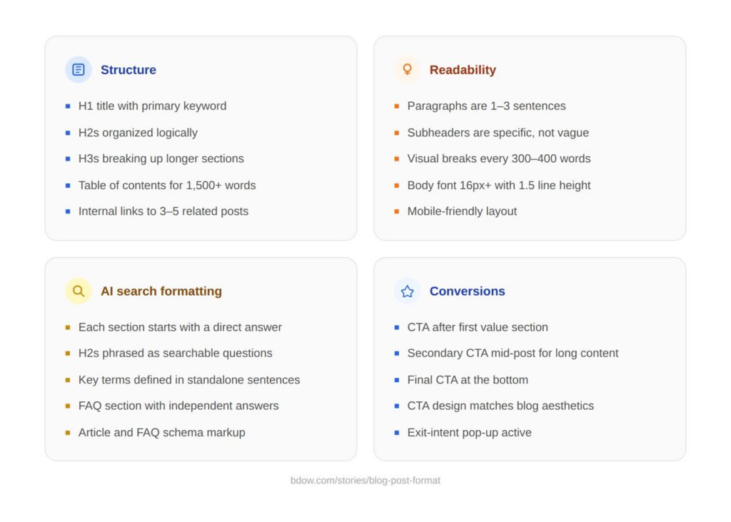
Structure
- [ ] H1 title with primary keyword
- [ ] H2s organized logically (each one could stand alone as a topic)
- [ ] H3s breaking up longer sections
- [ ] Table of contents for posts over 1,500 words
- [ ] Internal links to 3-5 related posts
Readability
- [ ] Paragraphs are 1-3 sentences
- [ ] Subheaders are specific and descriptive (not “Tips” or “More Info”)
- [ ] Visual breaks every 300-400 words (image, list, callout)
- [ ] Body font is 16px+ with 1.5 line height
- [ ] Mobile-friendly layout
AI Search Formatting
- [ ] Each section starts with a direct answer
- [ ] H2s phrased as searchable questions where possible
- [ ] Key terms defined in standalone sentences
- [ ] FAQ section with concise, independent answers
- [ ] Article and FAQ schema markup added
Conversions
- [ ] CTA above the fold or after first value section
- [ ] Secondary CTA in the middle for longer posts
- [ ] Final CTA at the bottom for engaged readers
- [ ] CTA design matches blog aesthetics
- [ ] Exit-intent pop-up active
FAQ
What is the best format for a blog post?
It depends on your topic and what the reader needs. How-to posts work best for instructional content. Listicles work when people want scannable options. Definitive guides fit broad topics where the reader needs everything in one place. Check what’s ranking for your target keyword and match the format to the search intent you see.
How long should a blog post be?
Long enough to cover the topic thoroughly, short enough that every sentence earns its place. For most topics, 1,500 to 3,000 words hits the sweet spot. But a 600-word FAQ post can outperform a 4,000-word guide if it answers the question better. Let the topic dictate the length, not an arbitrary word count target.
How do you structure a blog post for SEO?
Start with your primary keyword in the title and first 100 words. Use H2s and H3s to organize sections, and include keyword variations naturally in your subheaders. Add internal links to related content on your site. Write a meta description under 155 characters. Add alt text to images. Include an FAQ section for long-tail keyword coverage. Check our SEO blog tips guide for the full breakdown.
What’s the difference between blog format and blog structure?
They’re closely related but not identical. Blog format refers to the type of post (listicle, how-to, comparison) and the visual presentation. Blog structure is more about the internal organization: intro, body sections, conclusion, CTA. Think of structure as the blueprint and format as the finished building, including the paint and furniture.
How do I format a blog post in WordPress?
Use the block editor to add headings (H2, H3), paragraphs, images, and lists. Set your H1 through the post title field. Use the “Heading” block for H2s and H3s instead of just bolding text (bolding doesn’t create real header tags). Add alt text to every image through the image block settings. Install an SEO plugin like Yoast or Rank Math for meta descriptions and schema. Preview on mobile before publishing.
Should every blog post have images?
Not necessarily, but most posts benefit from at least one or two visual elements. Images break up text, add context, and give readers a resting point. Screenshots, simple graphics, and annotated examples tend to outperform generic stock photos. If your post is a quick FAQ or a short opinion piece, you might not need images. For anything over 800 words, add visual breaks.


Add A Comment
VIEW THE COMMENTS