It’s so frustrating, isn’t it?
You look at your heat maps and know people are seeing your calls to action… but they don’t freaking click on them.
You’ve done all you can to make your call to action visually appealing, You’ve:
- Made them the right color
- Increased the font size
- Placed them directly in the visitor’s line of sight
- Decreased the number of fields people need to fill out.
You’ve made converting as easy as possible from a visual standpoint, but there’s clearly still something missing.
And while the only way to be totally certain is to run an number of different A/B tests, I’d be willing to bet the reason people are seeing your call to action but aren’t actually acting on them like you want them to has something to do with copywriting.
Specifically, making sure that the way you’ve written your call to action) (CTA) and the text surrounding it is optimized for conversions.
Why Copywriting Hacks Are So Crucial to Your Call to Action Conversion Rates
Tell me if you’ve ever heard this piece of advice aimed at people who do anything online: Your headlines are important. Your headlines have to be awesome. If your headline isn’t interesting, no one will read anything else you write.
You’ve heard it before, haven’t you?
That’s because the way you construct your headline (your headline’s copywriting) matters to whether or not people feel compelled to click through.
And the same goes for the way you write your calls to action.
If they’re not interesting and intriguing enough to make your site visitor think “Oh yeah, I want that NOW”, your conversions are never going to be what you want them to be.
But having a handful of copywriting hacks up your sleeve to apply to your CTAs can make a big difference.
So what are some of these hacks? And how do you implement them?
1. Trash Generic Wording
“Submit,” though it comes standard in a lot of CTA form creation software, is the one word you should totally evict from your online business vocabulary.
Think about it: can you define “submit”?
Neither can I, and your visitors can’t either.
Sure, they are “submitting” their email address or phone number to you in exchange for a lead magnet, free trial, or demo call.
But nobody cares about the action of submitting. They care about what they’re getting in return.
It’s the same with words like “download”, “sign up”, “purchase” or whatever other generic phrase you can think of that you see over and over in online CTA buttons.
Trash the generic wording that means little to nothing and opt for button text that gets specific.
Because when you’re more specific with what the user is going to experience when they follow through, you’re more results-oriented by default.
In the example below, Lyft doesn’t ask you to “Submit” your information, even though that’s exactly what you’re doing. Instead, you as the site visitor know that it’s only after you fill out that information and click on their CTA button that you can become a driver.
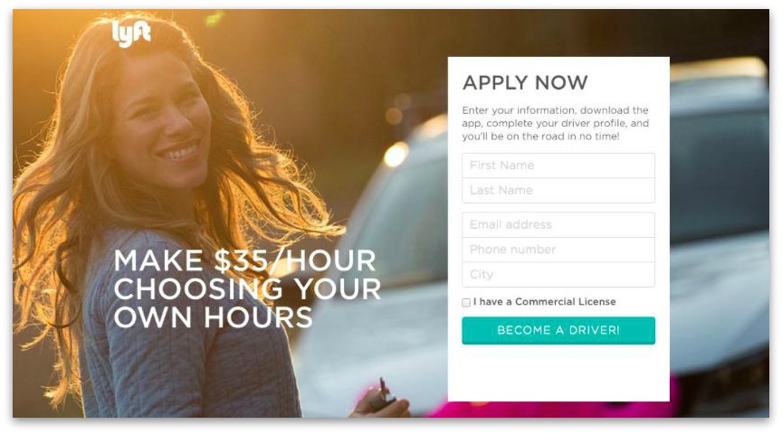
Lyft nails it with this CTA button text.
Sure, they could have written “Sign Up Now” and it would have been completely valid. But “Become A Driver” is so much more relevant to the reason the visitor is on that page in the first place… boosting their desire to fill out the form and click through rates.
2. Show Different Calls To Action to Different Customer Segments
Unless your product is super basic, it probably fulfills a number of different needs your target audience could have.
For example, say you’re selling a software to help entrepreneurs with their productivity. One segment of your audience might be interested because they desperately need to grow their revenue.
Another segment might be fine on revenue, but want to start getting home before 8 p.m. so they can finally achieve that work-life balance entrepreneurship promises.
The software you offer and its functionalities are the same for both groups, but what resonates with them about the software’s capabilities to help them is the biggest determining factor in whether or not they’ll click through on your CTA and become your customer.
So if you lead your traffic to your landing page from two different ad sets aimed at two different customer groups, make sure you either have two different landing pages or that the pages get tagged to display the call to action that’s appropriate for the group that person belongs to.
For example, Visual Website Optimizer talked about an instance where a national cab booking company might only see a 2% conversion rate on their site, but if they segmented visitors and showed content based on their location (the purpose of their visit to the site), they’d increase their conversions to 12%.
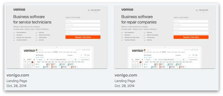
Ok, so maybe Vonigo didn’t shift their button text based on their visitors, but you can see how they’re on the right track to tailoring their website experience based on who is visiting their site at any given moment. Here, the difference is between service technicians and repair companies.
3. Add Visual Cues
In a manuscript published by the US National Library of Medicine, David A. Leopold and Gillian Rhodes write, “For humans, faces are among the most important visual stimuli… as a species, we are constantly, almost obsessively, monitoring each other’s faces, paying close attention to subtle details that can give some insight into the emotional state, level of engagement, or object of attention of our associates.”
This isn’t a direct “copywriting” in that it has to do with the actual wording that you use, but since copywriting involves so much more than simple words, and especially since we’re focused on conversions, this hack gets a spot near the top of the list.
We’ve got three different types of non-visual text cues to cover:
- Eye direction
- Body language perception
- Arrows
Eye Direction This hack takes advantage of the fact that we as humans willingly and eagerly seek out the faces of other humans in photos.
And when we do find those faces we’re looking for and they’re looking in a certain direction, we tend to follow where their eyes are looking to see what they’re looking at.
This can be a great way to direct eyeballs to the buttons you want your prospects to click on.
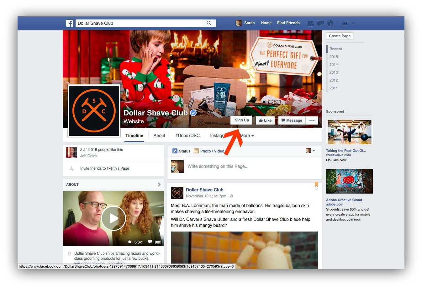
See how the boy’s eyes in the cover photo are both looking towards the shaving kit and the sign up button together? Non-text visual cue at work.
Even if it’s not applied directly to a call to action, a directional cue given by an arrow or a subject’s eyeballs direct your reader’s eyeballs in the way you want them to go, as pointed out by the Dollar Shave Club examples in this post (pictured above).
Body Language Excitement Further, the body language (excitement, grumpiness, etc.) of the person’s photograph you place alongside your call to action can have an impact on your conversions… conveying the excitement you want your reader to feel about the offer.
When ConversionVooDoo tested different poses and expressions of the same girl near their call to action, they found that her most excited stance increased their conversion rate by 6.83%, higher than any of the others in comparison to their beginning control image.
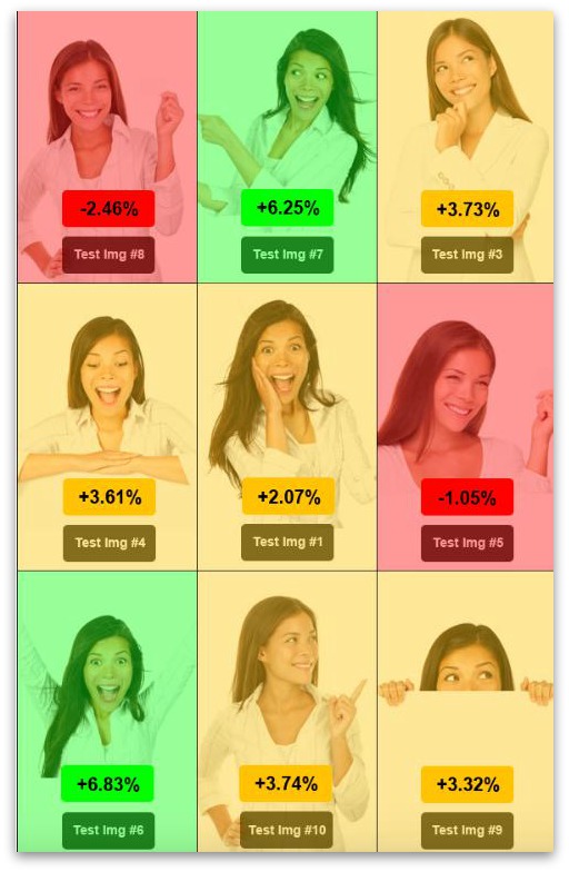
Arrows Likewise, arrows are a great way to literally “point” your prospects’ attention to where you want them to go and the direction words for what you want them to do.
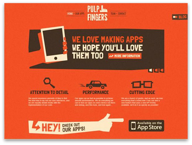
On this screen, Pulp Fingers goes out of their way to literally point out the call to action they want you to follow through on. It’s attention-grabbing and it works.
Many marketers hesitate with these because they feel it’s not subtle enough, it’s important to remember that you aren’t a spam marketer, and arrows work precisely because they aren’t subtle.
4. With CTA Wording from 2nd or 3rd Person into First Person
When you’re reading about a solution you can opt in for, all you’re thinking about is your problems and how this thing that’s being offered is going to make your life easier and whether or not it’s worth your money.
Which means that instead of thinking in 2nd person like a lot of website copy is written in, (which makes sense, it should be conversational), your end thoughts are all about your benefits. Which means your thoughts translate into things like “help me”, “my time”, “my money”, and “I want” or “I need.”
So instead of writing button text that says “Get Your Free eBook,” write button text that says “Send Me My Free eBook.”
It can feel a little odd at first, since you are the marketer writing to the prospect. But changing the wording of the CTA around to first-person eliminates brain friction where the prospect’s mind has to translate your second-person into their own first-person thoughts.
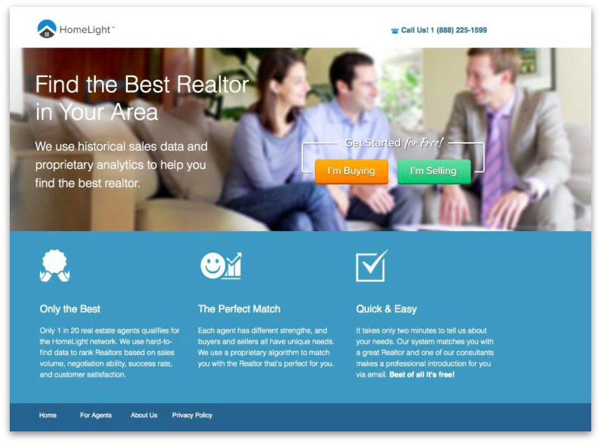
HomeLight starts off in first person with their two initial CTAs so the reader feels like the site identifies with them right away.
When Joanna Wiebe changed Schedulicity’s CTA text from third person to first person (and made it more benefits-focused), they saw a lift of 24%.
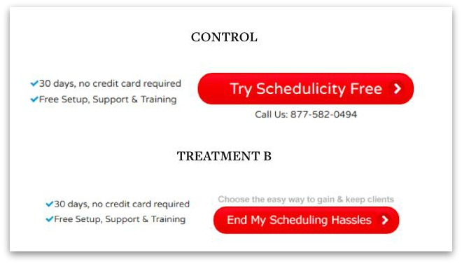
The lesson here is when you take the extra step to make your CTA text all about the user, you’ll see an increase in conversions.
5. Cumbersome Action Verbs vs. Passive Reception Verbs
We’re back to the wording of what actually appears directly on the button.
Verbs like “sign up,” “start,” or “get started” all denote that the person who clicks through on that button has to do work to get the result you’re promising.
But unfortunately…
Humans are inherently lazy.
So, even if you don’t change anything about your sign up or onboarding process, simply changing the wording of your CTA button to focus on a more passive reception of benefits is a hack you can employ to dig more conversions out of your existing on-site traffic.
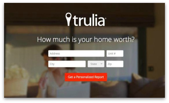
The language of Trulia’s call to action is totally passive. It doesn’t talk about the fact that you’ll have to enter some personal information next to get it… it just focuses on the passive benefit.
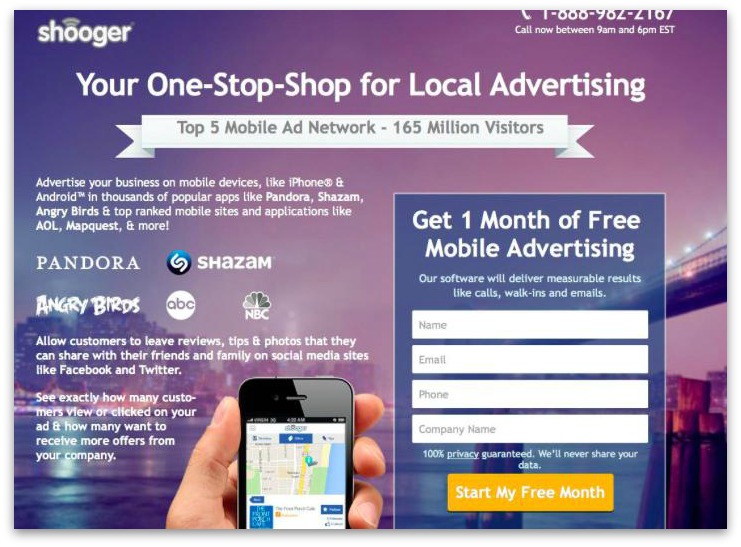
This Shooger CTA, though, isn’t so active. Even though “free” is a good word, “start” implies work involved.
So while “Free” can be a very compelling word in calls to action, it’s not the end-all be-all guaranteeing conversions… especially if your competition offers the exact same thing. Plus, words like “start” do imply work much more than they imply benefits, which is something to consider.
6. Increase Click-Through Confidence With Fewer Choices
Do you have a splash page?
That’s where your homepage is a set landing page.
If you have set up your Welcome Mat as an Instant Landing Page (where you remove the option for your users to scroll out of the Welcome Mat), you do.
This will naturally increase your conversions like crazy, because it reduces the number of choices you present your visitors with. It is one of the simplest ways to both increase for the type of conversions you want and make the visitors feel more confident that they made the right choice.
That’s one reason why. Plus…
Given two paths… we’re all more likely to take the one of least resistance.
So if I want to make my social media management more effective and you’re offering me two options:
- An ebook on social media management tips, or
- A free trial of your software
If I’m not familiar with you, I’m going for that ebook instead.
Which means that you get me on your email list, yes, but it puts me another step away from being a customer than what I could have been if you didn’t give me the ebook option and just told me to see for myself by trying your software for two weeks for free.
Even if your overall goal of having multiple choices is the same, reducing the number can have a greater impact on the results.
For example, Unbounce’s Director of Customer Success wanted to increase weekly webinar signups, so he sliced the signup options from four to three.
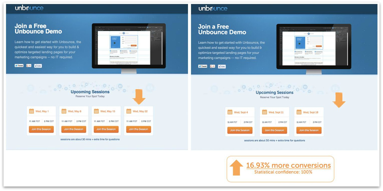
As you can see, it increased their conversions by almost 17%.
7. Hide Your CTA Behind Your Pitch Info
Most of us have clicked to learn more about an interesting offering, only to see a video in front of us that we’re forced to sit through until you get to any text or call to action buttons to click on.
As someone working online, you might not think it makes that much sense—after all, if people are ready to buy in, why not just go ahead and take their money?
But sometimes it helps to “force” people through listening to your full pitch before you let them opt in.
Now, as a disclaimer, this definitely isn’t an approach that will work for everyone… but if it does work for you, it’s one of the best hacks you can employ for increasing conversions, qualifying prospects, reducing your cost per acquisition, and increasing your customer LTV.
One diet specialist had anyone coming to her landing page watch a 30-minute video that couldn’t be fast-forwarded before they ever saw or got access to her CTA button.
And though it may have pissed some people off, her overall conversion rate skyrocketed by 144%. Which is nothing to cough at. That’s a lot more conversions, a lot more customers, and a lot more money.
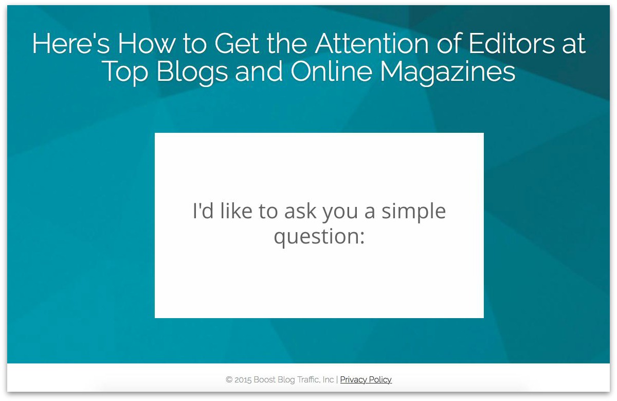
Jon Morrow does this.
Normally, this kind of approach annoys me because I can’t fast forward the video or see how I have to watch it before we get to the point. But I do have to admit that when I do pay attention and watch his videos, I’m much more interested and intrigued with his offer… and much more likely to convert once it’s over.
8. Employ Reverse Psychology
Reverse psychology is that thing parents use against their kids to get them to do exactly what they want.
Like if your parents wanted you out of their hair because you were being an annoying little brat… so they told you to stay inside, knowing it would spur you to want to go outside and play.
One experiment mentioned by Neil Patel on QuickSprout used reverse psychology to get 39% more click throughs than the control CTA button text that used the positive language we’re all familiar with.
First of all, this is not what people are used to seeing or expect to see, which is part of the reason why it can be so effective.
It interrupts the patterns that the brain is used to seeing—especially in sales material—and that interrupt perks it to attention, getting your prospect to more carefully consider what it is you’re offering them.
“Expectations reduce the amount of processing your conscious mind has to do everyday,” said M. Farouk Radwan, MSc. “The pattern interrupt technique is all about interrupting a very popular pattern so that you confuse the conscious mind of your target. Once this happens, you will have about five seconds to program that person.”
That, and it also gets your curiosity going.
Because what do you do the instant you hear someone say “don’t look”?
You look.
Patagonia pulled this off quite well.
They ran a campaign that very deliberately told you not to buy their stuff—or anyone’s stuff, for that matter.
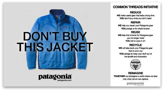
And by aligning themselves with their customers’ values of non-consumerism and using reverse psychology, they actually boosted their sales by 40%.
9. Add Time-Sensitive Words
Time sensitive words around your call to action are a great way to add urgency.
But do you want to know a secret?
You can do this even if your offer isn’t time-sensitive.
Words like “now” and “today” tacked onto the end of your CTA add urgency and encourage a click through because they propel the mind into a more urgent state (whether necessary or not) which suspends deliberate thought and encourages quick action.
This is something a lot of smart marketers have caught onto, too.
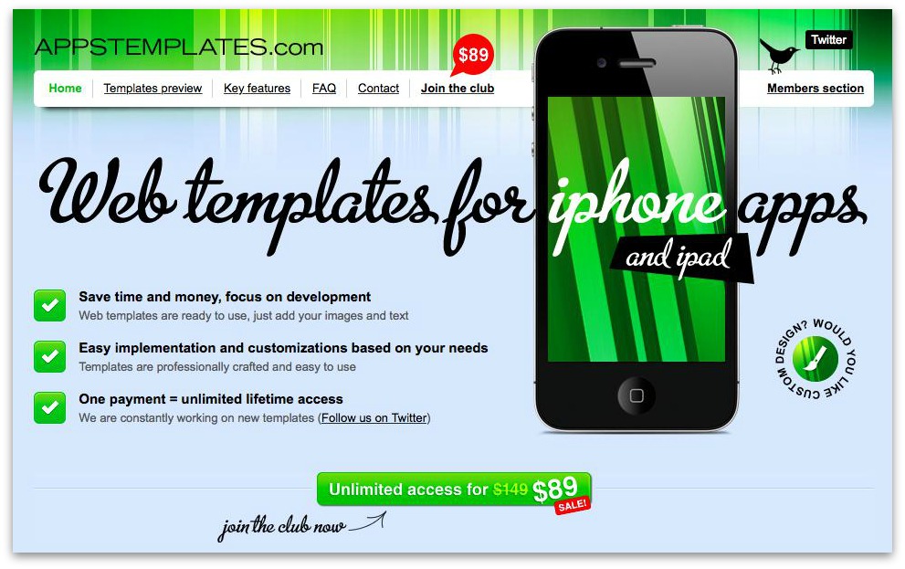
This website selling app templates adds two bits of urgency to their CTA: the word now and a sale price that isn’t likely to last for long.
But beyond just using time-sensitive words, you can put actual limits on the units you’re selling or the period of time you’re offering a certain price point.
Marcus Taylor wrote about his experience using these tactics in his CTA copy, which increased his sales by 332%.
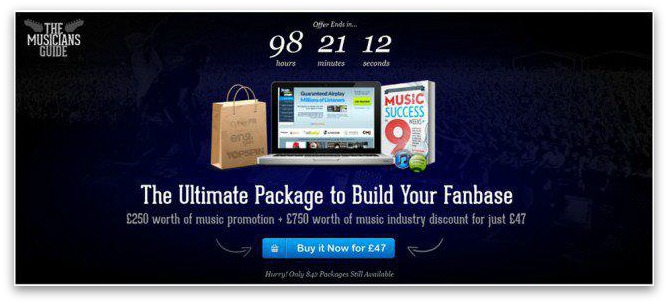
Here’s what the CTA copywriting looked like while he employed these strategies.
As long as you don’t do too many of these urgency and scarcity tricks that your customers start calling your bluff, they’re great ways to help boost your sales.
10. The Next Step is Obvious & Easy to Take
B2B selling is never as simple as you saying “Here’s my thing. It costs $200 per month. Wanna buy it?” And your prospect responding “Sure!” and handing over the money.
It’d be nice, wouldn’t it?
But the selling process is a little more nuanced than that, and therefore takes a little more time.
Instead the conversation might go a little more like this:
- You: “Here’s my thing. It costs $200 per month. Wanna buy it?”
- Prospect: “What does your thing do?”
- You: “It’s a virtual assistant staffing service that takes care of all of your bookkeeping, calendar scheduling, and time tracking for you.”
- Prospect: “That’s cool, but how would it help me?”
- You: “You told me that you currently do all these things yourself, and that they take you about 10 hours per week. So with our dashboard, most of our clients like you manage all of it and only spend 20-30 minutes managing all of these things instead. It’d help you get your time back to focus on more important things.”
- Prospect: “Cool, can I see how it works?”
- You: “Sure…..”
You see?
The next step after you tell them about what you’re selling isn’t to make the sell. It’s to show them.
So if your entire landing page talks about all the benefits the thing you’re selling can reap… the next logical step (if it’s possible) is for them to see for themselves exactly how what you’ve got can deliver.
Instead of skipping a step, trash your CTA of BUY RIGHT NOW and turn it into a CTA that offers a free trial, or a demo, or to see real numbers from real people that aren’t published anywhere else. Whatever works for your product and your customer base.
Make your CTA, particularly the button, the next obvious action that needs to be taken.
As Grigoriy Kogan says, “make the next step ridiculously obvious to your visitors.
It may be obvious to you that your site visitors need to sign up for a trial account to test your service, but it isn’t necessarily obvious to them.
So instead of writing “Sign Up For a Free Trial”, write something like “Try it Now.” Even if they follow the exact same steps, the language is more immediate and obvious to what they’re looking for.
Take a look at how MailChimp does this:
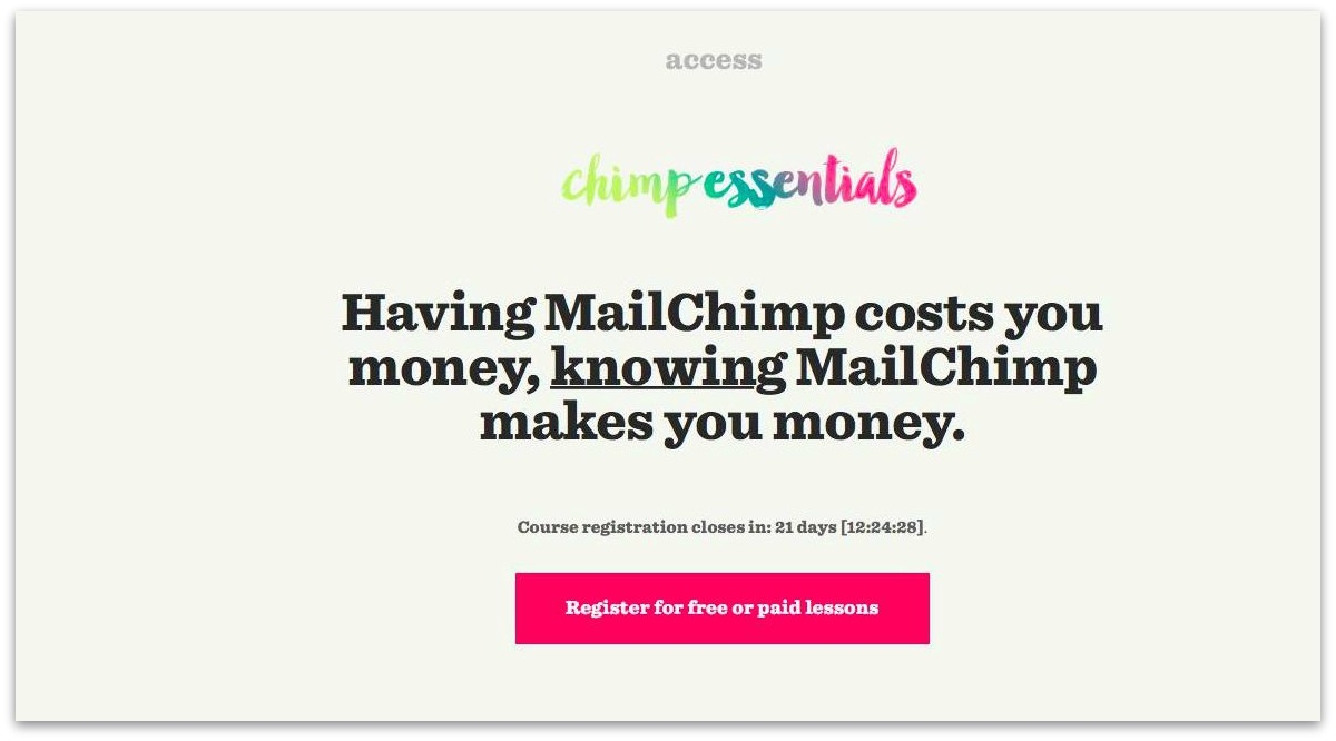
MailChimp starts out with a great hook, but their CTA button text skips a step in the visitor’s mind.
While they do need to register for lessons to start learning, the next thing the reader thinks is “Ok, so I need to start learning.” So CTA button text like “Start Learning” would probably prompt more click throughs to their lesson sign up page.
11. Eliminate Anxiety
Chances are, you’re a commitment-phobe.
We live in a society that’s got more and more anxiety surrounding any kind of commitment. Anxiety in spending emotion on relationships, maybe. But also anxiety towards the commitment of spending time and money on anything.
Time and money are both things that are incredibly valuable and personal to us, so anytime an outsider wants to encroach on them, we put our guards up.
To break down these guards, you can use your words to tell your prospects how little time or money they’re spending (none or only a little bit) with the wording in or around your CTA.
For example, if your button says, “Start My Free Trial Now,” you could write Signup Only Takes 60 Seconds underneath it.
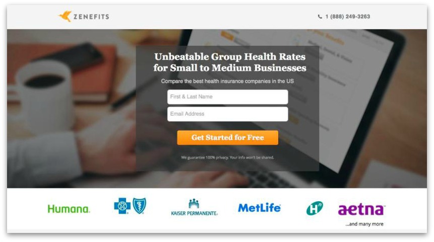
Zenefits helps eliminate the anxiety about sharing sensitive and personal information online with a “We guarantee 100% privacy” statement underneath their CTA button.
It’s an easy trick that can help push your prospects with commitment issues over the fence into paying customer territory.
12. Make it FREE
F R E E are perhaps some of the most effective letters for getting attention in the English language.
When Soocial simply wrote “It’s free!” next to their CTA button, they got a 28% increase in conversions.

(Image: VWO)
We love “free” so much that we would rather opt into a “Buy One Get One Free” offer than a “50% off” offer—even though we’re spending half of the money on the latter.
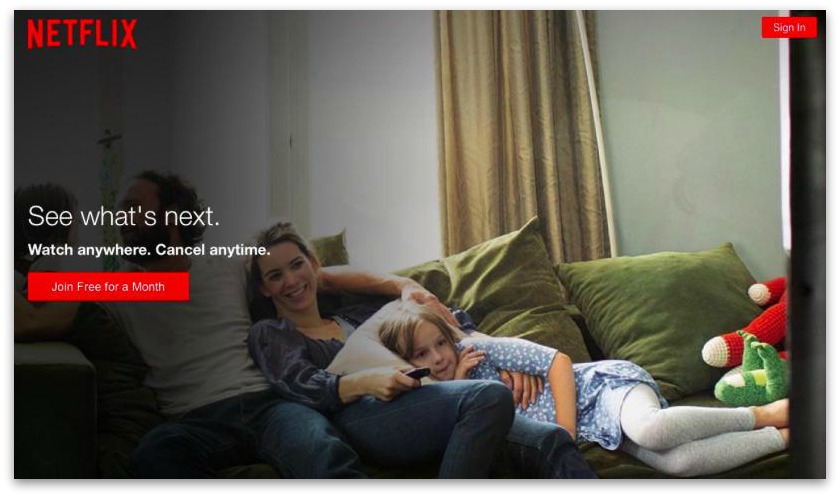
Sign up and get a month of TV watching for free? Don’t mind if I do, Netflix.
Dan Ariely did an interesting study on the power of “free” in selling small chocolates.
In one experiment, he and his fellow researchers sold Lindt Truffles for $0.26 and Hershey’s Kisses for $0.01. When consumers were asked to make a choice of which one to buy, they chose the truffles and the kisses in equal amounts. (40% each)
But when they “ran a sale” and dropped the price of each chocolate by $0.01, suddenly the kisses were free, and 90% of the customers opted for the free piece of candy over the $0.25 piece of candy, even though the price drop for each was exactly the same.
“Free” is powerful, indeed. And there’s two main reasons why.
First is risk-aversion. If you get something for free, you’ve done nothing to put yourself, your time, or your resources on the line to obtain it. Free is safe, and we like safe.
The second, though it falls in the same vein as risk-aversion, is that “free” represents low-hanging fruit that’s easier to access than anything else. Roger Dooley attributes the success of this reason to the innate nature of our hunter-gatherer brains that are constantly on the lookout for resources we’ll need to be of use. And if a resource is easy (and free) to access, there’s no reason not to pick it up.
13. Tie the Main Value Proposition into Your CTA Text
If you have a strong hook that states a bold promise, tie that into your call to action. This continues the strong sense of those initial emotions, making sure they’re felt all the way through the page.
Plus, when you do this, you stay relevant to the people you’re trying to convert. And in a world of crowded online ads vying for attention, relevance of a message (and keeping that relevancy going) is so, so important.
I mean, imagine if you were promised to be able to make an extra $15,000 per month in your new business, and all you saw for a call to action was “Sign Up Now.”
Yeah, no.
But if it said “Start Making My $15k Plan Today”?
Way better.
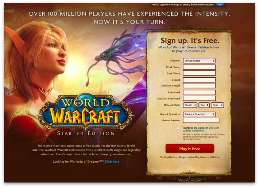
In their hook, World of Warcraft talks about experiencing the intensity and that now it’s the reader’s turn. Their CTA button text continues this promise with “Play it Free” to keep them moving through the conversion process.
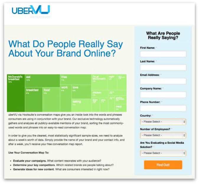
Similarly, uberVU entices you with a question and promises an immediate answer with their CTA button. It keeps the curiosity going, boosting conversion momentum.
Making your CTA emotionally charged is one of the best ways to get your visitors excited about your offer.
“You want to be able to elicit a strong response from your audience as a result of their enthusiasm,” said Billy McCaffrey on WordStream. “If your CTA is enthusiastic, then your audience will be enthusiastic too.”
Start Testing These CTA Hacks on Your Landing Pages
Hopefully at least one of these CTA hacks got your imagination rolling with ideas on how to tweak your call to action to be more effective with your target audience.
And if that’s the case, then you’ve got three things to do:
- Brainstorm the different CTAs you want to text. This doesn’t have to be hard – just write down all of your CTA text ideas somewhere.
- Prioritize them based on how well you think they’ll convert, or simply by which ones you want to try first.
- Test them out. If you’re unsure of how to actually run an A/B test, check out our cool three-minute A/B test tutorial video showing you how easy it can be.
Psssttt…. if you’re looking for a tool that’s easy to test call to actions with, you just might fall madly in love with our Welcome Mat, which captures conversions and leads the instant people land on your site.
Add A Comment
VIEW THE COMMENTS