Recent survey data shows us that when new visitors first land on a website:
- 47% make a beeline to the Products and Service pages
- 33% browse the homepage before jumping around elsewhere
- 16% check out the About Us page
Naturally, numbers like that convince you to focus your attention on pages you'll see the highest traffic and conversions when you launch a new site or update an existing one.
So you spend hours tweaking your homepage and snap hundreds of photos to show off your products.
But what about that 16%?
That 16% of your traffic — or roughly 16 out of 100 visitors — is keen on learning more about you and your brand.
And they’re kind of getting the short end of the stick if you don’t beef up your About Us page with the info they want to know.
This is a huge mistake far too many brands make.
These visitors are taking their first step into your funnel.
They’re trying to gauge whether your brand aligns with their values and if you can offer them a solution to their problem.
The answers to these questions aren’t always visible on your homepage or the Products page. That’s why your About Us page is so important to get right. Lucky for you, we've got a checklist to get you started:
Get Your Free “About Us” Checklist
When you have a good "About Us" page, your new visitors will eagerly move from being a complete stranger to becoming a potential customer.
They’ll get to know who you are and if your mission resonates with them.
On the flipside, terrible About Us pages will make new visitors bounce from your website entirely — so you’ll not only lose the touch point, you’ll lose any chance of capturing them as a potential customer.
Let’s introduce you and your brand the right way.
Today I’ll show you how to spot the telltale signs of a bad About Us page and give you the tools to fix yours. I’ll even share some real-world examples so you understand today’s advice in action.
When we’re done, you’ll have everything you need to create an authentic About Us page that captures your new visitor’s attention — and inspires brand loyalty — right from the start.
Use these guidelines as a checklist to draft an About Us page that encourages new visitors to get to know your brand better.
Here’s how to start:
Secret #1: Use a Conversational Tone
The quickest way to turn off your readers is using the wrong tone.
Red flags new visitors don’t want to see include using the third person to speak about your brand and stuffing your page with technical jargon.
Let’s look at this example to see what I mean:
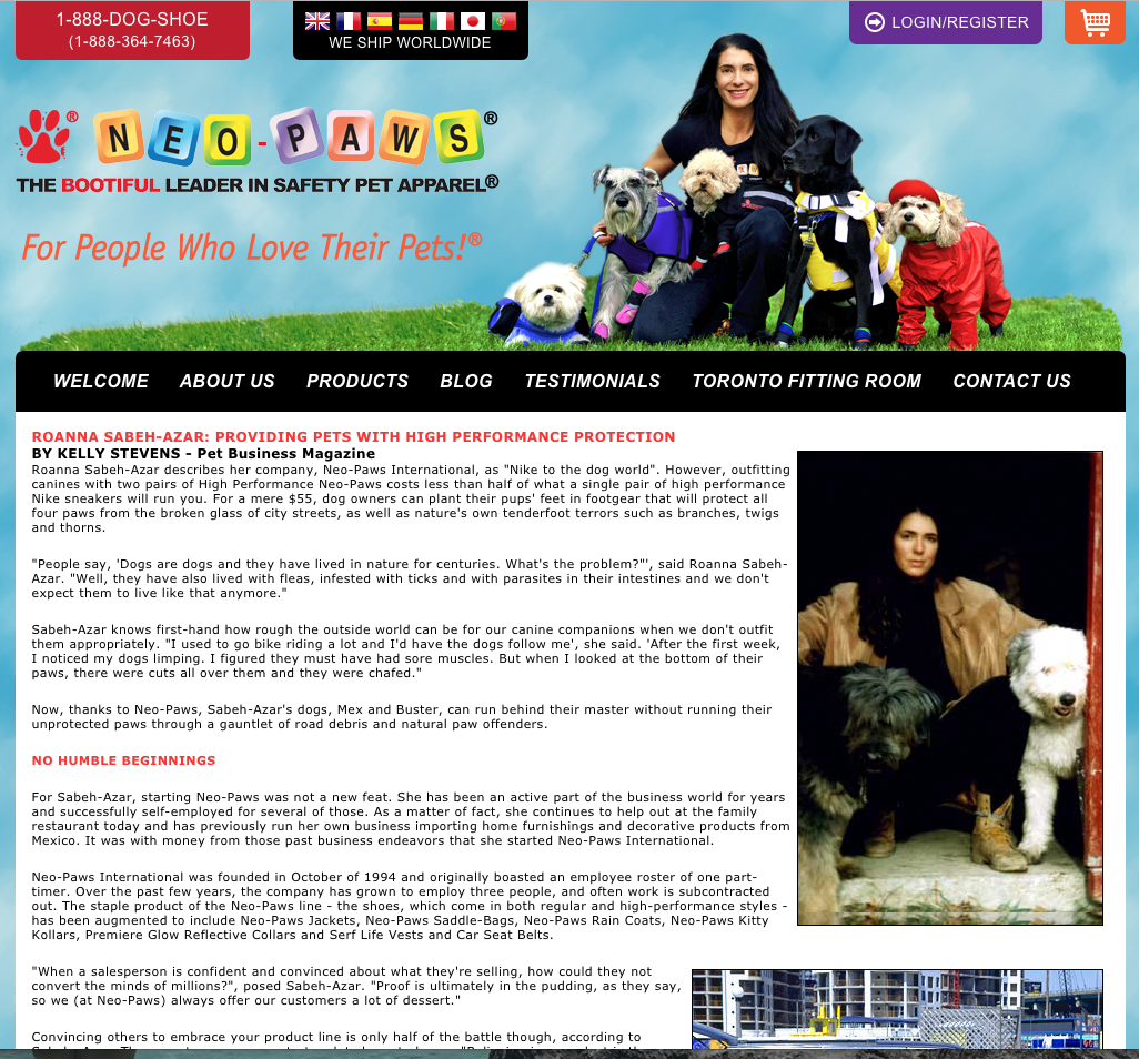
This About Us page is littered with third person references such as the pronoun she, the owner’s last name, and the company name.
It also lacks a conversational tone, which makes it come off as cold, unengaging, and super self-focused.
Readers have to trudge through this text as if they’re reading an autobiography or someone’s resume instead of an About Us page.
So to avoid all of those traps, let’s take a look at a warm and friendly About Us page that’s just the opposite.
Marie Forleo personally greets her visitors when they land on her About page:
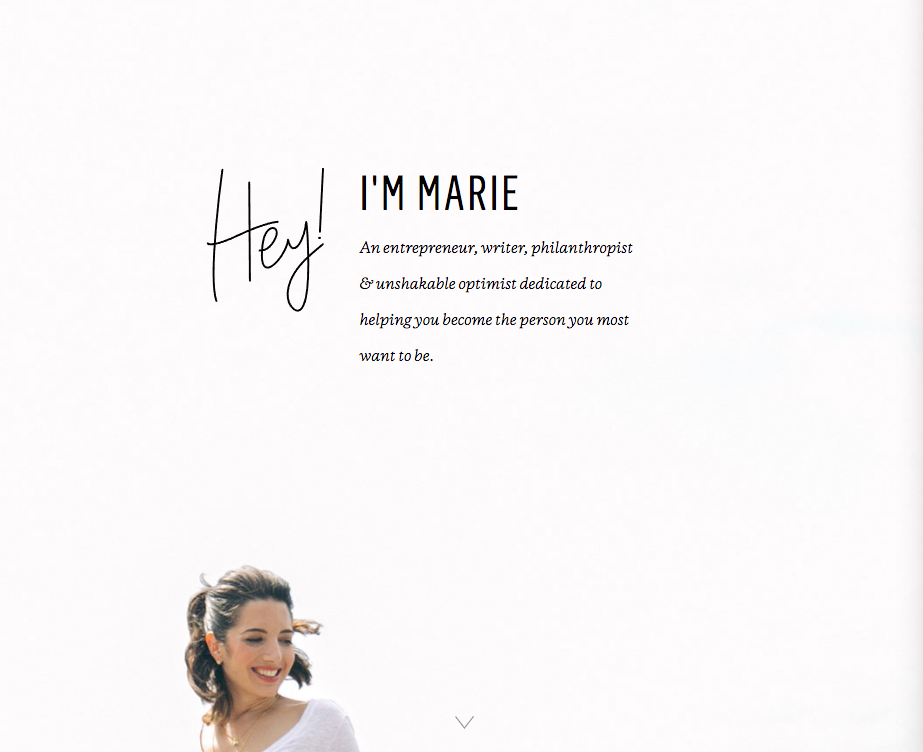
Her tone is conversational, engaging, and easy-to-read.
She also follows with a short description about who she is and her number one goal: “Helping you become the person you most want to be.”
Adding a little insight about herself, she then immediately shifts the focus to how she wants to help her visitors.
This second part is what our first example completely lacks.
As you scroll down the page, you learn more about Marie through her own words:
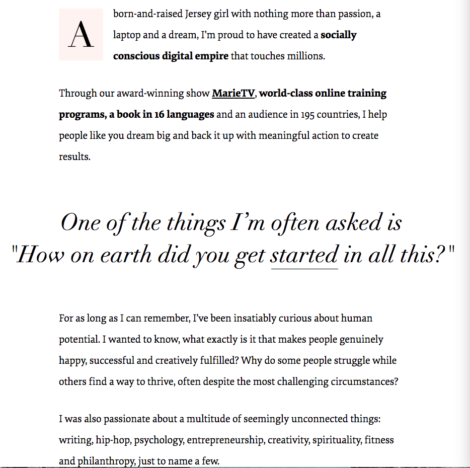
Phrases like Jersey girl, a laptop and a dream, insatiably curious about human potential, help paint the picture of the real human behind the scenes of her brand. It helps new visitors connect with Marie as a person, not just as a company.
Marie also uses short paragraphs and bold emphasis sparingly to really get her message across. This makes her story enjoyable, not just informative.
Speaking of her story, Marie is a poster child for getting the next secret right too.
Secret #2: Tell Your Story, Not a History Lesson
Whether you loved or hated history class, your About Us page should not read like a boring textbook.
Most of us don’t want to learn the history of your company.
Sure, it’s nice to know that your brand has been around for more than a decade, but do we really need to read about every minute detail of your brand’s timeline along the way?
Not really.
See, these pieces of information don’t help your new visitors figure out how you can help them.
In our next example, there’s way too much boasting and not enough information about how the company wants to help their potential customers:
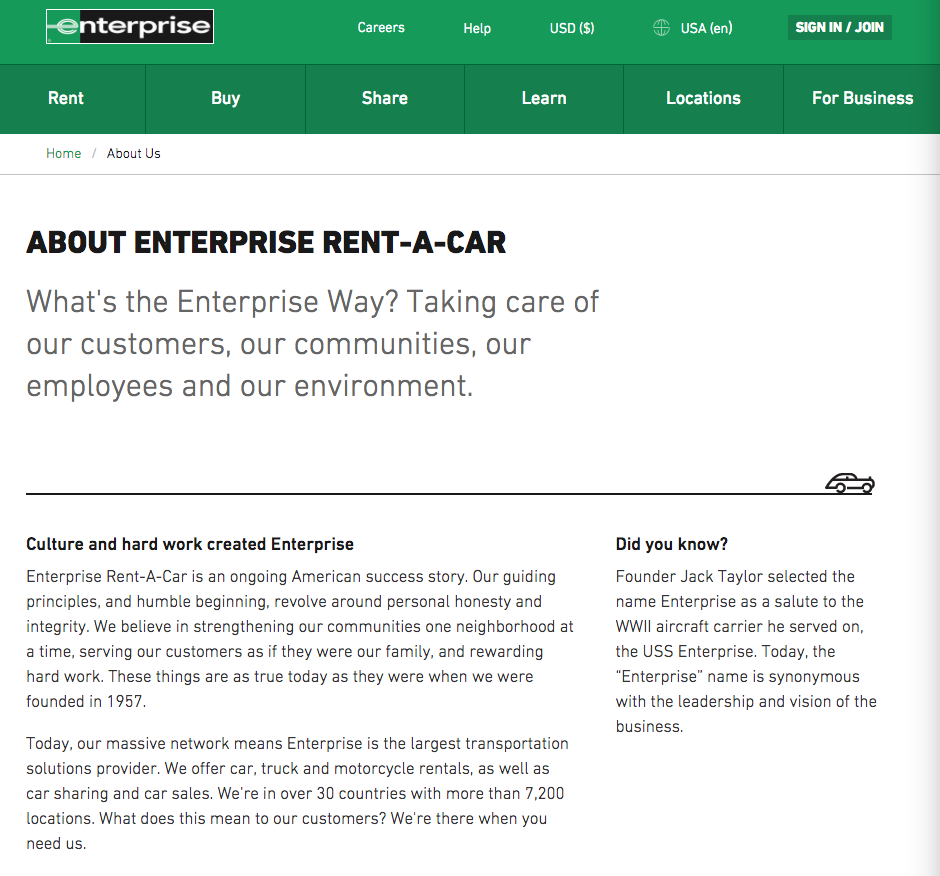
Words like ongoing American success story and our massive network don’t show us who’s behind the brand or how they plan to help their potential customers.
Instead, we find a big brand experiencing ongoing success. Great.
Shareholders may be cool with this, but what about new visitors? How is this information going to help them?
Your About Us page is where you’ll create a human connection with your visitors as if you were standing right in front of them.
It’s not about showcasing every accomplishment and bragging about how great you are. You can dump these achievements on a separate page.
Your About Us page is where you get the chance to connect with new customers — and it’s one interaction you can’t afford to mess up.
To connect with readers, you need to share an authentic story. And not your whole life story either, please.
Pare things down and get to the heart of your “aha” moment.
What problems were you facing that led you to create this solution?
How did it make you feel?
Why did you decide to share your solution with everyone?
These answers will help you connect with readers who are in the same situation you were in.
By doing this, you instantly become a trusted expert. Someone who can help them solve their problems.
As a reward, new readers will progress deeper into your funnel and will be excited to learn more about how you can help.
Lewis Howes, NY Times bestselling author and creator of The School of Greatness Podcast, does it right:
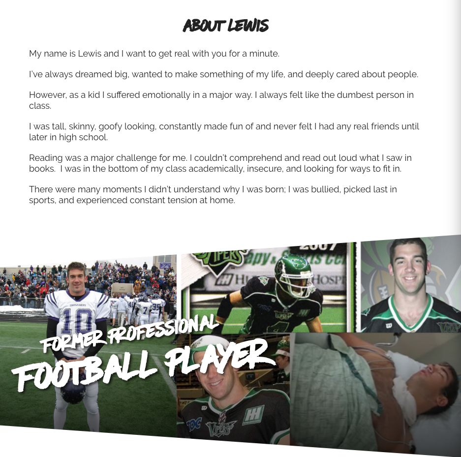
His About Us page is as authentic as it gets.
Lewis admits that he had big dreams and wanted to become something great, but he battled with:
- Not feeling smart enough
- Not having any real friends
- Struggling with reading
- Being bullied and picked on
Most of us would never admit these insecurities and yet he did it within seconds of introducing himself.
And almost all of us can relate to at least one or more of the feelings Lewis was experiencing.
This is why he connects so well with his readers. He’s created a growing audience that relates to him on so many levels they faithfully stick with him moving forward.
You can do the same thing for your brand.
Show your true story and show visitors that you were in the same situation they are and you can bet they’ll stick around your site longer.
You can also keep their attention once you have it by designing a visually appealing About Us page.
Secret #3: Make Your About Us Page Visually Exciting
While your story should lead your new readers, your visuals help keep your words interesting. But this only works with the right images.
Using generic stock photos — or worse, no photos at all — is a surefire way to cause visitors to jump off your About Us page.
When I land on this local dentist’s About Us page, I’m not excited to see what’s behind the door:
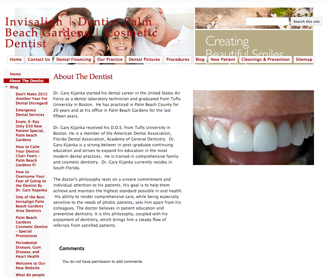
There’s an awkward photo of someone’s mouth, a bunch of stock images crammed in the header, and a text-heavy third person bio.
These three elements do not make me eager to check out the office or even learn more about the staff.
On the other hand, when you look at this orthodontist’s site from the same local area, you get a completely different picture (literally):
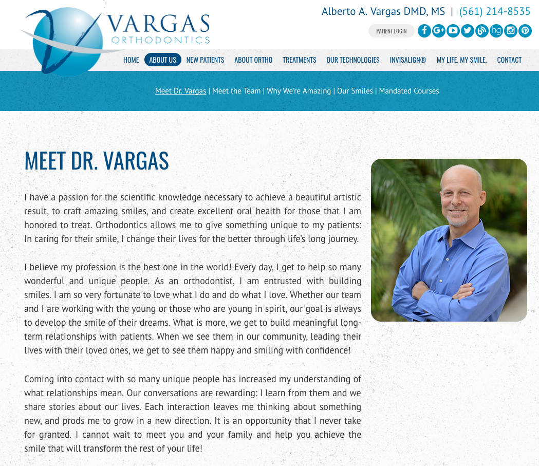
First, you actually see his picture.
It’s a welcoming, professional snapshot.
Next, you can see that he’s writing to us directly using the first person.
He mentions that he thinks his profession is the best in the world and that he’s honored to treat his patients.
I don’t know about you, but that’s the kind of person I want to learn more about.
My only critique here would be to break up the blocks of text further.
One site that nails the visually appealing element of an About Page is this one:
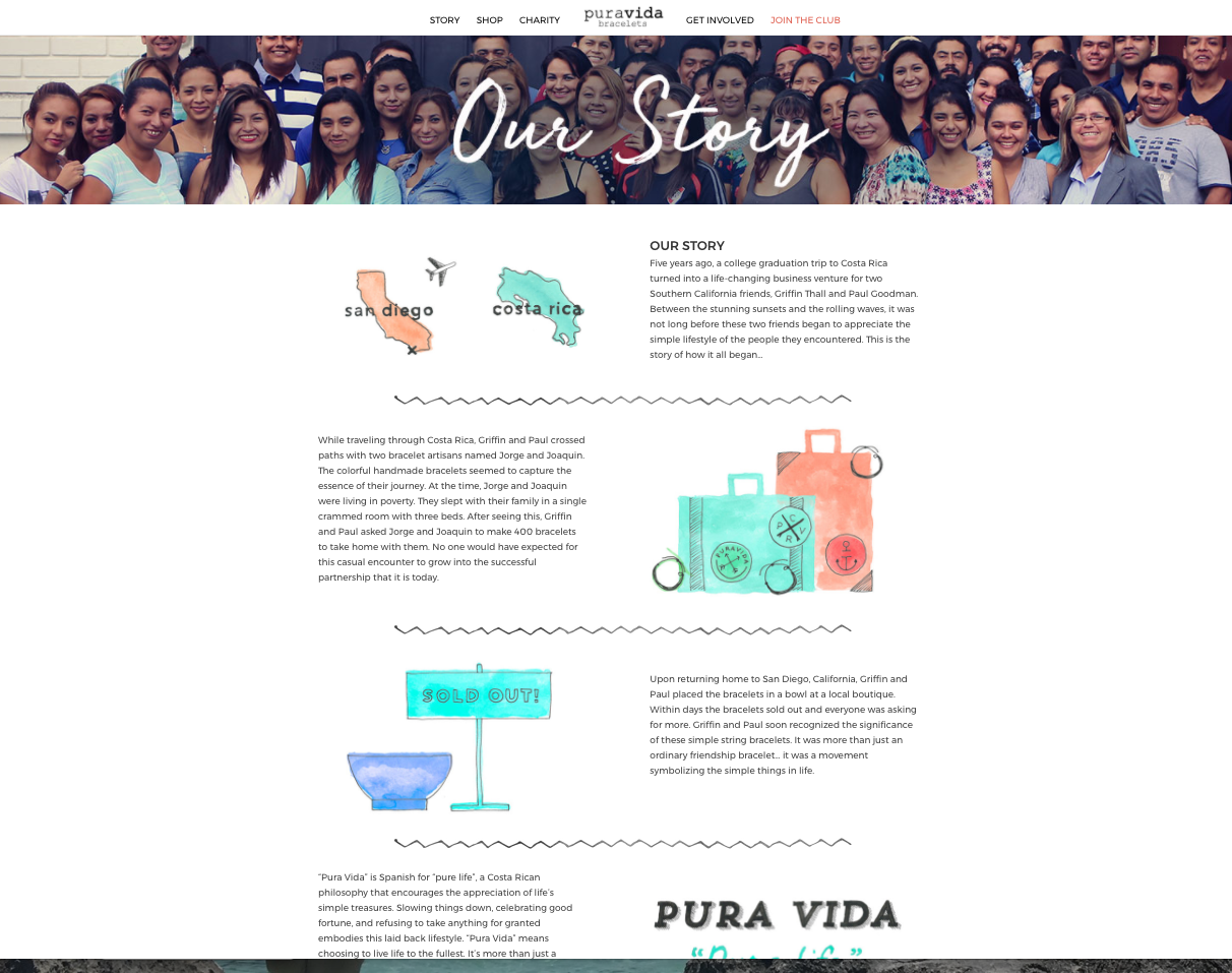
Here, Pura Vida bracelets combines custom, hand-drawn illustrations with a full-width header image of their actual team. It’s a smart way to show the true faces behind the brand while also keeping the rest of the page visually engaging.
Even though the text is somewhat chunky like in our orthodontist example, it’s broken up in smaller sections to keep the page light.
And thanks to the pictures, a natural flow is created that guides readers down the page to their one call to action (secret tip #5).
It also doesn’t hurt that the story behind this brand is nothing short of warm and fuzzy, making it a perfect overall example all around.
My small critique here: the tone of their story (secret tip #1) is done in third person. It would have been way more heartfelt coming from the first person (I, my, etc.) perspective.
Our next secret ingredient is also one that this example’s About Us page is missing.
Secret #4: Let Your Customers Do Some of the Talking
Another trustworthy move you can make to your About Us page is to display testimonials.
With this route, you’ll let your customers do the talking for you while you build trust in potential new customers along the way.
Nusii, a proposal software company, does a perfect job of displaying their testimonials in the bottom half of their About page:
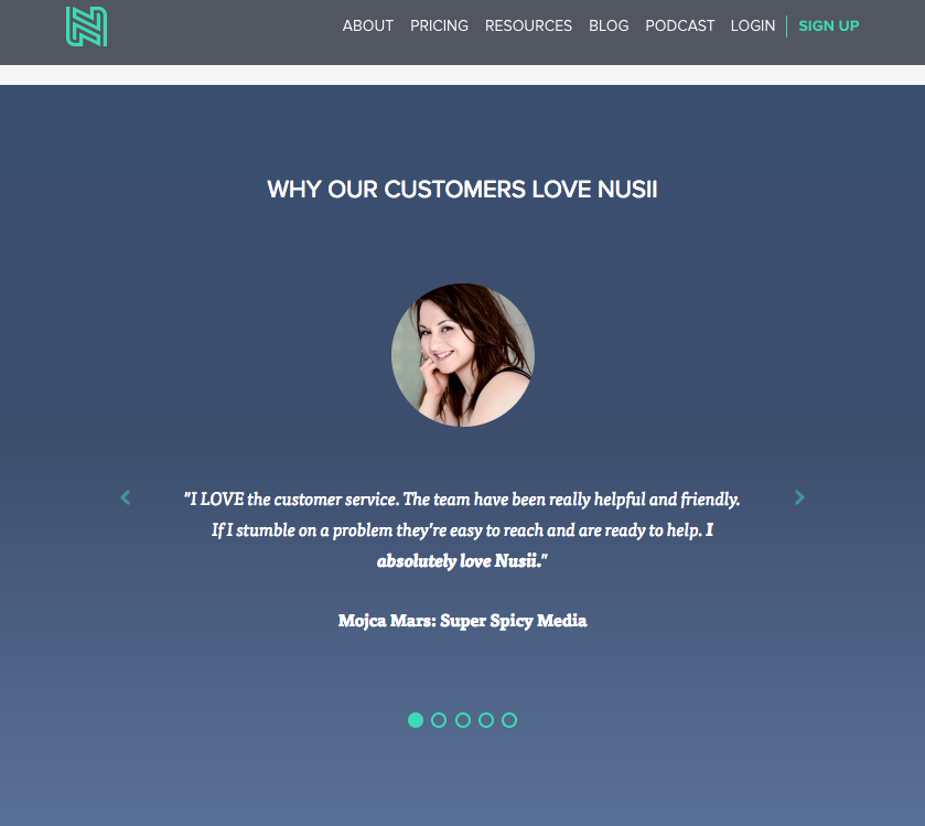
Interested visitors can use the arrows to read four more testimonials.
It also helps that these testimonials include an image of the actual person making the recommendation.
These two ingredients build trust and solidify that this brand can solve problems for its customers — because it has already.
My last secret ingredient is another that many brands fail to use right.
Secret #5: Choose One Call to Action Only
Your About Us page is one of the best funnels to start building for your brand, especially since it’s a natural first step for readers.
But the key here is that you can only use one call to action.
You shouldn’t ask your new readers to:
- Follow you on social media
- Sign up for your email list, and
- Check out your latest articles on your blog
Even though you want your new visitors to do all of these, if you send them in all kinds of crazy directions, nothing gets done.
Instead, choose one call to action and stick with that.
The Pura Vida example from earlier follows this advice:
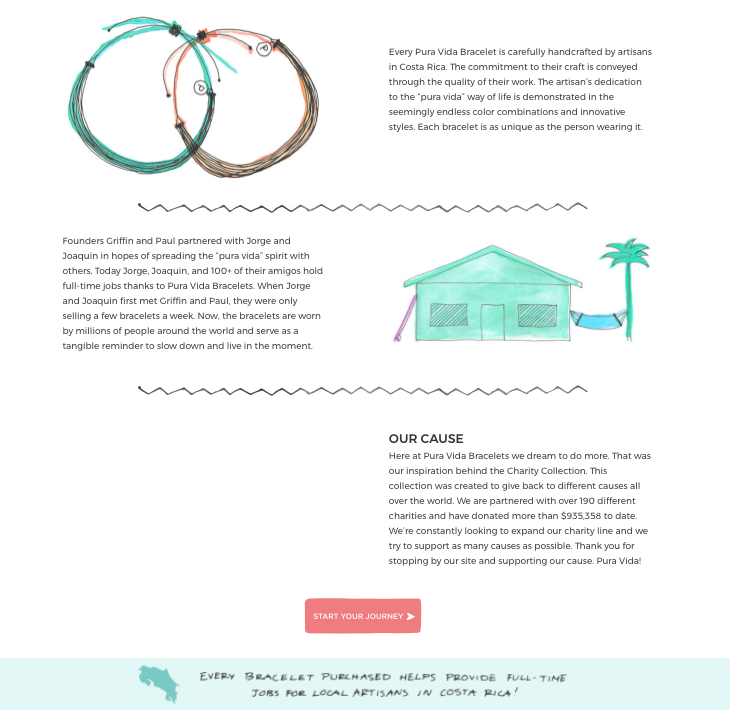
At the bottom of their Story page, they have a brightly colored coral button titled Start Your Journey.
When a new reader clicks it, it takes them straight to their Products Page. Talk about a seamless funnel.
This is exactly what you want to create.
Another good idea is to choose your email list — after all, it is your ATM — as your one call to action, just in case your reader isn’t ready to buy yet.
Then you can send follow up emails to keep your new reader interested.
Tom Ewer of Leaving Work Behind does this well.
First, he introduces the goal of his site and how he plans to help readers.
Then he follows this with an opportunity to sign up for his newsletters.
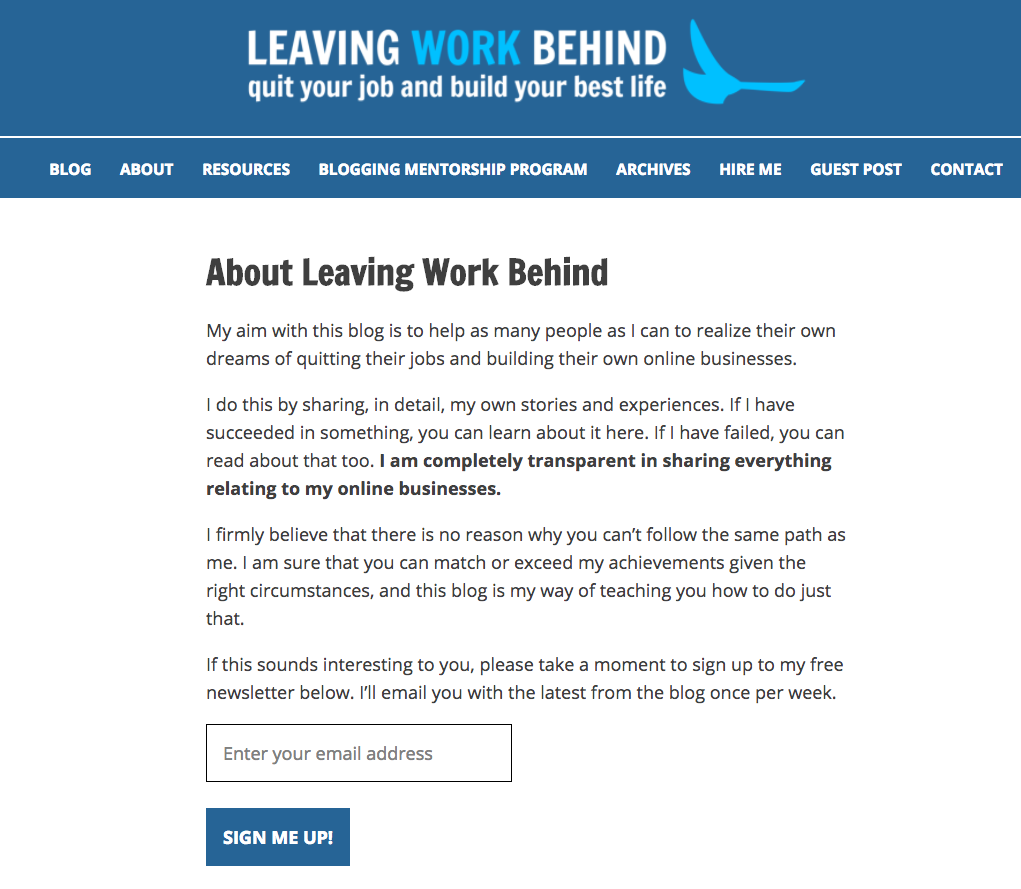
The sign up box is clearly visible and it’s also simple and clean. He’s not flashing a bright box at his new readers (#takenote).
This is how you capture readers who show interest in what you have to offer.
They already stepped one foot into your funnel, you just have to convince them to dive in.
Create an About Us Page Worth Reading
We’ve demystified the secret to a winning About Us page — and as you can see, it only takes five secret ingredients to create one for you and your brand today.
These aren’t complicated steps that require hours of your time to get right. It’s about being yourself and creating an authentic story new visitors will connect with and love.
And when this happens, your new traffic will naturally flow deeper into your funnel, converting from complete stranger to potential new customer to (eventual) lifelong buyer.
And psst – before you go, don't forget to get your hands on our free checklist. It'll help you apply everything you've just learned!
Add A Comment
VIEW THE COMMENTS