TABLE OF CONTENTS
- Intro
- Step #1: Start with the End Goal in Mind
- Step #2: Choose an Unforgettable URL
- Step #3: Choose Your Hosting Plan
- Step #4: Drop a CMS on Your Website
- Step #5: Customize the Look to Fit Your Brand
- Step #6: Create Goal-Driven Content
- Step #7: Add These Tools Before Launching
- Step #8: Choose a Launch Date, Fine-Tune, and Publish Your Site
- Step #9: What to Do Next
Does it seem as if every brand, adorable Instagram puppy, and neighborhood plumber have their own websites these days?
They do.
So you’re probably scratching your head and wondering why you don’t.
Brands have an almost unlimited pool of potential customers in the vast online expanse.
Already convinced? Jump ahead to Step 1.
Still on the fence? Keep reading..
Current stats tell us:
- Close to 50% of the world connects to the internet (that’s 3.6 billion users)
- 10x as many people use the internet now than during 1999–2013
The trick is just meeting everyone!
Most brands find social media the easiest way to plant their digital roots.
And it’s not exactly a bad place to connect.
After all:
- Facebook reports 1.13 billion daily active users
- Instagram boasts 500 million users per day
- Twitter wrangles in 313 million users per month
- Snapchat rolls in around 150 million daily users
- And LinkedIn’s members top 450 million
Your awesome brand may stack up likes, comments, and followers, but what happens when your social media tribe wants to learn more about your brand than your fave Instagram filter?
Where can they find solid information about who you are?
If your answer is something along the lines of I have my phone number, email, and business address listed in my profile, you’re doing a major disservice to your audience.
Not to mention completely shortchanging your brand.
See, while building your brand on social media is important, you can’t rely on those channels alone to help you tap into your online audience.
The reality is, some of your followers are not ready to buy yet.
They like your feed, they get your style, but they don’t know enough about you to hand over their hard-earned cash.
Your website needs to step in where your social posts can’t reach.
When done correctly, your killer website becomes:
- Your best salesperson, working hard even when you’re not
- A way to help you build authority and trust with your audience
- A much cheaper option than opening a brick-and-mortar store and just as profitable
- The ultimate resource for learning more about your brand, mission, and audience
Your website also takes the pressure off potential customers who are not in the ready-to-buy zone. You’ll be able to guide these visitors further down your sales funnel on their time.
This makes your chances of converting later way more likely.
So you need a website. Established.
But what happens when you know less than a six-year-old about building websites?
Or you can’t afford to hire someone to create a website for you right now?
I’ll tell you: You’re going to launch your very first website all on your own.
Actually, you’ll have today’s guide to show you exactly how to get this done even if you have zero technical experience with digital, code-y stuff.
I’ll take you on the same journey I’ve used to build tons of websites.
And I’ll be honest with you, not all my websites were shiny gems. But my early mistakes don’t have to be your failures.
By the end of this guide, you’ll have everything you need to go from concept to publishing your first site. And you’ll breeze right through it like a total pro.
Step #1: Start with the End Goal in Mind
This is going to sound counterintuitive, but you need to go with it.
Start this website project of yours by brainstorming about your end goal right from the beginning.
What do you want your website to actually do?
- Do you want it to attract new readers to your ebook?
- Does it need to display your portfolio so higher paying clients swing your way?
- Are you looking to set up a lead generator that works while you sleep?
- Or, are you creating an ecommerce store to sell your products online?
Whatever the case, you need to think about your end goal first.
This one step ensures that every component you build and add to your site aligns with getting you closer to your goal.
Skipping this step will cause major headaches, eager beaver.
You’ll end up spending countless extra hours hashing out our next steps because you never created a solid game plan.
So let’s take a look at a few examples of how goals differ between websites.
Looking at New York Times Bestselling author Elizabeth Gilbert’s homepage, we get her website’s focus right away:

She’s promoting her latest book front and center. Besides a short description of the story, Gilbert also displays store logos for where readers can buy her book.
Her #1 goal: Sell more Big Magic books.
Now if we compare this to an ecommerce site like Herschel Supply Co., we find multiple products displayed all at once:

Their goal is also to sell products, but they’re not pushing one over another.
Pat Flynn, the brains behind Smart Passive Income, on the other hand, uses his website more for lead generation and growing his audience.
You get a totally different feel from the first two examples as soon as you land on his site:
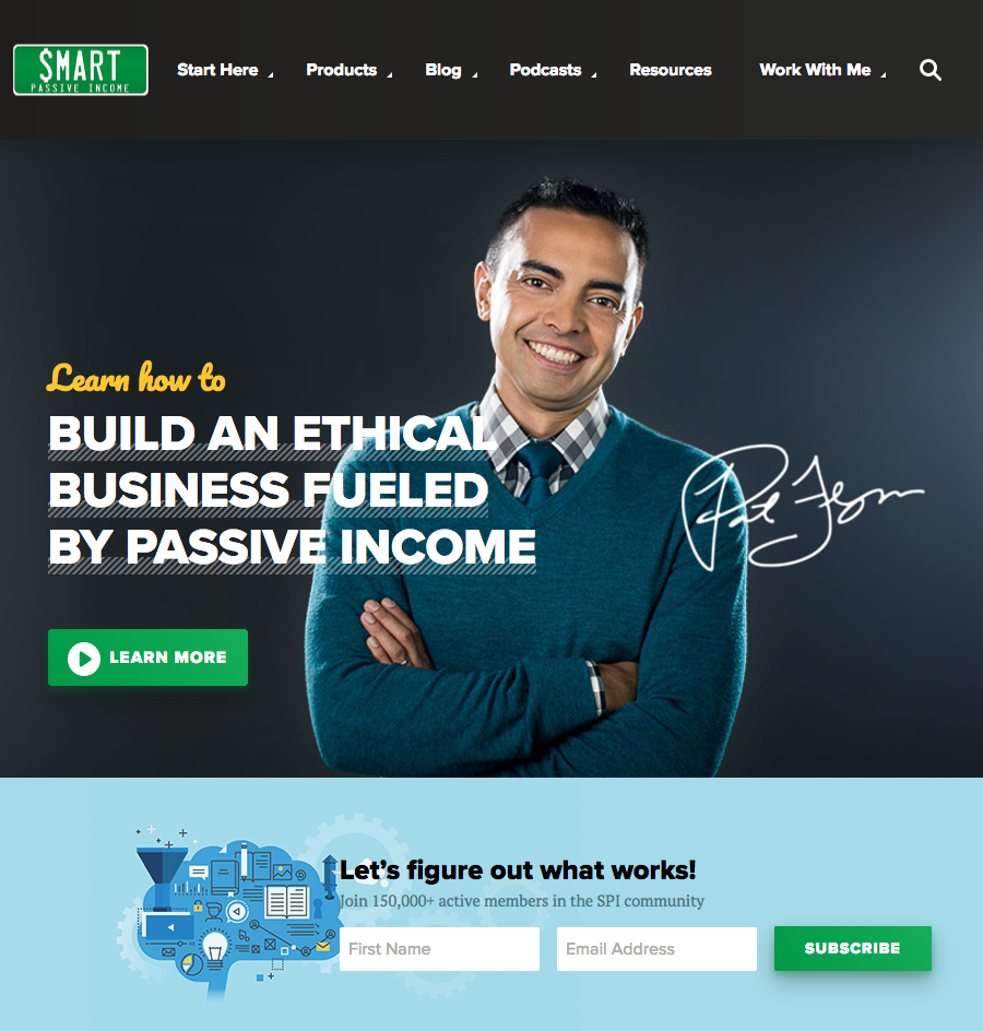
Flynn has a bright green “Learn More” button for all his new visitors.
Plus, he grabs visitors looking to take action by prompting them to join his email list right away.
Neither Gilbert’s nor Herschel Supply Co.’s websites mentioned anything about learning more about their brands or joining their email lists above the fold.
They have goals to sell more products; Flynn’s goal is to inspire more followers.
This is why having a game plan outlining the goals of your website is so essential.
It literally becomes the guiding support for all your website’s meat and potatoes (or products and content).
Here’s What to Include in Your Game Plan
Choose one and only one goal for your website.
Anything more and you’re bound to create a haphazard, chaotic, confusing mess.
Here’s a general guideline:
- If you’re just starting out and you’re content-based, concentrate on building your email list/growing your audience like Pat Flynn.
- For ecommerce, feature your products in the best way possible; use descriptive product titles and high-quality photos.
- And if you’re a consultant/freelancer, prominently showcasing your portfolio and previous testimonials should be a top priority—along with strong calls to action.
Once you’ve nailed down your goal, it’s time to set milestone dates.
Sure, you could create and launch a website in a few days if you’re on a caffeine bender and don’t care about seeing sunlight, but be forewarned that it’s a lot to tackle all at once.
I don’t recommend this strategy, so I prefer to set milestone dates to keep myself on track.
Depending on how much time you’re devoting to this, space out and set deadlines for when certain aspects of your website should be completed.
This keeps your project on schedule and gives you accountability to work with.
Choose a target date to complete each step in this guide to start.
Keep in mind, some steps will and should take you longer than others, so your milestones shouldn’t be evenly plotted on your calendar.
You may even be able to tackle a few at once.
Before you get schedule happy, make sure to read through the next few tips so you’ll have a better idea of how much work will be involved to cross each step off your list.
Step #2: Choose an Unforgettable URL
Your URL is the web address someone types in to find your site.
So Google.com, Sumo.com, and Yahoo.com are all examples of a URL.

Good URLs are:
- Short and sweet
- Memorable
- Pronounceable
Bonus points for adding keywords too.
The idea behind your URL is to make it super easy for your audience to remember and find your brand’s website.
You don’t want them guessing how to spell something weird here.
Your website won’t get picked up by search engines right away, so if your visitors can’t get your URL right, they may never find your site and all your hard work finishing this guide will be wasted.
You also want to consider what your audience will be looking for.
Visitors searching for consultants, solopreneurs, and creative types selling under their name might only perform searches for actual names.
Using your real name as your URL, as we saw with our Elizabeth Gilbert example, helps visitors find your site fast.

Another example is a favorite of mine because it’s pretty clever.
Michael Epstein, an online marketer and business strategy consultant, perfectly titled his site GetOnlineWithME.com.
It’s short, easy to remember, and also includes his initials ever so subtly on the end (ME). #genius

It’s the perfect example of a dynamite URL.
Unfortunately, you may not be able to come up with something quite so smart off the bat.
And that’s okay.
You can easily change your URL later on.
But for now, you should at least try to find a URL that fits your brand so you can get started.
Plus, if you figure this out sooner rather than later, you won’t have a ton of re-branding work in your future.
So brainstorm as many names connected to your brand as you can, but shoot for a minimum of 10.
This works for two reasons:
- It helps get your creative juices flowing
- It gives you backup options
With over 1 billion active websites, your first few domain names (or URLs) may be taken, so having a few back ups gives you a bit of wiggle room.
If brainstorming makes you itchy and freeze up, try using one of these free tools to do the thinking for you:
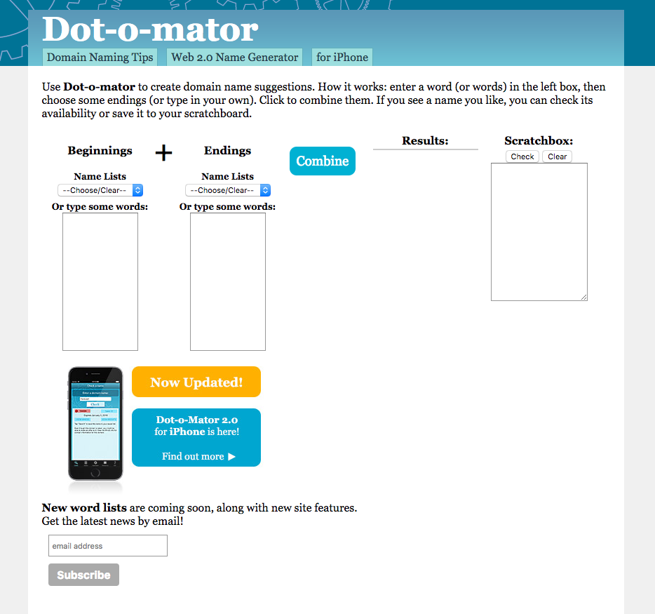
1. Dot-o-mator
With Dot-o-meter, just pop in a few keywords and the generator will find a way to combine them.
They also have a Scratchbox feature that lets you keep your ideas handy or check to see if they’re available.
2. NameStation
NameStation takes an unconventional approach to finding the best domain name.
With this tool, you still enter keywords just like the first two, but NameStation includes a “Crowdsourced Name Contests” feature.
This handy feature uses their community of domain researchers to help you uncover the right URL for your brand.
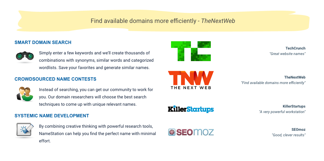
All three of those tools also let you verify if your potential URLs are available.
To find availability of a URL connected to your business name, you can also use popular sites like:
Once you find the right URL, be sure to:
- Check if matching social media handles are available.
- Double check that an existing brand doesn’t live online under a similar name. You don’t want users confusing you both.
- Snatch up the URL as soon as possible. These sell out faster than freshly made donuts, so if you see one you like, go for it.
- Consider buying similar names.
For example: You’d want to buy both TheMillennialDifference.com and MillennialDifference.com without “the”.
This guarantees you’re the only one under that brand name.
Bonus: Sometimes adding a second URL to your plan comes at a drastic discount so this protection shouldn’t cost you much.
Now that you know how to find the right URL, it’s time to get going.
But…
This is where the majority of us tend to get stuck.
Since choosing the right URL is hard, let’s talk about how to get over this hump without crashing.
How to Avoid Getting Stuck at This Stage
Before you get bogged down trying to find the perfect URL, understand that it’s perfectly acceptable to settle on one just to keep your website launch project rolling. The point here is to just get started.
Choose one that works. One that you’d be proud to share.
If you find a better name later on, no sweat — change it on up.
Use this method to find your first 10 potential URLs:
- First, brain dump a list of keywords connected to your brand.
- Add in any emotions or short key phrases that you’d like to include on this list.
- Set a timer for 15–30 minutes and come up with a few ideas using your list.
- Once your timer buzzes, circle your favorites and either move on to see if they’re available or set another timer for 15–30 minutes to repeat the process.
You can follow this method until you find a URL that sticks.
When you find one that you’re not totally embarrassed to call your own, take a breather for a few hours — or come back to your project the next day — to gauge if you’re still on board with the idea.
You shouldn’t race through this step, but you also don’t want to get stuck.
It’s a delicate balance, grasshopper, and only you will know when you’ve succeeded.

Give yourself about a week, at most, to decide on the right URL and just go with one so you can move to the next step: choosing a hosting plan.
Step #3: Choose Your Hosting Plan
Once you’ve secured your URL (congrats!), your next hurdle is hosting.
To distinguish between the two, think of your URL as your street address in the digital world.
Similar to a physical address someone can visit IRL, it’s what people type into their web browser to find your website.
Hosting, on the other hand, is the space you rent for your address, or URL, to be parked on.
It’s not visible on the front end to your visitors like your URL, but it’s what’s powering the space where your website lives.
Even though you don’t really see it, it’s essential that you choose the right hosting plan to meet your needs.
Choosing the wrong one could cause your website to look unprofessional, or worse, crash during high traffic spikes.
Both cases will ruin the experience for your potential customers and you’ll risk losing them.
When it comes to hosting, there are a few different routes to take, so let’s dissect each one.
#1: A Free Hosting Plan
Free hosting plans let you host your site without asking you to pay a dime.
Before you throw that fist pump in the air and run off to open a new tab for your free hosting search, this is one of those too good to be true situations.
In many cases, your URL turns into an automatic billboard after the hosting provider adds their domain name to the end of yours.
That looks like:
- YourSite.wordpress.com
- ImOnAFreeHostingPlan.wix.com
When this happens, you automatically lose a bit of credibility on top of creating a huge pain for your potential customers to type in.
Most will probably forget what’s in-between your URL and .com, which won’t help them find your site.
More bad news?
Free hosting plans aren’t designed to support high traffic bursts.
So if you plan on growing your site — which you should –– you’d need to upgrade before a huge traffic surge crashes your site.
Free hosting plans load slower and cause lags for your customers, both of which can be a distracting pain for your visitors.
All this raises the question: Is there ever a good time to use free hosting plans?
Eh… maybe.
When I graduated college, DevanCiccarelli.WordPress.com was a great way to showcase my portfolio as an entry-level marketer. Here, it made sense.
But after that, it just made me look like an amateur.
And it will do the same for your site too.
In short, avoid hopping on a free hosting plan from the start and you’ll be in a more professional place moving forward.
#2: Shared Hosting Plans
The next logical option for those looking to keep things shoestring affordable is signing up for a shared hosting plan.
Here, the web hosting provider parks multiple websites on the same, single web server even though the domain names and websites are completely unique.
Again, there are pros and cons to this route as well.
For starters, it’s slightly less expensive than it would be to purchase dedicated hosting, since the costs are spread out amongst several websites.
Plus, you don’t see the annoying add-ons like you do with free hosting plans (i.e., YourSite.WordPress.com), so you immediately give off a professional vibe.
Here’s even better news: When server issues come up, as they inevitably will, they’re not your problem.
Just like you’d turn to your landlord to fix your sink as a renter, all you’d have to do is report the problem to your web hosting provider and let them handle the rest.
But that also leaves you at their mercy.
If you have a huge launch scheduled while their server accidentally goes down, there’s nothing you can do but wait.
Until they fix things, you’re SOL.
Chew on these other cons:
Since you’re sharing your parking space with other sites, you’re limited on the amount of bandwidth your site can have.
This causes a problem in two ways:
- Huge traffic surges on other sites can become a nightmare for yours if the shared bandwidth gets maxed out. When this happens, your site goes down too.
- If you’re the one causing the surge, the result is the same: your site can go down or your users will experience painfully slow lags in loading times.
While it’s nice to not have to worry about dealing with server issues, you’re also limited with what you can download to the server.
Certain scripts and modifications must be approved by your provider, and if they pose a threat or issue to the shared hosting as a whole, you won’t be able to run them.
Shared hosting, just like with a free hosting plan, may seem like an appealing route to take, but later down the line when your traffic grows, it’s going to cause problems and headaches for both you and your customers.
And if your shared hosting neighbor already has huge spikes in traffic, your website will be affected, no questions asked. Unfortunately, you won’t know when this happens until it’s too late.
Knowing Murphy’s Law, it would probably happen during your biggest launch that took weeks to prepare for.
In the end, you’re better off with the next hosting option (if you can afford the price increase).
#3: Dedicated Hosting Plans
Dedicated hosting plans are the crème de la crème of hosting.
These plans let you rent the entire server as opposed to sharing it with other websites.
This gives you complete control over the server, any software being used, and the overall security of the site, according to Technopedia.
These plans are also more reliable since you can predict and plan for huge surges in traffic.
You won’t have to worry if your neighbor’s site suddenly gets noticed by search engines, because it won’t affect yours.
And since you’re not sharing your resources, your site performance and load times will be SO much faster.
You can also add extra layers of security and protection, as well as a fortified firewall to keep you free and clear of cyberattacks (as much as possible, at least).
So while this route is slightly more expensive, it’s certainly worth the extra investment.
Technically, you could always start out on a shared hosting plan and upgrade, but it’s simpler to just start off on the right plan from the get-go.
You don’t want your users to have a bad experience and never come back, do you?
Just avoid the free plans if you can.
Once you have your hosting locked down, it’s time to drop a CMS on it.
Step #4: Drop a CMS on Your Website
Since you’re starting from scratch, and you don’t have much experience with coding, it’s in your best interest to choose a content management system, or CMS, to work with to make your life easy.
This is just a fancy term for the tool that makes your website come to life.
Within your CMS dashboard, you have the ability to:
- Change the front-end look of your website
- Create pages, portfolios, and blog articles
- Manage images, videos, and other digital media
And you can do all of this without having to touch any code. This is how you’ll run your website like an actual pro.
Now, most CMS’s these days are designed to be intuitive and super easy to work with. If you can use Facebook, you should be able to use a CMS with zero hiccups.
But before you reach this point, you have to choose the right CMS for your needs.
This is a bit trickier.
First, think about the goal of your site, or what you outlined in Step 1.
Are you trying to promote a product or build your email list?
Will you be blogging regularly or adding videos?
The answers to these questions will help you determine what kind of CMS you should hunt for.
To help you out, I’ll explain three of the most popular CMSs next.
1. WordPress
- Roughly 15,886,000 websites use WordPress
- WordPress dominates 50–60% of the global CMS market — making it the most popular CMS
So why do so many sites trust WordPress as their go-to CMS?
It’s simple.
WordPress is easy to use and manage, especially for beginners. It’s just as simple as getting to know your Facebook dashboard.
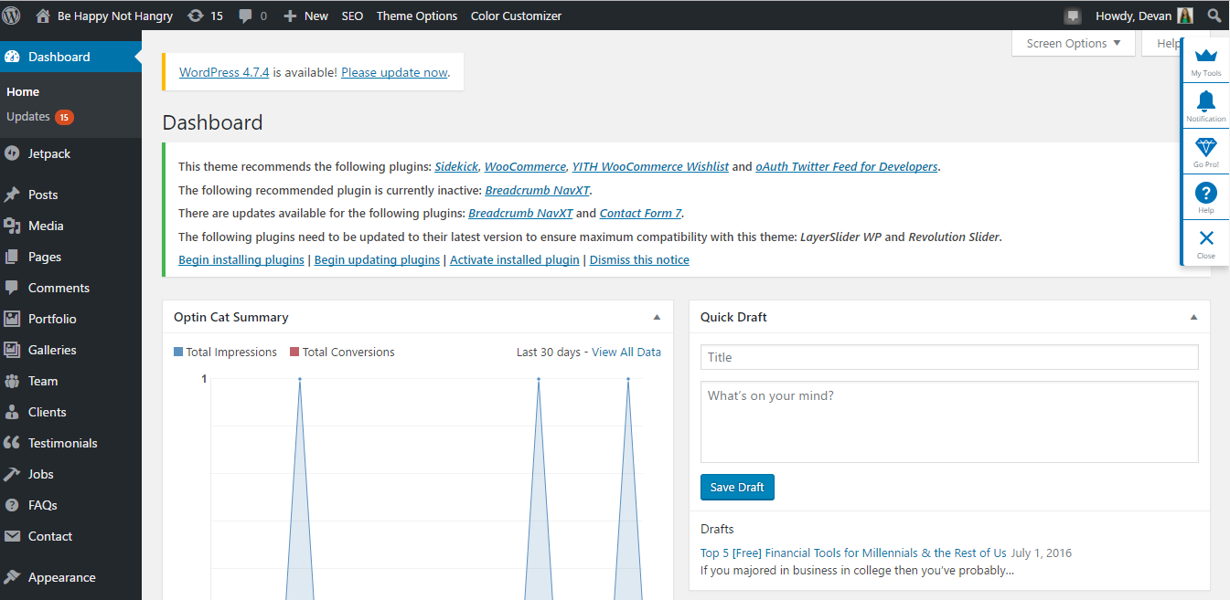
You’ll find all of the important items down the left hand side while the rest of your features branch out from there.
WordPress is also free as long as you already have your domain name and hosting purchased, so you’ll never have to pay a monthly or yearly fee for access to the platform.
Due to its popularity, there are tons of themes and plugins available for your website.
This makes it stupid simple for non-tech savvy people to create a professional-looking website that has all the features hand-coded pros would use — at a fraction of the cost.
Plus, with SEO plugins like Yoast, and a dashboard that’s already set up for optimization, you can quickly build a website that gets noticed by search engines even if you don’t have too much experience here either (that said, if you’re not an SEO master yet, you can check out this guide to change that).
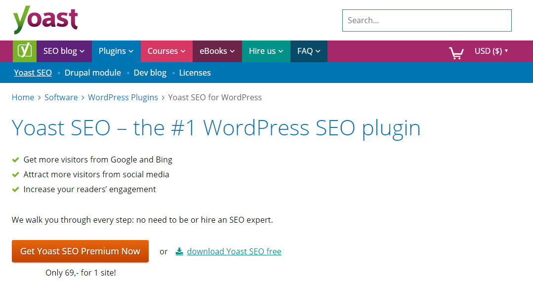
By filling out key items anytime you create a page or post, you’ll be set up for success in minutes.
WordPress brings safety to the table as well.
The developers behind the scenes are constantly making improvements and adding layers of security for the millions of users trusting their expertise.
You can even include your own layers of protection by using security plugins that further meet your needs.
WordPress is so versatile it works well for designing any of the following types of sites:
- Ecommerce store
- Membership site
- Portfolio/gallery
- Agency/business
- Blog
WordPress is my top choice for anyone launching a website for the first time.
It takes all the guesswork out of your website’s look and it’s relatively safe and reliable.
Although, the next CMS on my list is quickly gaining popularity — especially for newbies.
2. Squarespace
Even though it’s only starting to get noticed, Squarespace launched the same year WordPress did (2003).
And things are now escalating quickly.
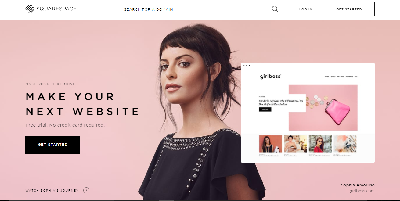
Its beginner-friendly nature is one reason it’s becoming a fan favorite.
You can quickly create pages, add images, and position things in a snap using their drag and drop visual editor.
This is a great option for people just starting out and looking to get up and running right away.
The amount of options on WordPress, on the other hand, can be downright overwhelming your first few encounters.
Keep in mind, the tiny bit of flexibility that Squarespace offers only goes so far, which is why most brands ultimately fare better by using WordPress.
You also may have to jump over a few additional hurdles with Squarespace you wouldn’t face growing your site on WordPress.
Yet just like WordPress, Squarespace also works well for creating a variety of sites.
You can launch:
- A personal site like a blog or portfolio
- A business site for consulting and as an official business listing
- An ecommerce store
One of the key differences between WordPress and Squarespace is in its pricing structure.
While WordPress is always free to use, Squarespace is not.
Personal sites can run you about $12 bucks per month with a contract; business and ecommerce plans start at $18 and can go as much as $26–$40 per month.
These prices include your domain name, access to the platform, and cloud-based hosting (among many other features).
With WordPress, these items need to be purchased separately.
IMO, WordPress is still the better option for the long haul, even if it’s slightly more overwhelming at first.
The next and final CMS on my list is geared towards ecommerce sites, so if your goal doesn’t fall under this umbrella, you can skip ahead to Step #5.
3. Shopify
Technically speaking, you could build an ecommerce site on either WordPress or Squarespace.
So why consider Shopify?
Because they only focus on ecommerce.
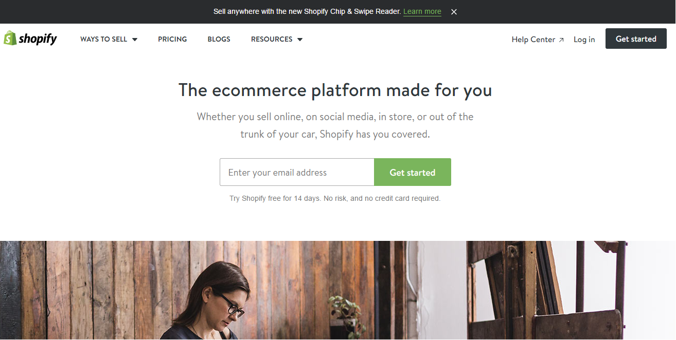
You get everything you need in one place without having to find ecommerce-specific themes or adding plugins to support your online store from third party vendors.
Shopify is your one-stop CMS shop.
You can manage sales, marketing, and your website itself using this simple platform that’s designed to meet one major goal: selling your products online.
Now that we know the benefits of using Shopify, let’s consider the other side of the coin.
First, the company is fairly new.
They’re just over 10 years old and they only have about 400,000 active sites.
This figure drastically pales in comparison to the millions using WordPress and Squarespace.
That’s not necessarily a bad thing; it’s just worth noting.
Just like Squarespace, Shopify charges a monthly fee. Theirs ranges from $29–$299 per month depending on the size of your team and whether you opt for added features such as discounted shipping and transaction rates.
Another similarity with Squarespace is that your hosting and domain name can be purchased directly through Shopify.
If you choose to carry over a URL from a previous hosting provider, you can do that, too. But otherwise, you can knock out everything you need in one place.
With your better understanding of the most popular CMSs, you’re ready to learn how to download them to your site.
How to Download a CMS
This step is actually easier than choosing a platform to go with.
With Squarespace and Shopify, just head over to their sites to create an account and get started.
From there, decide on your design and URL and you’re good to go.
As for WordPress, there’s a bit more involved, but I promise it’s still fairly simple.
In many cases, you can log right into your web hosting provider.
From there, you should see a list of a few one-button CMS installs.
This is what you’ll see on the backend with Bluehost:
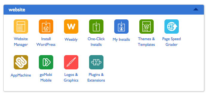
Once you find the platform you want to use, hit the button and it will automatically create your site and attach it to the URL you specified.
When that’s all done, you’re ready for the Design Phase.
You don’t need a degree from art school to create a professionally designed website if you just use the tips and secrets we’ll go over next.
Step #5: Customize the Look to Fit Your Brand
Before you fall deep down the rabbit hole of website themes, there’s homework to be done.
As you browse your favorite websites, start paying attention to elements and features you like or are drawn to.
Notice actions like – what happens when you scroll?
Where does the menu go as you move down the page?
How do your competitors’ blogs or shops look?
Compare sites that are the closest in goal-type to yours.
While you may not be able to include all the features you want initially, it helps you sift through the millions of themes out there when you know which features are high on your priority list.
Speaking of themes…
Can You Afford to Hire a Designer?
High quality sites don’t come cheap.
If they did, bad websites wouldn’t exist… but they do.
One way to combat this: hire an expert.
You can find a local graphic designer or outsource one overseas specializing in the type of website you’re looking to create.
Yes, anyone can design a general website, but you want someone with experience to help you optimize your design and help you achieve your goal.
These experts will give you advice for placing (and changing the color of) elements like buttons and calls to action so you’ll always catch your visitor’s attention and increase conversions without looking like a hot mess.
Plan to bring both your goals and the websites and features you’re looking to include to your initial meetings with your website designer.
By having a clear plan, you can communicate precisely what you’re looking for, which helps you get closer to your vision.
You also want to set realistic milestone dates with your designer to keep your project on track and moving forward.
Website projects can quickly spiral several weeks past their target launch dates, so it’s an important area that shouldn’t be overlooked.
Be prepared to shell out extra capital for this investment; high-quality designers come with a higher price tag.
The ol’ you get what you pay for mentality holds true here.
If now is not a good time to lay out the cash for the right designer, get out your notebook because this next section is for you.
If Not, Do This Instead
Don’t sweat it if you can’t afford to hire a professional designer.
Nowadays, there are millions of high-quality themes that are super easy to set up and look just as professional as one designed by hand.
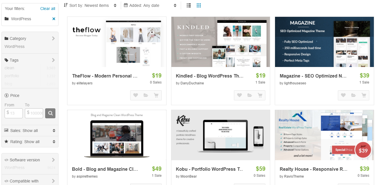
Just please don’t waste hours of your time searching for The One.
Browsing all these options only makes your decision harder.
To save you from indecision, check out these next two tips first.
#1: Grab Your Goal and Keep it Handy
The idea here is to start weeding out the themes that don’t work so your ideal theme sticks out as the obvious choice.
To do this, set your filters by the type of site you plan to create.
If you’re not building an ecommerce store, there’s no point in settling for an eye-catching ecommerce theme you’ll need to spend countless hours trying to manipulate and crack.
Stick to your intended site categories or find an all-in-one theme instead (more on this shortly).
Grab your end goals from Step #1 to see if each theme supports what you’re looking to create.
As hard as it may be to toss out your fave design, impractical ones will only distract you from your goal and eat up your time.
Your site should look good and be functional.
Once you have a handful of options to sift through, let’s find the one that fits best.
#2: Consider How Much Flexibility You Need/Want
An often overlooked area when it comes to using themes is how much flexibility you’ll be given.
In some cases, what you see is what you get. This type of theme is a template where you only get to plug in your info and run.
It’s great for brands that don’t have hours to spend getting their website launched.
The downside?
These designs can be so rigid that you lose the ability to make your website as unique and memorable as your brand.
On the other end of the spectrum, fully customizable themes will help you create and customize almost anything.
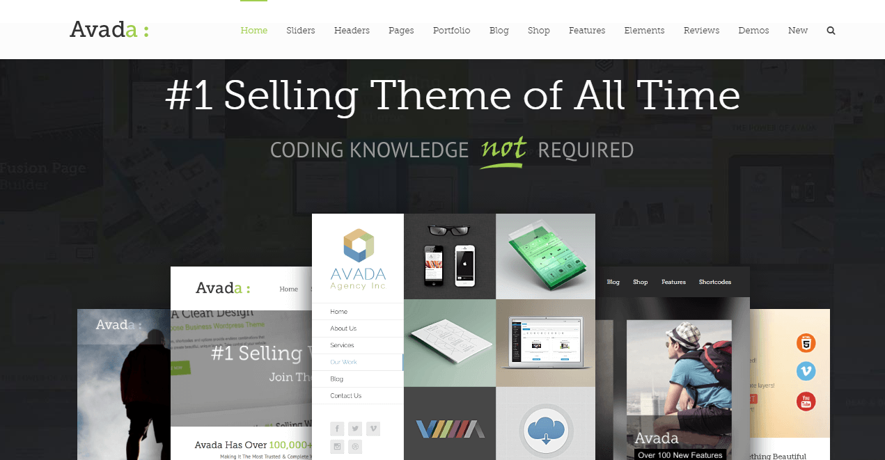
Beginners may find these customization options a time-drain, but they’re excellent for those with a bit more experience and room to play with.
Consider how much flexibility you’re looking for before deciding on a template.
If you prefer to plug and chug, find templates that look good as-is.
And if you’re all about on-point branding, choose a theme that offers complete control.
Now, if you decide to go the theme route and don’t hire a designer, you should still set milestone dates. Otherwise, you’ll end up stalling anytime a decision becomes hard to make.
This is exactly what happens when it comes to logos.
What About a Logo?
Logos are one of the toughest areas to get right when it comes to branding your business. And there’s no way I could give the topic justice here in this guide about launching your first website.
So, instead, here are a few basic rules to follow:
- If you can’t get a professional logo done, stick with using the name of your site in a font that matches the colors of your brand and is easily readable.
- Sites like Fiverr can be hit or miss. I’ve seen some logos turn out great while others are completely unusable. For that price tag, it could be worth a shot. But I wouldn’t use one that you don’t really like just because you paid for it. The sunk cost of $5 isn’t worth compromising.
- Consider skipping it altogether. If the logo is going to slow you down and you have no idea what to create, skip this step for now and come back to it later.
The point is to not get hung up on this stage of the process. Get something up and keep moving. You can always rework it.
Use a naked header or one that only includes the navigation menu until you decide on a better one to use.
One thing that will quickly outdate your site, even if it’s newly published, is a crowded navigation menu. Find out what to do instead in our next section.
Map Out Your Navigation
Before you start adding pages to your main header, map out your site’s navigation.
You want to approach this as if you were a brand new visitor to your site.
What would a brand new visitor be looking for?
Include the most important pages up front and only a small handful of items in your main header.
It can be tricky narrowing things down, but it’s essential.
Simple menus pique your reader’s interest; crowded ones paralyze them with indecision.
Organize the rest of your pages and group similar ones together. You can use drop down menus to branch out your additional pages from the main header pages.
Help your new visitors move in the right direction by adding a “Start Here” header item that looks more like a friendly button someone can’t wait to click.
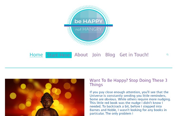
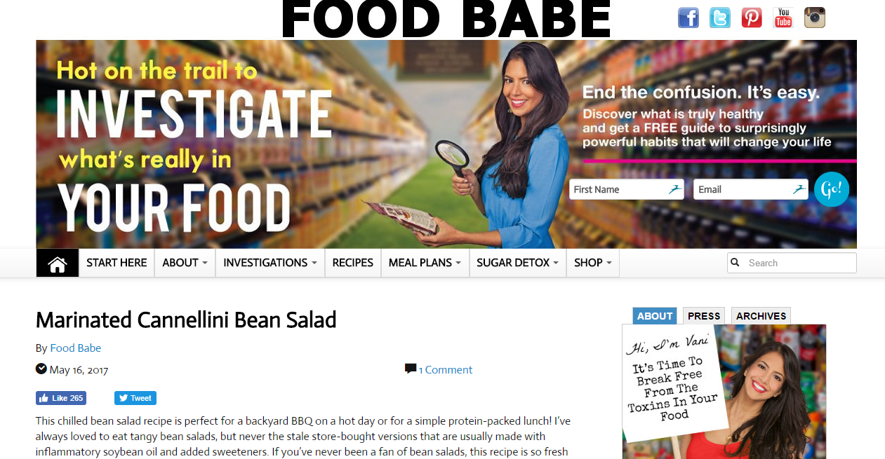
This is an easy way to guide new visitors through your funnel naturally.
If you don’t take this section to heart, your new reader may get overwhelmed with the amount of options staring back at them, or they’ll get lost in a disorganized mess.
When either one of these happen, your new visitor won’t stay long enough to see what you have to offer. So you can kiss email signups goodbye.
To figure out which menu items to keep, turn on Heat Maps and to see which links your website visitors care about and which ones can be dropped or moved.
Once your navigation is a minimalistic, functional dream, head on over to the next step: adding testimonials.
Build Trust with Testimonials
Search engines never trust new sites.
Sure, after enough time and effort, this will eventually change, but in the beginning, no one knows your website exists. No one is going to be referring your site but you.
It’s essential that visitors who do find your site — through your social promotion and killer content — stay long enough to verify that you’re trustworthy.
One way to do this is to display testimonials front and center.
They don’t need to be the first thing readers see but they should be fairly high up there.
In this example, you’ll see that after scrolling less than a quarter of the way down, two testimonials greet you before the next call to action.
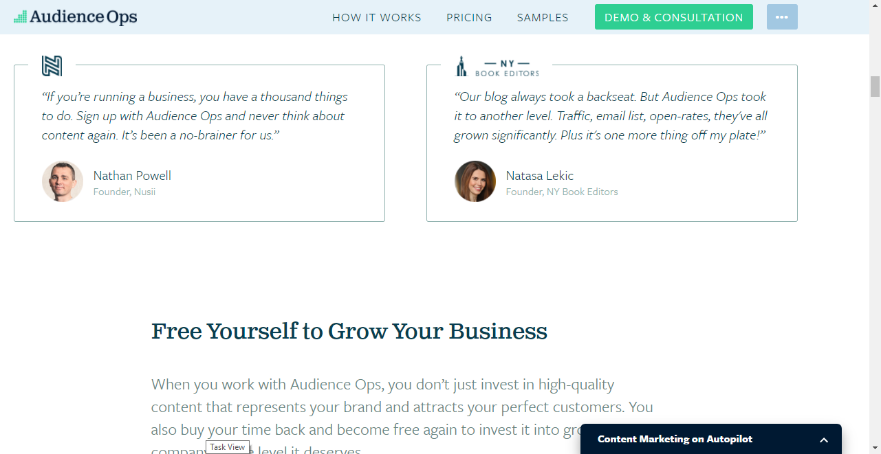
Take note of this and consider weaving testimonials between your calls to action to show that you’re a trustworthy source.
You can even add your email signup box just underneath that to capture email addresses from new visitors who are impressed by your glowing customer reviews.
That wraps up the design stage of your new website launch. Try not to spend too much time here or you’ll never reach your target launch date.
Now it’s time to start adding content.
Step #6: Create Goal-Driven Content & Follow These Tips
Creating pages of content requires a thoughtful approach to your purposes and goals.
Are you looking to explain more about your brand? Your services? Your expertise?
Give every page you write one goal and let your content reflect that goal.
When you find a focus for each page, stay on track by following these best practices:
#1: Keep it Short and Simple
Don’t bore your readers or lose them in a seemingly-neverending flow of words.
Plan out each page with a loose outline and a few bullet points.
When your write your content, trim the fat, as Sarah says, and toss out words you don’t really need. This keeps your writing strong and fluff-free.
#2: Your Content Should Not Be All About You
Please don’t babble on about how great you are.
Your testimonials should do this heavy lifting for you.
Your content should strike a healthy balance between explaining how your brand will help visitors and giving your target audience what they’re looking for: a solution to their problems.
So even though this is your site, stop boasting about your achievements and focus more on serving your audience.
#3: Brainstorm Your Calls to Action
Every piece of content you add to your site should be well-thought-out.
But this is especially true for your calls to action.
If you want visitors to take action, you need to explicitly tell them to do so. That’s where well-crafted calls to action become the heros of your website. When done right, they guide and motivate visitors to make a move.
In the same way that you have a goal for each page, your calls to action should have a goal too. What do you want your visitor to do?
This same concept applies for your button text as well.
Asking people to Submit to your newsletter isn’t going to cut it. Instead, use text like:
- Become a Driver (in Uber’s case)
- Grab Your Copy
- Try it Now
By paying more attention to these specific calls to action, you’ll set up your new website for conversions right from the start.
#4: Stack Up Your Site with a Few Articles
Add a few articles to your website’s blog before you launch. Use this as another area to show your expertise and build authority.
Translation: Don’t rush those blog posts just for the sake of completing them.
Remember, you’re trying to build trust with your new visitors. This is a great way to give them information they’re looking for without making it all about you or your brand.
Think about the biggest problems your potential readers face and make those your first articles to conquer.
Choose anywhere from 3–5 topics that you know really well so you can knock them out right away.
Not that you should speed through these articles; they’ll need your full attention if they’re going to serve as another first impression of your brand on your site.
If this proves to be too time-consuming — or you hate writing completely — don’t think twice about outsourcing this step. Just be sure the writing and tone used by your chosen writer reflect your brand and the messages you’re trying to convey.
#5: Create a Teaser Page While You Build
Since this section definitely adds a few days to your overall website launch timeline, you should create a teaser page to post on your site in the meantime.
This can be as simple as using Welcome Mat and adding one call to action with an email signup button.
A countdown to launch can also stir up excitement.
Just don’t clutter your page with too much as people are less likely to take action the more choices you flood their brain with.
HubSpot found that landing pages without navigation links saw higher conversion rates, ranging from 4-28%!
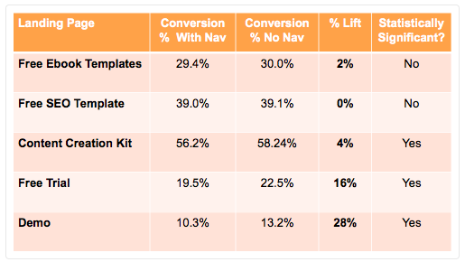
The idea here is that the navigation links can distract your new visitor and cause them to wander off before taking any action.
To avoid this, keep your main menu off your teaser or landing pages so the focus is clear.
Knowing these seemingly small details means your new site will see more success in a few weeks than most websites see in months.
The key is creating awesome content that always has a goal and purpose in mind. Otherwise, you’re just wasting everyone’s time — yours and your visitors’.
Don’t dare to hit that publish button until you read the next section.
Step #7: Add These Tools Before Launching
On top of adding Welcome Mat to your site, you should also include the following tools pre-launch:
#1: Google Analytics
You’ll need to install Google Analytics tracking for your site.
To do this, click over to their site after you’re done with this guide, create an account, and add their script to every page of your site.
Don’t worry, they’ll show you how to do all of this.
The reason you’re taking this step is to keep tallies on:
- The amount of traffic heading to your site
- Where the traffic is coming from (referral source)
- How long people stay on your site (and what the bounce rate is)
- Plenty of other things!
Google Analytics helps you gauge how effective your pages are and if your articles are resonating with visitors.
Another useful tool that helps you track the performance of your content is Content Analytics.
#2: Content Analytics
While Google Analytics tracks your website data as a whole, Content Analytics dives deeper into your actual content — your blog posts specifically.
This helps you:
- Learn how far down the page your visitors reading your content get
- Uncover the best places to add your call to action buttons
- See stats in real-time so you can make adjustments as needed
#3: Heat Maps
Heat Maps is another tool that you should use to understand how your site is performing.
With Heat Maps, you’ll see where your visitors are clicking and gravitating to so you can position features better.
If your buttons aren’t seeing any action, you’ll know right away thanks to the real-time feedback that comes standard with Heat Maps.
#4: List Builder
The last must-have tool to include in your pre-launch toolkit is List Builder.
No matter what kind of site you’re building, growing your email list should be a top priority. We talked about why this was so important here so we won’t spend time on this today.
What you should know is that List Builder makes this important task much easier for both you and your new readers.
Plus, you can use it in a variety of ways:
- Time your newsletter signup pop ups to show only after a certain time. This captures the most engaged visitors.
- Launch them just before someone leaves. If your new reader hasn’t signed up yet, you can set a popup to show just before they head out. This gives them another chance to take action.
- Use click triggers. Instead of a popup showing out of nowhere, you can set click triggers to show only when a user clicks a link such as “Join Now”.
In all four cases, these tools won’t take you more than 5–10 minutes to create, which means it’s one of the quickest steps to tackle in this whole website-building process.
That also means you have no excuses for not doing so.
Setting up these tools early on gives you the tools to monitor and track your efforts.
You’ll be able to diagnose and solve problems right away so you don’t waste months trying to figure out why your site and email list aren’t growing.
When these tools are functioning on your website, you’ll be one step closer to launching.
Speaking of that…
Step #8: Choose a Launch Date, Fine-Tune, and Publish that Bad Boy
When everything starts coming together, you should be ready to set an official launch date.
Setting an exact date is critical.
If you don’t do this, you’ll find yourself stuck in the stage of I just need to tweak a few things before launching — which is a fancy way of saying you’ll procrastinate and take forever to actually launch.
That’s because things are never perfect; if you wait for perfection, you’ll never go live.
Instead of succumbing to perfectionism, vow to launch by a certain date and consider your website a work in progress. As long as you get something out that looks professional, you’re in good shape. The rest can be updated later on.
If you’ve made it this far, a 30-day target launch date should be doable.
This gives you enough time to fine tune your work before actually going live, but it also keeps the pressure on to get it done ASAP.
Once you decide on a date, start the promotion train to get the ball rolling.
Share your site on social media or in personalized messages to your closest friends, family, or colleagues (depending on the niche of your site). Let them know what you’re up to with this new project.
They should be directed to the Welcome Mat/Landing Page that you created in Step #6 (down under point #5).
Be sure to include the date of when you’re going live as a means of holding yourself accountable. When you drum up excitement for a specific day, there’s more pressure to actually get it done by then.
Fine-Tune Before Publishing
Now it’s time to perform a final website audit before going live.
Here, you’ll meticulously comb through every page as if you were a new visitor with a menacing, digital red pen.
Pay attention to every little detail and make sure they align with your goal for your site.
If something doesn’t work, toss it out and add it to a list of items to work on post-launch.
Once you complete this audit, you should have a decent-sized list to work with.
Instead of getting bogged down here, pull out the items that must be tackled now pre-launch. Add the rest to your post-launch to-do list.
Work on the former items all the way up to your launch to make sure your site’s ready to go live by your target date. Only stall if there are major issues that could crash your site.
Otherwise, launch as is and work on the latter items afterwards.
While this may seem like the time to bask in your post-launch bliss, there’s still more work to be done. So before you grab your piña colada and kick back to celebrate, there’s one final section of this guide you’ll need to have under your belt.
Step #9: Post-Launch Bliss and What to Do Next
As fantastic as a set-it-and-forget it approach sounds, you’re not there yet, friend.
New sites garner more action, attention, and traffic.
There’s no better time to capitalize on this momentum.
You can do this by:
- Publishing new content weekly or bi-weekly (ideally). If this is too much, shoot for a new article at least once a month.
- Driving your social media followers to your new site.
- Mentioning your new website in posts, but for a more subtle promotion, add your new URL to each of your social profiles and to your email signature.We go over a few more ideas in this resource.
- Constantly reviewing your site’s performance using the tools you installed in Step #7.
These insights will help you determine if your site’s content is resonating with your visitors or needs to be tweaked, including buttons, calls to action, and everything else in-between.
Once you do that, the formula turns into a simple rinse-and-repeat: create new content, track your site’s performance, make the necessary tweaks, revisit your analytics, repeat.
Launch Your New Website Today
Now that you have everything you need to start building your first website, it’s time to get in the driver’s seat.
- Begin by setting a goal for your website and finding the best URL and hosting plan to meet your needs.
- From there, install a CMS, choose a design that reflects your brand, and create killer content that helps your new audience solve their biggest challenges.
- After that, it’s all about tracking your performance with a few helpful tools, fine-tuning your efforts, and publishing at a consistent rate.
Here’s a worksheet you can use as you launch your new website:
Add A Comment
VIEW THE COMMENTS