Confirmation emails aren’t exciting — but they are some of the most opened emails across the board.
What if you could create a confirmation email that drives engagement and that people actually want to read?
I’ve signed up to the world’s most popular newsletters, made purchases from ecommerce stores, and sent inquiries to agencies to see how the most creative marketers do it.
In this post, I share my findings with you so you can send confirmation emails that get opened and clicked.
%(tableofcontents)
What Is An Email Confirmation?
A confirmation email is an autoresponder triggered when a customer makes a purchase, subscribes to your mailing list, makes a booking, etc. Here's an example of a confirmation email from Keto Perfect — I’ll share more about it below.

Autoresponders are nothing new. But Chief Sumo Noah Kagan still swears by them as his top marketing strategy in 2020.
Why?
Confirmation emails can have 3x higher clickthrough rates (CTR) than the average CTR for all sectors across the board. That means people are three times as likely to click on the links placed within a confirmation email. [*]
People want to know that the action they took was successful, meaning you have their attention and a perfect opportunity to point them to more cool stuff.
Confirmation Email Examples
1. TIM FERRISS’ 5-BULLET FRIDAY NEWSLETTER
Tim Ferriss’ newsletter has over 1.5M subscribers. He’s a self-help legend with NYT bestselling books, one of the most popular business podcasts ever, and a loyal following that is notorious for acting on his advice.
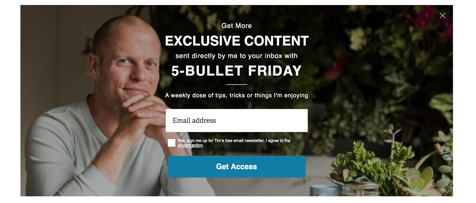
Tim’s newsletter is a weekly five-bullet list of the “coolest things he’s found or explored that week.”
What makes this email subscription confirmation so great, apart from being from Tim Ferriss?
Right off the bat, Tim establishes who his brand is for (people interested in lifestyle design) and the tone of voice. He makes it clear what type of content subscribers will receive and how often they should expect it.
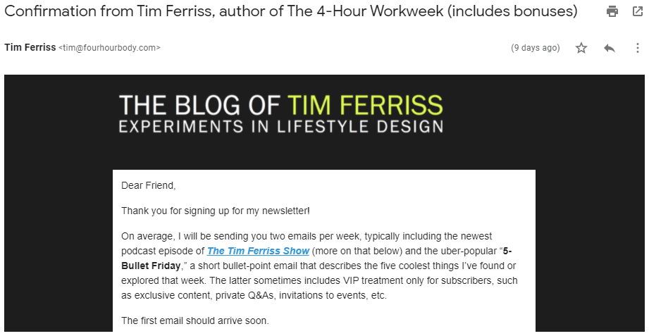
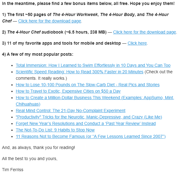
Since you’ve already taken the action to subscribe, Tim encourages you to do more and provides links to free bonus content.
The freebies here are key. You don’t want to get all sales-y and try to upsell your prospect as soon as they subscribe.
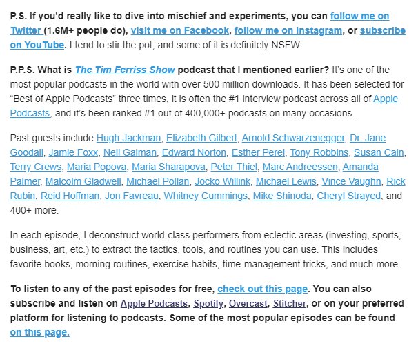
In the section below the fold, Tim signs off with a P.S. and asks subscribers to follow him on social. He also smartly uses social proof and mentions his notable Twitter following (1.6M+).
In the P.P.S., Tim includes more social proof and mentions his 500M+ podcast downloads, its #1 Apple Podcasts ranking, and the famous and wide-ranging guests he's hosted to elevate his brand.
Key Takeaways:
- Reinforce your brand image and what your subscribers should expect.
- Guide your readers to your other resources, without selling them anything.
- Use social proof to build credibility .
2. NOAH KAGAN'S SPICY OKDORK NEWSLETTER
Chief Sumo’s OkDork isn't one of the most popular newsletters out there, but it is one of the most valuable resources for marketers, entrepreneurs, and taco connoisseurs.
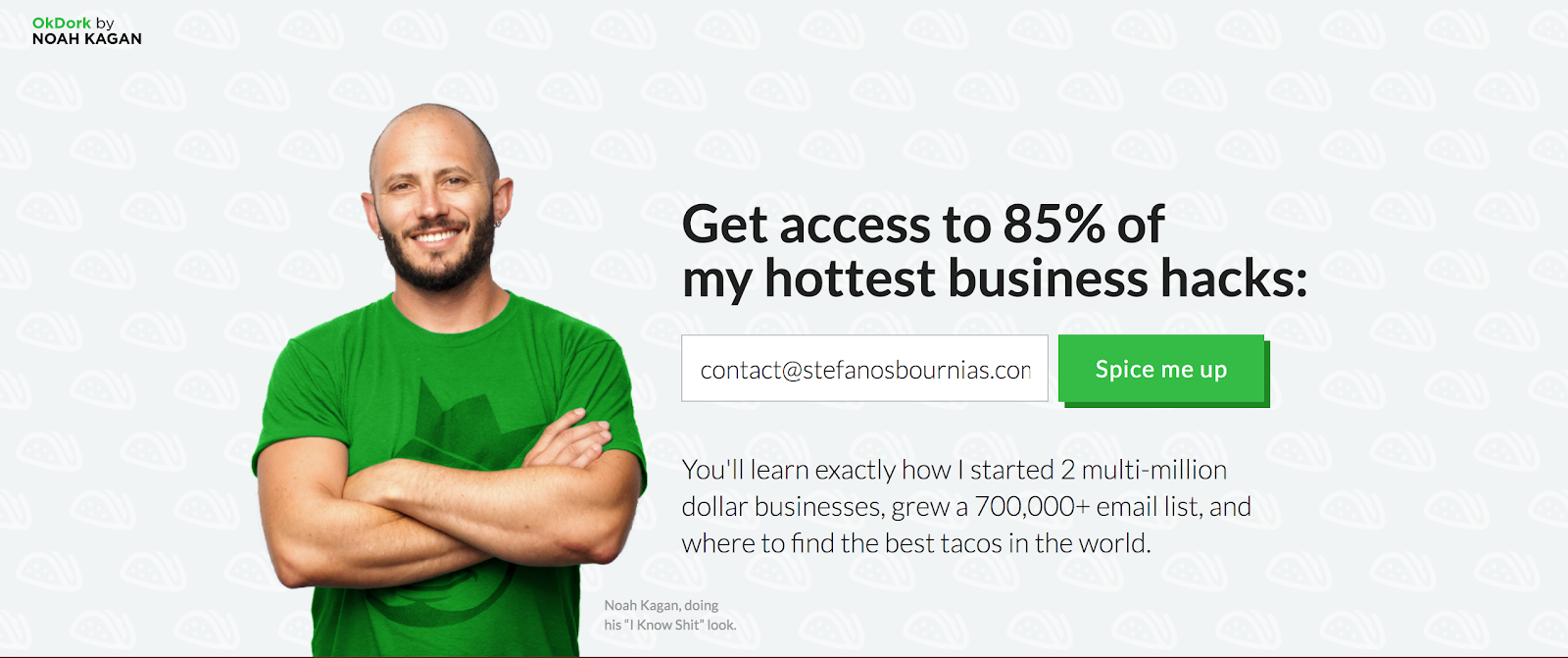
After entering their email, the visitor receives a confirmation email and is redirected to a landing page (shown below). They can access the resource right away, without the friction of checking their email for the link.
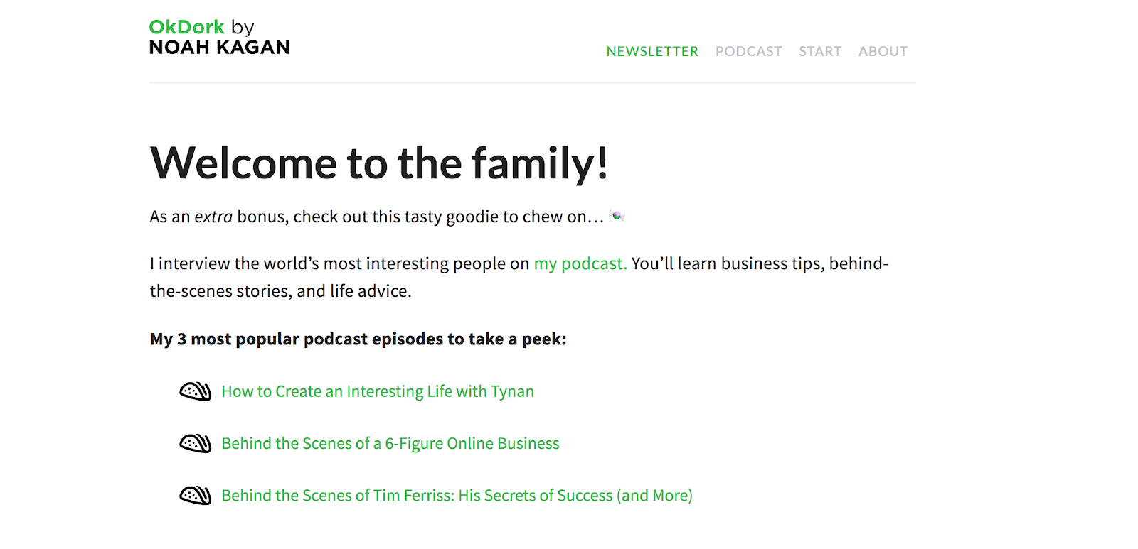
The landing page and confirmation email design of OkDork's newsletter is minimalistic. Short, concise, and pure text.
This works great because it doesn’t overwhelm the subscriber with unnecessary design elements or a laundry list of things to check out.
From a design standpoint, the branding is consistent with OkDork’s colors and minimalist design.
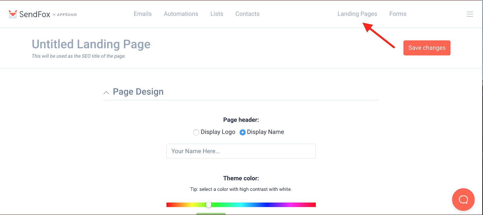
Most email marketing tools have landing page builders. I recently got a SendFox lifetime deal via Appsumo. As you can see below, it’s simple and intuitive to use.
Here’s the confirmation email you receive when you click “spice me up.”
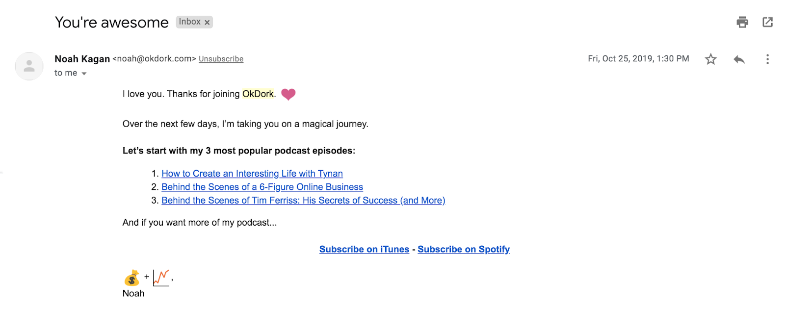
What makes this newsletter subscription confirmation great?
First, Noah flatters his subscribers with a bold subject line “You're awesome.” And flatters them again by spreading the love.
Second, Noah’s conversational, friendly tone of voice really shines through and is in line with his brand.
Noah is clearly focusing on growing his podcast. The only links included are a three-point taco list of his popular podcast episodes to guide subscribers to their next action.
The three-point list is perfect because it doesn’t overwhelm the subscriber with too many options, but it also provides them with some choice. Many popular newsletters use this three-point list.
Key Takeaways:
- Create a simple landing page for your email confirmation.
- Don’t overwhelm your subscribers with too many points.
- Use a three-point list to guide your subscriber to check out an area of your business related to your goals ( podcast episodes, blog posts, newsletter, etc.).
3. PRODUCT HUNT'S HELPFUL & FRICTIONLESS NEWSLETTER
Product Hunt started as a simple newsletter recommending the best new digital products. It’s since transformed into a monster of a platform that tons of new products have successful launches and get discovered on.
Their newsletter, currently at over 600,000 subscribers, continues to grow. When you click on the newsletter on Product Hunt, It redirects you to the page below.
And guess what?
If you're logged in to your account, Product Hunt auto-fills your email into the subscription box… talk about reducing friction.

Here’s the subscription confirmation email.
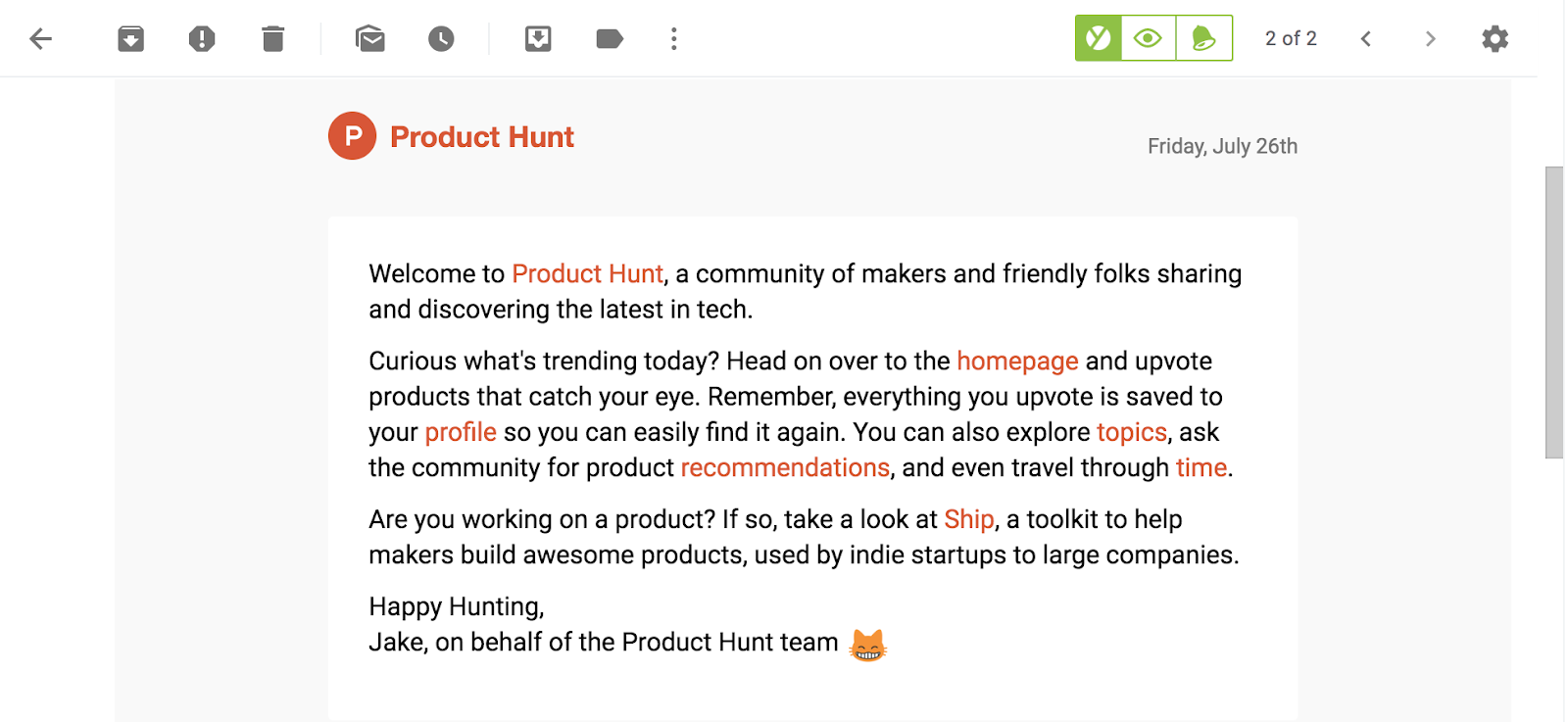
The confirmation email itself is pure text. It’s concise and explains what Product Hunt is all about for both product hunters and creators.
The email includes seven contextual CTAs that provide all the information subscribers need to start using Product Hunt. The links are in contrasting orange, which matches the overall branding.
Key Takeaways:
- Keep your confirmation short and concise.
- Place contextual links to push users to use your product and learn more.
- Reduce friction wherever possible. Do things like auto-filling subscribers' email addresses.
4. THE FULL-JOURNEY CONFIRMATION EMAIL BY CASPER
Casper is a company that has disrupted the 14 billion dollar sleep industry. Their email marketing is excellent from the moment you make a purchase.
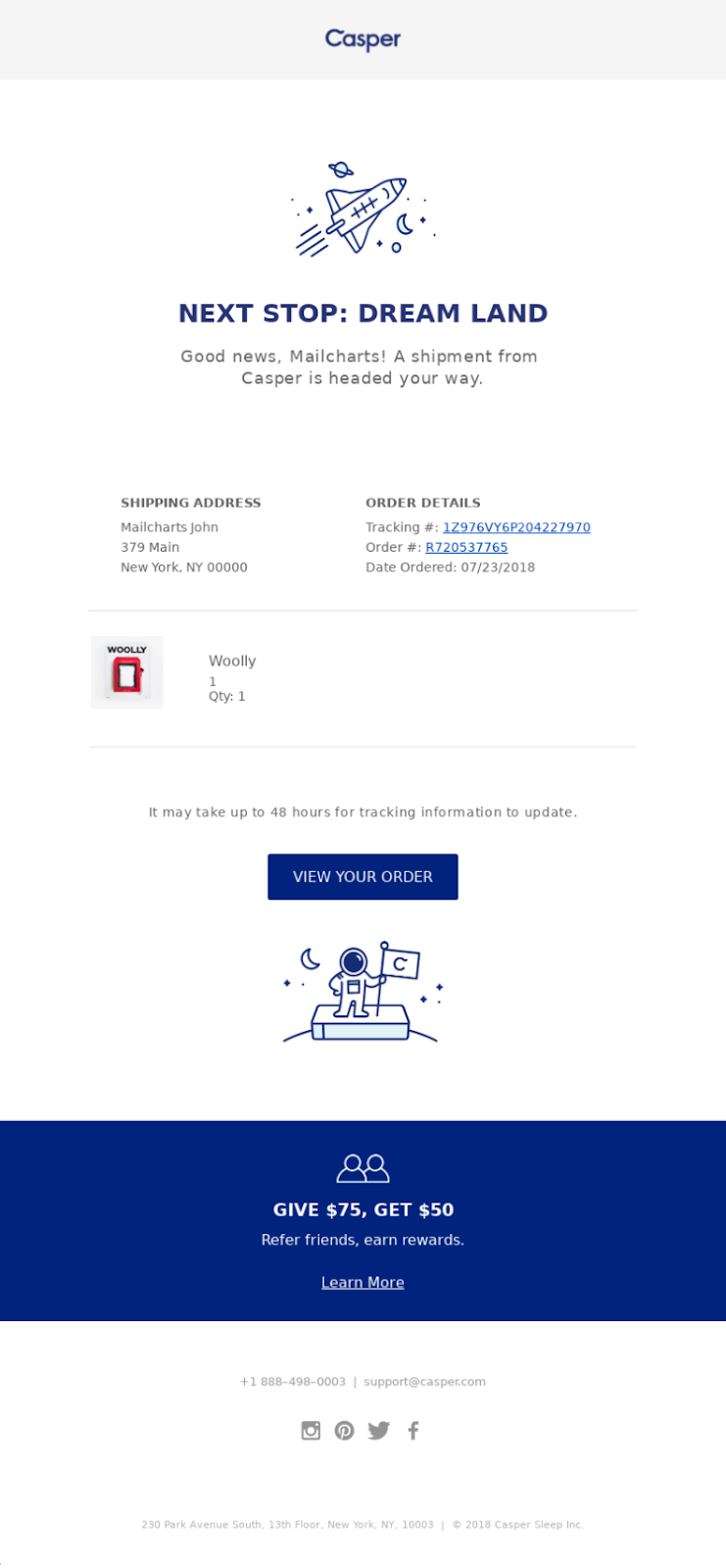
The post-purchase email confirmation is simple, on-brand, and to the point. It only includes what’s necessary for the buyer and stays consistent with visuals and colors.
The email also includes a referral program to “refer friends, earn rewards” in the footer to encourage customers to introduce the brand to their friends.
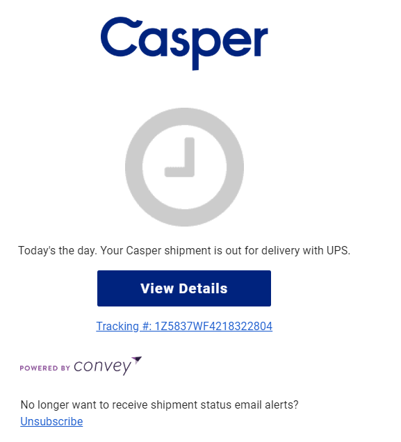
Casper also sends out multiple order updates on the shipment's progress.
Here’s one of them:
But Casper doesn’t stop there. About 20 days post-purchase, customers receive this email.
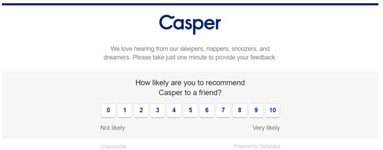
Casper uses this one-question survey embedded in the email to increase the number of people who fill in the survey, boost their Net Promoter Score, and evaluate likelihood of them recommending Casper to friends.
Key Takeaways:
- Every email has a clear purpose: one idea/CTA per email.
- Email journey doesn't stop at purchase: emails have follow-ups.
- Emails have consistent voice and design and aren’t text-heavy.
5. THE HIGH ENGAGEMENT ORDER CONFIRMATION BY PERFECT KETO
Perfect Keto is one of Noah Kagan's favorite companies based in Austin, Texas. I’ve used some of their products before, and decided to order something during the pandemic for the sake of this article.
Here’s the order confirmation I received.
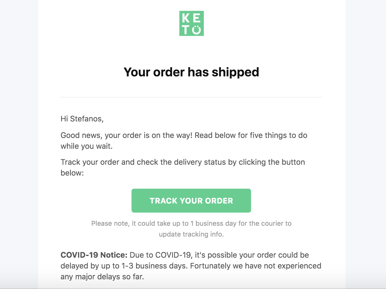
The email's branding is consistent, includes a notice to warn me of possible delays, and provides me with a clear way to track my order.
But what Perfect Keto really nails in this order confirmation email is the section that encourages you to do five more things: “5 keto things to do while you wait.”
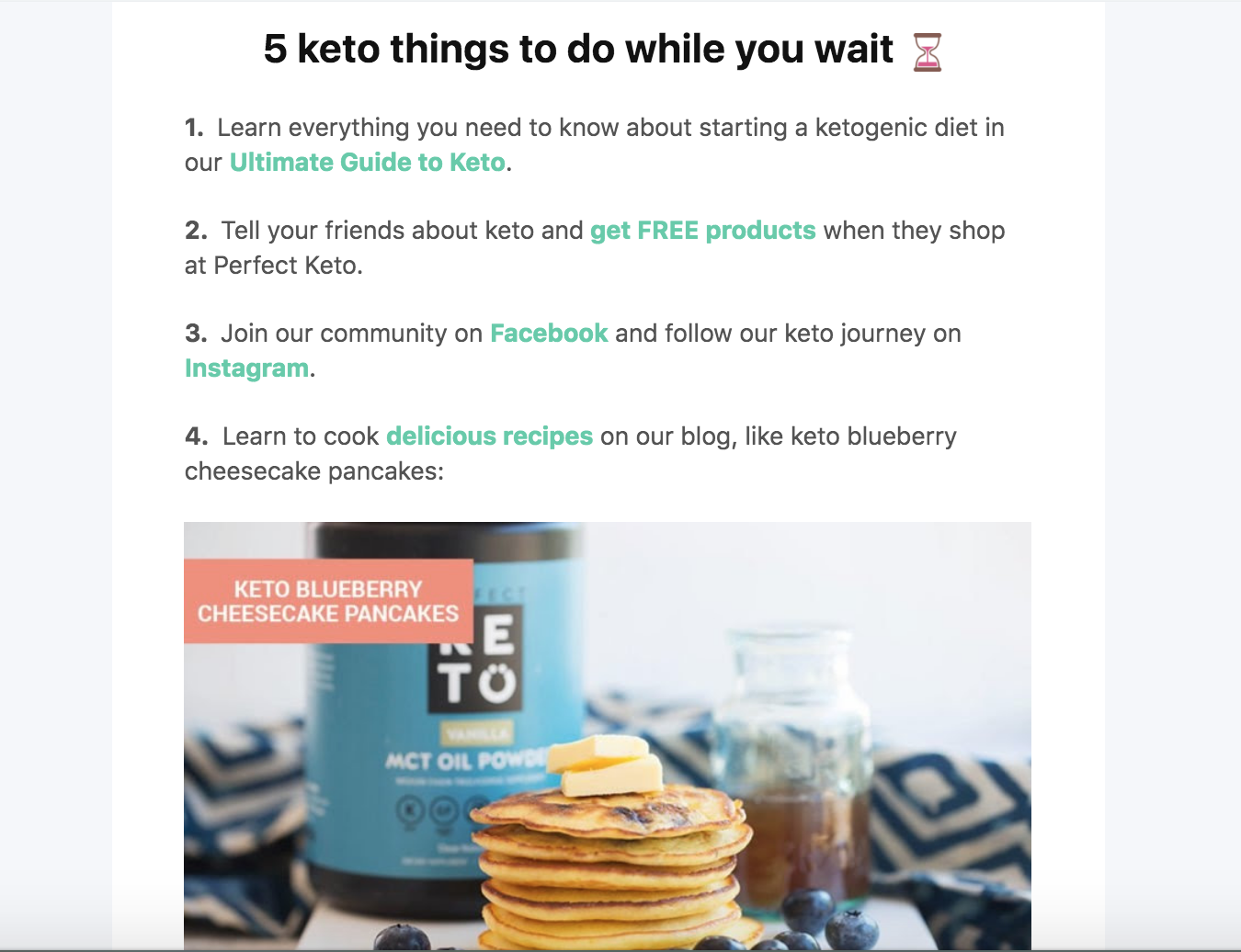
The list includes a free guide, a referral program, a Facebook keto community group, keto recipes to use with their products, and a podcast hosted by the founder.
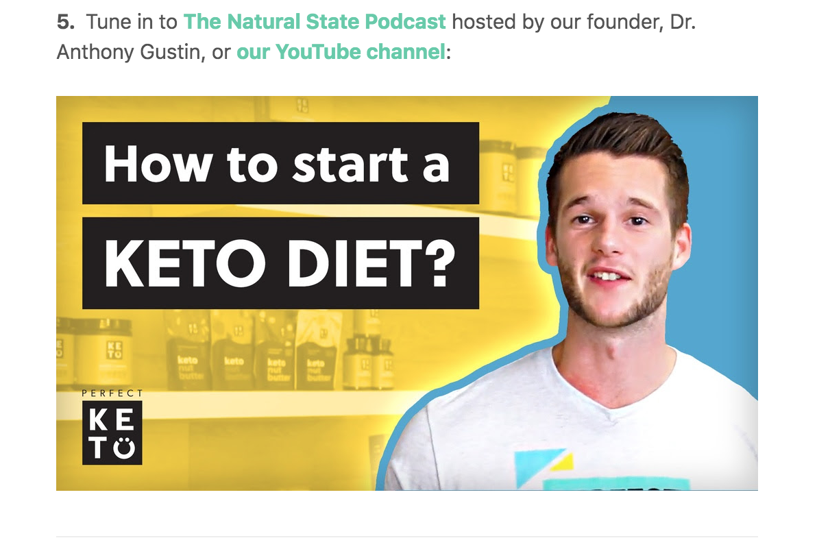
Instead of showing the order information on the top, Perfect Keto puts it in the last section.
Why?
Because that’s what YOU want to see. So you’re forced to scroll through what THEY want you to see.
It’s smart because people may open the email, see the confirmation, and close it without reading further.
Putting the content Perfect Keto wants you to see on top is akin to placing the most engaging content above-the-fold (like you would with a website).
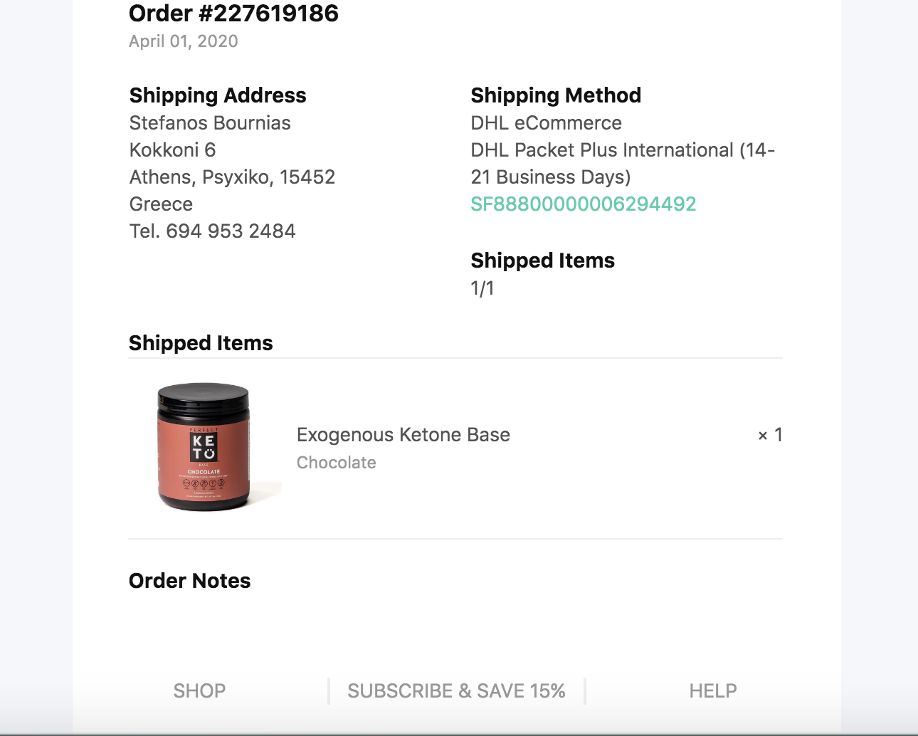
At the bottom, they’ve placed three links: redirect to shop, subscribe to their newsletter (incentivized by a 15% discount off your next order), and access to customer support.
Key Takeaways:
- Include a list of free things for your customers to check out above the fold of the confirmation email.
- Put a CTA button for customers to track their order at the top of the email but the order details at the bottom so it’s more likely customers will scroll and click through your email.
6. THE LIGHTLY PERSONALIZED THANK YOU CONFIRMATION EMAIL BY SWANKY BADGER
Swanky Badger sells cool, unique, personalized gifts for men. They’ve been featured by Buzzfeed and Reader's Digest.
Here’s an example of a lightly personalized order confirmation they send out when you make a purchase.
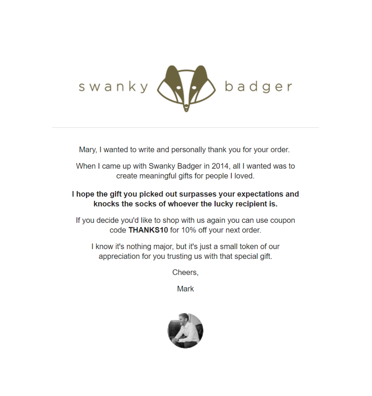
Screenshot from Chase H. Diamond, Boundless Labs.
It’s super simple compared to the previous examples, but it’s powerful.
In line with the personal products they sell, the email is personable and seems like it was manually written by the founder himself.
Key Takeaway:
-
Write a personalized confirmation email if it makes sense. Hint: it almost always does!
7. THE TESTIMONIALS & CROSS-SELL EMAIL BY NECK HAMMOCK
Neck Hammock sells two pain-relief products, the Neck Hammock and BetterBack.
Their flagship and most popular product is the Neck Hammock. This order confirmation introduces customers to their second product.
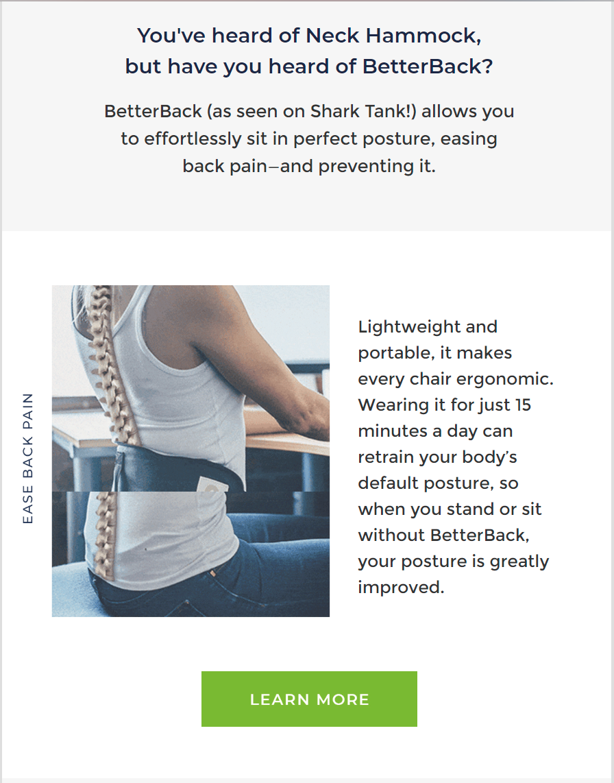
They use social proof in the first sentence (as seen on Shark Tank!) to create credibility.
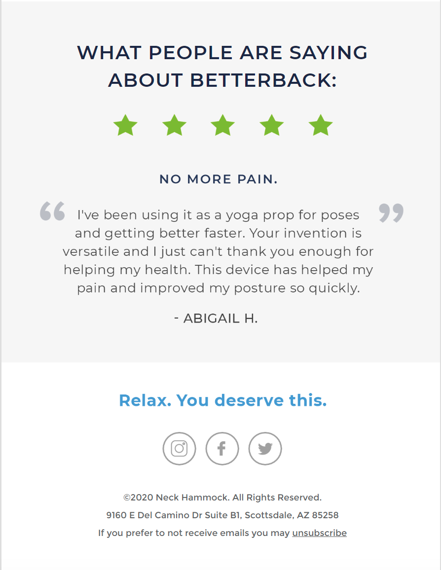
The next section adds social proof in the form of customer testimonials. A 5-star rating, a bold headline “No More Pain,” and a thorough use-case review from a customer.
Key Takeaway:
-
Use two layers of social proof — a credible source (Shark Tank) and customer testimonials to cross-sell customers.
8. THE MANUAL CONFIRMATION BY HEY DIGITAL
Hey Digital is a new agency that is killing it with PPC for SaaS businesses.
I clicked the unmissable “GET MY FREE PROPOSAL” CTA on their homepage and filled in some basic information.
Here’s the confirmation I received from the founder: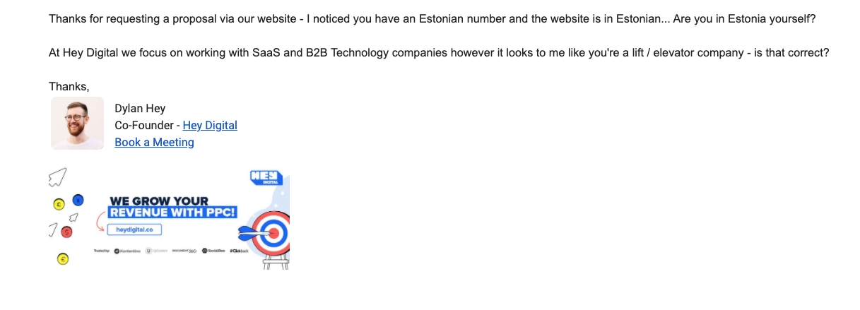
There’s nothing necessarily special about the email, except for the fact that it’s not an automated email.
How do I know it’s not automated?
- I received the email after 24 hours instead of right away.
- The copy in the body of the email: the founder (incorrectly) assumes I have an Estonian number and asks whether I’m in Estonia (where they are based).
- I worked with Dylan a while back and confirmed that it’s manual.
He also did a preliminary search to find out more about my nonexistent “company.”
Key Takeaway:
-
If you have few inbound requests, send manually written confirmations.
9. THE GATED CONTENT CONFIRMATION + BONUS BY ROCKETSHIP AGENCY
Chris Von Wilpert owns Rocketship Agency and Content Mavericks, and he’s notorious for his lead magnets.
Here’s the main lead magnet you’ll find on Rocketship’s homepage. It’s pretty irresistible with that bold headline — $100,000 from ONE blog post?!
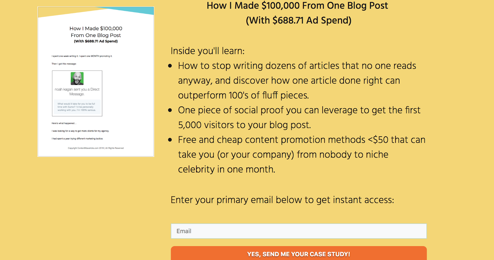
*Enters email.*
Here’s the confirmation landing page, created with Growth Tools. It includes a confirmation about the case study (sent to inbox) and a bonus video in exchange for a social share.
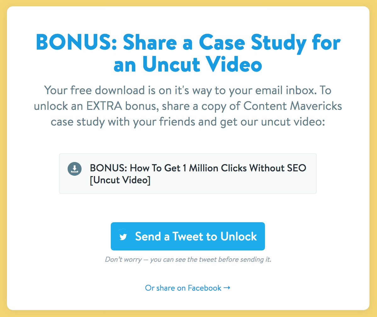
Here’s a little teardown:
Lead Magnet (Case Study) in exchange for email > Bonus material (video) in exchange for social share.
Key Takeaway:
-
Use a landing page to guide users to take more actions, and have it geared toward social shares.
10. THE STANDARD AGENCY BOOKING CONFIRMATION BY PEARL LEMON
Pearl Lemon is one of the best SEO agencies around.
Here’s a confirmation email I received after I booked a meeting with Ion the Greek. Disclaimer: I mentioned I was doing it for testing purposes.
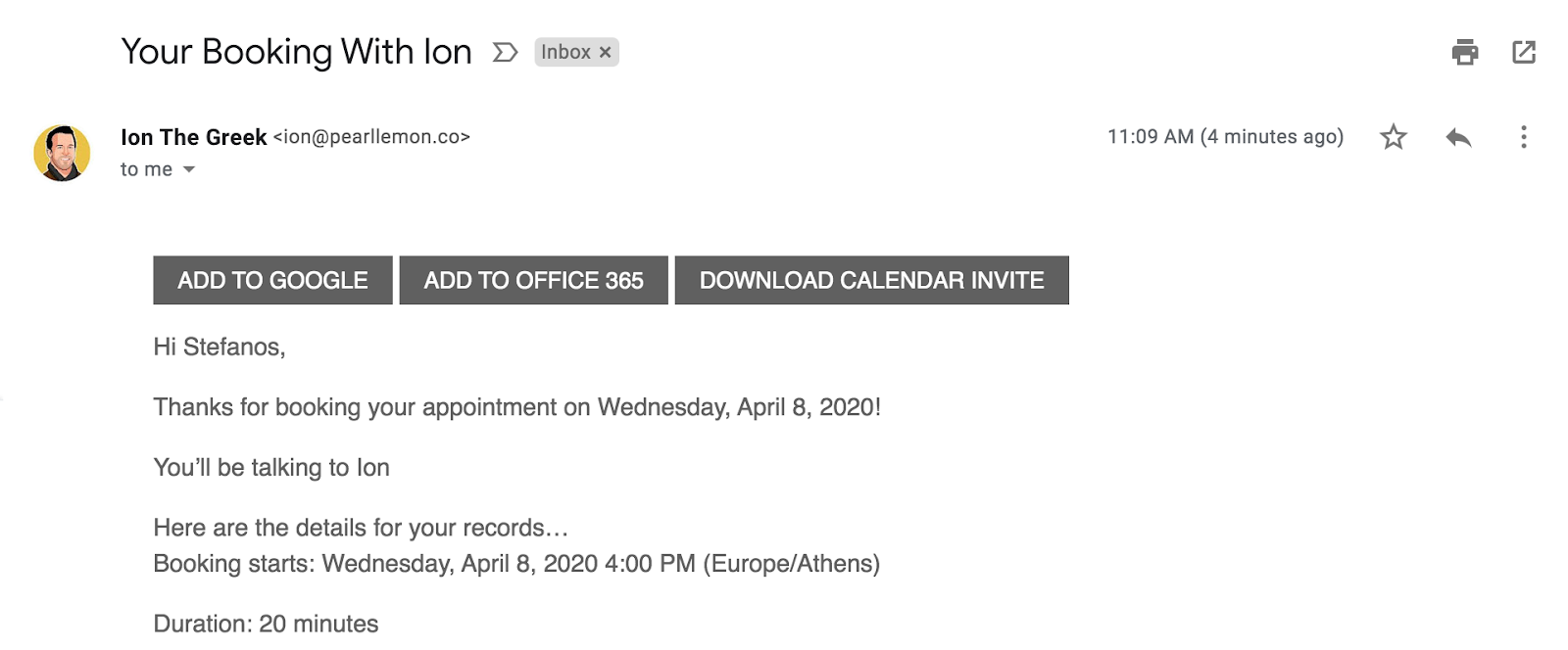
This email confirmation is simple because it’s all that’s needed.
It’s straightforward, with three buttons at the top so that you can add the meeting to your Google Calendar, to Office 365, or download the calendar invite.
The body of the email is short and concise — a summary of the booking with time and date, contact person, and call duration.
Key Takeaway:
-
Don’t overdo the booking confirmation email. Only provide what’s necessary and keep it brief.
Master Your Confirmation Emails: Best Practices
Now that you’ve seen examples of how the world’s best marketers use confirmation emails, I’ll give you seven best practices you can use when writing your confirmation emails.
1. KEEP BRANDING & TONE OF VOICE CONSISTENT
There’s no need to be fancy with your confirmation email design.
Keep it simple and keep the branding and voice of your emails consistent with your company's guidelines.
2. SET EXPECTATIONS
If your confirmation email is for an email newsletter signup, set expectations for the type of content and frequency that your customers will receive it to keep them engaged.
3. USE THE NUMBER THREE (OR FIVE)
Exploit the action-taking momentum by pointing your subscriber to three (or more) things they should check out.
Why three?
It’s the sweet spot. Just enough for your subscriber to have options but not too many to overwhelm them.
4. USE THE CONFIRMATION EMAIL TO POINT YOUR USERS TO MORE COOL STUFF
Tim Ferriss’ confirmation email does a great job at pointing subscribers to a whole range of cool stuff (free).
Perfect Keto’s purchase confirmation also does this pretty neatly by providing lifestyle-related content and a subtle upsell.
5. REDUCE FRICTION FOR CUSTOMERS TO FIND THE INFORMATION THEY NEED AFTER SUBSCRIBING OR BUYING.
Enabling a frictionless experience is the most important component of customer experience.
Reduce friction at all costs by redirecting subscribers to landing pages with relevant information/content/cool stuff, like OkDork.
6. USE TWO-LAYERS OF SOCIAL PROOF
How do you establish credibility?
Social proof.
Customers testimonials, peer approval, social approval, expert approval, and influencer endorsements. Use them in your emails.
7. UPSELL & CROSS-SELL: USE YOUR ORDER CONFIRMATIONS EMAIL TO MAKE MONEY BUT NEVER BE TOO SALES-Y
There’s nothing wrong with upselling or cross-selling your customers in a post-purchase email.
For example, you can use an upsell like Perfect Keto post-purchase or a cross-sell to introduce a new product like Neck Hammock.
Remember, the best time to sell something is when your customer is expecting to pay or has just paid for something.
WANT MORE TIPS TO MASTER YOUR AUTORESPONDER EMAILS?
Now you have some solid examples and best practices to experiment and get creative with your autoresponders. But there are always tweaks you can do for improvement:
-
Check out how this email formula achieved 78% open rate
Get inspired with these brilliant B2B & B2C email marketing examples
Add A Comment
VIEW THE COMMENTS