You already know why you need an email list and how to grow one. And now is the time to level up your email marketing game plan.
Today, I’m going to show you 30 brilliant email examples so you can discover what the pros do to increase their email opens, click through rates, and sales.
Professionally Designed Emails
Welcome Emails
One Call-To-Action Emails
Inspirational Emails
Personalized Emails
Content Emails
Round-Up Emails
Gated Content Emails
Webinar Emails
Cross Promotion Emails
Milestone Emails
FOMO Emails
Brand Personality Emails
- Example #27: Daniel DiPiazza
- Example #28: Ash Ambirge
- Example #29: Mizzen + Main
- Example #30: The Hustle
Want to get started immediately? Check out the extra resource below. In there, you’ll find email templates you can start using today.
Grab your free email templates here!
Professionally Designed Emails
When it comes to creating the right flow, you need to consider your customer’s journey from start to finish — from your subject line to reading your email all the way through.
Think of your email in the same step-by-step journey that your readers would take. What happens once they open your emails?
In the next two examples, a natural flow emerges:
Example #1: Duffy’s Sports Grill
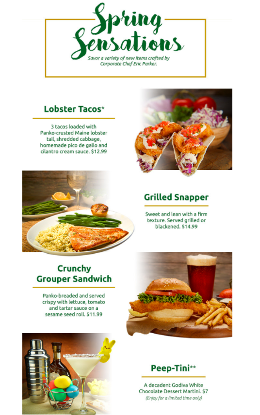
As soon as you open this Duffy’s email, you’re instantly greeted with a banner image and a call to action. As you scroll, you see the name of a menu item with a mouth-watering image to match just to the right of it.
This pattern is then repeated 4 more times. By the time you’re done scrolling, you land on a dessert Peep martini.
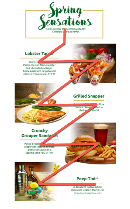
Not only does this flow well with images and copy, but it also takes the reader on a mini-journey as if they were actually at the restaurant.
You start out with an image of an appetizer, then move to two entree choices, and then land on dessert. The next step would be to head out the door and show up.
Well done Duffy’s marketing team!
Example #2: Hotel Tonight
This next example from Hotel Tonight is one that also has a good flow.
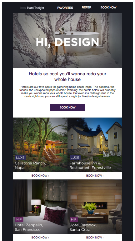
Again, we see another big bold image before anything else and, because of this, our attention is immediately drawn there.
As we make our way down the email, we see a similar form to the first example. Except, with this one, we see another image where the menu item description would be.
Since we read left to right, this flow takes advantage of that by placing the images exactly where our eyes would go naturally.
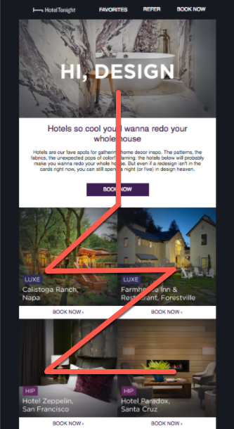
Either way, the form, combined with the eye catching images of designer hotels, keeps us interested and engaged.
Welcome Email
Your welcome email is your only chance to make a good first impression and guide your new subscribers into taking the next step.
You want one that shows off your brand’s personality and also makes the connection regardless if you’re one person or a brand emailing a new subscriber.
Weaving your brand’s personality into your emails is especially important since email is a digital form of communication that can be cold and off-putting (I’m looking at you junk mail).
Example #3: 1Password
Your welcome message should feel warm and engaging. In this next example, 1Password checks all of the boxes.
1Password welcomes new users with some personality with “Take your shoes off and stay a while” messaging combined with matching imagery.
They also let their new subscribers know what to do next. In this case, get the apps and print out your Emergency Kit.
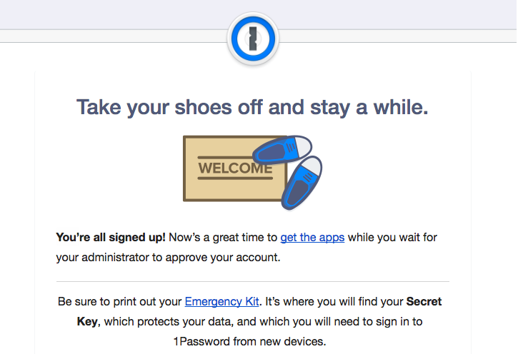
If you don’t give a call to action in your emails, you can’t expect your audience to take action.
Example #4: LearnVest
LearnVest also does this well.
Here, a welcome message with a “Let’s Get Started” button are the first things you see once you open the email.
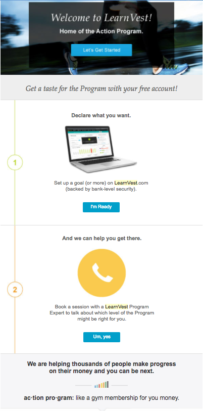
As you scroll down the page, you’re given two more steps to take.
This gives new subscribers three ways to move forward and they all depend on what level they’re at. It’s a great way to target multiple users in one email while still keeping things cohesive and not a haphazard mess.
Example #5: Autopilot
For a simpler, yet still effective, version of a welcome email, check out this next email marketing example.
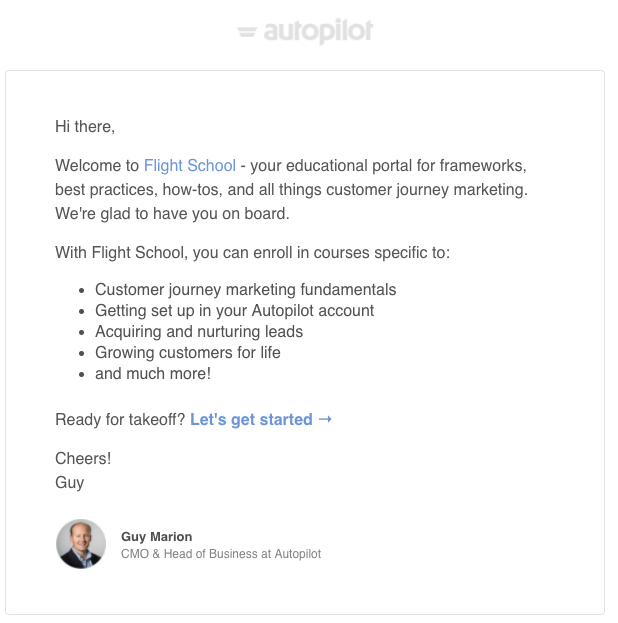
In just a few short paragraphs, Autopilot’s team shows off some personality (using words like Flight School and Ready for takeoff?) while making it clear what new subscribers can expect.
You may also notice that the text naturally creates a funnel shape and guides readers right to the brightly colored “Let’s get started link.”
Example #6: Kammok
Kammok’s welcome email is also one worth re-creating.
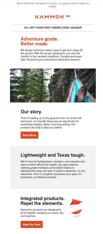
New subscribers see a discount code before the message even starts. But, the discount is tucked away in a subtle black font making it noticeable without being obnoxious.
As we scroll, we’re given:
- Information on their products
- Their story
- A little more information on their products
This flow balances everything nicely and helps guide new subscribers naturally.
One Call-To-Action Emails
To really get your readers to take action, consider only showing them the next step to take and only that one. Not only does this keep things simple visually, it also prevents new subscribers from getting distracted.
If you give your subscribers too much to do, they won’t do anything at all, as proven in this Jam study.[*]
Snagit and Adobe both do this well in the next two examples.
Example #7: Snagit
Snagit sends new users a video on how to start snagging. They also include a short description with a bright orange button to learn more.
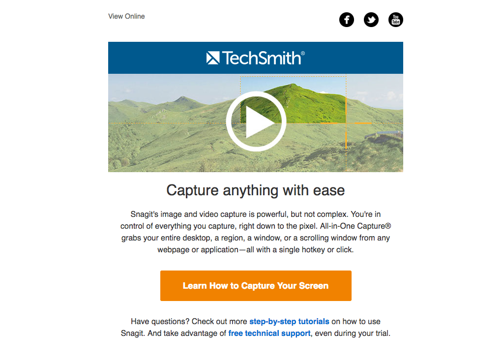
You can see that the goal is to get new members to use Snagit right away and they’re giving them the tools to do so.
Example #8: Adobe
Adobe does something similar.
The goal of this email is exactly the same as Snagit’s — get people to start using the product.
Adobe does this by using a call to action “Create something now. We’ll show you how” and a “Getting Started” link.
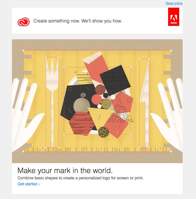
By keeping the focus on the next step, you won’t overwhelm or distract your new reader. When this happens, they’ll be more inclined to take the next step.
Inspirational Emails
Another way to nudge your audience into taking action is to give them the inspiration to do so.
Sometimes, all it takes is showing your audience the tools they need to get started.
Example #9: Michaels
Michaels does a great job of this in their summer-themed email.

Here, they sent subscribers 4 ways to use craft paint. As you scroll, you see a snapshot of tools plus the finished product. In this case, an Insta-worthy upcycled bike.
Not only does this give some major inspiration, but, by placing the exact tools in plain view, potential customers know exactly what to look for when they head to the store or browse online.
Example #10: LearnVest
LearnVest uses a similar strategy in their email.
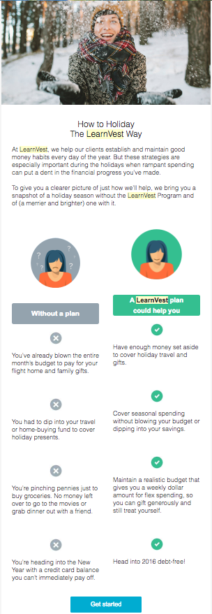
Instead of painting a picture of what you can create through crafting, the LearnVest team shows their audience the reality of what happens when you don’t create a financial plan.
They use simple illustrations and a side by side comparison to convey this.
By the time subscribers make their way down to the Get Started button, they can’t wait to begin.
This is also another good example of creating the right flow and keeping your focus simple.
Personalized Emails
These emails keep the focus on one thing: the reader.
Consider these stats on personalization:[*]
- Personalized messages see 6x higher transaction rates.
- When compared to general broadcast emails, relevant ones drive 18x more revenue.
- Emails packed with personalization see click through and conversion rate increases of 14% and 10% respectively.
But, to reap these rewards, you can’t stop at personalizing the greeting. You must take this one step further by personalizing both the greeting and the message.
Example #11: Chewy
Check out how Chewy does this:
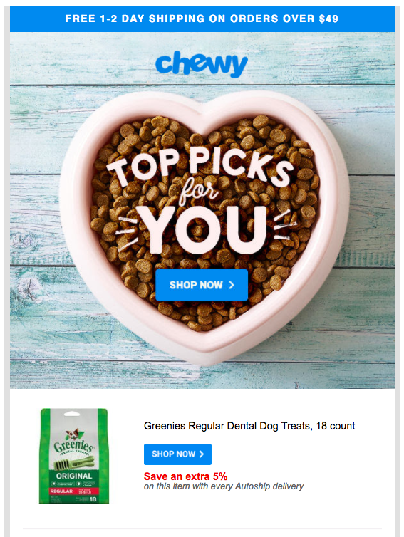
By using the word “you” with a heart-melting image, Chewy’s team is bringing the human conversation back to what could be a cold, digital form of communication.
As the reader scrolls through this email, they’ll see a series of products based on their past purchases. This type of customization reiterates that this email was tailored for this individual only.
And when this happens, the message feels as if you’re speaking directly to your subscriber. This step alone will make anyone more inclined to take action.
Content Emails
If you’re stuck trying to figure out how to best deliver your content each week, check out these next few examples for some inspiration.
These examples will show you how to get your content emails opened, clicked, and read.
Example #12: Neil Patel
In this first one, Neil Patel introduces his latest blog post within the first sentence. He also links the entire title in the second sentence.
For those still on the fence with reading this article, Neil provides a short teaser (taken from the first three sentences of his article) with a link to read the article afterwards.
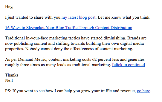
This gives his subscribers three opportunities to check out Neil’s latest article.
Example #13: Canva
Canva uses a similar style to Neil’s except they cut out the teaser and drop the link count from three down to one.
Here’s what that looks like:

Canva’s team uses one line of text to capture the reader’s attention and then follows this with a link to read the content.
By keeping things simple, your audience can figure out fairly quickly whether or not this article is for them.
Example #14: BuzzSumo
BuzzSumo follows a similar style to this one.
Just like in the Canva example, BuzzSumo uses a compelling question to kick things off.
They follow this with a list of bullet points that give their subscribers a sneak peek into the article.
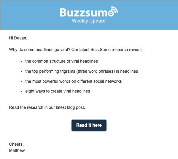
This is another easy to read example that lets your audience know what they can expect within a few seconds.
And by placing the button right in the middle, they know where to go from here.
Example #15: Nutrition Secrets
The last content email on our list does this too but it takes a slightly different approach.
Here, a small piece of the introduction of the article is used as the body of the email.
A call to action then guides subscribers to click the big pink button that spans the entire width of the email.
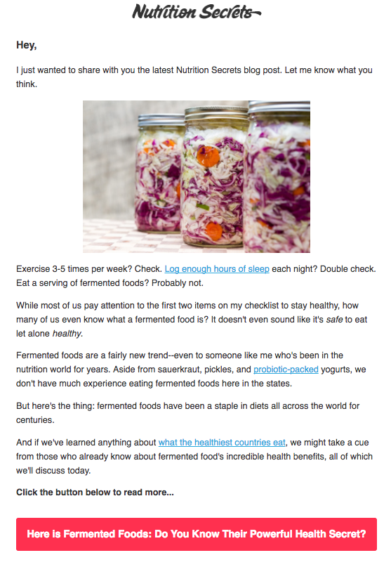
By giving subscribers the exact intro from your article, you can pump out content emails that much faster since you won’t have to come up with two introductions (one for the article and one for the email).
You can even trim down how much of the introduction you share. If you can find a nice break in the content that leaves your subscribers wanting more, cut your email there and add your call to action button so they’ll be inclined to click on it.
Round-Up Emails
Whether your audience lacks the time or your team does, sometimes sending out a weekly email is just not feasible.
In this case, you’re better off sending a round-up email that includes a small handful of articles or podcast episodes in one email.
This gives your busy subscribers a chance to catch up and gives them the option to scan a few pieces of content at once before settling on one.
Round-up style emails work well for those sending emails once per month or even every other week.
But, because you’re cramming in more than two articles, you need to make things visually appealing and neat.
These next few examples do just that.
Example #16: HubSpot
In this HubSpot one, the first sentence tells us that it’s a roundup email and then we see a series of blog articles.
Each one has the title and a short description with a big image in between the two.
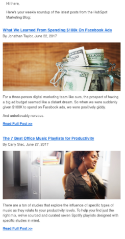
This is easy to read and perfect for anyone scanning the email to see what interests them.
Example #17: MyFitnessPal
MyFitnessPal does a great job of this too.
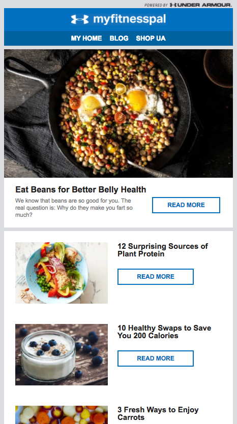
First, we see a big featured recipe and then a few smaller ones follow.
The featured recipe is the only one with a description, then each subsequent smaller one has a title and drool-worthy image next to it.
Again, this layout is perfect for those looking to scan the email to find only the recipes that interest them.
Gated Content Emails
Whenever you create gated content — pieces of content that require additional opt in information (like name, phone, etc) — you’ll need to send over an email that piques your audience’s interest enough for them to want to take the next step.
This email should also showcase the benefits of opting in right away or you’ll lose your subscriber’s attention.
Example #18: HubSpot
HubSpot’s opt in email is a great one to follow because they do just that.
Here, they introduce the email with an eye-catching statistic and follow this up with a link to their offer.
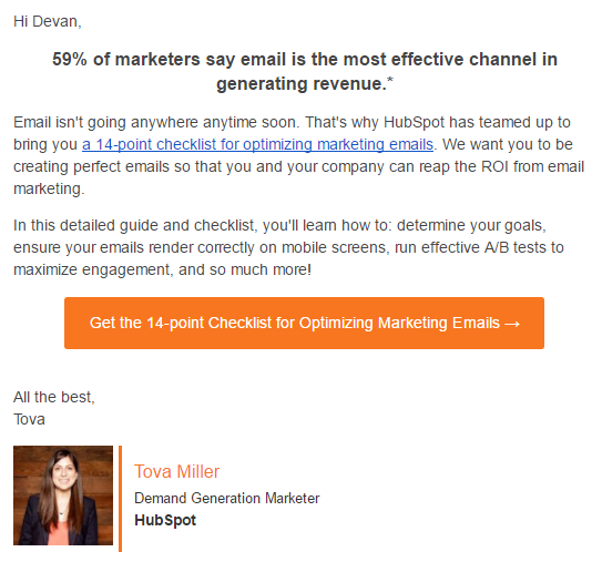
For those who haven’t clicked the link, they give a short description of what to expect and then they follow this up with a call to action button.
While the layout is simple, the two call to actions are perfectly placed to get readers to click.
Webinar Emails
If the thought of writing a webinar email gives you Blank Page Syndrome, these examples should help.
Example #19: Lewis Howes
First, we see how Lewis Howes delivers his webinar emails.
He starts out by sharing when the webinar is (tomorrow) and creates a sense of urgency (space is limited).
From there, Howes shares a short description of what attendees can expect.
He follows this up with a reminder that space is limited and then places a link to register just below this.
Howes also adds a bold statement above an eye-catching picture of himself standing on top of a mountain after a helicopter ride.
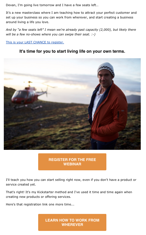
This image separates the top half of the email from the bottom.
In the second half of the email, we see two big orange buttons to register with a different call to action on each.
We also see another description between the two buttons. This time, the text reiterates what his subscribers will learn and who is an ideal attendee (even if you don’t have a product or service created).
With this example, you can choose to run with the top half of the email only, the bottom, or both. You can even run some AB tests to see which one performs best with your audience.
Example #20: Billy Gene
This next webinar example, from Billy Gene is Marketing, makes good use of a funny video they created, but that’s not all they do well.
Within the first three sentences they:
- Capture your attention with a funny pop-culture reference.
- Mention the exact date and time of their webinar.
- Add two call to actions (check out the video or register).
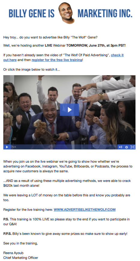
Just like Lewis Howes does, the content below the video focuses on what you can expect when you attend the webinar.
This example also uses another space wisely: the postscript.
You can see that the P.S. and P.P.S. drive home two more convincing details:
- Attendees should stay until the end for a Q&A
- Early bird attendees are eligible for freebies and prizes
By adding in all of these components, you’ll create a sense of urgency and excitement in your subscribers which translates into an increase in signups.
Cross Promotion Emails
Cross promoting your products shouldn’t feel sleazy. And when done correctly, it won’t.
Example #21: Kayla Itsines
Kayla Itsines does a great job of this.
In the email below, Itsines offers a deal on her foam roller.
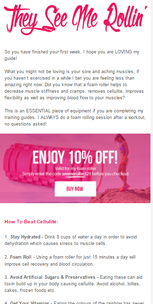
But if you look closely at the content, you’ll see that she’s addressing those who have already paid for and completed the first week of her workout guide. For these girls, muscle soreness is starting to set in big time and Itsines knows this and plays to this in her cross-promotion email.
She educates this segment of her list by explaining why foam rolling (the exact product she’s offering a deal on) is one of the best ways to combat tight, achy muscles.
The sale here becomes natural and supplemental. Because of this genuine nature, the sale is more likely to happen.
Consider how your products can complement an existing purchase and segment your message to this list only, like Itsine’s team does.
By doing this, you’ll come across as less promotional and more helpful. To your subscribers, it won’t even feel salesy.
Milestone Emails
Your subscribers may not remember important milestones such as your anniversary or birthday, but they will remember the sweet discounts or rewards you include to celebrate these.
And that’s exactly what the next three emails do.
Example #22: Vitamin Shoppe
With this first one from Vitamin Shoppe, they’re celebrating a 40th birthday. Instead of giving away the house at 40% off, they went with promotions like:
- 2x points on every purchase
- A $5 reward for every 100 points you accumulate
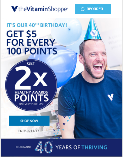
They also grabbed my attention with this catchy subject line: It’s our birthday — you get the gifts!
This perfectly sums up how you should approach these types of email.
Example #23: Mack Weldon
Mack Weldon, our next example, also does this in a similar way.
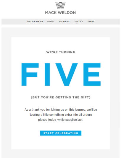
In honor of hitting the five year mark, they’re “tossing a little something extra into all orders placed today.”
This is a great way to drive sales without coming across as too promotional.
The Mack Weldon team also uses similar terms to Vitamin Shoppe with their “you’re getting the gift” messaging.
Again, the focus is on the audience. #TakeNote
Example #24: Runkeeper
Runkeeper takes both of these a step further by personalizing their milestone message.
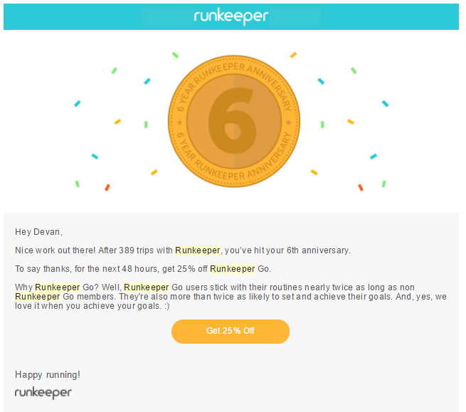
With this email, I’ve hit a six year anniversary with the workout logging app. To show their appreciation, they sent over a 25% discount off their paid version.
But here’s where it gets interesting.
Before they offered the discount, they pulled in another piece of information that made this message feel more personal. They mentioned that I’ve made close to 400 trips with them.
Between this, the personalized greeting, and the 6 year anniversary email that’s specific to my personal milestone, it feels like the offer is hyper-exclusive to me.
FOMO Emails
It’s not just for high school kids…
FOMO, or “the fear of missing out” is real.
It’s that nagging feeling you get when you stay in on a Friday night, the reason you sign up for every single new social media platform that comes up, and why you’re jealous of a friend attending a wedding you weren’t invited to… even if the wedding was the last place you wanted to be.
That’s bad news for your personal life, but good news for your email marketing.
Example #25: Michaels
You can trigger a FOMO reaction through scarcity, like Michaels has done with their sale recap email:
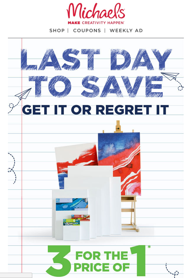
If you’re Michaels’ target market (which hopefully you would be if you were on their email list), this is a simple reminder of what you could be missing out on if you don’t take advantage of the sale.
Example #26: Derek Halpern
Another email marketing genius who uses FOMO emails to get attention is Derek Halpern:
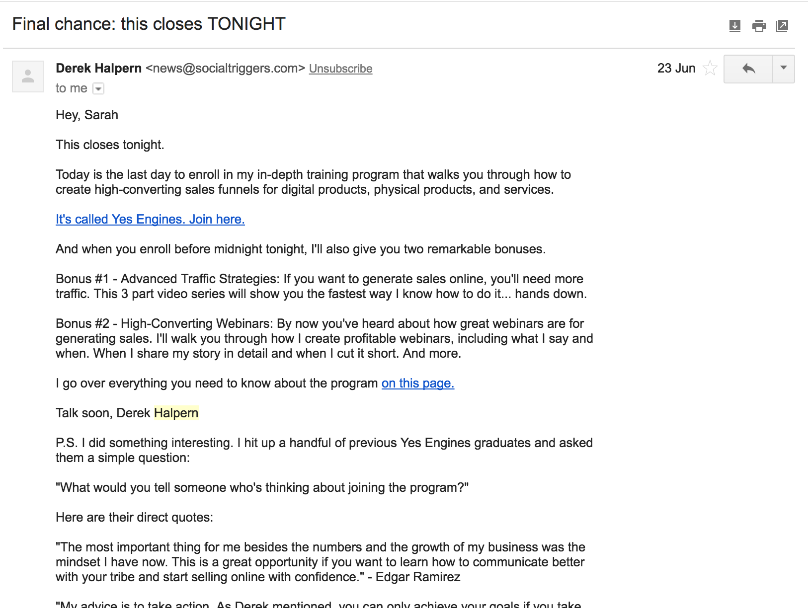
The subject line alone triggers some serious FOMO anxiety, and he cuts right to the chase in his recap email with the opening line.
Brand Personality Emails
Have you ever opened an email that reads like a textbook?
Actually, you probably wouldn’t know how these emails read, because you would have sent them straight to the junk mail dungeon after reading the third word.
That’s because nobody wants to read anything — an email or otherwise — that lacks personality.
This isn’t surprising. Personality is what resonates and connects with your subscribers. It’s what builds cult-like followings for companies like Saddleback Leather, Dollar Shave Club, and even influencers like Tim Ferriss.
So I don’t have to tell you that personality sells in email, too.
Example #27: Daniel DiPiazza
Daniel DiPiazza from Rich20Something understands this, and communicates personality through emojis, the language he uses, and even his unsubscribe copy in his emails:
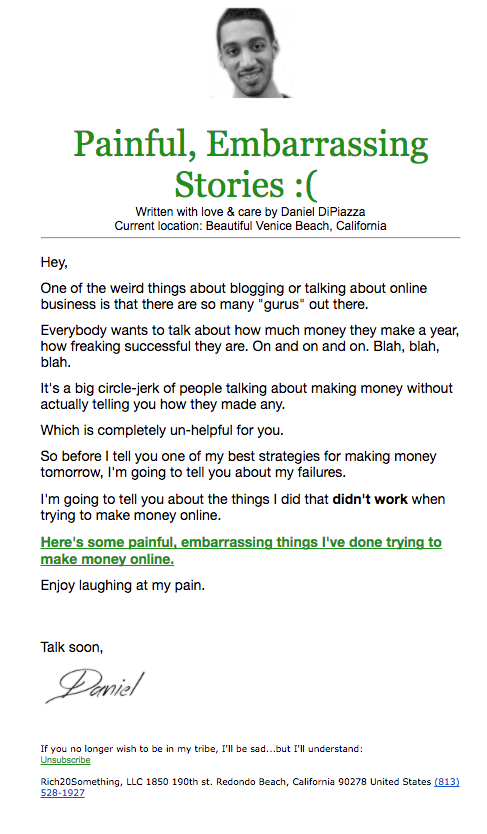
And he’s not the only one.
Example #28: Ash Ambirge
Known for her personal brand, Ash Ambirge uses personality to create a bond and resonate with her subscribers.
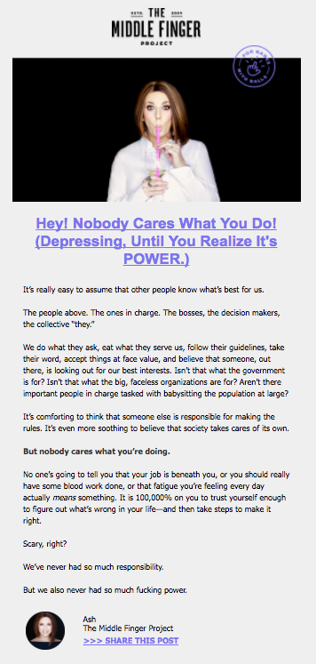
Leading to far more interest in her content email than she would have been able to generate if she’d taken a more “professional” approach.
Example #29: Mizzen + Main
Proving that you can use personality in email marketing even for an ecommerce business, Mizzen + Main employs humor and personality in their product email about these red chinos.

Here’s what the grey text between the two images says (in case you can’t read it):
The front door. Eagerly awaiting the postman to deliver his new red chinos. He’s been in this squat position for hours. Senses heightened. Like a lion stalking a wildebeest. I’d be scared if I were that postman but also honored.
Your emails don’t have to be long to get your unique brand across.
Example #30: The Hustle
The Hustle demonstrates you can (and should!) show off your personality in every single email — starting from your welcome email:
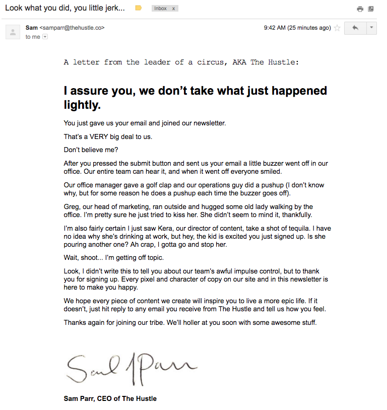
The Hustle captures your attention and keeps subscribers engaged by being a little silly and painting a personality-filled picture with their welcome email, generating excitement for their email content to come.
Your brand’s personality might not be sarcastic like Ash’s or silly like The Hustle’s, but it doesn’t have to be. What’s important is you coming up with your own unique brand personality that gives your subscribers a reason to open, act, and buy from you.
Before you schedule your next email broadcast, ask yourself these two questions:
- Would you want to read the email if it showed up in your inbox?
- If you sent the email to a friend with no sender, would they guess it was from you or your brand?
If either answer is “no”, put some personality into it before you send it.
How To Use These Email Marketing Examples
Now that you’ve seen all 30 examples, it’s time to start figuring out which ones to use first.
You can follow these steps:
- Step 1: Choose the type of email first.
- Step 2: Draw inspiration from one of the examples above. Consider what you like about these examples, what’s drawing you to them, and how you can tailor them to suit your audience.
- Step 3: Use one (or more) as a template or blueprint to create your email. This should feel unique to your audience.
- Step 4: Create your own version. Don’t be afraid to deviate from the examples above. These should serve as inspiration only.
To get started, check out the bonus material below. Inside you’ll find email templates you can copy-paste, and send to your email list.
Add A Comment
VIEW THE COMMENTS