The average business professional sends and receives around 126 emails a day in 2026.
Even if you’re only responsible for half of that traffic, you’re still looking at 40 to 50 emails a day with your name on them.
That’s 40 to 50 free chances to point people somewhere useful. Your site, your latest post, your calendar link, your Instagram, whatever moves the needle for you.
And almost nobody uses them.
Unlike a popup or an ad, your email signature never feels like marketing. It just sits there at the bottom of every message, quietly doing nothing, while you pay full price for a stamp, an envelope, and a sales pitch elsewhere.
Time to put that real estate to work. Here’s everything that goes into a signature people actually notice, plus 7 examples worth stealing from.
Table of Contents
Why Bother Creating an Email Signature in the First Place?
Even if you’re sending far fewer emails than the average person, you’re still talking about dozens of touchpoints a week that currently end in “Best, [Your Name]” and nothing else.
That’s a lot of missed opportunity for something that costs you zero extra effort to fix.
A signature that’s actually working for you can:
- Help someone find your contact info in two seconds instead of digging through old threads
- Drive traffic to your site, your email list, or your social profiles
- Give prospects a direct link to book time on your calendar
- Point readers to your best piece of content, whether that’s a blog post, a podcast episode, or a lead magnet
If your signature isn’t doing at least one of those things, it’s dead weight. Let’s fix that.
Must-Have Elements to Include in Your Email Signature
At a minimum, every signature needs:
- Your name
- Contact info
- Your current title and company
Here’s what a bare-bones (but functional) version looks like:

Notice the link to a company page tucked in there too. That’s your fourth non-negotiable if you can swing it: one link, somewhere strategic.
Be smart about where that link goes. Sending someone straight to your pricing page feels like a pitch. Sending them to a page where they can actually learn something about what you do feels like a favor. Same goes for a link to your social profiles, a podcast, or a scheduling page. More on picking the right one later.
The Optional Element Everyone Argues About
Should your email address live in your own email signature? Marketers genuinely disagree on this one.
The case for including it: when you’re 15 replies deep into a thread with six people cc’d, finding the right email address gets annoying fast. A visible address at the bottom saves everyone a step and cuts down on messages landing in the wrong inbox. If your team lives in long email chains, or if your company runs on Outlook or Gmail apps that bury addresses a few taps deep, this argument gets stronger.
The case against it: it’s redundant information sitting in a spot that could hold something more useful, and plenty of people find it a little strange to see an email address stapled to the bottom of, well, an email.
Here’s an example with the address left off entirely:

Not everyone deals with the kind of email volume that makes this a real problem. Yours might. Look at how your team actually communicates before deciding either way.
Don’t Make Your Email Signature Too Cluttered
A cluttered signature does the opposite of what you want. Instead of guiding someone toward one clear action, it gives them five mediocre options and a reason to ignore all of them.
This is a classic cautionary tale. Take a look at this overstuffed signature:

Three titles. An email address that’s already obvious. Competing links. Something in there probably got a click, but there’s no telling how many people bounced before they got that far.
Here’s what fixed it:
- Keep your title short (see #4 below for how to have fun with this)
- Simplify the links
- Cut anything you know people won’t use
Here’s the pared-down version, the title trimmed and everything else stripped out:

Cleaner, and more likely to be helpful. Don’t overwhelm people with too many things at once.
Optimize Your Signature for Mobile
Just like you’d never ship a website that only works on desktop, don’t design a signature that only works there either.
Roughly 46% of all email opens now happen on mobile, and that share keeps climbing. If your signature shrinks down so far that links become smaller than a comfortable tap target (aim for at least 72 pixels), you’ve built something nobody can actually use.
Test your signature on your own phone before you call it done. If you’re squinting or mis-tapping, so is everyone else.
7 Click-Worthy Email Signature Examples (& How to Make Them Work for You)
Here’s where the real inspiration lives. Keep these 7 approaches in mind as you build yours.
#1: Don’t Be Afraid to Use Color
Adding your brand colors and logo to your signature does more than look nice. It gives people a visual anchor to scan toward.

In this one, the name, title, and email address all pick up the logo’s color palette, which makes the whole block easy to scan even though the middle section packs in a lot of information.
One rule here: test your colors across a few devices and email clients before you ship them. Stick to one light shade, one dark shade, and standard black, then swap in your own brand colors for the light and dark slots. That formula rarely fails.
#2: Add a Photo
A photo turns a wall of text into a person. Here’s a signature from a HubSpot marketer that does it well:
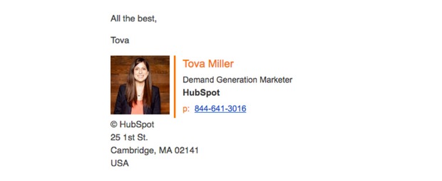
The sign-off, “All the best, Tova,” leads the eye straight into her photo, which makes the whole thing feel like it came from an actual human instead of a mail merge.
Just use a high-quality image or skip it entirely. A blurry, poorly cropped headshot undercuts everything else you’re doing.
#3: Handwritten Signatures Give a Personal Feel
Ann Handley took the “make it feel human” idea one step further with a handwritten-style sign-off:

It reads like she sat down with a pen. In reality, it’s a font, and it probably took her under a minute to set up. That’s the trick: a small, low-effort detail can carry a lot of warmth.
If you want to try this:
- Pick a thicker, more legible font over a delicate one
- If you go cursive, make sure it’s still easy to read at a glance
- Check it on a small screen before it goes live
#4: Have Fun With Your Title
Boring titles get ignored, or worse, flagged as spam bait. “Sales Consultant” and “SMB Sales Rep” are exactly the kind of phrases that make people’s eyes slide right past your name, similar to how certain trigger words can quietly tank a subject line.
Figure out how you actually help people, then title yourself around that instead. We lean on titles like “Growth Expert” for exactly this reason.

In this example, adding a distinctive middle name gives the whole signature a bit more personality and makes it memorable in a way “Account Executive” never will be.
The line to walk here is knowing your audience. A little personality goes a long way. Too much, and it stops reading as confident and starts reading as trying too hard.
#5: Show Your Personality While Keeping It Professional
You can build on the personality tip above without tipping into unprofessional territory. This example threads that needle with a clean layout, a real photo, and a sign-off with a little character:

A distinctive sign-off phrase, used consistently, becomes a small brand signal of its own. It’s personal enough to feel genuine without reading as unpolished.
#6: Play Around With Your Layout
Most signature examples put the image on the left. This one flips it to the right, and it still works because of how people naturally read.

Since most of us read left to right, the eye lands on the name, title, and contact info first, then moves to the logo. That order makes sense for most brands, so it’s a safe layout to borrow.
The white space between the name block and the contact details also matters more than it looks like it should. It keeps a signature with a lot of components from feeling crowded. Notice the “View My Open Jobs” CTA tucked in near the bottom too, which brings us to the last (and most important) tip.
#7: Add One Call to Action
If someone reads far enough down your email to hit your signature, they’re already interested. Give them exactly one next step to take.

In this example, an inbound marketer uses the space for a single “book a time to chat” link in a bright color pulled straight from his logo. The white space around it keeps the CTA visually separate from his contact details, so it doesn’t get lost.
Placing the CTA near the logo also does something subtle: it signals that this person represents a real brand, not just an individual sending emails into the void.
Before picking a CTA, ask what your reader actually needs next. Test a few options and see what earns clicks. That’s the same instinct behind a good popup CTA, one clear ask beats five vague ones every time.
3 Tools to Help You Build Yours
You can absolutely build a signature by hand. But these three make it faster, and harder to mess up.
#1: WiseStamp
WiseStamp remains a team favorite for a reason. Their free generator now includes an AI Designer that builds a full signature from a plain-text description or an uploaded logo, pulling your brand colors automatically instead of making you match them by eye.
You still get full control over layout, photo sizing, and borders if you’d rather build manually, plus a library of templates organized by email provider if you’re starting from a blank page.
#2: HubSpot
HubSpot’s email signature generator is still free, still requires no account, and still gets you a mobile-responsive signature in a couple of minutes.
The tradeoff hasn’t changed either: fewer customization options and a smaller template library than a dedicated tool. It’s a solid way to get something decent fast, but if you want your signature to stand out, it’s not going to be your final stop.
#3: Newoldstamp
Newoldstamp has a genuinely useful free tier and doesn’t require signing up to try it. It’s a strong pick if you’re a small team that wants a decent-looking signature without a big learning curve.
Their paid plans add banner campaigns, click analytics, and team-wide deployment, which matters more once you’ve got a handful of people whose signatures you want to keep consistent and on-brand.
Create an Email Signature That Stands Out
You know what makes a signature work now, so here’s the short version.
Strip your signature down to what actually earns its spot. Pick a link and turn it into a real call to action, the same way you’d think through the wording on a persuasive email or a sharp headline. Add a high-quality photo if you’re using one. Test it on your phone.
If you want extra credit, add a tracking tag to your signature link so you can see what’s actually working.
Whatever you do, stop leaving this space empty. It’s one of the few pieces of marketing real estate you already own, and it’s sitting at the bottom of every email you’ve sent this week.
FAQ: Quick Answers on Email Signatures
What should every email signature include?
Your name, your title and company, and one link that points somewhere useful. Everything past that is optional and should earn its place.
How long should an email signature be?
Short enough to fit in four or five lines without scrolling. If you can’t read the whole thing in a glance on your phone, it’s too long.
Do I need to include my email address in my signature?
Not always. It helps if your team lives in long email threads or juggles multiple inboxes. If most of your replies happen in a single, easy-to-follow conversation, you can safely leave it out.
What font should I use?
A standard, widely supported font like Arial, Helvetica, or Georgia. Decorative or handwritten fonts work fine for a sign-off flourish, but keep your name and contact info in something every email client renders correctly.




Add A Comment
VIEW THE COMMENTS