Urgh. This is the 13th time a customer has emailed you this question.
Deep down, you know why. It’s either A) your website is missing an FAQ page, or B) your customers are frustrated by its site navigation and resort to emailing you instead.
In this guide, I’ll show you 10 great FAQ examples to copy. Prepare to be inspired to polish your FAQ page or create one from scratch.
%(tableofcontents)
Let’s begin.
What Is An FAQ page?
An FAQ page is a webpage of the questions most often asked by your prospective and current customers.[*]
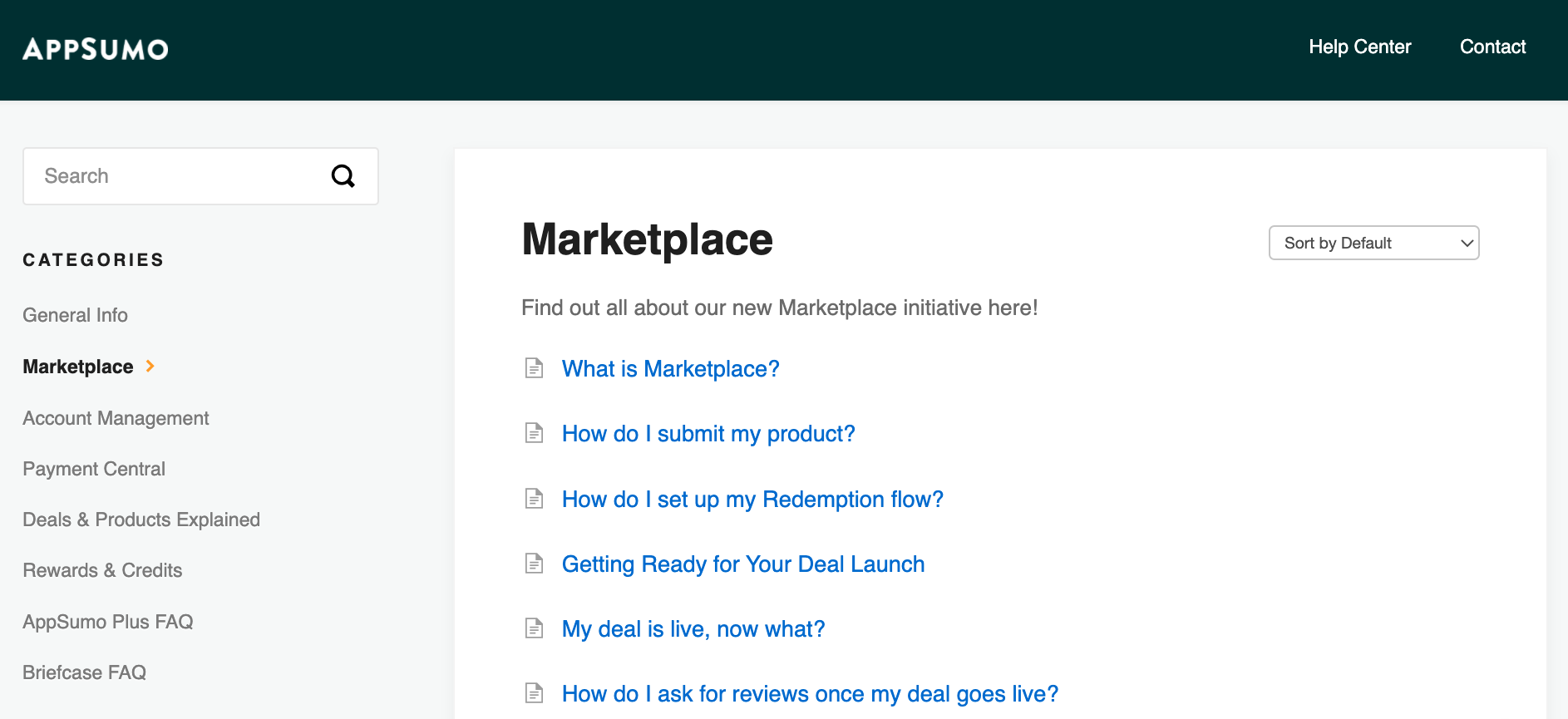
For a food and beverage (F&B) ecommerce store, it could be questions like shipping fees, ingredients, and packaging.
For a B2B SaaS startup, it could be pricing, product features, and best practices on how to use the product.
If you think the FAQ page only reduces customer inquiries and saves you time, think again. A great FAQ page also:
- Relieves customers’ anxiety by overcoming their buying objections.
- Highlights your value proposition and tells customers what they get when they buy from you.
- Boosts SEO as Google values audience-focused websites, especially those that provide information to help users make better-educated buying decisions.
- Prevents negative reviews by providing information for customers to make sure they’re a good fit for the products or services.
10 Great FAQ Examples You Can Learn From
I picked these 10 FAQ examples based on what makes an effective FAQ page:
- Is it easy to navigate?
- Does it address my questions clearly?
- Does it include a contact method if I don’t see my question listed?
- Is it optimized for SEO?
- Does it show the company’s personality?
No matter which industry you’re from, you’ll definitely walk away with fresh ideas. Let’s go!
1. AHREFS
Industry: Software as a service (SaaS)
Why It Works:
What’s the fastest way to know if your FAQ page is helpful to prospects and customers?
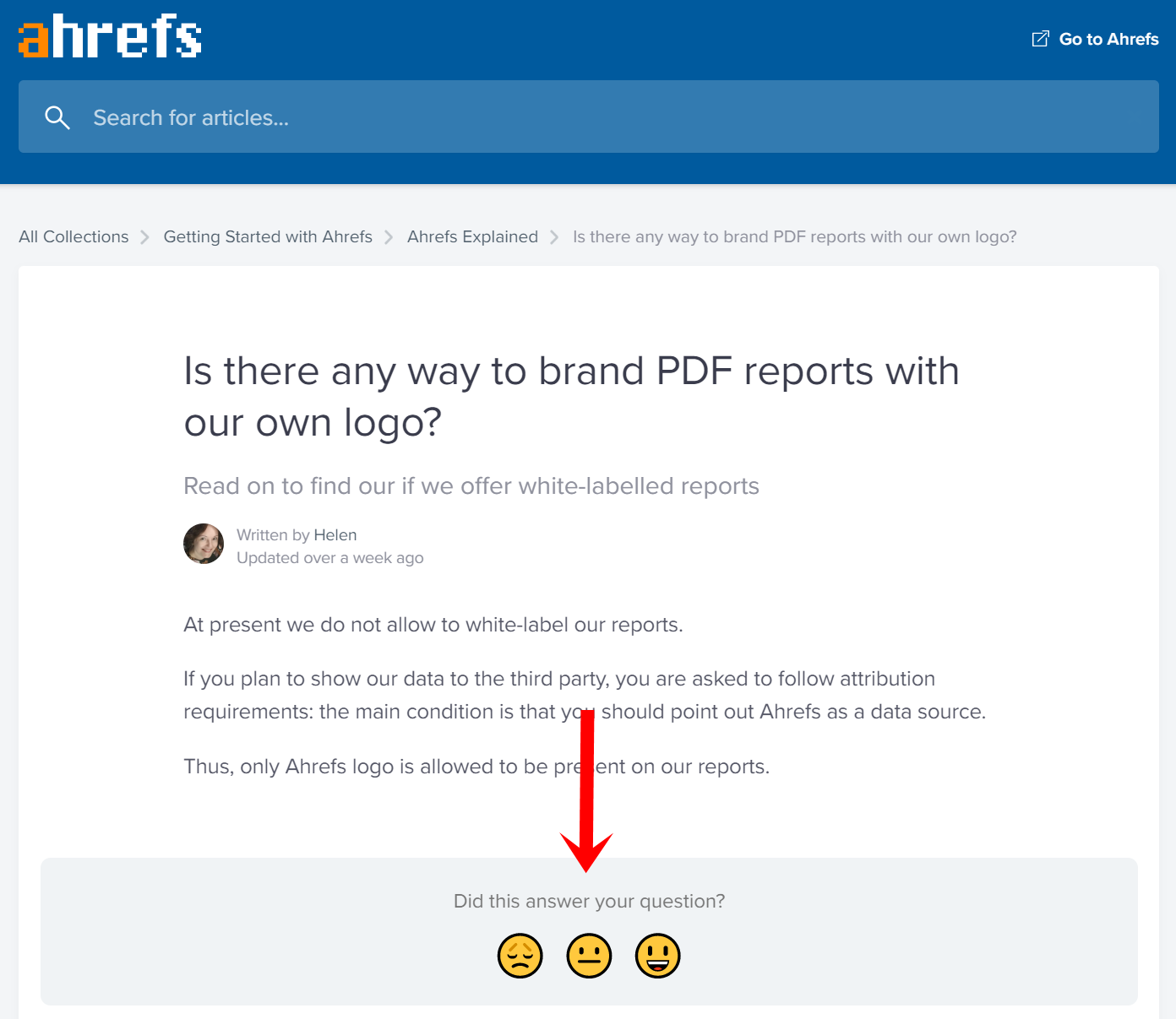
Adding a rating score after each answer — the way Ahrefs does on their pages.[*]
This satisfaction score tells Ahrefs which content works for their users and which needs more work.
More importantly, it lets them know if they’re meeting the concerns at every stage of their customers' buying journey.
Want to know if you’re heading in the right direction with your FAQ page? Integrate a rating score after each question and start gathering user feedback.
Here’s another highlight of Ahrefs' FAQ page: It’s optimized for SEO.
Go ahead, reread the question and answer. Notice there’s a natural keyword usage in the H1 question title, subhead, and body of the page?
These keywords match what users type in a search (e.g., “Is there any way to brand PDF reports with our own logo?”), attracting traffic from ideal customers who are deep into the sales funnel and ready to buy.
The location breadcrumbs also encourage users to delve deeper into Ahrefs' website, reducing bounce rate, and ultimately ranking the FAQ page in search.
2. CLIENT PORTAL
Industry: SaaS
Why It Works:
Friction occurs on the pricing page, as this is the stage where your target customers have to part with their money.
They might wonder:
-
-
This looks complicated. Do I need to know [Skill / Knowledge] to use it?
-
Can I integrate it with [App / Software]?
-
I don’t see my industry / niche here. Will this tool work for me?
-
These friction points aren’t just FAQs. They’re buying objections.
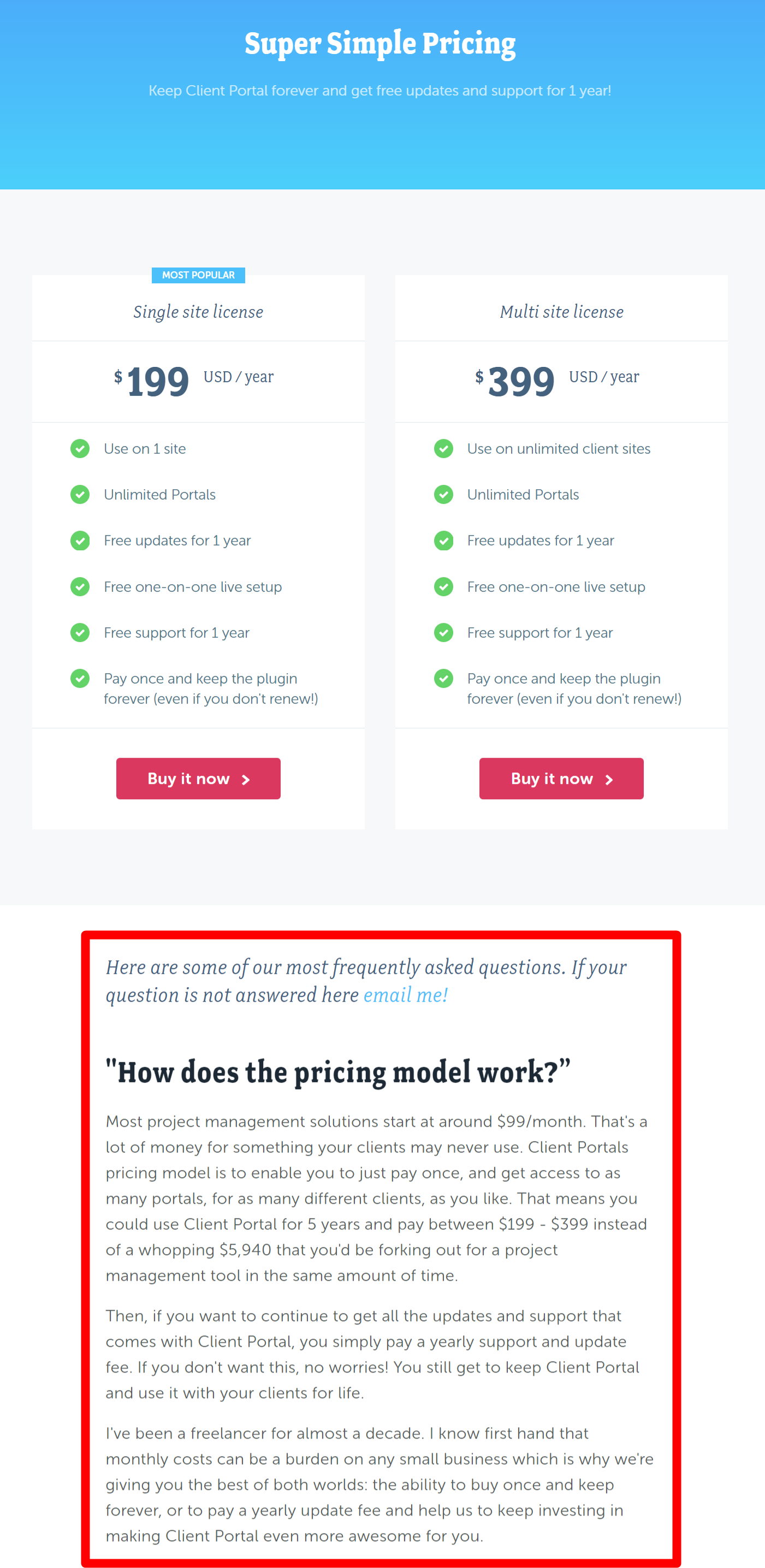
Client Portal combats these objections by integrating its FAQs on its pricing page.[*]
And not only that, the questions in the first-person point of view add a personal and open tone. It feels more relatable to target customers.
Another area that Client Portal does well is the product roadmap shared in one of the answers. By showing users upcoming features and encouraging them to share their requests, Client Portal convinces those on the fence that the features they want will be added soon.
The next time you create an FAQ page, merge it with your pricing page to reduce friction points. And while you’re at it, show the pricing table again after the FAQs. It’ll save customers a step of scrolling back up.
3. KETTLE & FIRE
Industry: Ecommerce
Why It Works:
Having your customers comb through information in an endless stream of questions is the definition of a #BadUX.
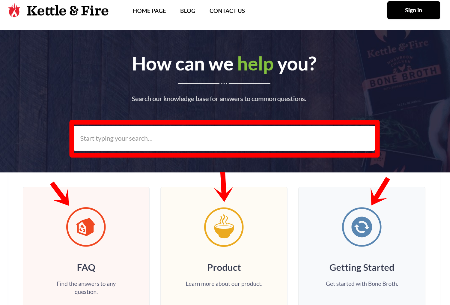
Kettle & Fire does a solid job presenting its FAQs, even though it has hundreds of answered questions.[*]
Rather than having users scroll through thousands of words, the F&B ecommerce site includes a search bar for them to find answers easily and shows the FAQs by subject, saving customers loads of time.
Note that Kettle & Fire is using a knowledge base software for its FAQ page. If you have hundreds of FAQs like they do, it’s worth investing in one to keep your content in order.
4. ANGELA RODGERS
Industry: Freelancing
Why It Works:
Here’s another effective approach to save users from scrolling through multiple questions that don’t apply to what they’re looking for.
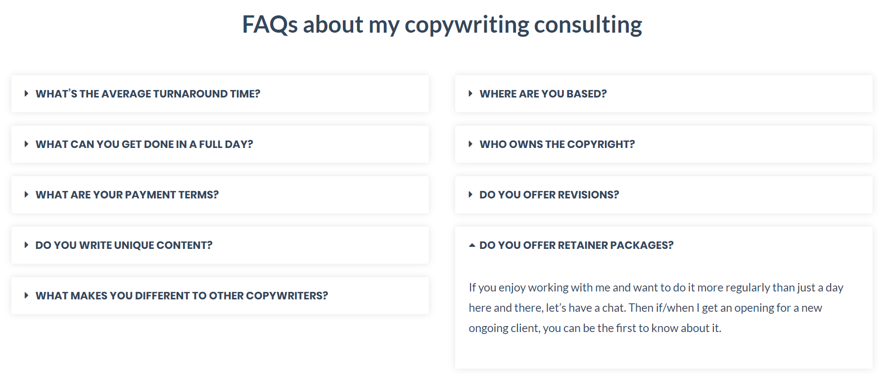
Copywriter Angela Rodgers adds her FAQs on her services page.[*]
There’s no need to look for more information elsewhere; all the related content is in one place.
The toggle widget adds a clean touch. When users land on the page, they see the question of each text box item. It’s only when they click in the box that it expands and the answer appears.
5. SINGLE GRAIN
Industry: Agency
Why It Works:
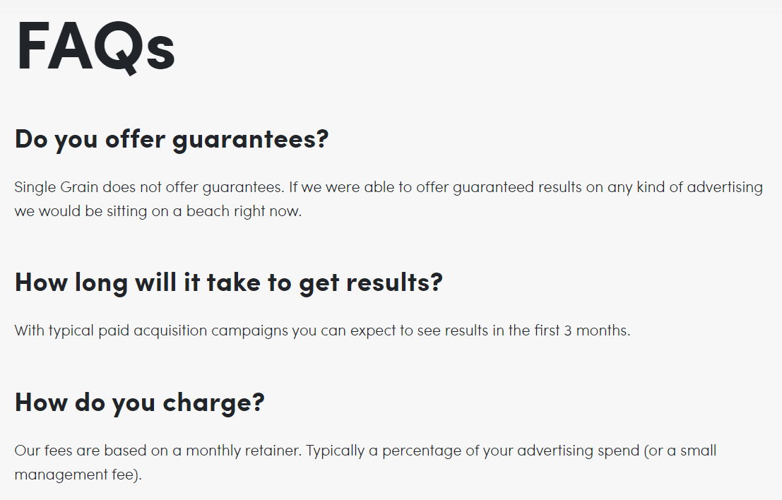
Single Grain lists its FAQs from their customers' viewpoint.[*]
Fun Fact: The agency is not the only one that uses this approach. If you reread this guide, you’ll notice ALL the examples list their questions from the point of view of their customers.
Why do this?
Writing questions from the perspective of your customers creates a conversational tone and helps them connect your answers to their own lives.
6. B-SCHOOL
Industry: Business
Why It Works:
Are your potential customers asking questions not covered on your FAQ page?
You don’t want frustrated users abandoning your website. Exit = Loss of Opportunity.
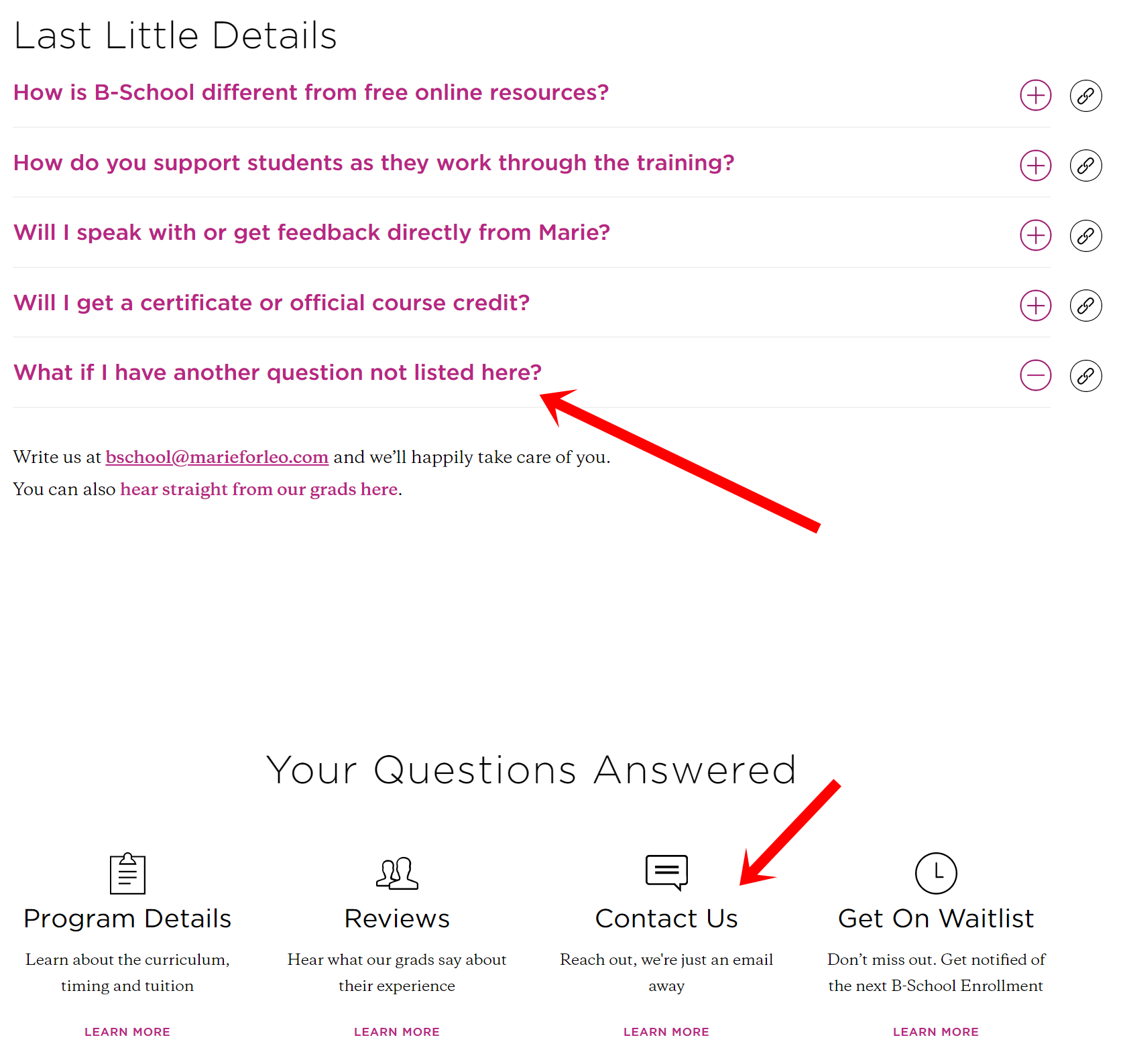
Take a leaf out of B-School’s book: Invite users who require additional help to contact you — and make your contact information highly visible.
Clearly show your contact information on the FAQ page! B-School does this in places where users expect: In the last question and near the footer.[*]
7. PISTOL LAKE
Industry: Ecommerce
Why It Works:
Do you know the most popular questions in your FAQs?
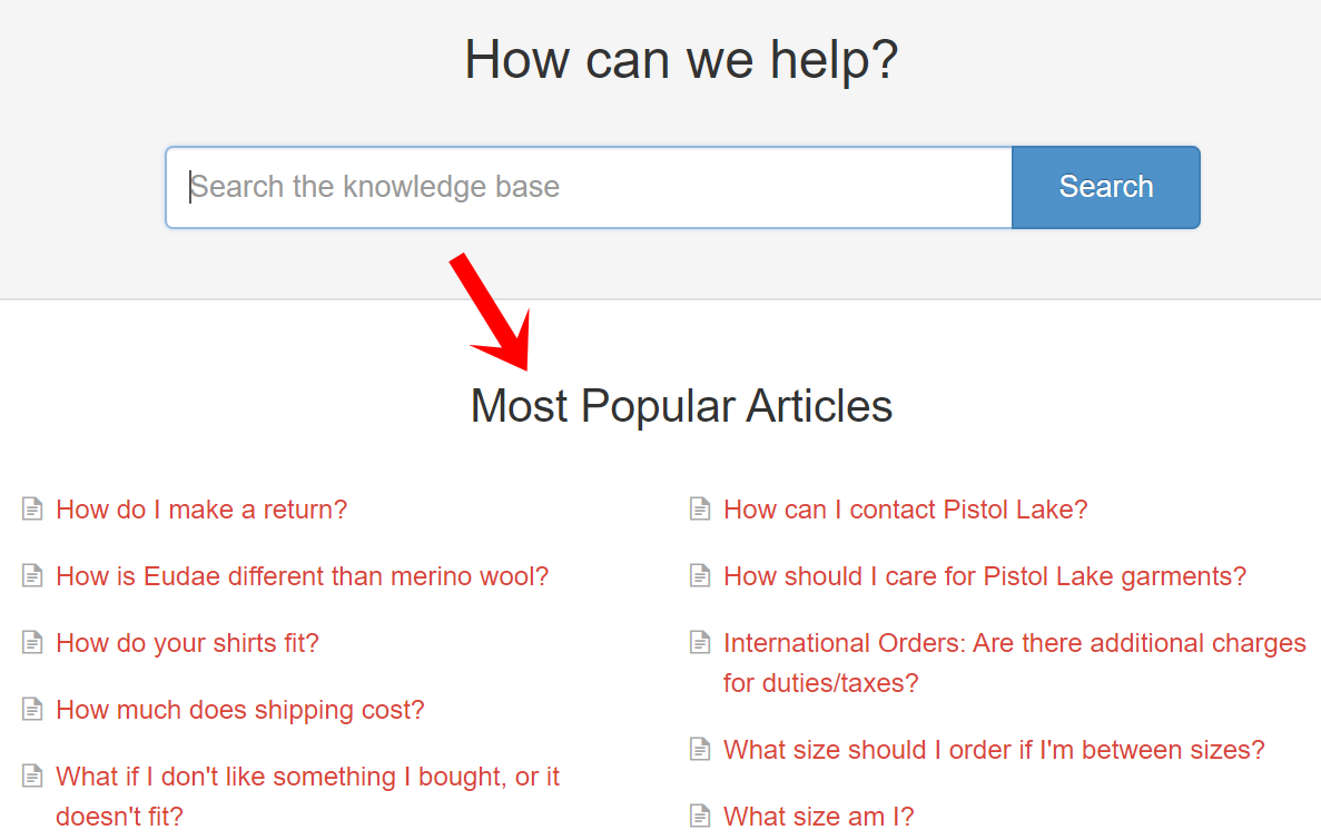
If you do, you should put them right at the top, like how Pistol Lake does here.[*]
These popular articles serve as an extra form of fast navigation, boosting the user experience.
Each question has an entire page devoted to the answer, and the page opens in a new browser tab. If you’re looking for an alternative to collapsing your answers yet still make it easier for users to view, this is worth a shot.
Tip: To locate your most popular questions, go to your analytics dashboard to see which pages have the most visits. Creating an FAQ page from scratch? Go through customers' inquiries and find the most common questions.
8. KALEIGH MOORE
Industry: Freelancing
Why It Works:
Your FAQ page helps you convince prospects you’re the right choice.
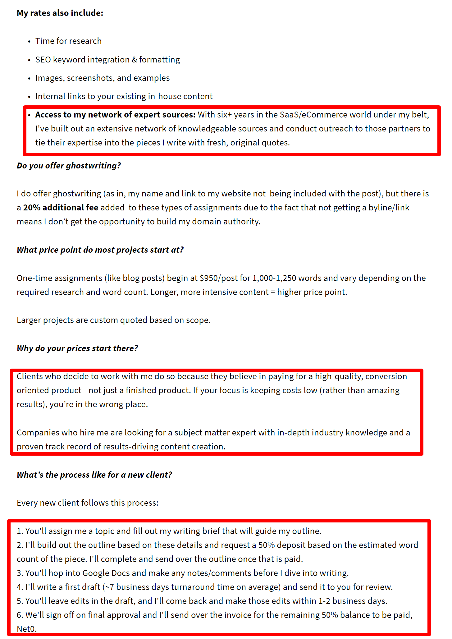
Freelance B2B content writer Kaleigh Moore does this well. She lists questions that prospects don’t know how to ask and subtly highlights her value proposition in several answers:[*]
-
-
Proven track record of results-driven content creation
-
Extensive network of expert sources from her 6+ years of experience
-
-
Effective process that ensures a smooth collaboration
These value props prove to prospects that Kaleigh is a PRO, and not a random amateur writer who’s just winging it.
9. GROWTH MACHINE
Industry: Agency
Why It Works:
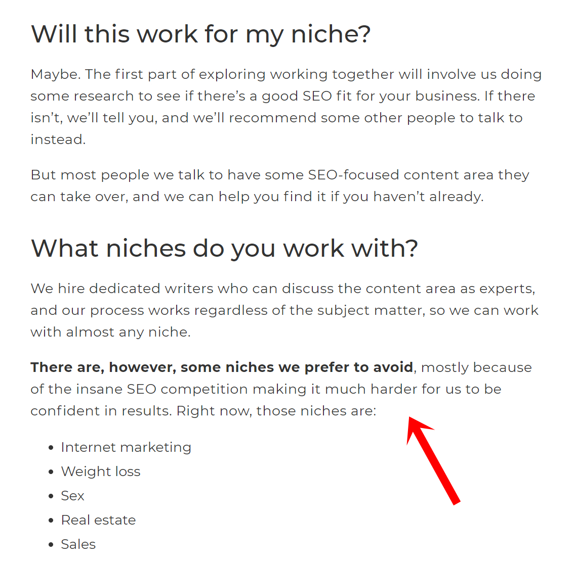
Here’s a genius approach by Growth Machine. This agency uses its FAQ page to prequalify its customers.[*]
Look at how it turns away unfit prospects. It straight-up tells them the niches they avoid, saving time and unnecessary conversations for both parties.
This is a helpful approach, especially for companies that sell to a niche audience:
- Business coach who works with CEOs of Fortune 500 companies.
- B2B content writer who writes only content, not copy.
- Graphic designer who works with startups with Series A, B, and C funding.
You don’t want to waste your time knee-deep in conversations with prospects only to find they’re a complete mismatch. Start prequalifying the clients you work with.
10. HARRY’S
Industry: Ecommerce
Why It Works:
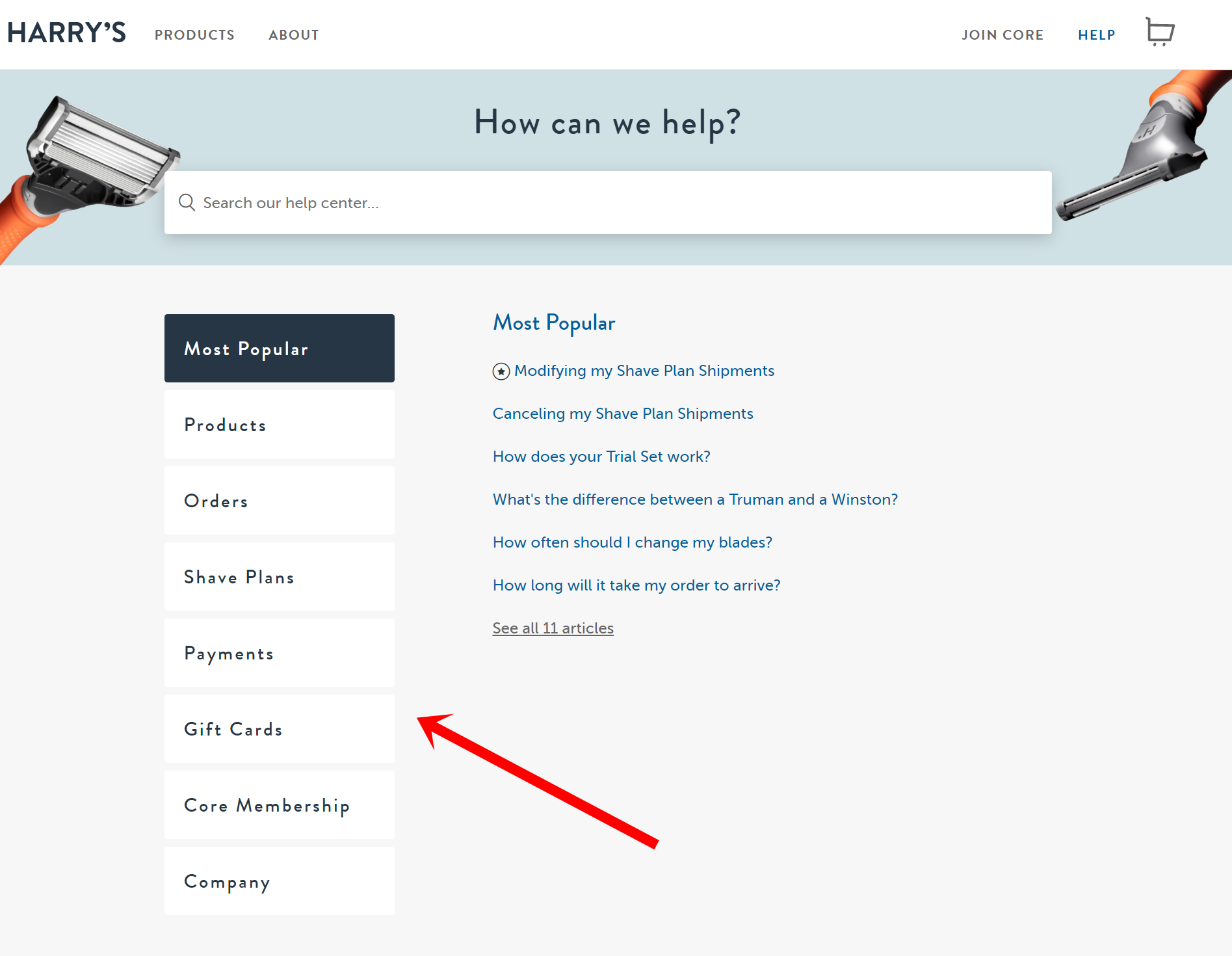
Creating a great user experience extends beyond placing a search bar and the most popular questions right at the top — and Harry’s knows it.[*]
The male grooming ecommerce store uses a sidebar navigation menu to categorize its FAQs, presenting information that’s easy to find.
This is similar to the toggle widget explained earlier. Note two differences, however:
- When the FAQ page is loaded, the first category is expanded, while the other categories remain collapsed. With the toggle widget, all questions are collapsed when the FAQ page is first loaded.
- Only one category of the sidebar navigation menu can be expanded at one time. The toggle widget, on the other hand, enables many questions to be expanded at one go.
Create A User-Friendly (And High-Converting) FAQ Page Today
To recap, here are some quick tips on how to create an FAQ page:
- Pay special care to site navigation. Use a toggle widget to show collapsed FAQs. Include a search bar and highlight your most popular questions.
- Keep it audience-focused. Write from the point of view of your customers to boost SEO. Help these customers connect your answers to their own lives. Make your email address visible.
- And above all else, bring the focus back to your business. Prequalify and address who you don’t work with. Highlight your value proposition to show your ideal customers why you’re the real deal!
It takes a lot of work to create an effective FAQ page, but the benefits are well worth the effort.
Use these 10 FAQ examples as inspiration.
Experiment with these tips.
Your inbox will thank you for it. 🙂
Add A Comment
VIEW THE COMMENTS