Want to add thousands of emails to your list every month, like we do:
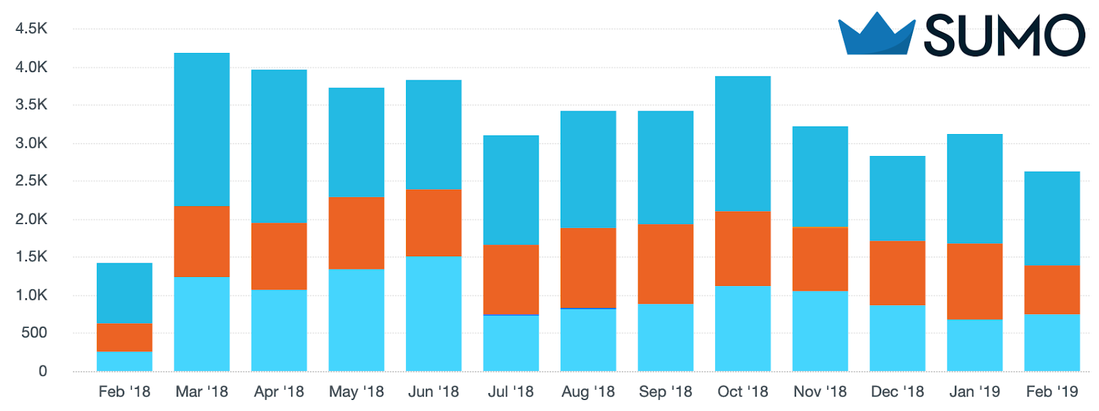
Good news: you don’t have to be a programmer, or a pro marketer, or even a rookie marketer to get results like these.
You just need these 10 little-known growth hacks that have helped us grow our email list to 100,000+ subscribers and consistently get 1,000+ traffic to every piece of content we publish.
%(tableofcontents)
Prefer watching a video instead? Here are our 10 growth hacking strategies in 10 minutes:
Oh, and we’re giving away our website review checklist. It’s the same checklist we’ve used internally to double email conversion rates for our customers.
Click here for your free website optimization checklist!
#1: SPY ON YOUR TARGET AUDIENCE TO GET THEM TO SHARE YOUR CONTENT
The Hack: Boost your social shares by finding out exactly where your audience prefers to share content and removing decision fatigue.
You’re probably scaring your audience away from sharing your content.
That’s because you’re giving them decision fatigue.
In one of the most well-known studies ever done on marketing psychology, researchers found that shoppers who were presented with 26 flavors of jam bought 1/10th of the amount of jam than those presented with 6.
When you give people too many options, they’re far less likely to act upon anything.
This hack helps you apply this knowledge to increase traffic and conversions by eliminating decision fatigue to increase the amount of social shares your content gets.
Instead of presenting your visitors with a million options to share your content:
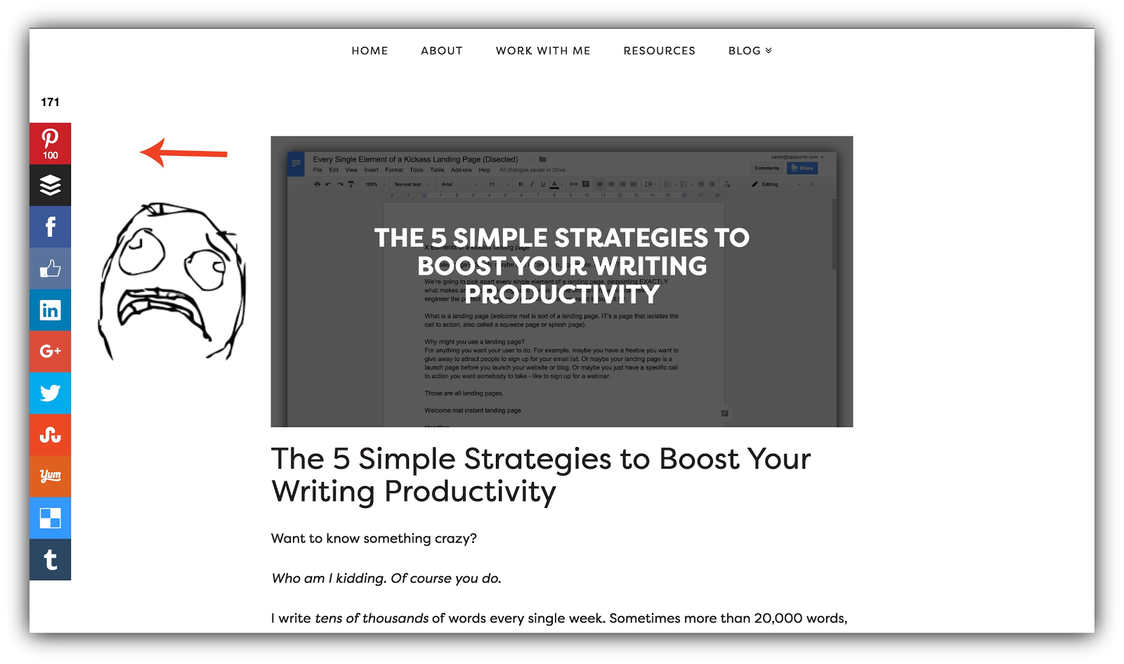
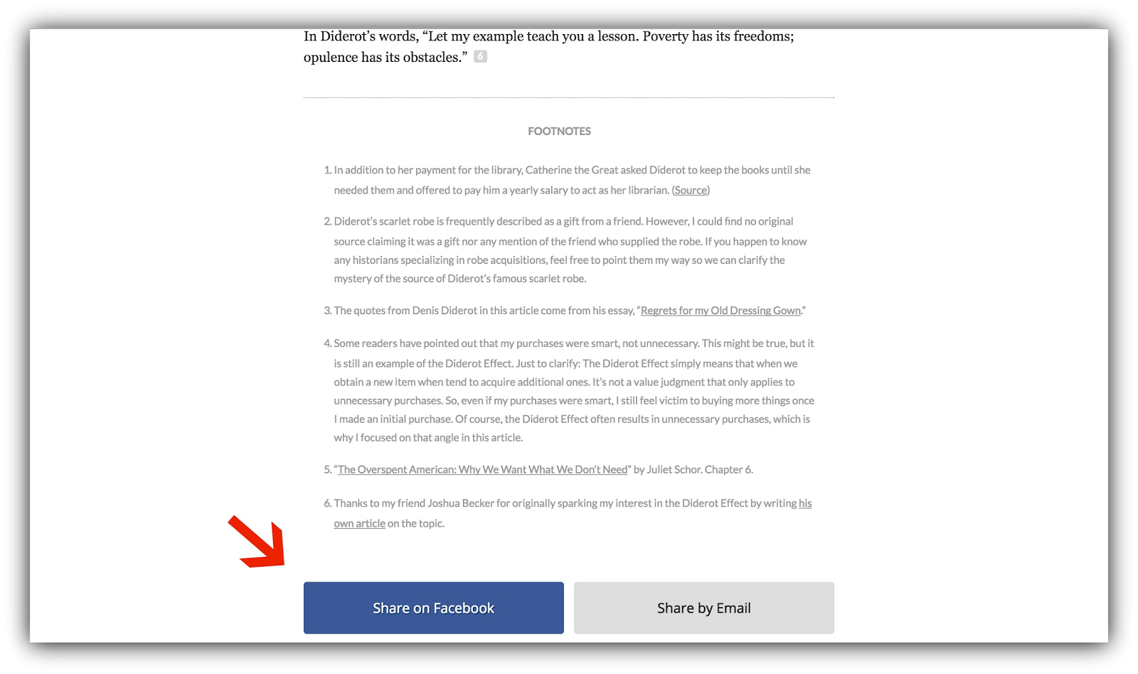
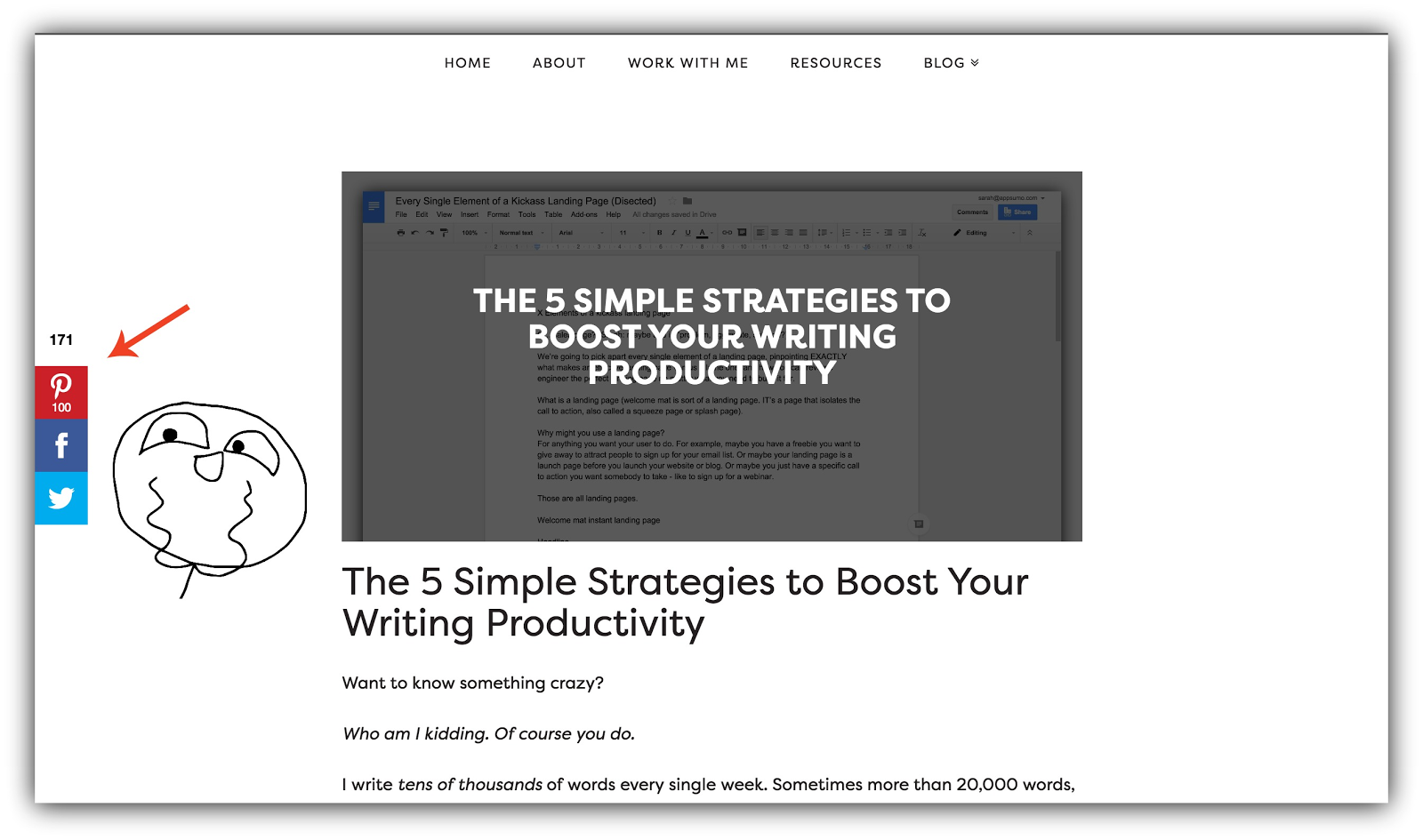
Thereby ensuring they’ll share on none of the platforms, increase your shares substantially by only displaying the social platforms your target audience actually uses, like James Clear does:
And don’t worry. You don’t have to guess which social networks to show. There’s a hack for that!
HOW TO CASH IN ON THIS HACK
The trick here is to only display the social networks that your target audience actually uses on your Share bar. So you need to know what those social networks are, right?
Step 1: Think of a popular blog or website in your niche that reaches your target audience. For example, let’s say you have a parenting blog and identified Scary Mommy.
Step 2: Take it to BuzzSumo or EpicBeat to type in the URL of the popular site to bring up the most popular content and the share counts on each of the top 5 social networks:
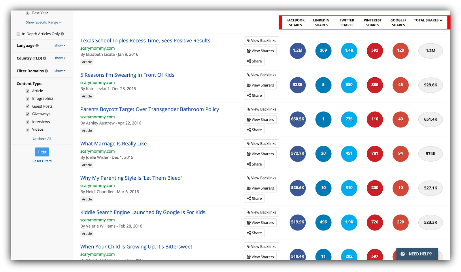
Step 3: Identify the top 2-3 social networks your target audience is sharing content on. In our example, it appears that Scary Mommy’s audience is sharing mainly on Facebook, Twitter, and Pinterest based on the numbers.
Step 4: Take that intel back to your Sumo dashboard, open Share, and go to Settings. Drag only the 2-3 most popular networks you just identified to Selected Services:
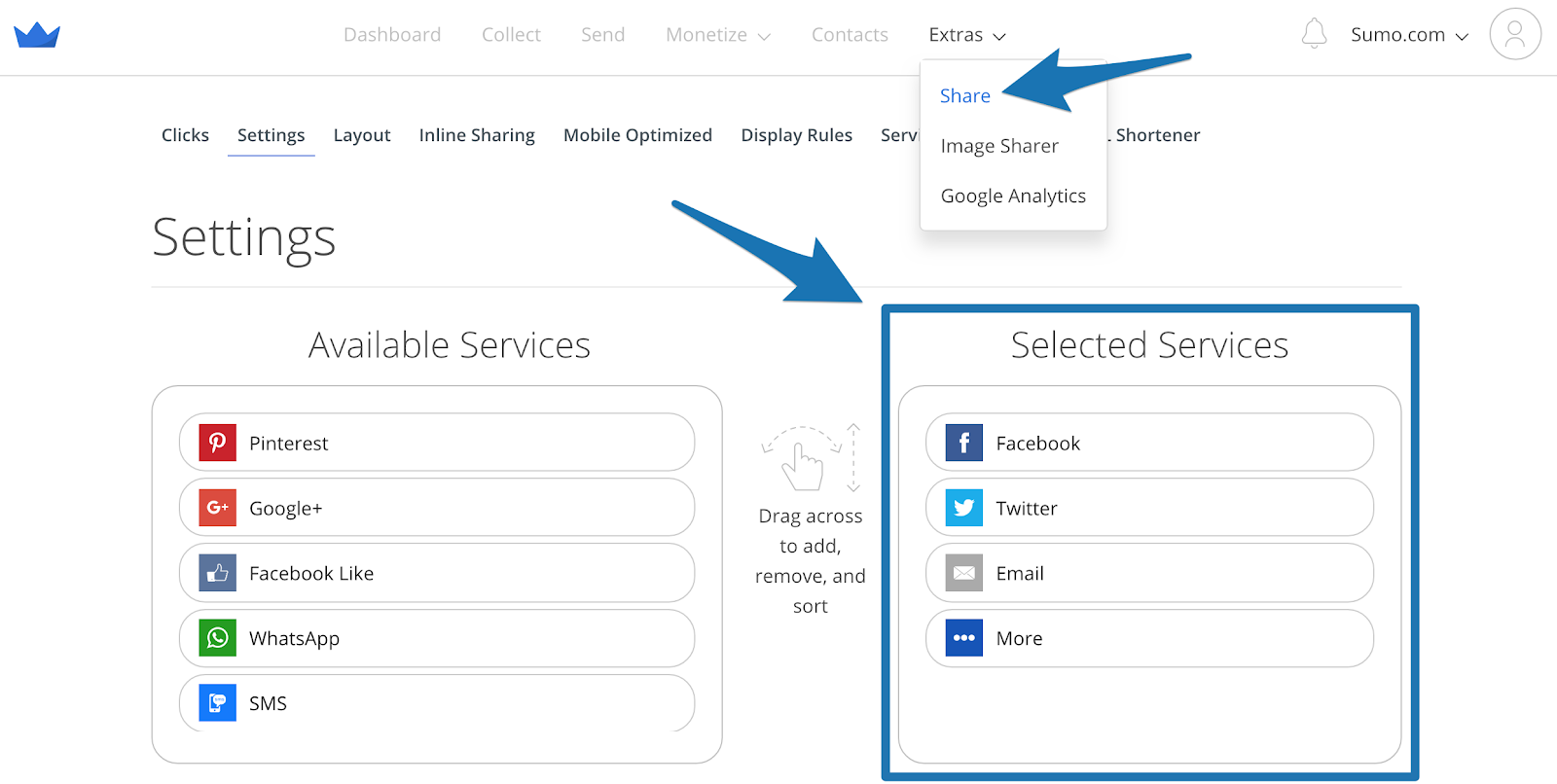
Step 5: Press Save and profit.
#2: CREATE AN INSANELY-POPULAR CONTENT UPGRADE & COLLECT TONS OF EMAILS IN LESS THAN 5 MINUTES
The Hack: Save yourself massive amounts of time and headache by giving away a 5-minute eBook with your content for a 70%+ conversion rate.
Sumo-Sized Guides are the most comprehensive free resources on the internet about a particular marketing topic.
But they’re 10,000 word guides. That’s a gigantic guide.
So instead of creating a brand new content upgrade, why not put the guide in an eBook and allow the reader to download it for keeps – and for free?
Turns out this was damn effective. Get a load of this conversion rate on our Welcome Mat for the eBook:

And how about this Click Trigger:

The average conversion rate on a Welcome Mat is 1.76%, and the average List Builder form converts at 1.28%, so I’d say we’re doing pretty well.
Not only did our readers obviously really want the eBook, but it also saved us a shit-ton of time to create a whole new content upgrade for the post.
Wam, bam.
And you can do it, too 🙂
HOW TO CASH IN ON THIS HACK
It’s as simple as copy, paste, format, and capture.
Step 1: Copy and paste your article into a Word Document, a Google Doc, or use Beacon to create a free eBook from your content.
Go through the copy and remove anything that would be related to reading it on your site.
Do some formatting using your brand’s colors, and create a simple cover page (I do this all in either Beacon or Google Docs. It doesn’t have to be fancy).
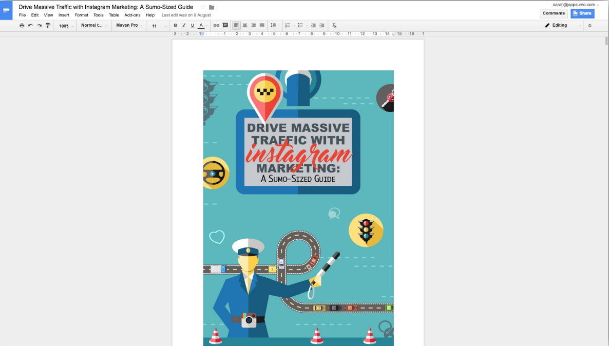
Download your new eBook as a PDF to give away.
Step 2: Create your email capture and call to action.
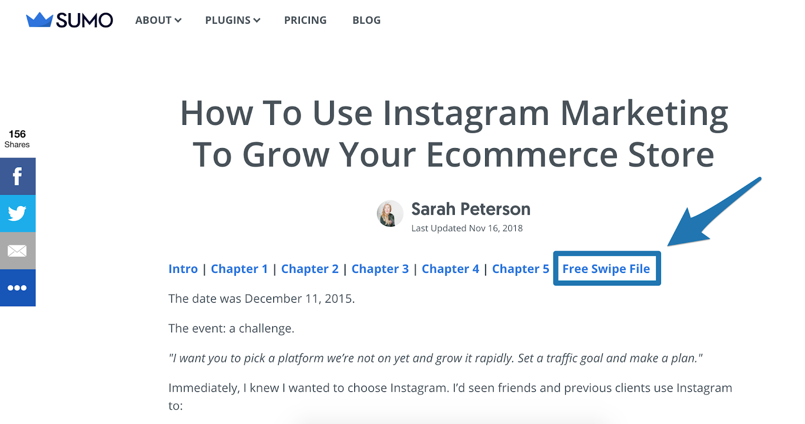
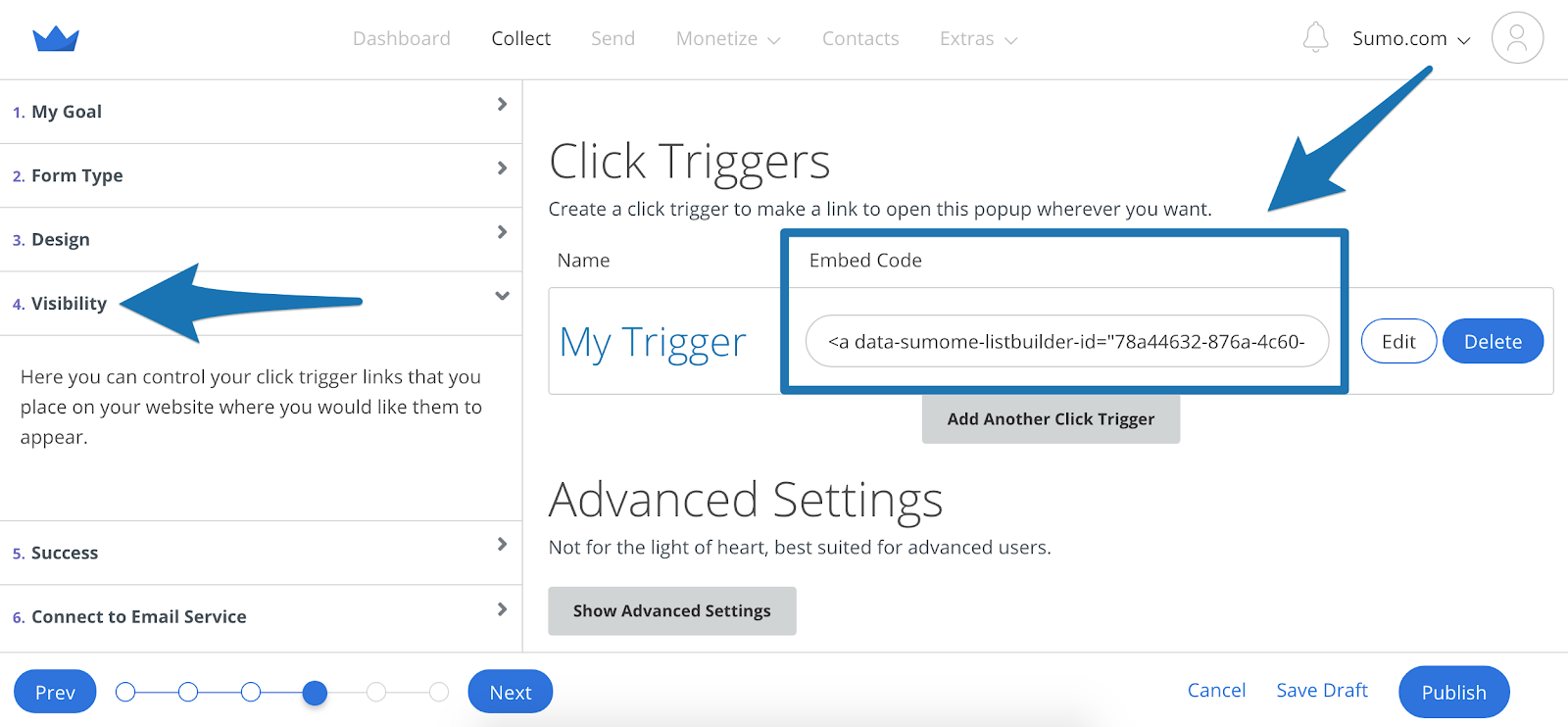
To give the swipe file and eBook away, I created a two step opt-in by creating a form and setting thewith the Form Type to aa Click Trigger Popup .

I then copied the Embed Code from the Visibility tab and linked to it at the end of the chapter links.
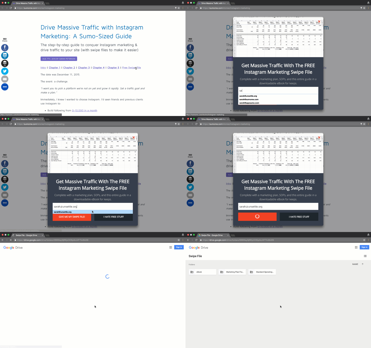
Here’s what the final version looked like:
It has converted 2,778 emails…… for a 72% conversion rate:

You can create Welcome Mats, pop-ups, Scroll Boxes, or whatever you choose, but I’d recommend starting with a Click Trigger.
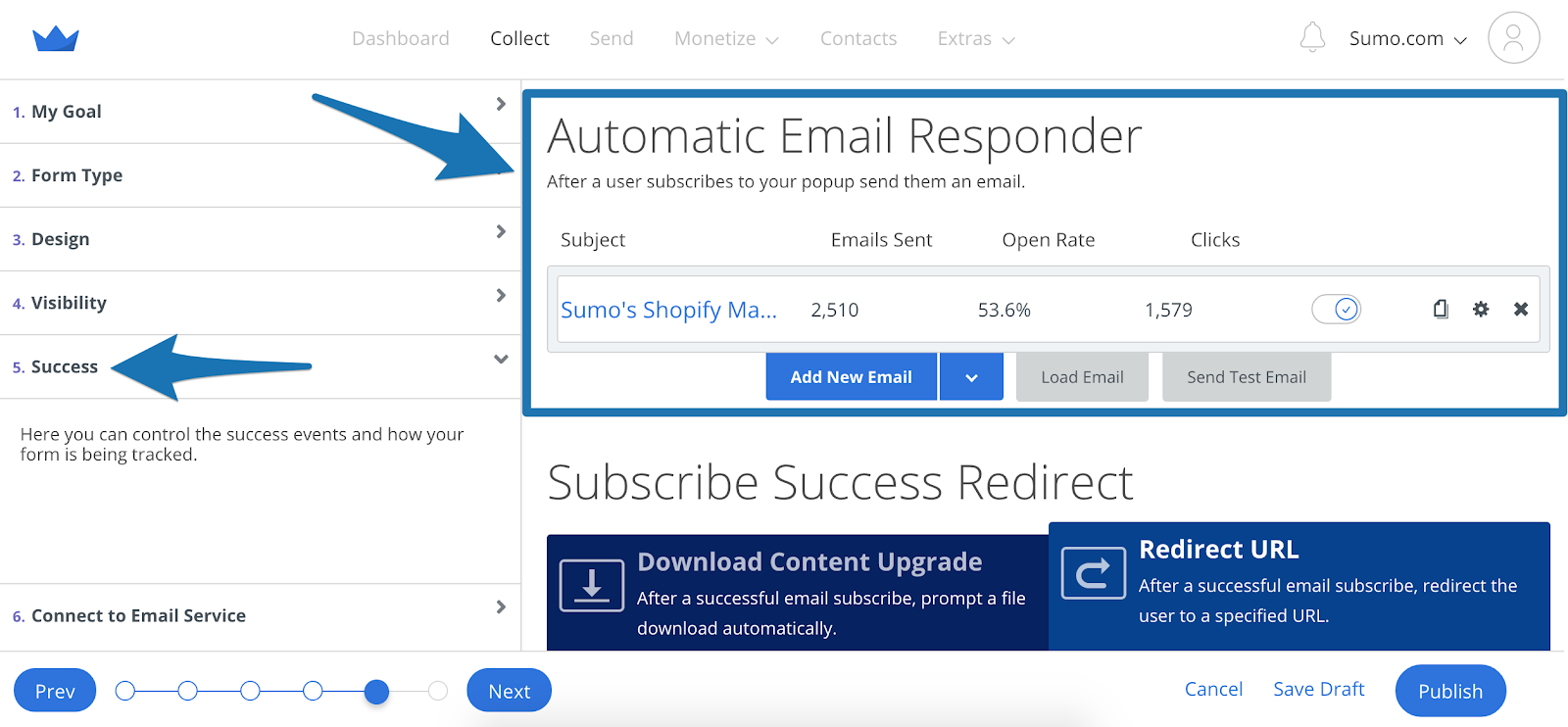
Step 3: Automatically send your 5-minute eBook to your brand new subscriber with hack #3 below (or go to the Success tab for your form and set up an autoresponder by clicking the Add New Email button to deliver the goods).
Step 4: Pour yourself a couple fingers of whiskey because you’ve got yourself a new subscriber-generating machine.
#3: BYPASS CONFUSING EMAIL AUTOMATION WITH YOUR CONTENT UPGRADE
The Hack: Avoid creating a whole new list in Aweber, Mailchimp, or Constant Contact every single time you want to offer a content upgrade.
Maybe email automation isn’t for you yet.
Do you find everything about setting up multiple lists, creating automatic triggers to send your content, and directing those people into a new upsell funnel confusing?
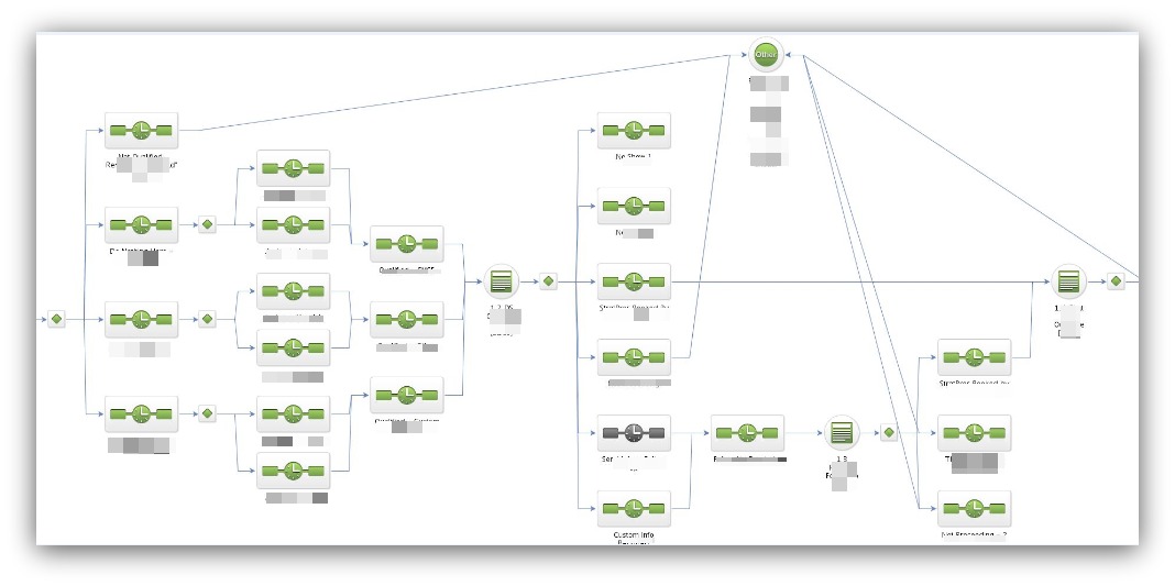
It’s this easy.
But if you don’t do automated email, then how do you deliver a content upgrade to subscribers?
It’s kind of a Catch-22. Damned if you do, and damned if you don’t.
Until now, that is.
This hack bypasses the traditional automation rules, letting you automatically deliver your content upgrade the moment your reader hits “Submit.”
HOW TO CASH IN ON THIS HACK
The beauty of this hack is you can leverage two of the most-used file storing sites on the planet — Dropbox and Google Drive.
Google Drive Version
Step 1: The first thing you’ll do is upload your file to your Google Drive:
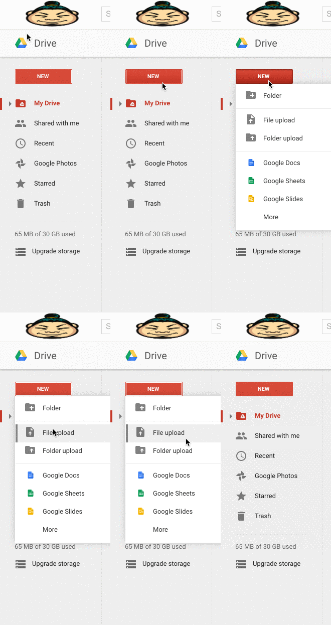
Select your file — a PDF, spreadsheet, slideshow, whatever — and upload it to your drive.
Step 2: Grab a shareable link for your file. This link is extremely important because it’s the only way your visitors can access your file:
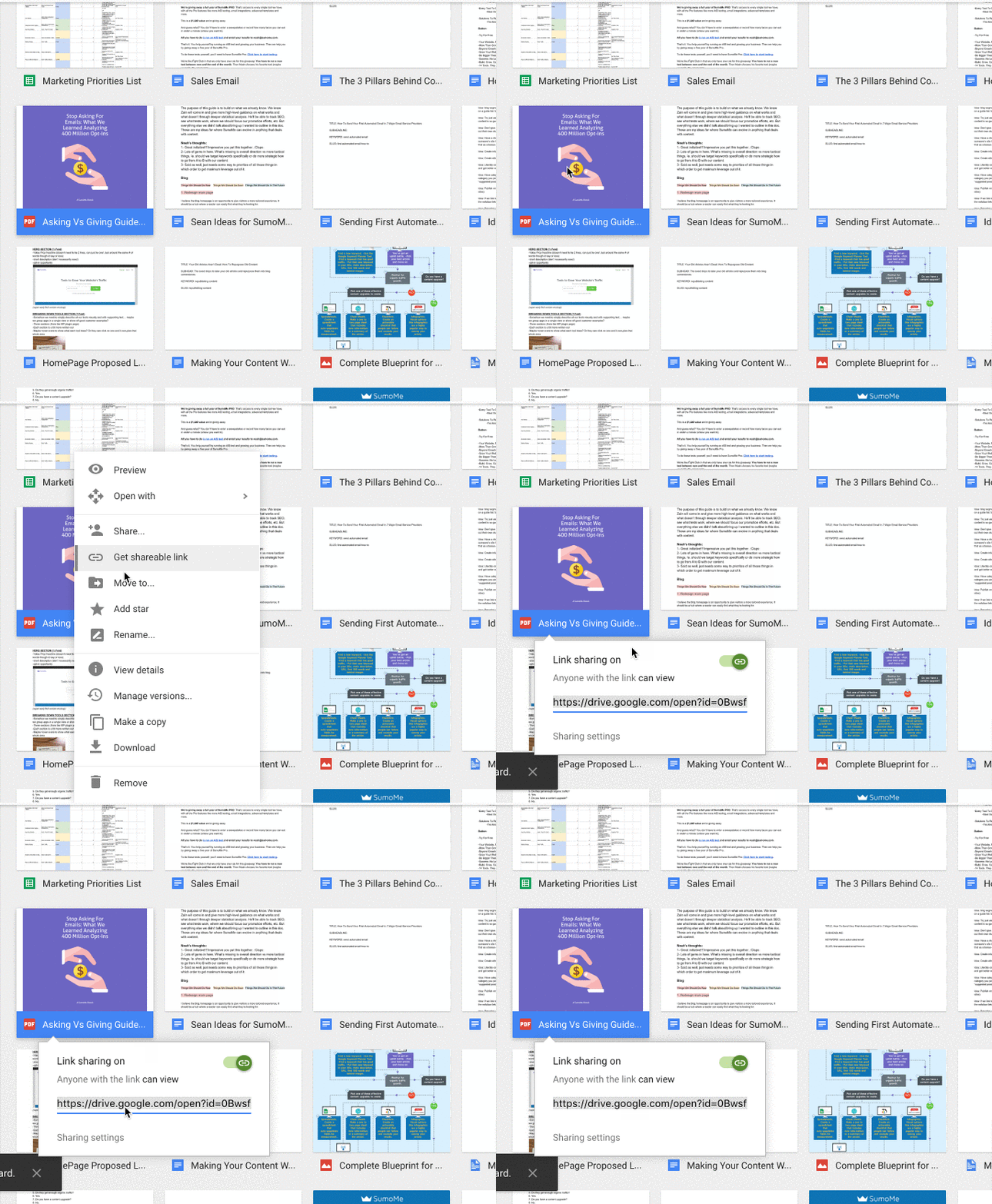
Very important tip: Make sure your sharing settings are set to “Anyone Can View.” Sometimes the default is set where only people from your company can view OR anyone can view but they can also edit. Both are bad situations.
So go into the sharing settings and set it correctly:
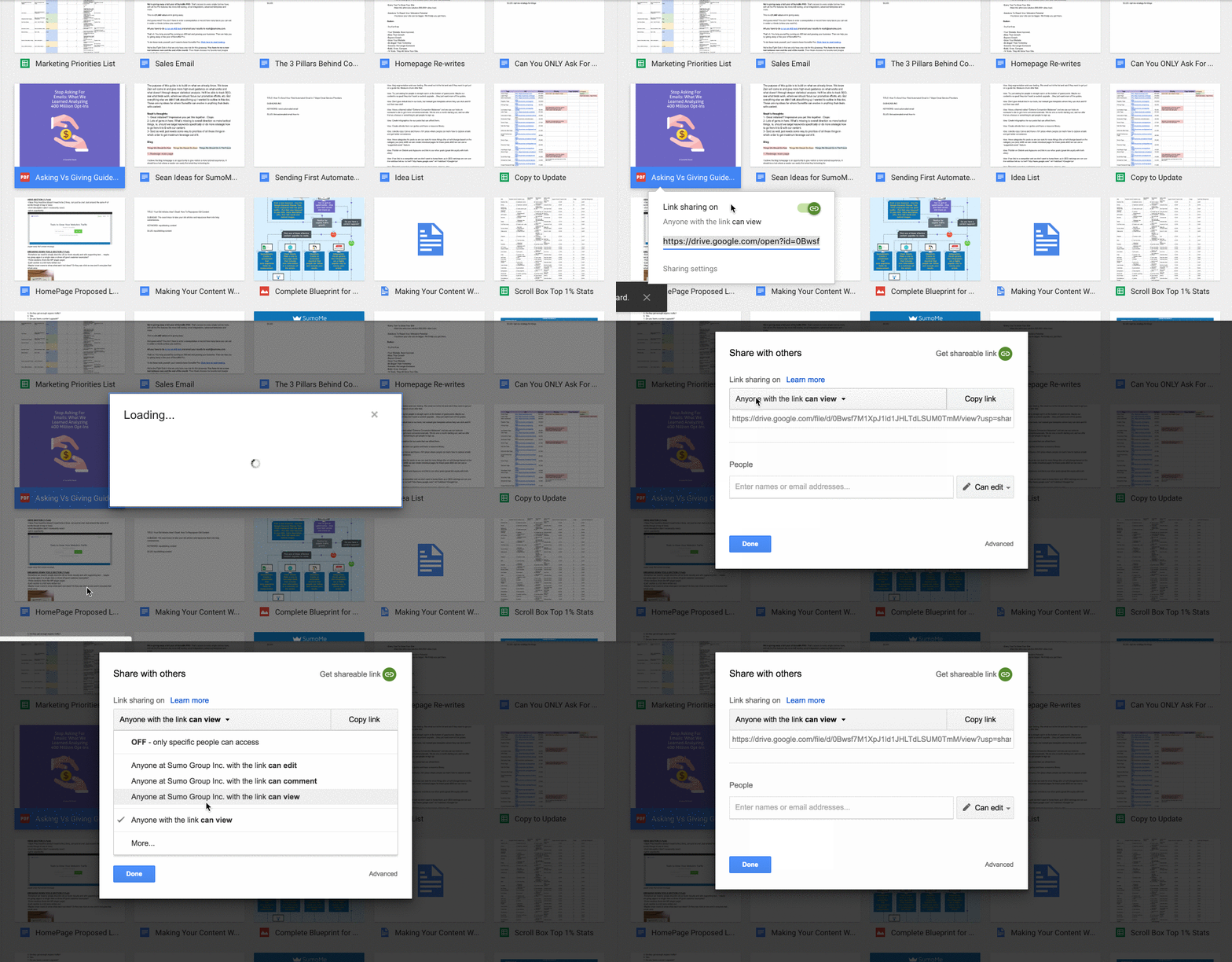
And grab that shareable link.
Step 3: Go into your email collection tool — List Builder, Welcome Mat, Smart Bar or Scroll Box. Click the Success tab, and paste your shareable link into the Redirect the user to this URL area:

Pasting that link into that area means your visitors, once they opt-in, will be directed to that file you uploaded to Google Drive. That way you can bypass the email automation while still directing subscribers to your content upgrade.
Dropbox Version
Dropbox is the same as Google Drive. You can take the exact same steps above and send your subscribers to the file location.
However, Dropbox has another cool hack-within-a-hack where your subscribers will automatically download the content.
Step 1: Go into Dropbox and get the shareable link like normal, making sure the settings allow everyone with the link to view:
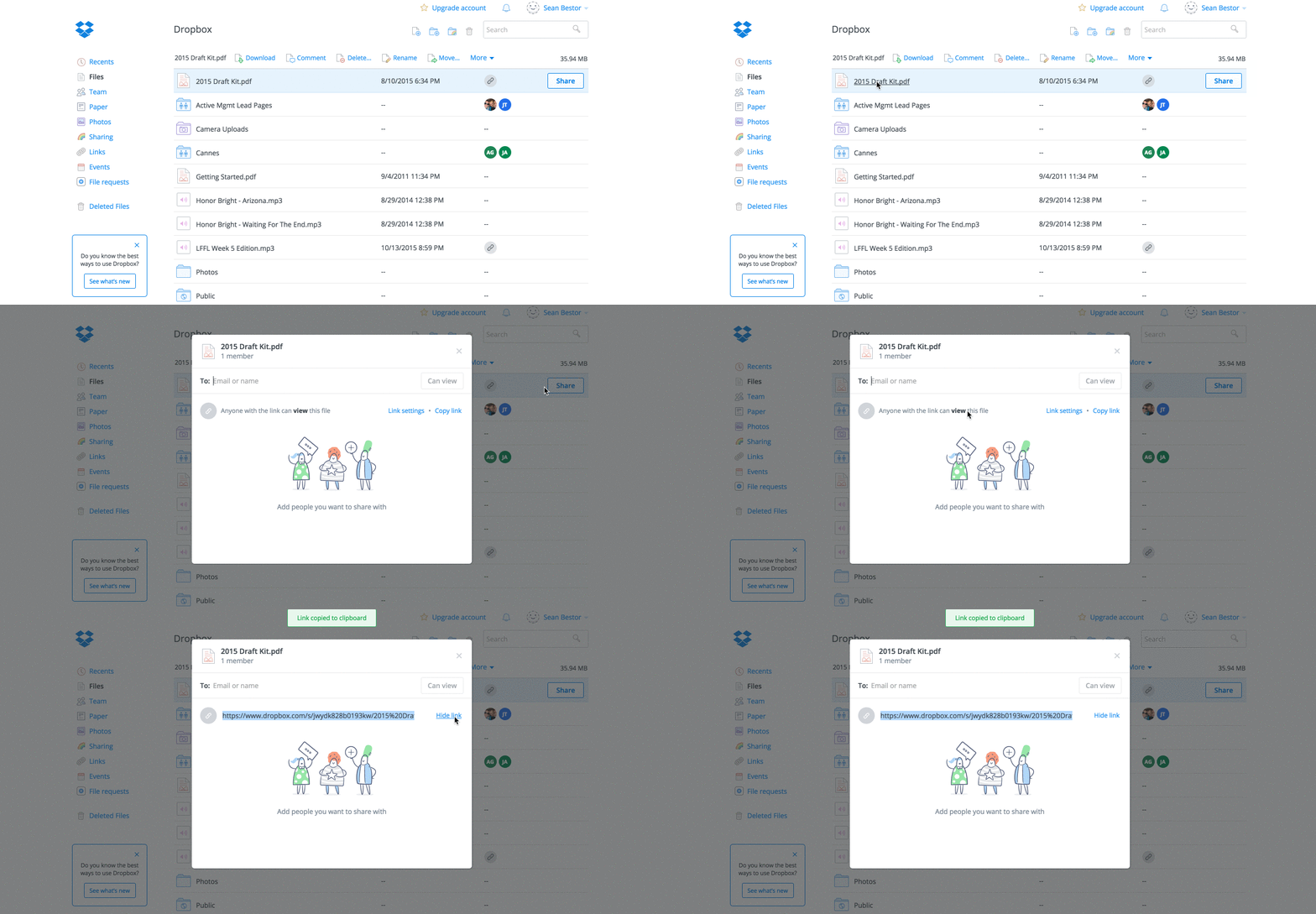
Step 2: Here’s where it gets interesting. Take that shareable URL and add this small bit of code to the end: dl=1.
So if your link was this:
https://www.dropbox.com/s/jwydk828b0193kw/sumo2015%.pdf?dl=0
You would change it to this:
https://www.dropbox.com/s/jwydk828b0193kw/sumo2015%.pdf?dl=1
Step 3: Take that link and pop it into your email collection tool. Go into the form pop-up you’re using, click the Success tab and paste your shareable link into the Redirect the user to this URL area:
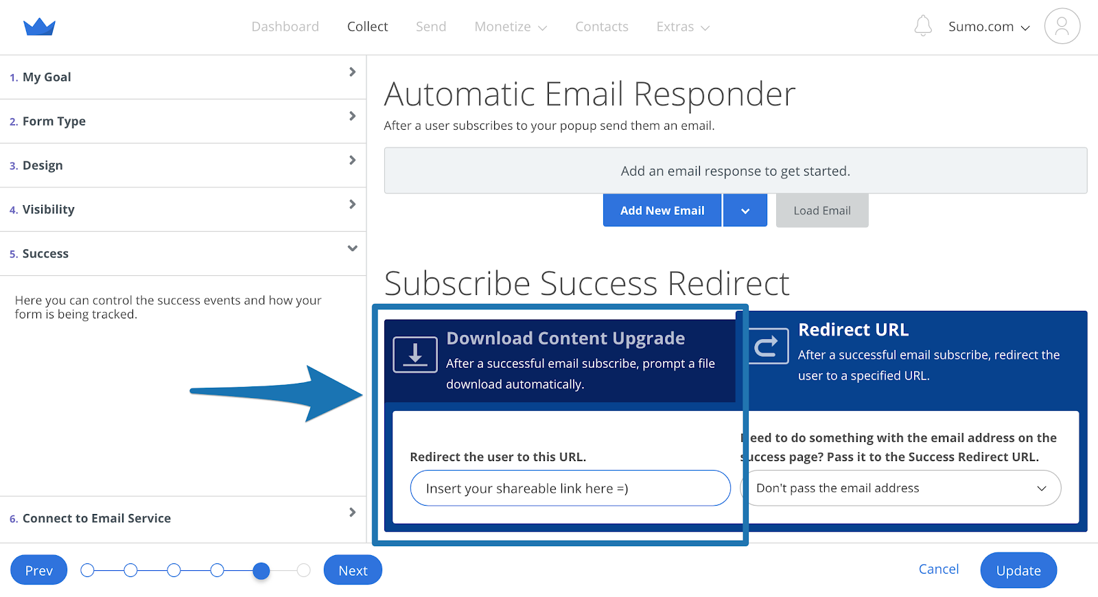
Now, when people subscribe, they won’t go to the Dropbox site. The file will automatically download in their browser.
It saves an extra step and keeps your subscribers from searching for the download button on Dropbox.
Cross “learning email automation” off your list (for now). This hack lets you spend time on the other parts of your business you want to focus on.
#4: DISCOVER IF MOBILE IS THE BACKBONE OF YOUR SITE
The Hack: Running a dedicated form for desktop AND mobile to see what platform converts better.
Since 2008, mobile usage per day has exploded. We’re now spending more time on our phones than our computers.[*]
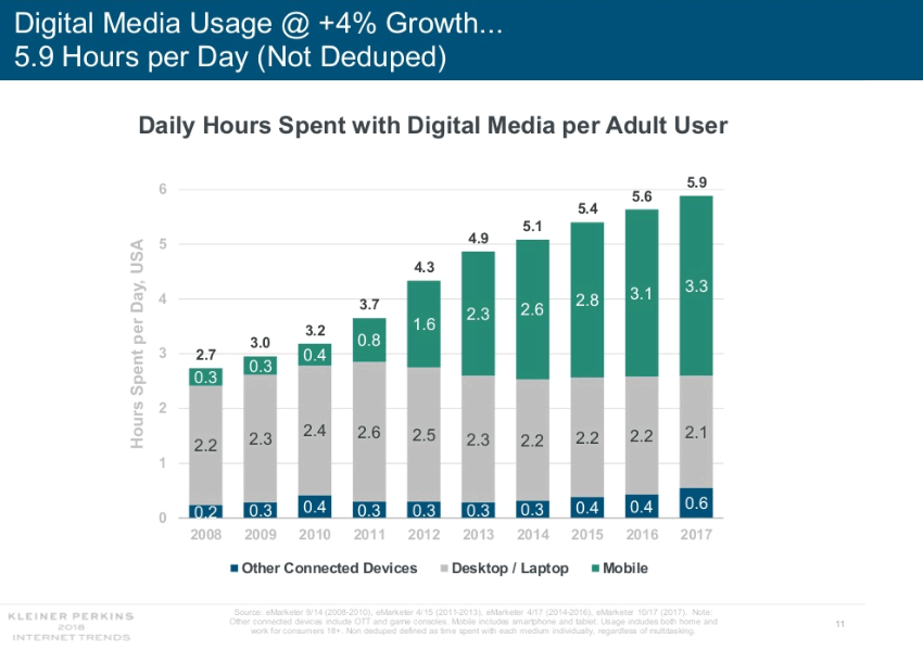
But what happens if mobile isn’t converting well for you?
It might seem crazy, seeing as every marketing article drools over mobile usage rates. But even though mobile is trouncing desktop in usage, guess who has the last laugh:[*]
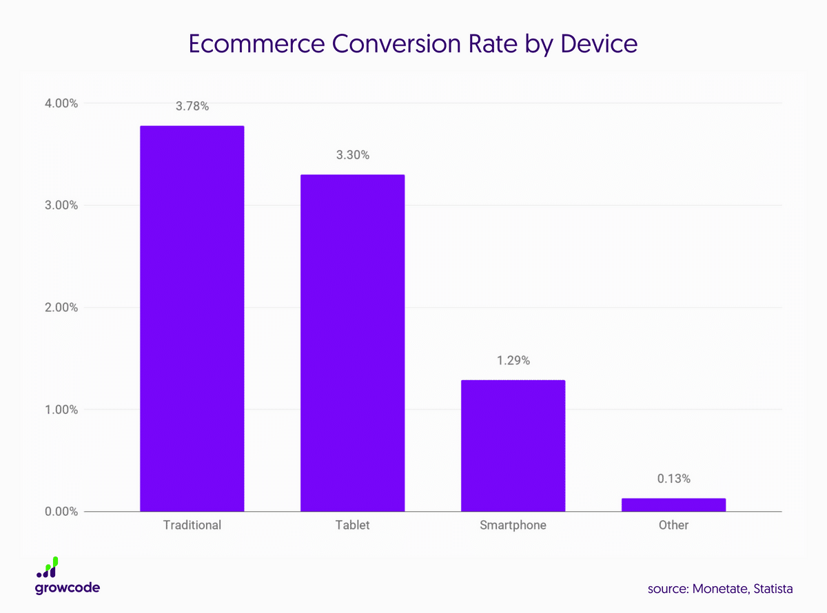
Traditional devices (laptops, desktops) triple their conversion rates over smartphones.
So the revolution isn’t fully upon us yet. But here’s the interesting bit to note: The stats are for sales on ecommerce sites.
When it comes to conversion rates for email opt-ins, the numbers vary from site to site. I’ve seen sites with huge mobile conversions and low desktop conversions (and vice versa).
Which brings me to my big question:
Do you know if mobile is converting better for your site?
I bet you don’t. That’s why this hack is vital for any smart marketer who really wants to know the impact mobile has on their site.
HOW TO CASH IN ON THIS HACK
This is simply an A/B test — we’re testing one device versus another.
Step 1: What you need to do is set up two different campaigns. Let’s use a List Builder form as an example.
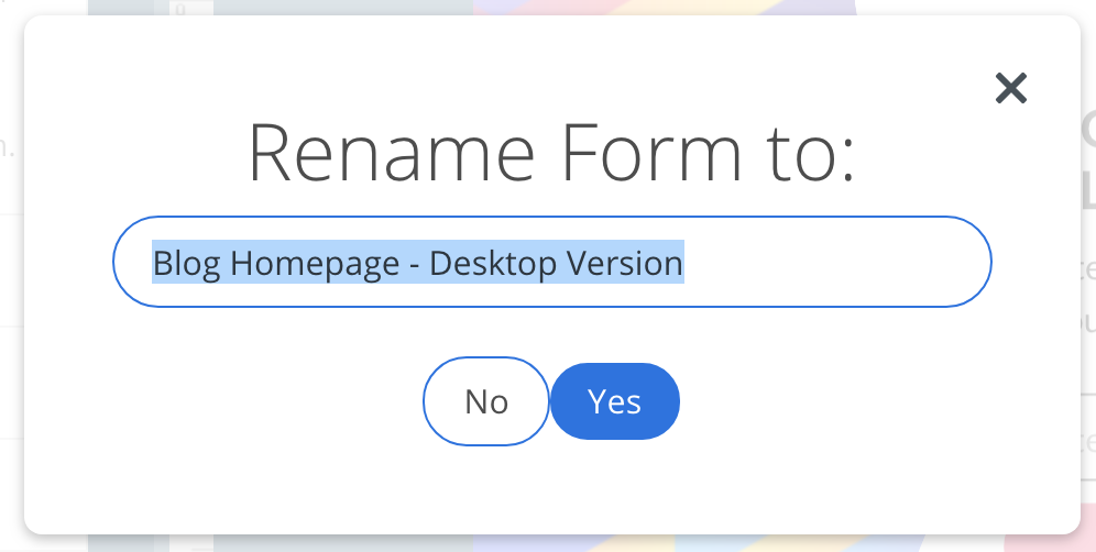
Your first form will be your desktop version of the form. Title it accordingly so you aren’t confused later on:
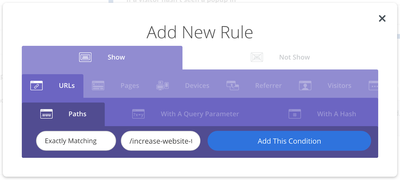
Step 2: Go right into Visibility, select Manual Mode, scroll to Display Rules and click on Add New Rule.
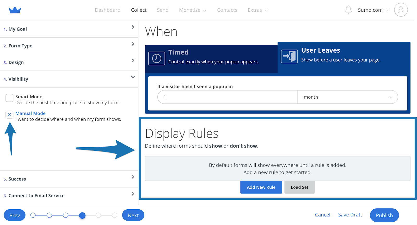
Set the form to show on the page you want to display it on:
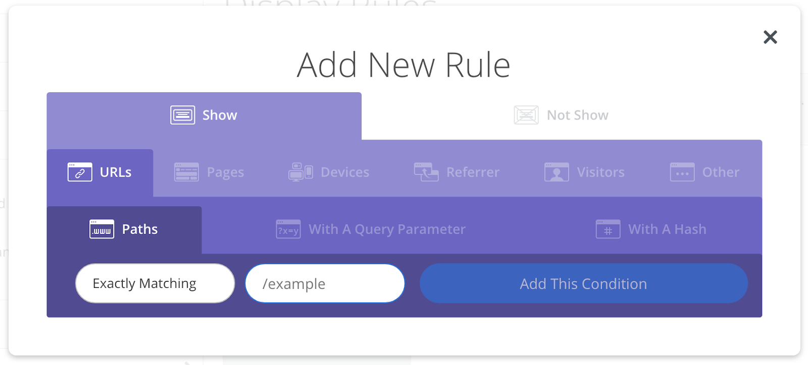
Then add another display rule to only show it on desktop by going to Devices, select Desktop and click Add This Condition:

This setup accomplishes two things. First, your form will only show on the page you designate.
Second, your form will only show to people on desktops/laptops. This option is the most important rule for our hack. Without it, your form will show to anyone on any device.
Step 3: Once you create your form, click Save Draft (always click Save Draft), and create a new form.
This new form is for your mobile visitors. Name it what you named the previous form, except substitute “Desktop Version” for “Mobile Version.”
Step 4: Go to the Display Rules again. Set it for the page you want the form to appear on, only this time change the second display rule to show only on Mobile:
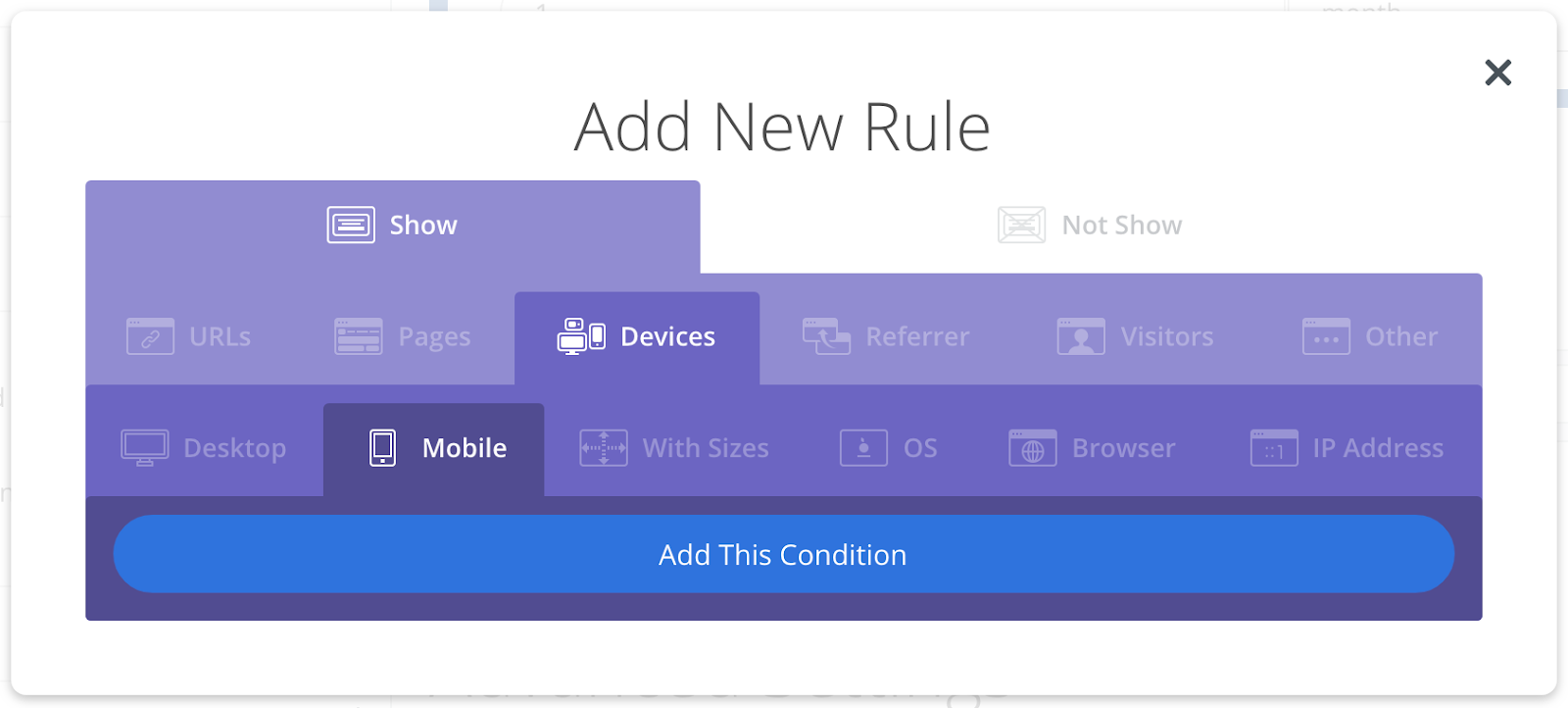
Now this form will show to mobile visitors.
Measuring the effectiveness of each device is easy when set up like this.
You simply go to Collect > Tests > Create New Test to create an a/b test between the two forms you created. Once you hit a Statistical Significance of >95% you can click the Use This button to declare a winner.
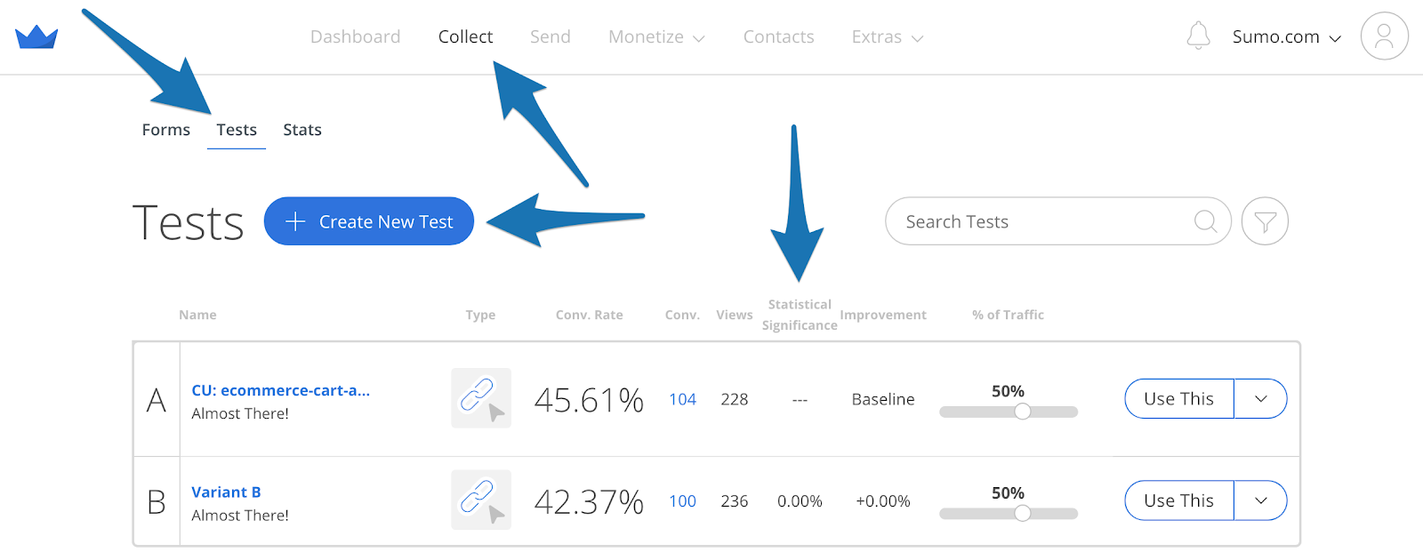
Within a few weeks you should know whether you need to pay more attention to optimizing for mobile.
#5: AVOID SCARING VISITORS AWAY BY REMOVING ANTI-SOCIAL PROOF
The Hack: Remove low social share counts to stop chasing your visitors away. They make you look like the kid sitting alone at the cafeteria.
Ever walk into a restaurant and immediately want to leave because there’s no other diners?
That’s “anti-social proof,” and it’s why restaurants fill the tables at the front of the store near the windows first. #Marketing.
Anti-social proof happens when you’re displaying weak social proof – low numbers, empty comments forms, little engagement – which demonstrates that your site isn’t popular…
Discourages people from sharing, liking, or signing up.
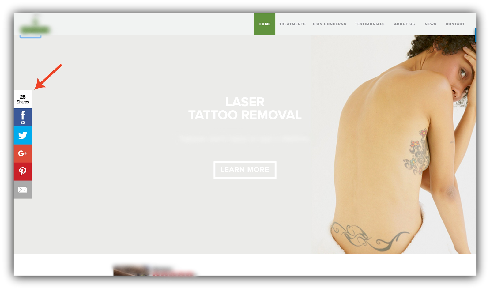
Nobody wants to sign up for an email list or hire a contractor from a website others are avoiding. So you can instantly increase your conversions by removing this anti-social proof.
HOW TO CASH IN ON THIS HACK
The most common type of anti-social proof is low social sharing numbers. To get rid of this, there are two things you should do:
-
Remove Share from your homepage unless you have 500+ social shares. For social proof to work properly, it needs to boast impressive numbers (ie 500+ social shares or more). If your homepage doesn’t have at least 500+ shares, disable your sharing buttons on your homepage all together.
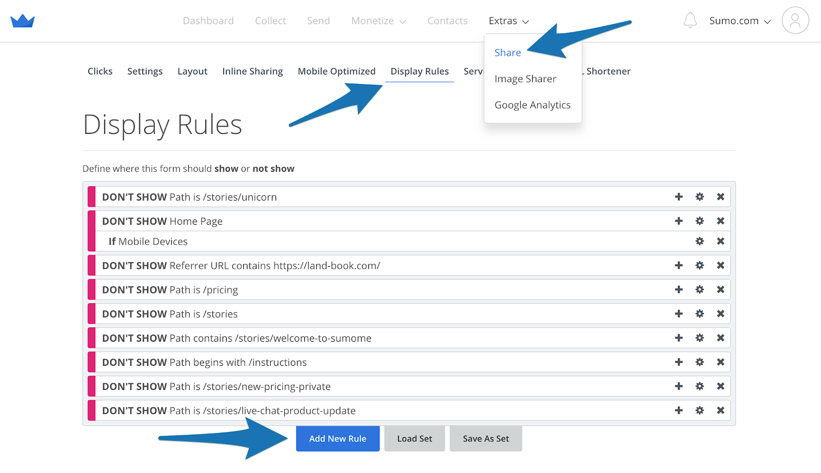
Open your Sumo dashboard, go into the Share app, click on the Display Rules tab, then click Add New Rule.
Add a Not Show rule for your Homepage:
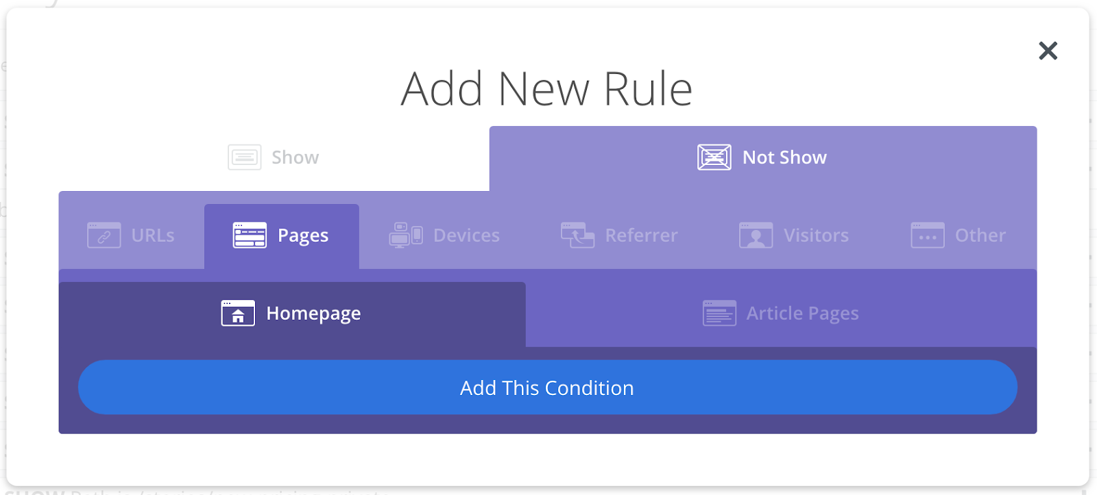
It’s as simple as that. Once you’ve added that one display rule you’re done!
-
Set a share count minimum for your products and content. We take conversions seriously, so Sumo has social proof gatekeeping built right in. You can set a minimum amount of shares on your product and content pages before the share count is shown.
Content and products are more forgiving than the homepage, so you can safely set your share count minimum to 50 or 100.
Then, the Share buttons would display how many shares the content has garnered if it’s above at least that many shares.
Log into your Sumo dashboard and open Share. Go to the Settings tab, and scroll down to Share Counts. Set the Show Share Counts Minimum to 50 or 100 (we set ours to 50), and press Save:
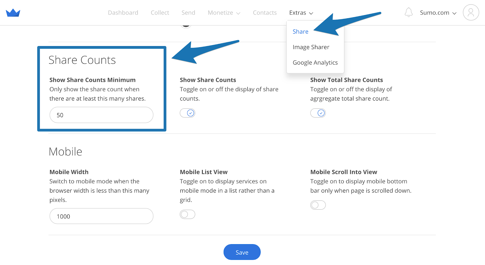
Woot! Now you’ve banished anti-social proof from your website.
#6: BANISH CART ABANDONMENT & BOOST SALES BY 220% WITH THIS TIMELESS STRATEGY
The Hack: Use scarcity to push “on the fence” customers right over the fence – into your waiting arms (or at least, into cart fulfillment).
You’re up at 2:30 AM hanging out in front of the tube in your Snuggie and find yourself captivated by an infomercial.
“That egg slicer sure would make your life easier…”
Just when you think you can hold off from rifling through your wallet for your credit card at least until the morning, they slap you with a deadline.
It’s only the low, low price of $24.99 for another 9 minutes and 46 seconds.
The infomercial company put the fear of scarcity in you.
Scarcity works. In one test, an ecommerce company tested a free shipping offer with a countdown timer to demonstrate scarcity, against the same product without scarcity:
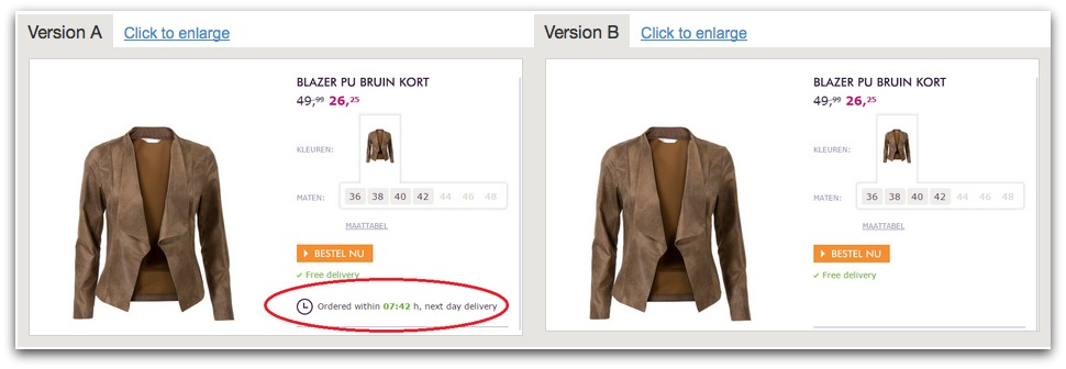
Unsurprisingly, the offer that triggered scarcity boosted sales by 226%.
Scarcity works for all of your offers – including your email opt-in offers, content upgrades, and discounts.
It’s also dead simple to trigger, and I’m about to show you how to use it not only to increase your sales and decrease cart abandonment, but also collect mad emails in the process.
HOW TO CASH IN ON THIS HACK
Let’s say your visitor is on your site looking at products in your ecommerce store. And you don’t want them to just put a few items in their cart and then leave.
Cue scarcity.
Offer shipping, a discount, or a freebie as a limited time offer just before they abandon their cart.
Step 1: Identify a limited time offer you could provide to your audience that would push customers who are “on the fence” to act. Don’t go overboard – free shipping or 10% off is often enough to push the needle, especially when paired with scarcity.
Step 2: Open List Builder in your Sumo dashboard, and create a new Form.
Step 3: Go to the Design tab of your form and add a Countdown timer to trigger scarcity:
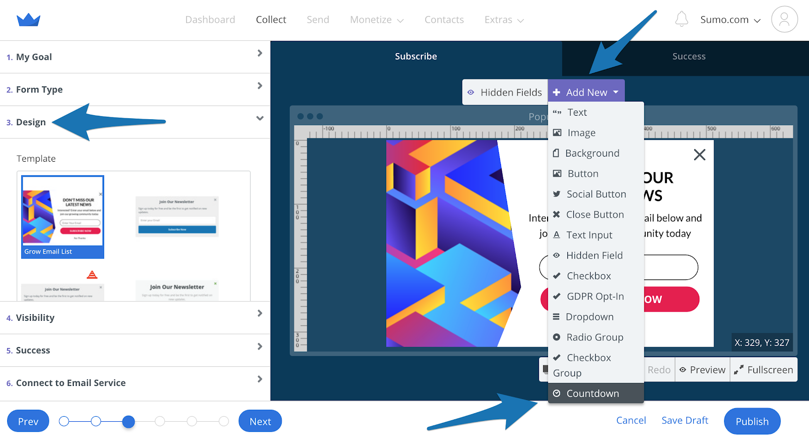
Set the countdown time to be 15 minutes or less. Any longer and the customer is more likely to think they will come back in a few minutes and then forget, leaving forever.
Step 4: Put the discount code for free shipping in your success popup:
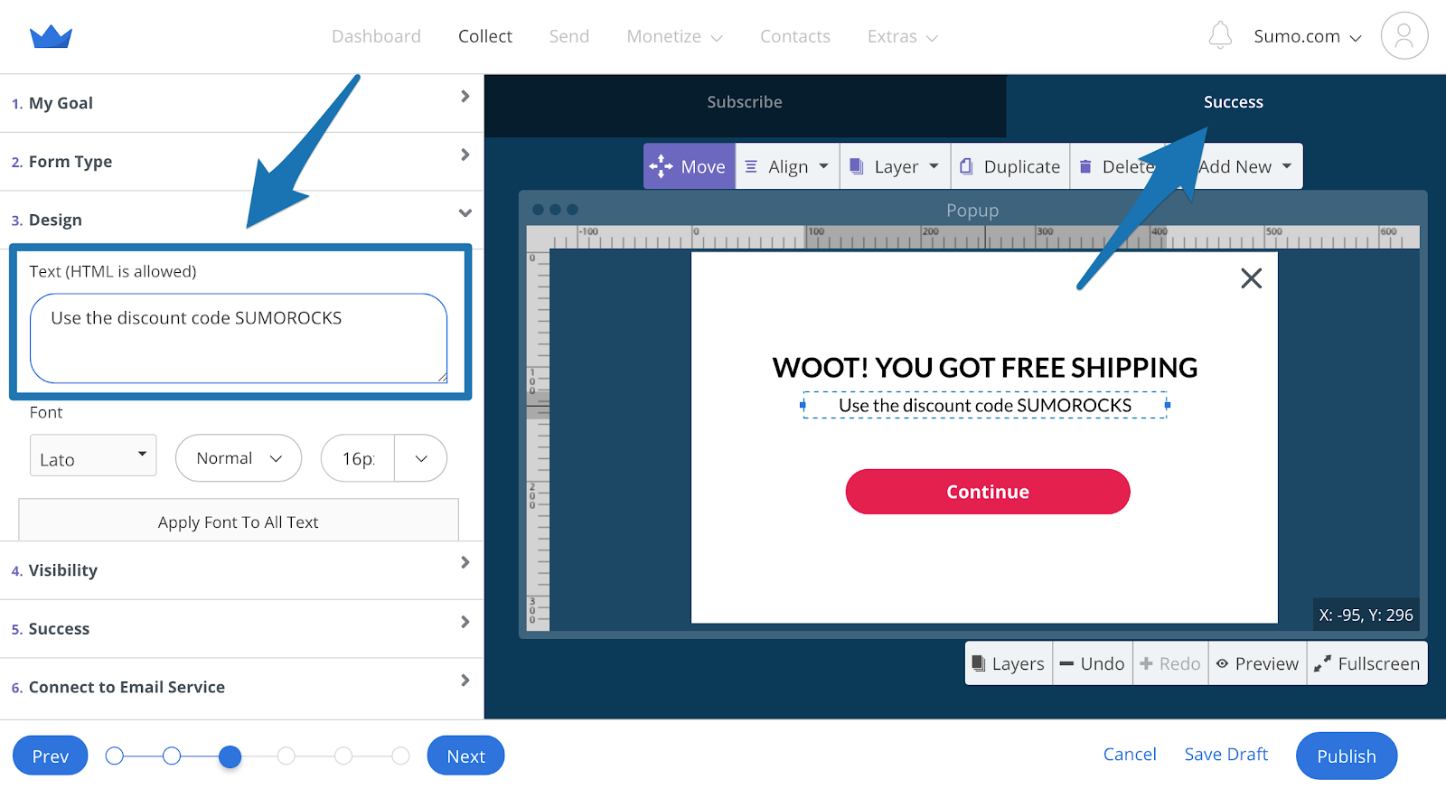
So when they enter their email address, they are redirected to the success popup for their discount code.
Step 5: In the Visibility tab set the Display Rules to only show the form in the shopping cart. When this is set up, the form will show immediately on your shopping cart page:
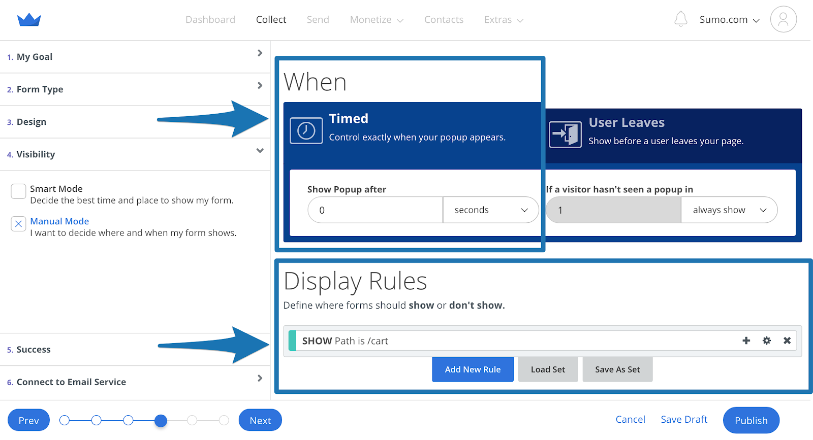
Press Publish, and you’ve got yourself a sales getting, emailing scoring, scarcity driven machine.
#7: INCREASE YOUR SOCIAL SHARES BY ISOLATING YOUR CALL TO ACTION
The Hack: Increase your traffic by asking your visitors to share your content – in a way that makes it far more difficult for them to say no.
The easiest way to drive more traffic to your website is to increase the amount of social shares your content gets.
The best way to increase your social shares – and therefore your traffic – is by isolating your call to action.
What’s going to be more effective for getting you to share content? This:
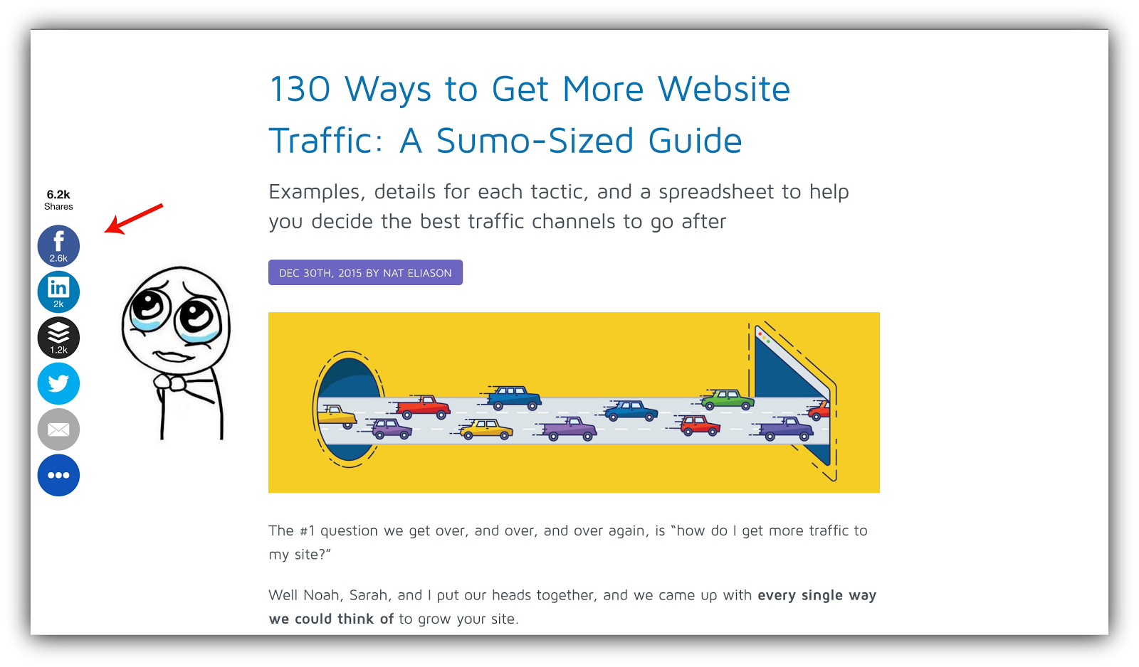
Or this?:
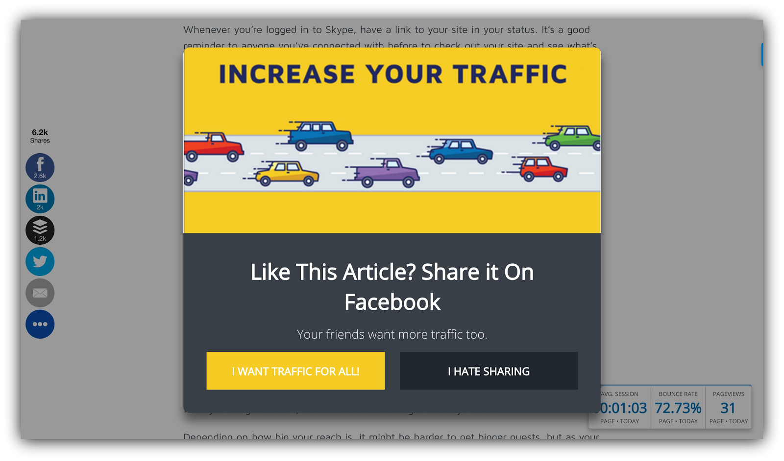
Trick question. You’d definitely be more likely to act on the second one, because it isolates the call to action.
Your shares are almost guaranteed to increase if you take this approach, raking in the traffic.
HOW TO CASH IN ON THIS HACK
The idea here is to choose the one social network your audience is most active on, and trigger a List Builder form, Scroll Box or even a Welcome Mat with the call to action to share your content.
Here’s how.
Step 1: Use the instructions I gave you in Hack #1 to identify the top social network your audience spends time on.
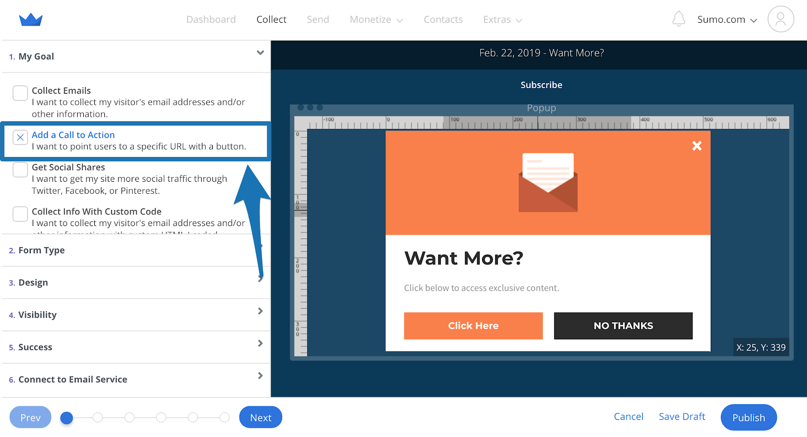
Step 2: Create a popup or Welcome Mat for your call to action. Under My Goal, select Add a Call to Action:
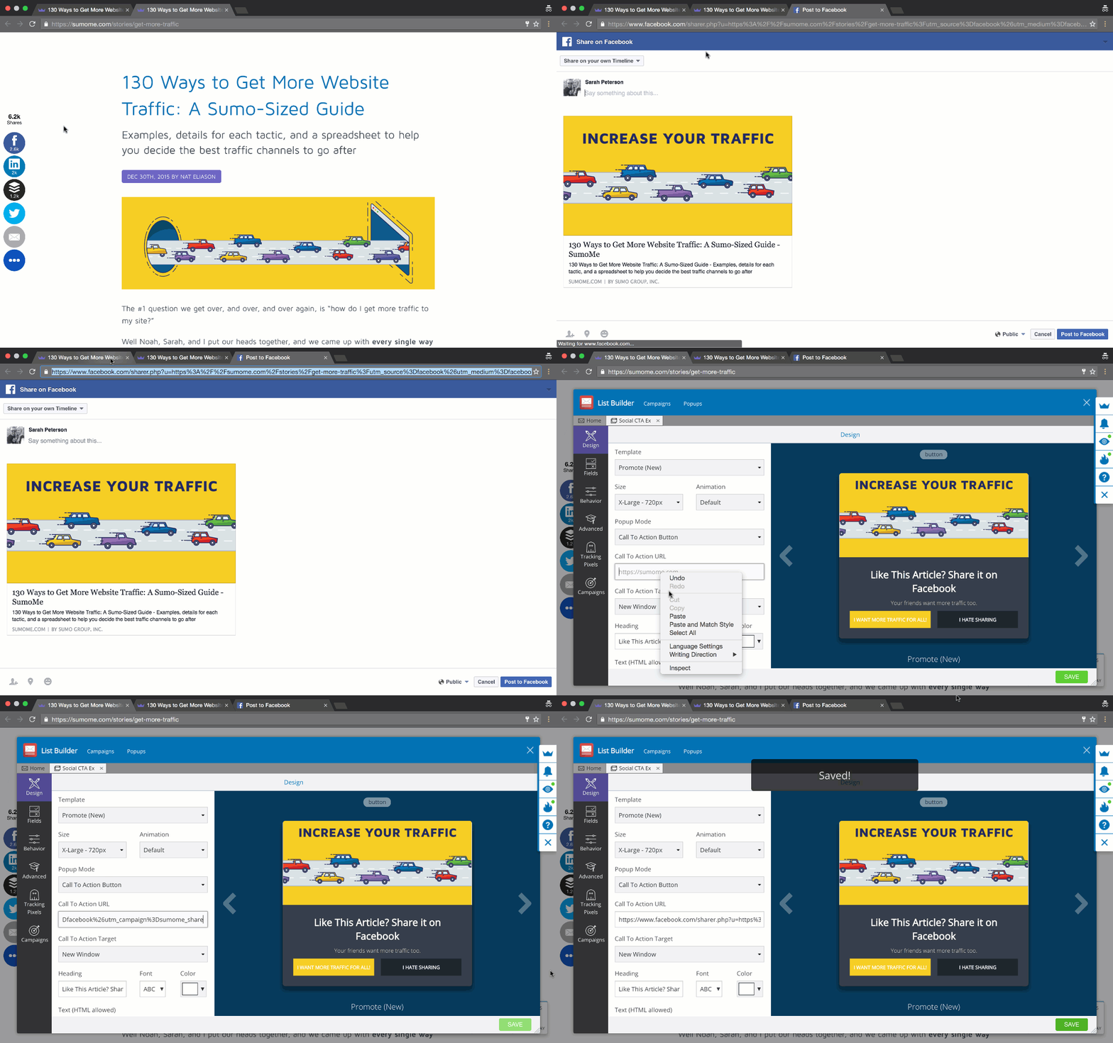
Step 3: Go to the content you’re setting this up for, and click the share button for the social platform you want people to share on. Copy and paste the link of the window that appears, go to the Design tab of your form and paste it into the Click Action URL field that appears when you click on the call to action button on your form:
Step 4: Set the Display Rules under the Visibility tab to only show the form on the content you’re working with:
Step 5: Press Publish and watch the shares roll in.
#8: GIVE YOUR AUDIENCE MORE OPPORTUNITIES TO SUBSCRIBE WITH A TWO STEP OPT-IN
The Hack: Take advantage of the “foot in the door” technique to not only ask your visitors to subscribe to your email list, but get them to request it.
Menus get a lot of the action on a homepage. They’re always there, they’re above the fold, and they are the primary way that users can navigate a website.

Everything should help you achieve your website’s main goal, including your site’s menu. And if your goal is to build your email list, you’re in luck. This hack has helped me achieve a 19.29% conversion rate in the short period of time I had it up:

So what’s the hack?
Include a two step opt-in in your menu, so that when your visitor clicks on the link, they see a popup form:
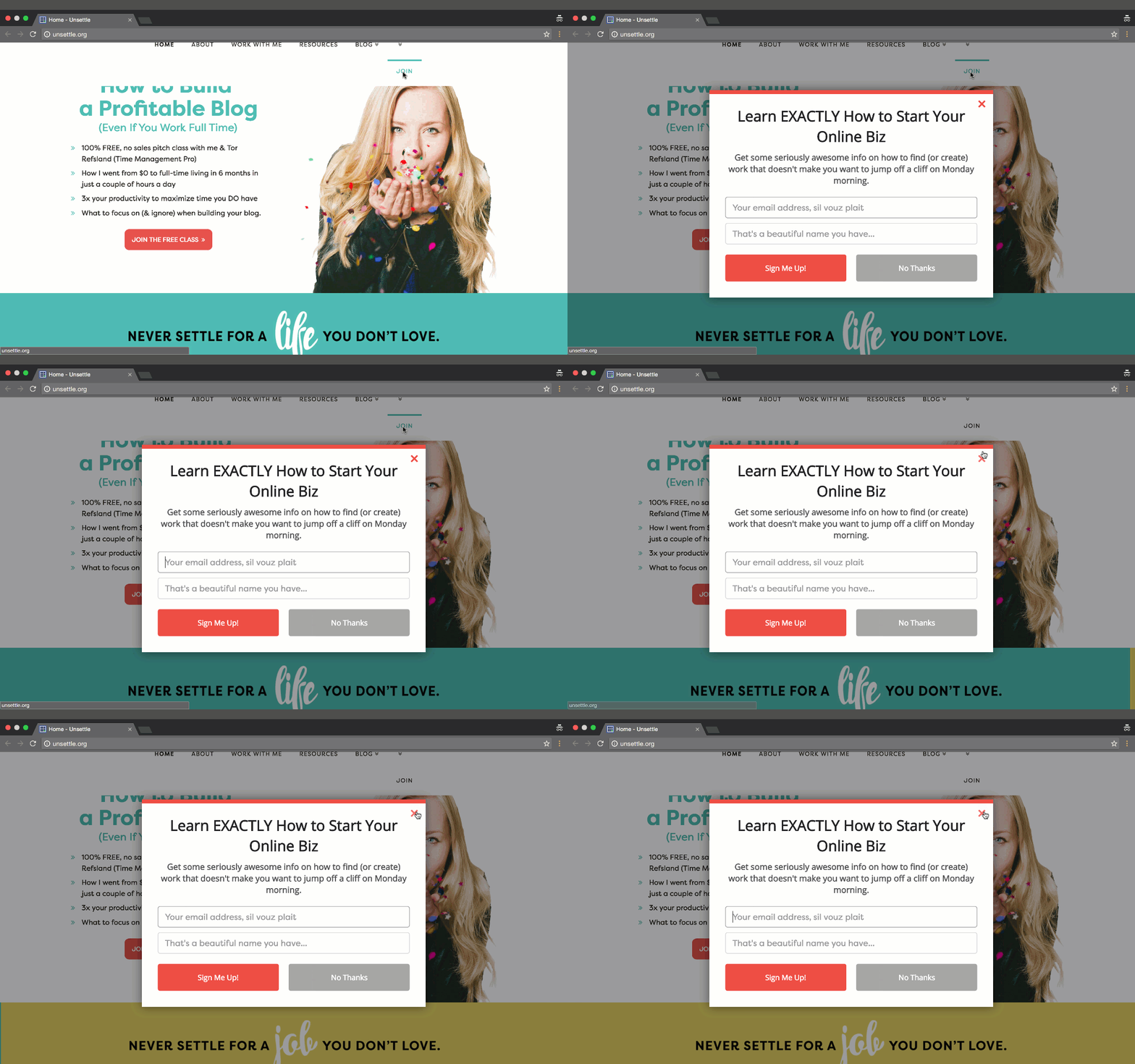
This called the “foot in the door” technique. When you can get people to comply with a smaller request (like clicking a link), they’re far more likely to comply with a larger request (entering their email address).
Pairing the attention that your menu gets, with the power of a two step opt-in like a Click Trigger is powerful stuff.
HOW TO CASH IN ON THIS HACK
You don’t have to be a programmer or web designer to take advantage of this hack. If you use WordPress and Sumo, I got you.
Step 1: Create a Click Trigger Popup in List Builder for your website menu. Then, create the popup that you want to appear when your menu link is clicked.
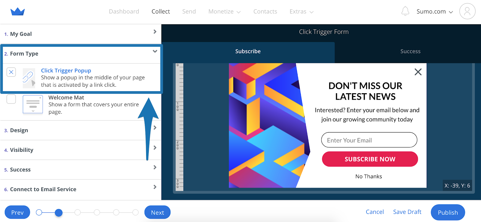
Under Visibility, copy the Embed Code:

Step 2: Go to your WordPress dashboard and under Appearance > Menus, find your main navigation menu. Add a Custom Link, and paste the Click Trigger Embed Code into both the URL and Link Text fields:
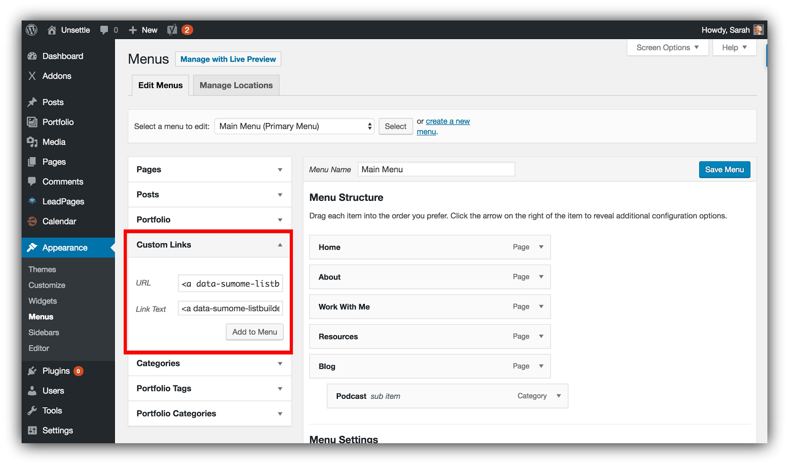
Press Add to Menu.
When the Click Trigger is in the Menu Structure section, remove the URL field so the only populated field is the Navigation Label field:
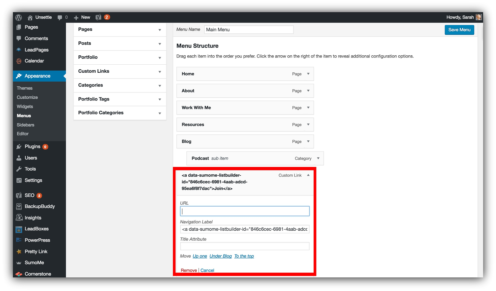
Press Save Menu.
Step 3: Test the Click Trigger, and then start rolling in the email conversions like Scrooge McDuck.
#9: GET HIGHER CONVERSION RATES FROM GUEST POSTS (WITHOUT A SINGLE CALL TO ACTION)
The Hack: Create targeted popups within your existing blog posts. Links to blog posts are removed less than links to landing pages in guest posts.
If you’re blogging, guest posting is a strong way to check a lot of boxes on your “marketing to-do” list. You get backlinks, shares, relationships and email subscribers from the same type of content you’d write for your own site.
So you write a guest post, pitch it, create a landing page with a sweet content upgrade…
But then something weird happens.
Your post is published and all those links to your landing page are gone.
See ya, new email addresses. The editor removed all of your links. Womp womp.
But let me let you in on a secret. Most editors don’t remove useful links as long as you aren’t shamelessly linking to everything. That means links that lead to helpful articles stay in your guest post.
And guess what? This hack takes advantage of those links to get more emails without a call to action OR a landing page.
HOW TO CASH IN ON THIS HACK
I’ve got my black ski mask on, because this one feels a bit sneaky (but you’ll love it).
Step 1: The first thing you need to do is know what the URL will be on your guest post. For example, let’s say you’re posting an article on Jeff Bullas’ site. Find out what that URL is ahead of time and write it down.
Step 2: Choose 1-3 of the links in your guest post that go back to articles on your site. Write those down somewhere, too.
Now, let’s make some magic. What we’re going to do is set up targeted popups to visitors from Jeff Bullas’ site on those 1-3 articles.
These will replace those landing page links that got cut from your guest post (and help you get more subscribers). And we’re going to build on the authority of the referring site (Jeff Bullas) with this strategy.
We’ll use a Welcome Mat for this example.
Step 3: Create a new form and go to Visibility. Under the Display Rules section we’re going to set up a couple rules:
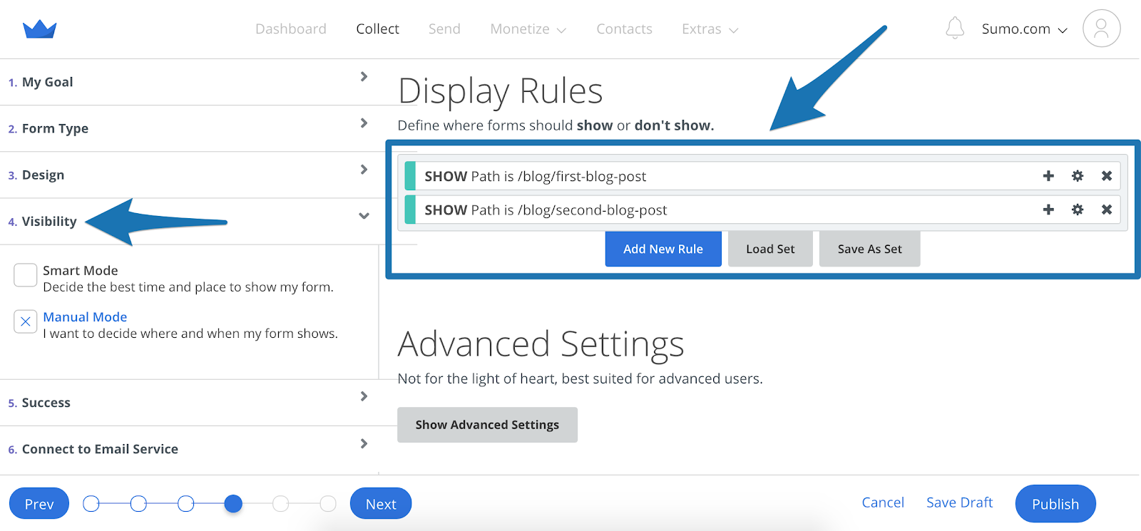
This first display rule is for the articles you linked to in your guest post. By pasting in the URLs of those articles into these show rules, your Welcome Mat will only show up on those specific articles.
But doing just this would show your Welcome Mat to any readers on that article. We only want to show the Welcome Mat to people visiting from your guest post.
We need to add one more rule so your Mat only shows to people coming from your guest post:
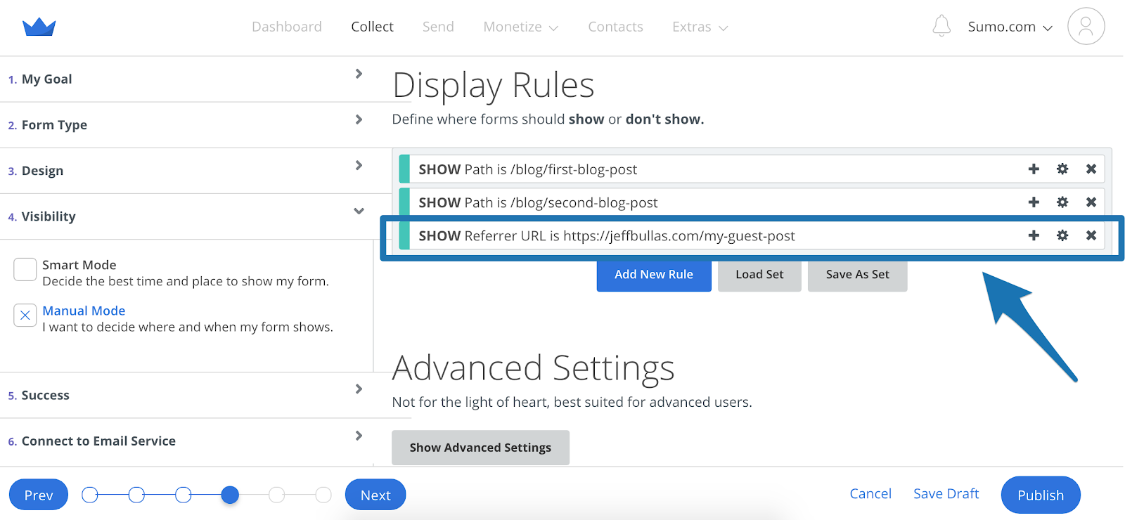
You select Referrer URL, then type in your guest post’s URL. Do this and only people from your guest post will see the Welcome Mat.
When it comes to your popup, you want to create it with your audience in mind. You know what site they’re coming from, so speak to that authority:
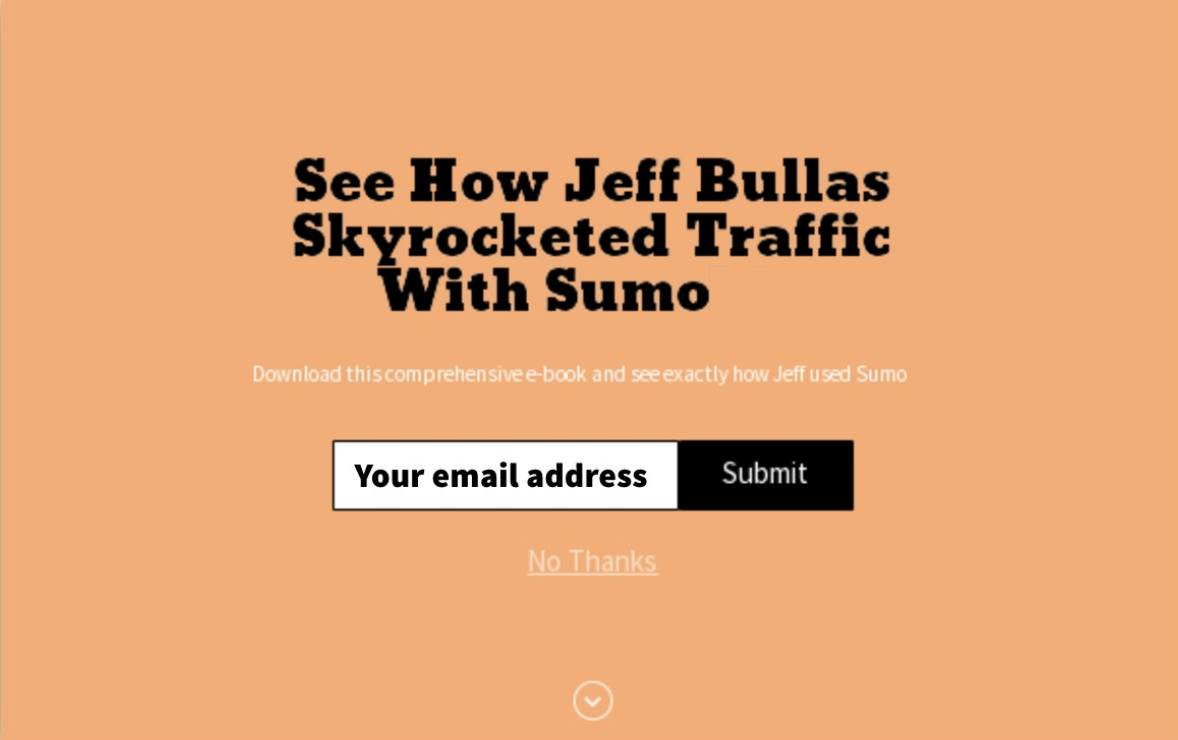
If people came from Jeff Bullas’ site and saw this popup, they’d be more likely to opt-in.
That’s because I know what site they came from, which means they’re fans of Jeff. You can play off the same authority in your popup, too.
And that’s it! You’ve now set up an editor-proof hack that makes your guest posts 10x more valuable. You don’t have to worry about your CTA being cut because your links to blog posts will help you build a killer list.
#10: SEE WHERE YOUR HIGHEST-CONVERTING TRAFFIC COMES FROM (WITHOUT GOOGLE ANALYTICS)
The Hack: Setting up popup display rules for each of your main traffic sources will show which traffic source converts best (and you need 0 Google Analytics knowledge for this).
If you know what channels convert the best, you can double-down in those areas and cut the fat from your marketing plan.
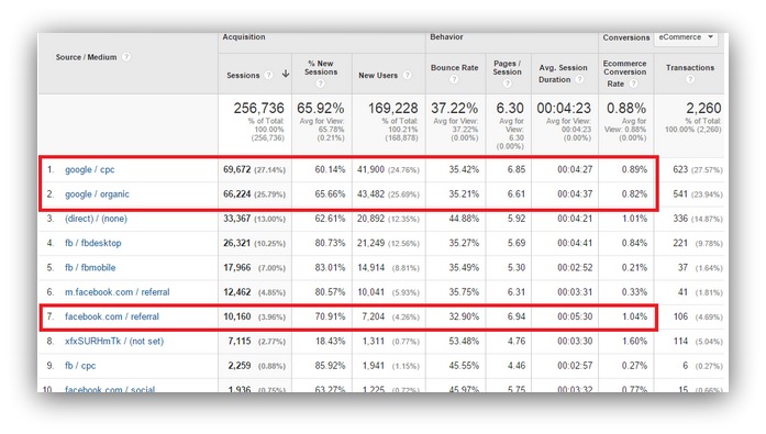
Do you know how to set this up in Google Analytics?
I freaking don’t. It takes time, a lot of experience and patience to set up a comprehensive tracking system in Google Analytics. And that’s just for ecommerce tracking. You can track opt-ins, too. But it’s more complex when you try to track those opt-ins from a 3rd party tool — which is how almost everyone collects emails these days.
So we’re going to show you an easy way to see how each traffic source converts. You don’t need Google Analytics know-how. You don’t need to pay someone a ridiculous amount of money.
You can do it yourself. And a couple minutes of work will give you the same results as years of Google Analytics knowledge.
HOW TO CASH IN ON THIS HACK
Before we dive in, I’ll say this — this might be one of my favorite starter hacks available. It takes something that was previously unavailable to everyone and makes it easily accessible.
Though, ironically, our journey starts in Google Analytics.
PUT DOWN YOUR PITCHFORKS!
What we’re looking for is easy to find. We’re just going to see what kind of traffic your site already receives.
Step 1: Pick a page you want to monitor conversion rates on. It could be your home page, a blog post, or anywhere else you’re collecting email addresses.
Then, log into your Google Analytics account and click the following things: Reporting → Behavior → Site Content → All Pages:
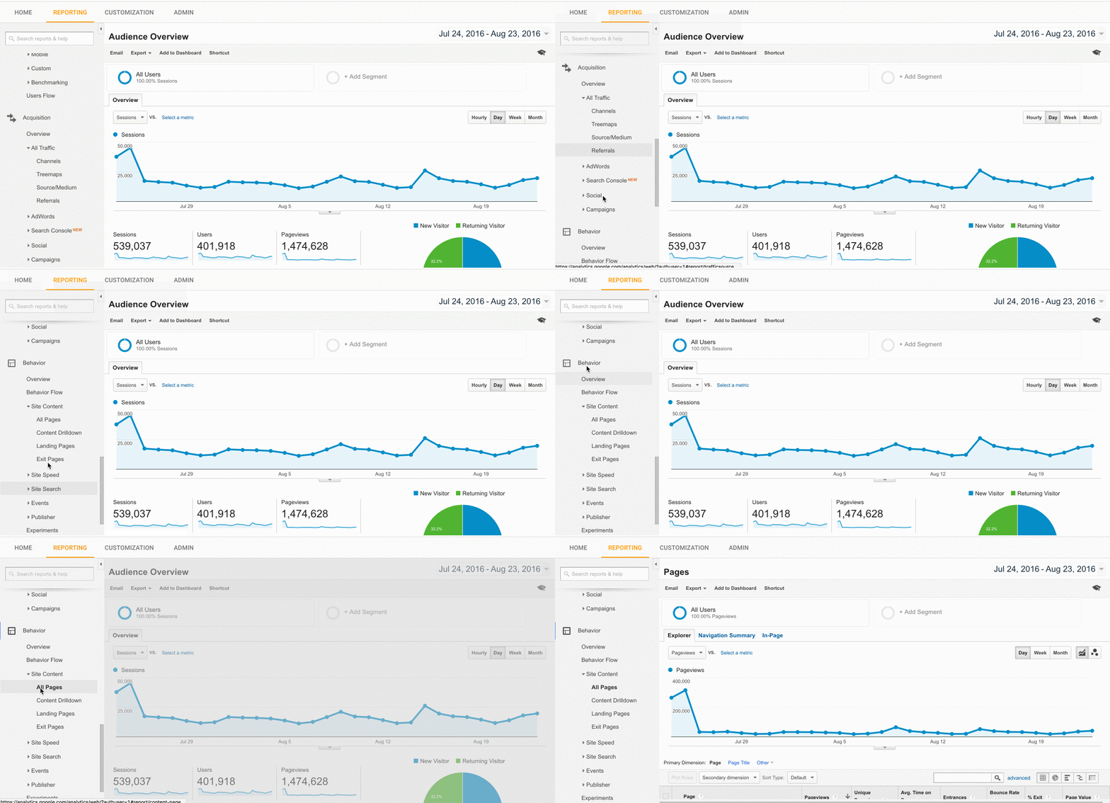
That lets you see the traffic to any of your site’s pages. Then, filter down to the page you want to measure in the search bar. To do that, you grab everything after your main URL.
So, if you wanted to monitor your blog, and your blog’s URL was www.testsite.com/blog, you would put /blog into the search area:
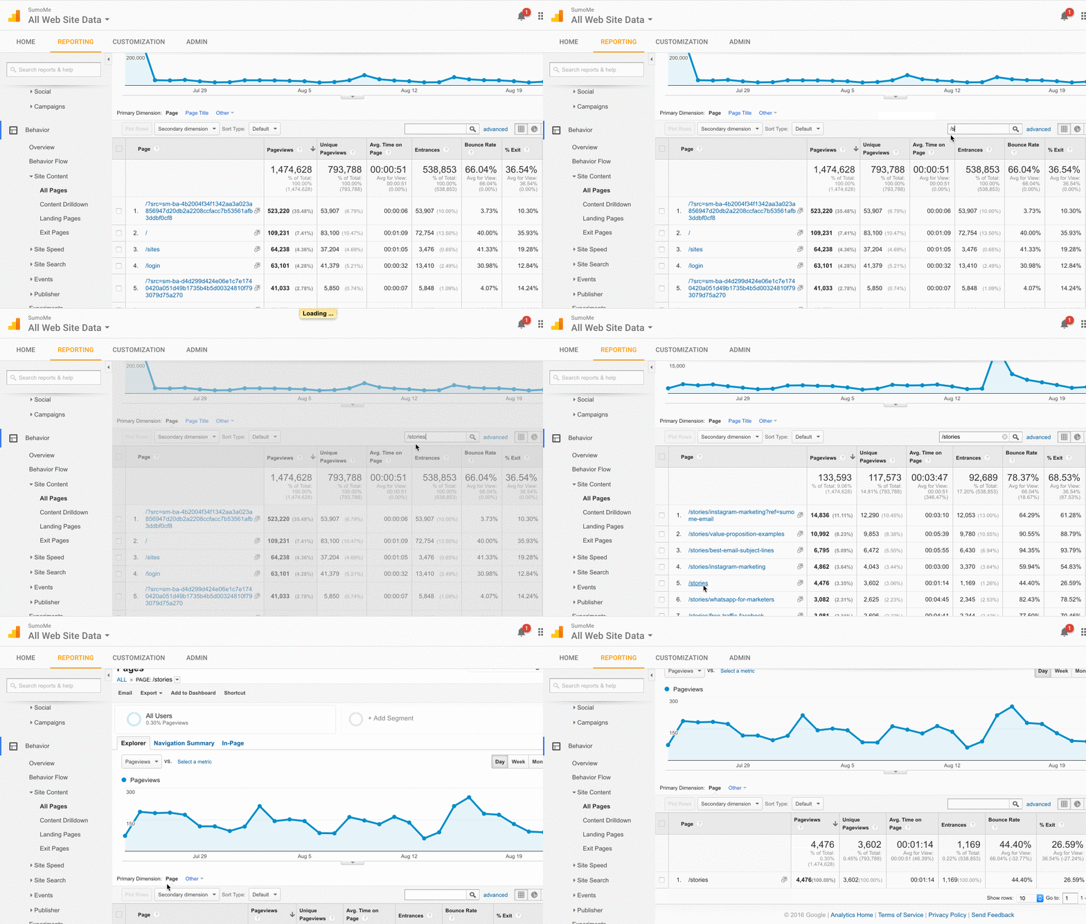
Searching and clicking on the intended path will bring you to that page’s specific stats. What we’re looking for is the type of traffic that comes to that page. That means we need to filter by traffic source. Do this by going to Secondary dimension → Acquisition → Source:
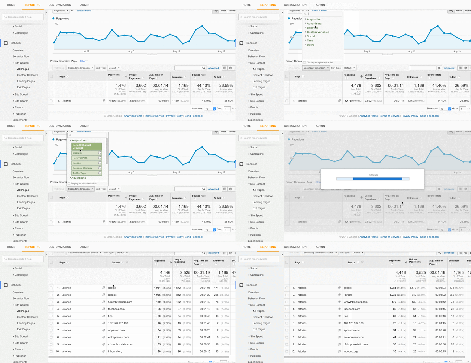
Now you can see exactly where people are coming from to get to your page.
Why do we need this? We’re going to set up list-building opportunities that only show to these specific traffic sources.
It makes sense to monitor your highest traffic sources. You don’t want to waste time monitoring conversion rates from sources that drive little traffic.
From our GIF above, I’d test out Google, GrowthHackers, Facebook, Twitter and Inbound. Your own traffic sources will be different, so write those down before we go to the next step.
Got ‘em? Good. We’ll use List Builder as our example email-collector again.
Step 2: It’s time to set up two different Forms. Your first form will be centered around one of your traffic sources.
Go into Visibility, set the popup for the page you want to display it on, then add the Referrer URL rule:
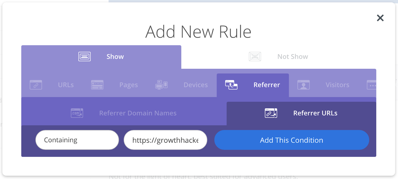
The form will only show to people coming to your page from the URL you type in.
Select Containing and type the URL of a traffic source. If I was tracking traffic from GrowthHackers, I’d select the Containing option and put https://growthhackers.com in the URL field.
Easy, right? Repeat this exact sequence for the traffic sources you want to measure.
I know I said it before, but I’ll say it again: Traffic may differ between different referrer URLs, but the conversion rate is a solid, universal way to determine what is more effective.
BONUS: OUR VERY BEST OPTIMIZATIONS
If you use the hacks in this guide, you’ll be doing things even advanced marketers don’t know about.
These are great hacks. Tremendous hacks.
But to be honest, we haven’t given you our best ways to improve your entire site.
We review well over 100 sites per year. We sit down and review page after page, and the advice we give helps hundreds of business owners drastically improve their sales.
Our secret? We use the same checklist every time to evaluate websites and give pinpoint guidance.
We’ve increased some of our customer’s conversions by 200% or more with this simple website optimization checklist we use internally.
Internally is the keyword, because we’ve never released this before. It’s our secret sauce. The Rosetta Stone of optimizing websites.
Today we’re releasing that spreadsheet on this guide. It may not stay that way forever, but for now we’re letting you have this special spreadsheet.
Combine the hacks in this guide with this website optimization spreadsheet, and you’ll turn your site into a list building, revenue-generating MACHINE.
Add A Comment
VIEW THE COMMENTS