Visual information is incredibly powerful. According to research compiled by Hubspot, articles with numerous images are shared twice as often on social media as those without, and Facebook posts with images see 2.3 times the engagement as those without images. That said, simple pictures are limited in how much information they can impart to your audience.
That means avoiding all-too-common errors in infographic design, such as errors that confuse or turn off potential leads and errors that reduce the value derived from your time and expertise.
In this post, we’ll show you the five most common mistakes businesses make with infographics — and how you level up yours.
%(tableofcontents)
The 5 Best Opportunities to Level Up Your Infographics
1. Unclear Flow
Just because your infographic is visual doesn’t mean you can ignore one of text marketing’s critical rules: It must be easy to follow. Not only that, but it must be simple to follow in two ways.
First, the infographic information should follow a narrative, with the art leading the viewer’s eye along that path.
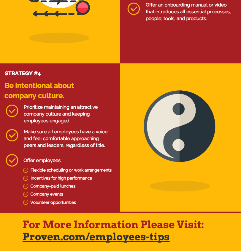
If you provide a series of impressive statistics about your service, it should flow from an eye-catching initial statement, through an escalating series of numbers, and end with the most remarkable tool you have available. If it discusses a process, it should lead the eye from start to finish. Look at this infographic from CPR Select that walks you easily from step to step, guiding your eye along the way:

Second, your infographic should end with a call to action, just like any other piece of marketing collateral. Design it from the beginning to lead a viewer from a neutral position to curious, motivated, or compelled to take the next step in your customer journey. How to perform that next step should be right next to the last item in the flow, like in this sample from Venngage:

If you fail on the first flow point, viewers may leave early or merely scan the infographic until they get bored or frustrated. If you fail on the second, you lose the power of infographics’ shareability because viewers won’t know what to do next.
2. Unchecked Math
If you include numbers, it’s essential to check your math. More than one infographic has surrendered credibility through a simple error or even a clear mistake. A few common arithmetic errors you see on the web include:
- Graphs where the amount represented doesn’t match the comparative visuals
- Errors in subtraction, multiplication, or division
- Digit transpositions, such as “18%” entered as “81%”
- Numbers commonly understood to be out of date
- Percentages that don’t add up to 100%
With that last error, it’s common for polls and research with multiple possible responses to correctly provide percentages that add up to more or less than 100%. If that’s the case for your infographic, include a footnote explaining this.
In all cases, make it a specific person’s job to check for these and other errors for every number you include or represent in your infographic. Make sure that person is good with math.
During this analysis, they should also examine the context of a statistic. For example, if you find something suggesting three out of four people trust online reviews, are they saying 75% of the general population do so, or just three-quarters of people who use them? Small details like that can make or break your credibility.
Also, dig to find the source of each statistic. Don’t rely on another infographic or the first Google result to confirm it’s accurate and relevant. Find its primary source, and check its age and reputation.
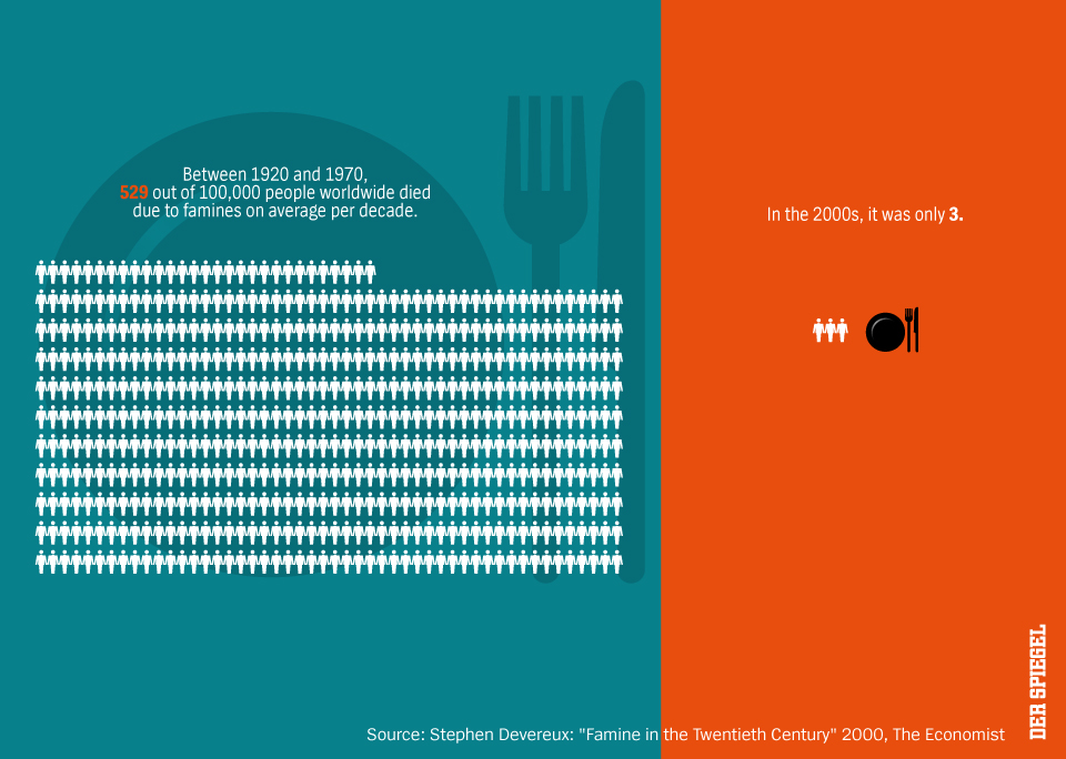
With math, sometimes statistics are so impressive they feel like something made up, especially if they support your product or company. In such cases, it’s smart to include attribution that proves the statistics to overcome this imaginary (but still compelling) objection. You can do this within the image, like in the example below from Statista, or simply put the footnotes in the caption.

When attributing your sources, don’t refer to another infographic or just the first result on Google. Find the highest-quality source you can find and direct curious viewers to it. That’s the best way to establish your credibility and your infographic’s authority.
3. Improper Scale
It’s surprising how many designers make this apparently obvious error, but it can sometimes be challenging to work around the realities of the numbers you’re trying to discuss. You must make sure you scale visual elements appropriately so the infographic is visually pleasing and readable.
For example, a graph showing a cost of $10 for one item and $1,000 for another would be tricky to read because of the large and small sizes. Either the “$10” is unreadably small or the “$1,000” dominates the page, leaving little space for other elements. One solution is batching data points in groups, so you might compare the total cost of several things to a single large item’s cost. You can also put the largest item only partially on the screen, like in those solar system images where you see each planet and just a wedge of the sun.
The same concern applies to balancing informative text with eye-friendly graphics while still leaving enough whitespace to avoid overwhelming the viewer. Keep your sentences short and your illustrations clean to maximize extra space, and if all else fails, divide the presentation into multiple infographics.
Another common issue is scaling graphics in a way that doesn’t represent the data. If your data shows a 10:1 ratio, your graph shouldn’t look more like that 100:1 ratio we just mentioned. Anybody who sees it won’t trust you because of this obvious discrepancy.
Keep your scales accurate, and consider carefully how to balance impressive differentials with the realities of graphic design. We don’t promise this will be easy, but it will make your infographic more effective.
4. Too Much, Too Soon
Remember the golden rules of marketing in the 21st century: People resent marketing unless they’re watching the Super Bowl. You want to give them a freebie to get their attention. In infographics, you can provide interesting facts presented via compelling graphics.
If you ask the viewer to do too much work, the freebie won’t work, and they’ll look at something else before they reach your call to action. That unclear path we mentioned earlier is one example, placing the onus of navigating your infographic on the viewer. Another example is putting too much information out all at once.
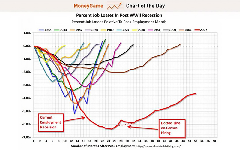
Densely packed designs perform worse than clean and clear infographics for this reason. For example, look at the complex graph below from Business Insider:
The same is true of infographics with long, complex sentences compared to those with short phrases presenting the information. Rule of thumb: the less it resembles something from college textbooks, the better.
Keep the mission of any infographic clear and straightforward so you can put out the smallest amount of information and make it easy for the viewer. When you have more information to present, do so with a series rather than packing it all in a single image.
5. Not Considering Mobile
According to data compiled by Statista, more than half of all web traffic worldwide comes from mobile devices.
The difference in screen sizes between a phone and the monitor your graphic design team uses can present a laundry list of problems.
When you build your infographic, avoid losing the interest of more than half your potential viewers by observing a handful of best practices:
- Remember to portrait-orient the infographic to suit how most viewers look at their screens.
- Make your call to action responsive and interactive to save space. Sometimes this might mean placing it outside of the infographic, via a popup or other mobile-friendly interface.
- Use large fonts for headlines, with smaller text viewers can zoom in on if interested.
- Limit yourself to a 5,000-pixel height maximum, as many smartphones won’t automatically display a larger image.
- Keep things simple and direct, eliminating interesting but unnecessary details.
If you have mobile and desktop versions of your site or content funnel, it’s best to have different infographics, each optimized for the appropriate user experience.
Final Thought
For your next step, we recommend reviewing the last 12 to 20 infographics your team has created. Check them all for the mistakes described above. If any appear more than two or three times, make a list of those items. Moving forward, have your design team use that list as a guide for things to avoid as they build new infographics to avoid those mistakes in the future.
Robert Keith is a Montana-based web developer and designer. He also consults with small businesses on their graphic designs.
Add A Comment
VIEW THE COMMENTS