This is a case study from Robbie Richards.
Building an email list should be your number one priority. Period.
The question is, how do you quickly build a list without giving away burritos to every reader? I’m going to let Robbie show you how below.
Take it away, Robbie…
In this post, I’m going to show you step-by-step how I collected 2,239 email subscribers in 117 days on the cheap.
The best part, I’m going to show you how I did it with…
-
Zero budget.
-
Zero connections.
-
And a tiny social media following.
Let’s do this!
%(tableofcontents)
TACTIC 1: COLLECTING THOUSANDS OF EMAILS WITH A DEAD-SIMPLE POPUP
List builder is the quickest and easiest way to get started collecting email addresses on your site.
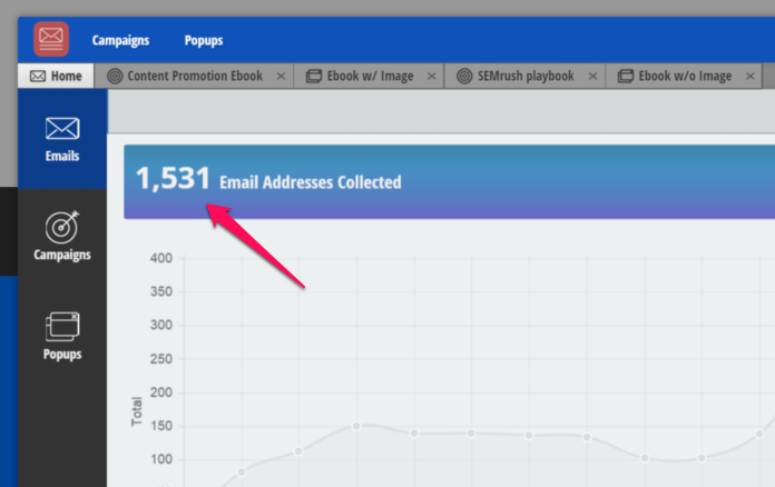
It’s a breeze to use, and in 117 days I collected 1,531 of my total 2,239 email addresses with the List Builder app:
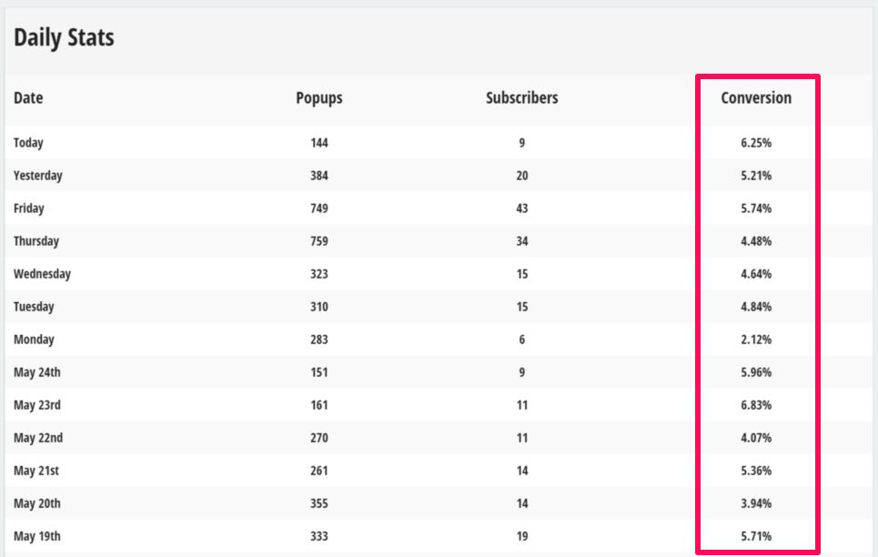
And achieved a 5.64% conversion rate:
AWESOME, RIGHT? HERE’S HOW YOU CAN GET THE SAME RESULTS.
Click here if you have Sumo installed already to skip ahead.
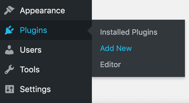
Otherwise, log into WordPress and select Add New from the Plugins section in the left navigation menu:
Next, search for the Sumo plugin:
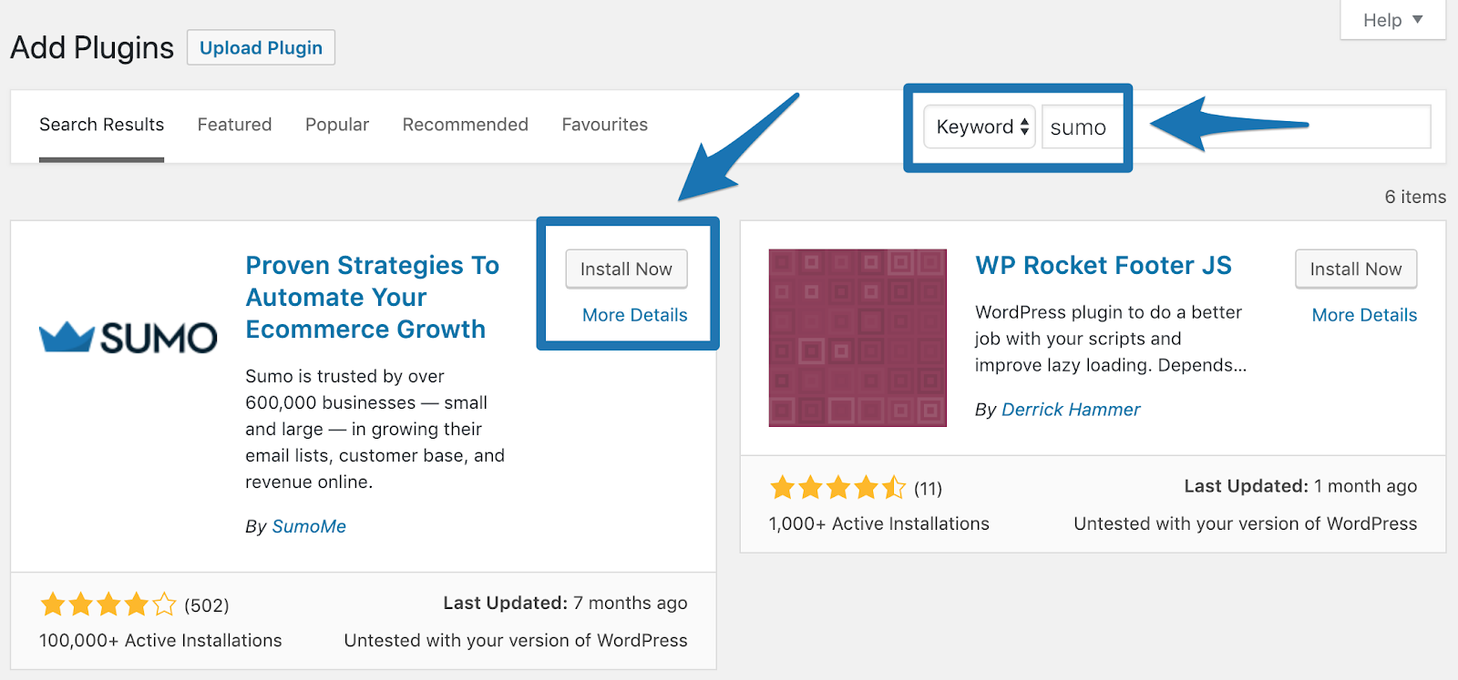
Click Install Now.
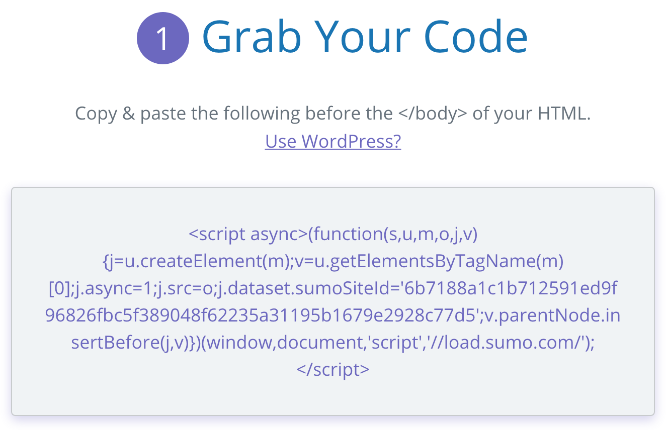
Note: If you don’t use WordPress you’ll need to copy the HTML code found here and paste it before the </body> tag of the HTML code on your website. If you’re not tech-savvy consult a developer.
Now, when you visit your website you’ll see the Sumo crown displaying on the right side of the screen:
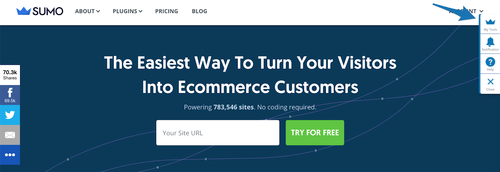
Click the crown icon and enter your name and email address to create a free account.
Once the account is created you’ll be able to go to the Collect tab and click on Create New Form:

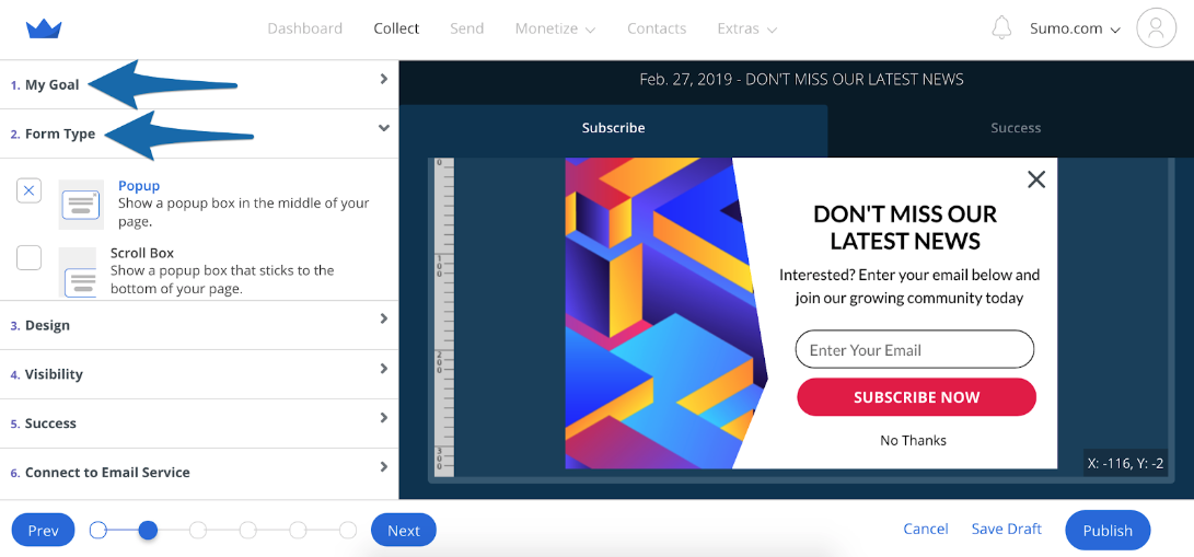
Select Collect Emails in the My Goal section, and Popup in the Form Type section.
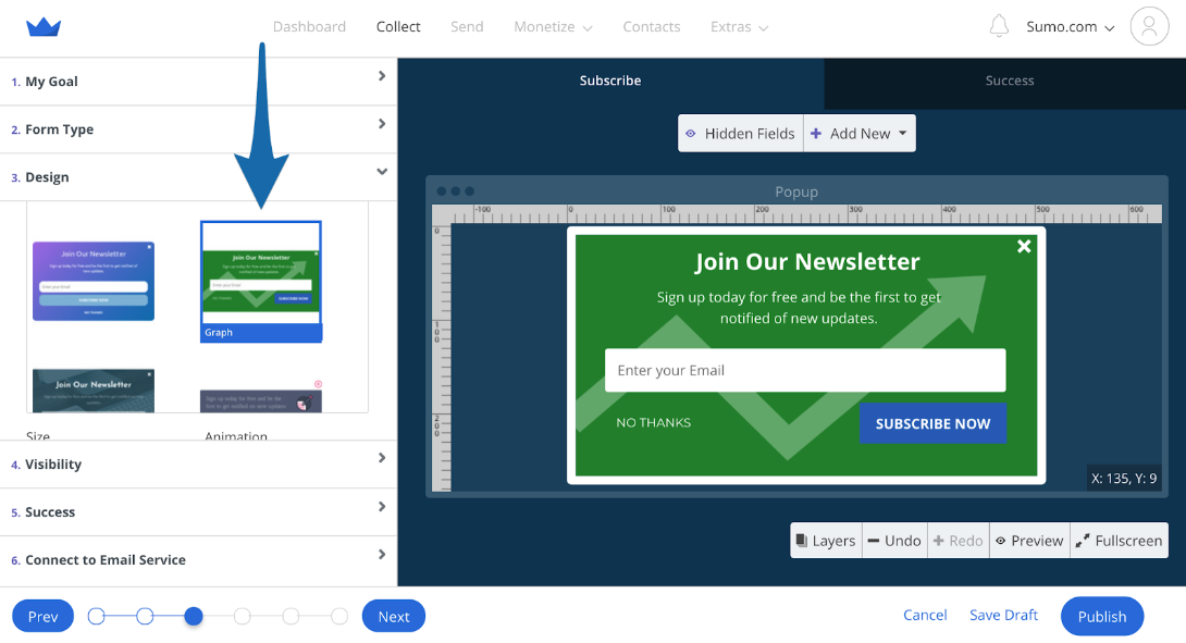
Next, hit the Design tab and choose:
-
Template
-
Form size
-
Headline copy (make it attention-grabbing)
-
Set font, background and button colors
I used the Graph template:
To create this popup form in two minutes:
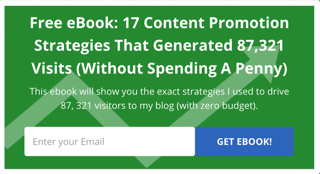
It has collected over 200 emails in 2 weeks and reached a peak conversion rate of 14.63%:
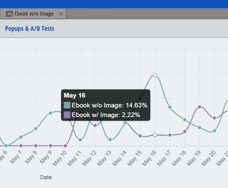
Pro Tip: I found offering a free eBook with a concrete result gets the highest opt-in rate.
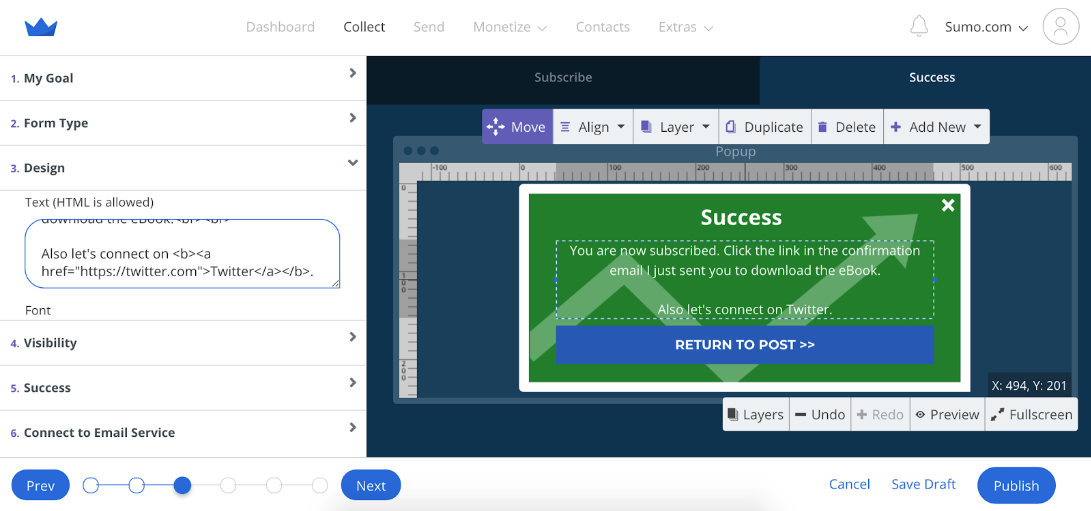
Next, customize the Success message on the Design tab. This is the message people see once they submit their email address.
A great thing to leverage at this moment:
Ask people to connect with you on social media. People are much more likely to take action right after they convert the first time. Here's mine:
Next, click on the Visibility tab.
You’ll be able to customize the following:
-
Visibility mode (let Sumo choose your settings, or decide for yourself)
-
Time trigger (how long after page load until the form displays)
-
Frequency (how often the form displays)
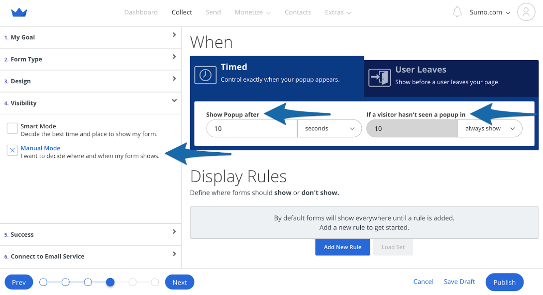
I’ve tested a number of different time-based triggers and found popups displaying at 10 seconds have the highest conversion rates.
You’ll also notice I have display frequency set to always show.
So, the opt-in form will trigger every time a reader loads a page. This is super aggressive, but it works. You don't have to be as aggressive.
As with everything, be sure to test these settings for yourself.
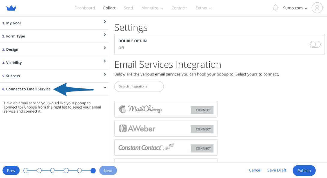
Finally, connect your form to your email service provider of choice on the Connect to Email Service tab. Sumo provides one-click API integration with all the major email service providers, including MailChimp, AWeber, Constant Contact, GetResponse, Infusionsoft and more.
Click here to set up your first email collection form.
TACTIC 2: TRIPLE YOUR CONVERSION RATE WITH CONTENT UPGRADES
What’s the best way to accelerate the growth of your email list?
Content upgrades.
A content upgrade is a content-specific offer that provides instant value to the reader.
That means that when you create an awesome, detail-rich blog post, you take extra materials like:
-
A video walkthrough
-
Step-by-step playbook
-
Useful spreadsheet
Or anything that will help the reader, and offer it to them in return for their email address.
For example, I offer the “Ultimate SEMrush playbook” as a content upgrade on this SEMrush tutorial:
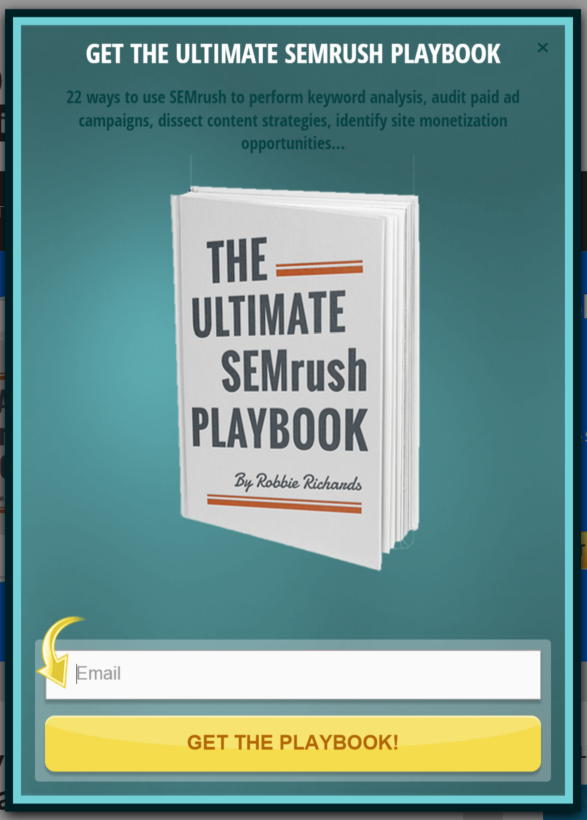
The content upgrade has an average conversion rate of 7.61% (peaking at 16.67% on May 13th):
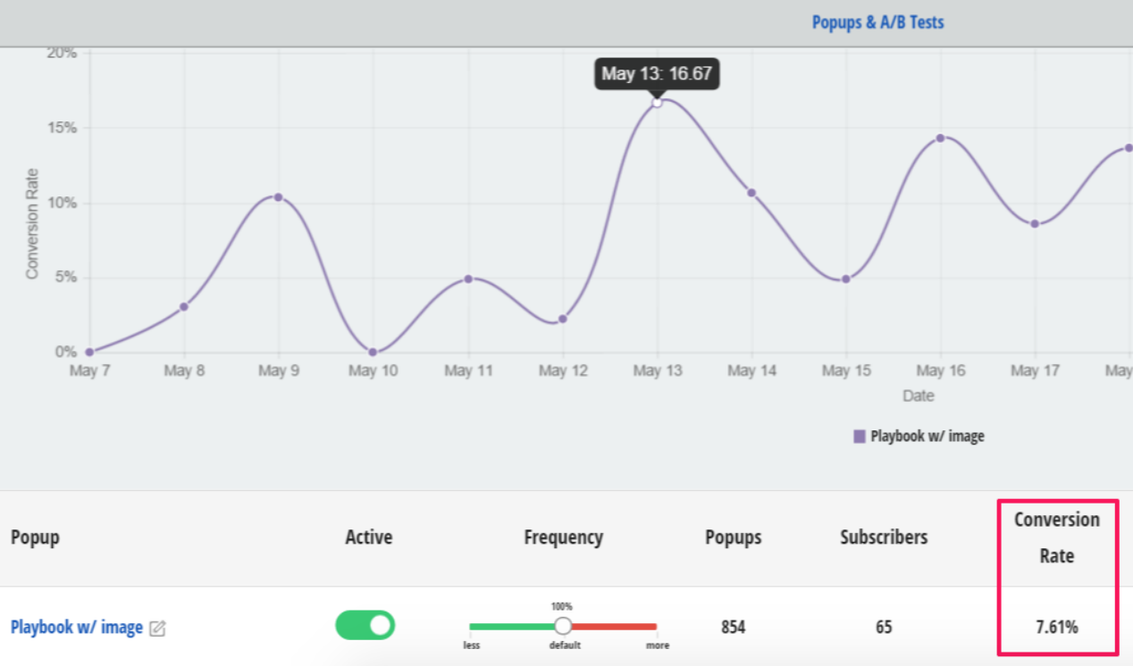
And it has added 186 new subscribers to my email list.
Here's how to create one with Sumo in 20 seconds:
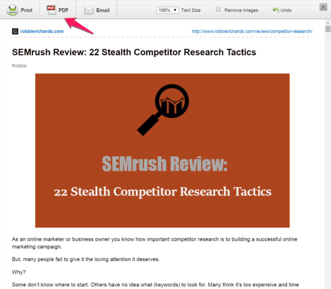
I simply took this post and converted it into a PDF in 10 seconds using the free Print Friendly and PDF chrome extension:[*]
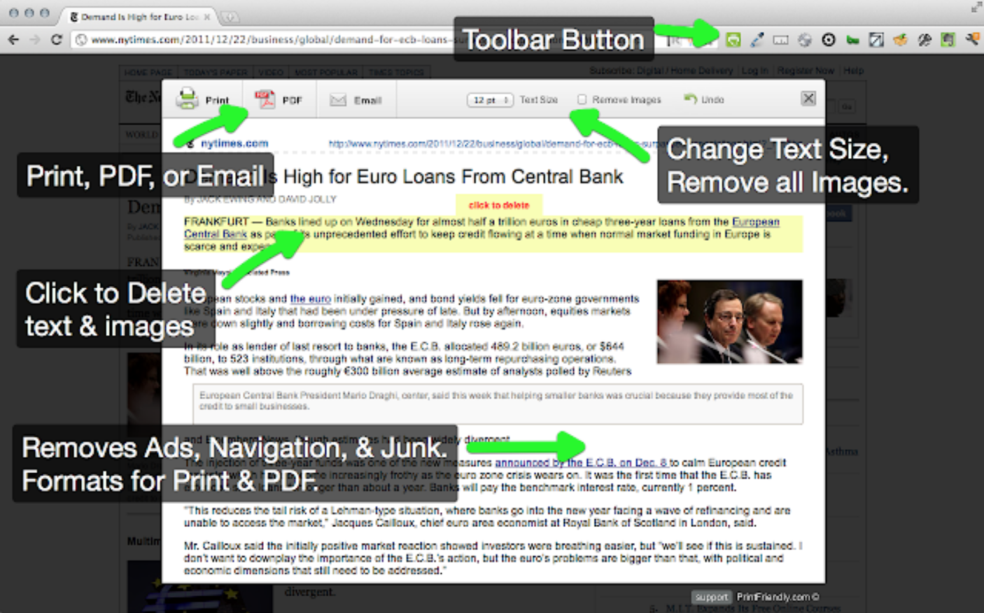
Open the post you want to convert to PDF and click the green Print Friendly & PDF chrome extension icon:

Next, click the PDF button to convert the post. All the links will pass from the post into the PDF:
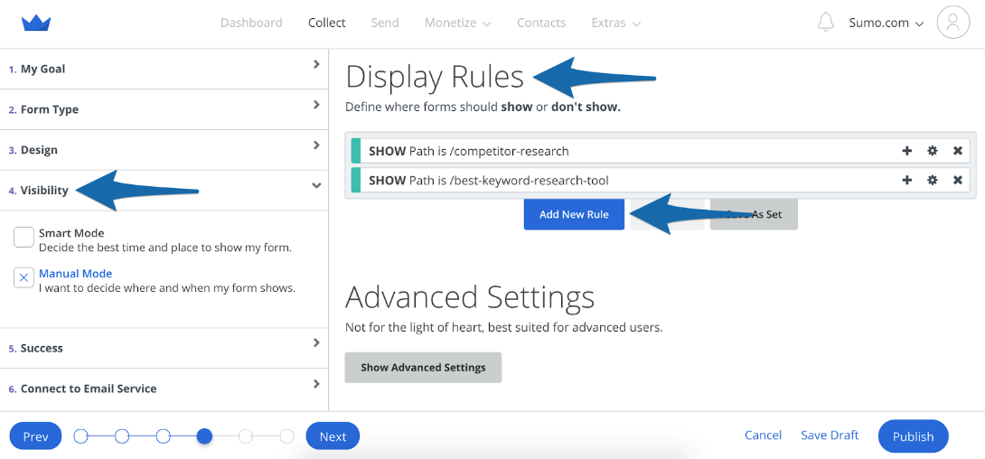
First, navigate to the form you want to add a content upgrade on, select Visibility from the left navigation, then go to Display Rules and click on Add New Rule:
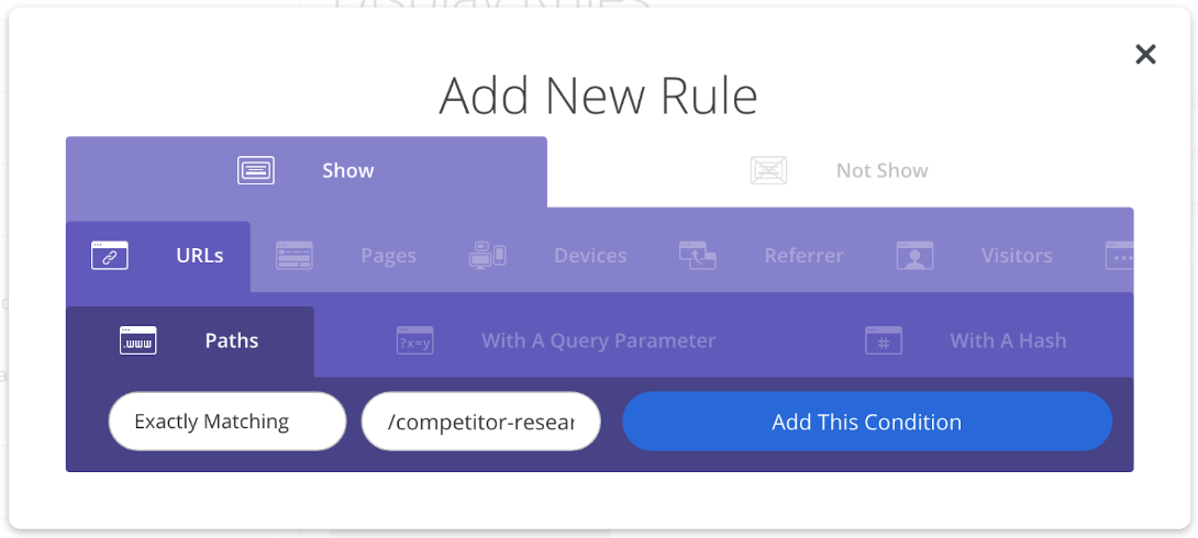
Next, choose Show > URLs > Paths > Exactly Matching > and put the URL of the page you want your content upgrade form to show on. For example I added this one on /competitor-research. You can add it to just 1 page or do it across many of them.
Pro Tip: Head over to Google Analytics and navigate to Behavior > Site Content > All Pages and look to see which posts are getting the most pageviews:
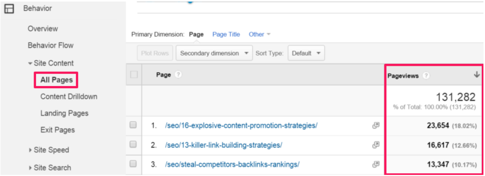
This will uncover popular posts on your site you can quickly turn into a PDF and add as a content upgrade. This should help you get at least 5% conversions to email signups on those pages.
Click here to add content upgrades with List Builder.
TACTIC 3: DOUBLING YOUR CONVERSION RATES WITH A/B TESTING
Having the ability to quickly deploy and target your opt-in forms is great, but what really matters is what converts.
Luckily, Sumo makes it easy to setup and test multiple form features, including different form designs and triggers.
Do you think adding an image helps improve email conversions? Let's see:
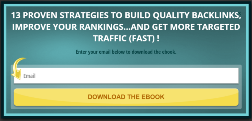
Or, this one:
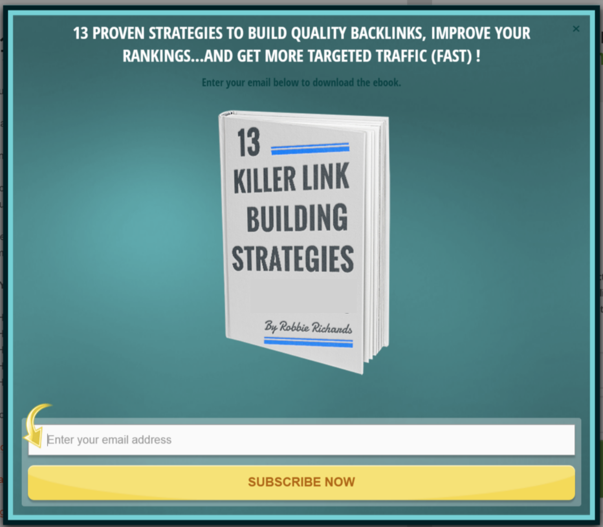
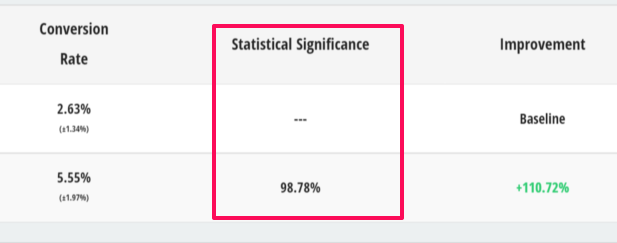
Adding an ebook image to the form boosted the conversion rate 110.72%:

All I did was add an image to my form and I doubled the conversion rate:
Setting up an A/B test only takes a few minutes. You can test anything you want, like:
-
Button colors
-
Timing of the popup
-
Different templates
-
Headline copy
-
And more…
To replicate the test from above:
Go to your Forms section and click on the Clone Form button to duplicate your current popup.

Click on the name of your new popup, go to the Design section, and click on Add New > Image:
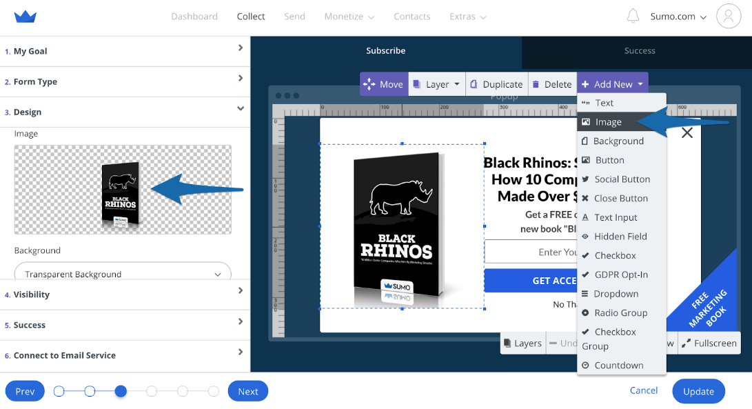
Hit Update then Publish and you’re done.
Start with a simple test. Once you have a test with statistical significance over 95% choose a winner and test another form feature.
Rinse and repeat.
Click here to set up an A/B test on your website.
TACTIC 4: ADDING AN UNOBTRUSIVE SIGN-UP REMINDER
If you find yourself in that camp and are looking for a less aggressive tactic, or if you want to try something new, there’s a solution called Scroll Box.
Scroll Box is List Builder’s more considerate younger brother. Instead of having a popup display after a certain period of time, you can use the Scroll Box app to display an email opt-in form only after a visitor has read through a specified amount of your post.
If you want to be more aggressive with your list building use a popup and a scroll box. Set the popup to display shortly after page load and the scroll box to slide in when the reader reaches the end of the post.
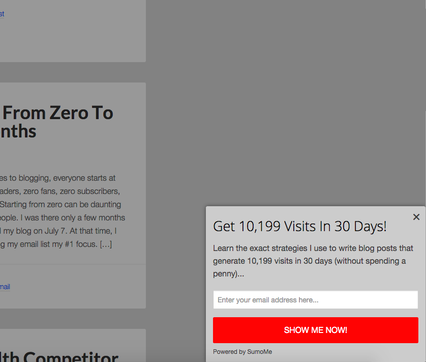
You can set the opt-in box to slide in from any corner of the website. It also has the option to slide in from up/down or left/right. You can run some A/B tests to see which slide movements convert best.
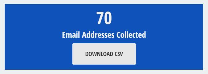
I used the Scroll Box for 27 days when I first started my blog and managed to collect an extra 70 email addresses:
The conversion rate was 3.2%:

Click here to set up a Scroll Box on your website.
TACTIC 5: STAY FRONT AND CENTER AT ALL TIMES
Hello Smart Bar. The Smart Bar is a handy Sumo app that places a bar on the top or bottom of your website that you can use to capture emails:

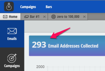
I collected 293 email addresses in the first 100 days with the Smart Bar:
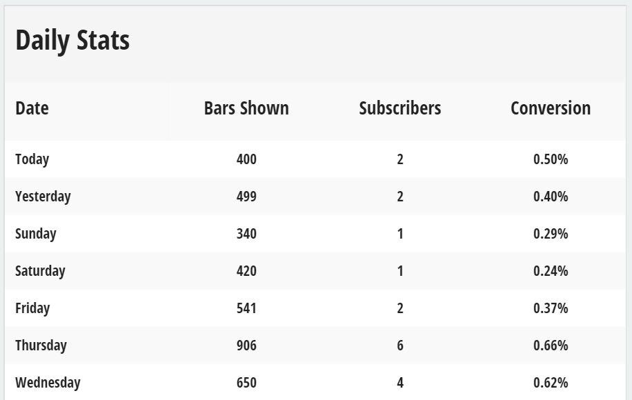
At a conversion rate of 0.64%:
The Smart Bar allows you to configure the header bar a number of ways, including:
CTAs that link to targeted landings pages:

These could be product pages, giveaway contests or to your squeeze pages. This is a great way to direct traffic to your highest-converting pages.
It even doubles as a tool to grow your social audiences. In fact, this feature helped me get 1,048 new followers in 30 days:

Sales, social media fans, emails…configure the Smart Bar to meet your specific business goals.
SETTING UP YOUR SMART BAR
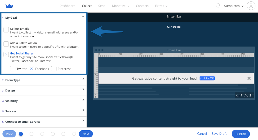
Go to the Forms section in Sumo and click on Create New Form. Then in the My Goal tab select whether you want to Collect Emails, Add a Call to Action, or Get Social Shares.
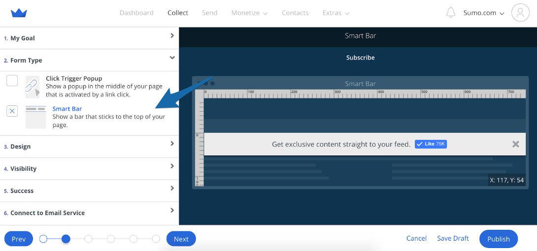
In the Form Type tab select Smart Bar:
In the Visibility tab I choose to show the Smart Bar at the top of the page at all times using the Sticky setting. This makes the Smart Bar scroll with the page as people read the content.
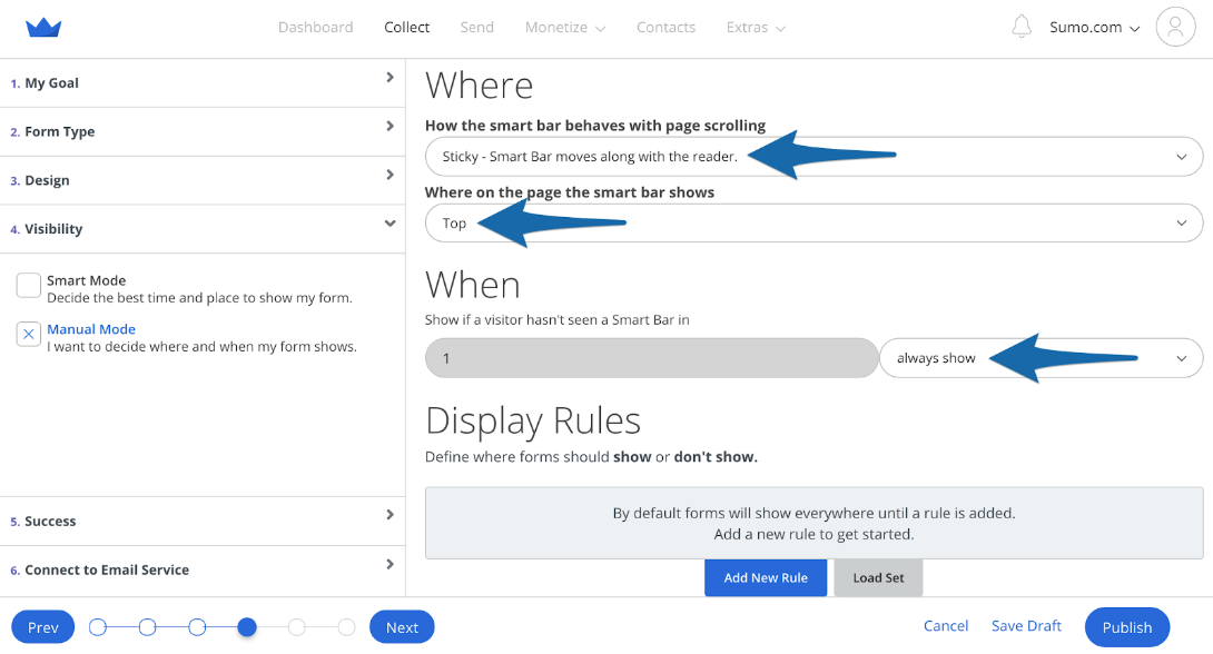
I did this so I could give the reader an opportunity to opt-in at all times.
Pro Tip: Take advantage of the Smart Bar “Success” message and ask subscribers to follow you on a select social media channel:

Or, remind them to click the link in their confirmation email.
You can also set up A/B tests and target Smart Bars to specific content and device types like we did with our content upgrade.
Click here to set up a Smart Bar on your website.
TACTIC 6: GET THOUSANDS OF SOCIAL MEDIA SHARES ON AUTOPILOT
Now, you might be thinking, “Robbie! This is a post about email marketing, why are you talking about sharing?!”
But here’s the secret. The more people share your content, the more visitors you get to your site, and the more potentials for signups you get.
Easy sharing = more traffic = more opt-in exposure = more email subscribers.
Now WordPress and other sites will give you some default sharing buttons… but they’re ugly. No one wants to click those dinky little Tweet or Like buttons!
Instead, just open up Sumo and install the Share app. Since installing it on my blog, the social engagement has skyrocketed.
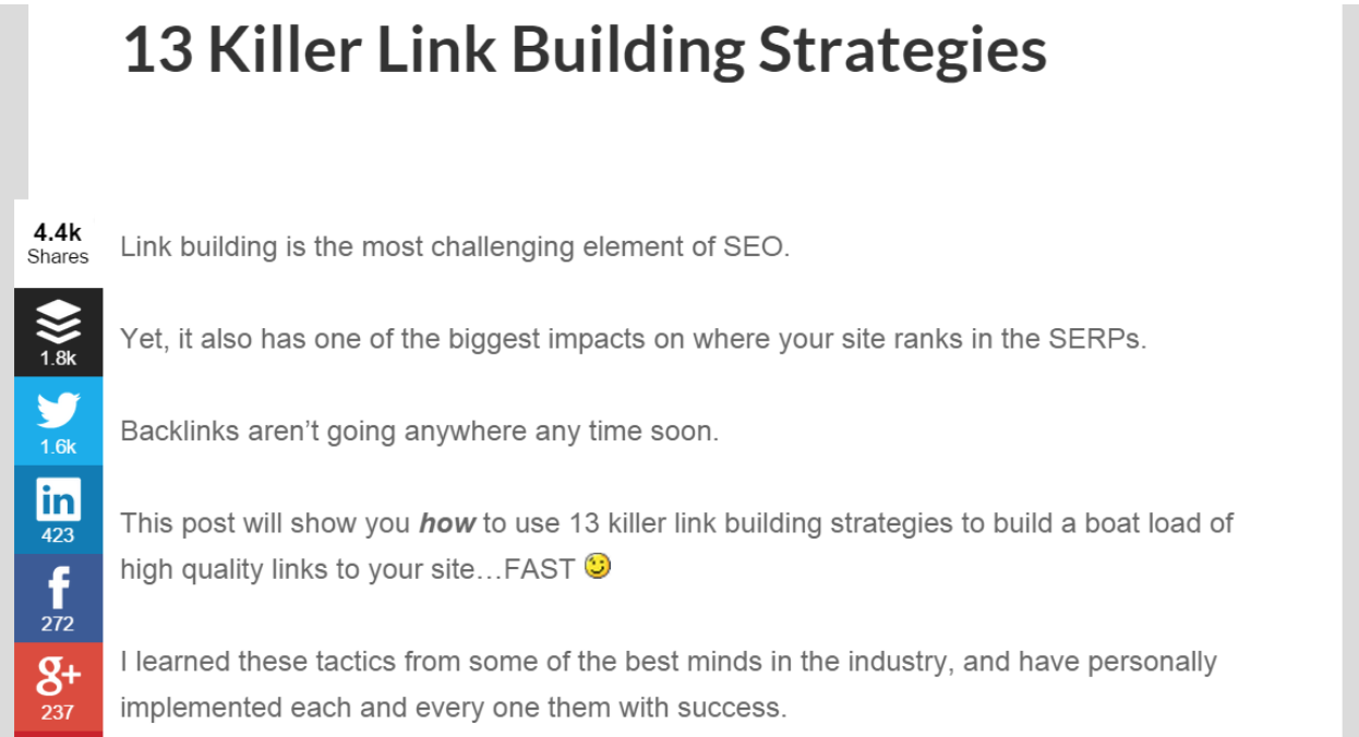
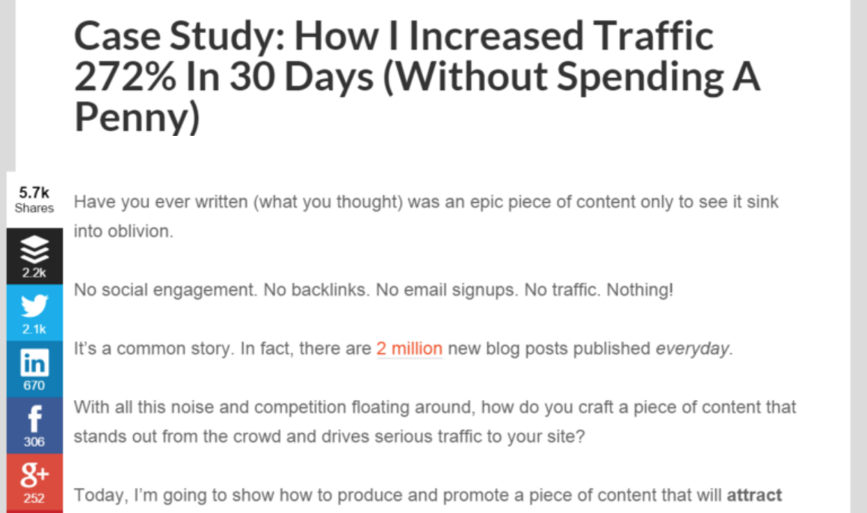
Two of my blog posts have combined for 10,100 social shares.
This one on link building strategies got 4,400 shares:
And this one on traffic got 5,700 shares:
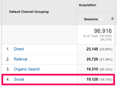
This helped drive 19,128 social media referral visits to my site:
And you might be thinking “sure, but social traffic doesn’t convert.” Well think again!
In the last 30 days, Twitter traffic alone has added 68 new subscribers to my email list:

It’s a beautiful cycle!
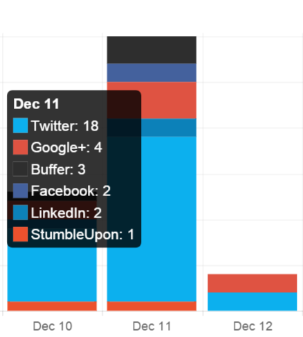
Pro Tip: Share also provides valuable analytics.
You’ll be able to view which channels are generating the most social engagement…
And, track which specific posts are most popular among your readers:

Case studies and expert roundups are by far my most popular content when it comes to social engagement.
I think I’ll do more of that 🙂
SETTING UP SHARE
Once you have the Share app installed, navigate over to the Layout tab and select the areas you want to show the share icons:
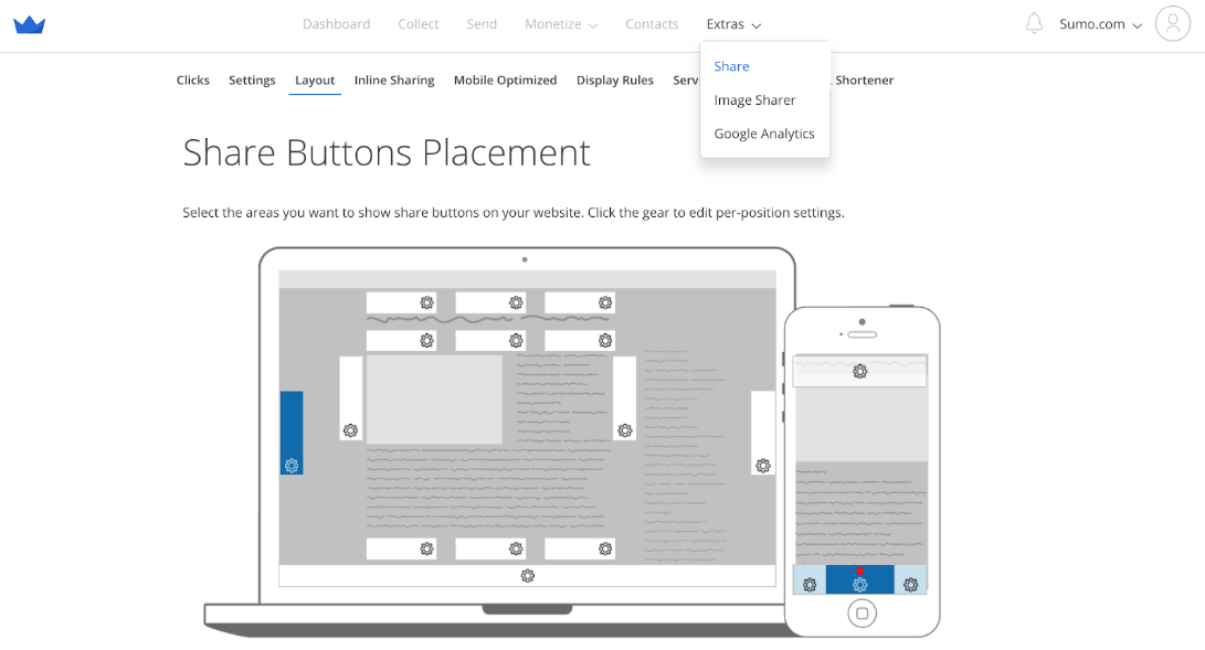
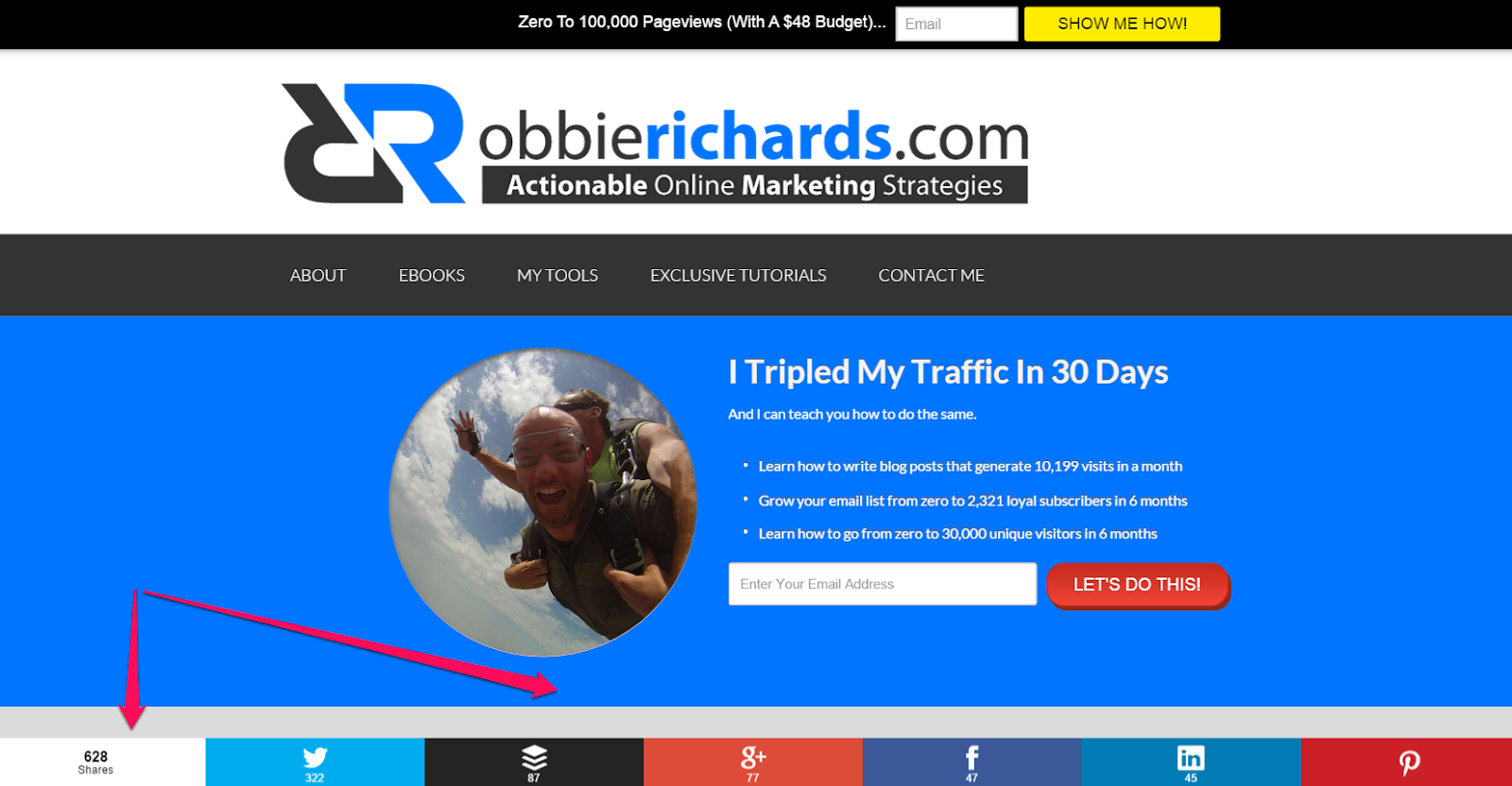
Here’s what your social sharing buttons will look like when placed at the bottom of your site:
In the Settings tab you can select the different social accounts you want to feature on your Share bar:
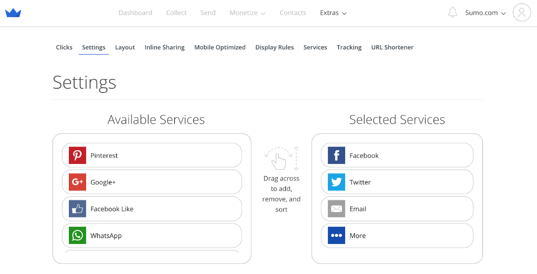
To keep it clean, I only include a maximum of six channels. Those I’m actively engaged on.
In the Settings tab, I also enabled Smart Mode so the most popular social networks (based on share count) are always placed at the top:
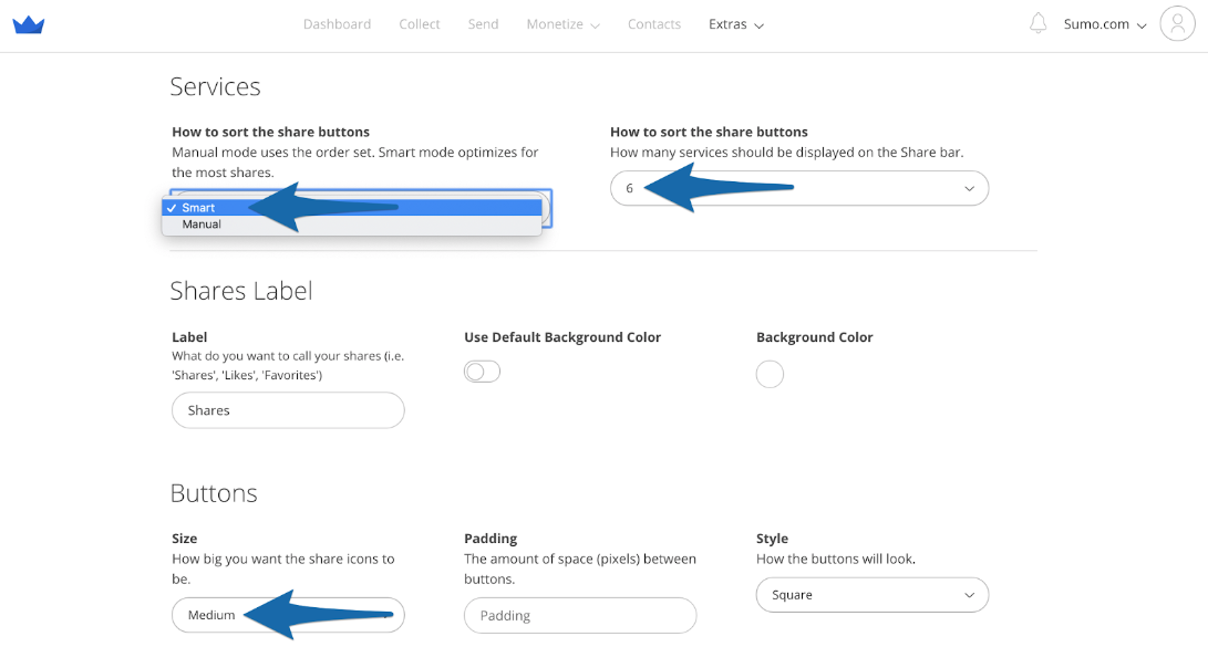
High visible share count = more social proof = more people will share it.
Finally, in the Services tab be sure to set your Twitter handle (do not include the ‘@’ symbol).
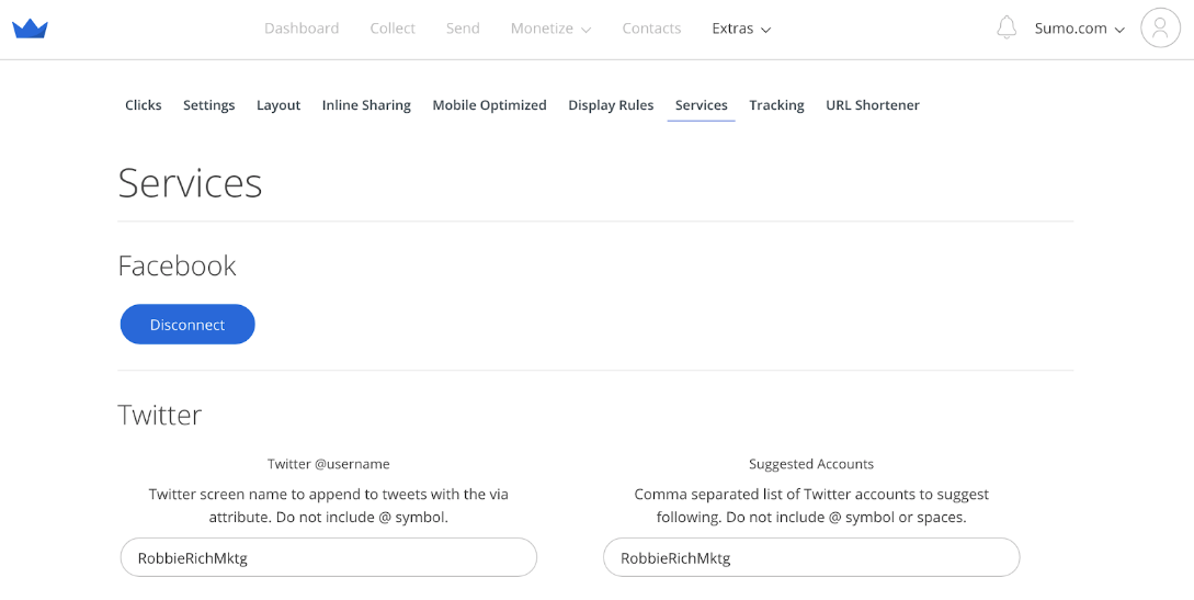
This will append your Twitter handle to the end of all the tweets generated by your Share bar:

HERE'S WHAT YOU SHOULD DO NEXT:
I just walked you through the exact process I used to collect 2,239 email subscribers in 117 days, and how you can duplicate it using five Sumo apps.
Now I want you to login to your Sumo account, make these changes and significantly grow your email list too.
If you don’t have a Sumo account, you can click here to get one for free.
The free account will let you do everything explained in this case study.
To grow your email list to the next-level, get our List Building Starter Kit:
Add A Comment
VIEW THE COMMENTS