69% of consumers will abandon a product page that lacks information.[*]
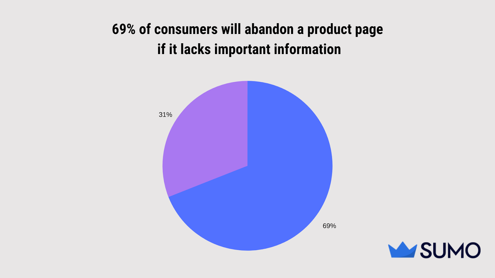
Data source: Salsify
Have you ever wondered what makes a high-converting product page?
That’s what we’ll answer in this guide. We’ll explore the 10 companies that nail their product pages, and how you can replicate their success to create your own.
%(tableofcontents)
Let’s roll.
What Is A Product Page?
A product page is a webpage that provides helpful information on a product and how it benefits the user.
Take Everlane.[*]
The ecommerce retail store shows a wealth of information for the user to make an informed decision. The key benefit of the heels — reflected in the product name and description — is clear as a bell: It can be worn all day without hurting our feet.
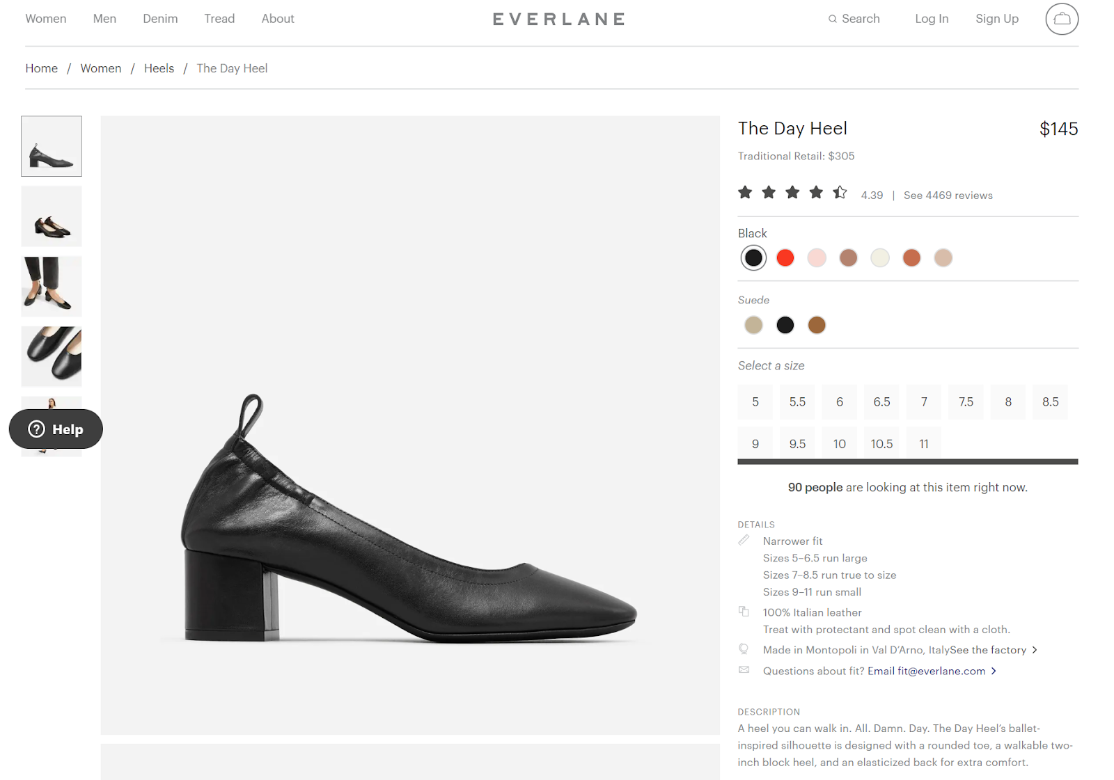
Typically, a product page includes the name, price, description, photos, and a call-to-action button.
A fashion store like Everlane would include additional elements like the material, size chart, and customer ratings and reviews.
A service-based business — say, an agency — would contain a project timeline, deliverables, and case studies.
Note: This is also known as a service page. There are many similarities between a service page and a product page. For this guide, we’ll treat them the same.
10 Product Page Examples That Make Visitors Want To Buy Now
I picked these 10 examples, as they met the following criteria:
-
Provides accurate information for visitors to know how the product solves their problem.
-
Engages visitors and encourages them to stay on the page longer.
-
Includes in-depth information for visitors to feel confident about their purchase.
To make this even more valuable, I’ve included examples outside of ecommerce. If you work in agencies, software-as-a-service (SaaS), or run a freelance business, stick around. I promise this will be just as helpful!
1. FOUR SIGMATIC
Industry: Ecommerce
Why It Works:
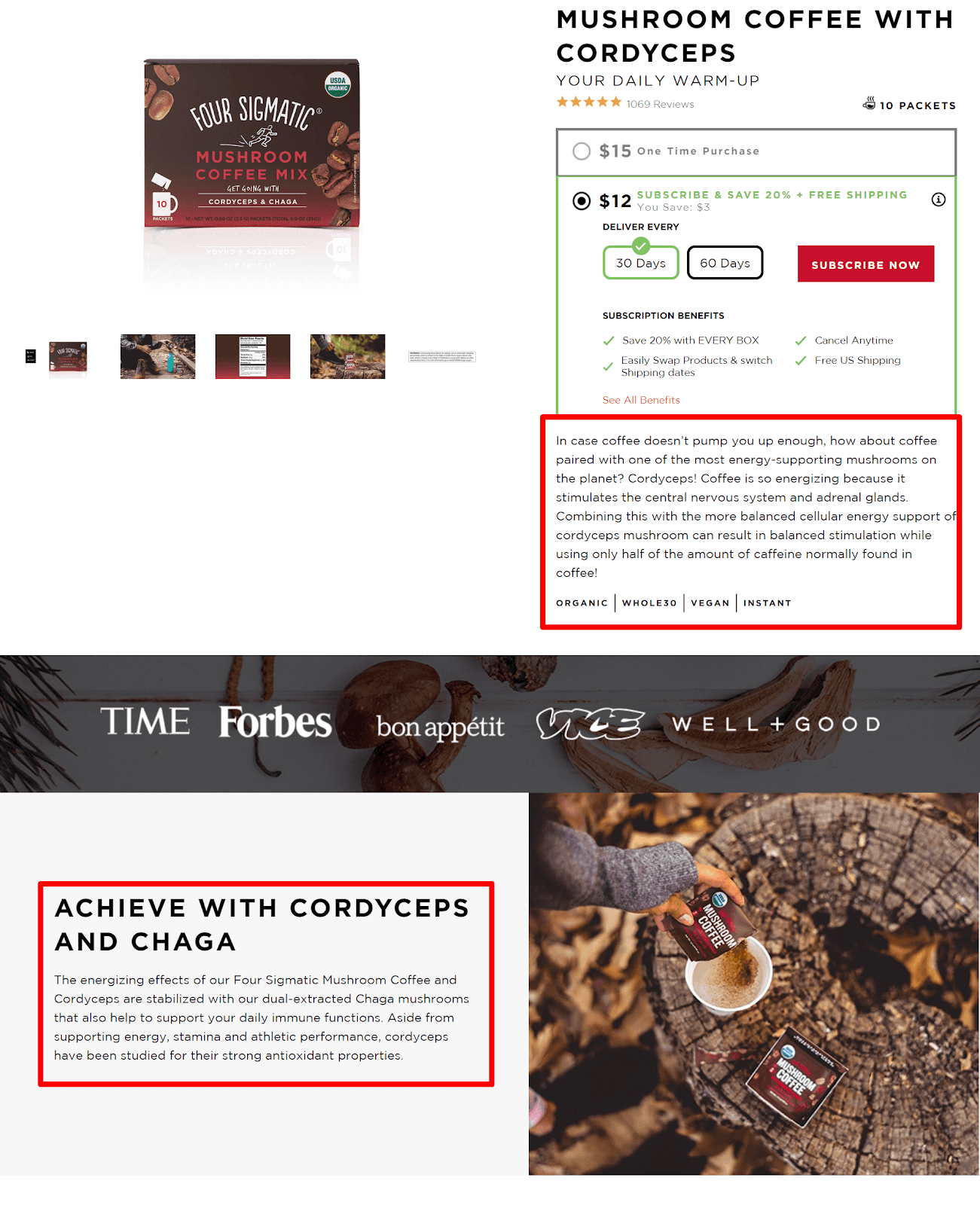
Four Sigmatic’s product page is product storytelling at its best.[*]
Right off the bat, visitors are transported into a magnetic story that guides them on mushroom coffee benefits and how their lives will look like after consuming it.
Copy this technique the next time you write your product copy: Tell a story to convey the value your product brings to customers' lives.
2. ANGELA RODGERS
Industry: Freelance
Why It Works:
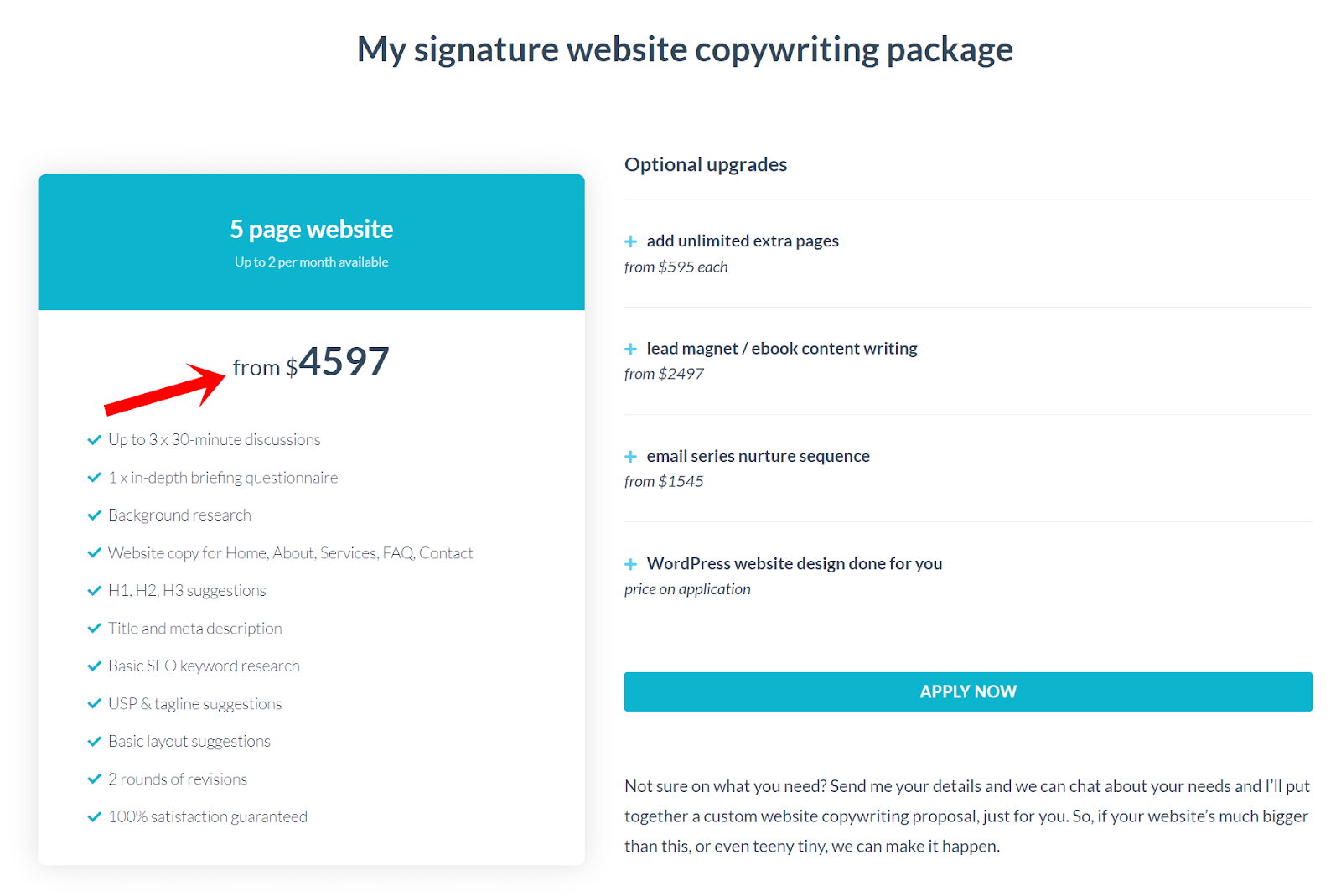
Customers want to know what they’re in for, so share the cost upfront and place it prominently.
You can do it like Angela Rodgers — use a larger font and bold it.[*]
Pro Tip: If you run a business with custom pricing, indicate a starting rate.
This ballpark figure helps prospective customers to self-qualify and see if you’d be a fit to work together.
3. FRESHSALES
Industry: SaaS
Why It Works:
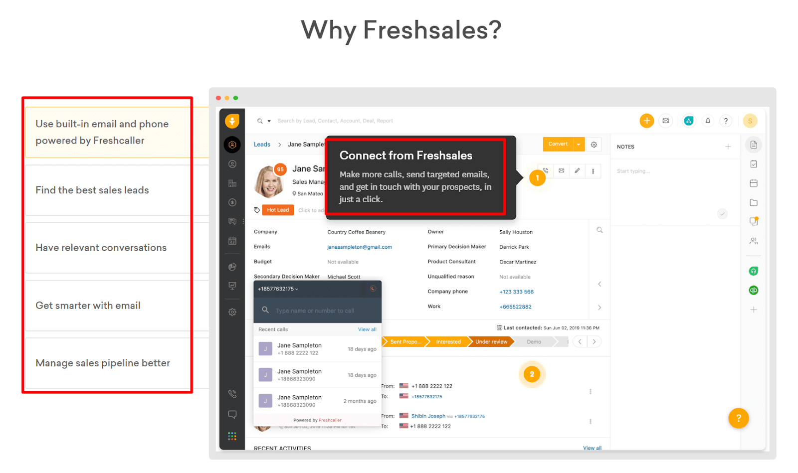
Combat your prospects’ buying objections by visually demonstrating how your product solves their everyday struggles.
Freshsales does this with an interactive walk-through of its CRM tool.[*]
The SaaS company shows a series of screenshots and captions that enables prospects to step through a predefined story. When they click the different tabs, they see the features in action and how their everyday tasks are made easier.
This is sleek. It visibly proves the benefits instead of having prospects imagine it themselves.
4. FABLETICS
Industry: Ecommerce
Why It Works:
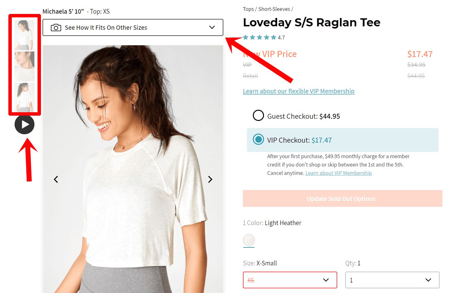
Look at your product page. Does it show product pictures from all angles in a single view?
Yes? Great!
I recommend you to go beyond that.
In fact, steal this idea from Fabletics — add a video to create a visual experience for users.[*]
Your audience sees how your product looks when they use it in their lives, and how the apparel looks in different sizes.
5. MICHAL EISIKOWITZ

Industry: Freelance
Why It Works:
If you’re a freelance copywriter like Michal Eisikowitz and you don’t know how to sell prospects the value of your packaged services, this is an idea worth borrowing.[*]
Share what’s in it for them. Break down the deliverables clients get in each stage of your project.
Pro Tip: Include high-level screenshots and visuals to show that this isn’t your first rodeo.
Note the nuances of Michal’s copy — every word is there for a reason.
Right away it shows she’s a pro.
6. COSCHEDULE
Industry: SaaS
Why It Works:
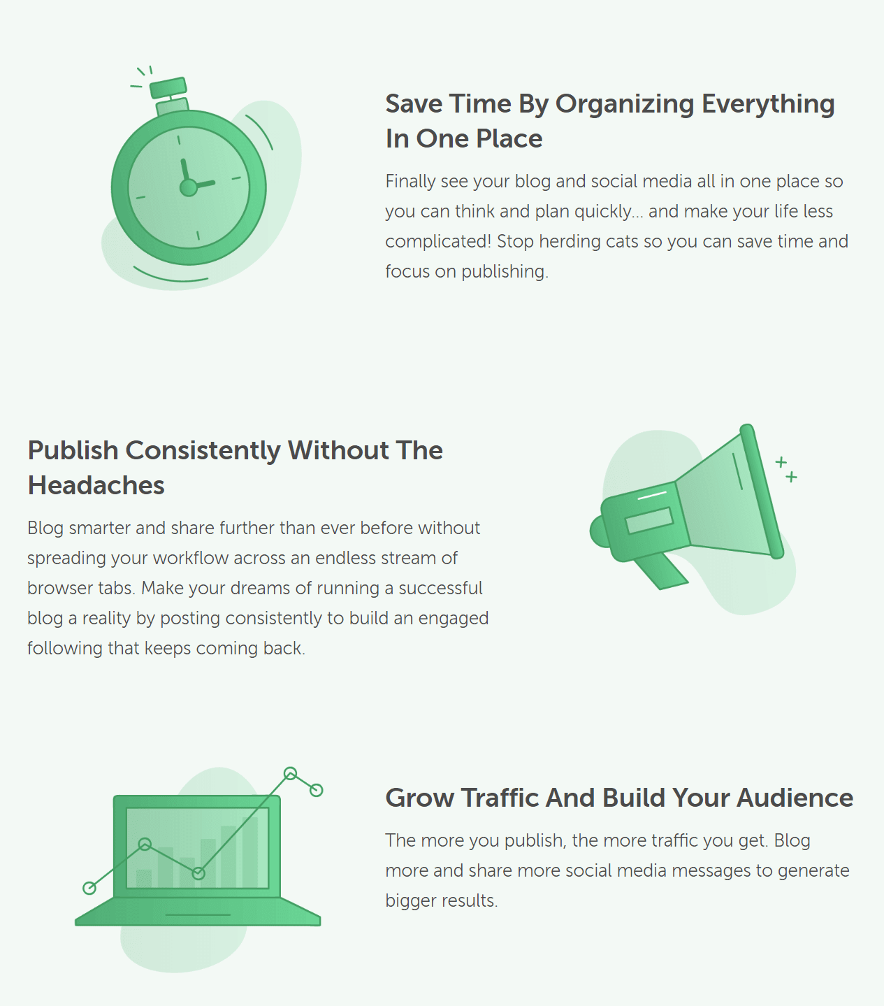
CoSchedule shows prospects the ideal versions of themselves in its Blog Calendar product page.[*]
The subheads (e.g., Save Time By Organizing Everything In One Place) speak to their innate desire for having productivity and more time.
While the copy below the subheads (e.g., think and plan quickly, make your life less complicated) highlights how their lives will improve after using its tool.
7. SECRET LAB

Industry: Ecommerce
Why It Works:
Do you sell products that require customers to assemble themselves?
That’s a point your product page needs to address, as you could sell to customers who require more support resources.
Secret Lab does a great job addressing this point.[*]
It combats this “exertion” through tutorial videos, clear instructions, and visual representations of its chairs.
This high-level information instills confidence in visitors and signals that assembling is not as difficult as they imagine.
8. THE CONVERSION KIT
Industry: Agency
Why It Works:
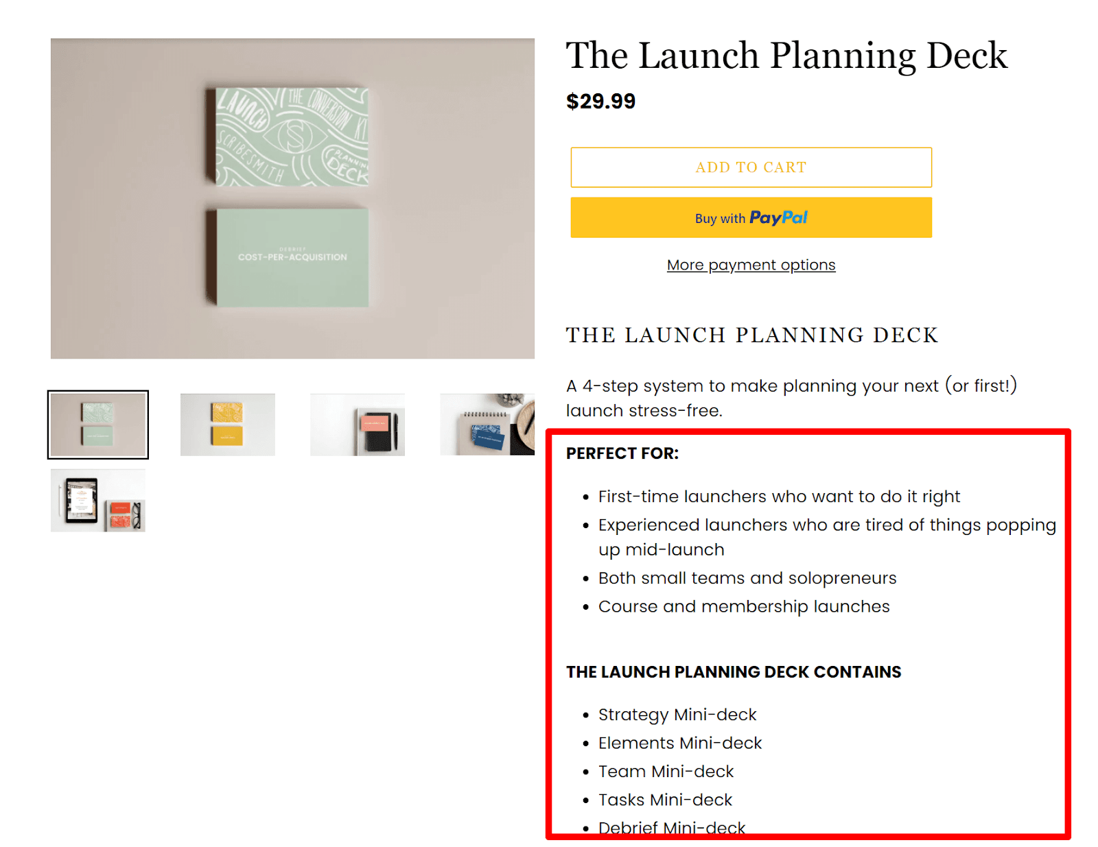
Do you sell to multiple customer segments? Or offer packaged services with multiple deliverables?
Copy-wise, that’s a lot of information to digest.
Most web users don’t read, they scan — so use bullet points, like the way The Scribesmith does here with their launch planning deck.[*]
Bullet points make it easy for readers to skim important information and make faster decisions.
9. BETTER PROPOSALS
Industry: SaaS
Why It Works:
Specificity SELLS.
How do you write specific product descriptions? By understanding your buyer persona and stealing their words.
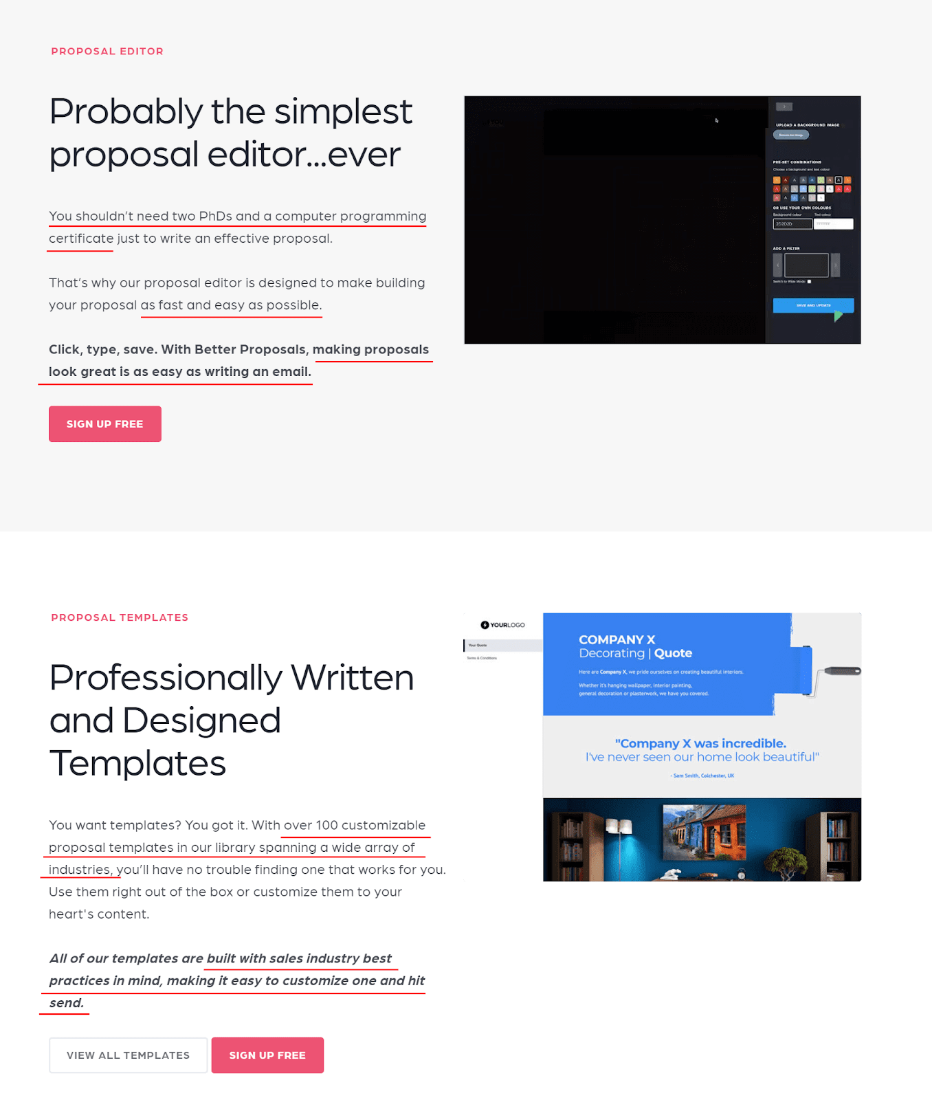
Look at Better Proposal’s product page.[*]
As its target market (i.e., freelancer), its specific language stands out. It makes me feel like they’re speaking to me directly:
-
… as easy as writing an email.
-
… built with sales industry best practices in mind, making it easy to customize one and hit send.
-
… shouldn’t need two PhDs and a computer programming certificate…
Right away, it tells me Better Proposal understands my frustration on creating proposals, and that it’s the solution I’m looking for.
10. EU NATURAL

Industry: Ecommerce
Why It Works:
Eu Natural’s product page leaves competitors jealous.[*]
Just scroll down to the customer reviews section.
The high ratings and detailed reviews instantly boost trust and credibility. No doubt they boost sales, too!
The Instagram feed at the bottom, which shows happy customers holding their EU Natural bottles, further serves as social proof.
How Do You Write High-Converting Product Descriptions?
Your product description is not here to be pretty. It’s here to SELL.
To sell, you need to know what your customers care about.
Only then can you prove you get their pain and persuade them to buy your product.
Here are three proven tips:
TIP 1: STEAL CUSTOMERS' WORDS
Go to where your customers hang out online. This could be places like forums and peer-review sites.
If you’re a freelance virtual assistant (VA) who wants to work with copywriters, hang out in Facebook Groups (e.g., The Copywriter Club). Type your keyword and see what pops up.
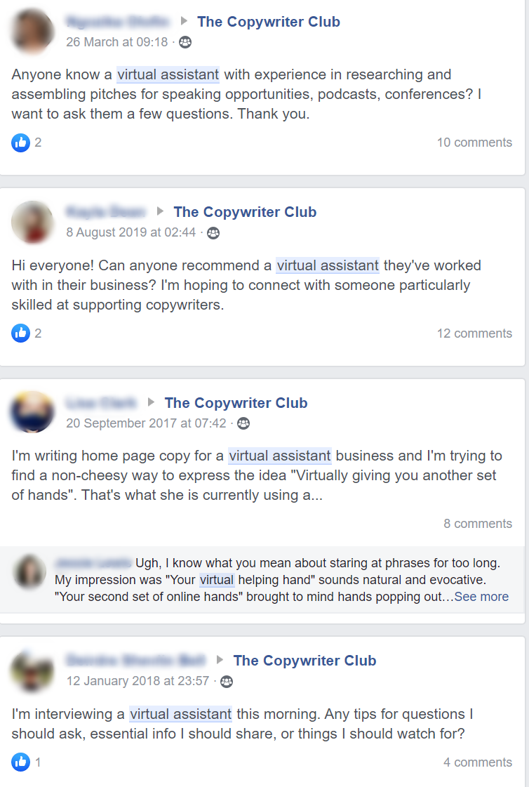
Read through the posts and observe your target customers' struggles.
Next, reflect these struggles in your product or service description to appeal to what they want.
Let’s use the first post as an example.

This is gold, as it tells us the specific tasks copywriters want to solve.
If I were a virtual assistant looking to update my product page, I’d grab it word-for-word and use it in my service description:
Looking for a reliable VA? When you work with me, I’ll help you to:
- Schedule discovery calls with new leads
- Research and assemble pitches for speaking opportunities at podcasts and conferences
- Send invoices once a project completes and make sure you get paid on time
There’s a lot more that goes into here. For a deeper look, check out our high-level guide on writing powerful product descriptions.
TIP 2: HIGHLIGHT CUSTOMERS' IDEAL SELVES
Your customers don’t want your product. They want the glowing results that come with it.
To show this change, highlight their ideal selves.
This is where EU Natural, one of our earlier examples, does well. It paints a picture of achieving that ideal self through its customers' reviews.

What if you don’t have customer reviews that show this ideal self?
Paint a picture in your product description then!
TIP 3: CONDUCT AN A/B TEST
As you stalk hang out with your target customers online, you may come across a ton of different user stories, problems, desires, etc.
DON’T lump everything together, as this results in convoluted copy.
DO this instead: Separate these variations and conduct an A/B test to see which message resonates better with your audience.
Your Product Page Has One Goal: Get The SALE
Want to make sure you NAIL your product page? Here are some best practices:
Optimize your metadata. This means your title, URL, description, and meta keywords. The first touchpoint in your customers' buying journey matters, so optimize it from the get-go!
Use the appropriate heading tags to provide a semantic structure to the outline of your product pages.
And lastly, put customer experience at the forefront to boost conversions. Include a chatbot. Show related products to cross-sell or upsell customers. Place an FAQ section.
Your days on writing mediocre product pages are over.
Take what you’ve learned today.
Make the changes.
And watch your sales numbers soar.
Add A Comment
VIEW THE COMMENTS