Do you want to get more visitors into your funnel? And then convert them into your subscribers, and better yet, customers?
There’s a simple solution: The Squeeze Page.
A squeeze page is a mini landing page with a single goal — to “squeeze” the contact information out of your website visitors.
Today, I share the six essential elements that make up a HIGH-CONVERTING squeeze page, including examples, screenshots, and tips.
%(tableofcontents)
Let’s dive in!
What is a Squeeze Page?
A squeeze page is a webpage with a single goal: To squeeze — in other words, capture — contact information from your website visitors.
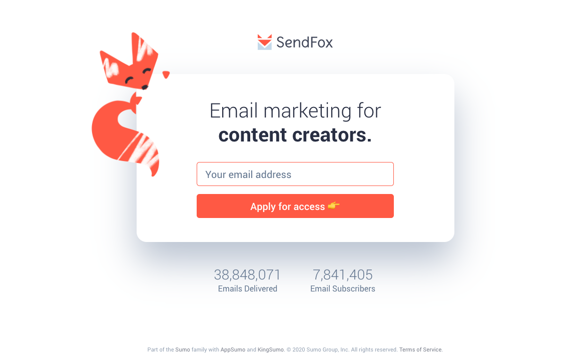
Here’s an example of a squeeze page the Sumo Group has for SendFox (as the homepage):
Squeeze Page vs. Landing Page: What’s the Difference?
The purpose of a squeeze page is to capture your visitor’s email, phone, name, etc. How is that any different from an ordinary landing page?
The biggest difference between a squeeze page and a landing page is that a landing page serves a wider range of uses and objectives. It can be designed to capture contact information, but also to get someone to buy a product, claim an offer, etc.
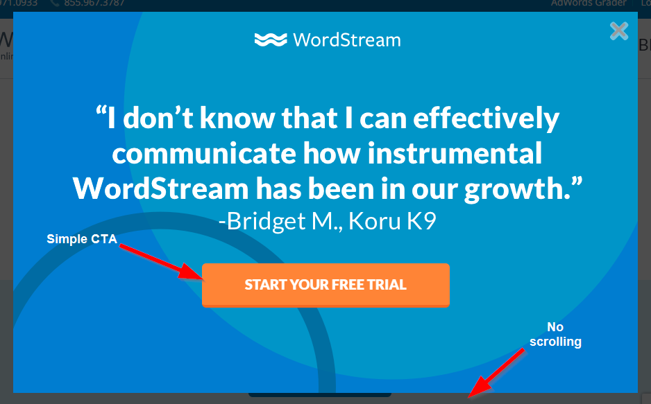
Another obvious difference between them, however, is the length. A squeeze page is mostly above the fold, meaning your visitors don’t need to scroll to see all the content.
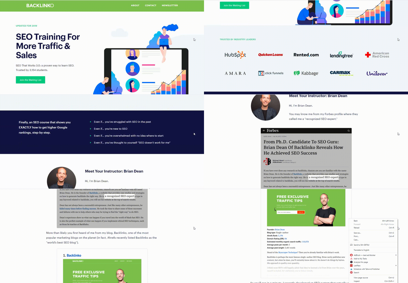
A landing page is usually much longer. You have to scroll to see everything. A landing page is usually trying to sell — or convince visitors to buy into — something, while a squeeze page is trying to get a piece of information from your visitors quickly.
Take a look:
Squeeze Page
Landing Page
A squeeze page can even come in the form of a pop-up, such as a Welcome Mat. But not all pop-ups are the same as a squeeze page.
Welcome mats are different because they take over the entire screen, unlike a typical pop-up, which only takes a small portion.
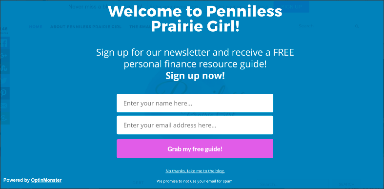
I explain how to create a squeeze page using Sumo’s Welcome Mat in the last section of this guide. But for now, let’s look at each of the components of a successful squeeze page.
Now every great squeeze page has six elements. We’ll break each of them down, and show you how to build a successful squeeze page of your own.
Squeeze Page Element #1: A Great Offer
The most important element of a squeeze page is the offer. If your offer is on point, the rest of the elements (almost) don’t matter.
Your offer must be in line with what your customers want; it needs to be relevant. I see too many companies offering something their customers couldn’t care less about.
If your visitors land on a blog page about email marketing, don’t try to get them to sign up for a generic “grow your business” guide. While it’s somewhat relevant, it’s still too far off from what they really want (email marketing advice).
A better offer would be a guide specifically to email marketing in this case.
Here are some examples:
Less-than-Ideal Offer:

While this free training from Copyblogger is awesome, it’s not super compelling because it’s so generic. “Superior business results” doesn’t speak to me and my specific business.[*]
Great Offer:
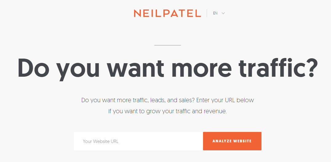
This squeeze page on Neil Patel’s site is a much better offer because everyone who comes to his site is looking for one thing: more traffic to their website. So it’s a much better match.[*]
In addition to being relevant, it has to be a no-brainer. I probably won’t give up my email for some one-page generic guide. But I might do it to unlock the rest of the videos in a series I’m already engrossed in, for example.
Make it so good they can’t ignore you!
Squeeze Page Element #2: A Killer Headline
Your headline is likely the only thing most of your site visitors will read. So it has to be big, bold, and enticing. Otherwise, you’ll lose your visitors before they even know what you’re offering.
For example, take a look at this squeeze page on my friend Jacob McMillen’s site:[*]
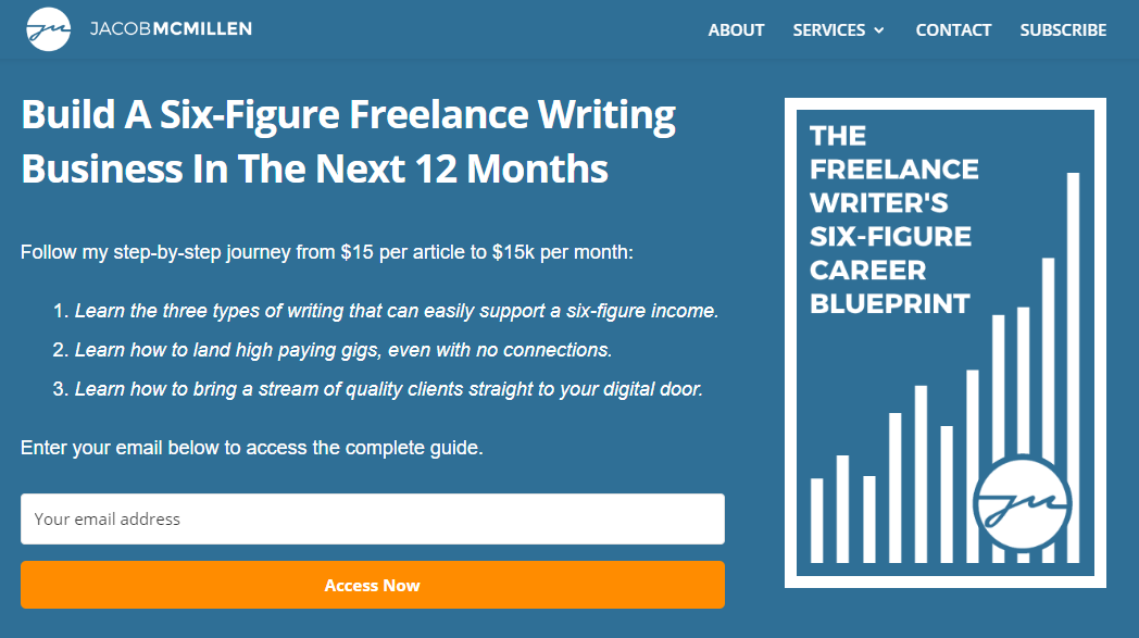
The first thing you see is his headline: Build a Six-Figure Freelance Writing Business In The Next 12 Months.
It’s a BOLD statement. But I’ll be damned if it doesn’t grab your attention!
It works so well because:
-
It’s big, bold, and stands out.
-
It makes a seriously strong promise.
-
If you believe what he says, signing up is a no-brainer.
If your offer is great, writing a great headline is easy. Just tell your visitors exactly what they’ll get when they sign up. If that doesn’t sound enticing, then your offer probably isn’t good enough. Go back to step one.
Squeeze Page Element #3: Awesome Secondary Copy
In the previous example, you saw that Jacob has some secondary copy after his headline. This extra copy is your chance to tackle objections and give some more information to seal the deal for the visitors who read beyond your headline.
Think of it this way: Your headline is your billboard, while your secondary copy is your salesman on the phone when they call the number on your billboard.
Here’s an example from Formilla:[*]
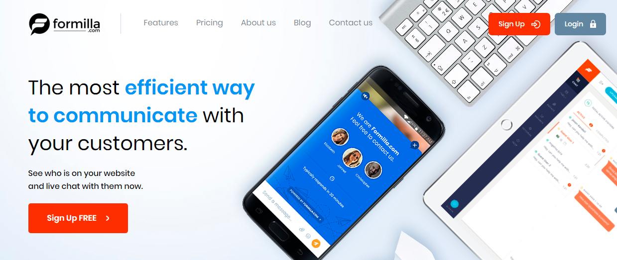
Their approach is one of simplicity; they tell you exactly what you get in a single sentence. See who is on your website and live chat with them now.
If you’re after live chat software, this is a no-brainer.
When crafting your secondary copy, consider the following:
-
What does your customer want?
-
How can you convince them they will get what they want with your secondary copy?
-
What objections might they have? For example, would they think your offer is too time-consuming? Too difficult? Not actually going to deliver on your promise? Use your copy to overcome these objections.
For example, let’s say you have a 20-page guide to starting your own blog. People might think, “20 pages? That’s way too much reading for me!”
You can overcome this objection by saying something like, “On average, it takes people just X days to finish and implement our guide and have their own blog up and running” or “Most of the 20 pages are screenshots that show you exactly what to do and where to click.”
Squeeze Page Element #4: A Bulletproof Call to Action (CTA)
Your call to action (CTA) is SUPER important. If it blends in with the background or isn’t enticing, people won’t click it.
In the last example, the CTA was “Sign Up FREE.” Free is a powerful trigger word that can help you get more clicks. Some other trigger words you can use include:
-
Discover
-
Guarantee
-
Boost
-
Cure
-
Elite
-
Insider
-
Overcome
Check out our full list of 101 trigger words here.
In addition to the wording, color also matters. I’m not talking about using a particular color, like red, to boost conversions. No one color works everywhere.
Instead, you need color CONTRAST on your CTA. Your button has to be a color that stands out from the background and other text on your page, while still fitting within your color palette.
For example, on Bank My Cell, the main colors are teal and navy, while the CTA colors are pink, causing them to stand out:[*]

Plus, how can you not click on a giant button that says “GET PAID”, am I right?
To help you find the right color for your CTA, use a tool like Paletton. Put your primary color in the tool, then click the Triad option.
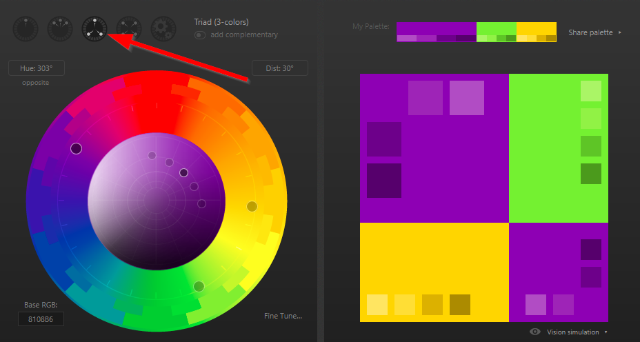
In the above example, your site’s main color is purple and your CTA should be green or yellow. In this case, I would use yellow, as warmer colors (red, orange, yellow, etc.) tend to draw the eye more than cooler colors (blue, green, purple, etc.).
Click the TABLES / EXPORT button to get the color codes.

Squeeze Page Element #5: Social Proof
At this point, we haven’t seen any examples of squeeze pages using social proof. It’s tough to fit all that on one page without scrolling, but if you can manage it (without the page becoming ugly or cluttered), social proof can improve your conversions.
By social proof, I mean testimonials or statistics that prove people are loving your offer. For example, Double Your Freelancing has a squeeze page for their email course.[*]
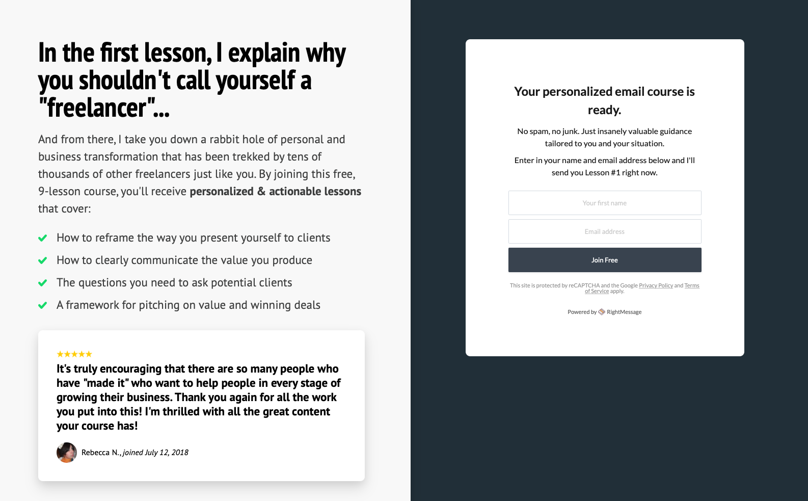
This testimonial is eye-catching with the 5-star rating, and even better, comes with the date it was given. It adds an extra layer of trust to show that it’s a real review.
Another way to provide social proof is by sharing how many people have already signed up for your offer, like how we do on FAM’s homepage:
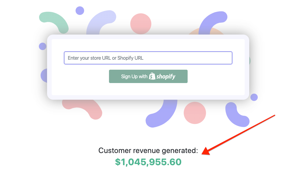
We mention how FAM has helped the users generate over a million dollars in revenue. If FAM has already worked for other customers, chances are it’ll work for visitors who are still on the fence.
Squeeze Page Element #6: A Simple, Straightforward Form
I’ll keep this short and sweet…
Do NOT have too many form options.
You should only have a single form option; two at the most. Primarily you want their email address, but you can also get their name if you truly need it. See how Noah Kagan does this on his email newsletter squeeze page:[*]
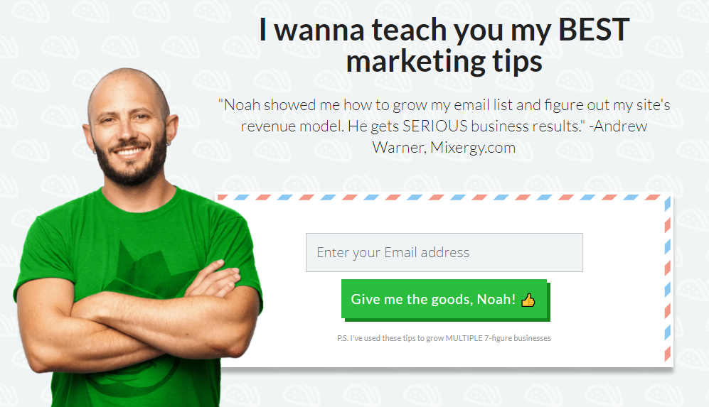
If you need more information, don’t ask for it until AFTER your visitor submitted their initial email, such as through a two-step squeeze page. First, they enter their email or click a button, THEN you ask for any more information you may need.
For example, the Sumo homepage has ONE form for a website URL.
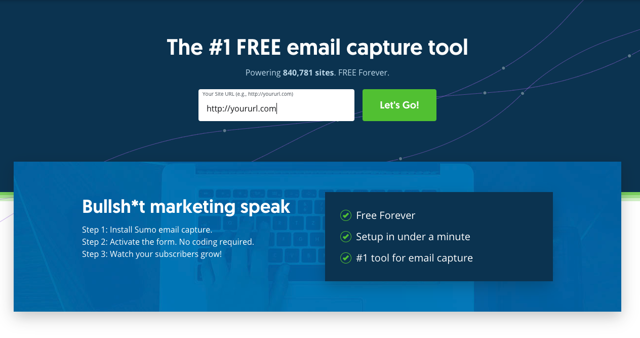
Once the visitors click the Let’s Go! button, we ask for their email address and new password to create a Sumo account.
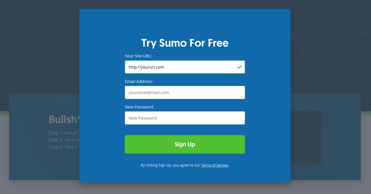
This works because once people commit to something, they’re more likely to follow through and finish. But they may not commit if they know all the work that’s involved. So hide the work until they’ve shown their commitment by clicking your CTA button.
How to Create an Instant Squeeze Page Using Sumo Welcome Mat
Ready to create your squeeze page? Here’s a five-step guide to creating a squeeze page using Sumo Welcome Mat.
Step 1: Sign Up for Sumo (Free) and Add Your Website
Once you sign up for Sumo (If you have an existing Sumo account, go to the Sumo dashboard), click the + Add New Site button.

Then just follow the instructions to set it up on your site!
Step 2: Create Your Welcome Mat Form
Go to the Forms page and click + Create New Form.

Change the Form Type to Welcome Mat.
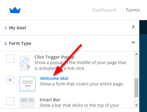
Design your form the way you like it! Choose a template you like the looks of, then start editing the text. I personally like the Brand template.
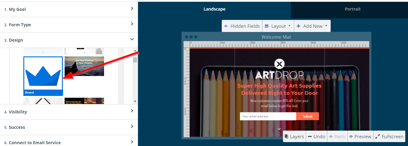
Step 3: Craft Your Copy & Design Your Squeeze Page
To create your squeeze page:
-
Change the logo to your logo or delete it altogether.
-
Update your copy to reflect your offer.
-
Change the font and colors to match your brand.
-
Change the CTA copy.
-
Change the background to an image that works with your brand (or a solid color). To do this, click the background image and press delete on your keyboard.
Here’s what mine looks like after doing all the above:
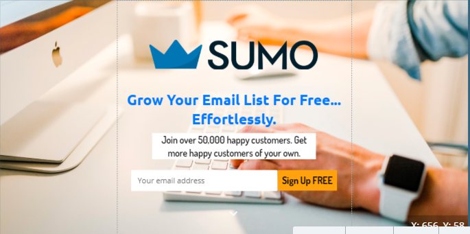
Step 4: Finalize Details & Link Your Welcome Mat to Your Email List
Once you’ve finished the design, simply go through the rest of the form settings one by one. Set the visibility (I like Smart Mode) and decide what happens when they click your CTA.
For example, if your offer is a download, create an email that sends them the download link. For more help sending a welcome email, check out this guide.
Finally, connect your form to your email service. You can either use Sumo as your email service or link it with another service like SendFox.
To link it with Sumo, do not connect with any email service. Simply create the email you want to send within your Sumo account, then select a list you’d like to send the subscribers to.

You can create new groups if you want to segment your list. And you can email these subscribers directly through your Sumo account. It’s up to you!
Step 5: Test Everything!
Don’t forget to visit your squeeze page on a laptop or desktop PC, as well as on a mobile device, to make sure it looks good and is working properly!
For more help creating and testing your welcome mat, check out these help articles:
When Life Gives You Online Traffic, You “Squeeze” It
Here’s a recap of what we learned:
-
A squeeze page is a simple landing page with the sole purpose of getting your website visitors to buy or subscribe.
-
The best squeeze pages use social proof, great copy, and a color-contrasting CTA button to get more conversions.
-
However, your OFFER is more important than any of these things. Start with what you’re actually giving people, then work on the details.
-
Great design is also important. If you have an amazing offer but an ugly and outdated squeeze page, you may lose trust with your visitors.
-
Test your squeeze page on multiple devices and using multiple browsers.
Now it’s over to you. Are you going to create a squeeze page? If you have already, how has it worked for you? Let us know in the comments below!
Add A Comment
VIEW THE COMMENTS