Imagine someone dragged you to a NASCAR event. Be honest, if someone said you had to watch a bunch of cars drive 200 MPH in a circle 200 times, what would you hope to see?
Crashes. SAFE, but spectacular crashes. For the same reason people want to see fights in hockey and why America’s Funniest Home Videos is still going strong.
We all want to see something go horribly, horribly wrong.
That’s why you’re here, yeah? You want to see what the worst popup in existence looks like.
I don’t blame you. Because this thing is ugly as sin.
GAZE UPON MANKIND’S FOLLY!

Don’t adjust your monitors — those are definitely the intended color schemes. Some of you might be squinting to read things. Some might be be bothered by the alignments. Some might be holding onto loved ones, praying this isn’t the beginning of the apocalypse.
You’re all justified to do that. But don’t laugh yet, cause here’s the truth…
You’re Committing The Same Errors In YOUR Popups
Look, you’re not going to see this exact popup in the wild. No one person has that bad of judgement. But this popup does contain 9 of the most crippling flaws that destroy your popups.
Oh, and spoiler alert: any one of these errors can absolutely SINK your conversion rates. Follow along as I dissect all 9 of these mistakes (and how you can avoid them).
By the way, here’s a 7-part course where we teach you how to build your list after you set up a popup — even if you have 0 traffic. Click here to grab that free course.
Popup Mistake #1: Your Color Palette Is Like A Tie-Dye Shirt On Its Worst Day
And that’s not a compliment. There’s something about creating a popup that brings out an irresistible urge to combine colors that have only ever cohabitated on a tie-dye shirt.
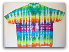
Before this guide, I had no idea there were tie-dye polos.
I kid you not, I once asked a client about their choice to use neon green font on an orange background and they said, “I wanted to get fancy with it.”
The only place “get fancy with it” is acceptable is on the dance floor and only if “Gettin’ Jiggy With It” is playing.
Here’s the problem with an…eclectic…color scheme. In web design, color is used to capture attention. You generally give the most stand-out color to your important areas like buttons and headlines. Everything else is a muted color to draw focus to those bright, important areas.
But when everything is a different color, nothing is important. Nothing stands out. Your visitors have to guess where you want them to look. When you’re dealing with limited focus, that’s a recipe for disaster.
Take our hideous popup example:

That red background is LOUD. If you turn your head away for a second then look back at this popup, you’ll notice you don’t really know where to look.
If I had to guess, you looked at the form fields because your eye was drawn to the white (it stood out more).
What’s worse is the button color blends into the background. It’s incredibly difficult to realize it’s even a button. Which begs the question: if you can’t see the button, how do you opt-in?
On top of all that, the colors make it almost impossible to read the headline and description. Time is precious to your visitors. If they have to work to even see what your popup is about, you’ve already lost them.
The Fix
Fixing your color palette is as simple as keeping four things in mind:
- Pick Either The Headline/Button Or Background: The headline/button coloring places importance on the actual offer in the popup. Generally your background is a neutral, muted color in that instance. If you color the background, you make your whole popup stand out. However, no one area has importance.
- White, Black Or Grey Font (For Safety): With a colored background, stick to a white font. Throwing colored font on colored backgrounds is asking for trouble. With a white background, the standard grey or black does the trick.
- Use 1 to 2 Colors: Ideally you want to stick with one color — it keeps things simple and easily points out all the important areas of your popup. If you DO want to get wild and make the headline and button different, use no more than two colors.
- Use Complementary Colors: No, hot pink and burnt orange don’t go together. If you do use two colors, make sure they complement each other. This tool is extremely useful for finding those perfect colors.
Here’s an example of one of our popups that follows this advice:
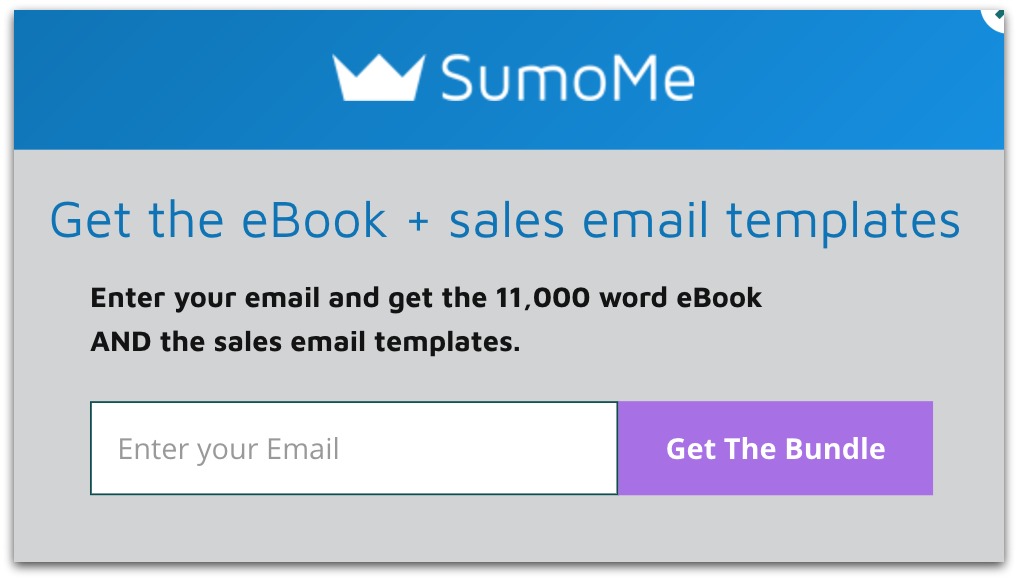
We only use two complementary colors — purple and blue. The headline and button stand out due to their unique colors against the grey background. Plus, everything is easy to read because we stick to our white and black font rule.
If we apply these rules to our ugly popup, it looks like this:
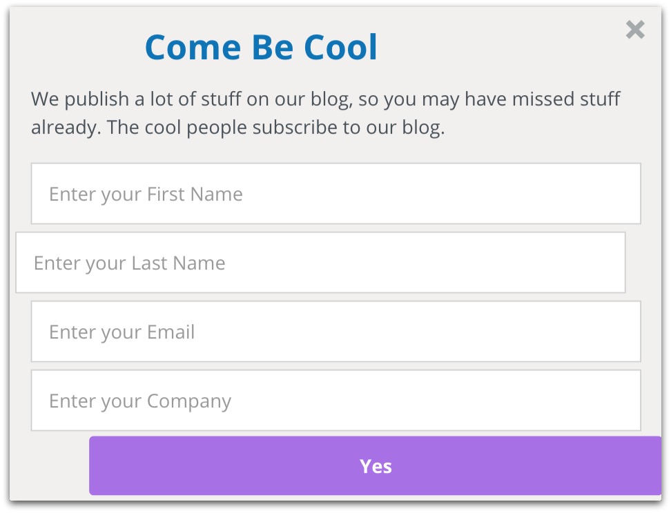
As my uncle said when I put on my prom tux, “Still ugly, but it’s progress.”
Check the Picasso aspirations at the door and stick to these color rules. Your conversion rate will thank you.
Popup Mistake #2: You’ve Awakened The Inner Stickler In Your Visitor
Does this bother you?

How bout this?
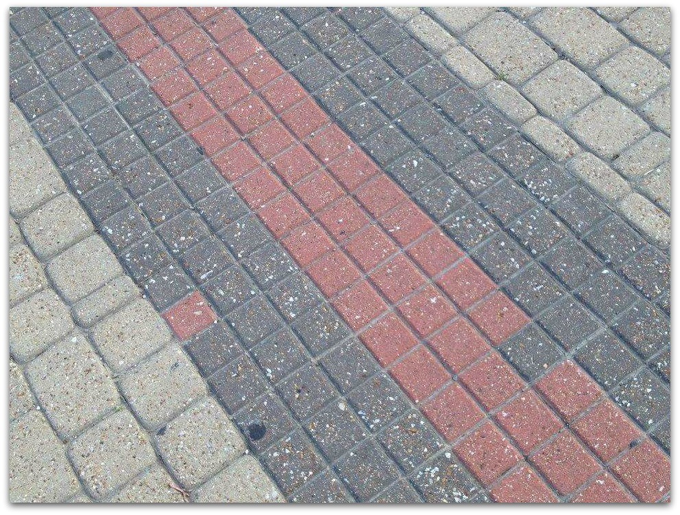
Things are just sliiiiiiightly off in these images. Yet I’m sure they made your soul boil over. WHY COULDN’T EVERYTHING BE IN ORDER?!
When you saw our ugly popup for the first time, I bet you noticed the slightly off-center elements like the form field, button and headline:
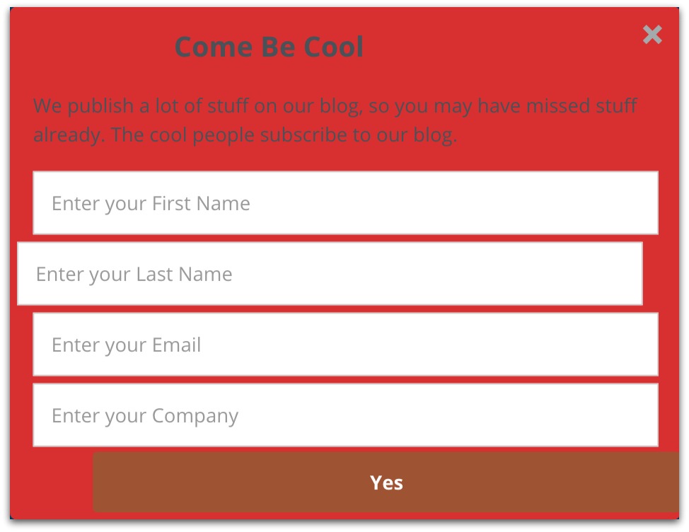
I bet you didn’t just notice it — it bothered the heck out of you. And if you’re focused on those flaws, you’re not focused on the popup’s message. Once your visitor questions your popup, you lost all credibility.
It’s not surprising in the slightest. Of the four credibility factors in web design, design quality is still the biggest factor in establishing trust.
The more control you have over your popup, the more likely you are to commit this kind of error. All it takes is dragging one element a little too far and suddenly you’ll find your conversion rates plummeting.
The Fix
Fixing alignment issues comes down to two main factors:
- Not settling for “close enough”: Close enough doesn’t cut it in design. If you see something and feel like it’s off, put in the extra few seconds to make it right.
- Having guidelines: If you’re just dragging things around all willy-nilly it can seem impossible to perfectly align your elements. You need a tool that does that for you.
Luckily, List Builder 3 automatically aligns your text, images, buttons and everything else. Watch how I un-mess up this ugly popup in List Builder 3:
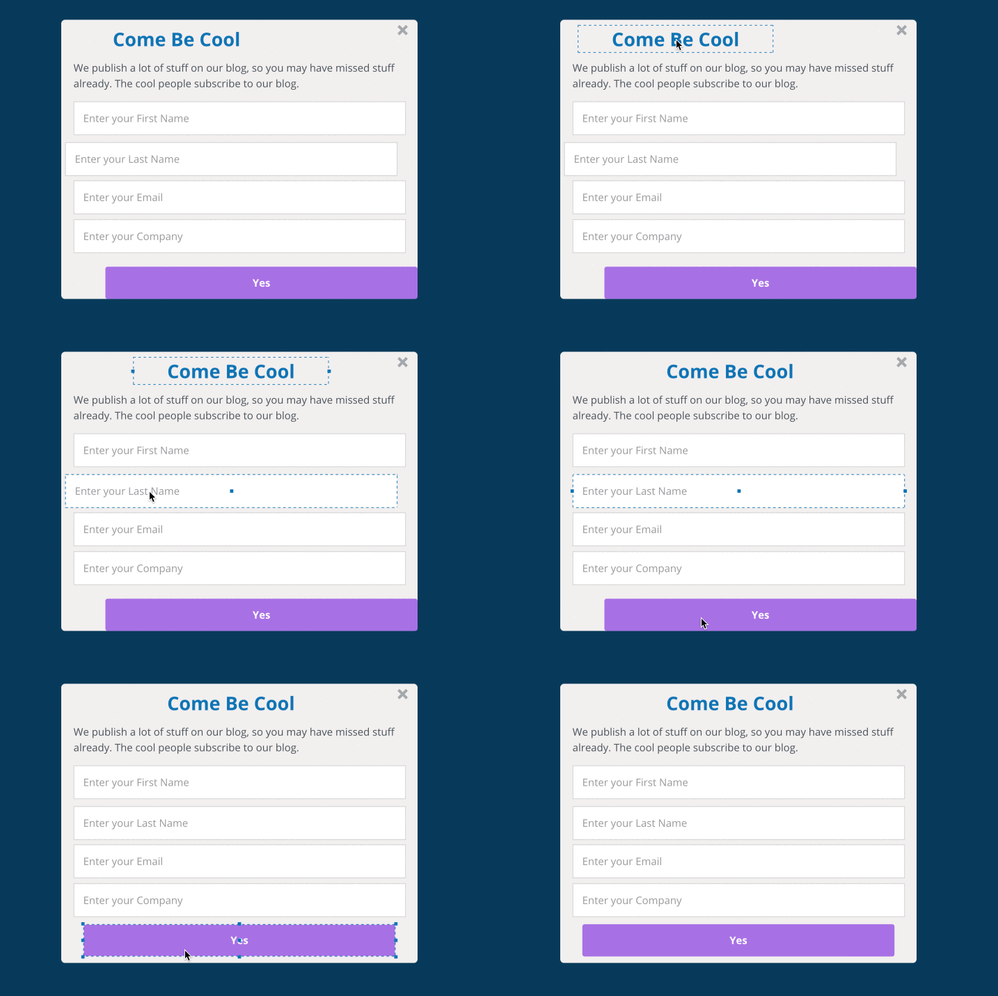
See how everything seems to snap into place? That’s List Builder 3 kicking in, letting you know where the right spot is.
Doesn’t the popup instantly look better? Design is the easiest mistake to point out because you instantly recognize it. Just by fixing color and alignment you end up with a respectable looking popup.
But therein lies the danger. It might look like a fine popup, but there’s still several things wrong with this popup.
Those other mistakes? They’re the ones you make the most. Starting with…
Popup Mistake #3: Your Headline Reads Like A 3am Drunk Text
C’mon. We’ve all sent this text at one point in our lives (or at the very least received one).
You think of something super clever to say, smirk a bit and fire off a Shakespearian text to a “person of interest.” Then you get this text back:
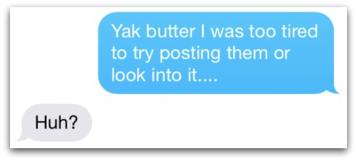
That….went better in your head. And you ended up confusing the hell out the person reading your text. In the end, your cleverness turned into a confusing jumble of words.
Headlines on popups are the same. When you try to be clever, you actually hurt your conversions.
Why? Remember, your popup has a limited exposure time. You have a few seconds to capture someone’s interest. If they have no idea what your popup is offering then you’re dead in the water.
We published a big study last year that proved straightforward headlines beat creative headlines 88% of the time.
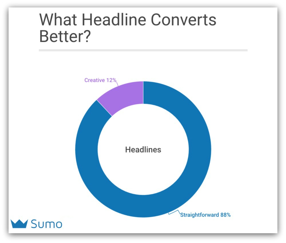
And the headline on the ugly popup is definitely more creative than straightforward — “Come Be Cool.” Any idea what that means?
Me either. If I was in high school I might be inclined to read on. Otherwise I have no idea if I’m getting a discount or content upgrade or joining a list.
Thanks, creativity.
The Fix
Just be straightforward and tell your visitor what you’re offering them. If I see a popup, I want to immediately know why it’s there and what it’s offering.
The good news is being straightforward takes far less time than being creative. Think about all the times you spent toiling over your keyboard trying to think of the perfect witticism. Wouldn’t it be nice if you could spend 15 seconds creating a better headline?
Case in point. Look at these two headlines:
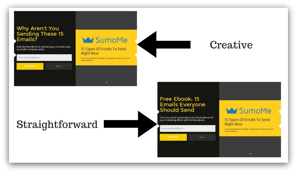
Guess what? The straightforward headline performed 2x better than the creative headline.
Let’s look at our ugly popup again. Spoiler alert, this popup is for capturing blog subscribers. So instead of “Come Be Cool,” we could rewrite it to say…
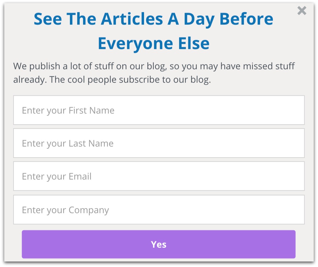
I changed it to “See The Articles A Day Before Everyone Else.” Now you at least know what the popup is offering.
More or less, your straightforward headline is a promise. Even if it’s something simple like:
- Win Two Tickets to Bruce Springsteen Live
- Download Our Free Ebook
- Get 20% Off Your First Order
It may seem underwhelming. And you may ache to bust out something real creative.
But the stats don’t lie. Being straightforward is your best chance to save your valuable time AND get higher conversions.
Popup Mistake #4: Descriptions Are For…
…describing things.
And you might think, “Yeah, duh, that’s what I’m DOING.”
But are you really describing your popup’s offer? One thing we all fall prey to is knowing something so well you assume your reader knows, too.
Imagine you were blind and didn’t know what the color blue looked like. Would you get a clear idea after this description:
“Blue is an excellent color. Tons of websites use it because it’s a pleasing color. It’s been shown to increase conversions vs. other brighter colors. Oh, and it’s pretty much the opposite of red.
Not. Helpful.
I talked a lot about blue. But I didn’t describe it because I know the color blue instinctively. You’d leave that description having no clue what blue looked like.
Our ugly popup example is guilty of that:

The description talks about the blog. But what are you supposed to do? Do you know what you get if you opt-in?
Probably not. It’s because this description isn’t really a description. It’s a brag masquerading as persuasion.
The Fix
When you write a description, all you have to do is follow a simple formula:
What you want them to do + why they should + what they get = $$$
Believe it or not, this formula was proven ever since cavemen wrote on walls. Simply put:
- What they get: What is the specific value? What does your visitor get when they opt-in? Make it explicit.
- Why they should: Give a compelling reason (usually one sentence) to follow through with your action. Prove the value of your offer.
- What you want them to do: Tell your visitor what you want. Do you want them to click a button? Enter their email address? Give them something actionable so they don’t guess.
Using that formula, our ugly popup description would look like this:

I’m telling the reader what to do (enter their email), telling them what they get (exclusive advanced access) and telling them why they should opt-in (50,000 people a month read these articles).
Did you have to guess what you’re getting? Nope — it’s all spelled out plain as day. And just by following four suggestions, look how much better that ugly popup is:
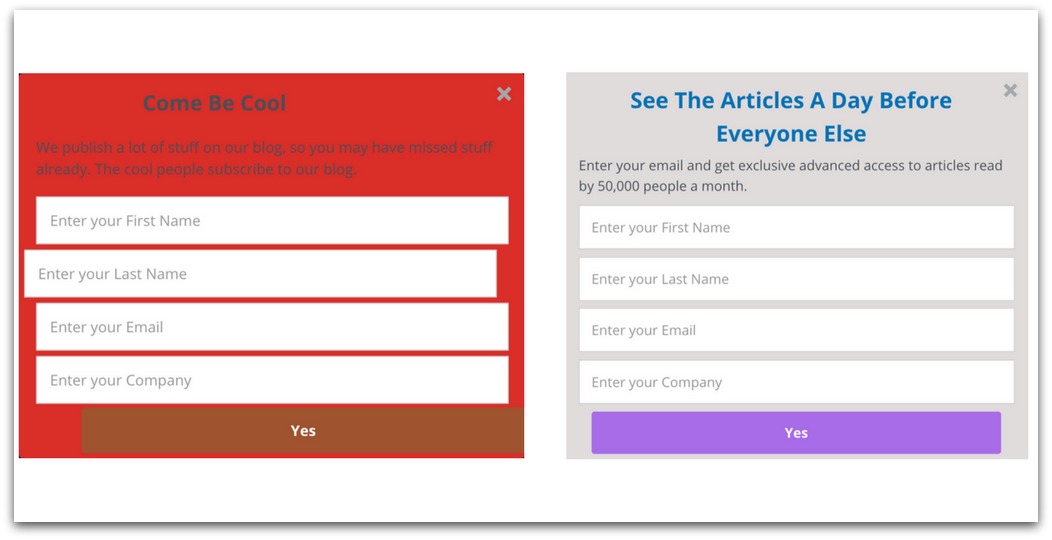
It’s like night and day. But if you think that’s something, watch what happens after this next popup mistake…
Popup Mistake #5: You’re Trying To Be Sherlock Holmes, But You’re More Like His Third, Lesser-Known Brother
You want to know your audience.
Like, really know them. So your popup gives the 3rd degree — who are you, where are you from, what’s your email address, who’s your favorite character in Breaking Bad?
You think you’re gathering information so you can speak to the hearts of your adoring fans…
But what REALLY happens is you turn into Sherlock Holmes’ third brother completely destroy your conversion rates.
Generally, the more fields on your popup, the lower your conversion rate. That’s because you’re asking a complete stranger to give you a lot of personal information.
Our terrible popup asks a little too much:

First AND last name? Company name? What is this, a first date?! Why would someone want to take the time to fill in all that information — especially when you’re just opting-in to a blog?
The answer is they don’t, and that makes your email list sad (and empty).
The Fix
Ask yourself what information you really need.
Look, I get it. There are times when having a lot of form fields will be advantageous for you. I’m talking consultations, demos, and anything else where you literally need info to follow through on your offer.
But for everything else? An email address will suffice.
In our ugly popup example, we’re asking people to subscribe to the blog. Instead of asking for a ton of information, just ask for the one thing that gets them on your list — their email address:
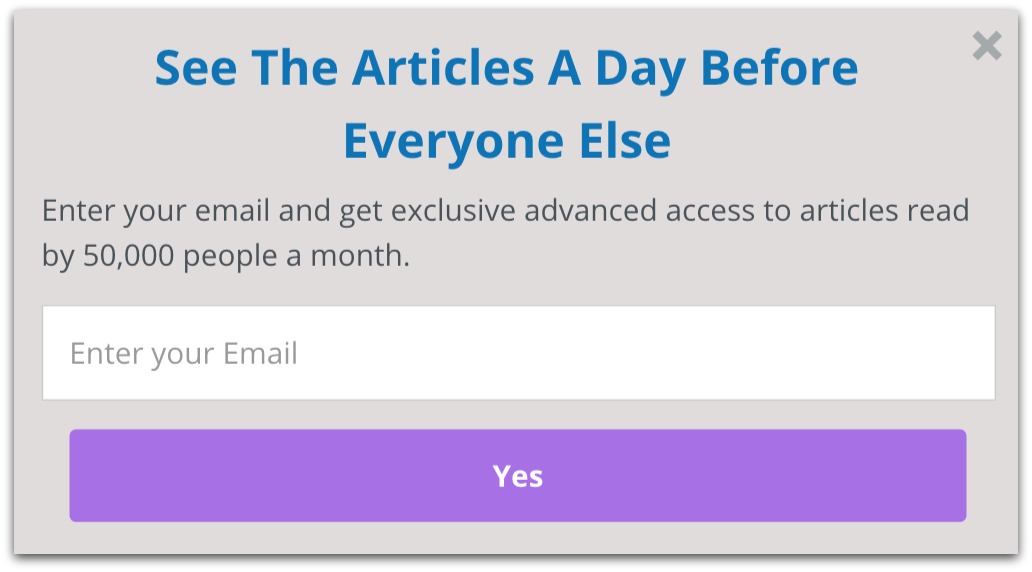
Doesn’t the popup already feel less intense? Instead of this long mamma-jamma, it’s just a short, simple offer.
Easy rule of thumb: just ask for the email address. It makes a visually clean popup and increases your conversions.
Popup Mistake #6: You’re No Braveheart
Remember the scene in Braveheart where Mel Gibson gives that crazy rousing speech to the Scottish countrymen?
Good lord, I could’ve run through a wall after that. He was super clear with what he wanted. His call to action was impeccable.
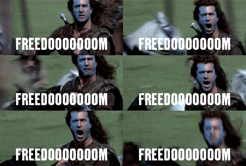
THEY CAN NEVER TAKE OUR EMAIIIIIIILLLLLLS!
The key to a great call to action is you clearly know what to do after seeing it.
Our ugly popup is….lacking that:

Yes what? What happens when you click that button? What do you get? Is there a “No” button I’m missing?
It may seem like a done deal when you nail your headline and description. But, surprisingly, the words you use on your button (the call to action) have a big effect on conversions.
Being cute, clever or mysterious in this area is a strict no-go. Your visitor may be sold after seeing your popup, but they can get spooked to click if the button doesn’t match up with what was promised.
The Fix
Make your call to action match your offer.
You’re basically just confirming your offer in a few words:
- If you’re offering a discount, you commonly see phrases like “Get Discount,” “Take X% Off,” and “Shop Now.”
- If you’re giving away a content upgrade, you see “Download,” “Get the Free (Whatever),” or “Get It Now.”
- If you’re asking for blog signups, you see “Subscribe,” “Join the Community,” or “Get Updates.”
The other option is to make the call to action more…action-y, kind of like a “knock knock, who’s there” format. The headline is the knock, and the button is the response.
If I wrote a popup headline that said “Get The Conversion Optimization Spreadsheet” I could write “Optimize My Site” as the button. It’s more action/results oriented, which works as well as the straightforward approach (though you miss more than you hit with this option).
For our ugly popup, we could replace the “Yes” with something that speaks more to the offer — getting advanced access to articles:
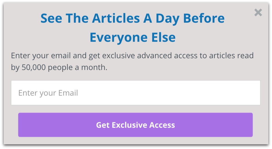
All I’m doing is echoing the offer. If you completely skipped the description, you’d know what you’re getting just by the headline and button copy alone.
Now the popup looks great, right? Here’s the thing — without telling you, I actually fixed the next mistake a little while ago.
Think you can spot it? It’s a bit tough…
Popup Mistake #7: You Ignored Legendary Singer Roger Hodgson
If you don’t know who Roger Hodgson is, how dare you. Get educated quick.
All the man asked was for you to “give a little bit.” Turns out that makes all the difference in popups.
When we did an exhaustive study of 400 million opt-ins, we found a strong pattern emerge….
The most successful popups gave the visitor something of value.
Seems like a “duh” statement. But how many thousands of sites do you see rolling out the same “Subscribe to my Blog” popup (maybe even yours)?
That’s what asking vs giving comes down to. Popups that ask you to join something without giving anything tend to fail. Who wants more emails from yet another site?
Popups that give, though, offer immediate and apparent value. You’re not just joining a list — you’re getting something of value in return. Two birds, one stone, baby.
In our bad popup example, it’s a simple (though confusing) ask to join the blog:

There’s no give. It’s just another generic popup asking you to join another generic blog.
The Fix
Like I said, we kinda already fixed this (secretly). Remember when we changed the headline to this:

That’s an example of giving instead of asking. The old popup asked people to join the blog. THIS popup gives subscribers something of value — advanced access to articles.
Instead of asking your visitors to join, give them something. Think about everything you can give:
- Discounts
- Content upgrades
- Exclusive access
- Consultations
- Tools
- Advanced notices
And that’s just the tip of the iceberg. To give you an example, we’ve only used ONE of the items on that list (content upgrades) on this blog. And we’ve collected hundreds of thousands of emails.
It’s all about finding value. If you know your audience, you can zero in on what they want then give it to them.
Popup Mistake #8: You Offered a Monster Truck to A Prius Owner
You might think you have a perfect popup. And you might think your offer is on-point.
But even the best offer is terrible in front of the wrong audience.
It’s like offering a monster truck to a Prius owner. Monster trucks are arguably the coolest things around. But you could offer that truck to a Prius owner FOR FREE and they still wouldn’t bite.
Remember what our ugly popup offered? It asked visitors to sign up for the blog.
You know where that popup would make no sense? On the homepage of a site:
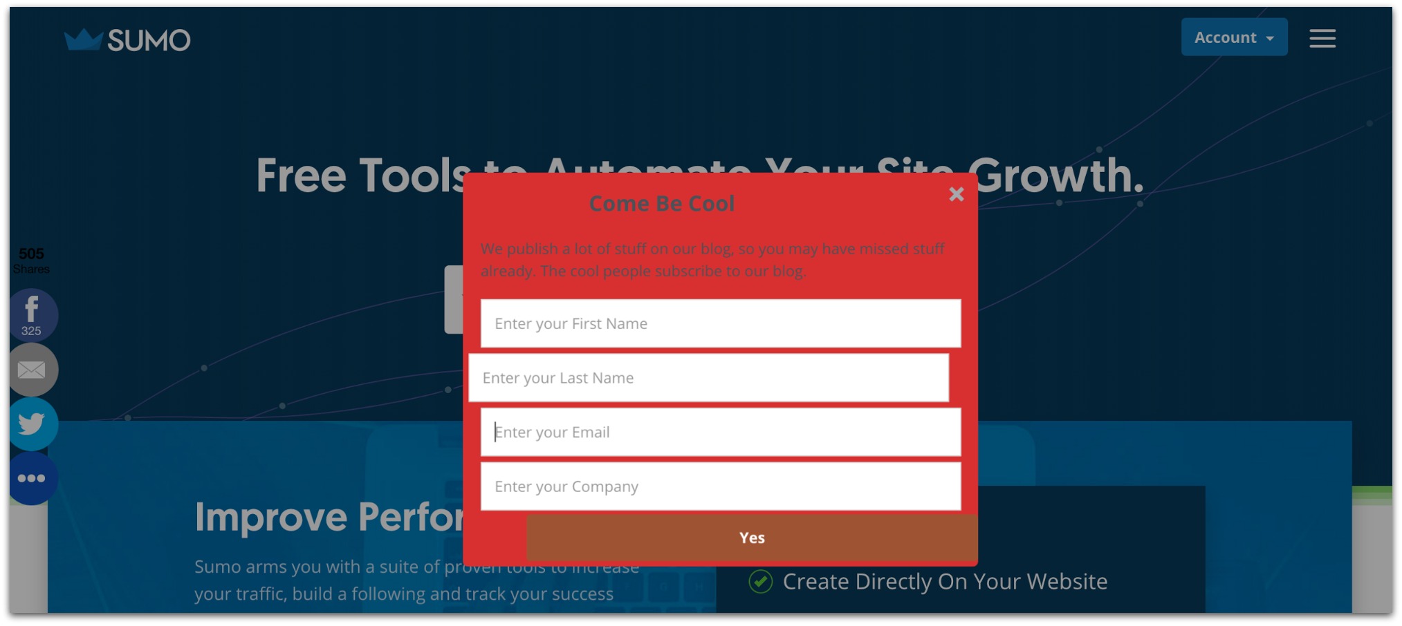
For the record, we’d never show this popup on our homepage. Gross.
If someone is on your homepage, you probably absolutely don’t want to distract them from your product with an offer to sign up for your blog. They’re not even on your blog! They might not even know you have a blog!
Putting a great popup on the wrong page is even worse than putting a bad popup on the right page. You’ll only annoy your visitors and get frustrated when your opt-in numbers are terrible.
The Fix
Make your offer match where your visitor is.
Granted, this is a pretty easy fix. All you have to do is look at your offer and match it up with the page that’s most closely related.
Easy example to start with: instead of a blog opt-in popup showing on a homepage, it makes more sense to show that popup on your actual blog:
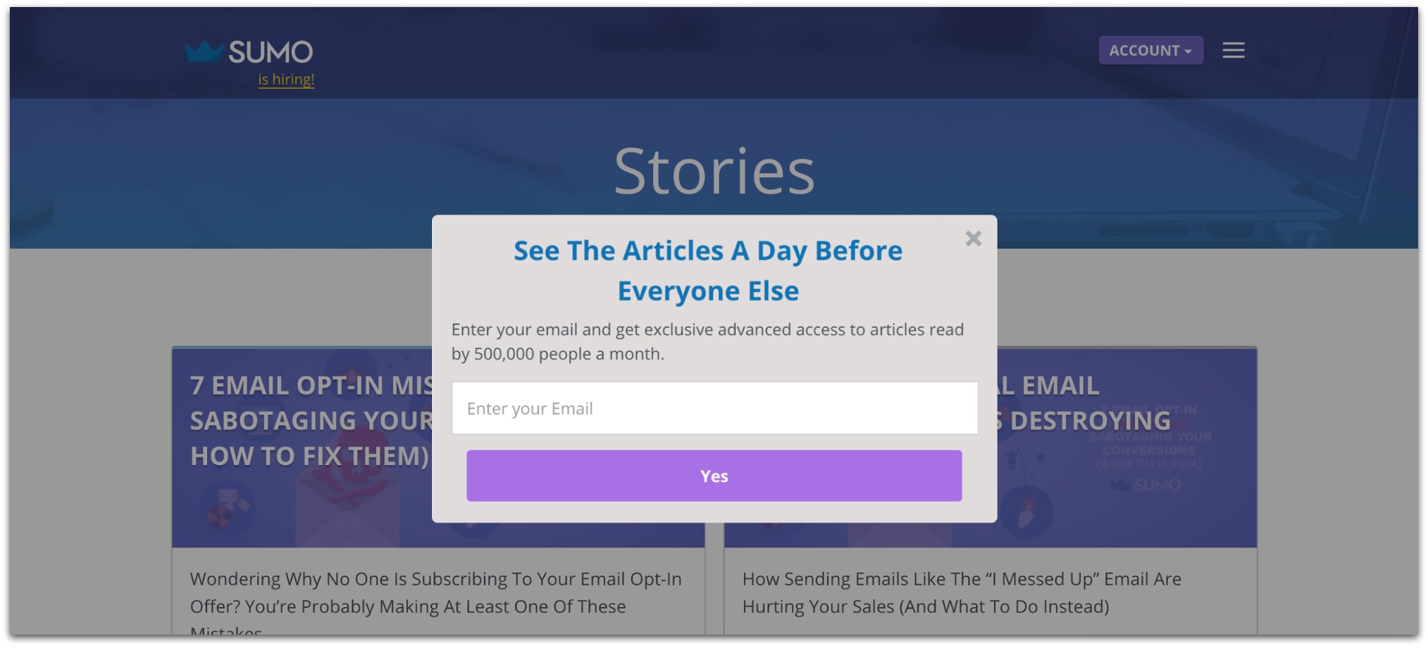
That’s easy enough, right?
But I get this counterpoint a lot: “Sean, I’m not giving away content upgrades or tools or any of that stuff. I’m giving away discounts. There’s no bad place for a discount on my site.”
I counter the counterpoint with this. Instead of a general discount all over your site, wouldn’t it be smarter to show specific offers to specific audiences?
Say you’re an apparel store and you sell shirts, pants, dresses, shoes, etc. You want to give a discount to all your visitors.
Don’t just throw a “15% Off Everything” popup everywhere. Make it more tailored to your visitors.
I’m talking about a popup for all your categories. That sort of targeting makes the offer feel so much more personalized — leading to higher conversion rates.
Oh, and did I mention List Builder 3 makes it incredibly easy to focus in on those specific visitors? You just insert your page’s URL:
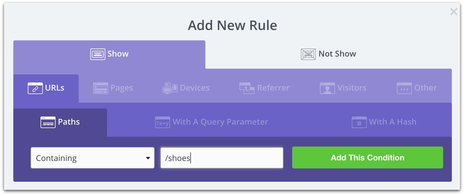
And the popup will show on that page.
You can apply this to any popup you create. Just remember — the more tailored the popup is to the visitor, the better off you’ll be.
Popup Mistake #9: You Just Couldn’t Wait, Could You?
I’ll admit. I cheated on this one. Technically, since I just used an image of our ugly popup, you wouldn’t know this was a problem.
But patience is a virtue, and your popup should be more like a monk than a toddler.
See, this ugly popup appears immediately when a visitor hits your site. I’m talking right when the page loads, the popup is there.
Two reasons why that isn’t great…
- You’ll Get Slammed On SEO: If your popup appears immediately on mobile devices, Google will give your site a big fat penalty. The cost? You fall down in rankings.
- Your Conversion Rate Plummets: You aren’t giving your visitor enough time to see your site. It’s like meeting someone the first time and asking them to loan you $10. It might happen, but it’s very rare.
That’s a double dose of trouble. Fewer emails captured AND Google slaps you around? All because you couldn’t wait to show your popup a few seconds later?
Is it worth it?
The Fix
Set your popup to appear a little later. It’s the easiest way to A) Give your visitors time to see your site and B) Keep Google of your back.
I’m not talking waiting an hour or even a minute. Give your popup a 10 second delay.
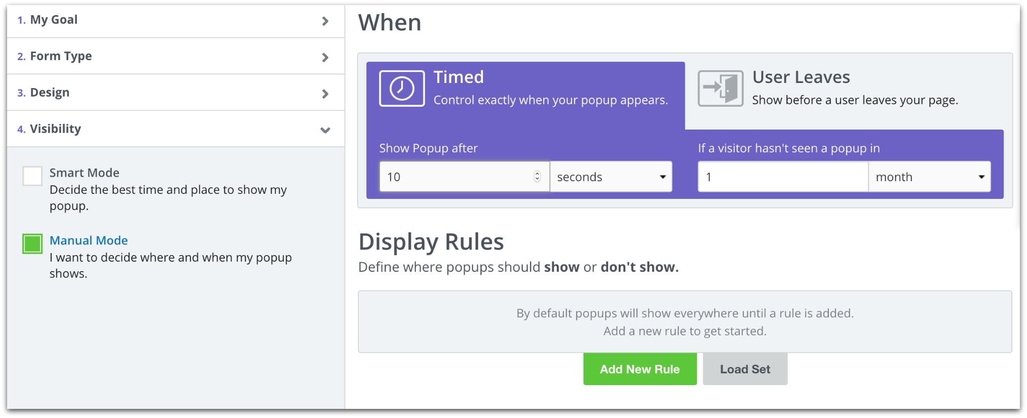
Ten seconds is more than enough time for a visitor to get acquainted with your site. On average, we see successful popups open in that five to ten second window.
If timing isn’t your thing, you can always create a Click Trigger. That just means the popup only appears when your visitor clicks a link or image (Hint: We see conversion rates of 60-80% on this blog with Click Triggers).
Either of these fixes keeps you golden in the eyes of your visitors and the robotic overlords at Google.
Think Your Popup Is Top-Notch? Let’s Get Serious About Building Your List
Hey, if you made it this far then you’re serious about building the best popup in existence.
But the best popup is useless without strategy. Do you know exactly how you’re going to build your list — where you’ll get traffic, how to literally create traffic and what to do after you get subscribers?
That’s where we come in. We created a huge 7-part course to help anyone and everyone build a massive list — even if you have 0 traffic.
We put a lot of hours into it, and we’re giving it away for free because we want to put out better FREE courses than what you’d pay for on other sites.
Download it and take a look.
Add A Comment
VIEW THE COMMENTS