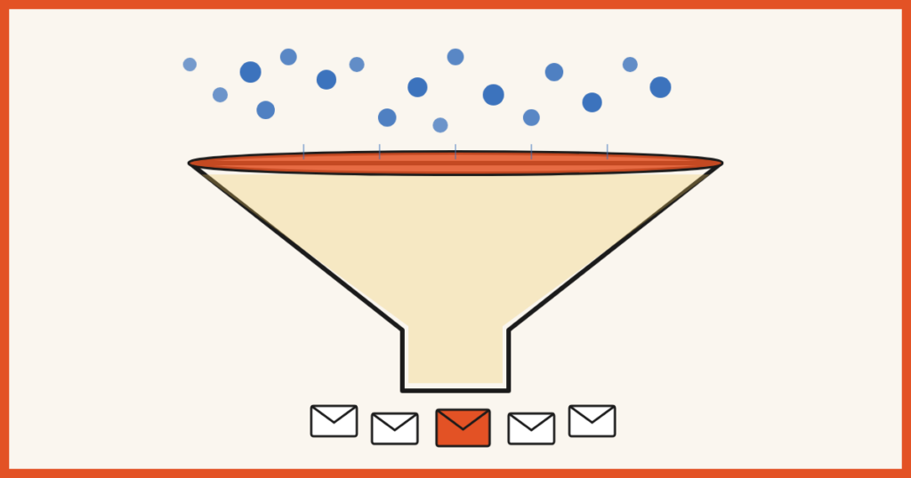
You’ve been pouring water into a leaky bucket.
Every month you grind for more traffic. You pitch guest posts. You optimize for search. You show up on Instagram. You run ads. And it works — visitors show up.
Then 97 of every 100 of them leave without subscribing.
That’s not a traffic problem. That’s a bucket problem.
Most site owners spend 90% of their energy pouring more water in and almost none patching the holes. Which is wild, because patching is the easier job. You don’t need a bigger audience, a viral moment, or another platform to learn. You just need the visitors you already have to convert at a higher rate.
It’s called conversion rate optimization, and the math is hard to argue with. If 100 people visit your site every day and 1% subscribe, that’s 30 new subscribers a month. Bump that to 3% — entirely doable — and you’re at 90. Same traffic. Same content. Three times the list growth.
We just republished our full guide to it: 27 tactics for turning the visitors you already have into subscribers, without chasing more traffic.
Below are 27 tactics to make it, grouped into five buckets so you can skim:
- Your offer (5 tactics): the foundation
- Your copy (6 tactics): the words doing the persuading
- Visual and design (6 tactics): what makes people notice
- Psychology and persuasion (5 tactics): why people convert when they didn’t plan to
- Technical and strategic (5 tactics): the structural stuff
First, a quick definition.
Table of Contents
What is conversion rate optimization?
Conversion rate optimization (CRO) is the process of improving your website to increase the percentage of visitors who take a specific action. For most people reading this, that action is opting in to an email list.
The math is simple:
Conversion rate = (conversions ÷ total visitors) × 100
If 100 people visit your site and 3 give you their email, your opt-in conversion rate is 3%.
CRO is different from SEO. SEO gets people to your site. CRO is what you do with them once they arrive. Both matter, but if your conversion rate is 1%, you’re leaving the vast majority of hard-earned traffic on the floor.
Industry averages for email opt-ins sit around 2-5%. Well-optimized welcome mats and exit intent popups can hit 10-20%+. The goal isn’t a magic number. It’s to convert more of the traffic you already have, this month, than you did last month.
Bucket 1: Your offer
The foundation. Skip this and the other 22 tactics won’t save you.
1. Create an opt-in offer
There are over a billion websites on the internet. Most of them want your visitors’ email addresses. So why would a visitor hand theirs to you in exchange for…vibes?
You need to give them something. Call it a lead magnet, a freebie, a content upgrade, a bribe to subscribe. The label doesn’t matter. What matters is offering specific value in exchange for the email. Without an offer, you’re asking visitors to sign up for “updates.” That works if you’re already famous.
Need help building one? Here’s our guide to creating a lead magnet that actually converts.
2. Make your opt-in stand on its own
Quick test: cover up everything on your page except the opt-in form. Look at just the headline and description. Could a stranger tell what they’d be signing up for?
If the answer is “exclusive content” or “join the community” or “get my updates,” no, they can’t. And they won’t sign up.
Your opt-in needs to make sense out of context. Half the time, your visitor landed from a Pinterest pin or a social share and is staring at your welcome mat before reading a single word of your site.
Be specific. “3 free videos to help you increase your conversions” beats “exclusive content” every time.
3. Sell benefits, not features
A common mistake: describing your offer as a list of stuff inside it.
- 7 emails delivered over 7 days
- Checklists and downloadable PDFs
- 12 videos and 6 audio files
Nobody cares. What does the email course help me do? Triple my productivity? Build a profitable side business while working full time? Sleep train my baby in two weeks?
Lead with the result. Format details can come later, if at all.
4. Use numbers and specific results
Numbers make claims tangible. “Increase your traffic” is forgettable. “Grow your traffic from 500 to 5,000 monthly visitors” is something a person can picture.
Two welcome mats on the same site. One uses a specific number in the headline (“18 resources”) and a result in the description (“helped me get to my first $10K/month”). Converts at just under 15%. The other? Descriptive, no numbers or results. Converts at 3.21%. Same site. Same audience. 5x difference.
If you can show real numbers, either from your own results or a customer’s, use them.
5. Use exclusivity
Remember high school, when the only thing that made a party worth going to was not being invited?
Humans want what they can’t have. When something feels exclusive, it instantly becomes more attractive. You don’t need to be a country club. You just need to position your offer as something not everyone gets: a limited number of spots, content only subscribers see, a members-only resource library.
Brian Dean has built his whole opt-in around the word “exclusive,” with the idea being that the tips in his emails aren’t on his blog. That single word does a lot of work. If you can frame your offer as something insider-y, do it.
Bucket 2: Your copy
You’ve got the right offer. Now the words have to sell it.
6. Work on your headline
Without a strong headline, nobody subscribes. About as unsurprising as the fact that email subject lines are also headlines, and if those suck, so will your open rates.
Your headline is the first contact your audience has with your opt-in. They don’t get to see the resource you spent two weekends building until they subscribe. So all you have is the headline. It needs to clearly describe what the subscriber gets and what it’ll help them do.
Stuck? We wrote 35 headline formulas you can swipe.
7. Use power words
Power words add a little oomph. They draw out excitement, fear, or curiosity. When used well (i.e., not in clickbait), they make your offer feel more vivid and more clickable.
Use them in your button copy, your headline, and your description. Don’t slap “ULTIMATE” on everything, but don’t shy away from words that establish authority and intrigue.
If you need a starting list, we put together 200+ power words you can pull from. Pair them with trigger words for extra mileage.
8. Speak your audience’s language
The best thing you can do for your copy is read your audience’s mind. The second-best, which is much more achievable, is to use their exact words.
When you echo back the language your audience already uses, you signal: I get it. I’m one of you. The trick is to actually listen. Reddit threads. Facebook groups. YouTube comments. Reviews of competing products. Anywhere your audience talks about their problems in their own words. Then use those exact phrases in your headlines and descriptions.
Example: you sell a course on Lightroom alternatives. Browsing a photography Facebook group, you see someone complaining about Lightroom “crashing constantly.” That’s your headline:
“Lightroom crashing constantly? 6 high-performing alternatives (with discount codes)”
You didn’t invent that pain point. You used the language the person on the other side of the screen is already using inside their own head.
9. Word choice matters: “free,” “get,” and other small swaps
A few small word swaps that punch above their weight.
“Free.” It’s almost embarrassing how well this works. Researchers ran a chocolate experiment: a Lindt truffle for $0.26 vs. a Hershey’s Kiss for $0.01. Forty percent of people picked each. Then they dropped both by a penny. Truffle to $0.25, Kiss to free. Ninety percent picked the Kiss. Relative price hadn’t changed. The word “free” did all the work. If your offer is free (and it should be), say so.
“Get.” Compare Subscribe for the email course vs Get the email course. “Get” implies you receive something without giving much up. “Subscribe” sounds like a chore. Same action. One converts better.
“You” over “I” or “we.” “Get our free PDF” is about you, the marketer. “Get the spreadsheet that saves you 4 hours a week” is about the visitor.
A/B test these. They cost nothing to change and the lift is often disproportionate.
10. Drop the self-centered language
The bigger version of the “you over I” point above. Watch how often “my,” “our,” and “we” sneak into your opt-in copy: “Subscribe to my newsletter.” “Join our community.” “Sign up for our weekly emails.”
Your visitor doesn’t care about your newsletter. They care about what they get out of it. Rewrite from their side of the screen:
- “Get the weekly playbook that 12,000 founders read with their morning coffee”
- “Join 8,000 marketers learning one new conversion tactic every Tuesday”
Same email list. Wildly different framing.
11. Pay attention to button copy
The button is small. The copy on it is not. A split test by Visual Website Optimizer found that swapping a generic “Join us” button for a benefits-driven “Make money flipping websites” button increased conversions by 33%.
Avoid Sign up, Subscribe, Join, and Submit. Especially submit. What does anyone “submit,” outside of a sparring match?
Use button copy that names the benefit. “Get my free spreadsheet.” “Send me the playbook.” “Start my 7-day course.” At minimum, anything other than submit.
Bucket 3: Visual and design

If nobody notices your opt-in, nobody opts in.
12. Set an action color
You’ve probably seen the debates. Red converts! No, green! Red is a stop color! No, it’s attention-grabbing!
The truth is messier: the best color depends on your audience and your brand. What we can say with confidence is that the more eye-catching the color, the higher your conversions tend to be. We ran our own test pitting red against yellow. Yellow won by 2.5%. If we’d tested pastel beige against soft gray, that gap would have collapsed entirely, because neither color jumps off the page.
Pick a bright action color that contrasts with the rest of your site. Use it consistently for buttons and CTAs. Then A/B test different bright versions to see what your audience responds to.
13. Make your CTA jump off the page
Most readers don’t read. They scan. Their eyes hop around the page looking for an image, a subheading, or a chunk of text that interrupts the flow.
If your in-content CTA is just an underlined link buried in a wall of paragraphs, most people scroll past it without registering it.
Give it a chance to be seen. Use a click trigger or two-step opt-in with a background color that breaks the page. Add an arrow. Append it to an image. We’ve seen CTAs jump from 50% conversion to 77% just by making them visually distinct from the surrounding text.
14. Use human faces
You’re attracted to human faces. So is your visitor. So is every visitor.
This isn’t a vague claim. Heat maps consistently show that when a face appears on a page, eyes track to it within milliseconds, faster than people can consciously decide to look. One A/B test by Signal v. Noise found that adding a person’s image to a sales page increased conversions by 102%.
Add a photo to your welcome mat, popup, or feature box. It can be you, a customer, or the founder of your company. What it should not be: a stock photo of a stranger laughing at a salad. Visitors clock those instantly and the whole effect collapses.
15. Use lines of sight
We follow directional cues automatically. An arrow pointing at something? We look. Eyes in a photo looking at a button? We look at the button. A subtle elbow gesturing toward a headline? Same. This is advertising 101, and it’s been working for fifty years because it bypasses conscious thought.
You can use this on opt-ins by adding an arrow that points at your CTA, using a photo of a person whose gaze leads toward your headline or button, or designing the layout so visual elements flow toward the form. Bonus points if you combine a face with a line of sight. Small detail, real lift.
16. Show what’s inside
You probably wouldn’t buy a couch online without seeing a photo of it. Same logic applies to your opt-in offer.
Instead of expecting visitors to give up their email for a faceless “free PDF,” show them what they’re getting. Take a screenshot of the spreadsheet. Blur out a page of the ebook. Freeze a frame of the video.
This works because it makes the offer feel tangible, it triggers curiosity (showing some, not all), and it gives the visitor context for what they’re about to receive. Pair the preview image with everything else in this section (a face, a line of sight, a bit of motion) and you’ve stacked a lot of attention-grabbing into one small popup.
17. Use motion
When you land on a web page, almost everything is still. So the rare element that moves catches your eye immediately.
A subtle animation on your opt-in, a gently rotating offer image, a button that pulses on hover, a welcome mat that fades in as the page settles, can dramatically increase the chance someone notices it in the first place.
The keyword is subtle. Motion to attract attention, not motion that makes the page feel like a Vegas casino.
Bucket 4: Psychology and persuasion
These tactics get people to opt in even when they didn’t sit down planning to.
18. Use social proof and testimonials
Research shows that 92% of people trust recommendations from peers. Maybe more striking: 70% trust recommendations from people they’ve never met.
That’s the power of social proof. And it’s why opt-ins with quotes, testimonials, subscriber counts, or media mentions consistently outperform ones without. You don’t need Tim Ferriss levels of recognition. You need a subscriber count (“Join 4,000 readers”), a quote from a customer, a logo bar of places you’ve been featured, or star ratings and review snippets.
Testimonials are powerful enough to deserve their own mention. WikiJob increased conversions by 34% in an A/B test just by adding them. If something works to get people to spend money, it definitely works to get them to spend an email address.
Need a deeper dive? We have full guides on social proof, social proof examples, and 12 types of testimonials with examples. And our social proof popup app bakes live FOMO notifications right into your site.
19. Pre-empt objections
You know those people who hear a perfectly good suggestion and immediately list five reasons it won’t work for them? You’re talking to those people. A lot of them.
So instead of just describing your offer and hoping the objections don’t fire, address them in the copy. What holes might a skeptical visitor poke? “I’m not technical.” “I don’t have a big audience yet.” “I don’t have time.” “This is just for people with established businesses.” Fill those holes with reassurance in the headline or description. Smart Blogger does this beautifully on a graphics course, pre-empting the “but I’m not a designer!” objection right in the headline.
Pre-empt the objection in plain sight and you steal the rebuttal before they can think it.
20. Get your foot in the door
If someone agrees to a small request, they’re much more likely to agree to a bigger one later. Psychologists call it the foot-in-the-door technique. Marketers call it the two-step opt-in.
Here’s how it works: instead of putting an email form directly on the page, you put a button or link. Clicking it triggers the popup. Then they fill in their email. Two-step opt-ins outperform direct forms because the user is asking for the popup (there’s already an implicit yes) and you’ve gotten them past the smaller commitment (clicking) before asking for the bigger one (the email).
We’ve seen two-step opt-ins boost site-wide popup conversions by 10x. Yes, 10x. By the time they get to the form, they’ve already mentally committed.
21. Build in scarcity
Scarcity is one of the oldest marketing levers in the book, and it works because it taps something primitive in how we evaluate offers. When something feels limited (limited stock, limited time, limited spots) we want it more. We worry about losing the chance to have it. That fear of loss often outweighs the lukewarm calculation of whether we actually wanted it.
One ecommerce A/B test compared a limited-time, next-day shipping offer against a control with no scarcity. Result: a 226% lift in conversions.
For opt-ins, scarcity can look like a countdown timer on a limited-time offer, a bonus that’s only available “this week,” or a “spots remaining” counter on a course or cohort. The key word is real. Fake scarcity (a countdown timer that resets every time the page loads) gets noticed fast, and it damages trust the moment it does.
22. Build in urgency
Scarcity and urgency sound similar but they’re not. Scarcity is about the offer disappearing. Urgency is about the problem getting worse if you don’t act.
If your visitor’s roof is leaking, “this offer expires in 24 hours” (scarcity) is useful. But “every day you wait, the water damage spreads” (urgency) is what makes them call right now.
For your opt-in, ask what problem your audience has right now, what happens if they don’t solve it, and how you can remind them in the headline or description of why it’s worth solving today. Sell a course on sleep-training infants? Your urgency angle isn’t “this freebie expires Friday.” It’s “every night you wait is another night nobody in the house sleeps.”
Aggravate the urgency. The conversions follow.
23. Show progress
If you’ve ever finished a meal you weren’t enjoying just because it was almost done, you understand this one. Humans have an obsession with completing things we’ve started.
Use it on multi-step opt-ins by showing a progress bar. If a visitor sees they’re 50% through the signup process, they’re significantly more likely to push to 100%.
This works for any opt-in with more than one field or step. A progress bar is a tiny commitment device, and it’s wildly effective at reducing form abandonment.
Bucket 5: Technical and strategic

The infrastructure stuff. Less glamorous, but the rest of the list assumes you’ve got it covered.
24. Remove distractions
The classic jam study tested two grocery store displays: one with 24 varieties of jam, one with 6. The 24-variety display attracted more browsers. But the 6-variety display sold ten times more jam. More choice attracts interest. Less choice drives action.
The lesson for your opt-in: if your above-the-fold area has links to your contact page, your about page, your blog, your podcast, your services page, your social profiles, and your shop, your visitor has too many options and will likely pick none of them. Simplify. Remove everything that isn’t essential to the action you want.
This is part of why welcome mats convert so well. They strip away the entire rest of the page and leave one decision: opt in, or scroll past. Same logic for popups. If your background is busy and your popup is small, the popup loses. Go larger, or use a darker overlay to mute the page behind it.
25. Give multiple opt-in opportunities
Let’s say you add a welcome mat to your site and it converts at 10%. Healthy. Do you stop there?
No. You add an exit intent popup for the 90% who didn’t opt in the first time. Maybe that converts at another 5% of remaining visitors. Now your site-wide conversion rate is closer to 15%. On 200 visitors a day, that’s 10 extra emails. Over a year, ~3,600 emails you wouldn’t have collected with just the welcome mat.
You can stack opportunities throughout the visitor journey: a welcome mat on first visit, inline opt-ins inside blog posts, a click trigger on a relevant content upgrade, an exit intent popup for the people leaving, and a sticky bar that follows them down the page. The trick is to avoid all of them firing at once. Different triggers, different visitor states, different offers. Each one catches a slice of people who didn’t bite on the previous one.
The psychology of exit intent is worth understanding. We wrote about it here.
26. Get the technical foundation right
The boring layer that protects everything above it.
Page speed. If your site doesn’t load within about 3 seconds, you’re losing visitors before they ever see your opt-in. Each one-second delay in load time can drop conversions by 7% or more. Slow plugins, unoptimized images, and bloated themes are the usual suspects. Run your site through Google PageSpeed Insights and fix the biggest issues.
Mobile responsiveness. More than half of web traffic is mobile. If your opt-in form is impossible to fill out on a phone, half your audience is dead on arrival. Test every opt-in on a real mobile device, not just a resized browser window. The “tap target too small” problem is the conversion killer nobody talks about.
If you’re using BDOW!, popups, welcome mats, and inline forms are responsive out of the box. If you’re rolling your own, this is the one technical thing worth obsessing over.
27. Cut form fields to the bare minimum
We are lazy creatures. We want the biggest payoff for the smallest effort. Every additional form field is a tax on that effort.
The data backs it up: cutting your form from 4 fields to 3 can increase conversions by 50%. Going from 3 to 1 is even more dramatic.
For most email opt-ins, the right number of fields is one. Just the email. You can collect first name later in the welcome email by asking nicely. Or in a survey two weeks in. Or you can decide you don’t actually need it.
While we’re on form friction: reconsider the “we won’t spam you!” disclaimer. It seems helpful but often backfires. By saying “no spam,” you’ve planted the word “spam” in your visitor’s brain, where it wasn’t a moment ago. Test removing it. You may be surprised.
The most important tactic: test everything
We just gave you 27 strategies. Here’s the unsexy truth about all of them.
They work generally. They’ve been tested across thousands of sites and they tend to move the needle. But how much they move your needle depends on your audience, your industry, your brand, and a dozen other variables we can’t see from here. Some will produce 5x lifts on your site. Some will produce nothing. A few might even tank conversions (we’ve seen it happen with overly aggressive scarcity on the wrong audience).
The only way to know is to test. Pick the easiest ones first:
- Button color. Swap your current color for something brighter. Run it for two weeks.
- Button copy. Test “Get the [thing]” against your current text.
- Headline. Try a numbers-and-results version against a benefits version.
- Form fields. Cut one. See what happens.
You don’t need to test everything at once. You need to test consistently, with one variable at a time. That’s how compounding works.
And that’s what BDOW! is built for: easy A/B testing, behavioral targeting, and templates that already have most of these tactics baked in. You can start free.
Frequently asked questions
What is a good conversion rate for an email opt-in?
Industry averages sit around 2-5% for general site opt-ins. Well-optimized welcome mats and exit intent popups can hit 10-20% or higher. The right benchmark isn’t the industry average. It’s your own conversion rate from last month. The goal is to keep moving it up.
How is conversion rate optimization different from SEO?
SEO brings people to your site. CRO converts the people who are already there. You can have great SEO and a terrible conversion rate, in which case you’re paying a lot (in time or money) for traffic that doesn’t translate to subscribers, customers, or revenue. The two work together: SEO fills the top of the funnel, CRO improves what happens after.
How long does it take to see results from CRO?
Simple changes (a new button color, a better headline) can show results in a few days if you have enough traffic to run a clean test. Bigger structural changes (a new opt-in offer, a new welcome mat) might take 2-4 weeks to gather enough data. General rule: you need at least 100 conversions per variant for an A/B test to mean anything statistically.
Do I need a lot of traffic to do CRO?
No. In fact, lower-traffic sites have the most to gain from CRO, because every visitor matters more. The catch is that statistical testing requires more time on low-traffic sites. If you have 100 visitors a month, you can still apply the tactics in this guide. You just won’t be able to A/B test them rigorously. That’s fine. Apply best practices, watch your numbers, and iterate based on what you see.
What’s the easiest CRO change to make first?
The fastest win for most sites is adding an opt-in offer if you don’t have one, or improving the headline on the one you do have. Both take less than an hour and tend to produce the biggest jumps. After that, focus on button copy and reducing form fields. These are the high-impact, low-effort changes.


Add A Comment
VIEW THE COMMENTS