You’ve already read articles about what content upgrades are and about how they can help to triple opt-in rates to your mailing list.
You may have even seen the video of how Sumo uses them as their primary list building strategy:
But maybe you haven’t pulled the trigger and created a content upgrade. Or maybe you did make one, but it isn’t working. Either way, you’ve got your doubts.
And that’s why I’m here. You might wonder how to create a content upgrade that works (without spending hours upon hours making it).
You know that your tired old CTA of “join my mailing list” just isn’t cutting it anymore, but you still haven’t switched to the content upgrade strategy.
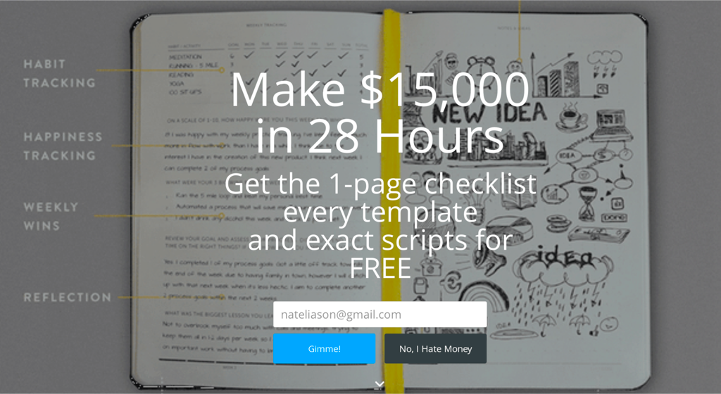
Using “join my mailing list” as a call-to-action is an easy option because it requires no extra effort, but we’re shortchanging ourselves a bit with this phrase. We should want people to sign up for our mailing list because we think that our future content or products will be useful to them. So let’s start out on the right foot and give them that value immediately.
The content upgrade technique immediately establishes trust. We offered something and gave it to readers immediately, no messing around.
My challenge to you: once you’ve read this article, you must forever stop using “join my mailing list” as a call to action.
Don’t worry, it’ll be easy. I’m going to show you a reusable framework for creating high quality content upgrades in less than 10 minutes.
How? By repurposing what you already have.
Creating Quick Content Upgrades: The Power of Repurposing
Content upgrades are, by definition, an extension of an existing piece of content – usually blog posts. And this solves the biggest problem that people face when it comes to producing content upgrades – where to begin?
Your blog is bursting with underutilized opportunities for content upgrades, so if you make the most of that resource, then you’ve already got a head-start.
Any content upgrade you produce should be directly related to the blog post that you are going to convert people from.
So if you have a list based article there’s not much point in turning it into a how-to guide – it just doesn’t suit the format. For listicles (do people still call them that?) something like a cheat sheet would work much better.
Here’s a handy reference for which content upgrades suit certain types of blog content:
- Instructional blog post -> How-to-guide
- Long form article -> Checklist or 1-pager
- Case study -> Slideshow
- Lists -> Cheat sheet
- Blog series -> eBook
- Other types of content upgrades, like spreadsheets, can work in a variety of situations depending on your goals.
And if you want the cheat sheet for putting these together on your blog right now, we've got you covered!
Three Easy Kinds of Content Upgrades
As I mentioned above, content upgrades come in all shapes and sizes. From videos to podcasts and everything in between. However, in this article I’m going to focus on 3 specific kinds of upgrades:
- How-to guides
- Mini eBooks
- Checklists
We’re concentrating on these 3 because they all perform well in terms of opt-ins, they are easy to produce, and they make use of our greatest time saving asset – existing content.
Emphasis on ‘Upgrade’
Your readers are going to feel pretty short-changed if all they get is a plain pdf with the exact same content of what they have just finished reading.
It’s important to reward the people who have opted-in to your mailing list with something that casual readers didn’t get. Otherwise, that trust you built up at the opt-in stage evaporates quickly.
 This doesn’t mean that you’re going to have to spend time writing more content. You could present the content in a different way, making it more suitable for the format.
How-to guides are a great example of how reducing content down actually makes the upgrade more effective.
Upgrade 1 – The How-To Guide
The main goal of a how-to guide is to help your reader implement the advice that you have just given them. And while a blog post is a good format for introducing someone to the subject matter, a how-to guide is an even better resource for referring back to when it comes down to getting practical.
Since how-to blog posts are already in a step-by-step format it’s really easy to recycle those steps into a content upgrade. For example, if each step in your post has an instructional graphic to go with it then just combine the graphics into a downloadable pdf.
Be careful though, if you’re doing this, make sure that the images make sense on their own. Be sure to label them or add supporting text if necessary.
If your post doesn’t call for instructional graphics then fear not. In that case I would recommend taking the main how-to steps and using Canva to add a visual punch that your readers will be grateful for.
Good design amplifies good content but we’re not trying to be Picasso here. Choose Canva templates that are simple and readable.
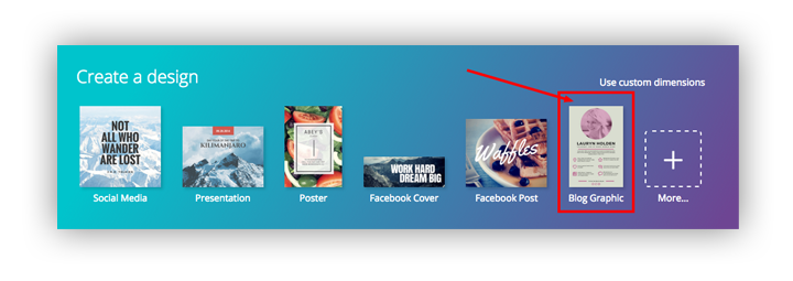
For making a how-to guide, I would recommend the ‘Blog Graphic’ templates in Canva as they offer enough space to include plenty of content.
Then, choose a layout that roughly resembles the format that suits your content. The one shown below already has text of multiple sizes which is a perfect starting point for our guide.
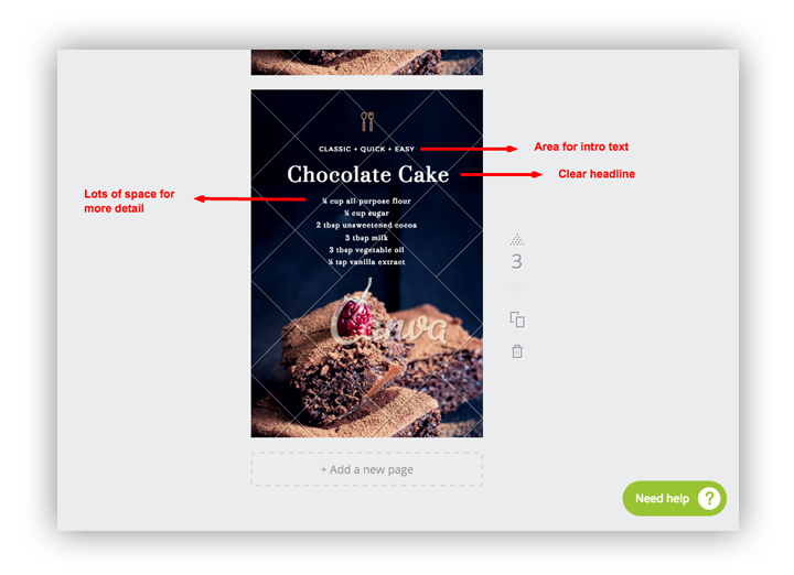
Since the content in a how-to-guide follows a standard pattern you can just duplicate this one page and change the text and imagery for each step in the guide. This will save you a bunch of time as you are effectively only ‘designing’ one layout.
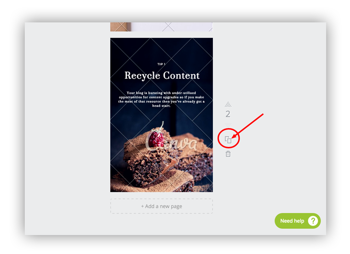
Next, if you paste your text into the existing boxes and add your imagery you’ll be done in no time.
If you can’t find images that suit your content, then I would recommend using bold type and bright colors. It’s a much quicker alternative that still looks good.
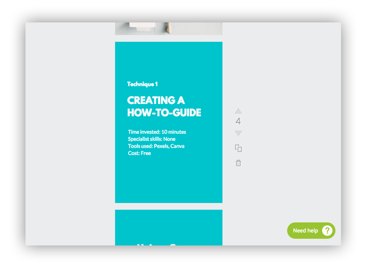
Sidenote: Stock up on Free Images
Canva is free to use but be careful – some of the elements like images and even layouts do have a cost of about $1 each.
If you subscribe to the Pexels newsletter they will instantly send you 40 truly stunning images that are free to use anywhere you like. How’s that for a content upgrade?!
You can then upload all these images into Canva at the same time and you won’t have to worry about paying for their stock images.
Bonus tip
Upload these in advance as high quality images have a large file size and will take a while to upload.
Upgrade 2 – Mini eBooks
- Time invested: 3 minutes
- Specialist skills: None
- Tools used: Beacon
- Cost: Free
The word eBook fills you with dread doesn’t it? As soon as your boss mentions it all you see is the endless weeks of prep in front of you. But it doesn’t have to be that difficult.
 If you remind yourself (and your boss) that there’s a big difference between a marketing eBook and a Pulitzer Prize Winner then the production process comes down to 2 main stages:
1. Gathering Content
Use Google Analytics as a guide to pick your most popular articles on a related subject. Depending on the length of your blog posts, you can use as little as 3 articles to make an eBook.
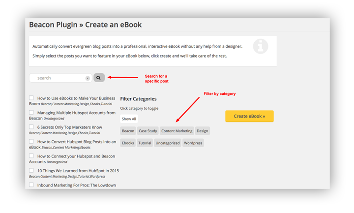
Beacon integrates with both WordPress and Hubspot so you can automatically convert your blog posts into the eBook format. If your blog uses a different CMS then good ol’ copy and paste will work just fine. Beacon preserves all your headings, paragraphs, lists and images so minimal formatting is required.
In this example we’ll be using the Beacon plugin for WordPress. It allows you to search for individual blog posts or filter by category.
2. Designing the Content
This is a pretty big stumbling block for most people, because while we can all spot bad design a mile off, creating good design from a blank canvas is difficult – that’s why designers get paid the big bucks. But time is of the essence here so hiring a designer just isn’t an option.
Beacon will automatically add a cover page, a table of contents and a full page call-to-action to go along with your blog content, helping to give that familiar eBook presentation.
If you start by choosing a visual theme for your book you can just customize the design to suit.
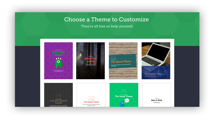
Beacon includes a range of recommended color palettes and font pairings that adhere to design best practices so you don’t need to be a designer to produce something that looks good.
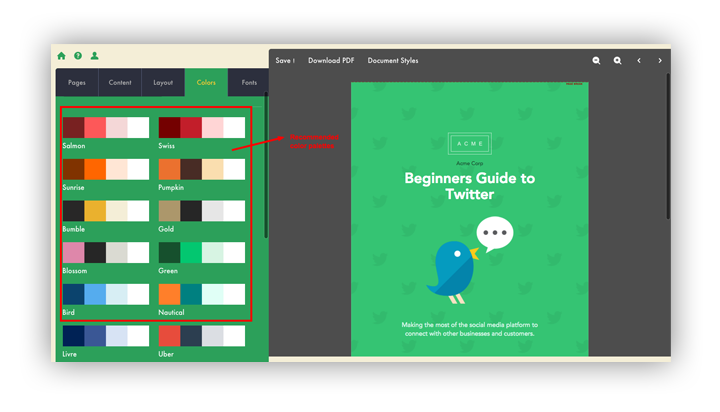
You can apply these styles to the whole book instantly so you don’t have to go through and style each element individually. This makes it easy to quickly experiment with different styles until you find one that suits.
It’s important to remember that any automated system won’t give you the same control that professional design tools do but what you’re losing in control you’re gaining in time.
Upgrade 3 – The Checklist
- Time invested: 3 minutes
- Specialist skills: None
- Tools used: Checkli
- Cost: Free
A checklist is a great way of making long blog posts more digestible.
Remember: the primary goal of creating content is to have people read it – but not everyone enjoys long-form blog content. So rather than simply not catering to those visitors, think of a checklist as a TL;DR for people who are pressed for time.
If your blog post has been structured properly with multiple level headings and lists, then use them as a guideline for the content of your checklist. And if your content hasn’t been structured properly then you need to shake yourself because you’re not only making it more difficult for humans to read but search engines too.

Checklists as a content upgrade are well suited to best-practice style blog posts. This article on Moz is a good example – “How to Comply with the FTC’s New Rules”. Depending on your industry, compliance can be a pretty scary subject – that’s definitely the sort of content that I want to download and keep close by.
With a checklist, it’s more appropriate to keep the design simple and straightforward. Checkli is perfect for that.
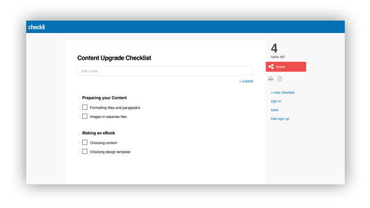
The Checkli interface is so simple that you can have your content upgrade ready in as little as 2 minutes. Be sure to break your checklist items into manageable chunks by adding subtitles throughout.
As well as a standard pdf, Checkli also offers the option of sharing an online version of your list that your readers can check off as they go.
Offering your Upgrade
The content upgrade doesn’t exist in isolation – it has to work in parallel with your chosen opt-in technique.
How you present the upgrade to your readers will have a big impact on your conversion rates. For example, if you are offering readers a downloadable how-to guide, it’s a good idea to let them read the blog post first. In this case something like Sumo’s List Builder would be a more appropriate opt-in technique than a Welcome Mat.
Always choose the technique that makes most sense for both the blog post and the upgrade.
Offering Content Upgrades with List Builder
You’ve probably noticed by now that we’re using List Builder in this very post. I’m a big fan of this technique for 2 reasons.
-
It’s effective. The whole purpose of this exercise is to gather more email addresses and List Builder has a great track record.
-
It’s flexible. You can offer your upgrade in several different ways to suit different types of reader.
I recommend using List Builder strategically throughout the post and also right when a reader is getting ready to leave.
Strategic Placement
With click triggers you can turn any link into a call-to-action that opens a lightbox for gathering email addresses. For a how-to article such as this one, relevant placement of your offer is essential to a healthy opt-in rate.
I would recommend placing click triggers at the following positions:
After the Introduction
For people who don’t have time right now but know that they will find the information useful at some point in the future.
At the Midway Point
This call-to-action should explicitly reference a piece of information you have just given the reader. For example “Download the how-to-guide so you can start using Canva to offer content upgrades”.
At the End
As part of a summary or conclusion you should prompt readers to put your advice into action. And what’s the best way to get started? With a handy how-to guide of course!
Configuring the Click Trigger
The click trigger is straightforward to set up. One tip I would share is to make sure that the Auto Redirect is toggled ‘on’. This prevents the popup from showing to people who have already subscribed – another simple way of establishing trust with our readers.
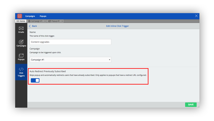
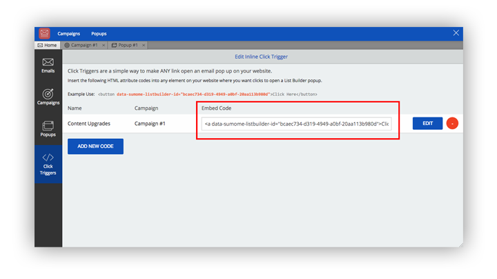
After that it’s a simple case of copying the embed code and pasting it as a link destination in your blog post.
Exit Intent
If you set List Builder to smart mode, it will prompt readers with a lightbox as soon as their mouse cursor leaves the window of the blog post.
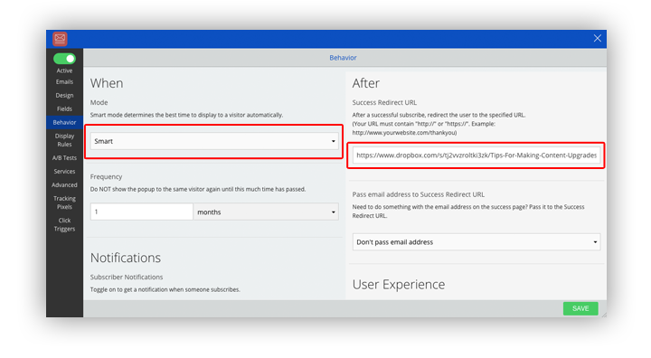
You reader is about to navigate away at this point anyway so you’ve really got nothing to lose. Hit them with a friendly content upgrade and you might just turn a one-time visitor into a loyal subscriber.
When configuring List Builder, set the Success Redirect URL to wherever your content upgrade is stored. Remember, this has to be somewhere online so Dropbox is your friend here.
Conclusion
So what do you think? After reading this are you still going to use “join my mailing list” as a call to action? Tell me in the comments.
Add A Comment
VIEW THE COMMENTS