The year was 2012.
My blog just received “Blog of the Year” honors from Travel + Leisure.
Ivanka Trump was even on the panel of judges (she thought the blog was tremendous, huuuuge, etc.).
A couple articles I’d written got so much traffic that they actually broke the city of Minneapolis’ website and got featured on the homepage of Sports Illustrated.
Needless to say, I was freaking out.
I celebrated this success by sharing it with a marketing mentor. I spoke a mile a minute, with that stupid smirk on my face young folks get when think they’re hot shit.
That dude sat back, sipped his coffee and casually proceeded to break my mind:
“Yeah, but what did the traffic DO?”
He was asking what all the traffic from these wins actually helped me achieve.
THE TRAFFIC GOT ME AN AWARD! And…ah…lots of people came to the site! It’s traffic. You always want traffic. Right?
I stuttered and tried to poke holes in his simple question, but the realization turned from a whisper to a full-out yell in my mind.
He was right.
I was doing nothing for the company with my traffic. Didn’t ask for emails, sales, calls, nothing. The traffic didn’t convert.
And traffic is worthless if it doesn’t convert. That traffic would visit the articles I worked so hard on, read them, and then leave. We’d never see them again.
And that’s a big mistake. I was letting that traffic slip through my fingers like a sieve.
But I’m not one to let history repeat itself. And neither should you. Which is why almost every guide I write collects emails in the most effective way possible:
Through content upgrades.
Here’s a video walkthrough of how it works:
Why You’re Giving Up Loads of Emails by Ignoring Content Upgrades
A content upgrade is an additional piece of content that a reader accesses in exchange for an email address or money.
The content upgrade usually builds on the topic you cover in your main content. If you’re a healthy eating blog and your article is a specific recipe, your content upgrade could be a full cookbook, a shopping list, or the printable version of the recipe.
Because these freebies complement the original piece of content by making it easier to use or more valuable, they’re usually highly desired.
That’s why content upgrades can help you easily double your email list.
There are all types of content upgrades:
-
Checklists
-
Transcripts
-
Videos
-
Ebooks
-
Worksheets
-
Spreadsheets
-
Templates
-
Lots more…
Generally, you put this behind some sort of tool that collects something from the reader in exchange for the content — think a Welcome Mat, List Builder, Scroll Box etc.
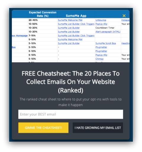
But not all content upgrades are created equal. That’s why one of our content upgrades can convert at almost 14%:

While another will only convert at 2.74%:

We’ve given away 60+ content upgrades at Sumo, and just when we think we’ve got a strategy pegged down something changes and wrecks “what we know.”
So how do you know which content upgrades to give away so they actually pull their weight?
We’ve got your back. In this guide, we’ll go over:
-
What Content Upgrades Worked (And Why): I’ll show you the exact content upgrades we used, what guides we used them in and how each one performed.
-
The Process Behind Creating The Upgrades: This is most important. I’ll walk you through why we created each upgrade and what we did after each learning.
That second point is key. Most articles just tell you what worked for them and leave it at that. Then you take what they say, make your own content upgrade and hope it works.
Here’s the thing: what worked for us may not work for you.
And hey – these aren’t ranked in any particular order. So instead of copying what worked for us, read all the way to the end and pay extra attention to why we tried each content upgrade and what we learned/did after.
So let’s start with something we’re known for at Sumo: spreadsheets.
Content Upgrade #1: Free Spreadsheets
At Sumo, we’re known for spreadsheets as content upgrades. We’ve done them since we’ve started the blog. I’ve got a tattoo on my lower back that says Spreadsheets: not just for accountants anymore.

Just kidding, it’s really this
Spreadsheets are excellent as a content upgrade because they’re extremely flexible. You can make them into a checklist, a formula, a plan, anything.
But here’s the important thing to remember: the spreadsheet is only the container for the value inside.
Here’s what we found.
Example: 82 Email List Building Ideas Spreadsheet
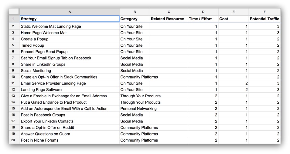
What it is: A spreadsheet that takes our 85 best list-building ideas and ranks them by time/effort, cost and potential traffic (with our top 30 recommendations inside).
The guide it was used in: A huge Sumo-sized guide on 85 ways to build your email list.
Why we created the upgrade: We listed out a crud-ton of options in that guide. While they’re all actionable, we didn’t do anything like rank them or say how long they took to create. This spreadsheet helped organize all the tactics by helpful criteria.
How it performed: 11.2% conversion rate.
What we learned: This was a decently popular spreadsheet for two reasons. First, it helps to turn something big (like a list of 85 strategies) into something that ranks them on helpful criteria like time/effort, cost and potential traffic.
Second, we narrowed those 85 ideas down to our favorite 30. The value in that is guiding the reader to the strategies we would use out of such a large list. Whenever you can narrow down something big, it seems to perform well.
Verdict: Success
Example: SEO Spreadsheet for Bloggers

What it is: A spreadsheet that helps bloggers with on-page SEO tactics, off-page SEO efforts and backlinking efforts.
The guide it was used in: A guide on the 17 SEO tips that bloggers need to follow (and exact examples on how to do them).
Why we created the upgrade: This is another guide with a lot of words and advice to follow, but not a concise way to track everything mentioned. This content upgrade presents everything in a neat, easy-to-track spreadsheet that any blogger can follow.
How it performed: 10.43% conversion rate.
What we learned: This content upgrade worked well because it acts as a checklist for everything a blogger needs to do before they publish. It’s way easier to use this every time you publish instead of reading a whole guide again.
Essentially, this spreadsheet is a tool that makes a blogger’s job easier because it’s simple and has proven steps to follow.
Verdict: Success
Example: Social Sharing Traffic Spreadsheet
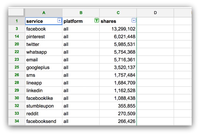
What it is: A spreadsheet showing the most shared-to mediums for articles.
The guide it was used in: A ground-breaking study on where people share to, sharing trends on mobile and desktop AND year-over-year changes.
Why we created the upgrade: We had so much data around where people shared, and we couldn’t feature every single source in the guide. So we created a spreadsheet to give readers access to the same numbers I found in the study.
How it performed: 14% conversion rate.
What we learned: People want access to large amounts of data that impact their business. We all care about where our content is shared to, and this spreadsheet showed the where the 200 million shares went to among the 70+ mediums.
Since we only focused on eight mediums in the guide, it made sense that people would want to see the 62 other mediums. It’s a combination of big data and extra access that made this spreadsheet work.
Verdict: Success
Example: Word-Based Spreadsheets
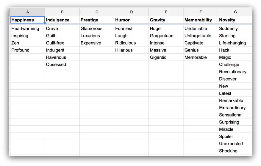
What they are: A spreadsheet that contains 355+ power words you can use in your copy to increase conversions.
The guide it was used in: Two guides. One was a guide on power words to turbocharge your copy. The other was on five types of psychological copy triggers.
Why we created the upgrade: There are certain types of words that act as “triggers” to promote action. We collected as many of them as we could so people could easily copy/paste them into their own copy.
How it performed: 3.98% and 4.1% conversion rates (respectively).
What we learned: The spreadsheets are insanely useful, but people don’t want to give up their email address for a list of words. The lower conversion rate was on the guide that had the words in the guide. So that’s a simple copy/paste to get the words already.
The higher rate was on the psychology guide which didn’t have the words included. Yet still, readers didn’t want to trade an address for the list.
The interesting part we used this content upgrade twice, and it got the higher conversion rate on the second guide. The only difference was the second guide didn’t have the words available in the guide.
Though the list of words is valuable, it’s not valuable enough to grab high conversion rates.
Verdict: Unsuccessful
What You Can Learn From Spreadsheets as Content Upgrades
-
Offering ways to better digest/navigate big lists is helpful. Especially when you narrow down and give recommendations.
-
Tools and formulas that make jobs easier are almost automatic wins (if they’re helpful enough).
-
Offering big, proprietary data/information is unique and sought after.
-
Spreadsheets that act as lists and checklists don’t seem to fit.
Content Upgrade #2: Infographics
We get it. Infographics are liked and shared 3x more than any other content on social media, yada yada…
They work. We get it. Which is why we dipped our toes into the infographics world. The marketing world is split on how to give away an infographic, though.
In one camp, you have marketers giving infographics away for free. It’s a piece of content everyone should have access to, and it increases the odds of your article/brand being shared.
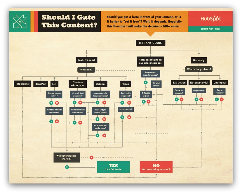
HubSpot is in that camp
In the other camp, you have marketers asking for emails in exchange for the infographic. The infographic took time and money to produce, so you should get something out of it, right?
For our experiments, we fell into the later camp. We had to pay a freelancer to design our infographics, and we don’t have a problem with reach. That left us with using our infographics to collect emails.
Here are the two biggest findings from that experiment.
Example: 19 A/B Testing Mistakes Infographic
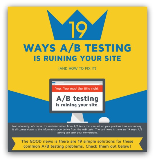
What it is: An infographic detailing 19 problems people commonly run into when conducting an A/B test (and the solutions to each problem).
The guide it was used in: This massive guide expanding on the 19 A/B testing mistakes (and how to fix them).
Why we created the upgrade: This was a long, long guide. We figured this list-style format would lend well to an infographic — taking 5k+ words and bringing it to under 300. Plus, it made the guide easier to understand at a glance.
How it performed: 5.2% conversion rate.
What we learned: Trying to gate the infographic didn’t work well. Perhaps there wasn’t high value, because all we did was shorten up the information from the guide. Since it was basically a Cliffs Notes version of the guide, it might’ve been too much to ask for an email.
Verdict: Unsuccessful (However, we gave the guide away for free and shares went up from 220 to 890).
Example: Repurposing Old Content Flowchart Infographic
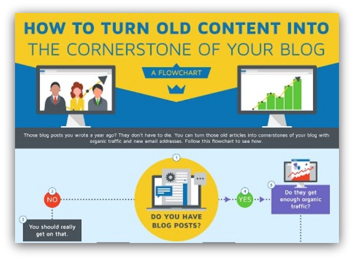
What it is: An infographic that acts as a flowchart logic tree. It walks you through the four main steps for republishing content (complete with yes/no answers for all 50+ mini-steps).
The guide it was used in: A guide showing the exact steps to take your old articles and repurpose them into blog cornerstones.
Why we created the upgrade: I don’t believe in abandoning an experiment if it fails the first time. Once is chance, twice is certain (as my grandpa said). That, plus the infographic gave a visual way to see the high-level steps outlined in the guide.
How it performed: 8.4% conversion rate.
What we learned: Gating an infographic didn’t work wildly well here, either. I even positioned the infographic as a flowchart rather than a true-blue infographic. Even then, the infographic wasn’t a high enough value to command opt-ins.
Verdict: Mostly unsuccessful.
What You Can Learn From On Infographics as Content Upgrades
-
Most times infographics aren’t high-value enough to get an email address in exchange.
-
Leaving the infographic as free and available on the guides did increase overall visits/shares on the guides.
-
The ROI on article shares vs. emails collected isn’t high enough to warrant paying the amount we paid for the infographics.
Content Upgrade #3: Videos
There’s no easier content upgrade that EVERYONE can create than a video.
Got a laptop? You probably have a webcam to record your face. Don’t have a webcam? There’s software to record your screen.
Don’t have either of those things? Grab your phone and record yourself. Honestly, there are so many ways to create a video, and video currently dominates on social media.
The options are there, it’s just a matter of the context of the video. As a content upgrade, your video needs to build upon the primary content.
We created a few videos as content upgrades that really built upon the primary content in our guides. Here’s what we found.
Example: How To Create An Attention-Grabbing Pop-up Video
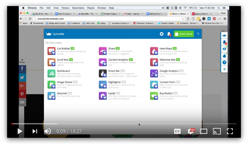
What it is: An 18 minute video that walks you through how to set up a pop-up that grabs attention better than anything else (without being annoying).
The guide it was used in: A unique data guide that analyzed the top 1% of successful pop-ups to see how they capture attention.
Why we created the upgrade: I wanted to take the next step and show how to make the perfect, attention-grabbing pop-up I described in the guide. I walk the reader through step-by-step how I’d create that pop-up in Sumo.
How it performed: 5.5% conversion rate.
What we learned: This was a bit of a harder sell, I’ll admit. To gain value from the video, you either need to be an existing Sumo user OR get Sumo after reading the guide (even for free). Not exactly great for anyone else.
Verdict: Unsuccessful.
Example: How To Create A High-Converting Exit Pop-up Video
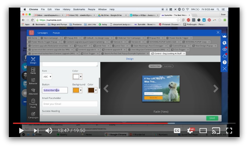
What it is: A 20 minute video showing you how to create an exit pop-up (and why most people mess up).
The guide it was used in: Another unique data guide that proved pop-ups aren’t dead (and they’re definitely not going anywhere).
Why we created the upgrade: I wanted to make sure the video tutorial route wasn’t completely off the table. The article basically proved pop-ups are necessary in one form or another. That kind of message, in my mind, would sway enough readers to create a pop-up. This video was a way to make sure they created a great pop-up.
How it performed: 2.79% conversion rate.
What we learned: Ow…my pride. This one performed worse than the last one. Two things might’ve worked against this video. First, exit pop-ups are a different classification of pop-ups, so that could’ve been too deep. Second, there’s still the decision of installing a pop-up creator. Those barriers might’ve killed this type of content upgrade.
Verdict: So embarrassingly unsuccessful I brought shame unto the dojo.
What You Can Learn From On Videos as Content Upgrades
-
Trying to offer a video that depends on external action (installing something) is a tough sell.
-
Though the conversion rate is lower, these are all very qualified leads (due to installing our tools). It slightly offsets the poor conversion rate, but not by much.
-
May be worth it to try filming a video that doesn’t depend on another action (in our case, installing Sumo). Though it could be argued that video shouldn’t be gated and should distribute on social media instead.
Content Upgrade #4: Cheat Sheets
Remember in high school or college when your professor said, “Cheat sheets are allowed on the test?”
Yeah, if you were an engineer maybe you got that lucky. For the rest of us liberal arts majors, cheat sheets were literally used to cheat. I remember writing answers inside a gatorade label and drinking it like I was dehydrated to see the answers.

Me, 20 minutes into the test
In the adult world, cheat sheets aren’t as frowned upon. In fact, they’re an incredibly useful way to reference otherwise long, in-depth content.
Cheat sheets as content upgrades are generally one page long — rarely do they go over two pages. They’re meant to be a quick summary to help remember the truly crucial tips from a given piece of content.
Since we write long guides, we thought this quick-hit content upgrade would lend well to the avalanche of information we provide.
So we tried it out. And here’s what we found.
Example: WhatsApp Marketing Best Practices Cheat Sheet
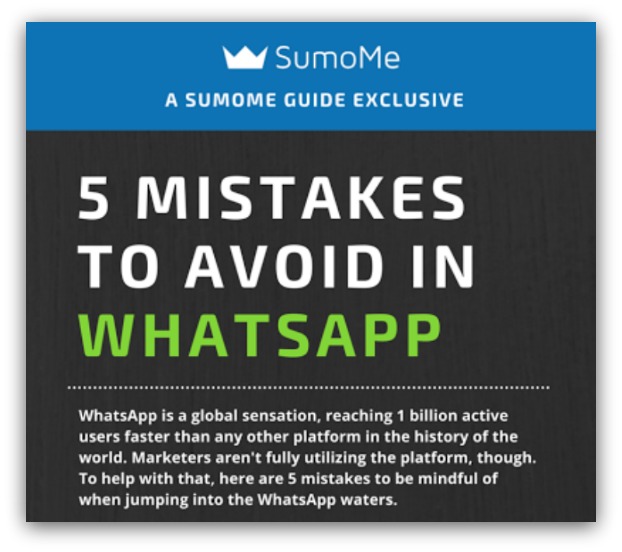
What it is: A one-page cheat sheet with the five biggest mistakes to avoid when you use WhatsApp.
The guide it was used in: This in-depth guide on how to use WhatsApp for marketing. That guide covered what WhatsApp is, why marketers should use it and how to breakthrough and build an audience before WhatsApp develops business solutions.
Why we created the upgrade: I mentioned a lot of step-by-step ways to start using WhatsApp in the guide. However, the mistakes were more between-the-lines reading — they weren’t overt or obvious. This upgrade addressed those more directly. Plus, pointing out mistakes to avoid is a powerful way to get attention.
How it performed: 6.54% conversion rate.
What we learned: This wasn’t terrible, but it wasn’t great, either. This upgrade doesn’t take a lot of time to create, so you can argue the 6.54% conversion rate isn’t bad for the resource investment. But for bigger returns, it takes more than a quick cheat sheet to get opt-ins.
Verdict: Mildly successful.
Example: Creating Perfect Facebook Call to Action Cheat Sheet
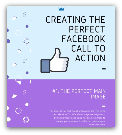
What it is: A one-page cheat sheet showcasing the four biggest elements (in order of importance) behind creating a Facebook post that actually gets clicked.
The guide it was used in: A massive guide showing how to create great Facebook posts. It goes over where a reader’s eyes go, what captures their attention and what makes them click (with a ton of examples).
Why we created the upgrade: This is another long guide with big examples in each of the four main sections. Those are essential to the story, but it can get difficult to keep the high-level points in perspective. This content upgrade distills everything to a one pager.
How it performed: 6.93% conversion rate.
What we learned: Again, another result similar to the previous cheat sheet — middle-of-the-road conversion rates. This isn’t a perceived high-value content upgrade, so the conversion rates aren’t crazy high.
Verdict: Mildly successful.
Final Thoughts On Cheat Sheets as Content Upgrades
-
They’re very easy to create, but the return (conversion rates) are pretty meh.
-
Perceived value is pretty low. Even if content in the upgrade is different/unique from the guide, it pales in comparison to the content in the guide.
-
If you don’t have an idea for a content upgrade (for shame), this is an easy solution that should get you decent opt-ins. But it won’t be anything special.
Content Upgrade #5: Ebooks
Ebooks, albeit one of the most popular types of upgrade, are also avery, very strange type of content upgrade. Here’s why.
On one hand, eBooks are very powerful for B2B purchasing decisions. Of all types of content, eBooks were the fourth-most influential sales driver (67% of sales through content). Generally, this comes from hosting an eBook on a landing page.
On the other hand…eBooks are situational. There’s this crux of using eBooks as content upgrades, and it goes like this:
-
You create one great eBook, use it as a content upgrade on all your content, but see your conversion rate slip as the eBook gets more exposure.
-
You create an eBook for each new guide, your conversion rate is high but all your resources are allocated to creating these eBooks.
That’s what it seems like. Most companies fall in the first category, because eBooks take a long time to produce (for high-quality).
So we decided to go the second route — creating a new eBook for each guide. Here’s what we found.
Example: Asking For Emails vs. Giving For Emails Ebook
What it is: A guide-turned-eBook about how to actually ask for emails the right way.
The guide it was used in: A big data guide that explored the top opt-in asks and what made them so unique.
Why we created the upgrade: We wanted to see if we could do an MVP-type eBook where we take the guide and straight-up turn it into an eBook. The guide was 4,000 words, so it felt long enough to turn into a meaty eBook.
How it performed: 5.23% conversion rate.
What we learned: The value wasn’t high enough to take what someone just read and keep it as an eBook. There’s a perception of not paying for what you’ve already got free access to, and that certainly happened here. Still, the eBook took us 30 minutes to make, so you get what you put in.
Verdict: Unsuccessful.
Example: 15 Emails You Should Be Sending Ebook
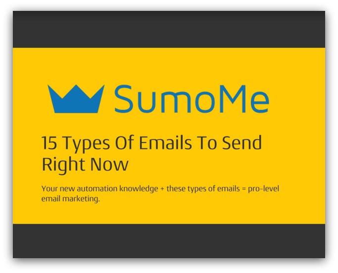
What it is: An eBook featuring 15 types of emails to send (plus the scripts and examples included in most).
The guide it was used in: A beginner-level guide on how to send your first automated email in any of the major email service providers.
Why we created the upgrade: We wanted to build on what we learned from the last content upgrade. Instead of turning the guide into an eBook, we took an old guide that was relevant to this guide, turned that into an eBook and added some brand new things to it. So this eBook built on the content as opposed to straight-up being an eBook form of the guide.
How it performed: 7.36% conversion rate.
What we learned: Offering a relevant eBook instead of a copy/paste eBook of the guide worked better. We still turned an old guide into an eBook, but we added and subtracted things to make it new. By using an eBook with content that built on the new guide, we added incentive to download the eBook and pair it with the knowledge in the automation guide.
Verdict: Mildly successful.
Example: Social Sharing Ebook
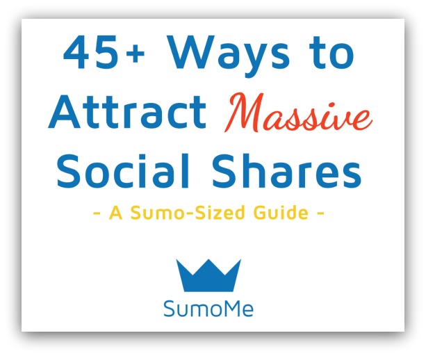
What it is: An eBook featuring 45 ways to get your content shared more (plus our personal favorites).
The guide it was used in: Exactly what the eBook was — a guide on 45 ways to get your content shared.
Why we created the upgrade: We wanted to experiment with laziness. Custom eBooks still didn’t fit into our bandwidth. So we took this massive, 12,000 word guide and turned it into an eBook. Our guess was most people didn’t want to read 12,000 words, but they’d be happy to download the guide and read it later.
How it performed: 21.2% conversion rate.
What we learned: That hypothesis was the most amount of correct anything could ever be. When we blatantly pointed out the length of the guide and offered the guide in eBook form to read later, people opted-in like crazy. There’s something about reading something on your own terms that’s very appealing.
Verdict: Extremely successful.
What You Can Learn From On Ebooks as Content Upgrades
-
Turning articles under 7k words into eBooks and giving them away on that same article doesn’t convert well.
-
Offering an eBook that fits contextually with an article (a la an eBook on 15 types of email to send offered on a guide about how to send automated emails) works decently well.
-
Turning a massive article into an eBook and framing it as a “read this article later” offer works really well.
-
If you’re a small/medium-sized team and you offer unique content upgrades on most of your articles, eBooks will be hard to replicate due to the time it takes to create a long/good one.
-
Would test in the future: shorter guides (800-1500 words) with bigger eBooks. Perhaps the shortness of the guide would lead to increased interest in an eBook that covers more of the topic.
BONUS Content Upgrade: Bundles and Swipe Files
There are a few other content upgrade categories I could cover, but I want to leave you with this one.
I want to talk about bundles. Because, believe it or not, we’ve been conditioned by companies for years to revere the power of bundles.
Think about car insurance. If you bundle your car with homeowner’s insurance or something else, you get a big discount.

That statement brought to you by a company that rhymes with “Schmico”
Think about buying internet. If you bundle internet with cable and a land line (why would you make us do that, Time Warner?!), you get a lower price.
Bundling seems like a bargain to us. You get more for less than if you bought individually. That makes the perceived value pretty high.
So we tried that tactic out on content upgrades. Here’s what we found.
Example: Instagram Marketing Bundle

What it is: A massive bundle of resources to help you dominate Instagram marketing. You get our marketing plan, standard operating procedures and the entire guide in eBook form.
The guide it was used in: Our 9,000+ word Instagram marketing guide (broken into five chapters).
Why we created the upgrade: We wanted to give everyone all the materials and marketing plans we used to build our Instagram account. Plus, we wanted to see what bundling would do for perceived value (as opposed to just offering an eBook).
How it performed: 13.9% conversion rate.
What we learned: Bundling is a successful strategy. These were all enticing offers, but bundling them created a highly valuable content upgrade. It would be interesting to see what happens when you bundle lower-level content upgrades (cheat sheets, worksheets, videos, etc) to create a more valuable whole.
Verdict: Very successful.
Speaking Of Bundles…
Time to see if my hypothesis is right.
I want to give you a few things we’ve never given away before (because you made it all the way through this guide):
-
-
This guide in eBook form: Just in case you want to have it for reference (or share with your team).
-
All the final thoughts in cheat sheet form: Don’t worry about writing down those high-level takeaways from each content upgrade. I’ll include them in a handy cheat sheet for easy reference.
-
Every single content upgrade in this guide: Forget about going to each guide and opting-in for every single content upgrade. I want to give you every one of those guides for free so you can see exactly what we created (these upgrades resulted in over 30,000 opt-ins).
-
That’s a lot of stuff for free. And you can use it to A) See the actual content upgrades we’re talking about B) Use those upgrades and C) Learn from our process so you can create your own signature content upgrades, too.
So lots of great extra content here. Plus you’d help me prove my hypothesis. Do it for science, if anything…
Add A Comment
VIEW THE COMMENTS