Imagine if you could press a button, go to sleep, then wake up with dozens or hundreds of sales in your inbox the next morning?
That’s the power of an email list.
But that’s not all. Get this:
-
Email has shown a 3,800% ROI — that’s $38 in for every $1 spent.[*]
-
One study found that 91% of respondents actually want to get emails from companies.[*]
In other words, having an email list (and sending emails to that list) is one of the best ways to grow your ecommerce business.
Today, I’m going to teach you how to build an email list from scratch using four simple strategies you can implement right away. Let’s do it!
%(tableofcontents)
Use A Simple, Non-Annoying Pop-Up To Capture Emails Automatically
You can’t talk about how to build an email list without talking about pop-ups.
In fact, Sumo was built based on the success of growing AppSumo’s email list with custom-built tools that were later turned into the Sumo product.
Pop-ups are everywhere. And yes, they can be incredibly annoying, distracting, and spammy. But that’s not our goal — we want results without hurting our relationship with potential customers.
How do we do that?
With a pop-up that makes sense.
It has to check all these boxes:
-
Visually appealing (doesn’t look spammy)
-
Offers something worthwhile
-
Doesn’t show up immediately on page load
Let’s break these down.
Visually Appealing Pop-Ups
Tell me, which of these pop-ups are you more likely to subscribe to?
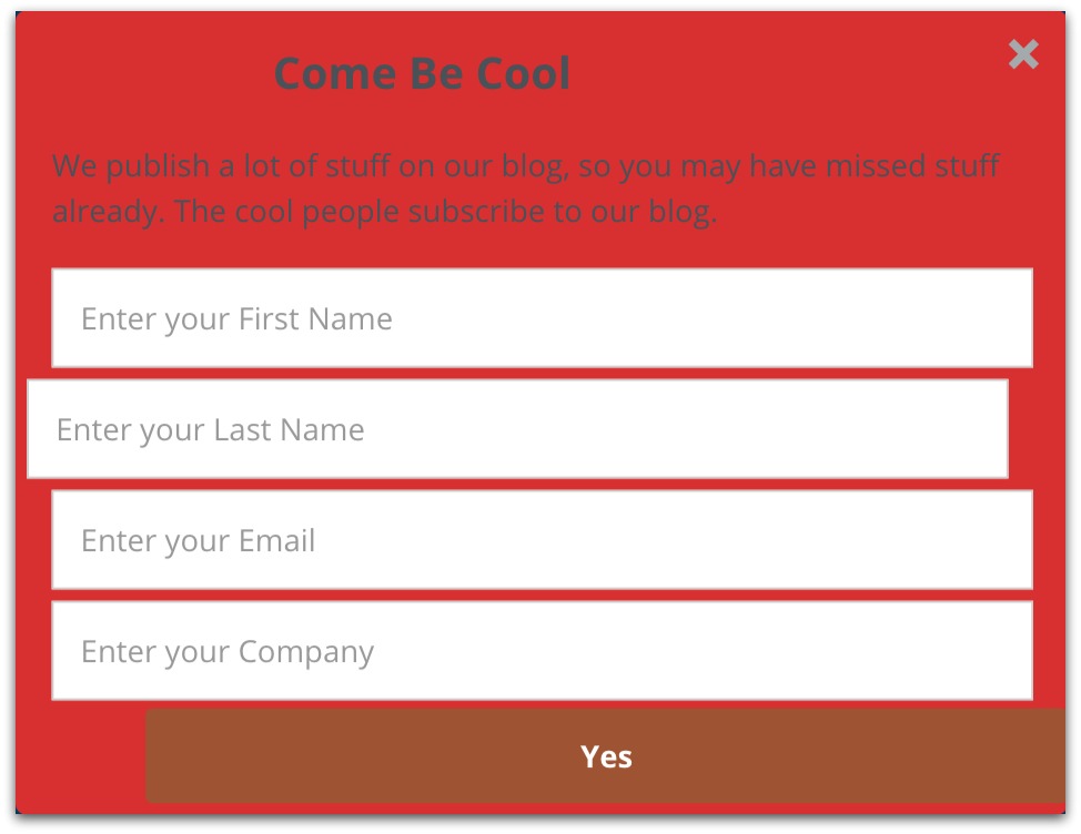

Probably the second one, right?
Because the first one is one of the ugliest pop-ups in existence, it looks amateurish and even a tad shady. It doesn’t build trust, that’s for sure.
This is bad news for your online store. Design is one of the four most important factors to establish trust with your visitors (the other three being transparency, comprehensiveness, and up-to-date content).[*]
So how do you design a visually appealing pop-up as a non-designer?
Simple: Use Sumo’s Grow Email List Shortcut and build your email pop-up in just a few minutes. It’s easy to quickly change anything you want about your pop-up.
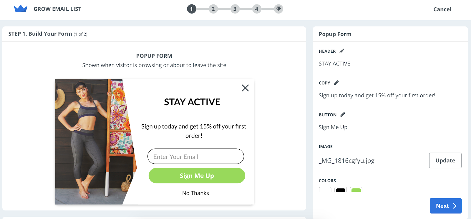
Important note: Due to recent changes to European laws called GDPR (General Data Protection Regulation), you need more consent from email subscribers. This applies to you regardless of the country you live in, since you’re bound to get traffic from the EU eventually. Luckily, all you need for consent is obvious wording that they agree to give you consent by signing up.
For example, you could say something like this: “Subscribe to our newsletter and get 15% off your first order, plus exclusive discounts and product updates!” instead of simply “Sign up to get 10% off.”
For more information, refer to the official EU GDPR site.[*]
Now the question becomes: What do you offer in your pop-ups?
Offer Something Worthwhile
I don’t know about you, but I don’t really want to sign up for any more email lists. I get too many emails as it is.
So how do you entice someone to share their email?
One great way is to give discounts.
I’ll gladly give you my email if I get 10% off my order. I’m not alone; everyone loves to save money.
(The key then is to keep them on your list by sending engaging emails, but that’s another article entirely.)
To give discounts, go to the Grow Email List Shortcut inside Sumo and make your way to Step 2: Build Your Email. Make it look how you want it, add your discount code, and change your call to action to something like “SHOP NOW”.
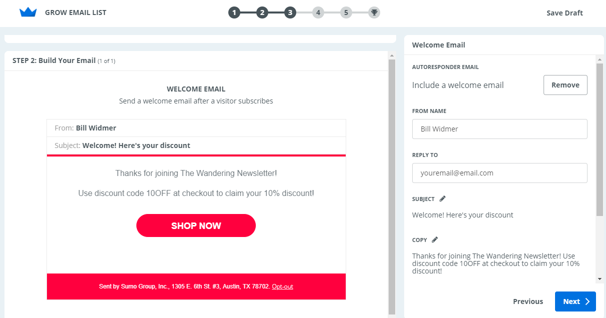
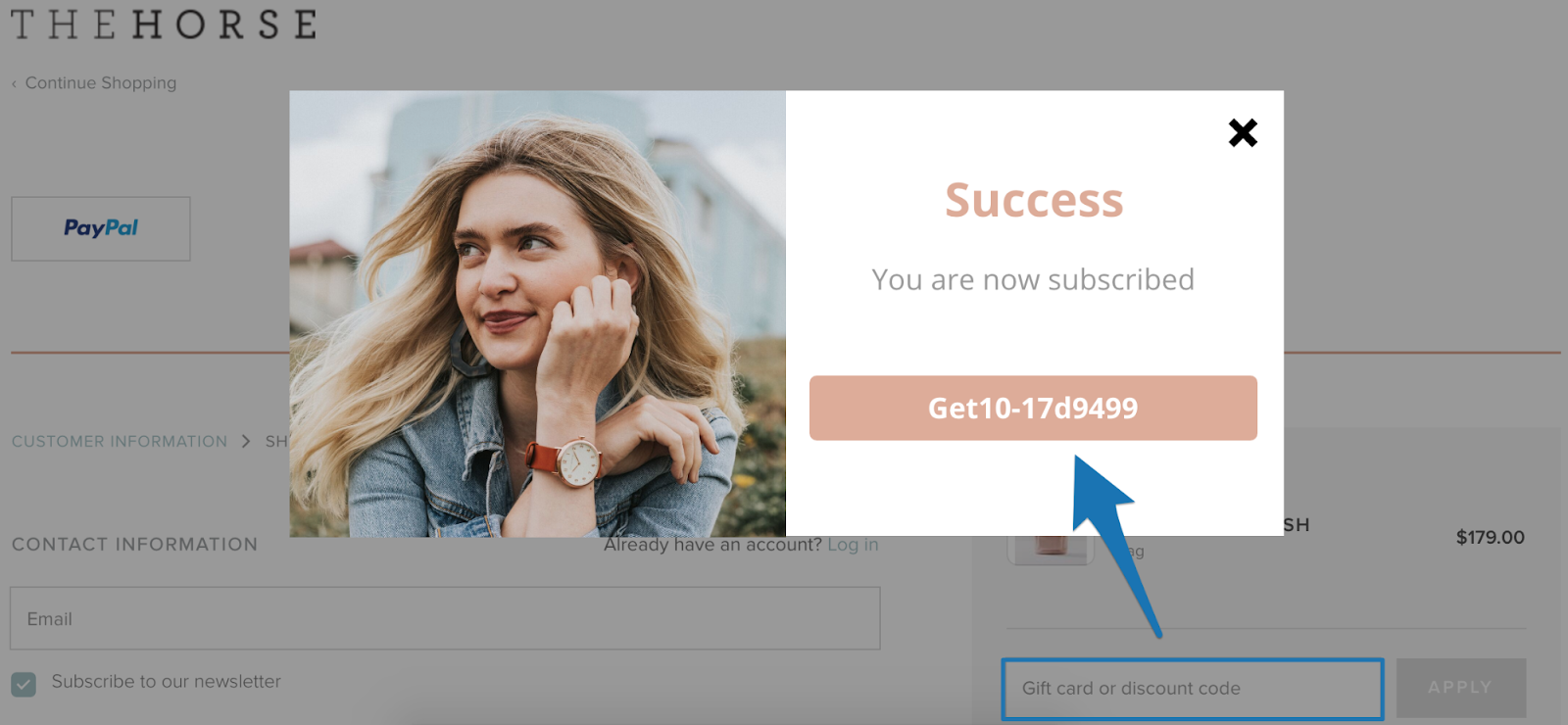
Pro tip: If you use Shopify, you can create abandoned cart pop-ups that give unique discount codes directly to your customers when they are on your site (see below).
Want some examples of real Shopify stores' pop-ups for inspiration? Click the button below to get the list building swipe file I put together:
Shopify List Building Swipe File
Besides discounts, you can also use content upgrades or store credit giveaways. But more on those in a bit… for now, let’s talk about when to show your shiny new pop-up.
When To Show Your Pop-Up
There’s nothing more annoying than landing on a page only to have a full-screen lightbox pop-up load before you even get to see the content.
(OK, there are more annoying things. But still!)
How do you avoid frustrating your visitors while still capturing as many emails as possible and growing your online store?
By giving them time to breathe.
You can accomplish this in two ways:
-
Use exit-intent pop-ups. Exit intent means your pop-up will display when the user's mouse leaves the web browser, signaling an intent to leave, or exit, the page.
-
Display your pop-up on a timer. Rather than loading a pop-up when the page loads, give the users some time to read through your content or view your products and establish trust.
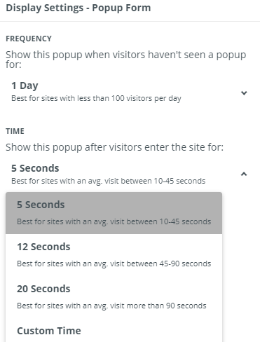
You can choose your display settings in Step 4: Confirm Your Display Settings in Sumo’s Grow Email List Shortcut. We make it straightforward to choose when your pop-up shows up, and give you an idea of which options are best.
Click the button the below if you’d like to set this up on your store.
Based on your average time on page, you can choose different options for display timing. (The times above were determined by a vote in the Sumo committee of ecommerce store owners and practitioners.)
Not sure of your time on page? Head over to your Google Analytics account and click BEHAVIOR > Site Content > All Pages. You’ll see the average time on page column there.
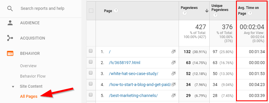
Based on my site's statistics, I would set different timings for different pages. On my “how to start a blog and get paid” guide with an average time on page of 4:23, I’d set the pop-up to appear after 20 seconds. But on my “white hat SEO case study” with an average 1:53 time on page, I’d shorten this to 12 seconds.
Reason being, the longer people are on your site, the more time they have to consume your content and learn that your content is amazing, increasing the chance they’ll opt-in to your list. (Your content is amazing, right?)
Enough about pop-ups — let’s talk about turning one-time customers into loyal, raving email subscribers.
Allow Guest Checkout — But Don’t Forget This Important Step
One of the most common reasons of abandoned carts is forced account creation. But this guide isn’t about abandoned carts, so why am I mentioning it?
Because even if you allow guest checkout, you should still give customers the option to sign up for an account post-purchase. (See image below.)[*]
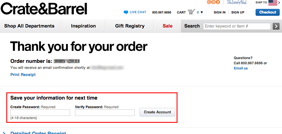
If you simply let them check out as a guest and don’t get them to commit to more, you could lose them as a return customer and you won’t be allowed to send them marketing emails. With a post-purchase account creation like Crate & Barrel does, you ensure the best possible chance of a return customer.
You can do this using the following apps/plugins:
-
Magento: Guest Checkout To Registered Customers
-
BigCommerce: This feature is built in
-
WooCommerce: WooCommerce Customers Manager
-
Shopify: Automatic Account Invites
Did you take the time to set that up? Good — on to my favorite strategy.
(Want to learn more about recovering abandoned carts? Check out this guide.)
Up The Ante With Content Upgrades
You’ve got a discount pop-up and you’re capturing as many customer emails as possible. You now have a good start on building an email list from scratch.
But wait, there’s more!
If you really want to up your game and capture as many emails as possible, you need content upgrades.
They’re the #1 way Sumo have grown their email list (see video below):
A content upgrade is exactly what it sounds like — an upgrade to your site’s content. It could be a PDF download, a checklist, a worksheet, use case, how-to guide — the list goes on. However, your readers need to submit their email to get access to it.
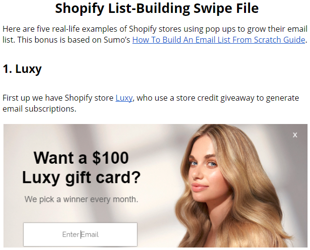
For example, the content upgrade to this guide is our list building swipe file with five real-life examples of Shopify stores using these strategies to grow their list.
Of course, this assumes you’re already using content marketing. If you’re not, then you should seriously consider starting a blog. It’s one of the best ways to grow your organic, social, AND paid traffic. And of course more sales, too.
But if you’re NOT able to start a blog? You can still use content upgrades on your category pages. To give you an example of this, take the Designer Paint Store. They have a few sentences on their category page above their selection of paints.
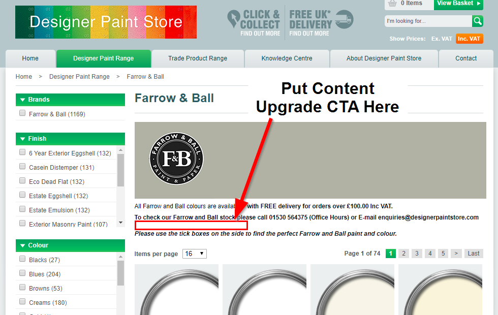
To capture emails of potential customers who might otherwise leave, they could put a content upgrade on this page, such as:
-
How to choose the perfect paint color for any room
-
A 10-point checklist to painting a room
-
A step-by-step guide to DIY painting
Then, from that upgrade, the company could nurture their list to help subscribers eventually buy the paint that’s right for them.
Get the idea? A content upgrade is there to help their customers get what they want. If you can do that, you’ll not only build your email list — you’ll also turn those emails into lifelong customers.
Finally, I mentioned one last strategy in the first section: store credit giveaways.
Use Store Credit To Grow Your List By 100-200 Emails Per Day
Giving discounts to your customers is a simple, easy way to build an email list from scratch. But there’s another way that costs less.
That way? Contests for store credit.

Shopify store Rhone used the simple discount strategy we shared earlier, and it worked well. But when they decided to try a store credit contest pop-up (see above), their email opt-ins skyrocketed from 50-100 emails per day to 100-200 emails per day!
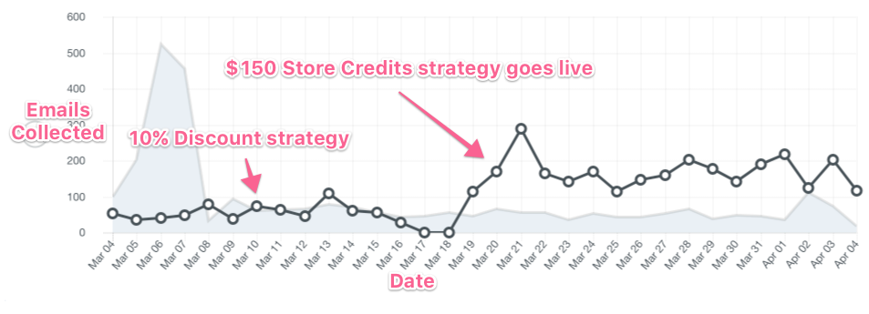
This is a win-win because not only can you capture more emails from people who are genuinely interested in your product, but you also lose less money to discounts!
Rather than giving a 10% discount on each new order, you’re only giving away $150 per month. Better yet, because it’s store credit, you’re only losing out on the cost of goods sold, not the full $150 (or whatever credit amount you decide to give away)!
To try this store credit strategy on your store for free, click the button below and then install Sumo’s Grow Email List Shortcut.
Alternatively, you can also try giving away a basket full of your products — but this may be more limiting since not all of your customers will want the same exact products (unless you only sell a few select items).
Pro Tip: Want to capture even more emails? Find and partner with a non-competing brand in the same or a similar niche to create an even bigger giveaway! For example, if you sell workout equipment, partner with a health foods company. If you sell daily planners, partner with a pen company. You get the idea.
Want Real-Life Examples Of Shopify Stores Building Their List From Scratch?
You now know four simple strategies to build your email list from scratch. If you use these proven strategies, you’ll have an email list of your 1,000 true fans in no time.
But if you REALLY want to kill it, click the button below to get my list building swipe file with five real-life examples of Shopify stores using these strategies to build their list.
Shopify List Building Swipe File
The money is in the list. Build yours today.
Add A Comment
VIEW THE COMMENTS