MailChimp is probably doing better than you ever realized. Their website traffic alone clocks in at a global rank of #979 out of the world’s more than one billion websites.

Total number of Websites [Source]
But that’s not all they’re known for. In 2016, they also:
- Made more than $400,000,000 in revenue with just 550 employees (that’s $727K per employee)
- Added nearly four million new users (increasing their total user base 30% from 12 million to 16 million in a single year)
- Had over 246 billion emails sent using their platform
Yeah, they’re a pretty big deal.
Despite this impressive growth, MailChimp didn’t skyrocket to success overnight (they’ve been around since 2001).
And they didn’t raise mass amounts of venture capital money at the start or begin with a big sales team.
They spent years and years experimenting, testing, and creating a functional, loveable product that caters to the needs of millions of people around the world.
Now that they’ve done the work for you, I’m going to show you ten little secrets that led up to (and continue to grow) MailChimp’s wild success.
Table of Contents
%(tableofcontents)
[Tip #1] Get Your First Customers By Putting On Your “Green Glasses”
MailChimp started as a web design agency called “The Rocket Science Group” in 2000 by Ben Chestnut and Dan Kurzius. In 2001 Ben and Dan found that a couple of their clients were having trouble sending email newsletters (they either had no idea how to do it, or they were using an enterprise software that was too difficult to use.)
Instead of ignoring the problem, Ben and Dan identified this as an opportunity to help their clients solve the problem. They got code from a failed digital greeting card product they had made and tweaked it to launch MailChimp to their web agency client base in 2001.
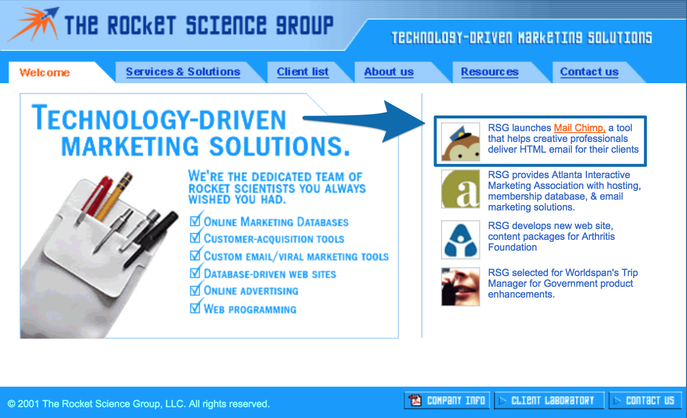
For five years, MailChimp was a side-project to Ben and Dan’s main web design agency. All MailChimp had for five years was this simple website:
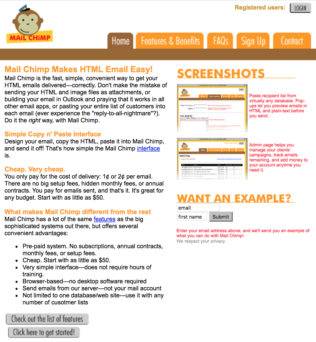
Because Ben and Dan focused on the customer’s needs, and then built MailChimp around those needs, it helped take the hard work out of product development and ensured that there was actually a market for the idea.
This helped them get their first initial customer base by organic word-of-mouth referral while they were focusing on growing their web agency business. As the MailChimp side-business grew over the years, Ben and Dan started testing different pricing strategies.
2001-2004
MailChimp started by charging for prepaid credits ranging from 1-2 cents per email sent based on these three different pricing tiers:

2005-2006
MailChimp introduced a free trial account where you could get 25 email sends for free, or select from one of twelve different pricing tiers:
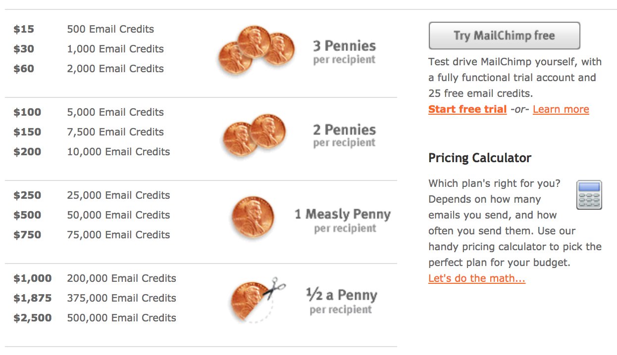
2007
Ben and Dan’s web design agency wasn’t growing fast enough, and they weren’t passionate about it anymore, so they stopped doing web design and focused exclusively on MailChimp.
It was during this year that MailChimp introduced five monthly plans to make their revenues more predictable, so they could start focusing on reinvesting the profits to grow the business without any outside funding:
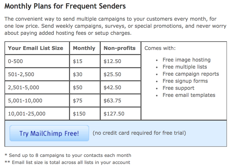
2008-2011
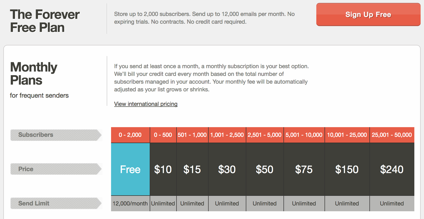
This is when MailChimp introduced their Forever Free Plan. Every year MailChimp increased the number of free email subscribers people could have:
- 2008 – 100 free email subscribers
- 2009 – 500 free email subscribers
- 2010 – 1000 free email subscribers
- 2011 – 2000 free email subscribers
2012-2017
Pricing plans stayed consistent across 2012 and 2014, until in 2014 when MailChimp decided to simplify down to three monthly plans (one being their free plan). After clicking “Learn More” underneath their pricing tiers you get taken to MailChimp’s pricing calculator to calculate your actual monthly cost based on email subscribers:
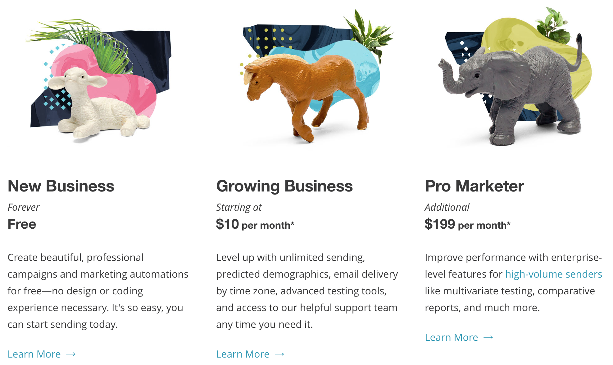
The main thing that changed from 2014 to 2017 wasn’t pricing, but rather the names of MailChimp’s plans. Here is how they changed over the years:
- 2014/2015 – Entrepreneur / Growing Business / High Volume Sender
- 2016 – Starting Up / Growing Business / Pro Marketer
- 2017 – New Business / Growing Business / Pro Marketer
By constantly experimenting with their pricing and product naming, MailChimp has been able to consistently improve the monetization of their business to be more and more profitable. While most marketers are chasing aggressive acquisition targets, MailChimp know that the real key to success is to make more money from every customer with pricing that matches what every small business owner is willing to pay.
The takeaway: Put on your green glasses. Increase your awareness of opportunities that are hidden in plain sight, learn to see abundance everywhere and always be testing your pricing (MailChimp did it by being aware of common pain points their web agency clients had, then creating a side-business out of it while constantly testing new pricing tactics.)
[Tip #2] Move People Down Your Marketing Funnel With The Facebook Ads “Funnel Stepping” Technique
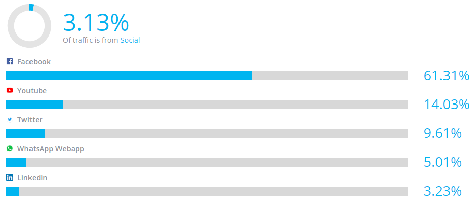
More than 61% of MailChimp’s social traffic comes from Facebook, which generates them 867,000 views to their website every month.
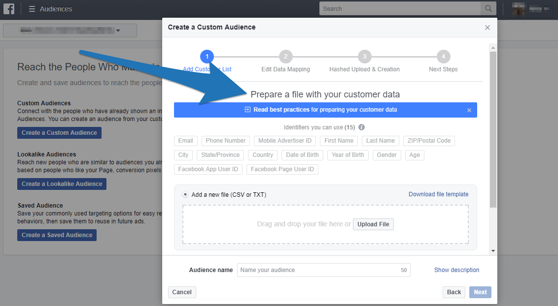
What MailChimp does really well is use something called Facebook Custom Audiences to leverage their email list and millions of customers.[*]
Facebook Custom Audiences are a way for you to target Facebook ads to specific groups of people (AKA your custom audiences) in your contact list.[*]
The real power of Facebook Custom Audiences can be found when you target your custom audiences with ads to get them further and further down your marketing funnel. Here is an example from Sumo where we use a similar marketing funnel to MailChimp:
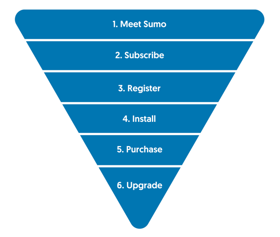
- Meet Sumo (cold traffic reads a Sumo blog post)
- Subscribe (paid ads to subscribe to the Sumo blog with email address)
- Register (paid ads to email subscribers to register for the Sumo free plan)
- Install (paid ads to registrations to install the Sumo site code)
- Purchase (paid ads to installers to purchase a Sumo paid plan)
- Upgrade (paid ads to purchasers to upgrade their Sumo account)
Step 3, 4, 5, and 6 all require the use of Facebook Custom Audiences. If you are just starting out, you should use email marketing to move people down your funnel. But once you have a big enough custom audience size to run ads at the other stages of your funnel (>1000 people) you can start targeting them with Facebook ads into the next stage of your funnel.
This is a technique I call Facebook Ads “Funnel Stepping” where you run ads to step people further down your marketing funnel.
Here are examples of 2 different Facebook Custom Audiences MailChimp use to move people further down their marketing funnel using “Funnel Stepping”, which you can swipe for your own business.
Facebook Custom Audience #1: MailChimp Users Who Haven’t Sent Their First Email Campaign
Here are the Facebook ads MailChimp runs for a custom audience of people who’ve signed up for the product but have never actually used the product to send an email campaign:
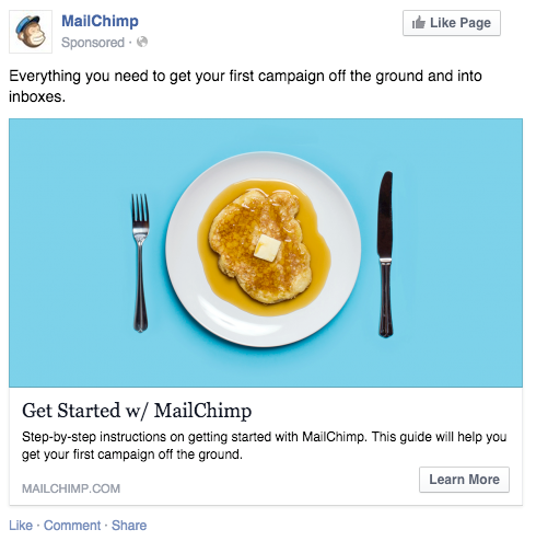
Golden Nugget: High contrast images, diagonal lines, and recognizable objects are a pattern interrupt that can help increase the CTR of your Facebook ads. The higher you can get your CTR, the lower your click costs will be. MailChimp are using two of these CTR elements in their ad to generate more clicks (high contrast sky blue background and circular plate).
On the ad, MailChimp give away their “Getting Started” guide. They are doing this to help people get on the path to sending their first email campaign so they get value from the product and don’t churn.
This is also the exact same “Getting Started” guide they use in their email drip campaign.
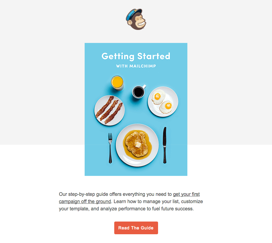
By sending people an email and targeting them with a Facebook ad, you have a higher likelihood of getting your message in front of your audience.
MailChimp has had some major success with this type of ad as “over the course of one week, 1,500 users clicked on the link to view and download the guide.”
Facebook Custom Audience #2: MailChimp Active Users
For its active users, MailChimp use Facebook Custom Audience targeting to promote various updates and related products.
For example, MailChimp ran a series of ads promoting their mobile app, MailChimp Snap to get more people using their product on their mobile devices and integrate MailChimp more into their day-to-day life.
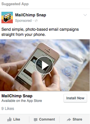
For this particular ad, MailChimp ran an A/B test. They showed this ad 50% of the time to active users, and 50% of the time to non-users who showed an interest around keywords like “digital marketing” or “mobile marketing.”
What they found was “the MailChimp user group clicked on the ads almost three times more often than the other group, and this use of Custom Audiences helped increase mobile app adoption rate more effectively than using general keyword targeting.”
The takeaway: Use “Funnel Stepping” to move people from the top to the bottom of your funnel. Start with email drip campaigns for each stage of your funnel, then when you have a big enough custom audience size at each stage of your funnel (>1000 people) target them with Facebook ads using Facebook custom audiences to advance them to the next stage of your funnel.
[Tip #3] Run A Viral Marketing Campaign Using This 3 Part “G-MAP” Framework
MailChimp is truly the king of using curiosity to build brand-name awareness.
One major way they did this was with their viral ad campaign called “Did You Mean MailChimp?”
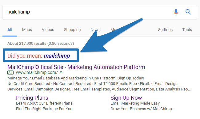
The inspiration for this campaign came from a “MailKimp” mis-pronunciation in one of their most successful podcast ads from 2014 that got one million listens per episode (where 95% of listeners identified MailChimp as an email service provider based on the ad.)[*]
MailChimp saw that people loved this play on MailChimp’s pronunciation from tweets and communication with customers (and even a MailKimp remix tape that was made from the ad).
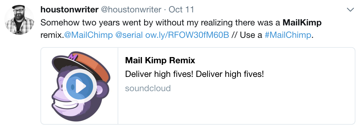
So based on that success MailChimp decided to double down on what works and make an entire marketing campaign based around nine different “fake” brands that sort-of sound like MailChimp.
Here they are:
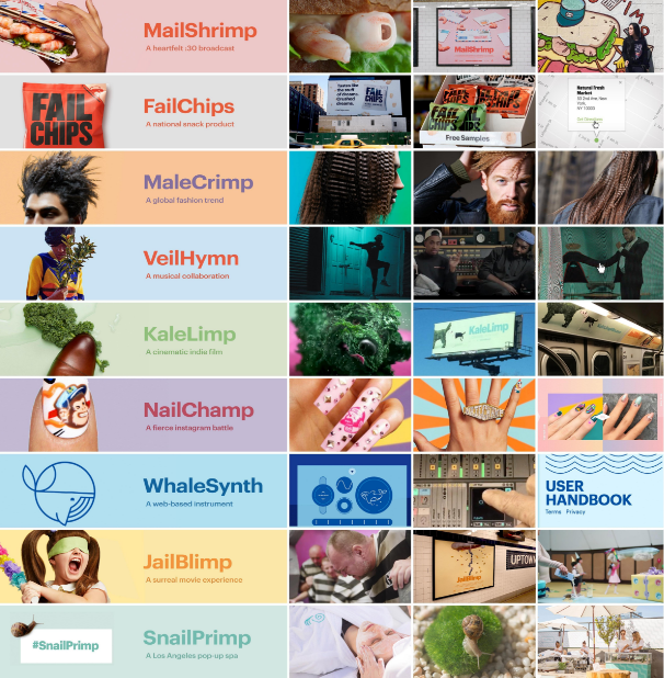
And they went all-out. They teamed up with an ad agency to produce short 1-minute films for MailShrimp, KaleLimp, and JailBlimp… and then created websites (and actual products) for the other six strange pronunciations.
The campaign was bizarre (though attention-grabbing), to say the least.
Here’s the video of the marketing campaign:
Click here to reveal the ad agency MailChimp used
The campaigns one minute “short films” were shown primarily as YouTube ads, which meant MailChimp could run them as pre-roll ads where you don’t need to pay until a user has watched at least 30 seconds of your video.
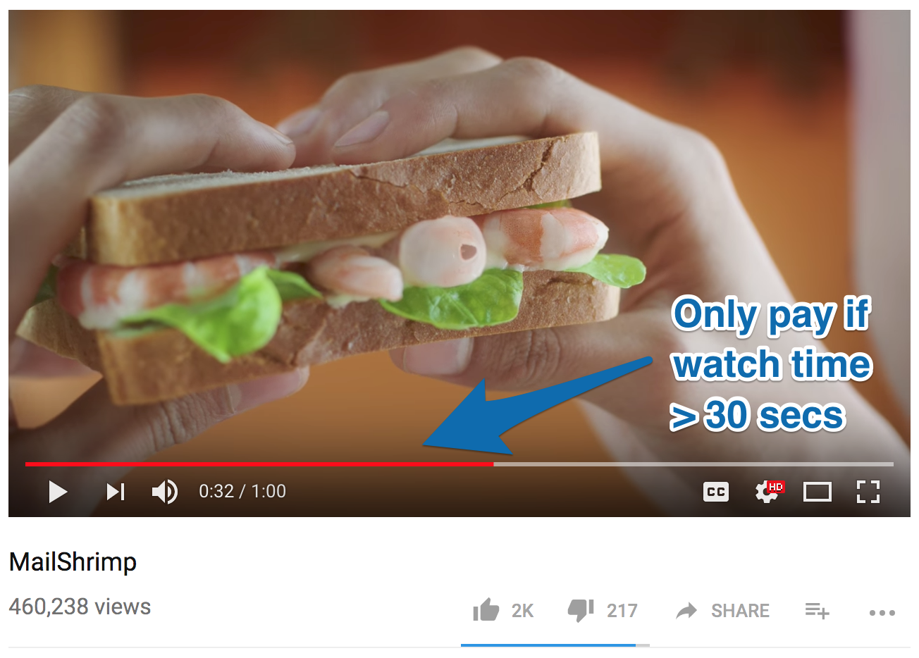
Golden Nugget: In addition to pre-roll ads, one of YouTube’s most affordable ad types is remarketing. Anyone who views your video, likes your video or shares your video can be remarketed to. MailChimp received over 460,000 views and 2,000 likes on this one video that they could use to remarket MailChimp to.
In addition to YouTube, MailChimp used print ads in a number of places designed to get people to search for MailChimp’s campaign brand names.
These places included billboards, subway trains, subway stations, and sponsored Instagram posts:
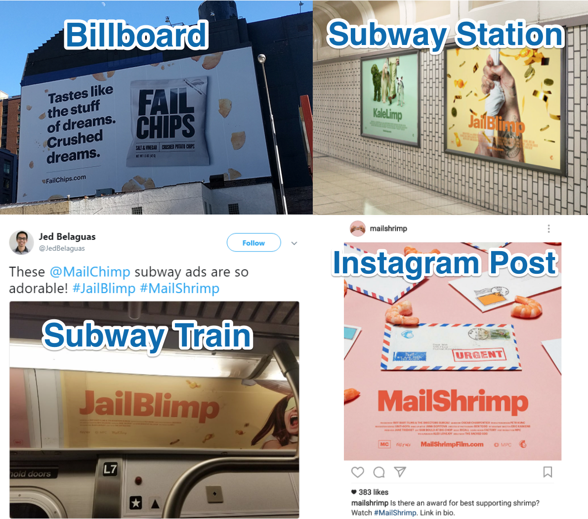
The mix of both online and offline marketing promotion turned the marketing campaign into a wild, polarizing success for MailChimp.
It got them a LOT of brand awareness, traffic, and free media including 3.8 million organic searches for either MailChimp’s name or a campaign product name.

Did You Mean MailChimp? [Source]
The campaign also started up a lot of heated discussions on the web, as most people either absolutely loved it or absolutely hated it:
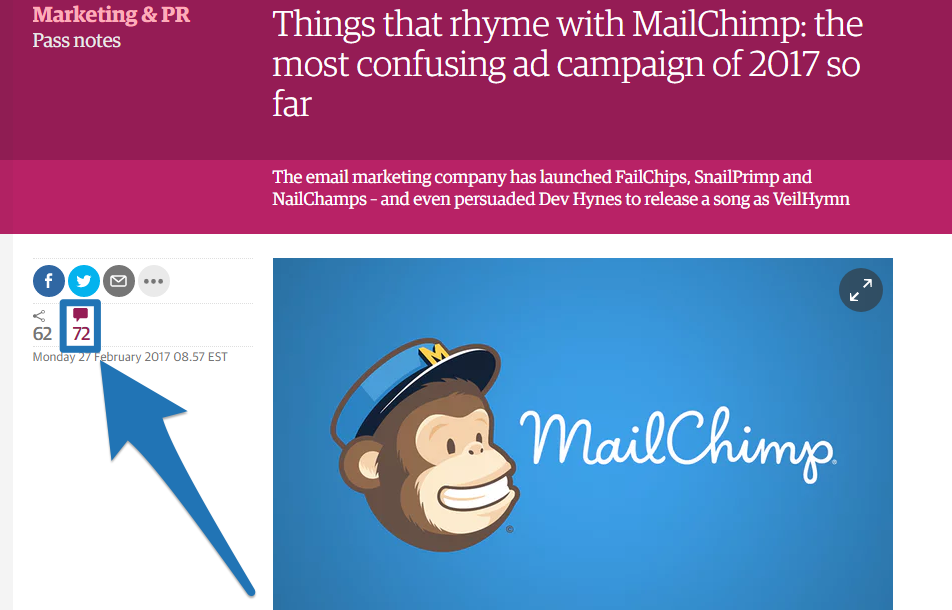
Even with the haters however, the word-of-mouth awareness got MailChimp featured in major publications like Rolling Stone, Pitchfork, French Vogue, Paper Magazine and The New Yorker.
But creating short films, music videos, websites, billboards, subway ads, etc. is all quite expensive. So if you’re not as big as MailChimp, but want to replicate this sort of success for your own company then you need to understand how to reverse engineer what MailChimp did. Here is the three part “G-MAP” creative marketing framework you can use to do this for your own company:
- Goal – What is your goal? (MailChimp’s was mass market brand awareness)
- Marketing Angle – What is your marketing angle? (MailChimp’s was creating weird, attention-getting brands that rhyme with MailChimp)
- Promotion – How will you promote it? (MailChimp used single page websites, YouTube video ads, Instagram ads, Subways ads and Billboard ads)
To give you an example of how to run one of these marketing campaigns, at Sumo I had a goal to increase website traffic by 50,000 in 2 days on the Sumo blog. It was during SumoCon, so I came up with a marketing angle to get Noah to fight a world champion Sumo wrestler. I then promoted it in the SumoCon Facebook Group:
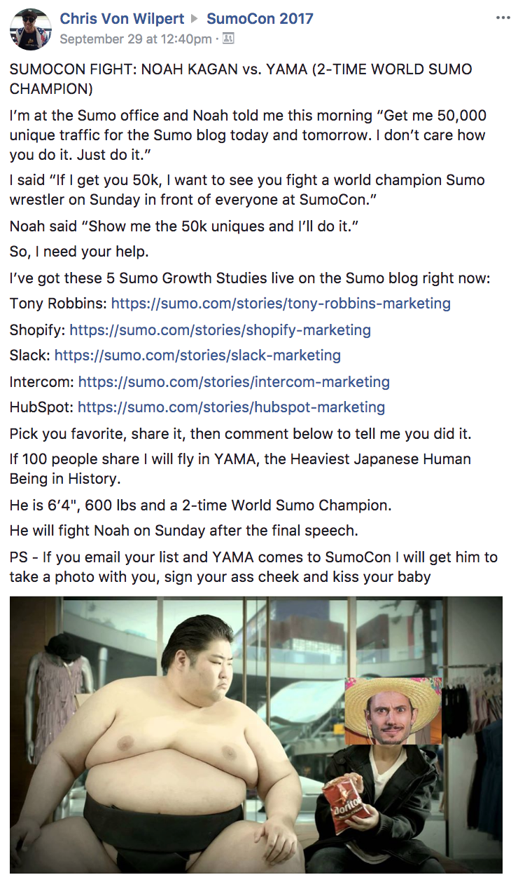
I booked 2 seats on a plane for Sumo Yama, hired a Sumo mat and staged a fight for Noah vs. Yama on the last day of the conference.
I ended coming up short on my goal by about 10,000 uniques, but the whole SumoCon audience loved it, shared the fight on Facebook Live and told their friends what a crazy good conference they’d just attended. It was something creative, out-of-the-box that no one had ever seen before.
The three part “G-MAP” creative marketing framework works. Use it to come up with your own creative marketing campaign.
Now to get back to MailChimp, they knew that getting views and interest on the nine brands they had created wasn’t enough. They needed to direct people to their website.
MailChimp did it by using a “curiosity gap.” Their primary goal was to drive traffic to their campaign websites, then use curiosity to get people to click-through to their main website to learn more about them.
For example, all of MailChimp’s YouTube videos finish with nothing but the smallest mention of MailChimp. Here’s how a JailBlimp video ends:
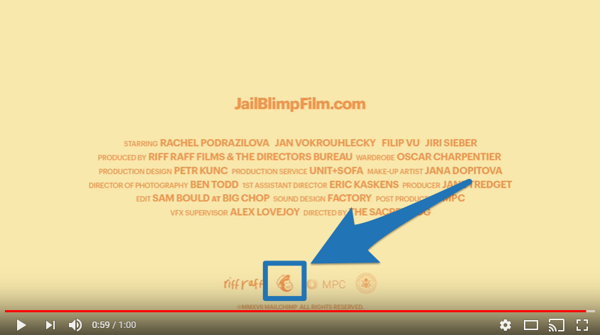
The name MailChimp is never spoken out loud, it’s hardly visible, and there’s no mention of what MailChimp actually is or does.
Just below the video, the description doesn’t tell people anything about them (they don’t even post the videos from their own MailChimp YouTube account, they create a new YouTube channel with one video):

They use this curiosity gap technique (where they don’t really let people know what’s going on) to convince readers to click-through.
Email marketing platforms aren’t exactly the sexiest products out there nor the type of product that really encourage click-throughs, so this is a great way to sell the click (actually, this is basically the exact same technique I saw Slack using in their viral “Animals!” marketing campaign).
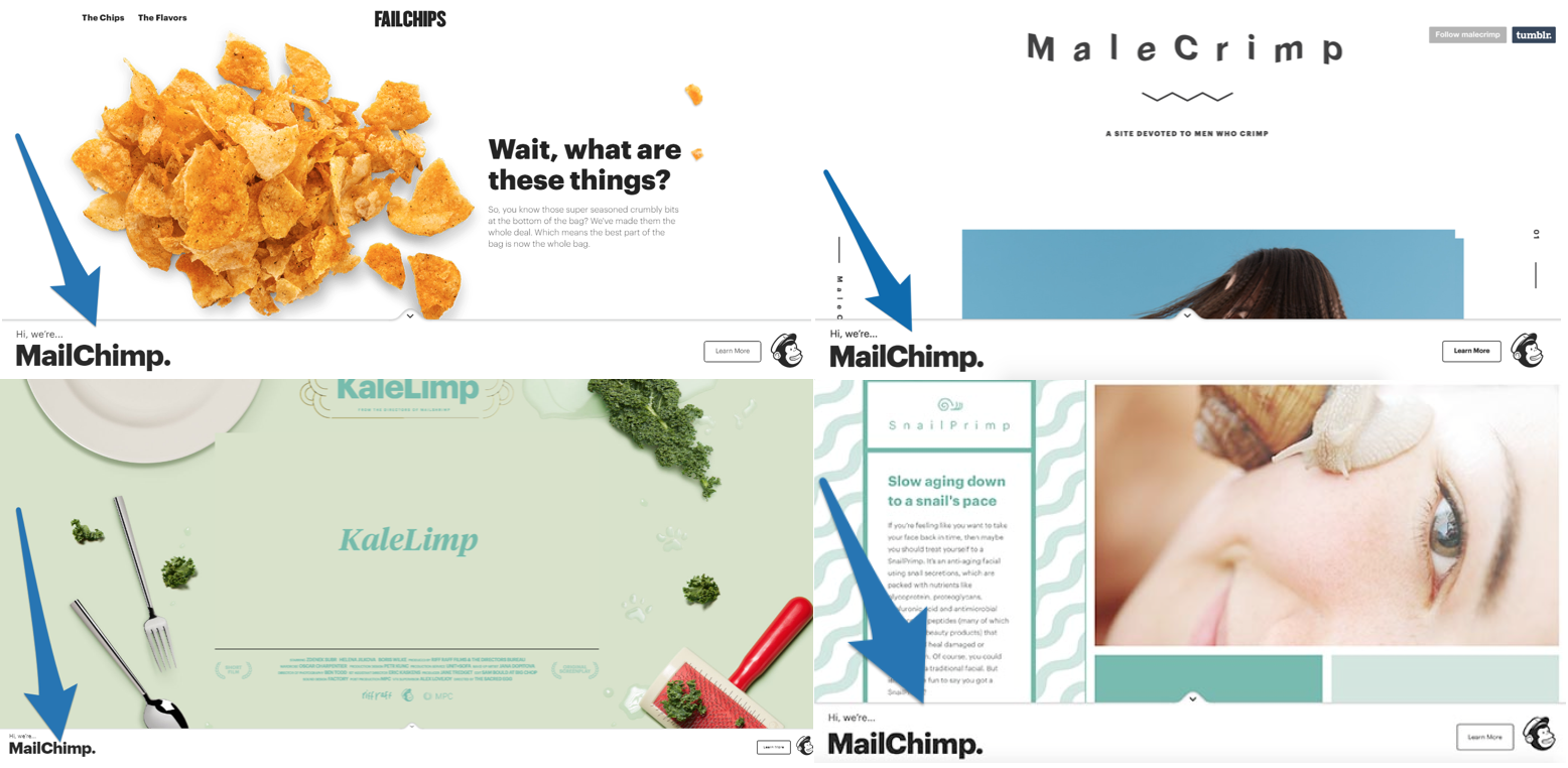
If I visit the YouTube URL in the description I get taken to the short films single page website where towards the end of the video a Smart Bar pops up linking me to MailChimp’s landing page where I can learn more about MailChimp.
Click to reveal the free tool you can use to create your own time-based “curiosity gap” Smart Bars
MailChimp created full websites for each of the branded campaigns they ran, using the the same Smart Bar CTA on every site to direct traffic back to their main website.
You can see the curiosity gap in action with that bottom bar that pops up and introduces MailChimp (without saying who they are or what they do)… and invites readers to “Learn More” next to Freddie’s head.

Clicking the “Learn More” button on the Smart Bar will direct the reader to a customized “Did you mean…?” landing page.
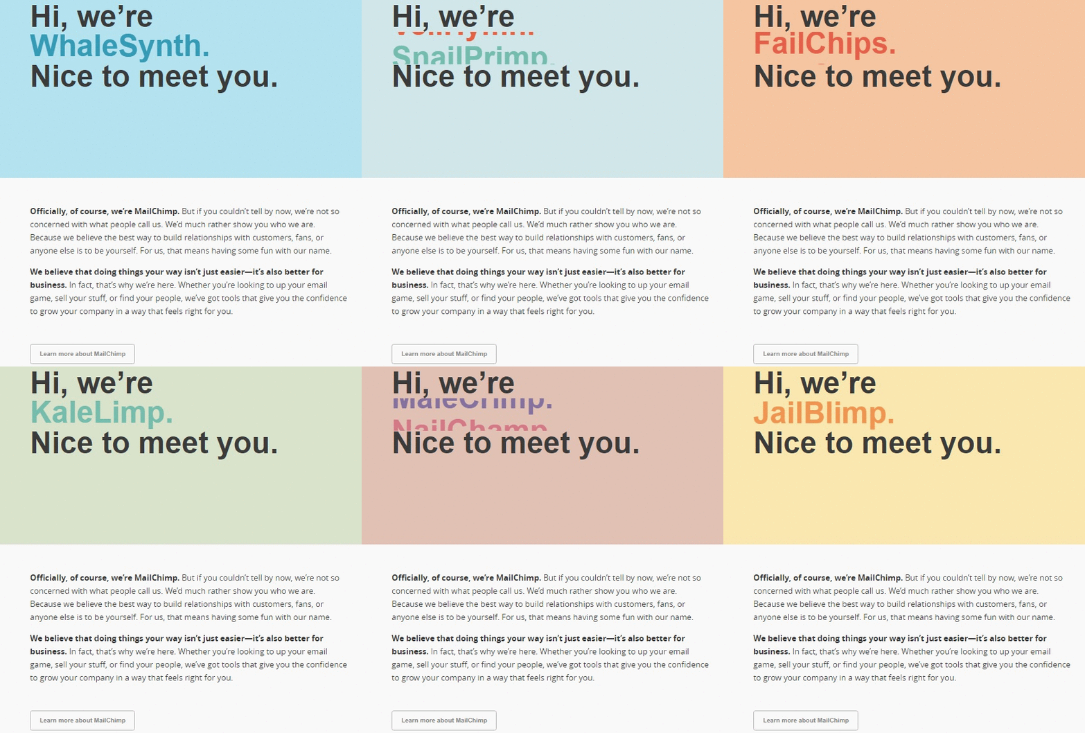
Check out the copy on the page. Although it gives audience members a bit more information about what MailChimp does, they still don’t come right out and say exactly what their product is.
Instead, they tell people what MailChimp can help with (without telling them how for now) then link to their homepage.
The takeaway: Use the three-part “G-MAP” creative marketing framework to come up with a unique marketing campaign for your business that will help you hit your marketing goal, increase your website traffic and get you more customers (MailChimp did it with three short films, a music video, a competition, a fashion blog, a web-based instrument and two sham products that got people typing their campaign names into a search engine.)
[Tip #4] Advertise Your Business Next To Something That Is Relevant To Your Product Using Niche Sponsorship
Between MailChimp’s memorable brand and massive customer base, it seems like everyone has heard of MailChimp.
But for many people, they first heard about MailChimp because they were addicted to Serial, a true crime podcast.
MailChimp identified a niche podcast series with a broad audience demographic (just like their software) and sponsored it, running this quirky little nineteen second ad at the beginning of each episode:
(If you can’t have a listen now, you’ll find a transcript just a few scrolls below.)
The Serial podcast with MailChimp’s ad on it broke iTunes’ record for being the fastest podcast to reach five million downloads and streams.[*]
To try and replicate this success for your own business, follow these 2 simple steps:
- Identify a piece of content (podcast, radio segment, blog) that is relevant to your product or has a similar demographic
- Have your advertising spot run adjacent to it
This tactic is called “niche sponsorship” and there are many ways you can do it, for example:
- If you sell a sports magazine subscription, you can advertise your product during a sports talk show
- If you sell auto insurance, you can run your spot close to the traffic report on the radio
- If you sell dog food, you can find top ranking dog recipe blogs and sponsor your ad placement
- If you sell a course, you can find people who make videos on your course topic and sponsor the end screen on their YouTube videos
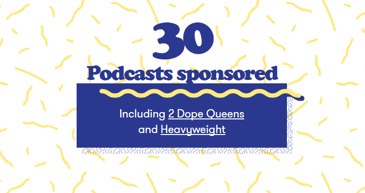
MailChimp are testing more niche sponsorships every year, just like Slack are doing. Last year they tested 30 podcast sponsorships.[*]
MailChimp found the most success when their niche sponsorship was announcer-read. Here is the exact transcript from the MailChimp podcast sponsorship ad:
Speaker #1: Support for Serial comes from MailChimp
Speaker #2: From MailChimp
Speaker #3: Mail…kimp? Chimp?
Speaker #4 (host of the podcast): More than 7 million businesses around the world….
Speaker #5: ….use MailChimp…
Speaker #6: ….to send emails, newsletters, and deliver high-fives
Speaker #4 (host of the podcast): MailChimp! Send better email.
Speaker #7: (quietly) Very nice!
Speaker #4 (host of the podcast): I use MailChimp
Speaker #7: You do!?
Speaker #4 (host of the podcast): I love it
Golden Nugget: Take note of how Mailchimp doesn’t actually give people a specific URL to visit. The goal of this is to boost organic search and get people searching MailChimp’s name out of curiosity.
This ad was born from MailChimp’s ad copy and Serial’s producers (NPR). The normal people on the streets of New York were the speakers.[*]
Here are a few nuggets of wisdom you can take away from it for your own sponsored podcast ad (or any kind of spoken ad):
- Multiple speakers make the ad more interesting to grab people’s attention more than just one voice
- By having it read by normal people, the ad turns out natural-sounding
- The host should play a role in the ad
- The name MailChimp is said six times (this makes it more likely people will remember it)
- They define who uses the product and what they use it for in one quick sentence
- They offer some social proof (“Seven million businesses…”)
- They give a concise, three-word phrase emphasizing what YOU can do with the product (“send better email”)
After someone hears the ad, MailChimp has a search marketing funnel to take prospects down a path to conversion. This is how they do it:
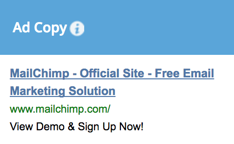
Step 1: When someone searches for “mailchimp” or “what is mailchimp” they are served a MailChimp branded ad. Here is what one of MailChimp’s earliest branded ads looked like when they ran their Serial campaign:
Step 2: After clicking on that ad you are taken to MailChimp’s homepage. Here is what it looked like back when the first season of Serial launched on Oct 3, 2014:
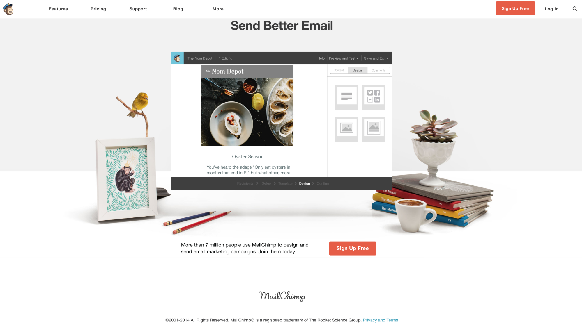
MailChimp made it super simple (one headline, one image, one sentence description and one signup button). They did it this way because they have a simple value proposition and people coming from a branded search are already in the funnel and don’t need a lot of information to make a decision.
Here’s a quick summary of the path MailChimp takes prospects down. The prospect:
- Hears the sponsored brand name on their favorite podcast
- Searches that brand name to find out what it is
- Clicks the PPC ad
- Signs up for MailChimp (or uses site navigation to learn more)
But we can’t talk about MailChimp’s “Serial” podcast ad without talking about the elephant in the room: MailKimp.
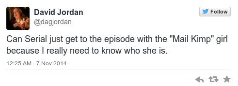
Where many companies would have just cut out this mistake (coming from a 13-year-old girl), MailChimp decided to go with it.
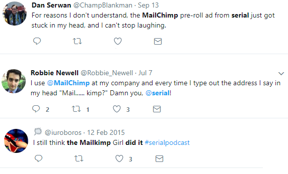
Not only does this “blooper” make the overall ad seem more natural and less “salesy,” but it’s memorable and funny. And the audience members loved it.
MailChimp co-founder and CEO Ben Chestnut has since joined in on the fun with his Twitter bio:
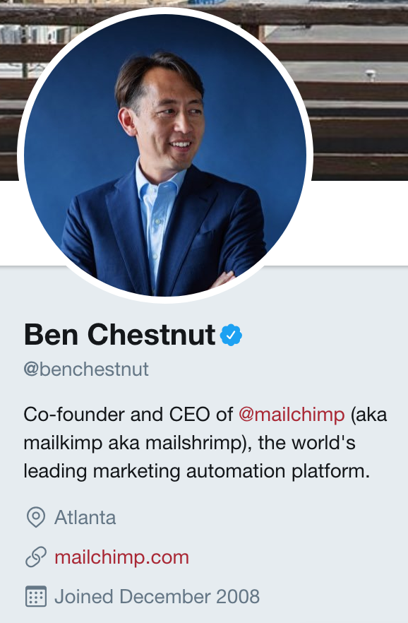
In other words, if something goes astray when you create your own ad, embrace the mistake. You never know what might happen.
P.S: In case you were wondering the cost of something like this, Serial has an audience of one million unique listens per episode and MailChimp paid $25 to $40 per thousand listeners. That is $25,000 to $40,000 advertising cost per episode.[*]
While this is obviously a big investment, keep in mind you can sponsor small, but highly engaged audiences for much less.
The takeaway: Identify a piece of content that is relevant to your product and run your advertisement adjacent to it (MailChimp did it by sponsoring a podcast where they could reach a broad demographic of people, then using multiple speakers in the ad where the MailChimp brand name was mentioned six times, resulting in 95% of listeners remembering MailChimp as an email service provider.)
[Tip #5] Use This 3 Part PPC Funnel With A Pre-Sell Landing Page To Warm Up Your Cold Paid Traffic
Most advertisers have ads that direct people straight to their sales page.
This is what Tony Robbins does, as an example.
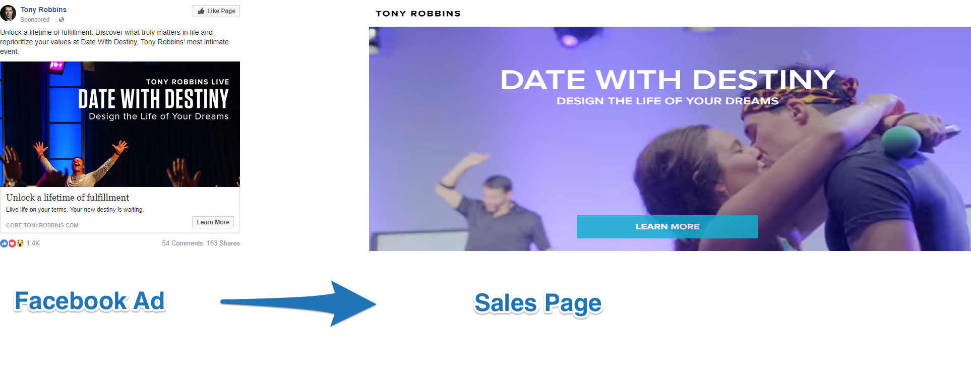
But MailChimp takes a slightly different approach.
MailChimp created a campaign called “MailChimp vs. the Black Hole”, targeting ecommerce businesses to use their product. To promote the campaign they ran a Facebook carousel ad to a pre-sell landing page.
Here is the campaign’s Facebook carousel ad:
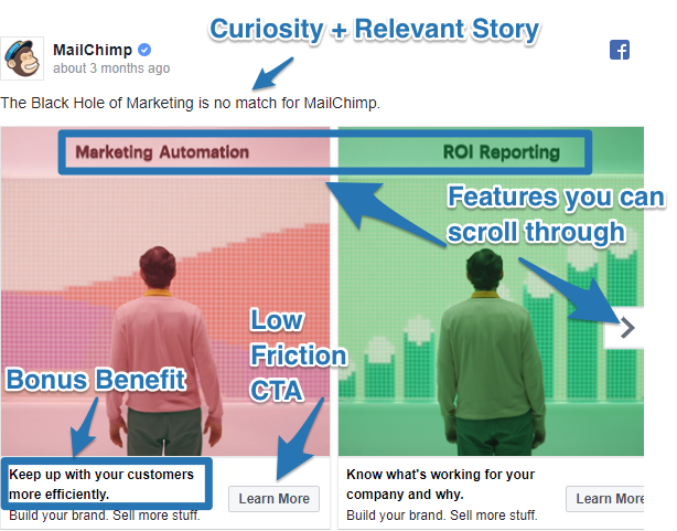
There are three parts of the ad to notice:
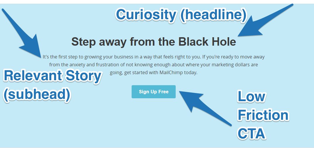
#1.The Curiosity + Relevant Story + Low Friction Call To Action (CTA) equation
#2. The three product features showcased in the rotating carousel (these are a condensed form of the same ones listed in Part 2 of the pre-sell landing page to increase Facebook Relevance Score)
#3. The bonus benefits (“keep up with your customers” and “know what’s working”) that highlight a benefit not already mentioned in the ad
The Pre-Sell Landing Page
The pre-sell page that follows this Facebook ad has been optimized to convert website visitors using this three-part landing page:
- Part 1: Curiosity + Relevant Story + Low Friction CTA
- Part 2: Top 3 Features
- Part 3: Curiosity + Relevant Story + Low Friction CTA
Part 1: Curiosity + Relevant Story + Low Friction CTA
This is the above-the-fold part of the pre-sell page.
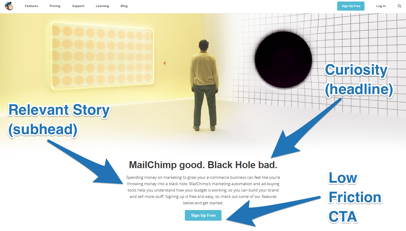
As you can see, this section follows that equation perfectly, beginning with a headline that gets people curious and wanting to keep reading, then ending with a low friction CTA for a free offer.
Part 2: Top Three Features
After capturing your attention above-the-fold MailChimp have a colorful breakdown of their three major features. Each feature section has a clear, no-nonsense headline, a short benefit-based description, a primary “Sign Up Free” CTA and a secondary “Learn More” CTA.
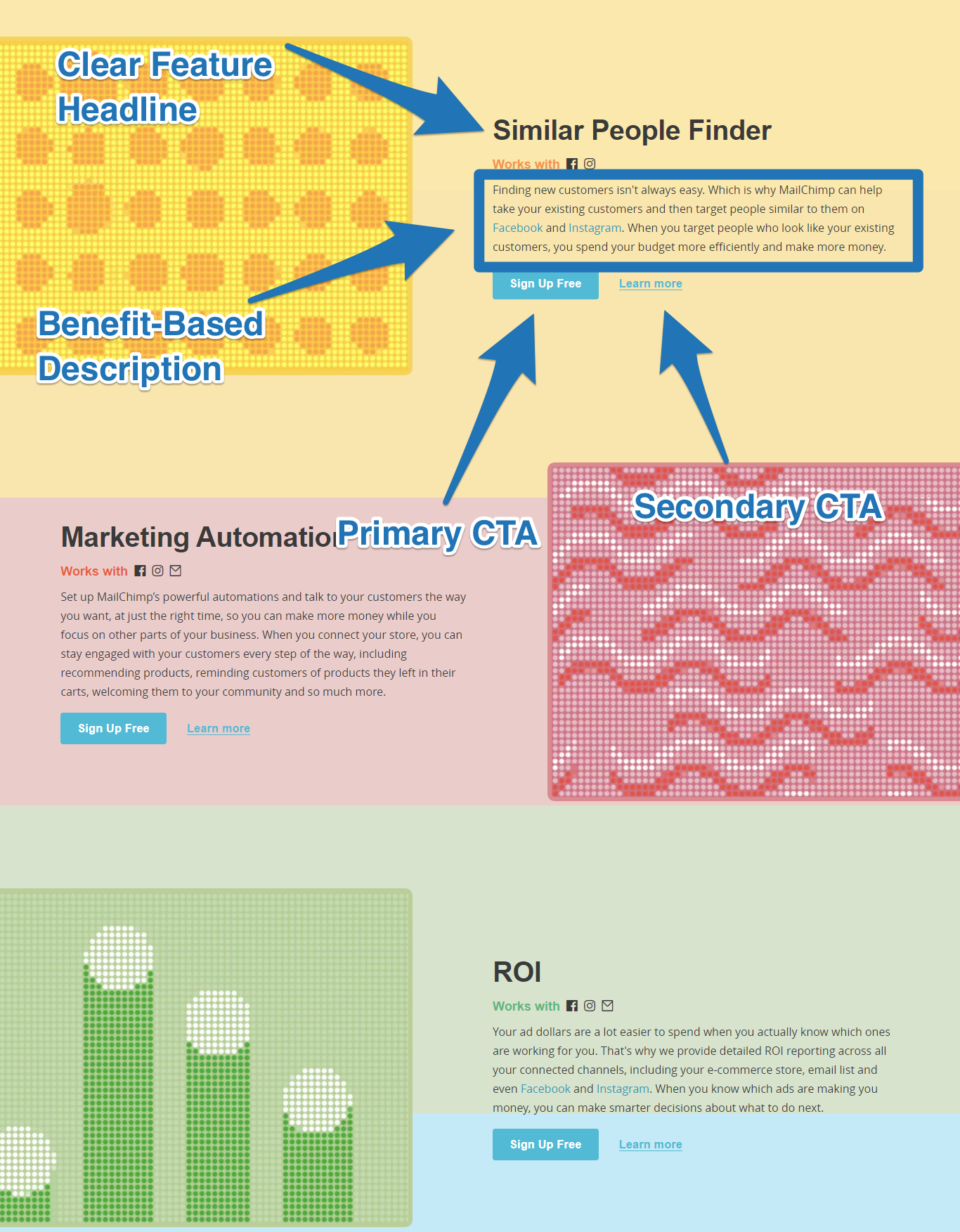
Notice how MailChimp makes it easy for website visitors to signup after reading about any feature with a “Sign Up Free” button. That is done on purpose so if one of the features resonates with you, you can quickly go straight to the signup page.
Part 3: Curiosity + Relevant Story + Low Friction CTA
Scrolling to the bottom of the page brings us to the same winning equation as Part 1, to reiterate the pain point of “not knowing enough about where your marketing dollars are going” then asking you to sign up.
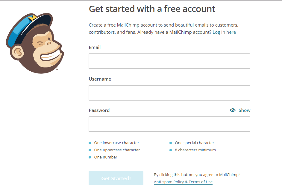
Clicking on any of the CTAs on the Pre-Sell Landing Page will bring you straight to MailChimp’s signup page.
Before you go and start running this same campaign for your own business, you should do the “back-of-the-napkin” math for your own business before you try it. Adding a pre-sell page like MailChimp requires that you have a high converting free-to-paid marketing funnel in place and deep pockets.
My friend Justin Brooke over at AdSkills reverse engineered MailChimp’s math problem, so you can see how to make the math work on your own ads:[*]
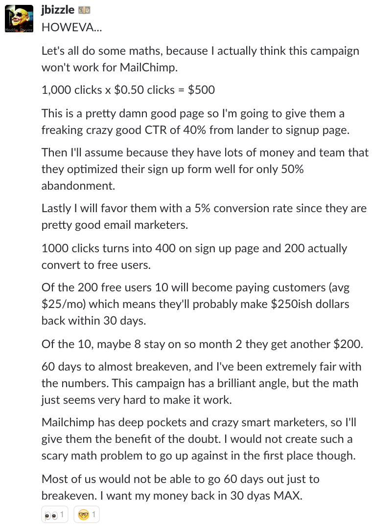
If you can’t afford to go 60 days out just to break even, you may want to merge your pre-sell page and sales page into one to make the math on your ads work. Or try driving ads to blog content, then to your signup/sales page like we do at Sumo.
Outside of driving traffic to the landing page on their main website, MailChimp get even more traffic to their campaign by content multiplying. They did this by taking their one landing page and creating a series of YouTube videos on “MailChimp vs. the Black Hole.”
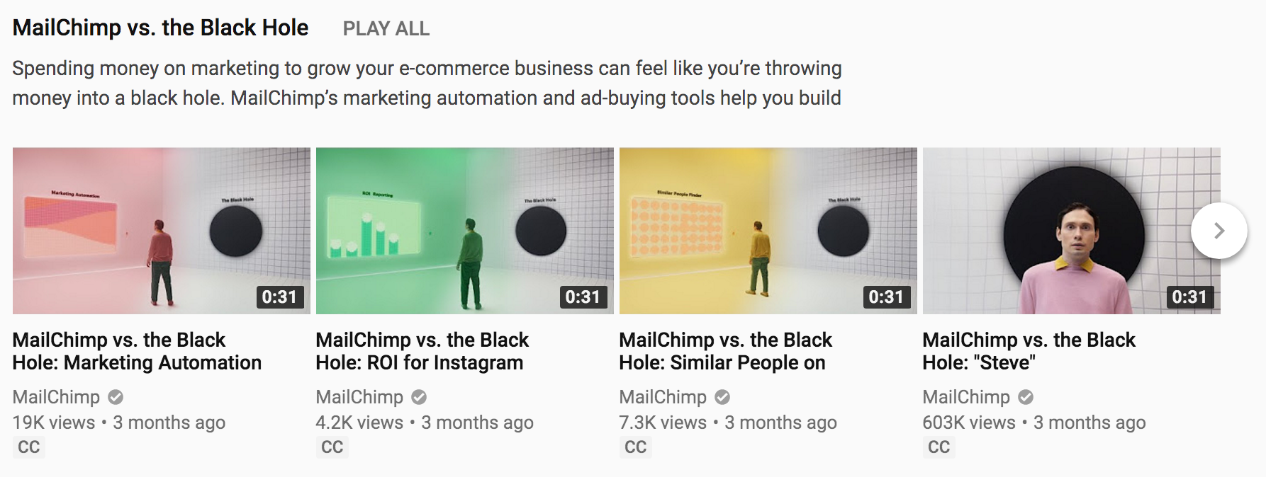
In each of the videos, MailChimp links to their landing page in the YouTube description and prominently mentions MailChimp so people can easily go and do an organic search for MailChimp to find out more.
The takeaway: Test running cold traffic to a pre-sell landing page or blog content to first warm up new prospects, then ask them to sign up for your product after they know more about you (MailChimp does it with a three-part funnel: Facebook carousel ad > Pre-sell landing page > Free signup.)
[Tip #6] Use The “Content Series” Content Strategy To Target Your Highest Revenue Buyer Personas
MailChimp has a specific way to attract their highest revenue customers, which are:
- Marketing agencies
- Advertising agencies
- Creative agencies
Agencies are the ones who refer their clients to MailChimp and set up accounts for them, so MailChimp definitely wants to attract them, address their needs, and give them exclusive perks so the agencies choose (and stick with) MailChimp over anyone else.
MailChimp does this by marketing to agencies in three ways:
- Their Agency Account
- Their Agency Newsletter
- Their Agency Content Series
#1) MailChimp’s Agency Account
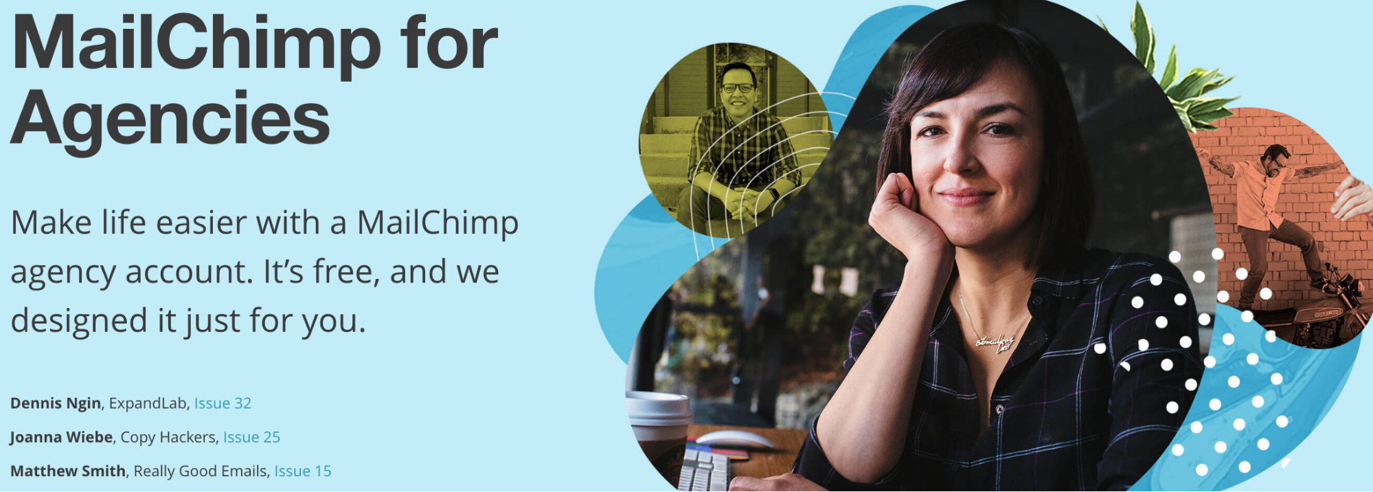
The purpose of agency accounts is to attract agencies by showing them that MailChimp can make their lives easier, as they can collaborate directly with clients, manage multiple clients, and see all their campaign stats across clients in once place through their MailChimp account.
Creating features like this are more likely to get agencies to choose MailChimp over other platforms, refer other agencies to the product and keep them using MailChimp for their clients long term.
#2) MailChimp’s Agency Newsletter
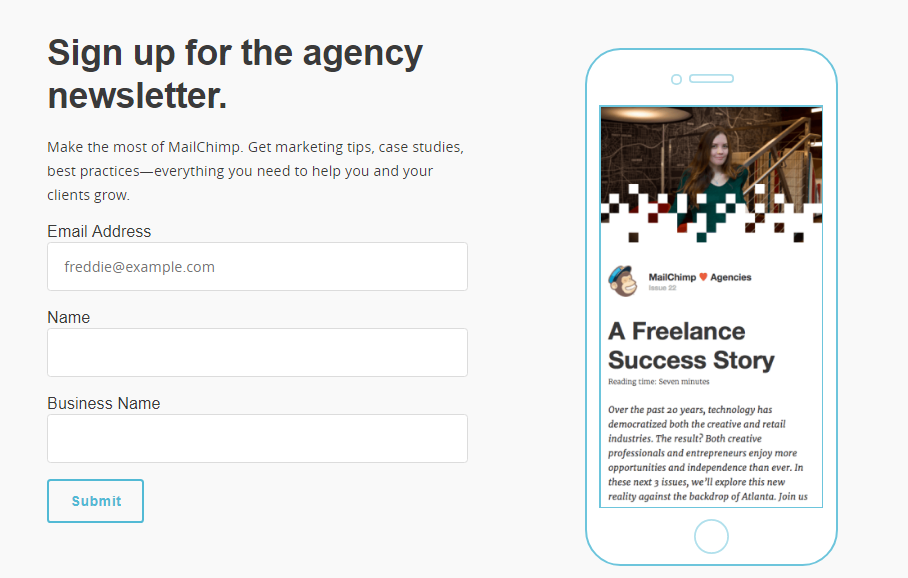
MailChimp has a newsletter tailored to help agencies grow their business and their clients business. Each newsletter comes as part of an “issue” in a series that they email to subscribers once a week.
#3) MailChimp’s Agency Content Series
Today, lots of business are building their blog on Medium. MailChimp tried it by starting a “MailChimp for Agencies” Medium publication.
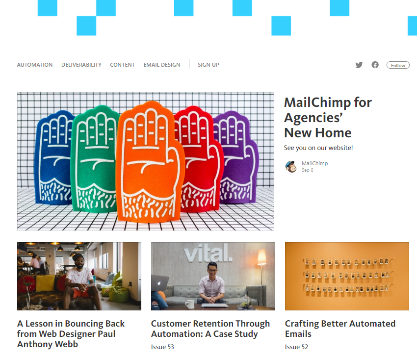
But after one year MailChimp moved all of the articles from their Medium publication over to their main website.
Why?
MailChimp decided to build a content marketing hub on their website with a content series for each of their three different buyer personas.
| Content Resource | Content Type | Buyer Persona |
| Guides | Marketing articles | SMB |
| Research | Data articles | SMB |
| What’s In Store | Ecommerce case studies | Ecommerce |
| Resources for Partners | Agency case studies | Agency |
Golden Nugget: Structure your content marketing around common themes that target your highest revenue buyer personas. Every one of MailChimp’s content marketing resources is focused on a series of articles targeted at a specific buyer persona that make MailChimp the highest revenue.
Today all four of those resources are hosted on MailChimp’s “Learning” resources page. They are such an important part of MailChimp’s web marketing strategy that they are one of the five main items in MailChimp’s site navigation.
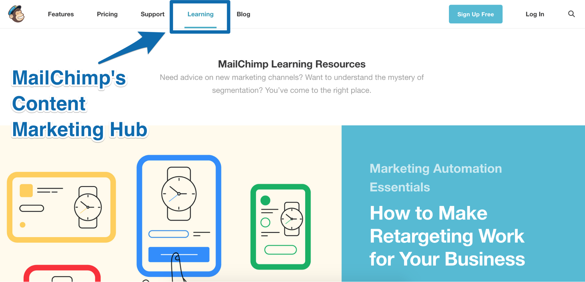
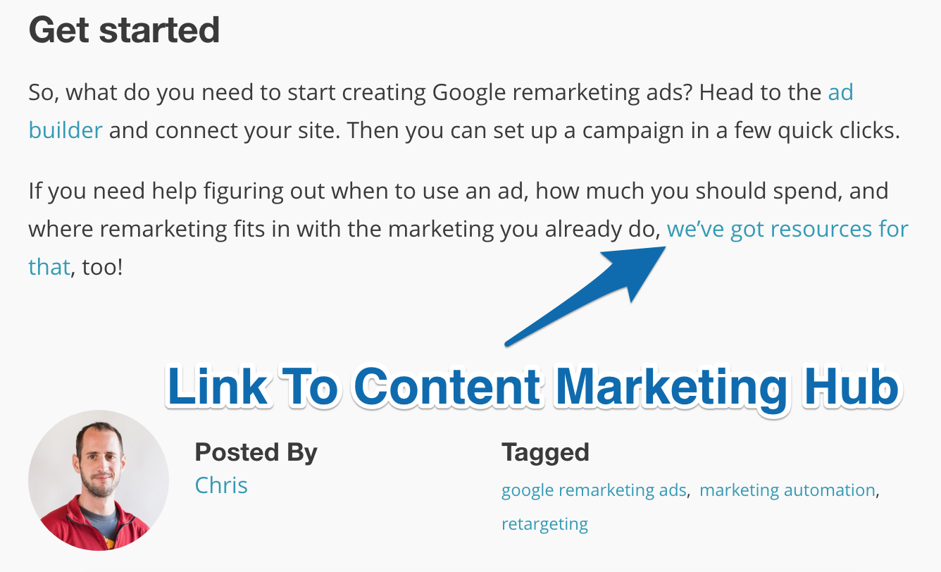
MailChimp create these four different content series and then use internal linking inside their blog articles when it contextually makes sense, like this:
To do this in your own business, follow these 2 steps:
- Identify who your highest revenue buyer persona is
- Build a list of content topics you can cover to help that buyer persona become more successful in his/her day-to-day life
The takeaway: Be strategic about your content marketing strategy by using the “content series” content strategy. Identify who your highest revenue customers are and then produce a series of articles to help them (MailChimp does it with marketing articles and data articles which help their broad market of small-to-medium size businesses. They also have a series of articles for eCommerce businesses and Agencies who they have identified as their highest revenue customers.)
[Tip #7] The Freemium Growth Lever You Can Pull To Double Your Profit In 1 Year
Many software companies battle with whether or not to offer a freemium plan. For MailChimp, creating a “forever free” plan in 2009 (after eight years of not having a free plan) was one of the things that took their growth to a whole new level.
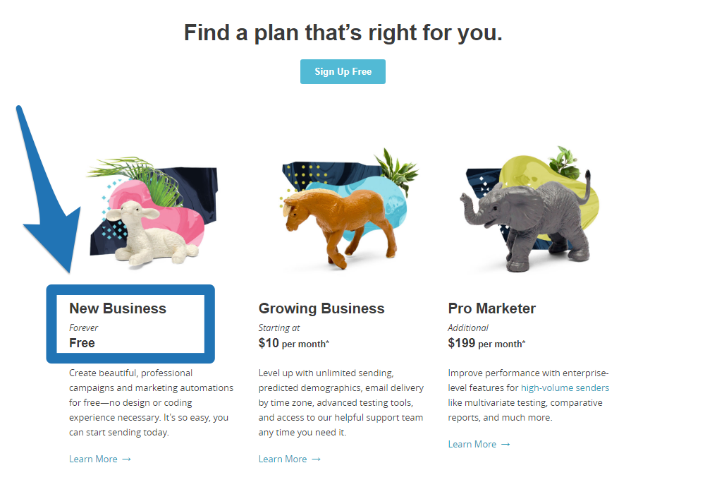
After one year of launching their freemium plan, MailChimp Co-founder and CEO Ben Chestnut said it helped them:
- Grow their user base 5X in one year (from 85,000 to 450,000)
- Increase their number of paying customers by over 150% (despite offering a free product)
- Hit several days of 2,000+ new user signups (when they were averaging about 1,000 new user signups daily before then)
MailChimp actually made money from this move…. they did NOT just get an abundance of free signups.
Launching their “forever free” plan helped MailChimp grow their profit (yes, profit - not revenue) 650% in one year by lowering their customer acquisition cost.[*]
To get people to convert from free users to paid users, there are three tactics MailChimp use that you can replicate:
-
Put maximum limits on your free plan
-
Increase switching costs
On the free plan, MailChimp let customers create marketing automations for free. This is a major feature most email marketing companies charge high monthly payments for.
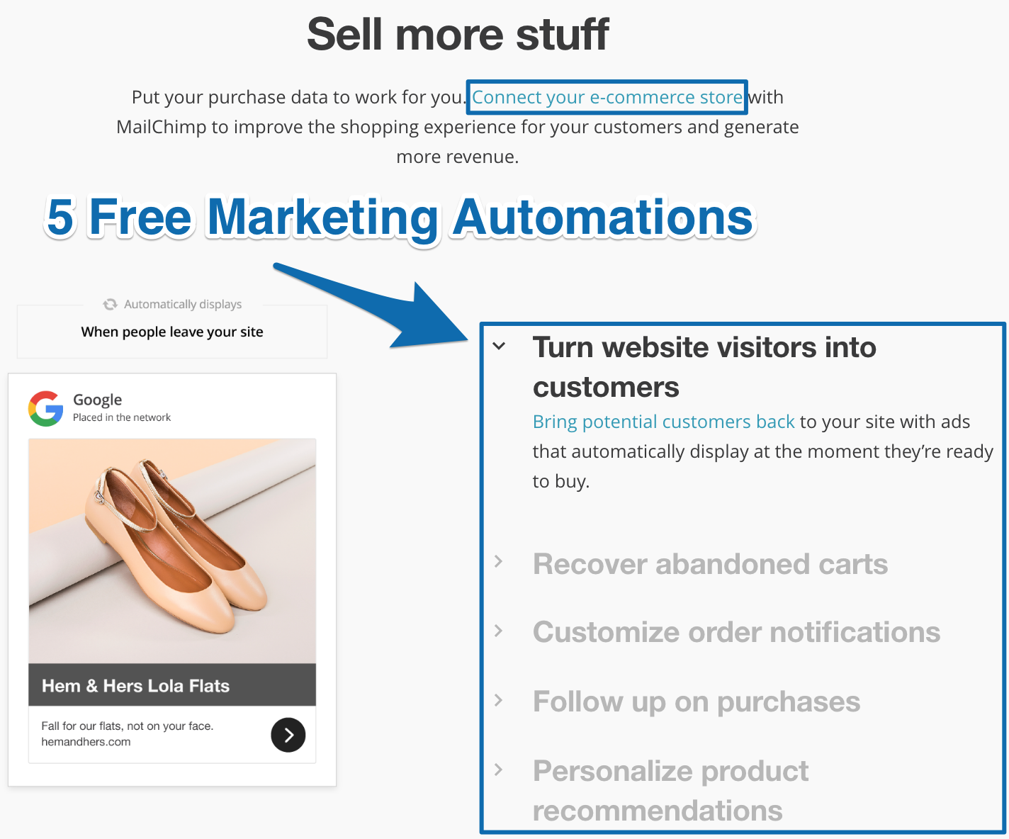
By letting free users connect their ecommerce store and send marketing automation emails and ads based on their website and customer purchase data, MailChimp are getting customers to invest their time and energy into making the MailChimp platform part of their daily business while helping them make money as fast as possible.
It’s easy to export your contacts, but it’s not easy to export contacts who are in the middle of your abandoned cart email drip campaign, plus four other marketing automation campaigns making you money.
-
Provide customer success resources
MailChimp have a Getting Started guide, Learning Resources page, Experts Directory and Research articles based on their own data set of millions of businesses.
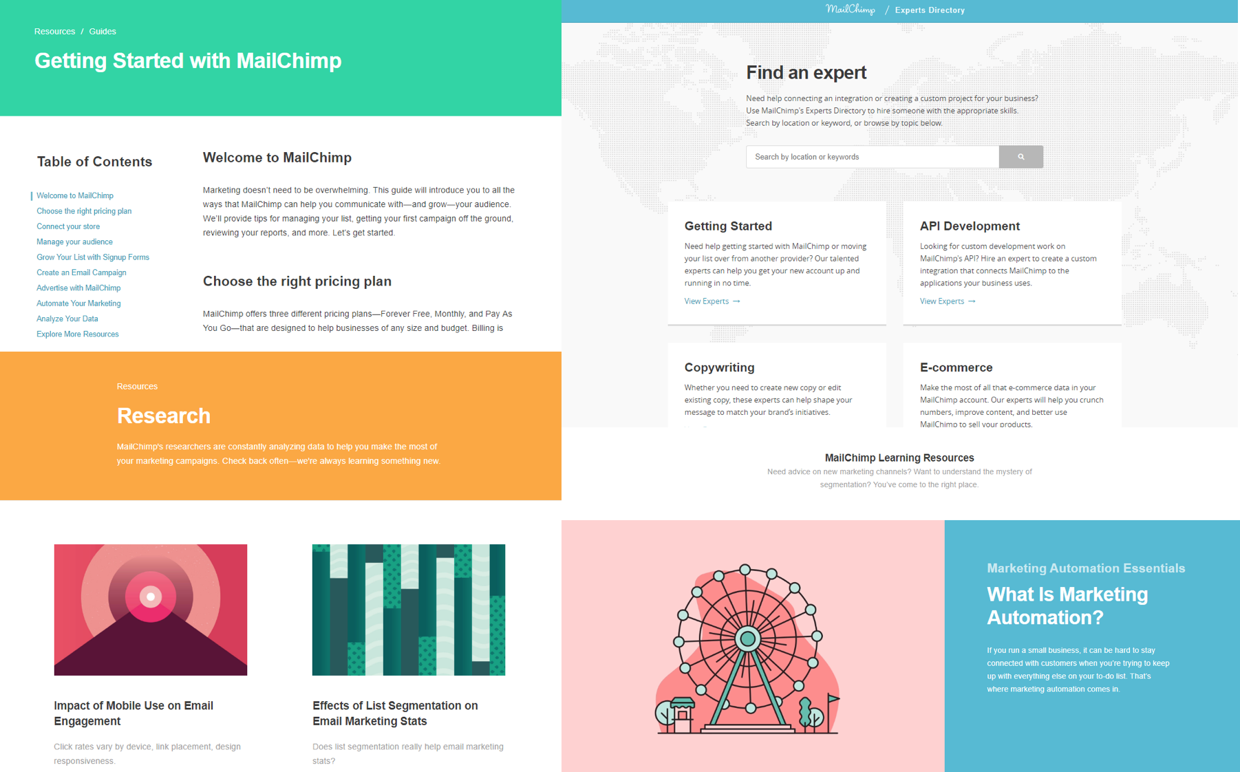
With all those resources it makes it easy for anyone to quickly learn MailChimp, get better at marketing their business and grow their email list to over 2,000 subscribers so they become a paying customer.
MailChimp put a maximum limit at 500 subscribers and increased that to 2,000 subscribers after their first year of freemium. They also limit freemium users to 12,000 emails per month.
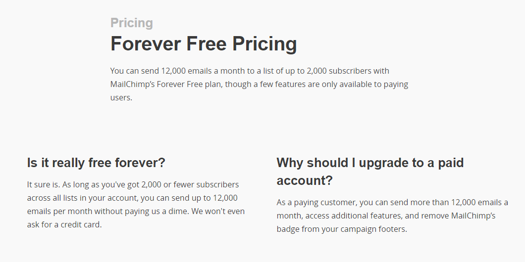
Once these customers grow their number of email subscribers above 2,000, they’ll have to opt into a paid plan. But by then, they’ve already got so much value from MailChimp that they don’t mind.
The takeaway: When it comes to getting people to convert from your free plan to your paid plan, it’s simple logic: if your customers are successful, you are successful as well (MailChimp does it by putting maximum limits on their free plan, increasing switching costs with sticky features like marketing automation and providing customer success resources.)
[Tip #8] The “Instant Affiliate Program” You Can Use To Generate Product Virality For <$100
If those three tactics in the last tip don’t work to generate paid users for MailChimp, they have a backup plan. MailChimp “brand” their product with a hyperlinked MailChimp logo in every email footer free users send.
They call this their “MonkeyRewards” badge. Clicking on it will direct people to MailChimp’s homepage.

You get thirteen options to choose from (including four custom designs inspired from their “Did You Mean MailChimp?” marketing campaign):
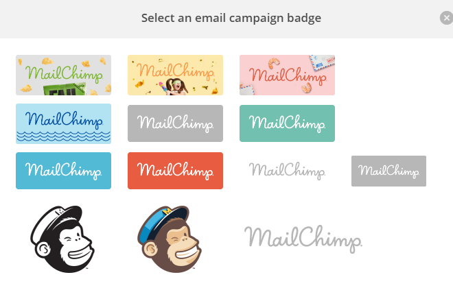
Golden Nugget: The MonkeyRewards badge is required for all freemium users. Paid users have the option to leave it off their emails. To incentivize paid users to keep it on, MailChimp offers $30 in MonkeyRewards credit for every person who clicks on the badge in their email and signs up.[*]
This is a genius idea to drive product virality (ie: get your most successful customers to promote your product for you in exchange for giving them money).
All you have to do is pay a small one-time fee every time one of your customers refers you another customer. You make more money and your customers make more money while exposing your brand and logo to thousands of people you otherwise wouldn’t reach. #winning
This made a big difference for MailChimp. As Ben put it, “this helped drive product virality, as recipients would click on the friendly face of MailChimp’s mascot and end up learning more about the company and their software.”[*]
(P.S: This “branding” tactic is a lot like the “powered by” tactic I saw Intercom using, but instead of free users promoting you… you reward your best customers to promote you who likely have bigger audiences send more emails).
To do this for your business, think about these 2 things:
- What reward will you give people for referring one customer to you (MailChimp give people $30 MonkeyRewards credit)
- How will you make it easy for people to refer one customer to you (MailChimp give people a MonkeyRewards badge they can turn on to show at the bottom of emails they send)
The takeaway: Make it easy for your customers to refer business to you by giving them money and making payment to them for referrals quick and easy (MailChimp does it by offering $30 MonkeyRewards credit for every customer referral).
[Tip #9] Use This “Too Long To Learn” Customer Development Framework To Improve Your Product
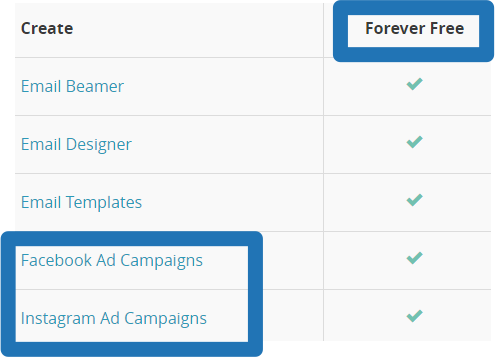
Most people know MailChimp as an email marketing software, but they do so much more now. MailChimp improved their product by offering Facebook and Instagram ads that customers can create inside their MailChimp account.
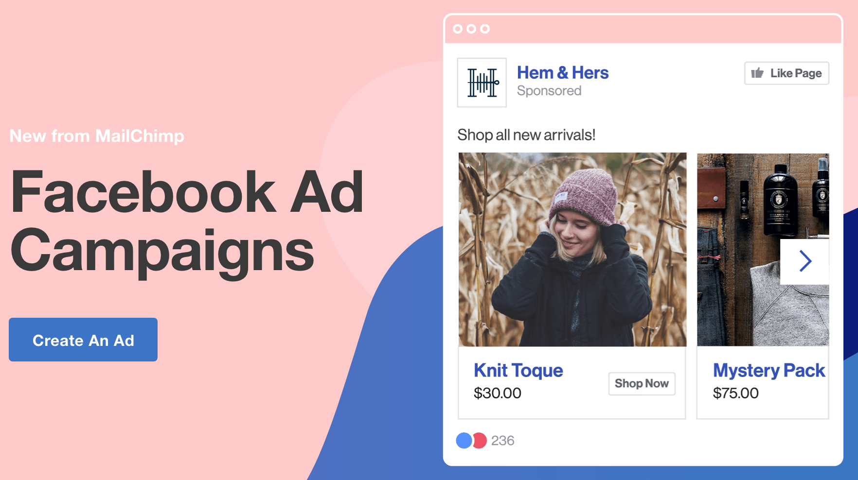
If MailChimp has already had awesome success with email, why bother changing things?
What it came down to was a lot of deep, deep digging done by their research team in an effort to see how they could make their customers more money, faster.[*]
Early in the research, Laurissa Wolfram-Hvass (Senior Research Manager at MailChimp) and Laura Jones (Researcher at MailChimp) interviewed small business owners (their intended target audience, not just current customers) and found that a lot of the people they spoke with weren’t using Facebook ads.
Their research uncovered small business owners don’t have a lot of time, and they thought Facebook ads were difficult and would take them too long to learn.
Bingo.
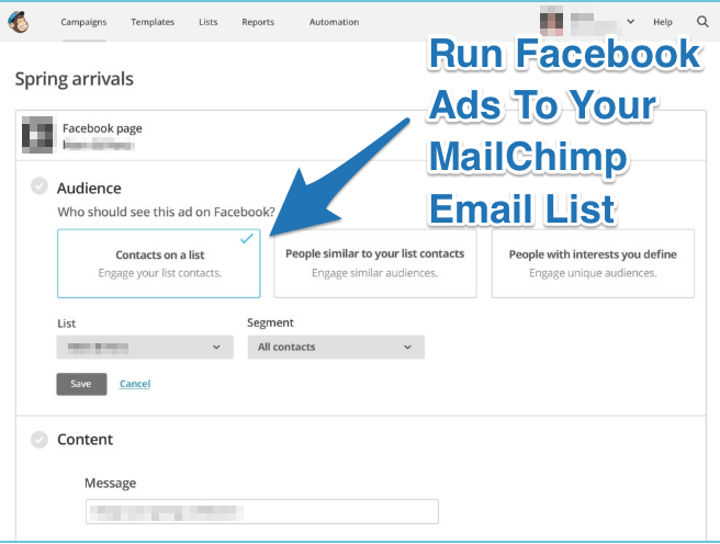
With this new insight, MailChimp made Facebook (and Instagram) ads easy for small business owners to do by letting them build the ads right inside MailChimp’s platform, and select from these three predefined audiences:
- Ads to people on your MailChimp email list
- Ads to people similar to people on your MailChimp email list
- Ads to interests you define
This simple ad campaign interface makes it easy for small business owners to set up Facebook and Instagram ads without having to spend time learning anything new. It’s been so successful that they added Google Display Remarketing ads to their ad builder.
And MailChimp doesn’t charge more for people to use this feature - it comes with their forever free plan so they can make it easier for free users to convert into paid.
To do this in your own business, follow these 2 steps:
- Interview your target audience to find out what things on their to-do list take “too long to do” that they would rather outsource to someone else
- Build that into your product or service offering
You will need to suck it up and actually talk to real people on the phone or in-person to get the most out of this research, just like MailChimp did.
The reward will be identifying a problem that you can use to improve your product by including the solution inside your product.
The takeaway: Use the “too long to learn” customer development framework to find new problems your product or service can solve (MailChimp found that small business owners find it difficult and time-consuming to create Facebook ads, so they made it easy for them to do it all inside MailChimp.)
[Tip #10] “The Welcome Mat” Homepage Hack To Convert First-Time Website Traffic Into Cash
To convert first-time visitors who come to the MailChimp website, Mailchimp use a Welcome Mat.
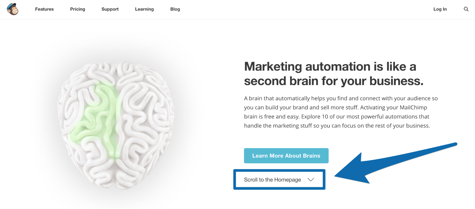
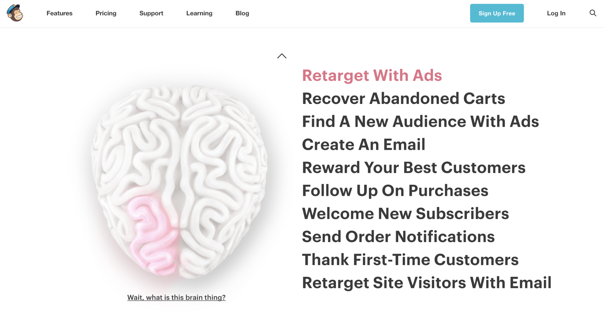
This is the same tactic I saw Tony Robbins use on his website. MailChimp’s Welcome Mat takes you to their “Brain” landing page which has the top 10 marketing automations you can start using when you sign up for MailChimp.
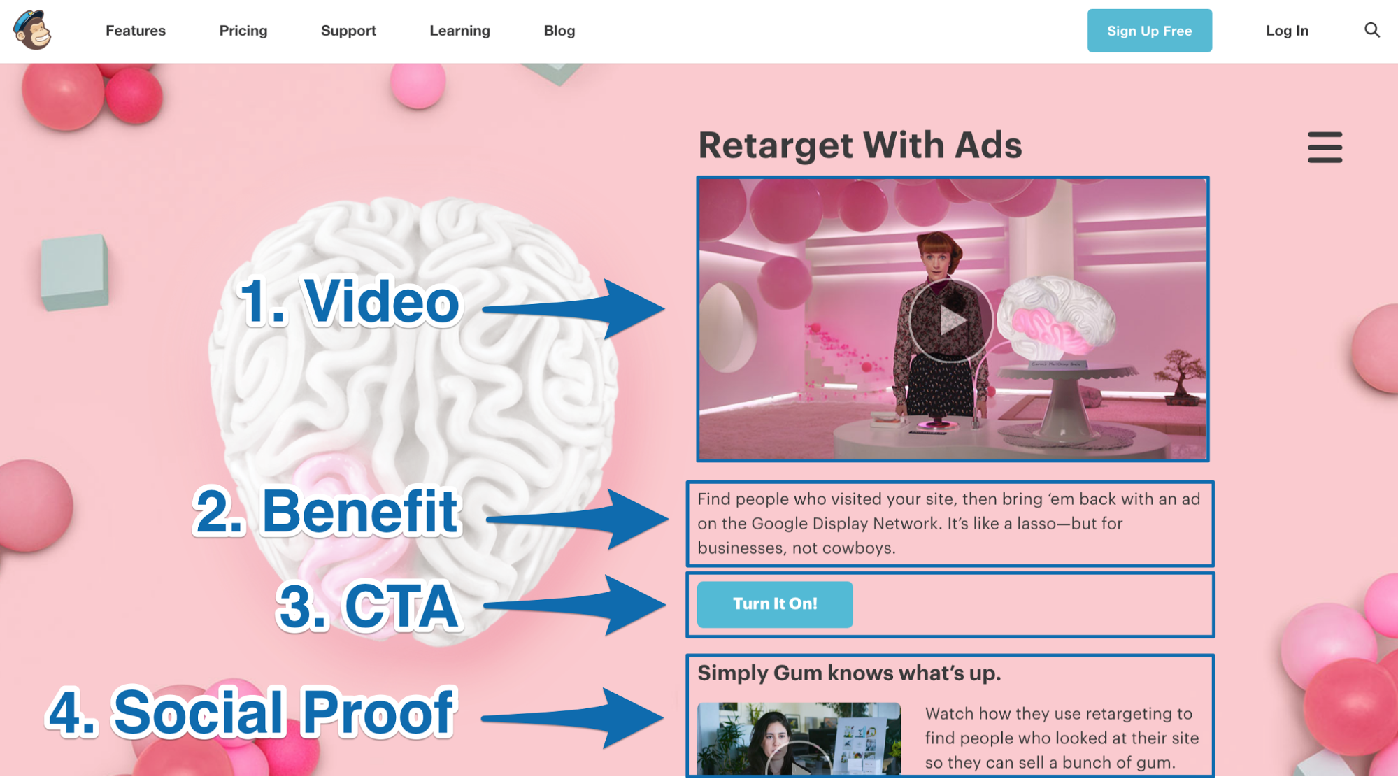
Every marketing automation has it’s own section on the page with these four elements:
- A professionally filmed video
- Benefit of what the marketing automation can do for you
- Call-to-action button for you to “Turn It On!” in MailChimp
- Social proof customer video testimonial related to how that marketing automation helped one of MailChimp’s customers
If you click on the CTA button in any of the sections and are logged into your MailChimp account, then you get taken to your MailChimp dashboard to turn on the feature. If you don’t have a MailChimp account then you will get taken to MailChimp’s Login page, where you can click on “Create an account.”
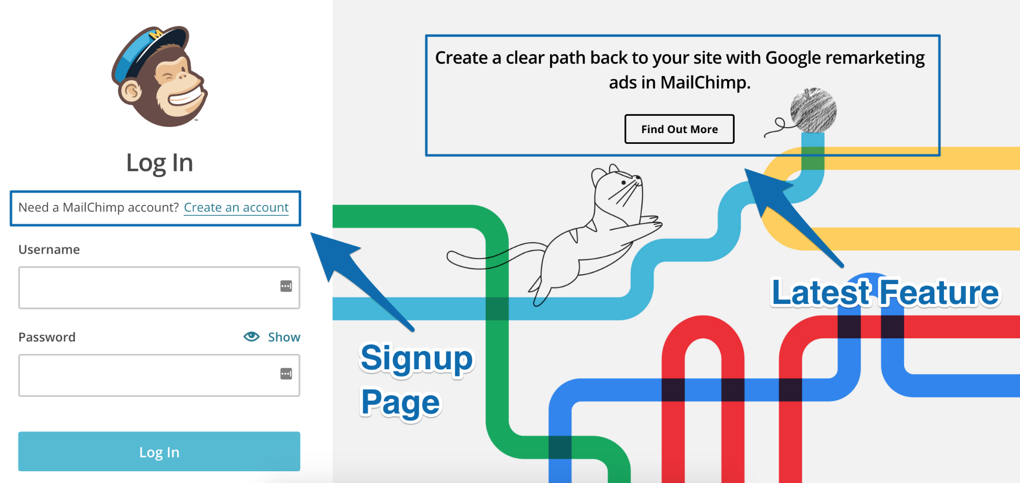
If you aren’t a first-time visitor to MailChimp’s site then you won’t see the Welcome Mat. Instead you’ll see MailChimp’s full homepage, where it’s clear they want you to do one thing: sign up for a free account.
And they use a straightforward, minimal frills approach to get you there.
Take a look for yourself:

This homepage features:
- Only two CTAs - one at the top and one at the bottom - asking you to “Sign Up Free” (shown in red)
- A breakdown of five of their most impressive benefits (shown in green) alongside a colorful image showing what the benefit looks like. Here’s a screenshot of one of the benefits below:
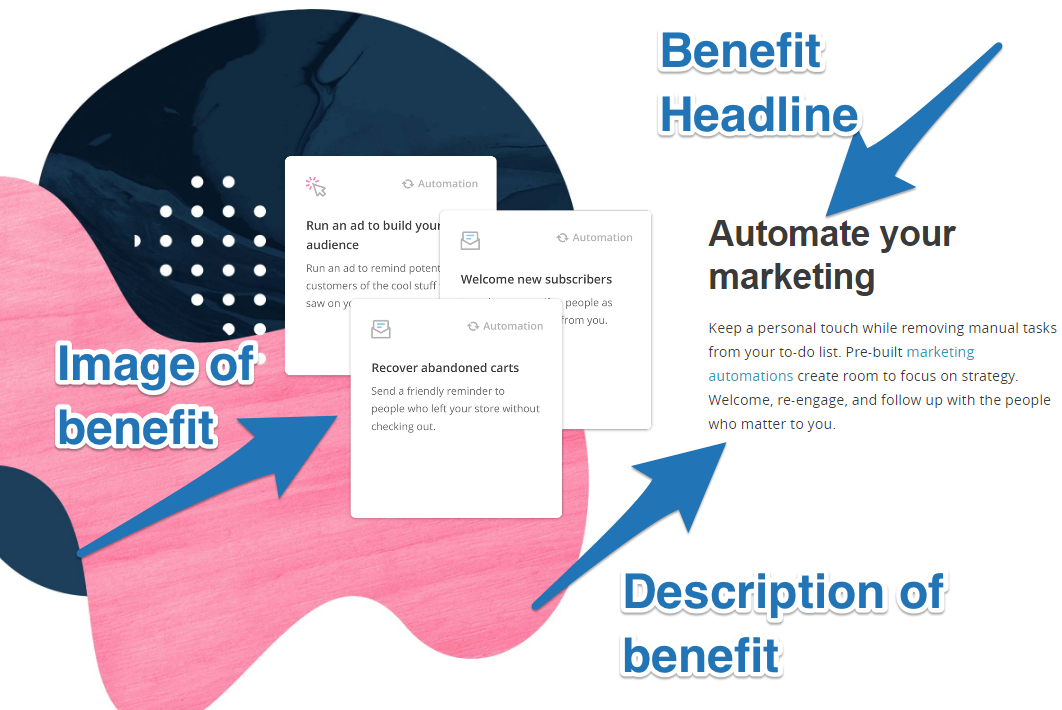
- Lots of white space for easy readability
- One hyperlink to learn more about each feature of the software that allows you to achieve that benefit (clicking on it will bring you to a specialized landing page focused on that one feature).
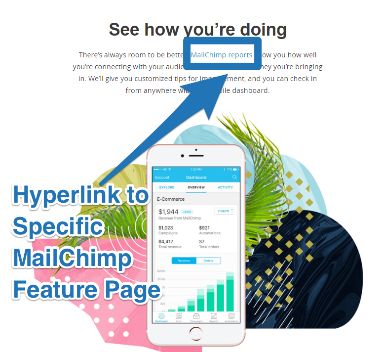
These links are used instead of bolder CTA buttons to keep the page as uncluttered and distraction-free as possible. This helps guide people right where you want them - straight to the CTA (I also saw Shopify doing the same thing on their homepage).
Click here to reveal the tool MailChimp used to build their homepage
The takeaway: Use a Welcome Mat to show your first-time website visitors the newest features, products or services you have to offer. On your homepage, identify the primary action you want your website visitors to take and use it as your one primary call-to-action (MailChimp highlight their free marketing automation features on their Welcome Mat and the primary action they want you to take is to become a free signup, so they cut the fluff and unnecessary distractions by making that their primary homepage CTA.)
10 KEY TAKEAWAYS FROM MAILCHIMP’S $400 MILLION DOLLAR SUCCESS
Marketing your business doesn’t need to be boring. Take a leaf out of MailChimp’s book and have fun with it with these ten key takeaways:
- Put on your green glasses to find business opportunities where people are struggling, but can’t find an easy solution. MailChimp found that it was a lot easier to provide value upfront for their customers by directly addressing pain points their web agency clients were having.
- Leverage your marketing list to retarget people from the top to the bottom of your funnel. MailChimp run ads to two Facebook custom audiences to retarget you further down their marketing funnel.
- Use the G-MAP framework to come up with ideas for a creative marketing campaign that can help you hit your marketing goal. Mailchimp used it in their viral “Did You Mean Mailchimp?” marketing campaign to generate 3.8 million organic searches.
- Find niche sponsorship opportunities where you can advertise your business next to something that is relevant to your product. MailChimp did it by identifying 30 podcasts with a broad audience demographic and sponsored them to run their ad during their show.
- Warm up your cold paid traffic by first sending them to a pre-sell landing page or piece of content. This is a tactic MailChimp uses to get people to know, like and trust them before asking you to sign up for their product.
- Identify who your highest revenue buyer persona is and create a content series that directly helps them become more successful in their day-to-day life. MailChimp does this by making their top referrers’ (agencies) lives easier with a content series about agency growth stories.
- If you offer a freemium product and want people to convert to a paid plan, help your customers succeed by giving them access to features that help them make money faster. MailChimp give people access to marketing automations they can use to quickly make more money from their website traffic, email list and customer list.
- Give your customers money for referring you business. Make it easy for them to promote you and make sure they get paid fast so you can generate product virality. MailChimp use $30 MonkeyRewards credits to incentivize paid customers to put their badge on the bottom of their emails.
- Interview your target audience to find the things that take them “too long to learn”, then solve it using your product. MailChimp found that people want to run Facebook ads, but it takes them too long to learn and is too difficult so they made it easy by adding a Facebook ad builder inside MailChimp.
- Use a Welcome Mat to showcase your highest converting landing page to first-time visitors when they hit your homepage. Then identify “the one thing” you want people to do when they visit your full homepage and use it as your primary call-to-action. For MailChimp, it’s to sign up for their free plan.
Related Articles
%(relatedarticles)
Add A Comment
VIEW THE COMMENTS