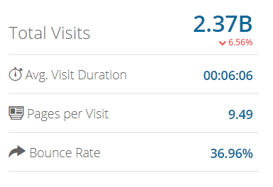
As an ecommerce company that gets more than 2 BILLION monthly website visitors, Amazon, the “earth’s biggest store” hardly needs any introduction.
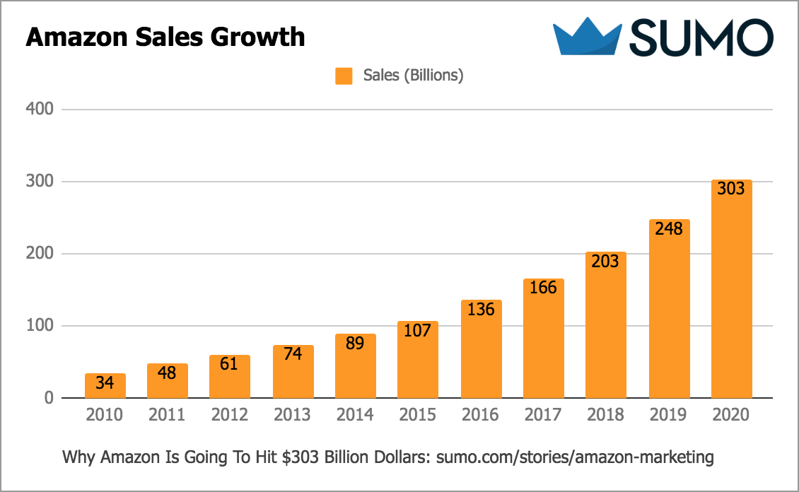
That’s why today I’m going to show you some of the top marketing tactics Amazon has used to get to this level of traffic and to grow from $34 billion in 2010 to a projected $303 billion in sales in 2020 (based on their average sales growth rate over the past five years.)[*]
Grab a taco, strap yourself in and get ready to grow your ecommerce business with these 8 marketing tips from Amazon.
Table of Contents
%(tableofcontents)
[Tip #1] Master Google AdWords With Amazon’s “Ecommerce Relevance-Raising” PPC Strategy
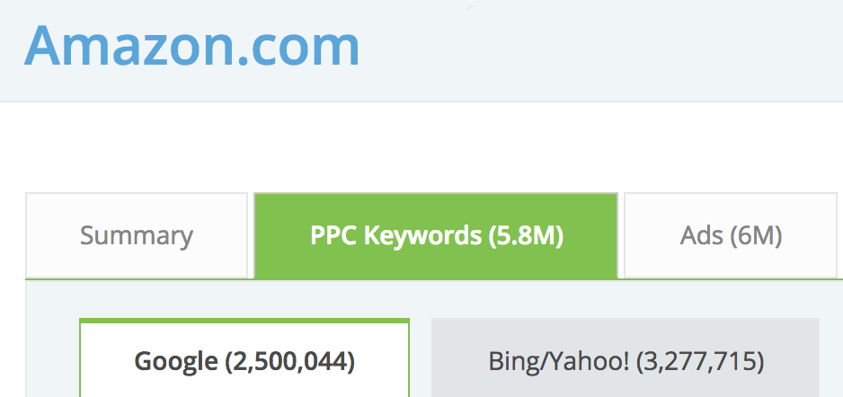
Amazon advertises on over 5.8 million PPC keywords across Google AdWords and Bing/Yahoo using 6 million ads.
Click here to reveal the tool you can use to spy on other companies’ PPC strategies
To advertise at that scale on that many keywords without writing 6 million individual ads, Amazon uses “Dynamic Keyword Insertion” (DKI) to make the keyword you are searching for magically appear inside the headline and description of the ad with a templated ad.
To prove I’m not making this stuff up, here are three completely unrelated products, and the Amazon ad that shows up when you type the keyword into Google:
Keyword: TENS Massager

Keyword: Phillips Screwdriver Size 0

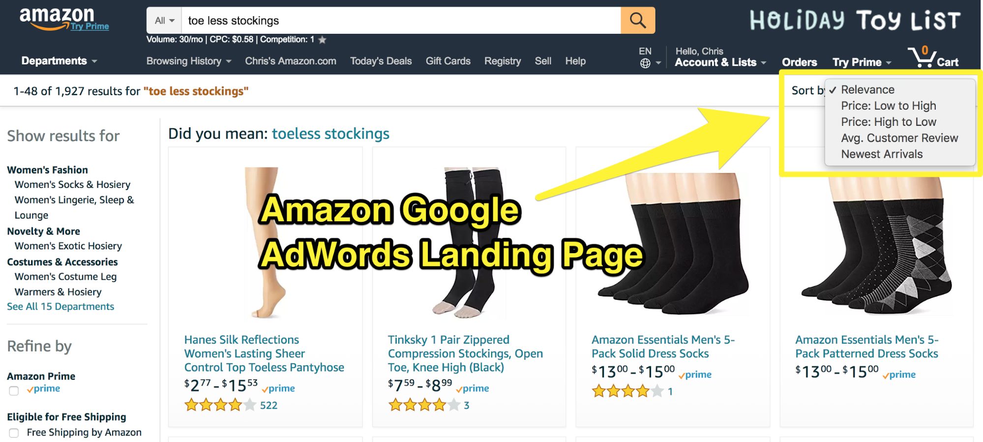
Keyword: Toe Less Stockings

By using DKI, Amazon can increase their Quality Score by making their ads more relevant to the person searching on Google.
Quality Score is measured by expected clickthrough rate (i.e., how many people click on your ad vs. other ads), ad relevance (i.e., how well your ad matches the keyword), and landing page experience. To boost all three factors, Amazon uses DKI to increase its expected clickthrough rate and ad relevance, then sends you to a product category landing page on their website sorted by “Relevance.”
Amazon doesn’t just do it for this one product; they have a system to do it for millions of different products. Here is just a sample of what I found:
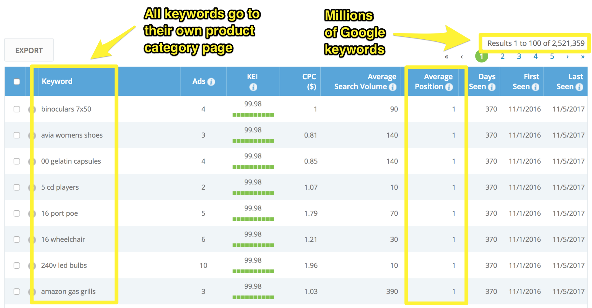
Not every keyword has an average position of #1, but Amazon consistently outcompetes millions of different advertisers (including Walmart and Target) for the top two ad positions.

Click here to reveal the tool you can use to find who has the best ad rankings in your market
Here is a step-by-step breakdown of Amazon’s templated ads with the different ad copy variations and ad extensions they use to do this (so you can copy them or beat them with your own Google AdWords ads):

1. Headline 1 with dynamic keyword insertion
- [Product Name] at Amazon®
- Shop [Product Name]
- [Product Name]
2. Headline 2
- Shop [Product Category Name]
- Free 2-day Shipping w/Prime
- Amazon.com Official Site
3. Display URL
- /[Main Category]
- /[Main Category]/[Sub Category]
4. Seller Rating Extensions
- Show when you have 150 unique reviews and rating of 3.5 stars or higher
5. Description line with dynamic keyword insertion
- Big Savings on [Product Name]. Free Shipping on Qualified Orders.
- Save on [Product Name]. Free 2-Day Shipping with Amazon Prime.
- Find Deals on [Product Name] in [Category Name] on Amazon
6. Callout Extensions
- Read Ratings & Reviews
- Save with Our Low Prices
- Shop Our Huge Selection
- Try Prime Free
- Stream Videos Instantly
- Discover Prime Music
- Explore Amazon Devices
7. Sitelink Extensions
- Amazon Gift Cards
- Amazon Prime
- Prime Instant Video
- Prime Photos
- Amazon Prime Student
- Shop by Room
- [Product Category]
Based on the headline and description ad copy variations I researched, Amazon could be testing up to 297 ads for any one product at a time with different rotating ad extensions showing up for each ad.
Here is an example of how you would set up one of these ads in your own AdWords account (notice the use of dynamic keyword insertion in Headline 1 and the Description):
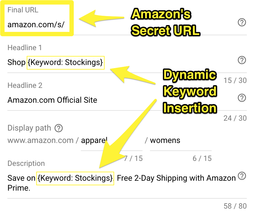
Amazon’s secret URL is a URL that generates based on a keyword someone searches in Amazon’s search bar. To customize the landing page for someone coming from Google, Amazon grabs the keyword you search on Google and dynamically adds it to the end of the URL.
This is what it looks like if you were to search for “Toe Less Stockings” on Google and then click Amazon’s Google ad (Amazon dynamically append the search query to the final URL):

Amazon does this by using the AdWords API to programmatically generate unique landing page URLs based on a keyword you search on Google.
You won’t be able to achieve this without a web developer; however, there is a simple alternative you can use to still create targeted, highly relevant Google Ads for your ecommerce store.[*]
Step 1: Create a SKAG (single keyword ad group)
Step 2: Place your product keyword in that ad group
Step 3: Create one ad targeted to that keyword
Step 4: Send all traffic to your product landing page for that keyword
Step 5: Add negative keywords based on unqualified traffic
This is how you can beat Amazon by being more granular and sending traffic to unique product landing pages based on individual keywords.
The takeaway: To outcompete your competitors on AdWords, set up highly targeted ads using dynamic keyword insertion, unique selling points, and custom landing pages for every keyword. Amazon does this using templated headlines and description lines with dynamic keyword insertion and dynamically generated landing pages that send people to product pages sorted by relevance based on the keyword.
[Tip #2] Sell A Loss Leader Product On The Front End To Make 4X More Money On The Back End
As of 2016, The Kindle Store had well over 4.6 million titles, making it the largest eBook retailer in the world, and it has shown no signs of slowing down anytime soon.
Back in 2011, Amazon’s fastest-growing product was the Kindle and related digital content, and it was projected to amass more than 10% of the company profits the following year. Now with the Kindle and a massive selection of eBooks, Amazon dominates the international eBook market.[*]
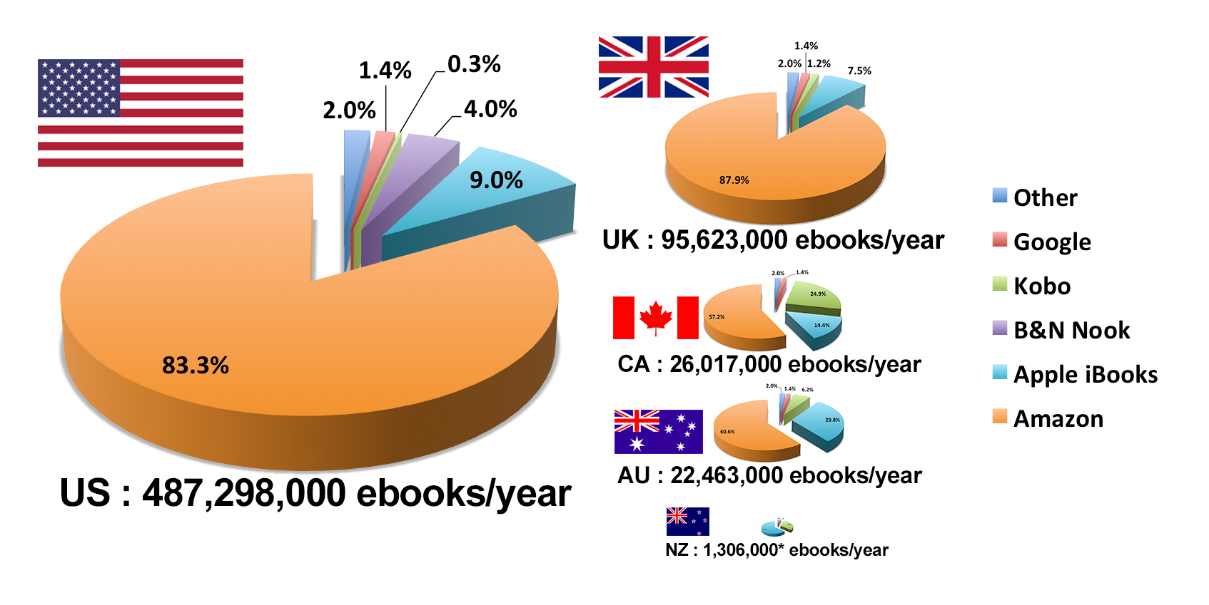
The Kindle store generates customers in two ways:
-
Through the sale of Kindles.
-
Through the sale of digital content.
But what’s most interesting about this is that Amazon sells Kindles at a loss to generate a profit from digital content later on.
And Amazon has seen that when users own a Kindle, they spend more money than those who just use the Kindle app.
So, they are willing to sell the Kindles at a loss for future increased revenue, as these Kindle owners then purchase and consume digital content later on.[*]
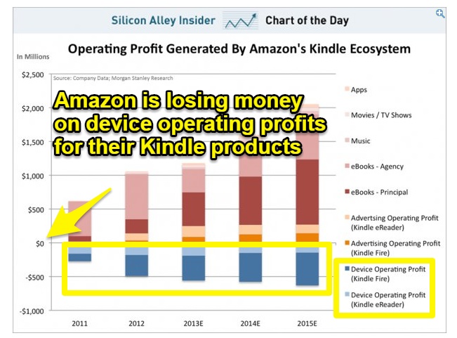
The Takeaway: Sell a product at a one-time loss with a simple and effective plan to make a profit off of recurring purchases in the future. Amazon takes an estimated $500+ million loss on the Kindle device (the front end) to make an estimated $2+ billion profit on eBooks, music, movies/tv shows, advertising, and apps (the back end.)
Selling the Kindle at a loss is a customer loyalty investment. Once a customer has the Kindle in their hands, they buy their digital content from Amazon. So, Amazon makes a point to offer highly relevant digital content that works with their Kindles.
One example of this is their subscription service for eBooks called Kindle Unlimited. For $13.99/month, subscribers have access to over one million titles in the Kindle store.
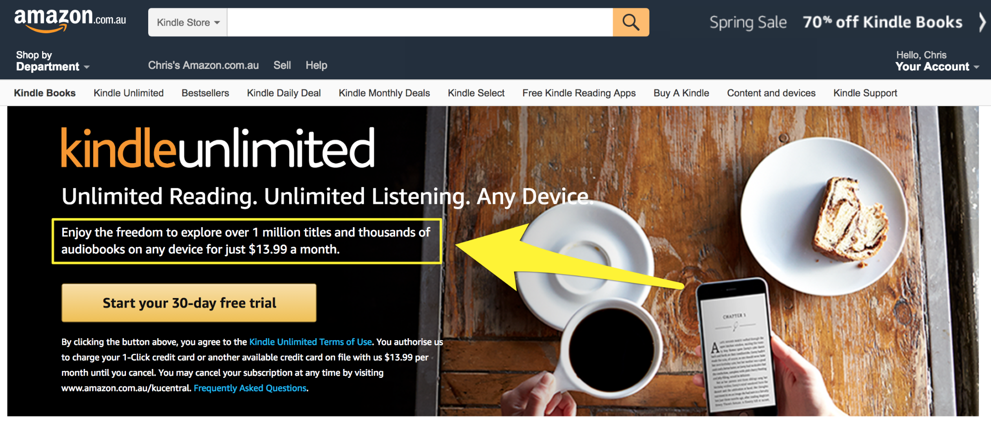
Amazon promotes the Kindle Unlimited offer by using popups on their “Books” pages. When you view a book with a Kindle version, you’ll immediately see a popup. Amazon can do this using “Visibility Rules” so the popup only shows on book pages that are available on Kindle.
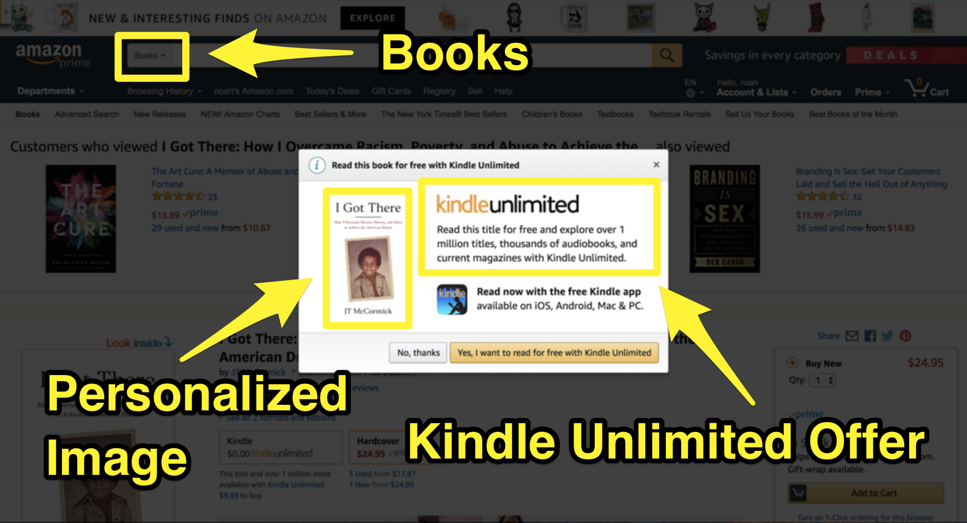
Click here to reveal the “Visibility Rule” popup you can use like Amazon
The Takeaway: Use an image from your landing page inside the popup to personalize and improve your conversion rate. This is something very tactical Amazon is doing to increase profit on their digital content, so they convert their “loss leader” product into recurring revenue.
Amazon also uses their Kindles to put their ads right in front of their customers and try to push them deeper into the Amazon ecosystem. Here is an example of an Amazon fireTV ad shown on the Amazon “Kindle with Special Offers.”[*]
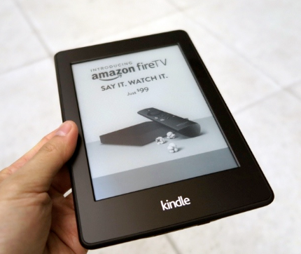
Note: Back in 2011 when the “Kindle with Special Offers” was released with the third generation Kindle it was $75 cheaper than the standard 3G version ($114 vs. $189.) This was a tactic used by Amazon to make Kindles more affordable while making that money back with ads for their other products.[*]
Selling loss leader products like the Kindle is a marketing strategy many businesses use to profit down the road. Here are a few examples:
-
Loss leader product: Dirt cheap razors.
Why do companies sell these at a loss? Razor manufacturers expect to profit off the replacement razor blades people buy in the future.
-
Loss leader product: Highly-discounted Black Friday deals.
Why do companies sell these at a loss? Stores expect to profit off all the extra customers drawn into their shop to see the deals.
-
Loss leader product: Cell phones.
Why do companies sell these at a loss? Phone companies expect to profit off the cell phone plans people will need to pay for to use their new phone.
-
Loss leader product: Milk and eggs.
Why do companies sell these at a loss? Supermarkets expect to profit off the other items people end up buying as they walk through the store.
Selling a loss leader at the front end isn’t a good option for every business or product. There are two situations when it can be a good fit:
Situation #1: Your loss leader product requires future purchases from your customers to be used properly (like razor blades to use the razor or ink to use the printer.)
Situation #2: Your goal is to attract new customers to your store that you think will make more purchases at the same time or after experiencing your product the first time (like how Black Friday sales attract many first-time buyers and how milk and eggs get people to the back of the store, making them walk past high-margin items.)
The takeaway: Selling a loss leader product on the front end has the potential to make some big recurring revenue on the back end if you design the future purchases to be a natural progression from the first (Amazon does this by selling the Kindle eReader and Fire tablet at an estimated $500+ million loss to make an estimated $2+ billion on eBooks, music, movies/tv shows, advertising, and apps.)
[Tip #3] The Charity Affiliate Program You Can Use To Profit From Philanthropy While Giving Back
The AmazonSmile Foundation is something Amazon has set up so customers can donate to charity while shopping.
This is how it works:
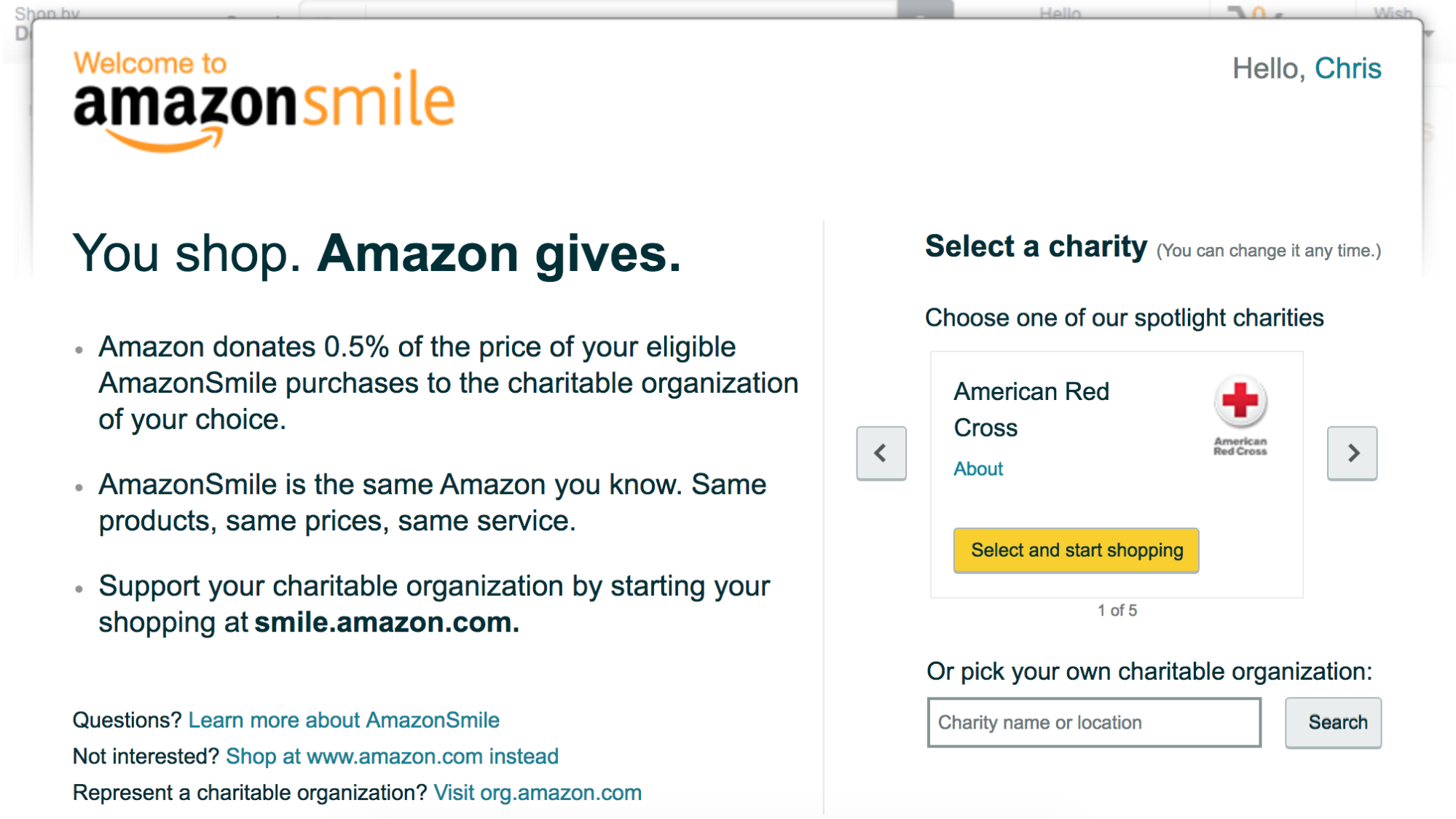
There are almost one million 501(c)(3) public charities who are a part of AmazonSmile.
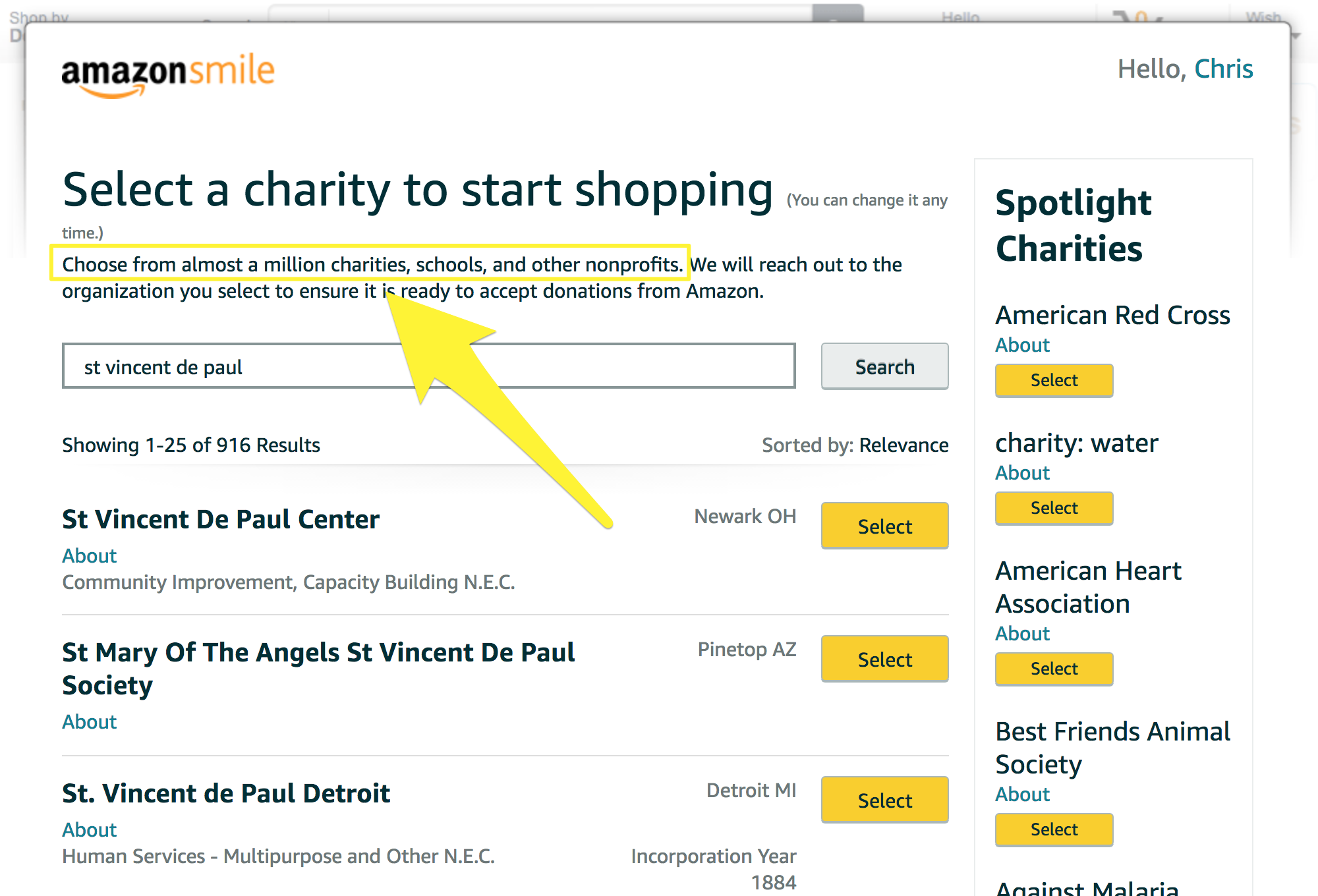
So far Amazon has donated more than $62 million to charities since October 2013. Giving away $62 million isn’t that much money for Amazon, when you take into account how much money they make from this program. You see, the AmazonSmile program is an affiliate program for a type of audience (charities) who are famously strapped for cash (and thus very willing to participate).
As with all classic affiliate programs, the AmazonSmile program gets their “partners” (the charities, in this case) to do the work of promoting Amazon for them. So, even if Amazon is giving these charities money, the amount of additional purchases they get because of the program is worth it.
At 0.5% donation per sale, for every $10,000 in sales Amazon makes when someone buys through the AmazonSmile site, $50 goes to charity. Plus, unlike other affiliate programs, the charitable twist has the added benefit of:
- Making customers feel better about their Amazon purchase
- Encouraging more purchases from Amazon in the future
- Customers viewing Amazon in a positive light
As with most successful affiliate programs, Amazon knows that a key is to make promotion easy for their partners. Once you sign up as a charity, Amazon gives you all the “marketing tools” you need to promote your AmazonSmile charity link.
Here is what Amazon’s landing page looks like after signing up as a charity:
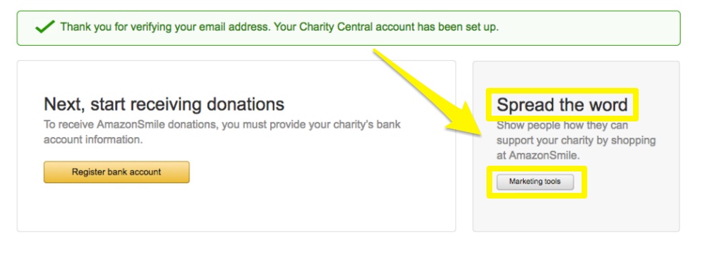
Part of what they offer you as a partner is “personalized web banners” and “ready-to-use Facebook and Twitter messages,” as this AmazonSmile welcome email explains:
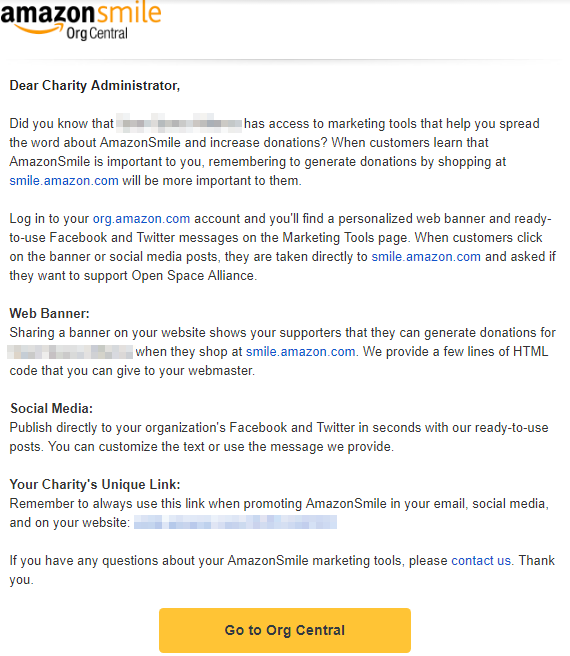
This is the same thing Shopify does with their successful affiliate program. This not only makes it easy for partners to promote AmazonSmile but also makes their promotions more effective. Here are a few of the ways partner charities are putting these marketing tools to use.
- Banners at the bottom of websites (California Historical Radio Society)
- Banners at the top of websites (Rowan Tree Foundation)
- Links inside blog posts (World of Children)
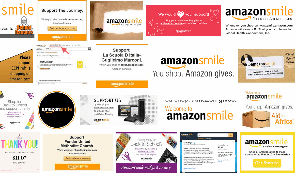
- Facebook posts for Amazon Prime Day (Talk It Up Foundation)
- Facebook posts with holiday banners (Delaware Valley Siberian Husky Rescue). Note how Amazon uses a hashtag in the Facebook Post copy to track and promote their campaign:
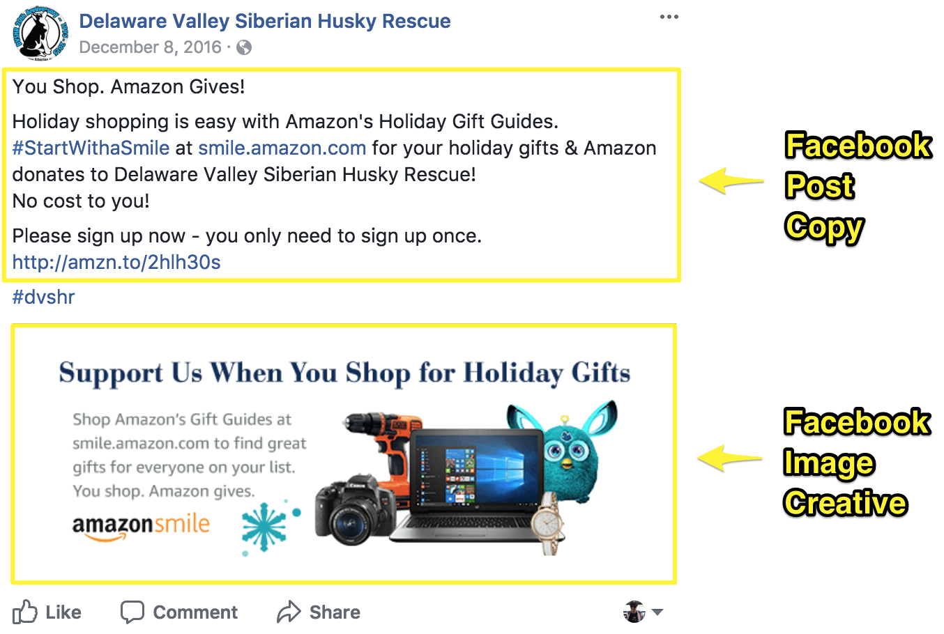
All of these charities (and the nearly 1 million other partners) are doing a lot to promote Amazon to their audiences. Which is exactly what you want your affiliate program to do — get your partners to do the work of getting existing audiences to buy more from you while you also get your brand in front of new audiences.
Seeing a reminder of Amazon again and again on different websites and social media increases Amazon’s brand awareness and makes them top of mind when people need to make an online purchase.
If you aren’t able to donate a percentage of your ecommerce sales to charity, or if you don’t sell products that have a wide market appeal, then here are some other ways you can tie philanthropy in with your business:
- Creating one-day sales events where you donate a portion of all purchases for the day to a charity.
- Product donations to charities who will tell their audience about you.
- Hosting live events with local charities (such as a walkathon, charity bike ride, fundraising dinner, or a comedy night).
- Partnering with charities that use (or could use) your products.
- Sponsoring a youth sports team who have the same fan base as you.
To make a philanthropic program like AmazonSmile work, Amazon needs to make their website visitors feel like they are giving back with every purchase they make on Amazon. Here is how they do it:
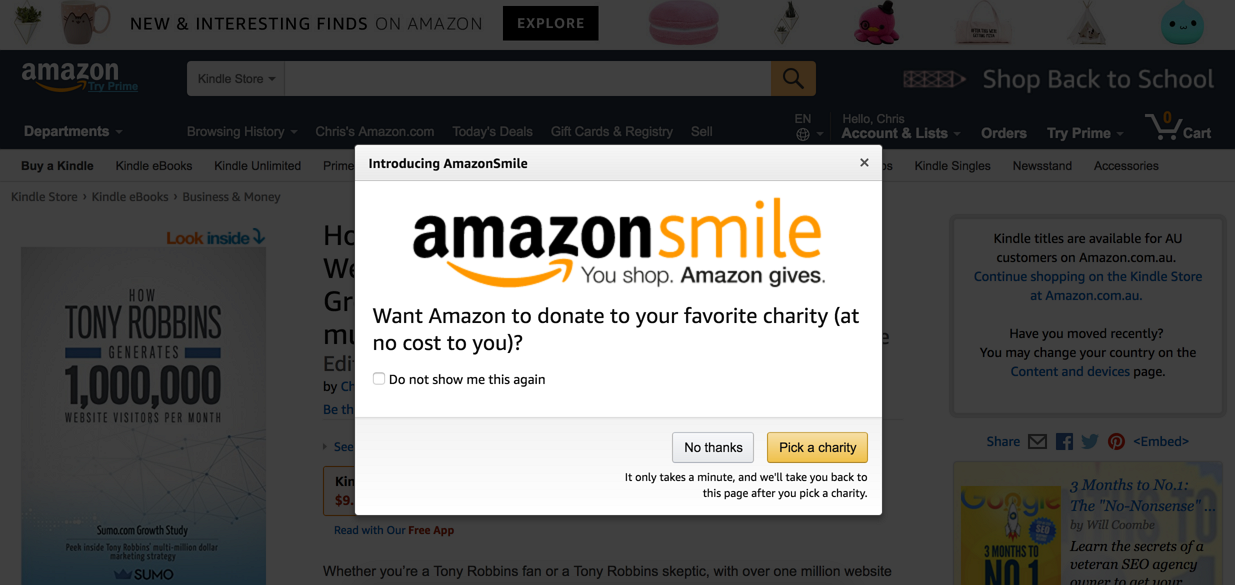
If people don’t go directly to the AmazonSmile page or end up on AmazonSmile through a charity promotion, Amazon makes people know about the program with this popup that can display on their product pages:
Click here to reveal the free tool you can use to create popups on your product pages like Amazon
The Takeaway: Use micro-copy underneath your call to action (CTA) button on your popups to increase the number of people who click it. Amazon uses microcopy under their “Pick a charity” CTA button, so you know it will be quick to pick a charity and then continue with your online shopping.
These popups get seen by millions of website visitors every month, so Amazon really wants you to know that they are willing to donate to your favorite charity and be known as a company that gives back.
But even if you do pick a charity, it doesn’t necessarily mean Amazon will donate. Donations are only given if you deliberately go through the AmazonSmile URL — it’s not automatic and has to be done every time you make a purchase (unless you download a web extension).
And if you are a forgetful, impulse-buyer, or mobile shopper, there’s a good chance you’ll just go straight through to the normal Amazon page unless you see a reminder popup (which triggers after you’ve previously picked a charity then visit an Amazon product page).
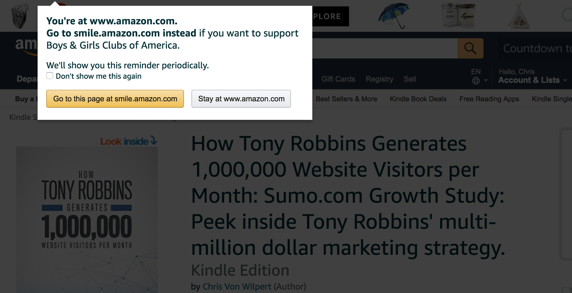
This is done deliberately by Amazon. They could just give you a tickbox option in your Amazon settings for donating to your favorite charity and link it to your Amazon account, but they don’t. There are also no mobile apps for AmazonSmile.
Amazon does this for a few reasons:
- So their partners (charities) are incentivized to continually promote Amazon on their website and across their social media accounts.
- So they aren’t forced to pay out significantly more donation money and destroy their profit margins.
Here is how the math works (using 2016 as an example):[*]
- Amazon made $136B sales in 2016 ($124B from product sales)
- Amazon made $2.4B profit in 2016
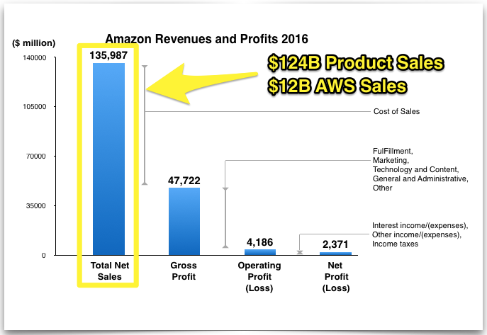
If Amazon let people connect their favorite charity to their Amazon account and everyone added it and used it all the time, they would lose $0.6B profit to donations ($124B x 0.5%). That is equivalent to 25% of their total profit for the year.
Obviously, not everyone would add it, especially people outside the US (and not all of Amazon’s revenue is made from their online store), but even if 50% of people did, that would reduce Amazon’s profit by $300 million. So to maintain a healthy net profit margin (Amazon’s profit margin is 1.7%) and continued expansion (like financing a deal to buy Whole Foods for $13.7 billion), Amazon only gives out donations when you buy through the AmazonSmile page.
When it comes to affiliates, Amazon’s real moneymaker is the Amazon Associate’s Program. The program is one of the world’s oldest and biggest affiliate programs.
Here’s how it works:
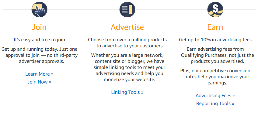
This classic version of an affiliate program does a lot of the same things the AmazonSmile Program does. They both:
- Get others (the affiliates) to do the work of promotion for them
- Give affiliates something in exchange (up to 10% of sales)
- Provide their affiliates with premade marketing material to help them promote Amazon easily and effectively
The three major differences between the two programs is that:
- Nearly anyone can be an affiliate in the Amazon Associate’s program, but only charities can be an affiliate in the AmazonSmile program
- People must click on an Amazon Associates affiliate link for the affiliate commission to be counted, but with AmazonSmile you can just go straight to the AmazonSmile URL and pick a charity
- AmazonSmile affiliates make 0.5% sales commission, while Amazon Associates make 1-10% commission.[*]
And since Amazon has such a wide-ranging audience, utilizing a more traditional type of affiliate program lets them reach as many people as possible.
To make sure the affiliates in the Associate’s program are successful, Amazon varies the type of marketing material they give to affiliates. For example, while the marketing material for AmazonSmile affiliates focuses on “Amazon gives” and general Amazon promotion, the material they give associates is much more specific.
Here is just one example of a native shopping ad unit Amazon give associates to display relevant product recommendations from Amazon on their website based on their page content.
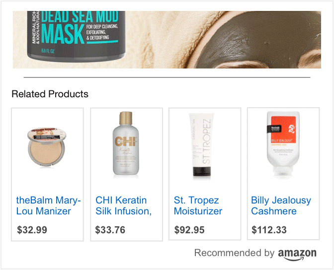
Ultimately, this helps Amazon’s affiliates personalize their promotion of Amazon products in a way they know would appeal the most to their audience. For example, a food blogger could use these ads to promote the specific cooking tools he or she writes about on the blog.
With this, Amazon improves their products relevancy to the affiliates audience so both parties can make more sales. Amazon just needs to invest in the one-time marketing material setup costs; then their affiliates will do the rest of the work for them.
The takeaway: Partner with affiliates that have the customer base you want to attract. Make it a two-way collaboration: they promote you with pre made marketing materials you give them, and you promote them to customers on your website (Amazon does it by partnering with charities and giving them 0.5% of their product sales along with premade website banners and social posts to promote on their website and across social media. They also promote their program with a popup on product pages and have an Associates Program where affiliates can make up to 10% commission.)
[Tip #4] Five Product Page Conversion Elements To Increase Conversion Rates On Your Product Pages
On just a single Amazon product page, you’ll find high-converting direct-response marketing tactics that include:
- Social Proof
- Perceived-Value Pricing
- Scarcity and Urgency
- 1-Click Buy Buttons
- Upselling and Cross-selling
Though this might seem like an excessive amount of conversion elements to put on just one product page, these finely tuned pages are an essential part of Amazon’s strategy to push people toward purchases. Without getting these pages just right, they likely wouldn’t be selling several billion products each year.[*]
Part of what makes Amazon’s pages so effective is that they use five product page conversion elements to get people to convert from product browsers to product buyers. As an example, here’s the above-the-fold view of an Amazon product page for a keychain:
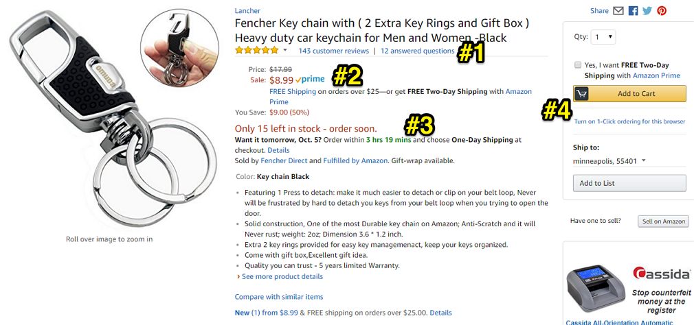
Product Page Conversion Element #1: Social Proof

When customers arrive on a product page, one of the very first things they see are those yellow stars showing just how much everyone likes (or dislikes) the product.
And there’s a reason Amazon puts this social proof front and center.
Before people have even thought much about the price or how much they need the item, they see what other people think. If they can see other people rate it highly, they are more likely to click and buy.[*]
You can do the same on your product page by adding:
- Star-based reviews
- Text reviews
- Testimonials
Check out this Sumo guide to social proof (with twelve social proof examples you can use in your business.)
Product Page Conversion Element #2: Perceived-Value Pricing

No matter what product you look at on Amazon, it always seems to be on “sale.”
Whether they actually are (or whether Amazon just says they are) doesn’t make a difference. As consumers, we just can’t help but be subconsciously drawn to the idea of a good deal.
Take careful note of how Amazon does this (there are more steps to it than you might think):
Step #1: They cross out the “original” price ($17.99)
Step #2: They show the “discounted price” ($8.99)
Step #3: They emphasize FREE shipping on orders over $25
Step #4: They remind the customer, yet again, how much they are saving in both dollar form ($9.00) and as a percentage (50%)
To do the same on your product pages, use the ‘perceived value’ of your product as the “Price” and follow Amazon’s four-step pricing method.
Note: If you are going to try something like this, be very careful when including the original price. In the past, Amazon used to include the initial list price. However, after Amazon and other retailers faced a number of lawsuits over fake discounting, Amazon has stopped using list prices entirely.[*]
Now, if they use this perceived-value pricing, their “original price” is just the price the item used to sell for on Amazon.
Something to keep in mind is that Amazon is always testing and trying new things. So, they seem to change both the prices as well as the presentation of their prices a lot to see what works best and gets the most sales.
For example, those first screenshots were taken a few weeks ago. Yet, when I go back to that very same product page, I can see that they are now presenting prices as just a single number without all the extra hype:
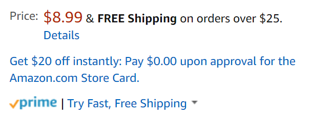
This current pricing presentation focuses less on the sale itself and more on making their recurring revenue Prime offer stand out.
Amazon also has a complicated dynamic pricing strategy with their prices regularly fluctuating. This is carefully done to make sure customers perceive Amazon as the cheapest place to buy overall.
They do this by heavily discounting prices for the products you see the most (i.e., the most popular products and the ones with the most reviews) so the prices are lower than their competitors like Walmart.[*]
Then, they keep prices for less desirable products normal or higher than their competitors.
Altogether, this dynamic pricing strategy helps Amazon discount just enough that customers believe Amazon to always be the cheapest choice, but not so much that they are cutting into their bottom line needlessly.
P.S: If you’re still struggling to come up with the right price for your product, check out our Sumo write-up of nine psychology-backed pricing strategies (you’ll see that some of these are strategies Amazon itself is using).
Product Page Conversion Element #3: Scarcity and Urgency

One of the most effective direct-response marketing tactics is using scarcity to tell buyers there are only a few items left in stock (“Only 12 left in stock – order soon”.) Not only does scarcity compel buyers to order now before stock runs out, but it makes consumers think the product must be popular or purchased often (thus boosting social proof even more).
Amazon then follows this up by using urgency to tell buyers if they want this to arrive by a certain date, they have to order by a certain time (“3 hrs 19 mins”). This increases people's chances of buying on Amazon instead of somewhere else because they can be guaranteed they will get it tomorrow if the purchase is urgent.
Do the same on your product pages by following Amazon’s example above or checking out our Sumo article with nine ways you can use scarcity in your marketing.
Product Page Conversion Element #4: 1-Click Buy Button
To avoid the dreaded abandoned cart, Amazon set up a shopping system that lets people make their purchases in a single click (after entering and saving their billing, payment and shipping information just once.)
This makes buying something ridiculously easy and fast (it’s just “1-click”), so customers aren’t given time to reconsider their purchase. Amazon patented the technology back in 1999, but now the patent has ended, anyone can use it to reduce cart abandonment.
Right now there are no off-the-shelf solutions for a one-click buy button technology from your product page, but if you have a high volume of ecommerce transactions on your website, it could be worth considering investing in software development resources to create your own.
Product Page Conversion Element #5: Upselling and Cross-selling
Even if you don’t end up buying what is on the product page you are viewing, Amazon is KING at making sure you buy something. They do this with some impressive upsell and cross-sell attempts that run the length of the page.
When I search under “All” products in Amazon for “keychain”, then click one of the product listings, this is what the top of the product page looks like:
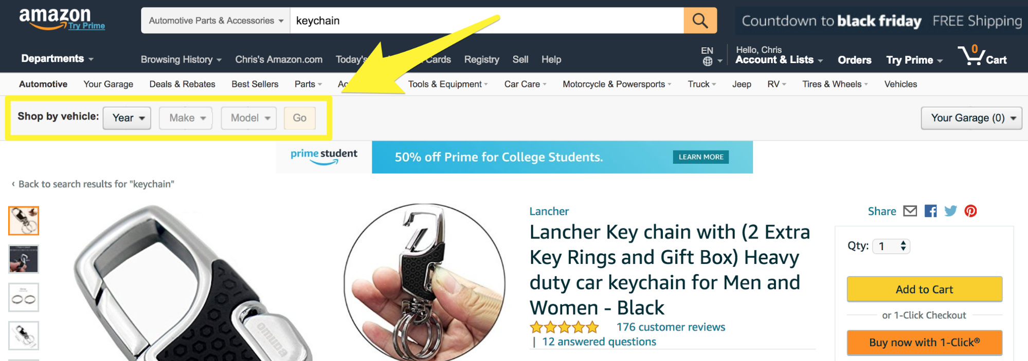
Amazon does this by using a visibility rule to show that “Shop by vehicle” bar whenever you view a product in the “Automotive > Interior Accessories” category. By knowing you’re looking at a product page for an interior automotive accessory, Amazon gives you a venue to search for more car products in a personalized way.
When you come back to look at more automotive accessories another day, Amazon automatically saves your car to “Your Garage” to make it easy for you to buy more accessories for your car:

If I scroll down, I end up on this bundle “Frequently bought together” upsell offering:

Amazon is showing me another relevant product (related to the first) that I can buy for a discounted price if I purchase the two together.
If I continue down the page, Amazon will suggest a LOT of other product options (including “related products” and “also bought” products):
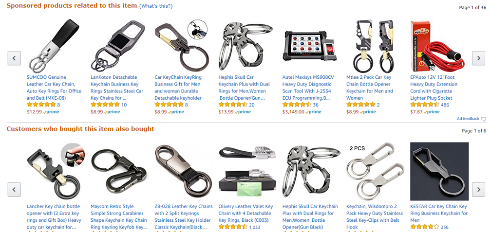
The “related products” section has sponsored ads from Amazon vendors that gives you more options in case you still want a keychain but are not interested in the one on the current page. The “also bought” section is the same, except these are not sponsored by advertisers.
Just below these two sections, Amazon has a free product comparison chart for the product I’m looking at and other relevant ones:
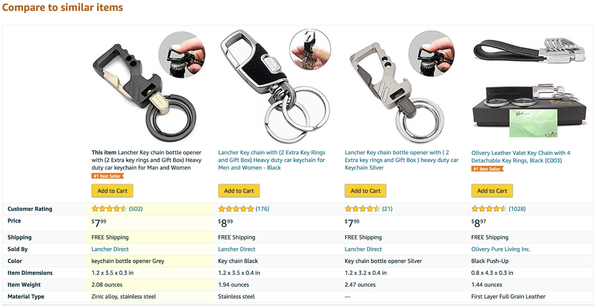
Amazon doesn’t care if you buy the product on the page you’re viewing. They just want you to buy something. So, it’s in their interest to make you feel like you’re getting the best product for you. Showing you a comparison chart helps you feel like you’re finding the right product to buy, with no need to visit another site.
The next sections of the product pages are product info provided by the vendor, customer Q&A, and reviews. The page then ends with yet more upsell and cross-sell attempts with a “Customers who viewed this item also viewed” and a “Your recently viewed items and featured recommendations” section.
Just to give you an idea of how often Amazon upsell or cross-sell on a single product page, here is an entire product page with those sections circled in red:

I know there are a lot of them, so here’s a quick review of all those sections:
- Personalized search (letting me search for other accessories based on my car model)
- Bundle offer with “Frequently bought together”
- “Sponsored products related to this item”
- “Customers who bought this item also bought”
- Product comparison chart
- “Customers who viewed this item also viewed”
- “Your recently viewed items and featured recommendations”
Product Page Conversion Element #6: The Smart Bar
Look at this screenshot one more time:
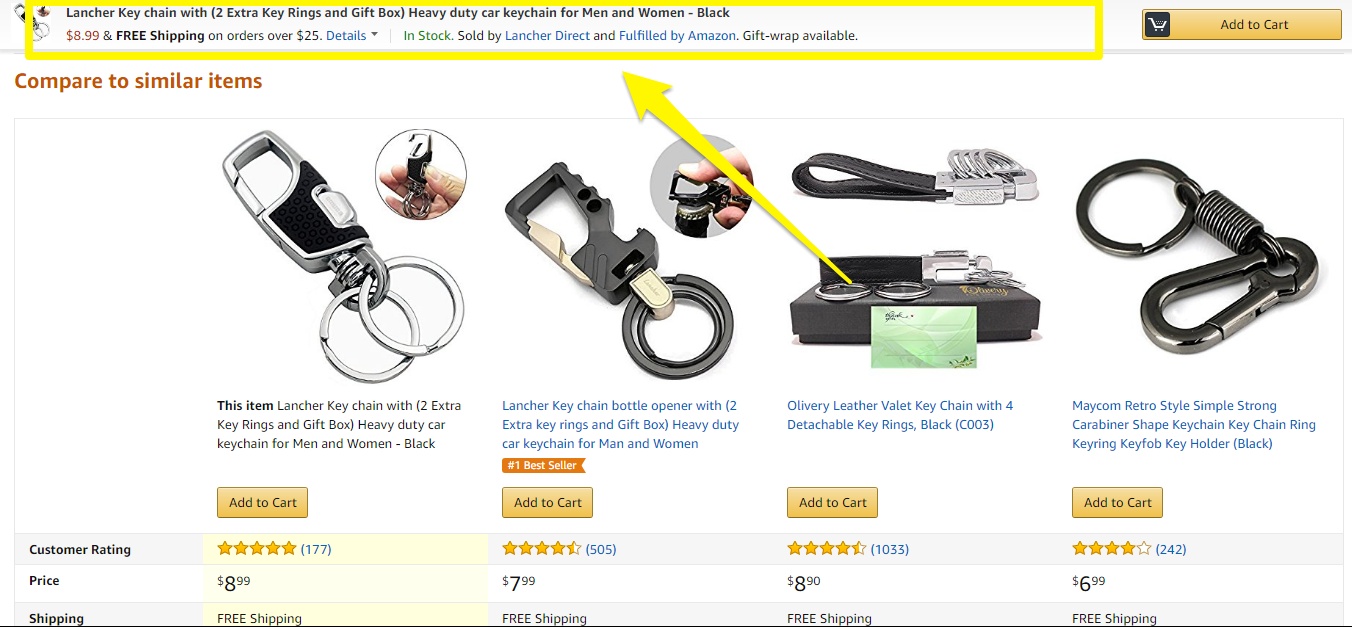
As I was scrolling down the page and hit this mid-way point (50% scroll down the page), that bar popped up and stuck there.

This Smart Bar is a clever “last chance” to urge you to make the purchase. Amazon does this with the promise of FREE shipping. Depending on the product, Amazon also pushes scarcity by mentioning their limited stock.

The takeaway: Make your product page a conversion powerhouse with these six product page conversion elements: social proof, discounting, urgency and scarcity, 1-click buy buttons, upselling and cross-selling, and the Smart Bar.
[Tip #5] Short 14 Second “Show, Don’t Tell” Product Video Ads You Can Use To Go Viral
Amazon has mastered the art of creating video ad campaigns that “show, don’t tell” for their Amazon Echo with their #justask campaign. In the campaign, the goal is to specifically show viewers what the Echo can do without actually explaining it.
See an example of how they do it in this video that has over 10,000,000 views on YouTube:
Little video ads like these are great for a few reasons:
- They are very short (most of the ads are 30 seconds or less).
- They are funny.
- They show real-life applications (every ad shows a different application).
In total, Amazon made more than 100 of these quick video ads, each showing a mini story revolving around asking Alexa (the Amazon Echo voice assistant) a funny question. They are being shown as TV and YouTube ads. But it’s what inspired Amazon to do these ads that makes this campaign so simple and effective.
According to Amazon, many of the real-life situations in the videos were pulled from the actual product reviews for Echo on Amazon’s website.[*]

This is a perfect example of using the language your customers use (a tried-and-true copywriting tactic).
If you’re ever stuck for words when creating an email, writing your website copy, or deciding what to say for a video ad; spend some time reading what your customers (or potential customers) have to say. Research what people are saying about your product, but also what people are saying (and like or don’t like) about your competition’s product.
You can do this by browsing:
- Amazon reviews
- Other review sites for your industry (Yelp, G2 Crowd, etc.)
- Relevant forums or message boards
- Facebook groups
- Subreddits
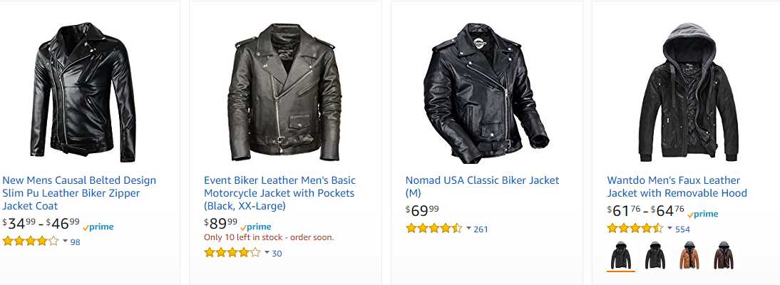
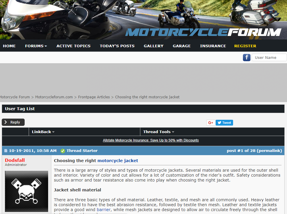
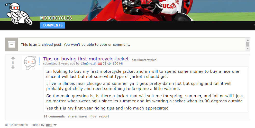
For example, if I sell biker jackets, here are three places I might want to dig through.
-
Amazon reviews for best-selling biker jackets:
-
A thread about choosing the right motorcycle jacket on a motorcycle forum:
-
Reddit discussion about buying your first motorcycle jacket:
The Takeaway: Narrow down all the products that have an average star review of >4.5. Look at the 3-star reviews of these highly rated products, and make a list of everything people say are missing from the best products. Use that list in your marketing (or first improve your product based on the feedback, then promote in your marketing.)
Here is an example of how you could take one 3-star review of a competing product, and make a 14-second video showing how your biker jacket has a soft, gentle fabric but is still strong enough to protect people if they fall off their motorcycle.

When you understand your customers better than they know themselves, you can generate content and ads that convert like crazy. To see a step-by-step example of how you can use the resources above to speak your customer’s language, check out our Sumo guide to discovering EXACTLY what your customers want.
The Takeaway: Research the language your customers use when communicating via reviews, forums and social media to come up with a marketing campaign that converts (Amazon does it by using real-life Echo reviews to create over one hundred short <30 second videos as part of their #justask video ad campaign on TV and YouTube.)
[Tip #6] The Portable “Pop-Up Shop” Strategy To Sell Exactly Where Your Customers Are
Even if your current business operates entirely online, there’s nothing quite like taking your products and putting them physically in front of your customers’ faces.
Doing this not only generates awareness of your product’s existence but gives customers a chance to test things out and experiment in a way an ecommerce store has yet to replicate.
For example:
- If you sell electronics or a SaaS product, seeing it in person gives customers a chance to ask questions and watch a demo.
- If you sell clothing, seeing it in person gives customers a chance to try it on to see if it fits.
- If you sell food or drink, seeing it in person gives customers a chance to sample it and see if they like it before committing to an order.
Although Amazon has been toying with the idea of setting up traditional brick-and-mortar stores around the country, they’ve also been experimenting with an even better alternative: pop-up shops.
Here is how Amazon’s website describes their pop-up shops:
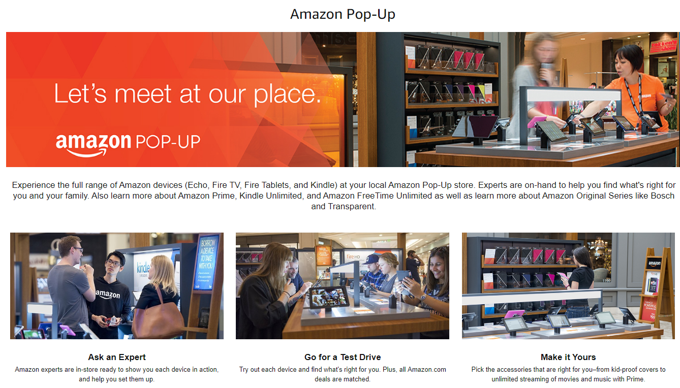
Amazon opened pop-up shops as a test a couple of years back. They are now expanding with the possibility of 100 set up around the United States by the end of 2017. These shops are part of the secret behind the wild success of Amazon’s own physical devices (Echo, Fire TV, Fire Tablets, etc.)
Just one of Amazon’s physical products, Echo smart speaker-with Alexa voice assistant-is estimated to bring Amazon $10 billion in revenue by 2020 from sales of Alexa products, people using Alexa to order, and developers needing Amazon Web Services to make Alexa apps.[*]
Pop-up shops offer Amazon a way to raise awareness of new products, educate customers, boost sales of their devices, and take free product returns (one of the few complaints Amazon customers have).
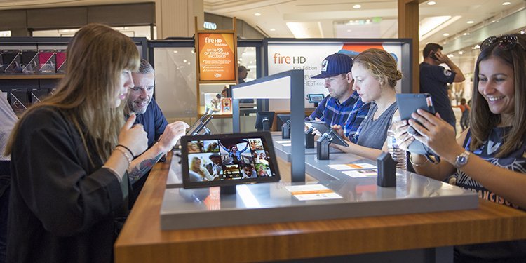
It’s a place where customers can test out Amazon devices in person, ask experts for advice, and purchase accessories.
This is a great way for ecommerce stores (or anyone that sells anything) to take their product and put it in front of customers wherever they are. Here is an example of an Amazon pop-up shop inside Kohl’s Bucktown Store in Chicago, Illinois:
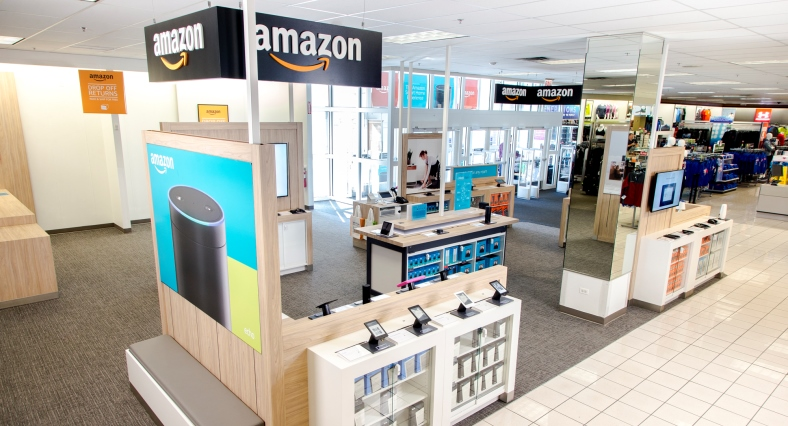
Just recently, Amazon announced they are bringing their products to where their customers are by setting up pop-ups in their newest acquisition: Whole Foods.[*]
There are a lot of reasons why pop-up shops beat out permanent storefronts, which is why Amazon chose them. Compared to traditional brick-and-mortar stores, pop-up shops are:
Much cheaper → you do have to pay to rent out the space, create your display and hire employees, but it’ll still be much less than a permanent location in the short term
More portable → you can put the shop exactly where your customers are — whether in the mall, at the local farmer’s market, or downtown outside a big event or popular nightlife strip
More fail-proof → if a location isn’t working or generating enough profit, you can move elsewhere (instead of being stuck in one location)
Easier to scale → you can decrease and increase the size of your area as needed (which isn’t always possible with a typical shopfront)
Lower commitment → you can be open for just a specific holiday or sale, or you can set up shop long-term.
Keep in mind your pop-up shop doesn’t need to be some big, elaborate display. The key here is just to get your product in front of your target customers. This could on be a smaller scale, like renting a mall kiosk, setting up a demo stand at events and conferences where your desired audience hangs out, or testing out something like Amazon’s Treasure Truck (see how it works in the image below.)
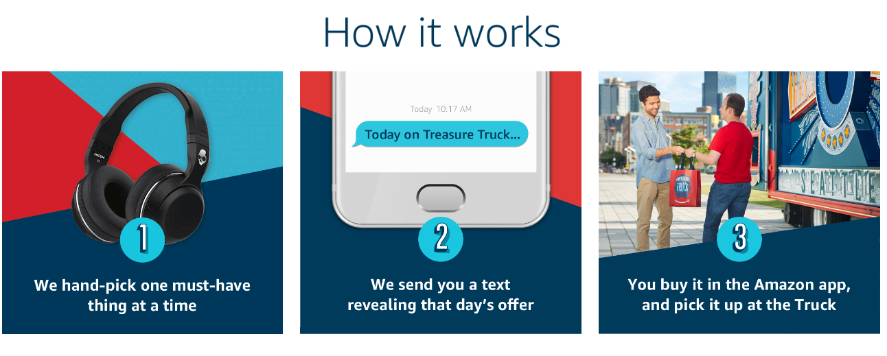
Here is a look at how three companies (both big and small) are embracing this portable pop-up shop marketing strategy:
-
With small indoor pop-up displays (Rivet and Sway eyeglass company pop-up for putting inside high-end salons)
-
With large outdoor pop-up displays (Adidas pop-up for Primavera Music Festival in Barcelona, Spain)
-
With scooter-ized portable pop-up displays on wheels (Penguin Books pop-up for Christmas at Westfield London)
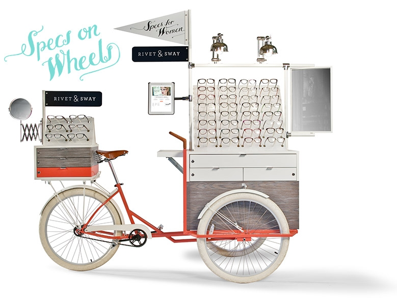
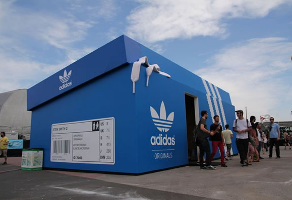
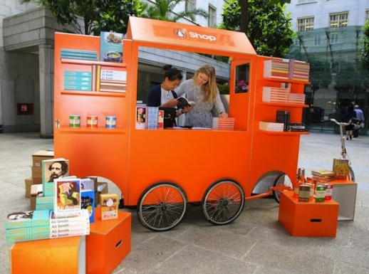
As you can see, there are a lot of ways you can create your pop-up shop no matter your budget or product.
The takeaway: Test one new marketing channel in your ecommerce business to get your business in front of your target customers (Amazon does it with their pop-up shops and other experiments like the Amazon Treasure Truck.)
[Tip #7] Add Recurring Revenue To Your Ecommerce Business With Amazon Prime’s 3 Success Tactics
Amazon Prime is the popular subscription service that gives Amazon users access to ‘prime only’ perks such as two-day free shipping. It costs $99/year or $10.99/month.
It also gives Amazon users unlimited access to Amazon’s streaming services (both video and music), the ability to borrow Kindle books, store photos, and a host of other benefits.
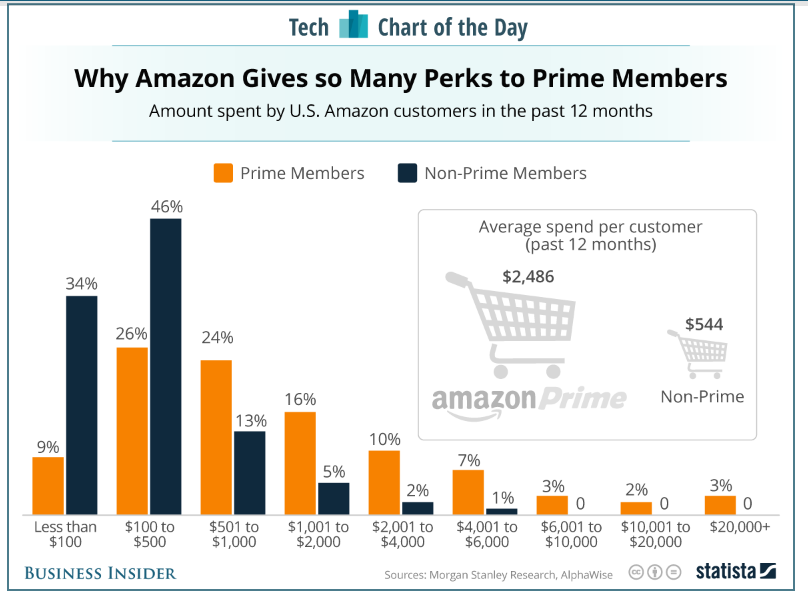
Amazon Prime has been quite the moneymaker not just in terms of signups, but also because Prime members tend to spend up to 3X more than non-members every year.[*]
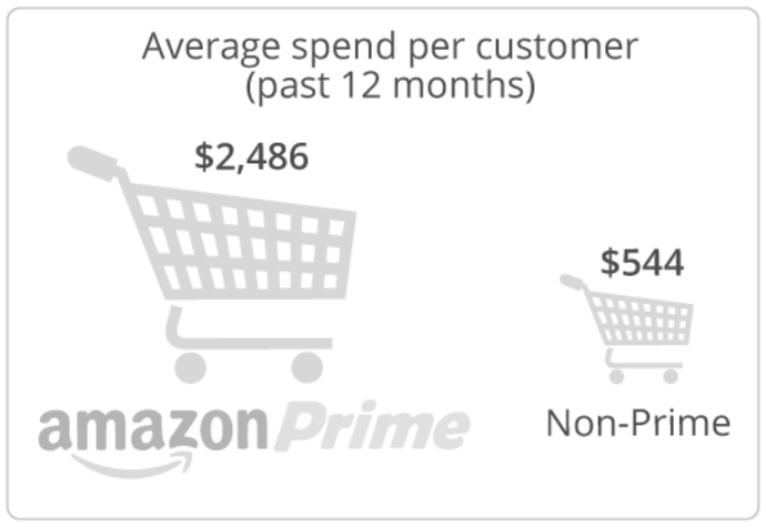
Amazon Prime’s success can be grouped loosely into three factors:
#1) Focusing on one key selling point
#2) Making sign up the obvious choice
#3) Using the right free-to-paid conversion techniques
Let’s look at them more closely.
Amazon Prime Success Tactic #1: Focusing On One Key Selling Point
Back in 2005, Prime first began with just free two-day shipping (all the other “bonus features” would come later).
No one likes paying for shipping or having to wait for something to arrive, so in a world where people expected to pay for 4-6+ day shipping, Amazon capitalized on this irritation with a solution.
It was risky at first, and Amazon lost millions of dollars in shipping revenue that first year. But clearly, they were on to something with free shipping.
Even today, Prime’s promise of free two-day shipping remains Prime’s biggest selling point. This promise is why nearly 80% of members decided to sign up in the first place:
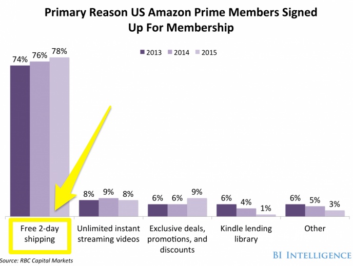
Amazon recognized early on that this would be their main selling point and is now developing even quicker delivery options (such as same-day or even two-hour delivery which has already been implemented in selected US cities.)
The two-day shipping is also the one Prime benefit that is highlighted the most (since Amazon knows this is the feature people are most drawn to and it’s easy for people to understand):
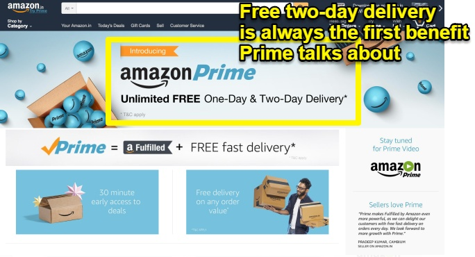
In other words, Amazon found one key selling point that got customers excited and then focused on making it even better (Focusing on something you already know has your customers talking is always a good idea. Doing this was what fueled the inspiration for a viral marketing campaign that generated 3.8 million organic searches for MailChimp).
But once Amazon started to see monthly memberships increase, they began to add other perks to Prime like video streaming, photo storage, eBook borrowing and more.
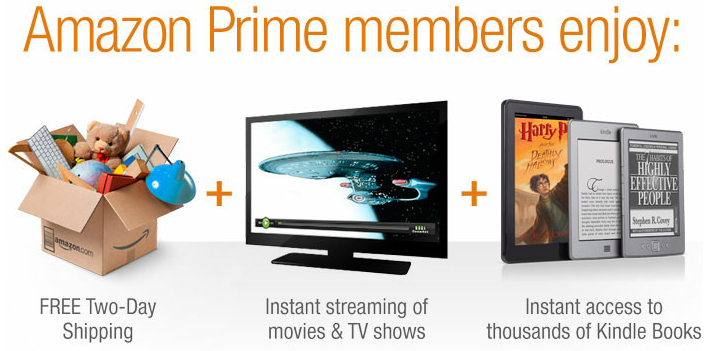
Why does Amazon add all of these free perks to Prime? Because Amazon Prime members average spend is $1,900 more than non-Prime members:
Since Amazon’s acquisition of Whole Foods, they announced that Prime members will soon be receiving discounts and other benefits at the health food store.
For the sake of convenience, Amazon is also going to make it possible for people to pick up their Amazon purchases (as well as make returns) from the Whole Foods of their choice.[*]
In other words, although Amazon Prime may have branched out, they are still staying true to their primary selling point.
Amazon Prime Success Tactic #2: Making Sign Up The Obvious Choice
After Prime was introduced, Amazon didn’t see the growth they were expecting until they began offering 30-day free trials of Prime to buyers of their newly launched Fire Tablet.
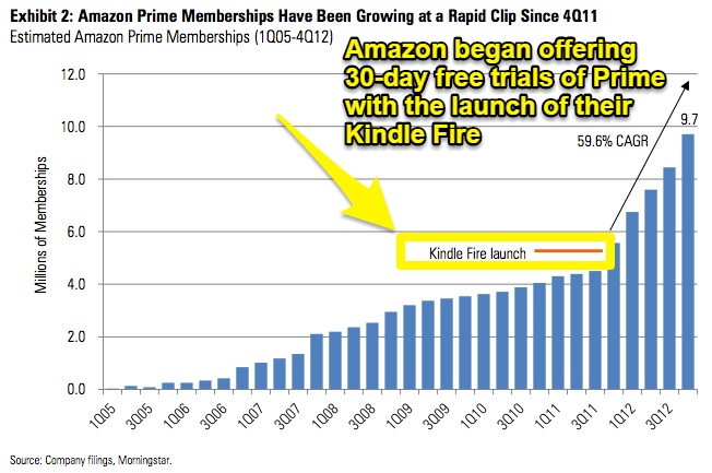
Clearly, attaching the free 30-day trial to a product launch decision was key to skyrocketing Prime’s growth and getting people to sign up in the first place.
Amazon had Prime in mind well before this launch. To help hook the new Prime members and get them to stay beyond the trial, Amazon did what they could to make Prime more enticing.They did this by launching two major Prime benefits earlier that year (both of which can be used easily with the user’s new Kindle): Prime Instant Video and the Kindle Owner’s Lending Library.
Eventually, Amazon opened up this free trial option to everyone.
Paying $99 (the yearly cost of Prime) right off the bat might seem a bit steep to many potential customers. But by adding in a free trial, customers had no reason not to try it out (especially as they could start saving on shipping costs right away.)
And with a deal like free two-day shipping, Amazon doesn’t have to do much to convince buyers. If someone is going to buy something from Amazon anyway and they haven’t tried out Prime, there’s not much reason for them to say no.
Today, here’s how Amazon makes that benefit clear and gets people to try out Prime on their product page:
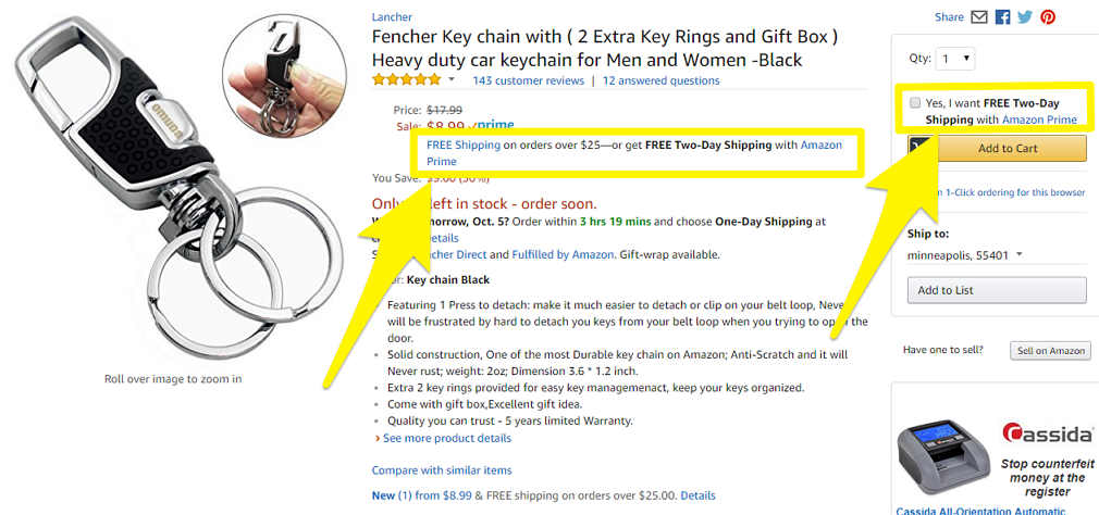
If I click on the hyperlinked “Prime” button, I’m taken to the Amazon Prime landing page where the two-day shipping benefit is made loud and clear:
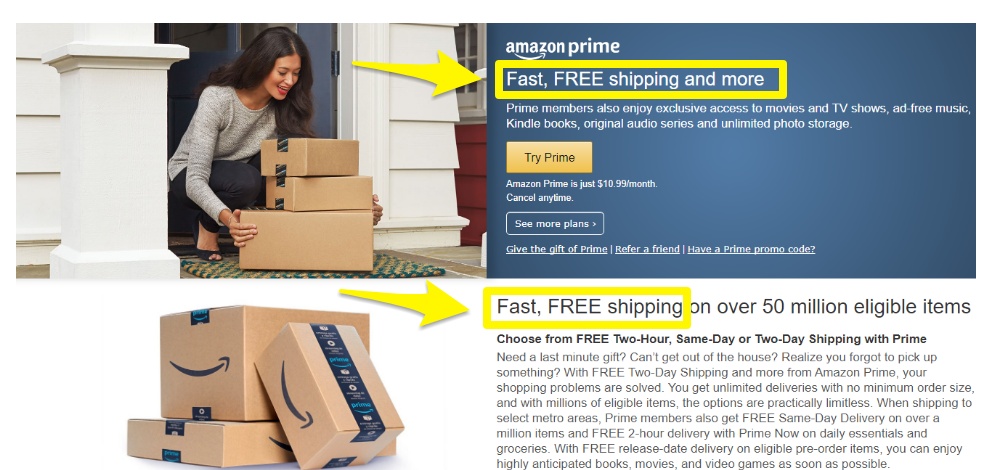
Look at how clear and straightforward the writing on this page is. The headline (“Fast, FREE shipping and more”) leaves you with no doubt as to what Prime is. The subhead then tells you all the bonus perks that sweeten the deal.
The microcopy under the “Try Prime” CTA is worth talking about, as well.
First of all, instead of advertising the $99/year price, they advertise the $10.99/month price. This is an easier price for people to stomach up front (even if it ends up being more over the course of the year in total).
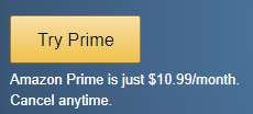
And in case anyone has other doubts or is worried they won’t like Prime, they’ve added in the “cancel anytime” promise.
Amazon also makes their Prime offering prominent on their homepage, by making a promotion for Prime part of the central carousel image, and including multiple mentions of Prime on the page.

Something important to take note of is that, during the free trial, members get 100% of the benefits of paid members. They’ll definitely save money on their purchases (with free two-day shipping) even if they don’t opt into the paid plan later on
Amazon Prime Success Tactic #3: Using The Right Free-To-Paid Conversion Techniques
Even if Amazon gets a ton of people to sign up for the Prime free trial, the challenge comes in getting those people to convert to the paid plan when their free trial expires. Yet, Amazon has the most impressive free trial to paid conversion rate I’ve seen.
In America, 73% of the subscribers who use Prime with the free 30-day trial offer convert to paid annual Prime members. An estimated 91% will renew their membership after the first year. This number jumps to 96% after year two, and then Amazon has a loyal customer for life.[*]
So, how does Amazon get people to convert to a paid plan? Let’s look at four of their most effective techniques.
1. Free Bonus Perks That Would Otherwise Cost As Much As The Subscription Price
To get people to sign up for Amazon Prime in the first place, Amazon focuses on grabbing people’s attention with the promise of free two-day shipping and a free trial.
But then, to get members hooked and make Prime more “sticky” in their lives so they want to continue their membership, Amazon has added a bunch of other free bonuses that they would otherwise have to pay a similar price for to get on their own, like:
- Video streaming (Netflix = $7.99/month)
- Music streaming (Spotify = $9.99/month)
- Photo storage (Dropbox = $9.99/month)
- Audiobooks (Audible = $14.95/month)
- eBooks (Kindle Unlimited = $9.99/month)
Once users realize that the price of Prime for $10.99/month vs. buying subscriptions to other platforms individually for $50+/month is such good value for money, sticking with Prime just makes sense.
Amazon makes sure new free trial users know all of the potential benefits with this Prime welcome email:
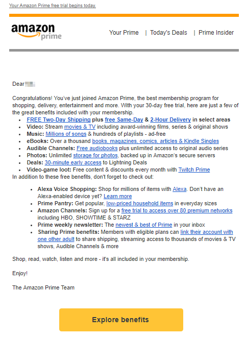
The Takeaway: Notice how Amazon lists out 13 specific benefits you are going to get in the email. This is a direct-response marketing tactic called “Bonus Stacking.” In this scenario, you have already bought, and Amazon is just reminding you of the bonus stack value. But this tactic can be used on your sales pages to make more sales and on webinars to sell webinar-only offers with a bonus stack at the end.
If you are a current Prime member, Amazon may show you this page as you are making a purchase:
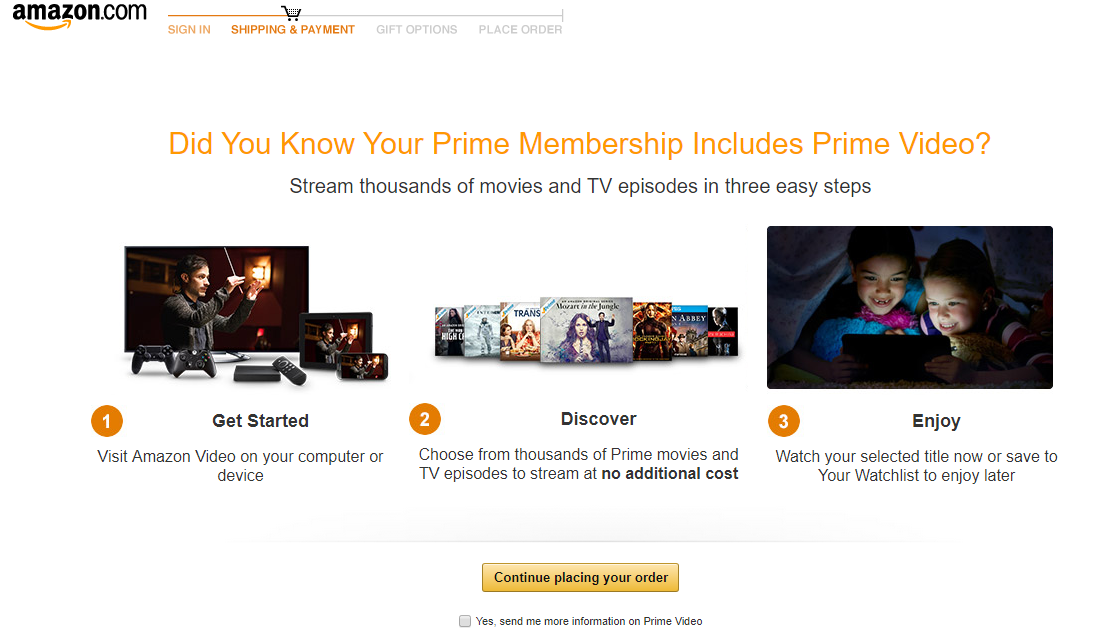
Amazon purposefully makes Prime members aware of benefits of the product they are not using so that Amazon starts to become their go-to spot for all their online shopping and entertainment needs and ultimately become a lifetime Amazon customer.
2. Benefit-Focused Cancellations Pages That End With A Downsell
If I go to Amazon’s website and try to cancel my Prime membership, this is the page I end up on:
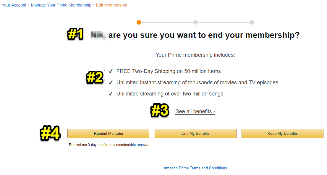
This short and simple page has been carefully designed to make you reconsider your decision to cancel.
Let’s go one by one.
#1) A headline that feels like a personal question (by including the customer’s name) that makes readers stop and think
#2) A reminder of Prime’s three biggest, most popular benefits beginning with the promise of “FREE two-day shipping” and number-backed statements showing just how big each service is (“thousands of movies”, “over two million songs”)
#3) A CTA reminding you that there are still more benefits to see that you will be missing out on
#4) A clever trio of CTAs
- Remind Me Later: This CTA aims to have you put off your decision to cancel by reassuring you that you can be contacted just before being charged (so you can continue reaping all the benefits of your free trial as long as possible)
- End My Benefits: A negative CTA that shows what you’re losing more than just saying “end membership”
- Keep My Benefits: A positive CTA that makes customers feel like they’ve made the right choice
Even if I go ahead and click “End My Benefits,” it doesn’t end there. Amazon ends with a downsell attempt that looks like this:
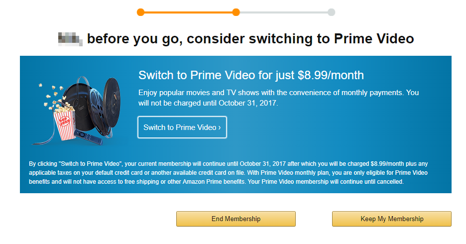
This is Amazon’s final, last-ditch attempt to get me to stay. They are doing this by downselling me a smaller, slightly cheaper product in the hopes that I’ll change my mind.
3. Limited Time Member-Only Discounts
Amazon Prime users get access to some pretty steep discounts, like this:
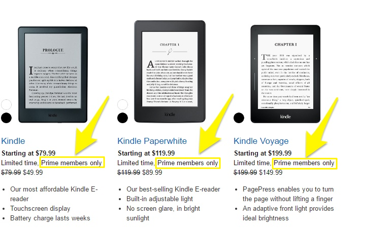
This gives people yet another reason to stick with Prime as they won’t be able to get these discounts otherwise.
These types of discounts also come in the form of the Amazon-created holiday: Prime Day. Prime Day is a 1-2 day annual sales event giving Prime users access to some major price cuts on all types of products Amazon sells.
To replicate this in your ecommerce business, create your own sale day event and give it a name. Most businesses do a Black Friday sale event, but why not create a sale day event and promote it to a segment of your customers who have purchased a particular product of yours that you know are more likely to spend more money with you?
4. Increase Free Shipping Minimum Spending Levels For Normal Customers
This last technique may be seen as a little sneaky and definitely pissed some people off (so use it with caution on your customers), but it’s one Amazon tried out in an aggressive attempt to get people to sign up for Prime (or stay with it as a paid user) simply because it was the best deal.
Although shipping has always been free for Prime members, in 2016 Amazon increased the minimum for nonmembers to get free shipping to a minimum purchase of $49 (or a minimum purchase of $25 of books).[*]

As you can imagine, this made many customers angry. But the goal behind this move was clear: drive more recurring revenue Prime signups by making free shipping more difficult to get for non-Prime members.
Amazon didn’t exactly try to hide their intention, either. Just below the announcement on Amazon’s website about the change, Amazon gave their sales pitch for Prime:[*]

As you can see, the interest in the search term “amazon free shipping” jumped the week Amazon announced the change:

Golden Nugget: This increase in people searching “amazon free shipping” would have been a perfect time for Amazon to run some PPC ads directing searchers to a Prime landing page. This could be done with a benefit-driven headline that shows people exactly what they are looking for (e.g., “Get Amazon 2-Day Free Shipping Forever – Try Prime”).
Earlier this year, Amazon dropped the price back down to a $35 minimum and it currently sits at a $25 minimum, a response to other big retailers (like Walmart) offering similar free shipping deals.
The takeaway: If you want your ecommerce revenue to be more predictable, create a recurring revenue product that incorporates benefits to all your other products. To promote it start by focusing on one key selling point that is universal across all your products (Amazon does it with their Prime membership that incorporates free access to multiple services people would otherwise have to pay up to 10X more for per month. To market it, they focus on free two-day shipping as their one key selling point.)
[Tip #8] 5 Types Of Emails You Should Send After Making A Sale If You Want To Make Even More Sales
If you’ve ever purchased anything from Amazon, you’ve probably noticed they send a LOT of emails. All these emails get Amazon nearly 100 million website visits (or 4.13% of their total monthly traffic).

So, if you’re in ecommerce (or really any business where you sell anything), you’re going to want to make sure you’re sending these types of emails yourself.
Here’s a quick look at the Amazon emails we’ll talk about:
- The First Purchase Congratulations Email
- The Order Confirmation Email
- The Order Shipped Email
- The Review Your Purchase Email
- The Sales Event Email
Email #1: The First Purchase Congratulations Email
What it looks like:
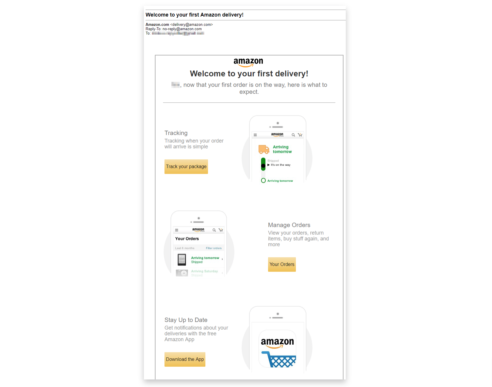
When you receive it: One day after you make your first purchase.
Things to take note of: The three gold CTAs all offer you a logical next step to take after your first order.
Goal of this email: To build your trust, set your mind at ease with what you can expect and begin engaging with you.
How you can do it: Make sure you always send people an email after their first purchase welcoming them and letting them know what other actions they can take. To encourage repeat purchases, you could also use this email as the chance to offer a special one-time discount for your customer’s next purchase.
Email #2: The Order Confirmation Email
What it looks like:
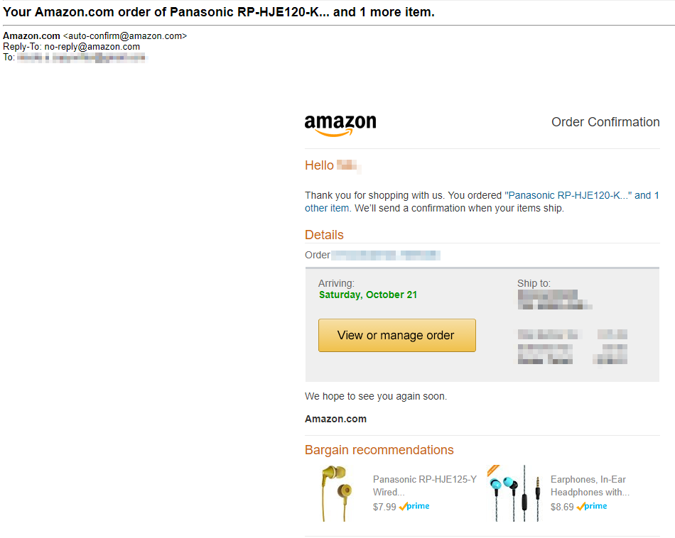
When you receive it: Just a few minutes after your purchase.
Things to take note of:
- The name of the product purchased is in the subject line
- The customer is greeted by name for personalization
- “Bargain recommendations” are added to the bottom of the email
- The arrival date stands out in another color
Goal of this email: At first, it seems like the goal of this email is strictly information.
But when you look closer, you see it’s a marketing email in disguise, aimed at getting you back onto Amazon’s website again via the “View or manage order” CTA.
And once you are brought back to Amazon’s website to see your “Order Details,” you are taken to an informational page that begins with order info, and ends with two Amazon product promotion widgets:
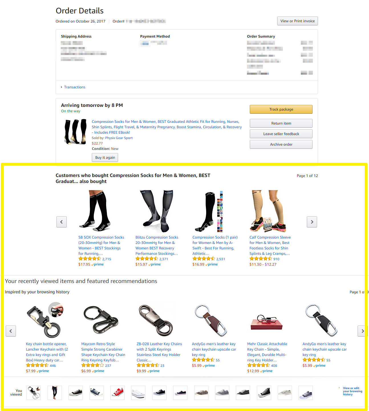
As we talked about in our Amazon product page analysis (tip #4), Amazon is KING at upselling and cross-selling their products whenever they can. This order details landing page is just another way they do it by showing sections for:
- “Customers who bought X also bought”
- “Your recently viewed items and featured recommendations”
- Your product browsing history
How you can do it: Send shoppers an order confirmation email with a summary of what they purchased. Then, give them a call to action to “View or manage order” that takes them back to an Order Details landing page where you can promote your other products (after you’ve given them their order details.)
Email #3: The Order Shipped Email
What it looks like:
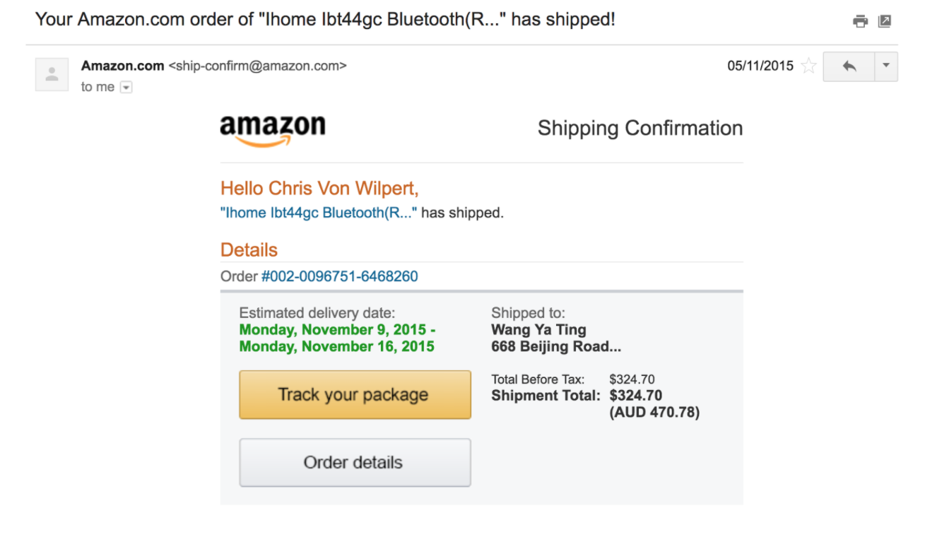
When you receive it: Immediately after your order has been shipped
Things to take note of:
- The email reminds shoppers of their order details (including the name of the product purchased, their shipping address and the total)
- Amazon puts the “Track package” CTA at the top of the email (which brings customers back onto their website)
- Subject line and name personalization are the same as the previous email
Goal of this email: Exactly the same as the previous one – get customers back onto Amazon’s website to foster repeat purchases.
If I click the “Track package” CTA, I’m brought to a page that, like the “Orders Details” landing page, gives customers the info they are looking for alongside plenty of extra product recommendations:
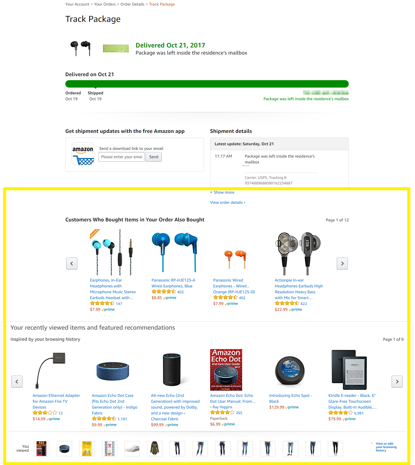
How you can do it: Send shoppers an order shipped email with a summary of the product shipped, shipping address, and shipment total. Then, give them a call to action to “Track package” that takes them back to a Track Package landing page where you can promote your other products (after you’ve given them their tracking information.)
Email #4: The Review Your Purchase Email
What it looks like:
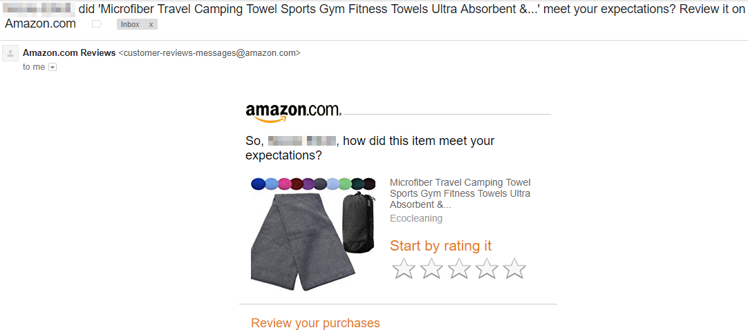
When you receive it: Several weeks after your purchase arrives (to make sure customers have had the chance to use it.)
Things to take note of:
- Amazon doesn’t ask customers to write out a full review right away. Instead, they make it easy by just making you click a star rating to start.
- The name of the customer is the first word in the subject line
Goal of this email: To get reviews and (you guessed it) get shoppers back on Amazon’s website.
If I click one of the stars in the email, I’m taken to this page where I can write a text review (and review any of my other product purchases):
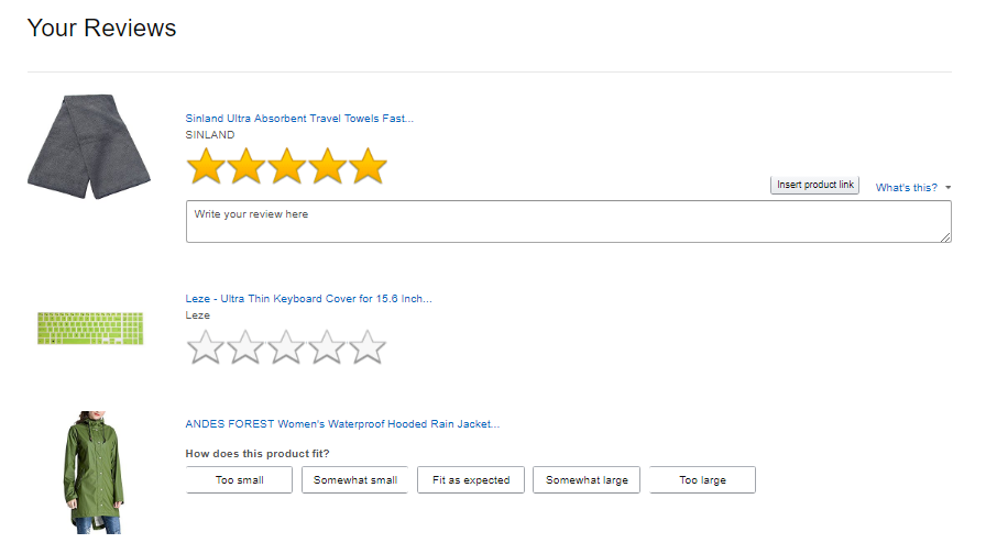
The Takeaway: Amazon uses the concept of “commitment bias” to ask you to take a low-commitment first step of picking a star rating review within the email, then only asking for a text review on their website after you’ve made the first small commitment. This tactic can increase the number of reviews you can get on your products.
Amazon uses their Review landing page as another opportunity to cross-sell other products (like all the web pages Amazon send traffic to from emails). At the bottom of the Review landing page after you scroll through your products, you’re given an “Inspired by your purchases” and “You viewed” section:
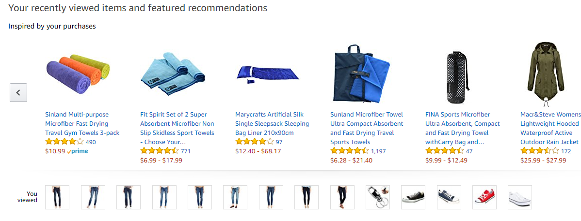
How you can do it: Make the first step for your customer to leave a review “one-click easy” by clicking on a star rating. Once they’ve started the first step, ask for a full-text review. Make sure to put your product recommendation widget on the page for more cross-sell opportunity.
Email #5: The Sales Event Email
What it looks like: This email will vary based on the type of sales event. Here is one Amazon sent for Cyber Monday.
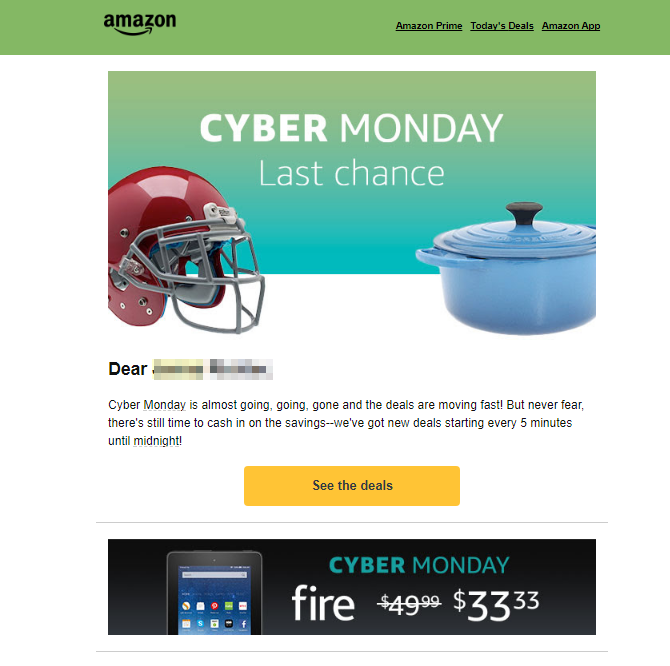
The Takeaway: Feature one of your hottest sales deals directly below the call to action button on the email to entice people to click through and buy.
When you receive it: Amazon is pretty shameless about promoting their time-limited sales events. So, your inbox might look like this leading up to a big sales event:
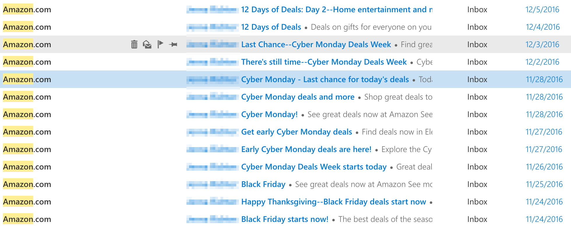
The Takeaway: Last chance announcements can nearly double the revenue of the initial announcements. Amazon does one in the morning as a "sales event" announcement and then one a few hours before the end of the day as a "last chance" announcement. You can use them in your product launches and discount events to increase your revenue.
Things to take note of:
- Every email subject line begins with the customer’s name (if Amazon have it)
- They experiment with many variations of similar subject lines and messages (e.g., “Cyber Monday!” and “Cyber Monday deals and more”)
- How often Amazon sends out these emails (daily or even twice daily)
How you can do it: Whenever you launch a new product or run a discount sale or sales event make sure it is time-limited with a deadline. Send a “sale announcement” email at the start of the day and a “last chance” email a few hours before the deadline ends.
If you’re not sure if it will work for your business, you can a/b test by sending a “sales event” announcement email and “last chance” email one month, but not sending the “last chance” email another month to see the impact on your revenue.
The takeaway: Swipe Amazon’s five email types to optimize your post-purchase email conversions and make more sales. Make sure you add your own unique spin to each email, to match your brand (Amazon does it with an email after you make your first purchase, order confirmation email, order shipped email, review your purchase email and sales event email.)
8 Key Takeaways From Amazon’s Billion Dollar Success
Whether you’re in ecommerce or an entirely different industry, there are eight nuggets of wisdom you can steal from Amazon and try out yourself.
Here are the eight key takeaways:
- You can still run custom PPC ads easily, even if you have thousands of products. Amazon does this by using templates to automatically create highly targeted ads with dynamic keyword insertion, unique selling points, and product category landing pages.
- See if there’s a way losing money upfront on a loss leader product can help you win big in the future. Just make sure you design your other products to be natural next purchases. Amazon does this by selling their Kindle products at a loss because they know they’ll make more money later when people buy digital media.
- Partner with affiliates that have the type of customers you want to attract. Then, make it a mutually beneficial relationship; you promote them on your website, and they promote you with the premade marketing materials you give them. Amazon does this right by partnering with charities and giving them 0.5% back.
- Use Amazon’s five product page conversion elements to push visitors to buy now. Amazon uses social proof, discounting, urgency and scarcity, 1-click buy buttons (you’ll need a coder for this one), upselling and cross-selling, and Smart Bars on their pages.
- Research what your customers are saying to you via email, reviews, and social media, then use that information form the foundation of your next marketing campaign. Amazon did it by getting inspiration from Echo product reviews to create short 14-second videos for their #justask marketing campaign.
- Put your ecommerce products directly in front of your customers. Amazon does this with their pop-up shop strategy.
- Add recurring revenue to your ecommerce business by creating a product that adds more value to your customers’ purchases. Amazon does it with their Prime membership program where you get faster shipping on your purchases plus video streaming, music streaming, file storage and more benefits for one low monthly fee.
- Increase your repeat buyers with Amazon’s five post-purchase email types including the first purchase congratulations email, the order confirmation email, the order shipped email, the review your purchase email, and the sales event email.
Related Articles
%(relatedarticles)



Add A Comment
VIEW THE COMMENTS